What is Attio CRM?什么是 Attio CRM?
Attio reimagines the CRM as a pure data instrument — dark surfaces, single-pixel borders, monospaced row identifiers, and a single violet accent that carries every ounce of color the interface allows.Attio 将 CRM 重新定义为纯粹的数据仪器:深色界面、单像素边框、等宽行标识符,以及一抹紫罗兰强调色——这是整个界面允许存在的全部色彩。
Attio CRM in briefAttio CRM 速览
Attio CRM is a visual design language born inside a London-based customer relationship management product launched in 2019. Where most SaaS tools of its era relied on friendly gradients, rounded illustration styles, and pastel palettes to soften the complexity of business data, Attio moved in the opposite direction — stripping back every decorative layer to expose the data itself as the primary visual object. The result is a style that reads more like a Bloomberg terminal or a code editor than a conventional CRM.Attio CRM 是一套视觉设计语言,诞生于 2019 年在英国伦敦创立的同名客户关系管理产品内部。彼时大多数 SaaS 工具依赖友好的渐变、圆润的插画风格和柔和的粉彩色板来软化商业数据的复杂性,而 Attio 选择了截然相反的方向——剥去每一层装饰,让数据本身成为主要的视觉对象。最终呈现出的风格,更像彭博终端或代码编辑器,而非传统 CRM。
The aesthetic rests on a small number of firm commitments: dark backgrounds that make structured data visible without strain, borders so thin they are barely perceptible yet perfectly sufficient, a monospaced typeface for record identifiers that signals machine precision, and a single violet hue deployed with discipline as the sole chromatic accent. Nothing competes with the information. Every visual choice either serves data density or gets removed.这套美学建立在少数几个坚定的选择之上:让结构化数据在不造成视觉疲劳的前提下清晰可见的深色背景;细到几乎无感却完全足够的边框;传递机械精确感的等宽字体行 ID;以及以克制方式部署的单一紫罗兰色——这是界面中唯一的色彩强调。没有任何元素与信息竞争。每一个视觉决定,要么服务于信息密度,要么被移除。
What makes Attio's approach historically significant is that it applied this developer-tool sensibility — established by products like Linear and Vercel in the engineering space — to a customer-data domain that had long been dominated by enterprise bloat and consumer-market friendliness. Attio demonstrated that business users working with complex relational data do not need to be shielded from density; they benefit from it.Attio 这一做法在历史上的意义在于:它将 Linear、Vercel 等产品在工程领域确立的开发者工具感性,精准地迁移到了长期被企业臃肿和消费市场友好感主导的客户数据领域。Attio 证明了:与复杂关系型数据打交道的商业用户,并不需要被屏蔽在密度之外——密度本身对他们有益。
Where does Attio CRM come from?Attio CRM 从何而来?
Attio was founded in London in 2019 by Nicolas Sharp and Alexander Christie. The founding premise was that CRM software had stagnated aesthetically and functionally — that Salesforce's visual paradigm, established decades earlier, had become a kind of institutional inertia, and that the tooling available to sales and customer-success teams had not kept pace with the expectations set by modern developer tools. The founders wanted to build a CRM that felt as precise and composable as a database, not as approachable and vague as a legacy enterprise suite.Attio 由 Nicolas Sharp 和 Alexander Christie 于 2019 年在英国伦敦创立。创立的前提是:CRM 软件在美学与功能上已陷入停滞——Salesforce 数十年前确立的视觉范式已演变为一种机构性惯性,而销售与客户成功团队可用的工具,远未跟上现代开发者工具所设定的期望。创始人希望打造一款感觉像数据库一样精确、可组合的 CRM,而非像传统企业套件那样亲切而模糊。
The visual language that emerged from this premise drew consciously from two parallel movements happening in the software design world around 2020 to 2022. The first was the dark-mode productivity tool aesthetic, exemplified by Linear's issue tracker, which used deep neutral backgrounds, restrained color, and high information density to signal that it was built for serious work. The second was the Notion-meets-Salesforce vision of flexible, structured data — the idea that users should be able to define their own data models rather than accepting whatever schema a vendor had decided was canonical.从这一前提出发形成的视觉语言,有意识地借鉴了 2020 年至 2022 年间软件设计世界中并行发生的两股运动。第一股是以 Linear 问题追踪器为代表的深色模式生产力工具美学:深沉的中性背景、克制的色彩、高信息密度,共同传达出「专为严肃工作而建」的信号。第二股是「Notion 遇见 Salesforce」的愿景——灵活、结构化的数据模型,让用户能够自定义数据结构,而非接受供应商预设的规范。
The Attio Brand team, working in the period roughly from 2022 to 2024, codified the visual system into its current form. The choice of violet as the single accent color was deliberate and unusual: violet does not appear in the legacy SaaS color vocabulary of blue-and-teal productivity tools or red-and-orange alert systems. It reads as neither warm nor cold, carries no strong cultural pre-association with software categories, and reproduces distinctively on both dark and light surfaces. Against a near-black background, a restrained violet accent reads as precise and intentional — not playful, not aggressive, simply exact.Attio 品牌团队在大约 2022 年至 2024 年间将这套视觉系统编纂为现在的形态。选择紫罗兰色作为唯一强调色是经过深思熟虑的,也是不寻常的:紫罗兰并不出现在传统 SaaS 的蓝绿系生产力工具或红橙系警示系统的色彩词汇中。它既不偏暖也不偏冷,在软件品类上没有强烈的文化预设,并且在深色与浅色表面上都能以独特方式呈现。在接近纯黑的背景上,克制的紫罗兰强调色传递出精确与刻意的质感——不活泼,不强硬,只是精确。
The grid discipline Attio adopted — a tight four-unit rhythm governing all spacing decisions — reflects the influence of systematic design approaches that became common in high-engineering-quality product organizations after 2015. This is not the organic, eye-balled spacing of early web design; it is the kind of mechanical consistency that code can enforce and that developers and designers at high-precision organizations find mutually intelligible. The combination of monospaced identifiers, single-pixel borders, and a consistent spatial rhythm gives the interface a quality that users often describe as feeling more like a designed system than a designed product — which is exactly what its creators intended.Attio 采用的网格纪律——一套驱动所有间距决策的紧凑四单位节律——反映了 2015 年后在高工程质量产品组织中普及的系统化设计方法的影响。这不是早期网页设计中凭直觉估量的有机间距,而是代码可以强制执行、设计师与开发者在高精度组织中都能相互理解的机械一致性。等宽标识符、单像素边框与一致的空间节律相叠加,赋予这套界面一种独特的品质——用户往往形容它感觉更像是一个被设计出的系统,而非一个被设计出的产品。这正是其创造者的意图。
What defines the Attio CRM look?Attio CRM 的视觉特征是什么?
Dark Surface Discipline深色表面纪律
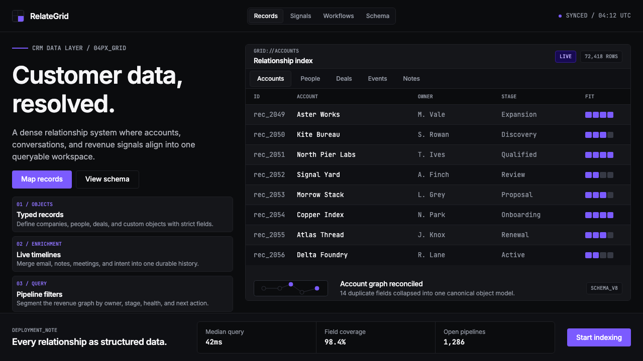
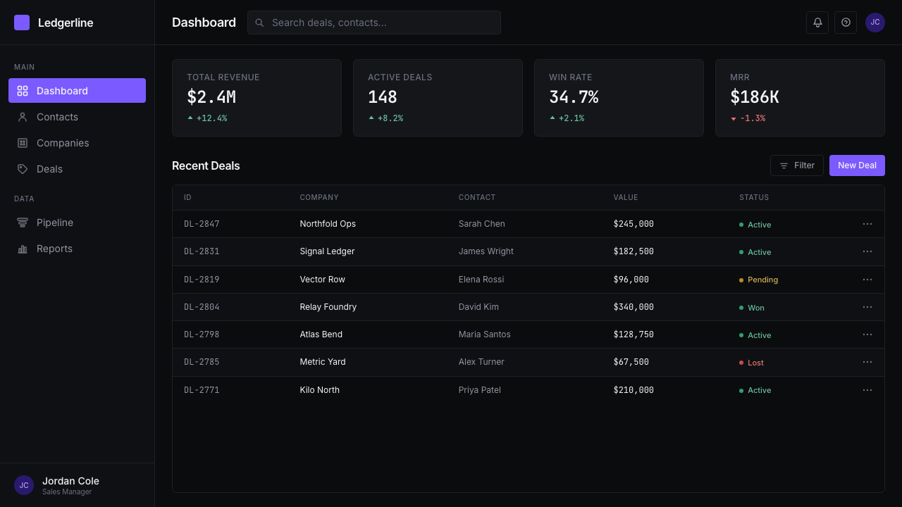
The foundation of the Attio aesthetic is a near-black background that is neither pure black nor a conventional dark gray — it sits at a depth that makes structured data visible without inducing the contrast fatigue associated with maximum-contrast dark modes. All surfaces are flat; there are no gradients, no vignettes, no ambient glow suggesting depth. The darkness is not atmospheric — it is a neutral field on which data can be read with precision.Attio 美学的基础是一种接近纯黑却并非正黑的深色背景——既非常规的深灰,也避免了最大对比度深色模式带来的对比疲劳,让结构化数据得以清晰可读。所有表面完全平整:无渐变,无暗角,无暗示深度的环境光晕。这种深色不是氛围性的——它是一片中性的场域,供数据被精确阅读。
Single-Pixel Border Language单像素边框语言
Where most modern UI design has moved toward borderless cards defined by shadow or background-color contrast, Attio uses explicit borders rendered at the thinnest legible weight. These borders delineate tables, cells, panels, and input fields with mechanical exactness. The approach is structurally honest — a border is a boundary declaration, not a styling choice — and produces layouts that feel more like data grids than product interfaces. The thinness of the border is load-bearing: thicker borders would introduce visual weight that competes with the data itself.大多数现代 UI 设计已转向以阴影或背景色对比定义无边框卡片,而 Attio 使用以最细可辨重量绘制的明确边框。这些边框以机械般的精确性划定表格、单元格、面板与输入框。这一做法结构上诚实——边框是边界声明,而非造型选择——并产生出感觉更像数据网格而非产品界面的版面。边框的纤细是承重性的:更粗的边框会引入与数据本身竞争的视觉重量。
Monospaced Identifier Logic等宽标识符逻辑
Record identifiers, row numbers, timestamps, and code-like references are rendered in a monospaced typeface throughout the interface. This is not decorative — it is functional. Monospaced characters allow users to scan and compare identifiers of equal character length without their eyes performing the variable-width compensation that proportional typefaces require. The visual effect is one of database readout: structured, indexable, machine-generated. The contrast between monospaced identifiers and proportional text elsewhere in the UI creates a clear semantic distinction between system-generated data and human-entered content.记录标识符、行号、时间戳和类代码引用在整个界面中均以等宽字体呈现。这不是装饰性的——它是功能性的。等宽字符让用户在扫描和比对等字符长度的标识符时,无需眼睛对比例字体所需的可变宽度进行补偿。视觉效果如同数据库读出:结构化、可索引、由机器生成。等宽标识符与界面其他位置的比例字体之间的对比,在系统生成数据与人工输入内容之间建立了清晰的语义区分。
Violet as the Sole Accent紫罗兰作为唯一强调色
Violet is used exclusively and sparingly for interactive affordances, selected states, active indicators, and branded moments. It does not appear in backgrounds, decorative shapes, or informational elements. Because the surrounding palette is achromatic — near-black, near-white, and mid-grays — even a small deployment of violet reads with strong signal. The color carries no warm-cold ambiguity, no status connotation borrowed from traffic-light metaphors, and no genre association with legacy enterprise software. It is categorically distinct, which allows it to serve simultaneously as a brand signal and a functional indicator without confusion.紫罗兰色仅在交互可供性、选中状态、活跃指示符和品牌时刻中以克制方式出现。它不出现在背景、装饰性形状或信息性元素中。由于周围的色板是消色差的——接近纯黑、接近纯白与中性灰——即便是小范围的紫罗兰色也能传达强烈的信号。这种颜色没有冷暖歧义,没有借自交通信号灯隐喻的状态含义,也没有与传统企业软件相关联的类别预设。它是范畴性独特的,这使它能够同时作为品牌信号和功能指示符,而不产生混淆。
Maximum Information Density最大信息密度
Attio's layout philosophy treats every unit of screen space as a resource to be allocated to data, not to whitespace for comfort. Row heights are compact; column widths are fitted to content rather than padded for breathing room; side panels and drawers open in context rather than replacing the primary view. This density is not carelessness — it is a deliberate choice premised on the belief that power users of structured data benefit from seeing more records, more fields, and more relationships simultaneously. The visual discipline required to maintain legibility at high density — consistent alignment, thin borders, clear typographic hierarchy — is what keeps the interface readable rather than overwhelming.Attio 的版面哲学将每一个屏幕空间单位视为应分配给数据而非留白的资源。行高紧凑;列宽按内容适配而非为呼吸空间填充;侧面板和抽屉在上下文中打开,而不是替换主视图。这种密度不是粗心——而是一种深思熟虑的选择,其前提是:结构化数据的高级用户能从同时看到更多记录、更多字段、更多关系中获益。在高密度下维持可读性所需的视觉纪律——一致的对齐、纤细的边框、清晰的字体层级——正是让界面可读而非压迫的关键。
Mechanical Grid Rhythm机械网格节律
All spatial relationships in the Attio system — padding, margin, gap, and component sizing — are governed by a strict unit-based rhythm. This grid is not a loose guideline; it is enforced with the consistency that comes from having spacing values defined as design tokens and applied programmatically. The effect is that no element sits at an arbitrary distance from its neighbor. Every gap is a multiple of the base unit. The resulting precision is perceptible even to users who cannot articulate why the interface feels unusually orderly — it is the same quality that distinguishes a typeset document from a word-processed one.Attio 系统中的所有空间关系——内边距、外边距、间隙与组件尺寸——均受一套严格的单位节律支配。这个网格不是宽泛的指南;它通过将间距值定义为设计令牌并以程序化方式应用而得到强制执行。效果是:没有任何元素与相邻元素之间存在任意距离。每个间隙都是基础单位的整数倍。由此产生的精确性是可感知的,即便用户无法言说为何这个界面感觉异常有序——这与排版文档区别于文字处理文档的那种品质相同。
Flat Depth Without Shadow无阴影的平面深度
In most UI systems, visual hierarchy is established through shadow — elevated elements cast diffuse shadows that signal their layer priority. Attio achieves layer differentiation through border contrast and background-tone shifts rather than shadow. A modal or panel sits on a surface that is very slightly lighter or darker than the background, outlined by a border at the same weight as all other borders in the system. The result is a layering system that remains architecturally flat — there is no simulated lighting model, no ambient depth — yet communicates containment and priority with equal effectiveness.在大多数 UI 系统中,视觉层级通过阴影建立——较高层级的元素投射漫射阴影,传达其层级优先级。Attio 通过边框对比和背景色调偏移而非阴影来实现层级区分。模态框或面板所在的表面比背景稍亮或稍暗,由与系统中所有其他边框相同重量的边框轮廓。结果是一套在建筑上保持平整的层叠系统——没有模拟光照模型,没有环境深度——却以同等效果传达包含关系与层级优先级。
Who shaped Attio CRM?谁塑造了 Attio CRM?
Co-founder and CEO of Attio, Nicolas Sharp shaped the product's founding thesis: that CRM should be rebuilt from the data layer up rather than from the feature list down. His background in software and his dissatisfaction with incumbent CRM products drove the decision to position Attio as a structured-data platform with a radical density-first visual philosophy, rather than yet another SaaS product competing on feature count and friendly onboarding.Attio 联合创始人兼 CEO Nicolas Sharp 塑造了产品的创立命题:CRM 应从数据层向上重建,而非从功能列表向下设计。他的软件背景以及对现有 CRM 产品的不满,推动了将 Attio 定位为结构化数据平台的决策——以激进的密度优先视觉哲学立身,而非以功能数量和友好引导与其他 SaaS 产品竞争。
Co-founder of Attio, Alexander Christie contributed the technical architecture that made the Attio data model flexible enough to support its visual system's information-density ambitions. The ability to define custom attributes, relationship types, and computed fields programmatically is what allows the interface to remain consistent — a monospaced identifier, a single-pixel border, a compact row — across wildly different customer data configurations.Attio 联合创始人 Alexander Christie 贡献了技术架构,使 Attio 数据模型足够灵活,能够支撑其视觉系统对信息密度的追求。以程序化方式定义自定义属性、关系类型和计算字段的能力,正是让界面能够在截然不同的客户数据配置中保持一致的原因——等宽标识符、单像素边框、紧凑行高,始终如一。
The in-house brand team working primarily between 2022 and 2024 codified the visual system into its current state. Their decisions — violet as the exclusive accent color, the enforcement of a tight unit-based grid, the commitment to flat depth without shadow, the use of monospaced type for identifiers — were not arbitrary stylistic preferences but reasoned positions derived from the product's core thesis: that business data deserves a visual environment as precise as the data itself.主要活跃于 2022 年至 2024 年间的内部品牌团队将这套视觉系统编纂为现有形态。他们的决策——紫罗兰作为唯一强调色、强制执行紧凑的单位网格、承诺无阴影的平面深度、对标识符使用等宽字体——并非随意的风格偏好,而是从产品核心命题出发的理性立场:商业数据值得拥有一个与数据本身同样精确的视觉环境。
Linear is not an Attio product, but its visual language — established between 2019 and 2022 for a software issue-tracking tool — was the most direct precedent for Attio's aesthetic. Linear proved that a dark, dense, high-contrast SaaS interface could be commercially successful and aspirationally positioned, and gave the broader market a reference for what post-gradient, post-illustration B2B software design could look like. Attio took that precedent and applied it to the CRM domain.Linear 不是 Attio 的产品,但其在 2019 年至 2022 年间为软件问题追踪工具确立的视觉语言,是 Attio 美学最直接的先例。Linear 证明了一套深色、高密度、高对比度的 SaaS 界面可以在商业上取得成功并具备渴望感定位,并为更广泛的市场提供了后渐变、后插画时代 B2B 软件设计的参照。Attio 将这一先例迁移到了 CRM 领域。
Vercel's design system, developed alongside its developer deployment platform, established a different but complementary set of principles to Linear: the idea that developer-facing infrastructure could be presented through an interface of almost typographic austerity — near-black backgrounds, monospaced terminal output, system-level precision. Vercel's influence on Attio is most visible in the identifier and timestamp treatment, where the interface borrows the grammar of a deployment log and applies it to CRM record fields.Vercel 的设计系统与其开发者部署平台并行发展,确立了一套与 Linear 不同但互补的原则:面向开发者的基础设施可以通过近乎字体排印般简朴的界面呈现——接近纯黑的背景、等宽终端输出、系统级精确性。Vercel 对 Attio 的影响在标识符与时间戳的处理上最为明显:界面借用了部署日志的语法,并将其应用于 CRM 记录字段。
How do you use Attio CRM today?今天怎么用 Attio CRM?
The Attio design language is a precision instrument, and its correct application depends on understanding what generates its authority: the combination of chromatic restraint, structural honesty, and density. Applying violet to a light-background interface, or adding soft shadows to components that should be defined by border alone, or inflating row heights for breathing room — any of these moves breaks the system's logic and produces something that looks like an imitation rather than a principled application of the aesthetic.Attio 设计语言是一种精密仪器,正确应用它依赖于理解其权威感的来源:色彩克制、结构诚实与信息密度三者的组合。将紫罗兰色用于浅色背景界面,或为本应仅由边框定义的组件添加柔和阴影,或为增加呼吸空间而扩大行高——任何这些举动都会打破系统的逻辑,产出一个看起来像模仿而非这套美学的原则性应用的结果。
For presentation slides, the Attio style works exceptionally well in contexts where the content is data-heavy or technically sophisticated. A cover slide benefits from the style's poster-like restraint: a near-black background, the title set in proportional type at large scale, a single structural detail — a thin horizontal line, a monospaced identifier in the corner — rendered in violet. Content slides should be treated as data panels: tight column grids, compact row heights, text hierarchies expressed through size and weight differences rather than color variation. Data visualization slides take on a terminal quality — charts and tables styled as if rendered by a system rather than decorated by a designer, with violet used sparingly to highlight the single most important data point.在演示文稿中,Attio 风格在内容以数据为主或技术色彩浓厚的场景中表现极为出色。封面页受益于这种风格的海报式克制:接近纯黑的背景、以大号比例字体设置的标题、一个结构性细节——一条细水平线,角落处的等宽标识符——以紫罗兰色呈现。内容页应当被视为数据面板:紧凑的列网格、压缩的行高、通过字号与字重差异而非色彩变化来表达的文字层级。数据可视化幻灯片具有终端式品质——图表和表格的样式仿佛由系统渲染而非设计师装饰,紫罗兰色仅用于高亮最重要的单个数据点。
For web UI and dashboard design, Attio's principles apply most naturally to internal tools, analytics products, and any interface where power users need to process large volumes of structured records. The approach: commit fully to a dark base surface, use borders rather than shadows to define components, apply violet exclusively to interactive affordances and active states, and resist the temptation to add illustration or photography to soften the density. Pricing pages and feature comparison tables benefit from the style's grid discipline — every cell aligned, every value presented in the same typographic weight and size, with violet highlighting the recommended tier.对于网页 UI 与仪表板设计,Attio 的原则最自然地适用于内部工具、分析产品,以及任何高级用户需要处理大量结构化记录的界面。方法:完全投入深色基础表面,用边框而非阴影定义组件,将紫罗兰色专门用于交互可供性与活跃状态,抵制为软化密度而添加插画或摄影的诱惑。定价页面和功能对比表受益于这种风格的网格纪律——每个单元格对齐,每个值以相同的字体字重和尺寸呈现,紫罗兰色高亮推荐方案。
For editorial and marketing contexts, the Attio aesthetic suits content that positions itself as analytically credible — research reports, data journalism, technical documentation, and brand communications aimed at an audience of builders and operators. A marketing page in this style uses a dark hero section with a near-white headline at large scale, a subhead in mid-gray at smaller scale, and a violet call-to-action rendered as a bordered button rather than a filled one. Body content sections can use a lighter surface — near-white rather than near-black — with the same thin-border, compact-spacing discipline carried through. The shift between dark hero and light body sections creates structural contrast without requiring decorative elements.对于编辑与营销场景,Attio 美学适合将自身定位为分析可信的内容——研究报告、数据新闻、技术文档,以及面向构建者和运营者受众的品牌传播。这种风格的营销页面使用深色首屏:接近纯白的大号标题、较小字号的中灰副标题,以及以有边框按钮(而非实心填充按钮)呈现的紫罗兰色行动召唤。正文内容区域可以使用较浅的表面——接近纯白而非接近纯黑——但延续相同的细边框、紧凑间距纪律。深色首屏与浅色正文区段之间的转换,无需装饰性元素即可创造结构性对比。
The most common mistake when working with the Attio style is treating the dark background as atmospheric rather than functional. Designers who add subtle grain textures, radial gradient glows around feature illustrations, or soft ambient lighting effects to a dark Attio-inspired layout are misreading the system: the darkness is not mood-setting, it is a neutral precision environment. A second common mistake is overusing violet — deploying it in backgrounds, decorative shapes, or section dividers rather than restricting it to interactive and selected states. Because the surrounding palette is entirely achromatic, violet appears disproportionately loud when misapplied, and the system's calibrated restraint collapses.使用 Attio 风格时最常见的错误,是将深色背景理解为氛围性的而非功能性的。在深色 Attio 风格版面中添加微妙的噪点纹理、功能插画周围的径向渐变光晕或柔和环境光效果的设计师,误读了这套系统:深色不是情绪营造,而是一个中性的精确环境。第二个常见错误是过度使用紫罗兰色——将其用于背景、装饰性形状或分区分隔线,而非将其限制于交互状态与选中状态。由于周围的色板完全是消色差的,紫罗兰色在被误用时会显得过于突兀,而系统精心校准的克制感随之崩溃。
Attio CRM — FAQAttio CRM · 常见问题
Is the Attio style only suitable for dark-mode interfaces?Attio 风格只适合深色模式界面吗?
The canonical Attio aesthetic is dark-first — the entire system is calibrated for near-black backgrounds, and the violet accent reads with its intended precision against a dark neutral field. A light-mode transposition is possible and Attio itself offers one, but it requires re-calibrating several decisions: the border weight that reads as 'barely there' on a dark surface becomes more visually heavy on white, the violet accent needs to be slightly more saturated to maintain its signal against light backgrounds, and the overall sense of density that dark mode enables naturally requires more deliberate spacing discipline on light surfaces. It is not that a light variant cannot work — it is that the dark version is the aesthetic's native state.Attio 美学的典型形态以深色优先——整套系统针对接近纯黑的背景进行校准,紫罗兰强调色在深色中性场域上以其预期的精确度呈现。浅色模式的转置是可能的,Attio 本身也提供了这个选项,但需要重新校准若干决策:在深色表面上「几乎无感」的边框重量,在白色背景上会显得视觉更重;紫罗兰强调色需要略微提高饱和度,以在浅色背景上维持其信号;而深色模式自然赋予的整体密度感,在浅色表面上需要更刻意的间距纪律。不是说浅色版本不能奏效——而是深色版本才是这套美学的原生状态。
How is the Attio style different from other dark B2B SaaS aesthetics like Linear or Vercel?Attio 风格与 Linear 或 Vercel 等其他深色 B2B SaaS 美学有何不同?
All three share the dark-base, high-density, low-decoration orientation, but each makes different choices at the level of color accent and domain context. Linear uses a broader accent palette — it allows multiple colors to encode issue status and priority — which gives it a more categorical, triage-oriented quality. Vercel's aesthetic is more purely typographic and terminal-derived, with almost no color outside of status indicators; it reads as infrastructure. Attio's specific contribution is the exclusive commitment to a single violet accent applied to a relational data domain — CRM records, pipelines, contact attributes — rather than code deployments or engineering tasks. The violet also differentiates it tonally from the blue-gray default of developer tooling, giving it a distinctly commercial rather than purely technical character.三者都具有深色基础、高密度、低装饰的取向,但各自在色彩强调和领域上下文层面做出了不同的选择。Linear 使用更宽泛的强调色板——它允许多种颜色编码问题状态和优先级——这赋予它更具分类性、面向优先排序的品质。Vercel 的美学更纯粹地基于字体排印和终端风格,几乎没有状态指示符以外的色彩;它读起来像基础设施。Attio 的特定贡献在于:在关系型数据领域——CRM 记录、管道、联系人属性——而非代码部署或工程任务中,专一地坚守单一紫罗兰强调色。紫罗兰在色调上也将其与开发者工具的蓝灰默认色区分开来,赋予它一种鲜明的商业特质,而非纯粹的技术特质。
Can the Attio style work for consumer-facing products, or is it inherently a business-tool aesthetic?Attio 风格能用于面向消费者的产品吗,还是它本质上是一种商业工具美学?
The Attio aesthetic is inherently optimized for power-user, data-intensive contexts — its density, precision, and chromatic restraint communicate seriousness and competence rather than warmth or accessibility. In consumer contexts where users arrive with low domain expertise, low motivation to learn the interface, and high expectations for sensory richness, the style's severity will work against the product. However, there are consumer-adjacent contexts where it can succeed: personal finance tools for technically sophisticated users, productivity applications aimed at knowledge workers, and any product whose users self-select for precision and dislike visual noise. The question is not whether the user is a 'consumer' by demographic, but whether their relationship to the product is one of skilled tool use or of casual engagement.Attio 美学本质上针对高级用户、数据密集型场景进行了优化——其密度、精确性和色彩克制传递的是严肃感与专业能力,而非温暖感或可及性。在用户携带低领域专业知识、低界面学习动机、高感官丰富性期望进入的消费场景中,这种风格的严肃性会对产品产生反效果。然而,存在若干接近消费者但能成功应用的场景:面向技术复杂用户的个人理财工具、面向知识工作者的生产力应用,以及任何用户主动选择精确性、排斥视觉噪音的产品。问题不在于用户在人口统计学上是否是「消费者」,而在于他们与产品的关系是熟练的工具使用还是随意的参与。
How should violet be used when building with the Attio style — are there proportions to respect?在使用 Attio 风格构建时,紫罗兰色应如何使用——有需要遵守的比例吗?
The operating principle is that violet should never appear where it is not needed as a functional signal. In practice this means: interactive elements in their default state are achromatic — bordered, gray-text — and violet appears only when an element is active, selected, focused, or used to mark the primary action on a screen. There is no fixed ratio, but a useful heuristic is that a correctly applied Attio layout should look almost entirely achromatic at a glance, with violet visible only when the user's attention is directed toward it intentionally. If violet is visible as a background color, a decorative shape, or a section divider, it is being overused. The contrast between the achromatic field and the violet signal is what gives violet its precision — diluting the surrounding achromacy dilutes the signal.运作原则是:紫罗兰色不应出现在不需要它作为功能信号的地方。实践中这意味着:处于默认状态的交互元素是消色差的——有边框、灰色文字——紫罗兰色只在元素处于活跃、选中、聚焦状态,或用于标记页面主要操作时出现。没有固定比例,但一个有用的启发是:一个正确应用 Attio 风格的版面,乍看之下应当几乎完全是消色差的,只有当用户的注意力被刻意引导时,紫罗兰色才会进入视野。如果紫罗兰色作为背景色、装饰形状或分区分隔线出现,则是被过度使用了。消色差场域与紫罗兰信号之间的对比,正是赋予紫罗兰精确性的原因——稀释周围的消色差性,就是在稀释信号本身。
Does the Attio style support data visualization, and if so how should charts and graphs be styled?Attio 风格支持数据可视化吗?如果支持,图表应如何设计?
Data visualization is central to the Attio style, not incidental to it — the entire aesthetic is premised on making structured data readable. Charts and graphs in this system should be styled as components of the data environment rather than as decorative infographics. This means: axes and grid lines at the same single-pixel weight as all other borders in the system; data series rendered in near-white or light-gray against the dark background, with violet reserved for the single highlighted series or the key data point being communicated; no fill gradients under line charts; no drop shadows under bar columns; no rounded bars or segments. The chart should look like it belongs to the same visual family as the data table next to it — which it does, because both are representations of the same underlying structured data.数据可视化是 Attio 风格的核心,而非附带功能——整套美学的前提正是让结构化数据可读。这套系统中的图表应当被设计为数据环境的组件,而非装饰性信息图形。这意味着:坐标轴和网格线与系统中所有其他边框使用相同的单像素重量;数据系列在深色背景上以接近纯白或浅灰呈现,紫罗兰色保留给单个高亮系列或正在传达的关键数据点;折线图下无填充渐变;柱状图下无投影;无圆角柱或圆角扇形。图表应当看起来与旁边的数据表属于同一视觉家族——事实上确实如此,因为两者都是同一底层结构化数据的表示形式。
Related design styles相关设计风格
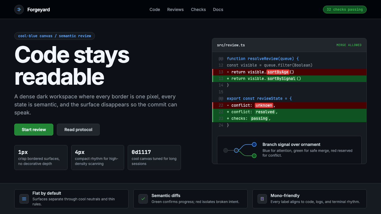 GitHub DarkCode-first darkness. Cool-blue canvas, 1px borders, green/red diff lines.代码优先的暗色:冷蓝画布、1px边框、绿红diff线。
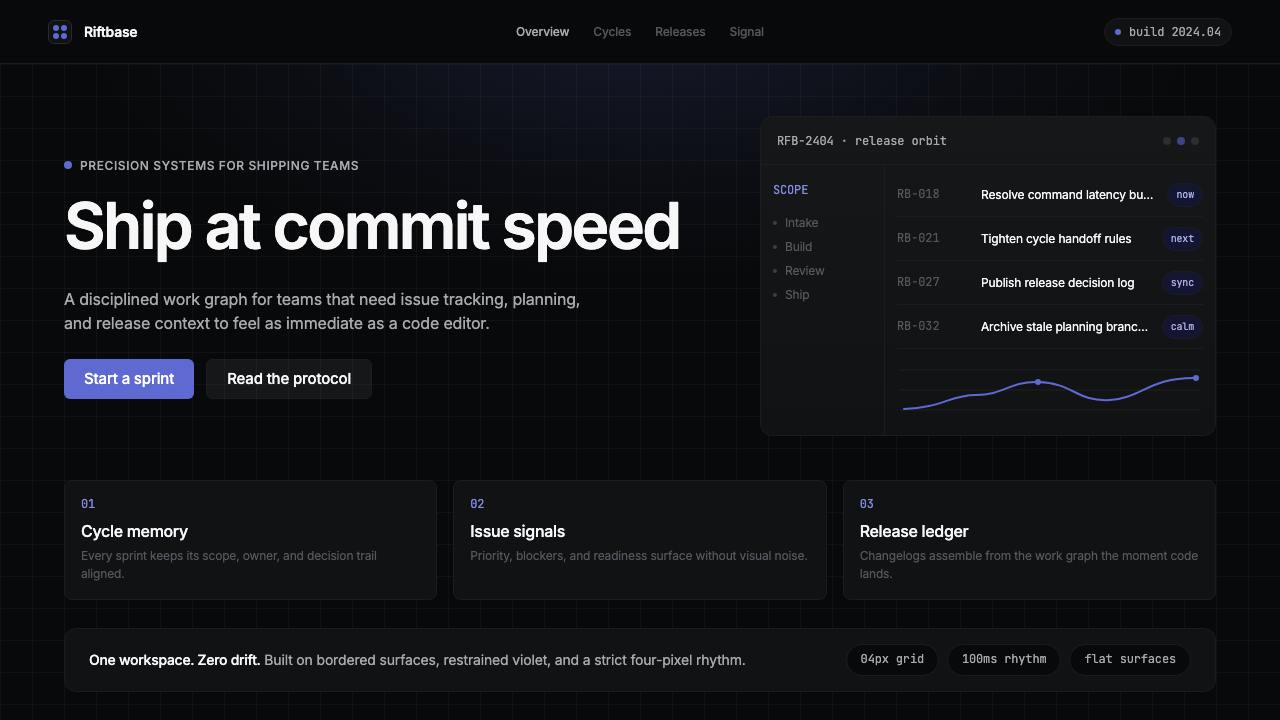 Linear 2024Precision down to the millisecond. Near-black, indigo-violet accents, Inter D…开发者工具美学的标杆:近乎纯黑、克制靛紫点缀、Inter Display 字体…
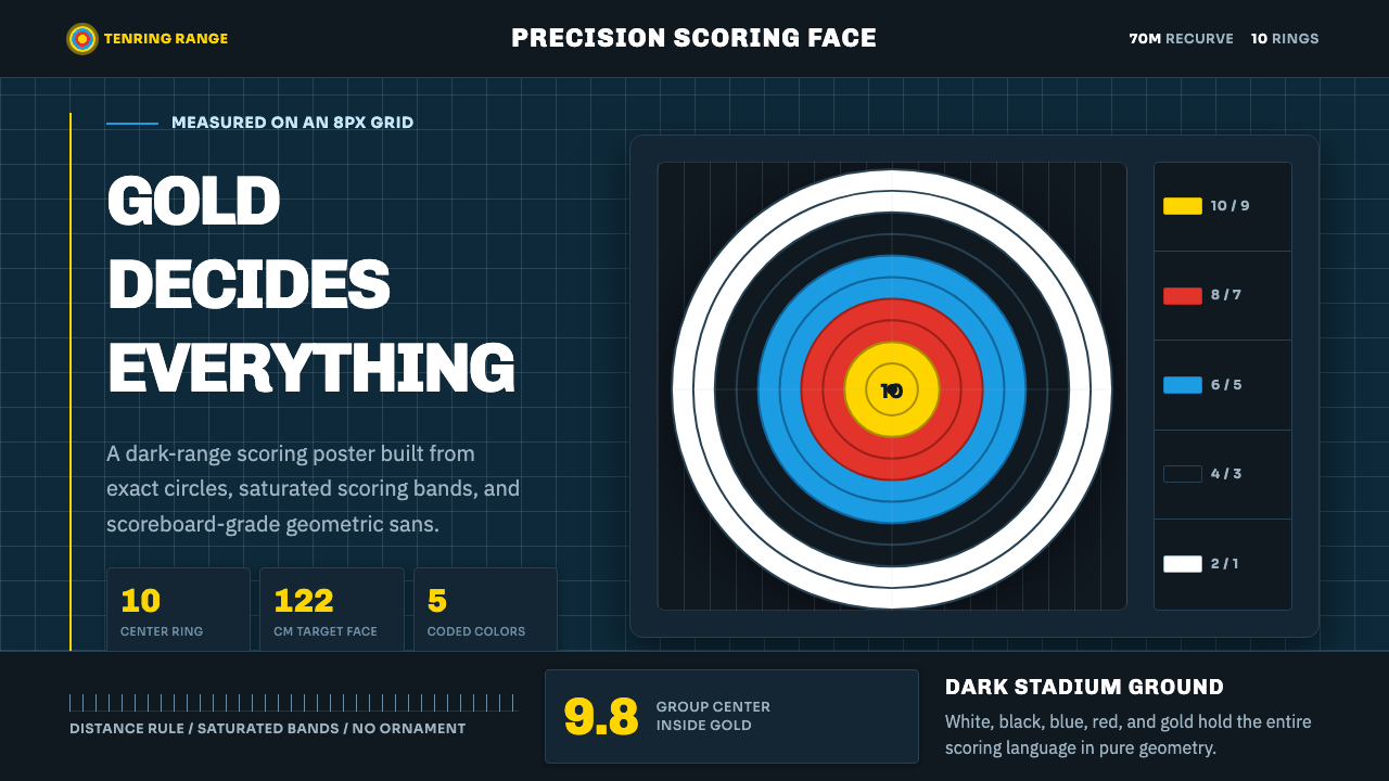 Olympic ArcheryPrecision is the drama. Gold-red-blue rings snap from a dark stadium grid.精准就是戏剧:金红蓝环从深色赛场网格中跃出。
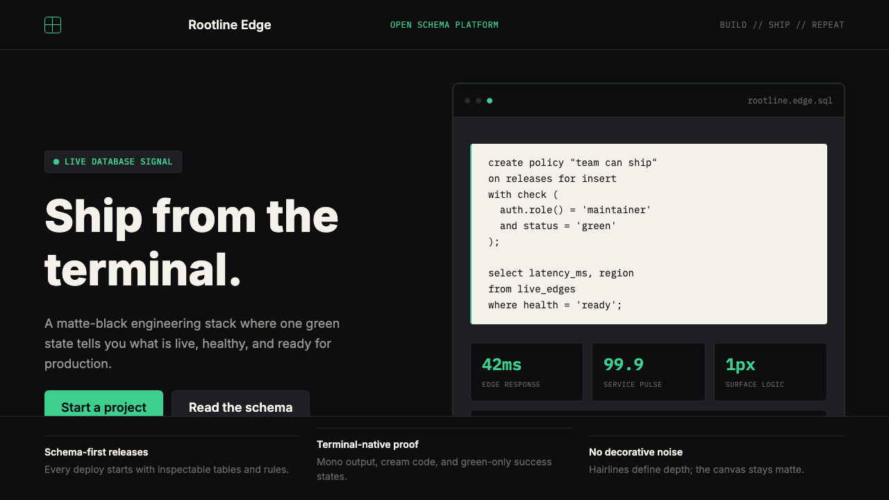 Supabase Postgres Green (2024)Midnight-terminal confidence. Matte black, Inter, mono code, and one electric…深夜终端般笃定:哑光黑、Inter、等宽代码与一抹电子绿。
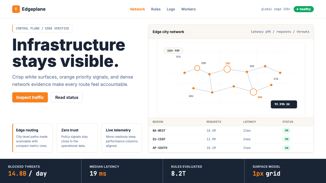 Cloudflare Orange EdgeOperational clarity wins. Orange accents, hairline grids, and mono metrics ma…运维清晰取胜。橙色强调、发丝网格与等宽指标让边缘数据利落。
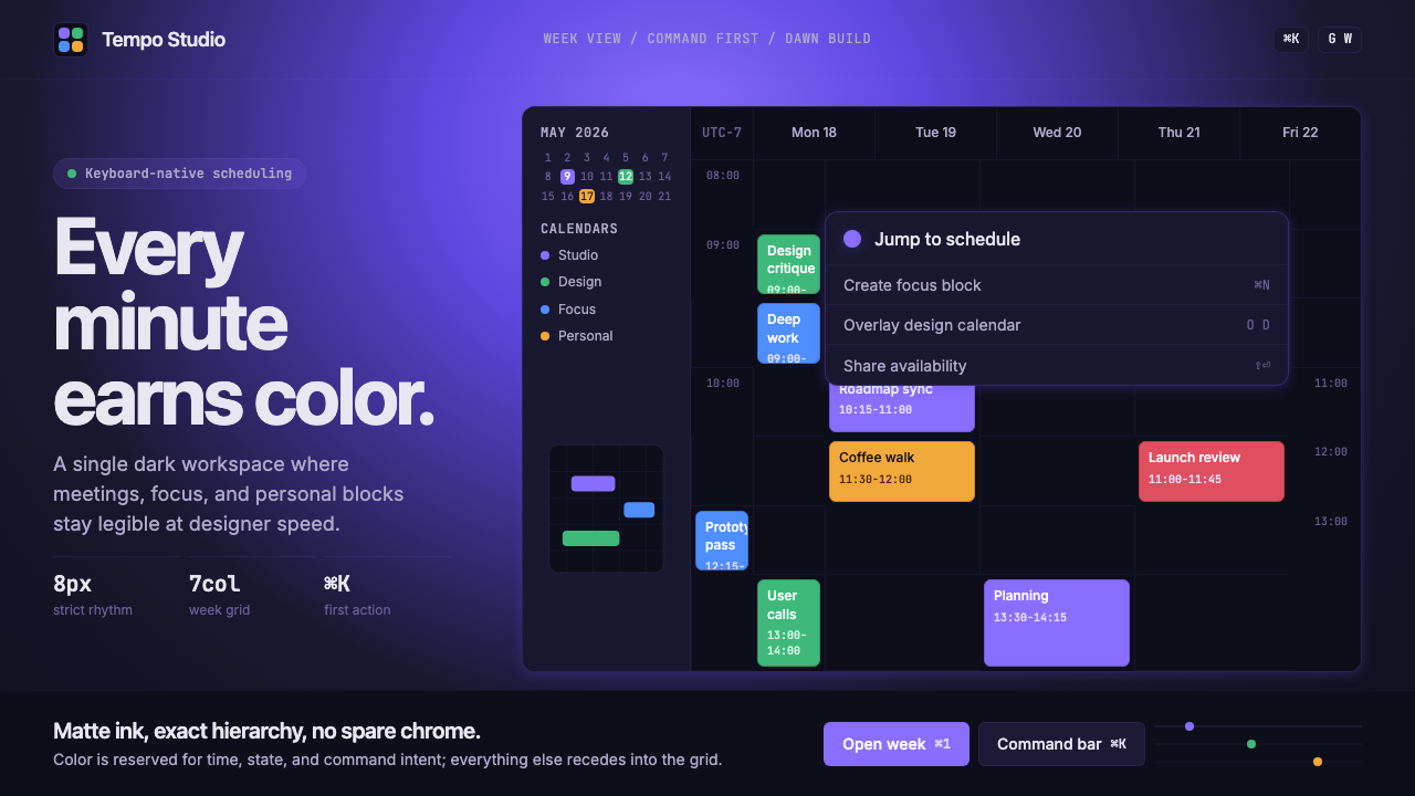 Cron CalendarDesigner-tech restraint. Purple wash, ink grid, mono shortcuts, surgical even…设计师科技的克制:紫色光晕、墨色网格、等宽快捷键与精准色块。