What is Container Port?
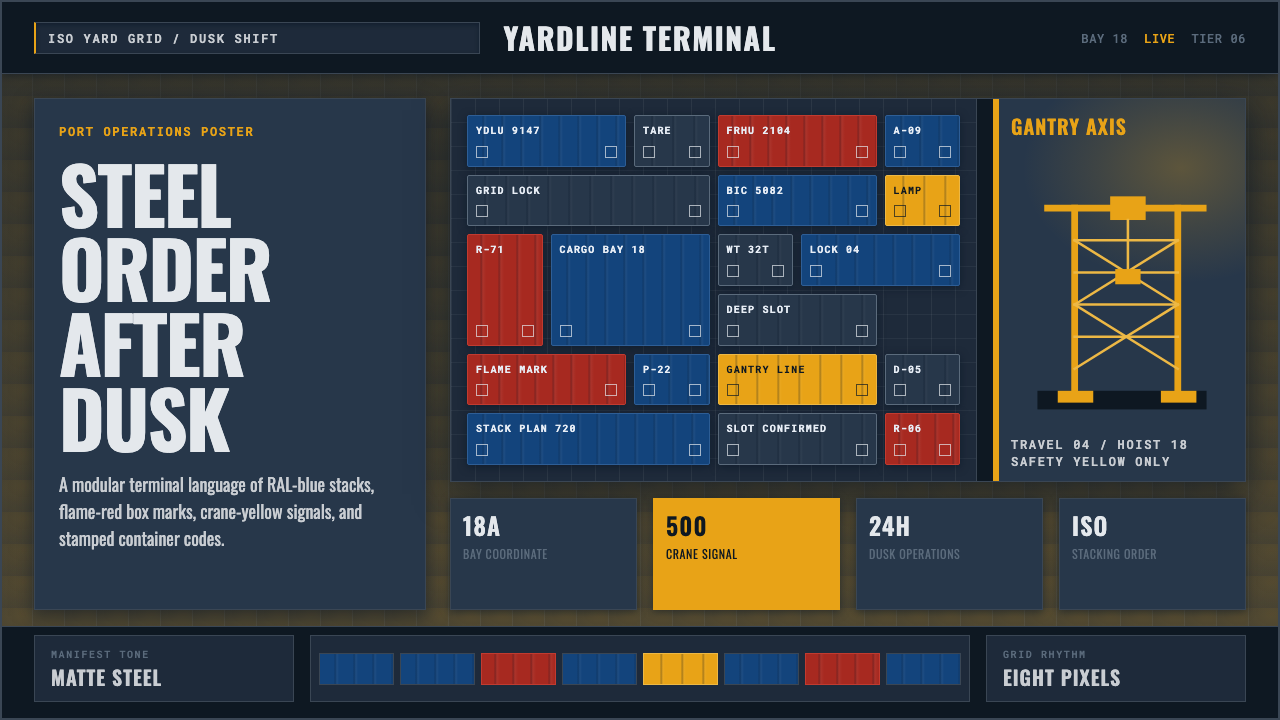
Container Port takes the mega-terminal at dusk — stacked steel boxes glowing under sodium lamps, gantry cranes lit safety yellow against a darkening slate sky — and turns the standardized order of global shipping into a design system.
Container Port in brief
Container Port distills the specific visual world of the modern container terminal: rows of steel shipping boxes stacked in disciplined grids, painted in the saturated, standardized hues that shipping lines use to keep their fleets recognizable, under a twilight sky the color of wet slate. Ship-to-shore gantry cranes rise above the stacks, their working lights burning a hard safety yellow against the dusk, while sodium dock lamps throw a warm amber glow across steel that has clearly seen weather and use.
The defining quality of the aesthetic is standardization made visible. Nothing about a container port is improvised — every box is the same handful of certified sizes, every stack follows the same modular grid, every unit carries the same style of stenciled alphanumeric identification code — and the visual system leans directly into that regularity rather than softening it. Repetition is not monotony here; it is the whole point, the visible proof of a system engineered to move goods at planetary scale without confusion.
This is also explicitly a 24-hour aesthetic. A container terminal does not close for the night, and the style captures that: the dusk-to-dark palette, the artificial glow of dock lighting standing in for daylight, and the sense of heavy machinery in constant, orderly motion. It reads as industrial without reading as abandoned or decayed — this is infrastructure at full operational capacity, not a ruin.
Where does Container Port come from?
The system this style depicts exists because of a specific historical rupture in how cargo moved. Before the mid-1950s, ocean freight was overwhelmingly break-bulk: loose crates, barrels, and sacks loaded and unloaded by hand, one item at a time, a slow and labor-intensive process that dominated shipping costs. The American trucking entrepreneur Malcom McLean is widely credited with the breakthrough that ended this era — in 1956, a converted tanker carrying standardized metal boxes sailed from Newark to Houston, demonstrating that cargo sealed inside a uniform steel container could move between truck, ship, and rail without ever being unpacked in between.
That idea only became a true global system once it was standardized. The International Organization for Standardization's freight-container committee, ISO TC104, set the dimensions, corner-fitting hardware, and stacking specifications that let a box built by any manufacturer, in any country, be lifted, locked, and stacked by any port's equipment anywhere in the world. Alongside this, an international identification scheme gave every container a unique alphanumeric code stenciled directly onto its steel skin — the practical origin of the monospace, code-like lettering that reads as a signature of this style.
The specific dusk-and-crane scene this system stages belongs to the contemporary mega-port era, roughly from 2010 onward, when the center of gravity of global container handling shifted decisively to East Asia — terminals in Shanghai, Shenzhen, and Busan among the busiest in the world. A major share of the ship-to-shore gantry cranes that give ports their skyline, and much of the automated and remote-controlled terminal equipment that has spread through roughly 2017 to 2024, comes from Shanghai Zhenhua Heavy Industries, known by its initials ZPMC, whose machines now anchor container terminals on every continent.
Shipping lines layered brand identity on top of this standardized hardware, painting their container fleets in consistent, saturated colors so that a stack of boxes reads as legible corporate territory from a distance — a practice global carriers such as Maersk are especially associated with. The result is a visual system built from two opposite forces working together: rigid international standardization underneath, and bold, deliberately readable color and lettering layered on top of it.
What defines the Container Port look?
Color
The palette pairs a cool, twilight slate-blue ground with saturated, standardized industrial hues — a deep gentian blue and a flame red among them, the kind of color carriers choose specifically so a fleet reads as instantly recognizable from a distance. Safety yellow is reserved for crane structures and hazard-relevant elements, functioning as a signal color rather than a decorative one.
Materiality
Surfaces reference corrugated and ribbed steel — the structural paneling of an actual shipping container — with a weathered, working-equipment finish rather than a rusted or decaying one. The material should look maintained and load-bearing: dented and sun-faded from real use, but never abandoned.
Stencil-Grotesque Typography
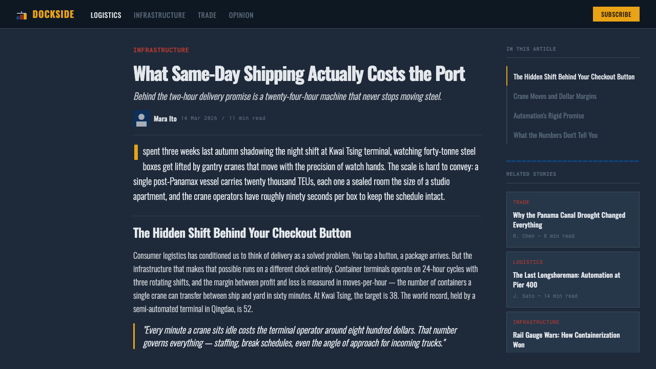
Lettering is condensed and blocky, in the tradition of grotesque sans-serifs adapted for stencil application on curved or ribbed steel. Container identification codes are set in a monospace style, echoing the fixed-width alphanumeric codes stenciled on every real shipping box, so that headings and labels alike carry the flat, functional authority of freight documentation rather than a conversational tone.
Modular Grid
Composition follows the literal stacking logic of the port itself: a strict modular grid where every unit is the same handful of certified proportions, aligned edge to edge with no gaps and no overlap. Hierarchy is built through repetition and count — a wider stack reads as more significant, not a differently shaped or decorated one.
Dusk Lighting and Atmosphere
The governing light condition is twilight rather than daylight or full night: a cool, darkening sky overhead, warm artificial glow from dock and crane lighting below. This contrast between cool ambient light and warm working light is what gives the style its sense of round-the-clock industrial activity rather than a static, daytime product shot.
Handling Iconography
Symbols borrow from real freight practice — crane silhouettes, corner-casting shapes, directional handling arrows, and hazard markers — used sparingly and functionally, the same way they appear on real equipment: small, high-contrast, and placed at edges rather than centered as ornament.
Scale and Repetition
Rather than avoiding repetition, the style makes it the primary source of visual power: rows of identical or near-identical units, stacked and stacked again, communicate scale and operational capacity. A single striking element is far less effective in this system than the same element repeated in disciplined, gridded rows.
Who shaped Container Port?
The American trucking entrepreneur widely credited with the 1956 voyage that proved standardized steel boxes could move cargo between truck, ship, and rail without unpacking in between, ending the era of hand-loaded break-bulk freight and setting the entire container-shipping system in motion.
The International Organization for Standardization's technical committee for freight containers, which set the dimensions, corner-fitting hardware, and stacking specifications that let a box built anywhere be lifted, locked, and stacked at any port on earth — the standardization that made the visual repetition of a modern terminal possible.
A Shanghai-based manufacturer that supplies a major share of the world's ship-to-shore gantry cranes and has driven much of the automated, remote-controlled terminal equipment that spread through contemporary mega-ports roughly between 2017 and 2024 — the machinery that gives the style's port skyline its crane silhouettes.
A global container shipping line especially associated with the practice of painting an entire fleet of containers in a single, consistent, saturated color, turning a stack of boxes into instantly recognizable corporate territory — the branding logic behind this style's bold, standardized color blocks.
How do you use Container Port today?
This style works best when standardization is treated as the message, not something to disguise — every layout decision should reinforce the sense of a rigorous, repeatable system moving at industrial scale.
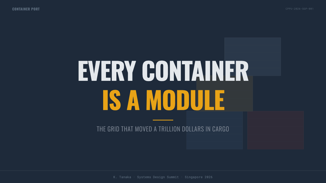
For presentation slides, cover pages benefit from a dusk-toned field with a single strong color block anchoring the title, echoing a stack of containers lit at twilight. Content slides should lean into strict modular grids — equal-sized blocks of information stacked and aligned the way containers are, with hierarchy built through count and repetition rather than varied shapes. Data slides are a natural fit: throughput numbers, counts, and status metrics can be presented the way a terminal operations board presents them, in condensed, monospace-style figures set against the slate ground.
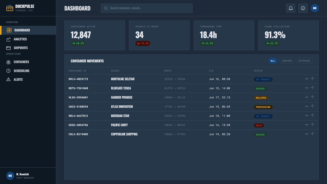
For web interfaces, the aesthetic suits logistics dashboards, supply-chain trackers, and operational tools where the goal is to communicate scale, status, and reliability at a glance. Pricing pages can borrow the 'container class' framing directly — tiers presented as stacked, color-coded units of equal shape but different color, so an upgrade path reads the way moving up a stack does. Interactive states can use the reserved safety yellow the way a crane uses it: sparingly, for anything that genuinely needs attention.
For editorial and marketing work, the style suits shipping and logistics brands, supply-chain software, global trade publications, and any B2B product that wants to project operational scale and dependability. Feature sections can be laid out as literal stacks — equal-height blocks in the standardized color palette, with condensed stencil-style headlines doing the work a decorative display face would do elsewhere.
A common mistake is applying the bright industrial colors everywhere at once, which flattens the day-to-night atmosphere that gives the style its mood — the slate-dusk ground should dominate, with the saturated blues, reds, and yellows appearing as accents on top of it, not as the base itself. A second mistake is softening the stenciled, monospace lettering into a friendlier rounded typeface, which undercuts the industrial, standards-driven authority the style depends on.
Container Port — FAQ
Is this the same as a generic industrial or grunge aesthetic?
No. Generic industrial or grunge styles usually lean on decay, rust, and distress texture applied for mood. Container Port is built on the opposite idea — a system that is rigorously standardized and fully operational, at full working capacity twenty-four hours a day. Weathering appears, but only as evidence of real use on maintained equipment, never as decorative ruin.
Does it require actual photographs of ports and cranes?
No — the system works as a purely graphic language of color blocks, grids, stencil type, and monospace codes, without needing photographic imagery at all. Photography can be layered in for added realism, but the underlying grammar of modular stacking and standardized color is what carries the identity.
How is it different from a generic dark-mode tech aesthetic?
A generic dark-mode tech look typically uses a neutral near-black ground with a single accent color and soft, ambient glow effects. Container Port instead uses a specific dusk slate-blue rather than neutral black, pairs it with several standardized industrial hues rather than one accent, and favors hard-edged, stenciled, condensed lettering over the softer geometric sans-serifs common to tech interfaces.
Can this style work for a brand that has nothing to do with shipping or logistics?
Yes, if the brand wants to borrow the underlying qualities the style signals — scale, standardization, operational reliability, round-the-clock capability — rather than the literal subject matter. It reads well for infrastructure, industrial software, manufacturing, and B2B operations tools even outside shipping specifically, but it works against any brand wanting to feel light, artisanal, or intimate.
Does the safety yellow need to follow real hazard-color conventions?
It does not need to match an official industrial standard exactly, but it should behave the way a genuine signal color behaves in this system: reserved for cranes, alerts, and elements that need immediate attention, and used sparingly against the slate and primary-color base. Spreading yellow broadly as a general accent color flattens the hierarchy the whole system depends on.
Related design styles
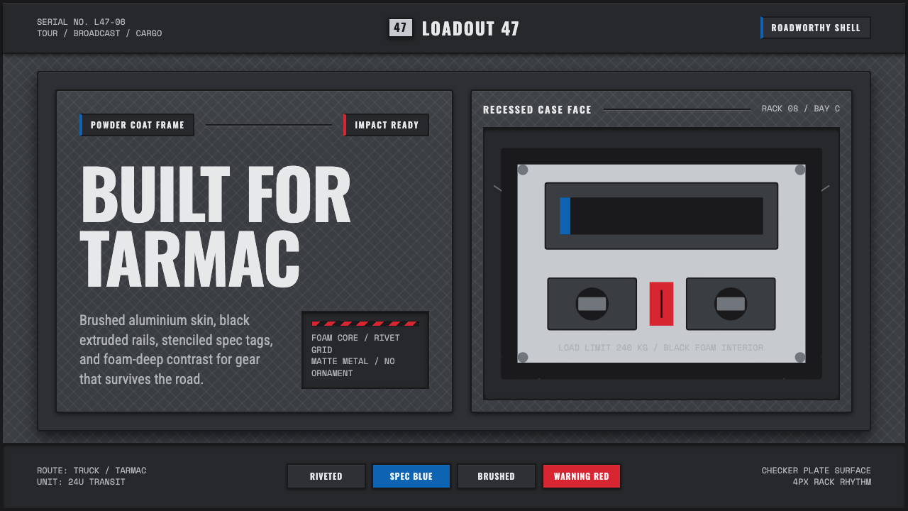 Aluminium Flight CaseRoadproof and exact. Diamond-plate gray, stencil type, black frames, blue-red…
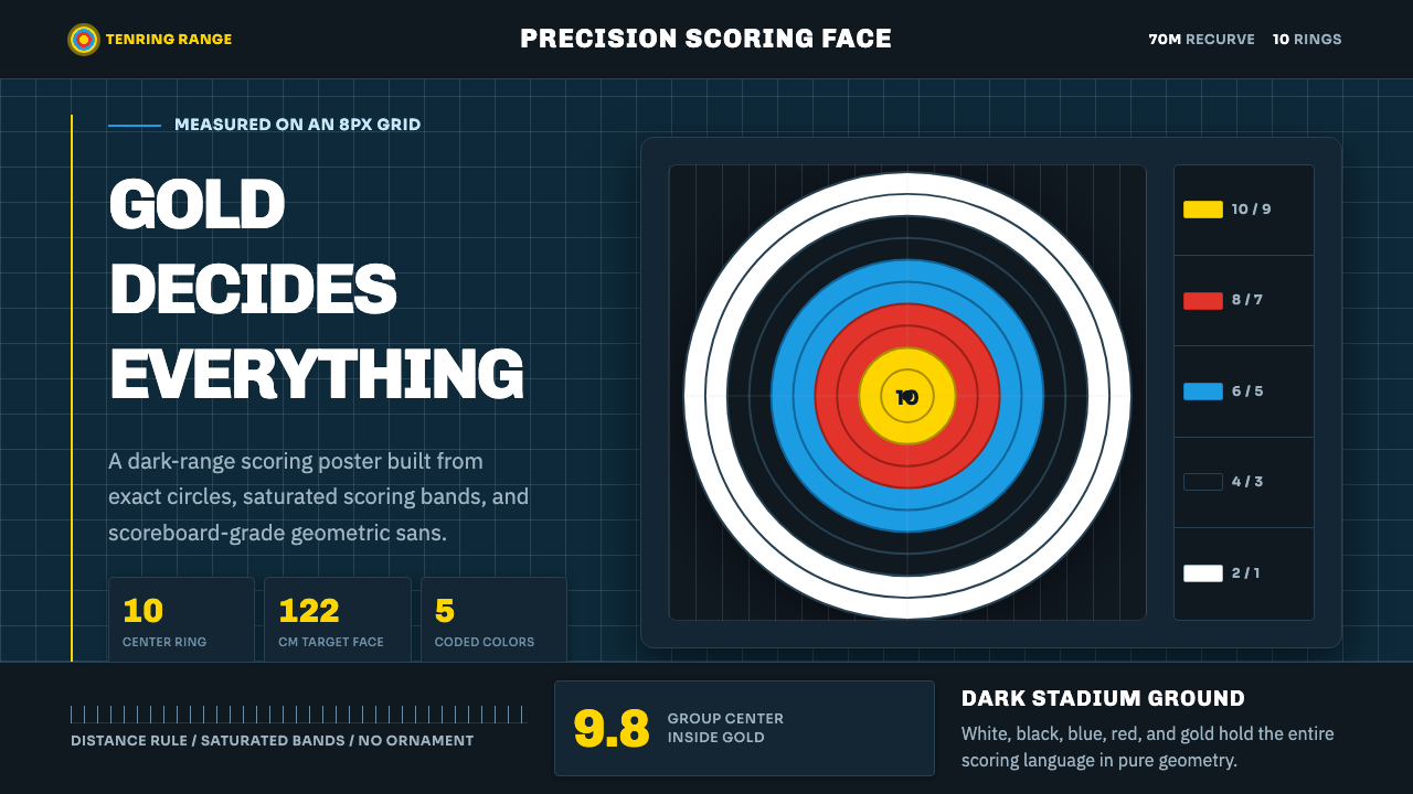 Olympic ArcheryPrecision is the drama. Gold-red-blue rings snap from a dark stadium grid.
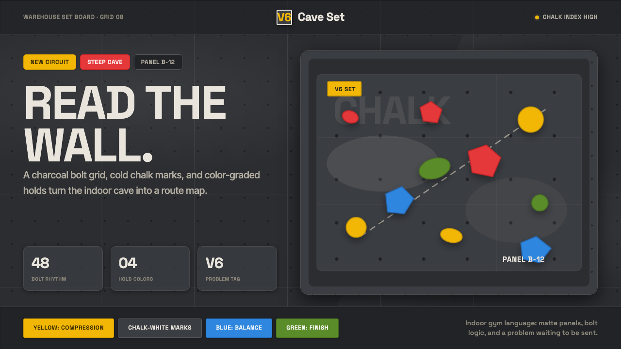 Bouldering ChalkGym-cave graphic. Chalk-white type rides a charcoal bolt grid with route-colo…
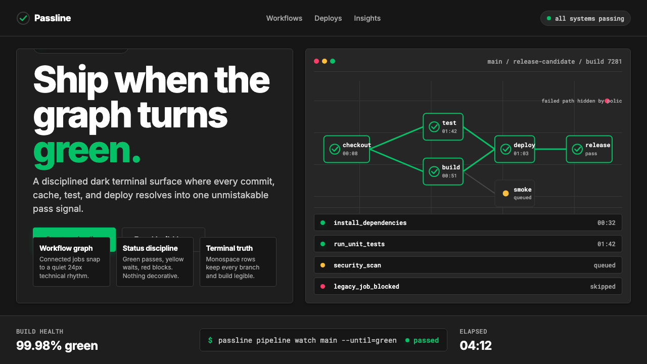 CircleCI Pipeline-GreenConfidence goes green. Emerald status lines cut through terminal-black pipeli…
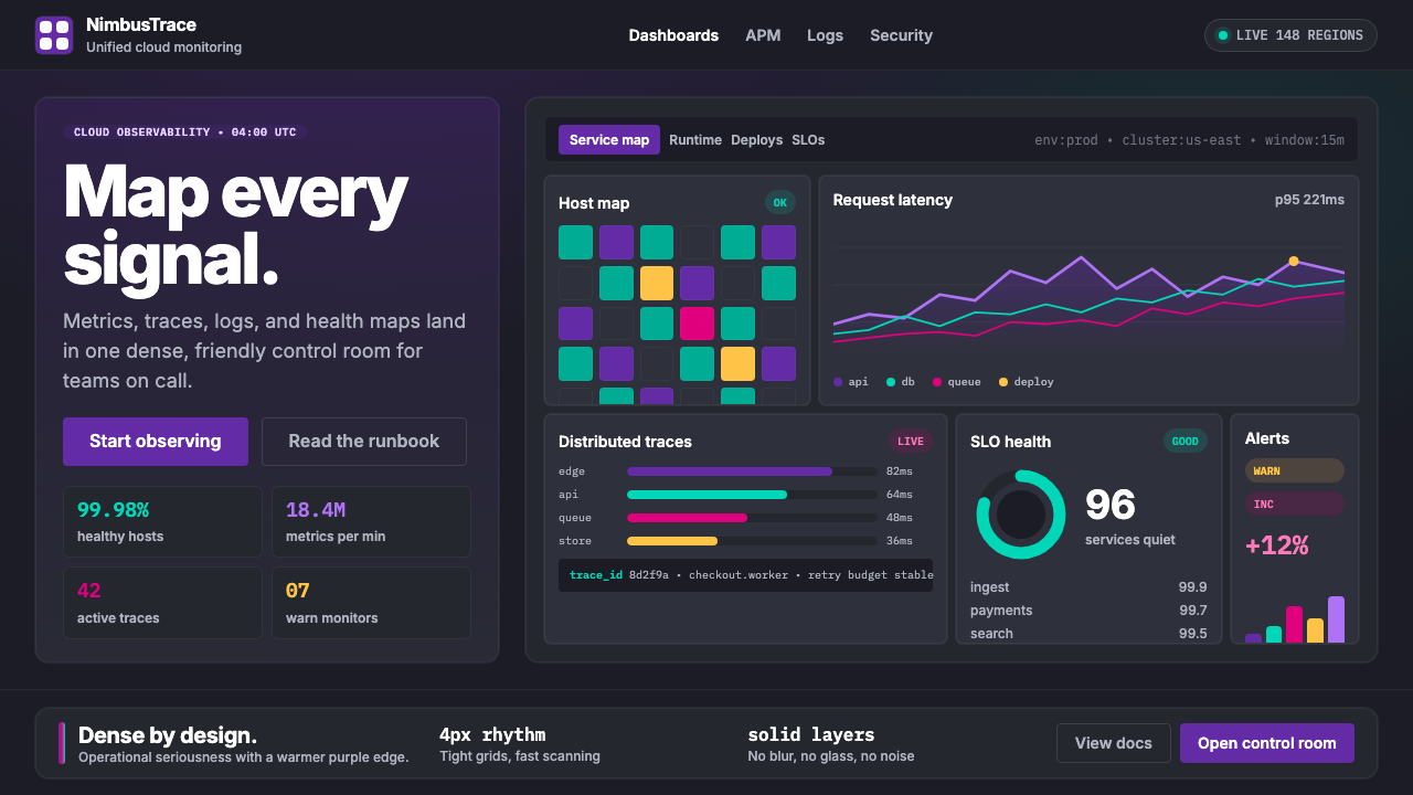 DatadogSerious telemetry, friendly pulse. Purple dark grids pack charts, badges, and…
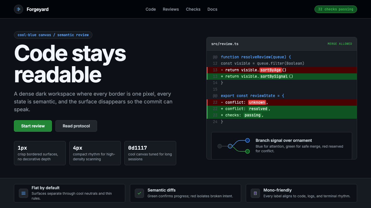 GitHub DarkCode-first darkness. Cool-blue canvas, 1px borders, green/red diff lines.