What is Bouldering Chalk?
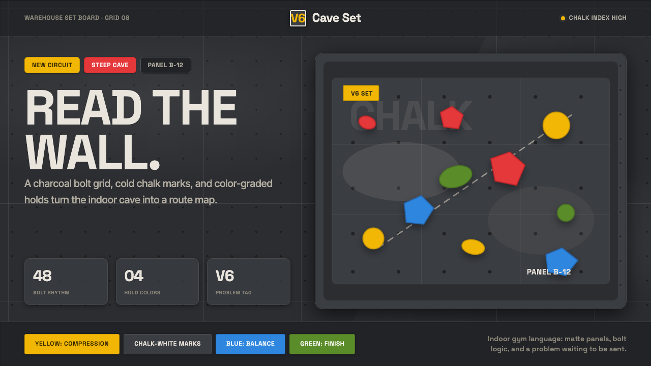
Bouldering Chalk renders the indoor climbing gym itself — a dim plywood cave, bolted in a grid, dusted white and studded with color-coded holds that double as a route map.
Bouldering Chalk in brief
Bouldering Chalk is the visual language of the modern indoor bouldering gym — the specific strand of climbing that dispenses with ropes and harnesses in favor of short, powerful routes close to the ground, protected only by thick foam crash pads. The style renders that physical space directly: a dim, charcoal-gray plywood wall lit by low warehouse lighting, dusted with the pale residue of magnesium-carbonate climbing chalk, and studded with brightly colored holds bolted on in a repeating grid.
The ground is cave-dark, never a bright or neutral surface, and chalk-white functions as the system's signature mark — the visible trace climbers leave behind on holds and on the wall itself after every attempt. Labels and typography read crisp and high-contrast against that dark ground, borrowed directly from the route cards, grade tags, and safety signage used in real gyms rather than from any generic sport-branding template.
Holds in graded colors — yellow, red, blue, green among them — scatter across the charcoal field the way a real climbing route is marked out on a wall, so any composition built in this style inherits a sense of purposeful scatter rather than a tidy, centered arrangement. It reads as a route to be solved, not a picture to be admired, and that functional, wayfinding logic is what separates it from generic gym or fitness branding.
Where does Bouldering Chalk come from?
Indoor bouldering underwent explosive growth from roughly 2010 onward, evolving from a niche training discipline attached to roped climbing gyms into a standalone urban fitness and social activity in its own right. Bouldering specifically means short, powerful routes climbed without a rope, typically no higher than a person can safely fall from onto a crash pad, which changes both the physical scale of a gym and the culture around it — sessions are social, conversational, and low-commitment compared with the harnessed, partner-dependent world of roped climbing.
Much of that growth happened inside converted industrial buildings: former warehouses, factories, and distribution spaces with the tall ceilings and exposed structural framing that bouldering gyms need but that purpose-built commercial real estate rarely offers cheaply. That adaptive-reuse origin is not incidental set dressing — it is a large part of why the aesthetic reads as raw and industrial rather than as polished athletic-brand marketing, and why exposed structure, plywood, and bolt hardware feel authentic rather than decorative.
The walls themselves are built from modular plywood panels drilled with a repeating grid of threaded inserts, onto which colored holds are bolted and periodically unbolted, rearranged, and rebolted as gyms reset their routes on a rotating schedule. That literal engineering detail — the visible bolt-grid pattern beneath the holds — became the graphic signature of the style, alongside the magnesium-carbonate chalk that climbers use for grip and that leaves the pale dust marks central to both the practice and its look.
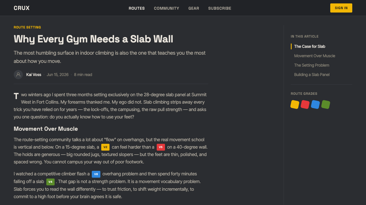
Route-setting itself functions as a form of information design: gyms grade routes by difficulty and encode that grading directly into hold color, so a wall becomes a color-coded map that climbers read at a glance to find routes within their ability. The style boomed first in North American urban bouldering gyms through the 2010s and has since become a recognizable shorthand for the broader modern sport-climbing aesthetic worldwide, carried by the same color-graded wayfinding logic wherever it spread.
What defines the Bouldering Chalk look?
Color palette
The ground is a dim, cave-dark charcoal gray rather than any bright or neutral shade, with cool chalk-white as the signature mark and a scattered set of saturated hold colors — yellow, red, blue, green — that function as coded information rather than decorative accents. Nothing in the palette is soft or muted; the contrast between the dark ground and the bright holds is meant to read clearly from across a gym floor.
Material and texture
Surfaces read as plywood panel rather than smooth drywall or poured concrete, with a visible bolt-hole grid running across the wall where holds are threaded on. This grid is not a decorative pattern applied afterward — it is the literal, load-bearing mounting system for the sport, which is exactly what gives the texture its industrial credibility.
Lighting and mood
Illumination is low and warehouse-like rather than bright and even, producing a dim, cave-like atmosphere that reads as focused and slightly clandestine — closer to a training space than a showroom. Shadows fall naturally across the textured wall surface rather than being flattened out by uniform overhead light.
Typography
Lettering favors a tight, modern sans-serif register that stays crisp and legible against the dark ground, mirroring the route cards, grade tags, and wall signage used inside real gyms. Labels prioritize high contrast and quick legibility over expressive character, since in a real gym they need to be read at a glance mid-climb.
Composition and scatter
Holds and graphic elements scatter across the field the way a real route is set on a wall — irregular, purposeful, and asymmetric rather than centered or evenly gridded. This scattered, route-like logic gives compositions in this style a sense of physical navigation, as if the surface itself were something to be climbed rather than simply viewed.
Chalk dust as signature mark
Pale, powdery chalk residue on holds and along frequently used sections of the wall is treated as a meaningful visual detail rather than as grime to be cleaned away — it is physical evidence of use, a record of where hands have gripped, and it is central to what makes the style read as lived-in and authentic rather than as a clean, unused stage set.

Who shaped Bouldering Chalk?
The professionals who design and physically build climbing routes inside a gym, choosing which holds go where and grading each route's difficulty largely through hold color. Their craft is functionally a form of information and wayfinding design, and it is the direct real-world source of the style's color-coded, scattered-hold compositional logic.
A climbing-wall manufacturer whose modular plywood panel and bolt-grid systems industrialized how modern gym walls are built, standardizing the mounting hardware that lets gyms rearrange holds and reset routes on a regular schedule. Manufacturers working in this mold are why the bolt-grid pattern is consistent across gyms worldwide rather than being a one-off design choice.
A North American gym chain that exemplifies the adaptive-reuse warehouse aesthetic central to this style — large-format facilities built inside converted industrial spaces, with exposed structure and tall ceilings left largely intact rather than concealed behind conventional commercial fit-out.
The culture surrounding bouldering's defining safety equipment — thick foam crash pads used instead of ropes — which shaped both the sport's low-to-the-ground physical layout and its social, casual, low-commitment gym atmosphere. This culture is a large part of why bouldering gyms feel more like informal gathering spaces than the more solitary, harness-dependent world of roped climbing.
How do you use Bouldering Chalk today?
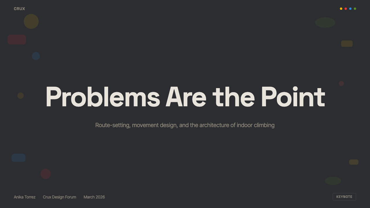
On a presentation cover slide, Bouldering Chalk works best as a large charcoal field with a small cluster of graded hold-colored shapes anchoring one corner and the title set in crisp, high-contrast type — the effect should feel like a close-up of a real wall, not a generic sports-brand banner. Content slides read well when body text sits on a slightly lighter charcoal panel for legibility, with graded accent colors reserved for labels, tags, or category markers rather than spread across every heading. Data slides suit the style particularly well: bar charts and progress indicators rendered in the same graded palette as climbing holds turn a chart into something that reads like a route difficulty legend, which keeps the data feeling native to the visual system rather than bolted on.
In web interfaces, the style suits any dashboard or tracker organized around graded categories or difficulty levels, since the color-coded hold system maps naturally onto tags, statuses, or tiers. On a pricing page, the dark charcoal ground with graded accent colors can differentiate plan tiers the way route grades differentiate difficulty, with the highest tier taking the boldest accent color the way the hardest routes typically take the most visually assertive hold colors in a real gym. Navigation and interactive elements benefit from the same crisp, high-contrast label treatment as real gym signage, since that legibility-first instinct is core to the style's authenticity.
For editorial and marketing content, the style performs well for anything genuinely about climbing, fitness culture, or adaptive reuse of industrial space, where the dark, textured ground and route-map compositional logic reinforce the subject matter rather than merely decorating it. It is less suited to soft, luxury, or purely aspirational lifestyle marketing, where the industrial darkness and scattered, functional layout can read as too utilitarian or too niche for an audience that isn't already familiar with the gym culture it depicts.
A common mistake is using the graded hold colors as a generic bright accent palette scattered evenly across a layout, the way a designer might sprinkle a standard brand palette. In the source material, hold color is information — it encodes route difficulty — so the strongest applications of this style keep that logic intact, using color placement to signal categories, statuses, or hierarchy rather than distributing it purely for visual variety.
Another frequent misstep is lightening the ground color to make the layout feel more approachable, which undercuts the cave-like, low-lit mood that gives the style its identity. The charcoal darkness is not an accident of poor gym lighting to be corrected — it is the defining atmosphere, and replacing it with a bright neutral background collapses the style back into generic sport branding with a few colored dots.
Bouldering Chalk — FAQ
Is Bouldering Chalk the same as generic sport or fitness branding?
No. Generic sport branding tends toward bright, even lighting and centered, symmetrical compositions built for broad appeal. Bouldering Chalk is specific to the physical reality of an indoor bouldering gym — a dim, cave-like plywood wall with a visible bolt-mounting grid, scattered graded holds, and chalk residue as a signature texture. Its compositional logic comes directly from how routes are actually set and read on a real wall, not from a generic athletic mood board.
Why does the style insist on a dark, dim ground instead of bright lighting?
The dim, warehouse-lit ground is not an aesthetic add-on — it reflects the actual lighting conditions of most real bouldering gyms, which favor low, focused illumination over bright even lighting to reduce glare on the wall and keep the space feeling like a dedicated training cave rather than a retail showroom. Brightening the ground removes exactly the atmosphere that gives the style its identity and pushes it toward generic gym branding instead.
What do the different hold colors mean, and should they be used decoratively?
In a real gym, hold color encodes route difficulty or route identity, letting climbers scan a wall and find routes matched to their ability at a glance. When applying this style, that same logic should carry over — color should signal something, such as a category, a status, or a tier — rather than being distributed purely for visual variety. Using the palette decoratively, with no informational logic behind it, discards the exact mechanism that makes the style feel authentic rather than merely colorful.
Does Bouldering Chalk work for products unrelated to climbing?
It can, particularly for products built around graded difficulty, progress tracking, or a rugged, hands-on, industrial mood — fitness apps, skill-tracking tools, or maker and workshop brands can borrow the logic naturally. It is a weaker fit for soft, luxury, or purely digital-native products with no physical, tactile, or effort-based dimension, since the style's entire visual grammar is built around the friction and grip of a physical wall.
How does this style differ from an outdoor rock-climbing aesthetic?
Outdoor rock climbing visual language tends toward natural rock texture, open sky, and earthy, weathered stone tones. Bouldering Chalk is specifically indoor and industrial — plywood rather than stone, a bolt-mounted grid rather than natural rock features, warehouse lighting rather than daylight, and bright manufactured hold colors rather than the muted tones of natural rock. The two share a sport but not a setting, and the style is unmistakably about the gym, not the mountain.
Related design styles
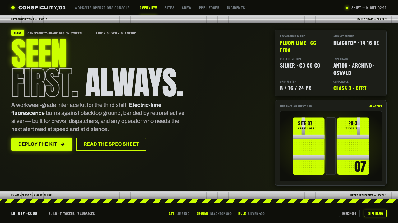 Hi-Vis Safety VestEngineered to be seen. Fluorescent lime on blacktop, silver reflective bands,…
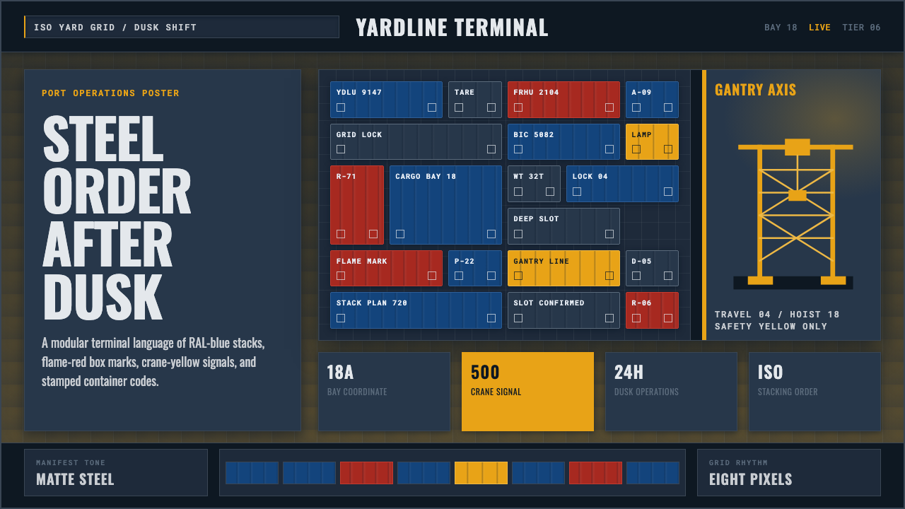 Container PortIndustrial dusk, standardized. Slate grid, RAL-blue stacks, and crane-yellow…
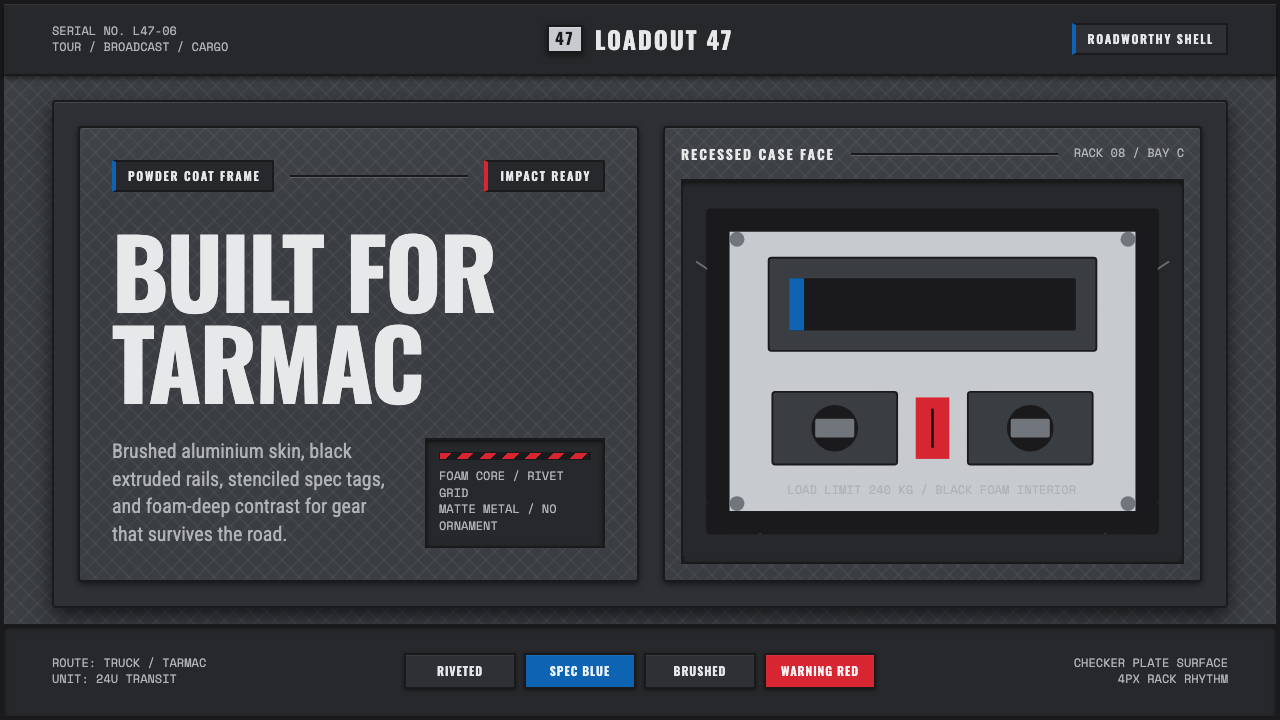 Aluminium Flight CaseRoadproof and exact. Diamond-plate gray, stencil type, black frames, blue-red…
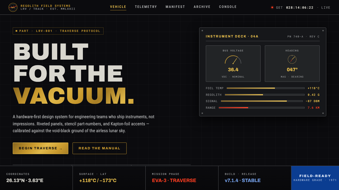 Lunar RoverBuilt for the vacuum. Kapton-gold foil and stencil part-numbers against void-…
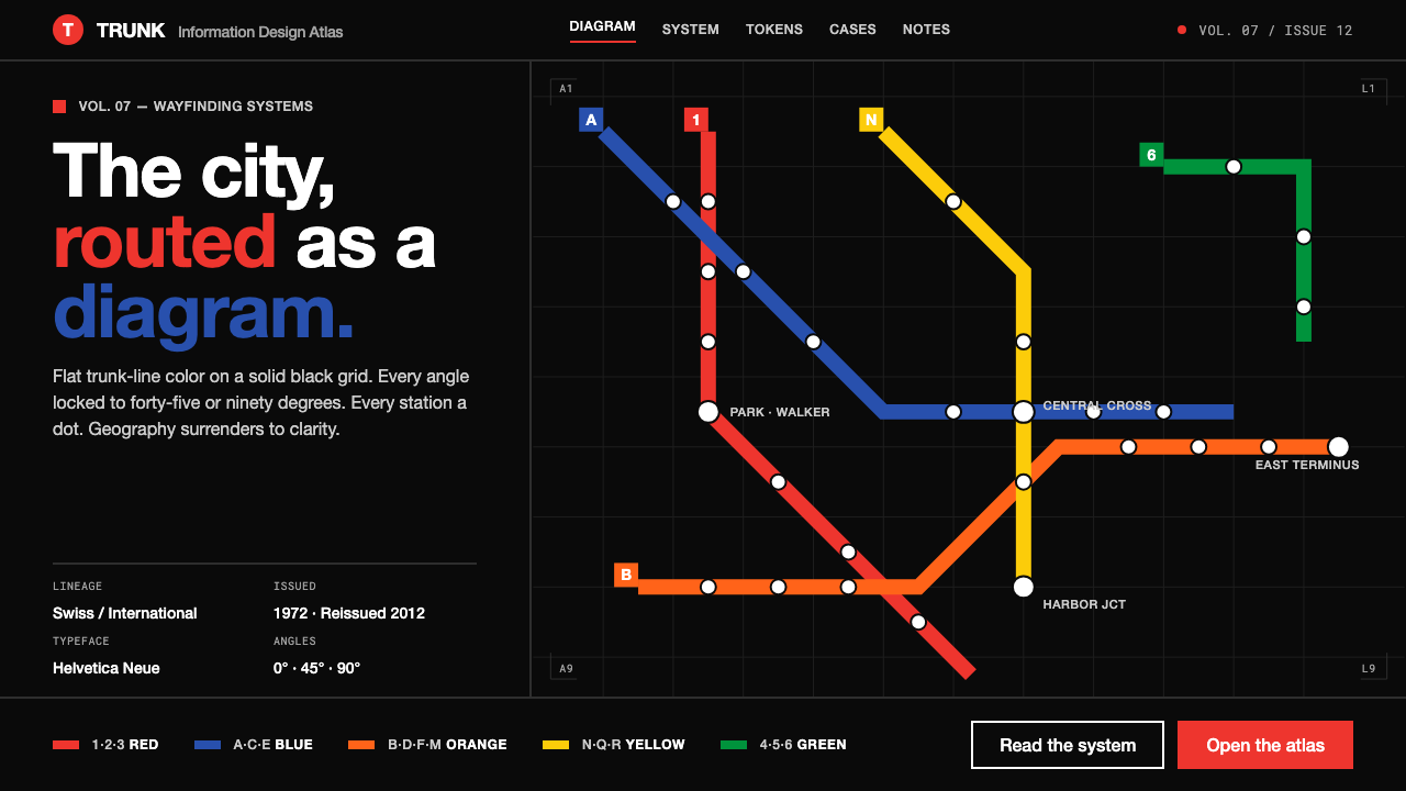 NYC Subway VignelliThe city as a circuit diagram. Flat trunk-line color on black, angles locked…
 RCR Weathering SteelRust is the only finish. Matte weathering steel emerges from soot-dark voids…