What is Hi-Vis Safety Vest?
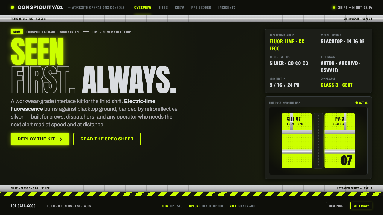
Hi-Vis Safety Vest turns the night roadwork uniform into a design system — electric lime blazing over blacktop, silver bands dividing the field, and condensed lettering engineered to be seen before it is read.
Hi-Vis Safety Vest in brief
Hi-Vis Safety Vest is an industrial visual language derived from the fluorescent workwear, retroreflective bands, and compressed safety lettering associated with EN ISO 20471 and Western European roadwork environments. Its defining image is a worker-shaped field of electric-lime mesh standing against night asphalt, crossed by silver-gray stripes that become brilliant when illuminated. Translated into graphic design, those elements create a system of extreme contrast, unmistakable structure, and immediate functional urgency.
The style is not simply a dark interface decorated with a bright accent. Its visual logic comes from personal protective equipment designed around visibility: the fluorescent field attracts attention under ambient light, while the retroreflective bands establish a second mode of recognition when light strikes them. On screen, electric lime carries the first signal, near-black supplies the environmental ground, and reflective silver organizes content into bands, crossings, edges, and checkpoints.
Typography completes the system. Condensed grotesque forms evoke safety markings and roadwork signage because they preserve force while fitting information into narrow spaces. Headlines behave like warnings, labels resemble equipment classifications, and numerals become operational markers. The result should feel engineered rather than styled: bold without luxury, severe without theatrical menace, and energetic because every element appears to serve visibility, orientation, or control.
Where does Hi-Vis Safety Vest come from?
The style belongs to the modern high-visibility standardization era of 1990–2010 in Western Europe. Its source is not an art school or an individual designer but a coordinated field of safety standards, industrial personal protective equipment, workwear production, and roadwork signage. EN ISO 20471 gives this field its clearest institutional reference: visibility is treated as a designed performance requirement rather than a decorative preference.
The fluorescent electric-lime material supplies the aesthetic's most forceful identity. Its role is active rather than ornamental: the fabric absorbs ultraviolet energy and re-emits it as visible light, producing the impression that the garment is brighter than its surroundings. Against dark roadwork asphalt, that brightness isolates the wearer from the environment. The visual relationship is therefore built on opposition — luminous workwear against near-black ground — and the digital style preserves that opposition as its foundational composition.
Silver retroreflective bands introduce a different kind of visibility. Where fluorescent lime establishes a broad luminous field, the bands cut across it as organized signals. Their repeated horizontal, vertical, or wrapping paths make the body legible as a structured object and give the garment its unmistakable safety identity. In graphic translation, the silver-gray band becomes more than a divider: it can define zones, connect information, frame a warning, or mark a transition between ordinary content and material requiring immediate attention.
Roadwork signage systems contribute the final layer: condensed industrial lettering, emphatic labels, direct hierarchy, and communication intended for speed and distance. These influences produce a style whose authority comes from public safety rather than institutional prestige. Its modern design value lies in preserving that origin. When the lime, blacktop, silver bands, and compressed type are treated as an integrated visibility system, the result retains the discipline of workwear; when separated into fashionable motifs, it loses the reason those forms exist.
What defines the Hi-Vis Safety Vest look?
Fluorescent Color
Electric lime is the dominant field, not a polite highlight. It should occupy decisive surfaces, lead the visual hierarchy, and appear to press forward from the dark ground. Its intensity comes from the workwear principle of conspicuity, so muted botanical greens or fashionable neon mixtures weaken the reference. Supporting color remains restrained: near-black for the road-like environment and silver-gray for reflective structure.
Blacktop Ground
The ground is near-black and environmental, recalling roadwork after dark rather than polished luxury packaging. Subtle differences between black, charcoal, and asphalt gray may separate layers, but the interface should still read as one continuous night field. Pure white or warm cream grounds contradict the system because they remove the contrast through which fluorescent workwear gains its purpose and emotional force.
Reflective Bands
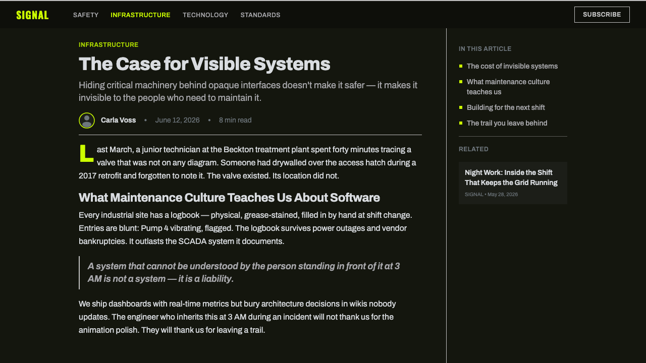
Silver-gray bands are the signature structural device. They divide broad lime or black areas, wrap around content groups, and create crossings that recall the construction of safety garments. Their strength comes from continuity and placement rather than decoration. A band should feel as though it identifies a zone or traces a protected route; scattered silver lines without structural responsibility become generic technical ornament.
Condensed Grotesque
Lettering is narrow, heavy, and industrial, built to remain legible when information must be grasped quickly or from a distance. Headlines favor compact blocks and commanding silhouettes; labels are brief, categorical, and visually firm. Wider body text may be used for sustained reading, but it should retain a plain grotesque character. Decorative display faces and delicate contrast introduce a refinement foreign to the source.
Operational Hierarchy
Information is organized like a safety system: primary warnings first, operational status second, explanatory detail last. Scale, compression, contrast, and bands make those ranks visible before the words are fully read. Short codes, strong numerals, and compact labels are especially effective because they resemble classifications or checkpoints. The hierarchy should remain sparse enough that the most urgent signal cannot be mistaken for ordinary content.
Mesh and Material Logic
Mesh texture can suggest breathable fluorescent fabric, but it should remain subordinate to information. Used broadly and quietly, it gives lime surfaces a physical workwear character; used as a noisy pattern behind text, it destroys the legibility the style is meant to protect. Reflective areas may imply a sharper, more luminous material response, creating a controlled contrast between porous fabric, hard bands, and matte asphalt.
Who shaped Hi-Vis Safety Vest?
The standards body supplies the institutional framework behind the aesthetic. Its importance lies in defining high visibility as functional performance, giving fluorescent material and reflective placement a coordinated purpose. For designers, this is the central lesson of the source: conspicuous color, reflective structure, and readable marking should operate together as a system rather than as independent industrial motifs.
Industrial personal protective equipment manufacturers translate safety requirements into garments that must function in demanding work environments. Their contribution is practical synthesis: fluorescent fields, reflective bands, durable visual separation, and direct markings become one recognizable object. The digital style inherits this insistence that every visually forceful component should also clarify protection, status, location, or priority.
Workwear manufacturers shape the style's material and typographic character through mesh fabrics, banded construction, compressed labels, and garments organized around movement and visibility. They demonstrate how repetition can create identity without ornament: the same silver path carried across a lime field is both structural and recognizable. This manufacturing logic supports modular layouts whose parts remain legible while belonging to one operational whole.
How do you use Hi-Vis Safety Vest today?
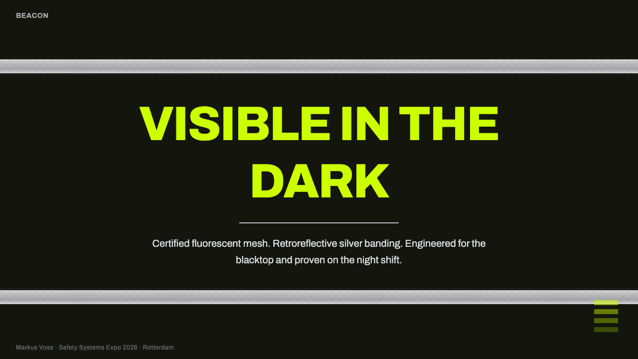
For presentation slides, the style is strongest when the cover behaves like a roadwork warning rather than a conventional title page. Let an electric-lime field or compressed headline dominate one region of the blacktop ground, then use a silver band to establish direction and contain supporting information. Content slides should preserve the same operational hierarchy: a clear section code, one commanding heading, restrained explanatory text, and bands that connect related material instead of merely decorating empty space.
Data slides benefit from the aesthetic's emphasis on detection and status. Charts can place lime against near-black for the primary series, use silver-gray for reference structure, and reserve subdued asphalt tones for secondary information. Large numerals should act as checkpoints, while labels remain condensed and direct. Avoid making every value fluorescent; the decisive result or risk condition needs visual priority, and excessive brightness turns a safety hierarchy into undifferentiated glare.
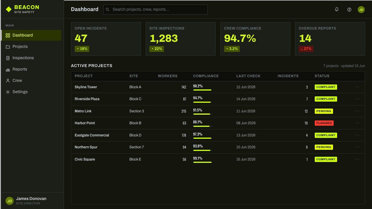
For web interfaces, Hi-Vis Safety Vest is particularly effective on operational dashboards, monitoring views, and pricing pages that need immediate differentiation. Dashboard modules can resemble marked work zones, with reflective bands grouping status, lime identifying active or critical states, and dark panels supporting dense information. On pricing pages, one recommended tier may carry the full fluorescent field while other tiers remain dark and silver, allowing visibility logic to communicate priority without relying on ornamental badges.
Editorial and marketing layouts should use the style's documentary industrial character rather than imitate a costume. An article can open with a broad blacktop field, a compact warning-like title, and silver bands that carry captions or metadata through the page. Marketing sections can alternate dark operational zones with decisive lime interventions, while calls to action behave like marked access points. Mesh texture and roadwork imagery should support context, never compete with the message.
The common mistake is to treat electric lime as a generic cyberpunk accent and cover every surface with glowing effects, diagonal hazards, and technical decoration. That approach abandons the source's functional discipline. A convincing application uses lime for conspicuity, silver bands for structure, near-black for environmental contrast, and condensed type for rapid recognition. If every item looks urgent, nothing is urgent; if every line resembles reflective tape, the signature band loses its authority.
Hi-Vis Safety Vest — FAQ
Is Hi-Vis Safety Vest simply an industrial dark theme?
No. A generic industrial dark theme may use charcoal surfaces, metal textures, and technical typography without a specific visibility system. Hi-Vis Safety Vest depends on the coordinated relationship among fluorescent electric lime, near-black roadwork ground, retroreflective silver bands, and condensed safety lettering. Remove the banded structure or reduce lime to a decorative accent and the design may remain industrial, but it no longer carries the recognizable logic of high-visibility workwear.
Why should the background remain dark?
The dark ground represents the asphalt-night environment in which the source material becomes most visually dramatic. It gives fluorescent lime room to appear active and makes silver bands read as reflective interruptions. A pale background collapses that relationship: lime loses much of its forward pressure, silver becomes an ordinary neutral, and the composition drifts toward sportswear or general-purpose safety graphics rather than night roadwork.
How should reflective silver be represented on screen?
Treat it first as structure, not as a realistic metal effect. Silver-gray bands should have clear continuity, crisp separation from the ground, and positions that organize or protect information. A restrained change in brightness can suggest the way reflective material catches light, but elaborate metallic rendering is unnecessary. The essential quality is sudden legibility: the band should feel capable of becoming visible at the exact moment attention reaches it.
Can the style support long-form reading?
Yes, provided the high-intensity vocabulary is concentrated around navigation, headings, callouts, and status information. Long body passages need calmer dark surfaces, generous breathing room, and a readable grotesque rather than the most compressed display lettering. Reflective bands can guide movement between sections, while lime marks entry points and key conclusions. Extending maximum contrast into every paragraph would exhaust attention and undermine the style's signaling function.
Where does Hi-Vis Safety Vest work poorly?
It struggles when the desired experience depends on softness, quiet intimacy, or an atmosphere in which no element should demand immediate attention. Its contrast and safety-derived hierarchy naturally communicate urgency, control, and operational awareness. Those qualities suit dashboards, technical services, event graphics, and assertive campaigns, but they can overwhelm reflective reading, delicate storytelling, or products that need to feel gentle and domestic. The style should be chosen when being seen is itself part of the message.
Related design styles
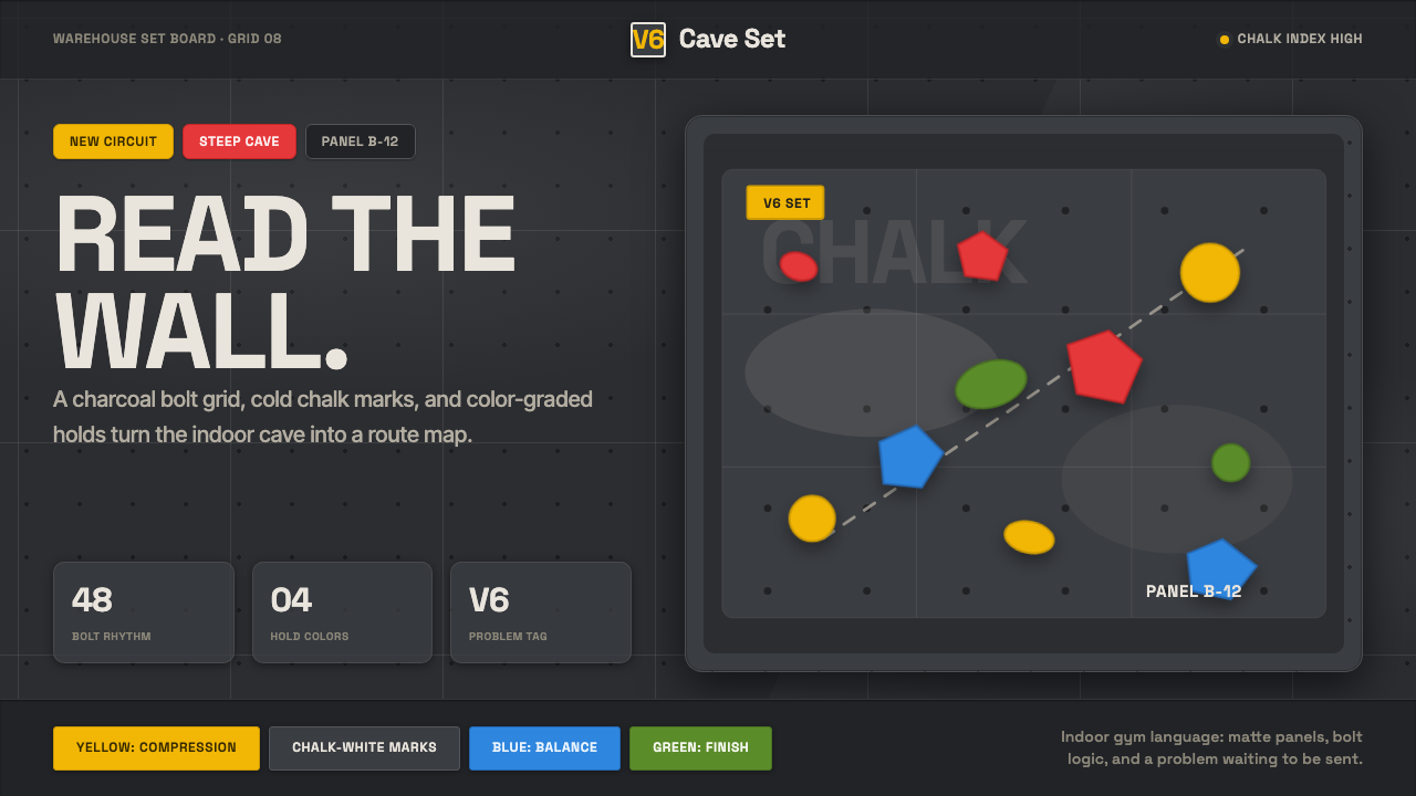 Bouldering ChalkGym-cave graphic. Chalk-white type rides a charcoal bolt grid with route-colo…
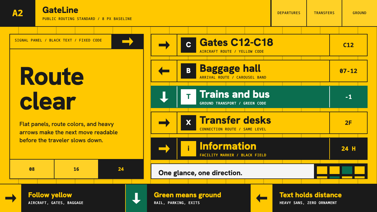 Airport Wayfinding GeometricLegibility becomes command. Signal yellow, black sans, and green route bands…
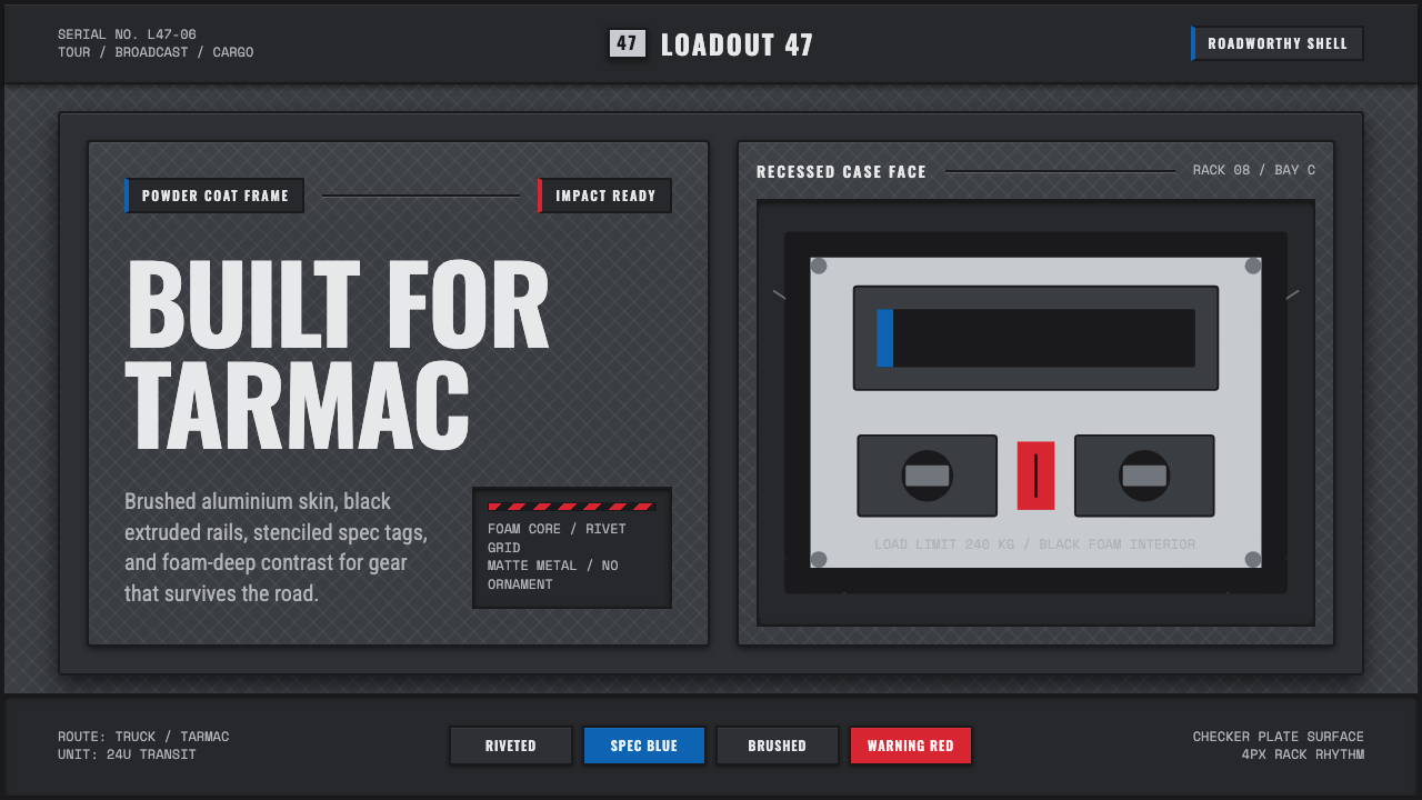 Aluminium Flight CaseRoadproof and exact. Diamond-plate gray, stencil type, black frames, blue-red…
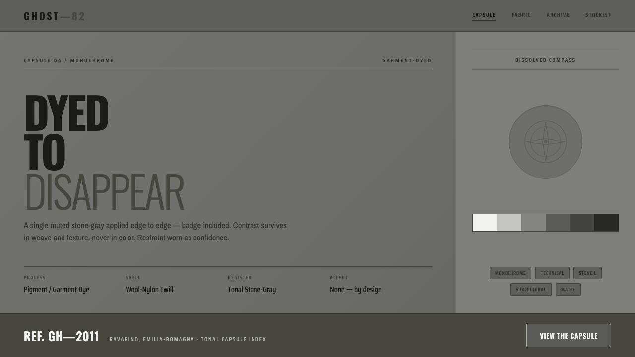 Stone Island GhostDyed to disappear. One garment-dyed stone-gray edge to edge, badge dissolved,…
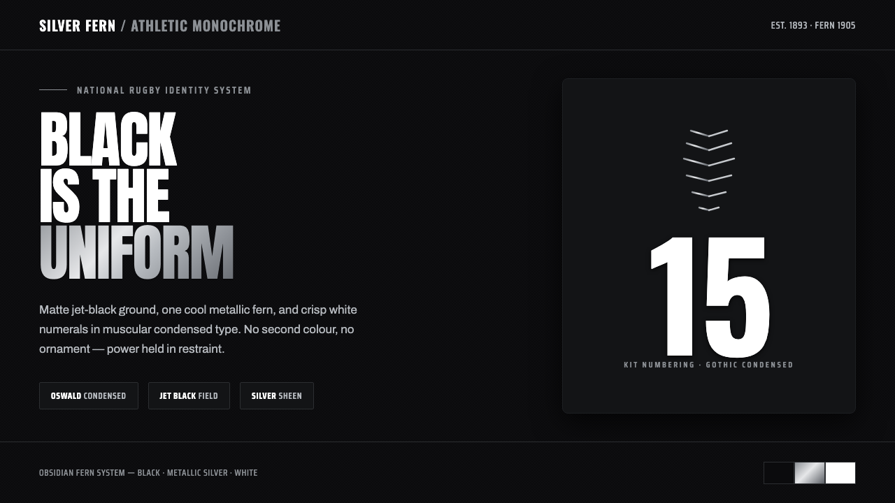 All Blacks Silver FernOne colour, total force. Jet-black field, a single metallic-silver fern, whit…
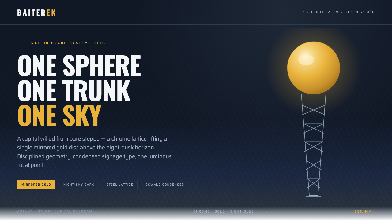 Astana Baiterek TowerCivic optimism in chrome and gold. A mirrored sphere crowns a white lattice t…