What is All Blacks Silver Fern?
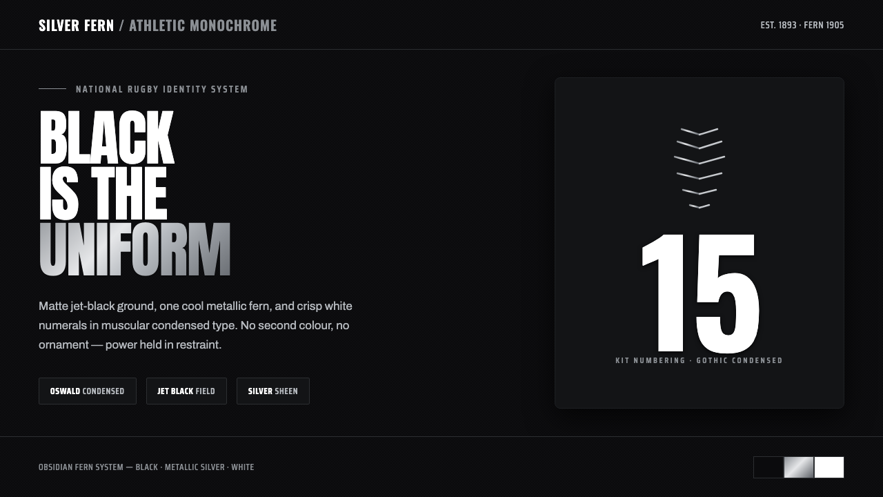
One color, total force: the All Blacks Silver Fern turns jet black, metallic silver, and white numbering into a national sporting identity of exceptional restraint.
All Blacks Silver Fern in brief
All Blacks Silver Fern is the visual identity associated with New Zealand’s national rugby union team: an all-black jersey carrying a single silver fern. Its core vocabulary is unusually narrow and therefore unusually forceful. Matte jet-black fabric provides the field, a cool metallic-silver fern acts as the emblem, and crisp white numerals supply the clearest functional information. There is no need for a broad palette, decorative pattern, or layered illustration. Recognition comes from the relationship between one dark ground, one heritage mark, and one assertive typographic signal.
The identity is athletic monochrome rather than generic minimalism. Black is not used as an absence of design; it is the dominant surface that gives every remaining element gravity. Silver does not behave like a soft neutral accent. It reads as metal: cool, reflective, precise, and distinct from the black surrounding it. White numerals complete the system with uncompromising contrast. Together, these elements create an interface vocabulary that feels direct, disciplined, and built for visibility under pressure.
Visually, the system depends on reduction. The silver fern is not one image among many but the single focal emblem. Condensed, muscular numerals are not decoration but identification at speed. The dark field does not need visual noise because it concentrates attention on the crest and the number. When translated beyond a jersey, the same logic produces a stark composition: black establishes authority, silver signals heritage and premium material presence, and white carries hierarchy, labels, and essential data.

Where does All Blacks Silver Fern come from?
The heritage behind this identity begins with New Zealand rugby’s adoption of black and the fern in 1893. Those two decisions established the visual ingredients that still define the system: a dark, almost absolute field and a botanical emblem presented with singular importance. The pairing is unusually durable because it is not dependent on changing illustration styles or seasonal sporting graphics. Black and fern form a compact national code whose meaning comes from repeated use, collective recognition, and the discipline of staying visually consistent.
The silver fern has appeared on the All Blacks jersey since 1905. Its placement on an all-black garment gives the mark a special role: it must carry identity without competing with a busy supporting composition. The result is an emblem-first tradition. The fern reads as a concentrated sign rather than an ornamental border or a decorative all-over motif. Against black, its cool metallic character becomes more pronounced, and its isolation allows it to function as the visual center of the jersey.
The modern professional-era expression of the identity belongs broadly to the period from 1990 to 2010, but it rests on the older black-and-fern heritage. In this contemporary setting, kit and crest tradition clarify the system into a practical sports-branding language: matte black fabric, a metallic-sheen silver fern, and white condensed numerals. The professional context favors elements that remain legible, recognizable, and emotionally charged without adding extraneous color. Every visible component has a role in team identification.
This is why the All Blacks Silver Fern system can extend into contemporary digital and editorial work without losing its source character. It is rooted in national sports branding, condensed gothic kit numbering, and the metallic-fern heritage emblem, rather than in a temporary graphic trend. The historical continuity is visible in its restraint. A composition feels connected to the identity when it protects the primacy of black, keeps the fern singular, and gives white type a clear operational purpose.
What defines the All Blacks Silver Fern look?
Jet-Black Field
The black ground is the system’s primary statement, not a backdrop waiting to be filled. It should feel matte, deep, and uninterrupted, creating a surface that absorbs visual chatter rather than amplifying it. Large black areas make the silver fern and white information appear deliberate and consequential. In interface work, black should carry the composition’s authority while empty space remains active, allowing hierarchy to emerge through contrast and placement instead of ornament.
Metallic Silver Fern
The silver fern is the singular heritage emblem and should retain that privileged role. Its silver quality is cool rather than warm, and metallic rather than merely gray. It works best as a clear, isolated mark with room around it, never diluted into a repeated texture or surrounded by competing badges. The emblem supplies continuity and identity; its visual restraint is precisely what lets it carry symbolic weight on a black field.
White Condensed Numerals
White is reserved for the most immediate functional communication: numerals, primary labels, essential data, and decisive calls to action. The typographic character is condensed and muscular, borrowing the force of kit numbering rather than the softness of editorial display type. Narrow, assertive forms create vertical energy and make short information blocks feel athletic. White type should be crisp against black, with scale and density doing the work of hierarchy.
Strict Monochrome Discipline
The system’s power comes from refusing extraneous color. Black, silver, and white already establish ground, emblem, and information; additional hues weaken the code by introducing meanings the identity does not need. Silver may provide sheen and material distinction, but it should not turn the composition into a decorative gradient exercise. The palette remains stark because scarcity is part of the visual message: every contrast has been earned.
Athletic Compression
Forms should feel contained, concentrated, and ready to perform. Condensed type, tight label groups, and controlled horizontal or vertical alignment give the identity its athletic pressure. This does not mean crowding every surface. Compression belongs in the information itself, while the black field remains broad and calm. The tension between dense white content and open darkness is more faithful than filling the layout with visual effects.
No Extraneous Detail
The visual code succeeds when each component can be named by its function: black establishes force, silver identifies heritage, white communicates. Decorative color, unrelated icons, ornamental borders, and busy textures introduce noise without strengthening this sequence. A strong All Blacks Silver Fern composition feels edited rather than embellished. It should look as though anything not necessary for recognition, hierarchy, or team character has already been removed.

Who shaped All Blacks Silver Fern?
New Zealand Rugby is the institutional figure behind the national rugby identity described by this system. Its role is visible in the continuity of the all-black kit, the silver fern, and the disciplined visual language attached to the team. In a design reading, it represents the long-term stewardship required for a restricted identity to become culturally legible rather than merely recognizable.
The New Zealand national rugby union team gives the identity its living context. The all-black jersey is not an abstract logo application but a team garment used to signal collective presence. The team makes the fern, black field, and white numbering meaningful through repeated performance and public visibility, turning a limited set of visual elements into a complete national sporting identity.
The All Blacks kit and crest tradition is the design lineage that joins the black-and-fern adoption of 1893 with the silver fern’s appearance on the jersey from 1905 onward. It explains why the system favors continuity over novelty. The crest is not a removable flourish; it is the concentrated sign around which the kit’s monochrome force is organized.
How do you use All Blacks Silver Fern today?
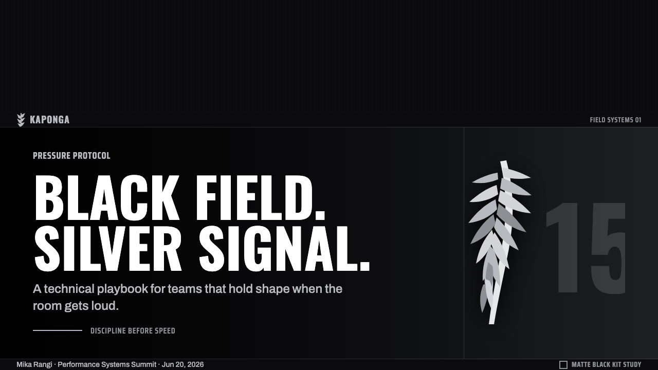
For presentation slides, use the black field as a stage rather than a fill. A cover can place a single silver fern in a commanding but isolated position, with a short white title set in condensed, muscular type. Keep supporting information quiet and subordinate. The visual point is not to recreate a jersey literally; it is to borrow its concentration. One emblem, one title block, and a generous black field will communicate more convincingly than a cover crowded with sport photography, badge collections, and multiple accents.
Content and data slides benefit from treating white typography as kit numbering translated into information hierarchy. Use strong white section labels, compact captions, and silver only where a heritage marker or structural distinction is needed. Data should remain stark and readable: values, axes, and category labels can be white, while a carefully chosen silver emphasis identifies the most important series or comparison. The presentation should feel decisive, not technical for its own sake. Black creates the field; type makes the score legible.
For web interfaces, the style is particularly suited to dashboards, score-oriented products, membership areas, and pricing pages that need a premium athletic edge. Let black define the main environment, keep primary navigation typographic and direct, and reserve white for actions, labels, and critical reading paths. A silver fern can function as an identity anchor in the header or at key transition points, but it should not be repeated in every component. The interface becomes stronger as the emblem becomes rarer and more intentional.
Editorial and marketing work can use the system to frame concise claims, campaign statements, product launches, or event-oriented content. Treat the page like a controlled black poster: white condensed headlines provide force, silver marks origin or signature, and the rest of the composition remains spare. Long passages need enough open dark space to remain comfortable to read. Marketing assets should emphasize resolve and identity, not nostalgia through excessive historical decoration.
The common mistake is mistaking this identity for a license to make every surface black and every element metallic. The source system works because its parts have distinct jobs: black is the field, silver is the singular fern and material signal, white is the information layer. Repeating silver effects, adding unrelated colors, making every label oversized, or turning the fern into a background pattern dissolves that hierarchy. The correct application is selective: force comes from what is withheld as much as from what is shown.
All Blacks Silver Fern — FAQ
Is All Blacks Silver Fern simply a black-and-white sports style?
No. Its identity is built from a specific relationship among matte jet black, a cool metallic-silver fern, and crisp white condensed numerals. Black establishes the field, the fern carries heritage, and white provides functional clarity. Removing the silver fern or treating all neutral tones as interchangeable turns the system into generic dark sports branding rather than this particular national rugby identity.
Can the silver fern be used as a repeating background pattern?
It can be reproduced technically, but doing so moves away from the source system. The fern’s force comes from its singularity on the all-black jersey. As a repeated texture, it becomes decoration and competes with the clear white numbering that the identity depends on. A better approach is to use one fern as a focal mark, then let black space give it authority.
Why should white type be condensed and muscular?
The visual source includes white condensed numerals set in muscular type. That character gives identification information an athletic, immediate presence against the black kit. In digital work, condensed white type preserves the same sense of compression and resolve, especially for short labels, headline statements, scores, and key data. It should support clarity first, not become a theatrical display effect.
Does the style work for non-sport products?
Yes, when a product benefits from a vocabulary of focus, strength, and disciplined hierarchy. Dashboards, membership experiences, pricing pages, event platforms, and premium utility tools can use the black field, silver identity signal, and white information contrast effectively. It is less suitable when a product needs a broad emotional palette or a visually busy environment, because the system gains its meaning from restraint and the rejection of extraneous color.
Related design styles
 Medellín Library ParkCivic gravity in slate. Near-black planes, cool grey hairlines, and bold wayf…
 Airport Wayfinding GeometricLegibility becomes command. Signal yellow, black sans, and green route bands…
 Hazmat SignageRead it from the loading dock. Caution-yellow ground, NFPA diamonds, monospac…
 Astana Baiterek TowerCivic optimism in chrome and gold. A mirrored sphere crowns a white lattice t…
 Brazilian Paulista ConcreteStructure made visible. Weathered béton-brut greys, hard cast shadows, conden…
 NYC Subway VignelliThe city as a circuit diagram. Flat trunk-line color on black, angles locked…