What is Astana Baiterek Tower?
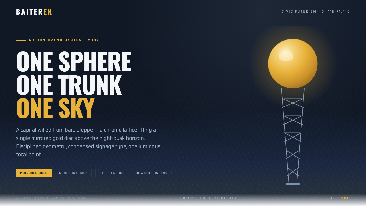
Baiterek turns post-independence ambition into a single luminous gesture: a white lattice trunk, a mirrored golden sphere, and night-blue civic optimism.
Astana Baiterek Tower in brief
The Astana Baiterek Tower is a civic monument completed in 2002, rising over the steppe as a steel-and-gold exclamation mark. Its white branch-girder trunk lifts a mirrored sphere that holds the Samruk bird’s golden egg, turning architecture into a compact national image.
The visual language is defined by restraint and focus. Deep night-blue grounds create the sky around a single dominant gold accent, while white structural lines provide the tower’s vertical framework. The composition is not crowded with competing symbols: one sphere, one trunk, one sky.
As an interface style, Baiterek translates the monument’s post-Soviet futurist civic character into clear hierarchy, tall condensed signage type, metallic contrast, and clean radial geometry. It feels ambitious without becoming ornate, monumental without becoming heavy.
Where does Astana Baiterek Tower come from?
Baiterek belongs to the 1990–2010 period and is rooted in Central Asia, specifically Astana, formerly associated with Akmola and Nur-Sultan in Kazakhstan. The monument’s identity is inseparable from a capital whose urban image was being formed as a deliberate statement of post-independence ambition.
The capital moved from Akmola to Astana in 1997, and Baiterek was completed five years later. That sequence gives the monument its particular civic charge: it does not present an old symbol preserved through time, but a new landmark designed to make a new capital legible and memorable.
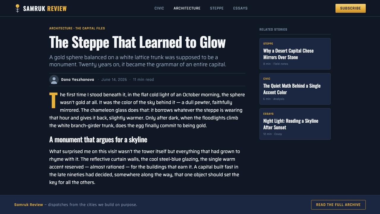
The source places the work within post-Soviet futurist civic architecture and nation branding. Those two movements explain its combination of architectural spectacle and communicative simplicity. The tower is both a physical landmark and a condensed identity system, designed to be recognized as an emblem rather than read only as a building.
Nursultan Nazarbayev and the Akmola–Astana capital vision are identified as key figures in the monument’s context. Baiterek embodies that vision through a highly legible silhouette: a white structural ascent terminating in a precious sphere, with chrome, gold, and night-blue forming the visual vocabulary of civic optimism.
What defines the Astana Baiterek Tower look?
Color
The palette is led by deep night-blue, with gold reserved for the principal point of attention. White supports the tower’s structural language, while chrome suggests a polished civic future. The colors should remain purposeful: night-blue establishes atmosphere, white clarifies framework, and gold marks aspiration.
Ground and Atmosphere
The background is not a neutral canvas but a night sky. Deep blue gives the brighter elements room to rise and makes the sphere feel suspended above the steppe. Empty space is therefore atmospheric as well as functional: it creates distance, scale, and a sense of civic drama.
Typography
Typography should feel like civic signage: tall, condensed, upright, and immediately legible. Headlines work best when they occupy the vertical register of the tower, while supporting text remains calm and open. Type is an architectural element, not a decorative voice competing with the gold focal point.
Radial Geometry
The sphere supplies the system’s dominant geometric idea, while the branching trunk provides its lines of ascent. Circles, rays, arcs, and converging structures can organize content, provided they remain clean and intentional. Geometry should express lift and convergence rather than become a pattern applied for its own sake.
Material Contrast
Baiterek depends on the contrast between white structural clarity, reflective chrome, and precious gold. In interface work, this can become a disciplined relationship between crisp lines, cool metallic surfaces, and one warm luminous accent. Material references should feel polished and architectural, never rustic or tactile.
Monumental Hierarchy
The composition has a strict order: the sky is the field, the trunk is the support, and the sphere is the crown. Interfaces should follow the same hierarchy. Establish one dominant destination, lead the eye upward or inward, and let secondary information support the main gesture instead of creating a second monument.
Who shaped Astana Baiterek Tower?
Nursultan Nazarbayev is named in the source among the key figures surrounding Baiterek’s civic and national context. Within the style system, that context appears through monumental ambition and a highly legible emblem rather than portraiture: the tower communicates a capital’s confidence through its silhouette and materials.
The capital vision connects the move from Akmola to Astana in 1997 with a new civic image. Baiterek gives that vision a memorable form: a landmark built from a vertical structural gesture and a radiant crown, designed to make post-independence ambition visible across the city.
The monument is the central visual source for the style. Completed in 2002, it combines a white branch-girder trunk, a mirrored sphere, and the Samruk bird’s golden egg into one compact composition. Its power comes from the clarity of the silhouette and the discipline of its limited material language.
How do you use Astana Baiterek Tower today?
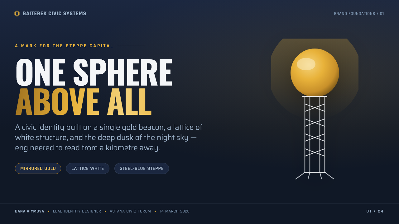
For presentation slides, use the style as a vertical civic narrative. The cover can place a tall title against a deep night-blue field, with a gold sphere or circular focus acting as the visual crown. Content slides should preserve the same order: a clear structural line, a restrained text block, and one directional or radial device. Data slides can turn charts into clean architectural diagrams, using gold only for the principal finding and white or cool tones for supporting information.
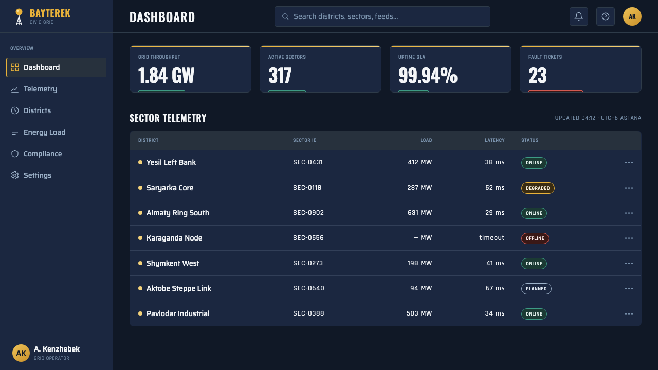
For web interfaces, Baiterek works especially well for dashboards, pricing pages, and products that need to feel authoritative, future-facing, and nationally or institutionally confident. Use the night-blue ground to create a strong field, keep navigation typographic and upright, and use white rules or lattice-like divisions to organize content. Gold should mark the active state, recommended tier, key metric, or primary action, not every interactive element.
For editorial work, the style supports reports, institutional stories, urban subjects, and articles about ambition or transformation. A tall title can establish the vertical axis, while radial diagrams, circular call-outs, and branching annotations echo the tower without copying it literally. Keep the body text calm and spacious so the page retains the contrast between a vast night field and a precisely placed monument.
For marketing, the system is strongest when it behaves like nation branding rather than luxury decoration. Use one confident message, one luminous accent, and imagery or graphics with a clear silhouette. Gold can frame a promise or destination, while chrome and white give the campaign a polished civic character. The result should feel aspirational and public-facing, not intimate, rustic, or handmade.
The common mistake is to treat gold, gradients, metallic effects, and radial shapes as interchangeable decoration. That produces visual spectacle without Baiterek’s discipline. The style depends on a single dominant focus and a clear supporting structure. If every card glows, every heading is condensed, and every surface imitates metal, the hierarchy collapses and the monument becomes a pile of effects.
Astana Baiterek Tower — FAQ
Is this simply a gold-on-blue luxury style?
No. Gold and night-blue are important, but the system is fundamentally civic and architectural. Its identity comes from the relationship between a dark atmospheric field, a white structural framework, and one precious focal element. Remove the vertical hierarchy and the sense of public ambition, and the result becomes generic luxury rather than Baiterek.
Why is the sphere so important to the style?
The sphere is the monument’s visual crown and its clearest point of recognition. It concentrates the gold accent, gives the composition a destination, and balances the linear ascent of the trunk. In an interface, a circle or rounded focal device can perform the same role, as long as it remains singular and clearly more important than the surrounding geometry.
Can the style work without literal images of the tower?
Yes. The source material is strong enough to work as an abstract system: deep night-blue atmosphere, white branching structure, a gold circular crown, tall condensed type, and radial organization. Literal photography is optional. In fact, abstraction often preserves the monument’s design logic more clearly than a decorative image of the tower.
Does Baiterek suit light-background layouts?
The style is most immediately recognizable on a deep night-blue ground because that setting establishes the sky around the monument. A light variation is possible, but it should retain the essential hierarchy: white or cool structural lines, a dominant gold focus, and a strong sense of vertical or radial movement. Without those relationships, changing only the background will not preserve the style.
What kinds of products benefit most from it?
It is strongest for civic platforms, institutional dashboards, urban projects, national or regional campaigns, analytical products, and presentations about growth or transformation. It can struggle where softness, intimacy, organic texture, or playful informality are central values. The style communicates scale and ambition first, so it should be chosen when those qualities genuinely belong to the product.
Related design styles
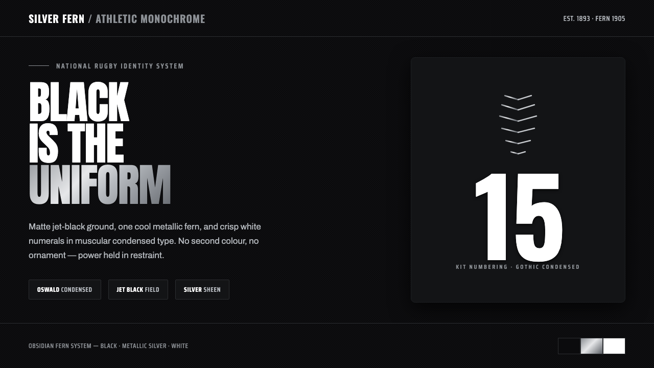 All Blacks Silver FernOne colour, total force. Jet-black field, a single metallic-silver fern, whit…
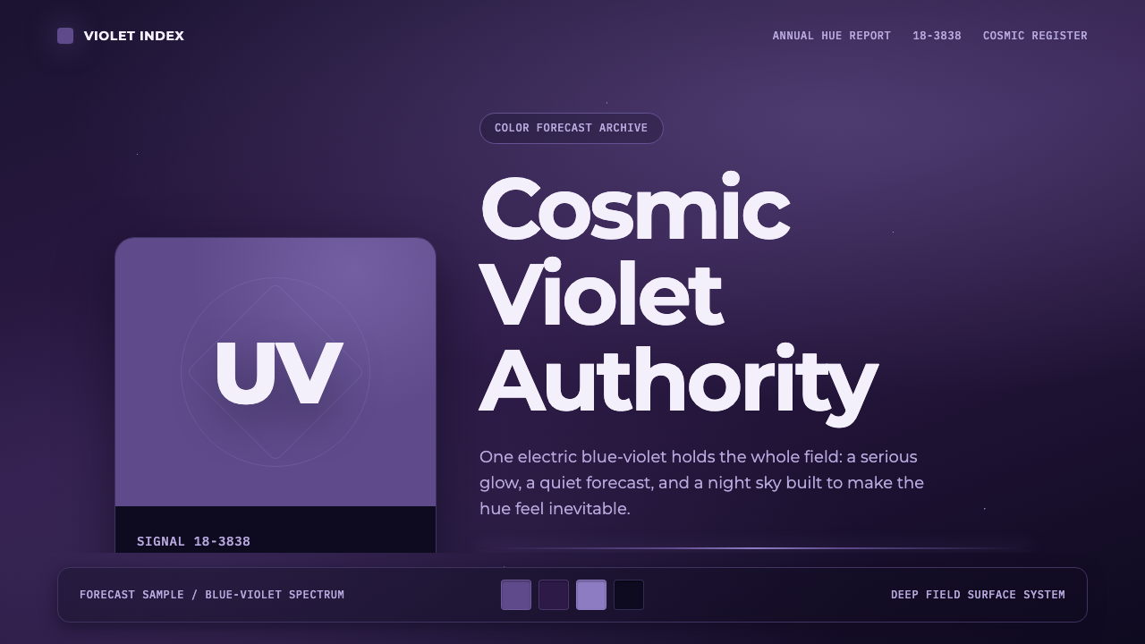 Pantone Ultra VioletCosmic authority. Ultra Violet glows through chip blocks, Montserrat, and dee…
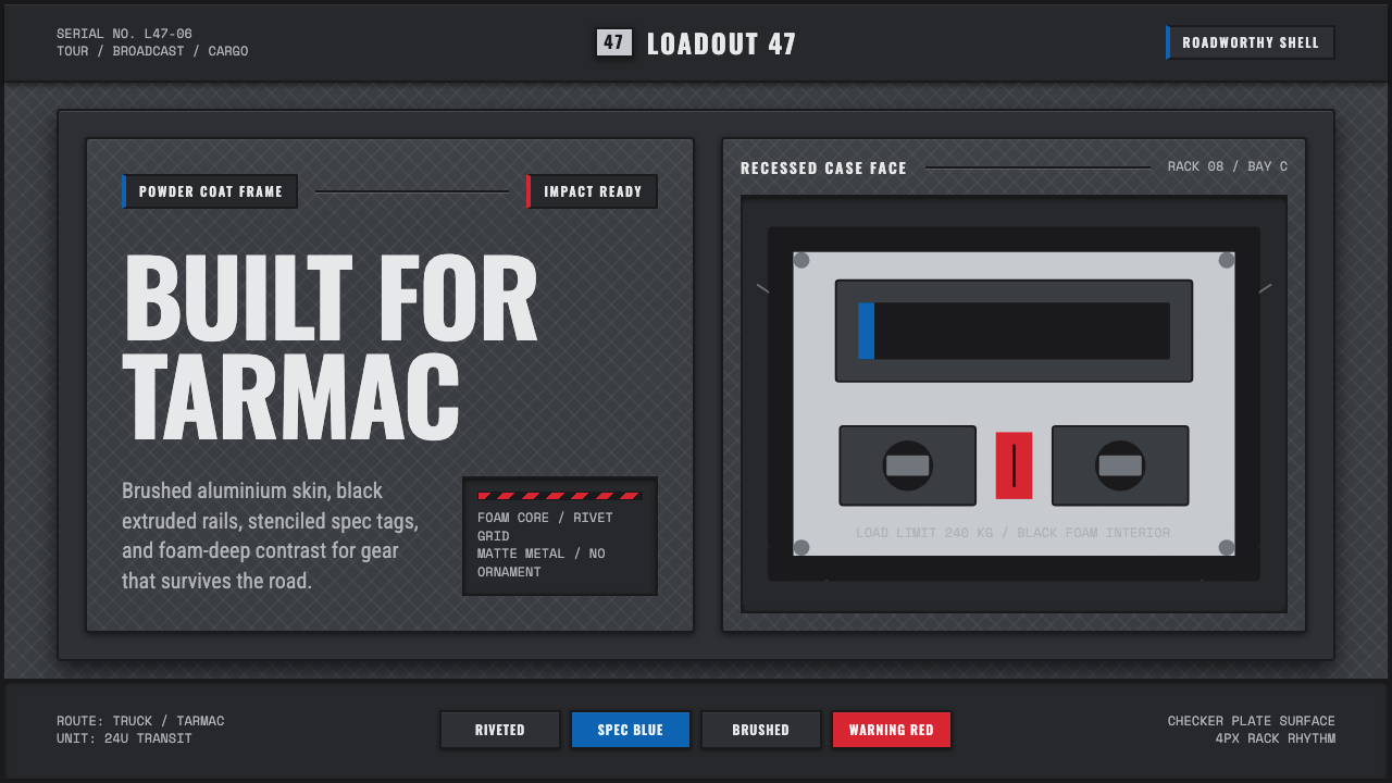 Aluminium Flight CaseRoadproof and exact. Diamond-plate gray, stencil type, black frames, blue-red…
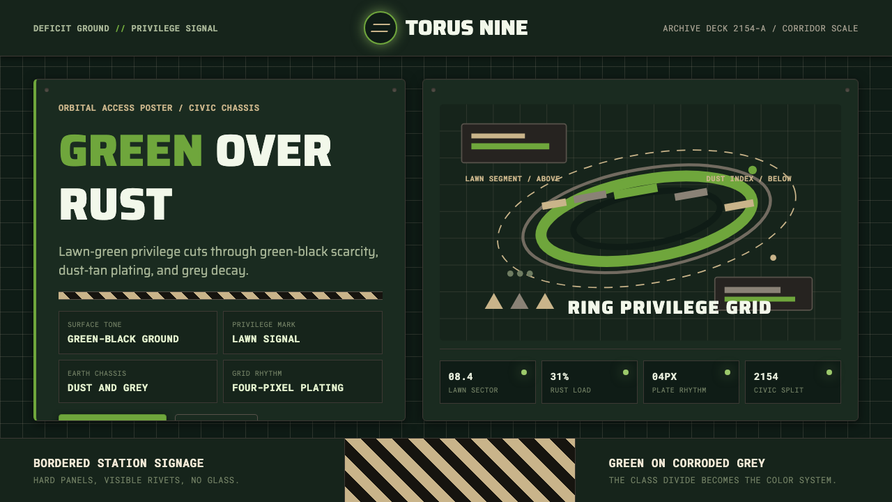 Elysium OrbitalClass divide made visible. Lawn green cuts through green-black plating and du…
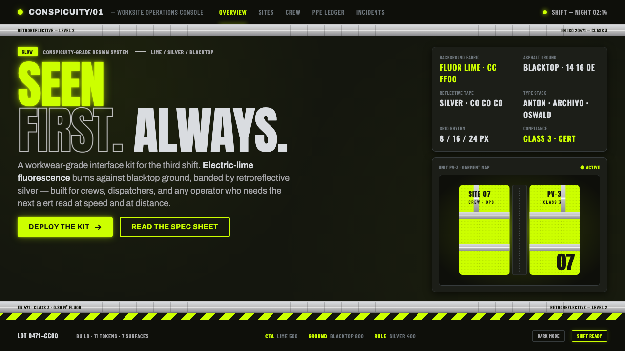 Hi-Vis Safety VestEngineered to be seen. Fluorescent lime on blacktop, silver reflective bands,…
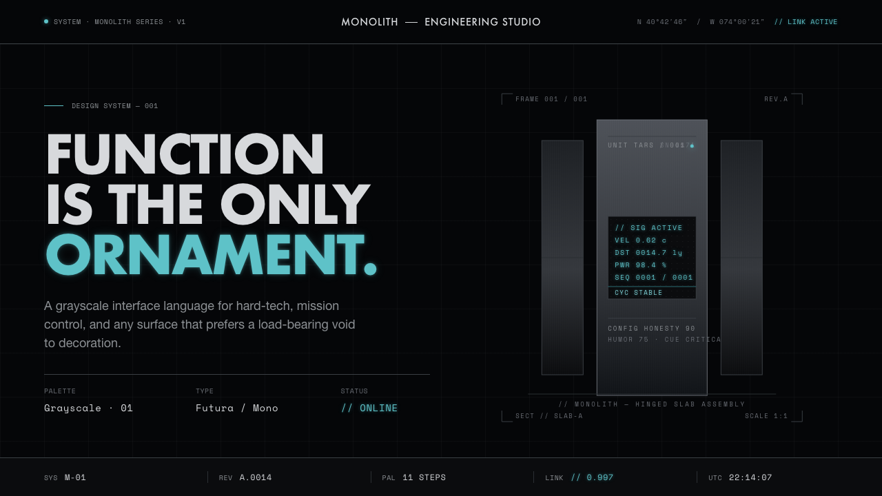 Interstellar TARSIf Mies built a robot. Brushed-aluminum grays on deep-space black, lit by one…