What is Elysium Orbital?
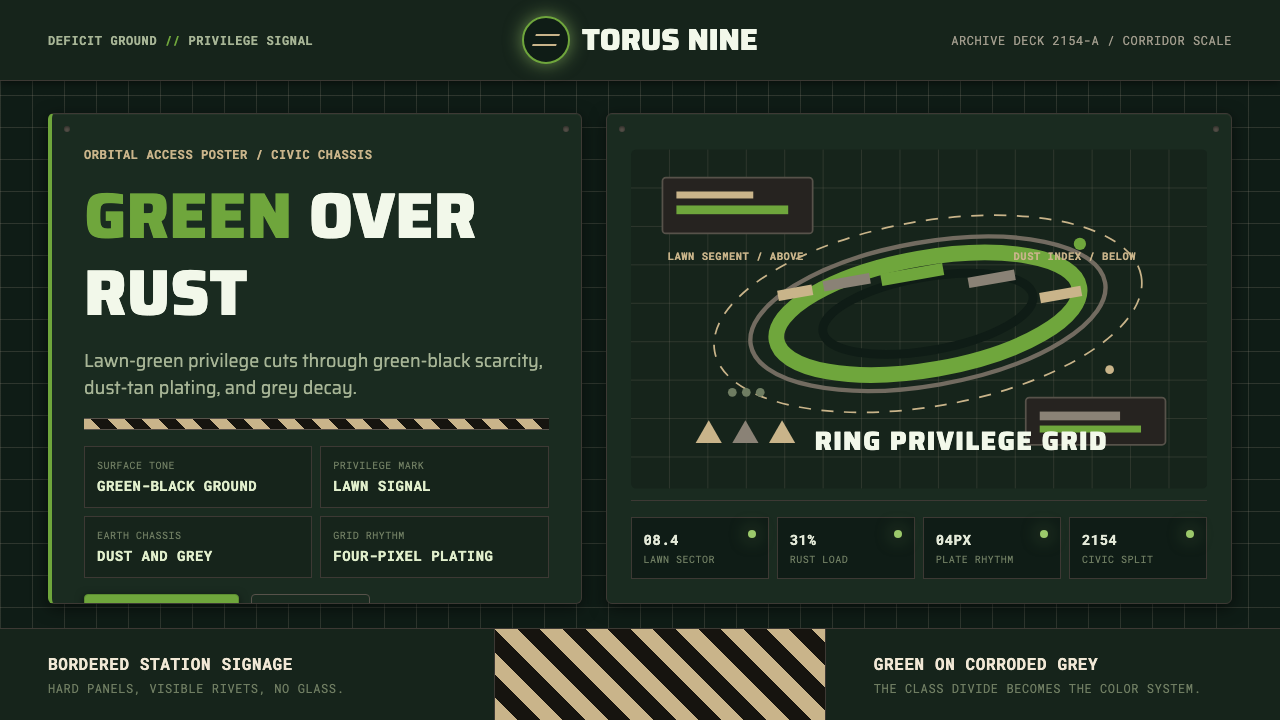
Elysium Orbital turns inequality into an environment: lawn green flashes across green-black armor and dust-tan grids, making privilege feel bright, distant, and fiercely protected.
Elysium Orbital in brief
Elysium Orbital is a dark social-science-fiction style derived from the visual premise of Elysium, Neill Blomkamp's 2013 film set in 2154. Its governing image is the class divide made spatial: a manicured Stanford-torus habitat hangs above a ruined Earth, placing turquoise lakes, white mansions, and impossibly lush lawns beyond the reach of rusted, dust-grey settlements below. The contrast is not background decoration. It determines the palette, hierarchy, materials, and emotional temperature of the entire system.
The style deliberately takes Earth's deficit condition as its base. Deep green-black surfaces resemble coated plating, dim machinery, and infrastructure that has been kept operational rather than made beautiful. Dust-tan grids and corroded greys carry the atmosphere of exhausted ground-level industry. Against them, elite lawn green becomes unnaturally vivid: part status signal, part promise, and part warning. A color associated with health and abundance therefore acquires political tension.
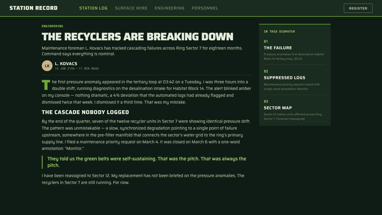
Typography and structure draw on hard-edged industrial futurism. DIN-family signage forms establish public authority, while stencil-like monospaced labels suggest logistics, machine inventories, and controlled access. Riveted panels, segmented frames, hazard-stripe dividers, and olive status indicators make information appear embedded in a physical system. The result is not sleek universal space luxury. It is a divided future viewed from the service corridor, where every glimpse of paradise is mediated by armor, procedure, and scarcity.
Where does Elysium Orbital come from?
The immediate source is Elysium, released in 2013 and directed by Neill Blomkamp. Set in 2154, the film organizes its world around a blunt vertical division. Wealth has withdrawn to an orbital ring whose lakes, lawns, and mansions reproduce an idealized terrestrial landscape, while poverty remains among the dust, scrap, and failing infrastructure of Earth. Elysium Orbital preserves that division as a design method: polished abundance is understood only through its collision with industrial deprivation.
The orbital setting reaches further back to the space-habitat studies associated with NASA in the 1970s. The Stanford torus proposed an inhabited rotating ring, while the related O'Neill-cylinder lineage imagined large artificial environments capable of supporting terrestrial life away from Earth. In the style, this history supplies more than a silhouette. It creates the unsettling idea that landscape itself can become engineered property: lakes, atmosphere, and lawns enclosed inside a controlled machine.
Syd Mead's industrial futurism provides a second conceptual lineage. Here the future is communicated through systems that look manufactured, labeled, maintained, and governed. Signage typography, stencil identifiers, grey machinery, joined panels, and hazard markings make speculative technology legible through familiar industrial conventions. That practical visual grammar keeps the orbital fantasy from becoming weightless; even paradise depends on hardware, access protocols, and the labor of infrastructure.
Neill Blomkamp, Syd Mead, Aaron Beck, and Image Engine form the source material's central creative constellation. Their combined association places the theme between social allegory, industrial concept design, and constructed screen imagery. Elysium Orbital condenses those strands into a reusable visual language. It does not attempt to reproduce a single scene. Instead, it preserves the film's decisive argument: when abundance and deprivation occupy separate worlds, every surface becomes evidence of which world controls the future.
What defines the Elysium Orbital look?
Divided Palette
The palette stages a conflict between scarcity and abundance. Deep green-black dominates as the color of plated infrastructure, with dust-tan and corroded grey defining grids, secondary panels, and inactive information. Lawn green is reserved for high-value signals, active states, or moments associated with access and vitality. Turquoise and white belong to the imagined orbital landscape and should appear as rare glimpses rather than equal partners. The hierarchy works because desirable colors remain scarce.
Industrial Typography
DIN-family signage type carries headings, navigation, and commands with the impersonal certainty of civic or transport infrastructure. Stencil-like monospaced forms handle identifiers, readings, classifications, and supporting metadata. Scale and density separate public instruction from machine detail: headings are broad and declarative, while labels are compact and procedural. Typography should feel assigned by a system, not chosen for personal expression.
Plated Structure
Containers behave like joined machine panels rather than floating cards. Frames are segmented, corners feel engineered, and seams may be reinforced by rivet-like details or narrow structural bands. The surface language implies repairability and repeated assembly. Depth should come from overlapping plates and firm edge separation, not from plush atmospheric softness. Even an information panel should appear capable of surviving dust, vibration, and institutional neglect.
Grid as Infrastructure
The grid is visible enough to feel operational. Dust-tan rules, registration marks, compartment boundaries, and aligned data columns suggest routing, inventory, and surveillance. Empty regions are not luxurious white space; they resemble reserved bays or inactive sectors. Alignment is strict, but the composition can remain uneven, with dense technical clusters pressing against broad dark fields. This produces the feeling of a system under load.
Hazard and Status Language
Hazard stripes and olive indicators convert decoration into operational meaning. Stripes mark boundaries, denied zones, or changes in information class; they should interrupt the layout at decisive points rather than repeat as a general motif. Olive status marks work quietly on grey machinery, while lawn green signals exceptional activation or privileged clearance. The distinction prevents every interface state from appearing equally urgent.
Controlled Contrast
The style depends on withholding visual comfort. Most surfaces remain dark, worn, and administratively neutral so that a clean white module, turquoise image, or vivid green action feels imported from another social world. Contrast is therefore narrative as well as visual. If every panel is bright, every status is active, or every image depicts orbital abundance, the class distinction collapses and the system becomes generic science fiction.

Who shaped Elysium Orbital?
Blomkamp directed Elysium and placed its class allegory inside a sharply divided built environment. The orbital habitat and ruined Earth do not merely host the story; their contrast states the story's politics before dialogue is required. Elysium Orbital follows that approach by treating hierarchy, access, and material condition as narrative information embedded in design.
Mead represents the theme's industrial-futurist lineage: a future made convincing through manufactured surfaces, transportation logic, signage, machinery, and coherent systems. His presence in the source material guides the style away from abstract digital glow and toward objects that seem engineered, labeled, and maintainable. Futurism becomes credible because its infrastructure can be read.
Beck belongs to the central group of figures identified with Elysium's visual world. Within this theme, that association supports a design language in which speculative forms remain hard-edged, functional, and materially legible. The lesson is to make every futuristic element answer practical questions: how it is divided, marked, accessed, joined, or repaired.
Image Engine is named among the key contributors associated with the source material's constructed imagery. Its relevance to Elysium Orbital lies in the union of environmental scale and readable detail: the immense ring must communicate an entire social order, while individual surfaces still need seams, labels, wear, and mechanical logic. Grandeur and infrastructure remain inseparable.
How do you use Elysium Orbital today?
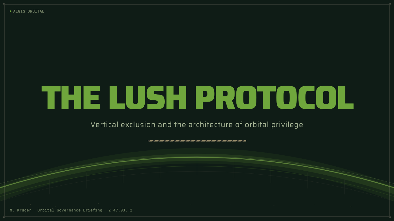
For presentation covers, begin on the Earth side of the divide. Use a broad green-black field, a compact block of institutional typography, and one sharply controlled lawn-green intervention. A thin glimpse of turquoise landscape or a clean white orbital arc can imply the inaccessible world above. Content slides should retain the plated grid: section labels resemble facility codes, text sits in disciplined compartments, and hazard dividers mark genuine changes of topic rather than decorating every boundary.
Data slides are especially compatible with Elysium Orbital because classification already belongs to its visual language. Charts can resemble resource monitors, access maps, or population registers without becoming theatrical props. Use corroded grey and dust-tan for context, olive for normal operation, and lawn green for the value that demands attention. Comparisons become most meaningful when abundance and deficit are placed in adjacent fields, allowing the layout itself to expose unequal distribution.
For web dashboards and pricing interfaces, translate class division into permission and service hierarchy without sacrificing usability. A dashboard can use dark plated containers, stencil metadata, visible status markers, and firm compartment boundaries. Pricing tiers may contrast an austere ground-level plan with a cleaner orbital tier, but essential information must remain equally readable. Reserve vivid green for decisive actions or granted access; if every control glows, the color no longer signifies privilege.
Editorial and marketing applications should foreground the allegory rather than imitate a film console. An article can alternate dense Earth-side evidence with restrained views of orbital abundance, using signage-like headings and archival-feeling captions. A campaign page can frame a desirable product image as something observed through an institutional access layer. The strongest copy addresses scarcity, mobility, ownership, health, or exclusion, themes already carried by the visual opposition.
The common mistake is to treat the style as a collection of science-fiction decorations: green glow, random caution stripes, dense serial numbers, and distressed metal applied everywhere. That approach erases the reason each device exists. Elysium Orbital requires an unequal distribution of beauty. Most of the system should feel constrained and infrastructural; moments of cleanliness, color, and openness must remain rare enough to register as another class of experience.
Elysium Orbital — FAQ
Is Elysium Orbital simply a dark science-fiction interface style?
No. Its defining quality is not darkness or machinery but structured inequality. Green-black plating and dust-tan grids establish the deprived baseline; lawn green, turquoise water, and clean white surfaces represent scarce abundance. A generic futuristic interface distributes spectacle evenly. Elysium Orbital withholds it, using contrast to show that different users inhabit different material realities.
Why is lawn green so important to the style?
Because it condenses the orbital habitat's promise into a single visual signal. Against exhausted greys and green-black machinery, cultivated green suggests land, health, maintenance, and access to resources. It is powerful precisely because it is not neutral. Used sparingly, it feels like privilege breaking through the interface; used everywhere, it becomes ordinary decoration and loses its social meaning.
How should orbital luxury appear without overwhelming the Earth-side system?
Treat it as a controlled reveal. A narrow landscape crop, a clean white enclave, or a turquoise field can interrupt the darker infrastructure at a moment of narrative importance. The surrounding grid should remain disciplined and materially heavy. Orbital imagery works best as evidence of an excluded condition, not as a permanent decorative backdrop. Distance gives the desirable world its charge.
Can the style be used for ordinary commercial products?
Yes, when the product benefits from themes of systems, access, resources, or institutional authority. It can suit analytical platforms, infrastructure services, speculative campaigns, or tiered offerings. It is less natural for products whose primary promise is softness, intimacy, or uncomplicated pleasure. The visual language always introduces tension, so the product should have a reason to carry that tension.
What separates authentic application from superficial imitation?
Authentic application assigns every visual device a social or operational role. Typography establishes authority, grids organize controlled information, hazard marks define boundaries, olive indicators report routine status, and lawn green identifies exceptional value or access. Superficial imitation merely accumulates distressed panels and futuristic labels. The test is simple: remove the story of unequal access. If the design remains unchanged, the theme was only costume.
Related design styles
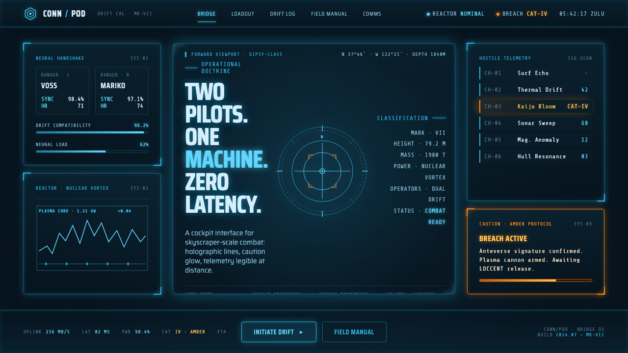 Pacific Rim Jaeger HUDTwo pilots, one machine. Faded Corsair-cyan holograms on near-black steel, am…
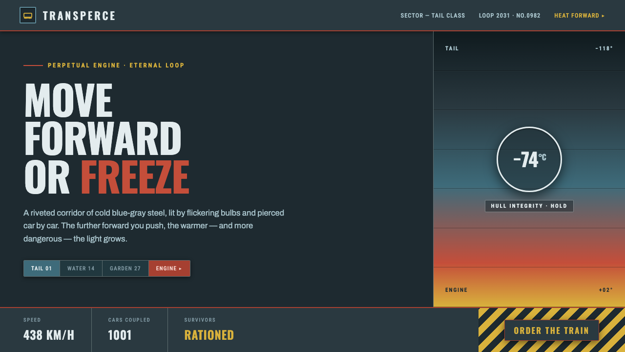 SnowpiercerMove forward or freeze. Cold blue-gray steel pierced by front-car red, conden…
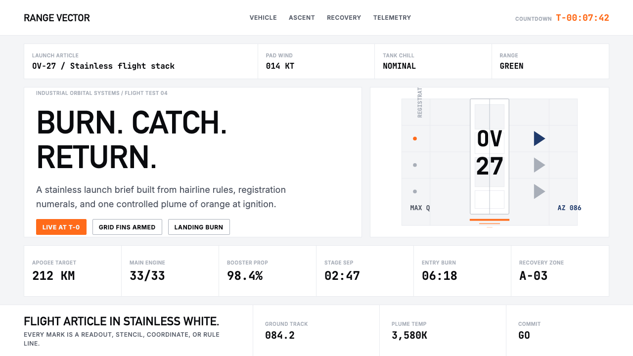 SpaceX Starship / FalconOrbital restraint. Stainless white grids, DIN-like type, and one orange burn…
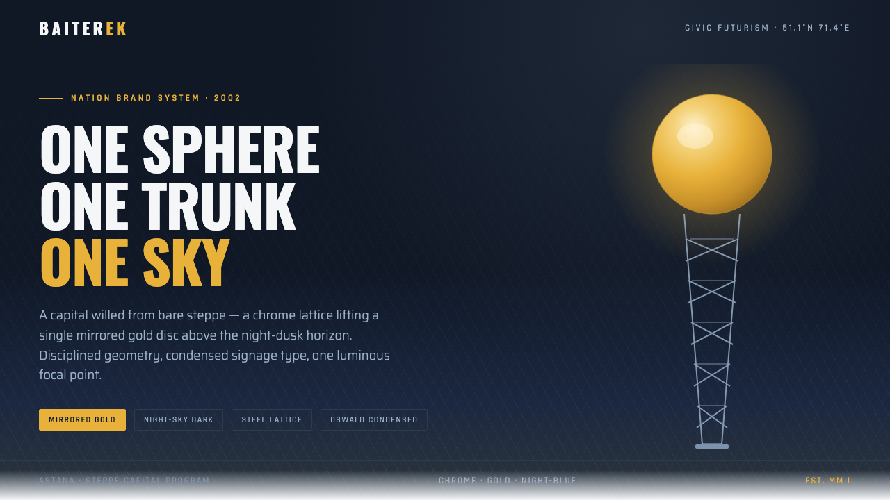 Astana Baiterek TowerCivic optimism in chrome and gold. A mirrored sphere crowns a white lattice t…
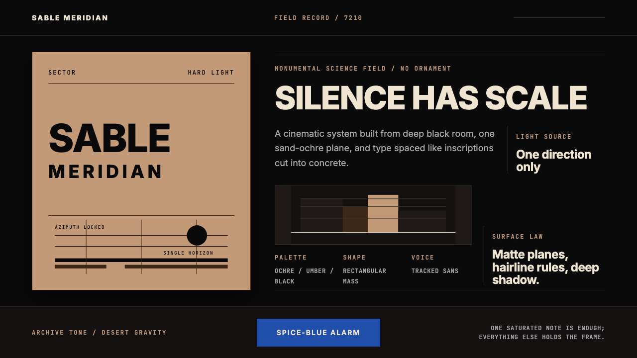 Dune Arrakis (Villeneuve)Silence has scale. Sand-ochre slabs, spice-blue alarm, and tracked Inter on b…
 Avatar — Pandora Bioluminescence (2009)The forest knows you are there. Cyan light blooms across a deep-teal living f…