What is Avatar — Pandora Bioluminescence (2009)?
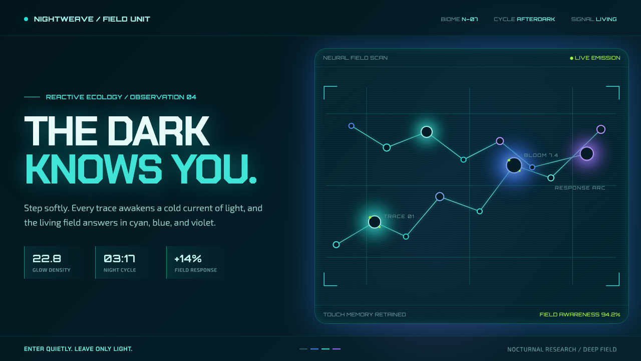
Avatar — Pandora Bioluminescence turns darkness into a living interface: a deep-teal forest where cyan light answers every presence.
Avatar — Pandora Bioluminescence (2009) in brief
Avatar — Pandora Bioluminescence is a dark eco-sci-fi visual language drawn from Pandora after nightfall: a near-black, deep-teal jungle in which leaves, spores, paths, and bodies emit their own light. Its central idea is not decoration placed on a dark background. The darkness is an active field, and every visible mark reads as a living signal within it.
Color behaves as emission rather than pigment. Cold cyan blooms, electric blue skin-light, and teal darkness establish a world where illumination appears to originate inside organic matter. Fine luminous strokes feel nervous, vascular, or botanical; diffuse halos suggest reactive plankton disturbed by touch. The image should imply that the environment is continuously sensing, transmitting, and responding.
The resulting interface sits between a Na’vi neural connection and an RDA holo-tablet. Glyphs float rather than rest on panels, trails imply interaction after it occurs, and light is treated as evidence of activity. The style is immersive rather than merely futuristic: it asks the viewer to feel enclosed by an intelligent forest, not positioned outside a machine.

See the Avatar — Pandora Bioluminescence (2009) design system
Where does Avatar — Pandora Bioluminescence (2009) come from?
The design language begins with Avatar, released in 2009, and is explicitly tied to Pandora after dark. Its franchise extension spans 2009 to 2022, preserving a consistent premise: darkness is not empty visual space but the condition that makes the world’s luminous life legible. In this setting, cyan and blue do not simply brighten a scene; they establish the scene’s biological and emotional logic.
Its listed geography joins Hollywood in the United States with Wellington in New Zealand, reflecting a film-world design language that is at once cinematic and technically constructed. The visual result depends on photoreal CGI world-building, where organic surfaces can appear to hold light, release it, and affect neighboring space without losing their material presence.
Bioluminescent naturalism gives the system its emotional center. Leaves, spores, footprints, and skin do not become generic neon props; they become signs that a living environment has registered contact. The movement’s eco-sci-fi dimension follows from that relationship between body and habitat: the visual system presents nature as connected, active, and larger than the individual moving through it.
Performance-capture cinema is also named among its foundations, which helps explain why the body is so important to the aesthetic. Electric blue light on Na’vi skin gives figures a place inside the same luminous ecology as the forest floor. Rather than separating character, environment, and interface into distinct visual systems, Pandora Bioluminescence lets them share one language of glow, darkness, and responsive traces.
What defines the Avatar — Pandora Bioluminescence (2009) look?
Emitted Light
Nothing should feel merely colored. Cyan veins, blue figures, glyphs, spores, and paths appear to generate light from within, while the surrounding darkness receives that light. This reverses ordinary surface logic: the bright element is not paint sitting on an object but a temporary biological or technological event. A successful composition makes each glow feel motivated by presence, contact, or transmission.
Deep-Teal Darkness
The ground is near-black but never dead black. Deep teal gives the void atmosphere, moisture, and depth, allowing cyan illumination to feel cold, aqueous, and alive. Darkness must remain generous enough to preserve contrast and mystery. Filling every area with glow removes the sensation of entering an uncharted forest and turns a living field into a decorative light pattern.
Reactive Halo
Glow spreads softly beyond its source, like reactive plankton responding to a disturbance. The edge should feel permeable rather than mechanically contained, suggesting that light travels through moisture, tissue, or suspended particles. These halos are most persuasive when they remain attached to a meaningful source: a footprint, a gesture, a leaf structure, or a floating glyph.
Organic Signal Lines
Thin neon-like strokes carry the style’s structural information. They may recall leaf veins, neural pathways, roots, or interface routes, but should not become sterile circuitry. Their purpose is to connect zones of attention and imply circulation through the scene. Curves, branching, and interrupted traces work especially well because they suggest a network that is alive rather than a diagram frozen in place.
Floating Glyphs
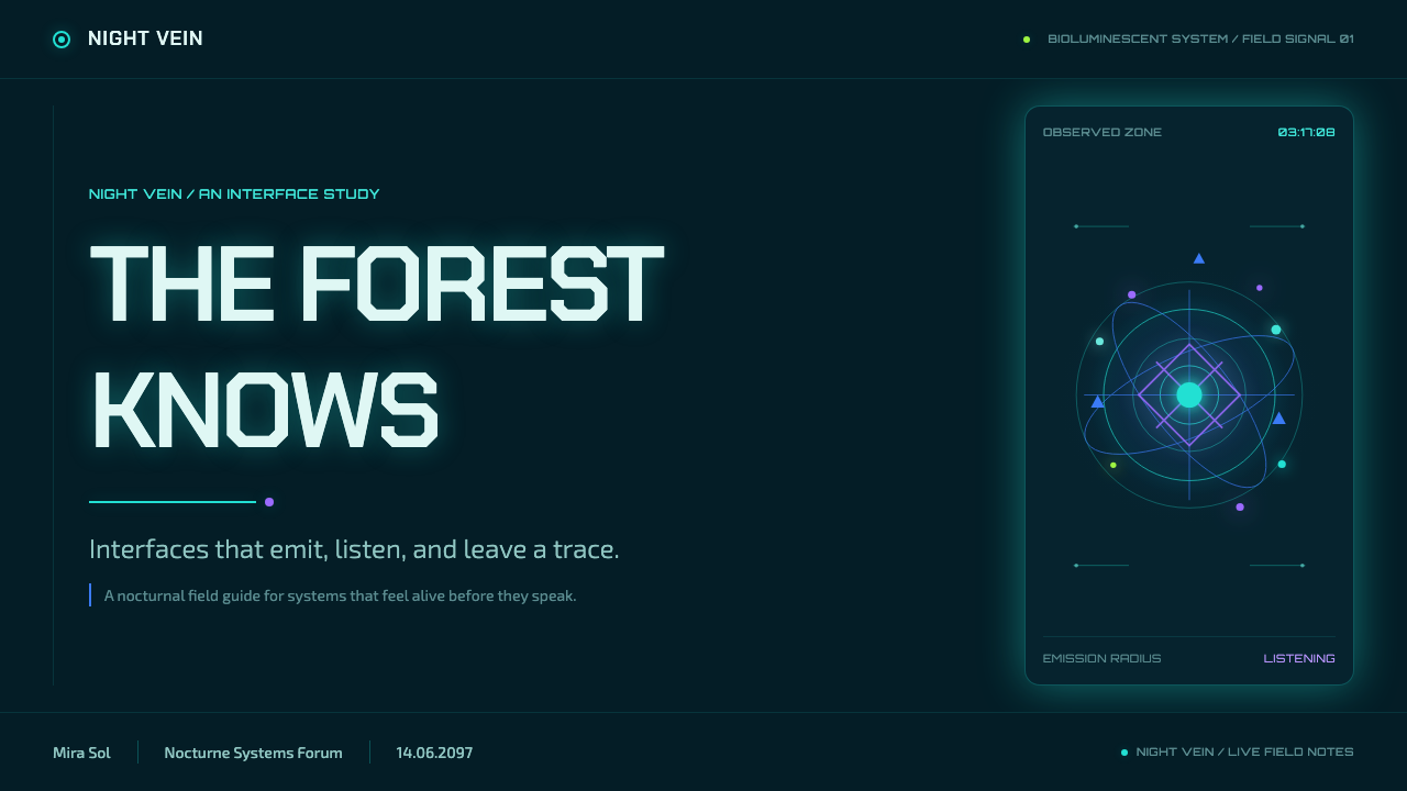
Textual and symbolic marks should feel suspended in the dark field, as though projected into air or emerging from a neural exchange. They belong to the environment rather than to a rigid rectangular container. Clear hierarchy still matters, but it should be achieved through luminosity, grouping, and spatial isolation, preserving the impression that information has surfaced from the forest instead of being laid over it.
Living Depth
Depth comes from layered radiance, receding teal space, and luminous elements at different apparent distances, not from heavy physical panels. A foreground trace can glow intensely while spores drift more quietly behind it and the forest dissolves into darkness beyond. This establishes an enveloping habitat, where every layer seems to belong to one responsive ecology.
See the Avatar — Pandora Bioluminescence (2009) design system
Who shaped Avatar — Pandora Bioluminescence (2009)?
James Cameron is listed among the key figures for Avatar — Pandora Bioluminescence. Within the supplied design lineage, his name anchors the 2009 film release from which the dark Pandora visual language begins and the franchise period through 2022 in which it extends.
Jon Landau is named as a key figure in the source material. His inclusion places him within the approved creative context for a world whose visual identity joins luminous organic life, deep-teal darkness, and the large-scale cinematic construction of Pandora.
Robert Stromberg appears among the key figures associated with this design language. The supplied material situates that language in photoreal CGI world-building, where forests, bodies, spores, and interactive-looking light must read as parts of the same coherent environment.
Paul Frommer is also identified as a key figure in the source material. In the style’s broader system, floating luminous glyphs and neural-interface associations show how communication can be made to feel embedded in Pandora’s living field rather than detached from it.
How do you use Avatar — Pandora Bioluminescence (2009) today?
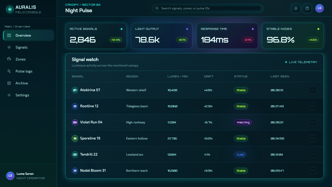
For presentation covers, begin with darkness and a single luminous event: a cyan botanical trace, a field of spores, or an electric-blue figure emerging from deep teal. Let the title appear as a floating signal with substantial empty darkness around it. On content slides, retain the dark field but make structure calm and legible; group information into isolated luminous clusters instead of enclosing every point in a bright panel.
For data slides, treat charts as organisms within the habitat. Lines can resemble paths of energy, selected values can bloom like activated bioluminescence, and annotations can hover as restrained glyphs. Keep unselected information quiet enough to recede into teal darkness. The goal is not to make data mysterious; it is to make attention feel activated, as though a specific pattern in the forest has responded.
For web interfaces, the style suits immersive dashboards, exploration tools, environmental storytelling, and product experiences that benefit from a sense of discovery. Navigation can operate as a constellation of glowing labels, while status changes leave gentle luminous trails or alter a local halo. Pricing pages can use the same atmosphere if tiers feel like distinct zones of access rather than glossy consumer cards, with the primary decision illuminated against the surrounding field.
For editorial and marketing work, use darkness as pacing. An opening passage can establish a nearly empty teal field, followed by close luminous details, then a wider section that suggests the forest’s scale. Photography or illustration should preserve the tension between void and emission. Copy works best when it is concise, sensory, and spatially placed, giving readers the impression that each phrase has been discovered in the dark.
A common mistake is treating Pandora Bioluminescence as a generic neon sci-fi theme. Dense cyan outlines everywhere, hard-edged interface boxes, and equally bright labels destroy its living hierarchy. Another mistake is using glow without a source or consequence. The essential question is always whether the light appears to have been awakened by something; if not, it is visual effect rather than Pandora-like presence.
See the Avatar — Pandora Bioluminescence (2009) design system
Avatar — Pandora Bioluminescence (2009) — FAQ
Is this style simply a dark neon interface?
No. Neon may be part of its surface vocabulary, but Pandora Bioluminescence depends on a stronger idea: light belongs to a living environment and appears to react to presence. Generic neon design often treats glow as a decorative accent on technology. This style treats glow as evidence that leaves, spores, bodies, paths, or glyphs are participating in the same responsive field.
Why does the system require a dark setting?
The supplied visual premise is that color reads as emitted light rather than pigment. Deep-teal darkness provides the contrast, atmosphere, and unknown space needed for cyan blooms and electric-blue figures to feel internally luminous. On a light field, the same marks become colored graphics; in darkness, they can feel like events occurring inside a living forest.
How should text and icons behave in this aesthetic?
They should behave as floating luminous signals, not as labels trapped inside rigid interface furniture. Text still needs clear hierarchy and readability, but its relationship to space should feel airy and embedded. Glyphs, lines, and short labels can imply neural exchange or holographic projection when they remain connected to the larger teal field and do not compete with every other light source.
Can it work for practical dashboards and pricing pages?
Yes, when immersion supports rather than obscures the task. A dashboard can use localized glow to identify active information, while quiet teal darkness lets secondary material recede. A pricing page can use luminous hierarchy to clarify the principal choice. The practical requirement is restraint: users should still be able to distinguish status, compare options, and move through the interface without navigating a wall of equally intense light.
Related design styles
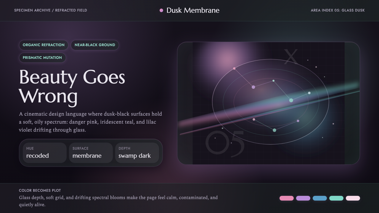 Annihilation (The Shimmer)Beautifully wrong. Dusk black carries pink, teal, and lilac refraction throug…
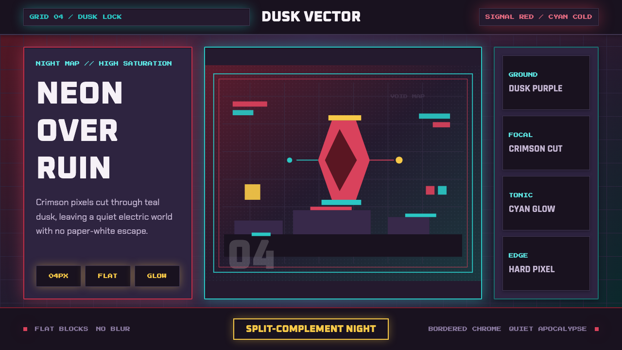 Hyper Light DrifterBeautiful ruin glows. Dusk purple holds crimson pixels and cyan grid light.
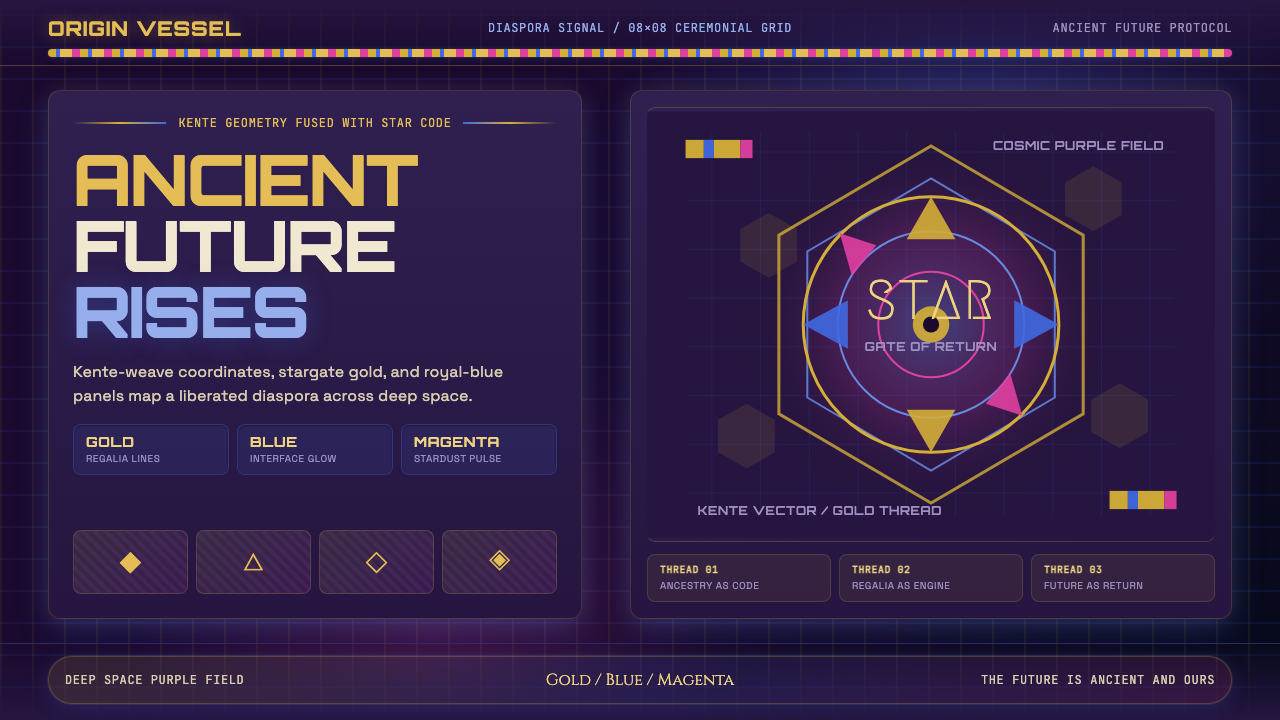 AfrofuturismAncient future, fully luminous. Gold kente grids cut through cosmic purple an…
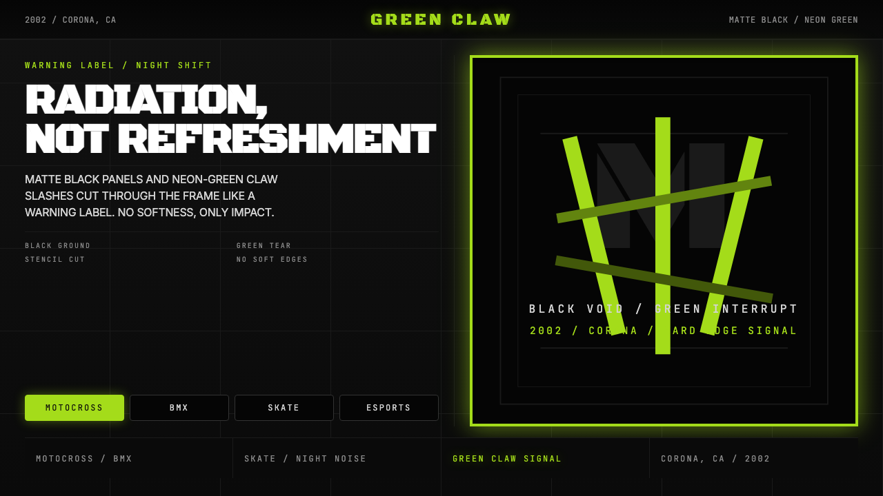 Monster Energy Claw (2002)Aggression, not refreshment. Matte black and neon-green claw slashes cut the…
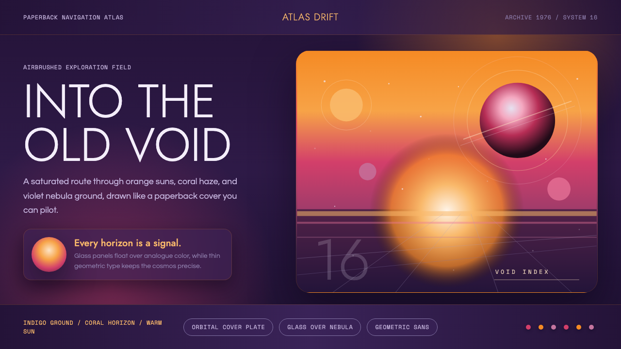 No Man's SkyA paperback cosmos you can enter. Orange suns, magenta haze, and Jost type fl…
 Yukon Northern LightsPhysics as interface. Electric oxygen-green curtains glow over blue-black nig…