What is No Man's Sky?
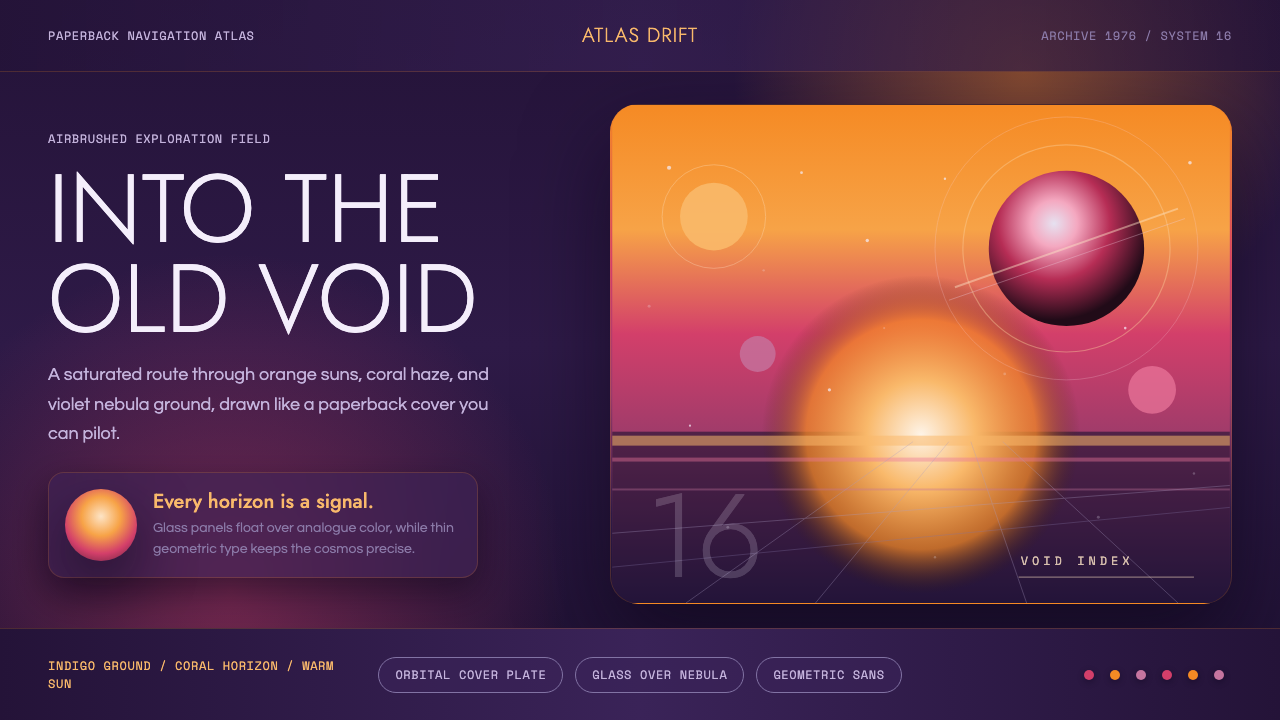
No Man's Sky renders a real-time video game universe as if it were the airbrushed cover of a 1970s science-fiction paperback — orange suns, indigo void, and magenta haze with never a flat gray surface in sight.
No Man's Sky in brief
No Man's Sky is a design system drawn from the visual identity of a 2016 space-exploration video game built by the small British studio Hello Games, whose entire art direction was organized around a single reference point: the painted cover art of vintage science-fiction paperbacks. Rather than pursuing the cool, hard-surfaced realism common to most space games, the studio deliberately chased a warm, painterly, almost nostalgic feeling — as if a player were stepping directly into an illustration rather than a simulation.
The palette is built on saturated, warm-to-cool gradients rather than flat, neutral color: a burning orange or gold sun dominates many skies, fading outward through pink and into deep violet or indigo, evoking an airbrushed sunset stretched across an entire planet's atmosphere. Nothing in the system is treated as plain gray or unlit — every surface, whether a planet's terrain, a spaceship hull, or an interface panel, sits within this same rich, glowing color logic, so that even mundane elements feel bathed in cosmic light.
Typography and interface elements stay deliberately restrained against this vivid backdrop: thin, geometric sans-serif wordmarks and labels, simple circular motifs echoing planets and suns, and smooth curved horizon lines. This combination — a maximally saturated, painterly world paired with a minimal, quiet interface layer — is what gives the system its particular identity: the loudness lives in the color and atmosphere, not in the interface chrome layered on top of it.
Where does No Man's Sky come from?
No Man's Sky was developed by Hello Games, a small independent studio based in Guildford, United Kingdom, and released in 2016 after several years of intense anticipation built around its promise of a vast, proceduraly generated universe players could explore almost without limit. Studio director Sean Murray set the game's visual tone from the outset around a single, explicit north star: the feeling of stepping into the cover art of an old science-fiction paperback, rather than the sleek, hard-surfaced aesthetic of contemporary science-fiction cinema and games.
Art director Grant Duncan translated that reference into the game's actual color language, painting skies and planetary atmospheres the way illustrators of the 1970s rendered alien vistas on paperback covers — warm suns burning against impossibly saturated skies, horizons blending orange into pink into violet rather than resolving into a naturalistic blue. This meant treating color as expressive and emotional first, and scientifically plausible second, a choice that set the game apart from harder science-fiction visual traditions built on plausible physics.
The specific reference point — 1970s paperback science-fiction cover illustration — was itself a mature visual tradition by the time the game drew on it. Artists working in this era, frequently painting for authors and imprints across the genre, developed a signature airbrushed technique: smooth gradient skies, glowing suns or twin suns, alien vegetation rendered in impossible colors, and sweeping, romantic vistas designed to be seen at a glance on a bookstore shelf and immediately promise adventure. No Man's Sky imported this entire visual grammar wholesale rather than referencing it lightly, treating the paperback cover as source material with the same seriousness a historical-recreation project might treat an actual period artifact.
The result was a title whose most memorable visual signature — its skies — owed more to commercial illustration history than to game-engine convention, and this commitment to a painterly, non-naturalistic color language became one of the qualities most consistently praised even during the game's turbulent, closely scrutinized launch, eventually standing as the visual identity the title is remembered for regardless of how its other systems evolved over time.
What defines the No Man's Sky look?
Warm-to-Cool Gradient Skies
Skies are rendered as smooth, sweeping gradients moving from a warm sun-adjacent glow through pink into deep violet or indigo, rather than resolving into a single naturalistic sky color. This gradient logic, borrowed directly from airbrushed illustration, is the system's single most identifying visual signature.
Burning Sun as Focal Anchor
A large, glowing sun or star is typically composed as a dominant focal point in any wide vista, echoing the way paperback cover illustrators used a bold central sun to anchor a composition and telegraph an alien, adventurous mood at a glance.
Deep Indigo Void
Space itself is rendered as a rich indigo rather than a flat black, giving even the emptiest parts of the universe a sense of depth and color rather than void. This choice keeps the palette warm and inviting even in scenes without a sun in frame.
Thin Geometric Wordmarks
Interface labels and titles use a light, geometric sans-serif treatment that stays quiet and structural against the vivid backdrop, letting the atmosphere and color do the expressive work while the interface layer remains understated and legible.
Circular Planetary Motifs
Circles and arcs recur throughout the system — planet silhouettes, sun discs, orbital curves — functioning as a consistent geometric vocabulary that reinforces the cosmic subject matter without relying on literal illustration in the interface itself.
No Flat Gray Surfaces
Even utilitarian or structural surfaces — terrain, ship hulls, interface panels — are treated as if lit by the same saturated cosmic light as the sky, avoiding neutral gray in favor of warm or cool tints pulled from the surrounding atmosphere.
Painterly Atmosphere over Hard Realism
The system consistently favors an expressive, illustration-driven color logic over scientifically plausible rendering, treating mood and wonder as more important than physical accuracy. This is the central creative decision that separates the style from harder science-fiction visual traditions built on naturalistic lighting.

Who shaped No Man's Sky?
Murray, director at Hello Games, set the game's visual identity around an explicit, singular reference point from the project's earliest stages: the feeling of stepping into the cover art of a vintage science-fiction paperback. His insistence on this reference over more conventional hard-surfaced science-fiction realism is the reason the game's skies and atmospheres read as painterly rather than simulated.
As art director, Duncan translated Murray's paperback-cover reference into the game's actual palette and rendering choices, painting skies and horizons in the saturated, gradient-driven manner of 1970s illustrators rather than pursuing naturalistic atmospheric color. His work is the direct technical and artistic bridge between vintage cover art and the game's real-time visuals.
The small Guildford-based studio built its entire art direction around this single cohesive reference point rather than distributing visual decisions across a large team with varied influences, which is part of why the game's aesthetic reads as unusually unified and consistent across its many planets and systems.
The unnamed but collectively influential generation of commercial illustrators who painted alien vistas for science-fiction book covers in the 1970s developed the airbrushed, saturated-gradient technique this entire design system draws from. Their work was designed to promise adventure at a glance from a bookstore shelf, a communicative goal the game's visual system inherits directly.
How do you use No Man's Sky today?
No Man's Sky suits projects that want to feel expansive, wondrous, and emotionally warm rather than technical or coldly futuristic — a distinction worth holding onto, since most 'space' visual references default to hard, neutral surfaces and this system deliberately does the opposite.
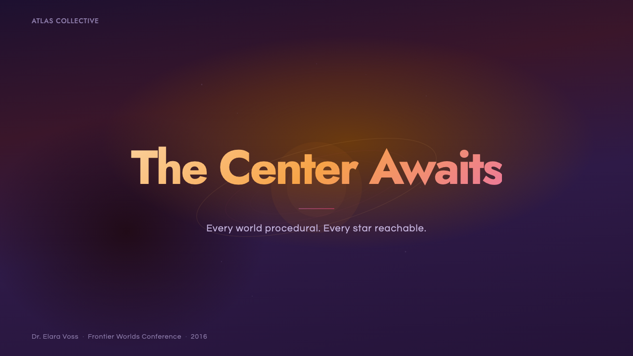
On presentation slides, the style produces striking cover pages built around a single glowing sun-like focal point set against a sweeping gradient field, with a thin geometric wordmark placed quietly rather than competing for attention. Content slides should carry the gradient through as a background rather than reverting to plain white or gray between sections, and any charts or icons should favor circular, planetary-inspired forms consistent with the system's geometric vocabulary.
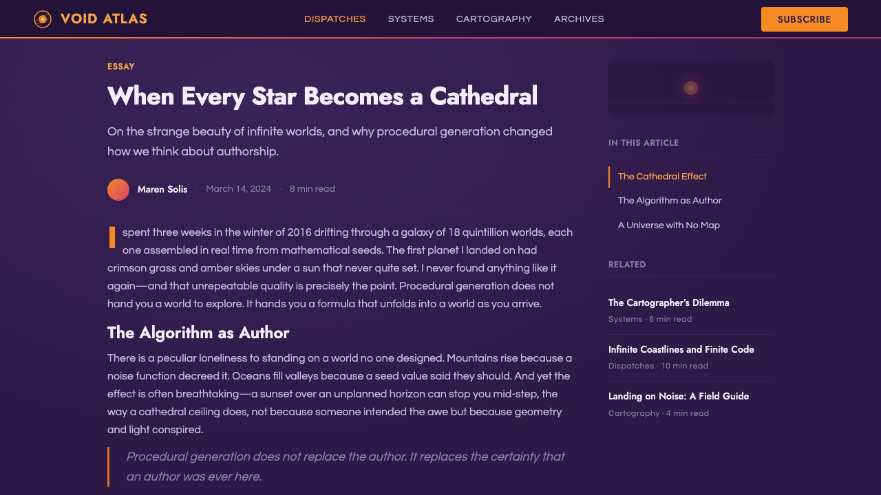
For web interfaces, this palette suits products in exploration, travel, astronomy, gaming, or creative tools wanting to feel imaginative and boundless — onboarding flows, landing pages, and hero sections benefit most, since sustained gradient backgrounds across a dense, data-heavy dashboard can undermine legibility. Where the system is used in a working interface, keep interactive chrome in the thin, quiet geometric-sans style so the gradient atmosphere remains the star rather than competing with functional UI.
In editorial and marketing contexts, the style is a natural match for science-fiction storytelling, space and astronomy content, and any campaign wanting a nostalgic, illustrated feeling rather than a sterile, photographic one. A feature spread can use a full-bleed gradient sky as a section background with a circular motif marking each new segment, echoing how a paperback cover uses one bold central image to draw the eye.
The most common mistake is treating this as generic 'space' styling and defaulting to a flat black background with scattered white stars, which is precisely the naturalistic, cold aesthetic this system was built to reject. The gradient, the warm sun, and the indigo (never black) void are not optional details — they are the entire point, and removing them collapses the reference into a completely different, harder science-fiction visual tradition. A second mistake is over-decorating the interface layer itself with heavy iconography or dense borders; the system's balance depends on keeping that layer thin and quiet so the atmosphere behind it remains the only loud element on the page.
No Man's Sky — FAQ
Why does No Man's Sky avoid the typical black-and-stars look of space games?
The studio's entire art direction was organized around a single explicit goal — recreating the feeling of a vintage science-fiction paperback cover — rather than pursuing scientifically plausible, naturalistic space visuals. Paperback cover illustrators of the 1970s used warm, saturated gradients to evoke wonder and adventure at a glance, and the game imported that expressive logic wholesale rather than defaulting to the cooler, harder-edged convention common to most space media.
Who set the visual direction for this style, and what was their actual reference?
Studio director Sean Murray set the reference point from the project's earliest stages, and art director Grant Duncan translated it into the game's actual palette and rendering choices. The explicit reference was the painted, airbrushed cover art of 1970s science-fiction paperbacks, not any prior video game or film — a commercial-illustration tradition rather than a screen-based one.
Does this style work for data-dense interfaces, or only for hero visuals?
It works best for hero sections, onboarding, and landing pages where a sweeping gradient background can be sustained without competing against dense information. In a data-heavy working interface, it is better to confine the full gradient treatment to accents or backgrounds behind sparse content, keeping interactive chrome in the system's thin, quiet geometric style so functional legibility is not compromised.
Why does the indigo void matter instead of just using black for space?
Rendering empty space as a rich indigo rather than flat black keeps the palette warm and painterly even in scenes without a sun in frame, preserving the illustrated, atmospheric feeling the entire system depends on. Falling back to plain black reintroduces the cold, naturalistic quality the style was specifically built to avoid.
Is this style only appropriate for game or science-fiction branding?
It transfers well beyond games to anything wanting to feel imaginative, expansive, and emotionally warm rather than clinical — astronomy content, travel and exploration brands, and creative tools all borrow its logic naturally. What matters is committing fully to the gradient-driven, painterly color language rather than applying it as a thin decorative layer over an otherwise conventional, neutral interface.
Related design styles
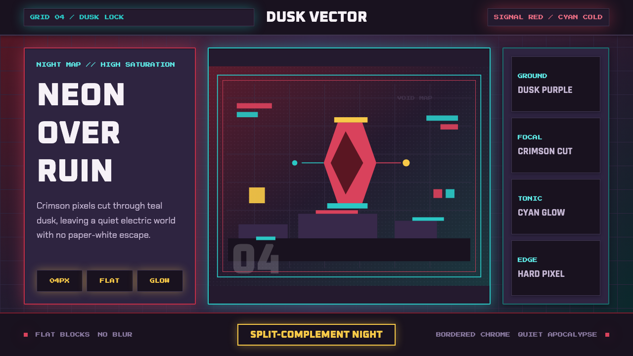 Hyper Light DrifterBeautiful ruin glows. Dusk purple holds crimson pixels and cyan grid light.
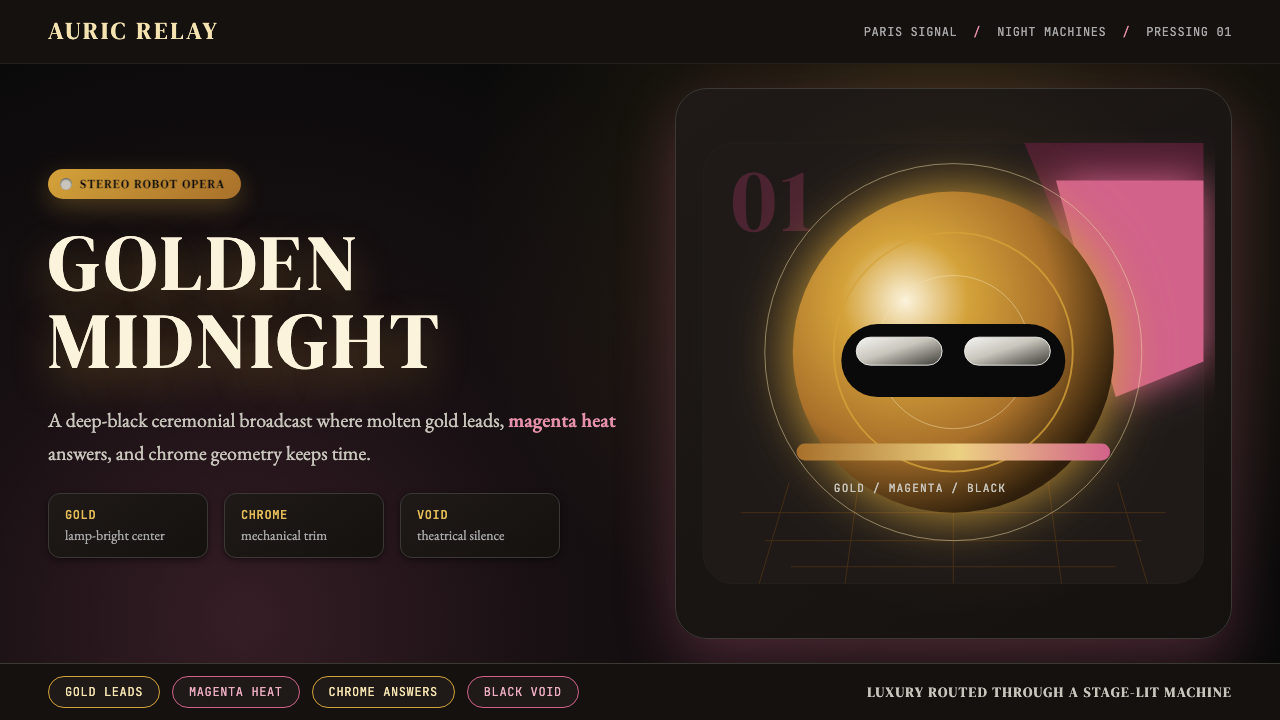 Daft Punk Discovery (Gold-Helmet)Warm sci-fi disco. Gold serif caps orbit a magenta void with chrome-disc geom…
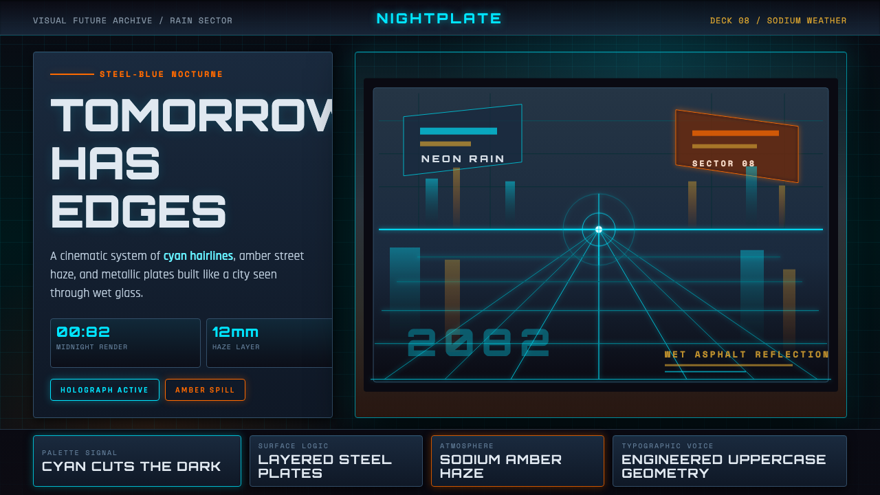 Retro-Futurism (Syd Mead)Tomorrow looks dangerous. Steel-blue night, neon cyan edges, and amber rain r…
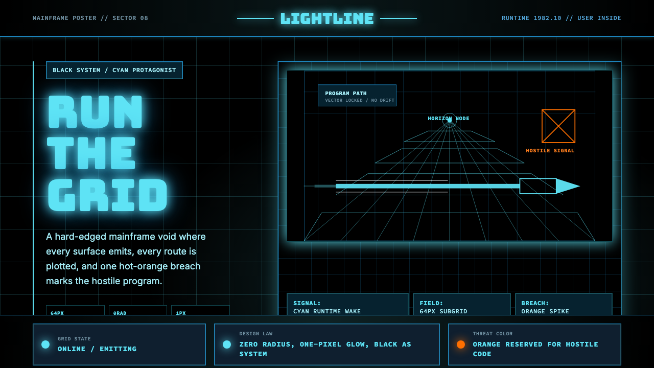 Tron Grid (1982)Cyber-precision in black. Neon cyan grids, Bungee type, and one orange breach…
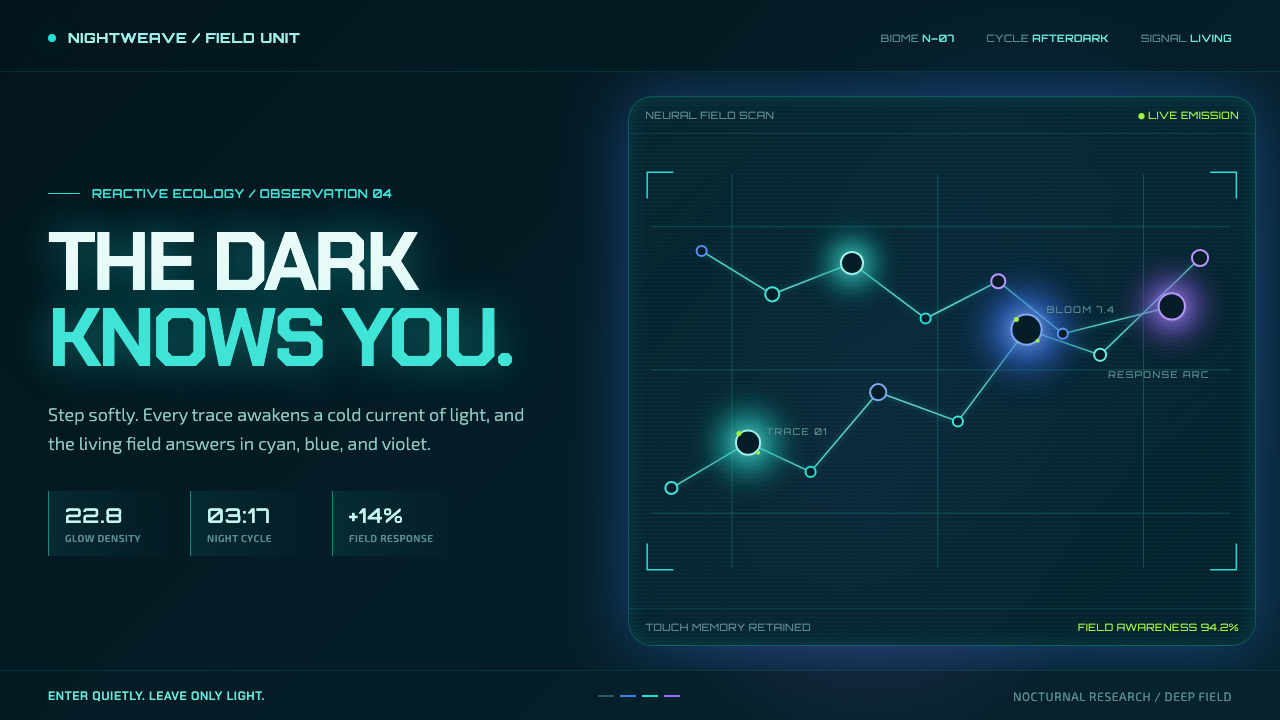 Avatar — Pandora Bioluminescence (2009)The forest knows you are there. Cyan light blooms across a deep-teal living f…
 GTA Vice City (2002)Neon-noir nostalgia. Pink-cyan dusk, chunky type, and palm silhouettes.