What is GTA Vice City (2002)?什么是 GTA Vice City (2002)?
GTA Vice City defined a generation's vision of 1980s Miami — saturated neon-pink dusk, palm silhouettes, and chunky display type that made synthetic nostalgia feel like mythology.《侠盗猎车手:罪恶都市》定义了整整一代人对 1980 年代迈阿密的想象——高饱和霓虹粉的黄昏、棕榈剪影、粗壮的展示字体,让人造怀旧散发出神话般的气息。
GTA Vice City (2002) in briefGTA Vice City (2002) 速览
GTA Vice City is the visual grammar of 1980s-Miami-neon-noir as filtered through a 2002 video game — Rockstar North's title gave an entire generation its template for what 'the eighties' look like: magenta sunsets bleeding into electric cyan, neon-pink tubes glowing against deep-black skies, palm-tree silhouettes pressed flat against gradient dusk, and chunky display lettering that carries the swagger of a film title card.《侠盗猎车手:罪恶都市》是 1980 年代迈阿密霓虹黑色气质经由 2002 年电子游戏过滤后的视觉语法 —— Rockstar North 的这部作品为整整一代人提供了「八十年代」的视觉模板:洋红的日落渗进电光青色,霓虹粉的灯管在深黑天幕上燃烧,棕榈剪影被压平在渐变的黄昏里,粗壮的展示字体带着电影片头字幕的狂妄气势。
The aesthetic is deliberate, populist, and unapologetically synthetic. It does not reconstruct the 1980s accurately; it reconstructs what the 1980s felt like when viewed through Miami Vice reruns, movie trailers, and a decade of pop-cultural nostalgia already in progress by 2002. Hot neon does the work that white space does in more restrained systems. Chunky type replaces delicacy. Sunset gradients and silhouettes carry the emotional weight that photography or illustration might carry elsewhere.这套美学是刻意为之的、平民化的、毫不掩饰人造感的。它并非精确重建八十年代,而是重建八十年代「感觉起来」的样子 —— 那种经由《迈阿密风云》重播、电影预告片和 2002 年前已持续十年的流行文化怀旧所沉淀下来的感受。滚烫的霓虹承担着其他系统里留白所承担的角色;粗壮的字体取代了精致;日落渐变与剪影承载着摄影或插图在别处所承载的情感重量。
This visual language has since escaped its original medium entirely. Synthwave album covers, retrowave motion graphics, nostalgia-soaked branding campaigns, and a wave of indie games all draw from the same well that Vice City codified. The style represents one of the clearest cases of a video game aesthetic crossing into broader design culture, becoming a shared visual shorthand for a specific flavor of retro-futurist longing.这套视觉语言此后早已逃出原来的媒介。Synthwave 唱片封面、逆波浪动态图形、带有浓烈怀旧感的品牌推广,以及一批独立游戏,都从罪恶都市所编纂的同一口井里汲水。这种风格代表了电子游戏美学跨入更广泛设计文化的最典型案例之一,成为特定味道的复古未来主义渴望的共同视觉简码。
See the GTA Vice City (2002) design system查看 GTA Vice City (2002) 完整设计系统
Where does GTA Vice City (2002) come from?GTA Vice City (2002) 从何而来?
GTA Vice City was developed by Rockstar North in Edinburgh and published by Rockstar Games in New York, releasing in October 2002. The game was a direct sequel to Grand Theft Auto III (2001), but where that game's fictional Liberty City drew from a grimy, autumnal New York, Vice City moved south and backward in time — to a fictional Miami stand-in set in 1986. The shift was total: architecture, vehicles, music, and visual identity all changed. The art direction team, led by figures including Sam Houser, Dan Houser, and executive producer Leslie Benzies, built a visual world that treated the 1980s as a mythology rather than a period.《侠盗猎车手:罪恶都市》由爱丁堡的 Rockstar North 开发,纽约的 Rockstar Games 于 2002 年 10 月发行。游戏是《侠盗猎车手 III》(2001 年)的直接续作,但前作虚构的自由城脱胎于昏暗秋意中的纽约,而罪恶都市则向南向过去移动 —— 来到了一个设定在 1986 年的虚构迈阿密。这次转变是全方位的:建筑、车辆、音乐与视觉身份全部改变。由山姆·豪瑟、丹·豪瑟和执行制片人莱斯利·本兹斯等人主导的艺术指导团队,构建了一个将八十年代视为神话而非历史时期的视觉世界。
The primary reference points were televisual and cinematic. Miami Vice (the NBC series, 1984–1989) had already canonized a specific look: pastel suits, no socks, speedboats, and — most importantly — the use of twilight as a near-permanent atmospheric condition. The film Scarface (1983) contributed the excess, the operatic violence, and the palm-tree opulence. Countless music videos of the era supplied the neon signage, the club interiors, and the sense that night was the natural state of a certain kind of American city. Vice City synthesized all of this into a single consistent visual system.主要参照来源是电视与电影。《迈阿密风云》(NBC 系列剧,1984—1989 年)已经将一种特定造型奉为经典:粉彩西装、不穿袜子、快艇,以及最重要的 —— 将黄昏用作几乎永久的大气条件。电影《疤面煞星》(1983 年)贡献了过度感、歌剧式的暴力,以及棕榈树环绕的奢靡。同时代无数音乐录影带提供了霓虹招牌、夜总会内景,以及某种美国城市以夜晚为自然状态的感觉。罪恶都市将这一切综合进单一一套连贯的视觉系统。
The neon-noir aesthetic had deeper roots than its immediate pop-cultural references. The 1980s saw Miami undergo genuine architectural and cultural transformation — the Art Deco revival on South Beach, the arrival of international capital, and the very real visual spectacle of neon lighting in a hot, humid climate where night offered relief from the sun. What Vice City captured was not just the pop-culture image of Miami but also something about the actual sensory texture of that city in that era: warmth, danger, excess, and the specific beauty of artificial light against tropical darkness.这套霓虹黑色美学有着比其直接流行文化参照更深的根源。1980 年代迈阿密经历了真实的建筑与文化变革 —— 南海滩的装饰艺术复兴、国际资本的涌入,以及霓虹灯在炎热潮湿气候中制造的真实视觉奇观(夜晚是对阳光的逃脱)。罪恶都市所捕捉的,不只是迈阿密的流行文化形象,也是那个城市在那个年代真实感官质地的某些东西:温热、危险、过度,以及人造光芒映照热带夜色时特有的美。
By 2002, nostalgia for the 1980s was already a mature cultural phenomenon. The decade had ended more than ten years earlier, enough time for its surface textures to become objects of affection rather than embarrassment. Vice City arrived at precisely the moment when the 1980s aesthetic was ready to be celebrated rather than merely tolerated, and the game's commercial success — it was one of the best-selling titles of its generation — amplified that aesthetic into mass consciousness. The synthwave and retrowave movements that would crystallize in the late 2000s and 2010s drew heavily from the visual vocabulary Vice City had made iconic, cementing the game's status as a foundational cultural document rather than merely an entertainment product.到 2002 年,对八十年代的怀旧已是成熟的文化现象。那个十年结束已逾十年,足以让它的表面质感从令人尴尬之物变为被深情珍视之物。罪恶都市在八十年代美学准备好被庆祝而非仅仅被容忍的精准时刻登场,而游戏的商业成功 —— 它是那一代最畅销的作品之一 —— 将这套美学放大进大众意识。2000 年代末和 2010 年代结晶成形的 Synthwave 与 Retrowave 运动大量借用了罪恶都市所使其标志性化的视觉词汇,巩固了这款游戏作为基础性文化文献而非单纯娱乐产品的地位。
What defines the GTA Vice City (2002) look?GTA Vice City (2002) 的视觉特征是什么?
Color色彩
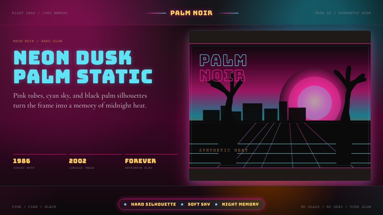
The palette is built on a core tension between hot and cool: deep magenta and neon pink on one side, electric cyan and aqua on the other, with both pressed against near-black backgrounds. These are not naturalistic colors — they are the colors of neon tube lighting as seen through the eye of a camera that has already been pushed for drama. Sunset gradients move from warm coral through magenta to violet and finally to the deep indigo of late night. Accent yellows and whites appear as highlights, simulating the bloom of a light source seen directly. The overall impression is of a world lit entirely from within.色板建立在冷暖之间的核心张力上:一边是深洋红与霓虹粉,另一边是电光青色与碧蓝,两者都被压在近乎纯黑的背景之上。这些不是自然主义的色彩 —— 它们是霓虹灯管的光,经过一台已被戏剧化推压的摄影机镜头所见。日落渐变从暖珊瑚色穿越洋红抵达紫罗兰,最终沉入深靛蓝的夜。强调性的黄色与白色作为高光出现,模拟直视光源时的光晕溢散。整体印象是一个完全由内部点亮的世界。
Typography字体排印
Display type is the primary visual event. Characters are wide, heavy, and spaced with confidence — letterforms that occupy space rather than deferring to it. The genre draws from two sources: the italic slab-serif style of late-1970s and early-1980s logo design, and the brush-script tradition seen in beach-town signage and period advertising. Both share an emphasis on physical weight and visual swagger. Type is rarely set quietly; even secondary information is given generous size. Neon-lit or chromatic display treatments — type that appears to glow, to be outlined in light, or to cast its own color into the surrounding space — are characteristic.展示字体是主要的视觉事件。字符宽阔、粗重、自信地设定字间距 —— 字形是占据空间的,而非谦让于空间。这个流派从两个源头汲取:七十年代末八十年代初标志设计中的斜体粗衬线风格,以及海滨城镇招牌与同期广告中的笔刷手写传统。两者都强调物理重量与视觉气势。文字几乎从不低调设置;即使是次要信息也被赋予慷慨的字号。霓虹发光或色彩处理 —— 字体看起来在发光、被光勾勒轮廓,或将自身颜色投射到周围空间 —— 是这套风格的典型特征。
Gradient and Atmosphere渐变与氛围
Where Bauhaus forbids gradients on principle, Vice City is built on them. The gradient is not decoration here — it is the primary atmospheric mechanism. Skies move through color as they would at actual dusk: warm at the horizon, cooling and deepening as they rise. Gradients are also used on solid shapes, giving them a sense of being lit by a nearby neon source. The visual logic is cinematic rather than diagrammatic: every surface has a light direction, every scene has a color temperature, and the mood of the whole is established through the quality of that imagined light.包豪斯从原则上禁止渐变,而罪恶都市则建立在渐变之上。渐变在这里不是装饰 —— 它是主要的大气机制。天空在黄昏时真实地穿越色彩:地平线处温暖,随着上升而变冷变深。渐变也用于实色形状,赋予它们被附近霓虹光源照亮的感觉。视觉逻辑是电影式的而非示意图式的:每个表面都有光的方向,每个场景都有色温,整体情绪通过那想象中光线的品质所建立。
Silhouette and Layering剪影与层次
Palm trees, low-rise Miami architecture, sports cars, and human figures appear as flat black silhouettes pressed against glowing sunset backgrounds. This layering — dark foreground, luminous middle ground of gradient sky, neon accent in the foreground — is the compositional signature of the style. The silhouette technique simultaneously evokes cheaply printed 1980s graphics (where fine detail was lost in mass production), the visual grammar of backlit dusk photography, and the technical constraints of early-era video game rendering. All three references reinforce each other into something that feels both nostalgic and designed.棕榈树、低矮的迈阿密建筑、跑车与人形,以平面黑色剪影的形式压在发光的日落背景之上。这种分层 —— 深色前景、渐变天空的发光中景、前景的霓虹强调 —— 是这套风格的构图签名。剪影技法同时唤起印刷粗糙的八十年代平面(大规模生产中细节丢失)、逆光黄昏摄影的视觉语法,以及早期电子游戏渲染的技术限制。三种参照相互强化,形成某种既令人怀旧又显然经过设计的东西。
Surface and Texture表面与质感
The style trades in surfaces that appear both slick and slightly degraded — chrome that reflects pink light, surfaces that carry a faint scan-line or grain as if viewed on a period television set, neon tubes that bloom and bleed slightly at their edges. This controlled degradation is part of what distinguishes Vice City aesthetics from clean contemporary retrowave: the original 2002 game was made for hardware that imposed visible constraints, and the aesthetic absorbed those constraints into its identity. Applied today, this texture is a deliberate choice rather than a technical limitation, but it still signals authenticity within the genre.这套风格交易于既光滑又略显老化的表面 —— 反射粉色光的镀铬,带着隐约扫描线或颗粒感仿佛在老式电视机上观看的表面,边缘略微溢光渗色的霓虹灯管。这种受控的老化感是将罪恶都市美学与干净的当代逆波浪区分开来的原因之一:2002 年的原版游戏是为施加了可见限制的硬件所制作的,而这套美学将那些限制吸收进了自身的身份认同。今天应用时,这种质感是刻意的选择而非技术限制,但它在这个流派中仍然传递着真实性的信号。
Iconography图像志
A specific set of motifs recurs across all authentic expressions of this style: palm trees (always as silhouettes, never photographically rendered), the Ocean Drive low-rise hotel profile, sports cars of the mid-1980s era, speedboats, flamingos, neon signage in cursive script, and the general vocabulary of Miami's tourist-facing identity. These icons function as shorthand — each one activates a cluster of associations with the era and geography. Used together, they create a scene; used sparingly, each carries enough charge to establish context on its own.一组特定母题在这套风格的所有真实表达中反复出现:棕榈树(永远是剪影,从不是摄影式再现)、海洋大道低矮旅馆的轮廓线、1980 年代中期的跑车、快艇、火烈鸟、草书霓虹招牌,以及迈阿密面向游客的身份认同的一般词汇。这些图像作为简码运作 —— 每一个都激活一组与特定年代和地理相关的联想。合并使用时,它们创造出场景;单独使用时,每一个都携带足够的电荷以独立建立语境。
Mood and Register情绪与调性
The emotional register of the Vice City aesthetic is one of confident excess — it is not ironic about its own loudness, nor is it earnestly sincere in the way of genuine 1980s commercial design. It occupies a third position: nostalgic affection for a version of the decade that probably never existed exactly as remembered, delivered with the knowing craft of a designer who can see the period from the outside. The result is warm rather than cold, playful rather than austere, and always slightly larger than life. It invites participation rather than demanding contemplation.罪恶都市美学的情感调性是自信的过度 —— 它对自身的喧嚣并不带反讽,也不像真实的八十年代商业设计那样诚挚。它占据第三种位置:对一个可能从未真正以所记忆的方式存在过的那个十年版本的怀旧深情,由一个能从外部审视这段时期的设计师以了然于心的匠艺传递。结果是温暖而非冷漠,嬉游而非严苛,且始终略大于生活本身。它邀请参与,而非要求沉思。
See the GTA Vice City (2002) design system查看 GTA Vice City (2002) 完整设计系统
Who shaped GTA Vice City (2002)?谁塑造了 GTA Vice City (2002)?
Co-founder and longtime president of Rockstar Games, Sam Houser was the primary creative force behind the GTA franchise's narrative and tonal ambition. His conviction that video games could carry the weight of serious cultural reference — film, music, visual art — drove the Vice City project's commitment to building a fully realized aesthetic world rather than simply a functional game environment. His leadership ensured that the art direction, soundtrack, and writing worked as a unified system, making Vice City a total aesthetic statement rather than a collection of individual design decisions.Rockstar Games 联合创始人兼长期总裁,山姆·豪瑟是 GTA 系列叙事与调性雄心背后的主要创意驱动力。他坚信电子游戏能够承载严肃文化参照的重量 —— 电影、音乐、视觉艺术 —— 这推动了罪恶都市项目致力于构建一个完整实现的美学世界,而非单纯的功能性游戏环境。他的领导力确保了艺术指导、原声音乐与写作作为统一系统运作,使罪恶都市成为整体美学陈述而非一组孤立设计决策的集合。
Co-founder of Rockstar Games and the principal writer on Vice City, Dan Houser's scripts gave the aesthetic world a narrative architecture that amplified its visual commitments. His approach to writing the 1980s setting was to treat period references — the cocaine trade, the real-estate boom, the music industry — as both subject matter and tonal key. The game's sardonic but affectionate voice helped establish the register that later became the Vice City aesthetic's characteristic emotional note: knowing, excess-embracing, and fundamentally in love with its subject.Rockstar Games 联合创始人兼罪恶都市首席编剧,丹·豪瑟的剧本为这个美学世界提供了一套强化其视觉承诺的叙事架构。他对八十年代背景的写作方式,是将时代参照 —— 可卡因贸易、房地产繁荣、音乐产业 —— 同时视为题材和调性密钥。游戏讽刺而深情的声音,帮助确立了后来成为罪恶都市美学特征情感音符的调性:了然于心、拥抱过度、从根本上爱着自己的题材。
As executive producer across the GTA series through this period, Leslie Benzies was responsible for the production coherence that allowed Vice City's art direction to be realized at the fidelity it achieved. Translating an ambitious aesthetic vision into a functional, shippable product within the hardware constraints of 2002 required systematic production discipline. The visual constraints those hardware limits imposed — reduced polygon counts, specific texture resolutions — were absorbed into the style rather than fought against, and Benzies's production management created the conditions for that integration.作为这一时期 GTA 系列的执行制片人,莱斯利·本兹斯负责使罪恶都市的艺术指导得以以其所达到的保真度实现的制作连贯性。在 2002 年硬件限制内将雄心勃勃的美学愿景转化为功能完善、可发行的产品,需要系统性的制作纪律。那些硬件限制所施加的视觉约束 —— 减少的多边形数量、特定的贴图分辨率 —— 被吸收进风格而非被对抗,本兹斯的制作管理为这种整合创造了条件。
Director of Miami Vice (1984–1989) and the film Heat (1995), Michael Mann did not work on Vice City but his visual vocabulary is so completely embedded in the game's aesthetic that any honest account of the style's origins must include him. Mann's use of twilight as an emotional rather than merely atmospheric condition, his insistence on pastel and neon as a serious color system, and his framing of Miami's architecture as both glamorous and menacing established the visual grammar that Vice City directly inherited and amplified for interactive media.《迈阿密风云》(1984—1989 年)和电影《盗火线》(1995 年)的导演迈克尔·曼恩并未参与罪恶都市的制作,但他的视觉词汇如此完整地嵌入游戏的美学之中,以至于任何诚实描述这套风格起源的叙述都必须包含他。曼恩将黄昏用作情感而非单纯大气条件的方式、他对粉彩与霓虹作为严肃色彩体系的坚持,以及他将迈阿密建筑框架为既迷人又威胁的方式,确立了罪恶都市直接继承并为交互媒介所放大的视觉语法。
Italian composer and producer Giorgio Moroder was a defining figure in the synthesizer-driven sound of the late 1970s and 1980s, contributing to soundtracks including Scarface and creating the sonic atmosphere that Vice City's radio stations evoked. While Moroder's contribution is primarily auditory, the relationship between this aesthetic and its music is inseparable — the Vice City visual system and the synthwave sound system co-evolved, each amplifying the other. Understanding the visual style in isolation from its sonic context is to understand only half of what makes it culturally powerful.意大利作曲家兼制作人乔治·莫罗德尔是七十年代末八十年代合成器驱动音乐的决定性人物,为包括《疤面煞星》在内的原声音乐做出贡献,创造了罪恶都市电台所唤起的听觉氛围。莫罗德尔的贡献主要是听觉性的,但这套美学与其音乐之间的关系是不可分割的 —— 罪恶都市的视觉系统与 Synthwave 音效系统共同演化,相互放大。将这套视觉风格与其听觉语境隔离开来理解,是只理解了其文化力量的一半。
How do you use GTA Vice City (2002) today?今天怎么用 GTA Vice City (2002)?
The Vice City aesthetic is one of the more demanding historical styles to apply correctly in contemporary design work, precisely because its excesses look right only when they are orchestrated rather than accumulated. Applying it correctly requires understanding what the visual system is actually doing: using color temperature and gradient to establish mood, using silhouette to create depth without naturalistic rendering, using chunky display type as a primary structural and emotional element, and using controlled surface degradation to signal authenticity within the genre.罪恶都市美学是当代设计实践中正确应用难度较高的历史风格之一,恰恰因为它的过度感只有在被编排而非堆砌时才显得正确。正确应用它需要理解这套视觉系统实际上在做什么:用色温和渐变建立情绪,用剪影在不依赖自然主义渲染的情况下创造深度,用粗壮的展示字体作为主要结构与情感元素,用受控的表面老化感在这个流派中传递真实性信号。
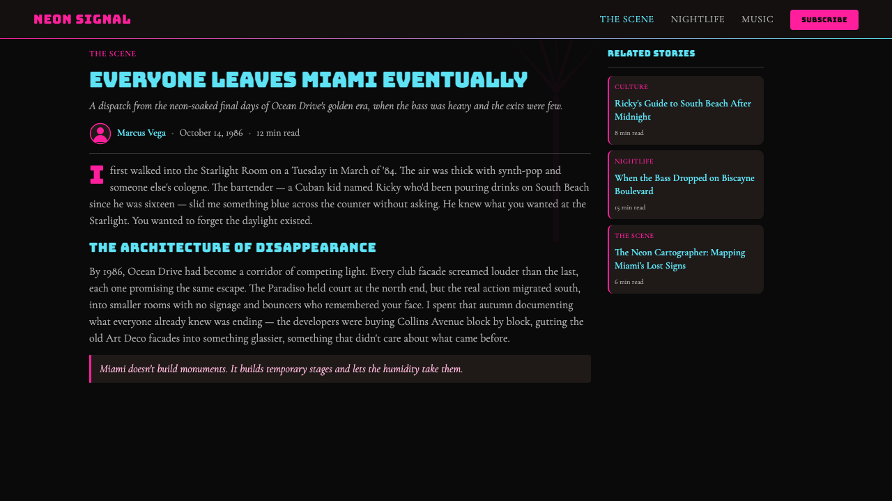
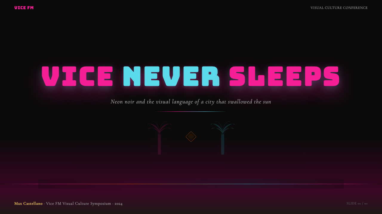
For presentation slides, the style excels on cover pages and divider slides where maximum visual impact is appropriate. A cover built in this language uses a deep near-black background with a full-width sunset gradient at the bottom third — from warm coral through magenta to violet — overlaid with a flat palm-tree silhouette in the foreground and a title set in wide, heavy display type at the top. Content slides require more discipline: keep the background dark and near-solid, use the gradient vocabulary sparingly as accent rather than as the full page treatment, and allow type hierarchy to carry information load. Data slides work well when chart elements are treated as neon-lit objects: bars or segments in magenta and cyan against a dark field, with white labels and minimal grid lines.在演示文稿中,这套风格在封面页和分隔页上表现最佳 —— 那些需要最大视觉冲击力的场景。用这套语言制作的封面,使用深色近黑背景,底部三分之一区域铺设从暖珊瑚到洋红到紫罗兰的全宽日落渐变,前景叠加平面棕榈剪影,顶部以宽阔粗重的展示字体设置标题。内容页需要更多节制:保持背景深沉而接近纯色,将渐变词汇用作强调而非整页处理,由字体层级承载信息负载。数据页在图表元素被当作霓虹发光对象处理时效果良好:深色底面上洋红与青色的柱条或扇区,搭配白色标签和极简网格线。
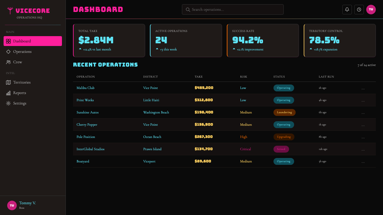
For web interfaces, the Vice City aesthetic is best suited to hero sections, landing page covers, event promotions, and entertainment-adjacent product pages — contexts where atmosphere is a feature, not a distraction. Dashboards and dense information interfaces are poor fits; the style's visual intensity undermines scannability in data-heavy environments. When applied to a web hero section, the approach is: full-width dark background, a gradient band establishing the horizon, large typographic headline in a display weight, and one or two iconic silhouette elements. Interactive states can use neon-colored outline treatments — borders and underlines in electric pink or cyan — rather than conventional fill-based hover states.对于网页界面,罪恶都市美学最适合英雄区块、落地页封面、活动推广,以及娱乐相关产品页面 —— 氛围本身就是特性而非干扰的场景。仪表板和信息密集型界面是糟糕的匹配;这套风格的视觉强度在数据密集环境中破坏可扫描性。应用于网页英雄区块时,方法是:全宽深色背景,建立地平线的渐变色带,展示字重的大号字体标题,以及一两个标志性剪影元素。交互状态可以使用霓虹色轮廓处理 —— 电粉或青色的边框与下划线 —— 而非常规的填充式悬停状态。
For editorial and marketing work, the style carries the declarative confidence of a film poster. Magazine covers, music release graphics, event posters, and brand campaign hero images are natural applications. The aesthetic also transfers well to physical print, where the contrast between deep near-black backgrounds and saturated neon colors benefits from the richness of CMYK or spot-color printing. Marketing pages that need to communicate exclusivity or cultural cachet — a festival lineup, a gaming product launch, a nightlife brand — can use this language to establish an atmosphere that pure typography and corporate color systems cannot.对于编辑和营销内容,这套风格携带着电影海报的宣告式自信。杂志封面、音乐发行图形、活动海报和品牌推广英雄图,都是自然的应用场景。这套美学也很好地转移到实体印刷品上,深色近黑背景与高饱和霓虹色之间的对比,在 CMYK 或专色印刷的丰富度下受益匪浅。需要传递独家感或文化格调的营销页面 —— 音乐节阵容、游戏产品发布、夜生活品牌 —— 可以使用这套语言建立纯字体排印和企业色彩系统无法达到的氛围。
A common mistake when applying this style is treating the neon palette as permission to use every vivid color simultaneously at maximum saturation. Authentic Vice City-derived work typically leads with one or two dominant hues — magenta and deep black, or cyan and near-black — and introduces the complementary accent color sparingly. Overloading the palette produces confusion rather than energy. A second common error is using soft, feathered gradients where the style calls for gradient bands with legible direction and movement: the sky in this aesthetic has a clear horizon and a clear zenith, not an undifferentiated glow. Finally, applying this style to products that depend on clarity, trust, or professional sobriety — legal services, healthcare, financial tools — will undermine those values; the aesthetic communicates excess and pleasure, not reliability.应用这套风格时最常见的错误,是将霓虹色板理解为同时以最大饱和度使用所有鲜艳色彩的许可。真实的罪恶都市衍生作品通常以一两种主导色为核心 —— 洋红与深黑,或青色与近黑 —— 并节制地引入互补强调色。色板过载产生混乱而非能量。第二个常见错误是在风格要求渐变色带具有清晰方向与运动感的地方使用柔和羽化渐变:这套美学中的天空有明确的地平线和明确的天顶,而不是无差别的光晕。最后,将这套风格应用于依赖清晰度、信任感或专业稳重感的产品 —— 法律服务、医疗、金融工具 —— 将破坏这些价值;这套美学传递的是过度与愉悦,而非可靠性。
See the GTA Vice City (2002) design system查看 GTA Vice City (2002) 完整设计系统
GTA Vice City (2002) — FAQGTA Vice City (2002) · 常见问题
Is Vice City aesthetic the same as synthwave or retrowave?罪恶都市美学与 Synthwave 或 Retrowave 是同一回事吗?
They are deeply related but not identical. Vice City (2002) is a specific, highly polished instantiation of a broader 1980s-Miami-neon-noir visual culture that predates the game — and the game's cultural impact is partly responsible for how synthwave and retrowave visually developed in the late 2000s and 2010s. Synthwave as a music genre has its own adjacent visual culture, but that culture draws from a wider set of 1980s references including science fiction, Japanese city pop, and European new wave. Vice City's aesthetic is specifically Miami-coded: palm trees and sports cars rather than neon-lit cityscapes or digital grids. The Vice City style also absorbed the specific technical constraints of early-2000s game rendering — silhouettes, limited polygon counts, specific texture qualities — that became part of its authentic signature.两者深度相关但并不相同。罪恶都市(2002 年)是一套更广泛的 1980 年代迈阿密霓虹黑色视觉文化的特定、高度精制的实例化 —— 这套文化早于游戏存在。游戏的文化影响,在一定程度上塑造了 Synthwave 和 Retrowave 在 2000 年代末和 2010 年代的视觉发展方向。Synthwave 作为音乐流派有其自己的邻近视觉文化,但那套文化从更广泛的八十年代参照中汲取,包括科幻小说、日本城市流行乐和欧洲新浪潮。罪恶都市的美学是特别以迈阿密为代码的:棕榈树和跑车,而非霓虹城市景观或数字网格。罪恶都市风格也吸收了 2000 年代初游戏渲染的特定技术限制 —— 剪影、有限的多边形数量、特定的贴图质量 —— 这些成为其真实签名的一部分。
Can this aesthetic work in a professional or corporate context?这套美学能在专业或企业语境中使用吗?
In specific niches, yes — but it requires careful calibration. The Vice City aesthetic communicates confidence, cultural awareness, and a willingness to embrace pleasure and excess; these values align well with entertainment brands, gaming companies, nightlife and events, music and creative agencies, and consumer products targeting audiences who identify with the aesthetic's cultural references. It works poorly for industries where the primary communication goal is trust, stability, or professional sobriety: finance, healthcare, legal services, and B2B enterprise software. A middle ground exists for technology products that want to signal cultural relevance alongside capability — a well-crafted Vice City-inflected brand identity can do this if the product genuinely serves the audience the aesthetic addresses.在特定细分领域,可以 —— 但需要仔细校准。罪恶都市美学传递自信、文化意识,以及拥抱愉悦与过度的意愿;这些价值观与娱乐品牌、游戏公司、夜生活与活动、音乐和创意机构,以及面向认同这套美学文化参照的受众的消费品,很好地对齐。它在主要传播目标是信任、稳定或专业稳重感的行业中表现糟糕:金融、医疗、法律服务和 B2B 企业软件。对于既想传递文化相关性又想展示能力的科技产品,存在一个中间地带 —— 如果产品真正服务于这套美学所面向的受众,精心制作的罪恶都市风格品牌识别可以实现这一目标。
How do you prevent this style from looking like a costume rather than a design system?如何防止这套风格看起来像戏服而非设计系统?
The distinction between a well-applied Vice City aesthetic and a pastiche lies in whether the style's elements are doing structural work or simply providing surface decoration. When a sunset gradient establishes the mood of an entire composition and every other decision flows from that atmospheric anchor, the style is working. When the gradient is applied as a background behind otherwise conventional corporate layout, it is a costume. The same test applies to typography: display type that carries the primary communication load and earns its visual weight is part of the system; heavy display type used as decoration around small, functional body text is not. Committing fully — building the entire design around the visual logic of the style rather than adding Vice City elements to a generic layout — is the only reliable path to an outcome that feels designed rather than dressed.罪恶都市美学被良好应用与被拙劣仿制之间的区别,在于这套风格的元素是否在做结构性工作,还是单纯提供表面装饰。当日落渐变建立整个构图的情绪,且其他所有决策都从那个大气锚点流出时,风格在发挥作用。当渐变被应用为否则依然常规企业版面的背景时,它就是戏服。同样的测试适用于字体排印:承载主要传播负载并赢得其视觉重量的展示字体是系统的一部分;作为装饰围绕小号功能性正文的粗重展示字体则不是。全力投入 —— 围绕这套风格的视觉逻辑构建整个设计,而非在通用版面上添加罪恶都市元素 —— 是获得感觉被设计而非被装扮的结果的唯一可靠路径。
Does the Vice City aesthetic work in light-background contexts?罪恶都市美学能在浅色背景语境中使用吗?
The style is fundamentally dark-ground — near-black backgrounds are not a stylistic choice but a structural requirement, because the neon color palette depends on darkness the way neon tube lighting depends on night. Neon pink on a white or cream background is just vivid pink; neon pink against a near-black background is luminous. A light-background variant is technically possible, but it requires substituting the luminous quality with a different mechanism — usually shifting to saturated pastels and leaning more heavily on the flat silhouette and bold typography components of the style, while accepting that the atmospheric glow effect cannot be replicated. The result is recognizably Vice City-adjacent but is better understood as a day-mode or editorial variant than as the authentic expression of the style.这套风格从根本上是深色底面的 —— 近黑背景不是风格选择而是结构性要求,因为霓虹色板依赖黑暗,正如霓虹灯管依赖夜晚。洋红色在白色或奶油底面上只是鲜艳的粉色;洋红色在近黑背景下才是发光的。浅色背景变体在技术上是可能的,但需要用不同机制替代发光质量 —— 通常是转向高饱和粉彩,并更重度依赖风格的平面剪影和粗体字体排印组件,同时接受大气光晕效果无法复制的现实。结果是明显带有罪恶都市风格的,但最好将其理解为日间模式或编辑变体,而非这套风格的真实表达。
What makes Vice City aesthetics feel dated versus timeless within the retro genre?在复古流派中,是什么让罪恶都市美学感觉过时,又是什么让它感觉永恒?
The elements that date fastest are those most tied to specific production trends of the early 2000s or mid-2010s retrowave revival: particular lens-flare treatments, specific motion-graphic conventions, or typeface combinations that were novel at a particular moment and became overused. The elements that remain durable are those rooted in the actual 1980s source material: the color relationship between magenta and cyan against darkness, the palm silhouette as compositional device, and the swagger of heavy display type against a gradient sky. Work that draws from the original sources — Miami Vice, Scarface, period advertising and signage — tends to feel more durable than work that draws from the 2010s retrowave revival of those sources. Distance from the original reference produces a copy-of-a-copy quality that erodes quickly; proximity to the original produces something that can remain resonant because it is connected to a genuine cultural moment rather than a trend cycle.老化最快的元素是那些与 2000 年代初特定制作趋势或 2010 年代中期逆波浪复兴最紧密绑定的:特定的镜头光晕处理、特定的动态图形惯例,或在特定时刻新颖后被过度使用的字体组合。保持持久的元素是那些植根于真实八十年代原始材料的:洋红与青色在黑暗中的色彩关系、棕榈剪影作为构图装置,以及粗重展示字体对着渐变天空的气势。从原始来源汲取的作品 —— 《迈阿密风云》、《疤面煞星》、同期广告与标牌 —— 往往比从那些来源的 2010 年代逆波浪复兴汲取的作品更耐久。距离原始参照越远,产生复制品的复制品质量,侵蚀得越快;靠近原始参照的作品可以保持共鸣,因为它连接着一个真实的文化时刻,而非一个趋势循环。
Related design styles相关设计风格
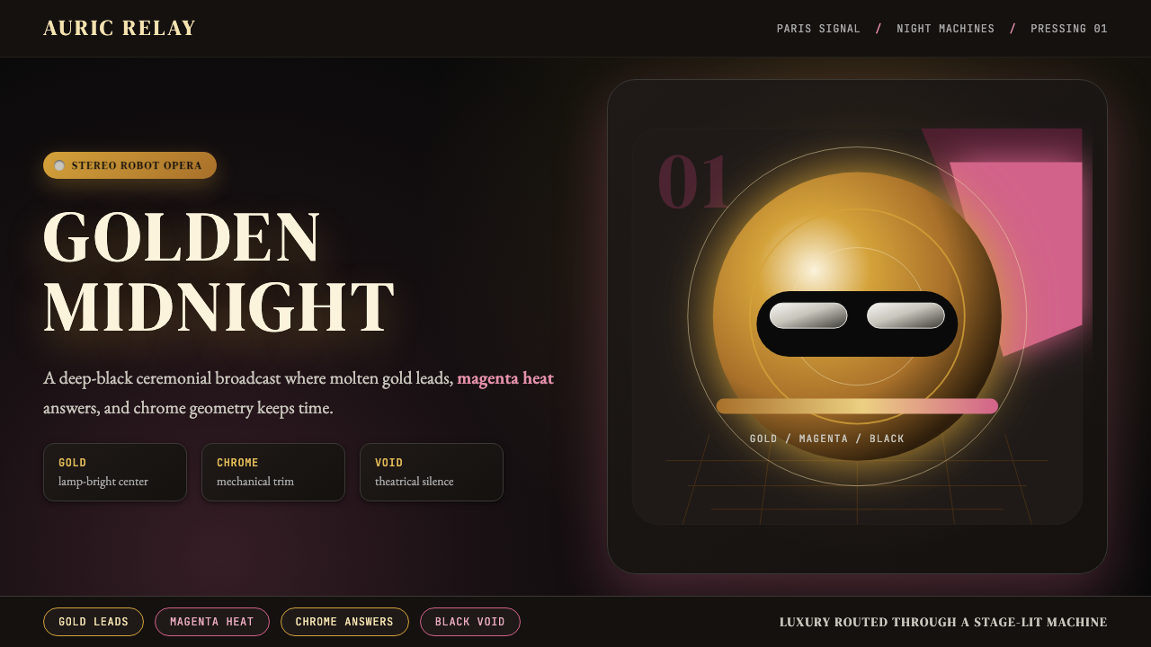 Daft Punk Discovery (Gold-Helmet)Warm sci-fi disco. Gold serif caps orbit a magenta void with chrome-disc geom…温热科幻迪斯科:金色衬线大字环绕品红虚空与铬色圆盘。
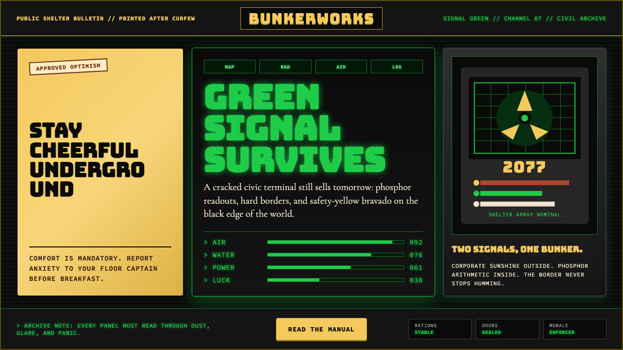 Fallout Vault-Tec Pip-BoyIrradiated optimism. Vault yellow and CRT green lock into a bordered bunker g…辐照乐观主义:避难所黄与CRT绿嵌入硬边地堡网格。
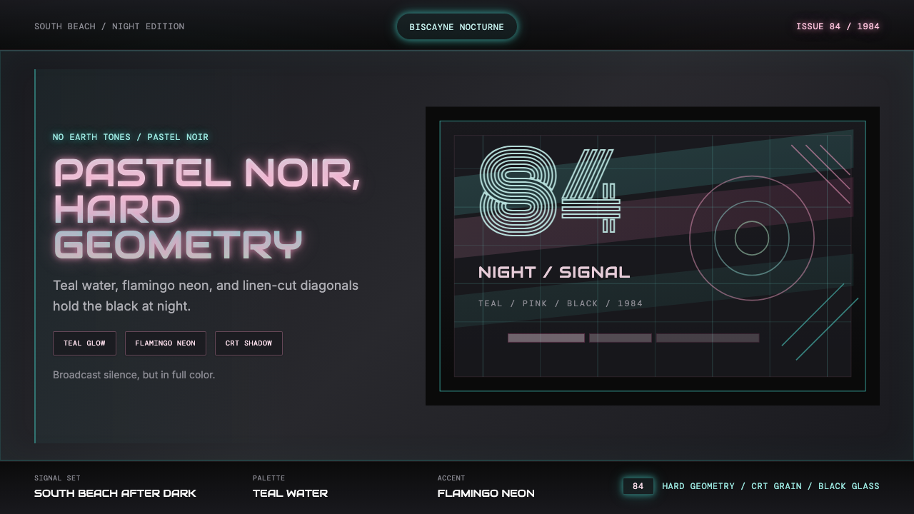 Miami Vice Pastel Teal (1984)Pastel noir, not nostalgia. Teal glow and flamingo pink slice black with geom…不是怀旧,是粉青霓虹。青光与火烈鸟粉切开黑底几何。
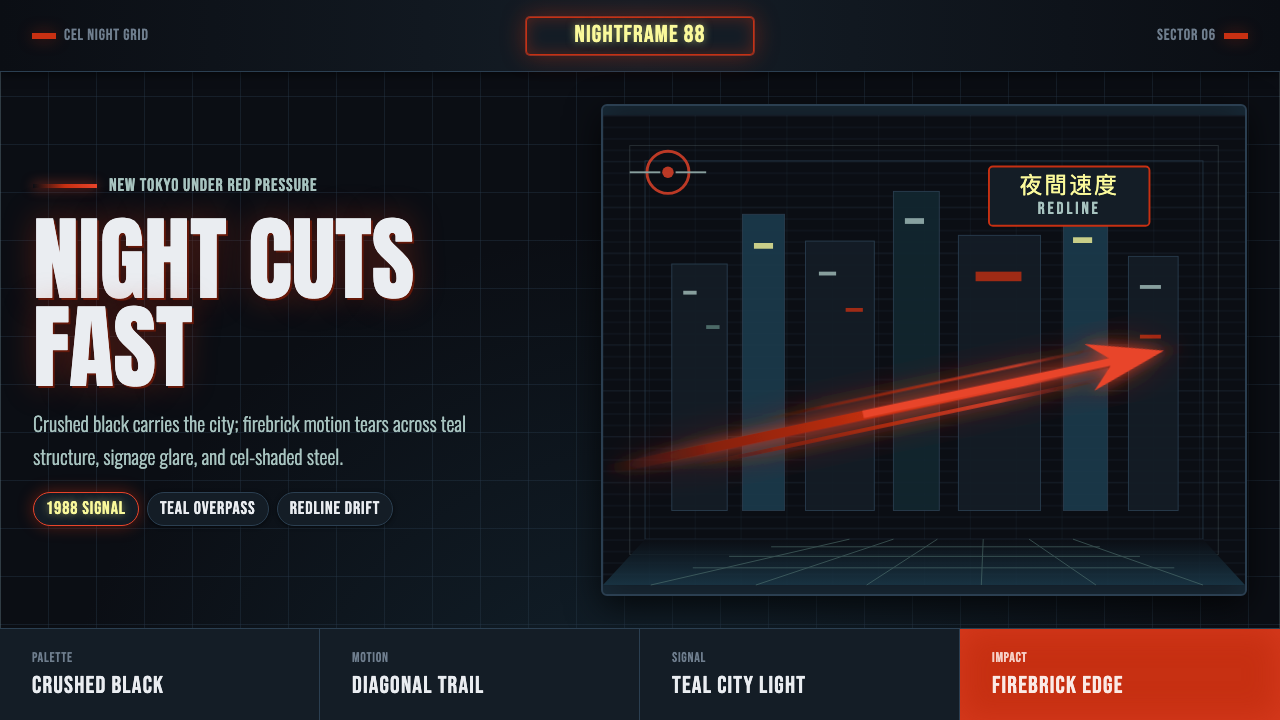 Akira Neo-TokyoNight moves fast. Firebrick trails cut crushed black, teal grids, and condens…黑夜疾驰。砖红光轨切开墨黑、青蓝网格与压缩招牌。
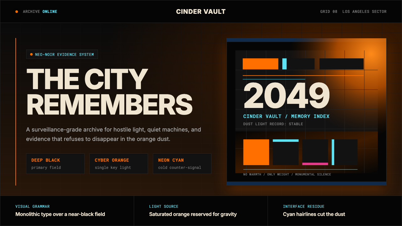 Blade Runner 2049Noir with tectonic weight. Orange dust, cyan hairlines, and monumental Inter…黑色电影有构造重量:橙色尘光、青色发丝线与黑底巨型 Inter。
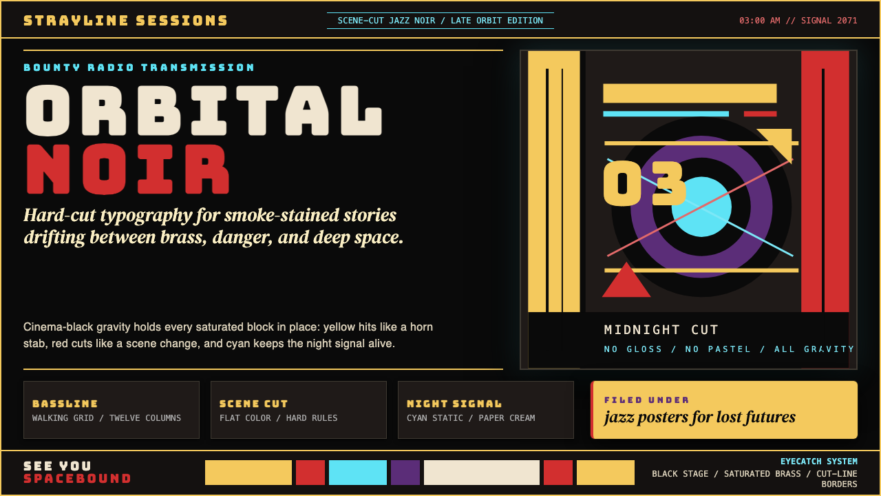 Cowboy Bebop Jazz-NoirCool at 3 AM. Bungee type, jazz yellow, red cuts, and cyan rules hit deep bla…凌晨三点的酷:黑底上 Bungee 字、爵士黄、红切线与青色规则。