What is Fallout Vault-Tec Pip-Boy?什么是 Fallout Vault-Tec Pip-Boy?
Vault-Tec's Pip-Boy aesthetic is nuclear-age optimism frozen in amber — a 1950s corporate America that never faced the bomb, rendered in phosphor green and propaganda yellow.Vault-Tec 与 Pip-Boy 的美学,是琥珀中封存的核时代乐观主义——那个从未迎来炸弹的 1950 年代企业美国,以磷光绿与宣传黄的形式被永久定格。
Fallout Vault-Tec Pip-Boy in briefFallout Vault-Tec Pip-Boy 速览
The Fallout Vault-Tec Pip-Boy aesthetic is a post-apocalyptic visual system built from two emotional registers held in deliberate tension: the bright, chirpy confidence of mid-century American corporate propaganda and the corroded, scanline-haunted residue of a civilization that did not survive. It is one of the most immediately recognizable design languages in interactive media — saturated institutional yellow paired with glowing cathode-ray terminal green, set against deep black voids and rust-streaked, parchment-toned surfaces.辐射 Vault-Tec Pip-Boy 美学是一套后末日视觉体系,由两种情绪刻意并置而成:一是上世纪中叶美国企业宣传的明快自信,二是一个未能延续的文明所留下的、被扫描线鬼魂萦绕的锈蚀余烬。它是互动媒体中最具辨识度的设计语言之一——饱和的机构黄与阴极射线终端的磷光绿并肩,铺陈于墨黑虚空与铁锈斑驳的羊皮纸色底面之上。
The system draws its vocabulary from a specific historical fantasy: the United States circa 1950, imagined as a world where atomic energy fulfilled its promise of infinite abundance, where Googie diners and chrome-finned cars proliferated indefinitely, and where corporate mascots beamed with wholesome confidence. In the Fallout universe, that world was cryogenically preserved by nuclear catastrophe — so its design language arrived two centuries later, brittle and irradiated but structurally intact. Chunky slab-serif and condensed display typefaces recall mid-century advertising; the Vault-Boy cartoon mascot channels the upbeat instructional illustration of workplace safety manuals; and the bordered, grid-locked interface of the Pip-Boy 3000 wearable computer mirrors the physical weight of 1950s consumer electronics.这套体系的词汇来自一段特定的历史幻想:约 1950 年代的美国,一个核能兑现了无限丰裕承诺、Googie 风格餐馆与镀铬鱼尾汽车无限蔓延、企业吉祥物以纯真自信向人们微笑的世界。在辐射宇宙中,那个世界被核灾难低温封存——于是它的设计语言在两个世纪后完整抵达,脆而辐射,但骨架犹在。粗壮的平板衬线与压缩展示字体唤起中世纪广告的记忆;Vault Boy 卡通吉祥物延续了职场安全手册的向上插图传统;Pip-Boy 3000 可穿戴电脑那带边框的网格化界面,映照着 1950 年代消费电子产品的物理分量感。
What makes the aesthetic distinctive as a design system is that both layers — the optimistic surface and the post-collapse patina — are treated as equally real and equally load-bearing. The yellow is not ironic quotation; the rust and the scanlines are not applied distress. Both are part of the same world, and applying the style correctly means holding both registers simultaneously rather than choosing between retro pastiche and gritty post-apocalyptic grunge.这套美学作为设计体系之所以独特,在于它的两个层次——乐观的表层与末日后的包浆——都被视为同等真实、同等承重。那抹黄色并非反讽引用;那些锈迹与扫描线也不是后期施加的人为做旧。两者同属一个世界。正确运用这种风格,意味着同时把握两种情调,而非在复古仿制与废土朋克之间二选一。
See the Fallout Vault-Tec Pip-Boy design system查看 Fallout Vault-Tec Pip-Boy 完整设计系统
Where does Fallout Vault-Tec Pip-Boy come from?Fallout Vault-Tec Pip-Boy 从何而来?
The Fallout visual identity was born in 1997 at Interplay Productions in Irvine, California, under the creative direction of Tim Cain, Leonard Boyarsky, and Jason Anderson. The team set out to build a post-apocalyptic role-playing game with a specific tonal argument: the apocalypse had not happened in the present or the near future, but in a divergent 1950s timeline where the transistor was never miniaturized and the Cold War escalated to actual nuclear exchange in 2077. This foundational conceit locked the game's design language into a double exposure — the aesthetic of a specific historical moment (postwar American triumphalism) as experienced from two centuries of wreckage.辐射的视觉身份诞生于 1997 年,诞生地是加利福尼亚州尔湾的 Interplay Productions,创作核心为 Tim Cain、Leonard Boyarsky 与 Jason Anderson。这支团队的目标是构建一款后末日角色扮演游戏,并为之确立一个明确的情调论点:末日不发生在现在或近未来,而发生在一条岔出的 1950 年代时间线上——在那个世界里,晶体管从未实现微型化,冷战于 2077 年升级为真实的核交换。这个基本设定将游戏的设计语言锁定为一次双重曝光:某一特定历史时刻(战后美国胜利主义)的美学,经由两个世纪的废墟滤镜后呈现。
Interplay's artists drew heavily on two streams of American visual culture. The first was the graphic design of the 1940s through 1960s: government civil defense pamphlets, World's Fair promotional materials, industrial company annual reports, and the bright instructional diagrams of Popular Mechanics and Popular Science. The second was early computing — the amber and green phosphor glow of cathode-ray terminal displays from the late 1970s and early 1980s, which carried connotations of both technological authority and fragile obsolescence. The Pip-Boy 3000, designed as a wrist-mounted personal information device, synthesized these two references into a single object: it looked like something a civil defense warden might have worn in 1957, but its screen displayed the kind of interface a programmer might have encountered on a DEC PDP terminal in 1978.Interplay 的美术师大量汲取了美国视觉文化的两条脉络。其一是 1940 至 1960 年代的平面设计:政府民防手册、世博会宣传材料、工业企业年报,以及《大众机械》与《大众科学》杂志中明快的图解插图。其二是早期计算机——1970 年代末至 1980 年代初阴极射线终端显示器发出的琥珀色与磷光绿光晕,同时携带着技术权威与脆弱过时感的双重意涵。Pip-Boy 3000 被设计为一款腕戴式个人信息设备,将这两个参照综合进一个单一对象:它的外形像是 1957 年一位民防指挥官可能配戴的装备,而屏幕上显示的界面却像一位程序员 1978 年在 DEC PDP 终端机上所见的那种。
Bethesda Game Studios acquired the Fallout intellectual property in 2007 and released Fallout 3 in 2008 — a pivotal moment for the visual system. Under art director Istvan Pely and game director Todd Howard, the aesthetic was extended from a 2D isometric context into a fully three-dimensional environment and a detailed first-person Pip-Boy interface. Bethesda codified the palette, refined the Vault-Boy illustration style, and established the scanline-overlaid, amber-tinted screen as the canonical Pip-Boy HUD. Fallout: New Vegas (2010, developed by Obsidian Entertainment), Fallout 4 (2015), and Fallout 76 (2018) each extended the system while preserving its core tension between corporate optimism and post-nuclear decay.Bethesda Game Studios 于 2007 年收购辐射知识产权,并于 2008 年发行《辐射 3》——这是视觉体系发展的关键节点。在美术总监 Istvan Pely 与游戏总监 Todd Howard 的主导下,这套美学从二维等距视角语境延伸至全三维环境,以及详尽的第一人称 Pip-Boy 界面。Bethesda 系统性地整理了色板,精炼了 Vault Boy 插图风格,并将叠加扫描线的琥珀色调屏幕确立为标准 Pip-Boy 平视显示器。《辐射:新维加斯》(2010,Obsidian Entertainment 开发)、《辐射 4》(2015)与《辐射 76》(2018)各自扩展了这套体系,同时保留了企业乐观主义与核后衰败之间的核心张力。
The 2024 Amazon Prime Video television adaptation, produced by Geneva Robertson-Dworet and Graham Wagner, introduced the aesthetic to an audience far larger than the game series had ever reached. Production designer Howard Cummings and his team built physical environments — Vault interiors, surface wastelands, corporate lobbies — that treated the visual system as a practical construction problem rather than a purely digital one. The result confirmed the aesthetic's robustness: the Vault-Tec yellow, the Pip-Boy terminal green, the Vault-Boy mascot, and the grid-bordered institutional signage all translated directly from pixel art and rendered game worlds into physical sets, costumes, and props without losing their structural identity.2024 年亚马逊 Prime Video 推出的电视改编剧集,由 Geneva Robertson-Dworet 与 Graham Wagner 主持制作,将这套美学带给了远超游戏系列受众规模的观众群体。制作设计师 Howard Cummings 带领团队将物理环境——避难所内部、地面废土、企业大堂——当作一个实际建造问题而非纯数字问题来处理。结果证明了这套美学的坚韧:Vault-Tec 黄、Pip-Boy 终端绿、Vault Boy 吉祥物与带网格边框的机构标识,在从像素艺术与游戏渲染世界转译为实体布景、服装与道具时,均未失去其结构身份。
What defines the Fallout Vault-Tec Pip-Boy look?Fallout Vault-Tec Pip-Boy 的视觉特征是什么?
Dual-Palette Structure双色调结构
The system operates on two foundational color poles that never merge into ambiguity. The first is Vault-Tec institutional yellow — a warm, saturated, high-visibility tone drawn from mid-century safety signage and corporate identity systems. The second is Pip-Boy phosphor green — a cool, slightly ethereal glow associated with cathode-ray terminals and early digital displays. Both colors function at high saturation against the third foundation: a near-total black that suggests both the void of space and the inside of a sealed bunker. Supporting tones — oxidized amber, cream parchment, and iron-rust brown — serve as mid-register surfaces, evoking aged paper and corroded metal without softening the core contrast.这套体系运行在两个基础色极之间,且两者从不融合为模糊地带。其一是 Vault-Tec 机构黄——一种温暖、饱和、高能见度的色调,汲取自中世纪安全标识与企业视觉识别系统。其二是 Pip-Boy 磷光绿——一种清冷、略带超现实感的光晕,与阴极射线终端机和早期数字显示屏相关联。两种颜色均以高饱和度呈现于第三个基础之上:一片接近全黑的虚空,同时令人联想到太空的空旷与密封地堡的内壁。辅助色调——氧化琥珀、奶油羊皮纸、铁锈棕——作为中间层表面,唤起老化纸张与腐蚀金属的质感,而不软化核心对比。
Chunky Display Typography粗壮展示字体
Headlines and display text in this aesthetic are deliberately heavy and condensed — slab serifs or thick gothic letterforms with strong vertical stress and minimal optical refinement. They evoke the commercial printing of the mid-twentieth century: newspaper wood type, dime-novel covers, and the bold lettering of wartime rationing posters. The weight signals authority, permanence, and institutional confidence rather than elegance or refinement. Body text shifts register completely, delivered in monospaced typefaces that reference the teletype machine and the command-line terminal — functional, unemotional, precise.这套美学中的标题与展示文字刻意厚重而紧缩——平板衬线或粗哥特字形,竖向应力强劲,光学精修极少。它们唤起二十世纪中叶商业印刷的记忆:报纸木活字、廉价小说封面、战时配给海报的粗粝字体。这份重量传递的是权威、永久性与机构自信,而非优雅或精致。正文则彻底换换挡,以等宽字体呈现,指涉电传打字机与命令行终端——功能性的、无情绪的、精确的。
CRT Scanline TextureCRT 扫描线纹理
The scanline — a horizontal banding pattern produced by the electron-gun sweep of a cathode-ray tube monitor — is one of the system's most immediately recognizable surface treatments. Applied as a semi-transparent overlay across screen-displayed content, it simultaneously communicates technological context (this is a display device, not a printed page), temporal aging (this technology predates the current era), and a particular quality of luminosity: the way CRT phosphors glow slightly between pixels rather than simply illuminating a flat plane. Scanlines are never applied to physical environments or printed surfaces within the system — they belong to screen-mediated content only, which makes them a consistent signal of the Pip-Boy interface specifically.扫描线——阴极射线管显示器电子枪扫描所产生的水平条纹——是这套体系最具辨识度的表面处理之一。将其作为半透明叠层覆盖于屏显内容之上,同时传递三重信息:技术语境(这是一块显示设备,不是一张印刷页面)、时间老化(这项技术早于当前时代)、以及一种特定的发光质地——CRT 磷光体在像素之间微微散射的方式,而非单纯照亮一个平面。扫描线从不施加于物理环境或印刷表面——它们只属于屏幕中介的内容,这使其成为 Pip-Boy 界面的专属信号。
Grid-Bordered Interface Architecture网格边框界面结构
Every panel, readout, and data field in the Pip-Boy interface is explicitly bordered — enclosed in hard rectangular frames with visible corner joints that recall the physical construction of analog instrumentation. This approach treats information not as floating text but as contained, categorized, and physically housed data. The grid is not merely an organizational device; it is a material metaphor. Information is boxed because it has weight and location, like a physical card in a file cabinet. Layered borders, nested frames, and redundant enclosures are additive rather than subtractive — each additional border reinforces institutional thoroughness rather than visual noise.Pip-Boy 界面中的每一个面板、读数与数据字段都有明确的边框——封闭在硬边矩形框架中,可见的角接构造令人联想到模拟仪器仪表的实体建构方式。这种方式将信息视为有容器、有分类、有物理安置的数据,而非漂浮的文字。网格不仅仅是组织工具,更是一个材料隐喻:信息被装入方框,因为它有重量与位置,就像档案柜里的一张实体卡片。层叠的边框、嵌套的外框与冗余的围合是累加性的而非减法性的——每一条额外的边框强化的是机构的严谨,而非视觉噪声。
Mascot and Propaganda Illustration吉祥物与宣传插图
The Vault Boy — a round-faced cartoon figure with an oversized thumb raised in cheerful approval — is the affective center of the Vault-Tec visual system. His illustration style derives directly from mid-century American corporate mascots and government safety characters: simplified anatomy, exaggerated facial expression, unambiguous gesture, and a color treatment that prioritizes readability over realism. He appears across the system as a behavioral guide, a certification mark, and a tonal anchor — signaling that even the most grim game-mechanical information (radiation poisoning, limb amputation, starvation) can be delivered with institutional cheer. Supporting propaganda poster formats — bold horizontal rules, large-print statistics, starburst accents, and slogans in condensed capitals — complete the persuasion-design vocabulary.Vault Boy——一个圆脸卡通形象,竖起一根大拇指以欢快的姿态表示赞同——是 Vault-Tec 视觉体系的情感核心。他的插图风格直接源自中世纪美国企业吉祥物与政府安全角色:简化的解剖结构、夸张的面部表情、明确无误的手势,以及优先考虑可读性而非写实性的色彩处理。他以行为引导者、认证标记与情调锚点的身份贯穿整套体系——即使是最严酷的游戏机制信息(辐射中毒、肢体截断、饥饿),也能以机构式的愉快语气传递。配套的宣传海报格式——粗水平线、大字统计数据、星爆强调图形,以及压缩大写字母的标语——共同完成了这套说服设计的词汇体系。
Patina and Controlled Decay包浆与受控腐蚀
Unlike purely retro-futurist aesthetics that present mid-century design as pristine and idealized, the Vault-Tec system applies a systematic layer of material aging. Surfaces are scratched, stained, and streaked. Metal shows rust bleed at seams. Paper and parchment tones appear yellowed and brittle. Screen elements flicker and ghost. This decay is not randomized distress texture applied cosmetically — it is structured to reinforce plausibility. The objects and environments look as though they have been in continuous use for two centuries under difficult conditions, which is precisely the narrative premise. The patina is part of the worldbuilding, not a stylistic garnish.与那些将中世纪设计呈现为崭新完好状态的纯复古未来主义美学不同,Vault-Tec 体系系统性地叠加了一层材料老化。表面有划痕、污迹与条纹;金属的接缝处渗出铁锈;纸张与羊皮纸色调显得泛黄而脆裂;屏幕元素有闪烁与余影。这种腐蚀不是随机施加的装饰性做旧纹理——它经过结构性处理以强化可信度。物体与环境看起来像是在严苛条件下连续使用了两个世纪,这恰恰是其叙事前提。包浆是世界构建的组成部分,而非风格点缀。
Institutional Tone and Bureaucratic Voice机构腔调与官僚文体
The Vault-Tec Pip-Boy system has a distinct textual register that is as important as its visual palette. Copy — in signage, on interface labels, in promotional materials — adopts the voice of a mid-century corporate communications department: confident to the point of condescension, optimistic about circumstances that do not warrant optimism, and bureaucratically thorough in ways that reveal absurdist gaps between official language and actual reality. This voice is rendered in all-capitals label text, numbered procedural instructions, corporate slogan formats, and cheerful advisory disclaimers. Matching the visual system without matching this tone produces work that looks right but feels hollow.Vault-Tec Pip-Boy 体系有其独特的文字语调,其重要性不亚于视觉色板。标识上的文案、界面标签、宣传材料——均采用中世纪企业传播部门的腔调:自信到近乎居高临下,对不值得乐观的处境保持乐观,并以官僚式的详尽暴露出官方语言与现实之间的荒诞裂隙。这种语调体现在全大写标签文字、编号程序性指示、企业口号格式与欢快的告知免责声明中。仅仅在视觉上匹配这套体系而不匹配其语调,会产生看起来对却感觉空洞的作品。
See the Fallout Vault-Tec Pip-Boy design system查看 Fallout Vault-Tec Pip-Boy 完整设计系统
Who shaped Fallout Vault-Tec Pip-Boy?谁塑造了 Fallout Vault-Tec Pip-Boy?
Cain served as lead programmer and producer on the original 1997 Fallout, and is widely credited as the primary architect of the game's world and systems. Working alongside Boyarsky and Anderson, he established the alternate-history 1950s timeline that locked the aesthetic into its mid-century American register. His insistence on tonal consistency — treating the humor and the horror with equal seriousness — established the emotional logic that the visual system had to serve. After leaving Interplay, Cain co-founded Troika Games and later worked at Obsidian Entertainment, where he contributed to Fallout: New Vegas as a designer.Cain 担任 1997 年初代《辐射》的主程序员与制作人,被广泛认为是游戏世界与系统的主要设计者。他与 Boyarsky 和 Anderson 共同确立了架空历史的 1950 年代时间线,将美学锁定在中世纪美国的语调中。他对情调一致性的坚持——以同等认真的态度对待幽默与恐怖——确立了视觉体系必须服务的情感逻辑。离开 Interplay 后,Cain 联合创立了 Troika Games,后加入 Obsidian Entertainment,以设计师身份参与了《辐射:新维加斯》的开发。
Boyarsky was the art director and co-designer of the original Fallout, responsible for establishing the visual language of the game's world: the Vault-Tec yellow, the Pip-Boy character design, the Vault Boy mascot illustration style, and the specific mixture of 1950s retrofuturism with post-nuclear decay. His training as a fine artist informed the painterly quality of the original game's environment art and character portraits. He later co-created Arcanum: Of Steamworks and Magick Obscura at Troika, then joined Blizzard Entertainment to work on Diablo III, before returning to the Fallout universe at Obsidian for Fallout: New Vegas.Boyarsky 是初代《辐射》的美术总监与联合设计师,负责确立游戏世界的视觉语言:Vault-Tec 黄、Pip-Boy 角色设计、Vault Boy 吉祥物插图风格,以及 1950 年代复古未来主义与核后衰败的特定融合方式。他作为纯艺术家的训练背景赋予了初代游戏环境艺术与角色肖像以绘画般的质感。他后来在 Troika 联合创作了《奥秘:蒸汽与魔法》,随后加入暴雪娱乐参与《暗黑破坏神 III》开发,之后又回到辐射宇宙,在 Obsidian 参与了《辐射:新维加斯》的创作。
Howard has served as game director at Bethesda Game Studios since Fallout 3 (2008) and is responsible for the three-dimensional translation of the Fallout visual system. Under his direction, Bethesda codified the aesthetic into a fully realized open-world environment: the ruined Washington D.C. of Fallout 3, the Commonwealth wasteland of Fallout 4, and the Appalachian setting of Fallout 76 each extended and stress-tested the system across different geographical and narrative contexts. Howard's production decisions — including the detailed first-person Pip-Boy interface and the extensive use of in-world holotapes and terminal readouts — anchored the CRT-terminal visual register as a core gameplay element rather than mere decoration.Howard 自《辐射 3》(2008 年)起担任 Bethesda Game Studios 游戏总监,负责辐射视觉体系的三维转译。在他的主导下,Bethesda 将这套美学系统化为完全实现的开放世界环境:《辐射 3》中废墟华盛顿特区、《辐射 4》中的英联邦废土、《辐射 76》中的阿巴拉契亚场景,各自在不同地理与叙事语境中延伸并压力测试了这套体系。Howard 的制作决策——包括详尽的第一人称 Pip-Boy 界面,以及大量使用游戏世界内部的全息磁带与终端机读数——将 CRT 终端视觉语调锚定为核心游戏元素,而非纯粹的装饰。
Anderson was the third pillar of the original Fallout creative triad — co-designer and co-writer alongside Cain and Boyarsky. His contributions focused primarily on the game's narrative systems, faction design, and the specific moral ambiguity that distinguished Fallout's post-apocalyptic vision from the morally simpler action games of its era. The institutional cynicism embedded in the Vault-Tec corporate voice — the cheerful promises that mask systemic cruelty — owes much to Anderson's writing sensibility. He left Interplay before Fallout 2 shipped and later worked on various projects including early development on Fallout: New Vegas.Anderson 是初代《辐射》创作三人组的第三支柱——与 Cain 和 Boyarsky 共同担任设计师与编剧。他的贡献主要集中在游戏的叙事系统、派系设计,以及将辐射的后末日愿景与同时代道德更简单的动作游戏区分开来的特定道德模糊性。Vault-Tec 企业腔调中内嵌的机构性犬儒主义——掩盖系统性残酷的欢快承诺——很大程度上源自 Anderson 的写作感性。他在《辐射 2》上市前离开了 Interplay,之后参与了多个项目,包括《辐射:新维加斯》的早期开发。
Pely served as lead artist and art director at Bethesda during the development of Fallout 3, making him the primary visual translator of the Fallout aesthetic into three dimensions. His team's work established the specific rendering approach — the desaturated, dust-filtered world surfaces contrasting against the vivid glow of Vault interiors and Pip-Boy screens — that became the visual signature of the Bethesda-era games. Pely's background in illustration and concept art informed the careful balance between environmental decay and legible design: the ruins had to read as ruins while still communicating the optimistic pre-war aesthetic that had decayed into them.Pely 在《辐射 3》开发期间担任 Bethesda 首席美术师与美术总监,是辐射美学向三维空间转译的主要视觉翻译者。他的团队确立了特定的渲染方式——去饱和、蒙尘滤镜的世界表面与避难所内部及 Pip-Boy 屏幕的鲜活光晕形成对比——这成为 Bethesda 时代游戏的视觉签名。Pely 在插图与概念艺术方面的背景,为环境腐败与可读设计之间的精微平衡提供了支撑:废墟必须看起来是废墟,同时仍能传递出那套已衰败其中的战前乐观主义美学。
How do you use Fallout Vault-Tec Pip-Boy today?今天怎么用 Fallout Vault-Tec Pip-Boy?
The Vault-Tec Pip-Boy aesthetic is highly transferable to contemporary design work because its emotional logic — institutional authority meeting visible entropy — is not genre-specific. The system works whenever the desired effect is a sense of something authentic, durable, and slightly worn: a brand that has been around long enough to show marks of use, an interface that prioritizes information density over decorative smoothness, or a communication that deliberately invokes mid-century authority while winking at its own absurdity.Vault-Tec Pip-Boy 美学具有很强的当代设计可移植性,因为其情感逻辑——机构权威与可见熵值相遇——并不局限于特定类型。这套体系在任何需要传递某种真实感、耐久感与轻微磨损感的场合都能奏效:一个经营时间足够长、已留有使用痕迹的品牌,一个优先考虑信息密度而非装饰流畅性的界面,或一种刻意援引中世纪权威同时向自身荒诞性眨眼的传播物。
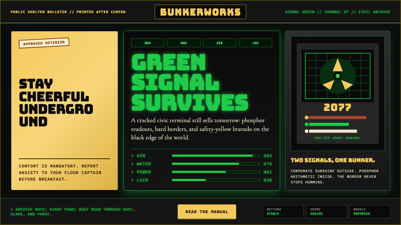
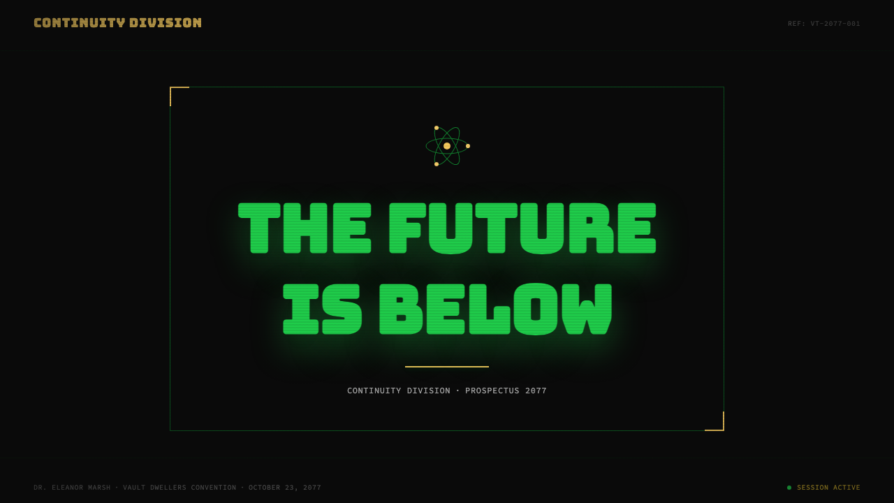
For presentation slides, the aesthetic is particularly effective as a cover treatment and for data-heavy content sections. A cover slide built in this system should feel like a classified briefing document: a heavy condensed headline at high contrast, a bordered frame around the key information block, and a Vault-Tec yellow accent used sparingly for a single focal element. Content slides should lean into the terminal-readout quality: a monospaced or near-monospaced typeface for data labels, explicit borders around data regions, and a phosphor-green or amber accent for values that need emphasis. Charts and graphs take on an almost instrumental quality — bar graphs become analog meter displays, progress indicators become countdown readouts. Avoid smooth gradients in data visualization; flat fills with hard edges maintain the aesthetic logic.在演示文稿中,这套美学在封面处理与数据密集型内容章节上尤为有效。以这套体系构建的封面幻灯片应有密级简报文件的质感:高对比度的粗重压缩标题、围绕关键信息块的边框、以 Vault-Tec 黄作为单一焦点元素的克制强调。内容幻灯片应靠近终端读数的质地:等宽或近等宽字体用于数据标签,数据区域有明确边框,磷光绿或琥珀色强调需要突出的数值。图表呈现出近乎仪器化的品质——柱状图成为模拟仪表显示,进度指示器成为倒计时读数。在数据可视化中避免平滑渐变;硬边平面填充维持了美学逻辑。
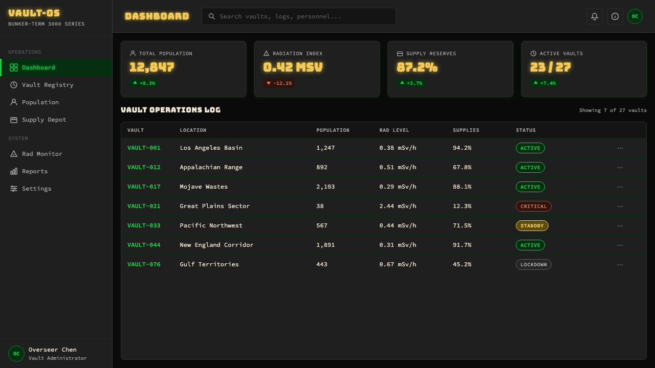
For web interfaces, the system is especially well-suited to dashboards, status monitors, and any interface where the user is expected to read and assess rather than browse and discover. The design approach: a near-black background surface, phosphor-green or amber for active data values, yellow for primary interactive elements, and a strict grid of bordered panels for information architecture. Typography should shift registers deliberately — a heavier slab or gothic display face for section headers, a monospaced face for data readouts, and a clean sans-serif for instructional or navigational text. Scanline texture can be applied as a subtle overlay to interactive panels to reinforce the terminal quality without making the interface illegible. Pricing pages benefit from the institutional-poster framing: bordered tiers, condensed headline treatment for plan names, and stark typographic hierarchy that makes comparison immediate.对于网页界面,这套体系尤其适合仪表板、状态监控器,以及任何用户预期是阅读与评估而非浏览与发现的界面。设计方法如下:近黑背景表面、磷光绿或琥珀色用于活跃数据值、黄色用于主要交互元素、边框面板的严格网格用于信息架构。字体应刻意切换语域——较重的平板或哥特展示字体用于章节标题,等宽字体用于数据读数,干净的无衬线字体用于指导性或导航性文字。扫描线纹理可作为细微叠层施加于交互面板,以强化终端质地同时不使界面难以阅读。定价页面受益于机构海报式的框架处理:带边框的等级区隔、计划名称的压缩标题处理,以及使比较一目了然的严峻字体层级。
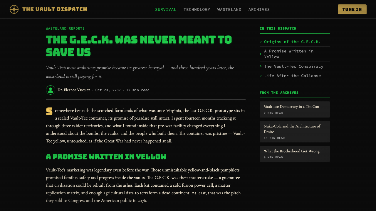
For editorial layouts, marketing materials, and social media formats, the propaganda-poster vocabulary provides a strong compositional framework. Full-bleed black or deep-charcoal backgrounds anchor the boldest applications; alternating between deep-black and Vault-Tec yellow grounds across a multi-page document or campaign creates rhythm without requiring complex compositional variation. The Vault Boy illustration style — when appropriately licensed or recreated in the same spirit — can function as a behavioral mascot in instructional or onboarding content: a figure demonstrating the correct action, rendered in the simplified, exaggeratedly cheerful style of mid-century instructional art. Starburst shapes, bold horizontal rules, numbered lists in condensed typefaces, and slogans in all-capitals lock-up formats complete the promotional vocabulary.对于编辑版面、营销材料与社交媒体格式,宣传海报的词汇提供了强劲的构图框架。全出血黑色或深炭灰背景锚定最大胆的应用;在多页文件或系列活动中交替使用深黑底与 Vault-Tec 黄底,无需复杂的构图变化即可创造节奏。Vault Boy 插图风格——在适当授权或以同等精神重新创作的情况下——可在指导性或新用户引导内容中充当行为吉祥物:一个展示正确动作的形象,以中世纪教学插图的简化、夸张愉快风格呈现。星爆形状、粗水平线、压缩字体的编号列表,以及全大写锁定格式的标语,共同完成了促销词汇体系。
A common mistake when applying this aesthetic is treating the decay and distress as purely cosmetic — adding scanlines and rust textures to content that is otherwise clean and corporate, hoping the surface treatment will carry the tonal work. This produces work that looks like a Halloween costume version of the style: the symbols are present but the underlying logic is absent. Authentic application requires that the decay be structural rather than applied: information hierarchies should feel like they were designed for legibility under difficult conditions, not for elegance under ideal ones; the borders and grids should feel like physical enclosures, not decorative dividers; and the tonal register — the institutional cheer that does not quite mask the underlying grimness — must be present in the copy and messaging, not only in the visual treatment.应用这套美学时最常见的错误,是将腐蚀与做旧视为纯粹的装饰——在其他方面干净而企业化的内容上叠加扫描线与铁锈纹理,期望表面处理能承载全部情调工作。这会产生风格万圣节服装版的作品:符号在场,但底层逻辑缺席。真正的应用要求腐蚀是结构性的而非叠加性的:信息层级应感觉像是为在艰难条件下保持可读性而设计的,而非为在理想条件下追求优雅;边框与网格应感觉像是物理围合,而非装饰性分割线;而情调语域——那种并未完全掩盖底层严酷的机构式愉快——必须存在于文案与信息中,而不仅存在于视觉处理层面。
See the Fallout Vault-Tec Pip-Boy design system查看 Fallout Vault-Tec Pip-Boy 完整设计系统
Fallout Vault-Tec Pip-Boy — FAQFallout Vault-Tec Pip-Boy · 常见问题
How is this aesthetic different from general post-apocalyptic or cyberpunk design?这套美学与一般的后末日或赛博朋克设计有何不同?
Post-apocalyptic design in general tends toward desaturation, organic decay, and improvised construction — the visual language of things falling apart without a plan. Cyberpunk tends toward neon-on-black high-tech squalor, implying a world of technological abundance maldistributed. The Vault-Tec Pip-Boy system is distinct from both because its central tension is specifically institutional: the decay is happening to a planned, corporate, optimistic system, not to nature or to an anarchic street culture. The yellow and the Vault Boy remain legible as corporate design even as the world crumbles around them. That specificity — corporate optimism outlasting the world it was meant to serve — is what distinguishes the aesthetic and makes it uniquely resonant for commentary on institutional failure.后末日设计通常倾向于去饱和、有机腐败与即兴建构——事物在没有计划的情况下崩塌的视觉语言。赛博朋克则倾向于霓虹配黑色的高科技窘境,暗示一个技术丰裕但分配失当的世界。Vault-Tec Pip-Boy 体系与两者都截然不同,因为它的核心张力是特定意义上的机构性的:腐败发生于一个有计划、有企业背书、满怀乐观的系统之上,而非发生于自然或无政府街头文化之上。即使世界在周遭崩塌,那抹黄色与 Vault Boy 仍作为企业设计保持可读。这种特殊性——企业乐观主义比它所服务的世界活得更久——正是这套美学独一无二之处,也是它对机构失败的评注产生独特共鸣的原因。
Can the Pip-Boy phosphor-green screen register be used independently of the Vault-Tec yellow?Pip-Boy 磷光绿屏幕语调能否独立于 Vault-Tec 黄使用?
Yes, and it is often a more disciplined choice. The phosphor-green terminal register — monospaced type, scanline texture, bordered readout panels on a near-black ground — is fully legible as a standalone system and carries its own specific connotations: early computing, command-line authority, and the slightly uncanny glow of a machine that has been running for a very long time. Used alone, it reads more as retro-computing than as Fallout specifically. Introducing Vault-Tec yellow as an accent tips the system toward the full Fallout association. Designers working on contexts where the Fallout game-brand association is not desired — but the CRT-terminal atmosphere is — can lean on the green register while keeping the yellow minimal or absent.可以,而且这往往是更有节制的选择。磷光绿终端语域——等宽字体、扫描线纹理、近黑底面上的边框读数面板——作为独立体系是完全可读的,并携带其自身特定的意涵:早期计算机、命令行权威,以及一台运行了极长时间的机器所散发的略带诡异的光晕。单独使用时,它更多被解读为复古计算,而非特指辐射。引入 Vault-Tec 黄作为强调色,则将体系导向完整的辐射联想。在不希望与辐射游戏品牌产生联想但需要 CRT 终端氛围的场合,设计师可以依赖绿色语域,同时将黄色保持在最低限度或完全省略。
How do you apply the institutional voice in written copy without making it feel like a joke?如何在文案中运用机构腔调而不使其显得像个笑话?
The institutional voice works best when it is played completely straight — not winking at the audience, not breaking frame to signal awareness of its own absurdity. The humor in Vault-Tec copy emerges from the gap between what the language claims and what the audience knows or suspects, not from the writing itself being funny. Practically: write the copy as a sincere mid-century corporate communications professional would write it, then let the context (the decay, the catastrophe, the grimness of what is being described) supply the irony. If the copy itself is jokey or self-aware, the effect collapses into parody. If it is earnest, the contrast between register and reality does all the work.机构腔调在完全直白地演绎时效果最佳——不向观众眨眼,不打破框架以示对自身荒诞性的觉察。Vault-Tec 文案中的幽默感来自语言所声称的内容与观众所知或所疑之间的落差,而非文案本身的滑稽。在实操层面:以一位真诚的中世纪企业传播专业人士的方式撰写文案,然后让语境(腐败、灾难、被描述之事的严酷)提供反讽。如果文案本身是玩笑性或自我意识的,效果就会坍缩为戏仿。如果它是认真的,语调与现实之间的对比将完成所有工作。
Is it appropriate for consumer-facing brands outside of gaming?这套美学适合游戏领域以外的消费者品牌吗?
It is appropriate when the brand values align with what the aesthetic actually communicates: durability, institutional weight, a slight defiance of contemporary smoothness, and the suggestion of a worldview rather than a mere visual style. Craft beverage brands, independent hardware and tools companies, preparedness and outdoor equipment brands, and retro-enthusiast communities have all adopted elements of the system credibly. It struggles in contexts requiring approachability, warmth, or luxury signaling — the aesthetic's authority reads as cold to audiences seeking softness, and its visible aging reads as low-fi to audiences seeking premium. It also risks feeling derivative in any gaming-adjacent context, where the Fallout association will overwhelm whatever independent brand identity is intended.当品牌价值观与这套美学实际传递的内容对齐时,它是适合的:耐久性、机构分量感、对当代流畅性的轻微抵抗,以及一种世界观而非单纯视觉风格的暗示。精酿饮料品牌、独立五金工具公司、应急准备与户外装备品牌,以及复古爱好者社群,都可信地采用了这套体系的元素。在需要亲切感、温暖感或奢华感的场合,它则力不从心——这套美学的权威感在寻求柔软的受众眼中显得冷漠,其可见的老化感在追求高端的受众眼中显得低保真。在任何邻近游戏的场合,它也有感觉衍生性的风险,辐射的联想将淹没任何意图打造的独立品牌身份。
What is the biggest structural difference between this style and other retro-futurist aesthetics like Space Age or Atompunk?这种风格与太空时代或原子朋克等其他复古未来主义美学在结构上最大的区别是什么?
Space Age and Atompunk aesthetics celebrate the future-optimism of mid-century design as aspirational — they present the flying saucers, bubble helmets, and chrome curves as icons of genuine possibility. The Vault-Tec system does not. It uses the same visual source material but frames it as failed promise: the optimism is structurally intact but historically discredited by the catastrophe that followed. This retrospective irony is built into every element of the system — the cheerful yellow is the yellow of a warning sign, the Vault Boy's grin is the grin of a propaganda poster, and the CRT glow is the glow of a system that outlasted the civilization that built it. Other retro-futurist aesthetics do not carry this embedded critique; Vault-Tec does.太空时代与原子朋克美学将中世纪设计的未来乐观主义以向往性的方式颂扬——将飞碟、气泡头盔与镀铬曲线呈现为真实可能性的图腾。Vault-Tec 体系则不然。它使用相同的视觉原材料,却将其框定为失败的承诺:乐观主义在结构上完好无损,却被随后发生的灾难从历史层面宣告失效。这种回顾性的反讽内嵌于体系的每一个元素中——欢快的黄色是警告标志的黄色,Vault Boy 的微笑是宣传海报的微笑,CRT 光晕是一个比建造它的文明活得更久的系统所发出的光晕。其他复古未来主义美学不携带这种内嵌批判;Vault-Tec 携带。
Related design styles相关设计风格
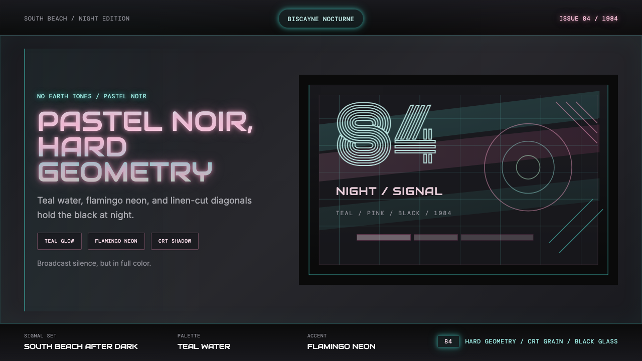 Miami Vice Pastel Teal (1984)Pastel noir, not nostalgia. Teal glow and flamingo pink slice black with geom…不是怀旧,是粉青霓虹。青光与火烈鸟粉切开黑底几何。
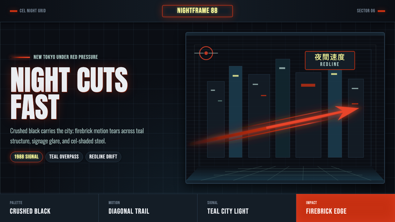 Akira Neo-TokyoNight moves fast. Firebrick trails cut crushed black, teal grids, and condens…黑夜疾驰。砖红光轨切开墨黑、青蓝网格与压缩招牌。
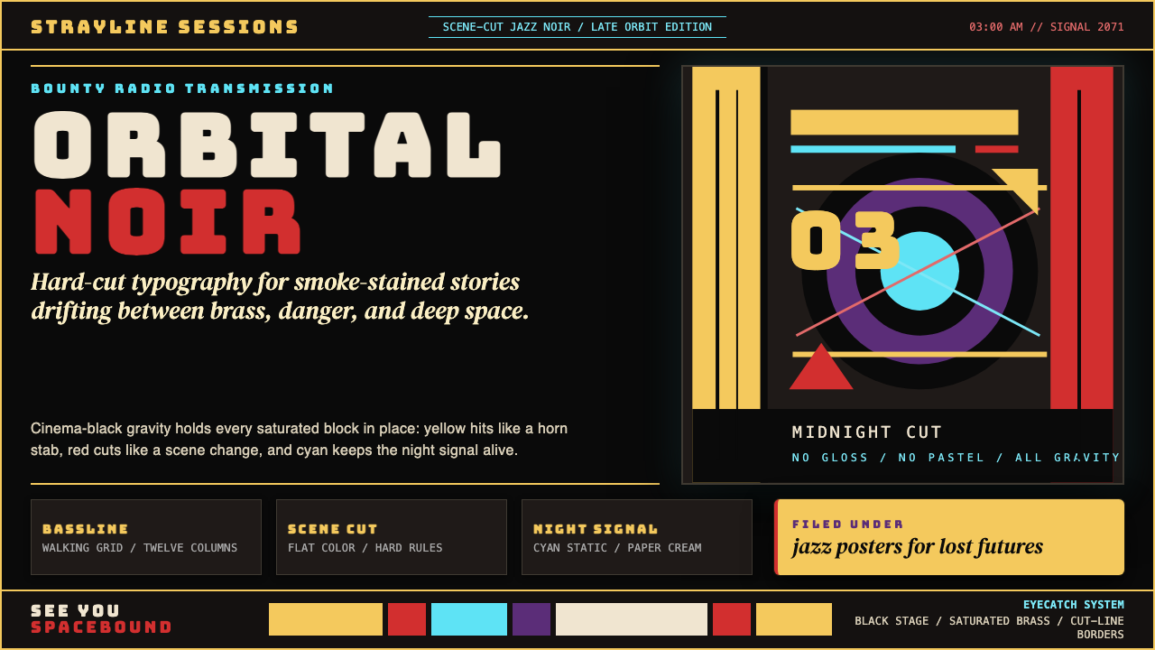 Cowboy Bebop Jazz-NoirCool at 3 AM. Bungee type, jazz yellow, red cuts, and cyan rules hit deep bla…凌晨三点的酷:黑底上 Bungee 字、爵士黄、红切线与青色规则。
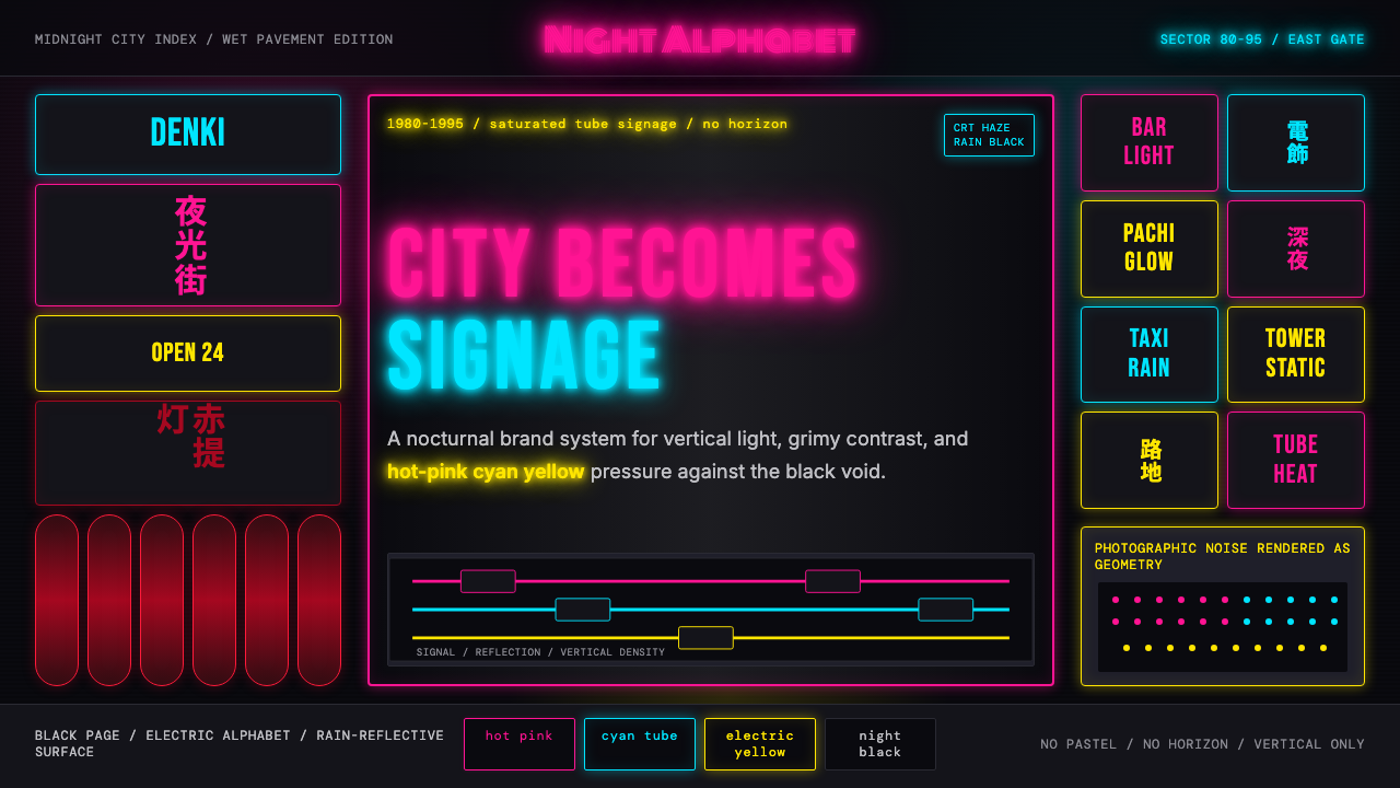 Tokyo Shinjuku Neon (1980)Night turns into alphabet. Hot pink, cyan, and yellow stack as glowing vertic…夜晚化作文字。热粉、青蓝、电黄垂直堆成霓虹峡谷。
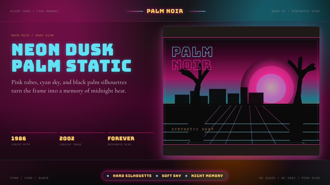 GTA Vice City (2002)Neon-noir nostalgia. Pink-cyan dusk, chunky type, and palm silhouettes.霓虹黑色怀旧。粉青黄昏、粗体字和棕榈剪影。
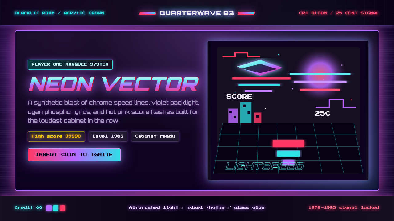 Arcade Cabinet MarqueeToo loud to ignore. Black-indigo glass, violet glow, cyan grids, hot-pink arc…刺眼才对。黑靛玻璃、霓虹紫光、电青网格与品红像素字。