What is Arcade Cabinet Marquee?
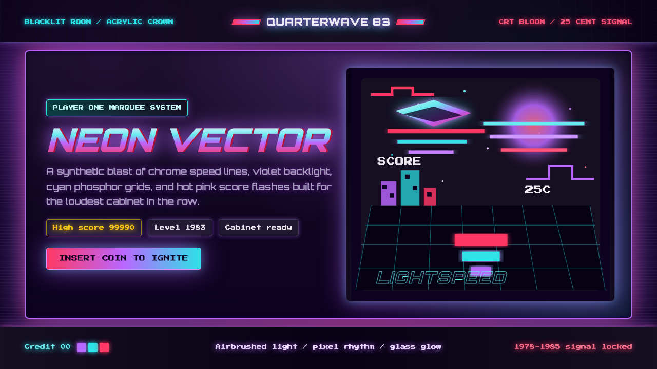
The arcade cabinet marquee is neon scripture — a backlit acrylic panel blazing with airbrush chrome, phosphor-glow type, and star-field gradients that turned the darkened game room into a cathedral of synthetic light.
Arcade Cabinet Marquee in brief
The Arcade Cabinet Marquee style is a visual language born in the North American video-game arcades of 1978–1985. Its defining qualities are a deep black-to-indigo ground, neon violet and electric cyan used as luminous light sources rather than pigments, hot magenta-pink accents, and chrome-streaked logotype lettering — all of which reproduce the sensation of a backlit acrylic panel glowing under blacklight.
Aesthetically, the style fuses three strands: commercial airbrush illustration (the craft of painting on acrylic panels for coin-operated machines), CRT phosphor bloom (the warm, slightly overexposed glow of early cathode-ray tube monitors), and the optimistic sci-fi of the early 1980s — spacecraft, chrome robots, pixel heroes. Color functions as radiated light: every hue reads as if it is illuminating the background from within rather than sitting on top of it.
The marquee style is maximal and unapologetic. Unlike minimalist traditions that equate restraint with quality, this aesthetic treats visual density as a virtue. Multiple saturated hues compete simultaneously, lettering is italicized and chrome-streaked for speed, and geometric grid overlays (often glowing cyan) reinforce a sense of engineered precision beneath the spectacle. The result is a design mode that is simultaneously nostalgic, synthetic, and visually aggressive.
Where does Arcade Cabinet Marquee come from?
The arcade cabinet marquee emerged directly from the economics and craft traditions of the coin-operated amusement industry. From the 1950s through the early 1970s, pinball and electromechanical arcade machines already used hand-painted and screen-printed backlit glass to attract players. When video games arrived in force with Pong (1972) and then Space Invaders (1978), manufacturers needed a new visual vocabulary — one that communicated the novelty, power, and excitement of electronic play to a customer standing fifteen feet away in a noisy, darkened room.
The solution was the airbrush marquee: a large acrylic panel, internally lit by fluorescent tubes, painted with commercial airbrush techniques that had been refined in hot-rod culture and aerospace illustration. Artists like Larry Day, George Opperman, and Doc Mari — working for manufacturers like Namco, Atari, Williams, and Midway — developed a house style that emphasized chromatic intensity, dramatic perspective, and the specific bloom of neon over dark grounds. The period 1978–1985 represents the golden age: Space Invaders, Galaga, Pac-Man, Donkey Kong, Centipede, and Tron all produced marquees of canonical quality during these years.
The aesthetic absorbed the visual culture of its moment. Early-1980s science fiction, defined by films like Star Wars (1977), Tron (1982), and the cover art of Heavy Metal magazine, provided the imagery — chrome spacecraft, glowing energy grids, pixel-block figures. Synthwave music culture, though it coalesced as a named genre later, was already developing the same palette in album art and concert posters. The blacklit game room itself was a designed environment, and the marquee was engineered to read within it: colors that appear flat under daylight become luminous under UV illumination, which is why the palette gravitates so heavily toward violet, cyan, and magenta — hues that phosphoresce dramatically under blacklight.
The golden age ended abruptly around 1985–1987. The home video game crash of 1983 damaged the industry financially, and as 16-bit home consoles improved through the late 1980s, foot traffic in arcades declined. When the industry partially revived in the early 1990s with fighting games (Street Fighter II, Mortal Kombat), the marquee style survived but evolved — more digital production, less hand-airbrushing. Today the aesthetic lives on primarily as a nostalgic and ironic reference, absorbed into retrowave and vaporwave visual culture, and deployed in brand design seeking to evoke the emotional register of a very specific technological and cultural moment.
What defines the Arcade Cabinet Marquee look?
Color as Emitted Light
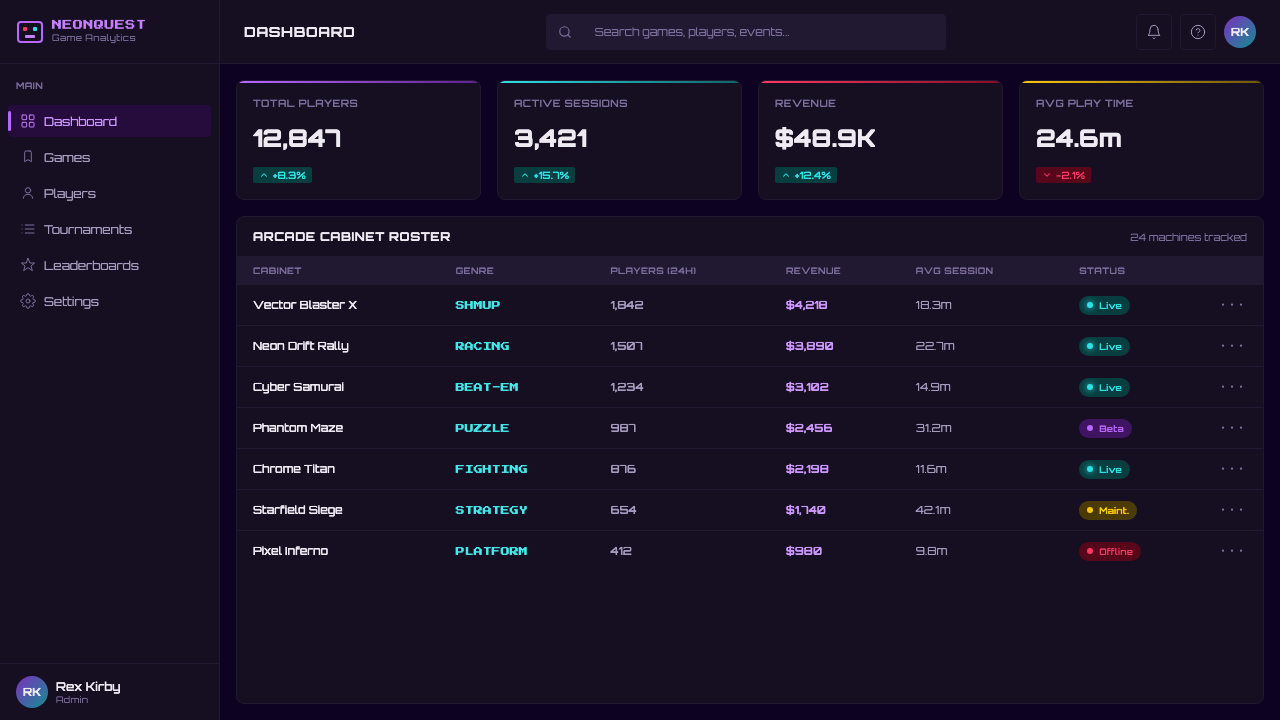
The palette is built on the premise that color should read as light emission, not pigment. The field is a deep near-black indigo — dark enough to read as void, blue enough to suggest depth. Neon violet, electric cyan, and hot magenta-pink are applied at maximum saturation, creating the impression that they are glowing outward rather than reflecting incident light. Secondary elements — grid lines, halos, lens flares — are rendered in the same high-saturation register, often at reduced opacity to simulate atmospheric bloom.
Chrome Lettering and Logotype Drama
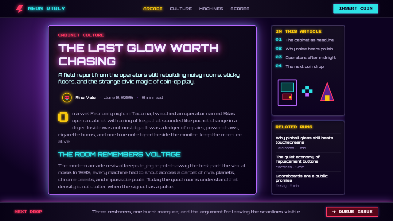
Game title lettering is the compositional centerpiece of every marquee. Letters are typically italicized at an aggressive angle to imply speed and forward momentum, then rendered with chrome gradients — light streaks running diagonally across the letterforms — that make them appear metallic and three-dimensional. Drop shadows are hard and offset rather than diffuse, and the shadow color is often the complement of the primary letter color rather than plain black. This lettering style descends from hot-rod and rock-concert poster traditions rather than from typographic convention.
Airbrush Gradients and Atmosphere
Unlike digital gradients, which transition mathematically between two endpoints, airbrush gradients have a hand-made quality — slightly uneven, with soft halos where the spray diffuses near an edge and denser saturation at the center of a glow. Star fields are spattered rather than programmatically distributed: clusters of varying size, occasional lens-flare crosses, and the suggestion of galactic depth. These imperfections are not errors — they are the signature of the medium, and reproducing them (even digitally) is essential to the style's authenticity.
Geometric Grid Overlays
A recurring motif is the perspective grid — typically rendered in electric cyan or violet — that recedes to a vanishing point in the center-bottom or center of the composition, evoking a landscape seen from above or a video-game playing field. The grid functions as both a spatial anchor and a technological symbol, suggesting computation, precision, and the ordered geometry of digital space. It often appears at reduced opacity, layered beneath the principal illustration, where it adds depth without overwhelming the primary imagery.
Pixel Typography as Ornament
Beyond the chrome logotype, many marquees incorporate pixel-block letterforms — the same low-resolution type that appeared on the CRT screen below. Used on a marquee, pixel type is enlarged and becomes almost abstract: each square cell reads as a geometric unit rather than a letterform component. This blurring of type and texture is characteristic of the style, and it reflects an early digital aesthetic in which the grid of the display and the grid of the design were the same underlying structure.
Subject Matter as Power Fantasy
The imagery is consistently heroic, technological, and kinetic: spacecraft in combat, chrome fists, determined pixel warriors, explosions rendered as starburst geometry. The scale relationships are deliberately distorted — heroes loom impossibly large against mechanical backdrops. This is power-fantasy illustration in its most unambiguous form, designed to make the player feel that inserting a quarter will briefly make them the protagonist of the depicted scene. The emotional register is excitement, aspiration, and spectacle — never irony.
Density and Competition
Unlike styles that use negative space as a primary organizing tool, the marquee aesthetic is deliberately packed. Multiple visual elements — the logotype, the illustration, the grid, the star field, the glow halos — all occupy the same composition simultaneously, fighting for the viewer's eye. Hierarchy exists, but it is established through scale, brightness, and chromaticity rather than through spatial breathing room. The intended reading environment — a loud, visually busy arcade room — demanded a level of visual intensity that would register as signal above noise.
Who shaped Arcade Cabinet Marquee?
Opperman was the primary in-house artist at Nintendo of America during the early 1980s and created the iconic marquee and cabinet art for Donkey Kong, one of the defining pieces of arcade illustration. His approach — expressive perspective, readable character silhouettes, and a tightly compressed color palette that reads clearly under blacklight — became a template for the industry. His work bridges commercial illustration and character design, giving the emerging Nintendo stable its first coherent visual identity in the North American market.
Day worked primarily for Atari and later for several coin-op manufacturers through the early-to-mid 1980s, becoming one of the most prolific contributors to the marquee aesthetic. His signature was an almost illustrative approach to type — treating letterforms as objects to be lit, chrome-streaked, and shadowed rather than as graphic symbols. His technique helped establish the chrome logotype as the standard convention for major arcade releases and influenced subsequent generations of game box art and promotional illustration.
As the game that triggered the first global arcade boom, Space Invaders established many of the foundational visual conventions of the marquee style. Its original Japanese cabinet used relatively restrained artwork, but the international licensing variants — particularly those produced for the North American market — introduced the high-contrast alien silhouettes on deep dark grounds that would become the aesthetic template for hundreds of games that followed. The game's cultural weight also established the expectation that arcade cabinet art should signal scale, threat, and spectacle.
The Tron arcade game, tied to Disney's landmark film of the same year, is the single most complete expression of the marquee style. Its cabinet art synthesized every defining element — the electric cyan grid on deep dark ground, chrome logotype, glowing energy lines, and a figure-composition that reads simultaneously as character illustration and technological diagram. The Tron aesthetic also represents the moment the style became self-aware: the game's visual language was designed to resemble what a digital world might look like, making the marquee a representation of the game world rather than merely an advertisement for it.
One of the few female artists working in the coin-op illustration industry during the early 1980s, Doc Mari contributed marquee and flyer art to several Williams and Midway releases. Her work is notable for pushing the airbrush technique toward more complex atmospheric compositions — multi-layered depth, subtle color temperature shifts within a single glow, and a greater emphasis on environmental context (the space, the landscape) rather than pure figure-versus-background. Her contribution represents a strand of the tradition that was more illustrative and atmospheric than purely typographic-commercial.
How do you use Arcade Cabinet Marquee today?
The Arcade Cabinet Marquee style is extremely effective for any context where the goal is to project energy, nostalgia, and technological spectacle simultaneously. Its emotional register is excitement and aspiration, and it works best when the product or content shares those values — gaming platforms, entertainment apps, music visualizers, retrowave-adjacent brands, event promotional materials, and any experience intended to evoke the feeling of a high-stakes, high-reward moment.
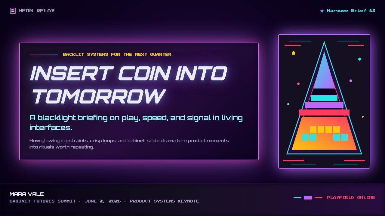
For presentation slides, the marquee style rewards a cinematic approach. Cover slides work best as full-bleed dark fields with the title as the primary chrome logotype element, supported by a radial or perspective grid in the background and a star-field spatter. Content slides should resist the urge to pack every element; instead, treat each slide as a marquee for a single idea — one dominant visual, one headline in the chrome logotype register, and body text in a clean sans-serif that holds its own against the intense background without competing in weight or drama.
For web interfaces, the style suits dark-mode experiences, game landing pages, event microsites, and portfolio work in the creative and entertainment industries. The key structural principle is to resist using all saturated hues simultaneously at full weight: designate one dominant glow color per major section and use the others as supporting halos or grid accents. Button and interactive states benefit from a glow-pulse effect — a subtle increase in the halo radius on hover — which reinforces the sense of luminous, reactive surfaces.
For editorial and marketing work, the style is most powerful as a controlled accent rather than a total environment. A single marquee-style panel — a hero image, a feature callout, a chapter divider — within an otherwise restrained layout creates high contrast without overwhelming the reading experience. Event posters and concert flyers are natural fits for the full aesthetic deployed at maximum intensity.
The most common mistake with the marquee style is confusing atmospheric richness with visual chaos. The original arcade artists worked within tight constraints — a fixed panel size, a small number of available inks, the physical limitation of the airbrush — that imposed discipline. Removing those constraints digitally often produces over-rendered, over-layered results where no single element reads clearly. The discipline to choose one dominant logotype, one dominant illustration, and two or three supporting atmospheric elements — and then to leave everything else as dark ground — is what separates coherent marquee-style work from derivative noise.
Arcade Cabinet Marquee — FAQ
Is the arcade marquee style the same as vaporwave or synthwave?
They share a common ancestor but are distinct aesthetics. The arcade marquee style is the original — a craft tradition from 1978–1985 rooted in airbrush illustration and the physics of backlit acrylic. Synthwave (mid-2000s onward) and vaporwave (early 2010s) are retrospective aesthetics that consciously reference and reinterpret the marquee era through a nostalgic or ironic lens, often mixing in elements from Japanese city-pop, Windows 95 UI, and Greek sculpture. The marquee style is earnest and functional; synthwave and vaporwave are inherently self-aware and often melancholic. Applying the marquee style correctly means recovering the excitement and optimism of the original, not the nostalgic distance of its later interpreters.
Can this style work on a light or white background?
Almost never successfully. The entire visual logic of the marquee style depends on color functioning as emitted light — hues that glow outward from a dark field. On a white or light ground, the same colors read as pigment sitting on a surface, which eliminates the luminous quality entirely. Attempting a light-background marquee typically produces results that look like oversaturated illustration without the depth or drama that makes the style work. The dark ground is not a stylistic option — it is the structural requirement that everything else depends on.
How do I stop it from looking like a generic 'retro gaming' pastiche?
The difference between an authentic marquee aesthetic and a generic retro-gaming pastiche lies almost entirely in compositional restraint and material specificity. Generic versions tend to scatter pixel art, neon grids, and chrome type across a dark background with no clear hierarchy or focal point. Authentic marquee design commits to one dominant element — usually the logotype — and builds everything else in service of it. It also uses the airbrush gradient quality rather than hard digital gradients, and it deploys glow halos as atmosphere rather than as accent decoration applied to every element. Study the original Atari, Williams, and Namco cabinet art rather than contemporary retrowave design; the originals are tighter and more disciplined than their later interpreters.
Is pixel art essential to the marquee style?
No — and this is a common misconception. The original marquee panels were handpainted with airbrush, which is the opposite of pixel art: smooth, continuous gradients and organic forms rather than discrete grid cells. Pixel typography appears on marquees as a reference to the CRT display below, but it is one motif among many rather than the defining technique. Applying pixel art across the entire composition as the primary illustration style collapses two distinct visual registers — the marquee panel (analog, luminous, airbrushed) and the game screen (digital, pixelated, grid-based) — into one, which was never the original relationship. Use pixel type as accent and contrast; use airbrush atmospherics as the dominant mode.
Does the style suit serious or professional contexts, or is it inherently playful?
The marquee style carries a strong emotional signature — excitement, spectacle, nostalgia — that limits its range of effective professional applications. It suits entertainment, gaming, creative industries, events, and any context where energy and aspiration are valued. It struggles in contexts that require trust, authority, or calm rational clarity: financial services, healthcare, legal, enterprise software, and similar fields where visual intensity may undermine credibility. There is also an age-signal problem: the style's nostalgic register is most legible to audiences who were children or young adults in the early 1980s, and its ironic reappropriation by younger generations carries a different connotation than earnest deployment. Understanding your audience's relationship to the reference is as important as understanding the style itself.
Related design styles
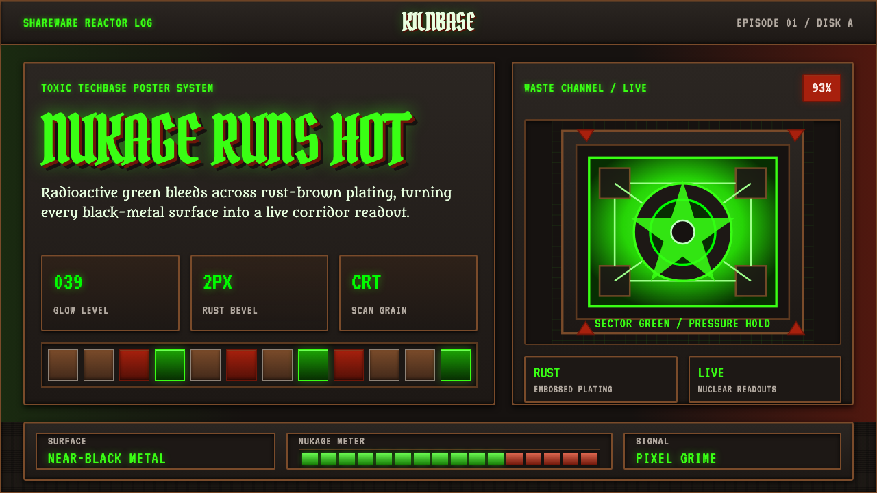 Doom 1993 Toxic GreenRadioactive metal bites. Toxic green readouts glow over rust bevels and CRT g…
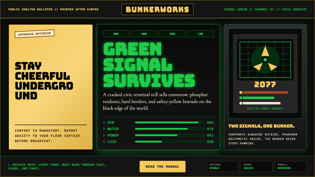 Fallout Vault-Tec Pip-BoyIrradiated optimism. Vault yellow and CRT green lock into a bordered bunker g…
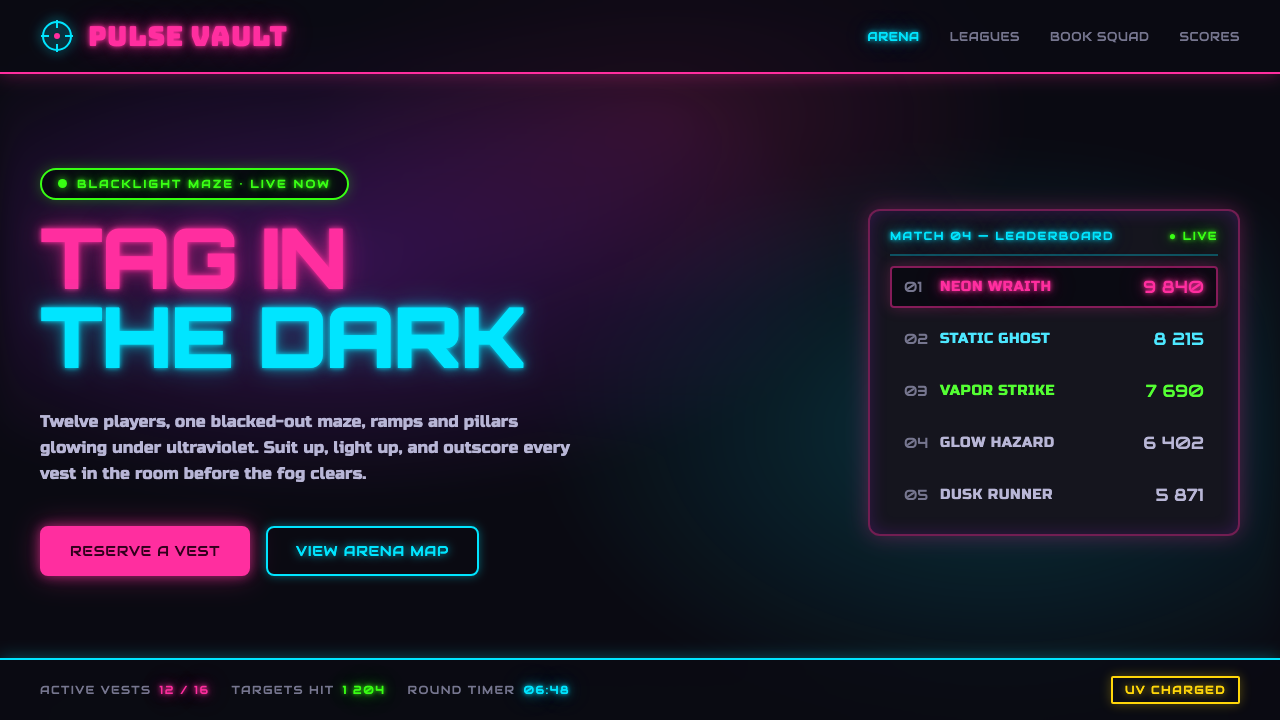 Laser Tag Arena BlacklightSuit up in the dark. UV pink, acid green and cyan glow on matte arena black,…
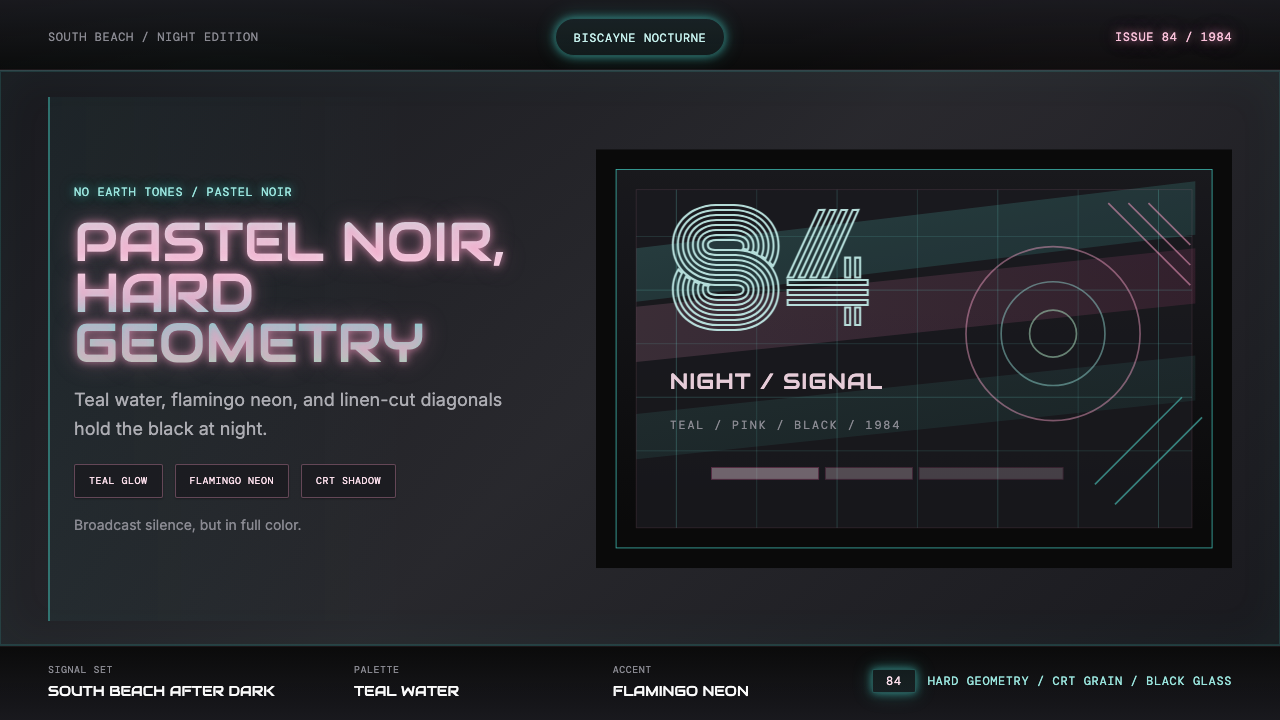 Miami Vice Pastel Teal (1984)Pastel noir, not nostalgia. Teal glow and flamingo pink slice black with geom…
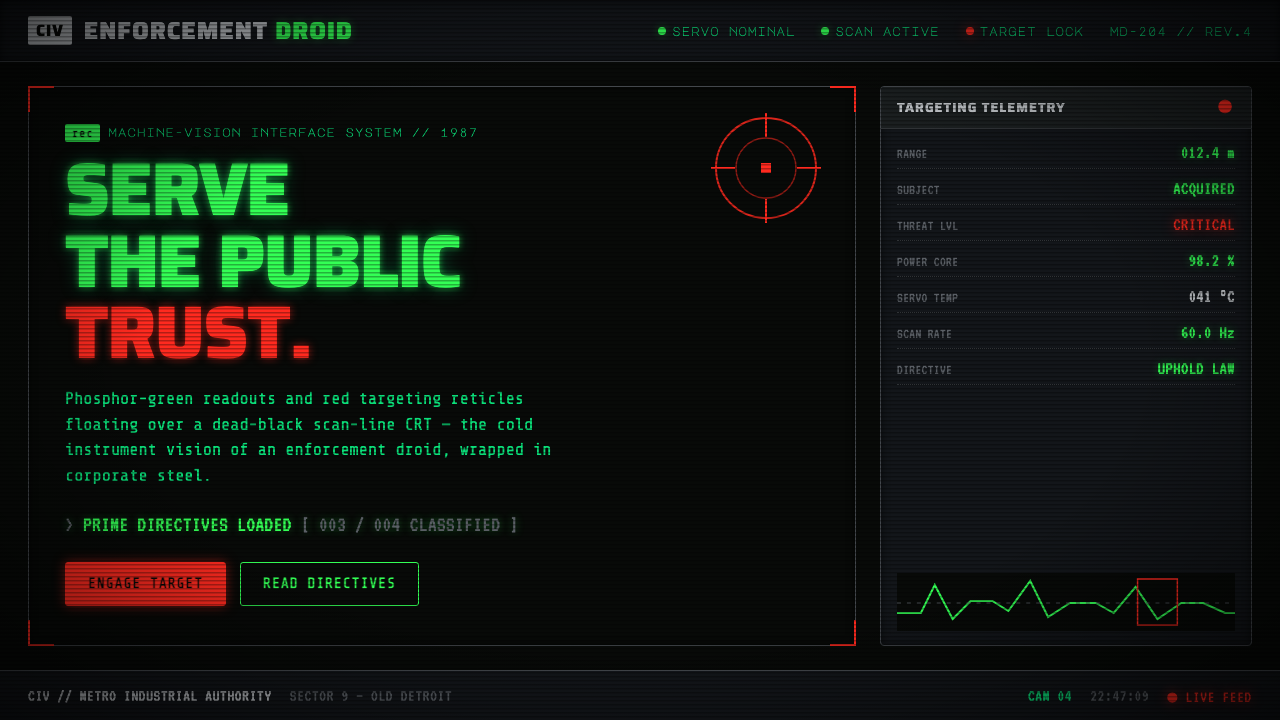 RoboCop (1987)Machine vision as interface. Phosphor-green readouts on dead-black CRT, red r…
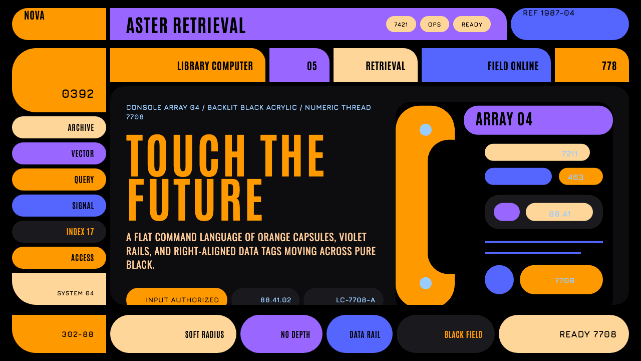 Star Trek LCARSFuture as flat command. Orange-violet elbows and Jura numbers glow on black.