What is Jungle / Drum & Bass?
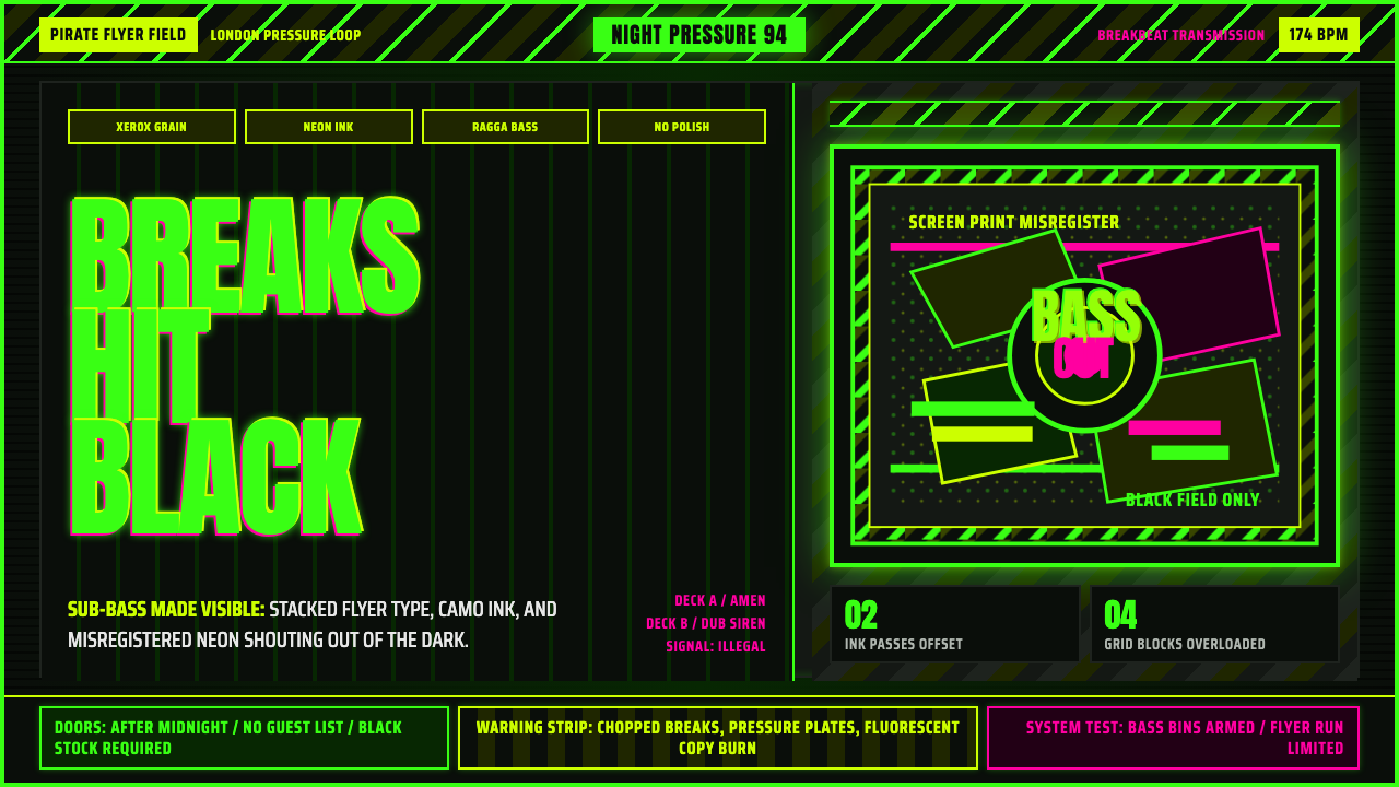
Jungle turned the rave flyer into a weapon — black ground, camouflage ink, and a neon green that only exists when it is fighting the dark.
Jungle / Drum & Bass in brief
Jungle is the graphic language of the UK rave flyer between 1992 and 1995: black-ground sheets run off a photocopier or a cheap screen-print press, handed out at record shops and passed hand to hand outside pirate-radio pirate parties. The look is aggressive by design — fluorescent green type stacked at maximum density, camouflage-pattern strips borrowed from military surplus, and the grain of a machine that has copied a copy one too many times.
The style exists to do one job: announce a night of music that itself refused to sit still. Jungle music spliced chopped, double-time breakbeats to sub-bass so heavy it register as pressure rather than sound, and the flyers had to match that intensity on paper. Nothing about the visual language is calm. Type doesn't sit quietly in a hierarchy — it shouts, overlaps, and crowds the black field the way a stack of soundsystem speakers crowds a room.
Unlike design movements that trace back to a school or a manifesto, jungle's visual identity was assembled by anonymous flyer artists working fast and cheap for a scene that needed a new flyer every week. It borrowed its ingredients rather than inventing them from scratch — graffiti lettering, hazard signage, army-surplus camo, xerox artifacts — and fused them into something that reads instantly as underground, nocturnal, and dangerous.
Where does Jungle / Drum & Bass come from?
Jungle emerged in London between 1992 and 1994 out of a specific collision: Jamaican sound-system culture, ragga and dancehall's bass-heavy tradition, and the accelerating breakbeat science of UK rave. Pirate radio stations broadcasting from tower-block rooftops were the music's true distribution network, and the flyer was the physical object that turned a radio signal into an address, a date, and a door price. A flyer had to be produced fast, cheap, and in bulk — often photocopied at a corner shop the same week the party was booked — and that economic constraint became an aesthetic signature rather than a limitation to hide.
The visual vocabulary drew directly from what was already lying around a working-class London scene rooted in Caribbean sound-system culture: camouflage fabric and army-surplus clothing worn on dancefloors, spray-can graffiti lettering from the same urban surfaces the ravers walked past on their way to the party, hazard-stripe warning tape borrowed from construction sites and industrial signage. None of it was designed for rave flyers originally — jungle's genius was recognizing that these already-aggressive visual signals, thrown together on a black ground, read as pure adrenaline.
Neon green became the style's signature because of a practical fact about cheap reproduction: fluorescent inks are the only colors that hold their punch when photocopied or run through a low-budget screen press onto black paper. Where a subtle color would flatten into gray sludge under repeated copying, fluorescent green (and to a lesser extent, fluorescent pink and orange) stayed loud. The flyer artists were not chasing a color theory — they were chasing a color that survived the xerox machine, and that survival became the whole look's most recognizable signal.
Producers and DJs like Goldie, LTJ Bukem, and Shy FX were the scene's central figures, and the labels and nights built around them commissioned the flyers that carried this look citywide. By the mid-1990s the sound had split and matured into drum & bass, a continuum that stretched from 1995 into the 2010s, but the founding visual grammar — black ground, camo, neon, xerox grain, maximal stacked lettering — remained the reference point that the entire lineage of flyers, record sleeves, and club signage kept returning to.
What defines the Jungle / Drum & Bass look?
Ground and Contrast
Everything sits on a black field — never cream, never white, never a soft gray. Black is not a background color choice here so much as a precondition: the neons and the warning strips only register as urgent because they are fighting a totally dark ground. Anything laid on a lighter field immediately reads as a different, tamer style entirely.
Fluorescent Green
A single saturated, acid-leaning green is the style's signature accent, chosen historically because it was one of the few colors that survived photocopying and cheap screen-printing without degrading into gray. It is used sparingly against the black ground — as headline type, as an outline, as a single dominant shape — rather than as a wash across the whole composition, so that it keeps its shock value.
Camouflage and Hazard Motifs
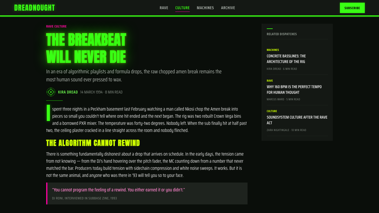
Military camo patterns and industrial hazard striping appear as strips, borders, or background textures cutting across the black field. These motifs are not softened or stylized for the flyer context — they read exactly as aggressive and utilitarian as they do on army surplus jackets and construction-site tape, and that unpolished directness is the point.
Condensed, Stacked Type
Lettering runs heavy and condensed, packed at a density that leaves almost no breathing room, often stacked line upon line to fill every available inch of the black field. Hierarchy is achieved through scale and weight jumps rather than spacing — a shouted headline crowds directly against smaller supporting text with little to no gutter between them.
Graffiti-Derived Lettering
Headline lettering frequently borrows the exaggerated, spray-can logic of street graffiti — sharp angles, exaggerated slants, letterforms that look thrown down fast rather than drafted. This gives the flyers a handmade, street-level urgency that distinguishes them from anything produced by a professional print shop or an established type foundry.
Xerox Grain and Misregistration
The texture of repeated photocopying — grain, streaking, ink dropout, and slightly misaligned print registration — is not hidden or corrected. It is embraced as evidence of the flyer's rapid, low-budget production cycle, and its rough edges are as much a signal of authenticity as the neon color itself.
Maximalist Density
There is no negative space to speak of. Every element competes for attention within the black field — type, camo strips, hazard stripes, and graphic marks are layered and overlapped rather than arranged with generous margins. This maximalism is the direct visual equivalent of the chopped, layered breakbeat production the flyers were advertising.
Who shaped Jungle / Drum & Bass?
Goldie was one of jungle and drum & bass's most visible producers and a central figure of the London scene the flyers advertised. His releases and club nights were among the events that gave flyer artists a citywide audience, and the visual intensity associated with his name — dense, neon-on-black, maximal — became a reference point other flyer designers measured themselves against.
LTJ Bukem represented the more atmospheric, jazz-inflected wing of the jungle continuum, and the nights and labels built around him show how the same black-ground, neon-accented flyer language could flex to advertise a smoother, more musically expansive strand of the scene without abandoning its core visual grammar.
Shy FX helped carry ragga and dancehall's bass-heavy sensibility directly into jungle production, reinforcing the sound-system lineage that the visual style also draws from. The flyers tied to his releases and appearances reflect that same Caribbean sound-system inheritance translated into camouflage, hazard stripes, and neon-on-black graphics.
How do you use Jungle / Drum & Bass today?
Jungle is a high-voltage, maximal style, and applying it well means resisting the urge to soften it into something calmer. It works best when a project genuinely wants to feel loud, underground, and slightly dangerous — not when it wants a generic 'urban' or 'edgy' accent applied to an otherwise conventional layout.
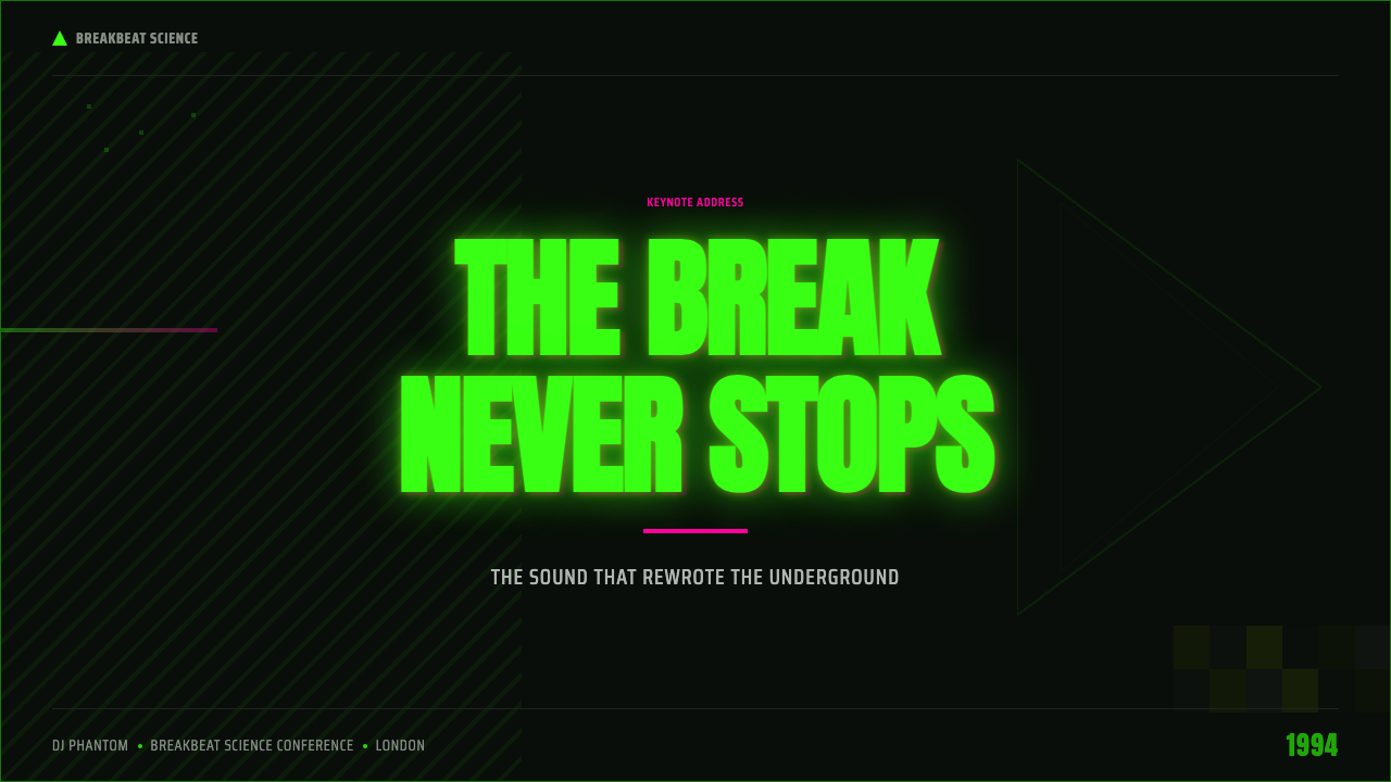
For presentation slides, a jungle-derived cover slide should commit fully to the black ground with a single dominant neon-green mark or headline, and can layer a camo strip or hazard stripe as a graphic accent rather than a subtle texture. Content and data slides should keep the black ground and use the neon sparingly — one accent color reserved for the number or label that matters most on the slide — because if every chart element goes fluorescent, nothing reads as urgent anymore. Density is welcome here in a way most presentation styles avoid: tightly stacked labels and condensed headlines are in keeping with the source material, not a mistake to fix.
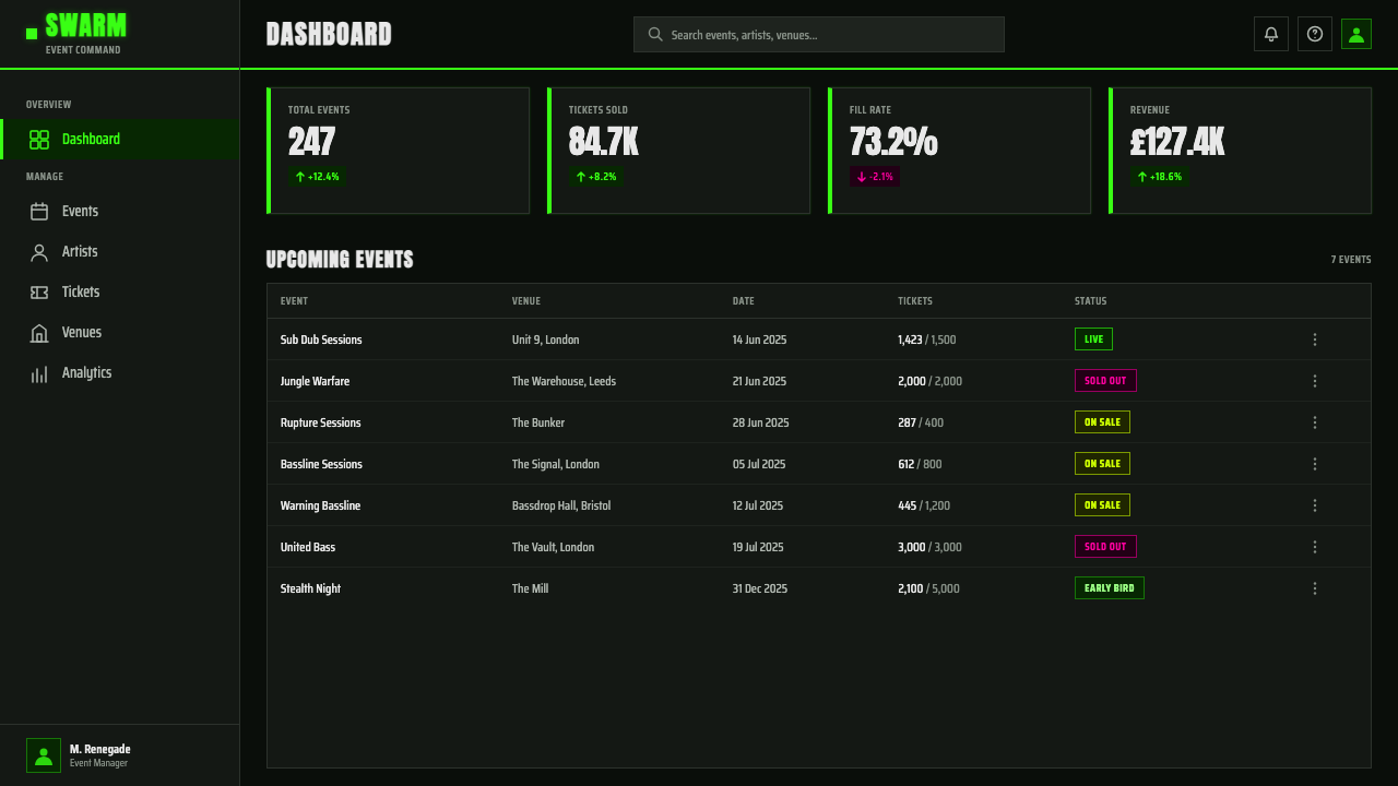
For web UI, dashboards and pricing pages can borrow the style's high-contrast urgency for moments that deserve it — a countdown, a live status indicator, a limited-availability flag — where the black ground and a flash of neon green genuinely earn their intensity. Overusing the treatment across an entire dashboard, however, quickly becomes fatiguing to read for long working sessions; the style is much better suited to a marketing or landing context than to a tool someone stares at for hours.
For editorial and marketing work, jungle suits gig posters, music-adjacent brand campaigns, streetwear-flavored promotions, and any content that wants to evoke a specific, dated rave authenticity rather than a generic idea of nightlife. Headlines can stack aggressively with little line spacing, camo or hazard motifs can frame a block of copy, and photography (where used) should be pushed to high contrast rather than treated naturalistically, so it sits comfortably against the black ground instead of looking like a soft photo pasted onto a hard graphic.
The most common mistake is treating jungle as simply 'black background plus neon green text.' Without the camouflage or hazard-stripe motifs, the graffiti-inflected lettering, and the deliberately rough, xerox-grain texture, the result reads as a generic dark-mode interface rather than an authentic rave flyer. The second common mistake is over-cleaning the composition — smoothing out the density, adding generous margins, or replacing the condensed stacked type with a polished modern sans — which quietly erases the exact qualities that make the style recognizable in the first place.
Jungle / Drum & Bass — FAQ
What is the difference between jungle and drum & bass as visual styles?
Jungle names the specific 1992–1995 peak period and its flyer aesthetic — black ground, camouflage, neon green, xerox grain, graffiti-inflected lettering. Drum & bass describes the broader musical continuum that jungle evolved into from 1995 onward, running through the 2010s. Visually, the drum & bass era that followed sometimes cleaned the look up — sharper vector graphics, more controlled color palettes — but the founding jungle grammar of black ground and neon-on-camo remains the reference point the whole lineage keeps returning to.
Why does the style rely so heavily on black backgrounds?
Black is what makes the fluorescent inks and hazard motifs read as urgent rather than merely colorful. Against a lighter ground, the same neon green would look playful or even cheerful; against pure black, it looks like a warning. The black field also mirrors the actual conditions the flyers were promoting — a dark club or warehouse lit by strobes and lasers — so the flyer's ground color echoes the physical environment of the night it is advertising.
Is the rough, photocopied texture essential, or can a cleaner digital version still count as jungle style?
The rough texture is not decorative noise — it is the visible trace of how these flyers were actually produced, on tight budgets and tighter timelines. A version that removes all grain and misregistration in favor of a perfectly clean vector composition loses a significant part of what signals authenticity. It is possible to apply the style with a lighter hand for legibility reasons, but the grain, streaking, and slight imperfection should be present in at least some form, or the result reads as a modern pastiche rather than a real evocation of the source material.
Can jungle style work for a brand that isn't music-related?
It can, but only for brands that genuinely want to signal underground energy, rebellion, or nocturnal intensity — streetwear, extreme sports, certain gaming or nightlife-adjacent products. It is a poor fit for anything that needs to read as calm, trustworthy, or premium in a soft-luxury sense; the style's entire visual logic is built around urgency and confrontation, and softening it to fit a gentler brand voice usually just produces a diluted, unconvincing result rather than a successful adaptation.
What role does typography play beyond just being condensed and stacked?
Typography in jungle flyers functions as a shout, not a caption — it is the loudest single element on the page, competing directly with the graphic motifs rather than sitting quietly beneath them. The graffiti-derived angles and exaggerated slants give the lettering a sense of motion and urgency that a straight, upright typeface cannot replicate. Because there is so little negative space elsewhere in the composition, type also has to do double duty as texture: a dense stack of headline words reads, from a distance, almost like a graphic pattern in its own right, not just as information to be read line by line.
Related design styles
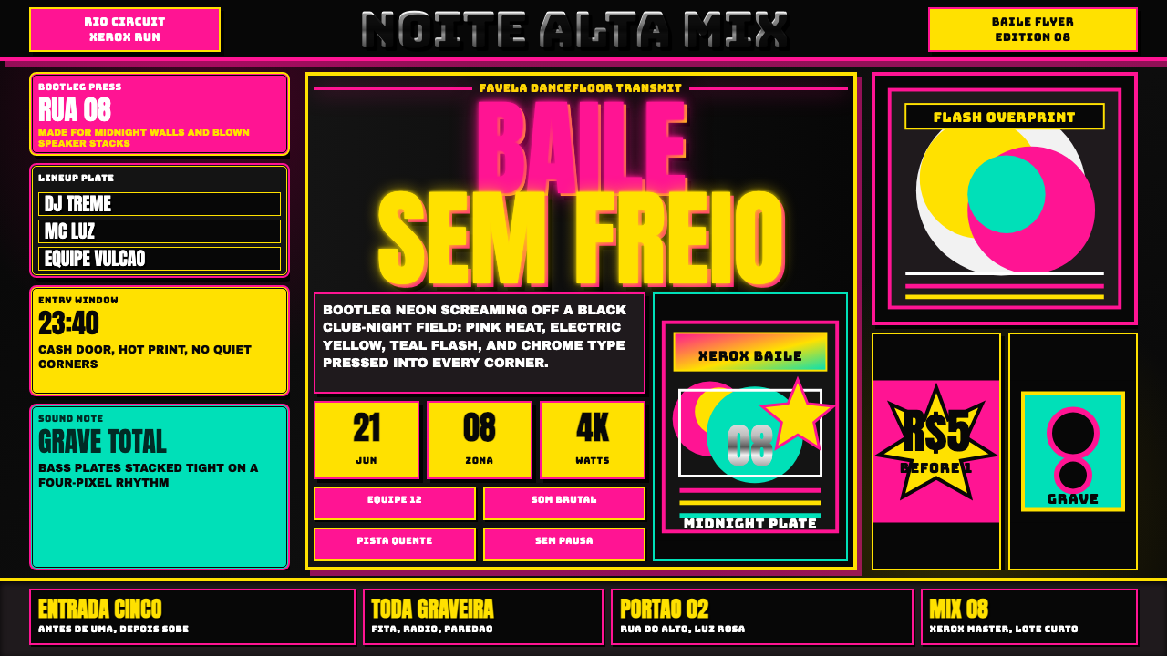 Funk Baile MixtapeNight refuses subtlety. Neon pink/yellow flyer plates cram chrome type on bla…
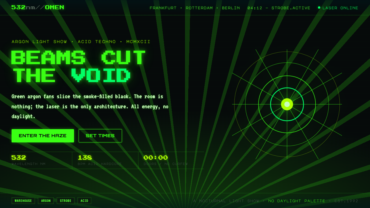 Acid Rave Laser Show 1992Beams cut the void. Argon green on pitch-black smoke, pixel marquee type, add…
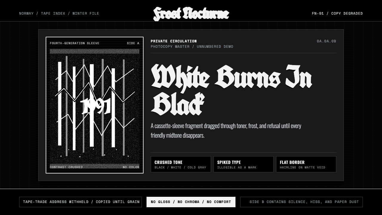 Nordic Black MetalUncompromising monochrome. Blackletter, hairline frames, and xerox grain crus…
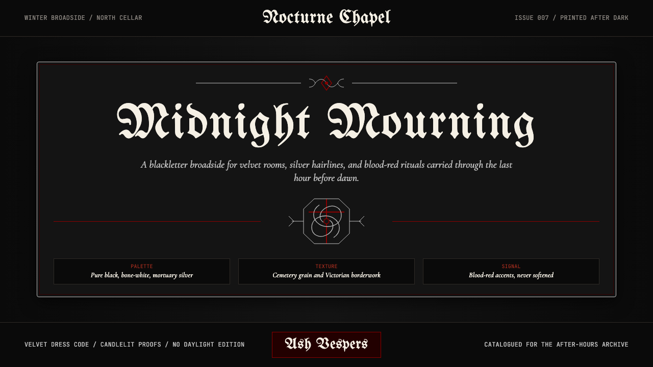 Traditional GothPost-punk in Victorian mourning. Black, blood red, bone white — Bauhaus album…
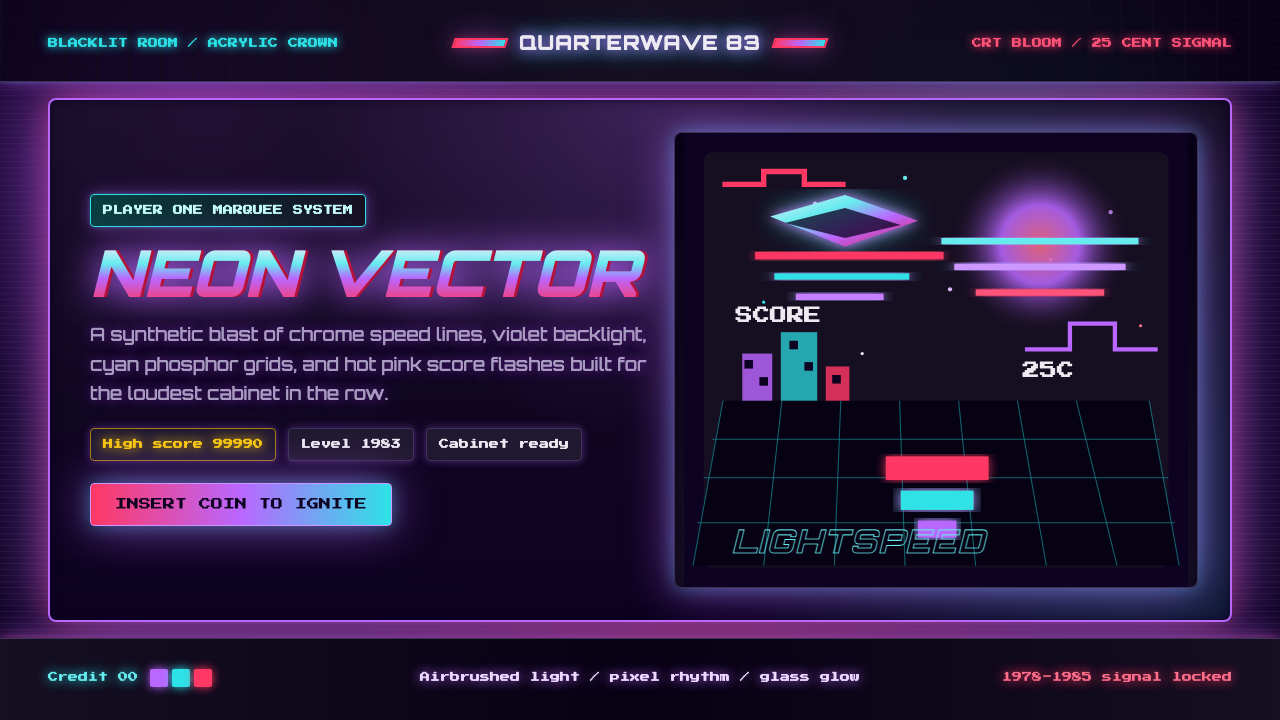 Arcade Cabinet MarqueeToo loud to ignore. Black-indigo glass, violet glow, cyan grids, hot-pink arc…
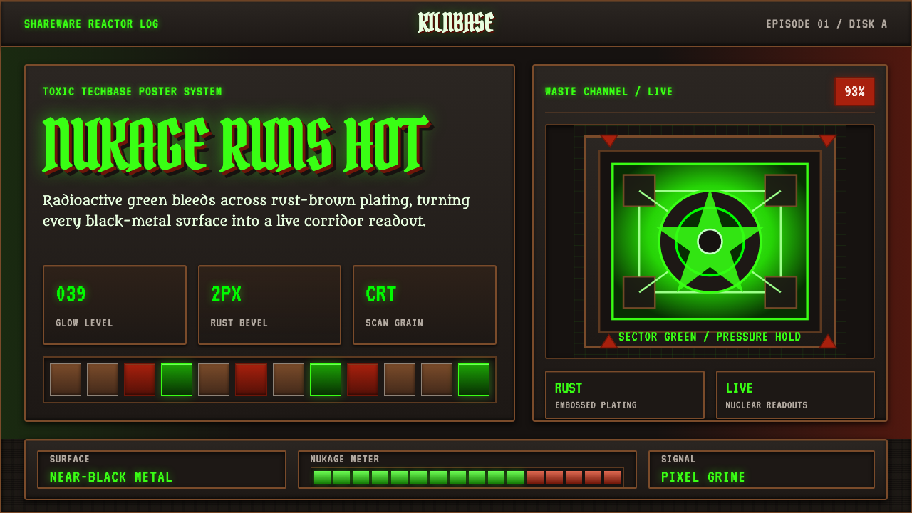 Doom 1993 Toxic GreenRadioactive metal bites. Toxic green readouts glow over rust bevels and CRT g…