What is UK Rave Glow-Stick Flyer?什么是 UK Rave Glow-Stick Flyer?
Acid house turned a photocopier, a marker pen, and three neon inks into the most euphoric graphic language of late-twentieth-century Britain.Acid house 用一台复印机、一支马克笔和三种荧光墨水,造出了二十世纪末英国最狂喜的视觉语言。
UK Rave Glow-Stick Flyer in briefUK Rave Glow-Stick Flyer 速览
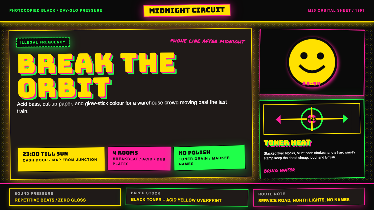
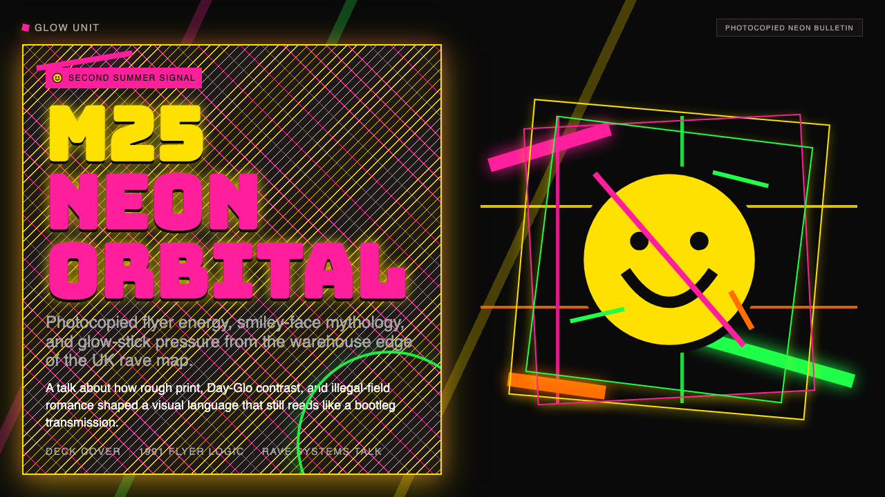
UK Rave Glow-Stick Flyer is the visual vernacular of British acid-house and free-party culture between 1988 and 1994 — a raw, saturated aesthetic born entirely outside commercial design studios. Neon yellow, neon pink, and neon green are slammed against a deep photocopied black, anchored by the smiley-face icon that had become the movement's universal emblem, and assembled through cut-and-paste collage rather than professional typesetting. The result is deliberately rough, loud, and cheap — a design language that wears its origins on its sleeve.「英国 Rave 荧光棒传单」是 1988 至 1994 年间英国 acid-house 与自由派对文化的视觉语言,一种完全诞生于商业设计机构之外的粗粝、饱和美学。荧光黄、荧光粉、荧光绿三色猛烈撞上深黑复印底,以成为运动普世标志的笑脸图标为锚点,用剪刀胶水拼贴而非专业排版组装而成。结果刻意粗糙、刻意嘈杂、刻意廉价——一套把自身来历写在脸上的设计语言。
What distinguishes this aesthetic from generic electronic-music pastiche is its extreme specificity. These were not posters produced by advertising agencies or design graduates; they were flyers photocopied by the thousand in corner shops and handed out at petrol stations, taped to lamp posts along the M25 orbital, or slipped into the hands of revellers leaving one party with directions to the next. The medium shaped the message: photocopier toner is monochrome, so color had to be added through Day-Glo paper stocks or fluorescent ink layers. The machine's grain, its blown-out blacks and chalky highlights, became a feature rather than a flaw.将这套美学与泛泛「电音风」区别开来的,是它极度的具体性。这些不是广告公司或设计专业毕业生制作的海报;它们是在街角便利店印出来的传单,数以千计,散发于加油站,贴在 M25 环城高速沿线的路灯柱上,或在一个派对结束时塞进人们手里,附上下一个派对的地址。媒介塑造了信息:复印机墨粉是单色的,所以颜色只能通过 Day-Glo 荧光纸或荧光油墨叠印来添加。机器的颗粒感、爆掉的黑色和粉笔质高光,成了特色而非缺陷。
The aesthetic carries a specific emotional charge that distinguishes it from all other forms of countercultural print. It is simultaneously illicit and euphoric — the visual equivalent of a warehouse where ten thousand people are dancing under laser grids and glow-stick arcs. Every element, from the smiley face to the chunky distorted lettering to the neon palette, is calibrated to communicate transgressive joy at a glance, in poor light, to someone who may have been dancing for six hours.这套美学承载着一种独特的情感强度,将它与所有其他形式的反主流文化印刷品区别开来。它同时是非法的,又是狂喜的——仓库里一万人在激光网格和荧光棒弧线下起舞的视觉等价物。从笑脸到粗体变形字母再到霓虹色板,每一个元素都经过校准,以便在昏暗的光线下,对着跳了六个小时舞的人,一眼就传达出越界的喜悦。
See the UK Rave Glow-Stick Flyer design system查看 UK Rave Glow-Stick Flyer 完整设计系统
Where does UK Rave Glow-Stick Flyer come from?UK Rave Glow-Stick Flyer 从何而来?
The story begins in Chicago and Ibiza and arrives in Britain in the summer of 1987. Acid house — a stripped, repetitive mutation of Chicago house built around the Roland TB-303 bass synthesizer — crossed the Atlantic in the luggage of British DJs who had spent summers in Ibiza. Back in London, nights at the Haçienda in Manchester, Shoom at the Fitness Centre in Southwark, and Spectrum at Heaven in Charing Cross became the crucibles of what the tabloids would call the Second Summer of Love. The music was the catalyst; the visual culture followed almost immediately.故事从芝加哥和伊维萨岛开始,在 1987 年夏天抵达英国。Acid house——一种围绕 Roland TB-303 合成贝斯构建的、精简而重复的芝加哥 house 变体——由在伊维萨度夏的英国 DJ 们带过大西洋。回到国内,曼彻斯特的 Haçienda、南华克 Fitness Centre 的 Shoom、查令十字 Heaven 的 Spectrum 成为小报所称「第二个爱之夏」的发源地。音乐是催化剂,视觉文化几乎随即跟上。
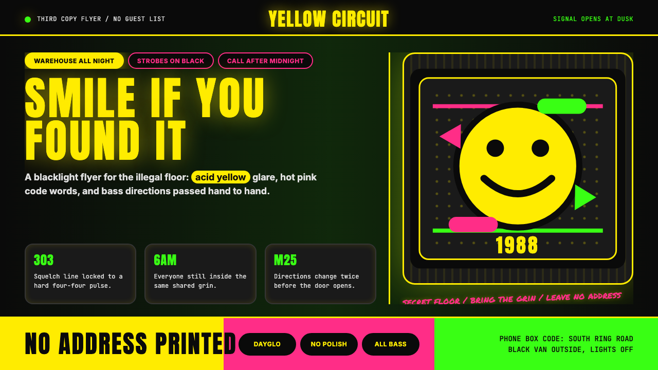
The smiley-face emblem — drawn, according to most accounts, by Danny Rampling for Shoom's flyers in early 1988 — crystallized the aesthetic. Rampling's designer used a hand-drawn yellow circle with black dot eyes and a simple arc mouth, photocopied onto fluorescent card stock. The image was contagious. Within months, smileys appeared on flyers across London, then across the country, then on t-shirts, in tabloid cartoons, and eventually on the facade of every souvenir shop in Britain. But the original flyer smiley was specific: hand-made, slightly irregular, embedded in a context of neon type and rough collage that signaled underground rather than commercial.笑脸标志——根据大多数说法,由 Danny Rampling 于 1988 年初为 Shoom 的传单设计——将这套美学结晶化。Rampling 的设计师在荧光卡纸上复印了一个手绘黄色圆圈,加上黑色点眼和简单弧形嘴。这个图像极具感染力。数月内,笑脸出现在伦敦各处的传单上,继而席卷全国,印上 T 恤衫,进入小报漫画,最终出现在英国每一家纪念品商店的橱窗。但最初的传单笑脸是具体的:手工制作,略有不规则,嵌入荧光文字和粗粝拼贴的语境中,发出的是地下而非商业的信号。
As the scene moved outdoors — from licensed clubs to unlicensed warehouses to open fields — the flyer culture scaled with it. Promoters like Sunrise, Energy, and Raindance organized events for tens of thousands of people along the M25 corridor. The Castlemorton Common Festival in 1992, organized by the Spiral Tribe sound system, drew an estimated twenty thousand people over a week and triggered the political crisis that culminated in the Criminal Justice and Public Order Act of 1994. The flyers for these events had to work without addresses — they directed ravers to phone lines or meeting points, with final locations revealed by radio. This constraint pushed the visual language toward pure affect: if you cannot say where, you say how it will feel.随着场景从有牌照的俱乐部转移到无牌照的仓库再到露天场地,传单文化也随之扩展。Sunrise、Energy、Raindance 等主办方沿 M25 走廊组织了面向数万人的活动。1992 年由 Spiral Tribe 音响系统组织的 Castlemorton Common Festival 吸引了估计两万人连续参与一周,引发政治危机,最终促成 1994 年《刑事审判与公共秩序法》的出台。这些活动的传单不能标注地址——它们引导参与者拨打电话热线或前往集合点,最终地点通过广播临时公布。这一限制将视觉语言推向纯粹的情感表达:如果你无法说在哪里,你就说它会是什么感觉。
The designers who defined the peak years of the aesthetic — most prominently Junior Tomlin and Pez — worked in conditions of deliberate urgency. Flyers were produced overnight, printed on whatever fluorescent stock was available, and distributed before authorities could act. The tools were intentionally limited: photocopier, marker, Letraset dry-transfer lettering, scissors, and spray adhesive. Genesis P-Orridge of Throbbing Gristle and Psychic TV had earlier explored industrial cut-up aesthetics that fed into the visual grammar; Andrew Weatherall, known primarily as a DJ and producer, brought a knowing art-school sensibility to the genre's iconography. By 1994, when the Criminal Justice Act made large unlicensed gatherings illegal, the aesthetic had already seeded itself across British popular culture — in album artwork, magazine design, and eventually the mainstream advertising that it had originally defined itself against.定义这套美学鼎盛时期的设计师——最具代表性的是 Junior Tomlin 和 Pez——在刻意紧迫的条件下工作。传单彻夜赶制,印在任何可以找到的荧光纸上,在当局采取行动之前发出去。工具刻意简陋:复印机、马克笔、Letraset 干刻字母、剪刀和喷胶。Throbbing Gristle 与 Psychic TV 的 Genesis P-Orridge 更早探索过工业剪切美学,这些美学为传单视觉语法提供了养分;主要以 DJ 和制作人著称的 Andrew Weatherall,则为这一流派的图像学带来了艺术学院式的自觉。到 1994 年《刑事审判法》将大型无牌聚会定为非法时,这套美学已在英国流行文化中播下种子——渗入唱片封面、杂志设计,最终进入它原本定义自身时所对抗的主流广告。
What defines the UK Rave Glow-Stick Flyer look?UK Rave Glow-Stick Flyer 的视觉特征是什么?
Neon-on-Black Palette黑底荧光色板
The defining color logic is inversion: the background is dense, near-absolute black — the darkness of a photocopied page pushed to its limits — and the foreground colors are the most saturated fluorescents available. Acid yellow, rave pink, and laser green are not simply bright; they are specifically Day-Glo, calibrated to read under ultraviolet light and to glow against darkness. The three colors rarely appear in equal measure: typically one color dominates — yellow is most common — while the other two appear as secondary emphasis or decorative edge.定义性的色彩逻辑是反转:背景是浓郁的、接近绝对的黑——复印页面被推至极限的那种黑暗——前景色是能找到的最饱和的荧光色。荧光黄、rave 粉和激光绿不仅仅是明亮,它们是专门的 Day-Glo 荧光色,校准为在紫外线灯下可读,在黑暗中发光。三色很少等量出现:通常一种主导——黄色最常见——其他两种作为次要强调或装饰边缘。
Smiley-Face Icon笑脸图标
The smiley is not decoration — it is the movement's primary symbol, as legible and culturally loaded as a political emblem. In flyer usage, it is almost always hand-drawn or photocopied from a hand-drawn original, which gives each instance a slightly irregular, humanly imperfect quality that distinguishes it from the clean commercial smileys that came later. The face is simplified to its minimum readable form: two dot eyes and an upward arc, usually in yellow on black or black on yellow, sometimes distorted by photocopy degradation into something that reads as both ecstatic and slightly sinister.笑脸不是装饰——它是这场运动的首要符号,其可读性和文化负载不亚于一个政治标志。在传单使用中,它几乎总是手绘或从手绘原稿复印而来,这赋予每个实例略微不规则、带有人类不完美感的品质,将其与后来出现的干净商业笑脸区别开来。这张脸被简化到最低可读形态:两个点眼和一条上扬弧线,通常是黑底上的黄色或黄底上的黑色,有时被复印降质扭曲成某种既狂喜又略带阴森感的东西。
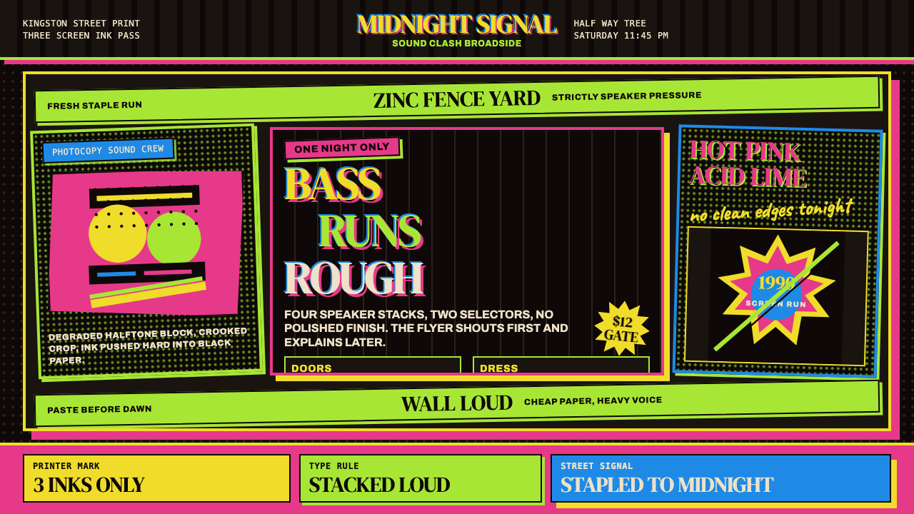
DIY Collage TypographyDIY 拼贴字体排印
There is no single typeface that defines the aesthetic — rather a method: cutting letterforms from other printed materials, combining Letraset dry-transfer alphabets, hand-lettering with fat marker pens, and photocopying the result at various sizes to create scale contrast. The output is intentionally inconsistent. Headlines might be enormous, condensed, and distorted by photocopier zoom; sub-information might be a hand-written note added after the fact. This typographic roughness communicates authenticity: a flyer that looks professionally set would signal the wrong kind of organization.没有单一字体定义这套美学——而是一套方法:从其他印刷品剪取字母,组合 Letraset 干刻字母表,用粗马克笔手写,然后以不同尺寸复印以制造尺度对比。输出刻意不一致。标题可能是巨大的、压缩的、被复印机缩放扭曲的;次要信息可能是事后添加的手写便条。这种排版的粗粝传达真实性:一张看起来经过专业排版的传单会发出错误的组织信号。
Photocopier Grain and Degradation复印机颗粒与降质
The photocopier is not merely the production tool — it is the aesthetic engine. Successive generations of copying introduce grain, lose mid-tones, blow out whites, and crush blacks into a solid dense field. This process, which any commercial printer would treat as a defect, is embraced and sometimes deliberately amplified: running a flyer through the machine multiple times to increase contrast and grit, or copying a copy of a copy to introduce the specific texture of information decay. The resulting surface resembles no other print medium — it is specific to the electrostatic process and to a particular moment in office-machine history.复印机不仅仅是生产工具——它是美学引擎。多次复印累积引入颗粒、丢失中间调、爆掉白色、将黑色压碎成一个实心的浓郁色块。这个过程——任何商业印刷商都会视为缺陷——在这里被拥抱,有时刻意放大:让传单多次过机以增加对比度和粗粝感,或者复印一张复印件的复印件,引入信息衰减的特定质感。由此产生的表面与任何其他印刷媒介都不同——它是静电成像工艺和办公机器历史特定时刻的产物。
Asymmetric Information Stacking非对称信息堆叠
Rave flyers must communicate quickly and clandestinely: event name, date, sometimes a phone number, and whatever location can be safely disclosed. The layout strategy is not a grid in the formal sense but a stacking of information blocks at different scales and angles, creating a composition that reads as urgent and layered simultaneously. Text blocks are placed without regard to alignment; elements overlap freely; the hierarchy is established by scale rather than position. This apparent disorder is functional: it draws the eye across the whole surface, ensuring that even a glance in poor light will capture at least the core information.Rave 传单必须快速而隐蔽地传达信息:活动名称、日期、有时是一个电话号码,以及任何可以安全公开的地点信息。版面策略不是正式意义上的网格,而是将不同尺度和角度的信息块堆叠在一起,创造出一种同时读来紧迫而又层次丰富的构图。文本块的放置不考虑对齐;元素自由重叠;层级由尺度而非位置确立。这种表面上的无序是有功能的:它引导眼睛扫过整个表面,确保即使在昏暗光线下匆匆一瞥,也能捕捉到至少核心信息。
Laser and UV Light References激光与紫外光引用
The visual language consistently references the physical experience of the rave itself: the sweep of laser grids, the pulse of strobe lights, the glow of fluorescent clothing under black-light. These references are not illustrative but atmospheric — a bold streak of neon across a black field evokes a laser trail without depicting one. The use of fluorescent inks that read differently under ultraviolet light than under daylight is the most literal translation of the rave environment into print: holding a flyer under a UV lamp, as ravers did in clubs, transformed its appearance entirely.这套视觉语言持续引用 rave 现场的实体体验:激光网格的扫射、频闪灯的脉动、荧光服装在黑光灯下的发光。这些引用不是图示性的而是氛围性的——黑色底面上的一道粗荧光线,在不描绘激光的情况下唤起激光轨迹。在紫外线灯下呈现出与日光下截然不同效果的荧光墨水,是 rave 环境最直接的印刷转译:在俱乐部里把传单置于紫外灯下——一如参与者的做法——完全改变了传单的面貌。
Coded and Incomplete Information编码与不完整信息
Perhaps the most culturally specific characteristic: rave flyers frequently omit the venue address, replacing it with a phone number, a map reference, or a grid coordinate that would only make sense to those already within the network. This was a practical response to police pressure — a flyer with a full address could be used as evidence and the venue raided before the event began. The visual language absorbed this constraint productively: the implied secrecy became part of the aesthetic, giving even printed information a sense of privileged access. The incomplete flyer is an invitation into an insider community, not just an event announcement.这或许是最具文化特殊性的特征:rave 传单频繁省略场地地址,以电话号码、地图参考或坐标取而代之,这些信息只对已在圈内的人有意义。这是对警察压力的实际应对——一张写有完整地址的传单可以被用作证据,场地可能在活动开始前就遭到突袭。视觉语言富有成效地吸收了这一限制:隐含的秘密性成为美学的一部分,使即使是印刷信息也带有一种特权准入感。不完整的传单是对内部社群的邀请,而不仅仅是活动公告。
See the UK Rave Glow-Stick Flyer design system查看 UK Rave Glow-Stick Flyer 完整设计系统
Who shaped UK Rave Glow-Stick Flyer?谁塑造了 UK Rave Glow-Stick Flyer?
Junior Tomlin is regarded as one of the most accomplished practitioners of the rave-flyer form. Working in London through the late 1980s and early 1990s, he developed a compositional approach that brought a degree of intentional sophistication to what was ostensibly a vernacular medium. His flyers for major events used the neon-on-black palette with a command over scale contrast and visual rhythm that distinguished them from simpler cut-and-paste work, while retaining the essential roughness and urgency of the form.Junior Tomlin 被视为 rave 传单形式最出色的实践者之一。他在 1980 年代末至 1990 年代初活跃于伦敦,发展出一种构图方法,为这个表面上的草根媒介带来了某种刻意的复杂性。他为大型活动制作的传单运用黑底荧光色板,在尺度对比和视觉节奏方面展现出驾驭力,将其作品与更简单的剪贴拼凑区别开来,同时保留了这一形式本质的粗粝感和紧迫感。
Pez — working primarily out of the Bristol and London scenes — brought a more graphic, almost poster-art sensibility to rave flyer design. Where many practitioners treated the flyer as purely functional, Pez treated it as a compositional problem worth solving for its own sake. His use of neon color was more architectural — using it to divide space and create visual structure rather than simply flood the surface — and his lettering work showed an awareness of the expressive potential of distorted display type that anticipated later developments in underground graphic design.Pez——主要活跃于布里斯托尔和伦敦场景——为 rave 传单设计带来了更具图形感、近乎海报艺术的感性。当许多实践者将传单视为纯粹功能性之物时,Pez 将其视为值得为其本身求解的构图问题。他对荧光色的使用更具建筑感——用它划分空间、创造视觉结构,而不仅仅是淹没表面——他的手写字体工作展示出对扭曲展示字体表现潜力的自觉,预见了后来地下平面设计的发展。
Spiral Tribe was a free-party sound system and art collective that became the most prominent exponents of the outdoor rave movement. Their visual identity — spiral motif, dense black backgrounds, hand-stencilled lettering — was inseparable from their organizational and philosophical commitments to free culture and non-commercial access to music. The Castlemorton Common Festival of 1992, with which they are most associated, became the defining event of the era: the scale of the gathering, and the government's response to it, crystallized the political stakes of the movement and its visual culture.Spiral Tribe 是一个自由派对音响系统兼艺术集体,成为户外 rave 运动最突出的代言人。他们的视觉形象——螺旋母题、浓密黑色背景、手刻字母——与他们对自由文化和非商业音乐接触的组织承诺和哲学立场密不可分。他们最为人称道的 1992 年 Castlemorton Common Festival 成为这个时代的定义性事件:聚会的规模以及政府的回应,将这场运动及其视觉文化的政治赌注结晶化了。
Andrew Weatherall was primarily known as a DJ and record producer — his remix of Primal Scream's 'Loaded' in 1990 helped define the sound of the era — but his contribution to the visual culture of British rave extended to record sleeves, flyers, and the broader iconographic environment of the clubs and events he was associated with. Weatherall brought an art-school literacy to contexts that often lacked it: his design sensibility was informed by dub music aesthetics, punk cut-and-paste, and continental surrealism, which he filtered through the Day-Glo urgency of the rave scene.Andrew Weatherall 主要以 DJ 和唱片制作人著称——他于 1990 年对 Primal Scream「Loaded」的混音帮助定义了这个时代的声音——但他对英国 rave 视觉文化的贡献延伸至唱片封面、传单,以及他所关联的俱乐部和活动的更广泛图像环境。Weatherall 将艺术学院的视觉素养带入通常缺乏这种素养的场域:他的设计感性受到 dub 音乐美学、朋克剪贴拼贴和欧陆超现实主义的滋养,并将这些通过 rave 场景的 Day-Glo 紧迫感过滤输出。
Genesis P-Orridge's influence on rave visual culture was upstream and philosophical rather than directly commercial. Through Throbbing Gristle in the late 1970s and Psychic TV in the 1980s, P-Orridge developed an industrial cut-up aesthetic — collaged imagery, deliberately degraded reproduction, occult symbolism, psychedelic color — that established a visual grammar for transgressive British subculture. When acid house designers reached for techniques to communicate illicit joy, they were often reaching for tools that P-Orridge had already tested and theorized: the photocopier as revolutionary instrument, degradation as authenticity signal.Genesis P-Orridge 对 rave 视觉文化的影响是上游的、哲学性的,而非直接商业性的。通过 1970 年代末的 Throbbing Gristle 和 1980 年代的 Psychic TV,P-Orridge 发展出一套工业剪切美学——拼贴图像、刻意降质的复制、神秘主义符号、迷幻色彩——为英国越界亚文化建立了视觉语法。当 acid house 设计师们寻找工具来传达非法的喜悦时,他们往往在触碰 P-Orridge 已经测试并理论化的手段:复印机作为革命性工具,降质作为真实性信号。
How do you use UK Rave Glow-Stick Flyer today?今天怎么用 UK Rave Glow-Stick Flyer?
Applying the UK Rave Glow-Stick Flyer aesthetic requires understanding that its power comes from controlled tension: neon against deep black, rough against deliberate, chaotic arrangement against urgent legibility. The style is not simply about bright colors on dark backgrounds — it is about the specific emotional register of transgressive joy, and every design decision should serve that register. Used without that intention, it risks reading as generic nightlife branding rather than the specific countercultural artifact it references.应用「英国 Rave 荧光棒传单」美学需要理解:它的力量来自受控的张力——荧光色对深黑、粗粝对刻意、混沌排列对紧迫可读性。这套风格不仅仅是深色背景上的明亮色彩——它关乎越界喜悦的特定情感频率,每一个设计决定都应服务于这一频率。若缺乏这种意图,它就有沦为泛泛夜生活品牌形象的风险,而非它所引用的那个具体的反主流文化产物。
For presentation slides, the style works best for cover and section-break pages rather than dense information slides. A cover built in this mode should commit fully to the black ground, choose one dominant neon color for the main title in oversized, visually distorted type, and use a second neon only for a subordinate line or accent. The smiley or a simplified circular motif can anchor the composition. Content slides within the same deck should be pulled back significantly — dark backgrounds become fatiguing for reading-heavy slides — so consider a desaturated or near-black background for text slides with neon used only for emphasis and data visualization highlights. Data slides can lean into the aesthetic's poster energy: bold bar charts in neon against black, with the grain and roughness deliberately softened so numbers remain legible.在演示文稿中,这套风格最适合封面和章节分隔页,而非信息密集的内容页。以这种模式构建的封面应当完全投入黑色底面,选择一种主导荧光色用于超大、视觉上变形的主标题,仅将第二种荧光色用于从属行或强调。笑脸或简化圆形母题可以锚定构图。同一套幻灯片的内容页则应大幅收缩——对于阅读繁重的幻灯片,深色背景会令人疲惫——因此考虑为文字幻灯片使用去饱和或近黑的背景,仅在强调和数据可视化高亮时使用荧光色。数据页可以倾向于这套美学的海报能量:黑底荧光色粗柱状图,颗粒感和粗粝质地刻意软化以保持数字的可读性。
For web interfaces, the aesthetic translates well into hero sections, loading screens, countdown pages, and event landing pages where mood-setting takes precedence over information density. Dashboard and pricing applications should use it selectively: reserve neon against black for primary calls to action, tier differentiation, or alert states, and use a lighter near-black or dark-charcoal ground for the main reading surface. Navigation elements should prioritize legibility over mood — the roughness of the rave flyer is compelling in a poster context but becomes tiring in a component that users interact with repeatedly.对于网页界面,这套美学可以很好地转化为英雄区块、加载屏幕、倒计时页面和活动着陆页——在这些场景中,氛围营造优先于信息密度。仪表板和定价应用应有选择地使用它:将黑底荧光色保留给主要行动召唤、等级区分或警示状态,主要阅读界面使用较浅的近黑或深炭灰底色。导航元素应优先考虑可读性而非氛围——rave 传单的粗粝感在海报语境中引人注目,但对于用户需要反复交互的组件来说会令人疲劳。
For editorial and marketing work, the style's most effective application is in contexts that explicitly reference energy, music, nightlife, or creative community — festival branding, music publication headers, youth-culture campaign materials, and fashion editorial. The DIY quality is the style's authenticity signal: attempting to polish it into a fully refined, professional finish undermines the very qualities that make it distinctive. In marketing contexts, the style works well when the brand can credibly claim some form of outsider or underground positioning — forced adoption by an obviously corporate product creates an uncanny valley effect, where the rough aesthetic highlights rather than conceals the commercial intent.对于编辑与营销工作,这套风格最有效的应用场景是那些明确引用能量、音乐、夜生活或创意社群的语境——音乐节品牌形象、音乐出版物标题、青年文化活动素材和时尚编辑。DIY 品质是这套风格的真实性信号:试图将其抛光为完全精致的专业成品,会破坏使其与众不同的那些品质。在营销语境中,当品牌能够可信地宣称某种局外人或地下定位时,这套风格最为有效——一个明显企业化的产品强行采用会产生恐怖谷效应,粗粝美学反而凸显而非掩盖商业意图。
A common mistake is applying the neon palette without committing to the black ground, resulting in fluorescent colors on white or mid-grey — which reads as generic festival branding rather than rave authenticity. Equally problematic is cleaning up the typography: replacing rough, irregular lettering with professionally set type in display weights removes the specific rough charge of the style and produces something that resembles a theme-park approximation. The photocopier grain is structural, not optional — if the surface looks too clean, it no longer reads as rave. Finally, resist the impulse to use all three neon colors simultaneously at full saturation; authentic flyers almost always lead with one dominant neon, using the others as peripheral accents.一个常见错误是应用荧光色板却不投入黑色底面,导致荧光色出现在白色或中灰色上——这会被读作泛泛的音乐节品牌形象而非 rave 真实性。同样有问题的是将字体整洁化:用专业排版的展示字重替换粗粝、不规则的手写字体,移除了这套风格的特定粗粝力量,产生出类似主题公园近似版的东西。复印机颗粒感是结构性的而非可选的——如果表面看起来太干净,它就不再具有 rave 感。最后,抵制同时以全饱和度使用三种荧光色的冲动;真实的传单几乎总是以一种主导荧光色领衔,其他两种作为边缘点缀。
See the UK Rave Glow-Stick Flyer design system查看 UK Rave Glow-Stick Flyer 完整设计系统
UK Rave Glow-Stick Flyer — FAQUK Rave Glow-Stick Flyer · 常见问题
Is this aesthetic appropriate for brands that have no connection to rave culture?这套美学适合与 rave 文化没有关联的品牌吗?
It can work, but with significant caveats. The aesthetic's power comes from its specific cultural authenticity — it signals something that was genuinely illicit and genuinely euphoric. Brands that borrow it without any credible connection risk reading as exploitative or simply confused. The most successful cross-context applications tend to share some values with the original: access, energy, community, anti-establishment positioning. A brand with none of those values should use the visual vocabulary sparingly and with full awareness that the cultural context is being cited rather than claimed.可以,但有相当大的注意事项。这套美学的力量来自其特定的文化真实性——它发出的信号关乎某种真正非法、真正狂喜的事物。没有可信关联的品牌借用它,有被读作剥削性甚至令人困惑的风险。最成功的跨语境应用往往与原始文化共享某些价值观:准入性、能量感、社群感、反建制立场。完全不具备这些价值观的品牌应当克制地使用这套视觉词汇,并完全意识到自己是在引用而非声索这一文化语境。
How do you make the style legible — isn't neon on black hard to read?如何让这套风格保持可读性——黑底荧光色不是很难读吗?
Legibility in this aesthetic is governed by scale and contrast rather than by the conventional rules of typographic hierarchy. Large text in neon yellow against black is highly legible — more so than the same text in a mid-value color — because the luminance contrast is extreme. The readability problem arises at small sizes, particularly for extended body text, where the halation effect of bright color on dark ground causes letters to bleed into each other. The practical rule: reserve neon for display sizes and any text that needs to be read quickly from a distance; use a lighter, less saturated near-white for body reading where sustained attention is required.这套美学中的可读性由尺度和对比度控制,而非常规排版层级规则。黑底上的大字荧光黄具有高度可读性——比相同的中明度文字更高——因为亮度对比极为强烈。可读性问题出现在小字号,尤其是延伸的正文文字,亮色在暗底上的晕光效应会导致字母相互渗透。实用原则:将荧光色保留给展示字号以及任何需要从远处快速读取的文字;正文阅读需要持续注意力时,使用较浅、饱和度较低的近白色。
Can the rave flyer aesthetic work in a light-background version?Rave 传单美学能做成浅色背景版本吗?
Technically yes, but it loses most of its specific charge. The black ground is not incidental — it is constitutive. Day-Glo colors on white read as generic 1990s nostalgia or retro sportswear rather than rave-flyer culture specifically, because the luminance relationship inverts: fluorescents lose their apparent glow when surrounded by a ground that is itself bright. If a light background is a hard requirement, the approach that preserves the most of the original energy is to use a very dark warm grey rather than white, and to treat the neon colors as aggressive foreground elements with strong dark outlines or drop-shadows that maintain the sense of contrast.技术上可以,但会失去大部分特定力量。黑色底面不是偶然的——它是构成性的。白底上的 Day-Glo 色被读作泛泛的 1990 年代怀旧或复古运动服装,而非专门的 rave 传单文化,因为亮度关系发生了反转:当荧光色被本身就明亮的底面包围时,它们失去了表观发光感。如果浅色背景是硬性要求,最能保留原始能量的方法是使用非常深的暖灰色而非白色,并将荧光色视为具有强烈深色轮廓或投影的积极前景元素,以维持对比感。
How does this style differ from other 1990s nostalgia aesthetics like Memphis or Grunge typography?这套风格与孟菲斯或垃圾摇滚字体排印等其他 1990 年代怀旧美学有何不同?
Memphis (associated with the 1980s Italian design group) is geometric and playful but fundamentally optimistic and commercial — it was designed for mainstream consumption. Grunge typography (associated with David Carson and Ray Gun magazine from the early 1990s) is also dark and distorted but intellectual in its deconstruction, designed for a literate design-school audience. The rave flyer aesthetic differs from both in its class origin and its function. It was made by non-designers for non-designers, for purely practical distribution purposes, in conditions of legal risk. Its roughness is not a critique of professionalism; it is the direct result of urgency and material constraint. This distinction matters when applying it: Memphis can be polished, grunge typography can be intellectualized, but rave-flyer aesthetic loses its essential character the moment it becomes too self-conscious.孟菲斯(与 1980 年代意大利设计团体相关)是几何的、玩乐的,但从根本上是乐观的和商业的——它是为主流消费而设计的。垃圾摇滚字体排印(与 1990 年代初的 David Carson 和《Ray Gun》杂志相关)也是黑暗而扭曲的,但其解构是知识分子式的,为具有设计学院素养的受众而设计。Rave 传单美学在阶级起源和功能上与两者都不同。它由非设计师为非设计师制作,出于纯粹实际的分发目的,在有法律风险的条件下完成。它的粗粝不是对专业主义的批评;它是紧迫性和材料限制的直接结果。这一区别在应用时很重要:孟菲斯可以被抛光,垃圾摇滚字体排印可以被知识化,但 rave 传单美学一旦变得过于自我意识就会失去其本质特征。
What happened to this aesthetic after 1994, and why does it feel current again now?这套美学在 1994 年之后发生了什么,为什么它现在感觉又重新当代了?
After the Criminal Justice Act of 1994 drove much of the free-party movement underground or into licensed venues, the flyer aesthetic was absorbed into mainstream graphic design — appearing in record packaging, magazine layouts, and advertising — and gradually diluted. A second wave of interest came with the early 2000s post-rave nostalgia in music and fashion. The current revival is driven by several converging forces: the fortieth anniversary of the Second Summer of Love, the prominence of 1990s reference in contemporary fashion, the TikTok-era rediscovery of rave culture by younger audiences, and a broader cultural interest in lo-fi and DIY aesthetics as a reaction against the over-polished visual language of algorithmic social media. The style feels contemporary because its values — roughness, urgency, community, anti-corporate affect — are in genuine demand again.1994 年《刑事审判法》将大部分自由派对运动逼入地下或有牌照场所之后,这套传单美学被主流平面设计吸收——出现在唱片包装、杂志版面和广告中——并逐渐被稀释。第二波兴趣随着 2000 年代初音乐和时尚界的后 rave 怀旧潮而来。当前的复兴由几股汇聚的力量驱动:「第二个爱之夏」四十周年、1990 年代参考在当代时尚中的突出地位、TikTok 时代年轻受众对 rave 文化的重新发现,以及更广泛的文化界对低保真和 DIY 美学的兴趣——作为对算法社交媒体过度精致视觉语言的反弹。这套风格感觉当代,是因为它的价值观——粗粝、紧迫、社群感、反企业情绪——再次处于真实的需求之中。
Related design styles相关设计风格
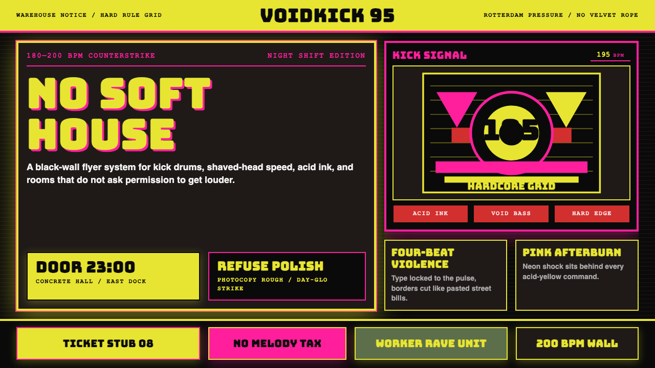 Rotterdam Gabber HardcoreHardcore refuses polish. Acid yellow, neon pink, black grid, and brutal Bunge…硬核拒绝精致:酸黄、霓虹粉与黑色网格,让粗暴 Bungee 字体像传单砸来。
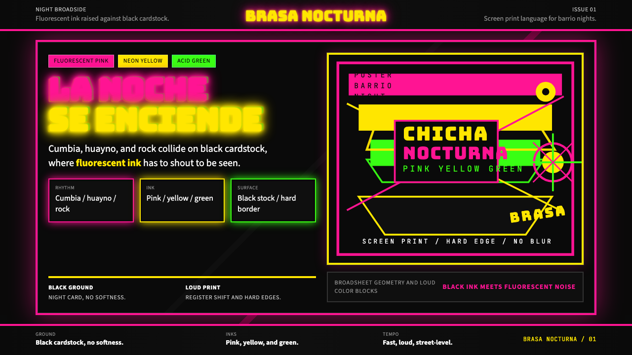 Peruvian Chicha Fluorescent PosterStreet-night fury. Pink, yellow, and green stack on black cardstock in hard b…夜街怒吼。粉黄绿硬边叠在黑卡纸上。
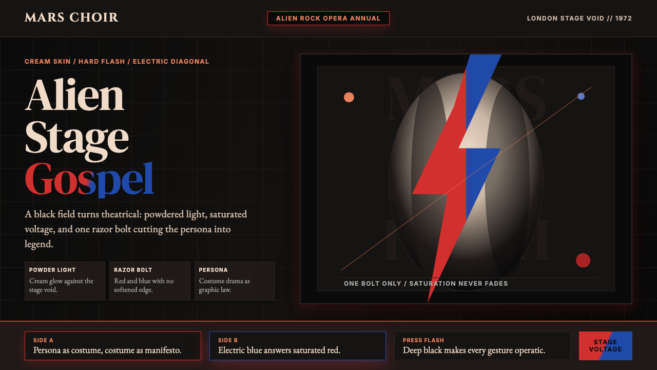 Bowie — Ziggy StardustTheater at full voltage. Cream-on-black portrait cut by one red and electric-…满电压的剧场感:黑底奶油肖像,被红与电蓝闪电劈开。
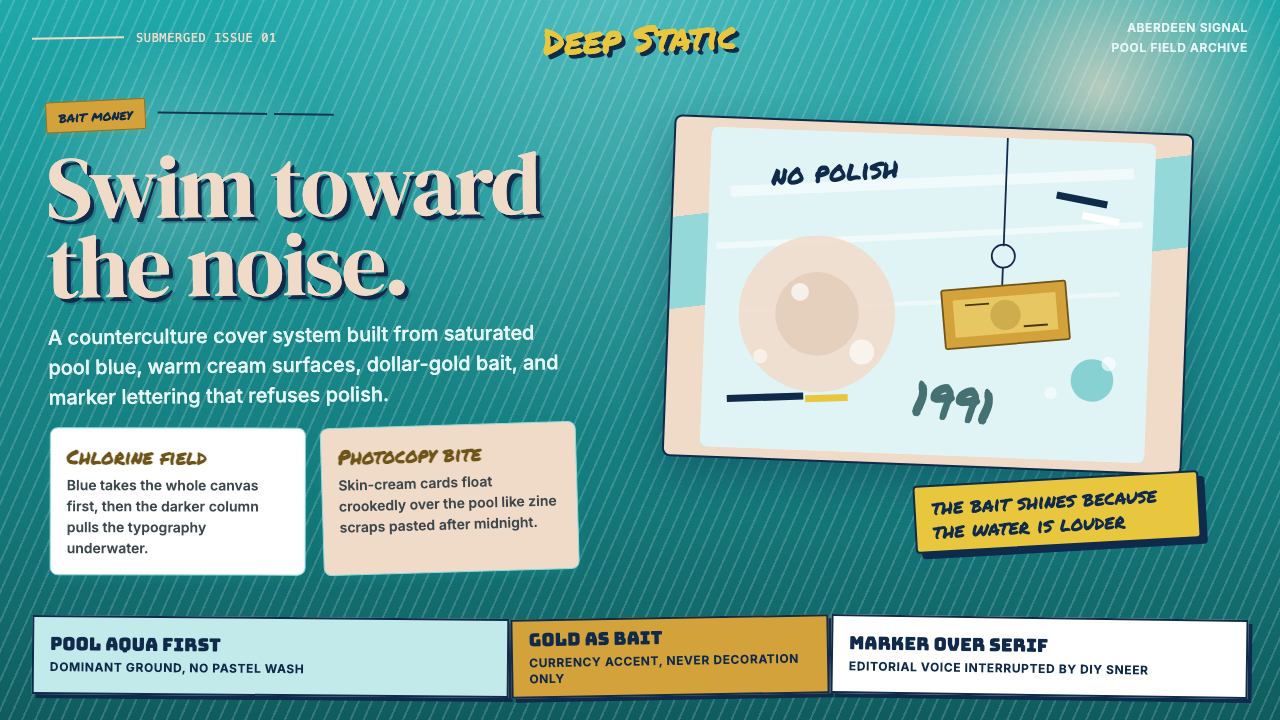 Nirvana — NevermindAnti-pop in pool blue. Cream cards, dollar-gold accents, and marker type roug…泳池蓝里的反主流:乳白卡片、美元金点缀与马克笔字打乱网格。
 Acid House Smiley (1988)Rave energy hits first. Acid yellow on black, Anton caps, smiley glow.锐舞能量先撞上来。黑底酸黄、Anton大写与笑脸辉光。
 Jamaican Dancehall 1990 PosterMidnight volume. Acid lime and hot pink type stack like screenprint ink on bl…午夜音量:酸绿与热粉粗字叠在黑新闻纸上,如丝印错位。