What is Bowie — Ziggy Stardust?什么是 Bowie — Ziggy Stardust?
David Bowie invented Ziggy Stardust in 1972 and with him a visual language of glam-rock theater — deep black, cream-pale skin, and a hard lightning bolt that turned pop music into costume drama.1972年,大卫·鲍伊创造了Ziggy Stardust,也创造了华丽摇滚的视觉语言——深黑底色、奶白肤色,以及一道将流行音乐变成戏剧的硬边闪电。
Bowie — Ziggy Stardust in briefBowie — Ziggy Stardust 速览
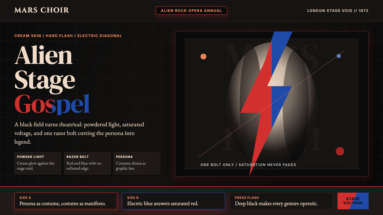
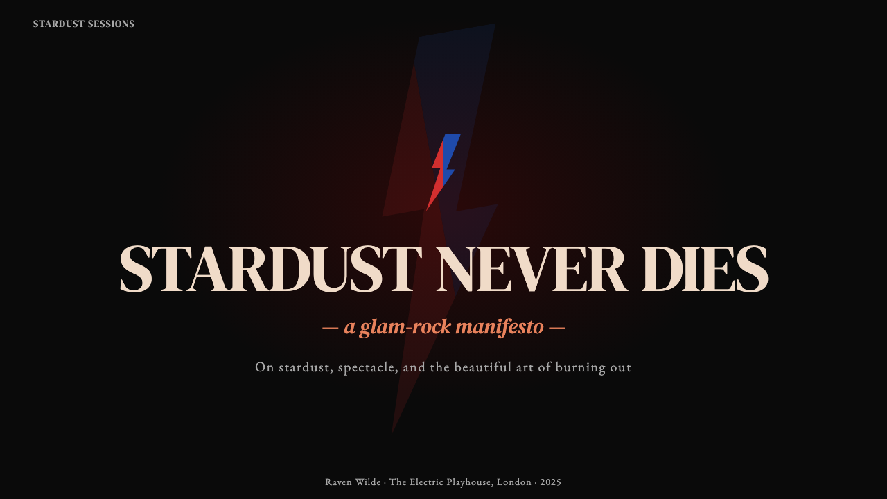
Bowie — Ziggy Stardust is the visual aesthetic that emerged from David Bowie's 1972–1973 glam-rock period, crystallized in the iconic Aladdin Sane album sleeve: a cream-pale face against a deep black backdrop, bisected by a hard-edged lightning bolt in red and electric blue. It is a style that treats pop music as theater, design as stagecraft, and the human face as a canvas for transformation.Bowie — Ziggy Stardust是从大卫·鲍伊1972至1973年的华丽摇滚时期生长出来的视觉美学,在《Aladdin Sane》专辑封面上得到最终凝结:奶白色面孔衬于深黑背景,一道由红与电蓝构成的硬边闪电斜劈而过。这是一种将流行音乐视为戏剧、将设计视为舞台技艺、将人脸视为变身画布的风格。
The aesthetic is saturated, androgynous, and theatrical. Color is pushed to maximum voltage — the contrast between the near-black void of the background and the almost luminous pallor of the skin is as stark as a spotlight on a darkened stage. The lightning bolt functions simultaneously as ornament, signature, and symbol: neither decorative frill nor legible type, but a graphic gesture that collapses the distance between costume and identity.这套美学是饱和的、双性同体的、戏剧化的。色彩被推至最高电压——近乎黑色的背景虚空与近乎发光的奶白肤色之间的对比,如同黑暗舞台上的追光灯。闪电同时充当装饰、签名与象征:既非可有可无的纹饰,也非可辨读的文字,而是一个折叠了服装与身份之间距离的图形姿态。
Unlike design movements that emerge from institutions or manifestos, this aesthetic is inseparable from a specific artistic persona. Ziggy Stardust was not simply a costume but a fully realized alien alter-ego, and every visual decision — the makeup, the hair, the photography, the album art — served that persona. The result is a design language defined by committed artifice: nothing here pretends to be natural, and that refusal of naturalism is its defining strength.与那些从机构或宣言中产生的设计运动不同,这套美学与一个特定的艺术人格不可分割。Ziggy Stardust不仅仅是一套服装,而是一个完整实现的外星他我,每一个视觉决定——妆容、发型、摄影、封面艺术——都服务于这个人格。其结果是一种由彻底的人工性所定义的设计语言:这里没有任何东西假装是自然的,而这种对自然主义的拒绝正是它的决定性力量。
See the Bowie — Ziggy Stardust design system查看 Bowie — Ziggy Stardust 完整设计系统
Where does Bowie — Ziggy Stardust come from?Bowie — Ziggy Stardust 从何而来?
David Bowie created the Ziggy Stardust persona in London in 1972, launching it with the album The Rise and Fall of Ziggy Stardust and the Spiders from Mars. Ziggy was conceived as an alien rock messiah, a being from another world who had descended to bring humanity its final message before apocalypse. This was not casual theatricality — it was a total artwork, merging narrative, performance, costume, and image into a single sustained fiction that Bowie inhabited onstage and off.大卫·鲍伊于1972年在伦敦创造了Ziggy Stardust这一人格,以专辑《Ziggy Stardust与来自火星的蜘蛛乐队的兴衰》正式发布。Ziggy被构想为一个外星摇滚救世主——一个从另一个世界降临,在末日前为人类带来最后信息的存在。这不是随意的剧场感,而是一件将叙事、表演、服装与图像融合为单一持续虚构的整体艺术作品,鲍伊将其贯穿台上台下。
The visual grammar of Ziggy was assembled from multiple influences. Bowie drew on Japanese kabuki theater for its tradition of extreme facial transformation and the coded meaning of stage makeup. He was influenced by the British glam-rock scene already in motion — Marc Bolan and T. Rex had introduced glitter and androgyny to rock — but Bowie pushed the artifice further, hiring theatrical costumers and making the alien-outsider image philosophically as well as aesthetically deliberate. Guitarist Mick Ronson contributed a raw, electric energy to the stage presence that the photographs of Mick Rock captured with stage-flash intensity.Ziggy的视觉语法由多重影响汇聚而成。鲍伊从日本歌舞伎戏剧中汲取灵感,借鉴其极端面部转化的传统与舞台妆容的编码意义。英国华丽摇滚场景已初具雏形——马克·波伦与T. Rex已将闪光与双性同体引入摇滚——但鲍伊将这种人工性推得更远,聘请剧场服装师,并使外星局外人的形象在哲学上与美学上同样经过深思熟虑。吉他手米克·朗森为舞台表现贡献了粗砺的电流能量,而摄影师米克·洛克用舞台闪光的强度将这一切凝固于底片。
The canonical image came in 1973 with the Aladdin Sane album, shot by photographer Brian Duffy with makeup by Pierre La Roche. Duffy photographed Bowie against a stark black ground, bleached to near-white pallor, with the red-and-blue lightning bolt applied across the face. The Aladdin Sane sleeve was designed by Celia Philo, and its compositional severity — face centered, background absolute black, bolt as the sole graphic element — distilled the entire Ziggy visual project into a single unforgettable image. It became one of the most reproduced photographs of the twentieth century.那张标志性的图像出现于1973年的《Aladdin Sane》专辑,由摄影师布莱恩·达菲拍摄,由皮埃尔·拉罗什负责妆容。达菲将鲍伊置于严峻的黑色背景前,漂白至近乎惨白的苍白,脸上贴覆红蓝闪电。封面由西莉亚·菲洛设计,其构图的严酷感——面孔居中,背景绝对黑暗,闪电作为唯一图形元素——将整个Ziggy视觉方案蒸馏为一张令人难忘的图像,成为二十世纪被复制最多的照片之一。
The glam-rock movement that Bowie helped define was partly a reaction against the earnest, earthy naturalism of late 1960s rock culture. Where the counterculture had celebrated authenticity, denim, and the communal, glam elevated artifice, costume, and the individual star image to high principle. Bowie's genius was to take this instinct to its logical extreme by insisting that the persona was not a mask worn over a real self but a fully valid artistic identity in its own right — a distinction that made the Ziggy project philosophically richer than mere spectacle and gave its visual language a coherence that outlasted the persona itself.鲍伊参与定义的华丽摇滚运动,部分上是对1960年代末期摇滚文化中那种诚挚、朴素的自然主义的反动。反文化运动崇尚真实性、牛仔布与集体主义,而华丽摇滚则将人工性、服装与个体明星形象提升为高度原则。鲍伊的天才在于将这种本能推向逻辑极端:他坚持认为人格并非覆盖在真实自我之上的面具,而是一种完全有效的艺术身份本身——这一区分使Ziggy方案在哲学上比单纯的奇观更为丰富,并赋予其视觉语言一种超越人格本身而延续的连贯性。
What defines the Bowie — Ziggy Stardust look?Bowie — Ziggy Stardust 的视觉特征是什么?
Color Voltage色彩电压
The palette operates at maximum contrast. A near-black or absolute-black ground is set against skin bleached to a luminous pallor that reads almost as white, then cut by the red-and-electric-blue lightning bolt — two colors chosen for their clash, not their harmony. The effect is not warm or welcoming but electric and confrontational. Saturation is pushed as far as it will go; the palette refuses any middle ground of warmth or grey.色板在最高对比度下运作。近乎黑色或绝对黑色的底色,衬以漂白至近乎发光苍白的肌肤,再被红与电蓝的闪电劈开——这两种颜色因其冲突而被选择,而非出于和谐。效果不是温暖或欢迎的,而是电气化的、对抗性的。饱和度被推至极限;色板拒绝任何温暖或灰色的中间地带。
The Lightning Bolt as Graphic Gesture闪电作为图形姿态
The Aladdin Sane lightning bolt is the defining graphic form: hard-edged, asymmetric, slashing diagonally across the face. It is neither purely geometric nor representational — it reads as both a natural symbol and an abstract shape. Critically, it is applied directly to the face, collapsing the boundary between design element and human subject. The bolt is not a logo placed beside the subject; it is part of the subject. This fusion of graphic form and human body is the aesthetic's most radical move.《Aladdin Sane》的闪电是决定性的图形形式:硬边、不对称,斜劈过面孔。它既非纯粹几何,也非写实——既被读作自然符号,又被读作抽象形状。关键在于,它被直接施加于面孔之上,消解了设计元素与人类主体之间的边界。闪电不是置于主体旁侧的标志;它是主体的一部分。这种图形形式与人体的融合,是这套美学最激进的举动。
Theatrical Lighting as Design Logic剧场光线即设计逻辑
The photography that defines this aesthetic — primarily Mick Rock's stage and portrait work — uses hard, directed flash that flattens the face into a graphic plane while creating pools of absolute shadow. This is not flattering portraiture but stage-lighting logic applied to still photography: the face becomes a mask, the shadows become shapes, and the resulting image reads as much as a designed artifact as a document of a person. The photographic approach is inseparable from the visual system.定义这套美学的摄影——主要是米克·洛克的舞台与肖像作品——使用硬朗的定向闪光,将面孔压平为图形平面,同时制造出绝对阴影的区域。这不是讨好人的肖像摄影,而是将舞台灯光逻辑应用于静态摄影:面孔成为面具,阴影成为形状,由此产生的图像被读作设计物与被摄者记录的程度相当。摄影方式与视觉系统不可分割。
Androgyny as Visual Statement双性同体即视觉陈述
The aesthetic deliberately refuses conventional gender signals. The bleached, made-up face is neither masculine nor feminine by the codes of its era — it is coded as alien, as other, as performed. This androgyny is not ambiguity but a decisive visual position: clothing, makeup, and posture are chosen for their theatrical impact and their refusal of norms rather than for naturalistic gender expression. The visual system thus communicates that identity itself is a costume — one that can be changed.这套美学刻意拒绝传统的性别信号。漂白的、浓妆的面孔在其时代的编码中既非男性也非女性——它被编码为外星的、他者的、表演性的。这种双性同体不是模糊性,而是一个决定性的视觉立场:服装、妆容与姿态是为其戏剧冲击力及其对规范的拒绝而被选择的,而非为了自然主义的性别表达。这套视觉系统因此传达:身份本身就是一套服装——可以更换的那种。
Black Ground as Stage黑色底面即舞台
The background in Ziggy-era imagery is almost invariably absolute black — not dark grey, not textured, but void. This is the logic of the theater curtain and the photographer's dark-room: it strips away environment and context so that only the figure and its graphic elements remain. The black ground is not a neutral backdrop but an active design decision that elevates the subject into the realm of symbol rather than documentation.Ziggy时代图像的背景几乎无一例外是绝对的黑——不是深灰,不是有质感的,而是虚空。这是剧场幕布与摄影师暗室的逻辑:它剥去了环境与语境,只留下人物与其图形元素。黑色底面不是中性背景,而是一个将主体提升至符号领域而非记录领域的主动设计决定。
Persona as Total Design System人格即整体设计系统
The coherence of the Ziggy visual language comes from the fact that every element — makeup, costume, hair, album art, stage lighting, promotional photography — was designed in service of a single fictional persona. This is an unusual design principle: consistency enforced not by a brand guidelines document but by the internal logic of a character. The aesthetic only works at full strength when all elements are aligned. Fragmentary application — a lightning bolt without the theatrical context, the palette without the persona — reads as costume rather than system.Ziggy视觉语言的连贯性来自这样一个事实:每一个元素——妆容、服装、发型、专辑封面、舞台灯光、宣传摄影——都被设计为服务于一个单一虚构人格。这是一个不同寻常的设计原则:连贯性不是由品牌手册文件强制执行,而是由一个角色的内在逻辑来保证。这套美学只有在所有元素对齐时才能全力发挥。碎片化的应用——没有戏剧语境的闪电,没有人格的色板——被读作服装而非系统。
Maximum Artifice, Zero Apology极致人工性,零道歉
The Ziggy aesthetic makes no pretense of naturalness or restraint. Makeup is heavy and obvious, color is pushed to its limits, the lighting is theatrical, and the persona is explicitly fictional. Where many design systems aim for invisibility — the work that conceals its craft — Ziggy Stardust announces its own construction at every moment. The craftsmanship is visible and intended to be visible: you are meant to see that this is a performance, and that awareness is part of the experience.Ziggy美学不假装自然或克制。妆容是厚重且显眼的,色彩被推至极限,灯光是戏剧化的,人格是明确虚构的。许多设计系统追求隐形——掩盖其工艺的作品——而Ziggy Stardust在每一刻都宣告自身的构造。工艺是可见的,且有意被看见:你理应看到这是一场表演,而这种意识是体验的一部分。
See the Bowie — Ziggy Stardust design system查看 Bowie — Ziggy Stardust 完整设计系统
Who shaped Bowie — Ziggy Stardust?谁塑造了 Bowie — Ziggy Stardust?
The originator of the Ziggy Stardust persona and the creative director of its entire visual project. Bowie conceived Ziggy not merely as a stage costume but as a fully realized alien identity, and he controlled every aspect of its visual expression — the makeup, the hair, the album art direction, the stage design. His instinct for total artwork, drawing on kabuki, mime, and European art cinema as much as rock music, gave the aesthetic its philosophical depth and its coherence across media. When he retired the Ziggy persona in July 1973, the abruptness of that decision itself became part of the persona's mythology.Ziggy Stardust人格的创造者,也是其整个视觉方案的创意总监。鲍伊将Ziggy构想为一个完整实现的外星身份,而非单纯的舞台服装,并掌控其视觉表达的每一个方面——妆容、发型、专辑封面方向、舞台设计。他对整体艺术作品的直觉——从歌舞伎、哑剧与欧洲艺术电影中汲取养分,不亚于摇滚音乐本身——赋予了这套美学哲学深度与跨媒介的连贯性。1973年7月,当他突然宣布退役Ziggy人格时,这一决定本身也成为了这个人格神话的一部分。
The photographer who shot the Aladdin Sane sleeve in 1973, producing the canonical Bowie image. Duffy was one of the 'Black Trinity' of 1960s British fashion photographers alongside David Bailey and Terence Donovan, but by the early 1970s he had moved toward more conceptual, high-contrast portrait work. His decision to shoot Bowie against an absolute black ground, bleached to near-white in post-production, and to let the lightning bolt function as the sole compositional element gave the image its graphic severity. Duffy later destroyed much of his archive in a period of disillusionment with the photography world, which has made the surviving Aladdin Sane prints especially significant.1973年拍摄《Aladdin Sane》封面的摄影师,创作出最具代表性的鲍伊图像。达菲是1960年代英国时尚摄影界「黑色三位一体」之一,与大卫·贝利和特伦斯·多诺万并列,但到1970年代初,他已转向更具概念性的高对比度肖像作品。他将鲍伊置于绝对黑色背景前、通过后期处理漂白至近乎惨白、并让闪电充当唯一构图元素的决定,赋予了这张图像其图形式的严峻感。达菲后来在对摄影世界感到幻灭的时期销毁了大量档案,这使得留存的《Aladdin Sane》印样尤为珍贵。
The photographer who documented Bowie and Ziggy Stardust throughout the 1972–1973 era, producing the defining stage and promotional images. Rock's work is characterized by his use of hard stage flash — a technique that flattens the face into a graphic plane, obliterates background detail, and creates the high-contrast, almost poster-like quality of the Ziggy images. He also photographed Iggy Pop, Lou Reed, and Queen during the same period, but his Bowie work remains the visual record of glam-rock at its peak. His photographs established the visual vocabulary that subsequent glam and glitter movements drew upon.整个1972至1973年间记录鲍伊与Ziggy Stardust的摄影师,创作出定义性的舞台与宣传图像。洛克的作品以其使用硬质舞台闪光为特征——这种技术将面孔压平为图形平面,消除背景细节,产生Ziggy图像那种高对比度、近乎海报感的品质。同期他也为伊基·波普、卢·里德和皇后乐队拍摄,但他的鲍伊作品仍是华丽摇滚巅峰期的视觉记录。他的照片建立了后续华丽与闪光运动所汲取的视觉词汇。
Lead guitarist of the Spiders from Mars, Bowie's backing band throughout the Ziggy era, and a crucial contributor to the visual identity of the live performances. Ronson's own stage presence — his platinum-blond hair, his aggressive playing style, his costumes — extended the Ziggy aesthetic beyond Bowie alone and established the glam-rock visual language as a collective rather than solo enterprise. He also served as arranger and producer on several Bowie records of the period, making him a full creative collaborator in the sonic and visual construction of the Ziggy project.蜘蛛乐队的主音吉他手——整个Ziggy时代鲍伊的伴奏乐队——对现场表演视觉身份的至关重要贡献者。朗森自身的舞台存在——他的铂金碧发、他激进的演奏风格、他的服装——将Ziggy美学延伸至鲍伊一人之外,并将华丽摇滚视觉语言确立为集体而非个人的事业。他在这一时期也担任多张鲍伊唱片的编曲与制作人,使他成为Ziggy方案音响与视觉建构中完整的创意合作者。
The makeup artist who executed the Aladdin Sane lightning bolt for the Brian Duffy shoot, as well as Bowie's stage makeup throughout much of the Ziggy and Aladdin Sane tours. La Roche worked within the theatrical makeup tradition — thinking in terms of mask, symbol, and visual impact from the back of the room rather than naturalistic enhancement — and his work on Bowie is the closest the Ziggy aesthetic comes to having a graphic designer: someone who translated the conceptual idea of the lightning bolt into a precise, reproducible, visually perfect mark applied to a face.为布莱恩·达菲拍摄执行《Aladdin Sane》闪电妆容的化妆师,也负责Ziggy与Aladdin Sane巡演大部分时间里鲍伊的舞台妆容。拉罗什在剧场化妆传统中工作——以面具、符号与从台下远处可见的视觉冲击来思考,而非自然主义的修饰——他在鲍伊身上的工作是Ziggy美学最接近拥有平面设计师的时刻:一个将闪电的概念意图转化为精确、可复制、视觉完美的标记并施加于人脸的人。
How do you use Bowie — Ziggy Stardust today?今天怎么用 Bowie — Ziggy Stardust?
The Bowie — Ziggy Stardust aesthetic is one of the most distinctive and demanding historical references in contemporary design. It works when a project genuinely calls for maximum theatrical impact, a dark and electric palette, and willingness to push past conventional restraint. It does not work as a casual overlay: the style demands commitment, because half-measures produce costume rather than conviction. Before applying it, confirm that the audience, context, and brand values all support a visual register that is explicitly dramatic and refuses to apologize for that drama.Bowie — Ziggy Stardust美学是当代设计中最具辨识度也最具挑战性的历史参照之一。当一个项目真正需要最大限度的戏剧冲击力、黑暗而电气化的色板,以及突破常规克制的意愿时,它发挥作用。它不适合作为随意的叠加:这种风格要求承诺,因为半途而废产生的是服装而非信念。在应用之前,确认受众、语境与品牌价值都支持一种明确戏剧化且拒绝为这种戏剧性道歉的视觉格调。
For presentation slides, the style is most effective on cover and section-break pages rather than content-heavy slides. A cover built on this aesthetic uses a dark — ideally near-black — background, a single high-impact image or typographic element treated with extreme contrast, and one or two saturated accent colors used sparingly and deliberately. The lightning bolt motif, while visually powerful, should be deployed with restraint: it works as a structural diagonal or a single accent element, not as a repeating pattern. Section breaks can use full-bleed dark backgrounds with bold, minimal type to maintain theatricality. Content slides should be simpler — dark background, clean type hierarchy, restrained color — to avoid visual fatigue across a long deck.在演示文稿中,这种风格在封面与章节分隔页上最为有效,而非内容繁密的幻灯片。基于这套美学构建的封面使用深色——理想情况下接近黑色——背景,以极高对比度处理的单一高冲击图像或字体元素,以及一两种克制而刻意使用的饱和强调色。闪电母题视觉冲击力强,但应以克制的方式部署:它作为结构性对角线或单一强调元素发挥作用,而非重复图案。章节分隔页可以使用满幅出血的深色背景与粗重、简洁的字体来维持戏剧感。内容幻灯片则应更为简洁——深色背景、清晰的字体层级、克制的色彩——以避免在长篇幻灯片中产生视觉疲劳。
For web interfaces, the aesthetic is well-suited to landing pages, artist or performer portfolios, music or entertainment platforms, and brand identity sites where differentiation and bold first impressions are the primary goal. The approach: commit to a dark-ground palette with near-black backgrounds, use a single saturated accent color for calls to action and interactive states, and treat photography or illustration with high-contrast cropping that isolates the subject from any naturalistic background. Dashboards and data-heavy interfaces are a poor fit — the theatrical palette works against the scannability that functional tools require.对于网页界面,这套美学非常适合登陆页面、艺术家或表演者作品集、音乐或娱乐平台,以及任何以差异化与大胆第一印象为首要目标的品牌身份网站。方法如下:以深色底面色板为基础,使用近乎黑色的背景,将单一饱和强调色用于行动号召与交互状态,并以高对比度裁剪处理摄影或插图,使主体从任何自然主义背景中隔离出来。仪表板与数据密集型界面是糟糕的配对——戏剧化色板与功能性工具所需的可扫描性相抵触。
For editorial and marketing work, the style supports striking covers, poster campaigns, music promotional materials, and any context where a single powerful image needs to command attention. The compositional principle is isolation: one dominant subject, one graphic element, maximum contrast, empty space used as darkness rather than as white breathing room. For multi-page editorial, the full-bleed theatricality of the cover should give way to a more restrained inner-page system — a dark accent color, bold section headings — to avoid exhausting the reader. Marketing materials that reference the style often work well in experiential and entertainment contexts: event posters, tour merchandise, brand activations in live music or fashion spaces.对于编辑与营销内容,这种风格支持引人注目的封面、海报运动、音乐宣传材料,以及任何需要单一强力图像命令注意力的场景。构图原则是隔离:一个主导主体,一个图形元素,最大对比度,将空白空间用作黑暗而非白色的呼吸空间。对于多页编辑,封面的满幅戏剧性应让位于更为克制的内页系统——深色强调色、粗重的章节标题——以避免令读者疲惫。引用这种风格的营销材料通常在体验性与娱乐性语境中表现良好:活动海报、巡演周边、现场音乐或时尚空间中的品牌激活。
A common mistake when applying this aesthetic is treating it as a general dark-mode style. The Ziggy palette is not simply dark — it is specifically high-voltage: saturated color against deep black, with no soft gradients, no desaturated tones, no warm shadows to soften the contrast. Applying the dark background without the electric color saturation produces a result that feels merely dim rather than dramatic. A second common error is applying the lightning bolt or face-bisecting graphic device too literally — reproducing it as a decorative element without the underlying logic of persona and transformation produces pastiche. The style works when the design stakes feel as high as a Bowie album cover; it reads as imitation when they do not.应用这套美学时最常见的错误是将其视为一般的暗色模式风格。Ziggy色板不仅仅是深色——它是具体的高电压:深黑之上的饱和色彩,没有柔和渐变,没有去饱和色调,没有温暖阴影来软化对比。使用深色背景却没有电气化的色彩饱和度,产生的结果感觉只是昏暗而非戏剧化。第二个常见错误是过于字面地应用闪电或面部分割图形装置——将其作为装饰元素复制而没有人格与变身的底层逻辑,产生的是模仿。这种风格在设计筹码感觉与鲍伊专辑封面同样高的时候发挥作用;当筹码不够高时,它被读作仿制。
See the Bowie — Ziggy Stardust design system查看 Bowie — Ziggy Stardust 完整设计系统
Bowie — Ziggy Stardust — FAQBowie — Ziggy Stardust · 常见问题
Is this style appropriate for corporate or professional contexts?这种风格适合企业或专业语境吗?
Rarely, and only for specific niches. The Ziggy aesthetic is explicitly theatrical, androgynous, and rock-inflected — qualities that work well in entertainment, fashion, music, creative agencies, and experiential brand contexts, but that create friction in financial services, enterprise software, healthcare, and most B2B environments. The exception is when a corporate brand deliberately wants to signal disruption, creativity, or cultural edge — a technology company positioning itself as a category-breaker, for instance. Even then, the application typically requires significant adaptation: the theatrical color voltage is dialed back, the black ground is softened, and the lightning bolt reference is abstracted rather than applied literally.很少,且仅适用于特定细分领域。Ziggy美学是明确戏剧化的、双性同体的、摇滚色彩的——这些品质在娱乐、时尚、音乐、创意机构与体验性品牌语境中表现良好,但在金融服务、企业软件、医疗健康以及大多数B2B环境中会产生摩擦。例外是当一个企业品牌刻意想要传达颠覆性、创造力或文化前沿感时——比如一家将自身定位为类别颠覆者的科技公司。即便如此,应用通常也需要显著改编:戏剧化色彩电压被降低,黑色底面被软化,闪电参照被抽象化而非字面应用。
How do I use the lightning bolt motif without it feeling like a costume?如何使用闪电母题而不让它像服装一样显得生硬?
The lightning bolt works in the original context because it is integral to a persona — it is applied to a face, at scale, as the organizing principle of an entire visual identity. When extracted and used as a decorative element, it quickly reads as quotation rather than design. The productive approach is to engage with the underlying principle — a hard diagonal that bisects a composition, creates tension, and implies sudden energy — rather than the literal form. A bold diagonal line, a sharp angular crop, an asymmetric layout with a strong diagonal axis: these channel the bolt's visual logic without literalism. Use the actual lightning bolt shape only when the project has sufficient theatrical context to support it.闪电在原始语境中之所以有效,是因为它与一个人格不可分割——它被施加于面孔之上,以大尺度作为整个视觉身份的组织原则。当它被提取出来作为装饰元素使用时,很快就会被读作引用而非设计。有成效的方法是与底层原则互动——一条劈开构图、制造张力、暗示突然能量的硬对角线——而非字面形式。粗重的对角线、锋利的角度裁切、具有强对角轴的非对称版面:这些传递了闪电的视觉逻辑,而不拘泥于字面。只有当项目拥有足够的戏剧性语境来支撑时,才使用真正的闪电形状。
Can this aesthetic work in a light or white-ground layout?这套美学能在浅色或白色底面版面中使用吗?
It is possible but significantly weakened. The deep black ground is not incidental to the Ziggy aesthetic — it is structural. The black creates the stage, the void from which the face and the bolt emerge with theatrical force. On a white or light ground, the same elements read as graphic design referencing the Ziggy aesthetic rather than embodying it. If a light-ground application is required by context (a print piece that will not reproduce well on dark stock, for instance), the most effective approach is to invert the logic: use the dark palette as a contained element — a black panel, a dark header band — within an otherwise light layout, preserving some of the theatrical contrast rather than abandoning it entirely.这是可能的,但会大幅削弱效果。深黑色底面对Ziggy美学而言不是偶然的——它是结构性的。黑色创造了舞台,那个虚空使面孔与闪电以戏剧性力量浮现。在白色或浅色底面上,同样的元素被读作参照Ziggy美学的平面设计,而非体现它。如果出于语境需要使用浅色底面(例如在深色纸张上复制效果不佳的印刷品),最有效的方法是反转逻辑:将深色色板作为包含性元素使用——黑色面板、深色页眉带——置于整体偏浅的版面中,保留部分戏剧性对比,而非完全放弃。
What makes this different from other dark, high-contrast aesthetics like film noir or goth?这套美学与黑色电影或哥特等其他黑暗高对比美学有何不同?
Film noir is cinematic and narrative — its darkness implies threat, mystery, and moral ambiguity, and it typically uses atmospheric shadow and diagonal composition to create unease. Goth aesthetics are rooted in romantic decay, Victorian funerary symbolism, and a darkness that is mournful rather than electric. The Ziggy aesthetic shares the dark palette but its emotional register is entirely different: it is not threatening or mournful but triumphant and performative. The blackness is a stage, not a shadow. The color, when it appears, is saturated and electric rather than jewel-toned or atmospheric. The defining quality is theatricality in the sense of deliberate, exuberant performance — which is why it aligns naturally with pop music, fashion, and entertainment contexts rather than horror, crime, or melancholy ones.黑色电影是电影式的、叙事性的——其黑暗暗示威胁、神秘与道德模糊,通常使用氛围性阴影与对角构图制造不安。哥特美学根植于浪漫的腐朽、维多利亚时代的葬礼象征,以及一种哀恸而非电气化的黑暗。Ziggy美学共享了深色色板,但情感格调完全不同:它不是威胁性的或哀恸的,而是凯旋式的、表演性的。黑暗是舞台,而非阴影。色彩出现时,是饱和的、电气化的,而非宝石色调或氛围性的。其决定性品质是剧场感——刻意的、热烈的表演意义上的剧场感——这正是它自然地与流行音乐、时尚与娱乐语境对齐,而非与恐怖、犯罪或忧郁语境对齐的原因。
How should photography be treated when applying this style?应用这种风格时,摄影应如何处理?
Photography in the Ziggy aesthetic is treated with maximum graphic intervention — it is never naturalistic or ambient. The Mick Rock approach is the reference: hard flash that flattens the face into a graphic plane, absolute black backgrounds that strip away environment, extreme contrast that pushes highlights toward white and shadows toward pure black. In contemporary application, this translates to: high-contrast processing that reduces tonal range, dark or black backgrounds achieved either in-camera or in post-production, and aggressive cropping that isolates the subject. Color photography should be pushed toward saturation rather than pulled toward neutrality. The goal is for the photograph to read as a designed object — a mask, a symbol, an artifact — rather than as documentation of a person or place.Ziggy美学中的摄影经受最大程度的图形干预——它从不是自然主义的或环境性的。米克·洛克的方法是参照:将面孔压平为图形平面的硬质闪光,剥去环境的绝对黑色背景,将高光推向白色、将阴影推向纯黑的极端对比。在当代应用中,这转化为:减少色调范围的高对比度处理、通过拍摄或后期制作实现的黑暗或黑色背景、隔离主体的激进裁切。彩色摄影应被推向饱和而非拉向中性。目标是让照片被读作一件设计物——面具、符号、器物——而非对一个人或一个地方的记录。
Related design styles相关设计风格
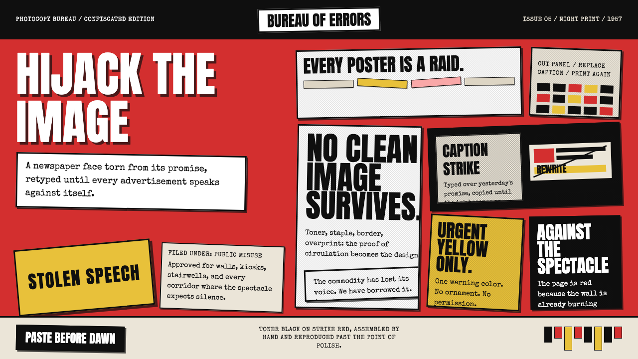 Situationist Détournement (1957)Contraband urgency. Strike red, toner black, and jagged comic panels make the…违禁般急迫:罢工红、碳粉黑与粗剪漫画格,让理论像偷印传单。
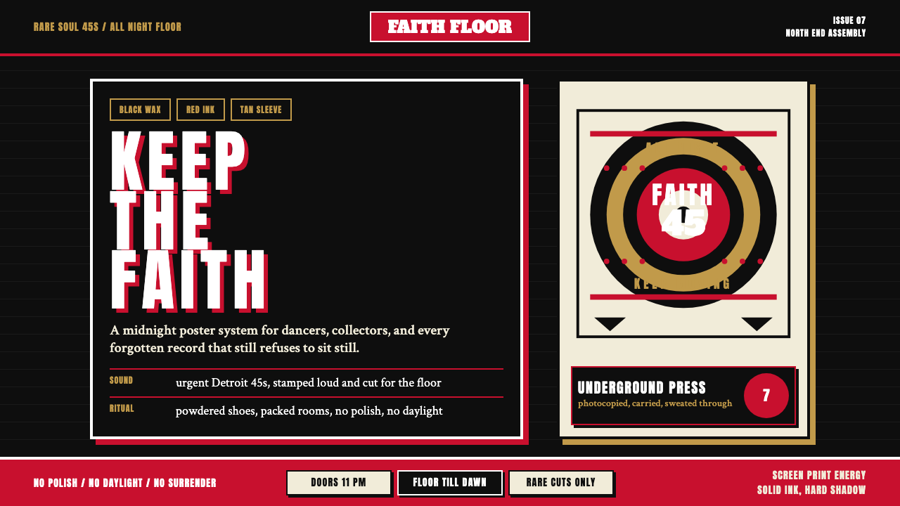 Northern Soul Wigan (1970)Underground urgency. Black ground, fist-red type, and tan vinyl rings hit lik…地下舞池的急迫感。黑底、拳红大字与唱片棕圆环像凌晨海报。
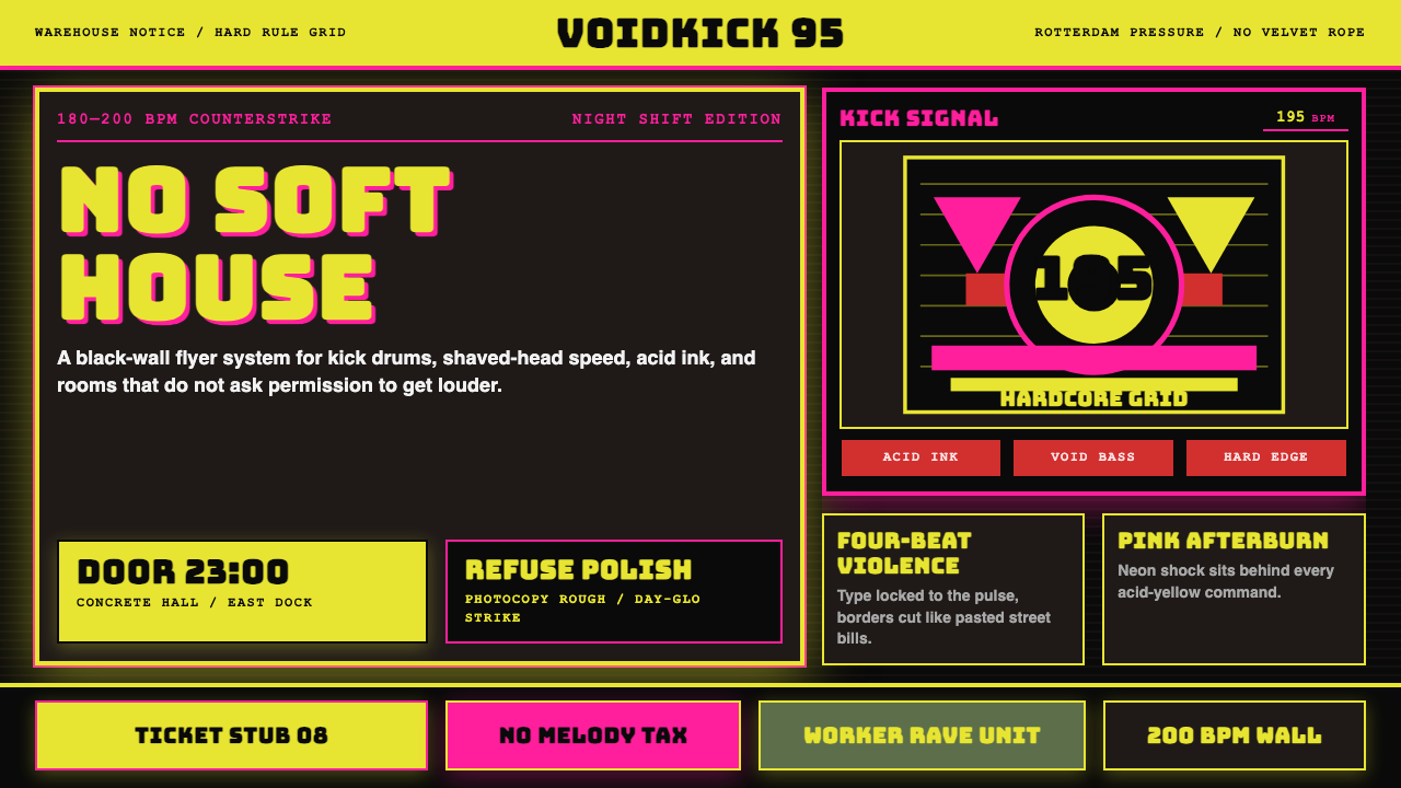 Rotterdam Gabber HardcoreHardcore refuses polish. Acid yellow, neon pink, black grid, and brutal Bunge…硬核拒绝精致:酸黄、霓虹粉与黑色网格,让粗暴 Bungee 字体像传单砸来。
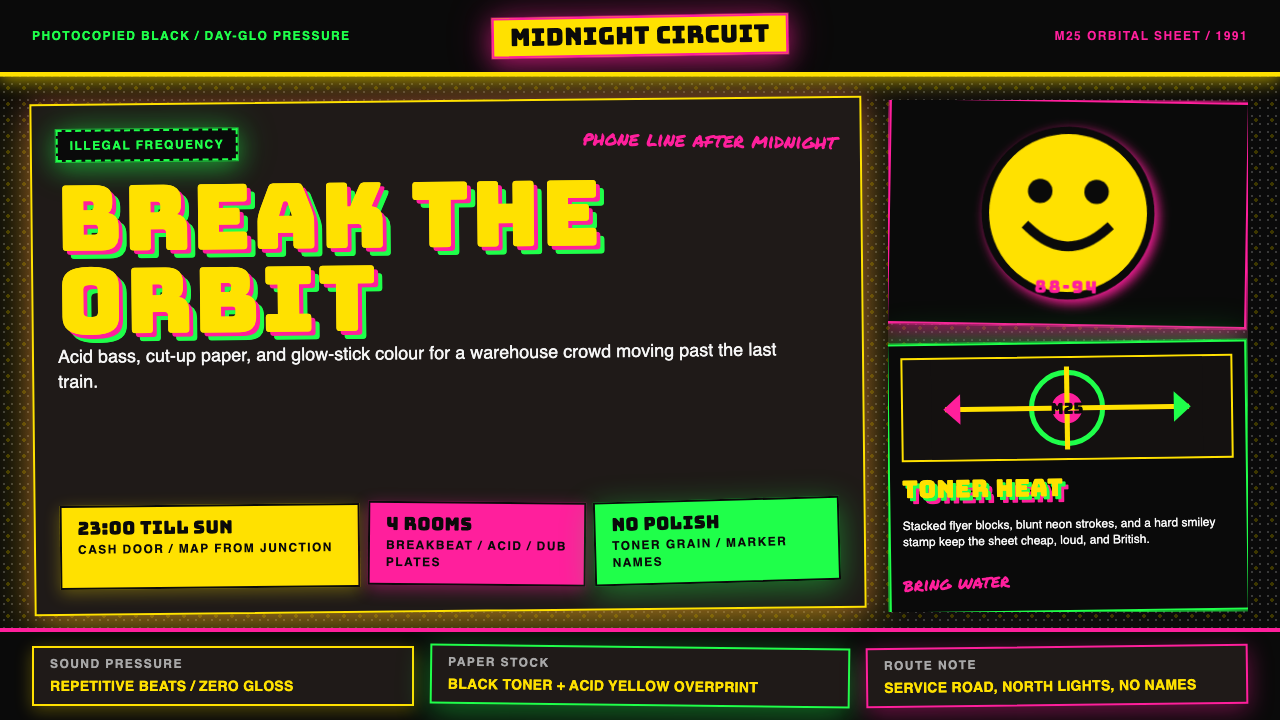 UK Rave Glow-Stick FlyerIllicit euphoria. Acid yellow, rave pink, and laser green slam into photocopi…非法狂喜。荧光黄、粉、绿撞上复印黑。
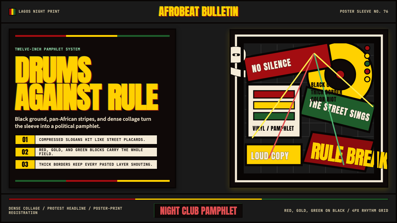 Fela Kuti Afrobeat Album (1976)Protest rhythm made visual. Red-yellow-green blocks and compressed Anton shou…抗议节奏视觉化。红黄绿块与压缩Anton黑底呐喊。
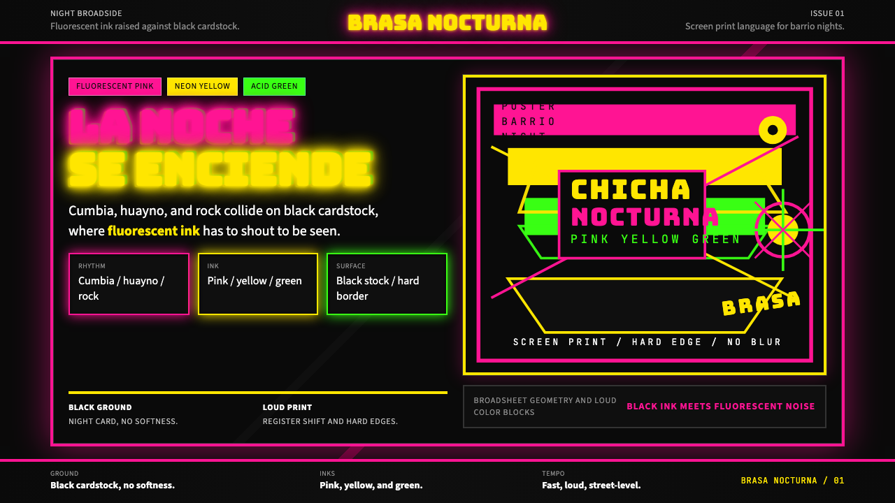 Peruvian Chicha Fluorescent PosterStreet-night fury. Pink, yellow, and green stack on black cardstock in hard b…夜街怒吼。粉黄绿硬边叠在黑卡纸上。