What is Fela Kuti Afrobeat Album (1976)?什么是 Fela Kuti Afrobeat Album (1976)?
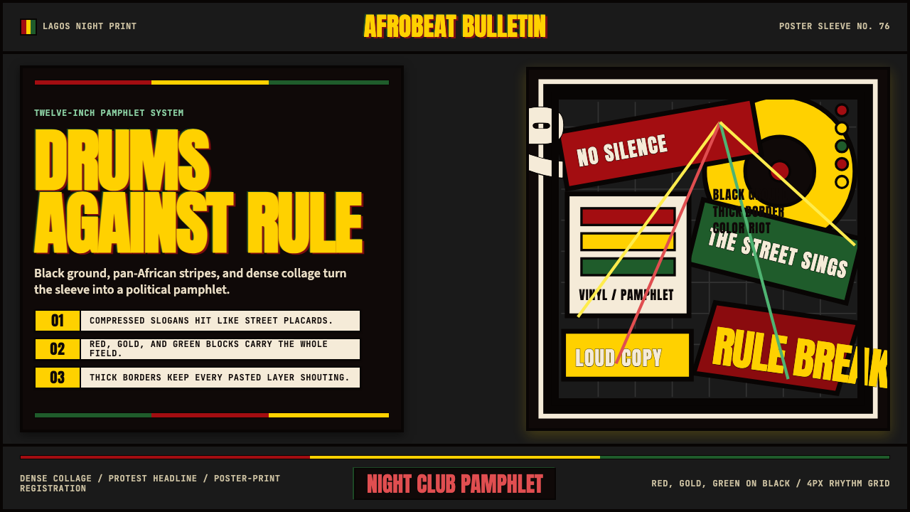
Protest music made visual: the scorched-black, pan-Africanist album sleeves of Fela Kuti's Lagos recordings fuse dense collage illustration, compressed headline type, and saturated red-yellow-green into a graphic language that shouts as loudly as the music inside.抗议音乐的视觉化:费拉·库蒂拉各斯录音的焦黑泛非主义专辑封套,将密集拼贴插画、压缩标题字体与饱和红黄绿融为一体,喊出与唱片内容同等响亮的图形语言。
Fela Kuti Afrobeat Album (1976) in briefFela Kuti Afrobeat Album (1976) 速览
The Fela Kuti Afrobeat Album design system draws from the visual universe of Fela Anikulapo Kuti's peak recording years, roughly 1972 through 1985, and in particular the sleeve art that artist Lemi Ghariokwu created for Fela's Kalakuta and Coconut releases throughout the mid-to-late 1970s. Those covers — dense with hand-drawn figures, political symbolism, bold lettering, and compressed color fields — were simultaneously music packaging and political broadsheets, circulating through Lagos markets and record shops as contraband challenges to the military governments of the period.费拉·库蒂非洲节拍专辑设计系统汲取费拉·阿尼库拉波·库蒂创作巅峰年代——大致1972年至1985年——的视觉宇宙,尤其是艺术家莱米·加里奥克武在整个七十年代中后期为费拉卡拉库塔与椰子厂牌创作的封套艺术。那些封面密布手绘人物、政治符号、粗体字样与压缩色域,同时兼具音乐包装与政治传单两种功能,在拉各斯集市与唱片店间流通,以禁书式的姿态挑战当时的军政权。
Aesthetically the system is loud, confrontational, and unapologetically loud. A deep black ground anchors everything; against it, the pan-Africanist triad of red, yellow, and green — the colors shared by the flags of Ghana, Guinea, Senegal, and other post-independence African states — blazes at full saturation. Type is set in compressed bold sans-serif letterforms that behave like protest-placard headlines rather than book typography. Borders are thick and black, evoking the registration marks of a silkscreen print. Illustrations, where present, are dense with layered figures and symbolic detail rather than clean negative space.美学上,这套系统张扬、对抗,毫不妥协地喧嚣。深黑底色锚定一切;与之相对,红、黄、绿这组泛非主义三色——被加纳、几内亚、塞内加尔等后独立时代非洲国家旗帜所共享——以全饱和度燃烧其上。字体采用压缩粗体无衬线字形,行为更像抗议标语标题而非书籍排版。边框厚重且黑,唤起丝网印刷的套版痕迹。插图(若有)密集叠压着层层人物与象征性细节,而非干净的负空间。
Unlike design systems rooted in reduction and restraint, this aesthetic celebrates accumulation and intensity. It is not trying to whisper; it is trying to fill a room. That energy, channeled through contemporary digital work, produces interfaces, covers, and presentations with a rare quality: they read as urgent.与根植于简化与克制的设计系统不同,这套美学颂扬积累与强度。它不是要低语;它是要充满整个房间。将这种能量导入当代数字作品,能产出界面、封面与演示文稿中罕见的品质:读来紧迫。
See the Fela Kuti Afrobeat Album (1976) design system查看 Fela Kuti Afrobeat Album (1976) 完整设计系统
Where does Fela Kuti Afrobeat Album (1976) come from?Fela Kuti Afrobeat Album (1976) 从何而来?
Afrobeat as a musical form was codified by Fela Kuti and his drummer Tony Allen beginning around 1968, blending Yoruba traditional music, highlife, James Brown-style funk, and free jazz into extended groove compositions that could stretch to twenty minutes or more on a twelve-inch single. Fela, educated in London at the Trinity College of Music and politicized by Black Power movements he encountered during a 1969 visit to the United States, returned to Lagos with a dual mission: to make music that belonged explicitly to Africa and to use that music as explicit political commentary on colonial legacies, military rule, and Western cultural imperialism.作为音乐形式,非洲节拍大约从1968年起由费拉·库蒂与鼓手托尼·艾伦共同定型,将约鲁巴传统音乐、海岸生活音乐(Highlife)、詹姆斯·布朗式放克与自由爵士融合成可在十二英寸单曲上延伸至二十分钟甚至更长的律动作品。费拉曾在伦敦三一音乐学院接受教育,并在1969年访美期间被黑权运动所激化,带着双重使命回到拉各斯:创作明确属于非洲的音乐,并以此对殖民遗产、军事统治与西方文化帝国主义进行直白的政治评论。
The visual identity of that mission was largely the creation of Lemi Ghariokwu, who began collaborating with Fela in 1974 at the age of eighteen and went on to design approximately twenty-six album covers over the following decade. Ghariokwu had no formal design training; he was a self-taught illustrator who absorbed influences from Egyptian hieroglyphics, traditional Yoruba textile patterns, American underground comics, and the psychedelic poster art circulating in Lagos at the time. The aesthetic he developed was emphatically hand-made: dense ink illustration, hand-lettered type, and saturated color blocking that looked more like an agitprop pamphlet than a commercial record sleeve.这一使命的视觉身份在很大程度上由莱米·加里奥克武所创造。他于1974年十八岁时开始与费拉合作,此后十年间设计了约二十六张专辑封面。加里奥克武没有受过正规设计训练,是一位自学成才的插画师,吸收了埃及象形文字、约鲁巴传统纺织图案、美国地下漫画以及当时在拉各斯流传的迷幻海报艺术等多方影响。他所发展的美学鲜明地属于手工制作:密集的墨线插画、手写字体,以及饱和色块——看起来更像煽动性小册子,而非商业唱片封套。
The political context was inseparable from the visual language. Fela's Kalakuta Republic — the communal compound in Lagos where he lived with his musicians and wives, and which he declared a sovereign state exempt from Nigerian law — was a physical embodiment of resistance. The album covers functioned as the visual proclamations of that republic. When the Nigerian military raided and burned Kalakuta in February 1977, killing Fela's mother, the subsequent album 'Coffin for Head of State' depicted a coffin being delivered to the presidential residence — an image so politically charged that the record was effectively banned. The covers were not decoration; they were evidence.政治语境与视觉语言不可分割。费拉的卡拉库塔共和国——拉各斯那处他与乐手及妻子们共同居住、并宣告为不受尼日利亚法律管辖的主权飞地——是抵抗的实体化身。专辑封面就是这个共和国的视觉宣言。1977年2月,尼日利亚军队突袭并焚毁卡拉库塔,杀害了费拉的母亲;随后发行的专辑《国家元首的棺材》描绘了一口棺材被送至总统官邸的画面——这幅图像具有如此强烈的政治冲击力,唱片实际上遭到了封禁。这些封面不是装饰;它们是证据。
The pan-Africanist color palette had specific historical resonance. Red, yellow, and green — sometimes called the pan-African colors — were popularized by Marcus Garvey's UNIA movement in the early twentieth century and then adopted by numerous African independence movements and post-colonial states. Their appearance on Fela's album covers was a deliberate alignment with a broader diasporic political tradition, linking the music to a geography that extended beyond Nigeria to the entire African continent and its descendants worldwide. The deep black ground was equally intentional: night as context, shadow as resistance, darkness as the ground from which something explosive emerges.泛非主义色彩组合有着特定的历史共鸣。红、黄、绿——有时被称为泛非色彩——在二十世纪初由马库斯·加维的UNIA运动推广,随后被众多非洲独立运动与后殖民国家采用。它们出现在费拉专辑封面上,是对更广泛的离散政治传统的刻意认同,将这些音乐与一个超越尼日利亚、延伸至整个非洲大陆及其全球后裔的地理空间相联结。深黑底色同样经过深思熟虑:夜晚作为语境,阴影作为抵抗,黑暗作为爆发物涌现其中的土壤。
What defines the Fela Kuti Afrobeat Album (1976) look?Fela Kuti Afrobeat Album (1976) 的视觉特征是什么?
Color: Black Ground with Pan-African Triad色彩:黑底与泛非三色
The palette is built on a deep, near-absolute black ground that functions as the visual equivalent of night or silence — the condition against which everything else asserts itself. Against this ground, red, yellow, and green operate at maximum saturation, with no tinting, shading, or modulation. Red carries urgency and blood; yellow carries gold, sun, and mineral wealth; green carries land, vegetation, and the continent itself. Unlike restrained palettes where color is used sparingly as accent, this system treats all three colors as primary actors, each given territory, with black as the stage. White appears rarely and only for type or detail, never as a ground.色板建立在近乎绝对的深黑底色之上,功能如同夜晚或静默的视觉等价物——其他一切都在其对立面上自我主张。在这一底色之上,红、黄、绿以最大饱和度运作,无淡化、无阴影、无调制。红色承载紧迫与鲜血,黄色承载黄金、太阳与矿产财富,绿色承载土地、植被与大陆本身。不同于将色彩克制用作点缀的克制性色板,这套系统将三种颜色均视为主角,各自占有领地,黑色则是舞台。白色极少出现,仅用于文字或细节,绝不作为底色。
Typography: Compressed Placard Energy字体排印:压缩标语能量
Headlines are set in compressed bold sans-serif letterforms — type that has been squeezed horizontally so that more characters fill a given width, creating a dense wall of text that reads as a shout rather than a statement. The visual effect is closer to a protest placard or newspaper front page than to conventional music packaging. Letter-spacing is tight, sometimes touching. Type is often reversed out of a color block — white or yellow letterforms on red or black — rather than set on a white ground. Body text, where it appears on covers or liner notes, uses a sharp contrast in scale to the headline, reinforcing the urgency of the primary message.标题采用压缩粗体无衬线字形排版——字体在水平方向被压窄,使更多字符填满给定宽度,形成如呐喊而非陈述般的密集文字墙。视觉效果更接近抗议标语或报纸头版,而非惯常的音乐包装。字间距紧密,有时相互触碰。文字常从色块中反白——红色或黑色上的白色或黄色字形——而非置于白底之上。封面或内页说明中出现的正文,与标题在尺度上形成强烈对比,强化了主要信息的紧迫感。
Illustration: Dense Collage and Political Allegory插画:密集拼贴与政治寓言
The illustration style is characterized by maximum density: figures are layered on figures, symbols overlap symbols, and negative space is treated as wasted opportunity. Ghariokwu's drawings are executed in a bold ink line that holds up at the scale of a vinyl sleeve and reads clearly even when reproduced in high contrast. The imagery is allegorical and specific: military figures, dancing bodies, the Lagos skyline, traditional masquerades, courtroom scenes, and abstract political symbols all appear in the same composition without hierarchy of realism. It is documentary and surreal simultaneously — Nigerian editorial cartooning crossed with West African ceremonial art.插画风格以极度密集为特征:人物层叠于人物之上,符号与符号相互重叠,负空间被视为浪费的机会。加里奥克武的画作以粗犷墨线完成,在黑胶唱片封套尺度上依然有力,即便在高对比度复制时也清晰可辨。图像具有寓言性且指向具体:军事人物、舞动的身体、拉各斯天际线、传统面具表演、法庭场景和抽象政治符号在同一构图中并存,不设现实主义层级。这同时是纪实的也是超现实的——尼日利亚新闻漫画与西非仪式艺术的交汇。
Borders: Thick Silkscreen Framing边框:厚重丝网印刷框架
Heavy black borders frame compositions in a way that echoes silkscreen poster printing, where borders emerge naturally from the layering of ink on paper and the registration process. These borders are structural rather than decorative: they define the edge of the visual field, separate zones of color and illustration, and give the whole composition the feel of a printed broadsheet or pamphlet. Within compositions, thick rules and dividers operate similarly — separating headline from body, image from text — with a weight that reinforces the system's confrontational character.厚重的黑色边框以呼应丝网印刷海报的方式框定构图,这类边框自然产生于油墨分层叠印与套版过程之中。这些边框是结构性的而非装饰性的:它们界定视觉场域的边缘,分隔色彩与插画区域,赋予整体构图以印刷传单或小册子的质感。在构图内部,粗重的线条与分隔符以同样方式运作——将标题与正文分开,将图像与文字分开——其重量强化了这套系统的对抗性格。
Texture: Ink, Grain, and Handmade Character质感:墨水、颗粒与手工特质
Unlike digital-era design systems built on smooth gradients and pixel-perfect edges, this aesthetic carries the texture of its original production process. Ink bleeds slightly at edges; solid color fields have a slight grain or variation suggesting offset lithography or silkscreen. This is not imperfection — it is the system's honest signature. In contemporary applications, reproducing this quality requires resisting the temptation of perfect digital flatness: a slight texture overlay, a rough edge on a color block, or hand-lettered accents can preserve the handmade urgency without descending into nostalgic pastiche.与建立在平滑渐变与像素级精确边缘之上的数字时代设计系统不同,这套美学携带着其原始生产过程的质感。墨水在边缘处略有渗透,实心色域带有轻微颗粒感或变化,暗示胶版印刷或丝网印刷的存在。这不是缺陷——这是这套系统诚实的签名。在当代应用中,再现这种品质需要抵制完美数字平整度的诱惑:轻微的纹理叠加、色块上的粗糙边缘或手写风格点缀,可以在不沦为怀旧仿制的前提下保留手工制作的紧迫感。
Composition: Full-Bleed Intensity构图:满幅强度
Compositions fill their format completely, with no comfortable margins and no quiet corners. Color blocks and illustrated zones push to the edges. Where a conventional design system might leave breathing room, this one fills it with another figure, another declaration, another stripe of color. This full-bleed intensity is not a failure of restraint — it is a formal argument that silence is complicity. The arrangement of color zones tends toward horizontal banding — broad stripes that echo both the structure of a flag and the visual logic of a vinyl record label.构图完全充满其格式,没有舒适的边距,没有安静的角落。色块与插画区域推向边缘。惯常设计系统可能留出呼吸空间之处,这套系统用另一个人物、另一句宣言、另一条色彩带来填满。这种满幅强度不是克制失败——它是一个形式论点:沉默即共谋。色彩区域的排列倾向于水平分层——宽阔的条纹,同时呼应旗帜的结构与黑胶唱片标签的视觉逻辑。
Symbol and Text Integration符号与文字整合
Text and image are treated as equals in this system, neither subordinate to the other. Headlines can interrupt an illustration; a figure can overlap a block of type; the artist and album name can be embedded directly within a drawn scene rather than isolated in a typographic zone. This integration echoes traditional West African textile and object design, where pattern and symbol carry communicative content inseparable from their visual form. The result is a surface where reading and looking are simultaneous rather than sequential acts.在这套系统中,文字与图像被视为平等,互不从属。标题可以打断插画;人物可以与文字块重叠;艺术家名与专辑名可以直接嵌入手绘场景之中,而非孤立于字体排印区域。这种整合呼应了西非传统纺织品与器物设计,其中图案与符号承载的传达内容与其视觉形式不可分离。结果是一个阅读与观看同时发生而非依次进行的表面。
See the Fela Kuti Afrobeat Album (1976) design system查看 Fela Kuti Afrobeat Album (1976) 完整设计系统
Who shaped Fela Kuti Afrobeat Album (1976)?谁塑造了 Fela Kuti Afrobeat Album (1976)?
Fela Kuti (1938–1997) was the musician, bandleader, and political activist whose recordings provided the content and context for the visual system described here. Trained in London and radicalized by exposure to the American Black Power movement, he returned to Lagos and established Kalakuta Republic as a space of creative and political autonomy. His music — extended, polyrhythmic Afrobeat compositions performed by his rotating ensemble Africa 70 and later Egypt 80 — was inseparable from its visual presentation. The album sleeve was part of the political act. Fela was imprisoned multiple times by successive Nigerian military governments, and his persecution gave the visual language of his albums an urgency that was not metaphorical but biographical.费拉·库蒂(1938—1997年)是音乐家、乐队领袖与政治活动家,其录音为本文所述视觉系统提供了内容与语境。曾在伦敦受训、经美国黑权运动激化后,他回到拉各斯,建立卡拉库塔共和国作为创造与政治自主的空间。他的音乐——由旋转阵容的乐团非洲七十及后来的埃及八十演奏的延展性、多节奏非洲节拍作品——与其视觉呈现不可分离。专辑封套是政治行动的一部分。费拉曾多次被历届尼日利亚军政府囚禁,这份迫害赋予其专辑视觉语言一种并非隐喻而是传记意义上的紧迫感。
Ghariokwu (born 1955) is the Lagos-based artist who designed the majority of Fela's iconic album covers between 1974 and 1984. Beginning the collaboration at eighteen with no formal training, he developed a hybrid visual language that fused Nigerian editorial illustration traditions, traditional Yoruba symbolic imagery, and the international visual vocabulary of political poster art. His covers for albums including 'Expensive Shit,' 'Zombie,' 'Coffin for Head of State,' and 'Beast of No Nation' are now recognized as significant works of African graphic art independent of their function as music packaging. Ghariokwu continues to work as an artist and has lectured internationally on the political dimensions of his Fela-era work.加里奥克武(生于1955年)是拉各斯艺术家,在1974年至1984年间设计了费拉大多数标志性专辑封面。以十八岁、无正规训练之身开始这段合作,他发展出一套融合尼日利亚编辑插画传统、约鲁巴传统象征图像与政治海报艺术国际视觉词汇的混合视觉语言。他为《昂贵的粪便》《僵尸》《国家元首的棺材》《无国之野兽》等专辑创作的封面,现已被视为独立于其音乐包装功能之外的重要非洲平面艺术作品。加里奥克武至今仍作为艺术家活跃,并曾在国际场合就其费拉时代作品的政治维度发表演讲。
Tony Allen (1940–2020) was Fela's drummer and musical co-architect for over a decade, widely credited as the rhythmic inventor of Afrobeat. His contribution to the design system is indirect but essential: the polyrhythmic, layered structure of the music — multiple rhythmic patterns cycling against each other at different intervals — has a direct structural analogy in the visual system's approach to layered color fields, overlapping illustration, and multiple competing visual rhythms occupying the same surface simultaneously. Understanding Allen's rhythmic logic helps explain why the visual system looks the way it does: it is not chaotic accumulation but structured density.托尼·艾伦(1940—2020年)是费拉的鼓手与十余年音乐共同架构师,被广泛认为是非洲节拍节奏上的发明者。他对这套视觉系统的贡献是间接但本质的:音乐中多重节奏模式在不同间隔相互循环的多节奏叠层结构,与视觉系统中叠层色域、重叠插画及多重竞争性视觉节奏同时占据同一表面的方式,存在直接的结构类比。理解艾伦的节奏逻辑有助于解释为何这套视觉系统呈现出它的面貌:这不是混乱的积累,而是结构性的密度。
Femi Kuti (born 1962), Fela's eldest son, continued performing and recording Afrobeat from the 1990s onward, and the visual language associated with the tradition extended into his album and concert work. Femi's visual productions draw from the same foundational palette and typographic intensity while incorporating influences from the subsequent decades of African graphic design, digital production tools, and international music marketing. His continuation of the tradition demonstrates that the visual system is not frozen in 1976 but is capable of evolution while retaining its core character — a useful reference point for designers working with the style today.费米·库蒂(生于1962年),费拉长子,自1990年代起持续演出并录制非洲节拍音乐,与这一传统相关联的视觉语言延伸进入他的专辑与演出作品。费米的视觉作品汲取同样的基础色板与字体强度,同时融入此后数十年非洲平面设计、数字制作工具与国际音乐营销的影响。他对这一传统的延续表明:这套视觉系统并非冻结于1976年,而是能够在保留核心特质的同时持续演化——这对今日使用这种风格的设计师而言是有益的参照点。
Marcus Garvey (1887–1940) was the Jamaican-born Black nationalist leader whose Universal Negro Improvement Association popularized the red, black, and green pan-African color combination in the early twentieth century. That combination — in Fela's visual system modified to red, yellow, and green against black, aligned with the colors of independent African states — connects the album covers to a diasporic political tradition that predates Nigerian independence by four decades. Designers working with this system should understand that the color choices are not arbitrary or purely decorative: they are a precise historical citation with a specific political meaning.马库斯·加维(1887—1940年)是牙买加裔黑人民族主义领袖,其世界黑人进步协会在二十世纪初推广了红、黑、绿的泛非色彩组合。在费拉的视觉系统中,这一组合被调整为黑底上的红、黄、绿,与独立非洲国家旗帜的色彩对齐,将专辑封面与一个比尼日利亚独立早四十年的离散政治传统相连接。使用这套系统的设计师应当理解:这些色彩选择不是任意的,也不是纯粹装饰性的——它们是具有特定政治含义的精确历史引用。
How do you use Fela Kuti Afrobeat Album (1976) today?今天怎么用 Fela Kuti Afrobeat Album (1976)?
Applying the Fela Kuti Afrobeat Album system correctly requires accepting its core proposition: this is not a style that whispers. The visual energy comes from controlled intensity, not from decoration applied to a neutral layout. The starting point for any application is the deep black ground, from which the color, type, and imagery emerge. Designers who begin with a light background and try to add the other elements will find the system resists — the logic runs in one direction, dark to vivid.正确应用费拉·库蒂非洲节拍专辑系统,需要接受它的核心命题:这不是一种低语的风格。视觉能量来自受控的强度,而非施加于中性版面之上的装饰。任何应用的起点是深黑底色,色彩、文字与图像从中涌现。从浅色背景开始、试图添加其他元素的设计师会发现这套系统在抵制——它的逻辑只沿一个方向运行:从暗到鲜活。
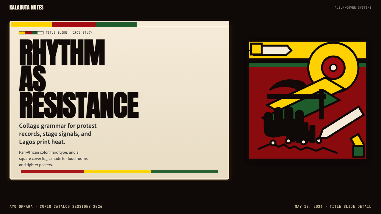
For presentation slides, the system works powerfully on both cover and section-divider pages. A cover built in this style places the title in compressed bold type reversed out of a wide color band — red or yellow on black, or black on red — with an illustrative or photographic element occupying a second zone. The full-bleed approach means no slide title floats on empty white space; every element is grounded in a color field. Content slides should use a simpler version of the system: one dominant color zone at the top or left, a black type zone for body content, and the characteristic thick rule as a divider. Data slides can assign one color from the triad to each data series, with bars and segments appearing as solid saturated blocks against the dark ground — charts become geometric objects with the same assertiveness as the illustration style.在演示文稿中,这套系统在封面页与章节分隔页上都极具力量。以这种风格制作的封面,将标题以压缩粗体字从宽幅色带中反白——红底或黄底上的黑字,或黑底上的红字或黄字——插画或摄影元素占据第二区域。满幅方式意味着没有幻灯片标题漂浮在空白白色空间中;每个元素都以色域为基础。内容页应使用这套系统的更简洁版本:顶部或左侧一个主导色域,黑色文字区域承载正文内容,特征性粗线作为分隔符。数据页可将三色组合中的一种颜色分配给每组数据序列,柱条和扇区作为实心饱和色块出现在深色底色之上——图表成为具有与插画风格同等主张性的几何对象。
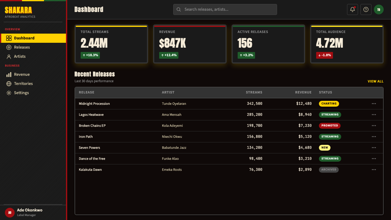
For web UI and dashboards, the system is particularly effective in contexts where urgency and clarity of status are required — monitoring dashboards, real-time data displays, alert systems, and platforms communicating about consequential information. The approach: black or very dark near-black background throughout, with red reserved for critical alerts and negative states, yellow or amber for warnings and active states, and green for positive or safe states. This color-to-state mapping aligns with established UI conventions while giving the interface a visual intensity that reinforces the seriousness of the information. For pricing pages, the three-color system maps naturally to tiered plans: one color per tier, with the recommended tier receiving the highest-saturation treatment.对于网页界面与仪表板,这套系统在需要紧迫感与状态清晰度的场景中尤为有效——监控仪表板、实时数据显示、告警系统,以及传达重要信息的平台。方法如下:全程使用黑色或深近黑色背景,红色保留给严重告警与负面状态,黄色或琥珀色用于警告与活跃状态,绿色用于正面或安全状态。这种色彩与状态的映射与既有界面惯例对齐,同时赋予界面一种强化信息严肃性的视觉强度。对于定价页面,三色系统自然地映射到分级方案:每级一种颜色,推荐级别获得最高饱和度处理。
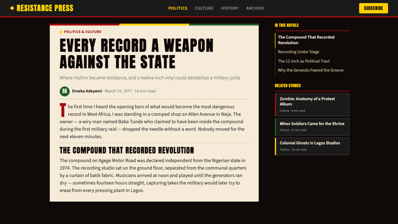
For editorial and marketing work, the system produces striking visual impact in contexts where the message is intended to be urgent, politically inflected, or culturally assertive. Music releases, cultural event promotion, social justice campaigns, and platforms with an explicitly activist brand character are natural fits. The full-bleed approach translates well to social media formats: a square or vertical composition with the characteristic black ground, one or two color fields, and compressed headline type reads as distinctive at small sizes in a feed. For longer editorial formats — scrolling web articles or printed magazines — use the horizontal banding principle: alternate sections built from the triad colors and black, with type reversed where necessary for contrast.对于编辑与营销作品,这套系统在信息意在传达紧迫感、政治色彩或文化主张的场景中产生震撼的视觉冲击。音乐发行、文化活动推广、社会正义运动,以及具有明确活动家品牌特质的平台,都是自然的契合点。满幅方式很好地转化为社交媒体格式:以特征性黑色底色、一两个色域和压缩标题字体构成的方形或竖向构图,在信息流中以小尺寸也能读作独特存在。对于更长的编辑格式——滚动网页文章或印刷杂志——使用水平分层原则:以三色组合色与黑色交替构建各节,在必要时反白文字以保证对比度。
A common mistake when applying this system is treating the pan-African colors as a purely decorative palette and the black background as a stylistic choice rather than structural elements with specific meaning. The result is work that borrows the surface appearance while losing the directional energy: colors that drift toward pastels, borders that thin to suggestions, type that reduces to conventional weight. A second common error is equating density with randomness — piling elements without the underlying structure of color zones, typographic hierarchy, and illustrative rhythm that makes the originals legible despite their complexity. If the composition is simply crowded rather than densely organized, the style is not being applied; it is being approximated.应用这套系统时最常见的错误,是将泛非颜色视为纯粹的装饰性色板,将黑色背景视为风格选择,而非具有特定含义的结构性元素。结果是借用了表面外观却失去了方向性能量的作品:向粉彩漂移的颜色,细化为暗示的边框,降至惯常字重的字体。第二个常见错误是将密度等同于随机性——堆砌元素却缺乏使原作在复杂中保持可读性的底层结构:色域分区、字体层级与插画节奏。若构图仅仅是拥挤而非密集有序,这种风格并未被应用;它只是被近似了。
See the Fela Kuti Afrobeat Album (1976) design system查看 Fela Kuti Afrobeat Album (1976) 完整设计系统
Fela Kuti Afrobeat Album (1976) — FAQFela Kuti Afrobeat Album (1976) · 常见问题
How does this style differ from other political poster traditions, such as Soviet Constructivism or Cuban revolutionary graphics?这种风格与其他政治海报传统——例如苏联构成主义或古巴革命图形——有何不同?
The most significant difference is the role of illustration and the use of darkness. Soviet Constructivism and its descendants favor geometric abstraction, flat planes, and diagonal dynamism on light grounds. Cuban revolutionary graphics, particularly the ICAIC poster tradition, use bold color and silhouette but with considerable negative space and a more elegant relationship between figure and ground. The Fela Kuti system is categorically denser and more narrative: the illustration is figurative, symbolic, and crowded with specific characters and political references that reward close reading. The deep black ground is also distinctive — it places the work in night rather than daylight, which has a specific emotional and political valence absent from the lighter-ground traditions.最显著的差异在于插画的角色和对黑暗的运用。苏联构成主义及其衍生流派倾向于几何抽象、平面色块和浅底上的对角线动感。古巴革命图形,尤其是ICAIC海报传统,使用大胆色彩与剪影,但负空间更为充裕,图形与底色之间的关系更为优雅。费拉·库蒂系统从根本上更为密集、更具叙事性:插画是具象的、象征性的,充满值得细读的具体人物与政治指涉。深黑底色同样具有独特性——它将作品置于夜晚而非白昼之中,这在情感与政治上具有浅底色传统所缺乏的特定含义。
Can this style work for brands or products that have no connection to West African culture or political activism?这种风格能用于与西非文化或政治活动毫无关联的品牌或产品吗?
It can, but the question deserves honest consideration. The visual language is not culturally neutral — it carries the specific historical meaning of pan-Africanism, political resistance, and a particular moment in Nigerian cultural history. Using it decoratively, without awareness of that meaning, risks reducing a serious political aesthetic to surface style. That said, the underlying formal qualities — density, saturated color on dark ground, confrontational type — are applicable wherever urgency and directness are genuine values. The safest applications are those where the brand's actual values — loudness, cultural assertiveness, political clarity, night-time energy — genuinely align with the aesthetic's origins, rather than simply borrowing its visual drama.可以,但这个问题值得诚实对待。这套视觉语言在文化上并非中立——它承载着泛非主义、政治抵抗与尼日利亚文化史特定时刻的具体历史含义。在缺乏对这层含义的认知下装饰性地使用它,有将严肃的政治美学简化为表面风格的风险。话虽如此,其底层形式特质——密度、深底上的饱和色彩、对抗性字体——在紧迫与直接是真实价值的任何场景中都可应用。最安全的应用是那些品牌的实际价值——张扬、文化主张、政治清晰度、夜间能量——与这套美学的起源真正对齐的场景,而非仅仅借用其视觉戏剧性。
How should photography be used within this system?在这套系统中应如何使用摄影图像?
Photography enters the system most effectively when it is treated as an element to be composited rather than a window to be opened. High-contrast processing — pushing shadows to near-black and highlights toward the dominant color of the composition — integrates photographs into the color system rather than placing them in visual competition with it. Duotone treatment in the triad colors, particularly red-and-black or yellow-and-black, is historically resonant: it echoes both the color limitations of offset printing in Lagos in the 1970s and the high-contrast aesthetic of protest photography and reportage. Documentary photography of musicians, crowds, urban environments, and political gatherings is thematically appropriate; aspirational lifestyle photography is not.摄影在被视为合成元素而非打开的窗口时,最有效地进入这套系统。高对比度处理——将阴影推向近乎纯黑,将高光推向构图主导色——使照片融入色彩系统,而非与之形成视觉竞争。以三色组合进行双色调处理,尤其是红黑或黄黑,具有历史共鸣:它既呼应了1970年代拉各斯胶版印刷的色彩限制,也呼应了抗议摄影与新闻报道的高对比度美学。音乐人、人群、城市环境与政治集会的纪录摄影在主题上是契合的;抱负式生活方式摄影则不然。
What is the difference between using this style and simply using a dark background with bright colors?使用这种风格与单纯使用深色背景配亮色有何不同?
The difference lies in specificity and structure. Many contemporary dark-mode interfaces use bright color accents on dark grounds — neon on charcoal is a common combination in gaming and tech interfaces. What distinguishes the Fela Kuti system is the combination of specific color values from the pan-African tradition, the confrontational compressed headline typography, the dense illustrative layer, the thick structural borders, and the full-bleed composition without comfortable margins. Any one of these elements on its own produces a dark-ground design; all of them together, pulled from the same historical reference, produce the specific aesthetic being described here. Authenticity comes from understanding the whole system rather than selecting individual elements.差异在于特殊性与结构。许多当代深色模式界面在深色底上使用亮色点缀——霓虹配炭灰是游戏与科技界面中的常见组合。费拉·库蒂系统的区别,在于来自泛非传统的特定色彩值、对抗性压缩标题字体、密集插画层、厚重结构边框,以及无舒适边距的满幅构图的综合运用。这些元素中的任何一个单独使用都能产生深底色设计;将所有元素合并,从同一历史参照中提取,才能产生本文所描述的特定美学。真实性来自对整个系统的理解,而非对单个元素的拣选。
Is this style appropriate for digital animation and motion graphics?这种风格适合数字动画与动态图形吗?
Yes, and the musical origins of the system suggest specific motion principles. Afrobeat is a polyrhythmic form in which multiple rhythmic layers cycle at different intervals, creating a dense groove that evolves without ever fully resolving. Motion applied to this visual system should echo that structure: elements enter and exit at different rhythmic intervals rather than all animating together; color zones shift at a slower tempo than illustrative elements; type pulses or compresses at a rhythm distinct from the background. Hard cuts between full-bleed color states — a full screen of red suddenly replaced by a full screen of black — are more appropriate than smooth crossfades. The style resists gradual, ambient motion; it rewards percussive, decisive transitions.适合,且这套系统的音乐起源暗示了特定的运动原则。非洲节拍是一种多节奏形式,多个节奏层以不同间隔循环,创造出一个密集而持续演化却从不完全解决的律动。应用于这套视觉系统的运动应呼应这一结构:元素以不同的节奏间隔进入和退出,而非同时动画;色域变换的节奏慢于插画元素;文字以与背景截然不同的节奏脉动或压缩。满幅色彩状态之间的硬切换——一满屏红色突然被一满屏黑色取代——比平滑交叉淡化更为适当。这种风格抵制渐进的、环境式的运动;它褒奖打击乐式的、决断性的过渡。
Related design styles相关设计风格
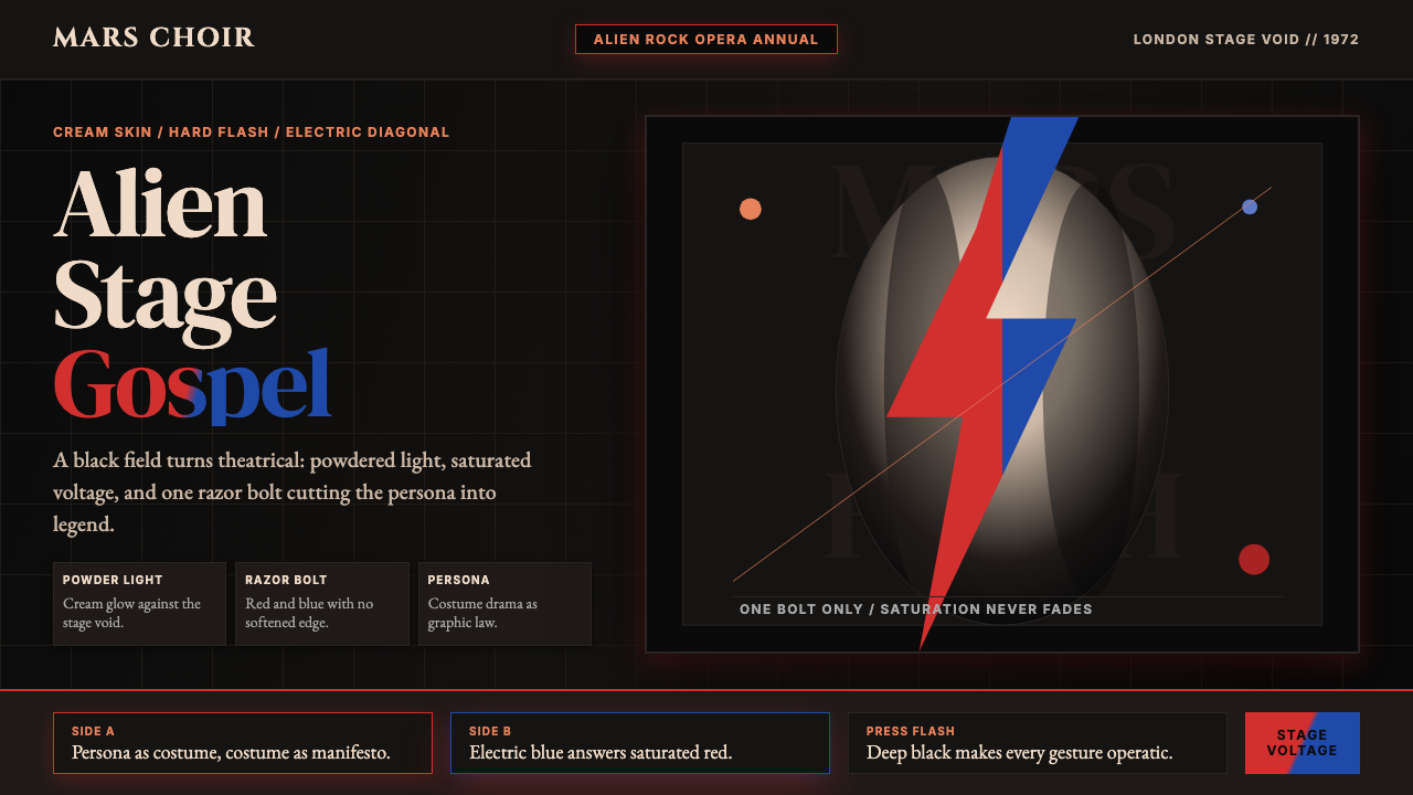 Bowie — Ziggy StardustTheater at full voltage. Cream-on-black portrait cut by one red and electric-…满电压的剧场感:黑底奶油肖像,被红与电蓝闪电劈开。
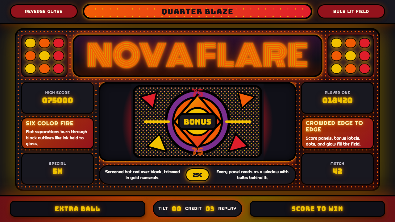 Pinball BackglassGlows like paid light. Monoton type, black outlines, orange-red halftones cro…像投币后的灯光燃起。Monoton 字体、黑描边与橙红半调挤满玻璃。
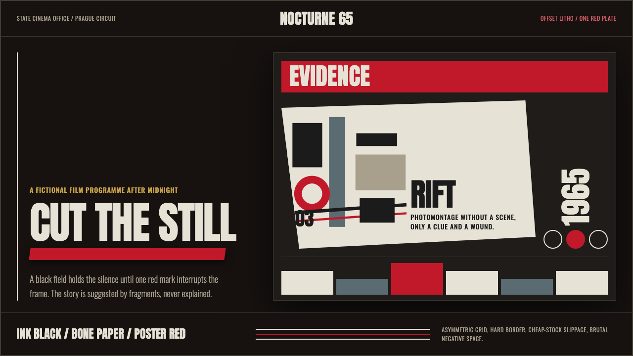 Czech New Wave PosterConcept before spectacle. Ink black, bone type and one poster-red incision fr…观念先于奇观。墨黑、骨白窄体与一道海报红切开网格。
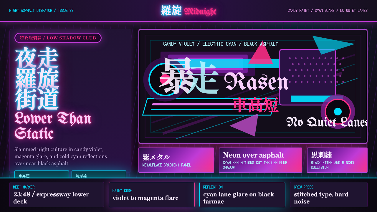 JDM BosozokuNight culture shouts. Candy violet, cyan neon, and stacked Mincho-blackletter…夜色里吼叫:糖果紫与电光青,明朝体和黑体叠满柏油。
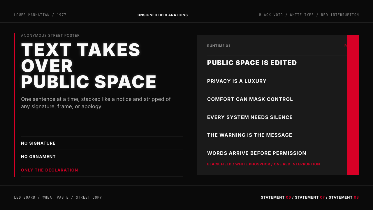 Jenny Holzer Truisms (1977)Austere declarations. White all-caps on black, cut by a single red warning.克制宣言。黑底白字,全大写排成LED板,红色只作警示。
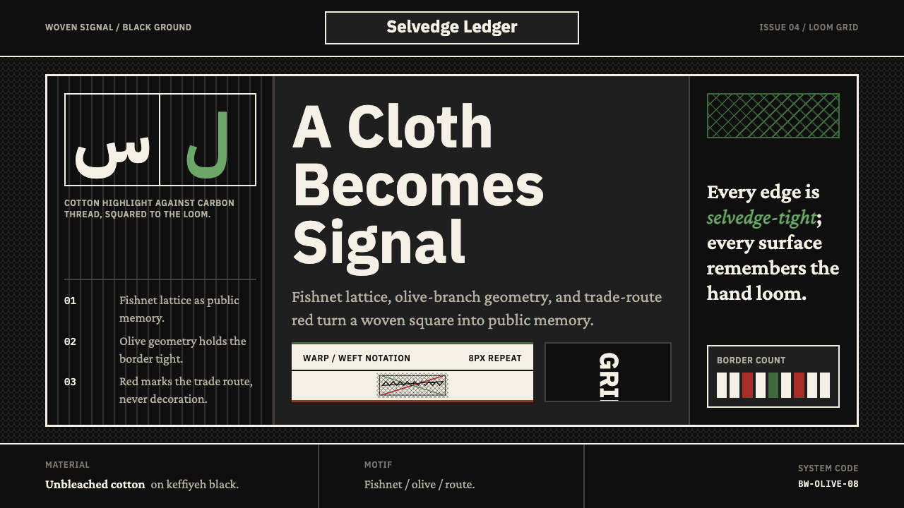 Levantine Keffiyeh Black & WhitePolitical textile, not ornament. Cotton type and fishnet lattice cut through…政治纺织,不是装饰。棉白字体与渔网格纹切入黑底。