What is Czech New Wave Poster?
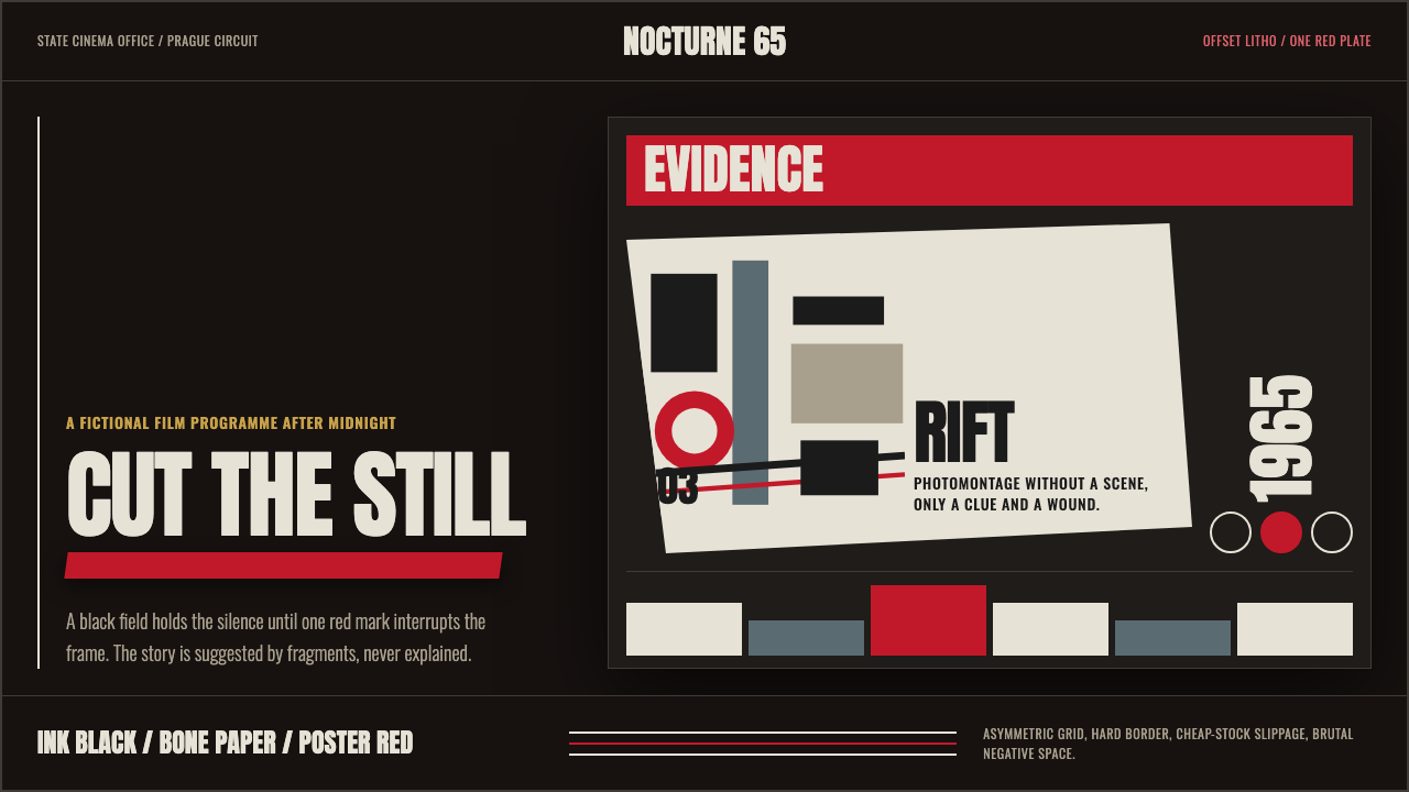
The Czech New Wave poster school turned state censorship into creative fuel — ink-black fields, a single blade of poster red, torn photographic fragments, and condensed type that shouts without shouting. Concept before spectacle, restraint as radicalism.
Czech New Wave Poster in brief
Czech New Wave Poster is a graphic design movement born in Czechoslovakia between roughly 1958 and 1975, reaching its darkest and most concentrated expression in the mid-1960s. Working within the state film distribution apparatus, a tight circle of designers — Zdeněk Ziegler, Josef Vyleťal, Karel Vaca, and Karel Teissig among the most prominent — produced film promotional material that bore almost no resemblance to the cheerful propaganda poster idiom that surrounded them. Instead they drew on Surrealism, photomontage, Constructivist tension, and the absurdist logic of the films themselves.
The visual signature is stark and immediately legible: an ink-black or near-black ground, one accent color (most often a fierce cadmium red) used as a single structural incision rather than decoration, photographic fragments cropped and torn rather than neatly composed, and oversized condensed letterforms that treat title and text as part of the image rather than a caption sitting beneath it. The composition is deliberately unresolved — tension rather than closure, a question posed to the viewer rather than an answer delivered.
Because the movement operated under Iron Curtain constraints — limited color printing budgets, state oversight of content, offset lithography as the dominant technology — its power comes precisely from scarcity. The palette cannot be rich, so every color choice becomes a statement. The imagery cannot be explicit, so juxtaposition and negative space carry the conceptual weight. The result is a body of work that remains startlingly modern: brutal, intelligent, and entirely free of the sentimentality that afflicts most film poster design.
Where does Czech New Wave Poster come from?
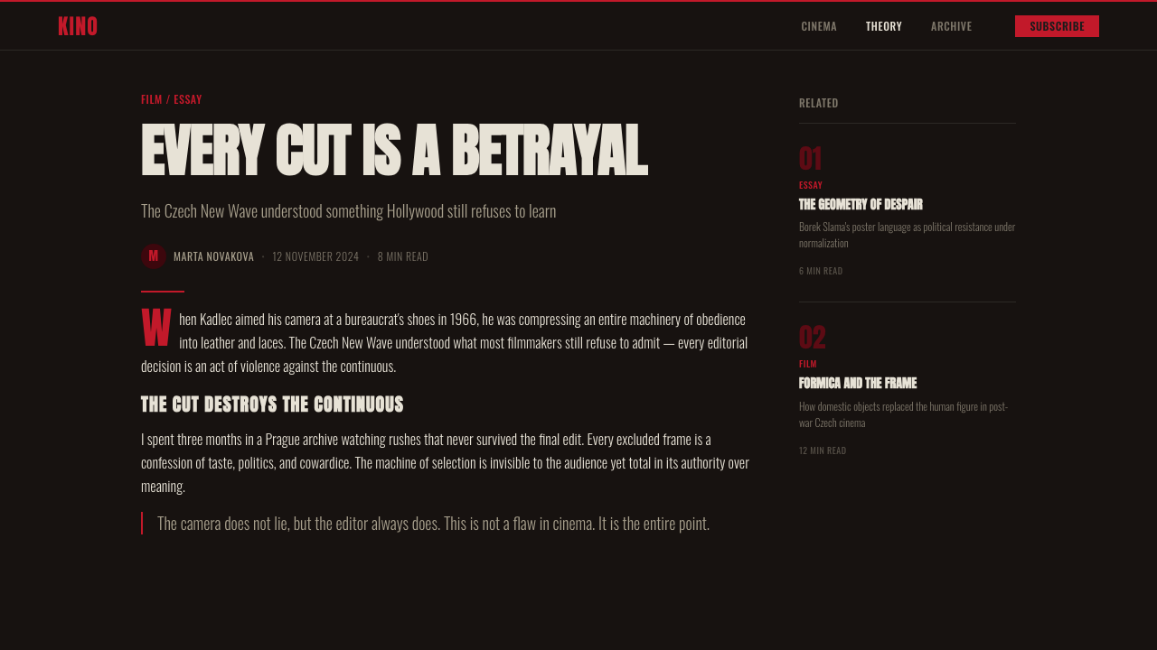
The Czech poster school emerged from the specific cultural thaw that followed Stalin's death in 1953 and deepened across the late 1950s. The Czechoslovak state ran its own film production and distribution infrastructure — Czechoslovak Film — and the posters commissioned to advertise domestic and imported films were a rare space of relative creative latitude. Designers were not making propaganda for the party; they were making commercial material for films, and the films themselves — especially after the Czech New Wave cinema began in the early 1960s with directors like Miloš Forman, Věra Chytilová, and Jiří Menzel — were formally experimental and politically elliptical. The posters followed the films: oblique, layered, resistant to single readings.
The technical conditions of Iron Curtain offset lithography shaped the aesthetic directly. Most posters were printed in two or three colors at most; full-color photographic reproduction was expensive and often unavailable. This forced designers toward bold reduction: a black ground, one strong accent, hand-drawn or photographically derived lettering integrated into the composition. The constraint that might have produced dull, cheaply executed work instead produced a visual economy so precise that every element has maximum weight. Ziegler in particular worked this dark register to its extreme: his posters are often almost purely black with a single color interruption, more like visual arguments than advertisements.
Photomontage — the technique of cutting and juxtaposing photographic fragments — came to Czech poster design partly through the legacy of interwar European avant-garde (Dadaism, Czech Poetism, Surrealism all had roots in Prague), and partly through the direct influence of the Polish poster school, which was developing simultaneously and with which Czech designers were in dialogue. The Polish school was somewhat brighter and more lyrical in its surrealism; the Czech school, especially in Ziegler's hands, pushed toward something harder, more confrontational, more willing to use emptiness as a primary compositional material.
The peak of the movement coincided almost exactly with the political relaxation of the Prague Spring in 1968 and then collapsed under the Soviet invasion and subsequent normalization. Many of the key designers continued working after 1968, but the creative energy of the movement — its willingness to be genuinely strange and unresolved — diminished under tighter cultural controls. The work of the 1960s peak, produced under the earlier, slightly looser restrictions, remains the definitive period of the style. What survives is a body of perhaps a few thousand posters, many now held in museum collections in Prague, Brno, and internationally, that represent one of the most distinctive national contributions to twentieth-century graphic design.
What defines the Czech New Wave Poster look?
Ground and Void
The defining move of Czech New Wave Poster design is the use of near-total darkness as ground. Where most commercial poster design uses background as a neutral support, here the black field is active and charged — it absorbs whatever is placed on it and gives the remaining elements an almost radioactive intensity. Negative space is not empty; it is pressure. Designers like Ziegler understood that an image placed against full blackness carries more visual weight than the same image on white, because the eye has nowhere else to go.
The Single Color Cut
Palette restriction was a technical necessity that became an aesthetic principle. The defining accent — most often a saturated red but sometimes a blood orange or cold blue — appears not as fill or decoration but as incision: a diagonal slash, a bleeding fragment, a single letter or numeral rendered in the accent color against the darkness. This structural use of one accent color is what separates the Czech approach from both Western commercial poster design (which tends toward full-color photographic reproduction) and Soviet propaganda (which uses red symbolically but rarely with this degree of formal precision).
Photomontage and Fragmentation
Photographic imagery enters these posters not as clean reproduction but as material — torn edges, overlapping fragments, unexpected juxtapositions that produce meanings neither image would carry alone. A face half-visible at the edge of darkness, a hand emerging from nothing, a landscape fragment suspended against pure black: the montage technique treats photography as raw material to be cut and repositioned rather than as a transparent window. This connects the movement to the European Surrealist tradition (especially Czech Poetism and the Prague Surrealist Group, which was active from 1934) as well as to Dadaist collage.
Condensed Typography as Image
Lettering in Czech New Wave Poster design is never incidental. Condensed, high-contrast typefaces — tall and narrow, with a marked difference between thick and thin strokes — are sized to compete with and interact with photographic elements rather than sit below them. Film titles become visual objects in their own right: the letterforms crowd the black field, bleed off the edge, overlap with photographic fragments, or appear in the accent color as a contrast to the surrounding darkness. Typography is treated with the same formal seriousness as imagery, and the boundary between the two frequently dissolves.
Conceptual Indirection
Perhaps the most radical quality of Czech New Wave Poster design is its refusal to illustrate. Where a conventional film poster shows stars, shows scenes, tells you what the film looks and feels like, the Czech approach offers a visual equivalent of the film's internal logic rather than its surface. A poster for a tragicomedy might offer an image of profound stillness and unease. A horror film might produce a poster of stark geometric elegance. The work functions as a parallel text to the film, interpreting it rather than advertising it — which is why so much of it holds up as autonomous graphic art independent of the films it was made to promote.
Structural Asymmetry and Tension
Compositions are asymmetric and deliberately off-balance — not in the way of accidental awkwardness, but in the way of a controlled lean, a system held in productive tension rather than resolved equilibrium. Elements are placed to create diagonal sightlines through the field; the eye is directed but not told where to stop. This instability is intentional and reflects the sensibility of the films being promoted: Czech New Wave cinema was itself characterized by open endings, unreliable narration, and a deliberate refusal of conventional resolution.
Absolute Economy
Nothing is decorative in Czech New Wave Poster design. Every element — the black ground, the accent color, the photographic fragment, the condensed lettering — is doing structural work. There are no borders for the sake of borders, no textures applied for visual richness, no ornamental flourishes softening the composition. The economy is even more radical than the Bauhaus zero-ornament principle because the Czech designers were not primarily interested in functionalist rationalism — they were interested in poetic shock, and they found that extreme reduction was the most effective delivery mechanism for it.
Who shaped Czech New Wave Poster?
Ziegler is the most internationally recognized of the Czech poster school designers, and his 1960s work represents the movement in its most extreme form. His posters for films by Věra Chytilová, Jiří Menzel, and international directors distributed in Czechoslovakia pushed the ink-black ground to its limit: compositions reduced to near-darkness with a single penetrating color accent, photographic fragments suspended in the void, and condensed lettering treated as a structural force rather than information delivery. His work was exhibited internationally during the 1960s and influenced poster designers across Eastern and Western Europe.
Vyleťal's contribution to the Czech poster school was a somewhat lighter, more lyrical variant of the dark photomontage approach — still conceptual and formally rigorous, but occasionally allowing color to breathe more and composition to open slightly. His work for animated and documentary films showed the flexibility of the movement's principles across different genres and demonstrated that the Czech approach was a genuine graphic language rather than a single formula.
Vaca's work bridges the Czech poster tradition with a stronger graphic design sensibility, bringing a clarity of composition to the dark photomontage approach that makes his posters among the most spatially controlled in the movement. His engagement with the films of the Czech New Wave cinema — which he approached as visual puzzles requiring a graphic equivalent rather than a promotional summary — produced some of the most conceptually tight work of the period.
Teissig was perhaps the most technically versatile of the core Czech poster designers, comfortable with both photomontage approaches and more drawn or painterly methods. His contribution to the school includes work that extends the dark-ground, accent-color vocabulary into more tactile, material-aware directions — surfaces that carry the memory of the printing process rather than erasing it. He also wrote extensively on the history and theory of the Czech poster, helping to establish the movement's critical framework.
Not a person but an inseparable creative context: the films of Forman, Chytilová, Menzel, Jan Němec, Evald Schorm, and their contemporaries were the direct occasion and inspiration for the poster movement. The cinema's formal qualities — elliptical structure, dark humor, documentary realism combined with surreal interruption, and political allegory encoded as personal drama — required posters that operated by the same oblique principles. The poster school and the film movement effectively co-authored each other, each pushing the other toward greater formal risk.
How do you use Czech New Wave Poster today?
Applying Czech New Wave Poster style requires commitment to its core mechanism: extreme reduction. The style fails if you treat the black ground as a dark theme applied on top of a normally structured layout. It works only when darkness is the default state and every element added to it has to earn its presence. Start by stripping the composition to a single photographic element and a single color accent, then ask whether any further addition is justified. If the answer is yes, be ruthless about how much space each element occupies and how it relates to the surrounding void.
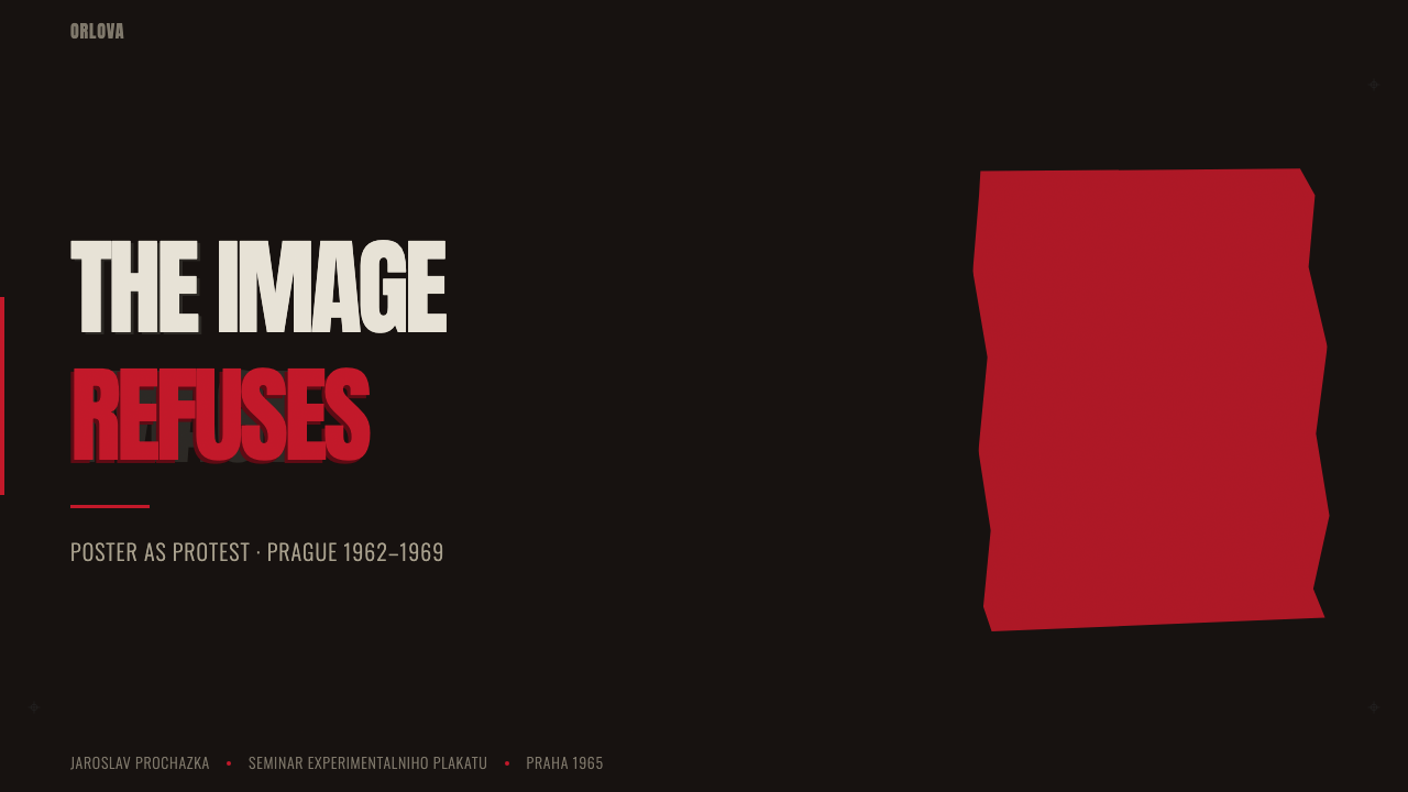
For presentation slides, this style works most powerfully as a cover treatment. A full-black slide with a single torn or cropped image fragment placed off-center, the title in condensed white or accent-colored type, and nothing else is a far stronger opener than a fully composed, element-rich design. Content slides are harder to execute in this style — the darkness that creates drama on a cover makes body text difficult to read at length. Use the style selectively: covers, section dividers, and key quote slides where impact matters; reserve lighter approaches for text-heavy content.
For editorial and marketing design, the style is extremely well-suited to materials where conceptual impact and a degree of creative mystery are valued: book covers, film or event posters, gallery announcements, brand identity for cultural institutions. The dark-ground, single-accent approach translates directly to these contexts. For digital materials, ensure sufficient contrast for accessibility — this style's natural high contrast between light elements and dark ground actually makes it more accessible than many contemporary light-gray-on-white approaches, provided the accent color is used with care.
For web interfaces and product design, use this style very selectively. It is a poster aesthetic — it is built for a single composition held at distance, not for a scrollable interface of many repeated elements. Where it works in digital product: full-bleed hero sections, modal overlays that need to command complete attention, loading screens, or brand-forward landing pages. Navigation, body content, and any context where the user needs to quickly parse and act should not be subjected to the extreme darkness and visual tension this style requires.
The most common mistake in applying this style is adding too much. Students and practitioners encountering the Czech New Wave Poster school for the first time are often drawn to the accent color — the poster red — and overuse it, applying it to multiple elements simultaneously. The accent works precisely because it appears once, as a rupture in the darkness. The second most common mistake is failing to commit to the darkness of the ground, setting the background to a comfortable dark gray rather than genuine near-black. The compression of the palette is not a stylistic preference; it is the system's operating principle.
Czech New Wave Poster — FAQ
How is Czech New Wave Poster different from the Polish Poster School?
The Polish Poster School, developing simultaneously in the 1950s and 1960s, shares the Czech school's surrealist sensibility, photomontage technique, and commitment to conceptual design over literal illustration. The key differences are tonal and chromatic. Polish poster design is generally brighter, more painterly, and more openly expressive — it allows color to be celebratory and occasionally even whimsical. Czech work, especially in the Ziegler mode, is darker, harder, and more austere. The Czech school's connection to the specifically bleak, absurdist, and politically constrained context of Czech New Wave cinema pushed it toward a formal severity that the Polish school rarely matched. Both are essential; they represent two national responses to the same cultural moment and the same set of technical constraints.
Can this style work for non-film contexts — branding, apps, editorial?
Yes, but with careful understanding of what you are importing. The style was developed for a specific context: a single-image composition advertising a film, printed at large format, seen from distance, designed for immediate impact rather than extended engagement. Its visual language — dark ground, single accent, fragment, condensed type — translates well to book covers, album artwork, event posters, brand identity for cultural institutions, and any one-to-one design object that is encountered as a whole. It does not translate directly to multi-page documents, interface navigation systems, or any design context where the viewer needs to move through the artifact rather than encounter it all at once. Use the principles selectively and understand that the style's power comes from restraint — deploying its drama across an entire visual system will dilute it.
Is the style inherently dark-mode, or can it work with a light ground?
The dark ground is not incidental to this style — it is the style. The ink-black field is where the visual logic originates: it is what makes the accent color carry explosive force, what allows photographic fragments to appear as if suspended in darkness rather than placed on a surface, what gives condensed type its weight. A light-ground version of Czech New Wave Poster design is possible, and some designers in the broader Eastern European tradition worked this way, but it produces a fundamentally different emotional register — one that reads more as collage or avant-garde print than as the specific charged, claustrophobic intensity that defines the movement. If you remove the darkness, you need to replace it with something equally committed. Without that commitment, you have the formal gestures of the style without its animating principle.
How should photography be selected and treated when applying this style?
Photography in Czech New Wave Poster design is never used for its surface beauty or as straightforward documentation. The selection criterion is conceptual resonance: does this fragment, in isolation and in darkness, produce a meaning or question that relates to the subject? Faces work well when cropped dramatically — an eye, half a face, a profile at the edge. Abstract or unexpected angles of ordinary objects can carry more weight than conventionally composed portraits. Once selected, the image should be treated as material: cropped without concern for conventional composition, potentially torn or fragmented at its edges rather than cleanly cut, placed against the darkness with deliberate asymmetry, and possibly altered in contrast to heighten its graphic rather than photographic qualities.
What makes this style feel dated versus contemporary?
The style itself does not date badly — work from the 1960s Czech school still looks compelling today because its principles are structural rather than decorative, and structural principles do not follow fashion cycles the way surface aesthetics do. What dates is imitation without understanding: a layout that uses black background and red accents as surface styling, without the underlying commitment to conceptual reduction and formal tension. Modernizing this style for contemporary use means honoring its operating principles — extreme economy, darkness as active ground, accent as rupture — rather than replicating its specific period textures, such as the visual grain of 1960s offset lithography. Use contemporary tools and contemporary photographic material; apply the principles with the same rigor the original designers applied them to their context.
Related design styles
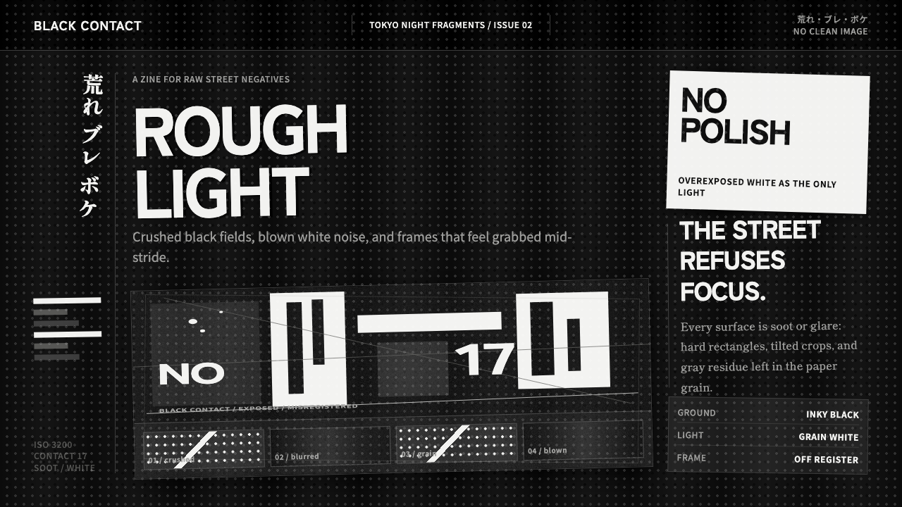 Daido Moriyama Are-Bure-BokeNothing is clean. Inky black, blown white grain, and tilted frames make the i…
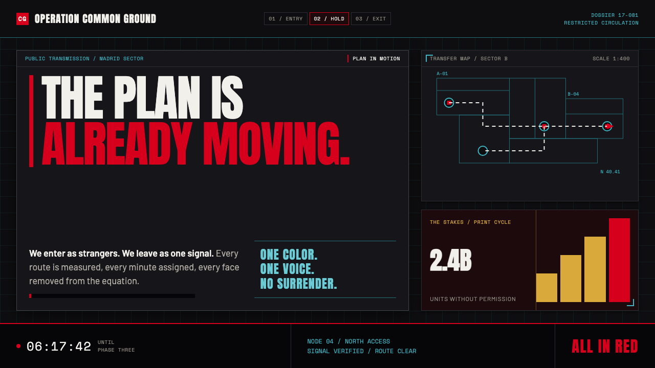 Money Heist (La Casa de Papel)Resistance becomes spectacle. Arterial red cuts through graphite grids and ta…
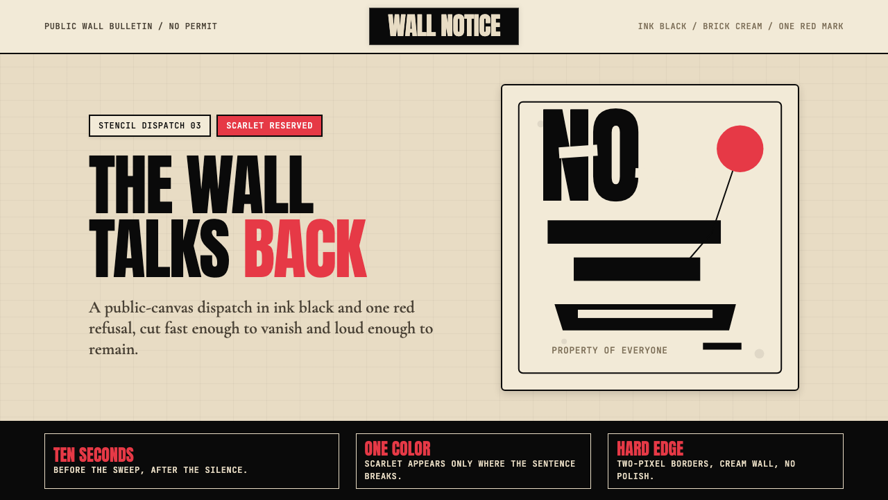 Banksy Stencil GraffitiProtest is reduced to a cut mark. Anton black on brick cream, one scarlet red…
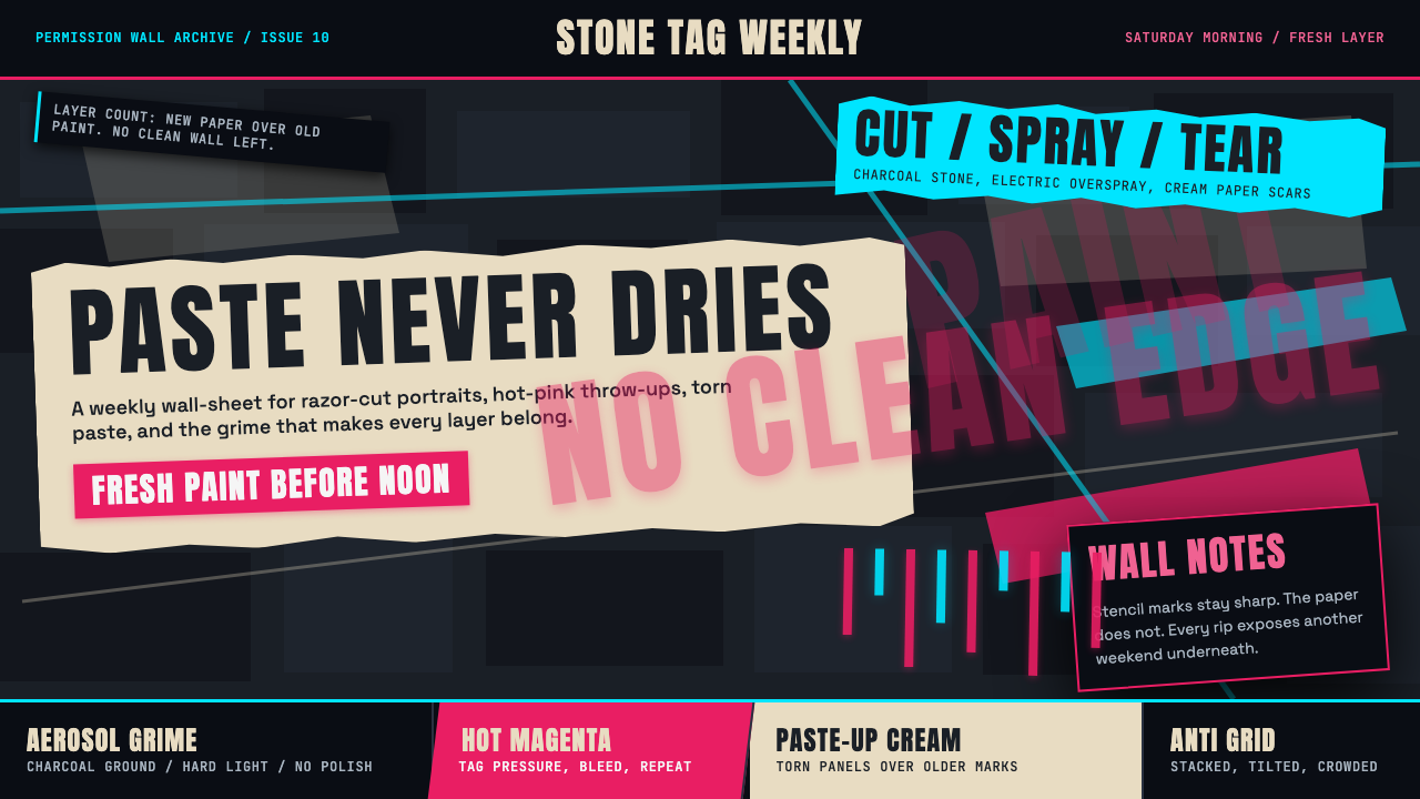 Melbourne Laneway Stencil (Hosier Lane)Permission-wall maximalism. Magenta tags slash charcoal bluestone and cream p…
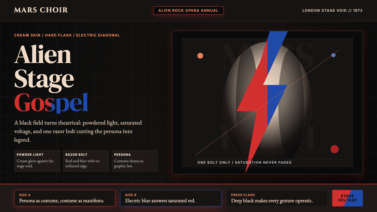 Bowie — Ziggy StardustTheater at full voltage. Cream-on-black portrait cut by one red and electric-…
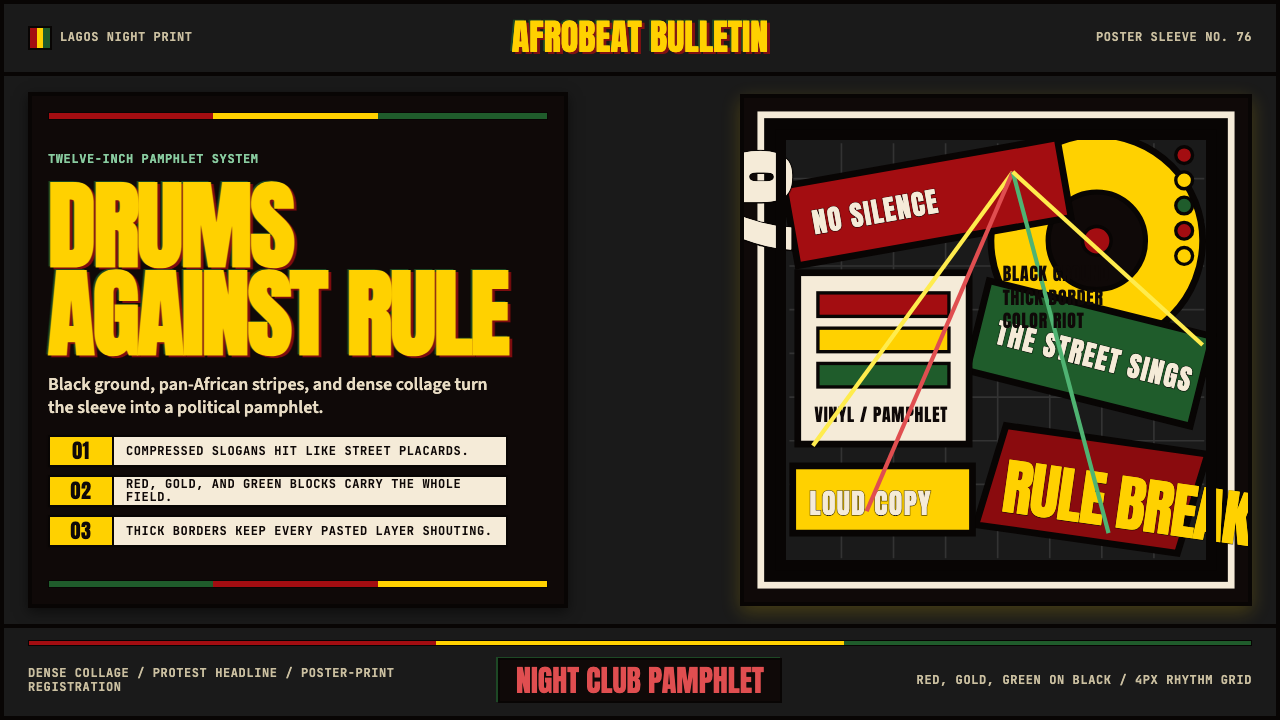 Fela Kuti Afrobeat Album (1976)Protest rhythm made visual. Red-yellow-green blocks and compressed Anton shou…