Design style guide设计风格指南
What is Melbourne Laneway Stencil (Hosier Lane)?什么是 Melbourne Laneway Stencil (Hosier Lane)?
Melbourne's Hosier Lane is where urban stencil culture reached its most layered and legally permissioned peak — a bluestone alley where aerosol, paste-up, and muralism have piled upon themselves every weekend since the early 2000s.墨尔本霍西尔巷是城市模板文化走向极致分层与合法化顶峰的地方——这条青石小巷自2000年代初起,每个周末都有气溶胶、贴纸与壁画层层叠压。
Melbourne Laneway Stencil (Hosier Lane) in briefMelbourne Laneway Stencil (Hosier Lane) 速览
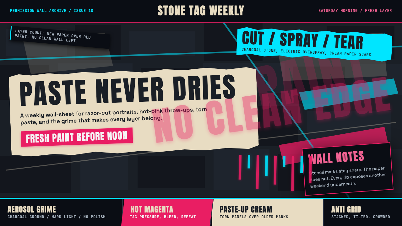
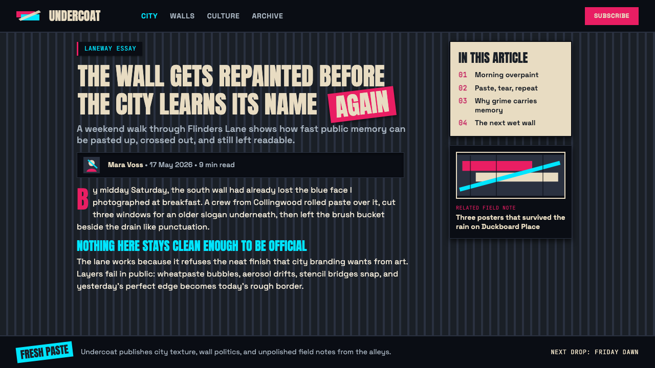
Melbourne Laneway Stencil is a visual system born from the walls of Hosier Lane — the world's most densely painted city block, a permission-walled bluestone alley in the heart of Melbourne's CBD. The style is defined by stencil-poster maximalism: hard-edged aerosol portraiture, hot magenta throw-ups bleeding down weathered stone, torn paste-up posters peeling to reveal older layers beneath. Everything sits on a charcoal-dark ground that reads as the wall itself, the accumulated grime of a thousand Saturday-morning sessions soaked into the texture.墨尔本小巷模板风格是一套从霍西尔巷墙面中生长出来的视觉体系——这条位于墨尔本CBD心脏地带的青石小巷,是全球涂鸦密度最高的城市街区,也是一面合法涂鸦墙。这种风格由模板海报极繁主义定义:硬边气溶胶肖像画、荧光洋红标签沿着风化石面淌落、撕裂的贴纸海报揭开一角露出更古老的图层。一切都叠落在炭黑色的底面上——那是墙壁本身的颜色,是数百个周六清晨积累下来的污渍与记忆渗入材质的痕迹。
The design vocabulary draws from multiple street-art traditions compressed into a single surface. Stencil cutting — the technique of razor-blading precise negative shapes from card or acetate before spraying — gives the portraiture its hard graphic edge. Paste-up adds a collage layer: printed imagery wheat-pasted over raw stone, sometimes overlapping fresh aerosol work. Throw-up lettering, rendered fast and dripping with urgency, contributes the expressive chaos that prevents the whole from reading as curated. The visual tension between precision and accident is the style's defining quality.这套设计词汇汇聚了多种街头艺术传统,将它们压缩在同一个平面上。模板切割——用美工刀在卡纸或醋酸薄膜上刻出精准的负形、再行喷涂——赋予肖像作品硬朗的平面感。贴纸层添加了拼贴质地:印刷图像用面糊粘贴在原石上,有时与刚完成的气溶胶作品相互叠压。迅速画就、颜料垂滴的标签字体带来表现性的混沌,使整体避免沦为经过策展的精致。精准与偶然之间的视觉张力,是这种风格最核心的气质。
As a design system, Melbourne Laneway Stencil is unapologetically maximalist and dark-ground. Surfaces are never empty. Color is deliberately clashing: acid magenta, chrome yellow, and electric teal cut across deep charcoal and chalky cream — not for harmony, but for visibility and raw energy. The aesthetic assumes accumulation. It is the opposite of a whitespace-led design philosophy: every square centimetre carries intention, even if that intention is to look spontaneous.作为一套设计系统,墨尔本小巷模板风格是无歉意的极繁主义与深色底面美学。表面从不留空。色彩是刻意冲突的:酸性洋红、铬黄与电气绿穿越深炭与粉白——不为和谐,而为可见度与原始能量。这种美学假定了积累的必然性。它是留白主导设计哲学的反面:每一平方厘米都承载着意图,即便那个意图是看起来自发与随机。
Where does Melbourne Laneway Stencil (Hosier Lane) come from?Melbourne Laneway Stencil (Hosier Lane) 从何而来?
Hosier Lane's transformation into a sanctioned street-art destination began gradually in the late 1990s, when the City of Melbourne adopted a policy allowing certain laneways to be painted freely without risk of prosecution. The policy was partly pragmatic — paint one alley and perhaps protect the rest — and partly a recognition that Melbourne's CBD laneway network had an irreplaceable urban character worth preserving. By the early 2000s, Hosier Lane had emerged as the focal point, its rough bluestone walls and cobblestone pavement offering an unusually textured canvas.霍西尔巷向合法街头艺术目的地的转变,始于1990年代末的缓慢积累。墨尔本市政府出台政策,允许特定小巷自由涂绘而不面临检控。这一政策一半出于务实考量——允许一条小巷,或许能保护其他地方——一半则是承认墨尔本CBD小巷网络拥有值得保护的不可替代的城市性格。到2000年代初,霍西尔巷已成为焦点,其粗粝的青石墙面与鹅卵石地面提供了质感异常丰富的画布。
The cultural context was shaped by the global explosion of stencil art following Banksy's rise in the late 1990s and early 2000s. Banksy's technique of using precisely cut stencils to deploy political imagery quickly and anonymously in public spaces was widely adopted and adapted. Melbourne's scene, however, developed its own distinct character: more painterly in ambition, more willing to abandon anonymity, and increasingly collaborative rather than competitive. Artists working Hosier Lane often left space for others to work over or around their pieces, producing the layered archaeological effect the lane became famous for.这一文化语境深受班克西(Banksy)在1990年代末至2000年代初崛起所引发的全球模板艺术爆发的塑造。班克西使用精确切割的模板在公共空间快速匿名部署政治图像的技术被广泛吸收与改造。然而,墨尔本的场景发展出了自己独特的气质:艺术野心更具绘画性,更愿意放弃匿名性,也越来越走向协作而非竞争。在霍西尔巷创作的艺术家往往会为他人预留空间,允许在其作品上或周围继续创作,由此产生了使这条巷子声名大噪的层叠考古效应。
The period from roughly 2008 to 2018 is widely regarded as the peak era for Hosier Lane as a cultural phenomenon. Key figures in the Melbourne stencil scene achieved international recognition during this window. Adnate developed a signature style of large-scale photorealist portraiture — particularly of Indigenous Australian faces — rendered in careful stencil layers that achieved near-photographic depth on rough stone. Rone became known for elegant, melancholic female portraiture at large scale, often combined with typographic elements. Lushsux brought irreverent, meme-aware commentary that sat in deliberate tension with the lane's more earnest art-world aspirations. HAHA contributed a consistently political and text-driven practice that traced roots back to the lane's earliest period.大约从2008年到2018年的时段,被普遍视为霍西尔巷作为文化现象的巅峰期。墨尔本模板场景中的核心人物在这一窗口期获得了国际认可。阿德纳特(Adnate)发展出大幅超写实肖像画的标志性风格——尤其是澳大利亚原住民面孔——以精心分层的模板在粗糙石面上实现近乎摄影的深度。罗恩(Rone)以优雅而忧郁的大尺度女性肖像著称,常与字体元素相结合。卢克苏克斯(Lushsux)带来了有意与小巷更严肃的艺术世界抱负形成张力的不敬与网络梗文化评论。哈哈(HAHA)则持续贡献着政治性的文字驱动实践,追溯至小巷最早期的脉络。
The 2010 period that gives this style its date reference marks a moment of particular visibility: international art press had begun covering Hosier Lane regularly, tourism to the lane was measurable and growing, and several artists whose careers began there were receiving gallery attention. The visual language that had accumulated by this point — the specific ratio of hard stencil to expressive spray, the palette dominated by magenta and charcoal, the torn-poster collage layering — had stabilized into something recognizable as a coherent aesthetic. This is the moment the style crystallizes: not its beginning, but its definition.这种风格以2010年为日期参照,标志着一个特别显著的时刻:国际艺术媒体已开始定期报道霍西尔巷,前往参观的旅游流量可量化且持续增长,多位从这里起步的艺术家开始受到画廊关注。彼时积累的视觉语言——硬边模板与表现性喷绘的特定比例、洋红与炭黑主导的色板、撕裂海报式的拼贴分层——已稳定成一种可被辨认的连贯美学。这是风格结晶的时刻:不是它的起点,而是它的定义。
What defines the Melbourne Laneway Stencil (Hosier Lane) look?Melbourne Laneway Stencil (Hosier Lane) 的视觉特征是什么?
Dark Ground深色底面
The foundational surface is always dark — raw charcoal stone, aged concrete, or a deep black painted base layer. This is not a stylistic choice so much as a material fact absorbed into the aesthetic: Hosier Lane's bluestone walls are naturally dark, and the accumulated layers of old paint and grime deepen that tone over time. Against a dark ground, every aerosol mark achieves maximum legibility. The darkness is treated as given, not as emptiness to fill.基底表面始终是深色的——裸露的炭黑青石、老化的混凝土,或深黑的底漆层。这与其说是一种风格选择,不如说是被美学吸收的材质事实:霍西尔巷的青石墙面天然色深,而历年叠积的旧漆与污渍更使其色调不断加深。在深色底面上,每一道气溶胶笔触都获得了最大的可读性。深色被当作既定条件,而非待填充的空白。
Clashing Neon Palette撞色霓虹色板
Color is deployed for maximum impact against the dark ground, not for harmony. Hot magenta, acid yellow, and electric cyan appear at high saturation and are allowed to clash deliberately. These are aerosol colors — colors chosen for visibility on a wall fifty metres away at sunrise, not for refinement at close range. Cream and chalky off-white appear in paste-up layers, introducing a third texture. The overall palette reads as both urgent and accumulated: layered, not orchestrated.色彩的使用以在深色底面上产生最大冲击力为目标,而非追求和谐。荧光洋红、酸性黄与电气青以高饱和度出现,刻意允许相互碰撞。这些是气溶胶色彩——是为了在五十米外的日出光线下也能清晰可见而选择的颜色,而非为了近距离审视时的精致感。奶油色与粉白色出现在贴纸层中,带入第三种质感。整体色板读来既有紧迫感,又有积累感:是叠加的,而非编排的。
Stencil Hard Edge模板硬边
The stencil technique produces edges of a particular quality: crisp where the card sits flush against the wall, slightly overspray-blurred where it lifts. This is not the clean hard edge of a vector graphic — it is a hard edge with memory of its making. The trace of the physical process (the overspray halo, the occasional paint bleed) is part of the visual vocabulary, not a defect to correct. Portraiture built in stencil layers achieves tonal depth without smooth gradients: dark, mid, light are separated decisions, each a pass of a different card.模板技术产生一种特殊品质的边缘:卡纸紧贴墙面处边线清晰,稍有翘起处则出现轻微的过喷晕染。这不是矢量图形那种干净的硬边——它是一条带有制作记忆的硬边。物理过程的痕迹(过喷的光晕、偶发的颜料渗漏)是视觉词汇的一部分,而非需要修正的缺陷。以模板分层构建的肖像画在不借助平滑渐变的情况下实现了色调深度:深色、中间调、亮色是分别的决定,每一层是一次不同模板的喷涂。
Paste-Up Collage Layering贴纸拼贴分层
Paste-up — wheatpasting printed imagery onto walls — adds a collage dimension that distinguishes this style from purely spray-based street art. The torn edges of paste-up posters, peeling away from the stone to reveal older images beneath, create an archaeological cross-section effect. Paste-up imagery tends toward photographic rather than graphic: faces, body fragments, typographic elements printed at large scale. When combined with stencil and aerosol work, it introduces a tension between flatness (the printed surface) and physicality (the peeling, the shadows cast by lifted edges).贴纸——用面糊将印刷图像粘贴到墙上——增加了一个拼贴维度,使这种风格区别于纯粹以喷绘为基础的街头艺术。贴纸海报从石面上剥落的撕裂边缘,露出更古老的图像层,营造出考古剖面式的效果。贴纸图像倾向于摄影性而非图形性:大尺寸印刷的面孔、身体局部、字体元素。与模板和气溶胶作品结合时,它在平面性(印刷表面)与物质性(剥落、翘起边缘投下的阴影)之间引入了张力。
Intentional Accumulation刻意积累
In conventional design, layering is either invisible (seamless) or controlled (deliberate arrangement). In the laneway aesthetic, layering is neither invisible nor fully controlled — it is intentionally accumulated. New work goes over old work with knowledge that both will be visible. This produces a palimpsest effect: no single composition fully dominates, and the passage of time becomes a visual element in its own right. Applied as a design system, this means embracing visible seams, overlapping elements, and imperfect registration as aesthetic features rather than errors.在常规设计中,分层要么是不可见的(无缝),要么是受控的(刻意排列)。在小巷美学中,分层既非不可见,也非完全受控——它是刻意积累的。新作品压在旧作品上,创作者知道两者都将可见。这产生了一种重写羊皮纸式的效果:没有任何单一构图完全主导,时间的流逝本身成为一个视觉元素。作为设计系统应用时,这意味着将可见的接缝、叠压的元素、不精确的套版当作美学特征而非错误来拥抱。
Expressive Lettering表现性字体
Lettering in this style ranges from highly controlled stencil text — tight, graphic, readable at distance — to expressive throw-up script that drips and bleeds with visible urgency. Both registers coexist on the same surface. Stencil lettering tends toward bold, condensed forms with minimal stroke variation; throw-up lettering allows maximum expressiveness, with thick swells and thin connections that emphasize speed of execution. The coexistence of these registers gives the style its characteristic tension between control and release.这种风格中的字体从高度受控的模板文字——紧凑、图形性、可远距离阅读——延伸至带有可见紧迫感的垂滴表现性标签字体,两种形态并存于同一表面。模板字体倾向于粗重、窄字身、笔画变化最小的形式;标签字体则允许最大程度的表现性,粗细交替的笔画强调执行的速度感。这两种形态的共存赋予了风格特有的控制与释放之间的张力。
Surface Texture as Participant表面质感作为参与者
The rough, porous surface of bluestone is not background — it is an active element in the image. Paint soaks differently into mortar than into stone, creating uneven saturation. Rough patches catch spray unevenly, producing natural dithering effects. Moss, water staining, and weathering add tonal complexity that no flat surface could replicate. The design system assumes a textured ground; applied digitally, it typically introduces artificial noise, grain, or distress textures to compensate for the absence of the real thing.粗粝多孔的青石表面不是背景——它是图像的主动参与者。颜料在灰浆中与在石面上的渗透方式不同,产生不均匀的饱和度。粗糙的凸起不规则地截留喷雾,产生自然的抖色效果。苔藓、水渍与风化增加了任何平滑表面都无法复制的色调复杂性。这套设计系统以有质感的底面为前提;在数字应用中,通常需要人工引入噪点、颗粒或做旧质感,以弥补真实材质的缺席。
Who shaped Melbourne Laneway Stencil (Hosier Lane)?谁塑造了 Melbourne Laneway Stencil (Hosier Lane)?
Adnate is among the most technically accomplished stencil portraitists to have worked Hosier Lane, known for large-scale, photorealist faces — particularly of Indigenous Australian elders — rendered through careful multi-layer stencil work that achieves extraordinary tonal range on raw stone. His practice expanded the visual ambition of the Melbourne stencil scene, demonstrating that the medium was capable of subtlety and emotional weight, not just graphic impact. His Hosier Lane works became among the most photographed in the lane's history.阿德纳特是曾在霍西尔巷创作的技术最为精湛的模板肖像艺术家之一,以大尺度超写实面孔著称——尤其是澳大利亚原住民长者——通过精心的多层模板处理在裸石上实现了非凡的色调层次。他的实践扩展了墨尔本模板场景的视觉抱负,证明这一媒介有能力表达微妙性与情感重量,而不仅仅是图形冲击力。他在霍西尔巷的作品成为小巷历史上被拍摄最多的图像之一。
Rone's large-scale female portraiture — melancholic, elegant, rendered in a palette that bridges photorealist subtlety and graphic impact — became one of the defining visual signatures of Hosier Lane's peak era. His figures, often at building scale, combined stencil precision with freehand spray in ways that blurred the boundary between street art and fine art practice. Later in his career, Rone shifted toward large-scale interior installation work, applying the same layered, time-sensitive aesthetic to abandoned architectural spaces.罗恩的大幅女性肖像——忧郁、优雅、以跨越写实微妙与图形冲击的色板呈现——成为霍西尔巷巅峰时代最具定义性的视觉标志之一。他常以建筑尺度创作的人物,将模板精准性与徒手喷绘相结合,模糊了街头艺术与纯艺术实践之间的边界。职业生涯后期,罗恩转向大型室内装置创作,将同样的分层式、时间敏感美学应用于废弃建筑空间。
Lushsux brought deliberate irreverence and internet-meme sensibility to Hosier Lane, creating works that sat in direct tension with the lane's more earnest artistic aspirations. His works — often featuring celebrities, political figures, or pop-cultural imagery rendered in a style that deliberately undercuts any expectation of high seriousness — generated significant controversy and, in doing so, drew additional international attention to the lane. His practice exemplifies the tension between street art's populist roots and its art-world co-option.卢克苏克斯将刻意的不敬与网络梗文化感性带入霍西尔巷,创作出与小巷更严肃艺术抱负直接产生张力的作品。他的作品——常以名人、政治人物或流行文化图像为题材,以刻意消解任何严肃预期的风格呈现——引发了相当大的争议,也因此为小巷吸引了更多国际关注。他的实践典型地体现了街头艺术的平民主义根源与艺术世界收编之间的张力。
HAHA is among the earliest sustained presences in Melbourne's stencil scene, with a practice rooted in political commentary and text-image combination. Tracing roots back to the 1990s Melbourne scene predating international stencil art's mainstreaming, HAHA's work provided a continuity thread connecting Hosier Lane's earliest period to its peak-era visibility. The practice is consistently politically engaged, using stencil as a tool for public speech rather than aesthetic expression alone.哈哈是墨尔本模板场景中最早、最持续的存在之一,其实践扎根于政治评论与文字-图像的结合。追溯至1990年代国际模板艺术主流化之前的墨尔本场景,哈哈的作品提供了一条连接霍西尔巷最早期与其巅峰时代的连续线索。这一实践始终保持政治介入性,将模板作为公共言论的工具,而非单纯的美学表达。
The City of Melbourne's decision to designate certain laneways as permissioned art spaces — Hosier Lane foremost among them — was a determining factor in shaping the visual culture the style captures. Without the legal protection from prosecution, the sustained collaborative accumulation that defines the aesthetic would have been impossible; artists would have had to work faster and more evasively, and the layered archaeological quality would never have developed. The policy represents an unusual instance of urban governance actively enabling a grassroots aesthetic culture rather than suppressing it.墨尔本市政府将特定小巷指定为合法艺术空间的决定——霍西尔巷首当其冲——是塑造这种风格所捕捉的视觉文化的决定性因素。若非获得法律保护而免受检控,定义这种美学的持续协作积累将不可能实现;艺术家将不得不更快速、更隐蔽地创作,层叠的考古质感也永远不会发展成型。这一政策代表了城市治理主动推动而非压制草根美学文化的罕见案例。
How do you use Melbourne Laneway Stencil (Hosier Lane) today?今天怎么用 Melbourne Laneway Stencil (Hosier Lane)?
Melbourne Laneway Stencil is a high-impact dark-ground aesthetic that carries strong urban, counterculture, and creative-industry associations. Applying it well requires committing to its foundational logic: dark surfaces, layered rather than clean composition, clashing neon accents, and visible traces of making. It does not translate gracefully to light or neutral grounds — a white background strips the style of its essential character. The first design decision when using this style should be establishing the dark ground.墨尔本小巷模板风格是一种高冲击力的深色底面美学,承载着强烈的城市、反文化与创意产业联想。正确应用它需要对其基础逻辑做出承诺:深色表面、层叠而非干净的构图、撞色霓虹强调、可见的制作痕迹。这种风格无法优雅地迁移至浅色或中性底面——白色背景会剥去风格的本质气质。使用这种风格时,第一个设计决定应当是建立深色底面。
For presentation slides, the style is best suited to covers and section dividers where atmosphere outweighs information density. A cover built on a deep charcoal or near-black ground, with large stencil-style type in a clashing accent color and a paste-up texture layer in the background, establishes the mood immediately. Content slides should be used sparingly in this style — the maximalism works against dense information display. Where data appears, treat charts as graphic objects: thick bars, flat fills in neon accent colors, no soft shadows. The overall deck works best when used selectively, rather than applying the aesthetic uniformly to every slide.对于演示文稿,这种风格最适合封面和章节分隔页——在那里氛围优先于信息密度。以深炭或近黑底面为基础构建的封面,搭配撞色强调色的大号模板式字体与背景中的贴纸质感层,立即确立基调。内容页应在这种风格中谨慎使用——极繁主义与密集信息展示相悖。数据出现时,将图表当作图形对象处理:粗条形、霓虹强调色的平面填充、无柔和阴影。整体演示效果最佳时应选择性应用,而非将美学均匀施加于每一张幻灯片。
For web interfaces, this style is well-suited to landing pages and marketing pages for creative agencies, music or festival brands, youth culture platforms, or any context where grit and energy are desirable signals. It is less suited to dashboards or data-heavy interfaces where legibility at small sizes is critical. A web implementation might use a textured dark background (subtle noise or grain applied as an overlay), neon accent colors for calls to action and hover states, and stencil-style or condensed bold display type for headlines. Image treatments should include grain or subtle desaturation to integrate photography with the graphic style.对于网页界面,这种风格非常适合创意机构、音乐或节庆品牌、青年文化平台的落地页与营销页,或任何以粗粝感与能量为理想信号的场景。它不太适合小尺寸可读性至关重要的仪表板或数据密集型界面。网页实现可采用带质感的深色背景(叠加细微噪点或颗粒层),以霓虹强调色用于行动号召与悬停状态,以模板风格或压缩粗体展示字体用于标题。图像处理应加入颗粒感或轻微去饱和,使摄影图像与图形风格融为一体。
For editorial and marketing work, the style shines in contexts that can support full visual commitment: festival posters, album artwork, brand identity for underground or independent creative ventures, zine design, and urban-culture editorial spreads. The approach: lead with a dark ground, use one dominant neon as the accent, treat typography as a graphic element of equal weight to imagery, and embrace imperfect alignment and visible layering rather than fighting it. The style's legitimacy depends on its rawness — overly refined execution loses the essential quality.对于编辑与营销内容,这种风格在能够支持全面视觉承诺的场景中大放光彩:节庆海报、专辑封面、地下或独立创意事业的品牌视觉、小杂志设计、城市文化编辑版面。方法如下:以深色底面为主导,以一种霓虹色为强调主色,将字体作为与图像等重的图形元素,拥抱而非对抗不精确的对齐与可见的分层。这种风格的合法性依赖于其粗糙感——过度精制的执行会失去本质气质。
A common mistake when applying this style is treating it as dark theming with some spray-paint texture added. The true system is fundamentally compositional: it is about layering, accumulation, and the coexistence of multiple graphic registers (precise stencil, expressive lettering, flat paste-up, raw surface). Applying a dark background and a single neon accent without the layering complexity produces something that looks more like generic dark UI than laneway art. The style requires commitment to visible depth — elements that overlap, bleed, and show the traces of how they were placed.应用这种风格时最常见的错误,是将其视为加了喷漆质感的深色主题处理。真正的系统在本质上是构图性的:它关乎分层、积累,以及多种图形形态(精准模板、表现性字体、平面贴纸、裸露表面)的共存。只使用深色背景和单一霓虹强调色而缺乏分层复杂性,会产生更接近通用深色UI而非小巷艺术的效果。这种风格需要对可见深度的承诺——元素相互叠压、渗透,并显示出被放置时的痕迹。
Melbourne Laneway Stencil (Hosier Lane) — FAQMelbourne Laneway Stencil (Hosier Lane) · 常见问题
Is Melbourne Laneway Stencil the same as general graffiti or street art?墨尔本小巷模板风格与一般涂鸦或街头艺术是同一回事吗?
No — Melbourne Laneway Stencil refers specifically to the aesthetic that developed in Hosier Lane and a handful of other Melbourne laneways under the City of Melbourne's permissioned art policy. General graffiti encompasses a far broader global visual tradition, from wildstyle lettering to tagging to bombing. What distinguishes the Melbourne laneway aesthetic is its permissioned, collaborative, accumulative character, and its particular combination of stencil-cut portraiture, paste-up collage, and aerosol maximalism on bluestone. It is a localized, historically specific crystallization of street-art culture, not a synonym for the broader form.不是——墨尔本小巷模板风格特指在墨尔本市政府合法艺术政策框架下,在霍西尔巷及少数其他墨尔本小巷中发展出来的美学。一般涂鸦涵盖的全球视觉传统范围宽泛得多,从花样字体到标签到轰炸式覆盖,不一而足。墨尔本小巷美学的独特之处在于其合法性、协作性与积累性,以及在青石上将模板切割肖像、贴纸拼贴与气溶胶极繁主义特定组合的方式。它是街头艺术文化的一种地域化、历史特定的结晶,而非这一更广泛形式的同义词。
Can this style work for corporate or professional contexts?这种风格能用在企业或专业场景中吗?
With care, and only for certain types of organizations. The style carries strong counterculture and urban-creative associations that are genuinely suited to creative agencies, music brands, festival identities, architecture firms with urban design practices, and similar contexts. For conventional corporate use — financial services, enterprise software, healthcare — the rawness and grit typically work against professional authority signals. The style is best deployed when an organization genuinely wants to signal creative independence, cultural credibility, or urban relevance, not as a superficial attempt to appear edgy.可以,但需谨慎,且仅适用于特定类型的组织。这种风格承载着强烈的反文化与城市创意联想,真正适合创意机构、音乐品牌、节庆视觉、从事城市设计的建筑事务所等类似场景。对于传统企业用途——金融服务、企业软件、医疗健康——粗粝感与粗砺质感通常与专业权威信号相悖。这种风格最适合在组织真心希望传递创意独立性、文化可信度或城市相关性时部署,而非作为显得前卫的表面化尝试。
How do you apply the layered look without it looking like a mess?如何呈现分层效果而不显得杂乱无章?
The key is to establish a clear hierarchy within the layering: one element must dominate, and everything else must either recede or act as texture. In Hosier Lane itself, hierarchy emerges naturally — the freshest, most intact work reads as foreground; older, more weathered or partially covered work recedes. In a designed application, this hierarchy must be intentional. Use opacity variation and contrast control to push background elements back. Ensure the primary message — a headline, a face, a call to action — reads clearly even before the viewer processes the layered context. The layering should enrich the experience of the primary element, not compete with it for attention.关键在于在分层中建立清晰的层级关系:必须有一个元素处于主导地位,其他一切要么退隐,要么充当质感。在霍西尔巷本身,层级自然涌现——最新鲜、最完整的作品作为前景呈现;更古老、更风化或被局部覆盖的作品退居其后。在设计应用中,这种层级必须是刻意的。使用透明度变化与对比度控制将背景元素推后。确保主要信息——标题、面孔、行动号召——在观看者处理分层背景之前就能清晰可读。分层应当丰富主元素的体验,而非与之争夺注意力。
What kinds of typography work best in this style?哪类字体排印最适合这种风格?
Two registers work best, used together or independently. First, bold condensed display type — heavy, tight, readable at distance — echoes the stencil lettering tradition and works well for headlines and callouts on dark grounds. Second, expressive display scripts or distressed brush-lettered forms echo the throw-up and tag tradition, working well for secondary typographic elements where expression matters more than legibility. Both registers benefit from being set large; the style does not reward small, refined type. Body text, if required, should be kept minimal and clearly separated from the expressive display elements rather than integrated into the layering.两种形态效果最佳,可单独使用或组合运用。第一种是粗重压缩展示字体——厚重、紧凑、可远距离阅读——与模板字体传统相呼应,适合在深色底面上用于标题与引语。第二种是表现性展示手写体或做旧刷字形态,与标签和涂鸦传统相呼应,适合表现性优先于可读性的次要字体元素。两种形态都适合大尺寸设置;这种风格不奖励小号精细字体。若需要正文,应保持最小化并与表现性展示元素清晰分离,而非融入分层之中。
Does the style have to be dark? Can it work on light grounds?这种风格必须是深色的吗?能用在浅色底面上吗?
The dark ground is structurally important to the style, not merely conventional. It is what makes the neon and high-saturation accents legible and impactful; the same colors on white would look garish rather than energetic. A light-ground version of this style tends to lose both the atmosphere and the color logic simultaneously, ending up resembling generic urban illustration rather than the specific laneway aesthetic. If a light background is essential for a given context, it is usually more successful to borrow isolated elements from the style — stencil-style portraiture, condensed bold type, rough texture — rather than attempting to transpose the full system.深色底面对这种风格来说在结构上至关重要,而非仅是惯例。正是深色底面使霓虹色与高饱和强调色具有可读性与冲击力;同样的颜色置于白色上会显得俗丽而非充满活力。这种风格的浅色底面版本往往同时失去氛围与色彩逻辑,最终更像通用的城市插画,而非特定的小巷美学。若特定场景确实需要浅色背景,通常更成功的做法是借用风格中的单一元素——模板式肖像、压缩粗体字、粗糙质感——而非试图整体移植这套系统。
Related design styles相关设计风格
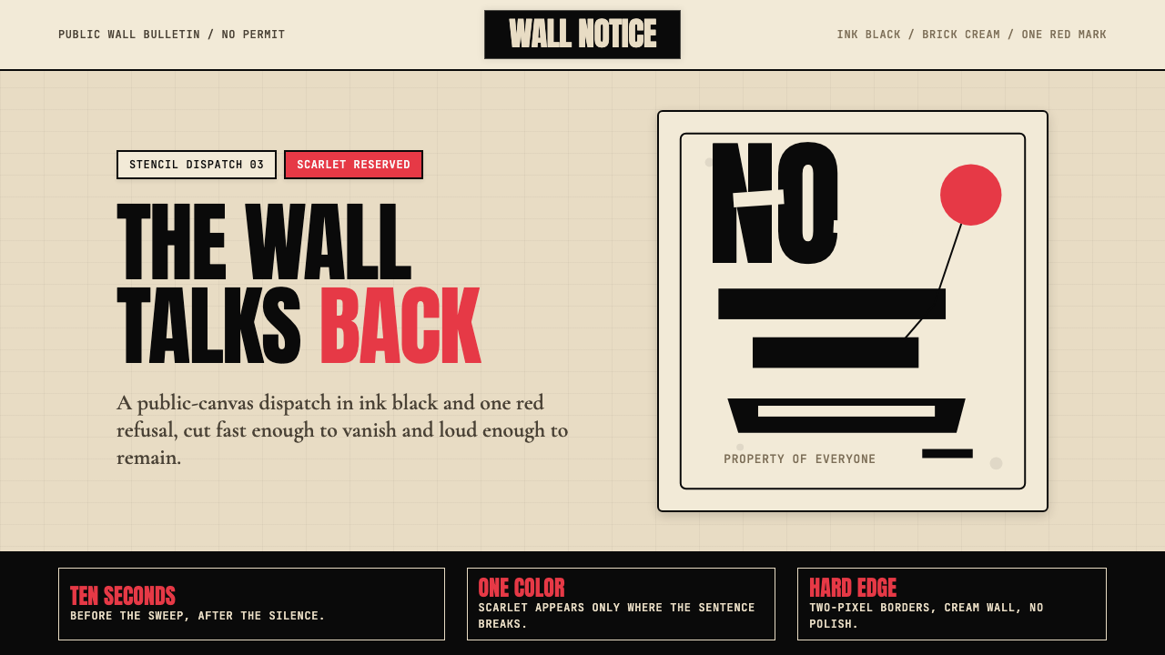 Banksy Stencil GraffitiProtest is reduced to a cut mark. Anton black on brick cream, one scarlet red…抗议被压成剪影。砖墙奶油底、Anton黑字,一点猩红打断。
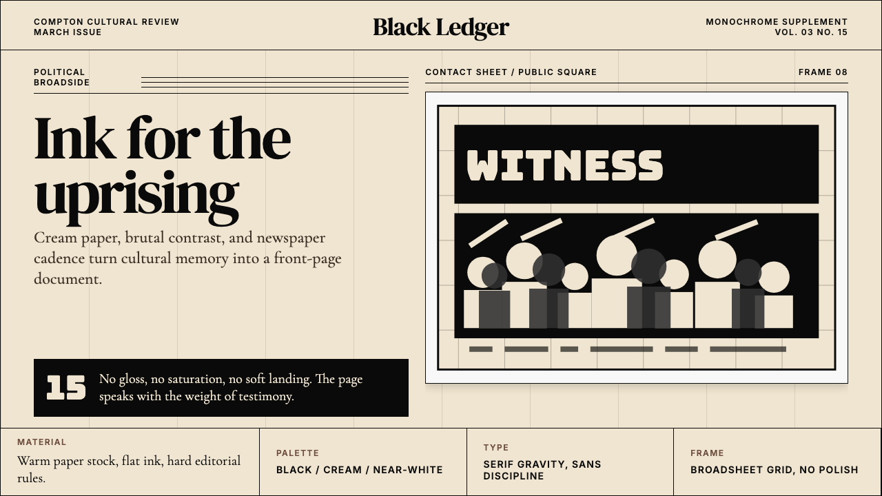 Kendrick — To Pimp a ButterflyPolitical weight, printed cold. Cream paper, hard serif type, monochrome crow…政治重量冷静落纸。米黄纸、硬衬线与黑白群像几何。
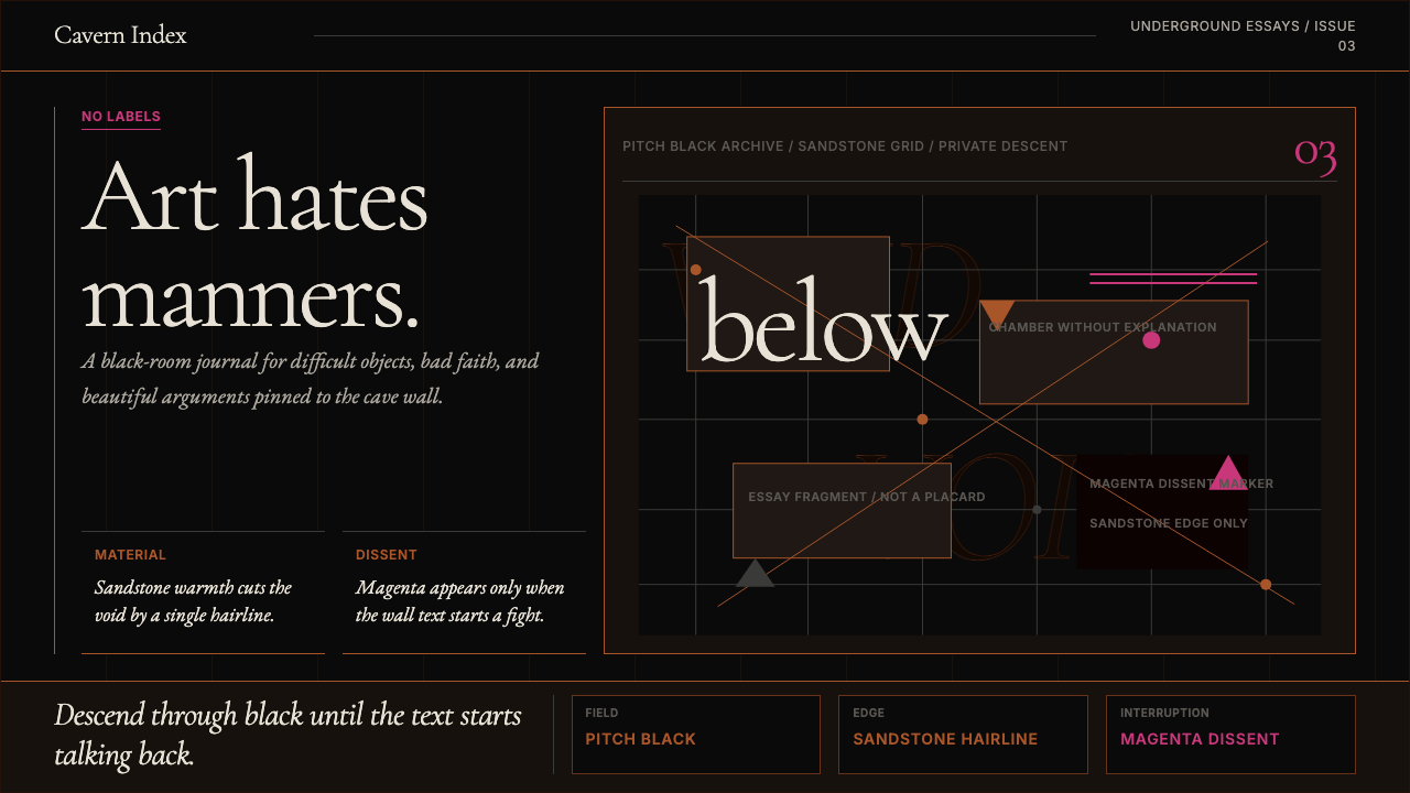 Tasmanian MONA Museum (2011)Hostile luxury underground. Pitch black, sandstone hairlines, magenta editori…敌意奢华的地下感:漆黑底、砂岩细线与品红挑衅。
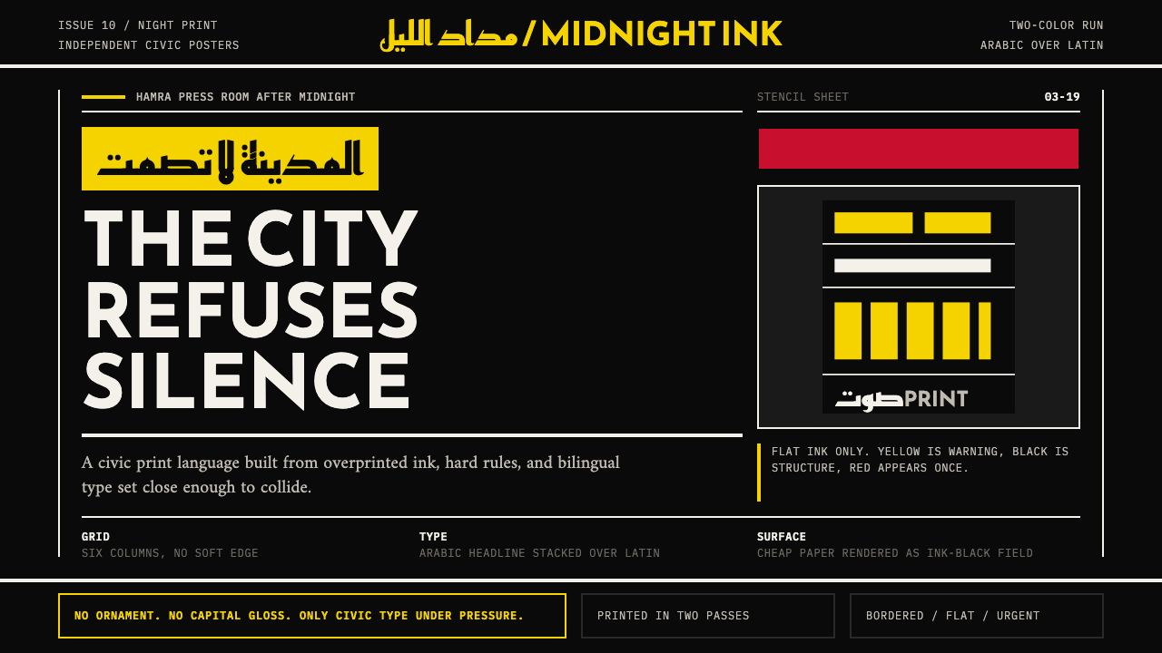 Beirut Indie Graphic DesignCivic type as protest. Sulfur yellow Arabic blocks collide with ink-black pos…公民字体即抗议:硫磺黄阿文块撞上墨黑海报网格。
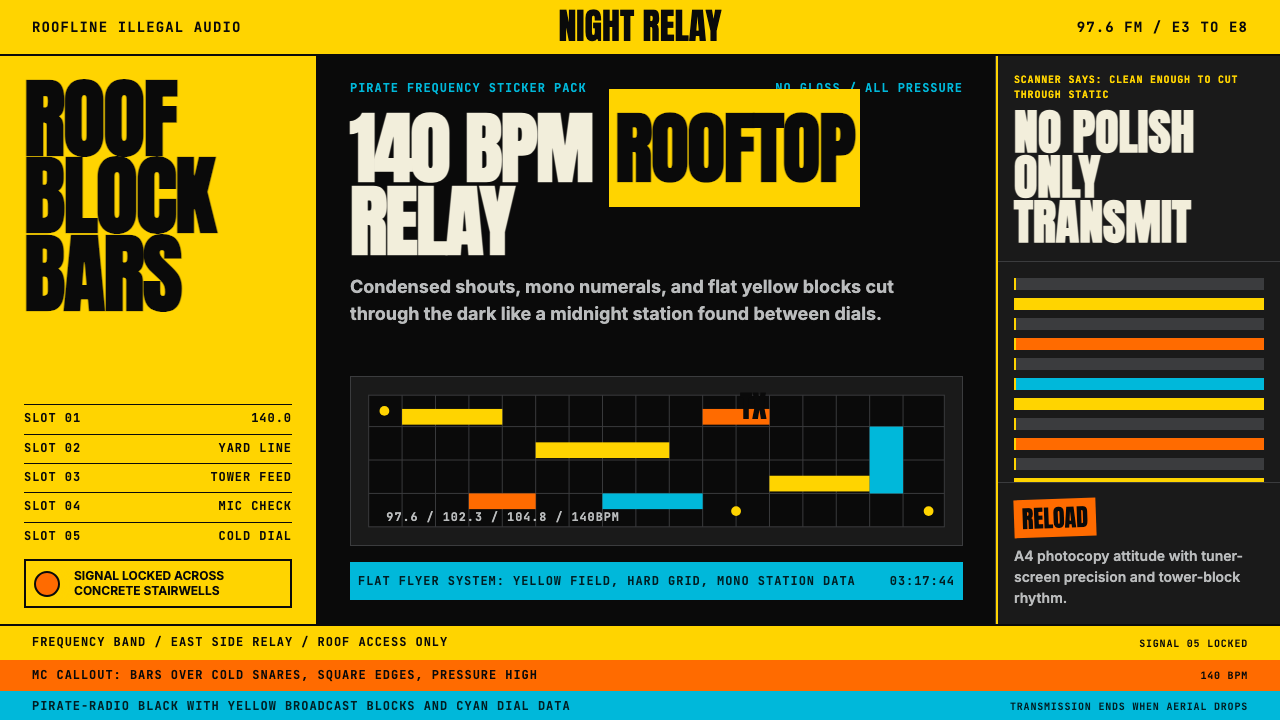 Grime London Pirate Radio (2003)Pirate signal, flat and urgent. Yellow blocks, mono FM numerals, hard flyer g…盗台信号,平面又急促。黄块、等宽频率字、硬网格成形。
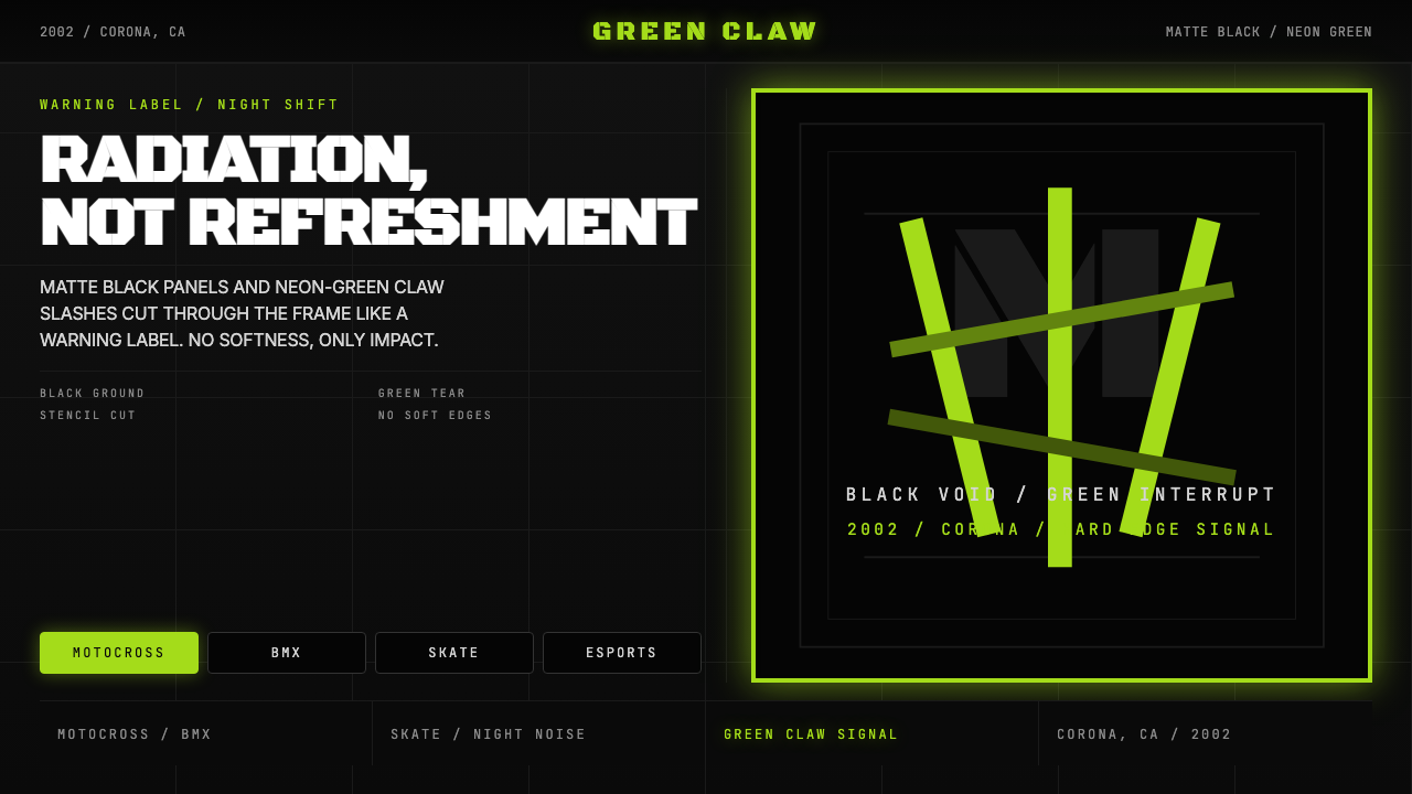 Monster Energy Claw (2002)Aggression, not refreshment. Matte black and neon-green claw slashes cut the…不是清爽,是冲击。哑黑底与霓绿爪痕撕裂画面。