Design style guide设计风格指南
What is Beirut Indie Graphic Design?什么是 Beirut Indie Graphic Design?
Beirut's indie graphic designers turned Arabic letterforms into acts of civic defiance — stacking script and Roman type so tight they fuse into a single bilingual shout.贝鲁特独立平面设计师将阿拉伯字形化为公民抵抗的行动——把阿拉伯文与拉丁文压叠得如此紧密,两者融为一声双语呐喊。
Beirut Indie Graphic Design in briefBeirut Indie Graphic Design 速览
Beirut Indie Graphic Design is the visual language forged in Lebanon's independent print workshops and art schools from the mid-2000s onward. It combines Arabic calligraphic tradition with the blunt geometry of European protest graphics, producing work that is simultaneously legible in two scripts and charged with political urgency. The palette is deliberately harsh: ink-black grounds, sulfur-yellow Arabic type blocks, and flashes of deep crimson — colors borrowed less from branding manuals than from newspaper ink and street paint.贝鲁特独立平面设计是从二十一世纪中期起,在黎巴嫩独立印刷工坊与艺术院校中锻造而成的视觉语言。它将阿拉伯书法传统与欧洲抗议图形的生硬几何相结合,产生的作品同时以两套字符系统呈现,并充满政治张力。色彩刻意粗粝:墨黑的底面、硫磺黄的阿拉伯文字块、深红的点缀——这些颜色与其说借自品牌手册,不如说借自报纸油墨与街头涂料。
The style's defining quality is its refusal of comfort. Where international editorial design smooths out tension with generous whitespace and curated photography, Beirut Indie stacks information until the grid strains. Arabic runs right-to-left while Latin runs left-to-right; rather than separating the two, designers force them into collision, treating the resulting visual tension as a message in itself. The page is a demonstration, not a composition.这种风格最鲜明的特质是拒绝舒适。国际编辑设计用宽阔留白与策展摄影来平滑紧张感,而贝鲁特独立设计则将信息层层叠压,直到网格承受极限。阿拉伯文从右向左,拉丁文从左向右;设计师不是将两者分隔,而是迫使它们碰撞,把由此产生的视觉张力本身作为信息传达。页面是一场示威,而不是一个构图。
This is not nostalgia for classical Arabic ornament, nor a straightforward adoption of Western modernism. It is something genuinely hybrid: a graphic dialect grown from risograph machines, cheaply produced zines, screen-printed street posters, and the urgent need to communicate across a society that had to address itself in multiple languages at once. The work looks unpolished by design — the grain, the misregistration, the overprinting are all deliberate.这里既没有对古典阿拉伯装饰纹样的怀旧,也没有对西方现代主义的直接照搬。它是真正意义上的混血:一种从丝网印刷机、廉价生产的杂志、街头丝网海报,以及必须同时以多种语言向社会发言的迫切需要中生长出来的图形方言。作品看起来粗糙,而这份粗糙是刻意为之——颗粒感、套版偏差、叠印,全部都是设计决定。
See the Beirut Indie Graphic Design design system →查看 Beirut Indie Graphic Design 完整设计系统 →
Where does Beirut Indie Graphic Design come from?Beirut Indie Graphic Design 从何而来?
The immediate trigger for Beirut's independent graphic culture was the 2005 Cedar Revolution — the mass street protests that followed the assassination of Prime Minister Rafik Hariri in February of that year. Within weeks, demonstrators were producing hand-drawn banners, screen-printed flags, and makeshift posters at a scale that overwhelmed any professional design infrastructure. Art students from the Lebanese American University, the American University of Beirut, and the École Supérieure des Arts et Métiers found themselves making protest graphics alongside militia flags and civil-society newsletters. The visual emergency of 2005 fused political urgency with print production in a way that redefined what Beirut's designers thought their work could be.贝鲁特独立图形文化的直接触发点是2005年的雪松革命——当年2月总理拉菲克·哈里里遇刺后,随之而来的大规模街头抗议。数周之内,示威者便以超出任何专业设计基础设施承载量的规模,生产手绘横幅、丝网印制的旗帜与临时海报。来自黎巴嫩美国大学、贝鲁特美国大学和艺术与手工艺高等学校的艺术学生,发现自己正与民兵旗帜和公民社会通讯的制作者并肩生产抗议图形。2005年的视觉紧急状态将政治紧迫性与印刷生产以一种方式熔合在一起,彻底重新定义了贝鲁特设计师对自身工作意义的理解。
This moment did not emerge from a vacuum. Lebanon had maintained one of the Arab world's most cosmopolitan and multilingual print cultures since the late nineteenth century: Beirut was simultaneously a center of Arabic literary publishing, a hub for French-language journalism, and a proving ground for English-language advertising produced for Gulf markets. That inheritance meant that bilingual layout — Arabic and Latin in conversation — was not a novelty but a professional standard. What the 2005 generation did was radicalize that standard: instead of keeping the two scripts neatly partitioned, they threw them together and let the collision become the content.这一时刻并非凭空而来。自十九世纪末起,黎巴嫩便维持着阿拉伯世界最具世界主义色彩、最多语种的印刷文化之一:贝鲁特同时是阿拉伯文文学出版的中心、法语新闻业的枢纽,以及为海湾市场生产英语广告的试验场。这份遗产意味着双语版面——阿拉伯文与拉丁文的对话——不是新奇事物,而是专业标准。2005年一代的设计师所做的,是将这一标准激进化:他们不再把两套字符系统整齐地分隔开来,而是将它们抛向彼此,让碰撞本身成为内容。
The movement was also shaped by a specific material condition: the risograph. By the early 2010s, risograph duplicators — originally designed for low-cost office document reproduction — had become the machine of choice for independent cultural production across East Asia, Europe, and increasingly Beirut. The risograph's mechanical limitations are also its aesthetic signature: ink lays down in a slightly grainy texture, two-color printing almost always produces some misregistration, and the available ink colors skew toward vivid, ink-heavy hues rather than process-color subtlety. Beirut's designers embraced every one of these constraints as expressive tools rather than problems to engineer around.这场运动同样被一种特定的物质条件所塑造:丝网版印机(risograph)。二十一世纪初,丝网版印机——最初为低成本办公文件复印而设计——已成为东亚、欧洲乃至日益增多的贝鲁特独立文化生产者的首选机器。丝网版印机的机械局限同时也是它的美学签名:油墨铺设带有轻微颗粒质感,双色印刷几乎总会产生一定的套版偏差,而可用的油墨颜色也偏向浓烈、厚重,而非印刷色的细腻微妙。贝鲁特的设计师将这些限制的每一项都当作表达工具,而非需要工程解决的问题。
The October 2019 thawra — the mass uprising that began on October 17 of that year, triggered by a proposed tax on WhatsApp calls and sustained by rage at the political class — became the moment when Beirut Indie Graphic Design reached its widest public. Within days of the uprising, designers were producing posters by the hundreds: on risograph, on screen-print, on digital-to-laser-print workflows, and painted directly onto the concrete barriers that ringed the parliament building. The visual language that had been developing in workshops and zine fairs since 2005 suddenly had to function at street scale, under direct sunlight, legible from fifty meters. It rose to the occasion.2019年10月的十月革命——从10月17日开始、由一项对WhatsApp通话征税的提案引发、以对政治阶级的愤怒为持续燃料的大规模起义——成为贝鲁特独立平面设计抵达最广泛公众的时刻。起义数天之内,设计师们便以数百张的速度生产海报:通过丝网版印机、通过丝网印刷、通过数字转激光打印的工作流程,以及直接用油漆绘制在围绕议会大楼的混凝土隔离墩上。自2005年以来在工坊与杂志展中发展成形的视觉语言,突然必须以街头尺度运作——在直射阳光下、从五十米外清晰可读。它做到了。
What defines the Beirut Indie Graphic Design look?Beirut Indie Graphic Design 的视觉特征是什么?
Bilingual Collision Typography双语冲撞排版
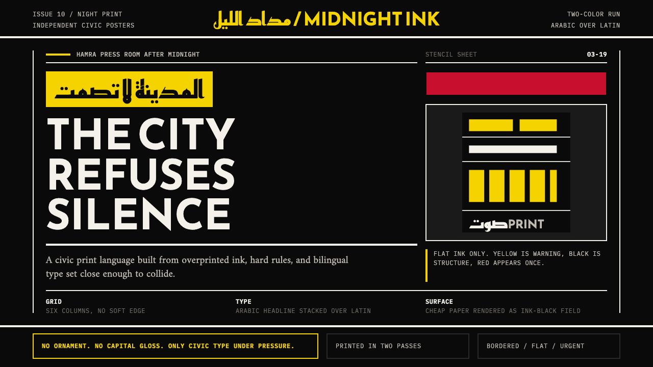
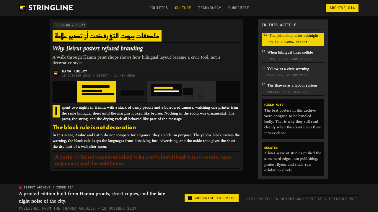
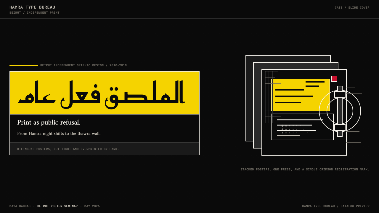
The core formal gesture of Beirut Indie is placing Arabic and Latin type not in careful parallel but in deliberate conflict. Headlines might be set in a bold Arabic block that bleeds across a column of Roman text; captions might run in opposite directions on the same line. The resulting composition is dense and directional — the eye is forced to negotiate between two reading axes simultaneously. This is not a failure of typographic organization; it is the organization, using the scripts' structural difference as the primary compositional material.贝鲁特独立设计的核心形式手势,是将阿拉伯文与拉丁文不是并排安置,而是刻意置于冲突之中。标题可能是一块粗重的阿拉伯文块,出血跨越一列罗马字正文;说明文字可能在同一行上朝两个方向延伸。由此产生的构图密集而具有方向性——眼睛被迫同时在两套阅读轴之间斡旋。这不是排版组织的失败,它本身就是组织方式,以两套字符系统的结构差异作为首要构图材料。
Restricted Protest Palette克制的抗议色板
The palette is narrow and chosen for maximum impact at low production cost: ink-black, sulfur-yellow, and deep crimson are the three primary registers, used in combinations of two at most on any single piece. These are the colors that survive photocopy degradation, survive outdoor sun exposure, and read across the widest possible range of viewing distances. They are also colors that carry historical and cultural weight — the yellow of road-warning signs, the black of mourning, the red of blood or alarm — meanings that the designers exploit rather than neutralize.色板狭窄而以最低生产成本实现最大视觉冲击为原则:墨黑、硫磺黄和深红是三个主要色彩档位,任何单件作品最多以其中两种组合使用。这些颜色能经受复印机降质的考验,能承受户外阳光的曝晒,能在最宽泛的观看距离范围内清晰可读。它们也是承载历史与文化重量的颜色——道路警示标志的黄色、哀悼的黑色、鲜血或警报的红色——这些含义被设计师主动利用,而非中和。
Newsprint and Risograph Texture新闻纸与丝网版印机质感
The material substrate matters enormously to this style. Cheap newsprint, uncoated stock, and risograph-printed sheets carry an inherent roughness — ink bleeds slightly into the paper fiber, edges soften, halftones break into visible dots. Beirut Indie designers treat these qualities as expressive content rather than print defects to minimize. The grain signals authenticity and speed: this was made fast, with available means, by people with something urgent to say. A version of this work produced on glossy coated stock would be a contradiction in terms.物质基底对这种风格至关重要。廉价新闻纸、无涂布纸张与丝网版印机印制的纸张,本身携带着一种粗粝感——油墨向纸张纤维轻微渗透,边缘变得柔和,半调网点分解为肉眼可见的点阵。贝鲁特独立设计师将这些特质视为表达性内容,而非需要最小化的印刷缺陷。颗粒感传递真实性与速度:这是用现有手段、被紧迫感驱动的人们迅速制作的。如果同样的作品印在光滑涂布纸上,则是一个自我矛盾。
Hard Editorial Grid硬朗编辑网格
Despite its apparent rawness, Beirut Indie work is structured on a strict horizontal grid, derived from newspaper layout conventions. Thick rules divide the page into registers — a practice inherited from Arabic broadsheet design where rules have historically served as both organizational dividers and visual anchors for right-to-left readers. These rules are not decorative: they slice the page like editorial deadlines, enforcing the sense that every element has been allocated a precise slot in a constrained system. The grid is visible, unapologetic, and load-bearing.尽管表面看似粗粝,贝鲁特独立作品实际上建立在严格的水平网格之上,这一网格源自报纸版式惯例。粗重的分割线将页面划分为各个区块——这种做法继承自阿拉伯宽幅报纸的设计传统,在那里,分割线历来兼作组织性隔断与从右向左阅读者的视觉锚点。这些线条不是装饰:它们像编辑截止时间一样切割页面,强化了每个元素都被分配到一个有限制系统中精确位置的感受。网格是可见的,毫无歉意,并且承重。
Arabic Type as Visual Form阿拉伯文字作为视觉形态
Beirut's designers — and specifically the Arabic-type reformers among them — treat the Arabic script not as a secondary or decorative system but as a primary visual architecture. Large Arabic letterforms are used at headline scale where their ligatures, counters, and stroke rhythms read as abstract shapes before they resolve into legible words. Designers such as Pascal Zoghbi pioneered Arabic typefaces specifically designed for editorial use at high contrast — faces with the visual authority to anchor a broadsheet front page or carry a protest slogan across a wall from twenty meters away.贝鲁特的设计师——尤其是其中的阿拉伯字体改革者——将阿拉伯文字视为主要视觉架构,而非次要或装饰性系统。大号阿拉伯字形以标题尺度使用,它们的连字、字腔与笔画节奏在成为可辨认的文字之前,先作为抽象形态被感知。帕斯卡尔·佐格比等设计师专门为高对比度编辑使用开发阿拉伯字体——这些字体具有足以锚定一个宽幅报纸头版、或让一句抗议口号从二十米外清晰可读的视觉权威。
Overprint and Register Misalignment叠印与套版偏差
Overprinting — layering one color of ink directly over another, producing a third mixed tone — is used as a compositional tool rather than a problem to solve. A sulfur-yellow headline printed over a black photograph produces a bruised, dark yellow that carries more weight than either color alone. Similarly, deliberate misregistration between passes — so that type or shapes appear slightly doubled or shifted — is used to convey mechanical urgency and to signal that the work comes from a material printing process rather than a pixel-precise digital one.叠印——将一种颜色的油墨直接叠加在另一种之上,产生第三种混合色调——被当作构图工具使用,而非需要解决的问题。印在黑色照片上的硫磺黄标题会产生一种深沉、淤青般的黄色,其重量感超过任何一种单独颜色。同样地,印次之间刻意的套版偏差——使文字或形状看起来轻微重叠或位移——被用来传达机械性紧迫感,并表明这件作品来自一个物质性印刷过程,而非像素精准的数字工作流。
Slogan Density口号密度
Text quantity is high by the standards of most international editorial design. Where a European modernist poster might use five words, a Beirut Indie poster might carry twenty-five — because the audience expects content, argument, and identification. The design challenge is not to reduce the word count but to find a typographic hierarchy that makes a dense text block legible at speed. This is achieved through dramatic contrast in type scale and weight: one or two lines enormous and immediate, the remainder smaller but still set with enough contrast to be read in sequence.以大多数国际编辑设计的标准衡量,文字数量是多的。欧洲现代主义海报可能只用五个词,贝鲁特独立海报可能承载二十五个——因为受众期待内容、论点和身份认同。设计挑战不是减少词数,而是找到一种字体层级,让密集的文字块能被迅速阅读。这通过字号与字重的戏剧性对比来实现:一两行字极大而直接,其余部分更小,但仍以足够的对比度依次呈现。
See the Beirut Indie Graphic Design design system →查看 Beirut Indie Graphic Design 完整设计系统 →
Who shaped Beirut Indie Graphic Design?谁塑造了 Beirut Indie Graphic Design?
A Beirut-based designer and educator whose work on bilingual poster design and political visual communication is foundational to the movement. Choueiry's practice bridges the academy and the street: he has produced campaign graphics for civil-society organizations while teaching design at Lebanese institutions, shaping a generation of designers who understand political communication as a core design competency rather than a niche application.贝鲁特平面设计师与教育者,其在双语海报设计与政治视觉传达领域的工作是这一运动的基石。舒埃里的实践横跨学院与街头:他在黎巴嫩机构执教的同时,为公民社会组织制作宣传图形,培育了将政治传达视为核心设计能力而非小众应用的一代设计师。
A Dutch-Lebanese type designer and design director whose work has substantially advanced the legitimacy and visual range of Arabic typography in international editorial contexts. Atrissi's Arabic typefaces are designed to hold their authority alongside — rather than beneath — Latin companions, and his writing and teaching on Arabic type design have expanded the theoretical vocabulary that younger Beirut designers draw on when making choices about script hierarchy and bilingual layout.荷兰-黎巴嫩字体设计师与创意总监,其工作极大地推进了阿拉伯文排版在国际编辑语境中的合法性与视觉广度。阿特里西的阿拉伯字体被设计为与拉丁文并驾齐驱,而非屈居其下;他关于阿拉伯字体设计的写作与教学,拓展了年轻一代贝鲁特设计师在做出字体系统层级与双语版面决策时所借鉴的理论词汇。
A designer and art director whose editorial work — particularly his tenure at NOW Lebanon and subsequent independent projects — demonstrated that the Beirut Indie visual language could sustain long-form publication design, not only poster production. Imam's layouts use the same bilingual collision grammar as street-poster work but apply it across multi-page magazine spreads, proving that the aesthetic is structural rather than situational.设计师与艺术总监,其编辑作品——尤其是在《今日黎巴嫩》(NOW Lebanon)的工作及此后的独立项目——证明了贝鲁特独立视觉语言能够支撑长篇出版物设计,而不仅限于海报生产。伊玛目的版面在多页杂志跨页中运用与街头海报相同的双语冲撞语法,证明这种美学是结构性的,而非情境性的。
A type designer and the founder of 29LT (29 Letters), a type foundry focused specifically on Arabic-Latin bilingual type systems. Zoghbi's foundry work has produced typefaces where Arabic and Latin variants are drawn to the same visual weight, x-height equivalence, and rhythmic density — families in which neither script dominates. His 2011 doctoral research on Arabic type design in the digital age remains one of the most cited academic foundations for the movement's typographic ambitions.字体设计师,29LT(二十九字母)的创始人,这家字体铸造坊专注于阿拉伯-拉丁双语字体系统。佐格比的铸造坊作品产出了阿拉伯文与拉丁文变体以相同视觉重量、字母高度对等与节奏密度绘制的字体——两套字符系统互不凌驾的字体家族。他2011年关于数字时代阿拉伯字体设计的博士研究,至今仍是这一运动排版抱负中被引用最广泛的学术基础之一。
An academic and practitioner whose work on Arabic comics and sequential visual narrative has expanded the style's vocabulary beyond poster and editorial work into sequential and narrative formats. Ghaibeh's research at the Lebanese American University examines how Arabic script functions in panel-based layouts — work that has directly influenced how Beirut designers think about text-image relationships and the spatial logic of right-to-left reading in multi-frame compositions.学者与实践者,其在阿拉伯漫画与序列视觉叙事领域的工作,将这种风格的词汇从海报与编辑作品扩展至序列与叙事格式。盖贝在黎巴嫩美国大学的研究考察了阿拉伯文字在分格版面中的运作方式——这项工作直接影响了贝鲁特设计师如何思考多帧构图中文字-图像关系以及从右向左阅读的空间逻辑。
How do you use Beirut Indie Graphic Design today?今天怎么用 Beirut Indie Graphic Design?
Beirut Indie Graphic Design is a contextually specific style that transfers best when the communication goal is direct, urgent, or politically engaged — and struggles when asked to convey luxury, calm, or institutional neutrality. Applying it well means understanding what the style is actually doing: using scarcity of color, density of text, and collision of scripts as signals of urgency and authenticity rather than aesthetic decoration.贝鲁特独立平面设计是一种语境高度特定的风格,在传达目标直接、紧迫或具有政治参与性时,移植效果最佳;而当被要求传递奢华、平静或机构中立性时,则力不从心。正确应用它,意味着理解这种风格实际上在做什么:用色彩的匮乏、文字的密度和字符系统的碰撞,作为紧迫性与真实性的信号,而非审美装饰。
For presentation slides, the style works best at cover and section-break moments rather than on dense data slides. A cover built on this aesthetic might use a single bold Arabic or Latin word — enormous, filling most of the frame — against an ink-black ground, with a subtitle in the other script running below it at a dramatically smaller scale. Section break slides can echo this two-weight, two-script structure. Content slides, however, require restraint: the style's high density is an asset for posters viewed at a distance but becomes a liability when an audience must read bullet points from a projected screen. Limit the palette to two colors, let one color dominate, and keep type hierarchies to two levels only.在演示文稿中,这种风格最适合用于封面与章节过渡时刻,而非密集的数据页面。以这种美学构建的封面,可以用一个单一的粗重阿拉伯文或拉丁文单词——巨大,填满画面的大部分——置于墨黑底面之上,副标题以另一套字符系统在其下方以戏剧性更小的尺度排布。章节过渡幻灯片可以呼应这种双字重、双字符系统的结构。然而内容页需要克制:这种风格的高密度在远距离观看的海报上是优势,而当观众必须从投影屏幕上阅读要点时,则变为负担。将色板限制为两种颜色,让一种颜色主导,并将文字层级严格保持在两级。
For web interfaces and digital products, the style is best suited to contexts where the brand explicitly wants to communicate cultural specificity, political earnestness, or a connection to the Arab world. Dashboards and SaaS interfaces generally should not use this style — the overprint textures, misregistration effects, and dense text blocks translate poorly to UI components that need to communicate precision and trustworthiness. Where the style does work digitally is in editorial sites, campaign microsites, cultural institution pages, and any context where the rawness is a feature rather than a bug. Use horizontal rules aggressively as section dividers, set headlines at oversized scale with generous leading cut short at the cap height, and let two-script labels coexist without padding them apart.对于网页界面与数字产品,这种风格最适合品牌明确希望传达文化特殊性、政治真诚性或与阿拉伯世界联系的语境。仪表板与SaaS界面通常不应使用这种风格——叠印质感、套版偏差效果与密集文字块,在需要传达精准度与可信度的界面组件中适应性差。这种风格在数字领域确实有效的地方,是编辑网站、活动专题页面、文化机构页面,以及任何粗粝感是特性而非缺陷的语境。大量使用水平分割线作为区块分隔,以超大尺度排设标题,行距在大写字母高度处收紧,让双脚本标签并存,不以内边距将它们撑开。
For editorial and print marketing, this is where the style performs at its highest register. A publication designed in this mode should use a strict modular grid visible through the layout — not hidden beneath it — with rules that bleed to the edge of the page. Full-bleed ink-black pages alternate with near-white pages to create a rhythm that reads as urgency without becoming monotonous. Photography, where used, should be treated as flat geometric areas rather than atmospheric windows: high contrast, cropped to edges, possibly overprinted with a second color. Pull quotes in the opposing script to the body text give each spread a bilingual axis that keeps the eye in motion.在编辑与印刷营销领域,这种风格表现在其最高档位。以这种模式设计的出版物,应使用在版面中可见的严格模块网格——而非将其隐藏其下——分割线出血至页面边缘。全出血墨黑页面与近白页面交替,制造一种读起来有紧迫感但不至于单调的节奏。摄影图像若使用,应被当作平面几何区域而非大气性窗口来处理:高对比度、裁切至边缘、可能叠印以第二种颜色。以与正文相反的字符系统设置提炼引语,给每个跨页一个双语轴线,使眼睛保持运动。
The most common mistake when applying this style outside its cultural context is aestheticizing the rawness while removing the density. A cleaned-up, refined version of Beirut Indie — smooth registration, generous margins, tasteful two-color palette — is simply a generic modernist poster with Arabic flavoring. The density, the misregistration, and the typographic collision are the content; removing them in the name of polish produces a pastiche. A second common error is treating Arabic type as decorative texture — using it at small scale for visual pattern while privileging the Latin text for actual communication. That reproduces the colonial hierarchy the style was invented to refuse.在其文化语境之外应用这种风格时,最常见的错误是将粗粝感审美化,同时移除密度。一个清洁化、精致化的贝鲁特独立版本——平整套版、宽阔边距、品味出众的双色板——不过是一张带有阿拉伯风味的通用现代主义海报。密度、套版偏差与排版冲撞才是内容;以抛光之名将它们移除,产生的是一种仿制品。第二个常见错误是将阿拉伯文字当作装饰性纹理——以小尺度使用它制造视觉图案,同时将拉丁文字优先用于实际传达。这再现了这种风格被发明出来加以拒绝的殖民主义等级关系。
See the Beirut Indie Graphic Design design system →查看 Beirut Indie Graphic Design 完整设计系统 →
Beirut Indie Graphic Design — FAQBeirut Indie Graphic Design · 常见问题
Is this style exclusively for Arabic-language or Middle Eastern contexts?这种风格是否只适用于阿拉伯语或中东语境?
Not exclusively, but the style's most powerful effects depend on bilingual script collision, and that collision only functions when both scripts are genuinely present and doing communicative work. Using Arabic type purely as visual texture in a Latin-script communication — without the Arabic carrying actual meaning — is both aesthetically hollow and culturally appropriative. Designers working in other bilingual contexts (Chinese-Latin, Hebrew-Latin, Cyrillic-Latin) can legitimately borrow the structural principles — hard grids, restricted palette, deliberate collision, risograph texture — without requiring the specific Arabic-Latin combination. The principles generalize; the specific scripts do not.并非只限于此,但这种风格最有力的效果依赖于双语字符系统的冲撞,而这种冲撞只有在两套字符系统都真正存在并承担传达功能时才能发挥作用。在拉丁字符系统的传达物中纯粹将阿拉伯文字作为视觉纹理使用——没有让阿拉伯文字承载实际意义——既在美学上空洞,在文化上也是一种挪用。在其他双语语境中工作的设计师(汉-拉丁、希伯来-拉丁、西里尔-拉丁)可以合理借用其结构原则——硬朗网格、克制色板、刻意冲撞、丝网版印质感——而无需要求特定的阿拉伯-拉丁组合。原则可以泛化,具体字符系统则不能。
How do I reproduce the risograph texture in digital work?如何在数字作品中重现丝网版印机的质感?
The risograph texture has three components: ink grain, color halftone, and misregistration. Grain is achievable by layering a mid-scale noise texture over flat color fills at low opacity, then reducing the output to a limited color profile. Color halftone — the visible dot pattern — can be approximated by applying a bitmap halftone effect to images before placing them in a layout. Misregistration — the slight offset between two color passes — is best achieved by duplicating a type or shape layer, offsetting it by a small amount in one direction, assigning the duplicate to the secondary ink color, and compositing the two at full opacity. The effect is most convincing when the offset is imprecise and directionally consistent across a piece rather than applied mechanically to every element.丝网版印机质感包含三个组成部分:油墨颗粒、色彩半调与套版偏差。颗粒感可以通过在平面色块填充上叠加一层中等尺度的噪点纹理(以低不透明度)、然后将输出转为有限色彩配置来实现。色彩半调——可见的网点图案——可以通过在将图像置入版面之前,对其应用位图半调效果来近似。套版偏差——两个印色通道之间的轻微位移——最好通过复制一个文字或形状图层、在一个方向上偏移少许、将副本指定为次要油墨颜色,并以全不透明度合成两者来实现。当偏移在整件作品中方向一致但并不精确,而非机械地应用于每个元素时,效果最为可信。
Does the style work for brands or only for activist communication?这种风格只适用于活动人士传达,还是也适用于品牌?
The style originated in activist contexts and continues to carry those associations, which means brands that adopt it are implicitly claiming an affiliation with civil-society urgency and political directness. That alignment is an asset for certain brands — cultural organizations, media publications, independent food or fashion businesses positioning themselves against corporate blandness, NGOs communicating about social issues. It is a liability for brands that need to project institutional trust, luxury, stability, or political neutrality. A bank or pharmaceutical company adopting this style would produce cognitive dissonance. A music festival, an independent bookstore, or a civil-society campaign would find it genuinely fitting.这种风格起源于活动人士语境,并持续携带那些联想,这意味着采用它的品牌正在隐性地声称与公民社会的紧迫性和政治直接性相关联。对于某些品牌来说,这种认同是资产——文化组织、媒体出版物、将自身定位为对抗企业乏味的独立餐饮或时尚品牌、就社会议题进行传达的非政府组织。对于需要投射机构可信度、奢华感、稳定性或政治中立性的品牌而言,它则是负担。银行或制药公司采用这种风格会产生认知失调。音乐节、独立书店或公民社会活动则会发现它真正契合。
How does Beirut Indie differ from broader Arabic design movements?贝鲁特独立设计与更广泛的阿拉伯设计运动有何不同?
Arabic graphic design encompasses a wide range, from classical calligraphic traditions to Gulf corporate identity to Egyptian commercial advertising. Beirut Indie is specifically a post-civil-war, post-assassination, post-uprising phenomenon — it is shaped by Lebanon's particular political situation, its cosmopolitan bilingualism, and its strong independent cultural sector. It has more in common with European and Latin American protest-print traditions than with, say, the ornamental Arabic-script calligraphy that appears in Islamic decorative arts or the slick modernist Arabic lettering developed for Gulf media brands. It is also specifically a product of a design-educated professional class working through inexpensive duplication technologies — not a folk craft tradition.阿拉伯平面设计涵盖广泛的范围,从古典书法传统到海湾企业视觉识别,再到埃及商业广告。贝鲁特独立设计特别是一种后内战、后暗杀、后起义的现象——它被黎巴嫩特定的政治处境、其世界主义的双语特性以及其强劲的独立文化部门所塑造。它与欧洲和拉丁美洲的抗议印刷传统的共同之处,多于与伊斯兰装饰艺术中出现的装饰性阿拉伯书法、或为海湾媒体品牌开发的流畅现代主义阿拉伯字母的共同之处。它同样特别地是一种受过设计教育的专业阶层通过廉价复制技术工作的产物——而非一种民间工艺传统。
What makes a Beirut Indie piece feel authentic versus derivative?是什么让一件贝鲁特独立作品感觉真实而非衍生?
Authenticity in this style is primarily a question of necessity. Authentic work in this tradition is built around a communication imperative — something that must be said, a deadline that exists, an audience that is genuinely addressed. The visual choices serve that imperative rather than demonstrating the designer's knowledge of the style. A derivative piece, by contrast, applies the visual signatures — the misregistration, the sulfur yellow, the collision typography — as surface effects layered onto a communication that would function equally well in any other style. The grain without the urgency is costume. The surest diagnostic is asking whether removing the stylistic elements would change the message: in authentic work, it would; in derivative work, it would not.这种风格中的真实性,首先是一个关于必要性的问题。这一传统中的真实作品围绕一个传达指令而构建——某件必须被说出的事,一个真实存在的截止时间,一个被真正面对的受众。视觉选择服务于这一指令,而非展示设计师对这种风格的了解。相比之下,衍生作品将视觉签名——套版偏差、硫磺黄、冲撞排版——作为表面效果叠加在一个用任何其他风格同样能奏效的传达之上。没有紧迫感的颗粒感只是戏服。最确实的检验方法是问:移除风格元素是否会改变信息本身?在真实的作品中,答案是肯定的;在衍生作品中,则否。
Related design styles相关设计风格
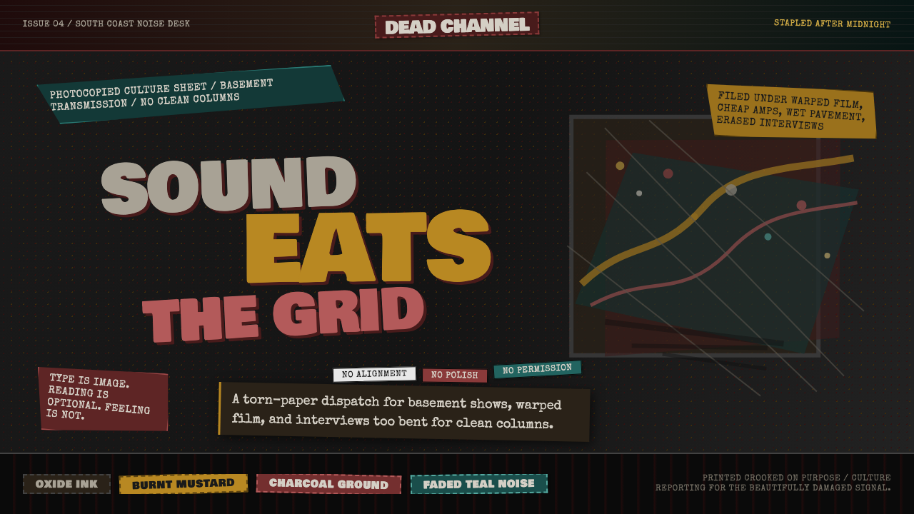 Grunge (Carson 1993)Carson's anti-rules, photocopied. Oxblood on charcoal, distressed type, delib…大卫·卡森颠覆现代主义排版的粗粝美学:暗红与焦黄、炭灰底、刻意打破的网格、油墨…
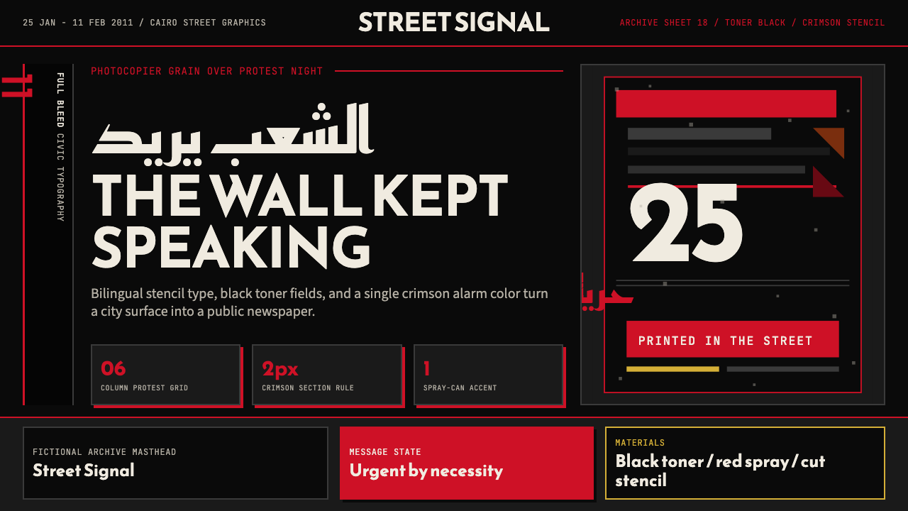 Tahrir Square 2011Civic signal, not polish. Photocopier black and crimson stencils on a hard gr…公民信号,不加修饰。复印黑与猩红模板压进硬网格。
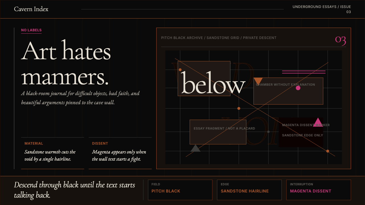 Tasmanian MONA Museum (2011)Hostile luxury underground. Pitch black, sandstone hairlines, magenta editori…敌意奢华的地下感:漆黑底、砂岩细线与品红挑衅。
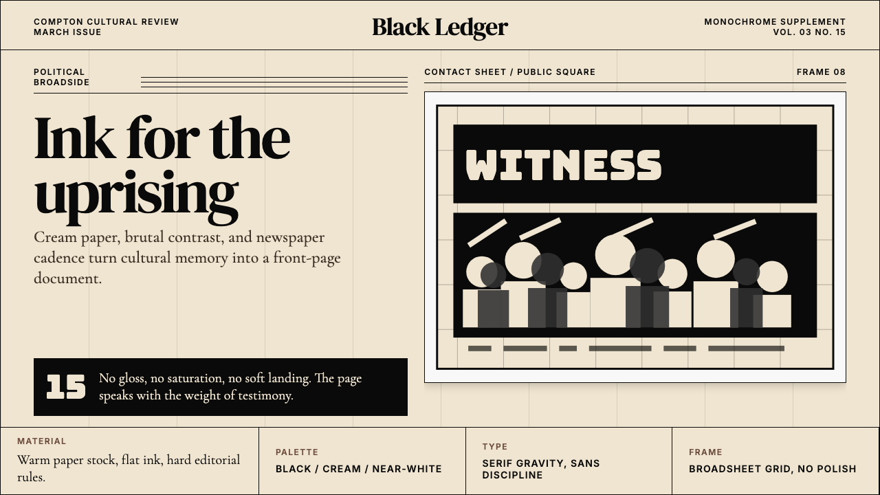 Kendrick — To Pimp a ButterflyPolitical weight, printed cold. Cream paper, hard serif type, monochrome crow…政治重量冷静落纸。米黄纸、硬衬线与黑白群像几何。
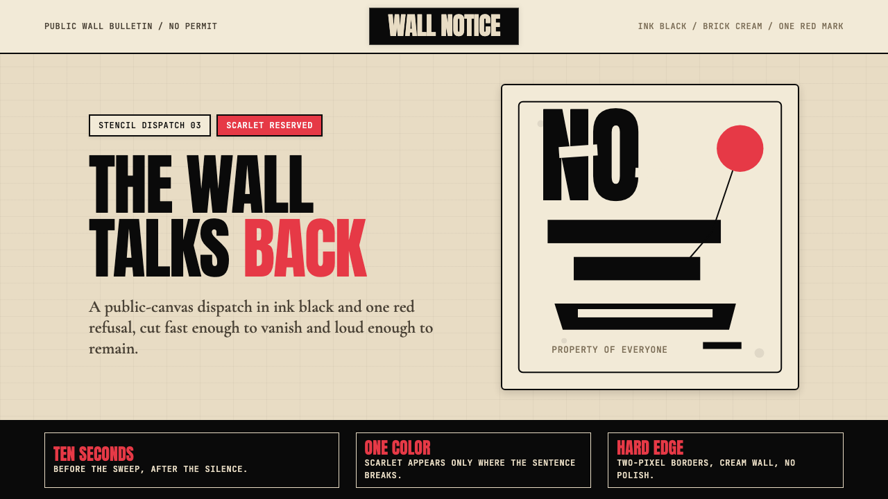 Banksy Stencil GraffitiProtest is reduced to a cut mark. Anton black on brick cream, one scarlet red…抗议被压成剪影。砖墙奶油底、Anton黑字,一点猩红打断。
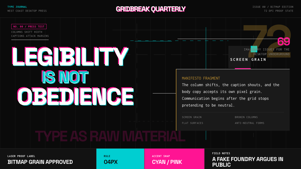 Emigre Magazine (1984–2005)Defies the tidy grid. Cyan, ochre, and hot-pink bitmap type collides on black.拒绝整齐网格:黑底上的青色、赭色与热粉像素字相撞。