What is Grunge (Carson 1993)?什么是 Grunge (Carson 1993)?
David Carson blew up the rulebook at Ray Gun magazine, proving that deliberate illegibility, shredded grids, and photocopy grain could carry more emotional truth than any clean modernist layout.大卫·卡森在《Ray Gun》杂志将规则手册炸成碎片,证明刻意的难读性、撕碎的网格与复印机噪点,能比任何整洁的现代主义版面承载更多情感真相。
Grunge (Carson 1993) in briefGrunge (Carson 1993) 速览
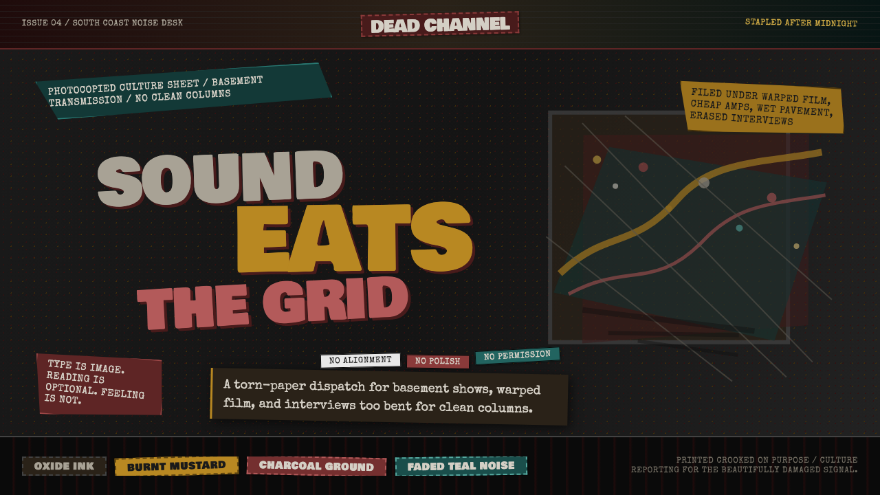
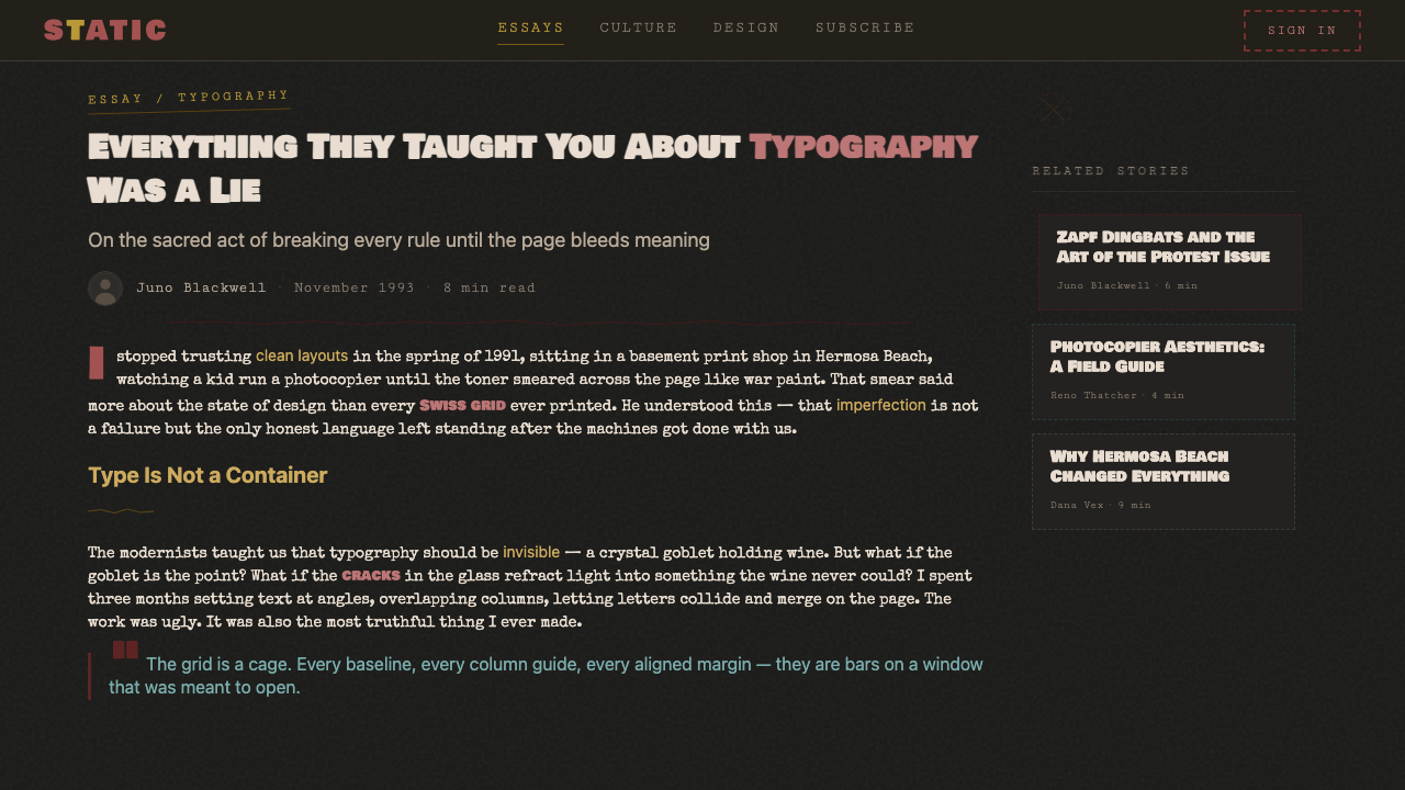
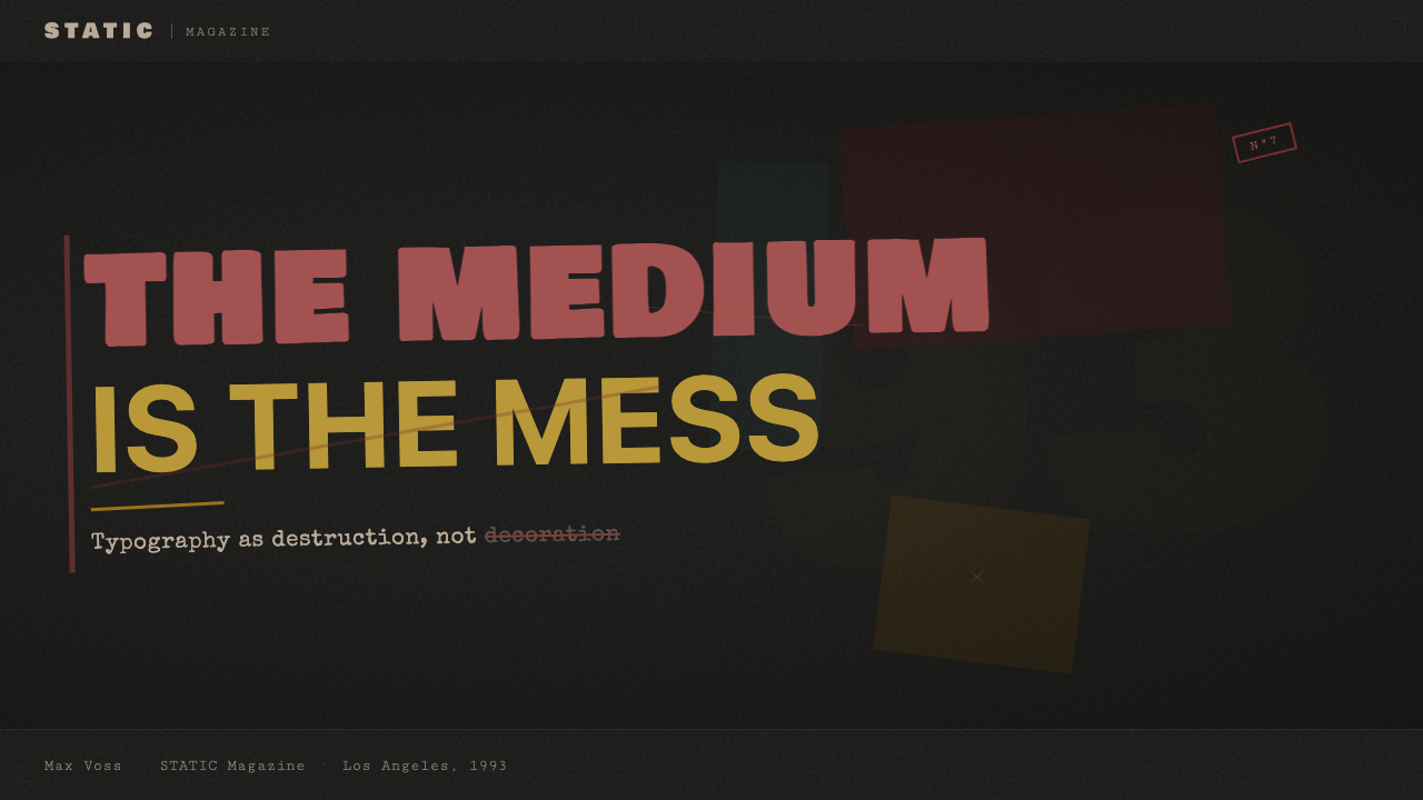
Grunge typography — as crystallized in David Carson's work at Ray Gun magazine between 1992 and 1995 — is a postmodern design language built on the deliberate destruction of the conventions that Swiss International Style and American corporate modernism had spent forty years perfecting. Where modernist typography sought neutrality, clarity, and the invisible hand of the designer, Carson's approach made the designer's hand grotesquely visible: type stacked at odd angles, layered over itself, set in multiple conflicting weights within a single sentence, or replaced entirely by symbol fonts chosen for their opacity rather than their meaning.垃圾摇滚排版——以大卫·卡森1992至1995年间在《Ray Gun》杂志的工作为最高结晶——是一种建立在刻意破坏之上的后现代设计语言。它所破坏的,正是瑞士国际主义风格和美国企业现代主义花了四十年打磨出来的那套规范。现代主义排版追求中立、清晰、设计师之手的隐形;卡森的方式则让设计师之手以一种怪异的方式变得可见:文字以奇怪的角度堆叠、自身叠加、在同一个句子里混用多种相互冲突的字重,或干脆被符号字体替换,而选择那种字体的理由,正是它的不可读性而非它的含义。
The visual palette of this style is drawn from the material conditions of its production: the muddy, warm darks of photocopied pages, the halftone grain of magazine printing pushed past its comfortable resolution, ink that bleeds and spreads at the edges of letterforms. Color is used expressively rather than symbolically — deep oxbloods and rusted ochres sit against charcoal and near-black grounds, with occasional bursts of acid color that feel less like design decisions and more like accidents of the darkroom. Nothing is refined; refinement is the enemy.这种风格的视觉色板源自其生产条件的物质现实:复印页面上浑浊而温暖的暗色调,杂志印刷的半调网点被推到舒适分辨率之外时呈现的颗粒感,在字形边缘渗透蔓延的油墨。色彩的运用是表现性的而非象征性的——深沉的暗红与锈黄坐落在炭灰与近黑色的底色上,偶尔迸发出一阵酸性色彩,那感觉与其说是设计决定,不如说是暗房里的意外。没有任何东西是精致的;精致本身就是敌人。
Critically, this style is not chaos for its own sake. Carson and his contemporaries — Neville Brody in London, Vaughan Oliver at 4AD Records, Rudy VanderLans at Emigre magazine — were each making an argument: that the conventions of readability and visual order were cultural impositions, not natural laws, and that breaking them could produce a different kind of communication, one that spoke to the body and the gut before it reached the rational mind. The grunge aesthetic is, at its core, a graphic philosophy of emotional priority.关键在于,这种风格并非为混乱而混乱。卡森和他的同时代人——伦敦的内维尔·布罗迪、4AD唱片公司的沃恩·奥利弗、《Emigre》杂志的鲁迪·范德兰斯——每个人都在阐明一个论点:可读性与视觉秩序的惯例是文化强加,而非自然法则,打破它们能产生一种不同类型的传播——一种在触达理性意识之前,先对身体与直觉说话的传播。垃圾摇滚美学,在本质上,是一种以情感优先为纲领的平面哲学。
See the Grunge (Carson 1993) design system查看 Grunge (Carson 1993) 完整设计系统
Where does Grunge (Carson 1993) come from?Grunge (Carson 1993) 从何而来?
The context for Carson's work at Ray Gun is inseparable from the American alternative music and skateboarding cultures of the late 1980s and early 1990s. Carson had come to graphic design through surfing journalism — he studied sociology, worked as a professional surfer, and came to typography sideways, without the formal Swiss-influenced training that dominated American design schools at the time. This outsider formation was decisive. He had no deep investment in the rules he was breaking, and the audiences he was designing for — readers of Surfer magazine, then Beach Culture, then Ray Gun — were young, subcultural, and deeply suspicious of anything that looked polished or corporate.卡森在《Ray Gun》的工作,与20世纪80年代末、90年代初美国另类音乐和滑板文化密不可分。卡森是通过冲浪新闻摄影进入平面设计领域的——他主修社会学,曾是职业冲浪运动员,以一种迂回的方式进入排版,完全没有受过当时主导美国设计学院的瑞士风格正规训练。这种局外人的成长背景是决定性的。他对自己正在打破的那些规则没有深厚的情感投入,而他为之设计的受众——《Surfer》杂志、《Beach Culture》、《Ray Gun》的读者——都是年轻的亚文化群体,对任何看起来光鲜精致或有企业气息的东西深怀戒心。
Ray Gun, founded in 1992 by Marvin Scott Jarrett as a music magazine covering alternative and indie acts, gave Carson an extraordinary degree of creative autonomy. The magazine's subject matter — Sonic Youth, PJ Harvey, Beck, Nirvana, Kurt Cobain — was itself invested in noise, rawness, and the rejection of mainstream production values. Carson designed the magazine to look like it felt: unstable, loud, densely layered, occasionally unreadable. His most notorious act was setting an entire Bryan Ferry interview in Zapf Dingbats — a symbol font — because he found the interview too boring to deserve legible type. The gesture, which appalled many designers and delighted many readers, crystallized what the style was doing.1992年由马文·斯科特·贾勒特创办的《Ray Gun》是一本报道另类与独立音乐的杂志,它给了卡森非同寻常的创作自主权。这本杂志的主角——音速青年、PJ·哈维、贝克、涅槃乐队、科特·柯本——本身就投身于噪音、粗粝与对主流制作价值观的拒绝。卡森把杂志设计成了它让人感受到的那种样子:不稳定、嘈杂、密集分层、偶尔无法阅读。他最出名的举动是用Zapf Dingbats符号字体排版了一整篇布莱恩·费里的访谈,理由是他觉得那篇采访无聊到不配拥有可读的字体。这个举动令许多设计师愤慨,却让许多读者狂喜,它将这种风格的本质结晶为一个单一的时刻。
The technological conditions of the early 1990s were equally formative. The desktop publishing revolution — driven by the Macintosh, Adobe PostScript, and applications like PageMaker and QuarkXPress — had placed professional typographic tools in the hands of designers for the first time, and those tools arrived with none of the craft constraints that had governed hot-metal or phototypesetting. You could now scale a typeface to three hundred percent, overlap two text blocks, set type on a curve, and print it on a photocopier, all in an afternoon. Carson and the broader grunge typographic movement were, in part, an expression of this new freedom — an answer to the question of what happens when you give someone all the rules and all the tools to break them simultaneously.20世纪90年代初的技术条件同样是塑造性的。桌面出版革命——由麦金塔电脑、Adobe PostScript以及PageMaker、QuarkXPress等软件驱动——第一次将专业排版工具交到了设计师手中,而这些工具到来时,没有带来任何曾约束活字印刷或照相排版的工艺限制。你现在可以在一个下午内,把一种字体放大到三百倍、让两个文字块相互叠加、将文字排在曲线上,然后用复印机打出来。卡森和更广泛的垃圾摇滚排版运动,在某种程度上,是这种新自由的表达——是对这个问题的回答:当你同时给一个人所有的规则和所有打破规则的工具,会发生什么?
Beyond Carson, the movement had a broader geography. In London, Neville Brody had been systematically deconstructing the conventions of magazine typography at The Face and Arena throughout the 1980s, developing custom typefaces that interrogated the structural logic of letterforms. At 4AD Records in London, Vaughan Oliver was creating sleeve artwork of hallucinatory complexity, layering photographic textures, handwritten elements, and abstracted imagery into dense, darkly beautiful objects. In the Bay Area, Rudy VanderLans and Zuzana Licko's Emigre magazine served as both a critical journal and a showcase for experimental type design, publishing the typefaces — blurred bitmaps, hand-distressed forms, geometric hybrids — that the grunge typographic movement drew on. These figures were not a school or a movement in any organized sense; they were parallel responses to the same cultural pressure: the exhaustion of high modernism and the new possibilities of digital production.在卡森之外,这场运动有更宽广的地理版图。在伦敦,内维尔·布罗迪整个80年代都在《The Face》和《Arena》杂志系统性地解构杂志排版的惯例,开发出质疑字形结构逻辑的定制字体。同在伦敦的4AD唱片公司,沃恩·奥利弗正在创作出令人眩晕的复杂唱片封套,将摄影质感、手写元素与抽象图像叠加成密集而暗黑美丽的物件。在湾区,鲁迪·范德兰斯与祖扎娜·利茨科的《Emigre》杂志既是批评性期刊,也是实验性字体设计的展示窗口,发表了那些垃圾摇滚排版运动赖以汲取灵感的字体——模糊的位图、手工做旧的形态、几何混血体。这些人物并不构成任何有组织意义上的学校或运动;他们是对同一文化压力的平行回应:高度现代主义的耗竭,以及数字生产的新可能。
What defines the Grunge (Carson 1993) look?Grunge (Carson 1993) 的视觉特征是什么?
Color色彩
The palette is built on deep, impure darks — charcoal and near-black grounds that read warmer than true black — layered with oxblood reds, burnt mustard yellows, and occasionally a rusted, aged orange. These colors are not clean: they carry a sense of having been photocopied, bleached, or left in the sun. Acid greens or electric blues appear rarely and always feel like intrusions, as if a marker has bled through from the page behind. Contrast is high but not crisp — the relationship between figure and ground has the soft, slightly uncertain edge of ink on newsprint.色板建立在深沉而不纯粹的暗色调上——炭灰与近黑色的底色,读来比纯黑更温暖——上面叠加了暗红、焦黄,偶尔有一种锈蚀的、做旧的橙色。这些颜色并不干净:它们带有一种被复印、漂白或在阳光下久置的感觉。酸性绿或电光蓝极少出现,且总是感觉像是入侵——仿佛一支马克笔从背后那页纸渗透过来。对比度很高,但并不清脆——图形与底面之间的关系有着油墨印在新闻纸上那种柔软而略带不确定感的边缘。
Typography字体排印
Type in this style is treated as raw material rather than a communication vehicle. A headline might be set in a degraded serif that appears to have been photocopied several generations past legibility; body text may shift typeface mid-paragraph without explanation. Letterforms are scaled to extremes — a single character might occupy a third of the page while a block of text is rendered nearly too small to read. Type runs at diagonals, overlaps other type, bleeds off the edge of the frame, or sits in a dense, textured mass that functions more as visual field than readable prose. The key principle is that type carries emotional and visual weight independent of its linguistic content.在这种风格中,文字被当作原材料而非传播媒介对待。一个标题可能用一种已退化到可读性临界点之外的衬线字体排版,仿佛被多次复印;正文可能在段落中途毫无理由地切换字体。字形被推向极端尺度——单个字符可能占据页面三分之一,而一段文字则被设定得几乎无法阅读。文字以斜线排列、与其他文字叠加、溢出画框边缘,或以一种密集而有肌理的团块出现,这团块作为视觉场域发挥作用,而不是可阅读的散文。核心原则是:文字承载着独立于其语言内容之外的情感与视觉重量。
Grid (or its absence)网格(或其缺席)
Where modernist design uses the grid as an invisible organizing structure, grunge typography makes the grid's destruction legible. Elements are placed with apparent disregard for alignment; columns are broken by images or text blocks that refuse to respect their boundaries. Yet there is a compositional logic underneath the chaos — Carson and his peers had absorbed enough formal training to understand balance and tension, and their apparently random layouts are in fact carefully tuned to feel unstable without becoming visually incoherent. The sensation is of a grid that existed and has been deliberately torn.现代主义设计将网格用作隐形的组织结构,垃圾摇滚排版则让网格的破坏变得可见。元素的放置表面上完全无视对齐;栏目被拒绝遵守边界的图像或文字块打断。然而在混乱之下有一种构图逻辑——卡森和他的同侪吸收了足够的形式训练,理解平衡与张力,他们表面上随机的版面实际上被精心调整,使其感觉不稳定而不至于视觉上失去连贯性。那种感觉是:一个曾经存在的网格,被刻意撕碎了。
Texture and Grain质感与颗粒
Surface texture is a defining characteristic rather than an incidental quality. Halftone grain — the dot pattern visible when print reproduction is pushed to its limits — appears as a deliberate formal element, not a production defect. Ink bleed softens and thickens letterforms at their edges. Paper texture reads through backgrounds, suggesting the physicality of offset or screen printing. Photocopier artifacts — streaks, fade gradients, the blurred edge where toner didn't quite adhere — are embraced and sometimes amplified. The effect situates the design unmistakably in the world of physical production rather than the clean unreality of the digital screen.表面质感是决定性特征而非偶发品质。半调网点——印刷再现被推到极限时可见的点状图案——作为刻意的形式元素出现,而非生产缺陷。油墨渗透在字形边缘软化并加厚笔画。纸张质感透过背景显露出来,暗示着胶印或网印的物质性。复印机的痕迹——条纹、褪色渐变、碳粉未完全附着的模糊边缘——被欣然接受,有时甚至被刻意放大。这种效果将设计明确地置于物质生产的世界中,而非数字屏幕那种干净的非现实性中。
Image Treatment图像处理
Photography in this style is treated with the same freedom as type — cropped aggressively, layered with type or other images, reproduced in high-contrast black and white or pushed to extreme color saturation. Photographic subjects bleed into each other, boundaries dissolve, and the overall effect is more collage than composition. Found imagery — photocopied textures, fragments of earlier printed materials, distressed photographic surfaces — is used alongside original photography without distinction. The image is not a window into reality but a raw material to be worked.在这种风格中,摄影与文字享有同等的自由度——被激进地裁切、与文字或其他图像叠加、以高对比度黑白再现或被推向极端色彩饱和度。摄影主体相互渗透,边界消融,整体效果更像拼贴而非构图。现成图像——复印的质感、早期印刷材料的碎片、做旧的摄影表面——与原创摄影并置使用,不加区分。图像不是通往现实的窗口,而是有待加工的原材料。
Emotional Register情感基调
The emotional register of grunge typography is deliberately unsettled. It does not want to comfort or orient the reader; it wants to disturb, energize, or create a specific kind of unease that corresponds to the music and subcultures it was born alongside. Tension is built through visual instability — elements that seem about to fall off the page, type that threatens to become unreadable, compositions that refuse the eye a clear resting point. This emotional priority — feeling over legibility, energy over clarity — is the deepest structural principle of the style.垃圾摇滚排版的情感基调是刻意动荡的。它不想安慰读者或为读者定向;它想要扰动、激发能量,或制造一种与它共同诞生的音乐和亚文化相对应的特定不安感。张力通过视觉不稳定性被构建——看起来就要从页面上掉落的元素,威胁要变得无法阅读的文字,拒绝给眼睛一个清晰停歇点的构图。这种情感优先原则——感受重于可读性,能量重于清晰度——是这种风格最深层的结构原则。
Anti-Refinement反精致
Refinement — the careful polishing of details, the obsessive adjustment of kerning, the smooth edge and the perfect color match — is not merely absent from this style but actively opposed. The rough edge is preferred to the clean edge, the approximate to the precise, the first draft energy to the finished surface. This is a formal position, not laziness: the argument is that excessive refinement produces work that is aesthetically pleasing but emotionally inert, and that the rawness of the unfinished carries an authenticity that polish destroys.精致——对细节的小心打磨、对字距的执念调整、平滑的边缘与完美的色彩匹配——在这种风格中不仅仅是缺席的,而是被主动反对的。粗糙边缘优于干净边缘,近似优于精确,初稿的能量优于完成的表面。这是一种形式立场,而非懒惰:其论点是,过度的精致产生的是审美上令人愉悦但情感上毫无生气的作品,而未完成之物的粗粝承载着一种精致所摧毁的真实性。
See the Grunge (Carson 1993) design system查看 Grunge (Carson 1993) 完整设计系统
Who shaped Grunge (Carson 1993)?谁塑造了 Grunge (Carson 1993)?
Carson served as art director of Ray Gun magazine from its founding in 1992 until 1995, producing one of the most influential bodies of editorial design work in the history of American print media. His approach — layered, distressed, frequently illegible, always emotionally charged — was informed by his background outside design schools and by the music he was covering. After Ray Gun, Carson's influence spread into advertising, motion graphics, and international brand work; his 1995 monograph The End of Print became one of the best-selling graphic design books ever published. He remains the most recognizable name associated with postmodern typography.卡森从1992年《Ray Gun》创刊起担任其艺术总监直至1995年,留下了美国印刷媒体史上最具影响力的编辑设计作品之一。他的方式——分层叠加、做旧处理、时常难以辨认、始终充满情感张力——来自他在设计学院之外的背景,以及他所报道的音乐。离开《Ray Gun》之后,卡森的影响扩散到广告、动态图形和国际品牌工作中;他1995年的专著《印刷的终结》成为有史以来最畅销的平面设计书籍之一。他至今仍是后现代排版最具辨识度的代名词。
Brody was art director of The Face magazine in London throughout the 1980s and subsequently Arena, developing a personal visual language that deconstructed typographic conventions through custom letterforms, industrial imagery, and layouts that challenged the reader's orientation. His 1988 monograph The Graphic Language of Neville Brody was a commercial sensation that brought postmodern typography to a wide international audience. Brody founded the FontShop type foundry and later co-founded Fuse, an experimental type publication, which distributed new typefaces alongside critical essays questioning the nature and purpose of letterforms. His influence on the generation that included Carson was substantial and direct.布罗迪整个80年代担任伦敦《The Face》杂志的艺术总监,随后又执掌《Arena》,通过定制字形、工业图像和挑战读者方向感的版面,发展出一种解构排版惯例的个人视觉语言。他1988年的专著《内维尔·布罗迪的平面语言》引发商业轰动,将后现代排版带给了广泛的国际受众。布罗迪创办了FontShop字体铸造厂,后来又联合创办了实验性字体出版物Fuse,将新字体与质疑字形本质和目的的批评性文章一同发行。他对包括卡森在内那一代人的影响是深远而直接的。
Oliver was the in-house designer and creative director at 4AD Records in London from the early 1980s, creating sleeve artwork for bands including the Pixies, Cocteau Twins, Dead Can Dance, and Throwing Muses. His work is the parallel development in album design of what Carson was doing in magazine publishing: densely layered photographic and typographic material, a palette of muted and degraded color, handwritten and distressed elements, and a wilful refusal to separate decoration from structure. Oliver's sleeves were objects in their own right — works that rewarded extended looking and resisted easy interpretation. His influence on the visual culture of alternative music was incalculable.奥利弗从80年代初起担任伦敦4AD唱片公司的驻场设计师与创意总监,为Pixies、双胞胎可可、亡者可以舞蹈、掷缪斯等乐队创作唱片封套。他的工作是专辑设计领域与卡森在杂志出版领域所做之事的平行发展:密集叠加的摄影与排版材料,柔和而做旧的色调,手写与做旧元素,以及拒绝将装饰与结构分离的任性姿态。奥利弗的封套本身就是独立的艺术对象——可以延伸凝视并抵制轻易解读的作品。他对另类音乐视觉文化的影响难以估量。
VanderLans co-founded Emigre magazine in 1984 with Zuzana Licko, and together they turned it into the central critical and typographic forum for experimental digital design throughout the late 1980s and 1990s. Emigre published the typefaces — distressed bitmap faces, deconstructed serifs, hybrid geometric forms — that the grunge typographic generation drew on as raw material, and its critical writing provided an intellectual framework for practices that might otherwise have seemed merely rebellious. Emigre Fonts, the type foundry they operated alongside the magazine, made experimental typefaces commercially available for the first time to a broad audience of designers.范德兰斯于1984年与祖扎娜·利茨科共同创办了《Emigre》杂志,并将其打造为整个80年代末至90年代实验性数字设计的核心批评与排版论坛。《Emigre》发表了垃圾摇滚排版一代视为原材料的那些字体——做旧的位图字体、被解构的衬线字体、几何混血形态——其批评性写作为那些若非如此可能仅仅看起来像叛逆的实践提供了智识框架。他们随杂志运营的字体铸造厂Emigre Fonts首次将实验性字体面向广泛设计师受众商业化发行。
Licko co-founded Emigre and designed many of the typefaces that defined the visual vocabulary of experimental digital typography in the 1990s. Her early bitmap faces — designed for the low-resolution screens and printers of the mid-1980s — treated the pixel as a unit of construction rather than a limitation, producing letterforms that were deliberately coarse and machine-like. Later typefaces, including Matriz and Mrs Eaves, explored the opposite territory: the reworking of historical forms through a digital sensibility. Licko demonstrated that the conditions of digital production could generate a genuinely new typographic aesthetic rather than merely approximating print conventions.利茨科共同创办了《Emigre》,并设计了许多定义90年代实验性数字排版视觉词汇的字体。她早期的位图字体——为80年代中期低分辨率屏幕和打印机而设计——将像素视为构建单位而非限制,产生了刻意粗粝和机械感的字形。后来的字体,包括Matriz和Mrs Eaves,探索了相反的领域:以数字感性重新诠释历史字形。利茨科证明了数字生产的条件能够催生一种真正新颖的排版美学,而不仅仅是对印刷惯例的近似复制。
How do you use Grunge (Carson 1993) today?今天怎么用 Grunge (Carson 1993)?
Applying Grunge (Carson 1993) in contemporary design requires understanding what the style actually does — it uses visual instability, texture, and emotional charge to create impact in contexts where a conventionally refined layout would feel dishonest or inadequate. The style is most effective when the content itself has edge: music and entertainment brands, fashion editorial, cultural institutions that position themselves as anti-mainstream, or any product aimed at audiences that are skeptical of corporate polish. Applied to the wrong content — a fintech dashboard, a healthcare onboarding flow — it will read as affectation rather than authenticity.在当代设计中应用「垃圾摇滚(卡森1993)」风格,需要理解这种风格实际上在做什么——它用视觉不稳定性、质感与情感张力,在那些常规精致版面会显得虚伪或力不从心的语境中制造冲击力。这种风格在内容本身有锋芒时最为有效:音乐与娱乐品牌、时尚编辑、将自身定位为反主流的文化机构,或任何面向对企业光泽持怀疑态度的受众的产品。将其用于错误的内容——金融科技仪表板、医疗健康引导流程——它将被解读为矫揉造作而非真实性。
For presentation slides, the style is best suited to cover pages and section breaks rather than dense content slides. A cover built in this manner typically places a large, textured or degraded type element as the visual anchor, with a secondary layer of smaller text running at an angle or offset from the grid baseline. Section breaks can carry a full-bleed texture or halftone grain treatment behind minimal text. Content slides, where legibility matters most, should pull back significantly from the full grunge vocabulary — maintaining the dark ground and warm color palette while ensuring that body text and data remain readable. Data slides can use the color palette and rough compositional energy while preserving clarity in the actual numbers and labels.在演示文稿幻灯片中,这种风格最适合封面页和章节分隔页,而非信息密集的内容页。以这种方式构建的封面,通常将一个大型、有质感或做旧处理的文字元素作为视觉锚点,辅以一层较小的文字以斜线排列或从网格基线偏移。章节分隔页可以在最少文字后面铺设全幅质感或半调网点处理。内容页——可读性最为重要的地方——应当从完整的垃圾摇滚词汇中大幅退回,保持深色底面和暖色色板的同时,确保正文和数据保持可读。数据页可以使用色板和粗粝的构图能量,同时在实际数字和标签上保持清晰度。
For web interfaces, this style translates most naturally to editorial and cultural contexts: music streaming platforms, arts organization websites, magazine-style layouts, portfolio sites for creative practitioners. Dashboard and pricing page applications are possible but require careful calibration — the texture and instability that define the style must be applied at the decorative layer (backgrounds, illustration zones, hero areas) rather than at the functional layer (navigation, form inputs, data tables). A grunge-inspired web UI might carry a dark, textured background with rough typographic heading treatments while maintaining high legibility in its interactive and informational elements.对于网页界面,这种风格最自然地转化到编辑与文化语境中:音乐流媒体平台、艺术机构网站、杂志风格版面、创意从业者的作品集网站。仪表板和定价页面的应用是可能的,但需要精心校准——定义这种风格的质感与不稳定性必须应用于装饰层(背景、插图区域、英雄区域),而非功能层(导航、表单输入、数据表格)。一个受垃圾摇滚启发的网页界面,可能在标题处理上带有深色有质感的背景和粗粝的排版,同时在交互和信息元素中保持高可读性。
For editorial and marketing work, the style's native territory, the approach is most effective when it serves as the primary visual language rather than an accent layer. A poster or campaign built entirely in this mode — degraded type, layered imagery, high-contrast dark palette with oxblood and ochre — reads as committed and coherent. Where it fails is when mixed with cleaner, more refined visual elements: a grunge-treated headline over a clean sans-serif body text on a white ground creates a stylistic conflict rather than a productive tension. Marketing applications work best when the entire surface — not just the headline treatment — participates in the aesthetic.对于编辑和营销工作——这种风格的原生领地——当它作为主要视觉语言而非点缀层时最为有效。完全以这种模式构建的海报或活动——做旧字体、叠加图像、暗红与赭黄组成的高对比度深色色板——读来是经过深思熟虑且连贯一致的。它失效的地方是与更干净、更精致的视觉元素混用:在白色底面干净的无衬线正文上方加一个垃圾摇滚处理的标题,制造的是风格冲突而非富有成效的张力。营销应用最有效的方式是让整个表面——而不仅仅是标题处理——都参与这种美学。
The most common mistake when working with this style is confusing messiness with intention. Carson's layouts are not random — they are the product of a designer who understood composition, hierarchy, and tension before he chose to distort them. Applying distressed type, dark grounds, and textural overlays without a clear compositional logic produces work that reads as incompetent rather than experimental. A second common mistake is treating the style as primarily about typography while ignoring its other registers: the specific warm darkness of the color palette, the material quality of the grain and texture, and the emotional temperature of unease and energy. Authentic work in this style integrates all of these simultaneously rather than picking one element as a shortcut.使用这种风格时最常见的错误是将杂乱与意图混淆。卡森的版面并不随机——它们是一个在选择扭曲之前就已理解构图、层级与张力的设计师的产物。在没有清晰构图逻辑的情况下叠加做旧字体、深色底面和质感覆盖层,产生的作品读来是无能而非实验性的。第二个常见错误是将这种风格主要视为关于排版的,而忽略其他维度:色板特定的温暖暗色调,颗粒与质感的材料质量,以及不安与能量的情感温度。真正的这种风格作品会同时整合所有这些元素,而不是把某一个元素当作捷径。
See the Grunge (Carson 1993) design system查看 Grunge (Carson 1993) 完整设计系统
Grunge (Carson 1993) — FAQGrunge (Carson 1993) · 常见问题
Is grunge typography the same as deconstruction?垃圾摇滚排版和解构主义是同一回事吗?
They overlap significantly but are not identical. Deconstruction in typography — influenced by Jacques Derrida's philosophical method and associated with designers like Jeffery Keedy, Ed Fella, and the Cranbrook Academy of Art — is primarily a critical and theoretical practice: it interrogates how typography constructs meaning and attempts to expose the conventions that naturalize hierarchy and authority in text. Grunge typography, while it shares the deconstruction of conventional grid and hierarchy, is more emotionally and subcultural in its orientation — it comes from music and youth culture rather than philosophy, and its primary goal is emotional impact rather than critical exposure. Carson himself has consistently resisted theoretical framing of his work, saying it comes from feeling rather than idea.两者有大量重叠,但并不相同。排版中的解构主义——受雅克·德里达哲学方法影响,与杰弗里·基迪、埃德·费拉和克兰布鲁克艺术学院等设计师相关联——主要是一种批评性和理论性实践:它审问排版如何建构意义,并试图揭露那些将等级与权威自然化的惯例。垃圾摇滚排版虽然同样解构了传统网格与等级,但在取向上更具情感性和亚文化性——它来自音乐与青年文化而非哲学,其首要目标是情感冲击而非批评性揭露。卡森本人一贯抵制对其工作的理论框架,说它来自感受而非理念。
Can this style work in a digital-first context, or is it inherently tied to print?这种风格能在数字优先的语境中奏效吗,还是它本质上与印刷媒介绑定?
The style translates to digital contexts, but the translation requires active effort. The physical print qualities that define the aesthetic — halftone grain, ink bleed, the warmth of paper — must be simulated as texture layers and visual treatments in digital production. Done well, this simulation can be convincing and powerful, particularly in contexts where the digital surface is itself meant to evoke physicality, tactility, or a connection to material culture. The risk is that digital implementations often overcorrect: they add so much texture and distress that the result reads as costume rather than conviction. The most successful digital applications of this style tend to be restrained in their use of texture while committing fully to the compositional and color principles.这种风格可以转化到数字语境中,但转化需要主动努力。定义其美学的物质印刷品质——半调网点、油墨渗透、纸张的温暖感——必须在数字生产中以质感层和视觉处理的方式被模拟。做得好时,这种模拟可以是令人信服且有力量的,特别是在数字表面本身旨在唤起物质性、触感或与材料文化之关联的语境中。风险在于数字实现往往矫枉过正:它们堆叠了太多质感和做旧处理,结果读来像是服装而非信念。这种风格最成功的数字应用,往往在质感的使用上是克制的,同时在构图和色彩原则上是全情投入的。
How do you balance legibility with the style's deliberate illegibility?如何在可读性与这种风格刻意的难读性之间取得平衡?
The answer lies in distinguishing between decorative and functional type. In Carson's best Ray Gun work, the layouts that push type to the edge of illegibility are almost always display contexts — headlines, section markers, image captions used as visual punctuation — while the actual body text, though set unusually, remains readable. The illegibility is strategic: it applies to the elements that are meant to be felt before they are read, not to the elements that carry the essential information. In contemporary applications, maintaining this distinction is critical. Headlines, hero text, and graphic type can participate fully in the aesthetic; navigation labels, body copy, and interface labels must remain legible. The skill is in creating enough compositional tension between these two registers that the overall effect still reads as coherent.答案在于区分装饰性文字与功能性文字。在卡森最好的《Ray Gun》作品中,那些将文字推到可读性边缘的版面,几乎总是在展示性语境中——标题、章节标记、作为视觉标点使用的图片说明——而实际正文,尽管排版方式不同寻常,仍然可读。难读性是有策略性的:它适用于那些应当在被阅读之前先被感受的元素,而非那些承载核心信息的元素。在当代应用中,维持这种区分至关重要。标题、英雄文字和图形文字可以充分参与这种美学;导航标签、正文和界面标签必须保持可读。技艺在于在这两种层次之间制造足够的构图张力,使整体效果读来仍然连贯。
Why does this style feel so connected to the 1990s — can it avoid nostalgia?为什么这种风格感觉与20世纪90年代如此绑定——它能避免怀旧感吗?
The 1990s associations are real and difficult to escape entirely, because the style is so closely linked to specific cultural artifacts — Ray Gun magazine, early alternative music video aesthetics, the visual language of zines and skate culture — that are themselves now historical objects. The cleaner path to avoiding pure nostalgia is to apply the style's structural principles — its emotional priority, its embrace of visual tension, its color relationships — in contexts and to subjects that are genuinely contemporary, rather than mimicking the specific formal signatures (the particular typefaces, the particular color combinations) most associated with the period. A grunge-inflected design that uses the underlying philosophy without the period-specific details will read as contemporary attitude rather than retro reference.与90年代的关联是真实的,且很难完全逃脱,因为这种风格与特定的文化产物如此紧密地联系在一起——《Ray Gun》杂志、早期另类音乐录像的美学、地下杂志和滑板文化的视觉语言——而这些本身现在都已成为历史对象。避免纯粹怀旧的更清晰路径,是将这种风格的结构原则——其情感优先性、对视觉张力的拥抱、其色彩关系——应用于真正当代的语境和主题,而非模仿那些与这个时期最相关的特定形式特征(特定字体、特定配色组合)。一个吸收了底层哲学而不带时代特定细节的垃圾摇滚风格设计,读来将是当代态度而非复古引用。
Is this style appropriate for brand identity work, or is it too tied to editorial?这种风格适合品牌识别工作吗,还是它与编辑设计绑定得太紧?
The style can support brand identity work, but the fit is specific. It is well-suited to brands in music, independent fashion, skateboarding, tattoo culture, independent publishing, and arts institutions — contexts where the brand's core proposition includes an element of anti-establishment positioning or subcultural authenticity. For these brands, a grunge-inflected identity can signal genuine alignment with their audience's values rather than a borrowed aesthetic. It is poorly suited to brands where trust, clarity, and broad accessibility are primary values: financial services, healthcare, major consumer packaged goods, or enterprise software. The worst outcome is a brand that uses grunge visual language as a superficial marker of coolness without the cultural legitimacy to back it up — audiences who know the style's origins can read this as appropriation, and it tends to undermine rather than build credibility.这种风格可以支持品牌识别工作,但适配是特定的。它适合音乐、独立时尚、滑板、纹身文化、独立出版和艺术机构等领域的品牌——这些语境中,品牌的核心主张本身就包含一种反建制定位或亚文化真实性的元素。对于这些品牌,带有垃圾摇滚风格的视觉识别能够传递与受众价值观的真实对齐,而非借用的美学。它不适合那些以信任、清晰度和广泛可及性为首要价值的品牌:金融服务、医疗健康、主要消费品或企业软件。最糟糕的结果是一个将垃圾摇滚视觉语言作为酷感的表面标记使用、却没有文化合法性支撑的品牌——了解这种风格起源的受众会将其解读为文化挪用,这往往会削弱而非建立可信度。
Related design styles相关设计风格
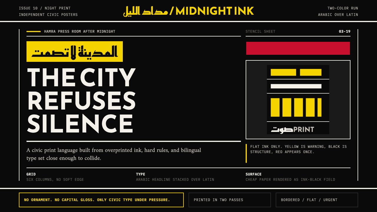 Beirut Indie Graphic DesignCivic type as protest. Sulfur yellow Arabic blocks collide with ink-black pos…公民字体即抗议:硫磺黄阿文块撞上墨黑海报网格。
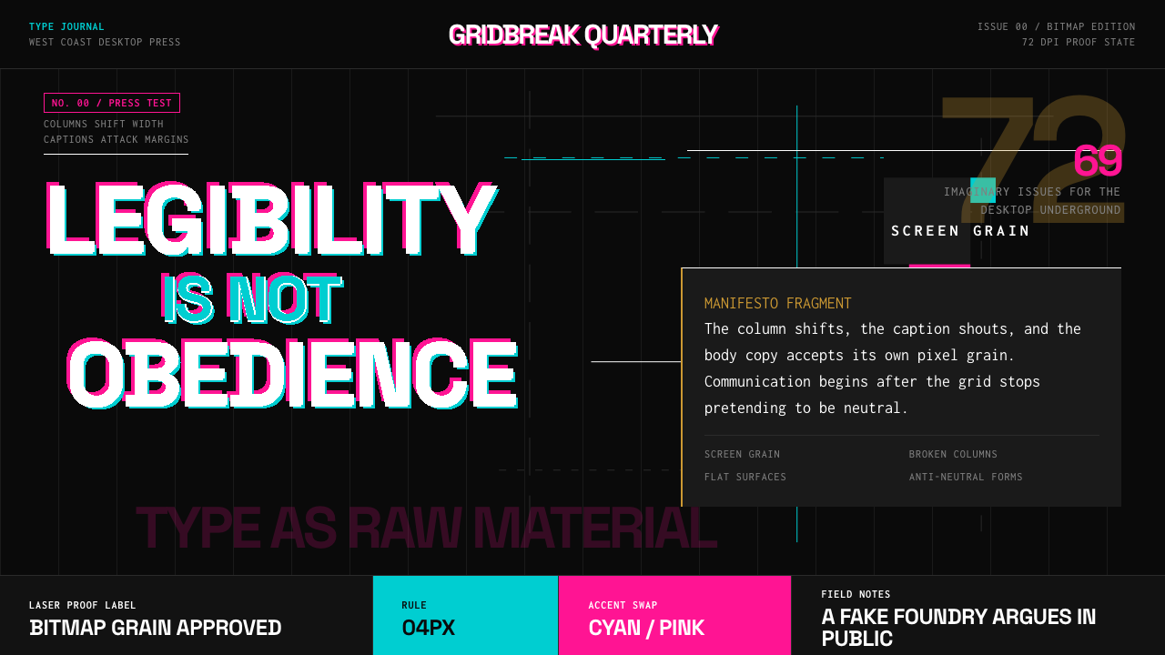 Emigre Magazine (1984–2005)Defies the tidy grid. Cyan, ochre, and hot-pink bitmap type collides on black.拒绝整齐网格:黑底上的青色、赭色与热粉像素字相撞。
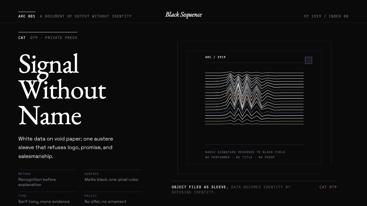 Peter Saville / Factory RecordsAnti-design becomes high art. Void black, white pulsar lines, and FAC mono la…反设计即高级艺术:黑色虚空、白色脉冲线与 FAC 等宽标签拒绝品牌化。
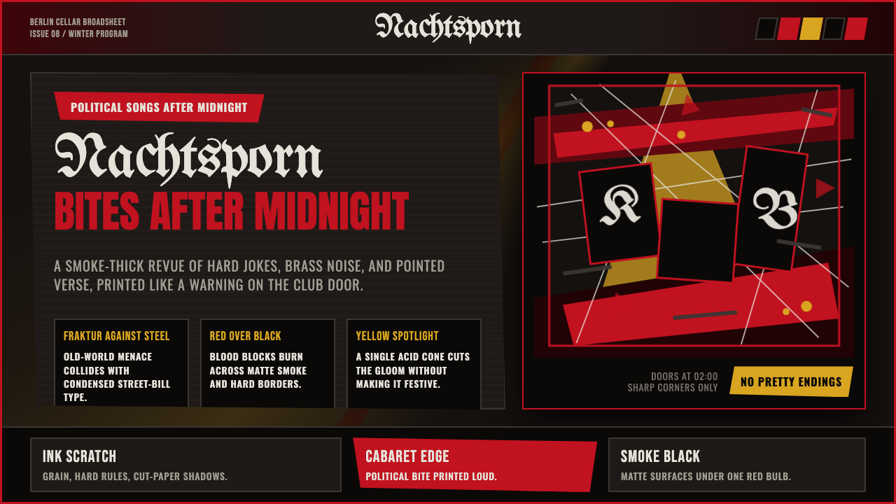 Weimar CabaretMenace at 2 a.m. Blood-red Fraktur, smoke-black grid, acid-yellow spotlight c…凌晨两点的锋芒:血红哥特字、烟黑网格与酸黄聚光灯。
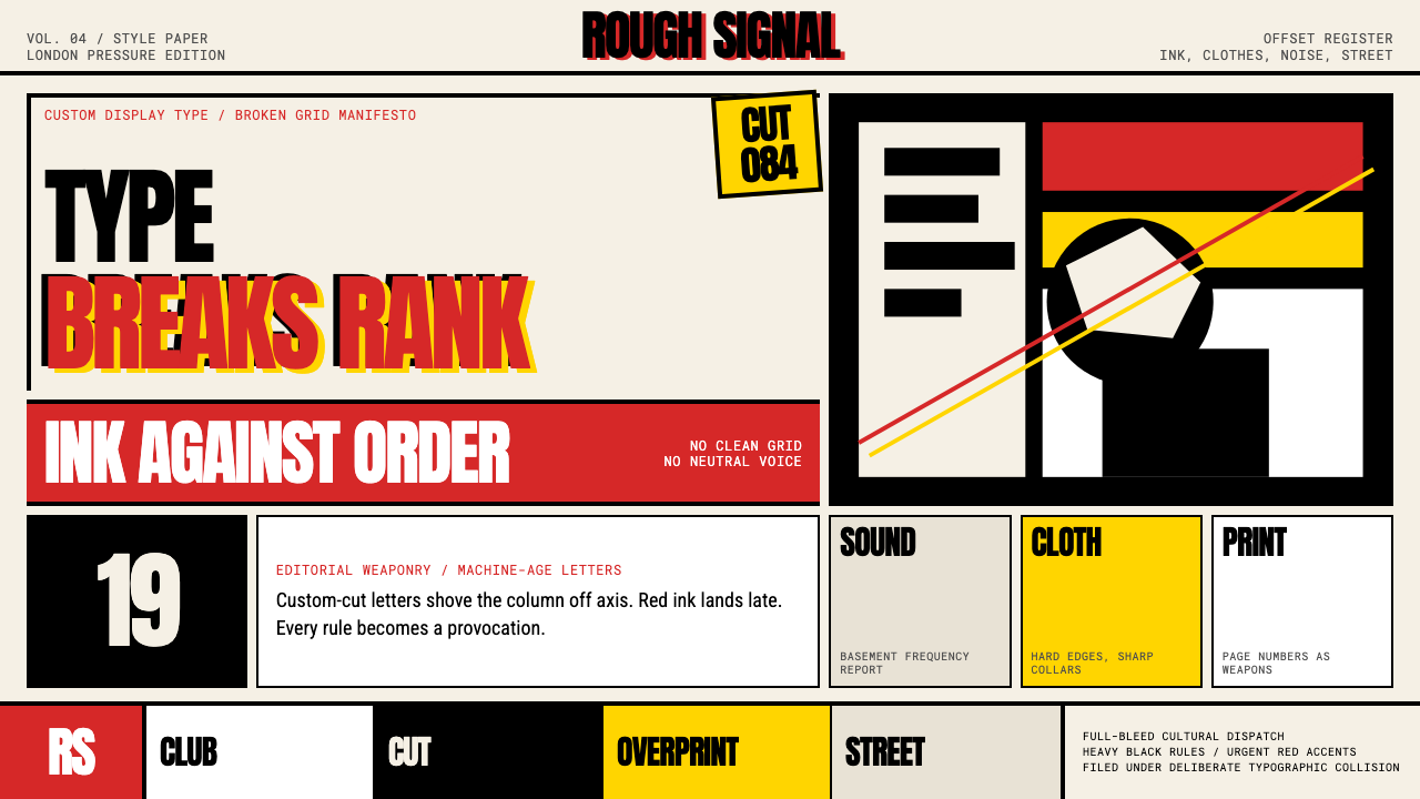 Neville Brody The FaceType mutinies on paper. Cream stock, black rules, urgent red overprint, broke…文字在纸上叛变:奶油纸、黑粗线、急促红色套印和破碎网格。
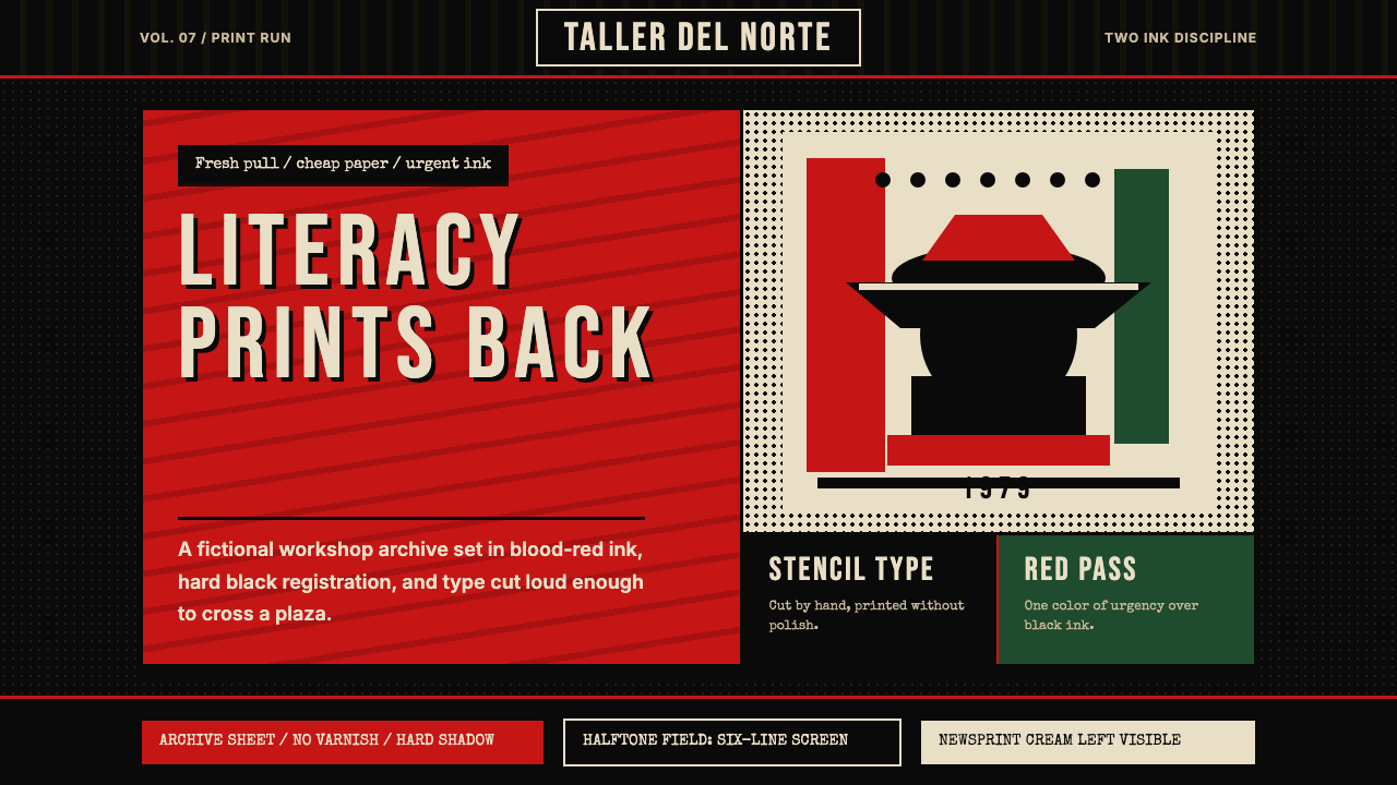 Nicaraguan Sandinista FSLN 1979Urgency in two inks. Blood red, jet black, halftone dots, and cut-stencil typ…双色油墨里的紧迫感:血红与漆黑、半色调网点、模板字。