What is Weimar Cabaret?
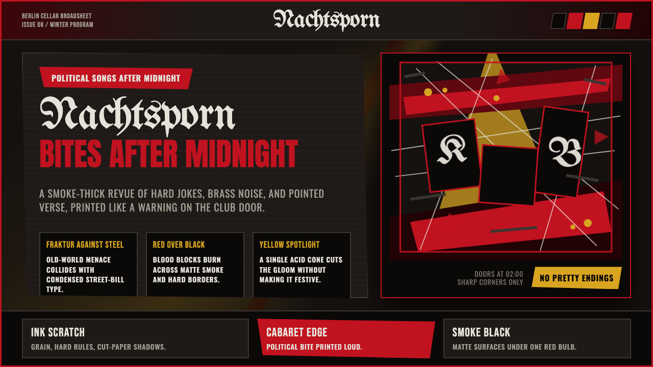
Weimar Cabaret is the visual sound of interwar Berlin at two in the morning — decadent, politically sharp, and lit like a spotlight cutting through cigarette smoke.
Weimar Cabaret in brief
Weimar Cabaret is a design system built from the nocturnal visual culture of Berlin during the Weimar Republic, particularly the Goldene Zwanziger (Golden Twenties) years of roughly 1924 to 1929 — the smoke-thick jazz nightclubs, the politically biting Kabarett stage, and the caustic satirical line work of artists like George Grosz and Otto Dix. It is a style defined by tension: blood-red burning over a smoke-blackened near-black ground, ornate Fraktur blackletter clashing against condensed sans-serif type, and every edge running jagged rather than clean.
The style's emotional register is deliberately uncomfortable. Weimar-era Berlin nightlife was not glamorous in a simple, aspirational sense — it was decadent in the literal meaning of the word, a culture partying at the edge of economic collapse and rising political extremism, and its visual language carries that awareness. Acid-yellow cuts through the gloom like a spotlight cone picking someone out of a crowd; grain and ink-scratch textures keep every surface restless, as if the image itself cannot quite settle down.
This makes Weimar Cabaret unusually pointed among historical design styles. Where many revival aesthetics aim for warmth or nostalgia, this one aims for menace and wit in equal measure — a poster meant to be glimpsed on a nightclub door at two in the morning, promising something thrilling and slightly dangerous rather than comfortable.

Where does Weimar Cabaret come from?
The Weimar Republic emerged from the collapse of the German Empire at the end of the First World War in November 1918 and lasted until Hitler's appointment as Chancellor in January 1933. Named for the city of Weimar where its founding constitutional assembly convened, the republic was Germany's first sustained experiment with parliamentary democracy — an experiment conducted under extraordinary duress, beginning with the humiliation of military defeat and the punitive terms of the Treaty of Versailles, and passing through hyperinflation so severe in 1923 that banknotes were reportedly used as wallpaper and children's building blocks.
Out of this instability, Berlin developed a nightlife culture of extraordinary intensity, often described using the German phrase Goldene Zwanziger, or Golden Twenties — though the gold was always shot through with anxiety. The city's Kabarett tradition, distinct from lighter cabaret entertainment elsewhere in Europe, was pointedly political: performers used song, satire, and dance to lampoon government corruption, militarism, and social hypocrisy, often skating right up to the edge of what censors would tolerate. Jazz, imported largely through American and Black musicians performing in Berlin, provided the soundtrack to nightclubs that operated late into the morning, serving an audience that included aristocrats, artists, criminals, and foreign visitors drawn by the city's reputation for permissiveness.
The visual art movement most associated with this period is Neue Sachlichkeit, or New Objectivity, a reaction against the emotional excess of earlier German Expressionism that instead turned a cold, unsparing eye on contemporary German society. George Grosz and Otto Dix, its most influential practitioners, produced savagely satirical drawings and paintings depicting corrupt officials, war profiteers, disfigured war veterans, and the era's nightlife with a caustic, almost grotesque line quality that refused any sentimentality. Christian Schad, working in a related vein, painted cooler, more classically composed but no less unsettling portraits of Weimar-era demimonde figures — dancers, sex workers, and androgynous nightclub habitués rendered with hyperreal precision.
This entire cultural moment collapsed with brutal speed after the Nazi Party's rise to power in 1933. The cabaret scene was shut down, its performers — many of them Jewish, queer, leftist, or all three — were driven into exile or worse, and the visual art of Grosz and Dix was condemned as 'degenerate art' and purged from German museums. The Weimar Cabaret aesthetic survives today largely through the surviving posters, photographs, and satirical prints from that brief period, along with its powerful afterlife in later cultural retellings of interwar Berlin.
What defines the Weimar Cabaret look?
Smoke-Blackened Ground
The base is a near-black ground with a faint smoky quality, as if darkened by cigarette haze in a crowded club rather than being a flat, clean black. This grounding color should feel atmospheric and slightly dirty rather than crisp — the visual equivalent of air thick with smoke.
Blood-Red Accent
A saturated, dark-leaning red burns against the smoky ground as the style's primary accent color, used for headlines, key symbols, or dominant graphic elements. This red should feel closer to dried or burning blood than to a bright, cheerful red — intense but never candy-like.
Acid Yellow Cuts
A sharp, slightly sour yellow appears in small, targeted doses — a spotlight cone, a single highlighted line of text, a graphic accent — cutting through the dark ground the way a stage spotlight isolates a performer from a dim room. It should never spread broadly; its power comes from scarcity and precision.
Fraktur and Condensed Sans Clash
Ornate Fraktur blackletter is used for headlines or key phrases, deliberately clashing against condensed, aggressive sans-serif type used for supporting text — a typographic tension mirroring the era's own clash between old Germanic tradition and modern, jarring urban culture. The two typefaces should never be blended into a harmonious pairing; the friction is the point.
Jagged Edges
Every border, frame, and cut edge in the system runs jagged and irregular rather than clean and straight, echoing torn poster paper and hastily cut stencils. Perfectly straight, ruled edges feel foreign to this style — everything should look slightly torn, cut, or scratched into existence.
Grain and Ink-Scratch Texture
Fine visual noise — print grain, scratch marks, an unevenness in solid color fields — keeps every surface restless rather than flat and digital. This texture should read as an artifact of imperfect litho printing and hard use, not as a smooth, uniform pattern overlay.
Satirical Line Quality
Any figurative or illustrative element should carry the caustic, slightly exaggerated line quality of New Objectivity satire — sharp, unflattering, and pointed rather than smooth or idealized. Figures and symbols should feel drawn with intent to provoke rather than to please.

Who shaped Weimar Cabaret?
A leading figure of New Objectivity and one of Weimar Berlin's most savage satirists, Grosz produced drawings and paintings depicting corrupt officials, war profiteers, and the decadence of Berlin nightlife with a jagged, unsparing line. His work was later condemned as degenerate art by the Nazi regime, and he emigrated to the United States in 1933.
Dix, who had served on the front lines of the First World War, brought a similarly unflinching eye to Weimar-era society, depicting disfigured war veterans, sex workers, and cabaret performers with hyperreal, often grotesque precision. Like Grosz, his work was condemned as degenerate art, and he was dismissed from his teaching post and largely confined to painting landscapes under Nazi rule.
Schad painted cooler, more classically composed but no less unsettling portraits of Weimar-era demimonde figures — dancers, androgynous nightclub habitués, and sex workers — rendered with an almost photographic precision that gave his subjects an eerie, hyperreal presence. His restrained technical control against psychologically charged subject matter is a key reference for the style's tension between order and decadence.
How do you use Weimar Cabaret today?
On presentation slide covers, the style delivers instant dramatic tension: a smoke-blackened ground, a jagged-edged frame, blood-red Fraktur or condensed sans title text, and a small acid-yellow spotlight accent cutting across one corner. Content slides should keep the smoky dark ground dominant throughout, reserving red for the most important headline text and yellow strictly for the single most critical data point or callout on any given slide.
For web interfaces, this style suits products in entertainment, nightlife, music, or any brand that wants to project a sense of edgy sophistication rather than comfort — ticketing platforms, music venues, adult-oriented entertainment products. Dashboards should be approached carefully: the style's intensity works well for marketing-facing surfaces but needs restraint in dense data contexts, where the jagged, high-contrast elements should frame data rather than compete with it.
In pricing pages, a single acid-yellow spotlight accent works well to highlight a recommended tier, echoing how a real spotlight isolates a single performer on a dark stage — but this should remain the only prominent use of yellow on the page, with red and Fraktur-style headlines reserved for section titles rather than every piece of text.
For editorial and marketing content about nightlife, music history, cultural criticism, or anything that benefits from a sense of danger or wit, full-bleed hero sections work well built from the smoky dark ground with a single bold red or Fraktur headline and jagged torn-paper framing, echoing an actual nightclub poster pinned to a door.
The most common mistake is spreading the acid-yellow accent too broadly, turning a precise spotlight effect into a generic bright-yellow color scheme that loses its dramatic isolation. A second frequent error is smoothing out the jagged edges and grain texture in pursuit of a cleaner, more 'modern' finish — but the restlessness and imperfection of the surface is not incidental noise, it is the entire emotional register of the style, and removing it leaves a flat, generic dark palette with none of Weimar Cabaret's specific menace.

Weimar Cabaret — FAQ
Is Weimar Cabaret the same as generic 1920s Art Deco or Gatsby-era styling?
No, and the difference is significant. Gatsby-era Art Deco is fundamentally aspirational — glamorous, gilded, celebrating wealth and glossy modernity. Weimar Cabaret is fundamentally uneasy — its decadence is shadowed by economic collapse and political menace, its typography clashes rather than harmonizes, and its texture is deliberately rough and smoke-stained rather than polished and gold-leafed. One is a celebration; the other is a warning wearing lipstick.
Why does the style pair Fraktur blackletter with a modern sans-serif rather than using Fraktur alone?
Fraktur alone reads as purely traditional or nationalistic German typography, which is not the point of this style. The deliberate clash with a condensed, aggressive sans-serif captures the actual cultural tension of Weimar Berlin — a society caught between old Germanic tradition and a jarring, fast-moving modern urban culture. The friction between the two typefaces is doing real communicative work, not just adding visual variety.
How much yellow should actually appear in a composition?
Very little, and only in tightly targeted spots — a single spotlight cone, one highlighted line of text, a small graphic accent. The style's acid-yellow works like a real stage spotlight: its power comes entirely from illuminating one specific thing against overwhelming darkness. Spread across a large area, it stops reading as a spotlight and starts reading as an ordinary bright color choice.
Is this style appropriate for mainstream commercial products?
It suits products that genuinely want an edgy, slightly transgressive, sophisticated-but-uneasy tone — music, nightlife, entertainment, certain fashion or cultural brands. It is a poor fit for products aiming at broad, comfortable, family-friendly appeal, or for anything needing to project calm trustworthiness, since the entire visual system is built to feel a little dangerous rather than reassuring.
What is the relationship between this style and the New Objectivity art movement?
New Objectivity is the fine-art movement — associated with Grosz, Dix, and Schad — that supplies the style's characteristic line quality: caustic, unsentimental, and pointed, refusing the emotional excess of earlier Expressionism. Weimar Cabaret as a design system pulls its figurative and illustrative sensibility directly from this movement, while drawing its color palette, typography, and texture from the printed posters and nightclub ephemera of the same period.
Related design styles
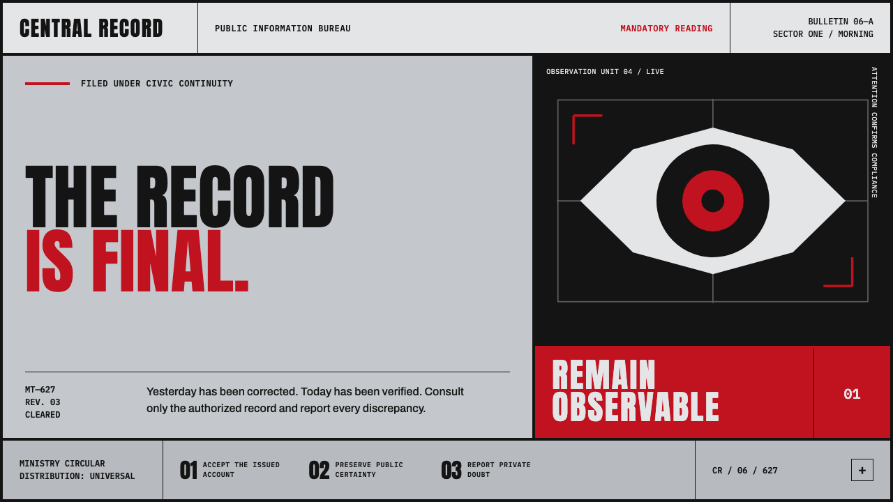 Orwell 1984 (Ministry Propaganda)Authority never blinks. Monumental black type and rationed red ink command a…
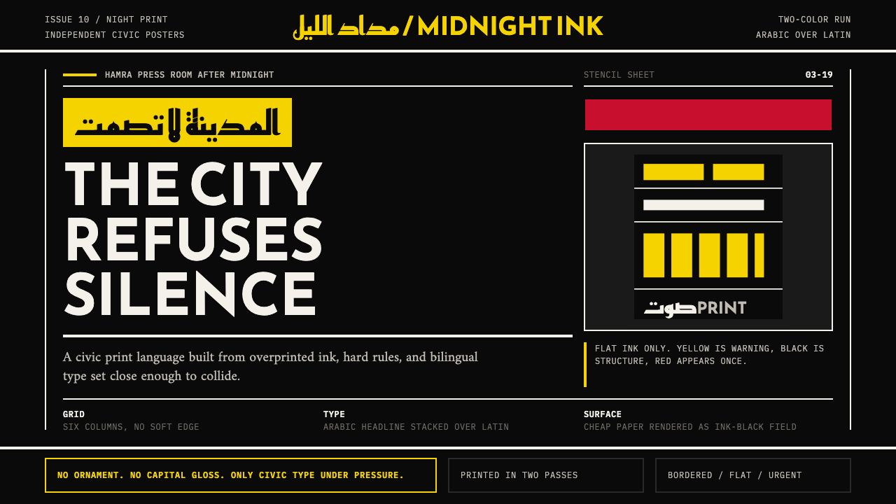 Beirut Indie Graphic DesignCivic type as protest. Sulfur yellow Arabic blocks collide with ink-black pos…
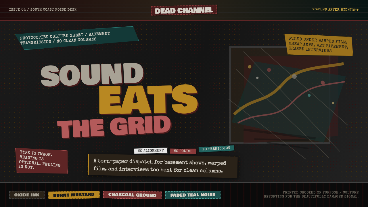 Grunge (Carson 1993)Carson's anti-rules, photocopied. Oxblood on charcoal, distressed type, delib…
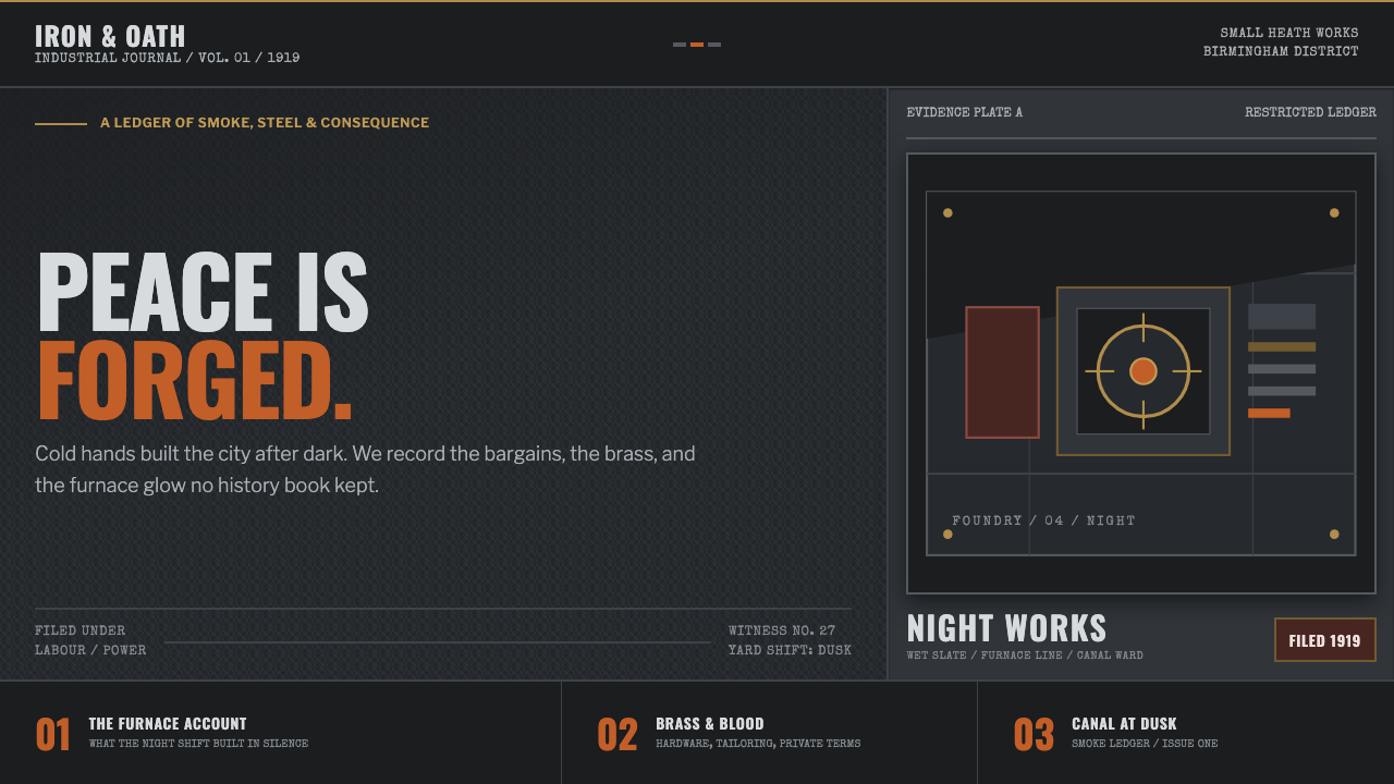 Peaky Blinders (1919)Industrial menace, struck alive. Cold slate grids meet one rare furnace-orang…
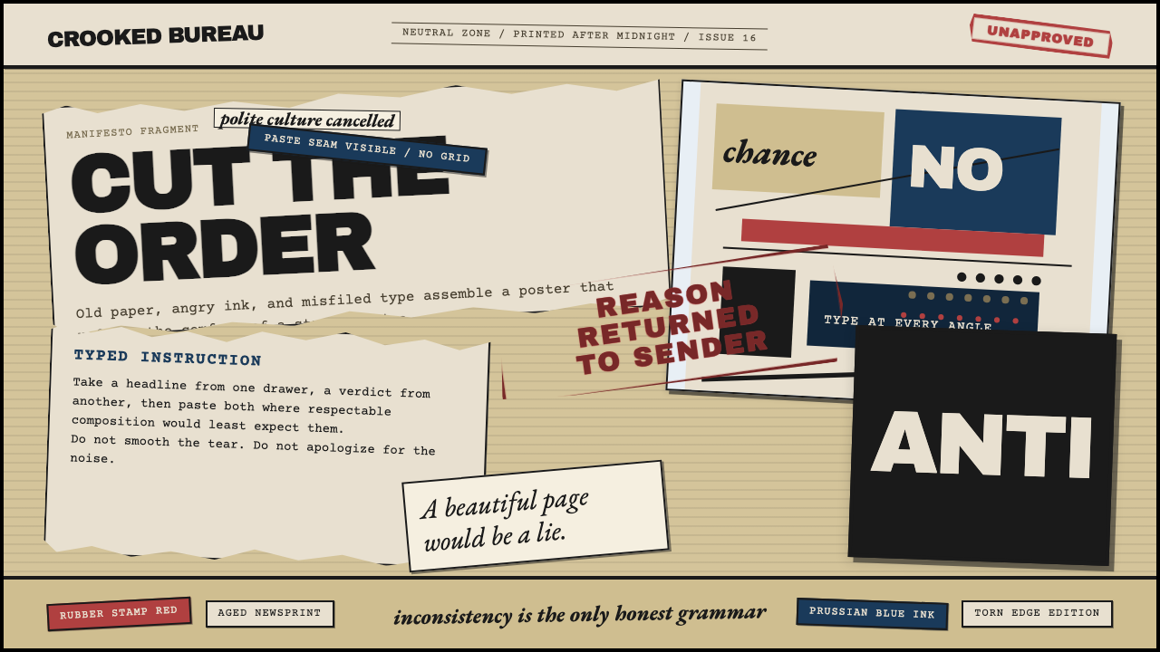 Dadaism (Zürich 1916)Chaos is the grammar. Aged newsprint, stamp red, Prussian blue, and tilted ty…
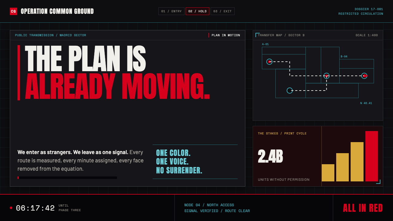 Money Heist (La Casa de Papel)Resistance becomes spectacle. Arterial red cuts through graphite grids and ta…