What is Dadaism (Zürich 1916)?什么是 Dadaism (Zürich 1916)?
Born in a Zürich cabaret in 1916, Dada declared that if civilization produced the trenches, then art had a duty to be as senseless as the war itself.达达主义1916年诞生于苏黎世一间酒馆:如果所谓文明能催生战壕,那么艺术就有义务与这场战争一样荒诞。
Dadaism (Zürich 1916) in briefDadaism (Zürich 1916) 速览
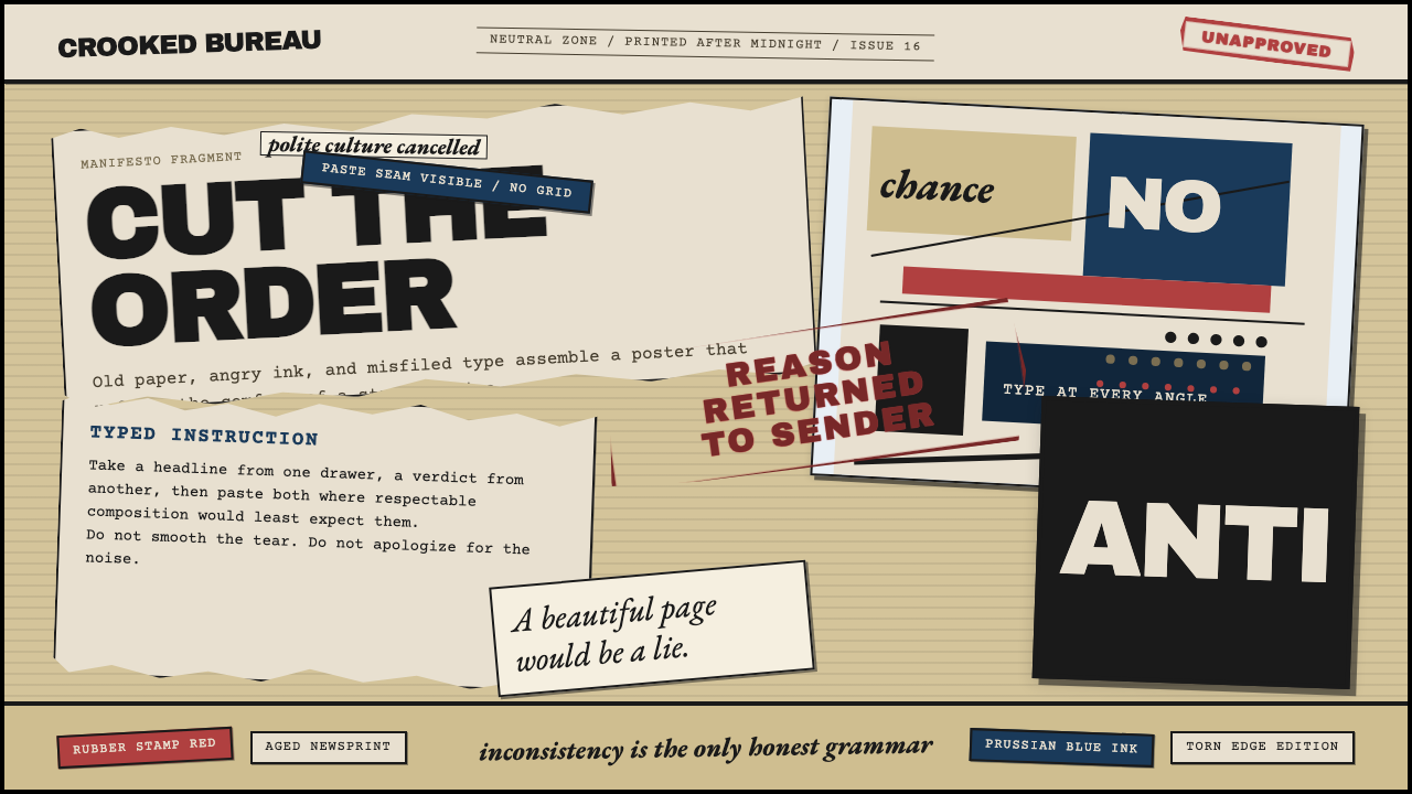
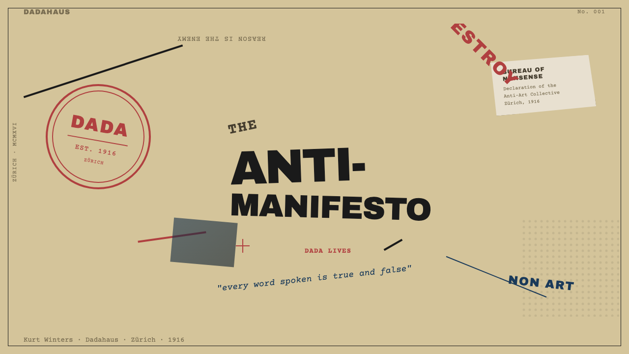
Dadaism is an anti-art movement that emerged at the Cabaret Voltaire in Zürich in 1916, built on the conviction that rational Western civilization had failed catastrophically and that the appropriate response was deliberate disorder. Its visual language — aged newsprint grounds, stamp-ink red, Prussian-blue halftone, and oil-black — combines photomontage fragments, rubber-stamp marks, hand-cut letterforms, and type set at every conceivable angle to produce compositions that refuse the logic of harmony, hierarchy, or readability.达达主义是一场“反艺术”运动,1916年发端于瑞士苏黎世的伏尔泰酒馆,其核心信念是:理性的西方文明已经彻底失败,而恰当的回应方式就是蓄意制造混乱。它的视觉语言——发黄的旧报纸底色、图章印泥红、普鲁士蓝的半色调网点与油墨黑——将照片蒙太奇碎片、橡皮图章印记、手工裁剪的字母与各种角度排列的铅字组合在一起,制造出拒绝和谐、层级与可读性逻辑的构图。
Where most design movements sought coherence, Dada sought productive friction. Headlines collide with body text at opposing angles. Multiple typefaces — typewriter, bold sans-serif, clipped newspaper serif — occupy the same line without resolution. Cropped photographs sit beside hand-drawn marks and rubber-stamp impressions, all arranged on surfaces that suggest torn newspaper rather than clean white paper. The visual message is the medium: disorder is not a failure of composition but its entire point.大多数设计运动追求连贯性,达达追求的是富有成效的摩擦。标题与正文以相对的角度碰撞,同一行内并置打字机体、粗体无衬线与剪报衬线字而不做任何调解,裁剪的照片与手绘标记、橡皮图章印迹并排,所有这些铺陈在暗示撕裂报纸而非洁白纸张的底面上。视觉信息即媒介本身:混乱不是构图的失败,而是构图的全部目的所在。
The style spans a narrow but intense window — roughly 1916 to 1924 — before much of its energy was absorbed into Surrealism. In that period it radiated outward from Zürich to Berlin, Paris, New York, and Hannover, producing distinct local inflections. The Berlin chapter was the most politically charged, using photomontage as direct satirical weaponry against the Weimar Republic's ruling class. The Hannover variant, associated with Kurt Schwitters and his Merz project, was more lyrical and collage-based. What united all of them was the embrace of accident, the mistrust of intention, and the insistence that a torn scrap of printed paper could carry as much meaning as a formally composed artwork.这种风格跨越了一个短暂而强烈的窗口——大约从1916年到1924年——之后它的大部分能量被超现实主义所吸收。在此期间,它从苏黎世向外辐射至柏林、巴黎、纽约和汉诺威,产生了各具特色的地方变体。柏林分支政治色彩最为浓烈,以照片蒙太奇作为直接讽刺魏玛共和国统治阶级的武器;与库尔特·施维特斯及其梅尔茨(Merz)项目相关联的汉诺威变体则更为抒情、更偏向拼贴。将它们统一起来的,是对偶然性的拥抱、对意图的不信任,以及一张印刷品碎片所承载的意义可以与正式构图艺术品等量齐观的坚持。
See the Dadaism (Zürich 1916) design system查看 Dadaism (Zürich 1916) 完整设计系统
Where does Dadaism (Zürich 1916) come from?Dadaism (Zürich 1916) 从何而来?
The founding moment is precisely documented: on the evening of 5 February 1916, Hugo Ball and Emmy Hennings opened the Cabaret Voltaire at Spiegelgasse 1 in Zürich. Ball — a poet, playwright, and pacifist who had fled Germany after failing his medical examination for the army — wanted a space for artistic experiment that could exist outside the war's logic. Within weeks, Tristan Tzara, Jean Arp, Richard Huelsenbeck, Marcel Janco, and Sophie Taeuber-Arp had joined, and the group began producing evenings of simultaneous poetry, noise music, masked performance, and visual work that bewildered even sympathetic audiences. The name 'Dada' is itself a subject of legend: various accounts credit a knife stuck at random into a French-German dictionary, landing on the word for a child's hobbyhorse — appropriate, the group decided, for a movement that intended to start over from nothing.创立时刻有精确的史料记录:1916年2月5日晚,雨果·巴尔与埃米·亨宁斯在苏黎世镜街1号开设了伏尔泰酒馆。巴尔——一位因体检未通过而逃离德国的诗人、剧作家与和平主义者——希望建立一个能在战争逻辑之外进行艺术实验的空间。几周之内,特里斯坦·查拉、让·阿尔普、理查德·许尔森贝克、马塞尔·让科和苏菲·陶伯-阿尔普相继加入,团体开始举办令观众瞠目的夜间演出:同步诗歌、噪音音乐、蒙面表演与视觉艺术。“达达”这个名字本身已成传奇:据说是随机将一把刀插进法德词典,落在一个意为儿童木马的词上——这个团体认为,对于一个意图从零开始的运动而言,这个名字再合适不过。
The historical context is inseparable from the aesthetic. Zürich in 1916 was a neutral island surrounded by a continent tearing itself apart. The city was full of exiles, deserters, and political refugees — Lenin was living a few doors from the Cabaret Voltaire on Spiegelgasse and is said to have attended performances. The founders were united by the conviction that the institutions of European culture — its academies, its rationalist philosophy, its nationalist politics — had directly produced the catastrophe of industrial warfare. If reason had led here, then unreason was the only honest position. The anti-aesthetic was the argument.历史背景与美学风格密不可分。1916年的苏黎世是一座被战火蔓延的大陆所环绕的中立孤岛,城中充满了流亡者、逃兵与政治难民——列宁当时就住在镜街伏尔泰酒馆几步之遥的地方,据说曾出席演出。创始人们共同相信:欧洲文化的各种体制——学院、理性主义哲学、民族主义政治——直接催生了工业化战争的灾难。如果理性导向了这里,那么非理性便是唯一诚实的立场。反美学本身就是论点。
The visual tools Dada deployed were not invented from scratch but assembled from what was at hand: the printed refuse of industrial culture. Newspapers, advertising posters, product labels, stamps, and bureaucratic forms were torn, cut, and repasted into new configurations. Hannah Höch, working from Berlin, elevated this practice into a systematic critique of mass media and gender politics — her photomontage 'Cut with the Kitchen Knife Dada through the Last Weimar Beer Belly Cultural Epoch of Germany' assembled hundreds of clipped images from illustrated magazines into a panoramic visual argument. Raoul Hausmann developed the photomontage independently and combined it with letterpress typography set in aggressive, deliberately jarring arrangements. Kurt Schwitters, though he never fully identified as Dada, developed his Merz practice in Hannover — creating assemblages from bus tickets, wire, wood scraps, and printed ephemera.达达所使用的视觉工具并非凭空发明,而是从触手可及之物中拼凑而来:工业文化的印刷废料。报纸、广告海报、产品标签、图章与官方表格被撕裂、剪切,重新粘贴成新的组合。在柏林工作的汉娜·霍赫将这种实践提升为对大众传媒和性别政治的系统性批评——她的照片蒙太奇《用达达厨刀切开德国最后一个魏玛啤酒肚文化纪元》从插图杂志中剪下数百张图像,拼合成一个全景式的视觉论证。劳尔·豪斯曼独立发展了照片蒙太奇,并将其与攻击性地、蓄意制造冲突的凸版排印相结合。库尔特·施维特斯虽然从未完全认同达达,但在汉诺威发展出了他的梅尔茨实践——用公交车票、铁丝、木片碎料和印刷品残片创作装置。
By 1920 the Zürich chapter had largely dissolved — Tzara moved to Paris, Ball had retreated into religious mysticism, and many others had scattered. But the movement's ideas were already migrating. In New York, Marcel Duchamp and Francis Picabia had independently arrived at similar conclusions, staging provocations that questioned what counted as art at all. In Paris, the Dadaists merged with the emerging Surrealist circle around André Breton, and the movement's visual energy was redirected into the dreamlike imagery of the unconscious. The Berlin Dada Club was suppressed by 1920. What remained was an approach — to collage, to found materials, to deliberate visual noise — that would prove enormously generative for the rest of the century, feeding directly into punk graphic design in the 1970s, postmodern typography in the 1980s and 1990s, and contemporary web aesthetics that celebrate lo-fi visual complexity.到1920年,苏黎世分支已基本解散:查拉移居巴黎,巴尔隐退至宗教神秘主义,其他成员四散各地。但这场运动的思想已经在迁徙。在纽约,马塞尔·杜尚与弗朗西斯·毕卡比亚独立得出了相似的结论,发动了质疑艺术边界的挑衅行动。在巴黎,达达主义者与安德烈·布勒东周围兴起的超现实主义圈子合流,运动的视觉能量被重新导向潜意识的梦境意象。柏林达达俱乐部于1920年被镇压。留存下来的,是一种方法——对拼贴、对现成材料、对蓄意视觉噪音的运用——这种方法在此后一个世纪中表现出巨大的生产力,直接滋养了1970年代的朋克平面设计、1980至90年代的后现代排印,以及当代推崇低保真视觉复杂性的网络美学。
What defines the Dadaism (Zürich 1916) look?Dadaism (Zürich 1916) 的视觉特征是什么?
Palette色彩
The Dada palette is not chosen for beauty but for legibility within chaos. The ground is almost always aged newsprint — warm, yellowed, slightly degraded — rather than clean white. Against this, stamp-ink red appears as sudden urgency: a block of color, a stamped shape, a circled headline. Prussian blue, often rendered as a coarse halftone dot pattern rather than a flat field, provides the cool counterweight. Oil black covers the bulk of typographic matter. Together these four values — warm ground, hot red, cool blue, heavy black — create a palette that looks printed, mechanical, and ephemeral simultaneously, as though each composition might decompose back into its source materials at any moment.达达的色盘并非为美感而选择,而是为在混乱中保持可辨识性。底色几乎总是发黄的旧报纸——温暖、泛黄、略显降解——而非洁白。在此之上,图章印泥红作为突兀的紧迫感出现:一块颜色、一个盖章形状、一个被圈出的标题。普鲁士蓝通常以粗粒网点而非平涂呈现,提供冷调的对立重量。油墨黑覆盖大部分排印内容。这四个色值——温暖的底、灼热的红、冷冽的蓝、厚重的黑——共同创造出一种看起来同时是印刷的、机械的、短暂的色盘,仿佛每件构图随时可能分解回其原始材料。
Typography字体排印
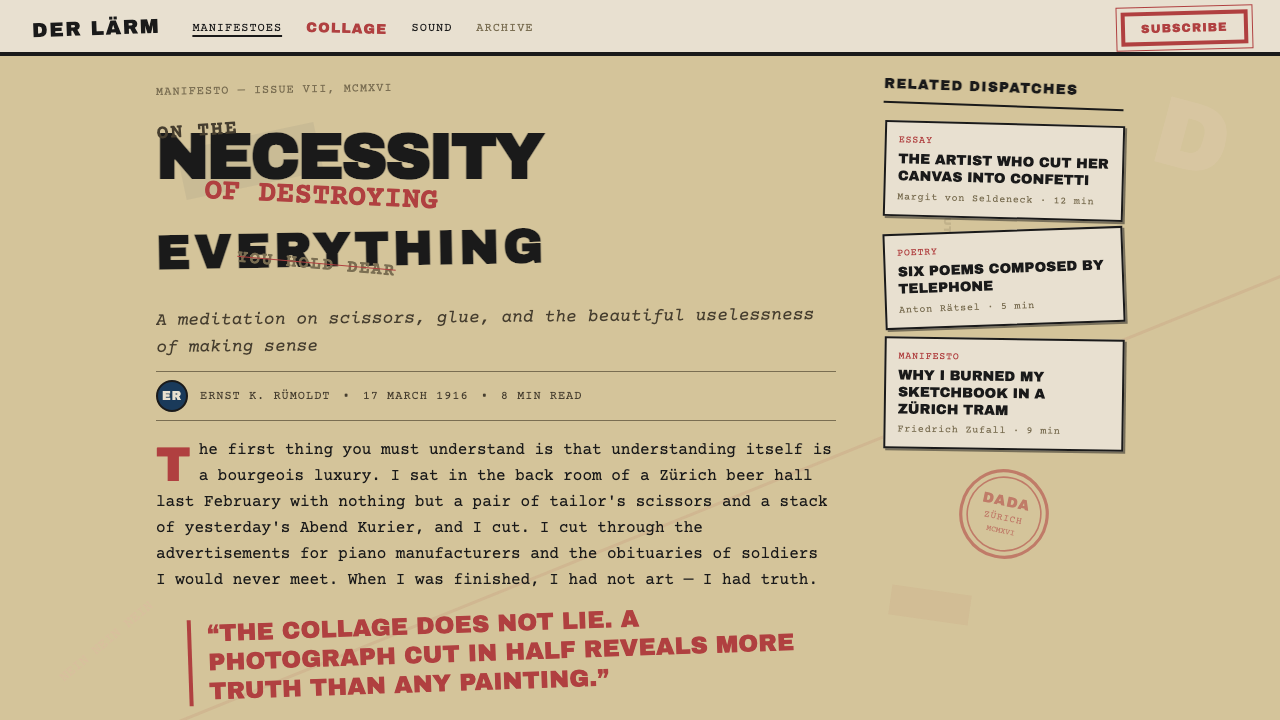
Dada typography is defined by deliberate misrule. Letters are sourced from multiple typefaces without coordination — the typewriter's equidistant characters sit beside newspaper headlines in bold serif condensed beside woodblock capitals beside handwritten words cut from another source. Scale shifts without warning: a single enormous letter may dominate an entire composition while the sentence it belongs to continues in text several orders of magnitude smaller. Type is rotated, mirrored, stacked vertically, or set in arcs and spirals. Lines of text frequently collide or overlap. The effect reads as something between a ransom note and a political broadsheet, which is precisely what the Dadaists intended.达达排印以蓄意的无法无天为标志。字母从多种字体中取用而不做任何协调——打字机等宽字符与粗体衬线窄体报纸标题并排,旁边是木刻大写字母,再旁边是从其他来源剪下的手写文字。字号毫无预兆地跳变:一个巨大的单字母可能主导整个构图,而它所属的句子在另一处以小几个量级的字号继续。文字被旋转、镜像、垂直叠排,或沿弧线与螺旋排列。文字行频繁碰撞或叠压。效果读来介于勒索信与政治传单之间——这正是达达主义者的意图。
Photomontage照片蒙太奇
Photomontage is Dada's most distinctive visual contribution. Rather than drawing or painting imagery, the Dadaists cut photographs — from newspapers, illustrated magazines, military communications, advertising catalogs — and reassembled them into new configurations where scale, context, and identity are deliberately scrambled. A general's head appears on a dancer's body; a factory chimney grows from a bourgeois parlor; a political figure is miniaturized and placed in a circus crowd. The technique was partly a practical response to a world oversaturated with printed imagery, and partly a formal argument: if reality itself is assembled from fragments, collage is the only honest pictorial method.照片蒙太奇是达达最具特色的视觉贡献。达达主义者不描绘或绘制图像,而是从报纸、插图杂志、军事通讯、广告目录中剪取照片,重新拼合成比例、语境与身份被蓄意打乱的新组合。将军的头颅出现在舞者的身体上;工厂烟囱从资产阶级客厅中生长出来;政治人物被缩小、置于马戏团人群中。这种技法既是对一个被印刷图像过度饱和的世界的实践性回应,也是一种形式上的论断:如果现实本身就是由碎片拼合而成,那么拼贴便是唯一诚实的图像方法。
Chance and Found Material偶然性与现成材料
Dada formally incorporated chance into the compositional process, treating accident not as error to be corrected but as a generative force to be embraced. Jean Arp created compositions by dropping torn paper from a height and arranging the pieces where they fell. Tzara famously proposed cutting a newspaper article into words, shaking them in a bag, and drawing them out one by one to create a poem. The visual corollary is work that deliberately retains the evidence of its own making — torn edges that are not trimmed, stamp marks that bleed and misregister, overlaps that are not smoothed out. Every trace of process is a statement against the idealized finished surface.达达将偶然性正式纳入构图过程,将意外视为需要拥抱的生成力量而非需要纠正的错误。让·阿尔普将撕裂的纸片从高处落下,按照纸片落定的位置进行排列。查拉著名地提议:将报纸文章剪成单词,装入袋中摇晃,再逐一取出以创作诗歌。视觉层面的对应做法是:作品有意保留其自身制作过程的痕迹——未经修整的撕裂边缘、渗出与错位的图章印记、未被平滑处理的叠压。每一道过程的痕迹都是对理想化完成表面的声明式抗拒。
Rubber Stamp and Bureaucratic Marks橡皮图章与官僚印记
Rubber stamps — the visual language of state authority, military bureaucracy, and commercial documentation — appear throughout Dada work, but always misappropriated. They are stamped at angles, overlaid on faces, applied to absurd texts, or multiplied so densely that their original communicative function collapses into pattern. The stamp is the emblem of institutional power; Dada takes it and makes it ridiculous. This motif extends to other bureaucratic artifacts: official letterhead, postage marks, passport-style portrait photographs, and tabular data forms all appear as raw materials, stripped of their original authority and reassembled into something between satire and pure visual noise.橡皮图章——国家权威、军事官僚与商业文件的视觉语言——贯穿达达作品,但总是以被挪用的方式出现。它们被斜盖,叠印在人脸上,盖于荒诞文字之上,或被密集重复直至其原有的传达功能崩解为纯粹的图案。图章是体制权力的徽章;达达将其拿来并使之滑稽。这一母题延伸至其他官僚制品:官方信纸、邮戳、护照式肖像照片与表格数据表——所有这些都作为原始材料出现,被剥夺原有的权威性,重新拼合成介于讽刺与纯粹视觉噪音之间的某种存在。
Irregular Texture and Surface不规则质感与表面
Dada compositions resist the smooth, clean surface that most print design of the period aspired to. Paper shows its age — discoloration, foxing, and irregular ink absorption are not hidden but exhibited. Halftone dots are deliberately coarse, close to the limit of the printing process's resolution. Ink appears uneven, occasionally blobbed or faded. Where other movements sought perfect registration of layers, Dada treated misregistration as a feature: slightly off-color overlaps create additional tonal complexity without additional color. The surface is worn and provisional, suggesting that the work is assembled from what survived rather than produced under ideal conditions.达达构图抵制当时大多数印刷设计所追求的光滑、洁净的表面。纸张显露其年龄——变色、锈斑与不均匀的墨水吸收不被隐藏,而是被展示。半色调网点被有意设置得粗糙,接近印刷工艺分辨率的极限。油墨看起来不均匀,偶尔有污斑或褪色。其他运动追求图层的精确对位,达达则将错位视为特性:略微偏差的颜色叠压无需增加色彩便创造出额外的色调复杂性。表面是磨损的、临时性的,暗示作品是从幸存的材料中拼凑而来,而非在理想条件下生产的。
Simultaneity and Visual Noise同时性与视觉噪音
Dada borrowed the concept of 'simultaneity' from the Futurists — the idea that a composition could represent multiple events or voices occurring at once rather than resolving into a single sequential reading. In practice, this means that a Dada page typically has no single reading path: the eye is pulled in several directions simultaneously, and the information is not presented in a hierarchy that guides comprehension. This is not a failure of design but a philosophical position: comprehension itself is suspect, and a layout that resists being fully decoded is making an argument about the limits of meaning. The visual result is what later designers would call 'noise' — but in Dada, noise is the signal.达达从未来主义者那里借取了“同时性”概念——即一件构图可以同时呈现多个事件或声音,而非归结为单一的顺序阅读。在实践中,这意味着一张达达页面通常没有单一的阅读路径:视线同时被多个方向拉扯,信息没有以引导理解的层级呈现。这不是设计的失败,而是一种哲学立场:理解本身是可疑的,一个拒绝被完全解码的版面正在对意义的限度提出论证。视觉结果就是后来的设计师所称的“噪音”——但在达达,噪音就是信号。
See the Dadaism (Zürich 1916) design system查看 Dadaism (Zürich 1916) 完整设计系统
Who shaped Dadaism (Zürich 1916)?谁塑造了 Dadaism (Zürich 1916)?
Ball was the founder of the Cabaret Voltaire and the intellectual anchor of early Zürich Dada. His sound poetry performances — in which he delivered phonetic non-language verses while wearing a cardboard bishop's costume of his own construction — established the tone of deliberate absurdism that Dada would carry forward. His diary, later published as 'Flight Out of Time,' remains the most immediate document of the movement's founding period. Ball's relationship to Dada was brief: by 1917 he had withdrawn, finding the movement's nihilism ultimately insufficient, and retreated toward Catholic mysticism. His early departure did not diminish his foundational importance.巴尔是伏尔泰酒馆的创始人,也是苏黎世早期达达的思想锚点。他的声音诗歌表演——身穿自制纸板主教服装,朗诵纯音节无意义诗句——确立了达达将要传承的蓄意荒诞主义基调。他的日记后以《逃离时代》为题出版,至今仍是该运动创立期最直接的文献记录。巴尔与达达的关系短暂:到1917年,他因认为这场运动的虚无主义最终不够充分而退出,转向天主教神秘主义。他的早期离去并不削减其作为奠基者的重要性。
Tzara was Dada's most energetic promoter and propagandist, and the figure most responsible for spreading its ideas internationally. Born in Romania, he arrived in Zürich in 1915 and almost immediately attached himself to Ball's project. His 'Dada Manifesto 1918' — the movement's most widely circulated theoretical statement — declared Dada's hostility to every fixed system of meaning, including logic, morality, and aesthetics. Tzara's typographic experiments, published in the journal 'Dada' and later in Paris, pushed the visual language of the movement toward extreme fragmentation: words scattered across the page, type of wildly varying scale, and the deliberate elimination of conventional sentence structure.查拉是达达最积极的推广者与宣传者,也是最重要的将其思想向国际传播的人物。他出生于罗马尼亚,1915年抵达苏黎世后几乎立即加入了巴尔的项目。他的《达达宣言1918》——这场运动流传最广的理论陈述——宣告了达达对一切固定意义体系的敌意,包括逻辑、道德与美学。查拉的排印实验在《达达》杂志及后来的巴黎出版物中发表,将运动的视觉语言推向极端碎片化:文字散落于页面各处,字号剧烈变化,以及对传统句子结构的蓄意消除。
Höch was the most technically accomplished photomonteur in the movement and the primary figure who directed Dada's visual strategy toward social criticism. Working in Berlin alongside Raoul Hausmann, she developed photomontage into a systematic tool for analyzing mass media, gender roles, and Weimar political culture. Her monumental work 'Cut with the Kitchen Knife' deployed hundreds of clipped images to construct a panoramic critique of German society. Despite her central role in Berlin Dada, she was frequently marginalized by her male colleagues — a contradiction that her work itself often addressed. Her influence on subsequent collage and mixed-media practice is immeasurable.霍赫是这场运动中技术最为精湛的照片蒙太奇师,也是将达达视觉策略导向社会批评的核心人物。她在柏林与劳尔·豪斯曼并肩工作,将照片蒙太奇发展为分析大众传媒、性别角色与魏玛政治文化的系统性工具。她的宏大作品《用达达厨刀切开》以数百张剪贴图像构建出对德国社会的全景批评。尽管她在柏林达达中扮演核心角色,却频繁地被男性同僚边缘化——这一矛盾本身常常成为她作品所处理的主题。她对后续拼贴与混合媒介实践的影响难以估量。
Hausmann, known as the 'Dadasoph,' was the theoretical engine of Berlin Dada and an inventor of multiple formal techniques the movement used. He claimed co-credit for inventing photomontage alongside Höch, and his poster poems — typographic works in which letters of varying size, weight, and typeface are scattered across the surface without conventional syntax — pushed the boundaries of what letterpress printing could do. His assemblage 'The Spirit of Our Time,' a sculptural head covered with measuring instruments and other mechanical objects, encapsulates the movement's critique of rationalism: the modern head is nothing but the measuring devices it wears.豪斯曼以“达达哲人”著称,是柏林达达的理论引擎,也是运动所使用的多种形式技法的发明者。他与霍赫共同声称发明了照片蒙太奇,而他的海报诗歌——将不同大小、字重和字体的字母在无传统句法的情况下散布于版面的排印作品——将凸版印刷的可能性推至极限。他的装置《我们时代的精神》——一个覆盖了各种测量仪器与机械物件的雕塑头颅——浓缩了这场运动对理性主义的批判:现代的头脑不过是它所佩戴的那些测量装置。
Schwitters occupied an ambiguous position relative to Dada — he was rejected from the Berlin Dada Club by Richard Huelsenbeck, who considered his work insufficiently political — but his Merz practice in Hannover represents the movement's most sustained and formally developed collage methodology. Working over decades, Schwitters assembled vast architectural installations called Merzbau from accumulated domestic and street debris: labels, tickets, scraps of wire, broken toys, and printed ephemera. His work reframes found material not as satirical provocation but as a kind of tender archaeology of everyday life, making him a pivotal bridge between Dada's anti-aesthetic and the more lyrical collage traditions that followed.施维特斯与达达的关系模糊——他因作品被认为政治性不足而被理查德·许尔森贝克拒于柏林达达俱乐部门外——但他在汉诺威的梅尔茨实践代表了这场运动中最为持久且形式上最为成熟的拼贴方法论。施维特斯历经数十年,用积累的家居与街头废料——标签、票据、铁丝碎片、破损玩具与印刷品残片——建造出被称为“梅尔茨大厦”的大型建筑装置。他的作品将现成材料重新定义为对日常生活的温柔考古,而非讽刺性挑衅,使他成为达达反美学与此后更为抒情的拼贴传统之间的关键桥梁。
How do you use Dadaism (Zürich 1916) today?今天怎么用 Dadaism (Zürich 1916)?
Applying Dada as a design reference requires understanding what it is actually doing: it is not random, even though it looks random. The visual chaos is constructed from a specific limited palette, a consistent set of found-material textures, and a clear conceptual logic — disorder as argument. The designer's task is to import those specific elements while retaining creative control over what the composition ultimately communicates. Dada works as a design language when the content itself benefits from disruption: announcements of rule-breaking, campaigns against convention, products that need to signal countercultural positioning, or any context where the expected visual language is deliberately overturned.以达达作为设计参考,需要理解它实际上在做什么:尽管看起来随机,它并不随机。视觉混乱是由一套特定的有限色盘、一组一致的现成材料质感,以及一个清晰的概念逻辑——混乱作为论证——共同建构出来的。设计师的任务是引入这些特定元素,同时保持对构图最终传达内容的创作控制。当内容本身受益于颠覆时,达达作为设计语言最为有效:宣告打破规则的发布、反对惯例的活动、需要传达反主流文化定位的产品,或任何预期视觉语言被蓄意颠覆的场景。
For presentation slides, the Dada approach is most effective for covers and section dividers rather than content-heavy pages. A cover built in this style uses the newsprint-toned ground as the base, introduces one violent typographic collision — a large, rotated word overlapping a smaller block of text at an opposing angle — and places a single stamp-red or Prussian-blue element for color. Section dividers can use extreme scale contrast: a single enormous letterform or number anchors the page while a short phrase is set in much smaller type at an unexpected position. Content slides require restraint — the chaos vocabulary works best as a visual frame around information that is itself clearly organized, not as a replacement for hierarchy.在演示文稿中,达达方式对封面和章节分隔页最为有效,而非内容密集的页面。以这种风格构建的封面以报纸色调底色为基础,引入一次激烈的排印碰撞——一个大型、旋转的词与一小块以相反角度排列的文字叠压——并以图章红或普鲁士蓝置入单一色彩。章节分隔页可以使用极端的尺度对比:一个巨大的单字母或数字锚定页面,而一个短语以小得多的字号出现在意料之外的位置。内容页需要克制——混乱词汇作为清晰组织的信息周围的视觉框架时最有效,而非作为层级的替代。
For web interfaces, full Dada visual language is too disruptive for most functional contexts, but selective elements translate effectively. A landing page or campaign page that needs to signal independence, subversion, or creative authority can use a newsprint-textured background, deliberately mismatched typeface sizes in the headline stack, and a stamp-style call-to-action button with a hard border and no radius. Dashboard or pricing UI is not well-suited to Dada's visual register — its scannability requirements conflict directly with the style's anti-hierarchy logic. Use the palette and texture selectively rather than the compositional system wholesale.对于网页界面,完整的达达视觉语言对大多数功能性场景过于破坏性,但选择性元素的转译是有效的。需要传达独立性、颠覆性或创意权威的落地页或活动页,可以使用报纸质感背景、标题文字中蓄意错配的字号组合,以及具有硬边框且无圆角的图章风格行动召唤按钮。仪表板或定价界面不适合达达的视觉调性——其可扫描性要求与这种风格的反层级逻辑直接冲突。选择性地使用色盘和质感,而非全盘套用构图系统。
For editorial and marketing work, Dada's influence is strongest and most historically validated. Magazine covers, event posters, brand identity systems for music or cultural venues, and editorial spreads about disruption, technology failure, or political satire all accommodate the style's visual energy. The photomontage tradition maps directly onto contemporary image-collage techniques: sourcing imagery from news photography, combining mismatched scales and contexts, and treating the image surface as a construction site rather than a window. Marketing campaigns for challenger brands or launches that need to dramatize breaking from an incumbent aesthetic can use controlled Dada disorder — deliberate typographic misrule, found-material textures — as a visual argument for the brand's position.在编辑与营销工作中,达达的影响最为强烈,历史上也有最充分的验证。杂志封面、活动海报、音乐或文化场馆的品牌识别系统,以及关于颠覆、技术失败或政治讽刺的编辑版面,都能容纳这种风格的视觉能量。照片蒙太奇传统直接映射至当代图像拼贴技法:从新闻摄影中取材、组合错配的比例与语境、将图像表面视为建设工地而非窗口。挑战者品牌或需要戏剧化地与主流美学决裂的发布活动的营销活动,可以使用受控的达达混乱——蓄意的排印无法无天、现成材料质感——作为品牌立场的视觉论证。
A common mistake is using Dada as a synonym for 'messy.' Authentic Dada work is disciplined in its chaos: it maintains a consistent palette, sources its found materials from a coherent cultural moment, and ensures that the disorder serves a legible conceptual purpose. The error is adding visual complexity without conceptual load — random typeface mixing without a satirical target, texture for texture's sake, or rotation and collision without compositional tension. The other frequent failure is losing readability entirely: Dada compositions are often more readable than they appear, because the key message is usually delivered by the largest or highest-contrast element, and the chaos surrounds rather than obscures it. Designs that bury the message in genuine noise have misunderstood the method.一个常见的错误是将达达等同于“杂乱”。真实的达达作品在其混乱中是有纪律的:它维持一致的色盘,从一个连贯的文化时刻中取用现成材料,并确保混乱服务于一个可辨识的概念目的。错误在于添加没有概念负荷的视觉复杂性——没有讽刺对象的随机字体混用、为质感而质感、没有构图张力的旋转与碰撞。另一个常见失败是完全丧失可读性:达达构图通常比表面看起来更易阅读,因为关键信息通常由最大或对比度最高的元素传达,混乱环绕着它而非遮蔽它。将信息埋没在真正的噪音中的设计,误解了这种方法的本质。
See the Dadaism (Zürich 1916) design system查看 Dadaism (Zürich 1916) 完整设计系统
Dadaism (Zürich 1916) — FAQDadaism (Zürich 1916) · 常见问题
Is Dada a design style or an art movement, and does the distinction matter?达达是设计风格还是艺术运动?这种区分重要吗?
Dada was explicitly an art and literary movement, not a design movement — its founders would have been suspicious of any attempt to systematize it into a transferable visual language. But the distinction matters less than it might seem, because Dada's primary production was graphic and typographic: manifestos, journals, posters, and flyers were the movement's main artifacts. The visual language those documents produced is coherent enough to be studied and applied. What the designer must remember is that the source material was always arguing against something specific — the war, the state, the art market — and that applying the visual register without that argumentative purpose risks producing aesthetics without content, which is the one thing Dada would have found most intolerable.达达明确是一场艺术与文学运动,而非设计运动——它的创始人会对任何将其系统化为可移植视觉语言的尝试抱有戒心。但这种区分没有表面上那么重要,因为达达的主要产出是图形与排印的:宣言、杂志、海报与传单是这场运动的主要制品。这些文件所产生的视觉语言具有足够的连贯性,可以被研究与应用。设计师必须记住的是,原始材料总是在针对某个具体的对象提出论证——战争、国家、艺术市场——而在没有这种论证目的的情况下应用这种视觉调性,面临着产生有美学而无内容的风险,这是达达最无法容忍的一件事。
How do I tell authentic Dada-influenced work from generic grunge or distressed aesthetics?如何区分真正受达达影响的作品与泛泛的垃圾风或做旧美学?
The key differentiator is conceptual load. Generic grunge applies distress textures and degraded type for visual atmosphere — the roughness is decorative. Dada-influenced work uses those same textures because the material itself carries meaning: the newspaper ground invokes mass print culture, the stamp marks invoke bureaucratic authority, the photomontage invokes the visual language of the media being critiqued. A second differentiator is palette discipline: Dada's four values — newsprint ground, stamp red, Prussian blue, oil black — are specific and historically grounded. Random warm browns and desaturated dirty palettes are grunge conventions, not Dada ones. Third, authentic Dada work always has a compositional argument: something is colliding with something else for a reason, even if that reason is the absurdity of reason itself.关键区别在于概念负荷。泛泛的垃圾风将做旧质感与降解字体用于视觉氛围——粗糙感是装饰性的。受达达影响的作品使用相同的质感,是因为材料本身承载着意义:报纸底色唤起大众印刷文化,图章印记唤起官僚权威,照片蒙太奇唤起被批评的媒体的视觉语言。第二个区别是色盘纪律:达达的四个色值——报纸底色、图章红、普鲁士蓝、油墨黑——是特定的、有历史依据的。随机的暖棕色调和去饱和的脏色盘是垃圾风惯例,而非达达惯例。第三,真实的达达作品总是有构图论证:某物与某物碰撞是有原因的,即便那个原因是理性本身的荒诞性。
Can Dada work in a corporate or professional context, or does it inherently signal rebellion?达达能在企业或专业环境中使用吗?还是说它本质上传达的是反叛信号?
Dada's visual language does carry an inherent adversarial charge — that is its historical meaning and the source of its visual energy. Deploying it in a corporate context without acknowledging that charge produces work that reads as pastiche: the textures and typographic disorder without the argument. That said, elements of the Dada visual system can be extracted and used in contexts where a degree of disruptive energy is appropriate: challenger brands, creative agencies, cultural institutions, technology companies positioning themselves against incumbents, or campaigns that explicitly frame themselves as breaking convention. The rule is that the content must be able to sustain the visual register's implied claim. If the product is genuinely disruptive, Dada's disorder is a truthful signal. If the product is conventional and the disorder is merely cosmetic, the visual language and the content are lying in opposite directions.达达的视觉语言确实携带着固有的对抗性——这是它的历史意义,也是其视觉能量的来源。在企业环境中使用它而不承认这种对抗性,会产生读来像仿制品的作品:有质感和排印混乱,却没有论证。话虽如此,达达视觉系统的元素可以被提取,用于一定程度的颠覆性能量是恰当的场景:挑战者品牌、创意机构、文化机构、将自身定位为对抗现有势力的科技公司,或明确将自身定位为打破惯例的活动。规则是:内容必须能够支撑视觉调性所隐含的主张。如果产品真的具有颠覆性,达达的混乱是诚实的信号。如果产品是常规的而混乱仅仅是表面装饰,视觉语言与内容便在朝相反的方向撒谎。
How does Dada relate to punk graphic design and lo-fi web aesthetics?达达与朋克平面设计和低保真网络美学有何关联?
The lineage is direct and well-documented. British punk design of the mid-1970s — ransom-note typography, xerox-degraded imagery, deliberate crudeness in paste-up — consciously drew on Dada precedents, filtered through the Situationist International's appropriation of Dada techniques for political agitation. Jamie Reid's work for the Sex Pistols is the most cited example. In the 1990s, the explosion of desktop publishing tools made typographic chaos easily producible, and designers like David Carson rediscovered Dada's misregistration and layering logic for magazine design. Contemporary lo-fi web aesthetics — brutalist web design, the deliberate misuse of HTML defaults, the 'Web 1.0 revival' — draw on the same tradition of using visual disorder to signal authenticity, anti-commercialism, and resistance to polished convention. Each iteration reactivates the core Dada argument: that the dominant visual language of an era naturalizes its power structures, and breaking it is a form of critique.这种传承是直接的且有充分记录的。1970年代中期的英国朋克设计——勒索信式排印、复印机降解图像、拼贴制作中的蓄意粗糙——有意识地借鉴了达达先例,经由情境主义国际对达达技法在政治鼓动中的挪用而过滤。杰米·里德为性手枪乐队所做的设计是被引用最多的例子。1990年代,桌面出版工具的爆炸性普及使排印混乱易于实现,大卫·卡森等设计师为杂志设计重新发现了达达的错位与分层逻辑。当代低保真网络美学——野兽派网页设计、对HTML默认样式的蓄意滥用、“Web 1.0复兴”——汲取自同一传统:用视觉混乱传达真实性、反商业化,以及对精致惯例的抵抗。每一次迭代都重新激活了达达的核心论证:某个时代的主流视觉语言将其权力结构自然化,而打破它是一种批评形式。
What is the single biggest misunderstanding about the Dada visual style?关于达达视觉风格,最大的误解是什么?
That it is about the absence of rules. Dada has rules — it is simply that its rules are rules about breaking other rules, and that discipline is more demanding than following conventions, not less. The palette is constrained to four specific values. The texture vocabulary comes from a specific material world — industrial print culture of the early twentieth century — and cannot be substituted arbitrarily. The compositional logic, while anti-hierarchical, maintains legibility for the primary message through scale and contrast. And most importantly, the disorder always carries a referent: it is disorder about something, not disorder for its own sake. A designer who treats Dada as permission to make anything goes misses the entire point — which is that Dada's apparent chaos was always a precisely targeted argument.最大的误解是:达达关乎规则的缺席。达达有规则——只是它的规则是关于打破其他规则的规则,这种纪律比遵循惯例更为苛刻,而非更为宽松。色盘被限制于四个特定色值。质感词汇来自一个特定的物质世界——二十世纪初的工业印刷文化——不能随意替换。构图逻辑虽然是反层级的,却通过尺度与对比维持着对主要信息的可读性。最重要的是,混乱总是携带着一个所指:它是关于某事的混乱,而非为混乱而混乱。将达达视为允许随心所欲的设计师完全错过了整个要点——因为达达的表面混乱始终是一个精准瞄准的论证。
Related design styles相关设计风格
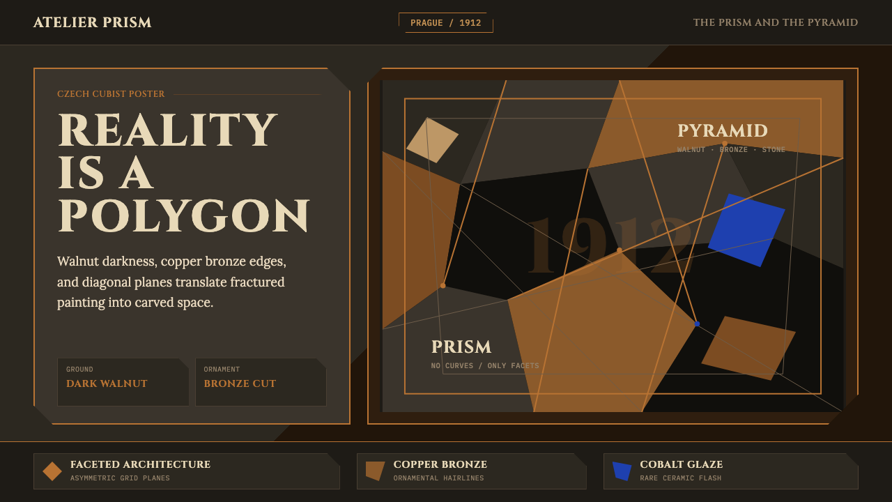 Czech Cubism (Prague 1912)Reality is faceted. Walnut ground, Cinzel capitals, and bronze diagonals cut…现实是多面体。胡桃木底、Cinzel 大写与青铜斜线切开平面。
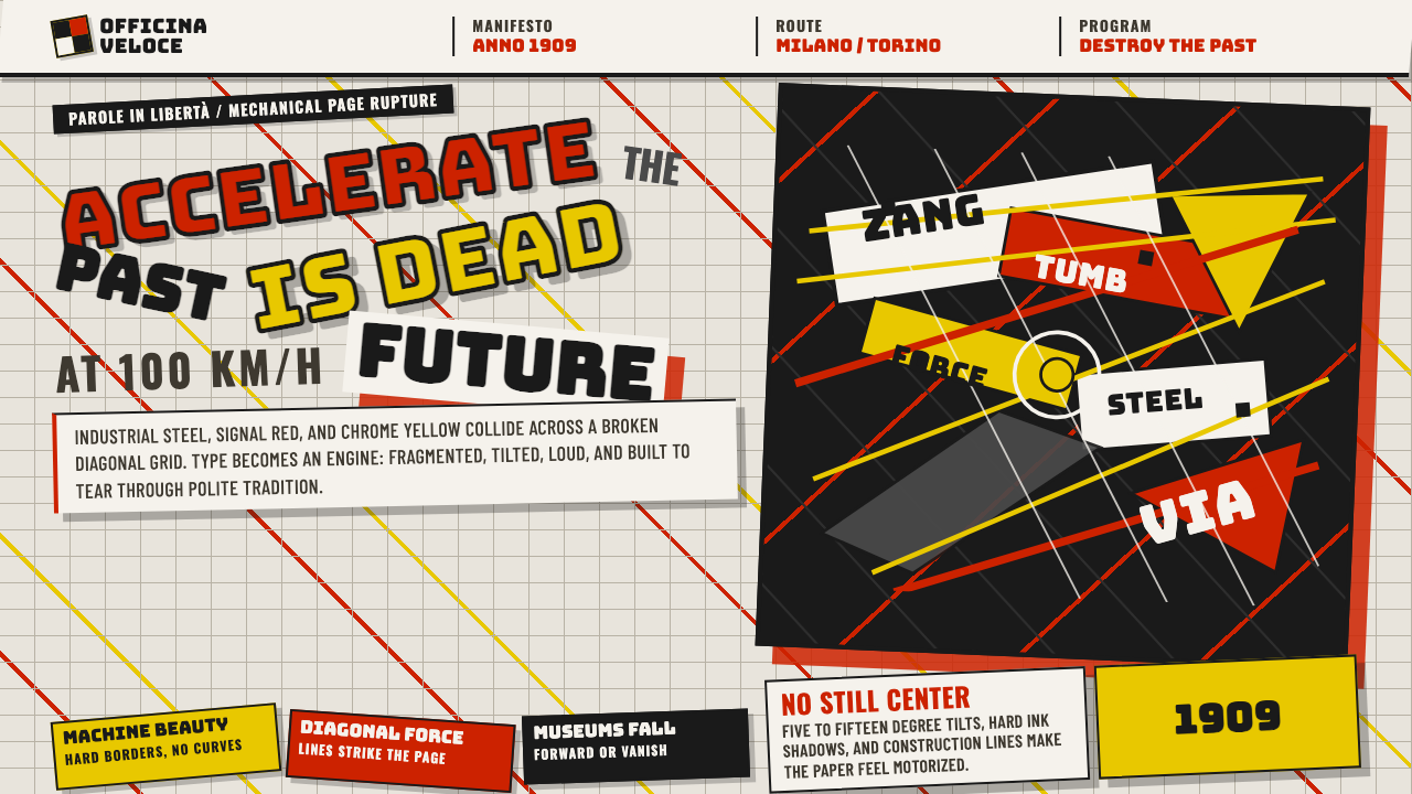 Italian Futurism (Marinetti 1909)Speed murders tradition. Signal red and chrome yellow slash a broken diagonal…速度杀死传统:信号红与铬黄斩开破碎斜向网格。
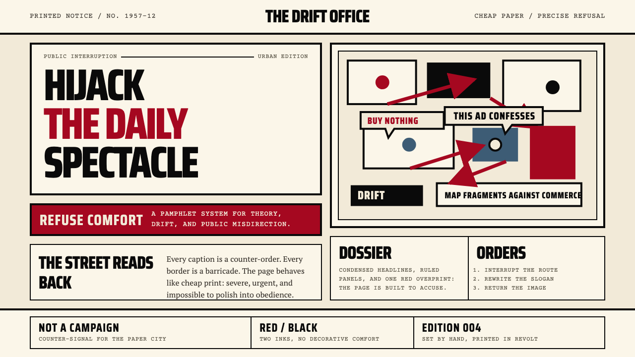 Situationist International (Debord, 1957)Agitation becomes structure. Red-black blocks and condensed type weaponize ne…煽动化为结构。红黑块面与压缩字体把新闻纸变成武器。
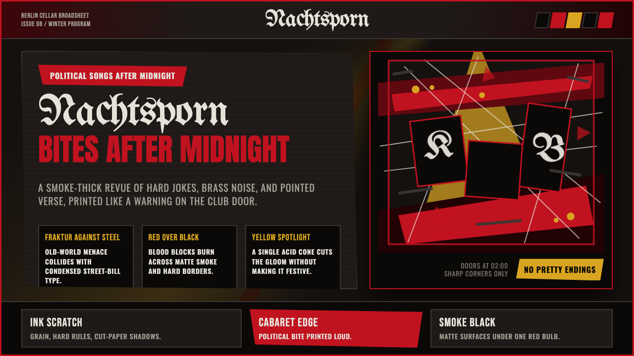 Weimar CabaretMenace at 2 a.m. Blood-red Fraktur, smoke-black grid, acid-yellow spotlight c…凌晨两点的锋芒:血红哥特字、烟黑网格与酸黄聚光灯。
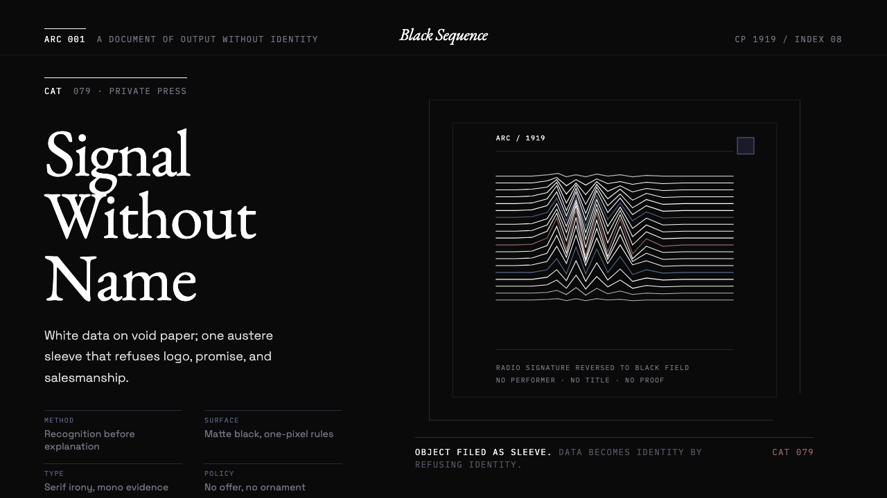 Peter Saville / Factory RecordsAnti-design becomes high art. Void black, white pulsar lines, and FAC mono la…反设计即高级艺术:黑色虚空、白色脉冲线与 FAC 等宽标签拒绝品牌化。
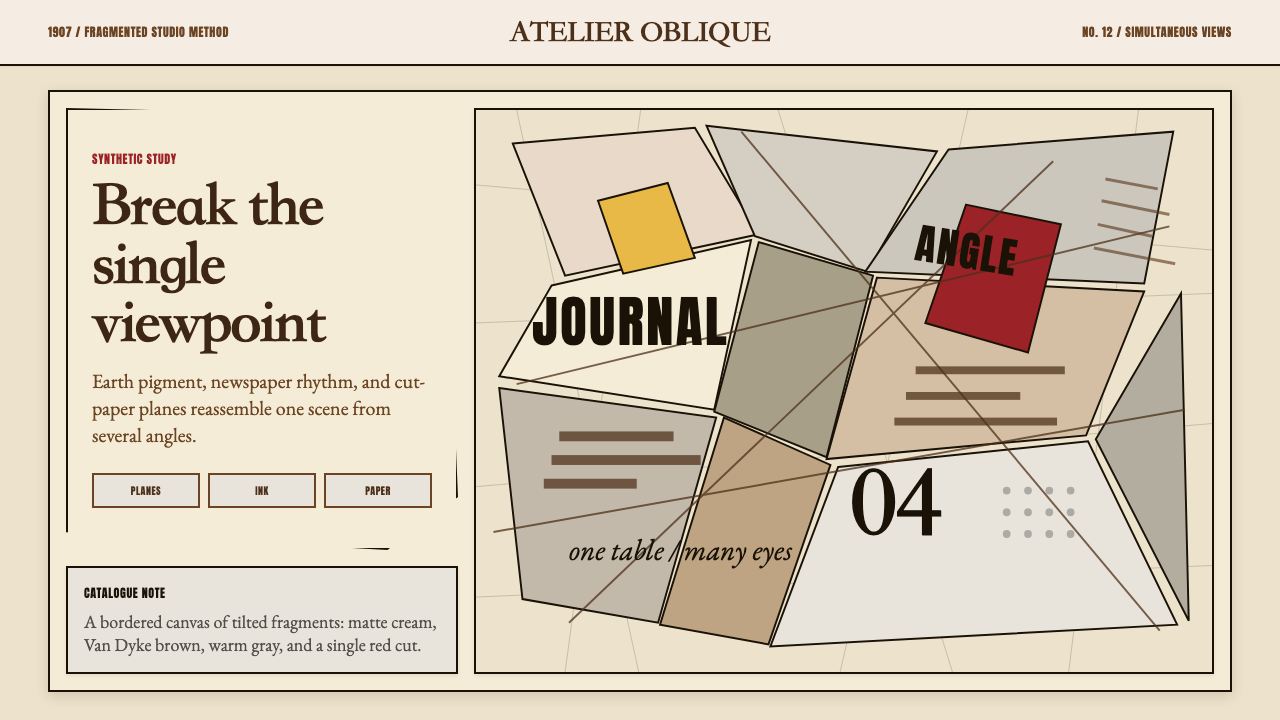 Picasso CubismSingle sight is shattered. Cream collage paper fractures brown-gray planes wi…单一视角被击碎:奶油拼贴纸上,褐灰棱面被一刀红色刺穿。