What is Situationist International (Debord, 1957)?什么是 Situationist International (Debord, 1957)?
Situationist International turned newsprint, hijacked imagery, and revolutionary red into weapons of political critique — refusing comfort in every typographic choice.情境主义国际将新闻纸、挪用图像与革命红色化为政治批判的武器,在每一个排版决定中拒绝舒适。
Situationist International (Debord, 1957) in briefSituationist International (Debord, 1957) 速览
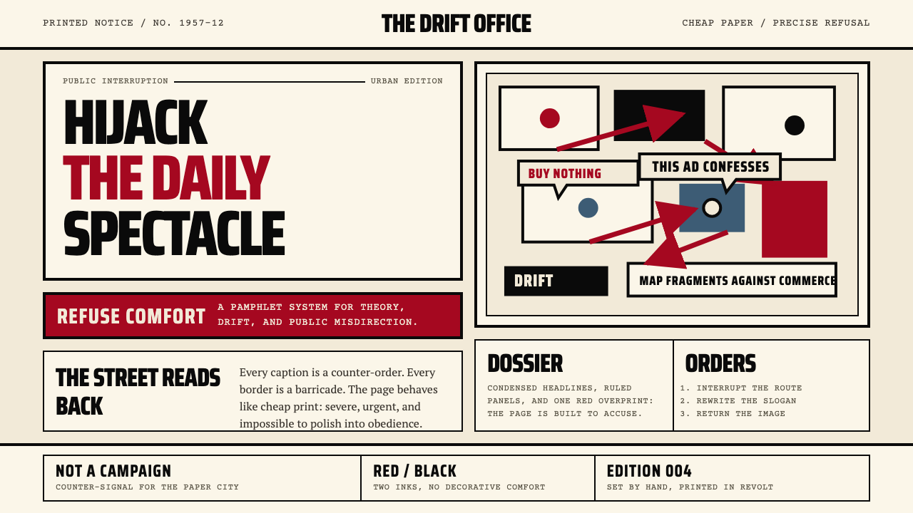
Situationist International (SI) is a visual and political movement founded in 1957 whose design language fuses the aggressive pamphlet traditions of revolutionary print culture with avant-garde collage. The vocabulary is immediately confrontational: bold condensed sans-serif headlines stacked at scale, heavy black borders framing blocks of text, a strict palette of cream, black, and revolutionary red, and collaged images whose original captions and speech bubbles have been replaced with subversive new text. Nothing in this system is neutral. Every element announces its adversarial intent.情境主义国际(SI)是1957年创立的一场视觉与政治运动,其设计语言融合了革命印刷文化中激进的传单传统与先锋派拼贴艺术。这套词汇直接具有对抗性:大尺寸堆叠的粗黑压缩无衬线标题,框住文字块的厚重黑色边框,奶油色、黑色与革命红组成的严格色板,以及原有说明文字和对话气泡被颠覆性新文本替换的拼贴图像。这套系统中没有任何中性元素,每个元素都宣告着它的对抗意图。
The SI's core theoretical concept — the spectacle, as theorized by Guy Debord in his 1967 book 'The Society of the Spectacle' — held that consumer capitalism had replaced authentic lived experience with a ceaseless flow of representations: advertising, television, commodity imagery. Against this, the SI proposed the practice of détournement: the hijacking and recontextualization of existing images, slogans, and cultural artifacts to expose and subvert their original ideological function. Visually, détournement means taking a familiar advertisement or comic panel and replacing its language, so that the spectacle's own images are turned against it.SI的核心理论概念——居伊·德波在其1967年著作《景观社会》中阐述的“景观”——认为消费资本主义已用无休止的表象流(广告、电视、商品图像)取代了真实的生活体验。对此,SI提出了“挪用”(détournement)的实践:劫持并重新语境化现有图像、标语与文化制品,以揭露并颠覆其原有的意识形态功能。在视觉上,挪用意味着取用一幅熟悉的广告或漫画格,替换其语言,使景观社会自身的影像反转为对它的控诉。
The resulting aesthetic is inseparable from its political argument. Newsprint grounds, compressed type, red spot-color, and roughly assembled collage do not merely evoke urgency — they embody it. This is a design language that refuses professional finish as a form of political sincerity, treating polish as complicity with the consumer culture it opposes. The rawness is not incompetence; it is a deliberate rejection of decorative comfort in favor of agitational clarity.由此产生的美学与其政治论点不可分割。新闻纸底色、压缩字体、红色专色与粗粝的拼贴并非仅仅唤起紧迫感,而是体现了它。这是一种将专业精致感作为政治诚意之拒绝的设计语言,将精良的制作视为对它所反对的消费文化的共谋。粗糙不是无能,而是对装饰性舒适感的刻意拒绝,以换取煽动性的清晰表达。
Where does Situationist International (Debord, 1957) come from?Situationist International (Debord, 1957) 从何而来?
The Situationist International was founded on July 28, 1957, at a meeting in the small Italian town of Cosio d'Arroscia, where representatives of several European avant-garde groups — the Lettrist International, the International Movement for an Imaginist Bauhaus, and the London Psychogeographical Association — merged into a single organization. The founding was presided over by Guy Debord, a French theorist and filmmaker whose earlier work with the Lettrist International had already developed many of the SI's core concepts: dérive (the practice of drifting through urban environments to discover their hidden psychological contours) and détournement (the reuse of existing cultural material against its original intent). Debord would remain the dominant intellectual and organizational figure throughout the SI's existence.情境主义国际于1957年7月28日在意大利小镇科西奥达罗西亚(Cosio d'Arroscia)的一次会议上宣告成立,来自数个欧洲先锋团体的代表——字母主义国际(Lettrist International)、想象主义包豪斯国际运动(International Movement for an Imaginist Bauhaus)和伦敦心理地理学协会——合并为一个组织。创立大会由法国理论家兼电影人居伊·德波主持;他早年在字母主义国际的工作已经发展出SI的多个核心概念:漂移(dérive,在城市环境中漂荡以发现其隐秘心理轮廓的实践)和挪用(détournement,将现有文化材料反向使用的方法)。德波在SI存续期间始终是其主导性的智识与组织核心。
The movement's visual practice drew on several immediate predecessors. Asger Jorn, the Danish painter and co-founder, brought the influence of COBRA (an avant-garde movement spanning Copenhagen, Brussels, and Amsterdam) — its expressionist energy, its rejection of formalist abstraction, and its insistence that art must be rooted in lived experience rather than aesthetic theory. Jorn's painted 'modifications' — cheap academic paintings purchased at flea markets and overpainted with vivid gestural strokes — were among the first systematic exercises in détournement as a visual method. The Lettrist International, meanwhile, had been producing intensely typographic work since the early 1950s, including metagraphic films in which text was projected directly over images, and pamphlets whose layouts deliberately violated the conventions of legible print.这场运动的视觉实践从数个直接先驱处汲取营养。丹麦画家、联合创始人阿斯格·约恩带来了COBRA的影响——这场跨越哥本哈根、布鲁塞尔与阿姆斯特丹的先锋运动拥有表现主义的能量、对形式主义抽象的拒绝,以及艺术必须植根于生活体验而非美学理论的坚持。约恩的绘画“改造”作品——在跳蚤市场购入的廉价学院派绘画上以鲜活笔触覆盖改写——是将挪用作为视觉方法进行系统练习的最早案例之一。字母主义国际则自1950年代初起一直在创作高度排版化的作品,包括将文字直接投射于图像之上的“元图形”电影,以及版面刻意违反可读性印刷惯例的传单。
The political and cultural climate of postwar Europe gave the SI its urgency. The late 1950s saw the consolidation of consumer society in Western Europe, the rise of advertising as a dominant cultural force, and the first wave of television saturation. The SI read these developments as a unified system of social control — the spectacle — in which authentic human experience was continuously displaced by its mediated representation. The movement's theoretical output, concentrated in its journal 'Internationale Situationniste' (published 1958–1969), developed this critique into a comprehensive account of how modern capitalism organized not just production and consumption but perception itself.战后欧洲的政治与文化氛围赋予了SI紧迫感。1950年代末,消费社会在西欧趋于巩固,广告作为主导性文化力量崛起,电视普及的第一波浪潮席卷而来。SI将这些发展解读为一个统一的社会控制系统——景观——其中真实的人类体验不断被其媒介化的表象所取代。该运动的理论产出集中于其期刊《情境主义国际》(1958—1969年出版),将这一批判发展成为一套关于现代资本主义如何组织不仅是生产和消费、更是感知本身的完整论述。
The SI's influence reached its visible peak during the Paris uprising of May 1968, when Situationist slogans — 'Under the paving stones, the beach,' 'Be realistic, demand the impossible,' 'All power to the imagination' — appeared on walls across France, and Situationist ideas circulated widely among the student and worker movements. The visual language of that moment, including screen-printed posters produced in the studios of the École des Beaux-Arts and hand-stenciled graffiti, directly embodied SI aesthetics: heavy lettering, bold simplicity, direct address, no decorative mediation between message and viewer. The SI formally dissolved in 1972, but its methods and visual vocabulary continued to propagate through punk graphic design (particularly in the work of Jamie Reid for the Sex Pistols), independent publishing, and critical graphic design practice into the twenty-first century.SI的影响在1968年5月巴黎起义期间达到可见的顶峰:情境主义口号——「在铺路石之下是沙滩」「现实一点,要求不可能」「一切权力归想象」——出现在法国各地的墙壁上,情境主义思想在学生与工人运动中广泛流传。那个时刻的视觉语言,包括在巴黎美术学院工作室印制的丝网海报和手刻模板涂鸦,直接体现了SI美学:粗重的字母、大胆的简洁、直接的诉求,在信息与观者之间毫无装饰性的中介。SI于1972年正式解散,但其方法与视觉词汇继续通过朋克平面设计(尤其是杰米·里德为性手枪乐队所做的设计)、独立出版与批判性平面设计实践传播至二十一世纪。
What defines the Situationist International (Debord, 1957) look?Situationist International (Debord, 1957) 的视觉特征是什么?
Palette色板
The color system is deliberately spare and politically coded: cream or off-white newsprint serves as the ground, black carries all structural weight (rules, borders, body text, block fills), and a single red acts as the agitational accent. This red is never soft or decorative — it is the saturated, urgent red of printing ink on cheap paper, of stop signs and alarm systems. The restriction to three tones is not minimalism; it is the visual equivalent of a clenched fist. No pastels, no gradients, no secondary hues appear in authentic SI-derived work.这套色彩系统刻意节制,并具有政治编码:奶油色或米白色新闻纸作为底色,黑色承载所有结构性重量(线条、边框、正文、实色块面),一抹红色充当煽动性的强调。这种红色从不柔和也不装饰——它是廉价纸张上印刷油墨的饱和、紧迫之红,是停止标志与警报系统的那种红。限定于三个色调并非极简主义,而是握紧拳头的视觉等价物。真正源自SI的作品中没有粉彩、没有渐变、没有间色。
Typography字体排印
Headlines are set in bold condensed sans-serif letterforms at large scale, compressed horizontally so that maximum words occupy minimum width — an effect that feels dense, urgent, and uncompromising. Text stacks vertically in tight leading, emphasizing mass over elegance. Body text is set in dense columns at small sizes, reflecting the pamphlet tradition where economy of space signals economy of production. The interplay between the massive headline and the tight body text creates a percussive rhythm that is the typographic equivalent of a shouted slogan followed by a rapid manifesto.标题以粗黑压缩无衬线字体大尺寸排列,水平方向压缩,使最多的文字占据最小的宽度——这种效果显得密集、紧迫而不妥协。文字以紧凑行距垂直堆叠,强调质量感而非优雅。正文以小字号排成密集列,反映传单传统中空间经济即生产经济的逻辑。巨大标题与紧凑正文之间的交错,创造出一种打击乐式节奏——这是喊出口号之后紧随快速宣言的排印等价物。
Détournement Collage挪用拼贴
The SI's signature image-making technique is détournement: taking an existing image — an advertisement, a comic strip panel, a propaganda poster, a film still — and inserting new text (particularly in speech bubbles and captions) that inverts or exposes the original's ideological content. The resulting collage retains the visual familiarity of the original image while completely reversing its message. This method produces a characteristic visual tension between polished source material and crude, confrontational new language, and between the recognizable and the radically altered.SI标志性的图像创作技术是挪用(détournement):取用一幅现有图像——广告、漫画格、宣传海报、电影剧照——并插入新的文字(尤其是对话气泡和说明文字),以颠覆或揭露原始图像的意识形态内容。由此产生的拼贴保留了原始图像的视觉熟悉感,同时将其信息彻底逆转。这种方法在精良的来源材料与粗粝的、对抗性的新语言之间,以及在可辨认的与被激进改造的之间,制造出一种标志性的视觉张力。
Heavy Borders and Rules厚重边框与线条
Thick black borders and heavy ruled lines do double duty in SI-derived layouts: they demarcate zones with an almost military authority, and they signal the newsprint and broadsheet heritage from which the aesthetic descends. Borders are not decorative — they are structural. They cut the page into blocks that read as discrete statements. Internal rules separate sections with the same uncompromising weight as the borders themselves. Nothing about these lines feels incidental; each one is a division that carries ideological as well as compositional force.厚重的黑色边框和粗实线在SI衍生版面中承担双重职能:它们以近乎军事权威的方式划定区域,同时传递这一美学所继承的新闻纸与对开大报传统。边框不是装饰性的,而是结构性的。它们把页面切割成作为独立陈述阅读的块面。内部分隔线以与边框本身同等不妥协的重量分隔各节。这些线条没有任何偶然感,每一条都是一条承载意识形态力量与构图力量的分界线。
Raw Newsprint Surface粗粝新闻纸质感
The SI published its ideas in cheaply produced newspapers, journals, and pamphlets — not glossy magazines or fine art books. The visual language encodes this material origin: cream or off-white grounds that evoke uncoated newsprint, slight optical roughness in the implied surface, and the overall impression of something produced urgently and inexpensively. This rawness is a political statement: beauty-through-expense is precisely what the SI critiques in consumer culture. The accessible, reproducible, deliberately unpolished surface is itself part of the message.SI以廉价印制的报纸、期刊和传单传播其思想,而非光面杂志或精装艺术书。这套视觉语言编码了这一物质起源:奶油色或米白色底面唤起非涂布新闻纸,隐含的表面质感略带光学粗粝感,整体上呈现出某种紧急且廉价产出之物的印象。这种粗粝本身是一个政治陈述:通过花费实现的美感,正是SI批判消费文化的核心。这种可及的、可复制的、刻意未精制的表面本身就是信息的一部分。
Direct Address and Slogan Typography直接诉求与标语式排印
SI layouts treat the reader as a political subject to be addressed, argued with, or incited — never as a consumer to be seduced. Headlines function as slogans: short, declarative, confrontational. Text is rarely descriptive; it is predominantly imperative or interrogative. The entire typographic register operates at a single, urgent pitch that does not modulate for comfort. In applied work, this quality translates into headings that make claims, calls to action that use direct imperatives, and a general refusal of softening language or design elements.SI版面将读者视为需要被诉求、论争或煽动的政治主体,而非需要被诱惑的消费者。标题作为口号运作:简短、陈述性、对抗性。文字极少是描述性的,主要是命令式或疑问式的。整个排印基调维持在一种紧迫的单一音调上,不为舒适而调节。在应用实践中,这种品质转化为提出主张的标题、使用直接祈使语气的行动号召,以及对缓和性语言或设计元素的全面拒绝。
Compositional Density构图密度
Unlike modernist design systems that use negative space as a primary compositional tool, SI layouts pack the page. Columns run to the edges. Images butt against text blocks. Headlines crowd their neighbors. This density is not a failure of composition — it is a deliberate analog of the informational overload the movement theorized as the spectacle. The page overwhelms in the way the spectacle overwhelms, but directed toward critique rather than consumption. Breathing room is not offered; the reader must push through.不同于以留白为主要构图工具的现代主义设计系统,SI版面将页面填满。文字列延伸至边缘,图像与文本块紧贴,标题与邻近元素拥挤。这种密度不是构图上的失败,而是对该运动所理论化为“景观”的信息过载的刻意模拟。页面以景观压倒人的方式压倒读者,但指向批判而非消费。没有喘息空间,读者必须奋力穿越。
Who shaped Situationist International (Debord, 1957)?谁塑造了 Situationist International (Debord, 1957)?
The dominant theorist and organizational center of the SI throughout its existence. Debord directed films, wrote theoretical texts, and edited the journal 'Internationale Situationniste', but his most influential contribution was 'The Society of the Spectacle' (1967), which provided the theoretical framework that unified the movement's diverse activities. His concept of the spectacle — the totality of social life mediated through commodified images — became one of the most cited frameworks in critical theory, media studies, and cultural criticism of the late twentieth century. His film of the same name (1973) translated the book into a visual form that exemplified détournement on a large scale.SI存续期间的主导理论家与组织核心。德波执导电影、撰写理论文本、编辑期刊《情境主义国际》,但其最具影响力的贡献是1967年的《景观社会》,为该运动多样的活动提供了统一的理论框架。他的“景观”概念——通过商品化图像中介的社会生活总体——成为二十世纪末批判理论、媒介研究与文化批评中被引用最多的框架之一。同名电影(1973年)将这本书转化为大规模体现挪用手法的视觉形式。
Danish painter and co-founder of the SI, Jorn brought the expressionist energy of the COBRA movement into the organization's visual practice. His technique of purchasing cheap academic paintings and overpainting them with vivid gestural marks — which he called 'modifications' — was among the earliest systematic applications of détournement as a visual method. Jorn left the SI in 1961 over disagreements with Debord about the role of artistic practice within the organization, but his influence on the movement's visual aesthetic — its embrace of gestural marking, appropriation, and deliberate roughness — remained fundamental.丹麦画家,SI联合创始人,约恩将COBRA运动的表现主义能量带入了组织的视觉实践。他购买廉价学院派绘画并以鲜活笔触覆盖改写的技术——他称之为“改造”——是将挪用作为视觉方法进行系统运用的最早案例之一。约恩于1961年因对组织内艺术实践角色的分歧与德波产生矛盾后离开SI,但他对该运动视觉美学的影响——对姿态性标记、挪用与刻意粗粝的拥抱——依然是根本性的。
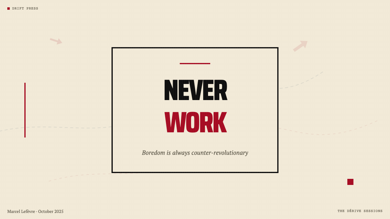
Belgian theorist and SI member whose book 'The Revolution of Everyday Life' (1967), published the same year as Debord's 'Society of the Spectacle', provided a more lyrical and experiential complement to Debord's rigorous analysis. Where Debord analyzed the spectacle systemically, Vaneigem described its effects on subjective experience — alienation, passivity, the colonization of desire — and called for the recovery of authentic lived experience against them. His slogans ('Never work,' 'Live without dead time') were among those most widely inscribed on Parisian walls in May 1968, demonstrating the direct translation of theoretical text into agitational visual language.比利时理论家,SI成员,其著作《日常生活的革命》(1967年)与德波的《景观社会》同年出版,为德波严谨的分析提供了更具抒情性与体验感的补充。德波系统地分析景观,而瓦内根则描述景观对主体体验的影响——异化、被动、欲望的殖民——并呼吁从中恢复真实的生活体验。他的口号(「从不工作」「在无死时间中生活」)是1968年5月被镌刻在巴黎墙壁上最广泛的那些,展示了理论文本向煽动性视觉语言的直接转化。
Dutch artist and SI member known primarily for 'New Babylon', an architectural project developed between 1956 and 1974 that imagined a planetary network of interconnected spaces designed for nomadic play, creative drift, and the total liberation of everyday life from work. New Babylon was presented through drawings, models, and plans that visualized what a post-spectacle society might look like spatially. Constant left the SI in 1960, but New Babylon remained an influential demonstration that Situationist critique could extend beyond printed media into architecture, urban planning, and the design of entire social environments.荷兰艺术家,SI成员,主要以“新巴比伦”(New Babylon)著称——这一建筑项目在1956至1974年间发展而成,想象了一个行星规模的互联空间网络,专为游牧式玩耍、创造性漂移,以及日常生活从劳动中的彻底解放而设计。新巴比伦通过图纸、模型与规划图呈现,将后景观社会的空间面貌视觉化。康斯坦特于1960年离开SI,但新巴比伦始终是一个具有影响力的示范:情境主义批判可以超越印刷媒介,延伸至建筑、城市规划与整个社会环境的设计。
British graphic designer who applied Situationist visual methods to the punk movement, most famously through his artwork for the Sex Pistols between 1976 and 1978. Reid's ransom-note typography — letterforms cut from different sources and reassembled — his use of red and black on white grounds, his heavily bordered layouts, and his practice of taking familiar imagery (notably the Queen's portrait) and defacing or subverting it all directly descended from SI détournement practice. Reid's work demonstrated that the SI's visual language could migrate from theoretical publishing into mass-market pop culture while retaining its adversarial character.英国平面设计师,将情境主义视觉方法应用于朋克运动,最著名的是其1976至1978年间为性手枪乐队创作的视觉作品。里德的勒索信式排印——从不同来源剪下字母重新拼合——以及他对白色底面上红黑配色的运用、厚重边框的版面、和取用熟悉图像(尤以女王肖像为甚)后对其涂污或颠覆的实践,都直接承袭自SI的挪用实践。里德的工作证明,SI的视觉语言可以从理论出版物迁移至大众市场流行文化,同时保留其对抗性特质。
How do you use Situationist International (Debord, 1957) today?今天怎么用 Situationist International (Debord, 1957)?
The Situationist International aesthetic is among the most politically charged visual systems available to contemporary designers, which means its application requires deliberate intent matching. It works well when a brand or project genuinely occupies adversarial, critical, or countercultural territory — independent journalism, activist organizations, progressive political campaigns, critical academic publishing, and creative products that position themselves against mainstream consumer culture. Applying it to a corporate SaaS product or a luxury brand creates an obvious and damaging contradiction between form and content.情境主义国际美学是当代设计师可用的政治色彩最浓厚的视觉系统之一,这意味着它的应用需要刻意匹配其意图。它在品牌或项目真正占据对抗性、批判性或反文化领域时表现出色——独立新闻、活动组织、进步政治运动、批判性学术出版,以及将自身定位为对抗主流消费文化的创意产品。将它应用于企业级SaaS产品或奢侈品牌,会在形式与内容之间制造出明显而有害的矛盾。
For presentation slides, the SI aesthetic works powerfully on cover and section-divider pages. A cover built from this language uses a dominant red block or heavy black border to frame a condensed, all-caps headline — the title as slogan. Section dividers treat each transition as a proclamation: one short declarative statement in large compressed type on a cream ground. Content slides should be treated like broadsheet columns: dense text in tight measure, minimal imagery (and only détourned or appropriated imagery used deliberately), data presented in stark diagrammatic form with no decorative chart chrome. Avoid the temptation to soften any of these choices — the system's power comes from its uncompromising consistency.对于演示文稿,SI美学在封面和章节分隔页上效果最为强烈。以这种语言构建的封面使用一个主导性红色块面或厚重黑色边框来框定一个压缩的全大写标题——题目即口号。章节分隔页将每次过渡处理为一次宣告:奶油色底面上以大尺寸压缩字体排印一个短促的陈述句。内容页应当像对开大报版面一样处理:紧凑行宽内的密集文字,极少图像(且只使用经刻意挪用或挪用的图像),数据以简洁的示意图形式呈现,无任何装饰性图表外壳。避免软化任何这些选择的冲动——这套系统的力量来自其不妥协的一贯性。
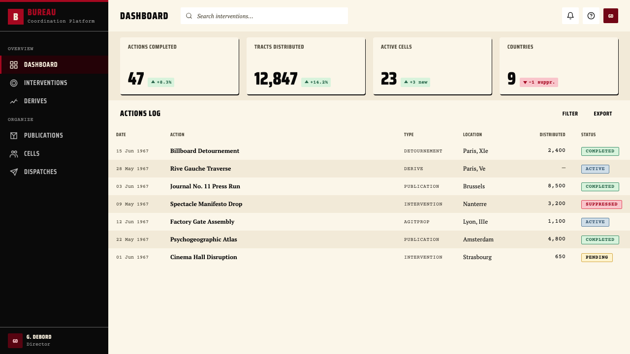
For web interfaces and dashboards, the vocabulary translates most naturally to products where critical clarity is the core value proposition: analytical tools, news platforms, data journalism, and interfaces designed for sophisticated users who distrust decorative polish. The approach begins with a cream or off-white background, heavy black rules separating content zones, and red reserved exclusively for the most urgent interactive state — a critical alert, a key metric threshold, a primary call to action that demands attention. Navigation should be purely typographic. No rounded corners, no soft shadows, no hover states that soften the interaction — every interaction should feel like a decisive act.对于网页界面与仪表板,这套词汇最自然地转化于以批判性清晰度为核心价值主张的产品:分析工具、新闻平台、数据新闻,以及为不信任装饰性精致感的精通用户设计的界面。方法以奶油色或米白色背景开始,以厚重黑色线条分隔内容区域,红色仅保留给最紧迫的交互状态——关键告警、核心指标阈值、需要注意力的主要行动号召。导航应是纯粹字体性的。没有圆角,没有柔和阴影,没有软化交互感的悬停状态——每一次交互都应该感觉像一个决定性的行为。
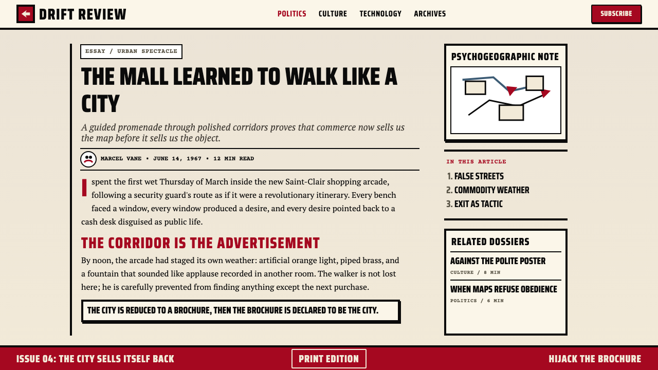
For editorial and marketing work, the style produces its strongest results when the content itself carries argumentative weight. A marketing page for a product genuinely challenging an established category can use SI-derived layouts: full-width text blocks alternating between black-on-cream and cream-on-black, a recurring red accent on the single most important claim, and collaged imagery where original commercial photographs have been treated (cropped, bordered, overprinted) to strip them of their seductive surface. Article layouts can adopt the narrow-measure, dense-column approach that reinforces the sense of reading urgent material rather than leisurely consuming content.对于编辑与营销内容,这种风格在内容本身承载论证性重量时产生最强效果。一个真正挑战既有品类的产品营销页面可以采用SI衍生版面:全宽文字块在黑底奶油字与奶油底黑字之间交替,红色强调一次性集中于最重要的单一主张,拼贴图像对原始商业摄影进行处理(裁切、加边框、叠印)以剥离其诱惑性的表面。文章版面可以采用窄行宽、密集列的方式,强化阅读紧迫材料而非悠闲消费内容的感受。
The most common mistake when applying this aesthetic is treating it as a purely formal exercise — borrowing the red-black-cream palette and heavy rules while filling the container with conventional commercial language and decorative choices. Authentic SI-derived design creates internal coherence between its formal choices and its communicative register. A second common error is confusing rawness with sloppiness: the SI's pamphlets were deliberately rough, but compositionally intentional. Every border, every type size, every block of red was placed with argued purpose. Applying this system well requires the same principled discipline — not polish, but precision in service of a clear adversarial intent.应用这一美学时最常见的错误,是将其视为纯粹的形式练习——借用红-黑-奶油色板和厚重线条,同时在容器内填入传统的商业语言和装饰性选择。真正的SI衍生设计在其形式选择与传达基调之间创造内在一致性。第二个常见错误是将粗粝与潦草混为一谈:SI的传单是刻意粗糙的,但在构图上是刻意的。每一条边框、每一个字号、每一块红色都被有论据地放置。出色地应用这套系统需要同样有原则的自律——不是精致,而是服务于清晰对抗意图的精准。
Situationist International (Debord, 1957) — FAQSituationist International (Debord, 1957) · 常见问题
How does the SI aesthetic differ from punk graphic design?SI美学与朋克平面设计有何不同?
Punk graphic design — particularly the work of Jamie Reid and the broader British DIY punk visual culture of the late 1970s — directly descended from SI practice and shares its ransom-note typography, red-black palette, and appropriation of existing imagery. The key differences are in theoretical grounding and compositional control. SI publications were produced by intellectuals who had developed a rigorous critique of consumer capitalism; their apparent rawness was purposeful rather than accidental. Punk design loosened the SI's compositional deliberateness in favor of more aggressive visual disorder — a chaos that communicated energy and rejection rather than structured argument. In practice: SI work tends toward block-based, heavily bordered, structured density; punk work tends toward scattered, overlapping, deliberately illegible chaos.朋克平面设计——尤其是杰米·里德的作品以及1970年代末英国DIY朋克视觉文化——直接承袭自SI实践,共享其勒索信式排印、红黑色板以及对现有图像的挪用。关键差异在于理论基础与构图控制。SI出版物由已经发展出对消费资本主义严格批判的知识分子制作;其表面粗粝是有目的的而非偶然的。朋克设计放松了SI的构图刻意性,转向更具攻击性的视觉混乱——一种传达能量与拒绝而非结构性论证的混沌。在实践中:SI作品倾向于基于块面、厚边框、结构性密集;朋克作品倾向于散落的、叠压的、刻意难以辨认的混沌。
Can this aesthetic work for digital interfaces, or is it inherently a print style?这种美学能用于数字界面吗,还是它本质上是一种印刷风格?
The SI aesthetic is fundamentally a print style — its vocabulary emerged from newsprint, offset lithography, and screen-printing — but it translates to digital interfaces more successfully than many historical print aesthetics. The reason is that its core moves (heavy borders, flat color, condensed type, stark contrast) all survive screen reproduction cleanly. The newsprint surface quality requires reinterpretation: on screen, the cream ground reads as a deliberate departure from corporate white-on-white or pure dark-mode black, not as a simulation of paper. The main challenge is interactive states — the SI aesthetic has no native vocabulary for hover, focus, or animation. These need to be invented in the spirit of the system: hard, decisive, immediate rather than soft, gradual, or decorative.SI美学根本上是一种印刷风格——其词汇源自新闻纸、胶版印刷与丝网印刷——但它比许多历史印刷美学更成功地转化于数字界面。原因是它的核心手法(厚重边框、平涂色彩、压缩字体、强烈对比)都能在屏幕复制中保持清晰。新闻纸的表面质量需要重新诠释:在屏幕上,奶油色底面被读作对企业级白底白或纯暗模式黑的刻意偏离,而非纸张的模拟。主要挑战是交互状态——SI美学对悬停、焦点或动画没有原生词汇。这些需要以这套系统的精神创造发明:硬朗、决断、即时,而非柔软、渐进或装饰性的。
Is it possible to use this style without making political statements?使用这种风格而不发表政治声明,可能吗?
Technically possible, but practically difficult and aesthetically dishonest. The SI aesthetic is inseparable from its political origins in ways that, say, Art Deco or Bauhaus are not — the red-black-cream palette, the condensed typography, the heavy borders, and the collage method all carry specific historical associations with revolutionary critique that most informed viewers will recognize. Deploying this aesthetic for a product with no adversarial dimension creates a kind of visual cognitive dissonance — the form promises a confrontation the content cannot deliver. The style can certainly be diluted or referentially used; many contemporary brands draw on elements of its vocabulary for connotations of authenticity, independence, or critical intelligence without fully committing. But the further a design moves from the SI's actual values, the more it becomes a pastiche that depends on the original's credibility without earning it.技术上可行,但实践中困难,在美学上也是不诚实的。SI美学与其政治起源的不可分割程度,不同于装饰艺术或包豪斯——红-黑-奶油色板、压缩排印、厚重边框与拼贴方法,都携带着与革命批判相关的特定历史联想,大多数了解背景的观者都会识别。将这种美学用于没有对抗维度的产品,会制造一种视觉认知失调——形式许诺一场内容无法兑现的对抗。这种风格当然可以被淡化或被参照性使用;许多当代品牌汲取其词汇的某些元素,以获得真实性、独立性或批判性智识的联想,而不完全承诺。但设计偏离SI真实价值观越远,它就越成为一种依赖原版可信度却未曾赢得它的仿制品。
How does détournement work practically in a design brief?挪用(détournement)在实际设计任务中如何运作?
Détournement in practical design work means identifying existing visual material — stock photography, advertising imagery, corporate logos, media screenshots — and recontextualizing it through crop, border, overprint, caption replacement, or collage assembly so that the resulting image means something different from (and often opposite to) its original intent. The technique works best when the source material is recognizable: the gap between what the image originally communicated and what it now says is where the critical energy lives. In contemporary application, this might mean using a familiar technology company's marketing imagery overlaid with text that interrogates its claims, or reassembling product photography into a grid that comments on consumer abundance. The essential rule: the source must be recognizable enough that the transformation registers as a deliberate act.在实际设计工作中,挪用意味着识别现有视觉材料——图库摄影、广告图像、企业标识、媒体截图——并通过裁切、边框、叠印、说明文字替换或拼贴组合对其进行重新语境化,使结果图像传达与原始意图不同(往往相反)的意义。这种技术在来源材料可辨认时效果最佳:图像原本传达的内容与它现在说的话之间的落差,正是批判能量所在。在当代应用中,这可能意味着使用一家知名科技公司的营销图像,叠加审视其声明的文字;或将产品摄影重新组合成一个对消费丰盛进行评注的网格。根本规则是:来源必须足够可辨认,使转化被识别为一种刻意的行为。
What is the right scope for applying this aesthetic — is it a full-system commitment or can individual elements be borrowed?应用这种美学的合适范围是什么——它需要全系统承诺,还是可以借用个别元素?
The SI aesthetic has more internal coherence than most historical styles — its elements are not merely correlated but mutually reinforcing. The cream ground, heavy borders, condensed type, and red accent work together because they all embody the same set of values: urgency, economy, structural honesty, adversarial intent. Borrowing one element in isolation — say, using a red-black palette on an otherwise conventional modern layout — tends to produce confusion rather than connotation, because the red-black signals a context that the rest of the design does not deliver. A more productive approach is to identify which of the system's values are genuinely relevant to the work at hand, and then apply the corresponding elements consistently. If structural density and typographic directness are the relevant values, use those fully. If revolutionary red is not backed by adversarial content, leave it out — the palette means something specific and borrows credibility from that specificity.SI美学比大多数历史风格具有更强的内在一致性——其元素不仅仅是相关的,而且是相互强化的。奶油色底、厚重边框、压缩字体与红色强调相互配合,因为它们都体现了同一套价值观:紧迫性、经济性、结构诚实性、对抗意图。孤立地借用一个元素——比如在其他方面传统现代的版面上使用红黑色板——往往制造困惑而非联想,因为红黑信号了一个设计其余部分无法兑现的语境。更有效的方法是识别这套系统的哪些价值观真正与手头的工作相关,然后一贯地应用相应的元素。如果结构密度与排印直接性是相关价值观,就充分地使用它们。如果革命红没有对抗性内容的支撑,就放弃它——这套色板传达的是特定含义,并从这种特定性中借取可信度。
Related design styles相关设计风格
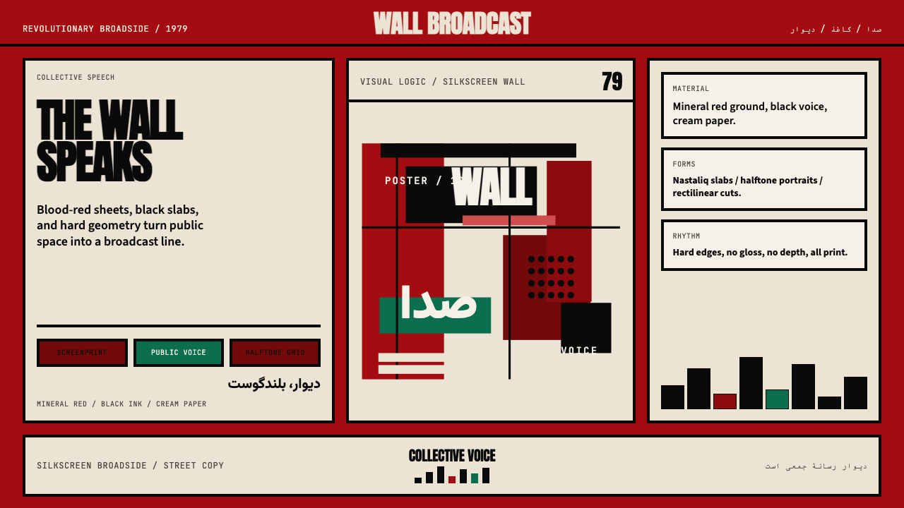 Iranian Revolution Poster (1979)Collective voice in ink. Blood red, black slabs, and hard screenprint geometr…集体之声凝成油墨海报。血红、黑色字块与硬边丝网几何。
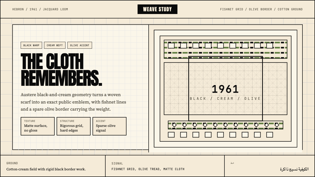 Palestinian Keffiyeh GridMemory in black and cream. Fishnet grid, olive border, and austere Anton type.黑白承载记忆。渔网格、橄榄边与峻厉标题字。
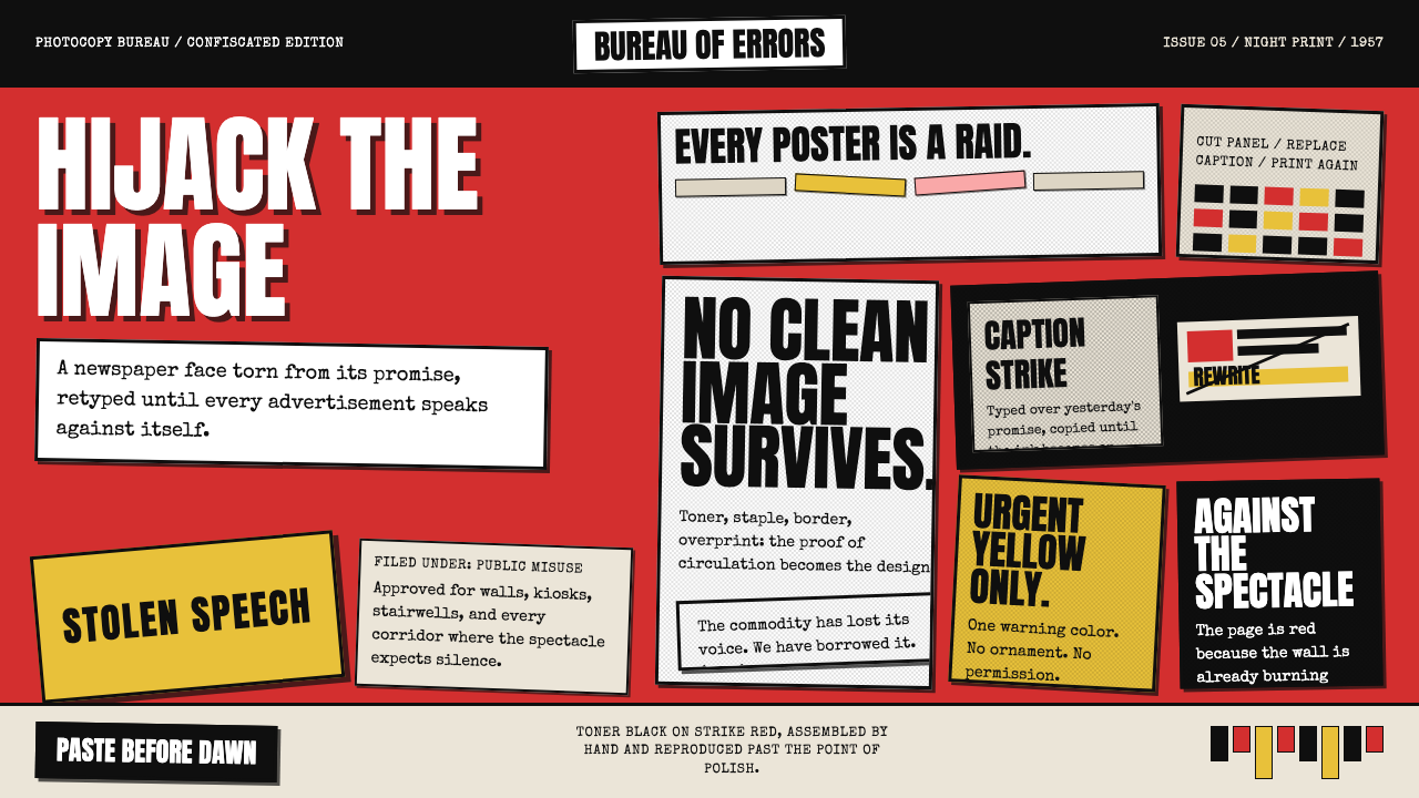 Situationist Détournement (1957)Contraband urgency. Strike red, toner black, and jagged comic panels make the…违禁般急迫:罢工红、碳粉黑与粗剪漫画格,让理论像偷印传单。
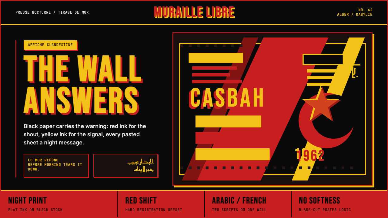 Algerian Casbah Poster (1954–1962)Every surface is a manifesto. Blood red, warning yellow, and stencil type hit…每个表面都是宣言:血红、警示黄与模板字撞上黑色新闻纸。
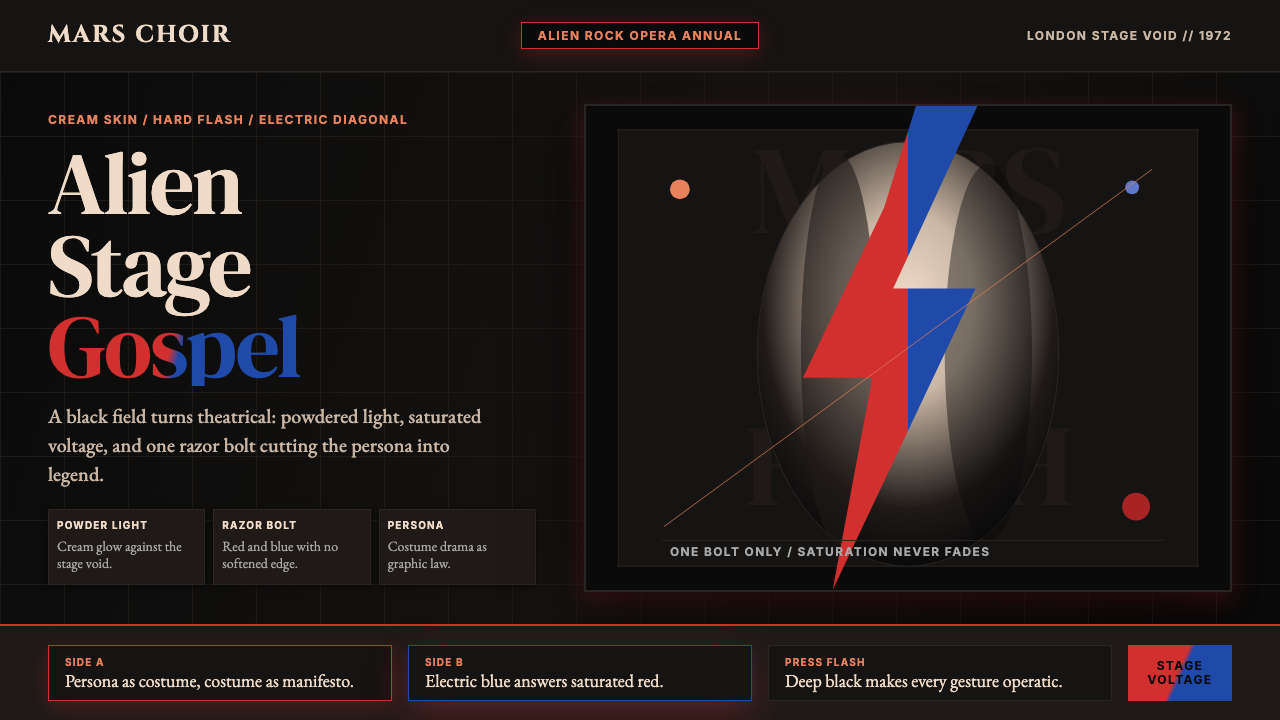 Bowie — Ziggy StardustTheater at full voltage. Cream-on-black portrait cut by one red and electric-…满电压的剧场感:黑底奶油肖像,被红与电蓝闪电劈开。
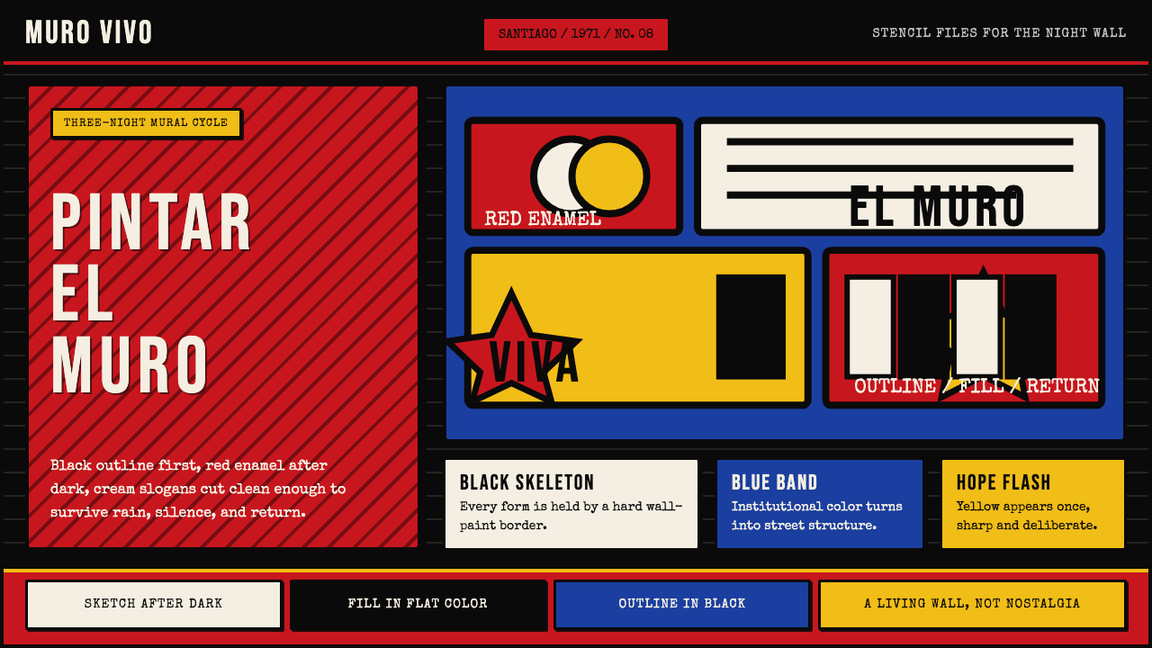 Chilean BRP Ramona Parra 1971Resistance stays alive. Blood red panels, black outlines, and stencil type re…抵抗仍在呼吸:血红墙面、粗黑轮廓与模板字重建街墙。