What is Chilean BRP Ramona Parra 1971?
When the walls of Santiago became the most contested public surface in South America, the Brigada Ramona Parra turned political urgency into a visual discipline that has outlasted every government that tried to silence it.
Chilean BRP Ramona Parra 1971 in brief
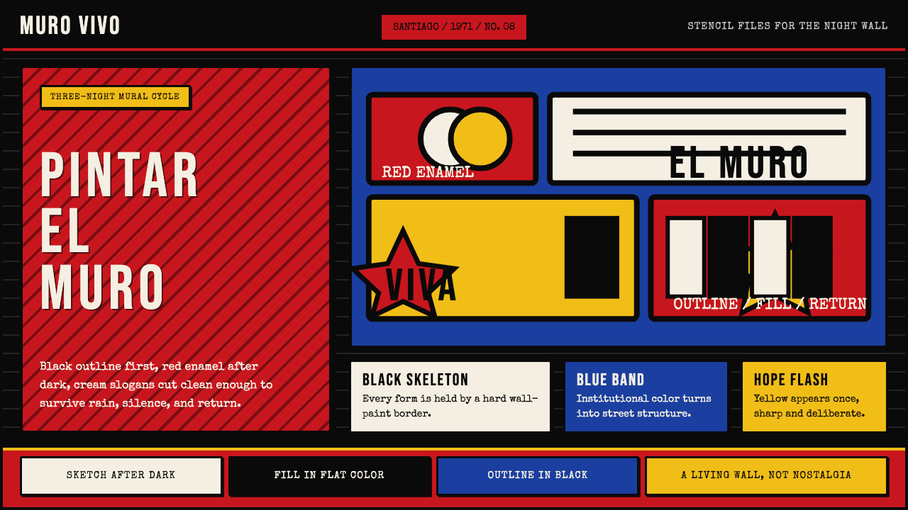
The Brigada Ramona Parra — commonly abbreviated BRP — is the mural brigade of the Chilean Communist Youth, founded in 1968 and named after Ramona Parra, a young Communist worker killed by police during a 1946 nitrate-workers' strike in Iquique. The brigade's visual language is among the most recognizable in the political art of the twentieth century: thick black outlines enclosing flat, saturated areas of blood red, white, and deep blue, stencil-cut or freehand lettering painted in tightly organized horizontal bands, and figures reduced to bold graphic silhouettes that read clearly at street scale from a moving car.
Unlike many political art movements, BRP was not a style invented by individual artists and then applied to political content. It emerged from strict operational necessity: brigades worked at night, moving fast, and their murals had to be legible under low light and from a distance. The thick outline was a production constraint — it defined forms cleanly even when the flat fill was slightly uneven — and it became the movement's signature. The visual system was collective by design, trainable across hundreds of volunteers who had never studied art.
The style reached its visual peak during Salvador Allende's Popular Unity government from 1970 to 1973, when the BRP painted the walls of Santiago, Valparaíso, and Concepción with a systematic intensity that turned entire neighborhoods into open-air declarations. After the 1973 military coup, those murals were whitewashed by Pinochet's forces within days. The aesthetic went underground — printed on clandestine flyers, carried in memory — until it re-emerged in the late 1980s democracy movement and exploded again during the 2019 estallido social, when a new generation of Chileans invoked the BRP visual grammar on walls across the country.
Where does Chilean BRP Ramona Parra 1971 come from?
The BRP was founded in 1968, in the political ferment that followed the Cuban Revolution and the global upheavals of that year. The Chilean Communist Youth needed a visible presence in the streets ahead of the 1969 parliamentary elections and the 1970 presidential campaign that would bring Allende to power. The first brigades were small — four to six people — and worked quickly, painting over existing graffiti or blank walls with whatever paint could be obtained. The aesthetic born of this urgency retained its core characteristics even as the movement grew.
The movement drew formal inspiration from Mexican muralism — particularly David Alfaro Siqueiros, whose politically charged, large-scale public murals had demonstrated that art could address millions of people simultaneously. But where Mexican muralism favored baroque compositional complexity and painterly illusionism, the BRP stripped the visual language to its minimum transmittable unit: a solid shape, a hard outline, a readable word. Siqueiros himself visited Chile in 1941 and left murals that the Chilean left knew well; his influence was real, but the BRP's solution to the problem of speed and collective execution was distinctively its own.
Alejandro González, known as Mono González, became the key figure in formalizing the BRP method. As the brigade's artistic director through the Allende years, Mono codified the collective painting process into distinct roles: the trazador sketched the composition directly onto the wall, the rellenador filled the flat color areas rapidly, and the perfilador traced the final black outlines that unified and clarified everything. This division of labor made quality consistent even when individual skills varied widely. The method was documented and taught, turning aesthetic decisions into repeatable procedure.
The years 1970 to 1973 were the movement's formative peak. With a sympathetic government in power, the BRP could operate openly, and the scale of their output expanded dramatically. Entire city blocks were muralized in coordinated campaigns; universities, factories, and working-class neighborhoods became canvases. The visual vocabulary expanded to include Allende's portrait, emblems of Popular Unity's constituent parties, and figures from Chilean labor history — all rendered in the same flat, outline-defined graphic language that had emerged from nocturnal necessity. When the coup came on September 11, 1973, the murals were erased almost immediately, but the visual grammar had been absorbed into collective memory.
What defines the Chilean BRP Ramona Parra 1971 look?
The Hard Outline
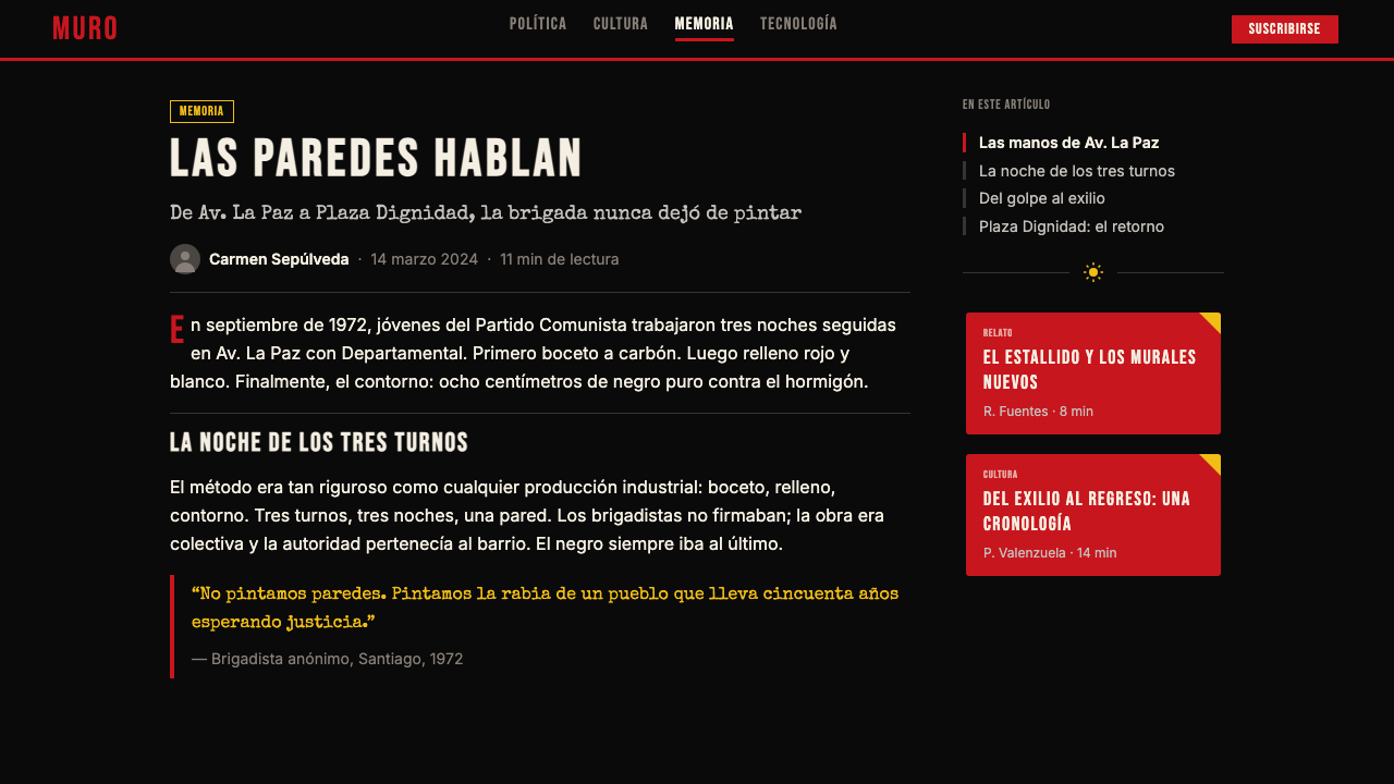
The defining mark of BRP work is the heavy black perimeter line that encloses every form — figures, lettering, shapes, decorative elements. This outline is not stylistic; it was operationally necessary. Painted at night by multiple hands in succession, the flat color fills were applied first, then the unifying outline was drawn last by the most skilled brigade member to clean up edges and impose consistency. The effect is graphic in the clearest sense: everything reads as a distinct, bounded shape, with none of the atmospheric bleeding that characterizes painted illusionism. Contemporary use of this aesthetic should treat the outline not as a decorative border but as the primary structural commitment — it defines the weight and presence of every element.
Flat Color with Political Meaning
BRP's palette centers on blood red, clean white, and deep blue — colors that read simultaneously as the Chilean flag, as Communist iconography, and as the stark visual logic of resistance. Color is never graduated, blended, or modulated by light; it exists as a flat declarative statement. Red is the dominant hue in most compositions, used for figures, filled letters, and large areas of emphasis. White provides ground and contrast, often doubling as the color of the outline itself where economy of paint required it. Black is reserved for outlines and occasional typographic weight. The flatness is not a limitation but a philosophy: every brushstroke is a commitment, not a suggestion.
Stencil and Freehand Letterforms
Text in BRP murals is inseparable from the image — it is drawn at the same weight as the surrounding figures, with outlines of matching thickness, so that words and images form a unified visual field rather than a caption beside an illustration. The lettering style is condensed, upright, and rendered with broad strokes that prioritize legibility over calligraphic refinement. Stencil-cut letters were used for repeatable slogans; freehand lettering allowed more variation in larger one-off compositions. Either way, text is never decorative filler — it carries equal structural and communicative weight to every other element.
The Figure as Silhouette
Human figures in BRP murals are not portraits in the realistic sense. They are bold graphic silhouettes — workers with raised fists, marchers in profile, hands reaching upward — in which internal detail is minimal and expressive posture carries all the meaning. Faces may be present but are simplified to essential features; clothing folds are reduced to a few decisive lines within the bounding outline. The figure is designed to communicate instantly at the scale of a building wall, which means anatomical precision is sacrificed for posture clarity. This is not incompetence but economy: the visual unit that must work at thirty meters does not benefit from detail visible only at arm's length.
Horizontal Band Composition
BRP compositions often resolve into strong horizontal registers — bands of color and text that stack vertically across the wall surface, each band internally consistent in its palette and weight. This organizational logic was partly practical: a long urban wall demands a compositional logic that extends across its full width without requiring the viewer to hold a single centered composition in mind. The horizontal register also echoes the format of protest banners, broadsheets, and marching slogans — media familiar to BRP's intended audience. The result is a visual rhythm that scans like reading, moving from left to right and resolving in a final pictorial or typographic statement.
Collective Authorship
BRP murals are never signed by an individual — they are signed by the brigade. This is not modesty but principle: the visual system was designed to be collectively executed, and individual expression within it was subordinated to the movement's communicative purpose. The aesthetic consistency of BRP work across thousands of murals, dozens of cities, and fifty years is itself a product of this collective authorship. The style is reproducible not because it was simple but because its rules were explicit, teachable, and held to collectively. This has direct implications for contemporary designers using the aesthetic: it is a system, not a style — it functions best when its internal rules are followed rather than loosely evoked.
Living Tradition, Not Museum Object
Unlike many historical design movements that have calcified into pastiche and nostalgia, BRP remains a genuinely active visual language. The 2019 Chilean estallido social saw new BRP-style murals appear on walls across Santiago within days of the uprising's beginning — not as historical quotation but as the most natural available vocabulary for the moment. Mono González, now in his seventies, participated directly. This living quality matters aesthetically: it means the style carries documentary weight, not retro charm. Designers using it reference a practice that is still in use, not a period piece.
Who shaped Chilean BRP Ramona Parra 1971?
Ramona Parra was a nineteen-year-old Communist Youth member and seamstress killed by police gunfire on January 28, 1946, during a protest in support of striking nitrate workers at the Humberstone and Santa Laura mines in the Atacama Desert. The protest was met with live fire; Parra and five others died. Her death became a foundational act of martyrdom for the Chilean Communist movement, and when the mural brigade was founded in 1968, it chose her name to honor those who died for collective organizing. She never made art; her significance is entirely symbolic — a face put to the cost of resistance.
Mono González is the figure most responsible for transforming the BRP from an improvised street-painting operation into a coherent visual system. As artistic director through the Allende years, he codified the three-role brigade method — trazador, rellenador, perfilador — that made consistent quality achievable through collective labor. After the coup and exile, he continued painting in Spain and eventually returned to Chile, where he remained active through the 2019 uprising. His longevity and continued practice are central to the argument that BRP is not a historical artifact but a living tradition.
Allende was not a visual artist, but his three-year presidency (1970–1973) created the political conditions in which BRP visual culture reached its fullest expression. The Popular Unity government's alliance with Communist Youth made the brigades semi-official voices of the state project, allowing them to operate at unprecedented scale. Allende's portrait became one of the most recurring images in the BRP canon — both during his presidency and, even more powerfully, after his death during the coup. His face in BRP murals functions as an icon in the theological sense: a flat, outlined, schematic image that stands for a set of values rather than a likeness.
Marcelo Montecino is a Chilean-American photographer whose documentation of BRP murals and their destruction after the 1973 coup constitutes the primary visual archive of the movement at its peak. Without Montecino's photographs, the murals painted between 1970 and 1973 — nearly all destroyed within weeks of the coup — would exist only in memory. His work transformed ephemeral street painting into historical record and gave subsequent generations of designers and activists a reference base to draw from. The existence of the BRP aesthetic as a reproducible canon owes a significant debt to his photographic preservation.
Though Siqueiros was Mexican rather than Chilean, his influence on BRP is foundational and acknowledged. His Chilean murals of 1941 demonstrated that politically committed large-scale public art was viable and powerful in the Southern Cone. Siqueiros worked with industrial paints, unconventional tools, and collective workshop methods — all of which the BRP would adopt and adapt. The connection between Mexican muralism and BRP is not mere stylistic influence; it is a conscious transmission of political and methodological conviction across a generation and a national border.
How do you use Chilean BRP Ramona Parra 1971 today?
BRP's visual grammar is one of the most immediately legible political aesthetics in the world, which means contemporary designers using it carry a significant interpretive responsibility. The style signals collective action, labor solidarity, and resistance to authoritarian power — meanings that are inseparable from the visual form. Using it for commercial work that contradicts these values produces a jarring incongruity that audiences will feel even if they cannot articulate it. The aesthetic is best suited to purposes that at minimum do not conflict with its historical register: social campaigns, cultural institutions, community organizations, or independent work with genuine political or civic content.
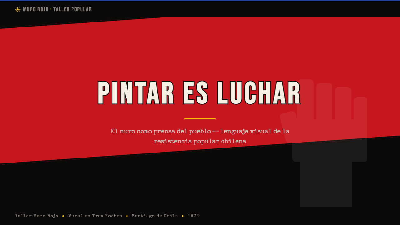
For presentation materials, the BRP aesthetic translates directly and powerfully to bold cover slides and section dividers. A cover built around the BRP method uses a single dominant silhouette — a figure, a hand, an architectural element — rendered in solid red against a black or white field, with the title set in heavy, condensed lettering at matching visual weight. The outline principle means every shape should be crisply delineated: no blurred edges, no soft drop shadows, no atmospheric gradients. Section slides work well with horizontal text bands across the full width of the slide, alternating between red-on-black and white-on-red to create rhythm and emphasis.
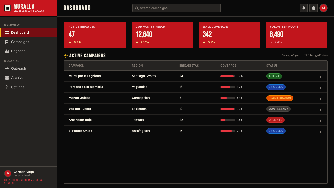
In web and digital interface design, BRP's graphic directness is well suited to pages where strong hierarchy and immediate impact matter more than nuance: landing pages, campaign microsites, announcement pages, and event promotion. The approach favors bold full-width blocks of saturated color, heavy outlined typographic treatments, and stark figure-ground contrast. Navigation and interactive states should be handled with restraint — the aesthetic's power comes from using its intensity selectively, not from saturating every element. White space plays a structurally significant role in authentic BRP work; crowding the composition degrades it.
For print and editorial work, the style functions best at large scale — posters, banners, broadsheets — where its street-scale legibility becomes an asset rather than a bluntness. A BRP-derived poster puts the outline-defined figure and the typographic message at equal visual weight in a single integrated composition, without the figure functioning as mere illustration for text that could stand alone. Editorial use in smaller formats requires editing: only one or two elements should carry the full BRP treatment; supporting text and secondary elements should step back in weight and color.
A common mistake is to treat the BRP's red-black-white palette as a freely combinable graphic kit — using outlines on some elements, dropping them on others, mixing graduated shadows with flat fills, or using the palette on content that carries no civic or collective meaning. The aesthetic degrades rapidly under inconsistency. Its power comes precisely from its totalizing commitment: everything in the composition follows the same rules. Designers who use the heavy outline on the hero image but not on the body copy, or who add soft background textures behind the flat color fields, produce work that references BRP without inheriting its logic — decorative political cosplay rather than genuine visual thinking.
Another frequent error is treating the style as one of confrontation and aggression without understanding that its emotional register is also one of warmth, solidarity, and collective celebration. The most powerful BRP murals were not only protest; they depicted workers building, families gathering, cultural figures being honored. The aesthetic can carry joy as effectively as it carries anger. Contemporary use that reduces it to pure antagonism misses the full spectrum of what the visual language has historically communicated.
Chilean BRP Ramona Parra 1971 — FAQ
How is BRP different from other Latin American mural traditions?
The most important difference is systemic versus individual authorship. Mexican muralism — Siqueiros, Rivera, Orozco — was primarily the work of named master artists who directed large-scale commissions with assistants. BRP was constitutively collective: no named authors, standardized roles, a visual system teachable to anyone. The aesthetic difference follows from this: Mexican muralism embraced representational depth, complex allegory, and a rich chromatic range because individual masters had the time and skill to execute such complexity. BRP produced graphic directness and outline flatness because these were the only qualities that could survive collective rapid execution. BRP is also explicitly partisan in a way that the great Mexican muralists, despite their politics, were not — it made work for an electoral campaign and named a political party as its client.
Can the BRP aesthetic be used in a non-political context?
It can, but the designer should be clear-eyed about what they are doing. The visual grammar carries its history wherever it goes. Using it in an apolitical commercial context does not neutralize the meanings embedded in the form — it creates a semantic tension that may read as ironic, as appropriation, or as a signal that the brand wants to claim political credibility it has not earned. The most successful non-political applications of BRP-derived aesthetics tend to be in cultural contexts — music, arts institutions, activist-adjacent brands — where the reference to collective action and popular struggle is legible as genuine affinity rather than borrowed authority. The aesthetic is not forbidden outside politics, but the designer carries the burden of making the frame coherent.
Why does the BRP style feel so different from European constructivist political graphics?
Both traditions share an ancestry in flat geometric graphics and political urgency, but they diverged sharply at the question of the human figure. European Constructivism — the Soviet posters of Rodchenko, Klutsis, Lissitzky — tended to use the human figure as a compositional element subordinate to abstract geometry: the photomontage worker serves the diagonal and the red wedge. BRP puts the human figure at the center, rendered in bold outline, as the primary expressive vehicle. The figure is not subordinate to the composition; the composition is organized around the figure. This difference reflects a fundamental distinction in political philosophy: Constructivism was oriented toward the machine, the collective, and historical inevitability; BRP was oriented toward the specific person, the named martyr, the recognizable worker, and individual sacrifice for collective ends.
Is the 2019 estallido revival authentic BRP or a pastiche?
The 2019 murals are largely authentic continuation rather than nostalgic pastiche, for two reasons. First, Mono González and other surviving members of the original brigades participated directly in some of the new murals, providing an unbroken thread of practice rather than a learned imitation. Second, the visual conditions that produced the original BRP — political urgency, night work, collective execution, the need for instant legibility — were replicated in 2019 almost exactly. The new murals emerged under the same operational pressures, and they followed the same visual logic organically. Where the 2019 work does differ from the Allende-era originals, it reflects genuine evolution: a wider color range in some cases, more complex layering in others, the influence of graffiti and street-art traditions that did not exist in 1971. The result is a living tradition in conversation with its own history, not a costume worn for a day.
What makes BRP visually different from generic street art or protest graphics?
BRP is distinguished from generic political street art by its systematic consistency and its specifically defined production method. Most protest graphics are improvised and varied — different hands, different tools, different aesthetics in the same movement. BRP murals from different cities, different years, and different brigades are immediately recognizable as the same visual system because the method was codified and taught. The thick outline at a consistent width, the flat fills, the condensed lettering at matching visual weight, the horizontal banding — these are not accidents of individual style but results of a trained procedure. This systematic quality is also what distinguishes BRP from contemporary street art, which typically celebrates individual signature style. BRP has no individual signature; the system is the signature.
Related design styles
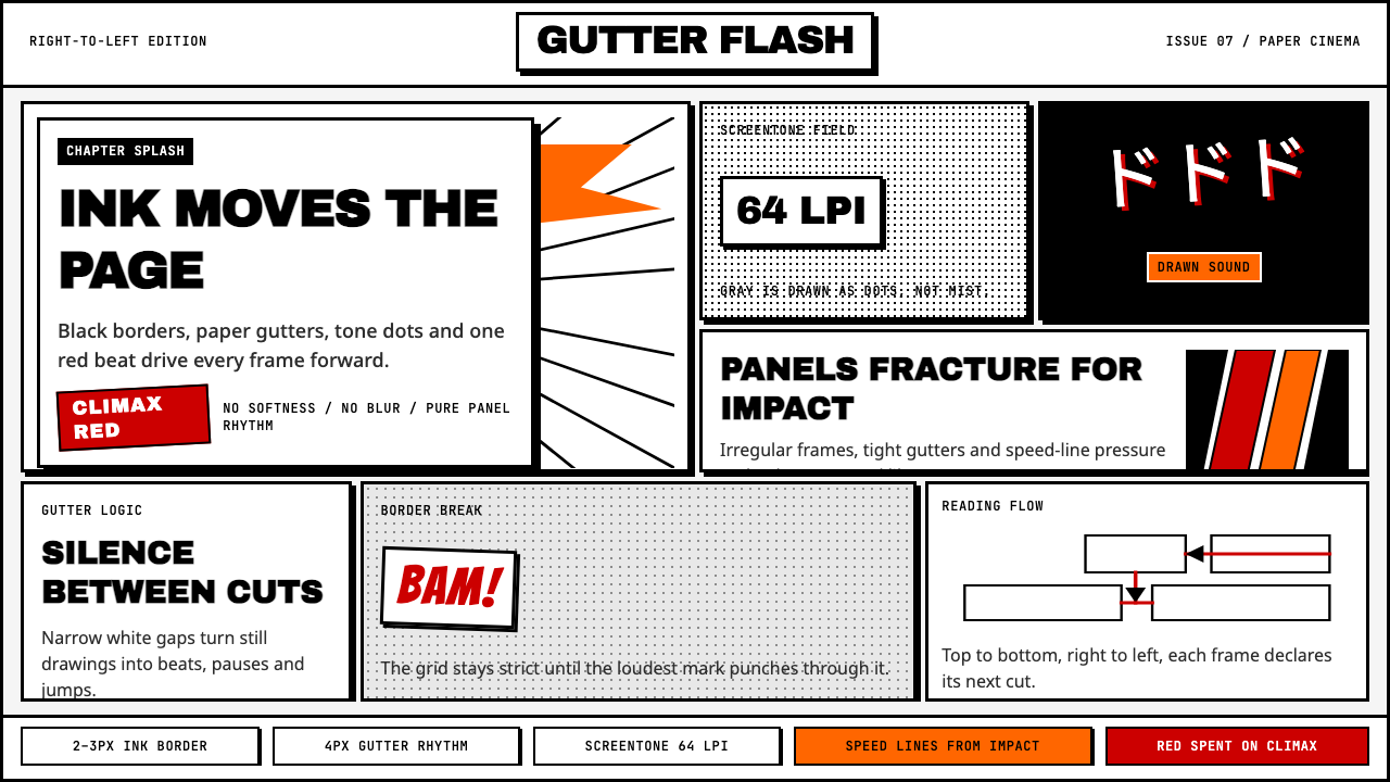 Manga Panel LayoutCinema in ink. Black panels, screentone dots, speed lines, and one red strike.
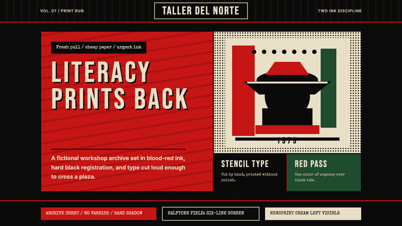 Nicaraguan Sandinista FSLN 1979Urgency in two inks. Blood red, jet black, halftone dots, and cut-stencil typ…
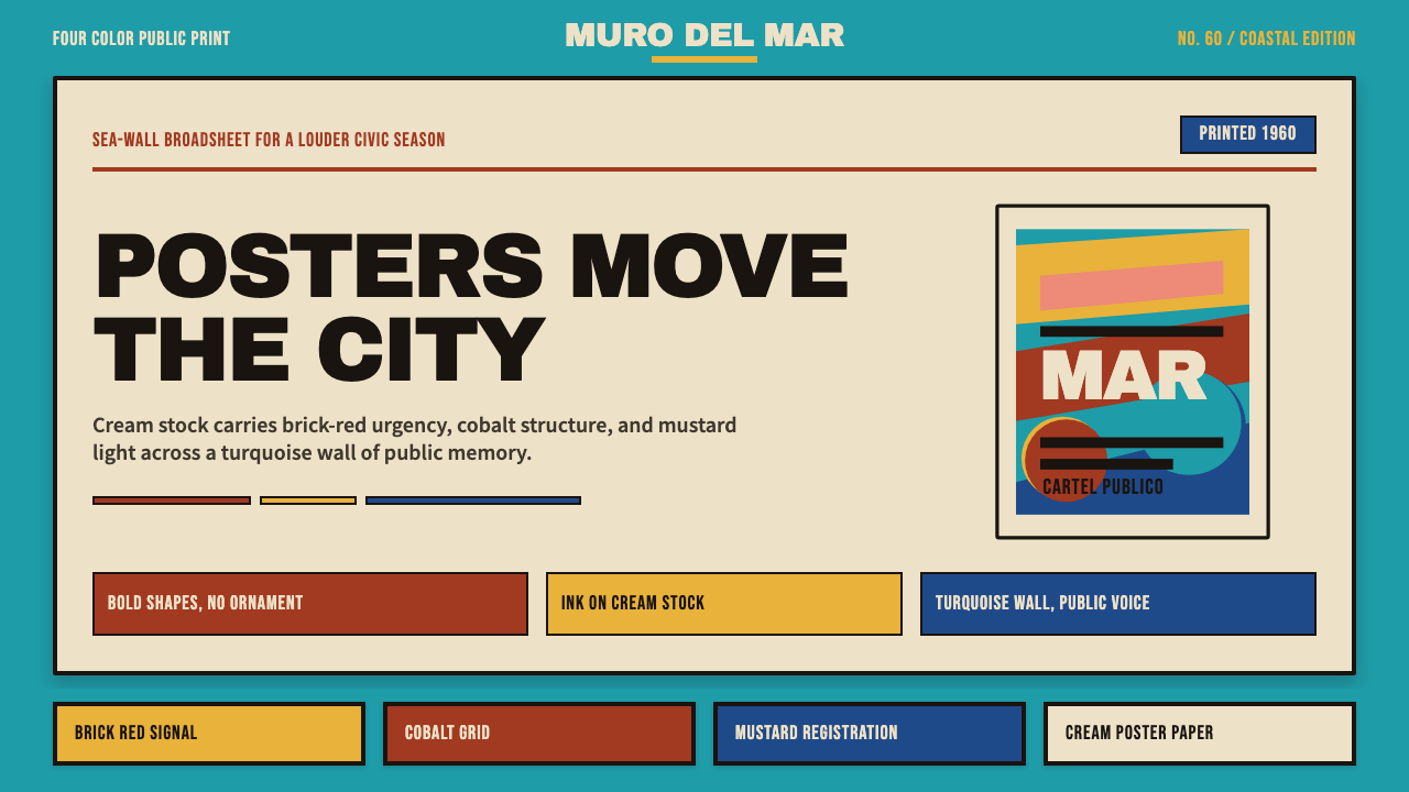 Cuban Malecón 1960 PosterPublic voice in flat ink. Turquoise wall, cream stock, brick red and cobalt b…
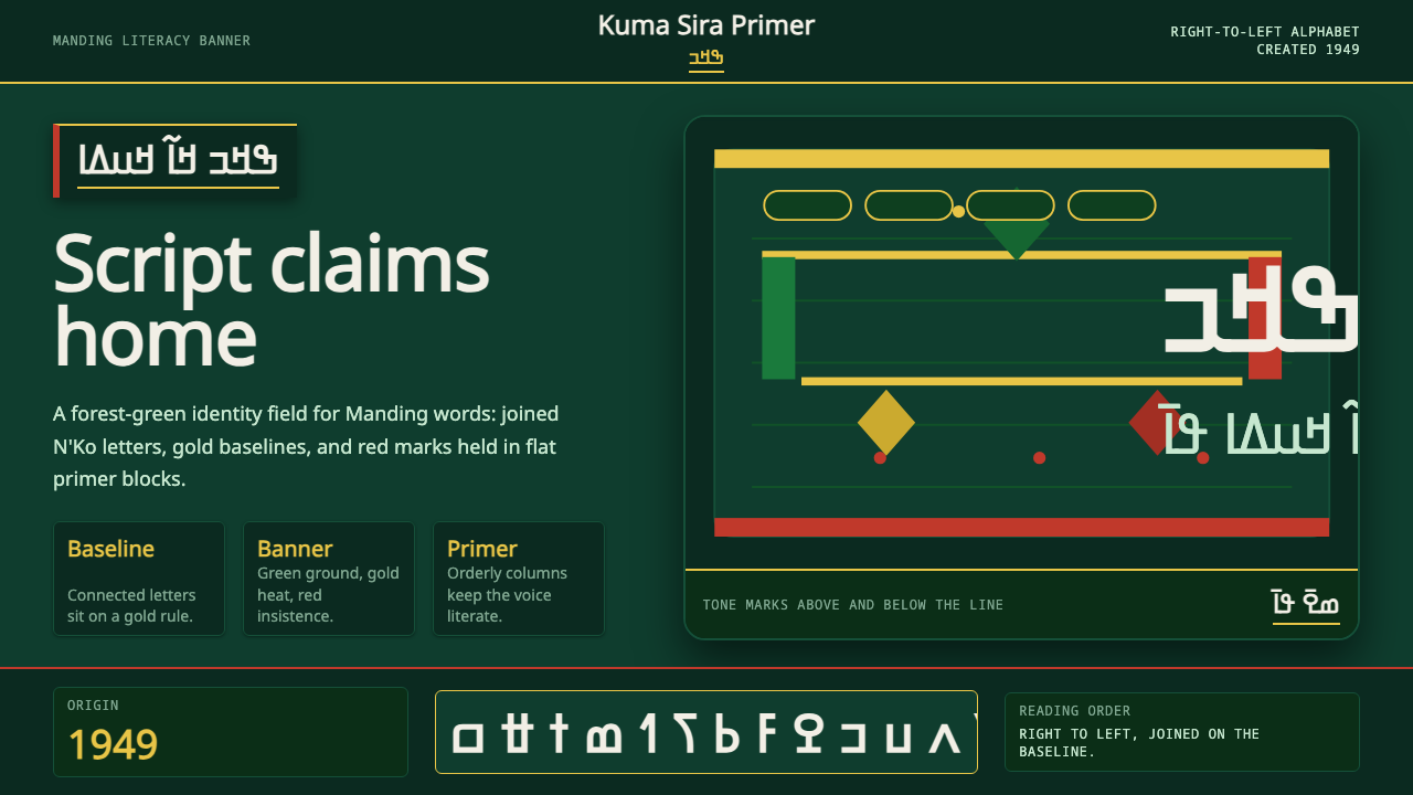 N'Ko ScriptIdentity writes itself. Forest green and gold baselines anchor joined N'Ko le…
 Paris MatchThe cover shouts in one red slab. Cream paper, serif headlines, and black rul…
 Rolling Stone MagazineCounterculture gets editorial weight. Cream paper, lipstick red script, serif…