What is Rolling Stone Magazine?什么是 Rolling Stone Magazine?
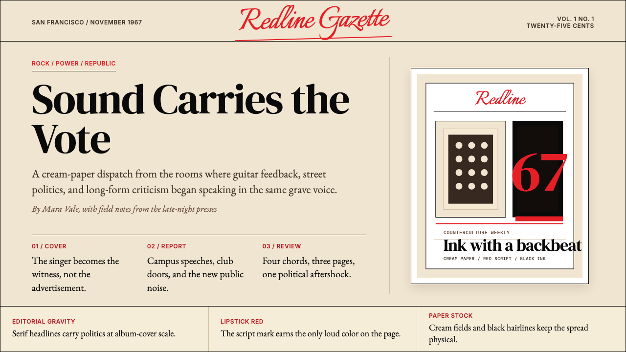
Born in a San Francisco loft in 1967, Rolling Stone turned counterculture into editorial weight — cream paper, lipstick-red script, and photographic portraiture that made rock music matter.1967 年诞生于旧金山阁楼的《滚石》,把反主流文化化作编辑的重量——奶油纸张、口红红手写体,以及让摇滚乐被认真对待的肖像摄影。
Rolling Stone Magazine in briefRolling Stone Magazine 速览
Rolling Stone Magazine style is the visual language of America's most influential rock-and-politics journal, distilled from its founding year of 1967 through its decades-long run: warm cream backgrounds evoking newsprint, a saturated lipstick-red wordmark rendered in fluid script, deep-black serif body type that carries the gravity of serious editorial, and photographic portraiture that fills the cover with unguarded, charismatic presence. It is counterculture given the authority of a broadsheet.《滚石》杂志风格是美国最具影响力的摇滚与政治刊物的视觉语言,从 1967 年创刊起一路沉淀:唤起新闻用纸的温暖奶油色底面、以流动手写体呈现的口红般饱和红色字标、承载严肃编辑分量的深黑衬线正文,以及把封面填满无防备、充满魅力的肖像摄影。这是反主流文化,但拥有大报的权威感。
What distinguishes this style from generic editorial pastiche is the specific tension it holds between heat and seriousness. The red wordmark is bold and sensuous — almost visceral — yet the body typography is composed, authoritative, and dense. The cream ground warms the whole system, softening what could otherwise feel combative into something that invites prolonged reading. This is not rock-poster energy; it is the energy of a journal that believed rock and politics and culture deserved the same analytical rigour as anything covered in the press.这种风格区别于一般编辑仿制品的,是它在热烈与严肃之间所维持的特定张力。红色字标大胆而感性——几乎带有官能的力度——然而正文排印却沉稳、权威、密集。奶油底色温暖了整个系统,把原本可能具有对抗性的东西柔化为邀请细读的氛围。这不是摇滚海报的能量;这是一份相信摇滚、政治与文化值得与新闻界其他任何议题同等分析严谨度的刊物的能量。
On screen, the style translates as: a warm off-white or cream background field, a lipstick-red accent reserved for headlines, wordmarks, or primary calls to action, black serif type for body content, and photographic imagery given generous proportions and treated as the visual center of gravity. Decorative ornament is minimal — the system relies instead on typographic contrast, the boldness of the red, and the warmth of the ground to create hierarchy and atmosphere.在屏幕上,这种风格呈现为:温暖的米白或奶油色背景底面;口红红色强调色专用于标题、字标或主要行动召唤;黑色衬线字体用于正文内容;摄影图像以慷慨的比例呈现,并被视为视觉重心所在。装饰性元素极少——系统依靠排印对比、红色的大胆感以及底色的温暖感来建立层级与氛围。
See the Rolling Stone Magazine design system查看 Rolling Stone Magazine 完整设计系统
Where does Rolling Stone Magazine come from?Rolling Stone Magazine 从何而来?
Rolling Stone was founded in November 1967 in a San Francisco loft by Jann Wenner, then twenty-one years old, and music critic Ralph J. Gleason. The timing was precise: the Summer of Love had just ended, Haight-Ashbury was in disarray, and the mainstream press still dismissed rock music as adolescent noise. Wenner and Gleason believed otherwise. Their founding editorial stated that they were not trying to be the music business's trade paper, nor a teenage magazine — they were a journal of rock and roll and the things and attitudes it represented. That ambition demanded a visual language to match.《滚石》由詹·温纳(Jann Wenner,时年二十一岁)与音乐评论家拉尔夫·格里森(Ralph J. Gleason)于 1967 年 11 月在旧金山一间阁楼里共同创办。时机精准:爱之夏刚刚落幕,海特-阿什伯里区一片混乱,主流媒体仍将摇滚乐视为青少年噪音而置之不理。温纳与格里森持不同看法。他们的创刊词声明,他们既不想做音乐产业的行业报,也不想做少年杂志——他们是一份关于摇滚乐及其所代表的事物与态度的刊物。这种抱负要求与之相称的视觉语言。
The original design drew directly from the broadsheet newspaper tradition rather than from glossy music magazines. The first issues were printed on newsprint in a broadsheet format, which partly reflected the founders' limited budget and partly expressed a deliberate editorial stance: this was journalism, not fan culture. The cream-toned newsprint, the dense serif typography, and the serious layout all signalled that the content inside should be read and argued over, not skimmed. The lipstick-red script wordmark — handlettered in a fluid, cursive style — provided the only concession to rock and roll flamboyance, and it became immediately iconic.最初的设计直接借鉴大报(broadsheet)的报纸传统,而非光鲜的音乐杂志。早期几期以新闻纸印刷、大报开本出版,这一方面反映了创办者有限的预算,一方面也表达了一种深思熟虑的编辑立场:这是新闻,不是粉丝文化。奶油色调的新闻纸、密集的衬线排版、严肃的版面设计,都在传达一个信号:里面的内容值得被阅读和争论,而非匆匆浏览。口红红色手写体字标——以流动草书风格手绘而成——提供了对摇滚浮华唯一的一点让步,并立刻成为标志性符号。
Annie Leibovitz joined the magazine in 1970 at age twenty and became chief photographer by 1973, and her influence on the visual identity of Rolling Stone cannot be overstated. Her cover portraiture — John Lennon curled naked around Yoko Ono, shot hours before his murder; Keith Richards in a hotel room at dawn; Mick Jagger loose and laughing — defined what a magazine cover could do. The photographs were intimate and psychologically revealing in ways that fashion photography was not. They gave the cream-and-red cover system its emotional power: the color and type created authority; Leibovitz's images created feeling.安妮·莱博维茨(Annie Leibovitz)1970 年以二十岁之龄加入杂志,1973 年成为首席摄影师。她对《滚石》视觉身份的影响怎么高估都不为过。她的封面肖像——约翰·列侬在遇害前数小时裸身蜷缩在小野洋子怀中;基思·理查兹在破晓时分的旅馆房间里;米克·贾格尔松弛而大笑——重新定义了杂志封面的可能性。这些照片的亲密感与心理穿透力远超时尚摄影所能触及的层次,赋予了奶油与红色封面系统以情感力量:色彩与字体制造权威;莱博维茨的影像制造感受。
Hunter S. Thompson's association with the magazine, beginning with his 1970 coverage of the Kentucky Derby and peaking with Fear and Loathing in Las Vegas serialized across two 1971 issues, introduced gonzo journalism as both a literary and a visual genre. Thompson's dispatches arrived as raw, first-person documents of barely controlled chaos, and the magazine's design adapted accordingly: sprawling text layouts, images that broke across spreads, a sense that the page itself was barely holding its contents together. This editorial fearlessness — in content and in form — became as much a part of the Rolling Stone visual identity as the wordmark or the paper stock.亨特·汤普森(Hunter S. Thompson)与杂志的联系始于 1970 年肯塔基赛马节的报道,并在《赌城风情画》(Fear and Loathing in Las Vegas)跨两期连载(1971 年)时达到顶峰,将「刚左新闻」(gonzo journalism)引入为一种文学与视觉的双重体裁。汤普森的报道以原始、第一人称的方式呈现几近失控的混乱,杂志的设计也随之调适:蔓延的文本版式、横跨跨页的图像、一种页面本身勉强维持内容不致溃散的张力感。这种编辑无畏——在内容上也在形式上——已与字标、纸张一起成为《滚石》视觉身份不可分割的组成部分。
What defines the Rolling Stone Magazine look?Rolling Stone Magazine 的视觉特征是什么?
Cream Ground奶油底色
The foundational color field is warm and off-white — reminiscent of aged newsprint or quality uncoated stock rather than sterile bright white. This warmth is not incidental. It softens the contrast of black type, reduces the visual aggression of the red wordmark, and signals analog editorial heritage. The cream ground is what separates the Rolling Stone aesthetic from cold modernist editorial design: the system feels printed, tactile, and time-stained in the best sense.基础色场温暖而非纯白——令人联想到陈年新闻用纸或优质非涂布纸,而非无菌的亮白。这种温度并非偶然。它柔化了黑色字体的对比度,减轻了红色字标的视觉攻击性,并传递出模拟编辑传统的气息。奶油底色正是将《滚石》美学与冷峻现代主义编辑设计区分开来的关键:这套系统有印刷感、触感,带着时间留下的最美意义上的痕迹。
Lipstick-Red Accent口红红强调色
The defining chromatic gesture is a saturated, warm red — neither orange-red nor blue-red but the specific hue of cosmetic lacquer, bold and slightly sensuous. It appears in the wordmark, in primary headlines, and in key navigational or structural markers. Its deployment is disciplined: used in full force at one or two moments per composition, it reads as a confident editorial voice. Diluted or scattered across a layout, it loses its authority and becomes mere decoration.最具决定性的色彩姿态是一种饱和的暖红——既非橙红也非蓝红,而是化妆品漆面特有的色调,大胆而略带感官气息。它出现在字标、主标题以及关键导航或结构标记中。其运用是克制的:在每个构图中以全力呈现于一到两个节点,读来是一种自信的编辑声音。若被稀释或分散于版面各处,它便失去权威,沦为纯粹的装饰。
Serif Authority衬线权威感
Body text and major headlines are set in serif type — a deliberate alignment with the broadsheet newspaper and literary journal traditions that Rolling Stone aspired to join. The serifs communicate seriousness and historical weight; they tell the reader that the content is meant to be read in full, not skimmed. Headline serifs are typically large, bold, and closely tracked; body serifs are set at a comfortable reading size with generous leading. The interplay between the serif gravity and the fluid red script wordmark creates the magazine's central visual tension.正文与主标题均使用衬线字体——这是对《滚石》渴望跻身其中的大报与文学期刊传统的刻意对齐。衬线传递严肃感与历史重量;它告诉读者,内容是供完整阅读而非浏览的。标题衬线通常大而粗重、字距紧凑;正文衬线则以舒适的阅读字号搭配充裕的行距排布。衬线的重力感与流动红色手写体字标之间的互动,构成了这份杂志的核心视觉张力。
Script Wordmark Energy手写体字标的能量
The flowing, handlettered wordmark is the single expressive release in an otherwise editorially restrained system. Its cursive looseness — the letters connecting and leaning as if written in one continuous gesture — introduces the spontaneity and physicality of rock and roll into a composition otherwise governed by journalistic convention. The script does not shout; it sings. Used sparingly as a signature element rather than a repeated motif, it anchors the identity without overwhelming the editorial content around it.流动的手绘字标是一套在其他方面受编辑克制支配的系统中唯一的表现性释放。其草书的松弛感——字母相连、倾斜,仿佛以一道连贯姿势写就——将摇滚的即兴性与肉身感引入了一个原本由新闻惯例支配的构图。手写体不是在呼喊;它在歌唱。作为签名式元素而非重复母题被节制使用,它锚定了身份认同,同时不凌驾于周围的编辑内容。
Photographic Portraiture肖像摄影
Imagery in this system is intimate, large-scale, and psychologically direct. Portraits dominate over landscapes or abstract imagery; the human face and body are given maximum visual real estate. Photographs are treated as primary editorial content rather than decorative fill — they are cropped to isolate psychological presence, not to flatten into graphic shapes. The color palette of the photographs tends to be rich and film-like: saturated but not processed, with the grain and warmth of analog photography rather than the hyper-precision of digital correction.这套系统中的图像亲密、大幅、心理上直接。肖像主导一切,压过风景或抽象图像;人脸与人体被赋予最大的视觉空间。照片被作为主要编辑内容而非装饰填充来处理——裁切是为了隔离心理存在感,而非压平为图形形状。照片的色调倾向于丰富而具有胶片质感:饱和但未被过度处理,带有模拟摄影的颗粒感与温度,而非数字修图的超精度。
Editorial Density编辑密度
Rolling Stone layouts are generous with text. Unlike contemporary digital editorial design, which often uses large white space as a luxury signal, the Rolling Stone tradition treats density as a mark of substance. Columns of body copy run long; headlines stack across multiple lines; pull quotes interrupt body text without apology. This density is not chaos — it is organized by a clear typographic hierarchy in which scale, weight, and color (especially the red) do the work of guidance.《滚石》的版面对文字慷慨。与当代数字编辑设计常将大面积留白作为高端信号不同,《滚石》传统视密度为内容分量的标志。正文栏落较长;标题可跨多行堆叠;摘引句打断正文而不作歉意。这种密度并非混乱——它由清晰的排印层级组织:字号大小、字重以及色彩(尤其是红色)共同承担引导功能。
Restrained Ornament克制的装饰
Despite its warmth and expressiveness, the Rolling Stone visual system uses very little decorative ornament. Ruled lines appear as section separators but are typically thin and unadorned. Drop caps, pull quotes, and typographic flourishes are used for functional editorial emphasis rather than visual enrichment. The restraint is what gives the red its power: in a system that indulges decoration freely, a saturated red accent becomes routine; in a system as disciplined as this one, it reads as a deliberate, authoritative gesture.尽管温暖而富于表现力,《滚石》的视觉系统极少使用装饰性元素。标线作为栏目分隔出现,但通常细而朴素。首字母放大、摘引句与字体花饰均用于功能性编辑强调,而非视觉丰富。正是这种克制赋予了红色以力量:在一个自由放纵装饰的系统中,饱和红色强调色不过是日常;在一个如此自律的系统中,它被读作刻意而权威的姿态。
See the Rolling Stone Magazine design system查看 Rolling Stone Magazine 完整设计系统
Who shaped Rolling Stone Magazine?谁塑造了 Rolling Stone Magazine?
Wenner co-founded Rolling Stone at twenty-one and served as its editor and publisher for fifty years. His editorial vision — that rock music and the culture surrounding it deserved the same analytical seriousness as politics or literature — determined both the content and the visual ambition of the magazine. The broadsheet format, the long-form writing, and the insistence on photographic quality were all expressions of his conviction that Rolling Stone was journalism, not fandom. His editorial decisions, from commissioning Annie Leibovitz to serializing Hunter Thompson, shaped a visual and intellectual identity that outlasted him at the masthead.温纳二十一岁共同创办《滚石》,担任编辑与出版人长达五十年。他的编辑愿景——摇滚乐及其周遭文化值得与政治或文学同等的分析严肃度——决定了杂志的内容与视觉抱负。大报开本、长篇写作、对摄影品质的坚持,都是他这一信念的表达:《滚石》是新闻,不是粉丝文化。他的编辑决策——从委托安妮·莱博维茨到连载亨特·汤普森——塑造了一种在他离开主编位置后仍然延续的视觉与智识身份。
Leibovitz joined Rolling Stone as a staff photographer in 1970 and became chief photographer in 1973, a position she held until 1983. Her covers defined the magazine's photographic identity for its most culturally formative period. She developed a style of portraiture that was intimate without being sentimental, psychologically penetrating without being cruel — achieved through extended time with subjects, unexpected locations, and an instinct for the unguarded moment. The visual grammar she established — generous scale, direct gaze, rich tonal range — became the template for editorial portraiture in the magazine era and remains the photographic reference point for the Rolling Stone visual system.莱博维茨 1970 年作为专职摄影师加入《滚石》,1973 年成为首席摄影师,这一职位她一直担任至 1983 年。她的封面定义了杂志在其文化形塑最关键时期的摄影身份。她发展出一种肖像风格:亲密而不煽情,心理穿透而不残酷——通过与拍摄对象的长时相处、意外的拍摄地点以及对无防备瞬间的直觉来实现。她所建立的视觉语法——慷慨的画幅、直视镜头的目光、丰富的影调层次——成为杂志时代编辑肖像摄影的模板,至今仍是《滚石》视觉系统的摄影参照点。
Thompson's contributions to Rolling Stone were as much visual events as literary ones. His gonzo journalism — first-person, subjective, formally chaotic — demanded page layouts that could accommodate unpredictable length, raw energy, and occasional illustration. The spreads designed around his work introduced a looser, more dynamic approach to the magazine's page architecture that balanced its otherwise disciplined editorial typesetting. His Fear and Loathing in Las Vegas, serialized in 1971 with Ralph Steadman's scratchy, aggressive illustrations, established that Rolling Stone would not sacrifice formal experimentation to visual tidiness.汤普森对《滚石》的贡献既是视觉事件,也是文学事件。他的刚左新闻——第一人称、主观、形式混乱——要求能够承载不可预测篇幅、原始能量和偶发插图的页面版式。围绕他的作品设计的跨页,为杂志页面架构引入了一种更松弛、更具动态感的方式,与其他方面克制的编辑排版形成平衡。他的《赌城风情画》1971 年连载,配有拉尔夫·斯特德曼(Ralph Steadman)粗粝而具攻击性的插图,确立了《滚石》不会为视觉整洁而牺牲形式实验的立场。
Gleason was a jazz and music critic of established reputation when he co-founded Rolling Stone with Wenner. His presence lent the new magazine immediate intellectual credibility with an older readership skeptical of rock journalism. More importantly, his insistence that popular music deserved serious critical attention — the same argument he had made for jazz — provided the editorial and ethical foundation for everything the magazine would become. His influence on the magazine's tone, if not its visual identity, cannot be separated from its early design choices: the broadsheet seriousness, the long reviews, the refusal to treat musicians as celebrities rather than artists.格里森是一位声望已建立的爵士与音乐评论家,与温纳共同创办了《滚石》。他的加入立即为这份新杂志在对摇滚新闻持怀疑态度的年长读者中赢得了智识可信度。更重要的是,他坚持认为流行音乐值得严肃的批评关注——这与他为爵士乐所作的论证相同——为杂志此后的一切提供了编辑与伦理基础。他对杂志语调(即便不是视觉身份)的影响,无法与杂志早期的设计选择分离:大报式的严肃性、长篇评论、拒绝将音乐人视为明星而非艺术家。
Steadman's illustrations for Hunter Thompson's gonzo dispatches in Rolling Stone introduced a visual counterpoint to the magazine's otherwise photographically driven identity. His ink-drenched, scratchy, deliberately ugly draftsmanship introduced raw expressionism into a layout system that was otherwise controlled and authoritative. The collaboration demonstrated that the Rolling Stone visual system was capacious enough to absorb formal contradiction — that the cream ground and red wordmark could coexist with illustration that was deliberately anti-beautiful — without losing its identity.斯特德曼为亨特·汤普森的刚左新闻报道所创作的插图,为杂志在其他方面以摄影为驱动的视觉身份引入了一种视觉对位。他那充满墨水、粗粝、刻意丑陋的手法,将原始表现主义引入了一套在其他方面受控而权威的版式系统。这次合作表明,《滚石》的视觉系统具有足够的包容性,可以吸收形式上的矛盾——奶油底色与红色字标可以与刻意反美学的插图共存——而不失去其身份认同。
How do you use Rolling Stone Magazine today?今天怎么用 Rolling Stone Magazine?
The Rolling Stone visual system transfers well to presentation slides, especially for editorial, cultural, music-industry, or brand-storytelling contexts where warmth and authority need to coexist. A cover slide built in this style anchors a large, intimate photograph — ideally a portrait — at full bleed or generous scale, with the presentation title set in large bold serif type in the upper third. The red accent appears in one place only: either the title itself or a horizontal rule below it. The cream ground is not pure white; allowing it to read as warm and slightly aged makes the whole composition feel intentional. Content slides follow a structured editorial layout: one or two columns of serif body text, section titles that step down through scale rather than color, and data panels that treat charts as editorial objects set within the same typographic system rather than visual appendages.《滚石》视觉系统在演示文稿中迁移效果良好,尤其适用于编辑、文化、音乐行业或品牌叙事语境——这些语境需要温暖感与权威感并存。以这种风格制作的封面幻灯片,将一张亲密的大幅照片——理想情况下是肖像——以全出血或慷慨比例锚定页面,演示标题以大号粗体衬线字排在上三分之一处。红色强调色只出现在一处:要么是标题本身,要么是标题下方的一条水平标线。奶油底色不是纯白;让它呈现出温暖而略带年代感的效果,会使整个构图显得刻意而为。内容幻灯片遵循结构性编辑版式:一到两栏衬线正文,通过字号大小而非颜色区分的章节标题,以及将图表作为编辑对象而非视觉附件纳入同一排印系统的数据面板。
For web interfaces and digital dashboards, the style suits platforms that want to communicate authority, intelligence, and depth without the coldness of purely modernist design. A pricing or feature page built in this tradition uses the cream or warm off-white as the page field, black serif for all descriptive copy, and the red as the single interactive highlight — hover states, selected tiers, primary buttons. Photography in hero sections should be treated as Rolling Stone covers: large, portrait-oriented where possible, not cropped to a decorative rectangle but given room to breathe as the page's main event. Navigation should be typographic and restrained, letting the wordmark or logotype carry the brand identity rather than iconographic decoration.对于网页界面与数字仪表板,这种风格适合希望传达权威、智识与深度而不带纯粹现代主义设计冷峻感的平台。以这一传统构建的定价或功能页面,以奶油或温暖米白作为页面底色,以黑色衬线字承担所有描述性文案,以红色作为唯一的交互高亮——悬停状态、选中等级、主要按钮。英雄区块中的摄影图像应被视为《滚石》封面来处理:大幅、尽量竖向构图,不被裁切为装饰性矩形,而是作为页面的主要事件获得充分呼吸的空间。导航应以字体为主、保持克制,让字标或标志承担品牌身份,而非图标式装饰。
In editorial and marketing contexts — magazine layouts, brand story documents, campaign landing pages — the style excels at building the impression that a brand has genuine history, intellectual seriousness, and cultural confidence. Long-form content is the natural territory: the system is built for sustained reading, not for rapid visual consumption. A marketing page in this mode structures its sections like editorial spreads — alternating cream-ground text sections with full-width photographs — and uses the red exclusively for calls to action and section-marking rules. Pull quotes in large serif type, set loose from the body column, provide visual rhythm without decorative ornament.在编辑与营销语境中——杂志版式、品牌故事文件、活动落地页——这种风格擅长建立一种印象:品牌拥有真实的历史、智识的严肃性与文化自信。长篇内容是其自然领域:这套系统为持续阅读而生,不是为快速视觉消费。以这种模式构建的营销页面,像编辑跨页一样组织其版块——奶油底色文字版块与全宽照片交替出现——并将红色专用于行动召唤与版块标记线。以大号衬线字排布、从正文栏松散脱离的摘引句,提供视觉节奏而无需装饰性元素。
The system is less suited to products or contexts where cheerfulness, playfulness, or visual lightness are primary values. The warmth of the cream ground is inviting, but the overall register is adult, serious, and slightly weighted. Consumer products aimed at broad demographic appeal, children's or family contexts, or fast-moving digital products that require aggressive visual hierarchy across many competing elements will find the Rolling Stone palette and typographic approach too restrained and too slow.这套系统不太适合愉悦感、趣味性或视觉轻盈感是核心价值的产品或语境。奶油底色的温暖是有邀请感的,但整体基调是成人的、严肃的、略带分量的。面向广泛受众的消费品、儿童或家庭语境,以及需要在众多竞争元素间建立强劲视觉层级的快节奏数字产品,会发现《滚石》的色调与排印方式过于克制、过于缓慢。
A common mistake when applying this style is confusing warmth with looseness. The Rolling Stone visual system is warm but not casual — it is an editorial system with strict hierarchy, and the red accent works precisely because it appears rarely and deliberately. Using the red liberally across many interface elements, or substituting playful display typefaces for the authoritative serif, dismantles the system's logic. Similarly, substituting a bright clean white for the cream ground cools the system significantly, moving it toward generic editorial modernism and away from the analog heritage that gives Rolling Stone its particular emotional register.应用这种风格时最常见的错误,是将温暖感与随意感混淆。《滚石》视觉系统是温暖的,但不是随意的——它是一套有严格层级的编辑系统,红色强调色之所以有效,恰恰因为它出现得稀少而刻意。在众多界面元素中大量使用红色,或以活泼的展示字体替代权威的衬线字体,都会瓦解系统的逻辑。同样,以明亮干净的白色替代奶油底色,会显著冷却整个系统,使其向通用编辑现代主义靠拢,远离赋予《滚石》特定情感质地的模拟媒介传统。
See the Rolling Stone Magazine design system查看 Rolling Stone Magazine 完整设计系统
Rolling Stone Magazine — FAQRolling Stone Magazine · 常见问题
What makes the Rolling Stone style different from generic editorial design?《滚石》风格与一般编辑设计有何不同?
The distinguishing factor is the specific combination of warmth and authority. Generic editorial design tends to choose one or the other: modernist editorial is cool and authoritative; lifestyle editorial is warm and casual. Rolling Stone holds both at once — the cream ground and flowing script introduce warmth, while the dense serif type and serious photographic portraiture introduce authority. This tension is not a compromise; it is the system's defining characteristic, and it reflects the magazine's original conviction that counterculture deserved the same analytical weight as any establishment institution.区分性因素在于温暖感与权威感的特定组合。一般编辑设计倾向于二选一:现代主义编辑冷峻而权威;生活方式编辑温暖而随意。《滚石》同时持有两者——奶油底色与流动手写体引入温暖,而密集衬线字与严肃肖像摄影引入权威。这种张力不是妥协;它是系统的决定性特征,并反映了杂志最初的信念:反主流文化值得与任何建制机构同等的分析分量。
Can this style work for technology or software products?这种风格适用于科技或软件产品吗?
It works for technology products that want to communicate depth, intelligence, and a point of view rather than neutral utility. Editorial tools, research platforms, long-form content applications, music or culture industry software, and any product positioning itself as thoughtful rather than fast would benefit from the system's warmth and typographic authority. It is less suited to software products that need to emphasize speed, efficiency, and frictionless interaction, where the serif density and cream warmth would read as slow and heavy rather than authoritative.它适用于希望传达深度、智识与独到观点而非中性实用性的科技产品。编辑工具、研究平台、长篇内容应用、音乐或文化行业软件,以及任何将自身定位为深思熟虑而非追求速度的产品,都能从这套系统的温暖感与排印权威中受益。它不太适合需要强调速度、效率与无摩擦交互的软件产品,在这些场景中,衬线字的密度与奶油色的温度会被读作迟缓与笨重,而非权威。
How should photography be selected and treated to fit this style?应如何选择和处理摄影图像以契合这种风格?
Photographs should be selected for psychological presence rather than compositional tidiness. A slightly imperfect, emotionally direct image will almost always serve the system better than a highly produced, art-directed photograph that prioritizes visual perfection. The preferred treatment is minimal: print-like tonal richness, authentic grain or texture rather than digital smoothness, and cropping that isolates the subject's presence rather than flattening them into a design element. Black-and-white treatment is highly compatible with the system, as it allows photographs to participate in the cream-and-black typographic field without color competition.照片应以心理存在感而非构图整洁感为选择标准。一张略有瑕疵、情感上直接的图像,几乎总是比一张高度制作、精心导演、优先追求视觉完美的照片更能服务于这套系统。首选处理方式是最小干预:印刷质感般的影调丰富性、真实的颗粒感或质感(而非数字平滑),以及将主体存在感隔离而非压平为设计元素的裁切方式。黑白处理与这套系统高度兼容,因为它让照片在奶油色与黑色的排印底场中参与其中,而不产生色彩竞争。
Is the Rolling Stone style appropriate for dark-mode interfaces?《滚石》风格适合深色模式界面吗?
The canonical Rolling Stone palette is light-ground — cream and off-white are essential to the system's warmth, and the style is not primarily designed for dark inversion. A dark-mode adaptation is possible but requires compromise: a very deep warm charcoal or near-black replaces the cream ground, the red accent remains but may need to be slightly more orange to maintain vibrancy against a dark field, and the serif type becomes cream or near-white. The challenge is that much of the system's warmth comes from the cream ground itself; on a dark field, the warmth must be carried entirely by color temperature of the red and the slight warmth of the background rather than the ground's intrinsic lightness.《滚石》的经典色调以浅色底面为主——奶油色与米白是系统温暖感的基础,这种风格并非主要为深色反转而设计。深色模式改编是可能的,但需要妥协:以非常深的暖炭灰或接近黑色的颜色替代奶油底色,红色强调色保留但可能需要略偏橙以在深色底场上维持活力,衬线字体变为奶油色或近白色。挑战在于:系统的大部分温暖感来自奶油底色本身;在深色底场上,温暖感必须完全由红色的色温与背景的轻微暖意承载,而非依靠底色固有的明度。
How does this style relate to other editorial styles like New Yorker or Vogue?这种风格与《纽约客》或《Vogue》等其他编辑风格有何关系?
All three are editorial systems built around strong typographic identity and authoritative photographic culture, but they serve different emotional registers. The New Yorker is cooler, more literary, and more restrained in photographic scale — illustration and text dominate over photography. Vogue is warmer and more sensuous, but its warmth comes from luxury and glamour rather than analog texture; its photography is art-directed and idealized rather than intimate and psychologically revealing. Rolling Stone occupies the middle ground — warmer and more physical than the New Yorker, less aspirationally glamorous than Vogue, and more politically and culturally engaged than either. The cream ground and red script are specific to its particular fusion of credibility and heat.三者都是建立在强烈排印身份与权威摄影文化基础上的编辑系统,但服务于不同的情感基调。《纽约客》更冷峻、更文学性,在摄影比例上更为克制——插图与文字压过摄影。《Vogue》更温暖、更感官,但其温暖来自奢华与魅力,而非模拟质感;其摄影经过精心导演、追求理想化,而非亲密与心理揭示。《滚石》占据中间地带——比《纽约客》更温暖、更具肉身感,比《Vogue》更少对奢华魅力的渴望,比两者都有更强的政治与文化介入感。奶油底色与红色手写体是其特定的可信度与热度融合的专属表达。
Related design styles相关设计风格
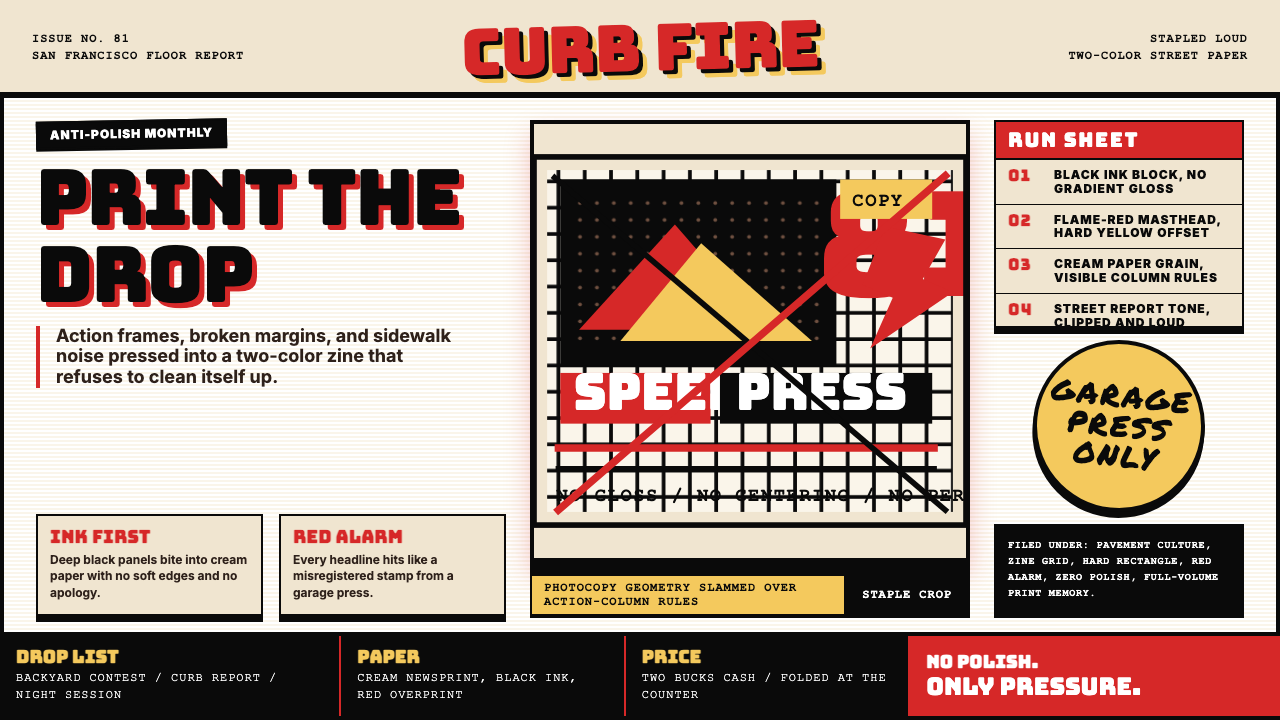 Thrasher Skate Zine (1981)Loud without polish. Flame red type, black ink blocks, and cream zine grids h…粗粝而响亮:火焰红大字、黑墨块与米色小报网格重击页面。
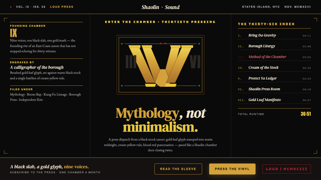 Wu-Tang Clan — 36 ChambersMythology, not minimalism. Gold-leaf glyph on matte black, cream-yellow rule,…神话感而非极简:纯黑底色压上金箔字徽,奶油黄细线,血红点睛,少林功夫片的重量。
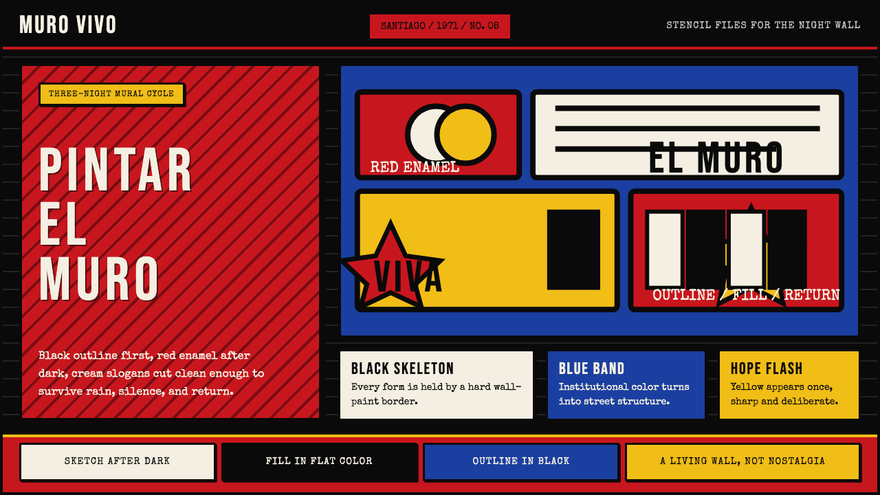 Chilean BRP Ramona Parra 1971Resistance stays alive. Blood red panels, black outlines, and stencil type re…抵抗仍在呼吸:血红墙面、粗黑轮廓与模板字重建街墙。
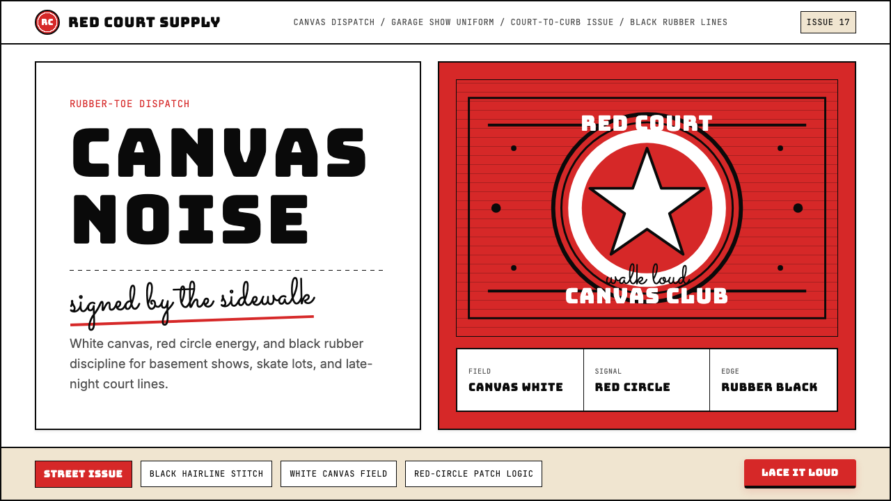 Converse Chuck TaylorPopulist and loud. Saturated red circles, Bungee type, black stitch lines on…平民而响亮:饱和红圆、Bungee 粗字、白帆布上的黑色缝线。
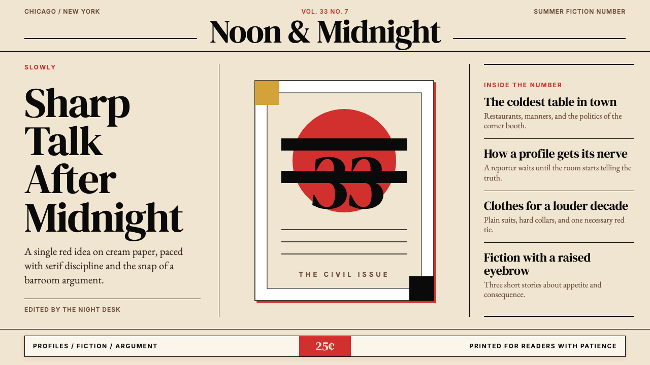 Esquire MagazineConceptual punch on paper. Cream stock, black hairlines, and one saturated re…纸上的观念重拳。米色纸、黑细线与一记饱和红。
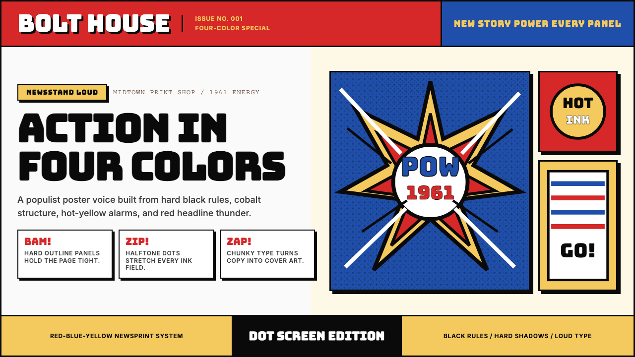 Marvel Comics (Kirby Era)Populist color hits hard. Red-blue-yellow panels, black rules, and halftone d…大众色彩直击眼球。红蓝黄画格、黑墨线与半调网点。