What is Marvel Comics (Kirby Era)?什么是 Marvel Comics (Kirby Era)?
Jack Kirby's Silver Age Marvel turned four-color newsprint into a kinetic mythology — saturated primaries, explosive action lines, and a thunder-god boldness that redefined what American popular imagery could be.杰克·科比的漫威白银时代将四色新闻纸变成了动能神话——饱和三原色、爆炸般的动势线条,以及一种重新定义了美式大众视觉边界的雷神式张力。
Marvel Comics (Kirby Era) in briefMarvel Comics (Kirby Era) 速览
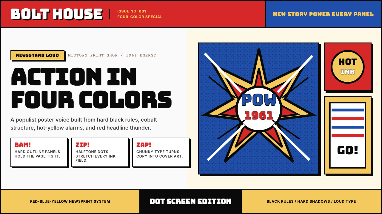
Marvel Comics' Kirby Era aesthetic is the visual grammar of the American Silver Age superhero — a bold, populist design system born in the early 1960s from the collision of limited four-color printing, deadline-driven storytelling, and Jack Kirby's irrepressible graphic instinct. The palette is built on saturated primary red, cobalt blue, and luminous yellow laid onto white newsprint, mediated through the dot-screen halftone process that gave every color a characteristic grain and warmth. Black ink defines everything: panel borders, figure outlines, and the heavy display lettering that headlines each cover.漫威科比时代的视觉美学,是美式白银时代超级英雄的视觉语法——一套大胆、平民化的设计系统,诞生于1960年代初四色印刷的局限、截稿期压力与杰克·科比无可抑制的图形本能的碰撞之中。调色板建立在饱和的三原色之上:红色、钴蓝与明亮黄铺设于白色新闻纸面,经由网点半调印刷工艺的处理,每种色彩都带有独特的颗粒感与温度。黑色墨水定义了一切:画格边框、人物轮廓,以及每张封面顶端那醒目的展示字体标题。
What distinguishes Kirby-era Marvel from other comic styles of the period is its sense of kinetic force. Action lines radiate from points of impact, figures are caught mid-leap at the peak of exertion, and panel compositions are rarely static — they angle, they tilt, they burst outward at the reader. The design language communicates urgency before a single word is read. This energy is not accidental; it is a formal system, one in which diagonal composition, compressed panel grids, and the contrast between dense ink and open white space all work together to create forward momentum.将科比时代漫威与同期其他漫画风格区别开来的,是它的动势感。动作线条从冲击点向外放射,人物被定格于奋力一跃的顶点,画格构图几乎从不静止——它们倾斜、旋转、朝读者猛然爆开。这套设计语言在读到任何文字之前就已传递出紧迫感。这种能量并非偶然;它是一套正式的系统,其中对角线构图、压缩的画格网格,以及浓重墨色与开阔白色空间之间的对比,共同创造出向前冲进的动势。
The style is also defined by what it does not do: it does not soften, it does not whisper, it does not recede. Marvel red blazes across the top of every cover as a wordmark; characters in crisis are rendered with maximum expression; color never fades to a tint to create mood. Everything operates at full saturation, full volume, full presence. It is a design system made for the newsstand, for split-second attention, for readers who might flip past thirty competing covers before stopping on the one that reaches out and grabs them.这种风格同样由它不做的事来定义:它不柔化,不低语,不退缩。漫威红以报头的形式横扫每张封面顶端;处于危机中的角色以最大的表情力度被描绘;色彩从不褪成淡调来制造氛围。一切都以满饱和度、满音量、满存在感运作。这是一套为报摊、为一瞬间的注意力、为那些可能在三十张竞争封面间翻过又翻、直到遇见那张伸手抓住他们的封面的读者而生的设计系统。
See the Marvel Comics (Kirby Era) design system查看 Marvel Comics (Kirby Era) 完整设计系统
Where does Marvel Comics (Kirby Era) come from?Marvel Comics (Kirby Era) 从何而来?
The story begins not with a rebrand brief but with a publishing crisis. By the late 1950s, the company then operating as Timely Comics — later Atlas — was on the verge of collapse. Its distributor had failed, and publisher Martin Goodman had slashed the line to a skeleton crew. Into this precarious situation stepped editor and writer Stan Lee, who in 1961 was given loose instructions to try something new. Lee partnered with Jack Kirby, an industry veteran who had already co-created Captain America two decades earlier, and together they produced Fantastic Four #1 — the first issue of the Marvel Age. The visual idiom they established in those pages would define a decade.故事的起点不是一次品牌重塑,而是一场出版危机。1950年代末,时代漫画公司——后改名为阿特拉斯——濒临崩溃。其发行商倒闭,出版人马丁·古德曼将整个系列削减至最低限度。编辑兼作家斯坦·李在这种岌岌可危的局面下被给予了一个宽泛的指令:尝试一些新东西。李与行业老将杰克·科比搭档——科比二十年前已联合创作了美国队长——两人共同完成了《神奇四侠》第一期,漫威时代正式开幕。他们在那些页面上确立的视觉语汇,将定义此后整整十年。
Jack Kirby's graphic sensibility had been shaped by years of working within the hard constraints of newsprint production. He understood, intuitively, that colors printed through a dot-screen on cheap paper would shift and muddy if not handled with directness — so he designed for clarity at the limit. His figures are massive and simplified, their musculature exaggerated to read as shape before it reads as anatomy. His panel compositions favor diagonal force lines, explosive negative-space bursts, and sharp geometric contrast between light areas and areas of dense black ink. The 'Kirby Krackle' — clusters of black dots suggesting cosmic energy or raw power — emerged as his signature visual device, a shorthand for forces too large for conventional rendering.杰克·科比的图形感性,是在新闻纸印刷的严格限制下历练多年而成的。他凭直觉理解:通过网点在廉价纸张上印刷的色彩,若不以直接的方式处理,就会发生偏移和混浊——于是他在极限条件下为清晰而设计。他笔下的人物庞大而简化,肌肉组织被夸张到首先作为形状、其次才作为解剖结构来阅读。他的画格构图偏爱对角线力线、爆炸式负空间爆裂,以及明亮区域与浓重黑色墨水区域之间的锐利几何对比。「科比克拉克尔」——成簇的黑色圆点,暗示宇宙能量或原始力量——作为他的标志性视觉装置出现,是一种对于大得无法用常规方式描绘的力量的简写。
Stan Lee's contribution to the system was tonal and typographic as much as narrative. His voice — exclamatory, inclusive, self-aware — set the register for the cover lettering and caption boxes that frame every image. Marvel's display lettering is bold and rounded, a comic-book tradition that Lee and letterer Artie Simek pushed to maximal impact: words like 'DOOM' or 'MARVEL' fill their allotted space completely, leaving no visual slack. The Marvel wordmark itself — red, all-caps, heavy — became an anchor element on every cover, a branding decision that made the entire line instantly recognizable across a cluttered newsstand.斯坦·李对这套系统的贡献,与其说是叙事层面的,不如说是语调与排版层面的。他那充满惊叹号、包容性强、带有自我意识的声音,为框定每幅图像的封面字体与说明框设定了基调。漫威的展示字体粗壮而圆润,这是漫画书的传统,被李与字体排版师阿蒂·西梅克推向了最大的视觉冲击力:如「DOOM」或「MARVEL」这样的词汇完全填满其分配的空间,不留任何视觉松弛。漫威商标本身——红色、全大写、厚重——成为每张封面的锚定元素,这一品牌决策使整条产品线在拥挤的报摊上即刻可辨。
The Silver Age coincided with the full maturation of the CMYK offset printing process for mass-market comic books. Colorists working within a restricted palette of flat tones — the Ben-Day dot system allowed only a limited number of hue and value combinations — developed instinctive strategies for making those constraints produce drama rather than limitation. Sky blue behind a red figure on a yellow ground creates a primary triad of maximum simultaneous contrast. These are not accidental color decisions; they are the accumulated craft knowledge of an industry that had spent three decades learning how to make cheap printing look spectacular.白银时代恰好与大众市场漫画书CMYK胶版印刷工艺的全面成熟同步发生。在平调色的有限调色板中工作的着色师——本-戴网点系统仅允许有限数量的色调和明度组合——发展出了将这些限制转化为戏剧性而非局限性的直觉策略。黄色底面上,一个红色人物身后的天蓝色天空,创造出最大同时对比度的三原色组合。这些不是偶然的色彩决定;它们是一个在三十年间学习如何让廉价印刷看起来壮观的行业所积累的工艺知识。
The Kirby Era's influence radiated far beyond comics. By the late 1960s, its visual language had been absorbed by underground poster art, record cover design, and the broader vernacular of American popular culture. When Marvel Studios began adapting the characters into film in the 2000s, design teams reached back to the Silver Age aesthetic as a touchstone for marketing materials, title sequences, and visual identity — ensuring that a graphic system born in a Manhattan editorial office in 1961 remained legible and potent more than six decades later.科比时代的影响辐射远超漫画领域。1960年代末,其视觉语言已被地下海报艺术、唱片封面设计,以及更广泛的美国大众文化俗语所吸收。当漫威影业从2000年代开始将这些角色改编为电影时,设计团队回溯白银时代美学,将其作为营销材料、片头序列与视觉识别的基准——确保了一套诞生于1961年曼哈顿某个编辑室的图形系统,在六十余年后依然清晰可辨、充满力量。
What defines the Marvel Comics (Kirby Era) look?Marvel Comics (Kirby Era) 的视觉特征是什么?
Saturated Primary Palette饱和三原色调色板
The Kirby Era palette is built entirely on the primary triad — red, blue, and yellow — deployed at full saturation with no softening to pastels or mid-tones. White newsprint serves as the fourth element, providing breathing room and allowing colors to operate at maximum intensity against each other. Black is not a neutral but an active structural color, used for heavy outlines, panel borders, and areas of deep shadow that anchor the composition. The effect is one of simultaneous contrast: the eye is continuously activated by colors fighting for dominance, which reads as energy and urgency.科比时代的调色板完全建立在三原色——红、蓝、黄——之上,以满饱和度部署,不向柔和色或中间调妥协。白色新闻纸作为第四元素,提供呼吸空间,使各色彩以最大强度相互对抗。黑色不是中性色,而是一种主动的结构性色彩,用于粗重的轮廓线、画格边框,以及锚定构图的深影区域。效果是一种同时对比:眼睛被争夺主导权的色彩持续激活,这被读解为能量与紧迫感。
Halftone Dot Texture半调网点纹理
Every color area in Silver Age Marvel printing is composed of a pattern of small dots rather than a solid fill — the artifact of the Ben-Day halftone process used in mass-market newsprint production. This dot screen gives flesh tones their warm grain, skies their vibrating quality, and shadows their atmospheric depth. Applied deliberately as a design element today, the halftone pattern signals an era, a production method, and a particular kind of democratic, low-cost beauty. It is the visual equivalent of vinyl crackle — an imperfection that became a character.白银时代漫威印刷中的每个色彩区域,都由细小圆点的图案而非实心填充构成——这是大众市场新闻纸生产中使用的本-戴网点工艺的产物。这种网点网版赋予了肤色温暖的颗粒感、天空震颤般的质感,以及阴影大气般的深度。今天作为设计元素有意运用时,半调图案传递出一个时代、一种生产方式,以及一种特定的民主化、低成本之美。它是视觉上的黑胶唱片噪声——一种变成了个性的不完美。
Kinetic Composition and Action Lines动势构图与动作线条
Kirby-era layouts reject the static rectangle. Figures burst through panel borders, compositions tilt at dramatic angles, and radial action lines emanate from points of impact to communicate speed, force, and explosion. The 'Kirby Krackle' — dense clusters of irregularly sized black dots — represents energy fields, cosmic power, or raw impact in a way that photorealistic rendering could never achieve. Even typography participates in the kinetics: sound-effect lettering ('KRAKOOM', 'THOOM') is treated as an illustration element, warping and scaling to match the energy of the action it describes.科比时代的版面拒绝静止的矩形。人物冲破画格边框,构图以戏剧性角度倾斜,放射状动作线条从冲击点向外延伸,传递速度、力量与爆炸感。「科比克拉克尔」——大小不一的黑色圆点密集成簇——以写实渲染永远无法企及的方式呈现能量场、宇宙力量或原始冲击。即使是排版也参与到动势之中:音效字体(「KRAKOOM」、「THOOM」)被当作插图元素处理,变形与缩放以匹配所描绘动作的能量。
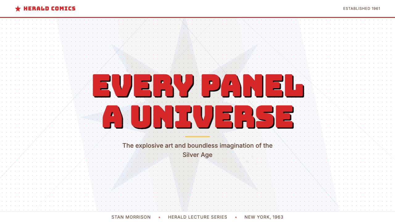
Heavy Display Lettering粗重展示字体
The lettering tradition of Silver Age Marvel is characterized by thick-stroked, rounded sans-serif capital letters that fill their space completely. Cover headlines leave no visual slack; the title of a story or the name of a character is set as large as legibility permits, then larger still. Caption boxes and speech balloons use a slightly lighter weight but maintain the same rounded, hand-crafted character. The Marvel wordmark — blocky, red, all-caps — appears as an indelible anchor at the top of every cover, establishing brand identity before any other visual element registers.白银时代漫威的字体排版传统,以笔画粗重、字形圆润的无衬线大写字母为特征,完全填满其所分配的空间。封面标题不留视觉松弛;故事标题或角色名称尽可能大地排设,然后再大一些。说明框与对话气泡使用稍轻一些的字重,但保持同样圆润、手工感的风格。漫威商标——方块状、红色、全大写——以永久锚点的形式出现在每张封面顶端,在任何其他视觉元素被注意到之前就确立了品牌识别。
Exaggerated Heroic Figure夸张的英雄人物造型
Human and superhuman figures in the Kirby tradition are anatomically exaggerated toward clarity and expressiveness rather than realism. Musculature reads as simplified geometric mass — a shoulder is a sphere, a forearm a cylinder, a fist a compact block. Poses are chosen for maximum symbolic legibility: the triumphant figure stands wide, the villain looms large and dark, the crowd cowers small. These are ideographic gestures, readable at reduced scale on a rotating newsstand rack, that carry the narrative argument of an entire issue in a single frozen image.科比传统中的人类与超人形象,在解剖上被朝着清晰与表现力而非写实主义的方向夸张。肌肉组织作为简化的几何体量来阅读——肩膀是一个球体,前臂是一个圆柱,拳头是一个紧实的方块。姿势的选择以最大限度的象征可读性为准:胜利者昂首阔立,反派高大而阴暗,人群渺小颤栗。这些是表意性的姿态,在旋转报摊架上缩小后依然可读,在一幅凝固的图像中承载着整期漫画的叙事论点。
Panel Grid as Narrative Engine作为叙事引擎的画格网格
The panel grid in Silver Age Marvel is not merely a container for images — it is a timing device and a pacing mechanism. Pages typically organize into four to six panels with clear left-to-right, top-to-bottom reading order, but Kirby frequently broke this convention with splash pages, half-page compositions, and panels that bleed into each other at climactic moments. The grid compresses time: a rapid sequence of small panels accelerates pace, while a single large image arrests it. The interplay between gridded regularity and deliberate breaks from the grid is where much of the style's dramatic energy lives.白银时代漫威中的画格网格,不仅仅是图像的容器——它是一种时序装置和节奏机制。页面通常组织为四到六个画格,具有清晰的从左到右、从上到下的阅读顺序;但科比频繁以整版大图、半页构图,以及在高潮时刻相互渗透的画格打破这一惯例。网格压缩时间:快速序列的小画格加速节奏,而单一的大图像则将其凝止。网格规律性与对网格刻意突破之间的张力,正是这种风格大部分戏剧性能量的栖居之处。
Populist Boldness平民化的大胆
The Kirby Era aesthetic is constitutively anti-precious. It does not whisper refinement or suggest taste through restraint — it announces itself. The design language was optimized for readers who might encounter it in a spinning rack at a corner store, in a barbershop waiting area, or being passed among children on a school bus. Every visual decision — the screaming red, the oversized type, the maximum-contrast color blocking — is calibrated for a democratic, distracted, mass audience. This is not a limitation of the style; it is the source of its power and its enduring legibility.科比时代的美学从根本上反对矜贵。它不低语修养,不以克制暗示品味——它自我宣告。这套设计语言被优化为服务于那些可能在街角商店的旋转架、理发店候座区,或在校车上孩子们之间传阅时遇见它的读者。每一个视觉决定——呐喊的红色、超大号字体、最大对比度的色块——都被校准为面向民主化的、分心的、大众化的受众。这不是这种风格的局限;它是其力量与持久可读性的来源。
See the Marvel Comics (Kirby Era) design system查看 Marvel Comics (Kirby Era) 完整设计系统
Who shaped Marvel Comics (Kirby Era)?谁塑造了 Marvel Comics (Kirby Era)?
Jack Kirby is the central visual architect of the Marvel Silver Age. Born Jacob Kurtzberg in New York in 1917, he co-created Captain America for Timely Comics in 1941 before producing the foundational Marvel output of the 1960s alongside Stan Lee: Fantastic Four, Thor, the Avengers, the X-Men, and Black Panther, among many others. His visual innovations — the Kirby Krackle, explosive panel compositions, the massive simplified figure style — became the visual standard for the American superhero genre. His later work at DC Comics produced the Fourth World mythology, which extended his cosmic visual language into entirely new territory. Kirby remains the single most influential draftsman in the history of superhero comics.杰克·科比是漫威白银时代的核心视觉设计师。本名雅各布·库尔茨伯格,1917年生于纽约。他在1941年为时代漫画联合创作了美国队长,此后在1960年代与斯坦·李共同创作了漫威最重要的系列:神奇四侠、雷神、复仇者联盟、X战警、黑豹等。他的视觉创新——科比克拉克尔、爆炸式画格构图、庞大简化的人物风格——成为美式超级英雄类型的视觉标准。他后来在DC漫画创作的「第四世界」神话,将其宇宙视觉语言延伸至全新的领域。科比至今仍是超级英雄漫画史上影响力最大的绘图师。
Stan Lee's contribution to the Kirby Era Marvel aesthetic was as much tonal and typographic as it was narrative. As editor and writer, he developed the Marvel voice — exclamatory, self-referential, inclusive, always in direct address to the reader — that shaped everything from cover headline lettering to caption box prose. His editorial instinct for maximum impact calibrated the size and weight of display type, the density of cover copy, and the balance between image and text. The 'Stan Lee Presents' box, the hyperbolic cover blurbs, and the letters pages he wrote and curated were as much part of the visual system as Kirby's linework.斯坦·李对科比时代漫威美学的贡献,在语调与排版层面与叙事层面同等重要。作为编辑兼作家,他发展出了漫威的声音——充满惊叹号、自我指涉、包容性强、始终与读者直接对话——这塑造了从封面标题字体到说明框文字的一切。他对最大视觉冲击力的编辑本能,校准了展示字体的大小与字重、封面文字的密度,以及图像与文字之间的平衡。「斯坦·李出品」方框、夸张的封面宣传语,以及他撰写和编辑的读者来信页面,与科比的线条一样,都是这套视觉系统的组成部分。
Steve Ditko co-created Spider-Man and Doctor Strange with Stan Lee, contributing a visual approach that complemented and contrasted with Kirby's heroic monumentalism. Where Kirby's figures were massive and simplified, Ditko's were more angular, neurotic, and expressionistically distorted — particularly in the hallucinatory Doctor Strange sequences, where reality itself warped into impossible geometries. Ditko's work expanded the Marvel visual vocabulary beyond the pure action idiom into psychological and surreal territory, demonstrating that the four-color system was capable of more registers than pure kinetic energy.史蒂夫·迪特科与斯坦·李联合创作了蜘蛛侠和奇异博士,贡献了一种与科比的英雄纪念碑式风格相辅相成又形成对照的视觉方式。科比的人物庞大而简化,迪特科的人物则更为棱角分明、带有神经质色彩,并以表现主义的方式变形——在幻觉般的奇异博士序列中尤为突出,现实本身扭曲成不可能的几何形态。迪特科的作品将漫威的视觉词汇从纯粹的动作语汇扩展至心理与超现实领域,证明了四色系统有能力承载纯粹动能之外更多的表达维度。
Artie Simek was the primary letterer on Marvel's most significant Silver Age titles, and his contribution to the visual system is often underestimated. Lettering in the Kirby Era is not a neutral support function — it is a design element that must integrate with figure composition, panel rhythm, and cover hierarchy. Simek's rounded, pressure-sensitive hand lettering set the tonal register for the entire line: his sound effects are illustrations in their own right, his caption boxes carry visual weight, and his balloon placement guides the reading eye through dense action sequences. The consistency of his lettering across hundreds of issues gave the Marvel line its graphic coherence.阿蒂·西梅克是漫威最重要的白银时代系列的主要字体排版师,他对这套视觉系统的贡献常常被低估。科比时代的字体排版不是一种中性的支撑功能——它是一种必须与人物构图、画格节奏和封面层级相整合的设计元素。西梅克那圆润的、带有压感的手写字体为整条产品线设定了语调基调:他的音效字是独立的插图,他的说明框承载视觉重量,他的气泡放置引导阅读视线穿过密集的动作序列。他在数百期漫画中字体排版的一致性,赋予了漫威产品线其图形连贯性。
Don Heck was a key illustrator during the early Silver Age, co-creating Iron Man and the Wasp with Stan Lee and serving as a primary artist on early Avengers issues. His style was somewhat more realistic and less explosively kinetic than Kirby's, providing a different register within the Marvel visual system — demonstrating that the Kirby Era palette and panel conventions were not solely dependent on one artist's approach but constituted a shared grammar that multiple hands could speak. Heck's work illustrates how the Marvel house style was not monolithic but a flexible framework held together by color, lettering, and panel grid conventions rather than a single drawing style.唐·赫克是白银时代早期的关键插图师,与斯坦·李联合创作了钢铁侠和黄蜂女,并担任复仇者联盟早期系列的主要画师。他的风格相较科比更为写实,动势爆发感稍弱,在漫威视觉系统中提供了一种不同的音域——证明了科比时代的调色板与画格惯例并非只依赖于一位艺术家的方式,而是构成了多只手都能言说的共同语法。赫克的作品说明,漫威的商业风格并非铁板一块,而是一个由色彩、字体排版与画格网格惯例而非单一绘图风格所支撑的灵活框架。
How do you use Marvel Comics (Kirby Era) today?今天怎么用 Marvel Comics (Kirby Era)?
The Kirby Era Marvel aesthetic is among the most legible and transferable of any twentieth-century popular visual style, precisely because it was designed for maximum impact across degraded media conditions. Applying it to contemporary work requires understanding its underlying logic — primary color at full saturation, heavy black outlines, bold display type, kinetic composition — rather than simply adding dot-screen texture as a surface effect. Texture without structure produces nostalgia; structure without texture produces a pastiché that reads as generic retro. The two must work together.科比时代漫威美学是二十世纪大众视觉风格中可读性最强、可移植性最佳的之一,正是因为它被设计为在质量降格的媒介条件下实现最大冲击力。将它应用于当代作品,需要理解其底层逻辑——满饱和度的三原色、粗重黑色轮廓、大胆展示字体、动势构图——而非简单地在表面叠加网点纹理。没有结构的纹理产生怀旧感;没有纹理的结构产生一种读起来像通俗复古的仿制品。两者必须协同工作。
For presentation slides, the style performs exceptionally well on cover pages and section openers. A cover built on this idiom uses a full-bleed background in one saturated primary, a white or contrasting-primary title treatment in the heaviest available display weight, and a single dominant illustration or graphic element that operates at the scale of the entire slide. Content slides are best treated as panel compositions: a strong typographic hierarchy with a very large leading number or label, dense body information in a clearly defined column, and a ruled border or bold color stripe that signals the slide's position in the deck's sequence. Data visualizations take on the quality of infographic panels — bar charts in pure primaries on white, with black axis labels and bold numeric callouts.在演示文稿中,这种风格在封面页和章节开篇页上表现出色。以这种语汇构建的封面,使用某一饱和三原色作为全出血背景,以现有最粗重的展示字体的白色或对比色标题处理,以及一个占据整张幻灯片尺度的单一主导插图或图形元素。内容幻灯片最好作为画格构图来处理:以非常大的引导数字或标签、在清晰定义的栏目中密集排布的正文信息,以及一条直线边框或粗色条——标示该幻灯片在整个演讲序列中的位置——构成强劲的字体层级。数据可视化呈现出信息图表画格的品质——白色底面上三原色的纯色条形图,配以黑色坐标轴标签和粗重的数字标注。
For web interfaces, the aesthetic suits applications where authority and excitement are both required — marketing landing pages, product launch announcements, event sites, and brand identity systems for entertainment, sports, or media companies. The approach requires committing to a restricted palette: one dominant primary as the brand color, black for all structural and typographic elements, white as the primary background, and a second primary held in reserve for interaction states or strong calls to action. Hard-bordered card components replace soft shadows; bold sectional dividers replace subtle separators. Navigation benefits from the Marvel convention of typographic boldness — wordmarks and section labels at outsized scale, no decorative icon sets.对于网页界面,这种美学适合那些权威感与兴奋感同时被需要的应用——营销落地页、产品发布公告、活动网站,以及娱乐、体育或媒体公司的品牌识别系统。这种方式要求承诺于一个受限的调色板:一种主色作为品牌色,黑色用于所有结构性和排版元素,白色作为主背景,第二种主色保留用于交互状态或强调行动召唤。有边框的卡片组件取代柔和阴影;粗重的分节分隔符取代细微分隔符。导航受益于漫威的字体大胆传统——超大尺寸的文字标识与章节标签,无装饰性图标组。
For editorial and marketing material — posters, social cards, covers, print ads — the Kirby idiom is naturally suited. A poster built on this system commits to one primary background color, white type at maximum size, and a central illustration rendered in the simplified, exaggerated style characteristic of the period. Marketing emails that use this aesthetic work best when they resist the temptation to soften: full-width color bands in pure primaries, large display type that fills the available container, and a single call-to-action button in a contrasting primary color rather than a ghost button or muted variant. The style's natural rhythm is declarative — it states rather than suggests.对于编辑和营销材料——海报、社交卡片、封面、平面广告——科比语汇天然适合。建立在这套系统上的海报,以一种主背景色为基础,以最大尺寸的白色字体,以及一个以该时期特有的简化夸张风格绘制的中心插图为构成要素。使用这种美学的营销邮件,在抵制柔化诱惑时效果最佳:纯三原色的全宽色带、填满可用容器的大展示字体,以及一个对比主色的单一行动召唤按钮,而非幽灵按钮或柔和变体。这种风格的自然节奏是宣告性的——它陈述,而不是暗示。
The most common mistake when applying this aesthetic is reaching for it as pure decoration — adding halftone dots to an otherwise conventional layout and calling it done. Authentic application requires adopting the structural commitments: primary color only, heavy black outlines on any key graphic element, display type at a scale that feels too large by conventional standards, and a willingness to let bold color areas occupy large portions of the composition without intermediate tones to cushion them. A secondary mistake is using the full primary triad simultaneously at equal weight — Kirby-era covers typically lead with one dominant color and use the others as accents, creating hierarchy rather than competition. Restraint within the bold palette is what separates coherent Kirby-inspired work from visual noise.应用这种美学时最常见的错误,是将其当作纯粹的装饰使用——在一个其余部分相当常规的版面上加入网点,然后认为大功告成。真实的应用要求采纳其结构性承诺:仅使用三原色、对任何关键图形元素施以粗重黑色轮廓、展示字体的尺寸要达到以常规标准衡量感觉太大的程度,以及愿意让粗大的色彩区域占据构图的大面积,不用中间色调来缓冲。第二个常见错误是同时以相等重量使用全部三原色——科比时代的封面通常以一种主色为主导,其他色彩作为强调色,创造层级而非竞争。在大胆调色板内部的克制,正是连贯的科比风格作品与视觉噪音的区别所在。
See the Marvel Comics (Kirby Era) design system查看 Marvel Comics (Kirby Era) 完整设计系统
Marvel Comics (Kirby Era) — FAQMarvel Comics (Kirby Era) · 常见问题
Is this style the same as general retro comics, or does it refer to something specific?这种风格和一般的复古漫画风格相同吗?还是指某个特定的东西?
It refers to something specific: the visual system produced by Jack Kirby, Stan Lee, and their collaborators at Marvel Comics between approximately 1961 and 1970 — the Silver Age of American superhero comics. It is distinct from the Golden Age style of the 1940s, which used a darker and muddier color palette; from the DC Comics house style of the same period, which was more conservative in composition; and from the underground comix movement of the late 1960s, which used similar printing constraints but for subversive rather than populist ends. When Curio references this style, it means the specific formal system: saturated CMYK primaries, Kirby-dynamics, halftone dot field, and the heavy display lettering of that particular era and publisher.它指的是某个特定的东西:由杰克·科比、斯坦·李及其合作者在约1961年至1970年间于漫威漫画创作的视觉系统——美国超级英雄漫画的白银时代。它有别于1940年代使用更暗沉、更混浊调色板的黄金时代风格;有别于同期DC漫画更保守的构图惯例;也有别于1960年代末使用类似印刷限制但服务于颠覆而非大众目的的地下漫画运动。Curio所指的这种风格,意味着那个特定时代与出版商的具体形式系统:饱和的CMYK三原色、科比动势、半调网点场,以及粗重的展示字体。
Can this aesthetic work in a digital product without feeling like costume design?这种美学能在数字产品中起效,而不显得像是戏服设计吗?
Yes, but the distinction between structural adoption and costume adoption is crucial. A digital product that uses the Kirby Era's underlying logic — primary-only color system, bold black typographic hierarchy, hard-bordered component structure, high-contrast composition — will read as coherent and purposeful even to users unfamiliar with the reference. A product that applies surface markers — dot-screen texture, speech-bubble UI elements, sound-effect typography — without the underlying structure will read as a theme rather than a language, which limits its usability and longevity. The test is whether the design decisions serve the product's information hierarchy or merely signal the style.可以,但结构性采纳与表面性采纳之间的区别至关重要。一个使用科比时代底层逻辑的数字产品——仅用三原色的色彩系统、粗重的黑色字体层级、有边框的组件结构、高对比度构图——即使对不熟悉这个参照的用户来说,也会读起来连贯而有目的。一个应用了表面标记——网点纹理、对话气泡式UI元素、音效字体——但缺乏底层结构的产品,会被读作一套主题而非一种语言,这限制了其可用性与持久性。检验标准是:设计决策是服务于产品的信息层级,还是仅仅是在传递风格信号。
How do I handle the halftone dot pattern — is it period-accurate or a modern approximation?如何处理半调网点图案——是追求历史准确,还是现代近似就足够了?
In original Silver Age Marvel printing, halftone dots were not an artistic choice but a production artifact of the offset printing process. They appear in color areas because flat color on newsprint was produced by printing dots rather than solid ink. Contemporary applications can approximate this effect through various means — dot-pattern overlays, halftone filters, textured color areas — but the goal should be verisimilitude, not literal replication. A slightly irregular, warm-toned dot pattern at the right scale reads as authentic; a perfectly uniform, digitally-precise dot grid reads as retro-kitsch. The dot should feel like it belongs to the printing process, not like it was added after the fact.在白银时代漫威的原版印刷中,半调网点不是一种艺术选择,而是胶版印刷工艺的生产产物。它们出现在色彩区域中,是因为新闻纸上的平涂色彩是通过印刷圆点而非实心油墨来产生的。当代应用可以通过各种方式近似这种效果——网点图案叠加、半调滤镜、带纹理的色彩区域——但目标应该是逼真感,而非字面复制。在合适尺度上略显不规则、带有温暖色调的网点图案读起来真实;完美均匀、数字精确的网点网格读起来像是复古装饰风。网点应该感觉像是属于印刷工艺的,而不是事后添加的。
Does the Kirby Era style conflict with accessibility standards for color contrast?科比时代的风格与色彩对比度无障碍标准相冲突吗?
Primary red and primary blue on white generally pass contrast requirements for large display text but may fall short for small body text — this is a genuine tension that requires case-by-case handling. The style's heavy reliance on black ink for critical information (outlines, captions, labels) is actually an accessibility asset: black on white or black on primary-yellow produces excellent contrast. Problems arise when red or blue text is used at small sizes on white, or when yellow text appears on a white ground. The practical solution is to reserve pure primary colors for graphical elements, backgrounds, and large-scale display type, while ensuring that all functional text — navigation, labels, body copy — falls on black or near-black against light backgrounds.白色底面上的原色红和原色蓝,通常能通过大型展示文本的对比度要求,但对于小号正文可能不达标——这是一个真实的张力,需要逐案处理。这种风格对黑色墨水用于关键信息(轮廓线、说明文字、标签)的高度依赖,实际上是一种无障碍资产:黑色在白色上,或黑色在原色黄上,产生极佳的对比度。问题出现在白色背景上使用小尺寸红色或蓝色文本时,或黄色文本出现在白色底面时。实际解决方案是将纯三原色保留用于图形元素、背景和大尺寸展示字体,同时确保所有功能性文本——导航、标签、正文——在浅色背景上落于黑色或近黑色之上。
What separates a design that genuinely references this era from one that just looks generic superhero?真正参照这个时代的设计,与那些只是看起来像通俗超级英雄风格的设计,区别是什么?
The difference lies in structural specificity. Generic superhero visual language tends to borrow isolated surface markers — a shield motif, a cape silhouette, a starburst — without adopting the underlying design grammar. Authentic Kirby Era application is identifiable by the convergence of several specific formal decisions: the full-saturation primary palette with no tertiary colors, heavy black outlines on all graphical elements at consistent weight, display type at a scale that dominates the composition rather than decorating it, panel or grid structure that creates genuine reading sequence, and composition that prioritizes kinetic diagonal force over static balance. When all of these operate together, the result is unmistakably specific; when only one or two are present, the result is superficial.区别在于结构性的具体性。通俗超级英雄视觉语言倾向于借用孤立的表面标记——盾牌图案、斗篷剪影、星爆——而不采纳底层的设计语法。真实的科比时代应用,可以通过几个特定形式决策的汇聚来识别:无三次色的满饱和度三原色调色板、以一致重量施于所有图形元素的粗重黑色轮廓、主导构图而非装饰构图的大尺寸展示字体、创造真实阅读序列的画格或网格结构,以及将动势对角线力量而非静态平衡置于优先位置的构图。当所有这些共同运作时,结果是不可混淆地具体的;当仅有一两个元素存在时,结果是表面性的。
Related design styles相关设计风格
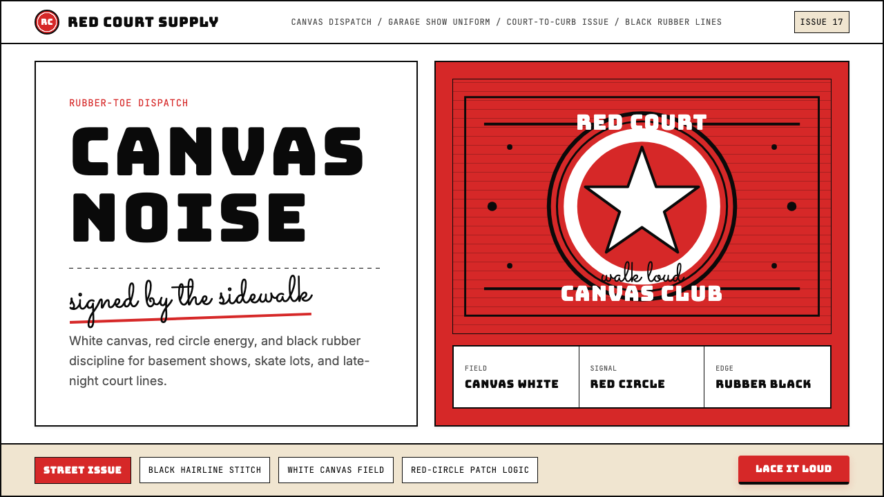 Converse Chuck TaylorPopulist and loud. Saturated red circles, Bungee type, black stitch lines on…平民而响亮:饱和红圆、Bungee 粗字、白帆布上的黑色缝线。
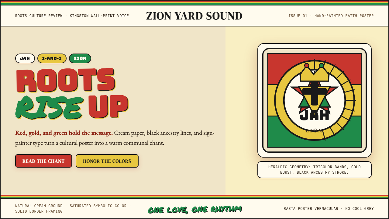 Caribbean Rastafarian (Jamaica)Warm faith, loud color. Red-gold-green bands and black poster type carry the…温暖信仰,高饱和发声:红金绿横带与黑色海报字承载吟唱。
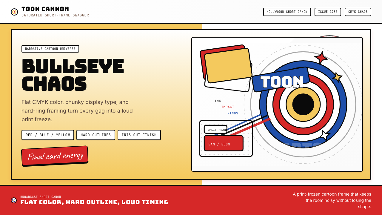 Looney Tunes (Warner Bros.)Pure cartoon chaos. Bull's-eye rings, Bungee type, and red-blue-yellow blocks.纯卡通混乱。牛眼环、粗壮标题字与红蓝黄块面。
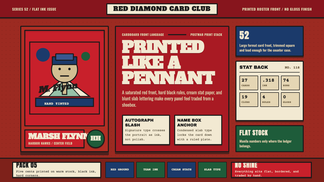 Topps Baseball CardCardboard heat. Brick-red slab panels, cream stats, and condensed type feel p…纸卡热度:砖红板块、米黄数据与压缩粗体,像平版印刷。
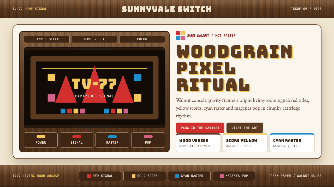 Atari 2600 (Woodgrain)Woodgrain meets raw pixels. Walnut panels frame Bungee type and CMYK raster b…木纹遇上生猛像素:胡桃木面板包裹Bungee字与CMYK色块。
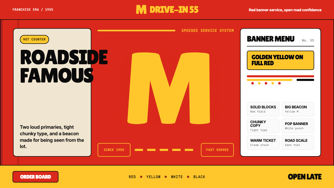 McDonald's Golden ArchesRoadside famous. Saturated red, hot yellow, and chunky type shout from 1955.路边即识别:饱和红、热黄与厚重字体喊出1955。