What is McDonald's Golden Arches?什么是 McDonald's Golden Arches?
Two colors, one letter, and seventy years of franchise muscle — McDonald's Golden Arches is the most recognizable fast-food visual system ever built.两种颜色、一个字母、七十年的连锁帝国积累——麦当劳金拱门是有史以来辨识度最高的快餐视觉系统。
McDonald's Golden Arches in briefMcDonald's Golden Arches 速览
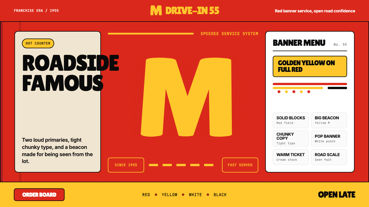
McDonald's Golden Arches design system is a study in the power of absolute simplicity deployed at industrial scale. Its visual vocabulary is deliberately narrow: a saturated red field, a blazing golden yellow, and a single bold letterform — the M — that doubles as both brand signature and architectural landmark. This is not minimalism for aesthetic fashion; it is minimalism enforced by the operational reality of feeding millions of people a day across thirty-eight thousand locations on six continents.麦当劳金拱门设计体系,是极致简洁在工业规模下所爆发出力量的一次深刻研究。它的视觉词汇被刻意压缩至最窄:一块饱和的红色底面、一抹炽热的金黄色、一个粗壮自信的字母「M」——它同时是品牌签名,也是建筑灯塔。这不是为了美学时尚而采用的极简主义,而是被现实强制执行的极简主义——在全球三万八千家门店、六大洲、每天服务数以百万计顾客的运营现实面前,唯有如此才能保持一致。
The system speaks entirely in primary-weight signals. Every element — the red background behind menu boards, the golden arch over the drive-through, the chunky confident type on the exterior signage — is calibrated for maximum legibility at distance and maximum recall under distraction. The design does not ask for the viewer's attention; it commands it. Roadside, in a strip mall, on a highway sign cluster, the golden M resolves before any other surrounding detail does.整个系统用「主色量级」的信号说话。每一个元素——菜单板后面的红色背景、得来速车道上方的金色拱门、外墙招牌上的粗重字体——都经过校准,追求在远距离下的最大可读性,在干扰环境中的最大记忆度。这套设计不是在请求观者的注意力,而是在命令它。在路边、在购物中心、在高速公路的路牌丛林里,那个金色的「M」会先于周围任何其他细节进入视线。
What distinguishes the Golden Arches system from other populist brand aesthetics is its consistency across media and scale. The same yellow and red that appear on a paper bag appear on a stadium-scale billboard, a mobile app button, and a sesame-seed-bun product photograph. There is no 'premium' variant and no 'casual' variant — the system is the system. That uniformity is itself the message: predictability, reliability, and the reassurance of knowing exactly what you are getting before you walk through the door.将金拱门系统与其他大众化品牌美学区别开来的,是它跨媒介、跨尺度的一致性。出现在纸袋上的红与黄,同样出现在体育场级别的广告牌、移动端应用按钮和芝麻汉堡包的产品摄影上。没有「高端」变体,没有「轻松」变体——系统就是系统。这种统一性本身就是它的信息:可预期性、可靠性,以及在推开大门之前就已经知道自己将得到什么的那份安心。
See the McDonald's Golden Arches design system查看 McDonald's Golden Arches 完整设计系统
Where does McDonald's Golden Arches come from?McDonald's Golden Arches 从何而来?
The story of the Golden Arches begins not in a boardroom but at a burger stand. In 1940, brothers Richard and Maurice McDonald opened their first restaurant in San Bernardino, California. Eight years later, they reinvented it as the Speedee Service System — a kitchen organized like an assembly line, with a limited menu, standardized portions, and prices low enough to attract working families. The first visual identity was rudimentary, built around a cartoon chef named Speedee. The arches themselves appeared not on paper but in architecture: in 1952, the brothers asked designer Stanley Meston to sketch a building concept using a pair of yellow parabolic arches rising from each side of the building — visible from the road, functional as structural supports, and arresting enough to make passing drivers look.金拱门的故事,起点不是某个董事会会议室,而是一个汉堡摊。1940年,理查德和莫里斯·麦当劳兄弟在加利福尼亚州圣贝纳迪诺开设了第一家餐厅。八年后,他们将其重塑为「快速服务系统」(Speedee Service System)——一个像流水线一样组织的厨房,菜单精简,份量标准,价格低廉到能够吸引工薪家庭。最初的视觉形象十分简陋,围绕一个名为「Speedee」的卡通厨师形象建立。拱门本身最初不是出现在纸面上,而是出现在建筑中:1952年,兄弟俩请设计师斯坦利·梅斯顿草拟了一个建筑方案,两个黄色抛物线拱门分别从建筑两侧升起——从道路上可见,兼具结构支撑的功能,又足够引人注目,让路过的司机忍不住驻足回望。
Ray Kroc, a milkshake machine salesman, visited the San Bernardino restaurant in 1954 and recognized immediately what the brothers had built. In 1955 he signed a franchise agreement and opened his own McDonald's in Des Plaines, Illinois — the outlet now considered the founding moment of the modern franchise empire. Kroc's genius was not culinary but operational and visual: he understood that if the system was going to replicate itself across America, every outpost had to look, feel, and taste identical. The arches, the red-and-white tile exterior, the bright lit interior — these were not decoration but operational code, signals to the customer that the deal was the same here as it was a thousand miles away.奶昔机销售员雷·克罗克于1954年造访圣贝纳迪诺的餐厅,立刻看出了这对兄弟所构建之物的潜力。1955年,他签署了特许经营协议,并在伊利诺伊州德斯普兰斯开设了自己的麦当劳——这家门店如今被视为现代连锁帝国的创立时刻。克罗克的天才不在于烹饪,而在于运营和视觉:他明白,如果这套系统要在全美复制自身,每一个加盟点都必须看起来、感觉起来、尝起来完全一致。拱门、红白相间的瓷砖外墙、明亮的室内——这些不是装饰,而是运营密码,是向顾客发出的信号:这里的交易,与一千英里外的那家是一样的。
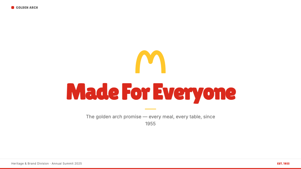
The stylized M that consumers recognize today emerged gradually. When the company incorporated the two architectural arches into its logo in the early 1960s, graphic designer Jim Schindler merged the two parabolic arches into a single interlocking M shape — both a legible letter and an abstraction of the building's silhouette. The golden color had already been associated with the arches through the yellow paint of the physical structures; now it became a signature hue with almost mythological status in brand identity circles. By 1968, the Golden Arches M had replaced Speedee as the company's primary mark.今天消费者所熟悉的程式化「M」标志是逐步演变而来的。1960年代初,公司将两个建筑拱门融入标志设计时,平面设计师吉姆·辛德勒将两个抛物线拱门合并成一个互扣的「M」形——既是清晰可读的字母,也是建筑轮廓的抽象提炼。金色早已通过实体建筑的黄色涂料与拱门产生关联;此时它成为品牌标志色,在品牌识别领域拥有了近乎神话般的地位。到1968年,金拱门「M」已取代「Speedee」成为公司的主要标志。
The current visual system — sometimes referred to internally as the Speedee system in homage to the brand's roots, though externally it is simply 'McDonald's' — reached its mature state through a series of refinements in the late twentieth and early twenty-first centuries. A significant modernization in the early 2000s moved the interiors from hard primary-color plastics toward warmer, more contemporary materials, while the exterior signage and brand identity retained the foundational red-and-gold duality. The most recent design cycle, reaching its current form around 2018–2024, reembraced bold color confidence: deeper reds, more saturated yellows, and a typographic voice that reads as assertive and populist rather than corporate-neutral.现行视觉系统——有时在内部以「Speedee 系统」致敬品牌根源,但对外仍简称「麦当劳」——经由二十世纪末至二十一世纪初的一系列优化,到达成熟形态。2000年代初的一次重大现代化改造,将室内空间从硬朗的纯色塑料向更温暖的当代材质转型,而外部招牌与品牌视觉则保留了红与金的基础二元结构。最近一轮设计迭代(大致于2018至2024年间成形)重新拥抱了大胆的色彩自信:更深沉的红、更饱和的黄,以及一种读来断然而平民化的字体语气——而非企业式的中性腔调。
What defines the McDonald's Golden Arches look?McDonald's Golden Arches 的视觉特征是什么?
Two-Color Dominance双色主导
The palette is built on exactly two heroes: a saturated, warm red and a hot, luminous golden yellow. These two hues are deployed in high contrast against each other and against white or cream grounds. No tertiary palette exists in the core system — tertiary colors appear only in food photography and promotional materials, and even there they are suppressed in favor of the two primaries. The narrowness of the palette is a deliberate constraint: it makes every application instantly identifiable and eliminates the decision fatigue that plagues multi-color brand systems.色板由两个绝对主角构成:一抹饱和而温暖的红,和一抹炽热而明亮的金黄。这两种色调相互之间、与白色或奶油色底面之间形成高对比。核心系统中不存在第三级色板——第三级色调仅出现在食品摄影和推广材料中,即便如此也被刻意压制,始终让位于这两种主色。色板之窄是刻意为之的约束:它让每一个应用场景都能被瞬间识别,并消除了多色品牌系统中常见的决策疲劳。
The Golden M as Wordmark and Icon金色 M:文字标志与图标的二合一
The Golden Arches M occupies an unusual position in brand identity: it functions simultaneously as a letterform (the initial of McDonald's), an abstract geometric shape (two interlocking arches), and an architectural reference (the physical arches that defined the early restaurant buildings). This triple function means the mark carries meaning at every scale, from the tiny favicon on a mobile browser tab to the towering illuminated sign at a highway rest stop. It is one of very few logotypes that loses no legibility or recall power as it scales downward.金拱门「M」在品牌识别领域占据着不寻常的位置:它同时是一个字母形(麦当劳首字母)、一个抽象几何形(两个互扣的拱门)和一个建筑参照(早期餐厅建筑上实体拱门的直接映射)。这种三重功能意味着这个标志在任何尺度下都承载着意义——从移动浏览器标签页上的小小图标,到高速公路服务区的巨型发光招牌。它是极少数随尺寸缩小而不损失任何可读性和记忆力的标志之一。
Chunky, Confident Typography粗壮自信的字体排印
McDonald's type voice is heavy, round-cornered, and unpretentious. The letterforms are wide rather than narrow, with generous ink weight that makes them readable at distance and at speed — on highway signs, on paper bags, on the menu board seen from across a crowded restaurant. Kerning is tight; leading is controlled. There is no typographic whimsy, no handwritten accent, no italic lean. The tone is direct and populist: these words mean exactly what they say, and they say it loudly.麦当劳的字体语气是厚重的、圆角的、不矫饰的。字形宽阔而非窄细,充足的墨色重量使其在远距离和高速度下依然清晰可读——无论是在高速公路路牌上,还是在纸袋上,还是在拥挤餐厅另一端望去的菜单板上。字距紧凑,行距受控。没有字体上的俏皮,没有手写风格的点缀,没有斜体倾斜。语调是直接的、平民化的:这些文字字面意思即全部意思,而且大声说出来。
Product Hero Photography产品英雄摄影
Where imagery enters the system, it arrives as full-bleed, saturated product photography: a burger shot from a slight elevation against a clean background, sesame seeds in sharp focus, lettuce and tomato vivid. The lighting is directional and warm, giving food surfaces a glow that reads as freshness and appetite. This photography style is not documentary — it is idealized portraiture of food. It plays against the flat graphic elements of the brand by introducing the one category of naturalistic imagery the system allows, while the surrounding red and yellow frames anchor the image firmly in the brand language.当图像进入系统,它以全出血、高饱和度的产品摄影形式出场:汉堡从略高的角度俯拍,芝麻粒清晰对焦,生菜和番茄色泽鲜亮,置于干净背景前。打光有方向感且偏暖,让食物表面呈现一种被解读为新鲜感和食欲的光晕。这种摄影风格不是纪实性的——它是对食物的理想化人物肖像式刻画。它与品牌的平面图形元素形成对话:在系统允许的唯一一类自然主义图像中引入温度,而周围的红与黄框架则将图像牢牢锚定在品牌语言之中。
Populist Scale and Directness平民化的尺度感与直给性
Everything in the Golden Arches system operates at a scale calibrated for the widest possible audience rather than for the connoisseur. Type is large. CTAs are unambiguous. Promotions are announced in bold numerals. There is no layered reading experience — no secondary message that rewards close attention, no typographic detail that only a trained eye catches. The design assumption is that the viewer is at speed, at distance, or in a distracted environment. Meeting the viewer in that condition, rather than asking them to slow down and look carefully, is the system's defining populist commitment.金拱门系统中的一切,都以服务尽可能广泛受众的尺度来校准,而非为鉴赏者设计。字体够大。行动号召够明确。促销信息用粗壮数字公告天下。没有分层阅读体验——没有奖励细心观察的二级信息,没有只有训练过的眼睛才能捕捉到的字体细节。设计的假设前提是:观者正在快速移动、保持距离,或处于分心的环境中。在这种状态下去迎接观者,而不是要求他们放慢脚步仔细看——这是这套系统最核心的平民化承诺。
Red-Gold Contrast as Structural Logic红金对比作为结构逻辑
The relationship between the saturated red and the golden yellow is not merely aesthetic preference — it is a structural hierarchy. Red tends to serve as the ground: the background field, the container, the frame. Gold tends to serve as the figure: the logo, the headline accent, the call to action. When this figure-ground relationship is maintained consistently, the system produces instant visual order regardless of how complex the content within it becomes. Applications that reverse or blur this hierarchy typically feel off-brand, not because of the colors themselves but because the logical relationship between them has been violated.饱和红与金黄色之间的关系,不仅仅是美学上的偏好——它是一套结构性层级逻辑。红色倾向于充当「底」:背景底面、容器、框架。金色倾向于充当「图」:标志、标题强调色、行动号召。当这种图底关系被持续维护时,无论其中的内容多么复杂,系统都能即刻产生清晰的视觉秩序。将这种层级颠倒或模糊的应用,通常会让人感觉不符合品牌调性——不是因为颜色本身,而是因为两者之间的逻辑关系被违背了。
Architectural Brand Extension建筑化的品牌延伸
Uniquely among major brand systems, the Golden Arches originated in physical architecture before it became a graphic mark. The two parabolic arches were load-bearing structural elements of the 1950s restaurant buildings before they were ever abstracted into a logo. This architectural origin gives the brand an unusual spatial quality: it occupies the built environment naturally, as a beacon on a skyline, rather than as a flat graphic applied to a surface. This is why the M works as well in three dimensions — as an illuminated sign, as a sculptural object at store entrances — as it does in two.在主要品牌系统中,金拱门是独一无二的——它在成为平面标志之前,起源于实体建筑。那两个抛物线拱门是1950年代餐厅建筑的承重结构构件,在被抽象成标志之前,它们首先是真实存在的建筑元素。这种建筑起源赋予了品牌一种不寻常的空间品质:它自然地占据建成环境,像天际线上的灯塔,而不是贴附于表面的平面图形。这正是为什么「M」在三维空间中——作为发光招牌、作为店铺入口处的雕塑体——与在二维平面中一样有力。
See the McDonald's Golden Arches design system查看 McDonald's Golden Arches 完整设计系统
Who shaped McDonald's Golden Arches?谁塑造了 McDonald's Golden Arches?
Richard McDonald, alongside his brother Maurice, invented the Speedee Service System in 1948 that became the operational blueprint for modern fast food. Richard's primary contribution was to the kitchen layout and menu discipline: he reduced the menu to nine items and organized the kitchen as a production line, achieving a consistency and speed that no table-service restaurant could match. The physical restaurant design — including the decision to add those first parabolic yellow arches — emerged from his insistence that the building itself should function as an advertisement visible from the highway.理查德·麦当劳与兄弟莫里斯一起,于1948年发明了「快速服务系统」,成为现代快餐运营的蓝图。理查德的主要贡献在于厨房布局和菜单纪律:他将菜单压缩至九个品项,并将厨房组织成流水线,实现了任何提供桌边服务的餐厅都无法比拟的一致性与速度。餐厅实体设计——包括增加第一批抛物线黄色拱门的决定——源于他的坚持:建筑本身应当成为一张从公路上就能看见的广告。
Ray Kroc transformed a single successful burger stand into a global industrial franchise system. His insight — that the real product was not the hamburger but the repeatable system that produced it — drove every visual and operational decision he made after 1955. Kroc's insistence on absolute uniformity across all franchise locations was the engine that made the Golden Arches meaningful: the M means the same thing in Illinois as it does in Tokyo because Kroc treated visual consistency as a form of quality control, not as a marketing exercise. His 1977 autobiography, 'Grinding It Out,' documents how deeply he believed that the built and visual environment of each restaurant was inseparable from the product itself.雷·克罗克将一个成功的汉堡摊变成了全球工业化特许经营体系。他的洞察——真正的产品不是汉堡,而是生产汉堡的可复制系统——驱动了他1955年之后的每一个视觉与运营决策。克罗克对所有特许经营门店绝对统一性的坚持,是金拱门变得有意义的引擎:「M」在伊利诺伊和在东京意味着同样的东西,因为克罗克将视觉一致性视为一种质量控制形式,而非营销演练。他1977年的自传《永不停止》记录了他对每家餐厅的建筑与视觉环境与产品本身密不可分这一信念的深刻程度。
Jim Schindler was the McDonald's construction and engineering chief who, in the early 1960s, solved the problem of how to translate the two separate architectural arches of the physical building into a single unified graphic mark. By merging the two parabolic arches into an interlocking M shape, Schindler created what became one of the most recognized marks in the world — not by inventing it from scratch but by recognizing that the architecture the brothers had already built contained the logo within it, waiting to be extracted. This kind of design thinking, finding the graphic within the existing form, is a recurring pattern in the most durable brand identities.吉姆·辛德勒是麦当劳的建筑与工程主管。1960年代初,他解决了如何将实体建筑上两个分离的拱门转化为单一统一平面标志的问题。通过将两个抛物线拱门合并成一个互扣的「M」形,辛德勒创造了世界上辨识度最高的标志之一——不是从零开始发明,而是认识到麦当劳兄弟已经建造的建筑中本已蕴含着这个标志,只待被提炼出来。这种设计思维——在既有形态中发现图形——是最持久品牌识别中反复出现的规律。
Maurice McDonald served as the operational and financial counterpart to his brother Richard's spatial and menu innovations. His meticulous cost controls and staffing systems were what made the Speedee Service System economically viable and replicable — the invisible foundation beneath the visible brand. Maurice was skeptical of Ray Kroc's franchise ambitions and eventually sold the business to him in 1961, famously declining to keep the company name for their own original restaurant as part of the sale. The irony is that the McDonald name — the most valuable word in fast food — was built into global dominance by someone other than its originators.莫里斯·麦当劳是兄弟理查德在空间与菜单创新上的运营与财务对应者。他精密的成本控制和员工管理体系,使「快速服务系统」在经济上可行且可复制——这是品牌可见外表之下的隐形基础。莫里斯对雷·克罗克的特许经营野心持怀疑态度,并最终于1961年将公司卖给了他,据说在出售协议中放弃了将自己原始餐厅继续使用麦当劳名称的权利。讽刺之处在于:快餐业最有价值的名字——「麦当劳」——被推向全球主导地位的,是除其原创者以外的另一个人。
Stanley Meston was the architect commissioned in 1952 to design the prototypical McDonald's restaurant building that introduced the parabolic golden arches. Working from a sketch by Richard McDonald, Meston developed the red-and-white tiled structure with its soaring parabolic arches into a building that was deliberately designed to be seen at forty miles per hour from a passing car. His design formalized the idea that the restaurant building was itself an advertisement — a principle that later drove the entire architecture of roadside commercial signage in mid-century America and that echoes in every drive-through design that followed.斯坦利·梅斯顿是1952年受委托设计麦当劳原型餐厅建筑的建筑师,正是这栋建筑引入了抛物线金色拱门。在理查德·麦当劳草图的基础上,梅斯顿将红白瓷砖结构与高耸的抛物线拱门发展成一栋被刻意设计为「以时速六十公里驾车路过时也能被看见」的建筑。他的设计将餐厅建筑本身即为广告这一理念正式确立——这一原则后来推动了美国二十世纪中叶路边商业招牌建筑的整体走向,也在此后每一个得来速设计中留下了回声。
How do you use McDonald's Golden Arches today?今天怎么用 McDonald's Golden Arches?
McDonald's Golden Arches style is one of the most instructive references in popular brand aesthetics precisely because it works through constraint, not through sophistication. Applying it well in contemporary design — for slides, web interfaces, or print — requires understanding that the system's power comes from committing fully to its two-color logic, its scale-first typography, and its refusal to pursue refinement at the expense of legibility. Picking up just the colors without the typographic weight, or borrowing the boldness without the structural red-gold hierarchy, produces something that looks vaguely familiar but lands with none of the original's force.麦当劳金拱门风格之所以是流行品牌美学中最具参考价值的案例之一,正是因为它通过约束而非复杂性发挥力量。在当代设计中——无论是幻灯片、网页界面还是印刷品——正确应用它,需要理解这套系统的力量来自于对双色逻辑、以尺度为先的字体排印,以及拒绝以可读性换取精致感这三点的全然投入。只借用颜色而不带字体分量,或者只借用大胆感而不建立红金结构层级,产出的东西会让人感觉似曾相识,却没有原作分毫的力量。
For presentation slides, the Golden Arches vocabulary translates most effectively when the cover slide commits to a full-bleed colored ground — deep red carrying large golden type, or a field of gold carrying red and white. Interior content slides work best treated as high-contrast informational posters: one dominant visual element per slide, headlines large enough to read from across a room, body text that does not compete with the headline. Data slides in this vocabulary should use the two primary colors as the full chart palette — one color for the primary data series, the other for secondary comparisons — with white or near-white as the background and no decorative chart furniture.在演示文稿中,金拱门词汇最有效的转化方式是:封面页采用全出血色彩底面——深红底面承载大字号金色文字,或金色底面承载红色与白色文字。内页内容幻灯片最好被当作高对比度信息海报来处理:每张幻灯片一个主视觉元素,标题大到可以从房间对面读清,正文不与标题竞争视觉权重。这种风格下的数据幻灯片,应以两种主色作为完整图表色板——一种用于主数据系列,另一种用于次级对比——以白色或近白色作为背景,不加任何装饰性图表附件。
For web UI and digital product design, the Golden Arches system is well suited to consumer-facing applications that need to communicate immediately and require zero learning curve: food ordering flows, promotional landing pages, loyalty program dashboards, and pricing displays. Navigation should be bold and typographic; primary calls to action demand the saturated golden yellow button on a red or white ground, or vice versa. Cards and containers benefit from high-contrast bordered edges rather than soft shadows — the hard edge reads as decisive, not corporate. Avoid the temptation to add neutral gray tones as a softening agent; the system loses its character the moment it starts hedging.对于网页界面和数字产品设计,金拱门系统非常适合那些需要即时传达、零学习曲线的消费者端应用:点餐流程、促销落地页、会员积分仪表板、定价展示页。导航应粗壮且字体化;主要行动号召需要在红色或白色底面上呈现饱和金黄色按钮,或反之。卡片和容器适合采用高对比度的有边框边缘,而非柔和阴影——硬边读来果断,而非企业化。抵制添加中性灰色调作为柔化剂的诱惑;系统一旦开始「对冲」,特质便立刻消散。
For editorial and marketing applications — promotional posters, social media cards, email headers, event graphics — the Golden Arches style supports a mode of visual communication that is unapologetically loud and immediate. A full-bleed red background with a single golden headline and one product image is often more effective than a more elaborately composed layout. Marketing pages work in alternating blocks: red ground with golden and white type, then a white ground with red and golden accents, creating rhythm without visual complexity. The style is particularly effective for countdown promotions, limited-time offers, and any content where urgency is the primary message — the palette and scale already communicate acceleration and appetite.对于编辑与营销应用——促销海报、社交媒体卡片、邮件头图、活动视觉——金拱门风格支持一种毫不掩饰地大声而即时的视觉传达模式。全出血红色背景加上单一金色标题和一张产品图,往往比更精心构图的版面更有效。营销页面在交替区块中运作:红色底面配金色和白色文字,然后白色底面配红色和金色点缀,创造节奏感而不增加视觉复杂度。这种风格对倒计时促销、限时优惠,以及任何以紧迫感为主要信息的内容尤为有效——色板和尺度本身已经在传递加速感和食欲感。
The most common mistake when attempting this style is treating the two colors as interchangeable or using them at equal visual weight simultaneously. Authentic applications of the Golden Arches vocabulary maintain a clear figure-ground relationship: one color is the background or container, the other is the active foreground element. A second common mistake is softening the typographic weight to make it feel more refined — round, lightweight type reads as a different brand entirely. A third mistake is adding a third or fourth color to add visual interest; the system's strength is its refusal to do this. If the two-color constraint feels limiting, the right response is to use scale, white space, and photography more aggressively — not to introduce additional hues.尝试这种风格时最常见的错误,是将两种颜色视为可互换的,或以相同视觉重量同时使用它们。金拱门词汇的真实应用,维持着清晰的图底关系:一种颜色作为背景或容器,另一种作为主动的前景元素。第二个常见错误是软化字体重量以追求精致感——圆润、轻量的字体读来完全像另一个品牌。第三个错误是添加第三或第四种颜色以增加视觉兴趣;这套系统的力量正在于对此的拒绝。如果双色约束感觉局促,正确的应对是更积极地运用尺度、留白和摄影——而不是引入额外色调。
See the McDonald's Golden Arches design system查看 McDonald's Golden Arches 完整设计系统
McDonald's Golden Arches — FAQMcDonald's Golden Arches · 常见问题
Can the Golden Arches aesthetic be applied to premium or luxury positioning?金拱门美学能否应用于高端或奢侈品牌定位?
With significant tension. The Golden Arches system is fundamentally populist — its entire visual logic is built around accessibility, immediacy, and the widest possible audience. These values are structurally incompatible with luxury design, which depends on exclusivity, restraint, and signals of scarcity. A design that borrows the red-gold palette and scales it down with lighter type and more white space can approach a premium register, but at that point it is departing from the core system significantly. The honest answer is that there are better reference systems for premium positioning — the Golden Arches DNA, even when refined, tends to read as approachable and democratic, which may or may not be an asset depending on the product.存在相当大的张力。金拱门系统本质上是平民化的——它的全部视觉逻辑围绕可及性、即时性和尽可能广泛的受众而建立。这些价值观与奢侈品设计在结构上不相容,后者依赖排他性、克制感和稀缺性信号。一套借用红金色板、以更轻量的字体和更多留白来降低强度的设计,可以接近高端调性,但在那一刻它已大幅偏离核心系统。诚实的答案是:对于高端定位,有更合适的参考系统——金拱门的基因,即便经过提炼,也倾向于被读解为平易近人和民主化的,这对具体产品而言可能是优势也可能不是。
How does the Golden Arches style handle dark mode or dark backgrounds?金拱门风格如何在深色模式或深色背景下运用?
The canonical Golden Arches system is built around red as a dominant ground color, which already reads as relatively dark and saturated compared to neutral backgrounds. Transitioning to a true dark background — deep charcoal or black — requires care. The golden yellow advances strongly against dark grounds, which can make it feel even bolder than intended. Red on dark tends to read as dramatic or aggressive rather than inviting. A dark variant works most cohesively when it commits to black as the ground, uses golden yellow as the primary active element, and introduces red only as a secondary accent or hover state. The system reads clearly but shifts from its characteristic warmth toward something cooler and more intense.标准金拱门系统以红色作为主要底色——与中性背景相比,这已经是相对深沉和饱和的色调。过渡到真正的深色背景——深炭灰或黑色——需要谨慎处理。金黄色在深色底面上具有很强的前进感,可能让它显得比预期更加强势。红色在深色上往往读来戏剧性甚至攻击性,而非令人亲近。深色变体在以下情况下最为连贯:以黑色作为底面,以金黄色作为主要活跃元素,仅将红色引入作为次级强调色或悬停状态。系统依然清晰,但从其标志性的温暖感向更冷峻、更强烈的调性转移。
Is this style appropriate for industries beyond food and retail?这种风格适合餐饮零售以外的行业吗?
The red-gold high-saturation vocabulary is strongly associated with food, energy, and speed — industries where appetite stimulation and urgency are primary communication goals. Applying it in industries like finance, healthcare, legal services, or enterprise software creates an immediate tonal mismatch: the palette signals excitement and appetite, while those industries need to signal trust, calm, and precision. That said, for consumer products where energy and immediacy are assets — sports, gaming, youth fashion, event promotion — the vocabulary transfers usefully. The key question is not whether the style is technically possible in a new industry but whether its emotional register matches what the product needs to communicate.红金高饱和色彩词汇与餐饮、能量和速度强烈关联——这些行业的主要传播目标是刺激食欲和制造紧迫感。将其应用于金融、医疗、法律服务或企业软件等行业,会产生即刻的调性错位:色板传递的是兴奋感与食欲,而那些行业需要传递信任感、平静和精准。话虽如此,对于能量感和即时性是资产的消费品领域——体育、游戏、青年时尚、活动推广——这套词汇的迁移是可行的。关键问题不在于这种风格在新行业中技术上是否可行,而在于它的情感频道是否与产品需要传递的信息相匹配。
What makes the Golden Arches M so durable as a mark across sixty-plus years?是什么让金拱门「M」在超过六十年的时间里始终如此经久耐用?
Three properties account for its durability. First, geometric simplicity: the M is reducible to two arches — a shape a child can draw from memory and that survives reduction to very small sizes without becoming illegible. Second, architectural origin: because the shape was physically built at full scale before it was abstracted into a logo, it carries a spatial authority that purely graphic marks rarely achieve. Third, color commitment: the golden yellow is not merely a brand color but a chromatic identity strong enough to function even when the letterform is absent. Most people can identify a golden M on red from peripheral vision alone. The combination of a simple shape, a distinctive color, and sixty years of repetition at enormous global scale has created a mark where recognition is nearly automatic.三个特性造就了它的耐久性。第一,几何上的简洁:「M」可以被还原为两个拱门——一个孩子可以凭记忆画出来的形状,缩小到很小的尺寸后依然不失去可读性。第二,建筑起源:因为这个形状在被抽象成标志之前已经以实物全尺寸建造出来,它拥有纯粹图形标志鲜少能达到的空间权威感。第三,色彩承诺:金黄色不仅仅是一种品牌色,而是一种强大到即便字母形缺席也能独立发挥作用的色彩身份。大多数人仅凭余光就能从红色中识别出金色的「M」。简单形状、独特色彩、以及六十年来在全球巨大规模上的重复——三者共同创造了一个辨识几乎是自动发生的标志。
How should designers avoid making the style feel like parody or pastiche?设计师应如何避免这种风格沦为模仿讽刺或表面拼贴?
The trap is treating the style as a visual joke or a retro reference rather than as a serious design system. Pastiche typically emerges when designers cherry-pick the most obvious surface elements — the colors, a retro typeface — without committing to the structural logic underneath. Authentic application requires commitment to the full system: the red-gold figure-ground hierarchy maintained throughout, the typographic weight appropriate to the context, the layout governed by legibility at distance, and food photography (if present) treated with the same saturated warmth as the original. When every element follows the same logic, the result reads as a coherent design language. When elements are mixed with irony or combined with incompatible aesthetics, the result reads as costume rather than design.陷阱在于将这种风格视为视觉玩笑或复古参照,而非一套严肃的设计系统。表面拼贴通常在设计师只摘取最显眼的表面元素——颜色、复古字体——而不投入其底层结构逻辑时出现。真实的应用需要对完整系统的承诺:全程维持红金图底层级,字体重量与语境相称,版面由远距离可读性驱动,食品摄影(如有)以与原作同等的饱和温暖感处理。当每个元素都遵循同一逻辑时,结果读来是一套连贯的设计语言。当元素以反讽精神混用、或与不相容的美学结合时,结果读来是戏服,而非设计。
Related design styles相关设计风格
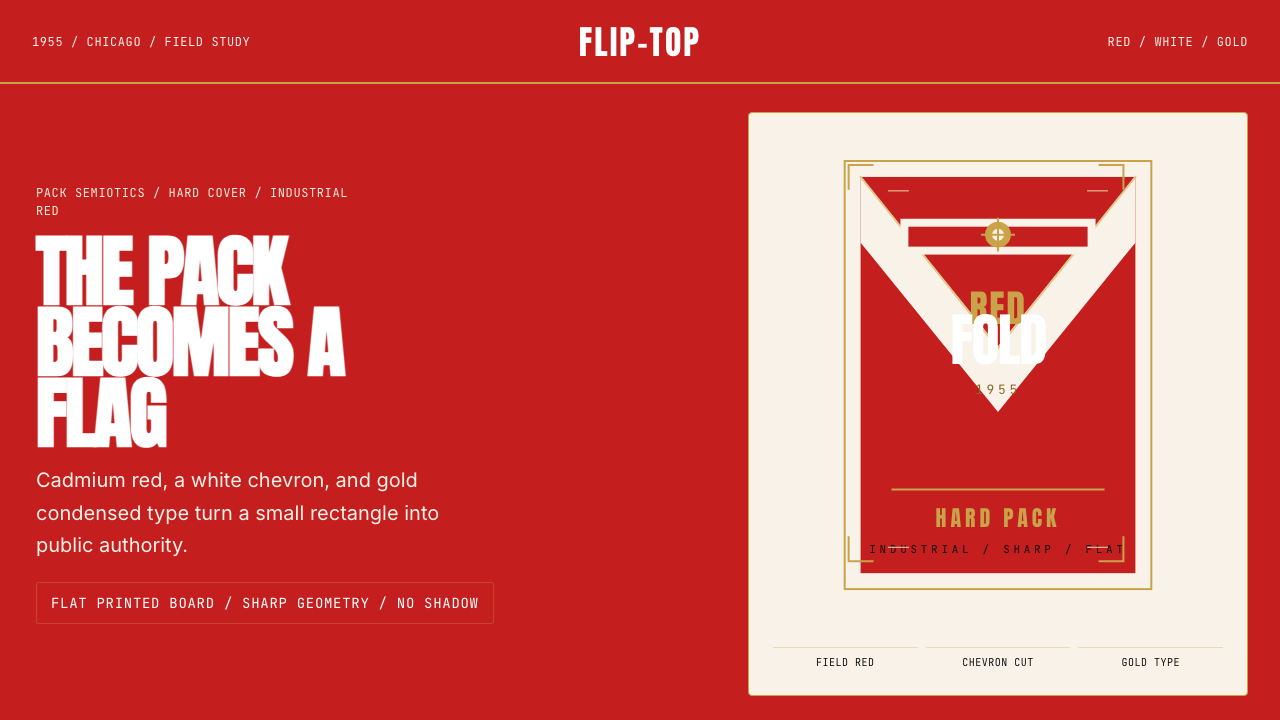 Marlboro Red Flip-Top (1955)Authority in one fold. Cadmium red, white chevron, and gold type read like a…一折成旗。镉红、白人字与金字排出强硬权威。
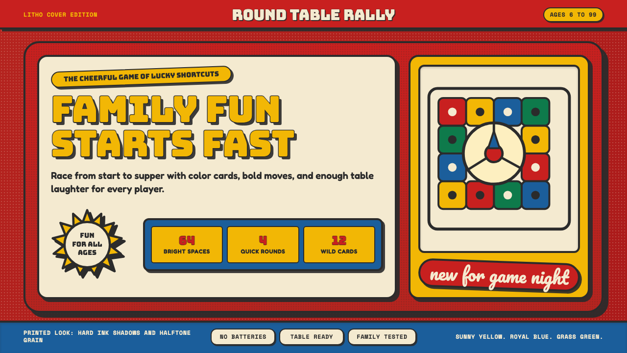 Vintage Board Game BoxShelf appeal shouts. Fire-engine red, Bungee lockups, yellow bursts, and ink…货架感在喊:消防红底、Bungee 标题、黄爆炸章与硬黑影。
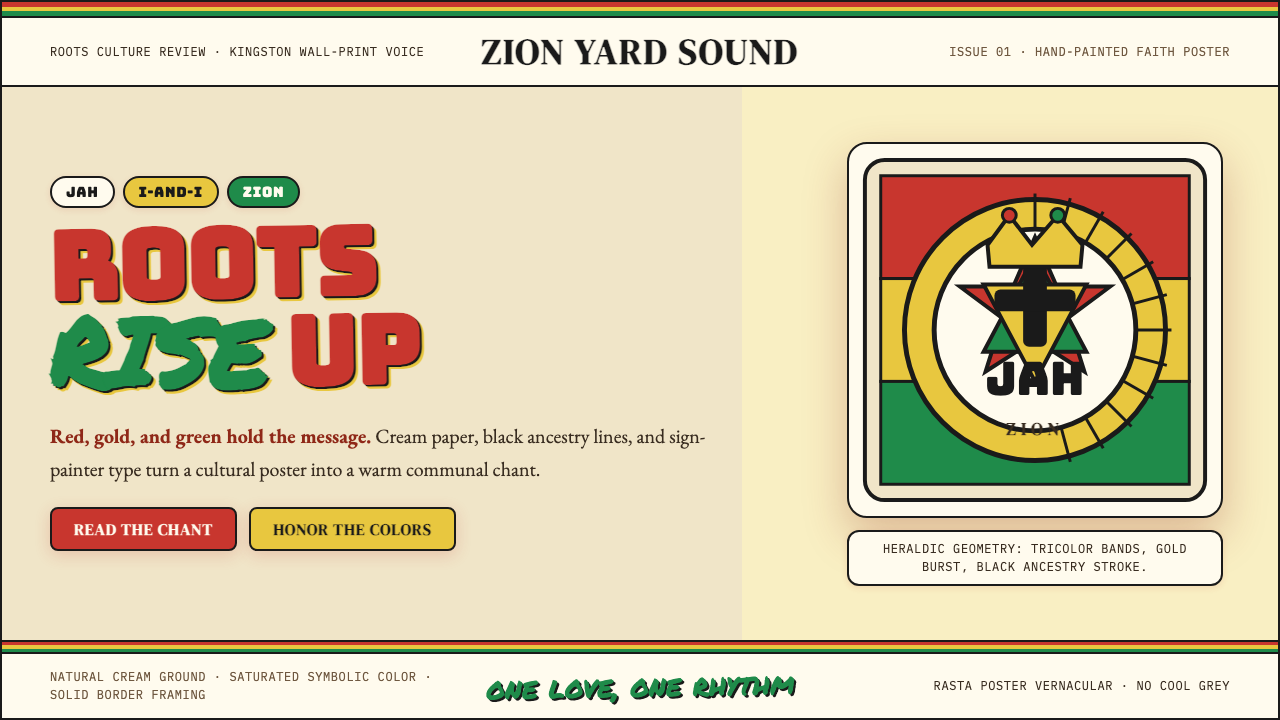 Caribbean Rastafarian (Jamaica)Warm faith, loud color. Red-gold-green bands and black poster type carry the…温暖信仰,高饱和发声:红金绿横带与黑色海报字承载吟唱。
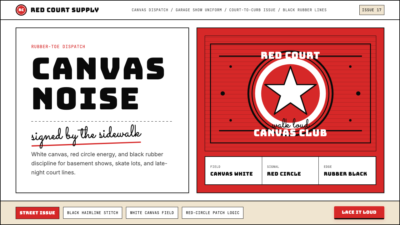 Converse Chuck TaylorPopulist and loud. Saturated red circles, Bungee type, black stitch lines on…平民而响亮:饱和红圆、Bungee 粗字、白帆布上的黑色缝线。
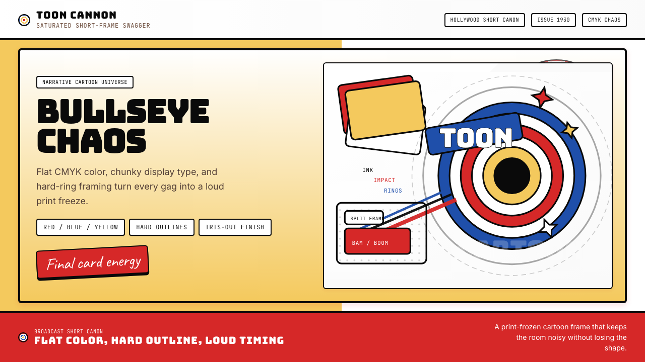 Looney Tunes (Warner Bros.)Pure cartoon chaos. Bull's-eye rings, Bungee type, and red-blue-yellow blocks.纯卡通混乱。牛眼环、粗壮标题字与红蓝黄块面。
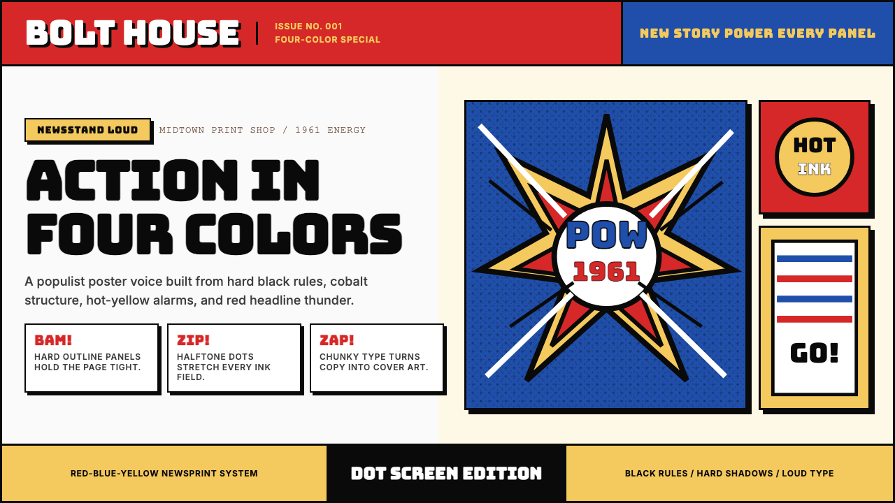 Marvel Comics (Kirby Era)Populist color hits hard. Red-blue-yellow panels, black rules, and halftone d…大众色彩直击眼球。红蓝黄画格、黑墨线与半调网点。