What is Vintage Board Game Box?
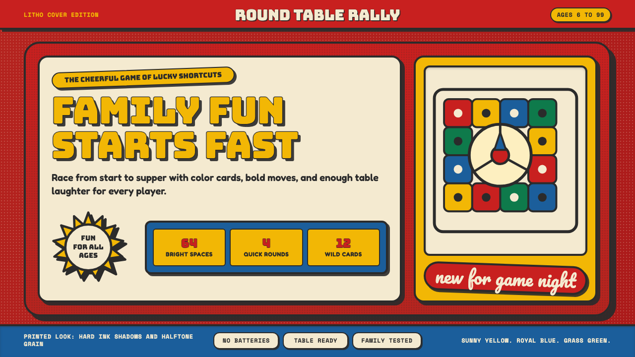
A mid-century board game box lid had one job on a crowded shelf: shout louder than the box next to it, in fire-engine red and sunny yellow.
Vintage Board Game Box in brief
Vintage Board Game Box is a design system drawn from the coated-paper lithographed box lids of mid-century American family board games — the tradition exemplified by manufacturers like Milton Bradley and Parker Brothers, whose products defined postwar living-room game shelves. Its defining trait is shelf appeal built purely from saturation: a dominant fire-engine-red field, sunny yellow bursts, royal blue, and grass green, all held together by chunky, outlined title lettering designed to be recognized instantly from across a store aisle.
The visual grammar is illustrative and commercial rather than fine-art in sensibility — these were mass-produced litho covers meant to sell a product, not gallery pieces, and every choice reflects that commercial purpose. A halftone litho grain sits underneath the flat color fields, a texture inherited directly from the coated-paper offset printing process used to produce these covers cheaply and in large volume. Ribbon banners and starburst badges punctuate compositions, echoing the promotional badges and callouts that retail packaging has long used to flag a product's appeal.
The emotional register is cheerful, dense, and high-contrast — an illustration of a beaming family gathered around a table is a recurring compositional anchor, embodying a specific postwar vision of wholesome domestic leisure. Everything in the system is designed to be seen and understood in a fraction of a second, a visual philosophy shaped entirely by the competitive reality of a crowded toy-store shelf.

Where does Vintage Board Game Box come from?
The mid-century American family board game industry grew rapidly in the decades following the Second World War, as suburban expansion, rising household incomes, and a cultural emphasis on wholesome family leisure time created a large and growing market for tabletop games meant to be played by parents and children together in the living room. Milton Bradley, founded in Springfield, Massachusetts, and Parker Brothers, founded in Salem, Massachusetts, were the two dominant manufacturers competing for space on retail shelves and in family homes during this period.
Because these games were sold in physical retail stores where dozens or hundreds of competing boxes sat side by side, the box lid itself became the single most important piece of marketing a game had. Unlike a modern product that can rely on digital advertising, online reviews, or a brand website, a 1960s board game box had to communicate its appeal entirely through what a shopper could see in the few seconds their eyes passed over a crowded shelf — hence the emphasis on maximum color saturation, bold outlined lettering, and instantly readable illustration.
The coated-paper lithography process used to print these covers was itself a technological and economic choice: it allowed vivid, saturated color to be reproduced cheaply at the scale required for mass consumer retail, at the cost of the fine tonal gradation a more expensive printing process might achieve. The characteristic halftone grain visible in these covers is a direct visual signature of this specific mid-century commercial printing technology.
The visual peak of this tradition ran roughly from 1955 to 1975, encompassing some of the most enduringly popular American family games — titles like Life, Mouse Trap, and Risk — whose box art became so culturally familiar that it functions today as an immediately recognizable shorthand for mid-century American commercial illustration and family leisure culture more broadly, well beyond the specific games themselves.
What defines the Vintage Board Game Box look?
Fire-Engine-Red Field
A dominant, highly saturated red typically covers a large proportion of the box lid, functioning as the primary field against which every other element sits. This red is chosen specifically for its ability to attract attention from a distance in a crowded retail environment, rather than for any subtler emotional or symbolic association.
Sunny Yellow Bursts
Bright, warm yellow appears in burst or starburst shapes used to call out key selling points or highlight the game's title, functioning as a secondary attention-grabbing device that contrasts sharply against the red field. The yellow is applied as a flat shape rather than a gradient glow, keeping it consistent with the litho printing process's flat-color logic.
Chunky Outlined Titles
Game titles are set in bold, rounded display lettering with a heavy outline, sometimes paired with a looser script accent for a subtitle or tagline. The outline treatment gives the type maximum legibility against a busy, colorful background, ensuring the title remains readable even when surrounded by illustration and other graphic elements.
Halftone Litho Grain
A subtle dot-pattern texture underlies the flat color fields and illustrated figures, a direct artifact of the offset lithography printing process used to mass-produce these covers cheaply. This grain gives the flat color a slightly textured, printed quality rather than the perfectly smooth flatness of a purely digital fill.
Ribbon Banners and Starburst Badges
Curved ribbon banners and radiating starburst badges appear as compositional accents, typically used to frame a subtitle, an age recommendation, or a promotional callout. These devices are inherited directly from broader mid-century retail packaging conventions, not unique to board games, and signal 'this is worth your attention' with maximum visual confidence.
Beaming Family Illustration
A recurring compositional anchor is an illustrated scene of a smiling family gathered around a table, rendered in the same bright, high-contrast palette as the rest of the box. This image does narrative work that abstract color and type alone cannot: it tells the shopper exactly who this product is for and what experience it promises.

Who shaped Vintage Board Game Box?
Founded in Springfield, Massachusetts, Milton Bradley was one of the two dominant American board game manufacturers of the mid-century period, producing enduringly popular titles and helping establish the saturated, illustrative, shelf-competing visual language this style draws from. The company's box design conventions were shaped directly by the practical demands of retail competition.
Founded in Salem, Massachusetts, Parker Brothers was Milton Bradley's chief competitor and produced some of the most iconic mid-century board game covers, including Risk. The rivalry between the two companies for shelf attention is part of what drove the visual intensity — the saturation, the bold lettering, the starburst callouts — that defines this design system.
How do you use Vintage Board Game Box today?
Vintage Board Game Box suits products and brands that want to feel playful, nostalgic, and unabashedly cheerful — family entertainment products, party or game platforms, or any brand wanting to evoke warm mid-century domestic leisure rather than sleek modern minimalism. The style's shelf-appeal logic also makes it a natural fit for anything genuinely competing for attention in a crowded visual environment.
For presentation slides, a cover slide can commit fully to the red field with a starburst-framed title in chunky outlined lettering, mimicking exactly how a box lid competes for attention. Content slides should reduce the red field to an accent band or header treatment rather than a full background, since sustained high saturation across many slides becomes visually exhausting in a way it never was on a single physical box lid seen for a few seconds.
For web interfaces, the style fits playful consumer products, game platforms, or family-oriented brands particularly well — a landing page hero section can use the full red-and-yellow treatment with starburst badges calling out key features, functioning much like the original box lid's promotional callouts. Dense functional screens like settings or account pages should pull back considerably, since the style's intensity does not suit sustained reading or data-dense work.
For editorial and marketing work, the aesthetic supports nostalgic feature pieces, toy and game industry retrospectives, or playful campaign moments. A feature opener can use the full illustrated-family and starburst treatment; body copy should sit on a calmer, lighter ground to preserve readability across longer passages, reserving the full saturated palette for section breaks and pull-quotes.
A common mistake is applying the bright color palette without the halftone litho grain, which loses the specific mid-century commercial-print quality that distinguishes this style from a generic bright, flat color scheme. Another frequent error is using starburst badges and ribbon banners too sparingly — the original box lids used these devices densely and confidently, and a single restrained accent undersells the shelf-competing energy the style depends on.

Vintage Board Game Box — FAQ
Why is the box lid so densely packed with color and graphic devices rather than more restrained?
Because the box lid had to compete for a shopper's attention against dozens of other boxes on a crowded shelf, all within the few seconds someone's eyes passed over the aisle. Restraint would have made a game invisible next to louder competitors; density and saturation were a direct, practical response to the competitive retail environment these products were sold in, not an arbitrary stylistic preference.
What causes the subtle dot-pattern texture visible in these box covers?
This halftone grain is a direct byproduct of offset lithography, the mass-production printing process used to reproduce these covers cheaply and at large volume on coated paper. The dot pattern is a technical artifact of how the printing press applied ink, and it gives the flat color fields a subtly textured, era-specific printed quality distinct from a perfectly smooth digital fill.
Is this style the same as generic 'retro' or '1950s diner' visual references?
They share a decade and a general cheerful mood, but this style is more specific: it describes the particular commercial illustration and lithography conventions of mass-market board-game packaging, including its halftone printing texture, starburst and ribbon devices, and heroic family-illustration compositions. A generic '1950s' reference could draw on chrome diners, rock-and-roll iconography, or advertising unrelated to toy packaging; this style is anchored specifically to the board-game box lid tradition.
Does this style work for adult-focused or serious product contexts?
It can work for adult products that deliberately want to lean into nostalgia, playfulness, or ironic retro appeal, but it fights against any brand wanting to feel serious, premium, or restrained. The style's core identity is loud, dense, and cheerful shelf competition, which is fundamentally at odds with the quiet sophistication many adult or premium product categories aim for.
Why does an illustrated family scene appear so frequently in this style?
The illustrated family scene does specific persuasive work that abstract graphic elements cannot: it shows a shopper exactly who is expected to enjoy the product and what kind of experience — wholesome, shared, domestic — it promises. This was a standard convention across mid-century family-oriented advertising and packaging more broadly, not unique to board games, reflecting the era's cultural emphasis on family togetherness as an aspirational ideal.
Related design styles
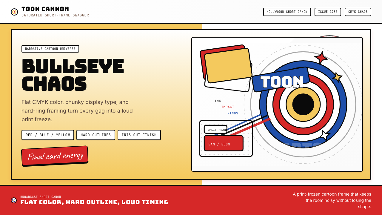 Looney Tunes (Warner Bros.)Pure cartoon chaos. Bull's-eye rings, Bungee type, and red-blue-yellow blocks.
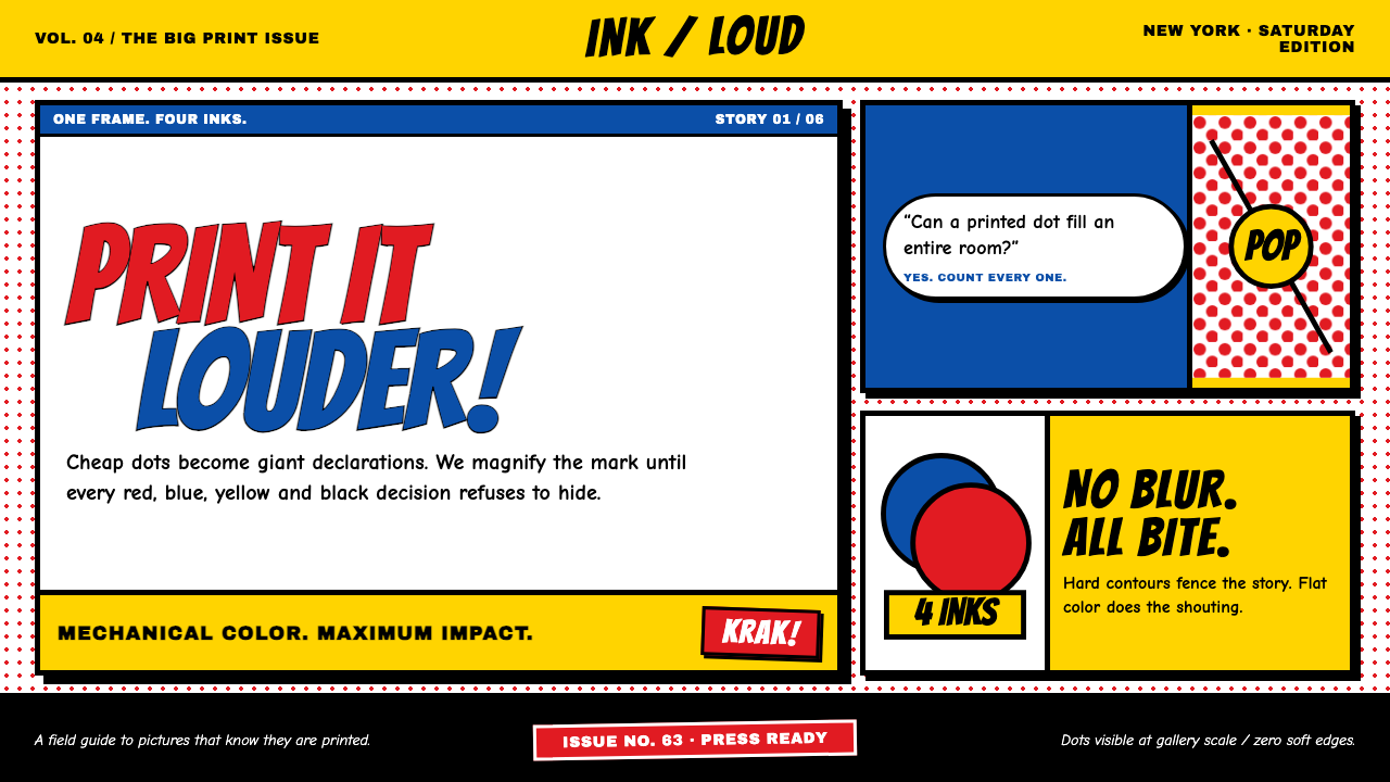 Lichtenstein Ben-Day (1963)Cheap print becomes heroic. Primary inks, giant dots and hard black contours…
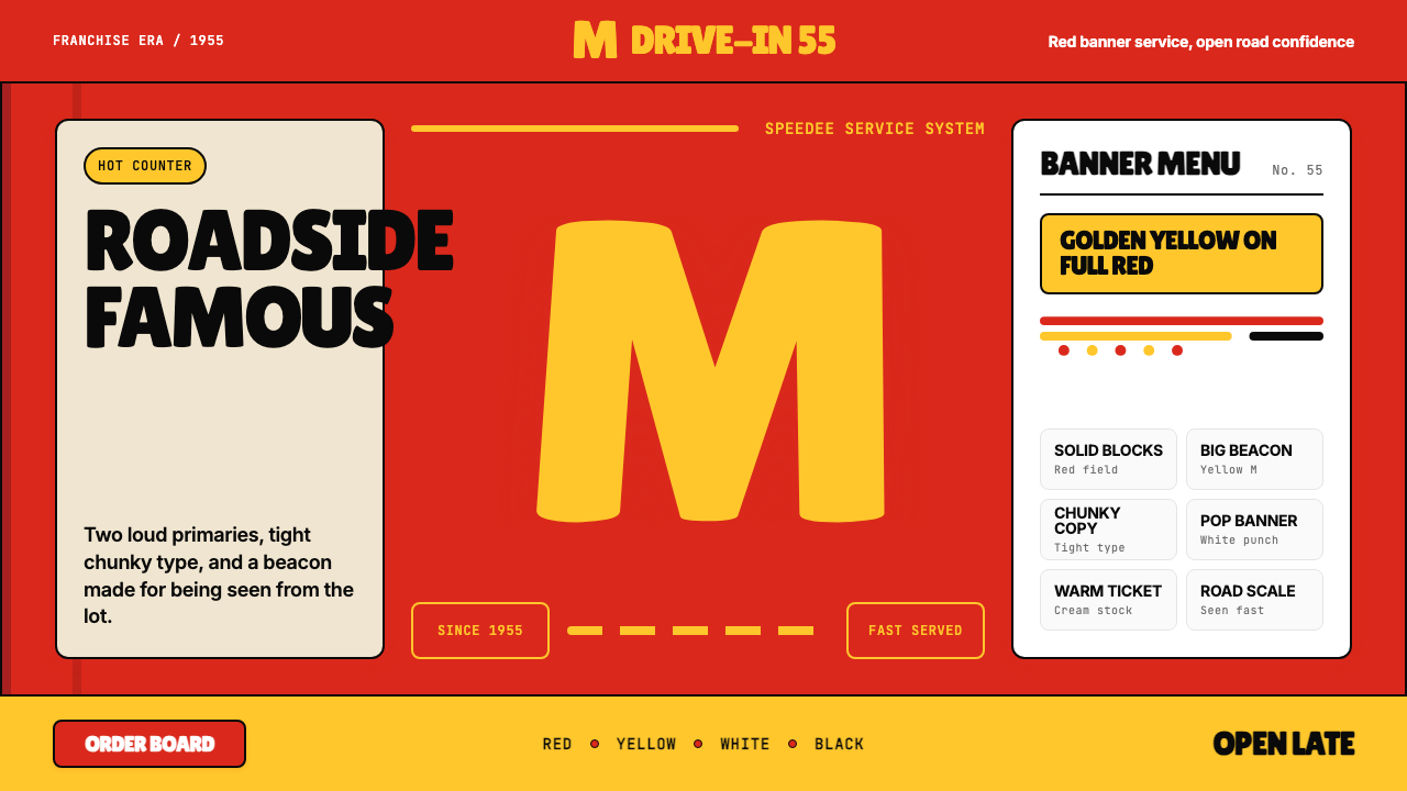 McDonald's Golden ArchesRoadside famous. Saturated red, hot yellow, and chunky type shout from 1955.
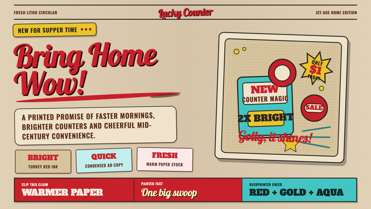 1950s Brush Script AdSells tomorrow in one swoop. Turkey red script, tan paper, starbursts, and ha…
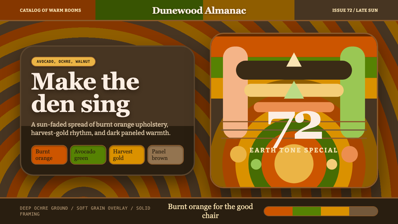 1970s Earth TonesWarm maximalism stays muddy. Bulbous slabs, avocado bands, and harvest-gold r…
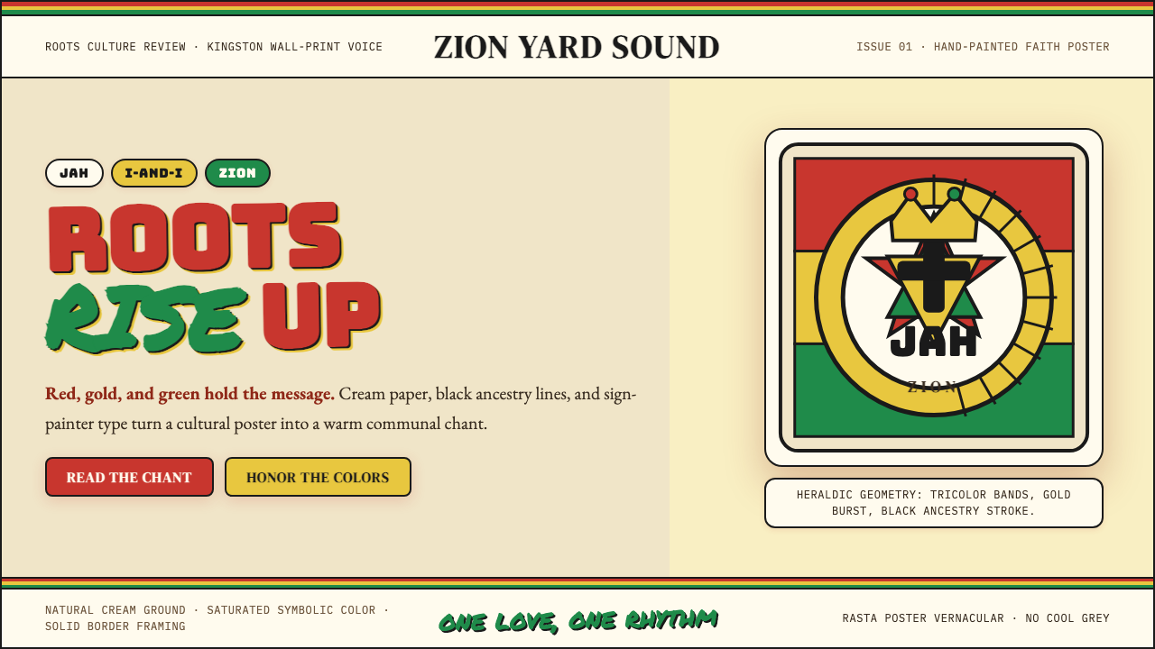 Caribbean Rastafarian (Jamaica)Warm faith, loud color. Red-gold-green bands and black poster type carry the…