What is 1970s Earth Tones?
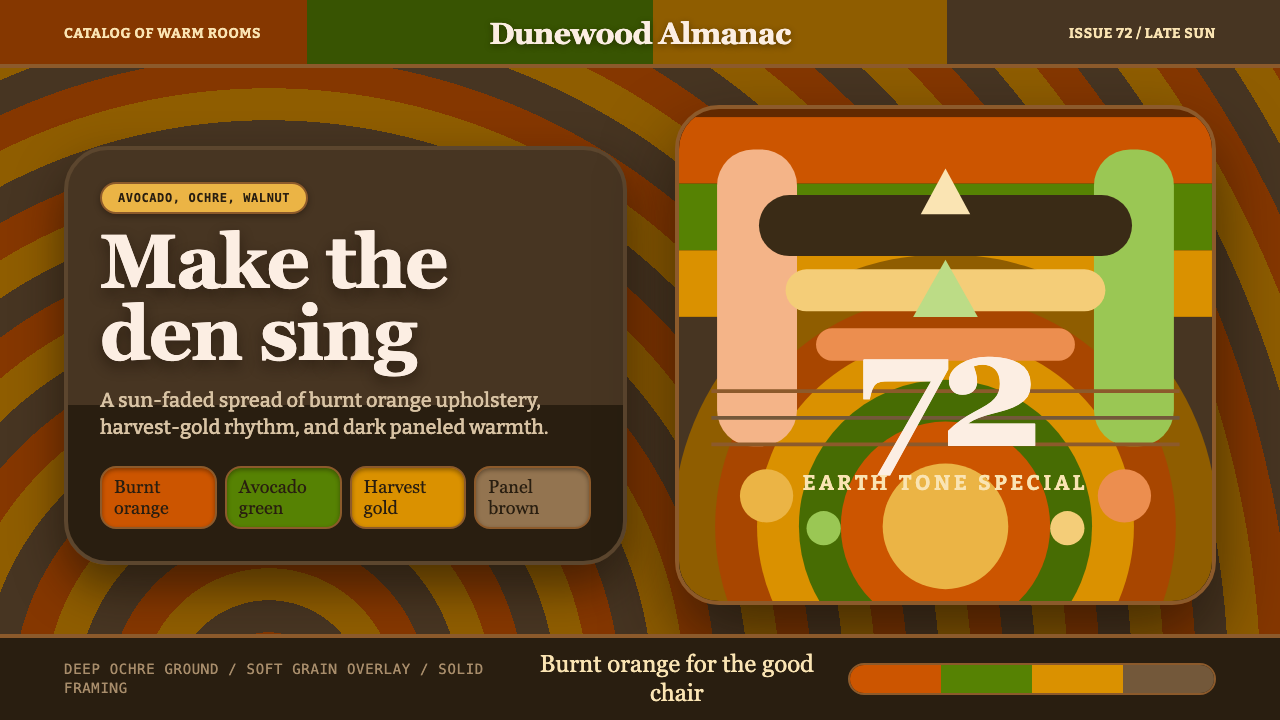
1970s Earth Tones is warm maximalism that refuses to apologize for muddiness — avocado green, harvest gold, and burnt orange, layered thick and unafraid of looking lived-in.
1970s Earth Tones in brief
This style reproduces the graphic and interior language of the North American home in the early-to-mid 1970s, peaking around 1972 — the era of avocado-green kitchen appliances, harvest-gold tile, burnt-orange upholstery, dark wood paneling, and deep-pile brown shag carpet. It is a domestic aesthetic first, translated afterward into print, packaging, and now interface design, and it carries the confidence of a decade that had fully committed to warm, saturated, unabashedly maximal color.
The defining quality is a refusal of coolness in every sense — no cold blues, no clinical whites, no restrained neutrals. Colors sit close to earth and food: avocado, mustard, rust, chocolate brown, harvest gold. These are not bright, candy-clean hues; they are deliberately muddied, as though every color had a little brown mixed into it, which gives the palette its warmth and its slightly heavy, grounded feel rather than a light or airy one.
Typographically and texturally, the style leans into roundness and softness rather than precision: bulbous, friendly display lettering (in the spirit of Cooper Black), concentric sunburst or ring motifs borrowed from psychedelic and groovy graphic design, and surface textures — wood grain, soft grain overlay — that make everything feel slightly worn, like a sun-faded page from an old magazine rather than a crisp new print.
Where does 1970s Earth Tones come from?
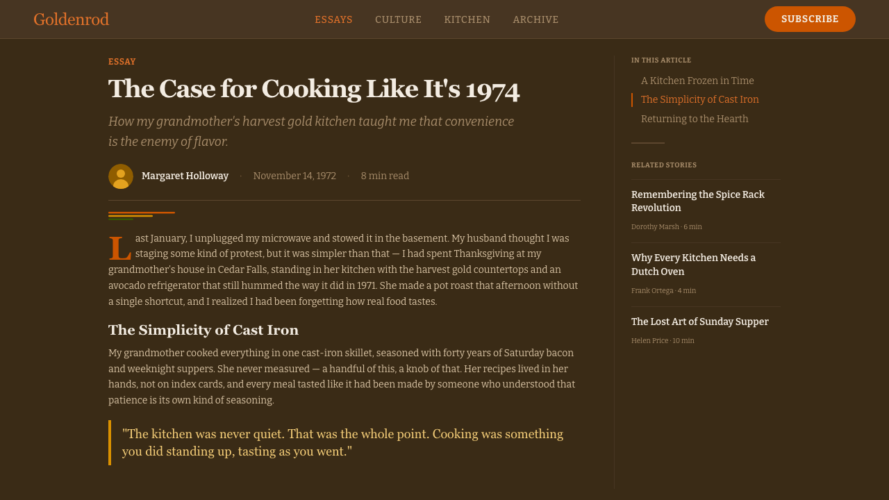
The style has its roots in mid-century American design more broadly (1950–1990) but reaches its most concentrated, recognizable form around 1972, at the tail end of the mid-century modern period and the height of what is now nostalgically remembered as 'groovy' 1970s taste. Post-war prosperity and mass-market home renovation had, by this point, matured into a distinct set of consumer color preferences, driven heavily by the appliance and home-goods industries.
Avocado green and harvest gold were, quite literally, marketing colors: major American appliance manufacturers introduced them as alternatives to the stark white of earlier decades, and the choice caught on so thoroughly that by the early 1970s these colors defined an entire generation's kitchens, bathrooms, and living rooms. Burnt orange and chocolate brown followed in upholstery fabric, carpet, and wood paneling, reinforcing a coordinated, warm, all-enveloping domestic palette that stood in deliberate contrast to the cooler, more restrained tones of the 1950s and early 1960s.
Graphic design of the period absorbed this same palette into advertising, album covers, and packaging, pairing it with the rounded, friendly display lettering that had become popular in the counterculture and psychedelic design of the late 1960s — typefaces like Cooper Black carried none of the severity of earlier mid-century sans-serifs, and their soft, bulbous forms matched the softness of the color palette. Advertising art directors and packaging illustrators leaned into concentric sunburst patterns, radiating stripes, and rounded geometric motifs, producing a visual rhythm that felt optimistic, casual, and distinctly of its moment.
Because so much of this aesthetic lived in physical materials — shag carpet fiber, wood veneer, printed fabric, sun-exposed magazine paper — the style carries an inherent texture memory even in its most graphic applications. The grain, the slight fade, the sense of surfaces that have absorbed light and time rather than staying pristine, are as much a part of the period's visual identity as its color choices.
What defines the 1970s Earth Tones look?
Color
The palette centers on muddied warm hues: avocado green, harvest gold, burnt orange, and deep ochre-brown, with chocolate brown used as a grounding neutral in place of black or white. Colors are never crisp or candy-bright; each has a slightly desaturated, earthy cast, as though mixed with a touch of brown, which produces the palette's characteristic warmth without ever tipping into cheerfulness or lightness.
Typography
Display type favors bulbous, rounded, friendly letterforms in the spirit of Cooper Black — thick strokes, soft rounded terminals, a warm and approachable feel rather than a precise or corporate one. Type is treated as another warm, rounded shape in the composition rather than as a neutral carrier of information, and headlines are often given generous size so their roundness reads clearly.
Concentric and Sunburst Motifs
A recurring structural device is the concentric ring or sunburst — bands of color radiating outward from a center point or stacked as parallel arcs. This motif, borrowed from psychedelic and groovy graphic traditions, gives compositions rhythm and movement without relying on straight-edged grids, and it pairs naturally with the rounded typography.
Texture and Grain
Surfaces carry a soft grain overlay and a suggestion of wood texture, giving even flat digital color a sense of physical material and slight age — closer to a printed page that has spent years in sunlight than to a clean modern screen. This textured quality is essential to the style's warmth; without it, the palette alone can read as merely retro rather than genuinely period.
Maximal Density
Compositions are confidently full rather than airy — color blocks, patterns, and motifs fill the space with little reserved negative space. This is a deliberate contrast to cooler, more minimal design languages: the 1970s domestic interior was itself a fully saturated, richly layered environment, and the graphic style inherits that same density and confidence.
Warmth as Discipline
Every color choice reinforces the same emotional register: warm, earthy, unhurried. There is no cool counterpoint color introduced for contrast — even accents stay within the warm family, shifting from gold to orange to brown rather than jumping to blue or gray. This consistency is what keeps a maximal, busy composition feeling coherent rather than chaotic.
Nostalgic Softness
Edges throughout the style tend toward soft and rounded rather than sharp and geometric — rounded type, curved sunburst rays, softly blended texture overlays. This softness is part of what reads as 'friendly' and 'lived-in' rather than corporate, and it distinguishes the style clearly from harder, more angular retro-futurist aesthetics from the same broad era.
Who shaped 1970s Earth Tones?
The residential interior designers of the decade established the core palette — avocado, harvest gold, burnt orange, dark wood — as a coordinated, marketable domestic look, giving the graphic style its foundational color vocabulary before it ever appeared in print.
Art directors working in print and television advertising translated the domestic earth-tone palette into commercial graphics, pairing it with bulbous display type and radiating motifs to sell everything from kitchen appliances to home furnishings.
Illustrators working on consumer packaging of the era rendered the same warm, muddied palette and rounded lettering onto product boxes and labels, reinforcing the aesthetic as a recognizable marker of the period across supermarket shelves.
How do you use 1970s Earth Tones today?
This style carries a strong emotional register — warm, casual, nostalgic — which makes it most effective where a product wants to feel approachable, comfortable, or deliberately retro rather than sleek or corporate. It rewards commitment to the full warm palette and rounded forms rather than a light dusting of retro color on an otherwise modern layout.
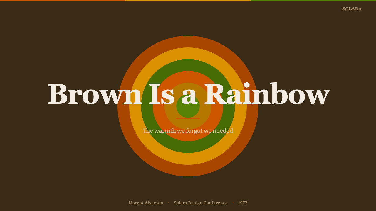
For presentation slides, the style suits cover pages and section breaks especially well: a full-bleed concentric sunburst in the earth-tone palette behind a bulbous headline immediately signals warmth and character. Content slides should keep body text in a simple, legible form set against a warm neutral (harvest gold or a muted cream) rather than the boldest colors, reserving avocado and burnt orange for section markers, highlights, or data callouts so the density stays readable.
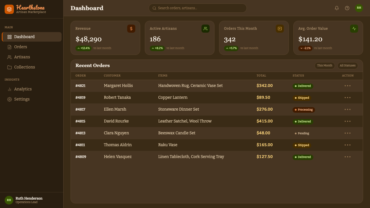
For web interfaces, the style works well for lifestyle, food, hospitality, and community-oriented products where warmth and personality matter more than clinical efficiency — think a dashboard for a neighborhood marketplace or a recipe platform rather than a financial analytics tool. Buttons and interactive states can use the rounded, bulbous letterforms and warm accent colors; card surfaces benefit from the soft grain texture to avoid feeling flat or overly digital.
For editorial and marketing work, the palette and typography pair naturally with nostalgic or heritage storytelling — brand histories, retro product relaunches, community and neighborhood content. A masthead using the concentric sunburst motif behind a bold rounded headline reproduces the confident, warm feel of period advertising without needing to copy any specific historical artifact.
The most common mistake is using only the color palette while keeping sharp, modern sans-serif type and generous cool-toned negative space — this produces a diluted, generic 'retro-ish' look rather than the real thing. The style depends on all three elements working together: muddied warm color, rounded bulbous type, and confident maximal density. Dropping any one of the three weakens the effect considerably.
1970s Earth Tones — FAQ
Is this the same as general 'retro' or 'vintage' styling?
It is a specific slice of a broader retro spectrum, anchored to a particular decade and a particular domestic color story — avocado, harvest gold, burnt orange, dark wood. Generic 'retro' styling can borrow from any decade or region; this style is specifically North American and specifically early-1970s, and its palette and texture choices are much more constrained than a loose vintage look.
Can this style work with a light or white background instead of the deep ochre-brown ground?
It can, but the effect softens considerably. The deep ochre-brown ground is what gives the palette its enveloping, domestic-interior feel; on a white background, the same colors read as merely 'warm accent colors' rather than a fully committed period palette. If a lighter ground is necessary, leaning more heavily on the rounded typography and sunburst motifs helps preserve the style's identity.
Does this style require the concentric sunburst pattern, or can it work with simpler compositions?
The sunburst is a strong signature but not mandatory. Simpler color-block compositions in the same muddied warm palette, paired with the bulbous rounded typography and a soft grain texture, still read clearly as belonging to this style. The sunburst is most valuable when a composition needs a strong focal rhythm, such as a cover page or hero section.
Is this style suitable for content aimed at a younger or more contemporary audience?
Yes — 1970s earth-tone aesthetics have cycled back into contemporary taste repeatedly, particularly in food, lifestyle, and craft branding aimed at audiences who associate the palette with warmth and authenticity rather than dated technology. It works less well for audiences or products where the visual language needs to signal cutting-edge or futuristic positioning.
How does this style differ from other 1970s-adjacent aesthetics like disco or psychedelic art?
Disco leans toward metallic shine, black, and high-contrast nightlife glamour; psychedelic art leans toward swirling, high-saturation color and optical distortion aimed at visual intensity. This style is domestic and daytime rather than nightlife-driven — its reference point is the family home, not the dance floor — and its palette is deliberately muddied and earthy rather than electric or hallucinatory.
Related design styles
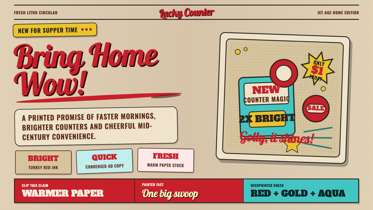 1950s Brush Script AdSells tomorrow in one swoop. Turkey red script, tan paper, starbursts, and ha…
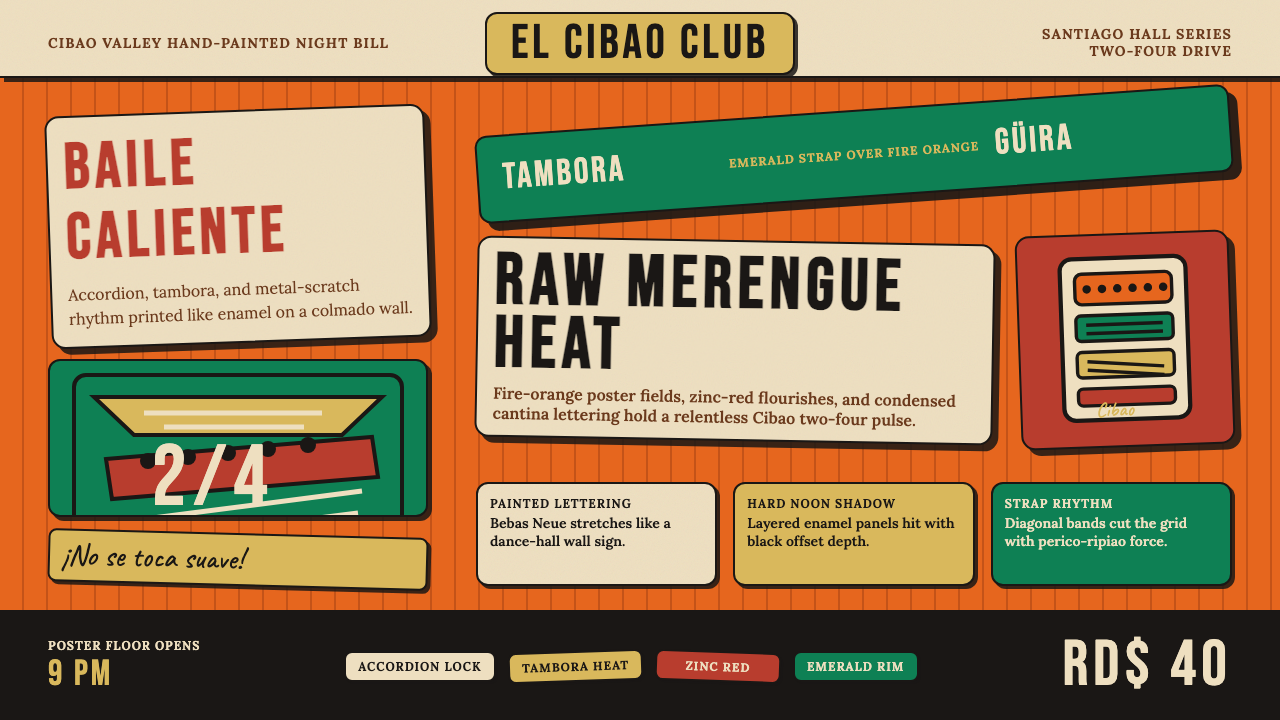 Dominican Merengue Perico RipiaoMaximalism keeps time. Fire-orange fields, Bebas Neue, and diagonal emerald s…
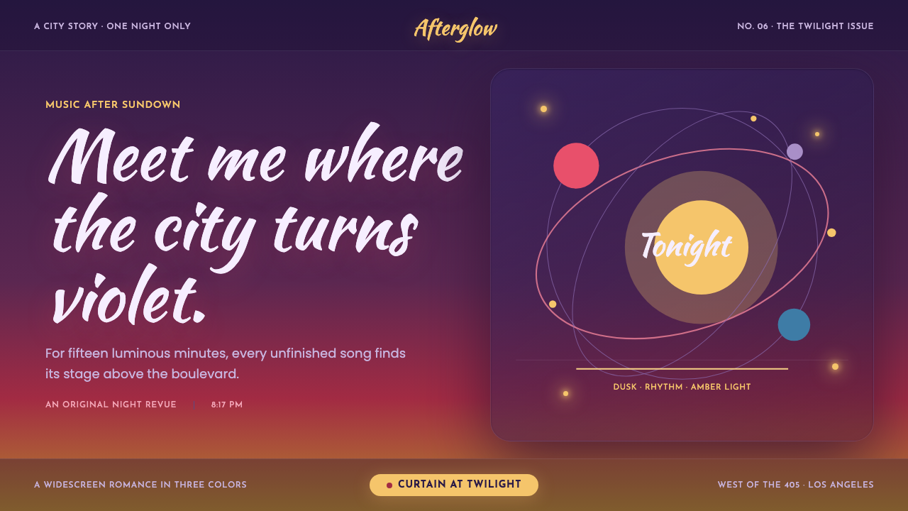 La La Land (2016)Twilight waits for a dance. Violet dusk, rose horizons and amber bulbs frame…
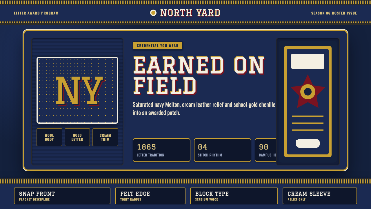 Varsity LettermanEarned, not printed. Navy wool ground, school-gold chenille and block varsity…
 1950s Diner AquaRoadside optimism shouts. Aqua walls, cherry vinyl, chrome bands, and neon sc…
 Braniff (Girard)Color becomes fuselage. Jellybean orange, turquoise blocks, and geometric san…