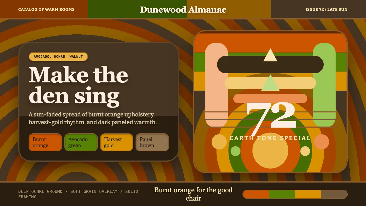
About 1970s Earth Tones
The 1970s North American home was a warm, saturated den: avocado-green appliances, harvest-gold tile, burnt-orange upholstery, all set against dark wood paneling and deep-pile brown shag. This is its graphic counterpart — confidently maximal, earthy, and unafraid of muddy-warm saturation.
Headlines arrive in bulbous, friendly Cooper Black; color blocks and concentric sunburst stripes carry the groovy rhythm. Nothing here is airy or cool. The world sits on a deep ochre-brown ground, layered with wood grain and a soft grain overlay that gives every surface the feel of a sun-faded magazine spread.
- Origin
- North America
- Era
- 1950–1990; peaking circa 1972
- Key figures
- 1970s interior designers · advertising art directors · packaging illustrators
- Movements
- Mid-century-to-seventies earth-tone design · groovy retro lettering
1970s Earth Tones design spec
Colors
Typography
The other 11 sections — buttons, cards, spacing, motion, techniques and more — open once you unlock. Download the DESIGN.md or send it to your AI in one click. Unlock once, yours forever.
Sign up nowStyles similar to 1970s Earth Tones
Also inspired by design movements, with a close feel.
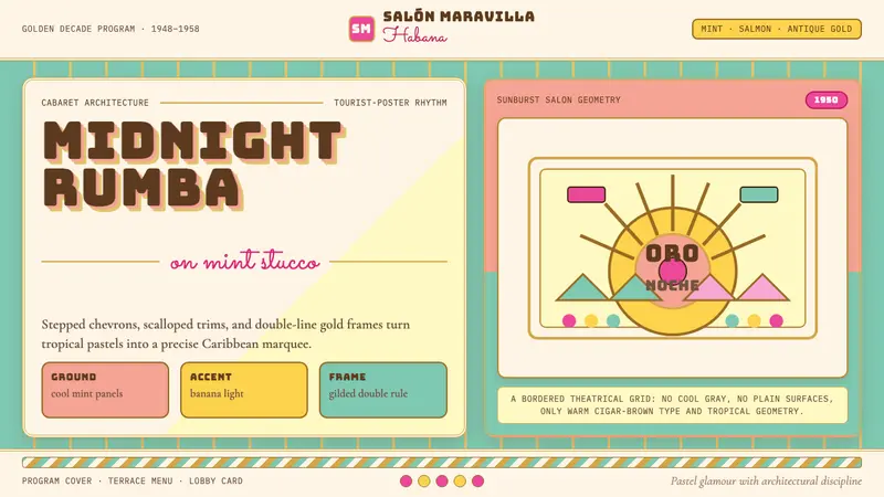 Cuban Art Deco (Havana 1950)Tropical Deco goes theatrical. Mint and salmon panels, gold double rules, Bungee marquee type.
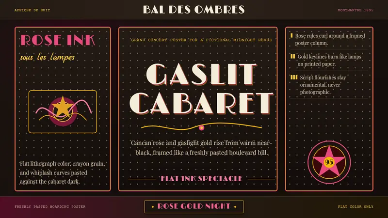 Belle Époque ParisCabaret night glows. Rose ink and gaslight gold curl across warm near-black poster panels.
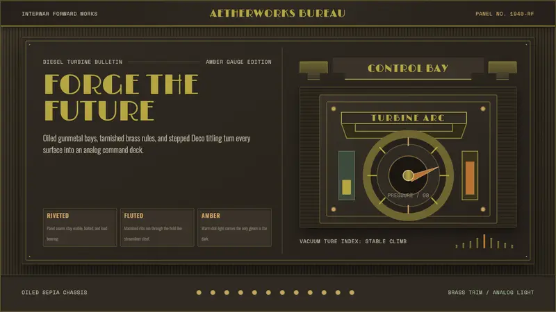 Dieselpunk RetrofutureMachine age, dark and bolted. Gunmetal grid, brass rivets, amber gauge geometry.
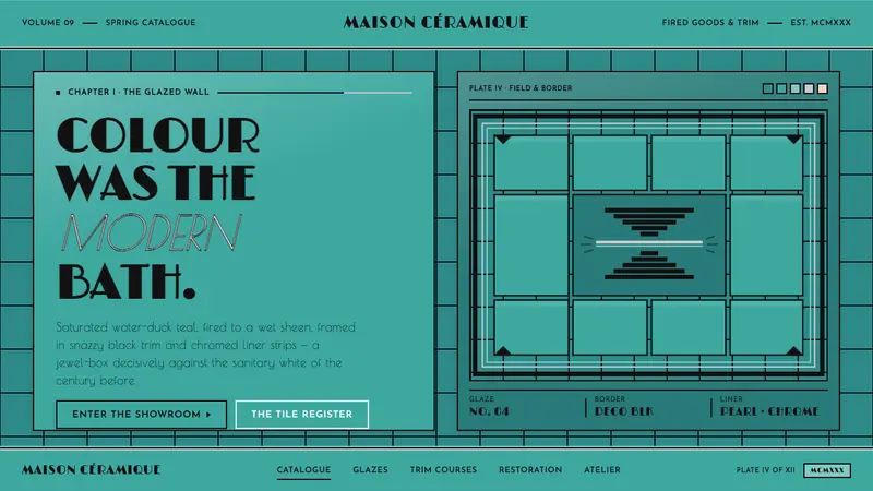 Art Deco Teal Bathroom (1930s)Colour was the modern bath. Water-duck teal glaze, snazzy black trim, Limelight Deco caps.