What is Looney Tunes (Warner Bros.)?什么是 Looney Tunes (Warner Bros.)?
Looney Tunes weaponized cartoon chaos into a design language — bull's-eye rings, bungee-bold type, and CMYK-primary color blocks that feel like a 1940s Warner Bros. short frozen mid-gag.乐一通把卡通混乱变成了一套设计语言——同心牛眼环、粗壮弹性字体,以及那些像华纳兄弟1940年代动画定格于笑点之间的CMYK原色块。
Looney Tunes (Warner Bros.) in briefLooney Tunes (Warner Bros.) 速览
Looney Tunes is the visual universe born from Warner Bros.' animated short film series, which began production in 1930 in Hollywood. At its commercial and artistic peak through the 1940s and 1950s, the studio produced hundreds of short films featuring characters including Bugs Bunny, Daffy Duck, Porky Pig, Tweety, Sylvester, and the Road Runner. The aesthetic that emerged from those films — saturated cartoon-primary colors, chunky display letterforms, dynamic action lines, concentric bull's-eye rings, and flat color fills without shadow or texture — became one of the most recognizable visual signatures in American popular culture.乐一通是华纳兄弟动画短片系列所孕育的视觉宇宙。这个系列自1930年在好莱坞开始制作,在1940至1950年代的商业与艺术巅峰期推出了数以百计的短片,主角包括兔八哥、达菲鸭、波奇猪、崔弟、傻大猫和路跑者。从这些短片中生长出来的美学——饱和的卡通原色、粗壮的展示字体、充满动感的动作线条、同心牛眼圆环、无投影无纹理的平涂色块——成为美国大众文化中最具辨识度的视觉印记之一。
Where Bauhaus reduced design to geometry and function, Looney Tunes maximized it for entertainment and impact. The guiding logic is exaggeration rather than restraint: colors pushed to maximum saturation, type treated as a physical object capable of stretching or bouncing, shapes simplified into bold readable silhouettes, and every compositional decision oriented toward immediate visceral recognition. The result is a design language that communicates energy, comedy, and speed at a glance.包豪斯将设计还原为几何与功能,乐一通则将设计推向娱乐性与冲击力的极致。它的主导逻辑是夸张而非克制:色彩被推至最大饱和度,字体被当作可以拉伸或弹跳的物理对象,形状被简化为粗放可读的剪影,每一个构图决定都指向即时的直觉认知。结果是一套能在一瞥之间传递能量、喜剧感与速度感的设计语言。
As a contemporary design style, Looney Tunes draws directly on that mid-century animated frame — its palette of hot red, cobalt blue, and hot yellow against pure white or dense black, its circus-poster confidence with letterforms, and its complete indifference to subtlety. It is unambiguously populist: this is design that wants to be seen across a movie theater lobby, on the side of a lunch box, or in the corner of a television screen.作为当代设计风格,乐一通直接取材于那个中世纪动画的定格画面——由热红、钴蓝、热黄构成的色板,衬托于纯白或浓黑背景之上;马戏海报般对字体的驾驭自信;以及对精巧微妙的彻底无视。它毫不含糊地属于大众:这是一套希望被看见于电影院大厅、饭盒侧面或电视屏角的设计。
See the Looney Tunes (Warner Bros.) design system查看 Looney Tunes (Warner Bros.) 完整设计系统
Where does Looney Tunes (Warner Bros.) come from?Looney Tunes (Warner Bros.) 从何而来?
Warner Bros. launched its animation division in 1930, initially as a vehicle to produce musical shorts that could showcase its record-label catalogue — the 'Looney Tunes' name itself was a direct parody of Disney's 'Silly Symphonies.' The early shorts were produced cheaply and quickly, with a house style that leaned on bold outlines, flat fills, and limited palettes that could survive the reproduction constraints of early theatrical printing and movie-poster lithography. These production realities shaped the aesthetic from the beginning: what looked good on a 1930s lobby card needed to be high-contrast, color-blocked, and immediately legible from a distance.华纳兄弟于1930年启动动画部门,最初只是作为推广旗下唱片公司歌曲目录的载体——「乐一通」这个名字本身就是对迪士尼「傻交响」的直接戏谑。早期短片制作迅速且成本有限,形成了一种依赖粗重轮廓、平涂色块和有限色板的厂内风格,以应对早期院线印刷与电影海报石版印刷的再现限制。这些生产现实从一开始就塑造了这套美学:在1930年代电影院大厅宣传卡上好看的东西,必须是高对比度、色块分明、从远处一眼可读的。
Through the late 1930s and into the 1940s, the studio assembled the group of directors — Chuck Jones, Friz Freleng, and Tex Avery — who defined the style's visual and comedic maturity. Avery in particular pushed the visual language toward hyperbole: characters whose eyes would fly out of their heads, whose bodies would flatten under anvils and immediately re-inflate, whose physical distress was drawn with swooping speed lines and explosive starbursts. Jones brought a more architectural sense of composition — his frames are notably balanced even in their chaos, with strong horizontal staging and carefully controlled pacing. Freleng contributed a musical sense of timing that synchronized visual gags with orchestral accents, reinforcing the style's relationship between rhythm and image.在1930年代末至1940年代,制片厂聚集了一批导演——恰克·琼斯、弗里茨·弗雷伦格和泰克斯·艾弗里——他们共同定义了这种风格视觉与喜剧的成熟形态。艾弗里尤其将视觉语言推向极度夸张:角色的眼睛会飞出头颅,身体会被铁砧压扁后立刻弹回原形,肢体的痛苦以弧形速度线和爆炸星芒来呈现。琼斯则带来了更具建筑感的构图意识——他的画面即便在混乱中也有明显的平衡感,横向舞台感强,节奏控制精准。弗雷伦格贡献了音乐般的时间感,使视觉笑点与管弦乐重音同步,强化了这种风格在节奏与图像之间的内在关联。
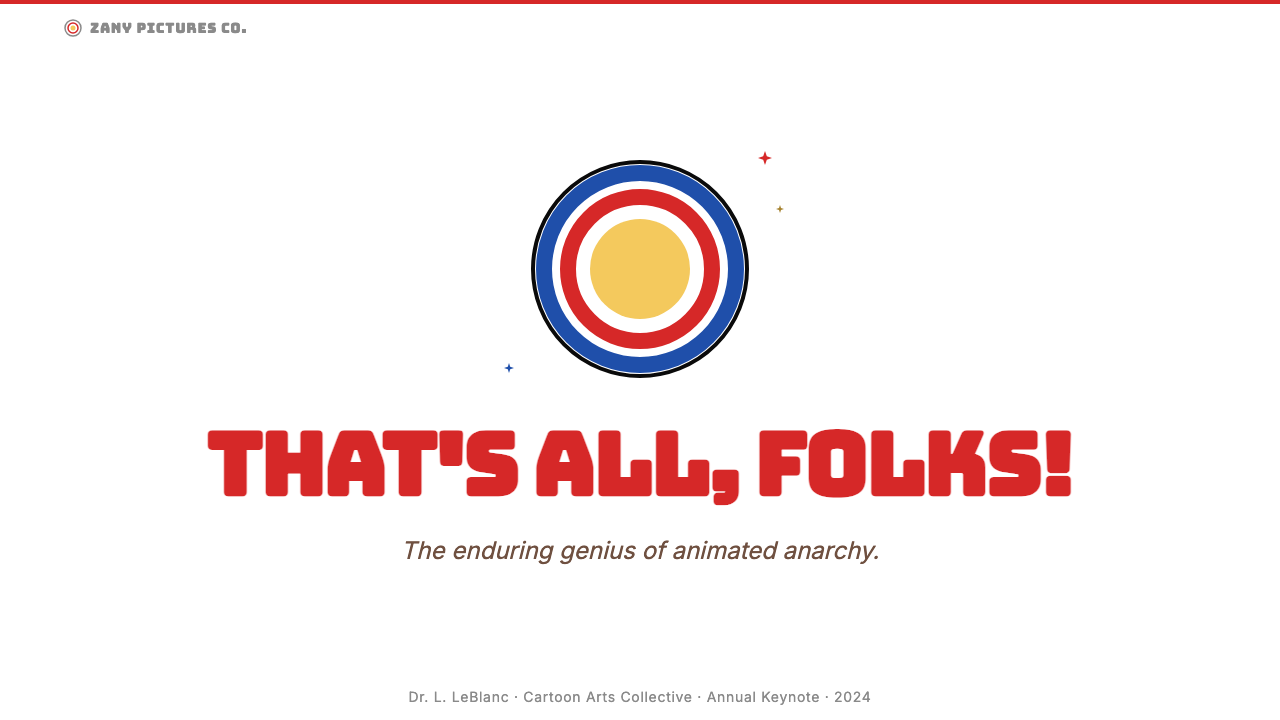
The voice performances of Mel Blanc — who voiced virtually every major character from Bugs Bunny to Daffy Duck to Porky Pig — gave the series a sonic identity that reinforced its visual one. Blanc's exaggerated, distinctly urban American vocal characterizations matched the visual exaggeration: nothing was underplayed. The iconic closing bull's-eye sequence — concentric pink and white rings irising in to reveal Porky Pig's stuttering sign-off 'Th-Th-Th-That's all folks!' — became the series' visual trademark, and it is from this motif that much of the contemporary design language derives its most distinctive single element.梅尔·布兰科的配音表演——他几乎为所有主角配音,从兔八哥到达菲鸭再到波奇猪——赋予了这个系列一个与视觉相互呼应的声音身份。布兰科夸张的、带有鲜明美式城市气息的声音塑造,与视觉上的夸张如出一辙:没有任何东西是低调的。标志性的收尾牛眼环序列——同心粉白圆环向中心收缩,显现出波奇猪结结巴巴的告别词「这、这、这、就这样了朋友们!」——成为整个系列的视觉商标,当代设计语言中最具辨识度的单一元素正源于此。
The Looney Tunes visual vocabulary was consolidated and broadcast internationally through television syndication beginning in the 1950s and accelerating through the 1960s and 1970s. Merchandise, promotional materials, and licensed products extended the aesthetic into print, packaging, and retail across decades. By the time Warner Bros. began systematically licensing the style for brand extensions and theme parks in the 1980s and 1990s, the core visual grammar — saturated CMYK primaries, bull's-eye rings, chunky bungee letterforms, explosive action marks — had become stable enough to function as a coherent design system applicable far beyond animated film.从1950年代开始,乐一通的视觉词汇随着电视联播向国际传播,并在1960至1970年代加速扩散。周边商品、宣传材料和授权产品在数十年间将这套美学延伸至印刷、包装与零售各领域。到1980至1990年代华纳兄弟开始系统性地授权品牌延伸与主题公园时,核心视觉语法——饱和CMYK原色、牛眼圆环、粗壮弹性字体、爆炸式动作标记——已经足够稳定,能够作为一套连贯的设计系统应用于动画电影之外的广阔领域。
What defines the Looney Tunes (Warner Bros.) look?Looney Tunes (Warner Bros.) 的视觉特征是什么?
Color色彩
The palette is built from the four pure CMYK printing primaries — red, cobalt blue, hot yellow, and pure white — used at full saturation with no dilution, no pastels, and no neutrals beyond black and white. Color blocking is the fundamental compositional strategy: large flat fields of a single hue are placed against each other or against white without gradation. The colors do not mix; they collide. Black is used heavily for outlines and structural containment — every colored form is bounded by a thick ink line, a convention borrowed directly from commercial lithography and comic-book printing.色板由CMYK四色印刷原色构成——红、钴蓝、热黄与纯白——以全饱和度使用,无稀释、无粉彩、除黑白外无中性色。色块平铺是基本的构图策略:大面积单色平涂区域与相邻色块或白底直接碰撞,不作渐变过渡。颜色不融合,只碰撞。黑色大量用于轮廓线与结构包裹——每个彩色形态都被粗重的墨线所界定,这一惯例直接借鉴自商业石版印刷与漫画印刷。
Typography字体排印
Letterforms in the Looney Tunes idiom are chunky, rounded, and physically assertive — the style sometimes called 'bungee' in contemporary design, after the visual sense that letters are stretched or compressed under pressure. Type is treated as a drawn object rather than a typeset element: characters may bulge, lean, arc across a curve, or be outlined with a thick stroke that makes them readable against any background. Scale contrast is extreme — display type is often many times larger than any supporting text, functioning more like a graphic element than a communication device.乐一通语汇中的字形粗壮、圆润、极具物理存在感——在当代设计中有时称之为「弹力」字体,因为视觉上字母仿佛在压力下被拉伸或压缩。字体被当作一个绘制的对象而非排版的元素:字符可以鼓胀、倾斜、沿弧线排列,或被粗重描边包围以便在任何背景上保持可读。尺度对比极端——展示字体往往比任何辅助文字大出许多倍,更像图形元素而非传播媒介。
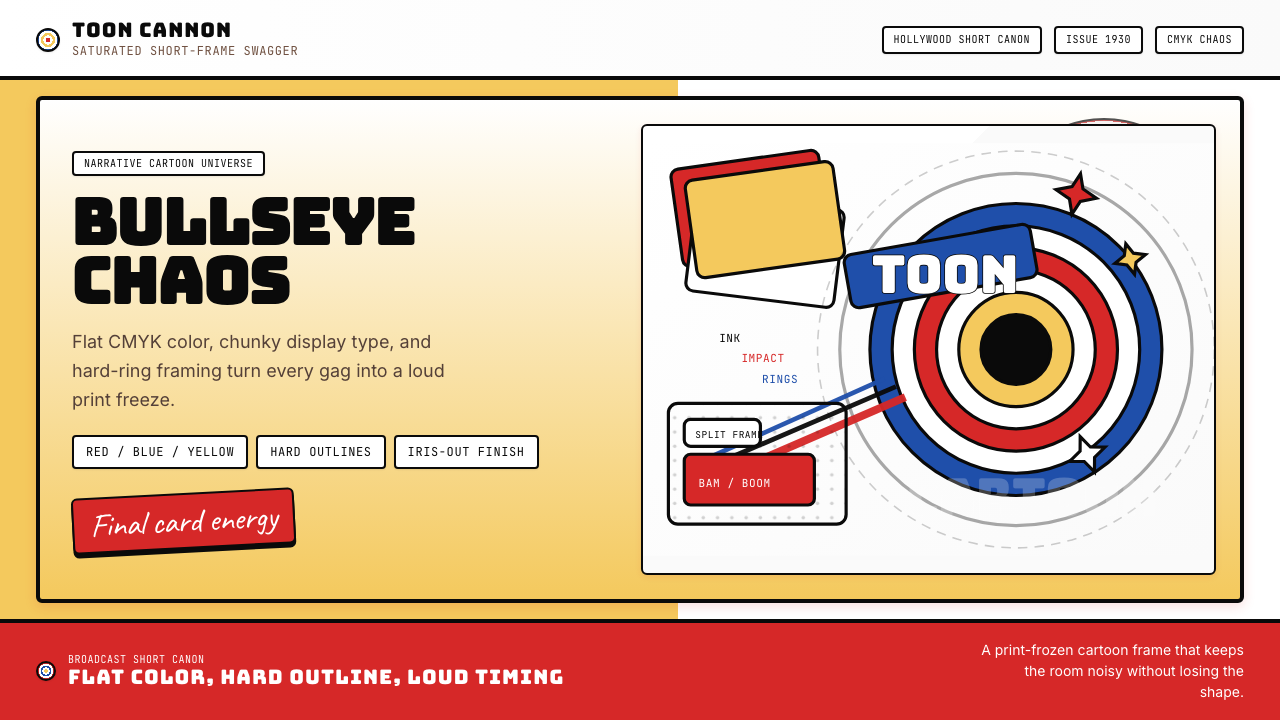
The Bull's-Eye Ring牛眼圆环
The concentric ring motif — derived from the closing iris of the 'That's all folks!' end card — is the Looney Tunes style's most singular graphic element. Typically rendered in alternating pink and white (or red and white, or black and white), the rings function as a frame, a focal point, and a brand signature simultaneously. In contemporary applications the motif is used as a containing shape for portraiture, as a background pattern, or as a compositional anchor that draws the eye to a central point. Its circular geometry provides a strong contrast against the otherwise angular or chaotic compositions typical of the style.同心圆环图案——源自「就这样了朋友们!」收尾画面的光圈收缩效果——是乐一通风格最独特的单一图形元素。通常以粉白交替(或红白、黑白)呈现,圆环同时充当画框、焦点与品牌印记。在当代应用中,这一母题被用作人像的容纳形态、背景图案或将视线引向中心点的构图锚点。其圆形几何与这种风格中普遍存在的棱角分明或混乱无序的构图形成强烈对比。
Action Marks and Speed Lines动作标记与速度线
Motion in the Looney Tunes visual language is always visible: speed lines sweep behind a running figure, starburst explosions mark moments of impact, and motion blur arcs indicate the path of a thrown object. These graphic conventions were developed in the animation cels themselves and passed directly into print design and merchandise. As design elements they function as energy amplifiers — placed around text or objects, they convey velocity, impact, and comic-book dynamism. They are almost always black, drawn with variable line weight from thick at the source to thin at the terminus.运动在乐一通的视觉语言中总是可见的:速度线从奔跑中的角色身后扫过,爆炸星芒标记冲击的瞬间,运动模糊弧线追踪投掷物的轨迹。这些图形惯例从动画赛璐珞片中发展而来,直接进入了印刷设计与周边产品。作为设计元素,它们充当能量放大器——围绕文字或物体放置时,传递速度、冲击力与漫画式的动感。它们几乎总是黑色,以从源头粗重到末端细薄的可变线重绘制。
Flat Fills and Zero Gradients平涂填充与零渐变
Every colored area in the canonical Looney Tunes style is a flat, unmodulated fill — the same color from edge to edge, with no shading, no highlight, and no shadow that is not itself a distinct flat shape of a different color. This flatness is a direct inheritance from cel animation, where each color on a character was a separate painted layer requiring physical separation. The result is a graphic system of hard-edged color areas that reads at any scale and at any reproduction fidelity, from a cel frame to a printed shopping bag to a full-size theme park banner.经典乐一通风格中的每个彩色区域都是平涂且均匀的填充——从边缘到边缘是同一颜色,无阴影、无高光,任何投影本身也必然是另一种颜色的独立平面形状。这种平面性直接继承自赛璐珞动画,其中角色身上的每种颜色都是需要物理分离的独立涂绘图层。结果是一套由硬边色彩区域构成的图形系统,在任何尺度、任何再现精度下都清晰可读——从动画帧到印刷购物袋,再到全尺寸主题公园横幅。
Outline and Containment轮廓线与形态包裹
Unlike Bauhaus, which relies on the geometric edge of a shape to define its boundary, Looney Tunes outlines virtually everything. Thick black contour lines wrap characters, lettering, graphic elements, and even color blocks. The outline weight is generous and consistent, functioning as a visual glue that unifies the composition across color contrasts. This convention also ensures legibility: any color reads against any other color when separated by a black line, which gives the style a structural flexibility that allows it to combine colors that would otherwise clash violently.与依赖形状几何边缘来界定边界的包豪斯不同,乐一通几乎对所有元素都加以轮廓线处理。粗重的黑色轮廓线包裹着角色、字体、图形元素甚至色块本身。轮廓线的线重饱满且一致,充当视觉黏合剂,在色彩对比之间统一构图。这一惯例同时确保了可读性:任何颜色在被黑线间隔后都能在任何其他颜色前清晰呈现,赋予这种风格一种结构弹性,使它得以组合那些在其他情况下会激烈冲突的颜色。
Exaggeration as Principle夸张作为原则
If the Bauhaus principle is restraint, the Looney Tunes principle is amplification. Every design decision leans toward more: more contrast, more saturation, more scale difference, more graphic density. This is not carelessness — it is a deliberate commitment to the visual logic of comedic exaggeration, which requires that every element be pushed past the point of naturalism to the point of instant legibility. The style works because exaggeration, at this register, becomes its own form of clarity: there is no ambiguity about what the composition is communicating.如果说包豪斯的原则是克制,乐一通的原则就是放大。每一个设计决定都指向「更多」:更多对比、更高饱和度、更大尺度差异、更浓密的图形密度。这并非粗心大意——而是对喜剧夸张视觉逻辑的刻意承诺,它要求每个元素都被推过自然主义的节点,推向即时可读的极致。这种风格之所以有效,是因为夸张在这个量级上成为其自身的一种清晰性:关于构图所要传达的信息,没有任何歧义。
See the Looney Tunes (Warner Bros.) design system查看 Looney Tunes (Warner Bros.) 完整设计系统
Who shaped Looney Tunes (Warner Bros.)?谁塑造了 Looney Tunes (Warner Bros.)?
Jones directed over three hundred Looney Tunes and Merrie Melodies shorts between 1938 and 1962, and is widely credited with bringing compositional sophistication to the series. His cartoons — including the Road Runner and Wile E. Coyote series, Rabbit of Seville, and What's Opera Doc? — are distinguished by a precise sense of staging, timing, and graphic economy. Jones understood that restraint in a character's stillness made the subsequent explosion of movement more readable, a principle that translates directly into design: the negative space in a Looney Tunes composition is as deliberate as any filled area.琼斯在1938至1962年间执导了逾三百部乐一通与梅里旋律短片,被广泛认为是为该系列带来构图精巧性的人。他的作品——包括公路跑者与大坏狼系列、《塞维利亚的兔子》和《这是歌剧,道奇?》——以精准的舞台感、时间感和图形节约性著称。琼斯深知角色静止中的克制能使随后的动作爆发更具可读性,这一原则直接转化为设计逻辑:乐一通构图中的留白与任何填充区域一样都经过深思熟虑。
Avery joined the Warners animation unit in 1935 and is credited with developing Bugs Bunny's irreverent, fourth-wall-breaking personality, though he directed many of those early formative shorts at a different studio. His defining contribution to the visual language was the grammar of hyperbolic reaction: eyes that pop from the skull, jaws that drop to the floor, characters who run off a cliff and hang suspended before looking down. These visual conventions — which passed directly into the broader Looney Tunes style vocabulary — are now standard shorthand for exaggeration in design, illustration, and animation across cultural contexts.艾弗里于1935年加入华纳动画部门,被认为是发展了兔八哥那种不敬、打破第四堵墙性格的功臣,尽管他执导那些早期奠基之作时身在另一家制片厂。他对视觉语言最决定性的贡献是极度夸张反应的语法:眼球弹出头颅、下巴掉到地板、角色跑下悬崖后悬空片刻才低头看的瞬间。这些视觉惯例直接融入了更广泛的乐一通风格词汇,如今已成为跨文化语境中设计、插画与动画里表达夸张的标准速记。
Freleng was one of the studio's earliest and longest-serving directors, working on the series from the early 1930s through the 1960s and returning in later revival efforts. His cartoons are notable for their musical sophistication — he came from a background as a musician and synchronized visual gags to orchestral arrangements with unusual precision. He is responsible for establishing many of the recurring visual relationships between characters, particularly Tweety and Sylvester, that became central to the series' brand identity. His timing-driven approach influenced how the style uses rhythm — beats, pauses, and accents — as a compositional tool.弗雷伦格是制片厂最早入职、服务时间最长的导演之一,从1930年代初一直工作到1960年代,并在后期的复兴版本中再度参与。他的作品以音乐上的精巧性著称——他有音乐人的背景,能以异常精准的方式将视觉笑点与管弦乐编排同步。他建立了许多角色之间反复出现的视觉关系,尤其是崔弟与傻大猫的组合,这成为该系列品牌身份的核心。他以时间感为驱动的方法影响了这种风格如何将节奏——强拍、停顿与重音——作为构图工具。
Known as the 'Man of a Thousand Voices,' Blanc was the primary voice actor for virtually every major Looney Tunes character from the late 1930s until his death in 1989. His vocal creations — the Brooklyn-inflected cool of Bugs Bunny, the sputtering aggression of Daffy Duck, the gentle stutter of Porky Pig — gave each character a sonic identity that reinforced its visual design. Blanc's work demonstrates how the Looney Tunes style is not purely visual: the exaggeration principle extends to every sensory channel. His voice work was so definitive that it influenced how subsequent designers conceived the characters as total identity systems rather than purely graphic ones.布兰科被称为「千声之人」,是1930年代末至1989年去世前几乎所有乐一通主要角色的首席配音演员。他所创造的声音形象——兔八哥带布鲁克林腔的洒脱、达菲鸭口水四溅的攻击性、波奇猪温柔的结巴——赋予每个角色与其视觉设计相互呼应的声音身份。布兰科的工作揭示了乐一通风格并非纯视觉的:夸张原则延伸至每一个感官通道。他的配音工作太过决定性,以至于影响了后续设计师将这些角色理解为完整身份系统而非纯图形系统的方式。
Clampett directed at Warners from 1937 to 1946 and is credited with some of the most formally adventurous cartoons in the series' history. His films pushed character design toward maximum distortion — figures that could warp, stretch, and multiply in ways that challenged any stable sense of an agreed visual form. This radical mutability influenced the way contemporary designers understand the Looney Tunes style as inherently flexible: the characters and motifs are not fixed icons but elastic systems that can absorb transformation and still be recognized. His work represents the full-throttle outer limit of what the visual language can do.克兰佩特于1937至1946年间在华纳执导,被认为创作了该系列历史上形式上最具冒险精神的作品。他的影片将角色设计推向最大程度的变形——人物可以以挑战任何稳定视觉形态共识的方式扭曲、拉伸和增殖。这种激进的可变性影响了当代设计师对乐一通风格内在弹性的理解:这些角色和图案并非固定的图标,而是能够吸收变形并依然可被辨认的弹性系统。他的工作代表了这套视觉语言所能企及的全速极限。
How do you use Looney Tunes (Warner Bros.) today?今天怎么用 Looney Tunes (Warner Bros.)?
Looney Tunes is among the most energetic and immediately communicative styles available to contemporary designers, but it requires discipline precisely because its loudness is a feature rather than a flaw. Applying it correctly means understanding that the exaggeration is systematic: every design decision — color, type scale, line weight, compositional density — should be calibrated to the same register of amplification, not mixed with quieter approaches that will simply look incomplete rather than balanced.乐一通是当代设计师可以使用的最有能量、最具即时传达力的风格之一,但它要求精确的自律,恰恰是因为它的「响亮」是功能而非缺陷。正确应用它意味着理解:这种夸张是系统性的——每一个设计决定,包括色彩、字体比例、线重、构图密度,都应当被校准到同一放大量级,而不是与较为安静的方法混合使用,否则只会显得不完整而非平衡。
For presentation slides, the style excels at cover pages, section dividers, and high-impact announcement moments where the goal is immediate engagement rather than information density. A cover built in this style uses the bull's-eye ring as a structural frame or focal element, bold bungee-style type at very large scale, and a palette of two or three solid primaries against white or black. Content slides are harder to execute well: keep the design's energy primarily in the headings and accent elements, and give the body content a quieter container — a clean white panel with black text — so the eye has a resting point. Data visualizations benefit from the flat color and bold outlines: bar charts become graphic objects in their own right when rendered with thick strokes and solid primary fills, and category labels can use the display lettering style without compromising legibility.在演示文稿中,这种风格在封面页、章节分隔页以及需要即时吸引注意而非传递信息密度的高冲击力公告时刻表现出色。以这种风格制作的封面,将牛眼圆环用作结构框架或焦点元素,弹力风格字体以极大比例呈现,色板由两到三种实色原色配以白底或黑底构成。内容页更难执行到位:将设计的能量主要集中在标题和强调元素上,为正文内容提供更安静的容器——白色面板配黑色文字——给视线一个休息点。数据可视化可从平涂色彩和粗重轮廓线中获益:当柱状图以粗边框和实心原色填充呈现时,便成为图形对象本身,类别标签可以使用展示字体风格而不损害可读性。
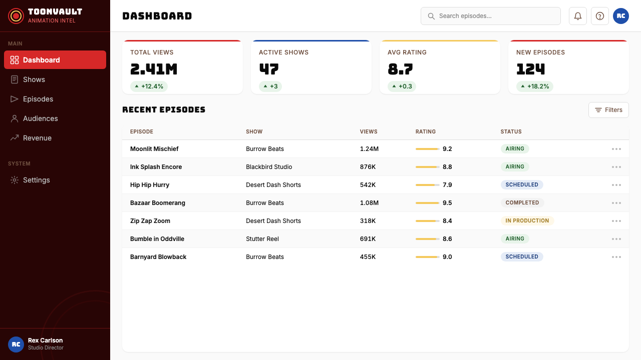
For web interfaces, the style is particularly well-suited to entertainment platforms, gaming products, children's services, and consumer-facing applications where personality and delight are product values. Dashboards built in this idiom should use the primary palette for interactive states and metric highlights, with a white or very light background for reading areas. Pricing pages work with the style's poster-like boldness — tier cards can use full-color fills with white reversed type, separated by the characteristic thick black outlines. Navigation and wayfinding benefit from the style's strong typographic character: wordmarks and section labels in display-style letterforms, with active states indicated by color fills rather than subtle underlines.对于网页界面,这种风格特别适合娱乐平台、游戏产品、儿童服务以及以个性与喜悦为产品价值的消费者应用。以此风格构建的仪表板,应将原色色板用于交互状态和指标高亮,阅读区域保持白色或非常浅的背景。定价页面适合这种风格的海报式大胆——层级卡片可以使用全色填充配白色反底字体,以标志性的粗黑轮廓线分隔。导航与路径标识从这种风格强劲的字体特性中获益:展示风格字形的文字标识与分区标签,以色彩填充而非细微下划线标示激活状态。
For editorial and marketing applications, the style's natural territory is anywhere that wants to be noticed first. Print and digital advertising, event promotional materials, social media assets, and packaging all benefit from the full-saturation palette and graphic boldness. A common and effective approach is to use the concentric ring motif as a containing shape for a hero image or product shot, framed by large display type and flanked by action marks. Marketing pages can alternate between bold full-color sections and clean white reading sections, using the primary palette for calls to action and the display type for headings. The style adapts well to seasonal and campaign contexts where the visual energy can shift without losing brand recognition.对于编辑与营销应用,这种风格的天然领域是任何希望先被注意到的地方。印刷与数字广告、活动推广材料、社交媒体素材和包装都能从全饱和度色板和图形大胆中获益。一种常见且有效的方法是将同心圆环母题用作主图或产品图的容纳形态,以大型展示字体框架,并以动作标记点缀两侧。营销页面可以在大胆全彩区块与干净白色阅读区块之间交替,将原色用于行动号召、展示字体用于标题。这种风格对季节性和活动语境有良好适应性,视觉能量可以在不失去品牌识别度的前提下转换。
A common mistake when applying this style is treating it as an excuse for visual chaos — piling on every motif simultaneously and assuming that more is always better. In the original animated films, the chaos was rigorously choreographed: every exaggerated element appeared in a specific sequence, at a specific scale, for a specific duration. The same discipline applies in design. Choose one or two of the signature elements per composition — the rings, or the speed lines, or the bungee type, not all three at once — and give each enough space to read clearly. A second common error is using the palette timidly: half-saturated versions of the primaries read as neither the Looney Tunes style nor anything else, landing in an uncertain middle ground that loses the style's entire communicative power. Commit fully or choose a different approach.应用这种风格时最常见的错误,是将其视为视觉混乱的借口——同时堆砌每一个母题,认为越多越好。在原始动画短片中,混乱是被严格编排的:每一个夸张元素都出现在特定的序列、特定的比例、特定的持续时长中。同样的自律也适用于设计。每个构图只选择一到两个标志性元素——圆环,或速度线,或弹力字体,而不是三者同时出现——并给每个元素足够的空间清晰呈现。第二个常见错误是怯懦地使用色板:半饱和度的原色既不像乐一通风格,也不像其他任何东西,落入一个不上不下的灰色地带,丧失了这种风格全部的传达力量。要么全力投入,要么选择别的方式。
See the Looney Tunes (Warner Bros.) design system查看 Looney Tunes (Warner Bros.) 完整设计系统
Looney Tunes (Warner Bros.) — FAQLooney Tunes (Warner Bros.) · 常见问题
How is Looney Tunes different from other retro cartoon styles like 1930s rubber-hose animation?乐一通与1930年代橡皮管动画等其他复古卡通风格有何不同?
Rubber-hose animation — exemplified by early Fleischer and Disney shorts — is characterized by limbless, boneless characters with fluid, looping movement and rounded, organic forms. Its color palette was typically limited and often pastel. Looney Tunes, by contrast, is harder-edged, more primary in its color use, and more graphically confrontational. Characters have defined anatomy (even if exaggerated), compositions are more aggressive, and the black outline is heavier and more structural. Rubber-hose reads as gentle and whimsical; Looney Tunes reads as anarchic and urban. They share a mid-century American cartoon origin but communicate very different emotional registers.橡皮管动画——以早期弗莱舍和迪士尼短片为代表——以无骨骼的角色、流体循环的运动和圆润有机的形态为特征,色板通常有限且常呈粉彩色调。乐一通则相反,边缘更硬,色彩使用更原色化,图形上更具对抗性。角色有明确的肢体结构(即便被夸张),构图更具攻击性,黑色轮廓线更重、更具结构性。橡皮管动画给人温柔奇趣的感受;乐一通给人无政府主义与都市感。两者共享美国中世纪卡通的起源,但传递截然不同的情感量级。
Can Looney Tunes work for professional or corporate contexts, or is it always casual?乐一通能用于专业或企业语境,还是注定只属于休闲场合?
The style is inherently populist and energetic rather than authoritative, so it carries a strong casual signal by default. However, there are professional contexts where this is exactly the right register: gaming companies, entertainment platforms, children's educational products, sports brands, and consumer packaged goods all regularly commission work in this visual territory without it feeling inappropriate. The question is not whether the style is 'professional' but whether its values — exuberance, approachability, humor, boldness — align with the product's values. A cybersecurity firm or a private bank would likely find the style a mismatch; a casual dining chain or an esports platform would not.这种风格本质上是大众性和能量型的,而非权威型的,因此默认携带强烈的休闲信号。然而,存在一些专业语境,其中这恰恰是正确的调性:游戏公司、娱乐平台、儿童教育产品、体育品牌和消费包装商品都定期委托这一视觉领域的作品,且不会显得不合适。问题不在于这种风格是否「专业」,而在于它的价值观——热情、亲切、幽默、大胆——是否与产品的价值观对齐。网络安全公司或私人银行大概会发现风格不匹配;休闲餐饮连锁或电竞平台则不会。
How do I use the bull's-eye ring without it feeling like a Warner Bros. trademark violation?如何使用牛眼圆环而不让人觉得侵犯了华纳兄弟的商标?
The concentric ring as a geometric motif predates Looney Tunes — it appears in target graphics, circus imagery, and Victorian decorative arts. What makes the specific Looney Tunes variant distinctive is the combination of the motif with the specific pink-and-white alternating color palette, the Porky Pig figure at center, and the 'That's all folks!' logotype. Using concentric rings in your own color palette, at your own proportions, without the character or the specific logotype, is well within the territory of working with a geometric motif rather than reproducing a trademark. The further you move the color palette and proportions from the canonical version, the more clearly the design becomes a reference rather than a reproduction.同心圆环作为几何母题早于乐一通——它出现在靶心图形、马戏海报和维多利亚时代的装饰艺术中。使乐一通特定变体具有辨识度的,是这一母题与特定粉白交替色板、波奇猪中心人物,以及「就这样了朋友们!」标志字体的组合。使用自己色板、自己比例的同心圆环,且不含角色或特定标志字体,完全属于运用几何母题而非复制商标的范畴。你将色板和比例偏离经典版本越远,设计就越清晰地成为引用而非复制。
What digital contexts work best for this style, and where does it fall flat?这种风格在哪些数字场景中效果最好,在哪里会失灵?
The style performs best in contexts with short dwell times and high competition for attention: social media assets, app store screenshots, landing page heroes, push notification thumbnails, and email headers. These are contexts where the style's fundamental promise — immediate, high-contrast legibility at any scale — is exactly what is needed. It performs poorly in contexts requiring extended reading, fine information hierarchy, or sustained emotional intimacy: long-form article layouts, mental health or wellness applications, financial reporting interfaces, or any product where the user experience depends on calm and trust. The style has no middle ground; it is either the right choice or the wrong one depending on the emotional contract the product is trying to establish.这种风格在停留时间短、注意力竞争激烈的场景中表现最好:社交媒体素材、应用商店截图、落地页主视觉、推送通知缩略图和邮件头部。这些场景正需要这种风格的核心承诺——在任何尺度下即时、高对比度的可读性。它在需要长时间阅读、精细信息层级或持续情感亲密度的场景中表现欠佳:长文章版面、心理健康或健康类应用、财务报告界面,或任何用户体验依赖平静与信任感的产品。这种风格没有中间地带;它要么是正确的选择,要么是错误的,取决于产品试图建立的情感契约。
How does this style handle dark mode or dark backgrounds?这种风格如何处理暗色模式或深色背景?
The canonical Looney Tunes palette is light-ground — the animation cels were painted on transparent acetate that, when filmed, produced a white or colored background behind the characters. A dark inversion is entirely viable and has strong precedent in the style's own history: nighttime sequences, outer-space settings, and certain character introductions all used deep backgrounds against which the saturated primaries read with even more intensity. On a black or very dark background, the yellow and white elements become the dominant compositional anchors, and the thick black outlines need to be replaced with white or a contrasting color outline. The essential requirement in a dark version is to preserve the hard edges and full saturation — soft shadows and low-contrast pastels on dark backgrounds are the antithesis of this style's logic.乐一通的经典色板以浅色为底——动画赛璐珞片涂绘于透明醋酸酯上,拍摄后在角色身后产生白色或有色背景。深色反转完全可行,在该风格自身历史中也有充分先例:夜间场景、外太空设定以及某些角色登场时都使用了深色背景,饱和原色在其上的呈现甚至更为强烈。在黑色或非常深的背景上,黄色和白色元素成为主导构图的锚点,而粗重的黑色轮廓线需要替换为白色或对比色轮廓线。深色版本的根本要求是保持硬边和全饱和度——深色背景上的柔和阴影和低对比粉彩,正是这种风格逻辑的反面。
Related design styles相关设计风格
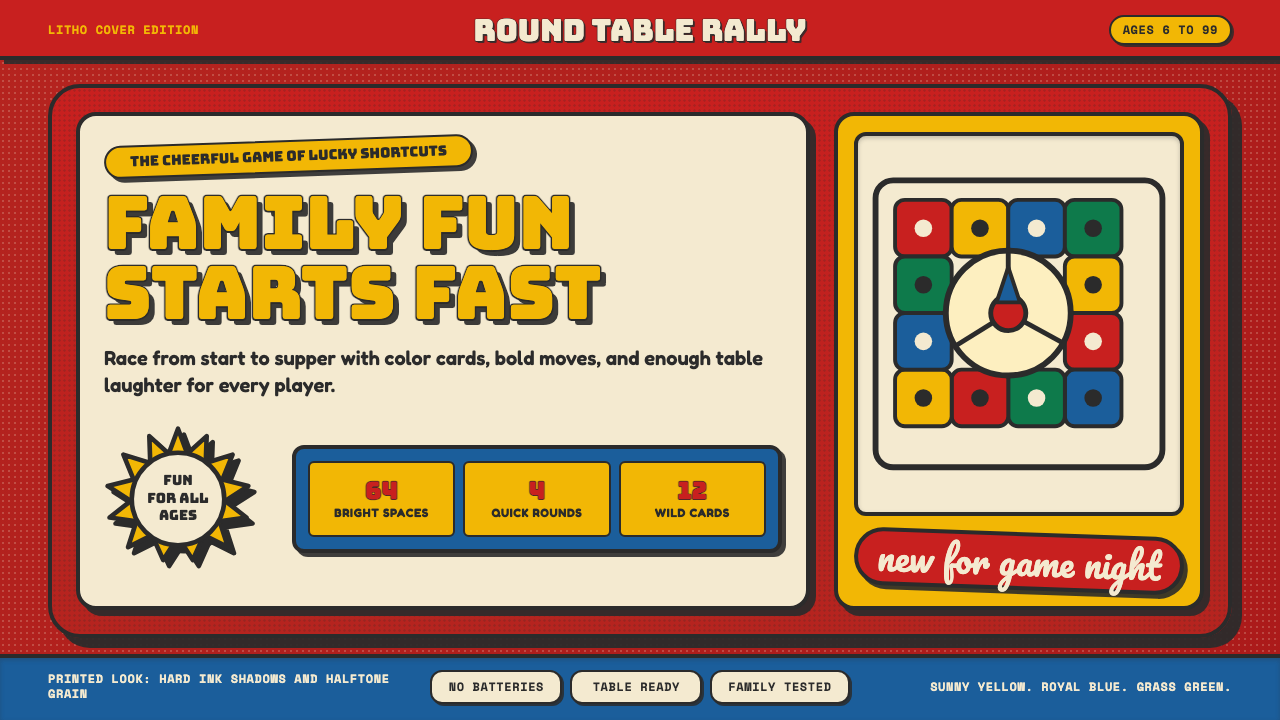 Vintage Board Game BoxShelf appeal shouts. Fire-engine red, Bungee lockups, yellow bursts, and ink…货架感在喊:消防红底、Bungee 标题、黄爆炸章与硬黑影。
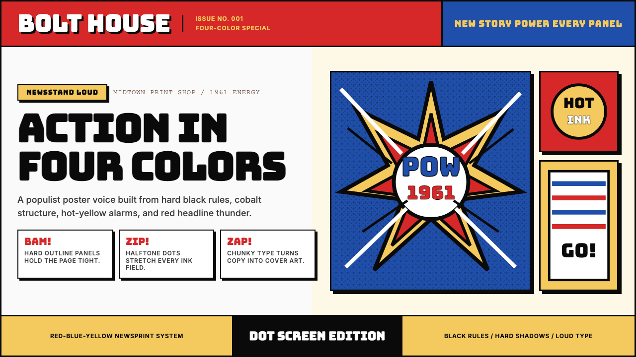 Marvel Comics (Kirby Era)Populist color hits hard. Red-blue-yellow panels, black rules, and halftone d…大众色彩直击眼球。红蓝黄画格、黑墨线与半调网点。
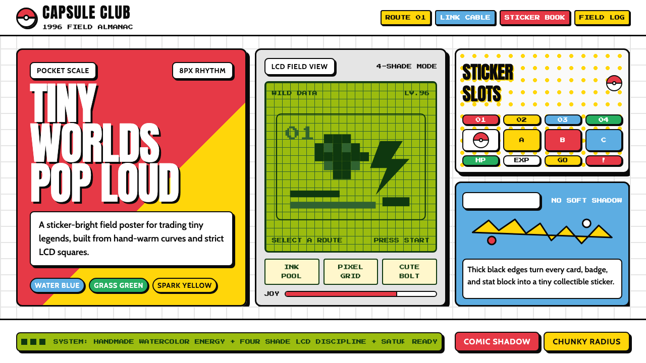 Pokémon Game BoyKawaii meets cartridge logic. Capsule red, LCD green, Anton heft, and 8px gri…卡哇伊撞上卡带逻辑:胶囊红、LCD绿、Anton粗字与8px网格同屏。
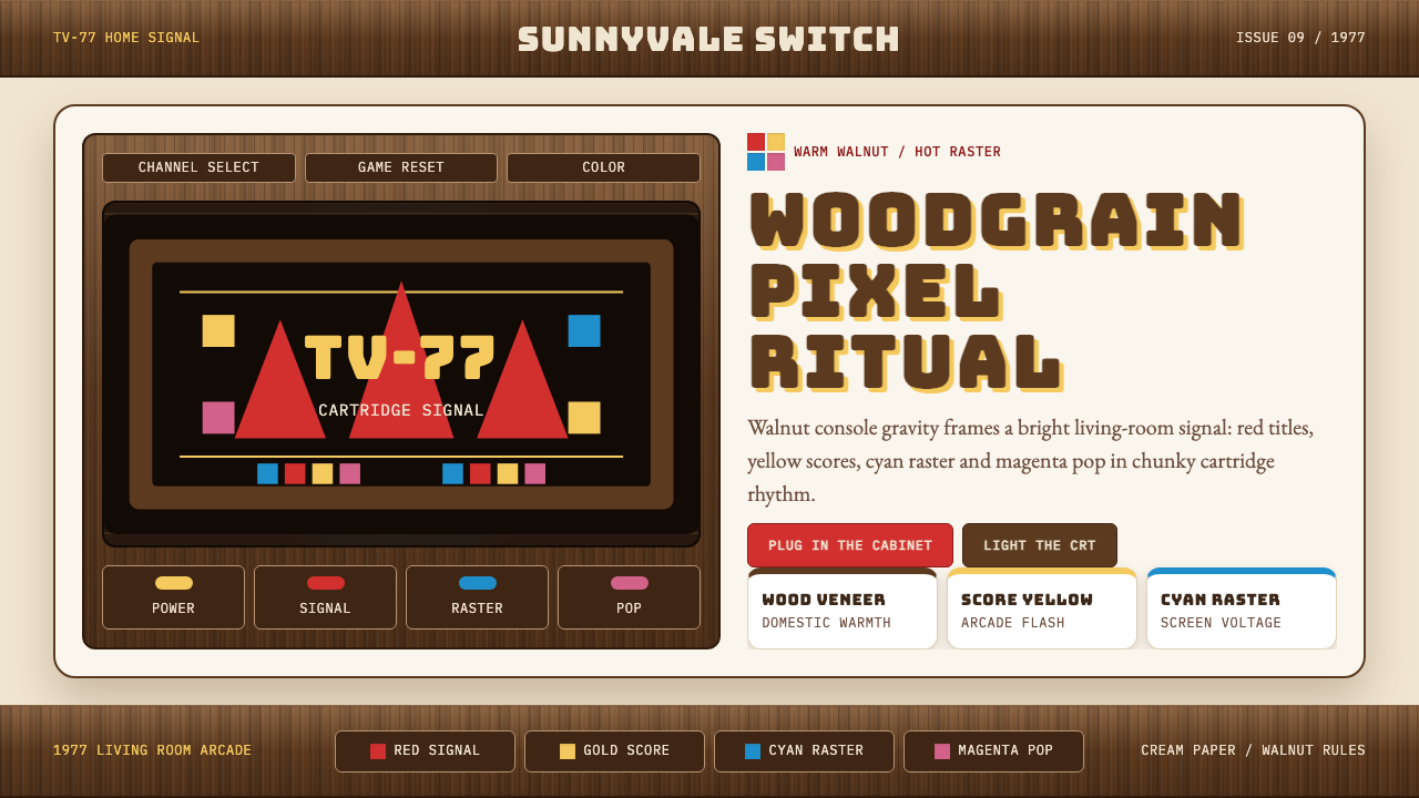 Atari 2600 (Woodgrain)Woodgrain meets raw pixels. Walnut panels frame Bungee type and CMYK raster b…木纹遇上生猛像素:胡桃木面板包裹Bungee字与CMYK色块。
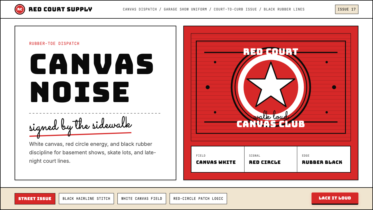 Converse Chuck TaylorPopulist and loud. Saturated red circles, Bungee type, black stitch lines on…平民而响亮:饱和红圆、Bungee 粗字、白帆布上的黑色缝线。
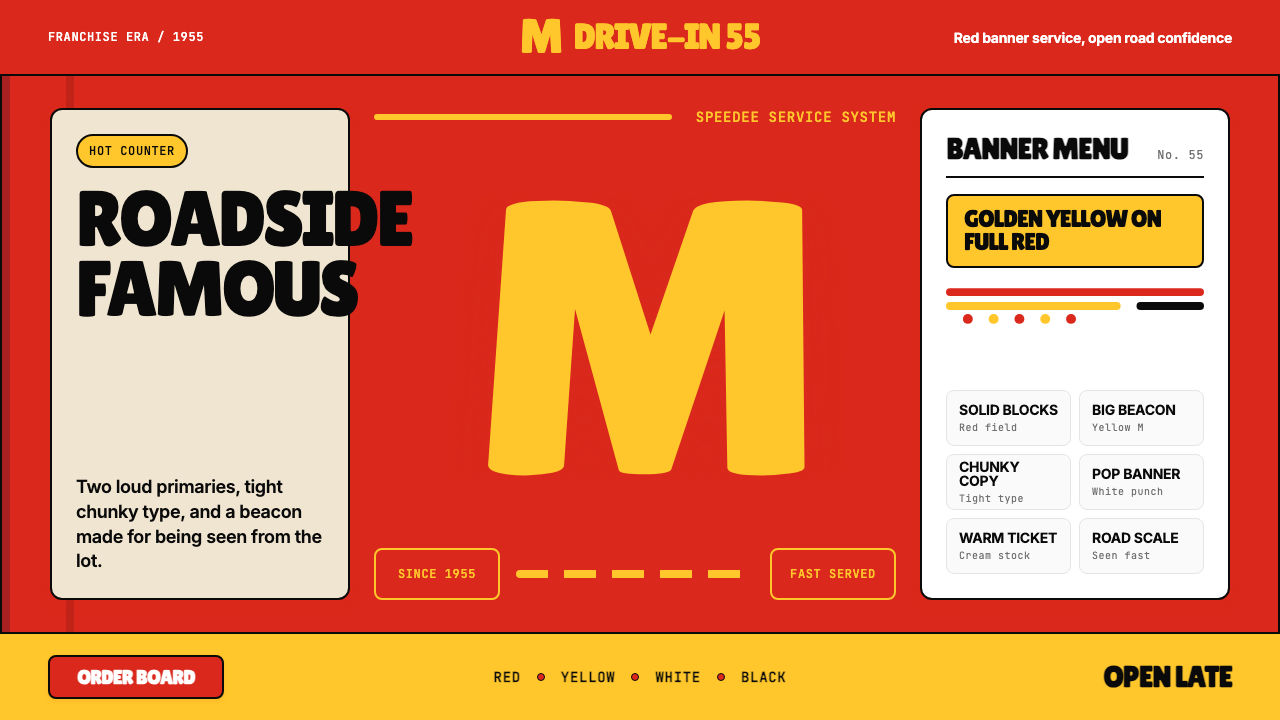 McDonald's Golden ArchesRoadside famous. Saturated red, hot yellow, and chunky type shout from 1955.路边即识别:饱和红、热黄与厚重字体喊出1955。