What is Pokémon Game Boy?什么是 Pokémon Game Boy?
Pixel sprites and hand-painted watercolors collided in 1996 to create one of the most joyful and instantly recognizable visual languages in the history of interactive media.1996年,像素精灵与手绘水彩的碰撞,诞生了互动媒体史上最令人愉悦、最具辨识度的视觉语言之一。
Pokémon Game Boy in briefPokémon Game Boy 速览
The Pokémon Game Boy aesthetic is a design language born from the collision of two seemingly opposed visual traditions: the rigorous, grid-bound pixel art of the original Game Boy hardware and the delicate, organic hand-watercolored creature illustrations that artist Ken Sugimori created for the franchise. The resulting system is simultaneously handmade and systematic — warm and playful at surface level, yet governed underneath by strict technical constraints that gave it coherence and memorability.宝可梦 Game Boy 美学是一种诞生于两种截然相对的视觉传统碰撞之中的设计语言:一边是初代 Game Boy 硬件严苛网格约束下的像素艺术,另一边是艺术家杉森建为这个系列创作的精致有机手绘水彩宝可梦肖像。由此产生的视觉系统既是手作的,也是系统化的——表层温暖而充满玩趣,底层却受制于严格的技术约束,正是这些约束赋予了它连贯性与记忆深度。
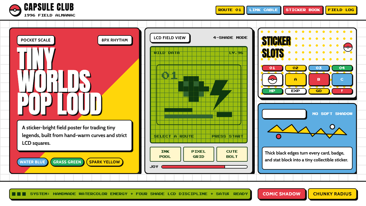
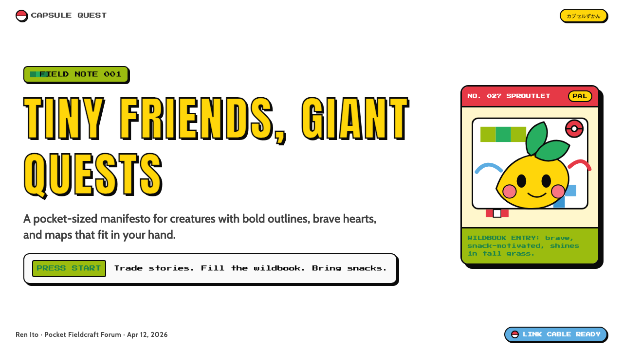
At its core, the style is defined by saturated kawaii confidence. A palette anchored by Pokéball red, Pikachu yellow, and the distinctive phosphor-green of the Game Boy LCD screen forms the chromatic foundation, set against the kind of pure whites and heavy blacks that manga line art demands. Thick contour lines borrowed from Japanese comic illustration give every element a sense of weight and presence. Rounded, capsule-shaped forms — chunky buttons, bubbly letterforms, softly squared badges — communicate approachability without sacrificing visual punch.在核心层面,这一风格以饱和的卡哇伊自信为标志。以精灵球红、皮卡丘黄,以及 Game Boy 液晶屏那种独特磷光绿为锚点构成的色彩基础,铺设于漫画线描所要求的纯白底面与浓重黑色之上。借鉴自日本漫画插图的粗轮廓线,赋予了每个元素以重量感与存在感。圆润的胶囊形——粗壮的按钮、饱满的字母轮廓、边角柔化的徽章——在不牺牲视觉冲击力的前提下传递出亲切感。
What makes the aesthetic durable across three decades is its successful resolution of a genuine design tension: it is both a product of severe hardware limitation and an expression of boundless creative ambition. The four-shade monochrome constraint of the original Game Boy forced pixel artists to develop an economy of form that, paradoxically, produces characters and interfaces of extraordinary clarity. Layered on top of that austere pixel logic, the kawaii illustration tradition — exaggerated proportions, expressive eyes, round silhouettes — fills the system with personality and warmth.这一美学能够跨越三十年保持生命力,在于它成功化解了一个真实的设计张力:它既是严苛硬件限制的产物,也是无边创作野心的表达。初代 Game Boy 的四色单色约束迫使像素艺术家发展出一种形态经济学,而这种经济学恰恰产生了极其清晰的角色与界面——这是一种矛盾中的馈赠。在这套朴素的像素逻辑之上,卡哇伊插图传统——夸张的比例、传神的眼睛、圆润的轮廓——为整个系统注入了个性与温度。
See the Pokémon Game Boy design system查看 Pokémon Game Boy 完整设计系统
Where does Pokémon Game Boy come from?Pokémon Game Boy 从何而来?
The story begins with Satoshi Tajiri, a game developer from Machida, Tokyo, whose childhood passion for collecting insects became the conceptual seed of Pokémon. Through the late 1980s and early 1990s, Tajiri and his company Game Freak labored over a concept they called Pocket Monsters — a role-playing game that would use the Game Boy Link Cable to let players trade and battle creatures between handheld consoles. Nintendo was skeptical, and the project languished for six years in development. When Pocket Monsters Red and Green finally launched in Japan in February 1996, they sold quietly at first, word spreading slowly through the elementary school networks that Tajiri had always imagined as his audience.故事的起点是田尻智——一位来自东京町田市的游戏开发者,童年收集昆虫的热情成为宝可梦概念的种子。整个1980年代末至1990年代初,田尻智与他的公司 Game Freak 埋头打磨一个名为「口袋妖怪」的构想——一款利用 Game Boy 连接线让玩家在掌机之间交换与对战生物的角色扮演游戏。任天堂起初持怀疑态度,项目在开发地狱中煎熬了六年。1996年2月,《精灵宝可梦 红/绿》在日本正式发售,起初销量平静,口碑慢慢在田尻智始终设想中的受众——小学生圈子——里传播开来。
The visual identity of the franchise was inseparable from Ken Sugimori's illustration work. Sugimori, a co-founder of Game Freak and Tajiri's closest creative collaborator, developed the original creature designs using watercolor and ink — a deliberately handmade technique that gave each creature warmth, organic texture, and a sense of individual character. His palette leaned toward saturated primaries and clean secondaries, with thick black outlines that would translate legibly at the Game Boy's small screen resolution and in the printed media — manga adaptations, trading cards, strategy guides — that were always envisioned as part of the franchise ecosystem. The 151 original creatures he designed established visual conventions — round silhouettes, large eyes, readable color differentiation — that persist in the franchise to this day.这个系列的视觉身份与杉森建的插图工作密不可分。杉森建是 Game Freak 的联合创始人,也是田尻智最亲密的创作伙伴,他以水彩和墨线完成原始宝可梦设计——这种刻意手作的技法赋予每只宝可梦温度、有机质感与独特个性。他的色彩倾向于饱和的原色与干净的间色,配合粗黑轮廓线,使设计在 Game Boy 的小屏分辨率下以及在始终被纳入规划的周边媒体——漫画改编、集换式卡牌、攻略书——中都清晰可辨。他设计的151只初代宝可梦确立了延续至今的视觉惯例:圆润的轮廓、大眼睛、清晰的色彩区分。
The Game Boy hardware itself was a decisive constraint and, in retrospect, a creative gift. The original Game Boy, released by Nintendo in 1989, displayed graphics on a reflective liquid crystal screen capable of rendering four shades of green-gray. Pixel artists at Game Freak, working within a strict tile-based grid, had to communicate creature personality, attack animations, and interface hierarchy using only this severely limited vocabulary. The discipline forced a kind of radical simplification that — like the best constraint-driven design — produced results with exceptional clarity and memorability. The chunky, high-contrast sprite aesthetic that emerged from these constraints would later be referenced deliberately by designers long after hardware had made such limitations obsolete.Game Boy 硬件本身是一个决定性的约束,回望历史,也是一份创作馈赠。1989年任天堂发售的初代 Game Boy 使用反射式液晶屏,只能显示四种深浅不一的绿灰色调。Game Freak 的像素艺术家们在严格的方块网格中作业,必须仅凭这套极为有限的词汇传递宝可梦的个性、攻击动画与界面层级。这种纪律迫使他们走向一种彻底的简化——就像最好的约束驱动设计一样——产出了清晰度与记忆深度俱佳的成果。在这些约束中诞生的粗犷高对比度精灵美学,后来在硬件早已超越这类限制之后,仍被设计师们有意识地援引。
The franchise's international expansion from 1998 onward — the Western release of Pokémon Red and Blue, the animated television series, the trading card game licensed to Wizards of the Coast, and the Pokémon Yellow version that added Pikachu as the player's companion — transformed the visual language from a Japanese niche product into a globally legible aesthetic. Each extension of the franchise reinforced the core visual vocabulary: Pokéball red-and-white, Pikachu's saturated yellow, the rounded typefaces and heavy outlines of the logo and merchandise. By the time the franchise reached its thirtieth year, that 1996 visual grammar had become one of the most commercially reproduced design systems in history, spanning games, animation, physical merchandise, theme park installations, and digital collectibles.1998年起的国际扩张——《精灵宝可梦 红/蓝》的西方发行、动画电视剧、授权给 Wizards of the Coast 的集换式卡牌游戏,以及让皮卡丘成为玩家同伴的《黄》版——将这套视觉语言从日本小众产品转化为全球通行的美学。每一次系列延伸都强化了核心视觉词汇:精灵球的红白配色、皮卡丘的饱和黄、标志与周边商品上的圆润字形与粗重轮廓。到系列迈入第三十年时,那套1996年的视觉语法已成为史上商业复制规模最大的设计系统之一,横跨游戏、动画、实体商品、主题乐园装置与数字藏品。
What defines the Pokémon Game Boy look?Pokémon Game Boy 的视觉特征是什么?
Color色彩
The palette is anchored by three hero colors: a saturated capsule red associated with the Pokéball, a warm and luminous yellow drawn from Pikachu's design, and the distinctive phosphor-green of the original Game Boy LCD screen. These sit against pure white backgrounds — the paper-white of manga pages — with black deployed for outlines and structural hierarchy. Each color carries narrative weight: red signals energy, danger, and action; yellow communicates warmth, electricity, and joy; the LCD green evokes the specific nostalgia of handheld gaming. Pastel secondary colors appear in creature and badge design, but the three primary anchors dominate every composition.色板以三种核心色为锚点:与精灵球相关联的饱和胶囊红、从皮卡丘设计中汲取的温暖明亮黄,以及初代 Game Boy 液晶屏那种独特的磷光绿。这三色铺设于纯白底面——漫画页面的纸白——黑色则用于轮廓与结构层级。每种颜色都承载叙事重量:红色传递能量、危险与行动;黄色传递温暖、电力与喜悦;液晶绿唤起掌机游戏的特定怀旧感。宝可梦与徽章设计中会出现柔和的间色,但三种主色始终主导每一幅构图。
Outline and Contour轮廓线
Heavy black outlines are the structural signature of the style, inherited directly from Ken Sugimori's ink-and-watercolor illustration method and from the pixel art tradition where clear silhouettes were a technical necessity at small display sizes. Every element — creatures, buttons, badges, text containers — is bordered by a consistent black stroke that reads as a confident declaration of form rather than a design accident. This outline logic extends to comic-book offset shadows: a shape's shadow is rendered as the same shape displaced at a diagonal, solid black or a deep color, rather than a soft diffuse blur.粗重的黑色轮廓线是这种风格的结构性标志,直接传承自杉森建的墨线水彩插图技法,以及像素艺术传统——在小尺寸显示屏上,清晰的剪影轮廓是技术必需。每个元素——宝可梦、按钮、徽章、文字容器——都被一条一致的黑色描边所框定,这条线读来是对形态的自信宣言,而非偶然的设计结果。这种轮廓逻辑延伸至漫画风格的偏移投影:一个形状的阴影被渲染为同一形状沿对角线位移后的实色黑或深色图形,而非柔和的漫射模糊。
Pixel Grid and Tile Logic像素网格与方块逻辑
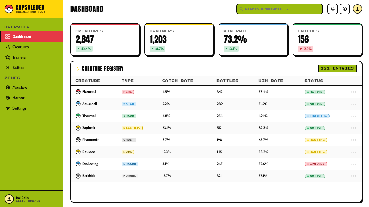
Beneath the kawaii surface, every spatial decision in the system is governed by a strict tile-based grid inherited from Game Boy hardware architecture. Buttons, cards, and content blocks align to a coarse modular grid — the visual equivalent of the hardware tile map — so that compositions feel both playful and rigorously organized. Rounded corners are generous and uniform, echoing the physical form of the Game Boy console itself and the capsule-shaped design of the Pokéball. This combination of grid discipline and rounded softness is the system's defining spatial characteristic.在卡哇伊表层之下,系统中每一个空间决策都受到继承自 Game Boy 硬件架构的严格方块网格的约束。按钮、卡片与内容块对齐于一个粗粒度的模块网格——视觉上等同于硬件的瓦片地图——使构图同时呈现出俏皮感与严谨的组织性。圆角慷慨而统一,呼应了 Game Boy 掌机本身的物理形态以及精灵球的胶囊造型。网格纪律与圆润柔化的组合,是这一系统决定性的空间特征。
Typography字体排印
Typefaces in the Pokémon Game Boy aesthetic are chunky, rounded, and unabashedly bold — letterforms that prioritize legibility at small sizes and emotional warmth over refined elegance. The style draws on the pixel bitmap font tradition of early game hardware, where every character was constructed from a small matrix of dots and required maximum contrast to be read on a green-gray screen. Display type is treated with the same weight and confidence as the illustrated elements — often outlined, frequently accompanied by a comic-book shadow — so that words function as visual objects rather than neutral carriers of information.宝可梦 Game Boy 美学中的字形粗壮、圆润、毫不掩饰地大胆——这些字母形态优先考虑小尺寸下的易读性与情感温度,而非精致优雅。这种风格汲取早期游戏硬件像素位图字体的传统——彼时每个字符由一个小点阵构成,需要最大化对比度才能在绿灰屏幕上被辨读。展示性文字与插图元素同等分量地处理——通常带有轮廓描边,常配以漫画风格的投影——使文字作为视觉对象发挥作用,而非中性的信息载体。
Kawaii Proportion and Form卡哇伊比例与形态
The creature design tradition of the franchise introduced a set of proportion conventions that permeate the entire aesthetic: oversized heads relative to bodies, large circular eyes that occupy much of the face, simplified limb forms, and overall silhouettes that read as round and soft rather than angular and threatening. These kawaii conventions — rooted in the Japanese aesthetic concept of cuteness as a value in itself — translate into interface elements that are generous in size, rounded in form, and warm in color temperature. Hardness and aggression are reserved for deliberate emphasis, such as type-weakness indicators or status effect alerts.这个系列的宝可梦设计传统引入了一套渗透整个美学的比例惯例:相对于身体过大的头部、占据大半面部的大圆眼睛、简化的四肢形态,以及整体读来圆润柔和而非棱角锐利的轮廓。这些卡哇伊惯例——植根于日本将可爱视为自身价值的审美概念——转化为尺寸慷慨、形态圆润、色温温暖的界面元素。硬朗与攻击感被保留用于刻意强调,例如属性克制指示或异常状态警示。
Badge and Emblem Logic徽章与徽纹逻辑
The franchise's Gym Badge system — eight collectible emblems representing regional champions, each with a distinct shape and color — introduced an emblem design vocabulary that is central to the aesthetic. Badges function as compact, high-contrast icons: a single dominant shape, one or two colors, a strong outline, and a design that reads instantly at small sizes and memorably at large ones. This badge logic extends naturally to interface design, where category chips, achievement indicators, type tags, and status pills inherit the same design DNA — each a self-contained visual object with immediate recognizability.系列中的道馆徽章系统——八枚代表地区馆主的可收集徽章,各具独特形态与配色——引入了一套徽纹设计词汇,成为这一美学的核心元素。徽章作为紧凑、高对比度的图标运作:一个主导形状、一至两种颜色、强劲轮廓,在小尺寸下即刻可辨、在大尺寸下令人难忘。这种徽章逻辑自然延伸至界面设计,类别标签、成就指示、属性标记与状态药丸形标签都继承了同样的设计 DNA——每个都是一个具有即时辨识度的自足视觉对象。
Noise, Dither, and Screen Texture噪点、抖动与屏幕质感
The four-shade constraint of the Game Boy display produced a characteristic visual texture: areas of mid-tone were achieved through checkerboard dithering patterns — alternating light and dark pixels that, at reading distance, blend into apparent gray values. This dither texture, along with the slight luminous haze of the original LCD backlight, gives the aesthetic a material specificity that distinguishes it from generic pixel art. Contemporary applications of the style often introduce subtle grain or scanline overlays to invoke this hardware memory without replicating it literally — gesturing toward the physical experience of playing a Game Boy under different lighting conditions.Game Boy 显示屏的四色约束产生了一种典型的视觉质感:中间调区域通过棋盘式抖动图案实现——交替排列的明暗像素在阅读距离上融合为表观灰度值。这种抖动纹理,加上原始液晶屏背光那种轻微的发光雾感,赋予这种美学以材料特殊性,使其有别于泛化的像素艺术。这种风格的当代应用常引入微妙的颗粒感或扫描线叠层,以唤起这种硬件记忆而不是字面复制它——在不同光照条件下把玩一台 Game Boy 的物理体验,以此方式得到致敬。
See the Pokémon Game Boy design system查看 Pokémon Game Boy 完整设计系统
Who shaped Pokémon Game Boy?谁塑造了 Pokémon Game Boy?
Tajiri is the creator and original director of Pokémon, whose childhood habit of collecting insects in rural Tokyo evolved into the franchise's central mechanic of catching, training, and trading creatures. His insistence on using the Game Boy Link Cable — a peripheral that Nintendo had largely abandoned — as the social backbone of the game forced a cooperative dimension into what could have been a solitary experience, and established the visual and mechanical vocabulary of creature exchange that defined the franchise's design logic. His six-year battle to bring Pokémon to market despite Nintendo's skepticism is a foundational story in the history of game design.田尻智是宝可梦的创作者与原始总监,他在东京郊外童年收集昆虫的习惯演变为这个系列的核心机制——抓捕、培育与交换宝可梦。他坚持将任天堂几乎已弃用的外设 Game Boy 连接线作为游戏的社交骨干,迫使一个原本可能是独玩的体验拥有了协作维度,并确立了宝可梦交换的视觉与机械词汇,这成为整个系列的设计逻辑基础。他历时六年与任天堂的怀疑抗争、最终将宝可梦推向市场的历程,是游戏设计史上的奠基性故事之一。
Sugimori is the lead creature designer and art director of the Pokémon franchise, responsible for the visual identity of all 151 original Pokémon and for establishing the illustration conventions — thick ink outlines, watercolor fills, exaggerated kawaii proportions — that define the franchise's look to this day. His transition from hand-painted originals to digital illustration tools as the franchise scaled is a case study in preserving aesthetic consistency across technological change. As art director, he oversaw the visual language of Pokémon through its expansion into trading cards, animation, and eventually three-dimensional game environments, maintaining the core character design DNA across all media.杉森建是宝可梦系列的主设计师与美术总监,负责全部151只初代宝可梦的视觉形象,并确立了定义这个系列至今的插图惯例——粗墨线轮廓、水彩填色、夸张的卡哇伊比例。随着系列规模扩张,他从手绘原稿过渡到数字插图工具的历程,是跨技术变革保持美学一致性的典型案例。作为美术总监,他监督了宝可梦视觉语言在集换式卡牌、动画乃至三维游戏环境中的延伸,在所有媒介中维护了核心角色设计的 DNA。
Masuda joined Game Freak as a programmer and composer for the original Pokémon games, later becoming director, producer, and eventually chief operating officer of Game Freak. His compositional work — creating the instantly recognizable eight-bit musical themes using the Game Boy sound chip — established an audio identity that reinforced the visual aesthetic: both were products of radical constraint producing memorable output. As director of subsequent mainline titles, Masuda was responsible for translating the franchise's core visual and mechanical language into new hardware generations while preserving the qualities that made the original design system durable.增田顺一以程序员和作曲家身份加入 Game Freak,参与初代宝可梦游戏的开发,后来陆续担任总监、制作人,最终成为 Game Freak 的首席运营官。他的作曲工作——使用 Game Boy 音频芯片创作那些即刻可辨的八位音乐主题——确立了强化视觉美学的音频身份:两者都是严苛约束产出令人难忘成果的产物。作为后续主线作品的总监,增田负责在新硬件世代中转译系列的核心视觉与机械语言,同时保留使原始设计系统经久耐用的特质。
Nishida is a designer at Game Freak credited with creating the original designs for Pikachu and several other iconic first-generation Pokémon, including Eevee. Her creature designs are notable for their particular balance of the kawaii tradition — roundness, large eyes, approachable scale — with visual distinctiveness and instant silhouette recognizability. Pikachu's design in particular, with its lightning-bolt tail, circular cheek markings, and fully saturated yellow body, became the visual ambassador of the entire franchise and one of the most reproduced character designs in commercial history. Nishida's work demonstrates how constraint-driven simplicity in character design produces icons rather than illustrations.西田亚沙子是 Game Freak 的设计师,被认为创作了皮卡丘及多只其他标志性初代宝可梦(包括伊布)的原始设计。她的宝可梦设计以卡哇伊传统——圆润、大眼睛、亲切比例——与视觉独特性及即时轮廓辨识度之间的特定平衡著称。皮卡丘的设计尤为典型:闪电形尾巴、圆形腮红、全饱和黄色身体,使其成为整个系列的视觉大使,也成为商业史上被复制次数最多的角色设计之一。西田的工作展示了角色设计中约束驱动的简洁如何产出图标而非插图。
The logo, packaging, and merchandise graphic design of the original Pokémon franchise was developed by a team of graphic designers working under the direction of Nintendo's product design division and the licensors at Creatures Inc. Their work established the franchise's typographic identity — the bold, rounded, outlined wordmark that appears on every game cartridge, box, and official piece of merchandise — and the packaging design conventions that would be maintained across decades and hardware generations. The original Red and Blue cartridge packaging, with its bold color blocking, creature portrait placement, and logo hierarchy, became a visual template referenced by game packaging design globally.初代宝可梦系列的标志、包装与商品平面设计由一支图形设计师团队在任天堂产品设计部门及 Creatures Inc. 授权方的指导下完成。他们的工作确立了系列的字体视觉身份——出现在每一盒游戏卡带、外箱与官方商品上的粗重、圆润、带描边的文字标志——以及在数十年与多个硬件世代中得以延续的包装设计惯例。原版《红/蓝》卡带包装凭借其大胆的色块分割、宝可梦肖像摆放与标志层级,成为全球游戏包装设计援引的视觉模板。
How do you use Pokémon Game Boy today?今天怎么用 Pokémon Game Boy?
The Pokémon Game Boy aesthetic is one of the few historical design systems that successfully combines systematic grid discipline with emotional warmth and playful exuberance. Applying it well requires understanding that the style works through contrast — the contrast between strict pixel-grid organization and organic kawaii illustration, between heavy black outlines and saturated warm color, between technical constraint and creative abundance. Simply applying a retro green color or adding pixel textures produces a nostalgia costume, not a coherent design system.宝可梦 Game Boy 美学是少数几个成功将系统化网格纪律与情感温度、玩趣活力相结合的历史设计系统之一。正确应用它需要理解这种风格通过对比发挥作用——严格像素网格组织与有机卡哇伊插图之间的对比,粗重黑色轮廓与饱和暖色之间的对比,技术约束与创作丰盈之间的对比。仅仅套用一个复古绿色或添加像素纹理只会产生一件怀旧服装,而非一套连贯的设计系统。
For presentation slides, the style excels at creating covers and section dividers with immediate visual impact. A cover page benefits from the franchise's poster-like composition logic: a large creature silhouette or badge-shaped emblem anchors the center, with the title treated as a display element with its own outline and offset shadow. The background should commit to one hero color — the saturated red, the bright yellow, or the LCD green — used at full saturation. Content slides should shift to a near-white ground with the hero color reserved for interactive elements, data callouts, and section headers. Data visualizations work naturally in this system: bar charts become stacked type bars with the franchise's color hierarchy, pie charts become badge-shaped emblems, and progress indicators become Pokéball-styled completion rings.在演示文稿中,这种风格擅长创作具有即时视觉冲击力的封面与章节分隔页。封面受益于系列的海报式构图逻辑:一个大型宝可梦剪影或徽章形图案锚定画面中心,标题作为带有独立轮廓描边与偏移投影的展示元素处理。背景应当全力投入一种核心色——饱和红、明亮黄或液晶绿——以全饱和度使用。内容页应转换至接近白色的底面,将核心色保留给交互元素、数据标注与章节标题。数据可视化在这个系统中自然运作:柱状图成为带有系列色彩层级的堆叠条形,饼图成为徽章形图案,进度指示器成为精灵球式的完成环。
For web interfaces, the style is particularly well-suited to products targeting younger audiences, gaming communities, creative tools, and any platform where visual energy and personality are as important as functional clarity. Dashboard layouts benefit from the badge-and-grid logic: category chips, status indicators, and achievement tiles adopt the rounded, outlined, high-contrast form of Gym Badges, arranged on a coarse modular grid. Pricing pages work well with this aesthetic's tier-differentiation vocabulary — each tier presented as a distinct badge or card with its own hero color, heavy outline, and offset shadow, immediately communicating visual hierarchy without relying on subtle gradient or typographic weight alone.对于网页界面,这种风格尤其适合面向年轻受众、游戏社区、创意工具,以及任何视觉活力与个性和功能清晰度同等重要的平台。仪表板布局受益于徽章与网格逻辑:类别标签、状态指示器与成就卡片采用道馆徽章的圆润、描边、高对比度形态,排列于粗粒度模块网格之上。定价页面适合这种美学的等级区分词汇——每个等级呈现为一个具有独立核心色、粗重描边与偏移投影的独特徽章或卡片,无需依赖细微渐变或字重差异即可即时传递视觉层级。
For editorial and marketing applications, the style brings strong visual authority to covers, campaign headers, and social media graphics where stopping power matters. A Pokémon Game Boy-derived editorial layout uses full-saturation color blocks for section dividers, bold outlined type for headlines, and a layout logic that echoes the franchise's trading card grid — information organized into compact, self-contained panels. Marketing pages can deploy the style's badge vocabulary for product feature callouts: each feature presented in a rounded, outlined container with its own color assignment and supporting iconography drawn from pixel-art conventions. The style also translates naturally to email design, where its high-contrast, flat construction ensures reliable rendering across email clients that routinely strip or reinterpret CSS.对于编辑与营销应用,这种风格为封面、活动标题与社交媒体图形带来强劲的视觉权威感——在这些场景中,停顿力是关键。宝可梦 Game Boy 衍生的编辑版面使用全饱和色块作为段落分隔,以粗体描边字型作为标题,版面逻辑呼应系列的集换卡牌网格——信息被组织进紧凑的自足面板。营销页面可将这种风格的徽章词汇用于产品特性标注:每个特性呈现在一个圆润的描边容器中,配有独立的颜色指派与取法像素艺术惯例的图标。这种风格也自然转译至电子邮件设计,其高对比度、平面化的构建方式确保在惯常裁剪或重新解释 CSS 的各类邮件客户端中稳定渲染。
A common mistake when applying this style is overloading the layout with all three hero colors simultaneously at full saturation. Authentic Pokémon Game Boy compositions typically lead with one hero color per scene or section, using the others as structural accents — the same principle that governs the franchise's own game UI, where a single type-color dominates each encounter screen. Another frequent error is treating the pixel aesthetic as purely retro: adding scanlines, resolution reduction, or dithering effects without the underlying grid discipline and outline logic produces a costume effect rather than a coherent design system. The pixel texture should feel structural — a consequence of the compositional rules — not decorative.应用这种风格时最常见的错误,是同时以全饱和度将三种核心色叠加于同一版面。真实的宝可梦 Game Boy 构图通常在每个场景或章节中以一种核心色为主导,其余作为结构性强调——这与系列游戏自身 UI 遵循的原则相同,在那里单一属性色主导每一个对战画面。另一个常见错误是将像素美学纯粹视作复古手段:在缺乏底层网格纪律与轮廓逻辑的情况下添加扫描线、降分辨率或抖动效果,产出的是服装效果而非连贯的设计系统。像素质感应当感觉是结构性的——构图规则的自然结果——而非装饰性的。
See the Pokémon Game Boy design system查看 Pokémon Game Boy 完整设计系统
Pokémon Game Boy — FAQPokémon Game Boy · 常见问题
Is this style purely nostalgic, or does it work for contemporary professional contexts?这种风格是纯粹的怀旧,还是适用于当代专业场景?
The style has genuine contemporary applicability when the product context supports it. The emotional warmth, badge-based hierarchy, and pixel-grid organization are genuinely useful design tools — not just retro decorations. Gaming products, creative tools, education platforms, youth-facing consumer apps, and event branding for entertainment properties all benefit from the system's combination of visual energy and structural clarity. The risk is misapplication: deploying the style for products where formal authority, calm, or clinical precision is the desired emotional register — financial services, medical tools, enterprise software — will produce a mismatch between aesthetic and context that users will sense even if they cannot articulate it.当产品场景支持时,这种风格具有真实的当代适用性。情感温度、基于徽章的层级结构以及像素网格组织都是真正有用的设计工具——不仅仅是复古装饰。游戏产品、创意工具、教育平台、面向年轻受众的消费类应用,以及娱乐IP的活动品牌,都受益于这套系统将视觉活力与结构清晰度相结合的特质。风险在于误用:将这种风格部署在需要正式权威感、平静或临床精确度的产品上——金融服务、医疗工具、企业软件——会造成美学与场景之间的错配,用户即便无法言说也会感受到这种不适。
How does this style differ from generic pixel art or chiptune aesthetics?这种风格与泛化的像素艺术或芯片音效美学有何不同?
Generic pixel art or chiptune aesthetics typically lean into monochrome or limited palettes, stark geometric blocks, and a kind of digital austerity that references arcade and early home console culture broadly. The Pokémon Game Boy system is distinctive in layering a warm, kawaii-inflected illustration sensibility on top of the pixel constraint — the franchise's visual identity was always defined by Ken Sugimori's organic, hand-painted creature designs as much as by the hardware's pixel grid. The result is a system that feels both technical and handmade, both nostalgic and emotionally immediate. The heavy black outline and the saturated, named-color palette — rather than the arbitrary palette of any specific hardware — are the style's identifying marks.泛化的像素艺术或芯片音效美学通常倾向于单色或有限色板、生硬的几何方块,以及一种广泛引用街机与早期家用主机文化的数字朴素感。宝可梦 Game Boy 系统的独特之处在于,它在像素约束之上叠加了一种温暖的、卡哇伊风格的插图感性——这个系列的视觉身份始终由杉森建有机的手绘宝可梦设计与硬件的像素网格共同定义。由此产生的系统既有技术感又有手作感,既令人怀旧又情感即时。粗重黑色轮廓线与饱和的具名色色板——而非任何特定硬件的任意色板——是这种风格的识别标志。
Can the style work in a dark-background or night-mode layout?这种风格能用在深色背景或夜间模式版面中吗?
A dark-background variant is possible and has precedent in the franchise itself — later Game Boy Color and Game Boy Advance titles used deep navy and charcoal grounds for night scenes and cave environments. The key challenge is that the style's outline logic depends on high contrast between the outline and both the element color and the background. On a dark ground, the black outline may need to be replaced with a light outline or a thick drop shadow to preserve the defining characteristic. The three hero colors respond differently to dark grounds: the LCD green reads with appropriate eeriness, the saturated red holds its presence, but the bright yellow can overwhelm a dark composition if used at full saturation for large areas. A dark variant works best when the yellow is reserved for small accent elements and a single hero color dominates each screen.深色背景变体是可行的,系列本身也有先例——后期的 Game Boy Color 与 Game Boy Advance 作品在夜景与洞窟场景中使用了深海军蓝与深炭灰底面。关键挑战在于,这种风格的轮廓线逻辑依赖于轮廓与元素色及背景之间的高对比度。在深色底面上,黑色轮廓线可能需要替换为浅色描边或粗重投影,以保留这一决定性特征。三种核心色对深色底面的反应各不相同:液晶绿呈现出恰如其分的诡异感,饱和红保持存在感,但明亮黄若以全饱和度用于大面积区域则可能淹没深色构图。深色变体最有效的做法是将黄色保留用于小面积强调元素,由单一核心色主导每一个画面。
How do you handle photography or realistic imagery within this style?如何在这种风格中处理摄影或写实图像?
Realistic photography sits uncomfortably within the Pokémon Game Boy aesthetic, whose visual logic is fundamentally illustrative and graphic rather than photographic. The franchise's own media never used photography for creature representation — watercolor illustration, pixel sprites, and later three-dimensional models were always the vehicles. When photography must be used in a contemporary application, the recommended approach is aggressive graphic treatment: high-contrast duotone conversion using the hero color palette, silhouette cropping against flat color backgrounds, or posterization that reduces tonal range to a small number of flat shades. The goal is to make the photograph function as a graphic element within the system's flat, high-contrast visual logic, rather than as a naturalistic window.写实摄影在宝可梦 Game Boy 美学中处境尴尬,因为这一美学的视觉逻辑从根本上是插图式和图形化的,而非摄影式的。这个系列自身的媒体从未使用摄影来呈现宝可梦——水彩插图、像素精灵,以及后来的三维模型,始终是表现载体。当当代应用中必须使用摄影时,推荐的处理方式是激进的图形化:使用核心色色板进行高对比度双色调转换,在平色背景上做轮廓裁切,或通过色调分离将明暗范围压缩至少量平色色调。目标是使照片作为系统平面、高对比度视觉逻辑中的图形元素发挥作用,而非作为自然主义窗口。
What makes this style durable across thirty years when most game aesthetics date quickly?是什么使这种风格跨越三十年保持活力,而大多数游戏美学却迅速过时?
Most game aesthetics date because they are expressions of what was technically possible at a given moment — early three-dimensional polygon graphics, mid-period bloom and lens flare, or the post-processing effects of a particular hardware generation. The Pokémon Game Boy aesthetic is durable for the opposite reason: it was defined by constraint and illustration, not by technical capability. The watercolor creature designs do not age because they were never meant to look photorealistic. The pixel grid logic became nostalgic rather than obsolete because it was always a design choice, not a hardware limitation. And the kawaii proportional conventions draw on a tradition — Japanese cute aesthetics — that predates and will outlast any particular technology. The style's durability is an argument for designing around strong illustrative and proportional principles rather than technical effects.大多数游戏美学之所以迅速过时,是因为它们是特定时刻技术可能性的表达——早期三维多边形图形、中期的泛光与镜头光晕,或某个特定硬件世代的后处理效果。宝可梦 Game Boy 美学的耐久性恰恰源于相反的原因:它由约束与插图定义,而非由技术能力定义。水彩宝可梦设计不会过时,因为它们从未意图呈现照片写实感。像素网格逻辑成为了怀旧而非过时,因为它始终是一个设计选择,而非硬件限制。卡哇伊比例惯例汲取的传统——日本可爱美学——早于任何特定技术而存在,也将比任何特定技术更为长久。这种风格的持久性是一个论点:围绕强劲的插图与比例原则设计,而非围绕技术效果设计。
Related design styles相关设计风格
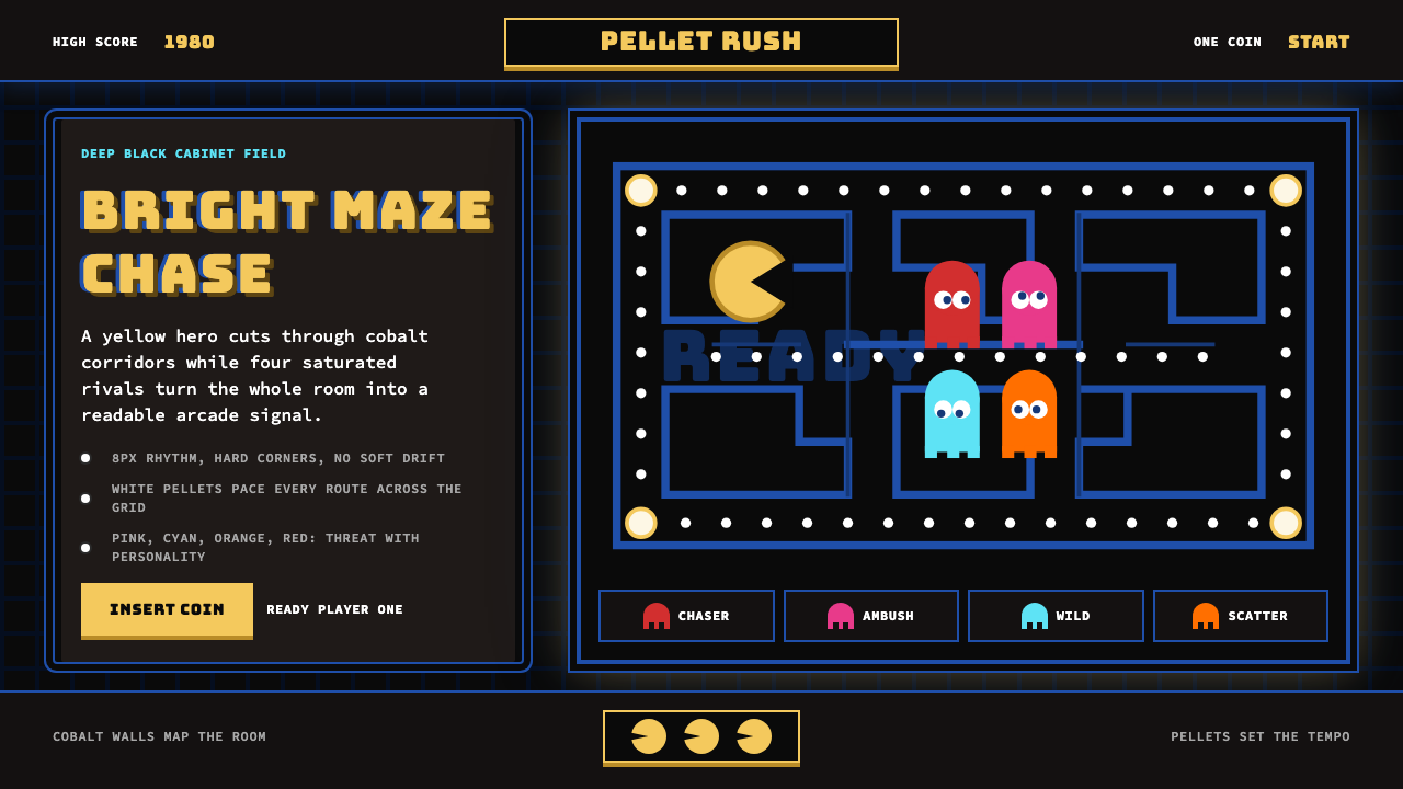 Pac-Man (Namco 1980)Arcade joy burns bright. Yellow disc, cobalt maze, and four ghost hues snap o…街机欢愉高亮燃烧:黄圆、钴蓝迷宫与四色幽灵在黑底上跳动。
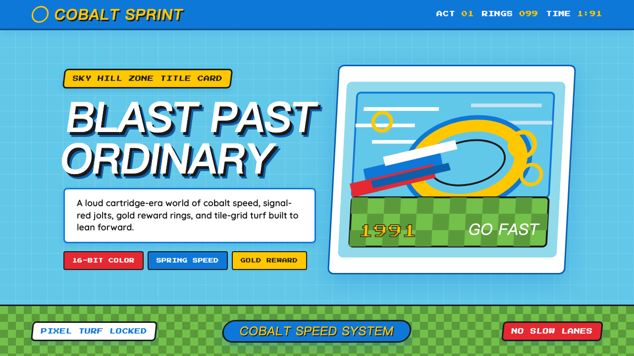 Sonic the Hedgehog (1991)Velocity has teeth. Sky-cyan, cobalt slant type, gold rings, checkerboard tur…速度带刺:天青底、钴蓝倾斜字、金环与棋盘草地。
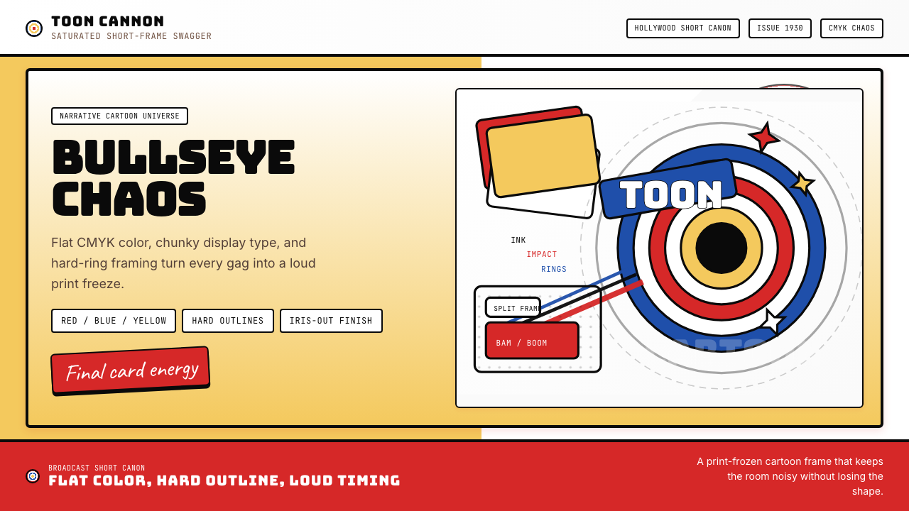 Looney Tunes (Warner Bros.)Pure cartoon chaos. Bull's-eye rings, Bungee type, and red-blue-yellow blocks.纯卡通混乱。牛眼环、粗壮标题字与红蓝黄块面。
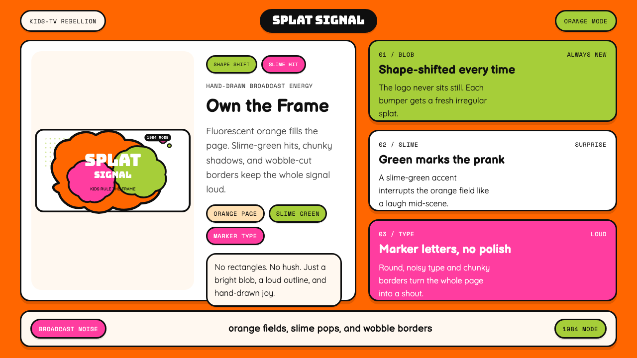 Nickelodeon Orange Splat (1984)Kids own the screen. Orange fields, slime-green pops, and wobble borders do t…孩子掌控屏幕。橙底、史莱姆绿点缀和歪斜边框一起喊话。
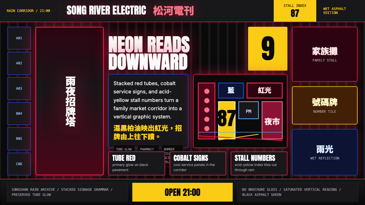 Taiwanese Raohe Night Market NeonTaipei night reads vertically. Neon red, cobalt panels, and acid-yellow numbe…台北夜色垂直閱讀:霓虹紅、鈷藍看板與酸黃號碼疊在濕黑地面。
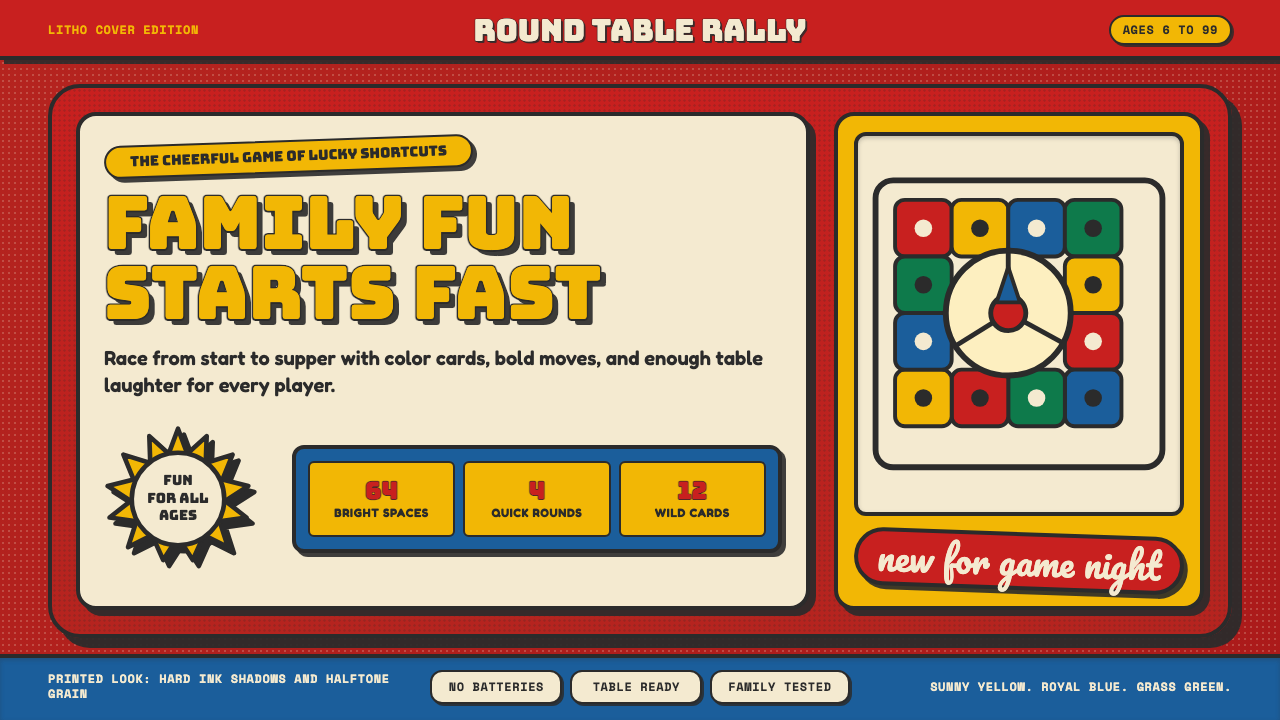 Vintage Board Game BoxShelf appeal shouts. Fire-engine red, Bungee lockups, yellow bursts, and ink…货架感在喊:消防红底、Bungee 标题、黄爆炸章与硬黑影。