What is Sonic the Hedgehog (1991)?什么是 Sonic the Hedgehog (1991)?
Velocity made visible: Sonic the Hedgehog's 1991 visual identity turned speed into an aesthetic — cobalt spikes, CRT-vivid color, italic everything, and attitude that dared an entire generation to keep up.速度的视觉化:刺猬索尼克1991年的视觉语言将速度本身变成了一种美学——钴蓝刺刺、CRT级鲜艳色彩、倾斜的一切,以及挑衅整整一代人跟上节奏的那份张扬。
Sonic the Hedgehog (1991) in briefSonic the Hedgehog (1991) 速览
Sonic the Hedgehog's 1991 visual identity is one of the most recognizable design systems to emerge from the era of 16-bit console gaming. Created in Japan and then amplified through Sega of America's aggressive marketing, it fused elements of Japanese character design, American attitude branding, and the technical constraints of Mega Drive hardware into a single coherent aesthetic that communicated speed, rebellion, and confidence before a player touched a controller.刺猬索尼克1991年的视觉语言是16位主机游戏时代最具辨识度的设计体系之一。这套体系在日本诞生,经世嘉美国分公司的强力营销放大传播,将日本角色设计、美式态度品牌塑造,以及Mega Drive硬件的技术限制熔合为一个连贯的整体美学——玩家还没碰手柄,就已经感受到速度、反叛与自信。
The system's visual core is built on saturated, high-contrast color relationships. A sky-cyan background against cobalt-blue character design, gold collectible rings against emerald green terrain, and a checkerboard ground pattern that creates an unmistakable sense of velocity and forward motion. Every color choice was made to pop against the low-resolution constraints of CRT televisions — colors needed to read clearly on a cathode-ray tube display with bleeding phosphors and limited luminance precision, which pushed the palette toward bold, unambiguous separation.这套体系的视觉核心建立在高饱和度、高对比度的色彩关系上:天青色背景映衬钴蓝角色,金色圆环立于翠绿地形,棋盘格地砖制造出强烈的速度感与前进感。每一个色彩选择都是为了在CRT电视的低分辨率限制下最大限度地跳出画面——荧光屏的磷光渗色与有限的亮度精度要求色调必须鲜明、分离,绝不含糊。
Typography and wordmark design followed the same logic: the Sonic logotype leaned into aggressive italic angles, giving static letterforms the visual suggestion of motion. This italic-as-speed convention became central to the early-90s gaming aesthetic and influenced how an entire generation of entertainment properties communicated energy through type. The result is an aesthetic that does not merely depict a fast character — it is itself a designed object that feels fast.字体与字标设计遵循同样的逻辑:索尼克字标采用大幅倾斜的斜体,让静态字形产生运动的视觉暗示。这种「斜体即速度」的惯例成为90年代初游戏美学的核心元素,并影响了整整一代娱乐内容通过字体传达能量的方式。最终呈现的不只是一个速度快的角色形象,而是一个本身就让人感觉快的设计物。
See the Sonic the Hedgehog (1991) design system查看 Sonic the Hedgehog (1991) 完整设计系统
Where does Sonic the Hedgehog (1991) come from?Sonic the Hedgehog (1991) 从何而来?
In 1990, Sega of Japan launched an internal competition to find a new company mascot that could compete with Nintendo's Mario. The winning design came from character artist Naoto Ohshima, who created a spiky cobalt-blue hedgehog inspired partly by Felix the Cat's boldness and partly by Bill Clinton's can-do attitude — both figures Ohshima had collected as visual references. The hedgehog's blue color was chosen to match Sega's own corporate blue, establishing an immediate brand alignment between character and company identity.1990年,日本世嘉发起了一场内部竞标,寻找能与任天堂马里奥抗衡的新公司吉祥物。获胜方案来自角色设计师大岛直人:一只带刺的钴蓝色刺猬,灵感部分来自菲利克斯猫的大胆感,部分来自比尔·克林顿的进取气质——这两位人物都是大岛直人收集的视觉参考。刺猬的蓝色被选中以匹配世嘉自身的品牌蓝,在角色与公司视觉识别之间建立起直接的品牌对齐。
Programmer Yuji Naka and game designer Hirokazu Yasuhara joined Ohshima to form the core team. Naka's technical breakthroughs allowed Sonic to move at screen-clearing speeds that had no precedent in console gaming, which meant the visual design had to function at blur-velocity — landscapes had to read as landscapes, obstacles had to read as obstacles, in fractions of a second. This constraint shaped everything: simplified, chunky character proportions that stayed legible at speed; large landmark shapes like loop-de-loops that registered instantly; color contrasts robust enough to survive fast scrolling.程序员中裕司和关卡设计师保原浩和大岛直人组成了核心团队。中裕司的技术突破使索尼克能够以前所未有的速度穿越整个画面,这意味着视觉设计必须在模糊的高速下依然有效——景观必须在瞬间被识别为景观,障碍必须在瞬间被识别为障碍。这一约束塑造了一切:简洁、敦实的角色比例在高速下依然清晰;回旋曲线等大型地标形状能被即时识别;色彩对比强健到足以抵抗快速滚动的消解。
Sega of America, led by Tom Kalinske, saw Sonic not just as a game character but as a brand weapon in the console wars. The American marketing apparatus translated the Japanese visual system into an aggressive street-level attitude campaign, encapsulated by the famous tagline positioning Sega against Nintendo. North American packaging and advertising pushed the palette toward even higher contrast, sharpened the italic angles, and adopted the blue spikes as a symbol of corporate rebellion against the status quo. The character design remained consistent; the attitude surrounding it intensified.由汤姆·卡林斯克领导的世嘉美国分公司将索尼克不仅视为游戏角色,更视为主机大战中的品牌武器。美国营销机器将日本视觉体系转化为一场激进的街头态度运动,以那句著名的广告语为代表,将世嘉与任天堂直接对立。北美包装与广告将色彩对比推向更高极限,强化了倾斜角度,并将蓝色刺刺确立为企业反叛建制的象征。角色设计保持一致,围绕它的态度则持续升温。
The classic visual canon — often dated 1991 to 1998, encompassing the original Mega Drive trilogy and the Sonic CD spin-off — represents the purest expression of this system before the character entered three-dimensional game space. The transition to 3D in 1998's Sonic Adventure required a significant redesign, elongating proportions and introducing more detailed rendering, which diluted many of the design qualities that made the original character so visually forceful. The 1991 identity is therefore understood as a closed and complete aesthetic chapter — chunky, two-dimensional, CRT-native, and unrepeatable.经典视觉规范——通常界定为1991年至1998年,涵盖Mega Drive原版三部曲与索尼克CD外传——代表了该体系在角色进入三维游戏空间之前最纯粹的表达。1998年《索尼克大冒险》向3D的转变需要重大的角色重设计:比例被拉长,渲染细节增加,这稀释了原版角色视觉力量的许多来源。1991年的视觉识别因此被理解为一个封闭而完整的美学章节——敦实、二维、CRT原生、不可复制。
What defines the Sonic the Hedgehog (1991) look?Sonic the Hedgehog (1991) 的视觉特征是什么?
Color Palette色彩体系
The palette is built around a small number of high-saturation hues selected for maximum contrast on a CRT display. Sky cyan dominates the background register; cobalt blue defines the character; gold-yellow marks collectibles; emerald green and earthy brick-red define the terrain. These colors were not chosen for subtlety — they were chosen to be unmistakable at motion blur. Black outlines around every element reinforce separation where color alone might bleed. The total effect is a palette that reads as cheerful and energetic even at a glance.色板围绕少数高饱和色调构建,专为在CRT显示器上实现最大对比度而选取:天青色主导背景层,钴蓝色定义角色,金黄色标记收集物,翠绿与砖红划定地形。这些颜色的选择不求细腻,而求在运动模糊中依然不可混淆。每个元素的黑色描边在色彩可能渗色的地方强化了视觉分离。整体效果是一套即使一瞥也能读出活力与能量的色板。
Character Proportion角色比例
Sonic's original sprite design uses chunky, compressed proportions — a large head relative to body, short limbs, and a silhouette dominated by the distinctive spiky quills. These proportions were partly dictated by the resolution limits of Mega Drive hardware, which constrained how many pixels could define a character without visual noise. The compression created a figure that is immediately readable at small sizes and remains legible when the screen scrolls at high speed. Every major anatomical feature — the eyes, the shoes, the spines — is oversized relative to realistic proportion, ensuring the character telegraphs intent and emotion across frames.索尼克的原版像素形象采用敦实、压缩的比例——相对于身体偏大的头部、短小的四肢,以及由标志性刺刺主导的轮廓。这些比例部分由Mega Drive的硬件分辨率限制所决定:有限的像素数量要求角色形象必须在不产生视觉噪声的前提下保持清晰。这种压缩塑造出一个在小尺寸下即刻可读、在画面高速滚动时依然清晰的形象。每个主要解剖特征——眼睛、跑鞋、脊刺——都相对写实比例做了夸大处理,确保角色能在帧与帧之间清晰传达意图与情绪。
Speed Signifiers速度符号
The visual language of speed permeates every design layer. Italic-slanted wordmarks and logotypes imply forward lean and momentum before any animation plays. Motion blur lines — simple parallel streaks — extend from the character during fast movement, translating a gameplay state into a recurring graphic motif. Loop-de-loop track elements provide a visual metaphor for unbroken circular velocity. Even the checkerboard ground tiles reinforce speed by creating a strong receding-plane perspective that draws the eye forward. These conventions became shorthand for speed itself across late-80s and early-90s entertainment design.速度的视觉语言渗透进每一个设计层面。倾斜字标与字标设计在任何动画播放之前就已暗示前倾的动势。运动残影线条——简洁的平行条纹——在高速移动时从角色身上延伸而出,将一种游戏状态转化为反复出现的图形母题。回旋轨道提供了不间断圆形速度的视觉隐喻。就连棋盘格地砖也通过制造强烈的消退透视感来强化速度,将视线持续引向前方。这些惯例在80年代末至90年代初的娱乐设计中成为了速度本身的视觉简写。
Outline and Pixel Clarity描边与像素清晰度
Every sprite and background element is bounded by a consistent black outline — a technique that traces directly back to the limitations of composite video output on CRT televisions, where adjacent saturated colors without separation would bleed into one another. The outline functions simultaneously as a technical workaround and a stylistic signature, giving the entire visual world a bold, almost comic-book quality. Objects look drawn rather than rendered, deliberate rather than simulated. This outlined, flat aesthetic became one of the defining visual signatures of the classic Sonic era and distinguishes it sharply from the smooth-shaded 3D aesthetic that followed.每个精灵与背景元素都被一致的黑色描边所界定——这一技法直接源于CRT电视复合视频输出的限制:相邻的高饱和色彩若无分隔就会相互渗色。描边同时充当技术变通方案与风格标志,赋予整个视觉世界一种大胆、近乎漫画的质感。物体看起来是被绘制出来的,而非被渲染的;是有意为之的,而非被模拟的。这种描边的平面美学成为经典索尼克时代最具决定性的视觉标志之一,使其与后来平滑着色的3D美学形成鲜明区别。
Attitude and Expression态度与表情
Sonic's character design encoded attitude as a design value, not merely a personality trait. The character's resting expression features a slight smirk and confident, slightly narrowed eyes — a visual posture of cool detachment that was deliberately modeled to contrast with the rounder, friendlier faces of Nintendo's characters. This attitude was systematically extended into all promotional materials: advertising, packaging typography, the aggressive forward lean of the logotype, and the slogan-based marketing campaigns. The visual system was designed not just to look exciting but to project an identity — young, rebellious, faster than anything the competition could offer.索尼克的角色设计将态度本身编码为一种设计价值,而非仅仅是性格特质。角色的默认表情带着一丝微笑和自信、微微眯起的眼睛——一种冷静超脱的视觉姿态,被刻意设计来对比任天堂角色更圆润、更友善的面孔。这种态度被系统性地延伸至所有推广物料:广告、包装排版、字标的攻击性前倾角度,以及以口号为核心的营销活动。这套视觉体系不只是为了看起来令人兴奋,更是为了投射一种身份认同——年轻、反叛、比竞争对手的一切都要快。
Environmental Iconography环境图像志
The Green Hill Zone — the first stage of the original game — established an environmental visual vocabulary that has persisted across the franchise. Checkerboard cliff faces, tropical palm trees against a bright blue sky, and rotating spike balls on chains provided a compact set of iconic shapes that instantly signal the Sonic world. Each of these environmental elements was designed to be readable at a single glance at any scroll speed, which meant strong silhouette shapes, high color contrast, and avoidance of visual ambiguity. The checkered-earth pattern became especially iconic — a graphic device rather than a realistic surface, a visual rhythm that makes the ground itself feel designed rather than represented.绿丘区——原版游戏的第一关——确立了一套贯穿整个系列的环境视觉词汇:棋盘格崖面、明蓝天空下的热带棕榈树、铁链上旋转的尖刺球,这一套紧凑的标志性形状能够即刻唤起索尼克的世界。这些环境元素中的每一个都被设计成在任意滚动速度下一眼可辨:强轮廓形状、高色彩对比、回避视觉歧义。棋盘格地面图案尤为标志性——它是一种图形装置而非写实表面,一种让地面本身感觉是被设计出来而非被再现出来的视觉节奏。
Wordmark and Logotype字标与标志字体
The Sonic logotype — rendered in bold, heavily italicized letterforms with a forward-slanting axis — is one of the clearest examples of typography deployed as pure attitude communication. The extreme angle of the slant goes beyond conventional italic usage; it approaches the visual territory of a speed blur, as though the letters themselves are still accelerating. Letterforms are thickened and slightly rounded at terminals, referencing the same chunky, legibility-at-speed logic as the character design. The wordmark was designed to work on North American packaging where aggressive contrast with competitor branding was a primary brief, and it succeeds by being visually louder than almost anything else in its retail environment.索尼克字标——以粗重、大幅倾斜的字形呈现,具有明显的前倾轴——是将排版作为纯粹态度传达的最清晰范例之一。倾斜的极端角度超出了常规斜体的使用范畴,进入了速度模糊的视觉领域,仿佛字母本身仍在加速。字形末端被加厚并略微圆润化,呼应了角色设计中相同的敦实、高速可读逻辑。该字标被设计用于北美包装,核心任务是与竞争对手品牌形成激进的视觉对比,而它通过在零售环境中做到视觉上比几乎一切都更响亮来完成了这一任务。
See the Sonic the Hedgehog (1991) design system查看 Sonic the Hedgehog (1991) 完整设计系统
Who shaped Sonic the Hedgehog (1991)?谁塑造了 Sonic the Hedgehog (1991)?
Ohshima was the character designer who created Sonic's original visual design, winning the internal Sega competition to find a mascot. His design decisions — the cobalt-blue color chosen to match Sega's brand, the compressed proportions optimized for sprite legibility, the attitude-forward smirk that defined the character's personality — established the complete visual DNA that the entire franchise rested on. Ohshima also designed Dr. Eggman (Robotnik), the primary antagonist, and contributed to the environmental design of early Sonic titles. His approach demonstrated how hardware constraint and character design could be treated as complementary creative forces rather than opposing pressures.大岛直人是创作索尼克原版视觉设计的角色设计师,赢得了世嘉内部寻找吉祥物的竞标。他的设计决策——为匹配世嘉品牌而选择的钴蓝色、为精灵可读性优化的压缩比例、定义角色性格的自信微笑——确立了整个系列所依托的完整视觉DNA。大岛直人还设计了主要反派蛋博士(罗博特尼克),并参与了早期索尼克作品的环境设计。他的方式展示了硬件限制与角色设计可以被当作互补的创意力量,而非对立的压力。
As the lead programmer, Naka's technical innovations were inseparable from the visual design: the game could only look the way it looked because his code allowed the character to move the way it moved. Naka developed the physics engine that produced Sonic's characteristic momentum-based movement — the way velocity builds, curves, and carries through loops — and this physics system directly determined which visual environments, character proportions, and speed-signifier conventions would be readable and which would collapse into chaos at high scroll speeds. The visual system and the game system were co-designed, and Naka's half of that collaboration is as responsible for the final aesthetic as any purely visual decision.作为首席程序员,中裕司的技术创新与视觉设计密不可分:游戏之所以呈现出那种视觉效果,正是因为他的代码使角色以那种方式运动。中裕司开发了产生索尼克标志性动量物理系统的引擎——速度积累、弯道过弯、穿越回旋环的方式——而这套物理系统直接决定了哪些视觉环境、角色比例和速度符号惯例在高速滚动下能被清晰辨认,哪些会崩溃为混乱。视觉系统与游戏系统是协同设计的,中裕司对最终美学的贡献与任何纯粹视觉决策同样重要。
Kalinske led Sega of America during the period when the Sonic visual identity was translated from a Japanese game aesthetic into a North American brand weapon. His aggressive marketing strategy — positioning Sega as the rebellious, cool alternative to a family-friendly Nintendo — required that the visual system carry attitudinal freight beyond what its original Japanese context demanded. Under his direction, advertising and packaging pushed the palette's contrast further, sharpened the logotype's angles, and developed the cultural messaging that surrounded the visual identity. The result was that the Sonic aesthetic became inseparable from a specific brand attitude, which is why the design reads not just as a game character but as a cultural position.卡林斯克在世嘉美国分公司领导索尼克视觉识别从日本游戏美学转化为北美品牌武器的阶段。他的进攻性营销策略——将世嘉定位为友善任天堂的反叛酷炫替代——要求视觉体系承载远超其日本语境所需的态度重量。在他的主导下,广告与包装进一步强化了色彩对比,锐化了字标角度,并发展出围绕视觉识别的文化叙事。结果是索尼克美学与一种特定的品牌态度变得不可分割,这也是为什么这套设计不只被解读为一个游戏角色,而是一种文化立场。
As game designer, Yasuhara was responsible for the level architecture — the structural environments that defined the visual contexts in which the character appeared. His stage designs balanced speed-oriented open corridors with obstacle-dense sections, and this structural rhythm required the visual environment to shift registers quickly and legibly. Yasuhara's design of Green Hill Zone established the template for Sonic environmental iconography: high-contrast landforms, distinct landmark shapes, and a strong foreground-midground-background layer system that remained readable at speed. His contribution is often discussed in gameplay terms, but its visual consequences were foundational.作为游戏设计师,保原浩负责关卡架构——定义角色所处视觉语境的结构性环境。他的关卡设计在速度导向的开阔通道与障碍密集区段之间取得平衡,这种结构节奏要求视觉环境能够快速而清晰地切换层次。保原浩对绿丘区的设计确立了索尼克环境图像志的模板:高对比度地形、清晰的地标形状,以及在高速下依然可读的强前景-中景-背景分层系统。他的贡献通常在游戏玩法层面被讨论,但其视觉层面的影响同样是奠基性的。
How do you use Sonic the Hedgehog (1991) today?今天怎么用 Sonic the Hedgehog (1991)?
The Sonic 1991 aesthetic translates most naturally into design contexts where high energy, bold hierarchy, and immediate visual impact are the primary goals. It is not a system for quiet refinement — it is a system for making things impossible to ignore. Applying it correctly means committing to its core logic: saturated color for meaning, strong outlines for separation, italic angles for momentum, and a refusal to let any element apologize for existing.索尼克1991年美学最自然地迁移到高能量、强层级和即时视觉冲击为首要目标的设计语境中。它不是一套追求静谧精致的体系,而是一套让任何事物都无法被忽视的体系。正确应用它意味着承诺于其核心逻辑:高饱和色彩承载意义,强描边确保分离,倾斜角度传递动势,拒绝让任何元素为自己的存在道歉。
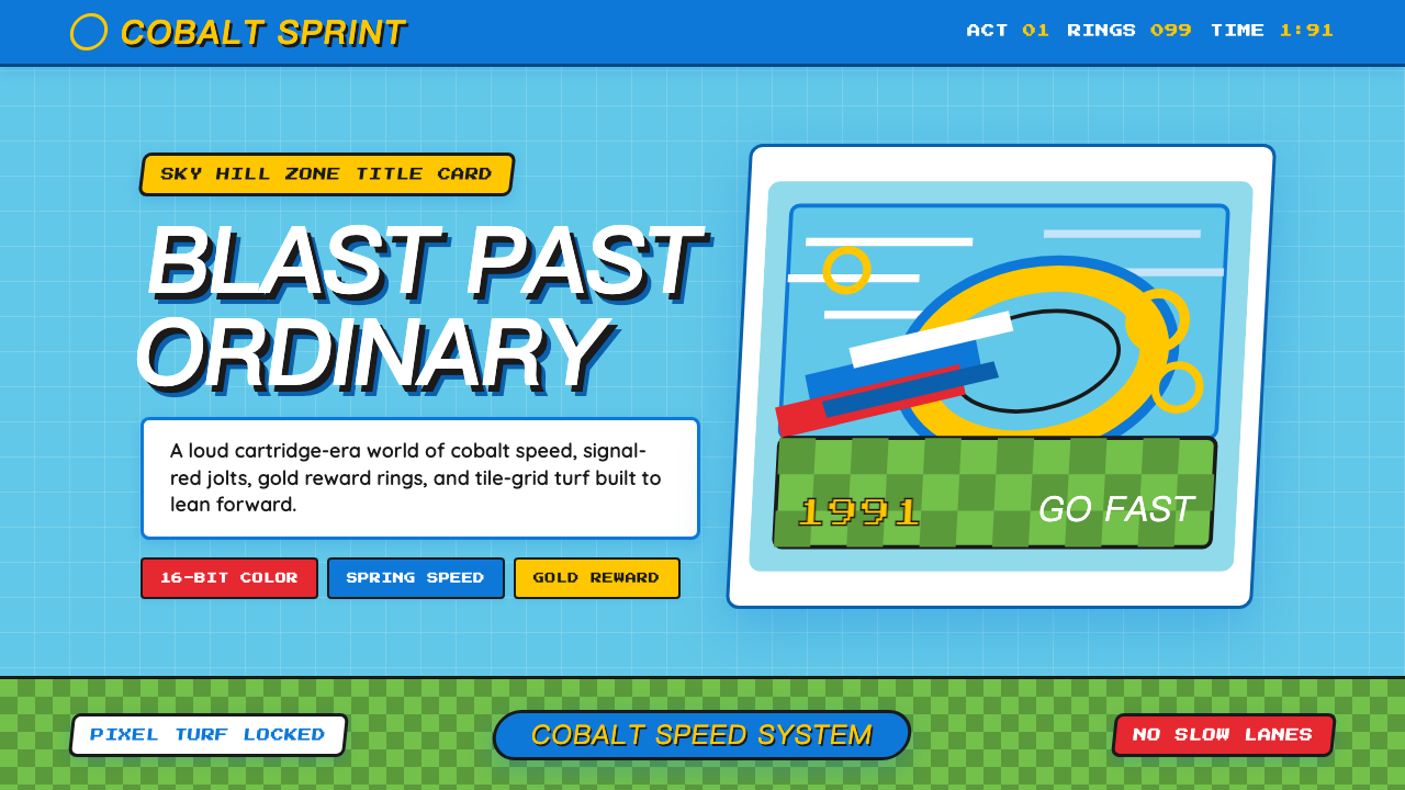
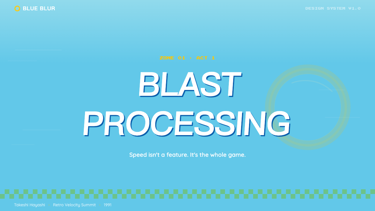
For presentation slides, the style works extremely well on cover and title pages where impact matters most. A cover built on this aesthetic uses a dominant sky-cyan or cobalt field, a heavily slanted wordmark or title in bold letterforms, and a single gold or red accent element — a geometric shape, a ring motif, a speed-line block — to anchor the composition. Content slides should simplify: a strong horizontal color bar defines the header register, body text sits in high contrast against a light ground, and data elements like bar charts take on the bold, flat geometry that the style demands. Keep the palette to two colors per slide; the full palette is for the system, not each individual frame.在演示文稿中,这种风格在最需要冲击力的封面和标题页上表现极佳。基于这套美学的封面使用天青色或钴蓝色为主色场,以大幅倾斜的粗体字形呈现标题,并用单一金色或红色强调元素——几何形状、圆环母题、速度线色块——来锚定构图。内容页应当简化:强横向色条定义标题区,正文以高对比度置于浅色底面,柱状图等数据元素采用这种风格要求的大胆平面几何形式。每张幻灯片色板控制在两种颜色以内;完整色板属于整个系统,而非每一帧。
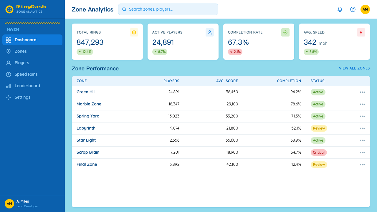
For web interfaces, the style performs well on landing pages and product announcement pages where the goal is to generate excitement and convey momentum. Full-width hero sections with a high-contrast color field and an oversized typographic statement establish the register. Pricing tiers or feature lists benefit from the style's natural hierarchy: use the boldest, most saturated color for the primary tier, a secondary hue for supporting options, and outline treatment for the least prominent. Button states should be clean and decisive — a solid fill shifts to a fully saturated variant on hover, with no soft transitions. Dashboard contexts can use the checkerboard motif as a subtle background texture in section headers to signal the style without overwhelming data content.对于网页界面,这种风格在目标是制造兴奋感和传递动势的落地页与产品发布页上表现出色。具有高对比度色场和超大排版声明的全宽英雄区段确立基本调性。定价层级或功能列表受益于这种风格天然的层级感:将最大胆、最饱和的颜色用于主推层级,次色用于支持选项,最次要的选项用描边处理。按钮状态应干净果断——实色填充在悬停时切换为完全饱和的变体,无柔和过渡。仪表板语境中可将棋盘格母题作为区段标题的细微背景纹理,以暗示这种风格而不压倒数据内容。
For editorial and marketing work, the aesthetic supports poster-style compositions where the message needs to hit at a glance. A Sonic-derived editorial layout uses a dominant image or color block in the upper register, a heavy italic headline that leans forward across the composition, and a tight lower section for body text with maximum contrast against the background. Marketing materials for entertainment products, sports events, gaming-adjacent brands, and youth-culture campaigns are natural applications. The style also has strong retro-nostalgia appeal, making it effective for anniversary campaigns, throwback product launches, or any context where early-90s cultural energy is the message.对于编辑与营销内容,这套美学支持需要一眼传达信息的海报式构图。衍生自索尼克的编辑版面在上方区域使用主导性的图像或色块,以向构图前方倾斜的粗重斜体标题横跨画面,下方紧凑的正文区段与背景保持最大对比度。娱乐产品、体育赛事、游戏相关品牌及青年文化活动的营销物料是天然应用场景。这种风格也具有强烈的复古怀旧吸引力,使其在周年纪念活动、复刻产品发布,或任何以90年代初文化能量为核心信息的语境中格外有效。
A common mistake when applying this aesthetic is confusing high energy with visual chaos. The original system works precisely because it is disciplined within its excess: every color has a consistent role, every italic angle is consistent, every outline weight is consistent. Importing the visual loudness without the underlying consistency produces work that reads as busy rather than bold. A second common error is over-indexing on the character imagery at the expense of the broader design system — the checkerboard, the speed lines, the saturated color architecture — which means the result looks like merchandise rather than a designed communication. The style's power comes from its systematic application, not from dropping a familiar mascot onto an otherwise generic layout.应用这套美学时最常见的错误是将高能量等同于视觉混乱。原版体系之所以奏效,恰恰是因为它在过剩中保持了纪律:每种颜色有一致的职责,每个倾斜角度保持一致,每条描边粗细保持一致。引入视觉响度而丢失底层一致性,产出的作品会读为繁乱而非大胆。第二个常见错误是过度依赖角色形象,以牺牲更广泛的设计体系为代价——棋盘格、速度线、高饱和色彩架构——结果让成品看起来像周边商品而非有设计感的传播物。这种风格的力量来自于系统性应用,而非把一个熟悉的吉祥物丢在一个通用版面上。
See the Sonic the Hedgehog (1991) design system查看 Sonic the Hedgehog (1991) 完整设计系统
Sonic the Hedgehog (1991) — FAQSonic the Hedgehog (1991) · 常见问题
Is this style just nostalgia, or does it work as a contemporary design system?这种风格只是怀旧,还是能作为当代设计体系有效运作?
It functions as a fully viable contemporary design system, not merely as a nostalgia trigger. The visual principles — high contrast, bold outline, italic momentum, saturated palette with clear role assignments — are structurally sound and solve real communication problems. Where it excels is in contexts requiring immediate impact: launch campaigns, event materials, entertainment products, and interfaces where energy is a brand value. The nostalgia layer is a bonus that activates recognition in audiences who grew up with the original, but the system's legibility and hierarchy work independently of that cultural reference.它作为一套完全可行的当代设计体系运作,而不仅仅是一种怀旧触发器。其视觉原则——高对比度、粗描边、斜体动势、有明确职责分配的高饱和色板——在结构上是扎实的,并能解决真实的传达问题。它擅长的语境是需要即时冲击的场合:发布活动、活动物料、娱乐产品,以及能量是品牌价值的界面。怀旧层面是一种红利,能在伴随原版长大的受众中激活识别感,但这套体系的可读性与层级感独立于那种文化参照之外同样成立。
How does the Sonic 1991 aesthetic differ from other early-90s gaming visual styles?索尼克1991年美学与90年代初其他游戏视觉风格有何不同?
The distinguishing features are the specific combination of attitude-forward character expression, cobalt-dominant palette with the sky-cyan pairing, and the systematic use of italic as a speed signal in the wordmark and marketing materials. Many contemporaries used high-saturation palettes and chunky proportions — these were general 16-bit era conventions. What makes the Sonic system distinct is that the design is not merely shaped by the hardware constraints but actively weaponizes them: the chunky proportions become boldness, the CRT-vivid colors become brand identity, and the speed-lines become a recurring graphic motif rather than just an animation effect. The design has a coherent attitude that goes beyond gameplay illustration.区别特征在于自信态度角色表情、以天青色配对为基础的钴蓝主导色板,以及在字标和营销物料中系统性地将斜体用作速度信号的做法这三者的特定组合。许多同时代作品也使用了高饱和色板和敦实比例——这些是16位时代的普遍惯例。使索尼克体系独特的是:这套设计不仅仅是被硬件限制所塑造,而是主动将其武器化——敦实比例变成了大胆感,CRT级鲜艳色彩变成了品牌识别,速度线变成了反复出现的图形母题而非仅仅是动画效果。这套设计拥有一种超越游戏插图本身的连贯态度。
Can this aesthetic work for non-entertainment brands?这套美学能用于非娱乐品牌吗?
Yes, with deliberate recontextualization. The core visual tools — saturated palette, strong outline, italic momentum, checkerboard geometry — are transferable to any brand context that wants to communicate speed, energy, and confidence. Technology startups positioning around performance, sports and fitness brands, rapid-delivery services, and youth-facing consumer brands are all natural recipients. The key is to abstract the visual principles away from the specific character imagery and gaming context: use the palette architecture and the typographic energy without the mascot, and the system functions as bold contemporary branding rather than gaming pastiche.可以,但需要刻意的语境再造。核心视觉工具——高饱和色板、强描边、斜体动势、棋盘格几何——可迁移至任何想传达速度、能量和自信的品牌语境。围绕性能定位的科技初创企业、运动与健身品牌、快速配送服务,以及面向年轻受众的消费品牌,都是天然的接收者。关键是将视觉原则从特定角色形象和游戏语境中抽离:使用色板架构和排版能量,但不使用吉祥物,这套体系就能作为大胆的当代品牌设计运作,而非游戏风格的仿制品。
What is the right way to use the checkerboard motif without it feeling like a costume?如何正确使用棋盘格母题而不让它显得像是穿了一件戏服?
Use it structurally, not decoratively. In the original game, the checkerboard ground serves a visual-design function: it creates a receding-plane perspective that communicates ground level and forward direction at high scroll speeds. Applied in contemporary work, the motif is most effective when it performs a similar structural role — as a section divider, a background texture that establishes spatial depth, or a grid-module pattern in a data-heavy layout. Applying it as a wallpaper fill or a purely ornamental surface pattern removes the structural logic and produces something that looks costumed. Size and scale matter: large-scale check blocks read as bold geometry; fine-grain checks read as decorative texture. The bold geometry is Sonic; the fine-grain texture is something else.将它用作结构性元素,而非装饰性元素。在原版游戏中,棋盘格地面服务于一种视觉设计功能:它创造出一种消退平面透视,在高速滚动下传达地面水平与前进方向。在当代设计中应用这个母题时,它最有效的状态是扮演类似的结构性角色——作为区段分隔、建立空间深度的背景纹理,或数据密集版面中的网格模块图案。将它作为壁纸填充或纯装饰性表面图案使用,会去除其结构逻辑,产出看起来像是穿着戏服的东西。尺寸与比例至关重要:大尺度格块读为大胆几何形;细密格纹读为装饰纹理。大胆几何形是索尼克的;细密纹理是别的东西。
How should color proportion be managed when the full Sonic palette is too much for a single composition?当完整的索尼克色板对单一构图而言过于丰富时,应如何管理色彩比例?
The original game managed this by assigning each color a consistent layer: sky cyan lives in the background, cobalt blue on the character, green and earthy tones on the terrain, gold on collectibles. This layer assignment meant the full palette was always present but never fighting itself — each color occupied its own spatial register. In contemporary work, the same principle applies: assign each palette color to a consistent compositional role before designing. Background, primary typographic element, accent, data element — one color per role. When the palette needs to be further reduced, sky cyan and cobalt are the most brand-essential pair; gold as accent; the terrain colors can be dropped entirely without losing the core identity.原版游戏通过为每种颜色分配一致的层次来管理这一点:天青色存在于背景,钴蓝色存在于角色,绿色和大地色存在于地形,金色存在于收集物。这种层次分配意味着完整色板始终在场,却从不相互争夺——每种颜色占据自己的空间层次。在当代设计中,同样的原则适用:在设计之前先为每种色板颜色分配一致的构图职责。背景、主排版元素、强调色、数据元素——每个职责一种颜色。当色板需要进一步缩减时,天青色与钴蓝色是最具品牌代表性的配对;金色作为强调;地形色可以完全省去而不失去核心识别。
Related design styles相关设计风格
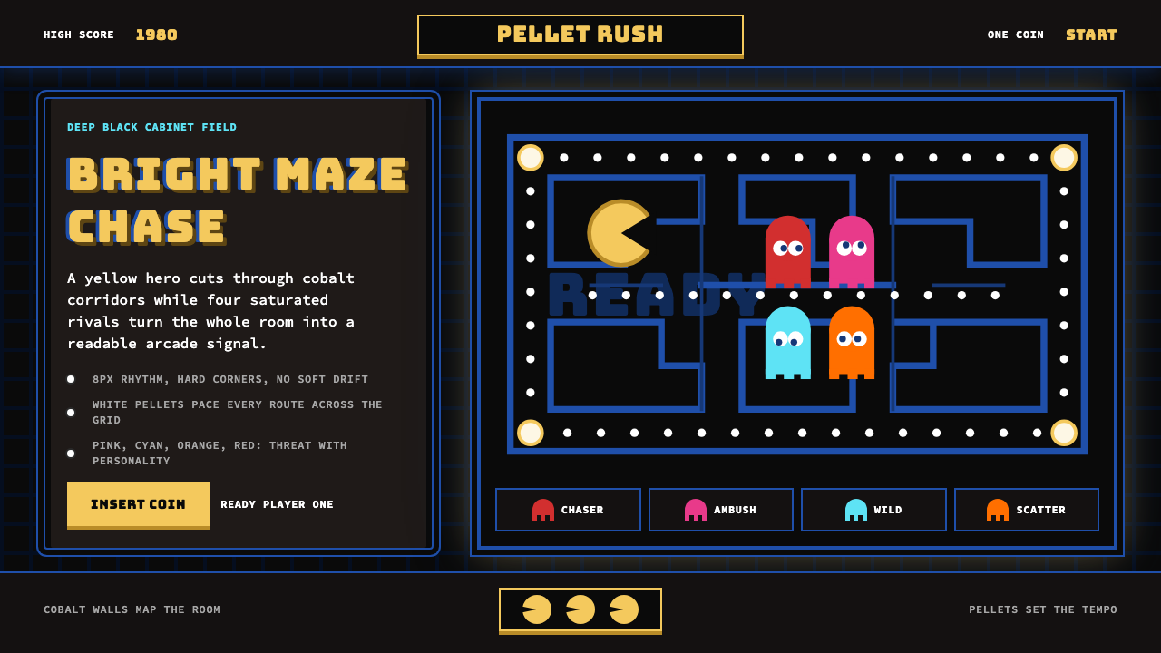 Pac-Man (Namco 1980)Arcade joy burns bright. Yellow disc, cobalt maze, and four ghost hues snap o…街机欢愉高亮燃烧:黄圆、钴蓝迷宫与四色幽灵在黑底上跳动。
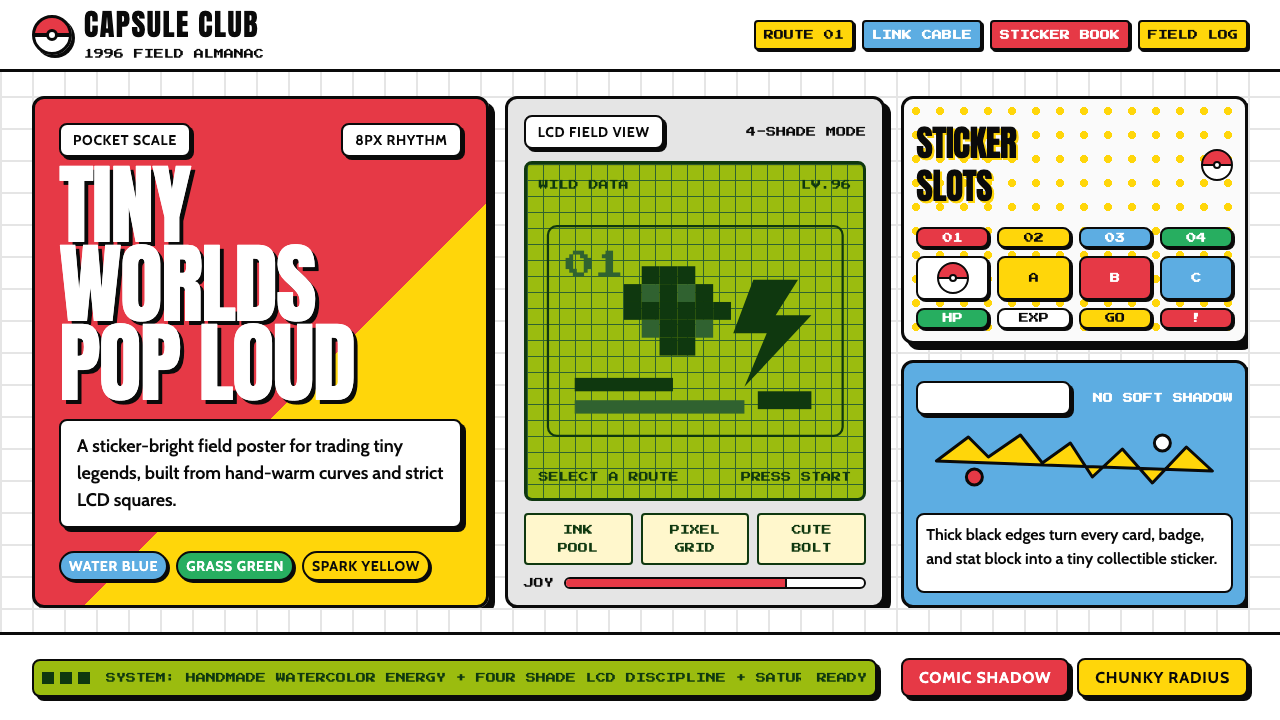 Pokémon Game BoyKawaii meets cartridge logic. Capsule red, LCD green, Anton heft, and 8px gri…卡哇伊撞上卡带逻辑:胶囊红、LCD绿、Anton粗字与8px网格同屏。
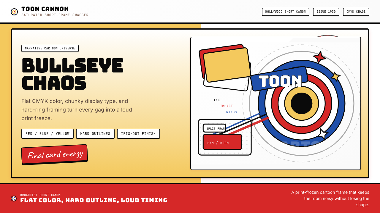 Looney Tunes (Warner Bros.)Pure cartoon chaos. Bull's-eye rings, Bungee type, and red-blue-yellow blocks.纯卡通混乱。牛眼环、粗壮标题字与红蓝黄块面。
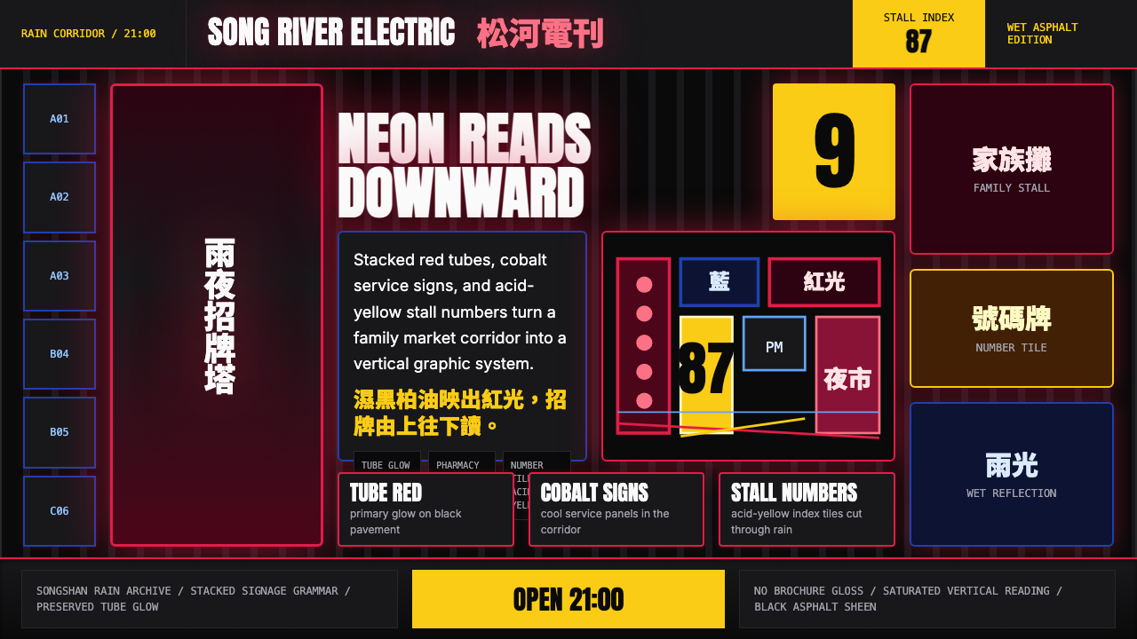 Taiwanese Raohe Night Market NeonTaipei night reads vertically. Neon red, cobalt panels, and acid-yellow numbe…台北夜色垂直閱讀:霓虹紅、鈷藍看板與酸黃號碼疊在濕黑地面。
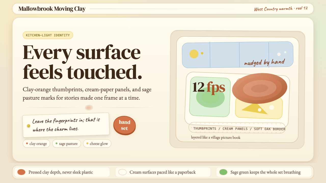 Aardman ClaymationHandmade warmth, visibly touched. Clay-orange panels, Caveat notes, thumbprin…手作温度可见:陶土橙面板、手写便签与指纹几何。
 Cartoon Network 90s BlocksKids-cable noise, squared. Black-white checkerboards crash into hot-yellow Bu…方块化的儿童有线电视噪音:黑白棋盘撞上热黄 Bungee 字块。