What is Cartoon Network 90s Blocks?什么是 Cartoon Network 90s Blocks?

Cartoon Network's 1990s identity weaponized the bluntest tools in the visual kit — black-and-white checkerboard, saturated primary blocks, and slab letterforms so chunky they look stamped rather than typed.Cartoon Network 1990 年代的视觉识别将最粗暴的设计武器化——黑白棋盘格、饱和原色块、厚墩墩的展示字体,像是用模具砸出来的而不是排版出来的。
Cartoon Network 90s Blocks in briefCartoon Network 90s Blocks 速览
Cartoon Network 90s Blocks is a pop-culture graphic style derived directly from the on-air identity that Cartoon Network broadcast throughout the 1990s and early 2000s. Its core grammar is immediately legible: a high-contrast checkerboard of pure black and pure white squares serves as the signature ground or accent pattern; against this, single blocks of fully saturated color — hot yellow, cobalt blue, signal red, lime green, or hot pink — are placed with the bluntness of a rubber stamp. Over everything sits a wordmark or headline in a typeface so wide and heavy that it reads as a physical object rather than a linguistic sign.Cartoon Network 90s Blocks 是一种流行文化图形风格,直接源于 Cartoon Network 在整个 1990 年代至 2000 年代初期播出的频道视觉识别系统。其核心语法一目了然:纯黑与纯白方格交织形成的高对比棋盘格,作为招牌底纹或点缀图案;在此之上,完全饱和的单色色块——热黄、钴蓝、信号红、柠檬绿或热粉——以橡皮图章般的直接感砸下去。整体之上,字标或标题采用宽度与字重都极度夸张的展示字体,读起来像一个实物而不是一个文字符号。
The style belongs to a specific moment in American popular culture when cable television was fighting for children's attention and brand recognition had to work at the resolution of a cathode-ray tube screen seen from across a living room. Every element was therefore pushed to the point of no subtlety: maximum contrast, zero gradients, corners so sharp they could be cut with scissors. This was not a failure of sophistication — it was a deliberate calibration to the medium's constraints and the audience's age.这种风格属于美国流行文化的特定时刻——有线电视正在争夺儿童注意力,品牌识别必须在阴极射线管屏幕上、在客厅的另一头就能被认出来。因此每一个元素都被推到毫无细腻感的极致:最大化对比度、零渐变、角落锐利得像可以用剪刀裁出来的那种。这不是设计功力不足,而是对媒介限制和受众年龄的刻意校准。
Used today, the style functions as an immediately recognizable nostalgic signal. It carries connotations of Saturday-morning ritual, after-school television, and a particular strain of American countercultural humor that ran through shows like Dexter's Laboratory, Johnny Bravo, The Powerpuff Girls, and Courage the Cowardly Dog. Designers reach for it when they want to invoke that specific warmth of 1990s kids-cable memory, or when a project calls for an energy that is loud, confident, and deliberately unbothered by restraint.放到今天使用,这种风格是即时可辨认的怀旧信号。它承载着周六早晨仪式感、放学后看电视、以及贯穿《德克斯特的实验室》《强尼大冒险》《飞天小女警》《胆小狗英雄》等节目的那种特殊美式反文化幽默的联想。当设计师想唤起 1990 年代儿童有线电视的那份特定温度、或项目本身需要一种响亮、自信、刻意不在乎克制的能量时,就会选择它。
See the Cartoon Network 90s Blocks design system查看 Cartoon Network 90s Blocks 完整设计系统
Where does Cartoon Network 90s Blocks come from?Cartoon Network 90s Blocks 从何而来?
Cartoon Network launched on October 1, 1992, as a division of Ted Turner's Turner Broadcasting System, headquartered in Atlanta, Georgia. Its initial programming was drawn entirely from the Hanna-Barbera and MGM animation libraries that Turner had acquired — Yogi Bear, The Flintstones, Tom and Jerry — but the channel needed a visual identity powerful enough to carve shelf space from two dominant incumbents: Disney Channel and Nickelodeon. The solution was a brand system built around the most reductive possible visual unit: the square.Cartoon Network 于 1992 年 10 月 1 日正式开播,作为特德·特纳旗下特纳广播系统的一个频道,总部位于佐治亚州亚特兰大。其初期节目内容完全来自特纳收购的 Hanna-Barbera 与 MGM 动画库——瑜伽熊、摩登原始人、猫和老鼠——但频道需要一套足够强势的视觉识别,以便从迪士尼频道和尼克国际儿童频道这两个主导竞争者手中切出一块市场份额。解决方案是一套建立在最简化可能视觉单元之上的品牌系统:正方形。
The original identity design used a simple black-and-white checkerboard as its organizing motif, with the letters 'CN' locked into a two-square block. The system was deliberately system-agnostic — it reproduced cleanly in any color combination, at any scale, on the limited broadcast graphics technology of the early 1990s. When color blocks were introduced as bumpers and interstitials throughout the decade, they followed the same logic: one flat saturated color per block, no blending, no gradients. The checkerboard and the color slab were interchangeable modules in a visual kit that any production team could operate without specialized design expertise.原版视觉识别设计以简洁的黑白棋盘格作为组织母题,将字母「CN」锁定在一个双格方块中。这套系统被刻意设计成与具体应用无关——在任意颜色组合、任意尺寸下,以 1990 年代初期有限的广播图形技术都能清晰还原。当整个十年间色彩块开始出现在台标间隔和节目间插片中,它们遵循同样的逻辑:每个色块只有一种平面饱和色,无混合,无渐变。棋盘格与色板是同一视觉工具包中可互换的模块,任何制作团队无需专业设计经验都能操作。
The cultural context mattered as much as the technical constraints. The early 1990s were a moment of post-MTV visual maximalism in American media — the music channel had established that graphic boldness and rapid-cut energy were not only acceptable but expected in youth-targeted television. Cartoon Network absorbed this lesson and pushed it further into pure geometric flatness, partly because animation cel aesthetics already privileged flat color and sharp outlines, and partly because the network's countercultural positioning relative to the more polished Disney and Nickelodeon brands called for something rougher and more deliberately 'undesigned-looking.'文化背景与技术限制同样重要。1990 年代初是美国媒体 MTV 后期视觉极简主义的时刻——那个音乐频道已经确立,图形大胆与快切能量在面向年轻人的电视中不仅可以接受,更是被期待的。Cartoon Network 吸收了这一经验,并将其推向更纯粹的几何平面感:一方面因为动画赛璐珞美学本来就偏重平面色彩与硬边轮廓,另一方面因为该频道相对更精致的迪士尼和尼克国际儿童频道的反文化定位,需要某种更粗粝、更刻意「看起来没有设计过」的东西。
The creative ecosystem that grew up around the network in the mid-1990s reinforced the aesthetic. Mike Lazzo, the executive credited with shaping the network's experimental sensibility, championed shows that broke with the smooth production values of competitor networks. Genndy Tartakovsky's Dexter's Laboratory and Samurai Jack used hard-edged color fields and deliberate stylization drawn from mid-century Modernist animation. Craig McCracken's The Powerpuff Girls deployed flat primary-color character design that read like Pop Art applied to children's television. Adult Swim, launched as a late-night block in 2001, extended the checkerboard identity into something more deadpan and conceptually strange. Together, these productions gave the graphic style a body of associated cultural material so dense that it now functions as a complete aesthetic shorthand — the black-and-white checker alone is enough to trigger the entire referential system.1990 年代中期围绕该频道成长起来的创作生态进一步强化了这种美学。被认为塑造了频道实验性气质的执行制片人迈克·拉佐,力推那些打破竞争网络光滑制作价值观的节目。根迪·塔尔塔科夫斯基的《德克斯特的实验室》和《武士杰克》使用硬边色域与刻意的风格化,源自二十世纪中期现代主义动画。克雷格·麦克拉肯的《飞天小女警》部署了读起来像波普艺术应用于儿童电视的平面原色角色设计。2001 年作为深夜节目块推出的 Adult Swim,将棋盘格识别延伸成某种更加冷面孔、概念上更奇异的东西。这些节目共同为这种图形风格提供了如此密集的关联文化素材,以至于它现在作为完整的美学速记而运作——仅黑白棋盘格就足以触发整个指涉系统。
What defines the Cartoon Network 90s Blocks look?Cartoon Network 90s Blocks 的视觉特征是什么?
Checkerboard Ground棋盘格底纹
The alternating black-and-white square grid is the style's most distinctive and non-negotiable element. It operates both as background fill and as a secondary graphic object — appearing behind type, bordering a color slab, or cropped to a strip as a dividing element. The squares are always equal in size and always in pure black and pure white, never softened to gray or tinted. The pattern carries an optical vibration at smaller scales that reads as raw visual energy, which is precisely the effect it was designed to produce in short-format broadcast contexts.黑白交替的方格网格是这种风格最独特、不可妥协的元素。它既作为背景填充,也作为次级图形对象运作——出现在文字后方、色板边缘,或被裁切为条状用作分割元素。方格始终等大,始终是纯黑与纯白,从不柔化为灰色或染色。该图案在较小尺度下携带一种视觉振动感,读作原始的视觉能量——这正是它被设计为在短格式广播语境中产生的效果。
Saturated Color Blocks饱和色块
Color in this style is applied in single, undivided, fully saturated slabs. Hot yellow, signal red, cobalt blue, lime green, and hot pink are the characteristic hues — all pushed to maximum chroma, never tinted or toned down. Each color block occupies a clearly bounded rectangular area with no bleed, no gradient transition, and no inner shadow. The blocks are combinatorial: two or three colors might appear on the same composition, but they never blend — they simply abut, creating hard seams that emphasize the stacked-cardboard quality of the overall design.这种风格中的色彩以单一、不分割、完全饱和的色板形式应用。热黄、信号红、钴蓝、柠檬绿和热粉是典型色调——全部推至最大彩度,从不调淡或降调。每个色块占据清晰边界的矩形区域,无渗出、无渐变过渡、无内阴影。色块是组合性的:同一构图中可能出现两到三种颜色,但它们永不混合——只是紧靠在一起,形成强调整体设计堆叠纸板感的硬接缝。
Chunky Display Letterforms厚墩展示字体
Type in this style is exhibition-weight — meaning letterforms are so wide and heavy that they function more like geometric shapes than linguistic characters. The defining quality is mass: each letter feels as though it has physical weight, its strokes thick enough to cast a shadow if the characters were made of cardboard. These are rounded or squared display sans-serifs, with minimal contrast between thick and thin strokes. Letterspacing is tight to negative, pushing letters into each other to reinforce the impression of a solid block. All-caps settings are standard for headlines; mixed case appears only in secondary text.这种风格中的文字是展览级字重——字形宽度和字重都极度夸张,功能上更像几何形态而非语言符号。定义性品质是质量感:每个字母感觉都有实体重量,笔画粗到足以让纸板字母投下阴影。这些是圆角或方角的展示无衬线字体,粗细笔画之间对比极小。字间距紧凑至负值,字母相互挤压,强化实心色块的印象。标题使用全大写是标准做法;混合大小写仅出现在次级文字中。
Hard-Edge Flat Construction硬边平面构成
Every element in a correctly executed composition is flat, opaque, and hard-edged. There are no drop shadows with feathered edges, no glows, no translucency, no inner highlights simulating three-dimensional surfaces. Where an offset shadow is used for type or a block element, it is a solid duplicate shifted at an angle — itself a flat shape, not a lighting simulation. This absolute flatness is not minimalism in the contemporary sense; it is a direct inheritance from animation cel production, in which flat color fields were a technical requirement, and from the broadcast graphics technology of the era.在正确执行的构图中,每个元素都是平面的、不透明的、硬边的。没有羽化边缘的投影,没有发光效果,没有半透明,没有模拟三维表面的内高光。当文字或块元素使用偏移投影时,它是以角度移位的实心复制品——本身是平面形状,而非光照模拟。这种绝对平面感不是当代意义上的极简主义;它直接继承自动画赛璐珞制作(平面色域是技术要求)以及那个时代的广播图形技术。
Brick-Stack Composition砖叠式构图
Layouts in this style organize elements in stacked horizontal or vertical bands, like courses of bricks or layers of cardboard. A typical composition might consist of a checkerboard strip at top, a wide color-block band containing the headline, and a white or black band below for secondary information — with no decorative transitions between zones, only a hard line where one color ends and another begins. This banded structure scales well to both landscape and portrait formats and produces the same visual impact whether the output is a television bumper, a social media card, or a presentation slide.这种风格的版面将元素组织成堆叠的水平或垂直条带,像砖块或纸板层叠。典型构图可能由顶部的棋盘格条带、包含标题的宽色块带、以及下方白色或黑色的次级信息带组成——区域之间无装饰性过渡,只有一种颜色结束、另一种开始的硬边线。这种条带式结构在横向和纵向格式下都表现良好,无论输出是电视台标、社交媒体卡片还是演示文稿幻灯片,都能产生同样的视觉冲击。
Zero Ornament, Maximum Signal零装饰,最大信号
Unlike many nostalgic or retro design styles, Cartoon Network 90s Blocks carries no decorative detail beyond its primary visual vocabulary. There are no halftone dots, no distressed textures, no decorative borders with chamfered corners, no illustrated mascots or character art beyond the design system itself. The style's energy comes entirely from the collision of its three core elements — checkerboard, color block, chunky type — not from surface embellishment. Adding decorative elements to a composition in this style is the most reliable way to dilute it.与许多怀旧或复古设计风格不同,Cartoon Network 90s Blocks 除其主要视觉词汇外不携带任何装饰细节。没有半调网点,没有做旧纹理,没有倒角角落的装饰边框,没有设计系统本身之外的插画吉祥物或角色艺术。这种风格的能量完全来自三个核心元素的碰撞——棋盘格、色块、厚重字体——而非表面装饰。在这种风格的构图中添加装饰元素,是稀释它最可靠的方式。
CN Wordmark LogicCN 字标逻辑
The original CN logo — two letterforms locked into a checkerboard-derived two-square format — encodes the style's entire compositional logic in miniature. Type and pattern are not separate layers but a single integrated object. Contemporary applications of the style often import this same logic: a letterform or short word is dropped directly into a color block or checkerboard field, with no padding or separation, so that the type and the ground become a single graphic unit. This fusion of letterform and pattern is the style's most distinctive structural move.原版 CN 标志——两个字形锁定在棋盘格衍生的双格方块格式中——以微缩形式编码了这种风格的全部构图逻辑。文字与图案不是独立的图层,而是单一的整合对象。这种风格的当代应用经常引入同样的逻辑:一个字形或短词被直接置入色块或棋盘格场中,无任何内边距或间隔,使文字与底面成为单一图形单元。字形与图案的这种融合是这种风格最具特色的结构性动作。
See the Cartoon Network 90s Blocks design system查看 Cartoon Network 90s Blocks 完整设计系统
Who shaped Cartoon Network 90s Blocks?谁塑造了 Cartoon Network 90s Blocks?
Ted Turner founded Cartoon Network as a vehicle for the enormous Hanna-Barbera and MGM animation library he had acquired, and his competitive instinct drove the channel's aggressive brand differentiation from Disney and Nickelodeon. The checkerboard identity system was, in part, a product of his mandate that the channel be unmistakable at a glance — a constraint that pushed the design team toward maximum contrast and minimum visual complexity. Turner's broader media empire context also meant the channel launched with the expectation of scrappy resource efficiency, which the modular, template-based visual system was designed to satisfy.特德·特纳以自己收购的庞大 Hanna-Barbera 与 MGM 动画库为基础创建了 Cartoon Network,他的竞争本能推动了频道相对迪士尼和尼克国际儿童频道的激进品牌差异化。棋盘格识别系统在某种程度上是他「频道必须一眼即辨」这一要求的产物——这个限制推动设计团队走向最大对比度和最小视觉复杂性。特纳更广泛的媒体帝国背景也意味着频道在资源效率的期待下起步,而模块化、模板化的视觉系统正是为满足这一需求而设计的。
As a programming executive, Mike Lazzo shaped the editorial culture that gave the Cartoon Network visual style its particular flavor of self-aware strangeness. He championed original productions that deliberately pushed against the grain of mainstream children's television, and his influence extended to the Adult Swim late-night block, which inherited the checkerboard identity but stripped it to its most deadpan, conceptually minimal expression. Lazzo's programming philosophy — that the audience was smart enough to appreciate work that did not explain itself — is embedded in the visual system's refusal of decoration.作为节目策划高管,迈克·拉佐塑造了赋予 Cartoon Network 视觉风格其特有的自我意识奇异感的编辑文化。他力推刻意逆主流儿童电视之道而行的原创制作,他的影响力延伸至 Adult Swim 深夜节目块——后者继承了棋盘格识别,但将其剥离至最冷面孔、概念上最简化的表达。拉佐的节目哲学——观众足够聪明,能欣赏不加解释的作品——被嵌入这套视觉系统对装饰的拒绝之中。
Tartakovsky's shows — Dexter's Laboratory, The Powerpuff Girls (as character designer), and later Samurai Jack — became the most visually sophisticated expressions of the Cartoon Network aesthetic. His work synthesized the channel's flat-color, hard-edge visual grammar with influences from mid-century American Modernist animation and Japanese visual culture, producing show designs that looked simultaneously like Cartoon Network bumpers and like genuine animation art. Tartakovsky demonstrated that the blocky visual system was not a creative limitation but a formal constraint that, when mastered, produced work of considerable artistic distinction.塔尔塔科夫斯基的节目——《德克斯特的实验室》、《飞天小女警》(作为角色设计师)以及后来的《武士杰克》——成为 Cartoon Network 美学在视觉上最为精致的表达。他的作品将频道的平面色彩、硬边视觉语法与二十世纪中期美国现代主义动画及日本视觉文化的影响加以综合,产出的节目设计同时看起来像 Cartoon Network 台标和真正的动画艺术。塔尔塔科夫斯基证明了这套块状视觉系统不是创意限制,而是一种形式约束——一旦掌握,能产出具有相当艺术分量的作品。
McCracken created The Powerpuff Girls, whose character and production design became one of the clearest articulations of what the Cartoon Network style could achieve at the level of a full animated series. The show's visual vocabulary — primary-color character palettes, hard outlines, flat fills, and a background design language drawn from Modernist graphic design — demonstrated that the channel's brand aesthetic was not just a bumper style but a complete visual framework capable of sustaining half-hour narrative television. McCracken's success helped establish the visual system's credibility as an artistic choice rather than a budget constraint.麦克拉肯创作了《飞天小女警》,该节目的角色与制作设计成为 Cartoon Network 风格在完整动画系列层面能够实现什么的最清晰阐述之一。节目的视觉词汇——原色角色配色、硬边轮廓、平面填色、以及源自现代主义平面设计的背景设计语言——证明了频道的品牌美学不仅仅是一种台标风格,而是一套能够支撑半小时叙事电视的完整视觉框架。麦克拉肯的成功帮助确立了这套视觉系统作为艺术选择而非预算限制的可信度。
The Hanna-Barbera production library — acquired by Turner in 1991 — provided not just the programming content that filled Cartoon Network's schedule but a direct visual precedent for the channel's design system. Hanna-Barbera's 1960s and 1970s television animation was itself a system of simplified flat color and hard outlines developed in response to the economic constraints of weekly broadcast production. The limited animation style that the studio pioneered — static backgrounds, simplified character movement, bold flat color — is a direct ancestor of the Cartoon Network 90s Blocks aesthetic. The channel's identity design was, in this sense, a graphic distillation of the very animation tradition it was built to broadcast.特纳在 1991 年收购的 Hanna-Barbera 制作库,不仅提供了填充 Cartoon Network 节目表的内容,还为频道的设计系统提供了直接的视觉先例。Hanna-Barbera 1960 至 70 年代的电视动画本身就是一套简化平面色彩与硬边轮廓的系统,是在每周广播制作的经济限制下发展起来的。该工作室开创的有限动画风格——静态背景、简化角色动作、大胆平面色彩——是 Cartoon Network 90s Blocks 美学的直接祖先。从这个意义上说,频道的视觉识别设计是它被建立来播出的动画传统的图形提炼。
How do you use Cartoon Network 90s Blocks today?今天怎么用 Cartoon Network 90s Blocks?
Cartoon Network 90s Blocks is a high-energy, high-specificity style — meaning it works extremely well in contexts where its cultural associations are desirable, and it fails conspicuously in contexts where they are not. The designer's first task is to determine whether the audience will read the checkerboard-and-saturated-block vocabulary as charming nostalgia, as energetic boldness, or as juvenile inappropriateness. For youth-targeted brands, gaming companies, entertainment products, and any project that explicitly wants to invoke 1990s American popular culture, the style is one of the most immediately effective tools available.Cartoon Network 90s Blocks 是一种高能量、高特异性的风格——意味着它在其文化联想被认为可取的场景中极为有效,在不可取的场景中则非常明显地失效。设计师的首要任务是判断受众会将棋盘格加饱和色块的词汇读作迷人的怀旧、充满活力的大胆,还是幼稚的不恰当。对于面向青少年的品牌、游戏公司、娱乐产品,以及任何明确想唤起 1990 年代美国流行文化的项目,这种风格是最即时有效的工具之一。
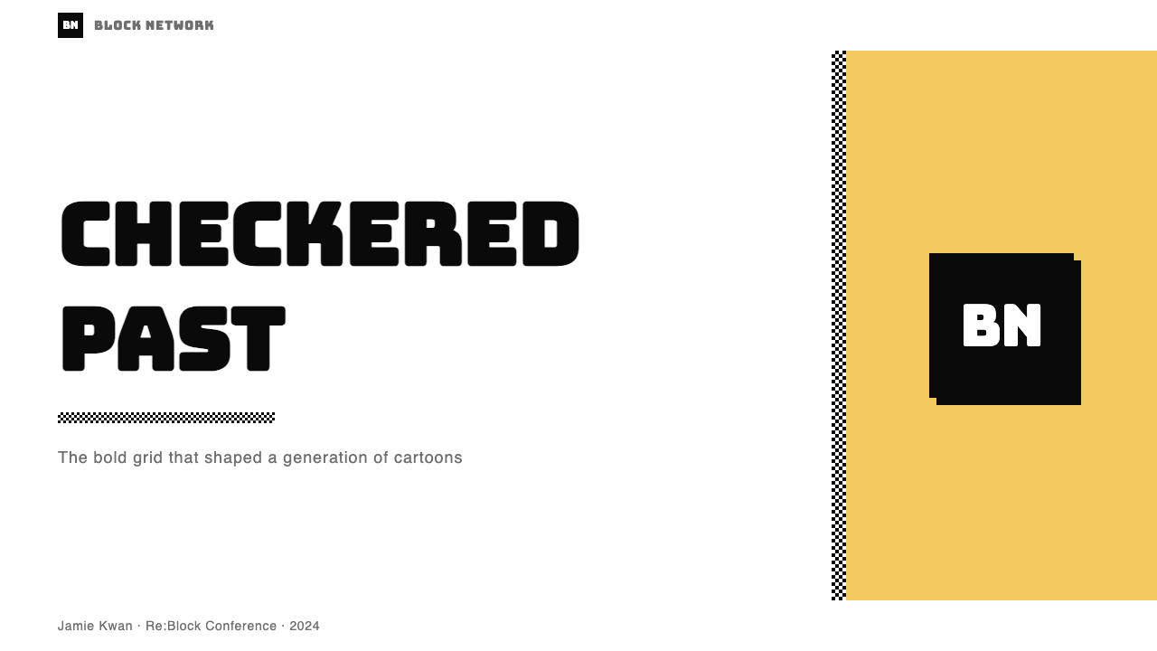
For presentation slides, the style produces exceptional cover pages when applied with structural discipline. A cover built in this mode works best with a single wide color block anchoring the lower two-thirds of the slide, a checkerboard strip running along one edge, and the title set in the heaviest available display weight — white or black depending on the color block beneath. Content slides should strip back to a near-white or black ground with color used only for section headers or call-out blocks; applying the full checkerboard treatment to every slide in a deck quickly becomes visually fatiguing. Data slides benefit from the style's flat-color logic: bar charts and progress indicators can be given the same saturated block treatment as the brand elements, with each data category assigned its own primary-palette color. The key is that data elements should look like they belong to the same visual system as the slide furniture, not like a chart pasted in from a spreadsheet application.对于演示文稿幻灯片,在施以结构性纪律的情况下,这种风格能产出出色的封面页。以这种方式构建的封面最有效的做法是:单一宽色块锚定幻灯片下三分之二,棋盘格条带沿一侧边缘延伸,标题用最重的展示字重排版——根据下方色块选择白色或黑色。内容页应退回到接近白色或黑色的底面,仅将颜色用于段落标题或引用块;在一套幻灯片的每一页都应用完整棋盘格处理,会迅速产生视觉疲劳。数据页受益于这种风格的平面色彩逻辑:柱状图和进度指示器可以被赋予与品牌元素相同的饱和色块处理,每个数据类别分配各自的主色系颜色。关键在于数据元素应看起来属于与幻灯片框架相同的视觉系统,而非像从电子表格应用中粘贴进来的图表。
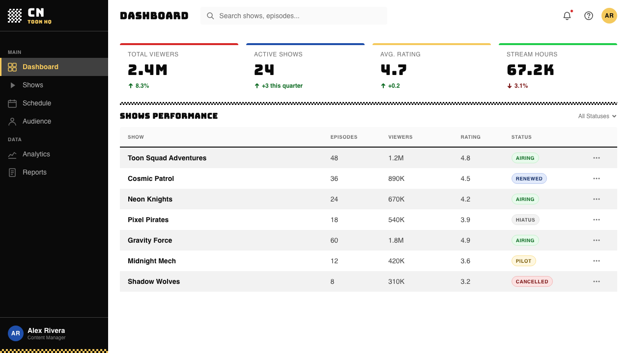
For web interfaces — particularly dashboards, event landing pages, gaming platform interfaces, and youth-brand product pages — the style offers a ready-made hierarchy system. The checkerboard pattern works well as a background accent or section divider rather than a full-page wallpaper; as a full background it competes with content for visual attention. Color blocks should be used for primary call-to-action zones, navigation backgrounds, and section headers, with a near-white or black main content area providing the visual relief the eye needs to read smaller text comfortably. Button states, alerts, and interactive indicators are natural candidates for the saturated accent colors. Pricing pages in this style benefit from assigning one color block per pricing tier, creating a visual differentiation that requires no additional iconography.对于网页界面——特别是仪表板、活动落地页、游戏平台界面和青少年品牌产品页面——这种风格提供了一套现成的层级系统。棋盘格图案作为背景点缀或章节分割线使用效果很好,而不是全页壁纸;作为全页背景,它会与内容争夺视觉注意力。色块应用于主要行动号召区域、导航背景和章节标题,接近白色或黑色的主内容区域提供眼睛舒适阅读小字号文字所需的视觉休憩。按钮状态、警示和交互指示器是饱和强调色的天然候选对象。这种风格的定价页面受益于为每个定价等级分配一个色块,产生无需额外图标系统的视觉差异化。
For editorial and marketing work — social media content, event posters, merch graphics, and youth-targeted advertising — the style is at its most native. A social card in this style is structurally very simple: a color block as ground, a checkerboard strip as a secondary element, and display type that fills most of the available space. The style's strength in this context is that it competes well in feed environments where most content uses photography and soft gradients — a hard-edged flat-color composition stands out by contrast. For physical print applications such as posters and merchandise, the style's flat construction and hard edges mean it reproduces with perfect fidelity at any scale, with no loss of impact between a mobile screen and a large-format print.对于编辑与营销内容——社交媒体内容、活动海报、周边图案和面向青少年的广告——这种风格处于最原生的状态。这种风格的社交卡片结构非常简单:色块作为底面,棋盘格条带作为次级元素,展示文字填满大部分可用空间。这种风格在此场景下的优势在于,它在大多数内容使用摄影和柔和渐变的信息流环境中竞争力强——硬边平面色彩构图通过对比而突出。对于海报和周边商品等实体印刷应用,这种风格的平面构成和硬边意味着它在任意尺寸下都能完美还原,从手机屏幕到大幅面印刷之间没有任何冲击力损失。
The most common mistake when applying this style is treating the checkerboard as wallpaper — tiling it across every background regardless of context. The pattern has very high visual noise at full coverage; it works as an accent, a strip, or a contained element, not as a page-filling ground competing with a text-heavy composition. A close second mistake is using all available accent colors simultaneously at full saturation in a single composition. Each color block should be treated as a primary character in the layout; combining four or five saturated hues at equal intensity produces visual chaos rather than energy. Choose one or two dominant colors per composition and allow the black-and-white checker to provide the contrast.应用这种风格时最常见的错误是将棋盘格当作壁纸——不顾场景地将其平铺在每个背景上。该图案在全覆盖时具有非常高的视觉噪声;它作为点缀、条带或有边界的元素使用有效,而不是与大量文字构图竞争的全页底面。紧随其后的第二个错误是在单一构图中同时使用所有可用强调色,且全部处于最大饱和度。每个色块应被视为版面中的主要角色;将四五种饱和色以相等强度组合,产生的是视觉混乱而非能量。每个构图选择一到两种主导颜色,让黑白棋盘格提供对比。字体选择仅仅「粗体」而非真正展示级别且宽幅的,也是常见失误——这种风格的字体能量依赖于整体比例接近正方形、笔画粗重到字母内部白色反白空间与笔画本身视觉上同样活跃的字形。标准粗体的中性无衬线字体在饱和色块旁会显得力量不足;文字必须感觉像在与色块争夺主导权,而不是在它们后面退缩。
A third common error is choosing a typeface that is merely bold rather than genuinely display-weight and wide. The style's typographic energy depends on letterforms that are close to square in their overall proportions, with strokes heavy enough that the white counter spaces inside letters become as visually active as the strokes themselves. A standard bold weight of a neutral sans-serif will look underpowered next to the saturated color blocks; the type must feel like it is competing with the blocks for dominance, not retreating behind them.
See the Cartoon Network 90s Blocks design system查看 Cartoon Network 90s Blocks 完整设计系统
Cartoon Network 90s Blocks — FAQCartoon Network 90s Blocks · 常见问题
Is this style the same as general 1990s nostalgia design?这种风格与一般的 1990 年代怀旧设计是同一回事吗?
No — Cartoon Network 90s Blocks is a specific, well-defined visual system, not a catch-all category for anything that feels retro from that decade. General 1990s nostalgia design often incorporates elements like halftone textures, distressed typography, neon gradients, and grunge textures, none of which appear in this style. The Cartoon Network system is unusually pure: checkerboard pattern, flat saturated color blocks, and display-weight type are the complete vocabulary. Introducing halftones, textures, or gradient-neon elements creates a mixed-nostalgia composition that fails to read as authentically CN. If the goal is a specific Cartoon Network reference, keep the system tight.不是——Cartoon Network 90s Blocks 是一套具体、定义明确的视觉系统,而不是那个年代任何有复古感的东西的大杂烩类别。一般的 1990 年代怀旧设计经常包含半调纹理、做旧字体、霓虹渐变和垃圾摇滚纹理等元素,这些都不出现在这种风格中。Cartoon Network 系统异常纯粹:棋盘格图案、平面饱和色块和展示级字体是完整的词汇表。引入半调、纹理或渐变霓虹元素,会产生一种混合怀旧构图,读起来不像真正的 CN 风格。如果目标是特定的 Cartoon Network 指涉,保持系统的纯粹。
Can the style work in a restrained, professional context like a B2B product?这种风格能用在 B2B 产品这样克制、专业的场景中吗?
With significant adaptation, yes — but the result will necessarily move away from the core style. The elements of the system that can be selectively imported into a more professional context are the hard-edge flatness, the block-based layout logic, and the use of a single saturated accent color alongside black and white. The checkerboard pattern specifically tends to read as playful or childlike in B2B contexts and is usually the first element to be dropped or reduced to a very small accent. The display-weight typography can be retained if tightened in its proportions. The risk is that selective adoption produces something that looks like a diluted or confused version of the style rather than a professional design with CN-derived influences. If the B2B context requires authority and trust signals, a style with more heritage behind it — Bauhaus, Swiss International Style — may serve better than a 1990s cable-television brand system.经过重大调整可以——但结果必然会远离核心风格。这套系统中可以选择性引入更专业场景的元素包括:硬边平面感、基于色块的版面逻辑,以及在黑白之外使用单一饱和强调色。棋盘格图案在 B2B 场景中特别容易被读作活泼或孩子气,通常是第一个被删除或缩减为极小点缀的元素。展示级字体如果比例收紧可以保留。风险在于选择性采用可能产生看起来像风格稀释版或混乱版的东西,而不是带有 CN 衍生影响的专业设计。如果 B2B 场景需要权威和信任信号,拥有更多历史积淀的风格——包豪斯、瑞士国际主义风格——可能比 1990 年代有线电视品牌系统更有效。
What is the relationship between this style and Adult Swim?这种风格和 Adult Swim 是什么关系?
Adult Swim launched in 2001 as Cartoon Network's late-night programming block and inherited the channel's checkerboard visual identity while developing a distinct sub-aesthetic. Where the main Cartoon Network identity was saturated, loud, and energetic, Adult Swim stripped the same checkerboard vocabulary back to its most reduced form — black and white only, with the checkerboard used in a more fragmented, almost glitchy way, and typography that was deliberately flat and low-key rather than display-weight and punchy. Adult Swim's aesthetic is the same source material processed through a deadpan, ironic sensibility. Designers sometimes combine both registers — the saturated Cartoon Network energy and the flat Adult Swim restraint — but this requires careful calibration to avoid producing something that reads as neither.Adult Swim 于 2001 年作为 Cartoon Network 的深夜节目块推出,继承了频道的棋盘格视觉识别,同时发展出独特的子美学。主频道 Cartoon Network 识别是饱和的、响亮的、充满能量的;Adult Swim 将同样的棋盘格词汇剥离至最简化形式——仅黑白,棋盘格以更碎片化、近乎故障感的方式使用,字体刻意平淡低调而非展示级别且有冲击力。Adult Swim 的美学是相同的源材料经由冷面孔、反讽感性处理后的结果。设计师有时会组合两种语域——饱和的 Cartoon Network 能量和平面的 Adult Swim 克制——但这需要仔细校准,以避免产出既不像前者也不像后者的东西。
Does this style work for dark or night-mode interfaces?这种风格适合深色或夜间模式界面吗?
Yes, and in some respects the style is more at home on a black ground than it is on white. The original Cartoon Network identity used black and white in equal measure, with pure black as a fully active design element, not merely a text color. On a black ground, the saturated color blocks advance with particular aggression, and the white checkerboard squares read as light-emitting rather than paper-colored — which suits digital screen contexts well. The practical consideration for dark interfaces is that hot yellow, which is very legible and energetic on white, can become visually dominant to the point of instability on black; in dark-mode applications, red or cobalt tends to hold its structural role more reliably. The checkerboard in a dark implementation usually works best when the two alternating values are pure black and pure white, without tinting either toward gray.可以,而且在某些方面这种风格在黑色底面上比在白色上更自然。原版 Cartoon Network 识别等量使用黑白,纯黑是完全活跃的设计元素,而不仅仅是文字颜色。在黑色底面上,饱和色块以特别强势的方式前进,白色棋盘格方块读起来像发光而非纸张颜色——这很适合数字屏幕场景。深色界面的实际考量是,热黄在白色上非常易读且充满能量,在黑色上可能变得视觉上主导到不稳定的程度;在深色模式应用中,红色或钴蓝往往能更可靠地保持其结构性角色。深色方案中的棋盘格通常在两个交替值为纯黑和纯白时效果最好,不将任一方向调向灰色。
How do I avoid the style looking like a cheap parody of itself?如何避免这种风格看起来像对自身的廉价仿讽?
The difference between an authentic application of Cartoon Network 90s Blocks and a cheap parody of it is structural discipline. A parody version typically piles on every element simultaneously — full-coverage checkerboard, all five accent colors, multiple display typefaces, checkerboard borders around checkerboard content — until the composition collapses into visual noise. Authentic application treats the system as a kit with rules: one or two dominant colors per composition, the checkerboard used as an accent rather than a wallpaper, a single typeface family at varying weights, and empty black or white space given the same importance as the color blocks. The CN design system was always a system — constrained, modular, and rule-governed. Applying it successfully requires the same discipline that the original broadcast designers applied to bumpers that had to communicate in under three seconds.Cartoon Network 90s Blocks 的真实应用与对自身的廉价仿讽之间的区别在于结构性纪律。仿讽版本通常将每个元素同时堆叠——全覆盖棋盘格、所有五种强调色、多种展示字体、棋盘格内容的棋盘格边框——直到构图崩溃为视觉噪声。真实应用将系统视为有规则的工具包:每个构图一到两种主导颜色,棋盘格用作点缀而非壁纸,单一字体家族以不同字重使用,空白黑色或白色空间被赋予与色块同等的重要性。CN 设计系统始终是一个系统——受约束的、模块化的、规则治理的。成功应用它需要原始广播设计师应用于必须在三秒内传达信息的台标的同等纪律。
Related design styles相关设计风格
 Taiwanese Raohe Night Market NeonTaipei night reads vertically. Neon red, cobalt panels, and acid-yellow numbe…台北夜色垂直閱讀:霓虹紅、鈷藍看板與酸黃號碼疊在濕黑地面。
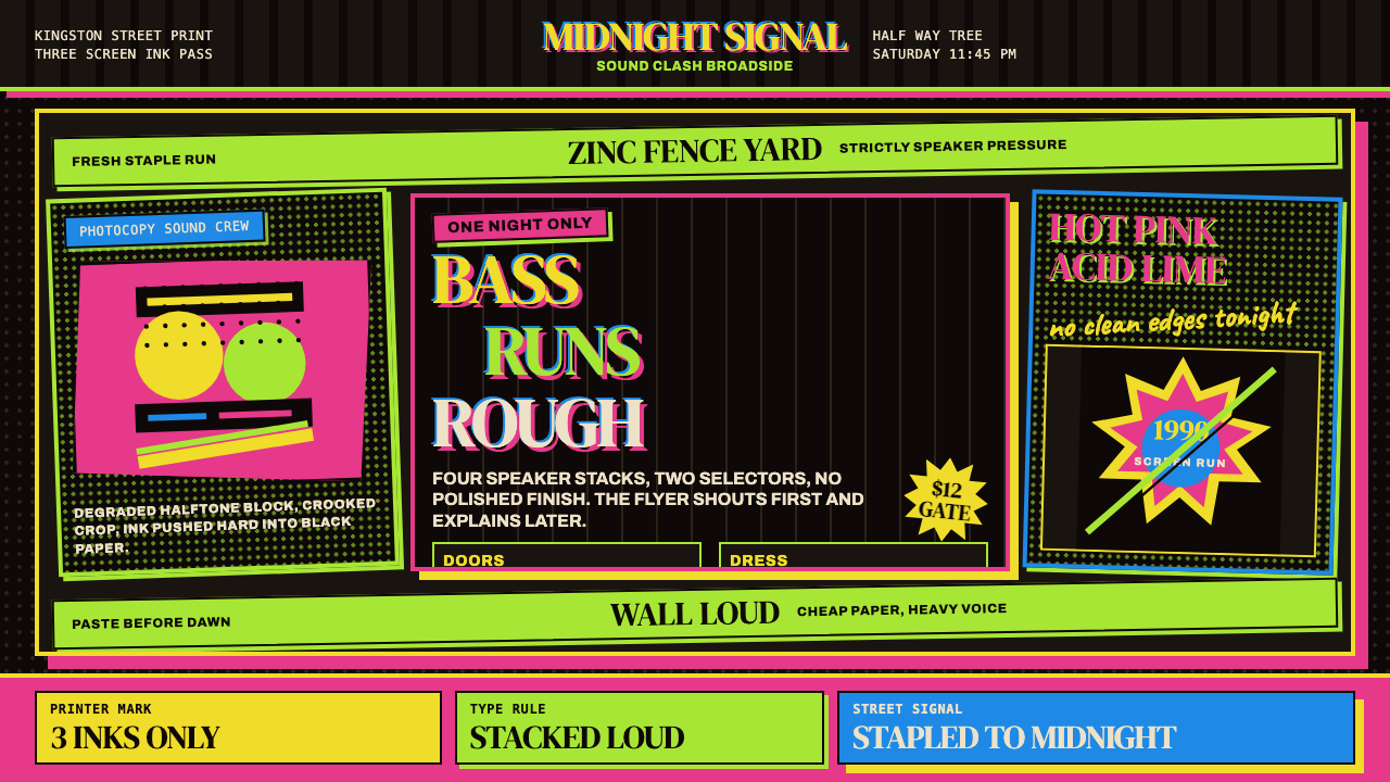 Jamaican Dancehall 1990 PosterMidnight volume. Acid lime and hot pink type stack like screenprint ink on bl…午夜音量:酸绿与热粉粗字叠在黑新闻纸上,如丝印错位。
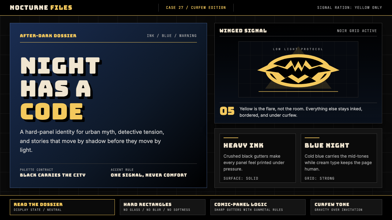 DC Comics Batman NoirGravity, not cheer. Black panels, Gotham blue, and one bat-yellow signal cut…重力而非欢愉:黑色分镜、哥谭蓝与一束蝙蝠黄切开夜色。
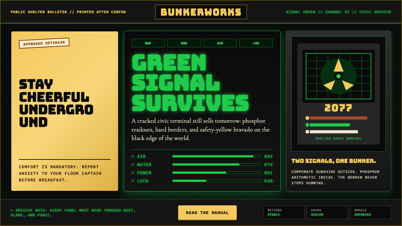 Fallout Vault-Tec Pip-BoyIrradiated optimism. Vault yellow and CRT green lock into a bordered bunker g…辐照乐观主义:避难所黄与CRT绿嵌入硬边地堡网格。
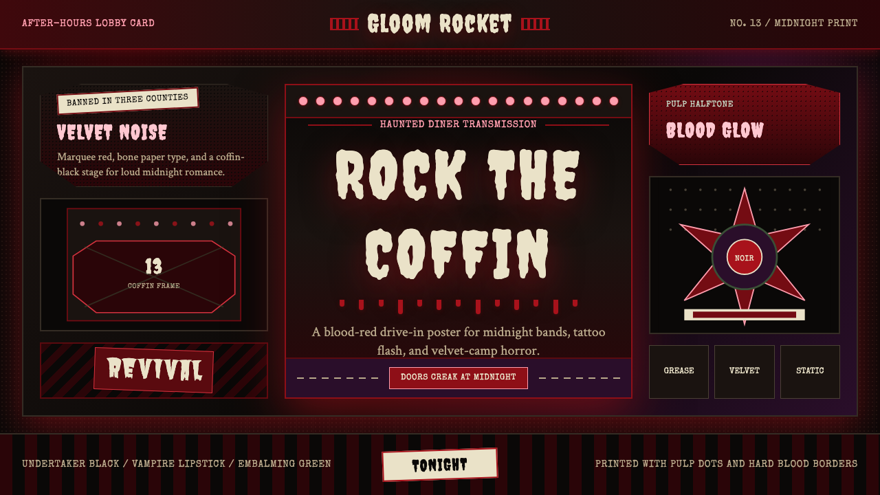 Gothabilly Horror RevivalHaunted swagger. Blood-red marquee type, coffin frames, and pulp halftone on…闹鬼的摇滚张扬:血红跑马灯字、棺材框与黑底半色调。
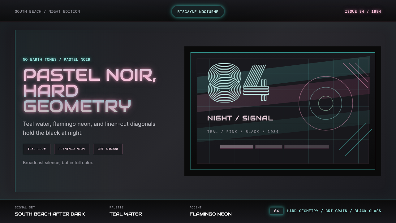 Miami Vice Pastel Teal (1984)Pastel noir, not nostalgia. Teal glow and flamingo pink slice black with geom…不是怀旧,是粉青霓虹。青光与火烈鸟粉切开黑底几何。