What is DC Comics Batman Noir?什么是 DC Comics Batman Noir?
Batman's visual identity is chiaroscuro made canonical — deep black, Gotham-night blue, and a single rationed bat-yellow signal that cuts through the dark like a warning flare.蝙蝠侠的视觉身份是被奉为经典的明暗对比法——深沉的纯黑、哥谭夜空蓝,以及一束像警报信号弹那样划破黑暗的、被严格配给的蝙蝠黄。
DC Comics Batman Noir in briefDC Comics Batman Noir 速览
DC Comics Batman Noir is the visual language built across eight decades of Batman publishing and film adaptation: a palette of near-absolute black, Gotham-night blue, and gunmetal grey, punctuated by a single saturated yellow used only at moments of maximum narrative weight. The system fuses the thick ink and exaggerated shadow of pulp-comic illustration with the chiaroscuro lighting logic of film noir — where darkness is not an absence but an active, menacing presence.DC 漫画蝙蝠侠黑色风格,是跨越八十年蝙蝠侠漫画出版与电影改编积累而成的视觉语言:近乎绝对的黑色、哥谭夜空蓝和枪管灰构成主调色盘,仅在叙事分量最重的时刻,以一抹高饱和黄色点破。这套系统把美式漫画厚重的墨色与夸张阴影,和黑色电影的明暗对比光效熔铸在一起——在这里,黑暗不是缺席,而是一种主动的、充满威胁的存在。
Typography in this world is chunky and slab-footed, communicating mass and physical force rather than elegance or approachability. Layouts are organized like comic-book panels: strict rectangular divisions, hard corners, deep black gutters, and a compositional logic that moves the eye across the frame in deliberate, dramatic beats. Nothing drifts or softens at the edges — every boundary is a decision, every shadow is a weight.这个世界里的字体粗壮、带钉头衬线,传递的是质量与物理力量,而非优雅或亲近感。版式像漫画分镜那样组织:严格的矩形分割、直角、深黑色装订线,以及一种将视线在画面上以刻意、戏剧性的节奏引导前行的构图逻辑。没有什么在边缘飘散或柔化——每一条边界都是一个决定,每一道阴影都是一种重量。
The system is not simply dark. It is hierarchically dark: black and very deep blue carry the dominant mass; gunmetal grey and aged cream hold mid-tone supporting roles; and a single bat-yellow, deployed sparingly, carries the entire system's emotional signal. This chromatic restraint is what separates the style from generic dark design — the yellow earns its force precisely because it appears so rarely.这套系统不只是「黑」,而是有层级的黑:黑色与极深的蓝色承担主体质量,枪管灰与陈年奶油色担任中间层次的配角,而那唯一一抹蝙蝠黄,被节制地使用,承载着整套系统的情感信号。这种克制的色彩配置,正是将这一风格与泛泛的暗色设计区分开来的关键——黄色之所以有力量,恰恰因为它极少出现。
See the DC Comics Batman Noir design system查看 DC Comics Batman Noir 完整设计系统
Where does DC Comics Batman Noir come from?DC Comics Batman Noir 从何而来?
Batman made his debut in Detective Comics #27 in May 1939, created by artist Bob Kane and writer Bill Finger. The character's visual foundation was established almost immediately: a full-black costume with a scalloped cape, a cowl with pointed ears, and an emblem that would eventually stabilize as a yellow oval surrounding a black bat shape. Kane drew on the visual vocabulary of the pulp-magazine era — heavy ink washes, deep cast shadows, and the exaggerated physical drama of the adventure-comic page. Finger, whose contributions were long uncredited, shaped the character's world as Gotham City: a noir-inflected urban landscape of rain-slicked streets, corrupt institutions, and nocturnal menace.蝙蝠侠于1939年5月在《侦探漫画》第27期首次登场,由画家鲍勃·凯恩与编剧比尔·芬格创造。角色的视觉基础几乎立即确立:全黑服装配扇形斗篷、带尖耳的面罩,以及后来稳定为黄色椭圆内嵌黑色蝙蝠轮廓的标志。凯恩汲取了廉价杂志时代的视觉词汇——厚重的墨色渲染、深沉的投影,以及冒险漫画页面夸张的肢体戏剧性。长期未被署名的芬格则将角色的世界塑造为哥谭市:一座黑色电影风格的都市地景,雨后油亮的街道、腐败的机构、夜行的威胁。
The 1940s and 1950s saw the style migrate across media. The black-and-white film serials of 1943 and 1949 translated the ink-shadow logic directly into cinematic chiaroscuro. The comics of that era, working under the four-color printing constraints of newsprint, developed a distinctive shorthand: deep blue used as a substitute for absolute black in lit areas, and pure black reserved for the deepest shadow. This blue-and-black relationship, born of production necessity, became a defining characteristic of the aesthetic — so much so that it persists in digital Batman design today, long after printing constraints disappeared.1940至50年代,这种风格向多种媒介迁移。1943年和1949年的黑白电影系列将墨色阴影的逻辑直接转译为电影明暗对比法。那个时代的漫画,受制于新闻纸四色印刷的条件,发展出一种独特的速记方式:在受光区域用深蓝色代替绝对的黑,而纯黑则留给最深的阴影。这种蓝与黑的关系,诞生于生产限制,却成为这套美学的决定性特征——以至于在印刷限制早已消失的数字时代,它仍在蝙蝠侠设计中顽强延续。
The pivotal formal statement came in 1986 with Frank Miller and Klaus Janson's The Dark Knight Returns — a four-issue limited series that reimagined Batman as a middle-aged, near-obsessive vigilante in a dystopian near-future. Miller and Janson's visual approach was deliberately brutal: scratchy, hatched inks; compositions that fragment across irregular panel grids; color by Lynn Varley that deepened the noir atmosphere with acid-washed skies and industrial grey urban surfaces. The series established a formal benchmark that all subsequent Batman design — in comics, animation, and film — has either followed or consciously responded to.1986年,弗兰克·米勒与克劳斯·扬森的《黑暗骑士归来》带来了形式上的关键声明——这部四期限定系列以反乌托邦近未来为背景,将蝙蝠侠重新塑造为中年、近乎偏执的义警。米勒与扬森的视觉风格刻意粗粝:刮划式的交叉线条墨迹、在不规则分镜网格中破碎的构图,林恩·瓦利的着色以酸洗感的天空和工业灰的城市表面深化了黑色电影氛围。这部作品确立了一个形式标杆,此后所有蝙蝠侠设计——在漫画、动画与电影中——要么追随它,要么有意识地回应它。
The cinematic tradition extended and codified the aesthetic further. Tim Burton's 1989 Batman film brought production designer Anton Furst's vision of Gotham as a city of industrial Gothic excess — all vertical stone, exposed machinery, and perpetual night. Christopher Nolan's Dark Knight trilogy (2005–2012) shifted toward a more photorealistic noir approach, grounding the visual system in practical architecture and real-world shadow rather than fantastical exaggeration, but retaining the fundamental chromatic logic: darkness dominant, colour rationed, yellow present only as signal. Each film cycle absorbed the comic's visual DNA and returned it to print design as an expanded, culturally entrenched reference point.电影传统进一步延伸和编纂了这套美学。蒂姆·伯顿1989年的《蝙蝠侠》带来了制作设计师安东·弗斯特对哥谭的构想:一座工业哥特式过度的城市——竖向的石砌建筑、裸露的机械装置,以及永恒的黑夜。克里斯托弗·诺兰的《黑暗骑士》三部曲(2005—2012年)转向更具纪实感的黑色风格,将视觉系统植根于实际建筑与真实光影而非奇幻夸张,但保留了根本的色彩逻辑:黑暗主导、色彩配给、黄色仅作信号出现。每一轮电影周期吸收漫画的视觉基因,再将其作为扩展的、被文化深度内化的参照点返还给印刷设计领域。
What defines the DC Comics Batman Noir look?DC Comics Batman Noir 的视觉特征是什么?
Chromatic Hierarchy色彩层级
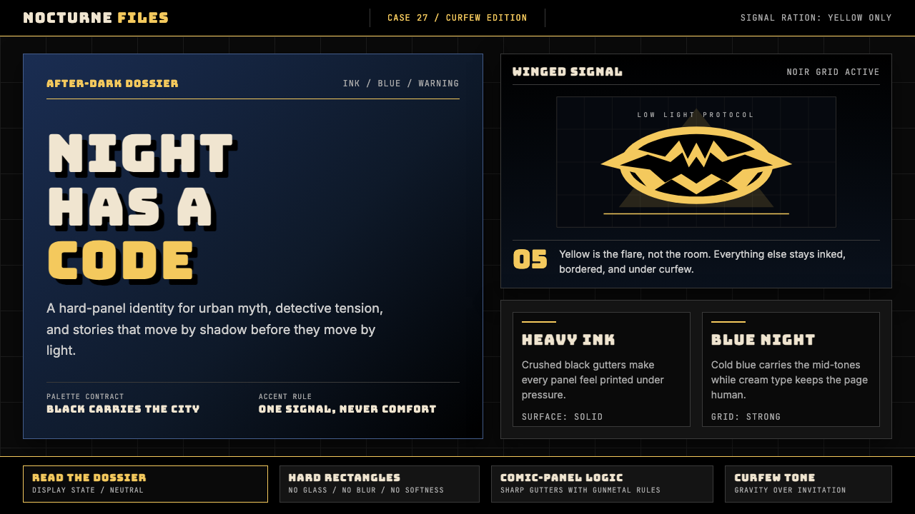
The palette operates in strict tiers. Black and deep Gotham-night blue claim the largest surface area — walls, backgrounds, negative space, and shadow volumes. Gunmetal grey and aged off-white carry structural mid-tones for surfaces, type areas, and secondary containers. Bat-yellow appears last and least, reserved exclusively for the emblem, the signal, and the single most important call-to-action in any composition. This rationing is the system's core discipline: every other colour gains its force by contrast with the yellow's scarcity.色板以严格的层级运作。黑色与深沉的哥谭夜空蓝占据最大面积——墙面、背景、负空间与阴影体量。枪管灰与陈年白承担结构性中间层次,用于表面、文字区域和次级容器。蝙蝠黄最后出场、面积最小,专门保留给标志、信号灯,以及任何构图中最重要的那个行动召唤。这种配给制度是整套系统的核心纪律:其他所有颜色的力量,都来自与黄色稀缺性的对比。
Ink-Weight Typography墨色字重排印
Letterforms carry physical mass — thick strokes, pronounced serifs with a slab or wedge character, and tight tracking that packs words into dense, compressed blocks. Headlines occupy the full visual weight of a panel or section header, treated as a drawn element rather than a typeset element. Smaller body text is set in dense columns, its compactness reinforcing the sense of information delivered under pressure. There is no light, wispy, or hairline letterform anywhere in the authentic system.字形携带着物理质量——粗笔画、突出的钉头或楔形衬线,以及将词语压入紧密块状的细字距。标题占据版面分镜或章节标题的全部视觉重量,被当作绘制的元素而非排印的元素来对待。较小的正文字体设置在密集的栏目中,其紧凑感强化了信息在压力下被传递的感觉。在真正的系统中,任何地方都不存在纤细、飘逸或发丝般的字形。
Panel-Grid Composition分镜网格构图
Layouts are structured like comic-book pages: hard rectangular frames, clearly delineated gutter space between elements, and a reading sequence that choreographs the eye through the composition with deliberate, sequential tension. Elements do not float freely — they are contained in panels or anchored to a structural grid. Full-bleed black areas serve as panel borders writ large, and overlapping or broken-panel compositions appear only as intentional dramatic emphasis, not as decoration.版式像漫画页那样构建:硬边矩形框架、元素之间清晰划定的装订线空间,以及一条用刻意、连贯的张力引导视线穿越构图的阅读序列。元素不自由漂浮——它们被容纳在分镜框内,或锚定于结构性网格。全出血黑色区域作为放大的分镜边框,重叠或打破边框的构图仅作为有意图的戏剧性强调,而非装饰。
Hard Shadow and Chiaroscuro硬边投影与明暗对比
Shadow in this style is not ambient or diffuse — it is directional, hard-edged, and cast at sharp angles that describe a single, definite light source. Large areas of an image or layout may be entirely consumed by shadow, with subject forms emerging partially from the dark. This chiaroscuro logic, borrowed directly from film noir cinematography, creates compositions where what is hidden is as visually active as what is revealed. Soft shadows, ambient occlusion, or layered gradient darkening are all foreign to this system.在这种风格里,阴影不是环境光式或漫射式的——它是有方向的、硬边的,以尖锐的角度投射,清晰描述单一且明确的光源。图像或版式的大面积区域可能完全被阴影吞没,主体形态从黑暗中部分浮现。这种明暗对比逻辑直接借鉴自黑色电影摄影,创造出隐藏与显现同样在视觉上活跃的构图。柔和阴影、环境光遮蔽,或分层渐变变暗,对这套系统来说都是异物。
Urban Gothic Texture都市哥特质感
Where texture appears, it reads as worn, industrial, and structural — aged stone, scored metal, rain-streaked concrete, ink-soaked paper grain. These are not decorative patterns overlaid for visual richness but rather surface qualities that reinforce the setting's nocturnal, post-industrial character. Texture is applied with restraint and always serves narrative atmosphere. Smooth, clean, modern surfaces exist in this world only when the design calls for an explicit contrast against the surrounding dark texture.出现质感的地方,读起来都是磨损的、工业的、结构性的——风化的石材、划痕金属、雨水冲刷的混凝土、被墨水浸透的纸张纹理。这些不是为了视觉丰富性叠加的装饰图案,而是强化这个场景夜行性、后工业特质的表面属性。质感以克制的方式运用,始终服务于叙事氛围。光滑、干净、现代的表面在这个世界里只存在于设计明确要求以此与周围黑暗质感形成对比的时候。
Emblem and Signal Logic标志与信号逻辑
The bat emblem functions not as a logo in the conventional corporate sense but as a signal — a projected warning in yellow-on-black that commands attention and carries narrative authority. This signal logic extends to the broader design system: every yellow element in a Batman Noir composition should feel earned and purposeful, as if it were a signal flare rather than a colour choice. The emblem shape itself — stylized bat wings contained within an oval — demonstrates how a complex silhouette can be reduced to its most legible geometric form without losing character.蝙蝠标志的功能不是传统企业意义上的商标,而是一个信号——一个以黑底黄色投射的警告,命令注意力并承载叙事权威。这种信号逻辑延伸至更广泛的设计系统:蝙蝠侠黑色风格构图中每一个黄色元素,都应当让人感到是被赢得的、有目的的,就像信号弹而非色彩选择。标志形状本身——包含在椭圆内的风格化蝙蝠翼——展示了一个复杂轮廓如何在不失去个性的前提下被简化为最易读的几何形态。
Cinematic Framing电影式取景
Compositions favor extreme angles and unconventional viewpoints: low Dutch angles that loom and threaten, extreme low shots that place the viewer below the subject, high overhead shots that render figures small against vast dark architecture. These are the framing choices of noir cinematography, transplanted from the camera into the layout. They communicate power imbalance, psychological tension, and environmental scale without relying on any explicit narrative content. Even a static product page or slide can carry cinematic weight when framed through this logic.构图偏爱极端角度与非常规视点:低倾斜角度制造逼近与威胁感,极端低角度让观者处于主体下方,俯瞰高角度则使人物在巨大黑暗建筑前渺小化。这些是黑色电影摄影的取景选择,从镜头移植到版面设计之中。它们无需任何明确的叙事内容,就能传递权力失衡、心理张力与环境规模。即使是静态的产品页面或幻灯片,只要通过这种逻辑取景,也能承载电影式的重量。
See the DC Comics Batman Noir design system查看 DC Comics Batman Noir 完整设计系统
Who shaped DC Comics Batman Noir?谁塑造了 DC Comics Batman Noir?
Bob Kane is the credited co-creator of Batman, whose 1939 debut in Detective Comics #27 established the character's foundational visual signature. Kane drew on multiple sources — Douglas Fairbanks's swashbuckling films, Leonardo da Vinci's ornithopter sketches, and the pulp magazine tradition of high-contrast ink illustration — to arrive at the black-caped, cowled figure that has remained visually consistent across eight decades. Though Bill Finger's writing contributions were equally foundational and went uncredited for most of the character's history, Kane's drawing decisions fixed the chromatic and silhouette logic that all subsequent Batman design inherits.鲍勃·凯恩是蝙蝠侠的署名共同创造者,1939年在《侦探漫画》第27期的首次登场确立了这个角色基础性的视觉签名。凯恩汲取了多方来源——道格拉斯·费尔班克斯的剑侠电影、达·芬奇的扑翼机草图,以及廉价杂志高对比度墨色插图的传统——最终构建出这个黑色斗篷、面罩覆面的形象,在八十年间保持了视觉的一致性。尽管比尔·芬格在写作上的贡献同样奠基性却长期未被署名,凯恩的绘图决策固定了所有后续蝙蝠侠设计所继承的色彩与轮廓逻辑。
Bill Finger co-created Batman but received no formal credit until 2015, when DC Entertainment officially recognized his contributions. Finger wrote the early stories that established Gotham City as the character's defining environment — a city visually and narratively indebted to 1930s noir cinema, with its rain-slicked streets, corrupt civic institutions, and architectural Gothic excess. Finger also introduced many of Batman's most iconic adversaries and the psychological depth that separates Batman from sunlit superhero archetypes. The darkness of Gotham as a designed visual world is inseparable from Finger's narrative framework.比尔·芬格共同创造了蝙蝠侠,但直到2015年,DC娱乐才正式承认他的贡献。芬格撰写的早期故事将哥谭市确立为这个角色决定性的生存环境——一座在视觉和叙事上都借鉴了1930年代黑色电影的城市:雨后油亮的街道、腐败的市政机构,以及建筑上的哥特式过度。芬格还引入了蝙蝠侠最具标志性的诸多对手,以及将蝙蝠侠与阳光下的超级英雄原型区别开来的心理深度。哥谭作为一个被设计的视觉世界,其黑暗性格与芬格的叙事框架密不可分。
Frank Miller's The Dark Knight Returns (1986, pencils and story) and Batman: Year One (1987, story, with art by David Mazzucchelli) are the two most formally influential Batman works of the modern era. Miller brought the scratchy, expressionist inks of crime noir illustration into superhero comics, flattening the page into high-contrast compositions where black masses and grey mid-tones do most of the visual work. His narrative reinvention of Batman as a psychologically driven, morally complex figure was inseparable from the visual reinvention: the harshness of the line and the weight of the shadow were arguments about character, not just stylistic choices. All cinematic Batman design from 1989 onward is downstream of Miller's formal decisions.弗兰克·米勒的《黑暗骑士归来》(1986年,铅笔稿与故事)和《蝙蝠侠:元年》(1987年,故事,大卫·马祖切利绘图)是现代蝙蝠侠最具形式影响力的两部作品。米勒将犯罪黑色插图中粗粝的表现主义墨色带入超级英雄漫画,将页面压扁为高对比度构图,其中黑色块面与灰色中间层次承担了大部分视觉工作。他对蝙蝠侠作为心理驱动、道德复杂人物的叙事重塑,与视觉重塑密不可分:线条的粗粝与阴影的重量是关于角色性格的论点,而非仅仅是风格选择。1989年以后所有电影版蝙蝠侠设计,都是米勒形式决策的下游产物。
Jim Lee's tenure as penciller and co-publisher at DC shaped the contemporary Batman visual standard that most digital-era designers encounter first. His line work balances the expressionist weight of Miller-era Batman with a more anatomically detailed, kinetically dynamic rendering style — heavy cross-hatching in shadow areas, dramatic foreshortening in action sequences, and meticulous attention to the costume's sculptural qualities. Lee's Batman is the version that most strongly informs the character's appearances in video games, collectible figures, and commercial illustration, making his visual interpretation the default reference for most contemporary Batman Noir design work.吉姆·李担任DC铅笔稿画师与联合出版人期间,塑造了大多数数字时代设计师最先接触的当代蝙蝠侠视觉标准。他的线条工作将米勒时代蝙蝠侠的表现主义重量,与更具解剖细节、动态感更强的渲染风格相平衡——阴影区域的大面积交叉线条、动作序列中的戏剧性透视缩短,以及对服装雕塑感的精心呈现。李的蝙蝠侠是在电子游戏、收藏品和商业插图中最强烈影响这个角色呈现方式的版本,使其视觉诠释成为大多数当代蝙蝠侠黑色风格设计工作的默认参照。
Anton Furst served as production designer on Tim Burton's 1989 Batman, for which he won the Academy Award for Best Art Direction. Furst's Gotham City was an architectural argument: a city built by adding one corrupt layer on top of another until the original street level was buried under decades of industrial and municipal excess. The resulting visual — vertical, claustrophobic, nocturnal, and lit almost entirely by artificial sources — set the cinematic standard for Gotham that persisted through subsequent film cycles. Furst's design translated the comics' black-ink-and-shadow logic into three-dimensional space with a rigor that few production designers have matched since.安东·弗斯特担任蒂姆·伯顿1989年《蝙蝠侠》的制作设计师,并凭此获得奥斯卡最佳艺术指导奖。弗斯特的哥谭市是一个建筑学上的论点:一座由腐败的层层叠加建造的城市,直到原始街道层被数十年的工业与市政过度所掩埋。由此产生的视觉景观——竖向、幽闭、夜行,几乎完全由人工光源照亮——确立了哥谭的电影标准,并延续至后续的电影周期。弗斯特的设计将漫画的黑色墨迹与阴影逻辑以极少制作设计师所能匹敌的严谨度转译进三维空间。
How do you use DC Comics Batman Noir today?今天怎么用 DC Comics Batman Noir?
Batman Noir is a high-intention style with a narrow range of appropriate contexts — it communicates authority, gravity, nocturnal drama, and controlled menace. Applied correctly, it produces work that commands immediate attention and signals seriousness without the clinical coldness of minimal design. Applied carelessly, it produces layouts that feel oppressive, illegible, or tonally confused. The discipline required is not technical complexity but chromatic restraint: the system only works when black and deep blue dominate, grey and off-white provide structure, and yellow appears no more than once or twice per composition as a genuine signal.蝙蝠侠黑色风格是一种高意图、适用范围较窄的风格——它传递权威、重力、夜行戏剧感与受控的威胁。运用得当,它产出能立即命令注意力、传递严肃性而不带极简设计那种临床式冷漠的作品。运用粗糙,它产出让人感到压抑、难以辨读、或在格调上陷入混乱的版面。所需的纪律不是技术上的复杂性,而是色彩上的克制:只有在黑色与深蓝主导、灰色与米白提供结构,且黄色在每个构图中最多出现一两次作为真正信号的情况下,这套系统才能奏效。
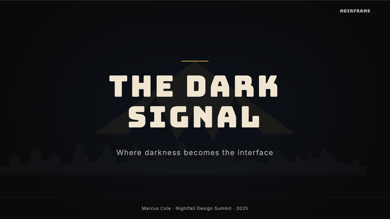
For presentation slides, the style is most effective on hero covers and section dividers. A cover built in Batman Noir should commit to a near-full-bleed dark ground, with the headline set in heavy, slab-inflected type that sits high in the composition — leaving the lower register for a single yellow accent or graphic element. Content slides should be treated with more restraint: a dark background with cream or light-grey type is readable and atmospheric, but the composition must maintain clear text hierarchy through scale contrast rather than colour variety. Data visualization slides gain dramatic impact when chart elements — bars, areas, segments — are rendered in the primary blue-grey palette with a single yellow series used to highlight the key finding.在演示文稿中,这种风格最适用于主视觉封面和章节分割页。用蝙蝠侠黑色风格构建的封面,应当提交给近乎全出血的深色底面,标题以粗重、带钉头特质的字体设置在构图的上方——将下方区域留给单一的黄色强调或图形元素。内容幻灯片应当以更克制的方式处理:深色背景配奶油或浅灰文字是可读的且有氛围,但构图必须通过尺度对比而非色彩变化来保持清晰的文字层级。数据可视化幻灯片在图表元素——柱状、面积、扇形——以主色调蓝灰色系渲染、并以单一黄色系列凸显关键发现时,会获得戏剧性的视觉冲击。
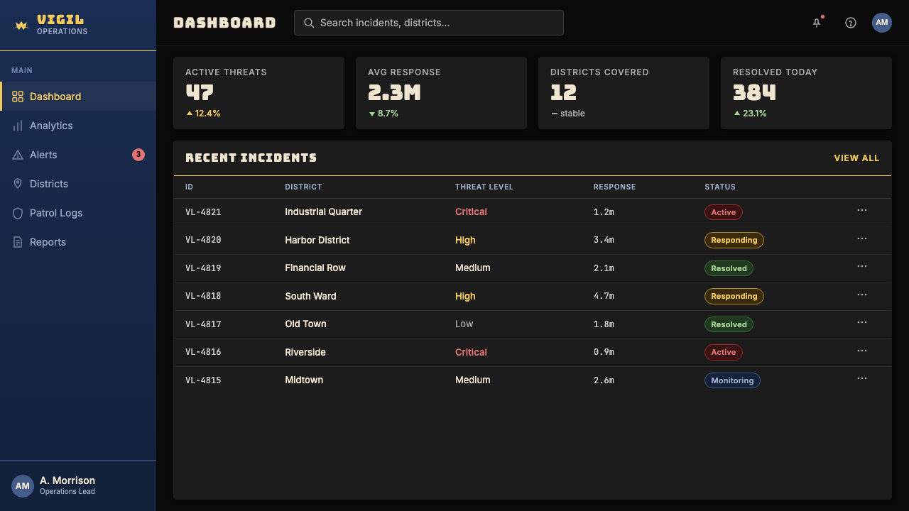
For web interfaces and dashboards, the style is well-suited to products that need to communicate authority, vigilance, or performance monitoring — security platforms, trading dashboards, analytics tools, or any product where the user's primary task requires focus and the environment should actively support that focus rather than competing with it. The approach: commit to a very deep background, reserve near-white or light-grey for body text and data labels, use the Gotham blue as a structural mid-tone for panel backgrounds and card surfaces, and allow yellow only for interactive states and primary action buttons. Navigation should be typographic and minimal; icon use should be reduced to a single-weight line style with no fill. Pricing pages benefit from the style's natural tier-differentiation logic — a highlighted plan reads immediately in yellow against darker peer cards.对于网页界面和仪表板,这种风格非常适合需要传递权威感、警觉感或性能监控感的产品——安全平台、交易仪表板、分析工具,或任何用户主要任务需要高度专注、而环境应当主动支持而非与之竞争的产品。方法如下:提交给极深的背景,将近白或浅灰保留给正文文字和数据标签,将哥谭蓝用作面板背景和卡片表面的结构性中间层次,且只允许黄色出现在交互状态和主要行动按钮上。导航应当是字体性的、极简的;图标使用应当简化为无填充的单一线宽线条风格。定价页面受益于这种风格天然的等级区分逻辑——在较暗的同类卡片中,被高亮的方案立即以黄色显现。
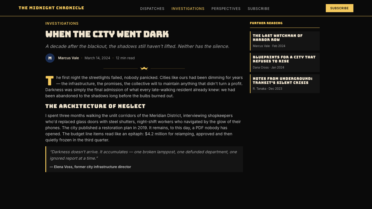
For editorial and marketing design, Batman Noir supports strong poster-logic layouts where a single dominant image or graphic element commands the full-width composition and typography is set at dramatic scale. Magazine covers, event posters, campaign hero images, and announcement graphics all suit the style. Marketing copy should be set short and declarative — the style's compression and weight do not support long, flowing body text. A common and effective approach for editorial content pages is to use the dark ground only for pull-quotes and full-width breaks, reverting to a near-white or cream ground for article body text, where the Gotham-blue drop caps or section headers carry the stylistic signature without sacrificing readability over long passages.对于编辑与营销设计,蝙蝠侠黑色风格支持强海报逻辑的版式:单一主导图像或图形元素占据全宽构图,排印以戏剧性的尺度设置。杂志封面、活动海报、campaign 主视觉图和公告图形都适合这种风格。营销文案应当简短且陈述性——这种风格的压缩感与重量不支持长而流动的正文。对于编辑内容页面,一种常见且有效的做法是:只在引文提取和全宽分割处使用深色底面,在文章正文文字处返回近白或奶油色底面,在那里以哥谭蓝的首字下沉或章节标题承载风格签名,而不牺牲长篇阅读的可读性。
The most common mistake when applying Batman Noir is distributing yellow too liberally. Once yellow appears in more than two or three locations in a composition, it loses its signal force and the palette collapses into generic dark design. A second frequent error is using navy or midnight blue as the only dark, without introducing true near-black — the system requires both, in a hierarchy where near-black dominates and the blue is the lighter of the two darks. A third mistake is importing soft, glowing light effects — halos, bloom, ambient gradients — which are visually incompatible with the style's hard-edge chiaroscuro logic and immediately undermine the noir atmosphere the palette depends on.应用蝙蝠侠黑色风格时最常见的错误,是过于宽泛地分配黄色。一旦黄色在构图中出现超过两三处,它就失去了信号力量,整个色板就坍塌为泛泛的暗色设计。第二个常见错误是只使用海军蓝或午夜蓝作为唯一的深色,而不引入真正的近黑色——这套系统需要两者都存在,且在层级上近黑主导、蓝色是两种深色中较浅的那个。第三个错误是引入柔软的发光效果——光晕、泛光、环境渐变——这些在视觉上与这种风格的硬边明暗对比逻辑不兼容,会立即破坏整个色板所依赖的黑色电影氛围。
See the DC Comics Batman Noir design system查看 DC Comics Batman Noir 完整设计系统
DC Comics Batman Noir — FAQDC Comics Batman Noir · 常见问题
Is Batman Noir just a dark theme, or is there a genuine design logic behind it?蝙蝠侠黑色风格只是一个暗色主题,还是背后有真正的设计逻辑?
It is a complete visual system with specific rules, not a generic dark theme. The key distinction is chromatic hierarchy: the system requires near-black and deep blue at dominance, grey and off-white as structural mid-tones, and yellow appearing only as a rationed signal. A generic dark theme might use any dark background with white text and coloured accents. Batman Noir's specific blue-black relationship, its hard-edge shadow logic, its ink-weight typography, and its panel-grid composition are all historically derived from pulp-comic and film-noir conventions — they are not arbitrary aesthetic preferences but a consistent formal system with traceable origins and internal logic.它是一套有具体规则的完整视觉系统,而不是泛泛的暗色主题。关键区别在于色彩层级:这套系统要求近黑与深蓝处于主导位置,灰色与米白作为结构性中间层次,黄色仅作为被配给的信号出现。一个泛泛的暗色主题可能使用任何深色背景配白色文字和彩色强调。蝙蝠侠黑色风格特有的蓝黑关系、硬边阴影逻辑、墨色字重排印,以及分镜网格构图,都是从廉价漫画和黑色电影惯例中历史性地衍生而来的——它们不是任意的审美偏好,而是一套可追溯来源、具有内在逻辑的一致形式系统。
How is Batman Noir different from general noir or dark cinematic design?蝙蝠侠黑色风格与一般的黑色电影或暗调电影设计有什么不同?
General noir design — derived from the 1940s and 1950s American crime film tradition — typically uses desaturated grey scales, occasional warm amber or sepia tones, and photographic textures. Batman Noir is a specific comics-inflected version: it adds the flat, ink-rendered quality of print illustration to the noir shadow logic, introduces the deep Gotham blue as a distinct mid-dark tone that photographs would not typically include, and most distinctively, introduces the bat-yellow as an active signal color against the dark. The emblem logic — a designed graphic element that functions as a narrative warning — is also specific to the Batman system and has no equivalent in traditional noir cinema.一般的黑色电影设计——源自1940至50年代美国犯罪电影传统——通常使用去饱和的灰阶、偶尔的暖琥珀色或棕褐色调,以及摄影质感。蝙蝠侠黑色风格是一种特定的漫画感版本:它将印刷插图平面的、墨色渲染的质量叠加在黑色电影的阴影逻辑之上,引入深哥谭蓝作为一种照片通常不包含的独特暗中间调,并最具区分性地引入蝙蝠黄作为黑暗背景上的主动信号色。标志逻辑——一个作为叙事警告发挥作用的设计图形元素——也是蝙蝠侠系统所特有的,在传统黑色电影中没有对应物。
Can this style work for brands outside superhero or entertainment contexts?这种风格能用于超级英雄或娱乐背景之外的品牌吗?
Yes, but context alignment is critical. The style's core values — authority, vigilance, controlled power, nocturnal seriousness — transfer well to security technology, professional sports, premium automotive, high-end audio equipment, and certain financial or trading platforms. It is poorly suited to food brands, healthcare, children's products, wellness services, or any product whose emotional promise depends on warmth, lightness, or organic quality. The test is not whether the brand is associated with superheroes, but whether the brand genuinely wants to communicate the values the style carries. When the alignment is real, the style's cultural weight works in the brand's favour rather than overshadowing it.可以,但场景对齐至关重要。这种风格的核心价值——权威、警觉、受控的力量、夜行的严肃性——能很好地迁移到安全科技、职业体育、高端汽车、顶级音响设备,以及某些金融或交易平台。它不适合食品品牌、医疗保健、儿童产品、健康服务,或任何情感承诺依赖温暖感、轻盈感或有机质量的产品。检验标准不是品牌是否与超级英雄相关联,而是品牌是否真正想要传递这种风格所承载的价值观。当对齐是真实的,这种风格的文化重量会为品牌服务,而不是压倒它。
What is the most common way designers misread the yellow in this palette?设计师在理解这套色盘中的黄色时最常见的误读是什么?
The most common misreading is treating yellow as a general accent colour rather than as a signal element. In the authentic system, yellow appears once — as the emblem, the searchlight, the one critical action — and its power derives entirely from its scarcity against the surrounding dark. When designers use yellow for headlines, subheadings, multiple interactive states, decorative dividers, and iconography simultaneously, the colour loses its urgency. A related mistake is using a warm, golden, or amber yellow rather than the saturated, slightly electric bat-yellow. The authentic system uses a yellow that reads as artificial light — a signal flare or a beacon — not as organic warmth.最常见的误读是将黄色当作一般的强调色而非信号元素来使用。在真正的系统里,黄色只出现一次——作为标志、探照灯、那个最关键的行动——而它的力量完全来自于它相对于周围黑暗的稀缺性。当设计师同时将黄色用于标题、副标题、多个交互状态、装饰性分割线和图标时,这种颜色就失去了紧迫感。一个相关的错误是使用暖金色或琥珀色的黄色,而不是那种高饱和、略带电感的蝙蝠黄。真正的系统使用的是读起来像人造光的黄色——信号弹或灯塔——而非有机的温暖感。
How should imagery and photography be handled within this design system?在这套设计系统中,图像与摄影应该如何处理?
Photography and illustration should be treated as high-contrast monochromatic or duotone elements rather than as full-colour windows into a scene. In practice, this means converting photographic images to a blue-black duotone or pushing them into extreme contrast so that mid-tones collapse and the image reads primarily as silhouette and shadow. Colour photography placed directly into a Batman Noir layout without treatment will look discordant — the naturalistic colour rendering is visually incompatible with the system's flat, ink-logic chiaroscuro. Where full colour photography is necessary for content reasons, it should be framed within a hard rectangular container that separates it explicitly from the surrounding designed system, rather than bleeding into the dark ground.摄影和插图应当被当作高对比度的单色或双色调元素来处理,而不是作为全彩色地进入某个场景的窗口。在实践中,这意味着将摄影图像转换为蓝黑双色调,或将其推向极端对比度,使中间层次坍塌,让图像主要以剪影和阴影的方式呈现。将未经处理的彩色摄影直接置入蝙蝠侠黑色风格版面,会显得不协调——自然主义的色彩渲染在视觉上与这套系统的平面、墨色逻辑明暗对比不兼容。若出于内容原因必须使用全彩摄影,它应当被框入一个硬边矩形容器中,将其明确与周围设计系统隔开,而不是让其流血进入深色底面。
Related design styles相关设计风格
 Cartoon Network 90s BlocksKids-cable noise, squared. Black-white checkerboards crash into hot-yellow Bu…方块化的儿童有线电视噪音:黑白棋盘撞上热黄 Bungee 字块。
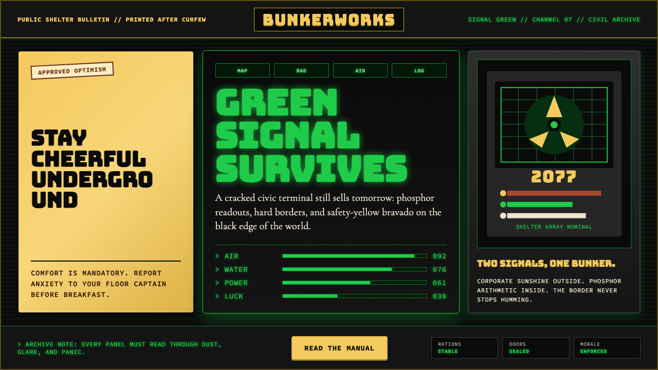 Fallout Vault-Tec Pip-BoyIrradiated optimism. Vault yellow and CRT green lock into a bordered bunker g…辐照乐观主义:避难所黄与CRT绿嵌入硬边地堡网格。
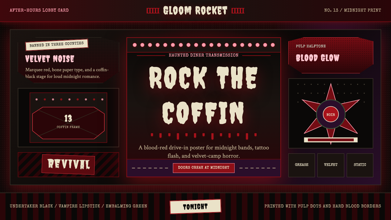 Gothabilly Horror RevivalHaunted swagger. Blood-red marquee type, coffin frames, and pulp halftone on…闹鬼的摇滚张扬:血红跑马灯字、棺材框与黑底半色调。
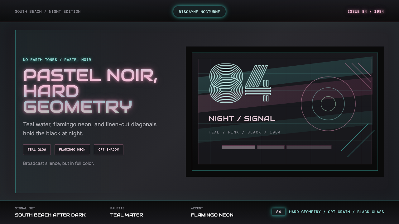 Miami Vice Pastel Teal (1984)Pastel noir, not nostalgia. Teal glow and flamingo pink slice black with geom…不是怀旧,是粉青霓虹。青光与火烈鸟粉切开黑底几何。
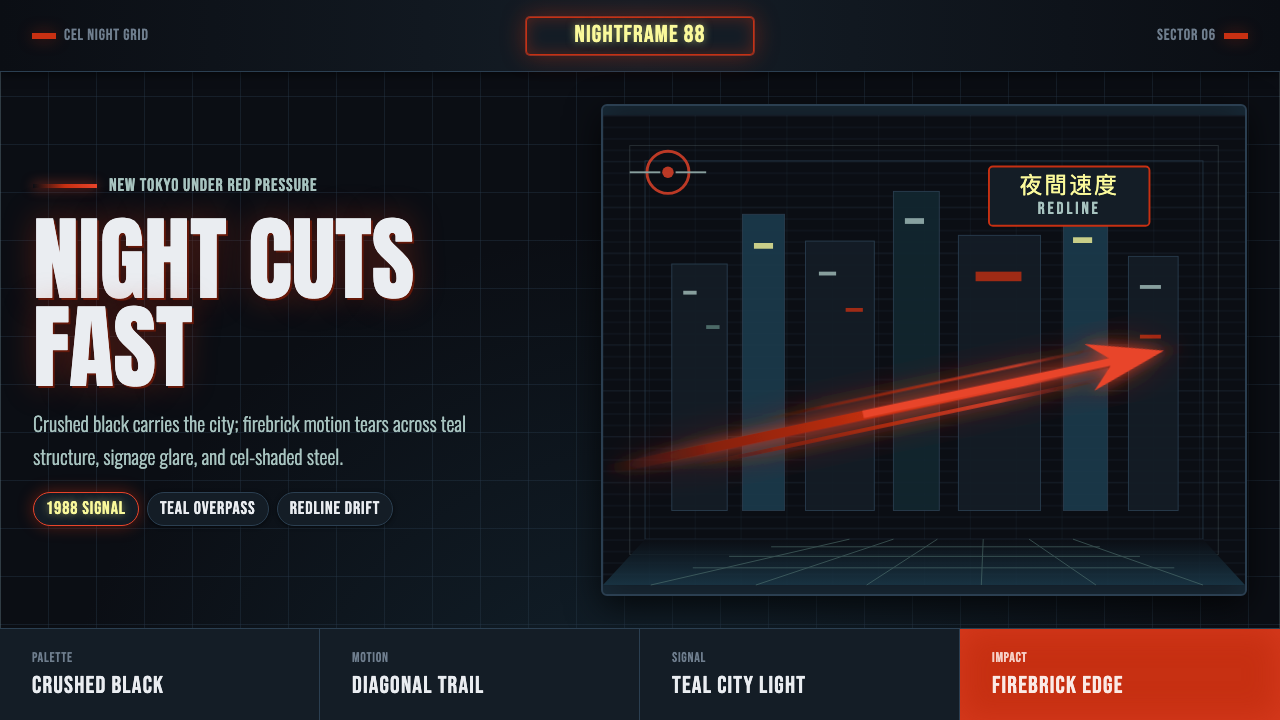 Akira Neo-TokyoNight moves fast. Firebrick trails cut crushed black, teal grids, and condens…黑夜疾驰。砖红光轨切开墨黑、青蓝网格与压缩招牌。
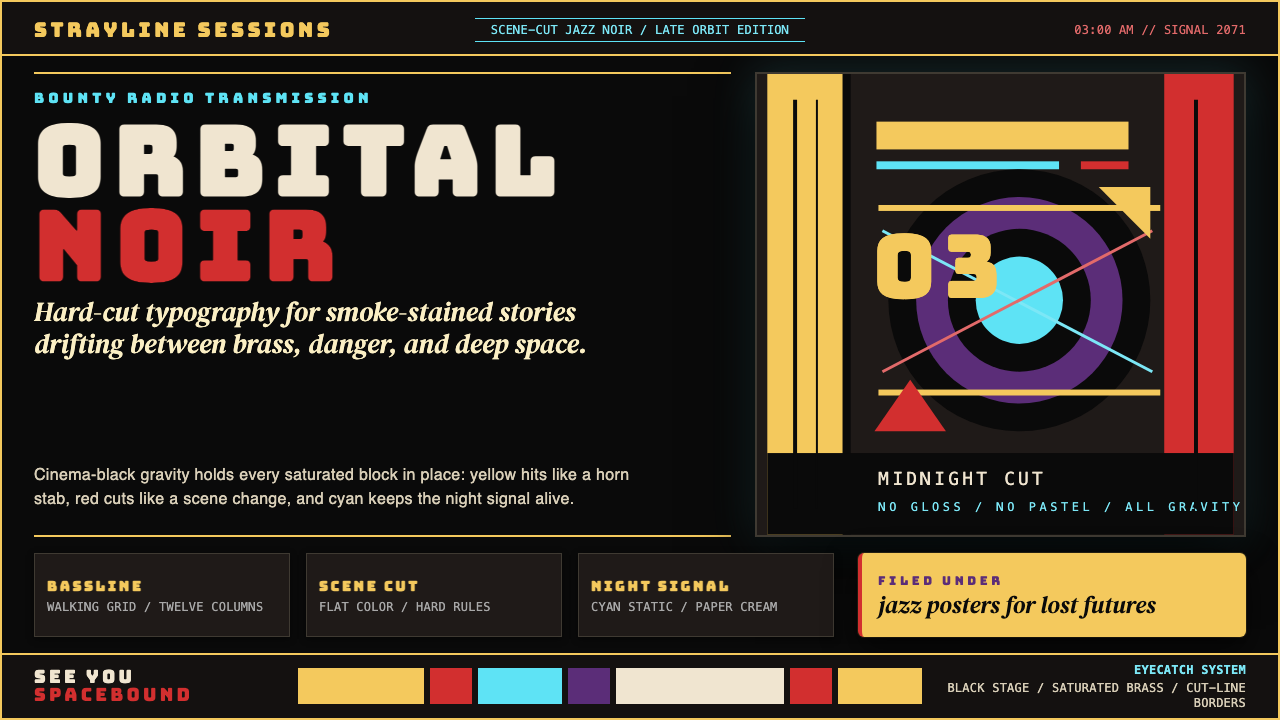 Cowboy Bebop Jazz-NoirCool at 3 AM. Bungee type, jazz yellow, red cuts, and cyan rules hit deep bla…凌晨三点的酷:黑底上 Bungee 字、爵士黄、红切线与青色规则。