Design style guide设计风格指南
What is Gothabilly Horror Revival?什么是 Gothabilly Horror Revival?
Gothabilly is rockabilly's haunted twin — the moment a 1950s diner gets possessed by horror-film iconography, drip-blood ornament, coffin-black velvet, and blood-red marquee type.哥特比利是摇滚比利的闹鬼孪生——那个1950年代小餐厅被恐怖片图像语言附身的瞬间:滴血装饰、棺材黑丝绒、血红跑马灯字体。
Gothabilly Horror Revival in briefGothabilly Horror Revival 速览
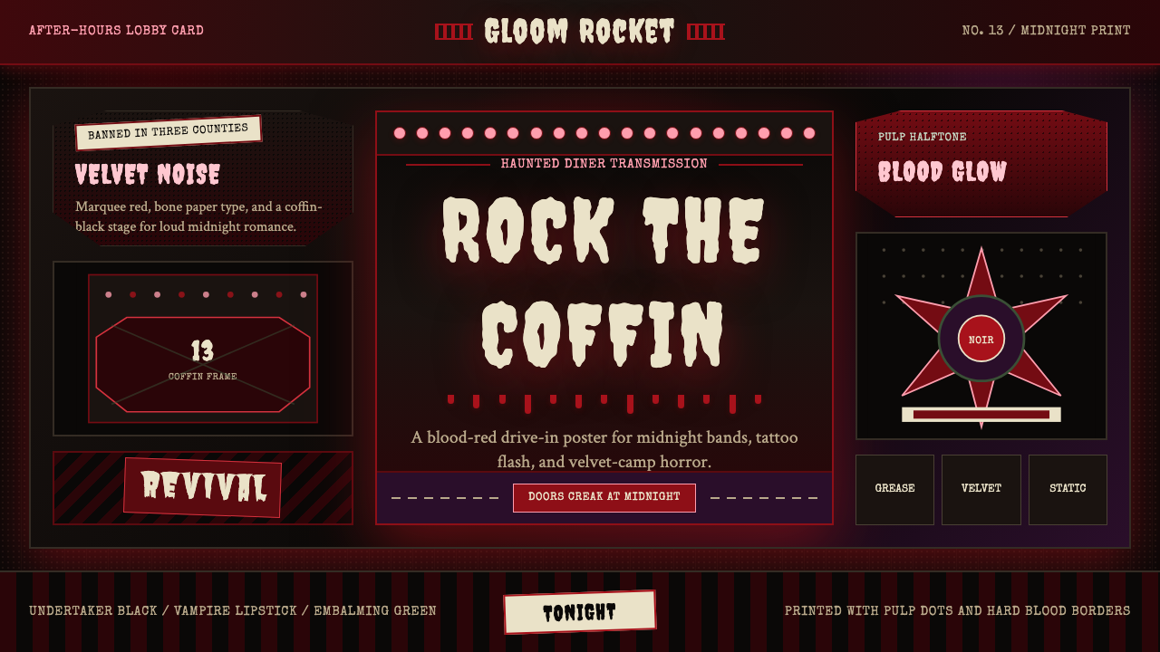
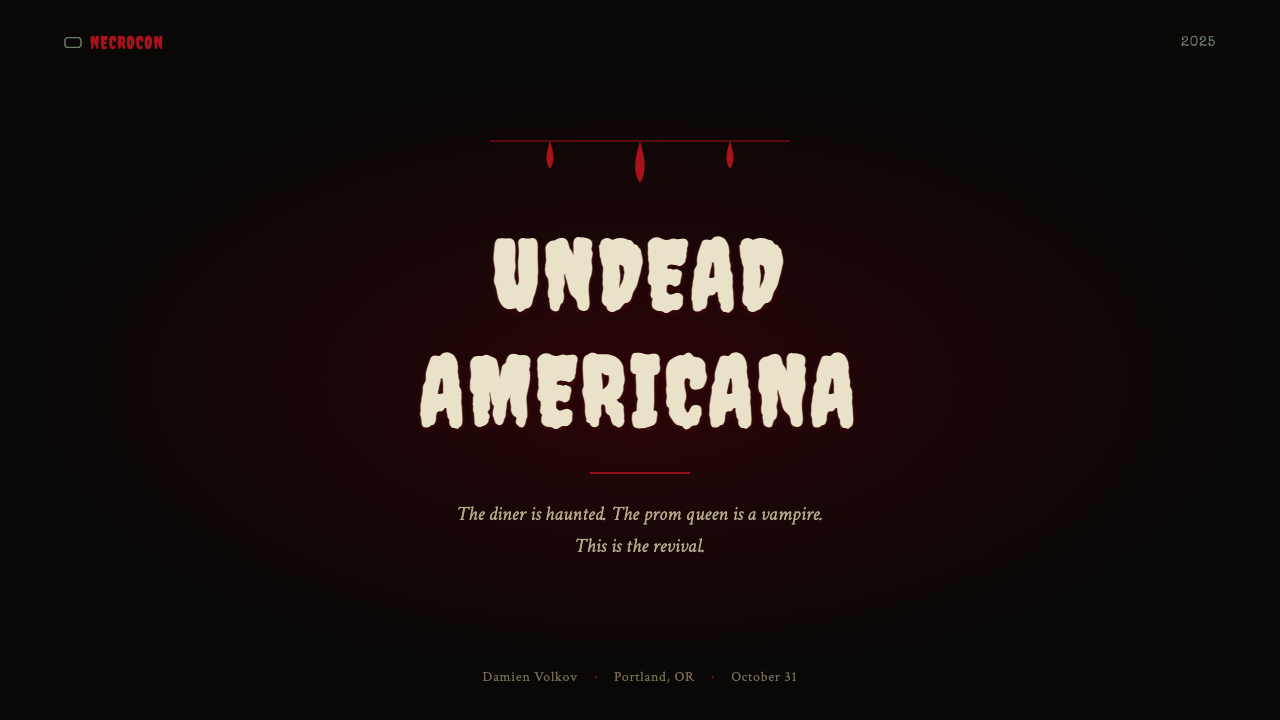
Gothabilly Horror Revival is a design aesthetic that fuses two apparently incompatible American subcultures: the grease-and-chrome swagger of 1950s rockabilly and the campy, theatrical horror-film tradition that ran from Universal Studios monster pictures through the drive-in B-movie era. The result is a visual register of extreme contrast — very dark grounds (near-black or deep charcoal) lit by blood-red and bone-white accents, with hand-lettered marquee type and pulp-halftone textures that evoke rotting posters peeled off a roadside movie-house wall.哥特比利恐怖复兴是一种将两种表面上相互矛盾的美国亚文化熔为一炉的设计美学:1950年代摇滚比利的机油与镀铬张扬,以及从环球影业怪物片一路延伸至汽车影院B级片时代的坎普风恐怖片传统。其视觉效果是极端对比的:极深的底色(近黑或深炭灰)被血红与骨白点亮,手绘跑马灯字体与纸浆半色调质感令人联想到剥落自路边电影院墙壁的腐朽海报。
Where most dark aesthetics aim for sleek menace or ethereal gloom, Gothabilly is deliberately theatrical and camp. It celebrates excess: too much drip ornament, type that looks almost too lurid, coffin-shaped frames that make no pretense of subtlety. The horror elements are drawn from the Universal and AIP (American International Pictures) visual vocabulary — Frankenstein's bold slab serif, the B-movie title card tradition of distressed hand-lettering, halftone dot patterns that simulate cheap pulp-magazine printing. The rockabilly DNA shows in the gestural energy, the pin-up silhouettes, and a fundamental joy in transgression that keeps the mood from tipping into pure dread.大多数暗黑美学追求冷峻的威胁感或飘渺的阴郁,哥特比利却刻意追求剧场感与坎普风。它拥抱过度:过多的滴淌装饰,看起来几乎过于耸人的字体,毫不掩饰的棺材形边框。恐怖元素取自环球影业与美国国际电影(AIP)的视觉词汇——《科学怪人》的粗重平板衬线字、B级片片头的手绘做旧美术字传统、模拟廉价纸浆杂志印刷的半色调网点图案。摇滚比利的基因则体现在手势性的能量、针尖插画般的人物剪影,以及一种对越界的根本性喜悦——正是这种喜悦阻止了整体氛围滑入纯粹的恐惧。
Digitally, the style translates into a toolkit of atmospheric surface treatments: coarse grain overlays that imply age and slight decay, marquee-style lettering with theatrical inline strokes or exaggerated slab serifs, ornamental dividers that drip or drape rather than rule straight across, and a color logic so high-contrast that it functions almost like a woodblock print. It is a style that announces itself loudly and rewards audiences who already love the source material.在数字界面中,这种风格转化为一套大气层次的表面处理工具:暗示年代感与微妙衰败的粗粒纹理叠加,带有剧场式内描线或夸张平板衬线的跑马灯式字体,滴淌或垂坠而非直线横贯的装饰性分割线,以及高对比度到近乎木刻印刷的色彩逻辑。这是一种大声宣告自身存在的风格,会犒赏那些早已爱上原始素材的受众。
See the Gothabilly Horror Revival design system →查看 Gothabilly Horror Revival 完整设计系统 →
Where does Gothabilly Horror Revival come from?Gothabilly Horror Revival 从何而来?
The ancestral root of Gothabilly is psychobilly, a genre that emerged in Britain and the United States in the late 1970s and early 1980s, cross-wiring the stripped-back energy of punk rock with classic rockabilly rhythm patterns. The Cramps, formed in New York in 1976 and fronted by Lux Interior and Poison Ivy, are generally credited as the proto-psychobilly originators. Their visual identity — B-movie poster art, graveyard imagery, quiff-and-leather pin-up iconography set against horror-film subject matter — established the template that Gothabilly would later refine and intensify.哥特比利的祖先源头是迷幻比利(psychobilly),这一音乐类型于1970年代末至1980年代初在英美两国兴起,将朋克摇滚的精简能量与经典摇滚比利的节奏模式交叉嫁接。由勒克斯·英特里奥(Lux Interior)与波伊森·艾薇(Poison Ivy)主导、1976年成立于纽约的The Cramps乐队,通常被公认为原型迷幻比利的开创者。他们的视觉身份——B级片海报风格插图、墓地意象、飞机头与皮革相配的针尖插画置于恐怖片主题之上——奠定了哥特比利日后精炼与强化的模板。
Through the 1990s, the Gothabilly aesthetic took shape on the West Coast of the United States, particularly in California and Texas, where a goth-tinged rockabilly scene developed its own costume culture, poster art tradition, and visual shorthand. Bands like Tiger Army, founded in Oakland in 1995 by Nick 13, wove together traditional rockabilly instrumentation with goth atmosphere and horror imagery, generating both a music and a visual identity that could be printed on promotional material, merchandise, and club flyers. HorrorPops, the Danish band led by Patricia Day, extended the aesthetic into a more self-aware burlesque register, while Voltaire, the darkwave musician and cartoonist, contributed the comic-book dimension that gave Gothabilly its satirical edge alongside its menace.整个1990年代,哥特比利美学在美国西海岸成形,尤其是在加利福尼亚和德克萨斯,一个带有哥特色调的摇滚比利圈子发展出自己独特的服装文化、海报艺术传统与视觉速记语言。Tiger Army乐队由尼克·13(Nick 13)于1995年在奥克兰创立,将传统摇滚比利乐器与哥特氛围、恐怖影像编织在一起,形成了可以印制于宣传物料、周边商品和俱乐部传单上的音乐与视觉双重身份。丹麦乐队HorrorPops由帕特里夏·戴(Patricia Day)领衔,将这种美学延伸至更具自我意识的舞厅歌舞表演语境;而暗潮音乐人兼漫画家沃尔泰尔(Voltaire)则贡献了漫画书的维度,赋予哥特比利在其威胁感之外的讽刺锋芒。
The visual language drew heavily on two American print traditions: the pulp magazine illustration of the 1930s through 1950s, with its halftone printing artifacts, sensational hand-lettered headlines, and monster-movie poster art conventions; and the rockabilly and hot-rod culture graphic tradition, with its brush-script lettering, pin-up figure drawing, and a palette anchored by saturated red and black. The goth subculture contributed the Victorian funerary aesthetic — coffin shapes, drip ornament derived from candle wax imagery, cemetery gate ironwork — which provided formal structure and a layer of art-historical legitimacy to what might otherwise have stayed purely subcultural.这套视觉语言大量汲取了两种美国印刷传统:1930至1950年代的纸浆杂志插画——携带半色调印刷痕迹、耸人听闻的手绘大字标题,以及怪物电影海报的惯例;以及摇滚比利与热杆文化的图形传统——毛笔手写美术字、针尖人物素描,以及以饱和红色与黑色为核心的色板。哥特亚文化贡献了维多利亚式殡葬美学——棺材形状、源自烛蜡意象的滴淌装饰、墓地大门铁艺花纹——为原本可能停留于纯亚文化层面的视觉语言提供了形式结构与一层艺术史上的合法性。
By the 2000s, Gothabilly had established a recognizable design vocabulary that circulated not only through music culture but through tattoo art, burlesque costuming, Halloween retail design, and the broader dark-lifestyle market. Its adoption by digital designers accelerated in the 2010s, as high-resolution screens made the texture and ornamental detail of the style viable at screen resolution and the nostalgia economy created sustained appetite for mid-century aesthetics. The revival element in the name acknowledges that Gothabilly is always already a revival — a self-conscious return to a specific moment in American popular culture filtered through multiple layers of subsequent subcultural processing.到2000年代,哥特比利已建立起一套可辨认的设计词汇,不仅在音乐文化中流通,更扩散至纹身艺术、歌舞表演服装、万圣节零售设计,以及更广泛的暗黑生活方式市场。2010年代数字设计师的采用加速了这一传播——高分辨率屏幕使风格中的质感与装饰细节在屏幕分辨率下具备可行性,而怀旧经济持续激发了对中世纪美学的市场需求。「复兴」二字点明了哥特比利始终已是一种复兴——对美国大众文化某一特定时刻的自觉回归,经由随后多层亚文化处理过滤而来。
What defines the Gothabilly Horror Revival look?Gothabilly Horror Revival 的视觉特征是什么?
Color色彩
The palette is built on extreme polarity: near-black or deep charcoal grounds, blood-red as the primary accent, and bone-white or aged-cream for type and ornamental highlights. Secondary accents draw from sickly greens, deep purples, and jaundiced yellows — colors associated with old horror-film tinting and four-color pulp printing. The overall effect is high-drama and maximally saturated within a very controlled range. Color rarely appears in smooth gradients; instead it shifts in abrupt jumps that echo the dot-gain artifacts of vintage offset printing.色板建立在极端的两极对立上:近黑或深炭灰的底色,血红作为主要点缀色,骨白或陈旧奶油色用于文字与装饰性高光。次级强调色取自病态的绿色、深紫,以及泛黄的灰黄——这些颜色与老式恐怖片染色及四色纸浆印刷相关联。整体效果是高度戏剧性的,在非常受控的范围内达到最高饱和度。色彩极少以平滑渐变的方式出现,而是以突兀的跳跃方式变化,呼应了复古胶印印刷的网点扩张痕迹。
Typography字体排印
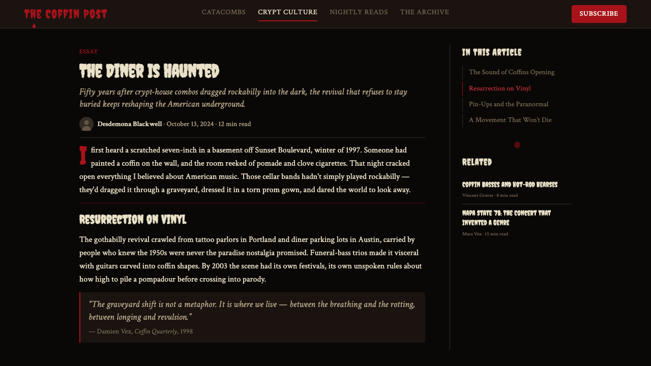
Type is the aesthetic's loudest instrument. Display lettering draws from two main sources: theatrical marquee letterforms with exaggerated slab serifs and inline strokes that recall illuminated movie-house signage; and distressed hand-lettered styles that suggest worn B-movie title cards. Both carry visible imperfection — ink trap artifacts, uneven stroke weight, letterforms that look as though they were painted by hand rather than set by machine. Body text, when it appears, is typically set in condensed serifs to contrast with the display drama above. Tracking is generous to maximize the marquee effect.字体是这种美学最响亮的乐器。展示性文字从两大源头汲取:带有夸张平板衬线与内描线的剧场跑马灯字形,令人联想起灯光闪烁的电影院招牌;以及暗示磨损B级片片头字卡的做旧手绘风格。两者都携带着可见的不完美——墨水陷阱痕迹、不均匀的笔画粗细、看起来像手绘而非机器排版的字形。正文(如果出现)通常采用压缩衬线字体,与上方展示字的戏剧感形成对比。字间距宽松,以最大化跑马灯效果。
Ornament and Decoration装饰与纹样
Gothabilly is one of the few contemporary design styles that treats ornament as a primary — not secondary — visual element. Drip motifs derived from candle wax, blood, and graveyard icicle imagery frame compositions vertically and horizontally. Coffin-shaped frames replace conventional rectangles as image containers. Crosshatched and etched textures evoke Victorian woodblock illustration and classic monster-movie credit sequences. Skull imagery, spider webs, and bat silhouettes function as compositional punctuation. The ornament is never delicate or filigree — it is bold, solid, and printed at maximum opacity.哥特比利是少数将装饰视为主要(而非次要)视觉元素的当代设计风格之一。源自烛蜡、血液和墓地冰柱意象的滴淌母题在纵横方向上框定构图。棺材形边框取代传统矩形成为图像容器。交叉排线与蚀刻质感唤起维多利亚式木刻插图与经典怪物电影片头字幕的质感。骷髅图案、蜘蛛网与蝙蝠剪影充当构图标点符号。这些装饰从来不是纤细或镂空的——它们粗粝、实心,以最大不透明度印刷。
Texture and Surface质感与表面
Flat digital surfaces are avoided in favor of heavily textured grounds that suggest age, analog reproduction, and material deterioration. Common treatments include halftone dot overlays that simulate cheap pulp-magazine printing, grain and noise layers that imply photographic film or degraded offset, and paper-crinkle or torn-edge effects that evoke vintage ephemera. These textures are typically applied at high opacity so they actively interrupt the underlying image or color field rather than functioning as a subtle atmosphere. The net effect suggests that the piece was printed on poor-quality materials forty years ago and has been slowly rotting ever since.平滑的数字表面被大量质感化的底面所取代,暗示年代感、模拟复制与材料的老化。常见处理包括模拟廉价纸浆杂志印刷的半色调网点叠层、暗示胶片感或退化胶印的颗粒与噪点层,以及唤起复古临时印刷品的纸张皱褶或撕裂边缘效果。这些质感通常以高不透明度叠加,以至于它们会主动打断底层图像或色彩区域,而非仅作为微妙的氛围。最终效果暗示这件作品四十年前印刷于劣质材料上,此后一直在缓慢腐烂。
Composition and Frame构图与框架
Layouts favor strong vertical or symmetrical axes — centered compositions that echo vintage poster design and carnival banner conventions — rather than the asymmetric grids of modernist design. The frame itself is an expressive element: coffin-shaped outer borders, arched theatrical openings, or tombstone silhouettes define the picture plane. Negative space is minimal; the impulse is toward dense, packed composition where every zone of the layout carries some decorative or typographic element. Despite the density, hierarchy is maintained through extreme scale contrast between headline type and everything else.版式偏爱强烈的垂直或对称轴——呼应复古海报设计与嘉年华横幅惯例的居中构图——而非现代主义设计的非对称网格。框架本身是一个表达性元素:棺材形外框、拱形剧场开口,或墓碑剪影界定了画面平面。留白极少;冲动是向着稠密、紧实的构图,版式的每个区域都承载着某种装饰性或字体性元素。尽管密度很高,层级仍通过标题字体与其他一切元素之间的极端尺寸对比来维持。
Imagery and Iconography图像与图像志
Figurative imagery is drawn from two pools: the pin-up tradition of 1950s American illustration, with its exaggerated feminine silhouettes, hourglass proportions, and coy-but-confident expression; and classic horror-film iconography — Frankenstein's creature, Dracula, werewolves, mummies — rendered in the graphic shorthand of B-movie poster art rather than realistic illustration. Both sources are typically treated as high-contrast silhouette or limited-tone duotone rather than full-color photographic rendering. The tension between glamour and horror is the aesthetic's central subject matter.具象图像取自两个来源:1950年代美国插画的针尖传统——夸张的女性剪影、沙漏比例与含蓄而自信的表情;以及经典恐怖电影图像志——科学怪人的怪物、德古拉、狼人、木乃伊——以B级片海报风格的图形速记而非写实插画方式呈现。两种来源通常被处理为高对比度剪影或有限色调的双色调,而非全彩摄影式渲染。魅力与恐怖之间的张力是这种美学的核心主题。
Mood and Camp Sensibility情绪与坎普气质
Gothabilly never takes itself entirely seriously. The horror elements are presented with evident relish and a wink — the excess of ornament, the sheer luridness of the color, the improbability of the subject matter all signal that the designer knows exactly how over-the-top it all is and considers that a virtue. This camp sensibility, theorized by Susan Sontag as a love of the exaggerated and theatrical, is what distinguishes Gothabilly from straightforward horror design. The goal is not to frighten but to delight through theatrical excess, subcultural in-joke, and aesthetic commitment to the gloriously overwrought.哥特比利从不把自己完全当真。恐怖元素以明显的津津有味和一个眨眼展示——装饰的过度、色彩的纯粹耸人、主题的荒诞不经,都在表明设计师清楚地知道这一切有多夸张,并将其视为一种美德。这种坎普气质——苏珊·桑塔格将其理论化为对夸张与剧场性的热爱——正是哥特比利与直白的恐怖设计区别开来的东西。目标不是恐吓,而是通过剧场式的过度、亚文化内部玩笑,以及对光荣过火之物的美学承诺来带来愉悦。
See the Gothabilly Horror Revival design system →查看 Gothabilly Horror Revival 完整设计系统 →
Who shaped Gothabilly Horror Revival?谁塑造了 Gothabilly Horror Revival?
Lux Interior, born Erick Lee Purkhiser, was the co-founder and vocalist of The Cramps, the New York band widely recognized as the originators of the psychobilly and proto-Gothabilly aesthetic. From 1976 until his death in 2009, Interior and The Cramps maintained a visual identity rooted in B-movie horror poster art, graveyard imagery, and 1950s rockabilly performance conventions pushed to theatrical extremes. Their album artwork, stage design, and promotional photography established most of the visual vocabulary that subsequent Gothabilly artists would codify and extend.勒克斯·英特里奥(Lux Interior),本名埃里克·李·珀赫西尔,是The Cramps乐队的联合创始人与主唱。这支纽约乐队被广泛认为是迷幻比利与原型哥特比利美学的开创者。从1976年直至他2009年去世,英特里奥与The Cramps始终维持着根植于B级片恐怖海报艺术、墓地意象与1950年代摇滚比利表演惯例(被推至剧场极限)的视觉身份。他们的专辑封面、舞台设计与宣传照片建立了随后哥特比利艺术家将加以编码与延伸的大部分视觉词汇。
Nick 13 founded Tiger Army in Oakland, California in 1995, creating one of the most visually coherent Gothabilly projects of the style's formative decade. Tiger Army's visual identity married traditional rockabilly graphic conventions — brush-script lettering, flame motifs, hot-rod color palettes — with cemetery imagery, gothic architecture details, and a generally more elegiac tone than the raw camp of earlier psychobilly. Nick 13 also produced a body of solo work that pushed the style toward classic country and Americana aesthetics, demonstrating Gothabilly's capacity to absorb adjacent traditions without losing its distinctive dark signature.尼克·13于1995年在加利福尼亚奥克兰创立了Tiger Army,打造了这种风格形成期中最具视觉连贯性的哥特比利项目之一。Tiger Army的视觉身份将传统摇滚比利的图形惯例——毛笔手写美术字、火焰母题、热杆汽车色板——与墓地意象、哥特建筑细节,以及比早期迷幻比利原始坎普风更为哀婉的整体基调相结合。尼克·13还创作了将这种风格推向经典乡村与美国民族音乐美学的个人作品,展示了哥特比利在不失去其独特暗黑印记的情况下吸收相邻传统的能力。
Patricia Day led HorrorPops, the Copenhagen-based band that brought a distinct burlesque-goth dimension to the Gothabilly aesthetic during the early 2000s. Day's visual persona and the band's art direction contributed a more fashion-conscious, self-aware campness to the style — one that drew on pin-up model photography, burlesque costuming, and an explicitly feminine perspective on the tradition's more macho rockabilly roots. HorrorPops' album artwork and music videos demonstrated that Gothabilly's visual language was flexible enough to accommodate gender critique and humor without losing its horror-film intensity.帕特里夏·戴领衔HorrorPops——这支哥本哈根乐队在2000年代初为哥特比利美学带来了鲜明的歌舞表演哥特维度。戴的视觉人格与乐队的艺术指导,为这种风格贡献了更具时尚意识、更自我意识强烈的坎普感——取材于针尖模特摄影、歌舞表演服装,以及对这一传统中偏阳刚摇滚比利根源的明确女性视角。HorrorPops的专辑封面与音乐录影带证明,哥特比利的视觉语言具有足够的弹性,可以容纳性别批评与幽默,而不失其恐怖电影强度。
Voltaire — born Aurelio Voltaire Hernandez — is a darkwave musician, singer-songwriter, and cartoonist whose visual work helped define the more satirical, comic-book-influenced strain of Gothabilly design. His self-illustrated album covers and animated short films brought the aesthetic into direct dialogue with underground comics and editorial cartooning traditions, adding a graphic wit and narrative dimension that distinguished his work from the more purely visceral horror-camp of earlier psychobilly. Voltaire's output demonstrated that Gothabilly's visual language could support extended narrative and character illustration, not only poster-art spectacle.沃尔泰尔(Voltaire),本名奥雷利奥·沃尔泰尔·埃尔南德斯,是一位暗潮音乐人、创作歌手兼漫画家,其视觉作品帮助定义了哥特比利设计中更具讽刺性、更受漫画书影响的那一支流。他自绘的专辑封面与动画短片将这种美学带入与地下漫画及编辑漫画传统的直接对话,增添了图形机智与叙事维度,使他的作品有别于早期迷幻比利更纯粹的内脏恐怖坎普风。沃尔泰尔的创作证明,哥特比利的视觉语言不仅能支撑海报艺术式的视觉奇观,还能承载延伸叙事与角色插画。
Though not a designer herself, Bettie Page was the most reproduced visual source in Gothabilly's pin-up dimension. The pinup model and actress, photographed prolifically in the early 1950s, provided the aesthetic with its signature female silhouette: dark bangs, hourglass form, and a combination of confident sexuality with playful theatricality. Page's images — especially the fetish and bondage-themed photographs shot by Irving Klaw — introduced the camp dimension of performed transgression that became central to Gothabilly's tone. Her visual legacy circulates through the style as both quotation and archetype.尽管贝蒂·佩吉本人并非设计师,她却是哥特比利针尖插画维度中被引用最多的视觉来源。这位在1950年代初期留下大量摄影作品的模特与女演员,为这种美学提供了标志性的女性剪影:深色刘海、沙漏身形,以及自信性感与嬉戏剧场感的结合。佩吉的图像——尤其是由欧文·克劳(Irving Klaw)拍摄的恋物与束缚主题照片——引入了表演性越界的坎普维度,这一维度成为哥特比利基调的核心。她的视觉遗产作为引用与原型同时在这种风格中流通。
How do you use Gothabilly Horror Revival today?今天怎么用 Gothabilly Horror Revival?
Gothabilly Horror Revival is one of the most immediately recognizable design styles available, which means it functions best in contexts where the audience self-selects and the brand has already committed to a particular subcultural position. Applied correctly, it signals authenticity to a community that is acutely sensitive to imitation; applied carelessly, it reads as Halloween-retail pastiche. The foundation is always the palette: near-black ground, blood-red accent, bone-white type. Everything else — the ornament, the texture, the letterform choices — builds from that base.哥特比利恐怖复兴是现有最易被立即识别的设计风格之一,这意味着它在受众自我选择、品牌已明确承诺某种亚文化立场的语境中表现最佳。正确应用时,它向一个对模仿极为敏感的社群发出真实性的信号;轻率应用时,则读起来像万圣节零售的仿制品。基础始终是色板:近黑底色、血红强调色、骨白字体。其他一切——装饰、质感、字形选择——都从这个基础生长。
For presentation slides, Gothabilly creates exceptional impact on covers and divider slides but requires restraint on content-heavy pages. A Gothabilly cover works through extreme contrast: the title in a large, exaggerated slab serif centered on a near-black ground, with drip or coffin-frame ornament scaled generously enough to read at projection size. Section-divider slides can carry the full decorative treatment. Content slides should pull back dramatically — bone-white ground, condensed serif body text, a single blood-red accent for key callouts — to let the information breathe. Data visualization benefits from the palette's high contrast: data series mapped to blood-red and bone-white on dark grounds produce charts that are both dramatic and highly legible.在演示文稿中,哥特比利在封面与分节幻灯片上创造出非凡的视觉冲击,但在内容繁重的页面上需要克制。一张哥特比利封面通过极端对比发挥作用:标题以大号夸张平板衬线字体居中置于近黑底面,滴淌或棺材形边框装饰的比例大到足以在投影尺寸下清晰可读。分节幻灯片可以承受全套装饰处理。内容幻灯片则应大幅收敛——骨白底面、压缩衬线正文,单一血红强调色用于关键引文——以让信息得以呼吸。数据可视化受益于色板的高对比度:在深色底面上以血红与骨白映射数据序列,产生既有戏剧感又高度清晰的图表。
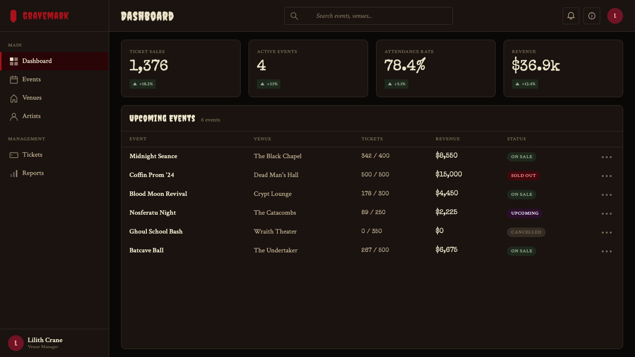
For web interfaces, the style is well-suited to event ticketing pages, music streaming contexts, dark-lifestyle e-commerce, and entertainment platforms — anywhere the user experience is supposed to feel like entering a particular subcultural space rather than a neutral utility. Applied to a product-detail page or landing page, the approach is: near-black background, marquee-style display type for the product name, a single blood-red call-to-action, and sparse body text in a condensed serif. Navigation should be minimal and type-only; ornamental elements should be reserved for section transitions and feature callouts rather than repeated as a continuous background pattern.对于网页界面,这种风格适合活动售票页面、音乐流媒体场景、暗黑生活方式电商,以及娱乐平台——任何用户体验应当感觉像进入特定亚文化空间而非中性实用工具的地方。应用于产品详情页或登陆页时,方法是:近黑背景,跑马灯式展示字体呈现产品名称,单一血红行动号召按钮,以及压缩衬线字体的稀疏正文。导航应当极简且仅由文字构成;装饰性元素应保留给区块过渡与特性引用,而非作为连续背景图案重复使用。
For editorial and marketing work, the style produces its strongest results in contexts where the audience is already familiar with the visual references: event posters, music editorial, Halloween-adjacent seasonal campaigns, and dark-lifestyle brand identity. An editorial layout works by treating the page as a classic horror-movie poster: dominant display type with heavy decorative treatment, a strong central image in high-contrast duotone, supporting information in condensed serif at a scale small enough to contrast dramatically with the headline. Marketing materials should commit fully to the palette and resist the impulse to lighten or soften the aesthetic for broader audience accessibility — diluted Gothabilly almost always reads as Halloween store signage rather than subcultural authenticity.对于编辑与营销内容,这种风格在受众已熟悉视觉参照的语境中产生最强效果:活动海报、音乐编辑内容、万圣节相关季节性营销活动,以及暗黑生活方式品牌识别。一个编辑版式通过将页面视为经典恐怖电影海报来发挥作用:带有大量装饰处理的主导展示字体,以高对比度双色调处理的强烈中心图像,压缩衬线字体的辅助信息采用足以与标题形成戏剧性对比的小号尺寸。营销材料应当完全承诺于色板,抵制为了更广泛受众的可及性而减淡或软化这种美学的冲动——被稀释的哥特比利几乎总是被读解为万圣节商店招牌,而非亚文化真实性。
A common mistake when applying Gothabilly is overloading every surface with ornament and texture simultaneously. The style's visual density is its signature, but density becomes noise when every layer competes for attention at the same visual priority. The discipline is to choose one primary decorative element per composition — drip ornament, coffin frame, or halftone texture — and let the other supporting elements operate at lower intensity. Similarly, type choice is frequently mishandled: using an ornate blackletter or overly generic spooky typeface instead of the marquee-slab and distressed-brush lettering that characterize the actual historical reference produces results that look like costume-store packaging rather than authentic Gothabilly design.应用哥特比利时最常见的错误,是同时用装饰与质感超载每一个表面。这种风格的视觉密度是其标志,但当每一层都以相同的视觉优先级争夺注意力时,密度就变成了噪音。纪律性在于:每个构图选择一个主要装饰元素——滴淌装饰、棺材边框,或半色调质感——让其他辅助元素以较低强度运作。同样,字体选择也经常被误处理:使用华丽的黑字体或过于通用的恐怖字体,而非表征实际历史参照的跑马灯平板衬线与做旧毛笔美术字,会产生看起来像戏服商店包装而非真实哥特比利设计的结果。
See the Gothabilly Horror Revival design system →查看 Gothabilly Horror Revival 完整设计系统 →
Gothabilly Horror Revival — FAQGothabilly Horror Revival · 常见问题
What separates Gothabilly from generic Halloween-themed design?哥特比利与通用万圣节主题设计有何区别?
The difference is specificity of reference and the presence of a camp sensibility. Generic Halloween design borrows horror iconography — skulls, bats, pumpkins — without any underlying subcultural logic. Gothabilly draws from a specific intersection of 1950s rockabilly visual culture and the B-movie horror film aesthetic, channeled through goth subculture and psychobilly music from the 1970s onward. The camp dimension is also essential: Gothabilly knows it is theatrical and revels in that knowledge. It references specific source material (The Cramps, drive-in movie poster conventions, Universal Studios creature design) rather than generic spookiness, and that specificity is what separates authentic design from costume-store pastiche.区别在于参照的具体性与坎普气质的存在。通用万圣节设计借用恐怖图像志——骷髅、蝙蝠、南瓜——没有任何底层的亚文化逻辑。哥特比利取材于1950年代摇滚比利视觉文化与B级恐怖电影美学的特定交汇点,经由1970年代以来的哥特亚文化与迷幻比利音乐加以过滤。坎普维度同样至关重要:哥特比利知道自己是剧场性的,并在这种认知中陶醉。它参照具体的源素材(The Cramps、汽车影院海报惯例、环球影业怪物设计),而非泛泛的恐怖感,正是这种具体性将真实的设计与戏服商店仿制品区分开来。
Can Gothabilly work in light-mode or light-background contexts?哥特比利能在浅色模式或浅色背景下使用吗?
It can, but it requires significant adaptation and the result should be considered a Gothabilly-adjacent style rather than authentic Gothabilly. The style's dark ground is not simply a preference — it is structural, because the blood-red and bone-white accents only achieve their high-drama contrast value against near-black. On a light or white ground, the red accent weakens considerably, the bone-white disappears entirely, and much of the ornamental detail loses its punch. A workable light adaptation uses aged-parchment or warm grey grounds rather than pure white, maintains the blood-red as a strong accent, and pulls back significantly on texture to avoid visual cacophony. The theatrical excess that defines the style is harder to sustain at low contrast.可以,但需要大幅调整,结果应被视为哥特比利相邻风格,而非真实的哥特比利。这种风格的深色底面不仅仅是一种偏好——它是结构性的,因为血红与骨白的点缀色只有在近黑背景上才能达到其高戏剧性的对比价值。在浅色或白色底面上,红色点缀色明显减弱,骨白完全消失,大量装饰细节失去其冲击力。一种可行的浅色改编使用陈旧羊皮纸或暖灰色底面而非纯白,将血红作为强劲的点缀色保留,并大幅收敛质感以避免视觉嘈杂。定义这种风格的剧场式过度在低对比度下更难维持。
How should data visualization be handled within a Gothabilly design system?在哥特比利设计系统中,数据可视化应如何处理?
The high-contrast palette actually serves data visualization well if the mapping is kept simple. The most effective approach restricts each chart to two data colors maximum — blood-red for the primary series and bone-white or aged-cream for the secondary — against the near-black ground. The resulting charts are dramatic and highly legible, with the dark ground ensuring that both accent colors read at maximum luminance. Avoid introducing additional hues from the secondary palette (the sickly greens and deep purples) into data visualization, as they introduce ambiguity about relative importance. Typography within charts should use the condensed serif rather than display marquee lettering — axis labels and annotations need clarity over theatricality. Chart containers can be coffin-framed or ornamentally bordered if the context is decorative-editorial, but in functional dashboard contexts the ornament should be minimized.高对比度色板在保持映射简洁的情况下实际上很好地服务于数据可视化。最有效的方法将每个图表限制在最多两种数据颜色——主数据系列用血红,次数据系列用骨白或陈旧奶油色——置于近黑底面上。由此产生的图表既有戏剧感又高度清晰,深色底面确保两种点缀色以最高亮度呈现。避免将次级色板中的其他色相(病态绿色与深紫)引入数据可视化,因为它们会对相对重要性引入歧义。图表中的字体应使用压缩衬线而非展示跑马灯字体——坐标轴标签与注释需要清晰而非戏剧性。图表容器在装饰性编辑语境下可以使用棺材形边框或装饰性框架,但在功能性仪表板语境下,装饰应当最小化。
Is Gothabilly appropriate for professional or corporate contexts?哥特比利适合专业或企业语境吗?
Only for specific industries and brands. Gothabilly is the right tool for music-industry clients, entertainment and events platforms, tattoo studios, dark-lifestyle retail, Halloween-adjacent seasonal campaigns, and any brand whose identity is deliberately positioned within or adjacent to the subcultures that produced the style. For general corporate, financial, healthcare, or consumer-goods contexts, the style signals the wrong values — the theatrical excess and horror iconography read as unprofessional or alarming rather than authoritative and trustworthy. The test is whether the brand's existing identity already includes a dark, subcultural, or theatrically excessive dimension. If it does, Gothabilly amplifies that dimension. If it does not, applying the style creates friction between the design and the underlying brand promise.仅适用于特定行业与品牌。哥特比利是音乐行业客户、娱乐与活动平台、纹身工作室、暗黑生活方式零售、万圣节相关季节性营销活动,以及任何身份有意被定位于或毗邻产生这种风格的亚文化之内的品牌的正确工具。对于一般企业、金融、医疗或消费品语境,这种风格传递了错误的价值信号——剧场式的过度与恐怖图像志被读解为不专业或令人担忧,而非权威与可信赖。检验标准是:品牌现有的身份认同是否已包含暗黑、亚文化或剧场式夸张的维度。如果是,哥特比利放大了那个维度。如果不是,应用这种风格会在设计与底层品牌承诺之间制造摩擦。
What is the difference between Gothabilly and Horror Punk aesthetically?哥特比利与恐怖朋克在美学上有何不同?
Horror Punk, associated primarily with The Misfits and their graphic descendents, draws from a harder-edged punk graphic tradition — photocopied flyer aesthetics, aggressive hand-lettering, a rawer and less crafted visual energy. Its color range tends toward monochrome with occasional stark accents, and its ornamental vocabulary is simpler: skulls as emblems rather than architectural elements, straight-edged borders rather than coffin shapes or drip ornament. Gothabilly, by contrast, has significantly more craft investment — the marquee lettering is more refined, the ornamental treatment more complex, the pin-up illustration dimension entirely absent from Horror Punk. Gothabilly also incorporates the 1950s rockabilly visual heritage more explicitly, including gesture toward chrome, hot-rod graphics, and a warmer, more theatrically lit sense of production values.恐怖朋克主要与The Misfits及其图形传承者相关联,取材于更硬朗的朋克图形传统——复印传单美学、激进的手绘美术字,以及更粗糙、手工感更低的视觉能量。其色彩范围倾向于单色调配以偶尔的强烈点缀,装饰词汇也更简单:骷髅作为徽章而非建筑元素,直边框而非棺材形状或滴淌装饰。相比之下,哥特比利投入了更多的工艺:跑马灯字体更精炼,装饰处理更复杂,针尖插画维度在恐怖朋克中完全缺席。哥特比利也更明确地融入了1950年代摇滚比利视觉遗产,包括对镀铬、热杆图形的姿态,以及更温暖、更具剧场灯光感的制作价值取向。
Related design styles相关设计风格
 Cartoon Network 90s BlocksKids-cable noise, squared. Black-white checkerboards crash into hot-yellow Bu…方块化的儿童有线电视噪音:黑白棋盘撞上热黄 Bungee 字块。
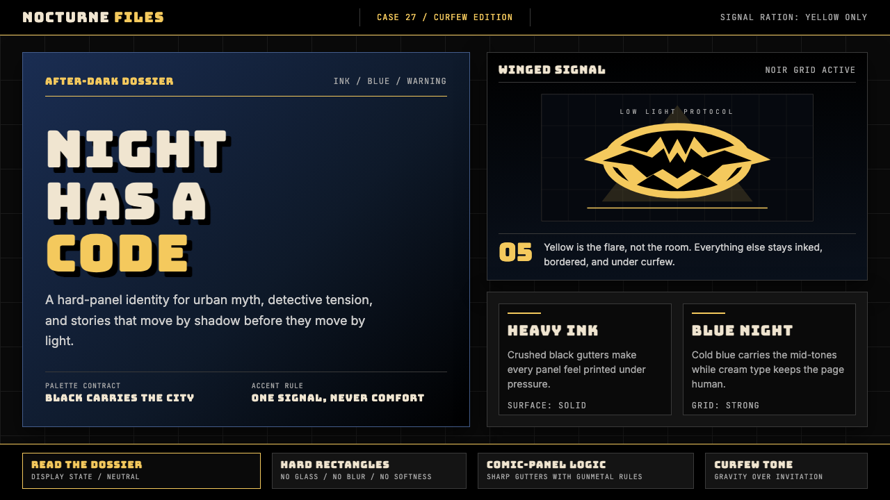 DC Comics Batman NoirGravity, not cheer. Black panels, Gotham blue, and one bat-yellow signal cut…重力而非欢愉:黑色分镜、哥谭蓝与一束蝙蝠黄切开夜色。
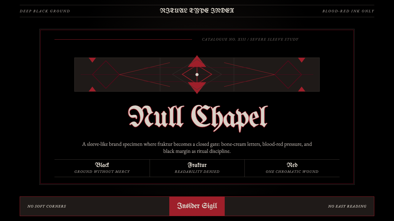 Death Metal BlackletterUnreadable by design. Bone fraktur on black, cut by one blood-red geometric s…以难读划界:黑底骨色哥特字,被一道血红几何符印切开。
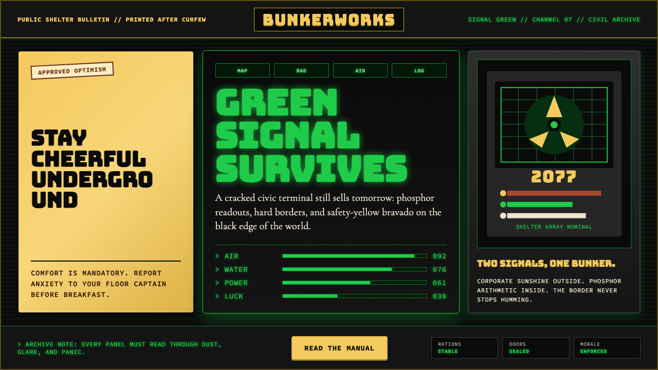 Fallout Vault-Tec Pip-BoyIrradiated optimism. Vault yellow and CRT green lock into a bordered bunker g…辐照乐观主义:避难所黄与CRT绿嵌入硬边地堡网格。
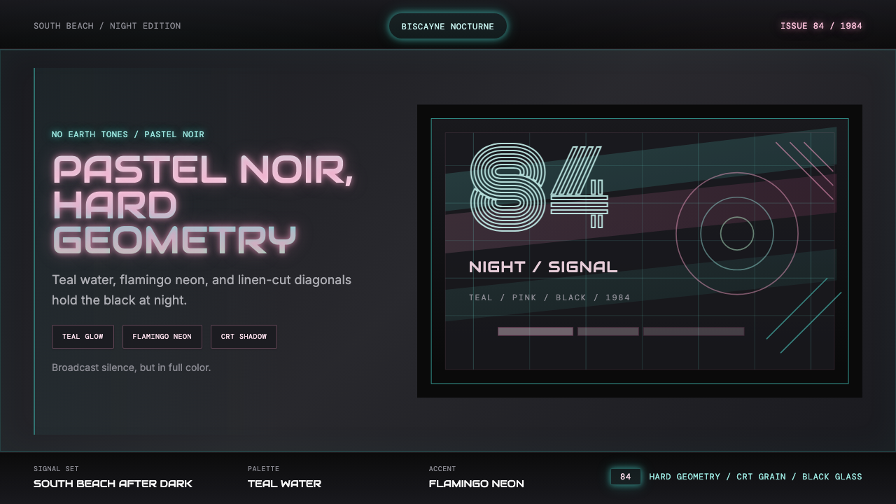 Miami Vice Pastel Teal (1984)Pastel noir, not nostalgia. Teal glow and flamingo pink slice black with geom…不是怀旧,是粉青霓虹。青光与火烈鸟粉切开黑底几何。
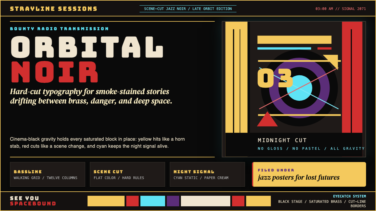 Cowboy Bebop Jazz-NoirCool at 3 AM. Bungee type, jazz yellow, red cuts, and cyan rules hit deep bla…凌晨三点的酷:黑底上 Bungee 字、爵士黄、红切线与青色规则。