What is Death Metal Blackletter?什么是 Death Metal Blackletter?
Death Metal Blackletter weaponizes medieval script into ritual — deep-black grounds, blood-red geometry, and tangled fraktur pushed so far past readability that illegibility itself becomes the message.Death Metal Blackletter 将中世纪字体炼制为仪式武器——纯黑底色、血红几何、缠绕至难以辨读的 fraktur,让「读不出来」本身成为信息。
Death Metal Blackletter in briefDeath Metal Blackletter 速览
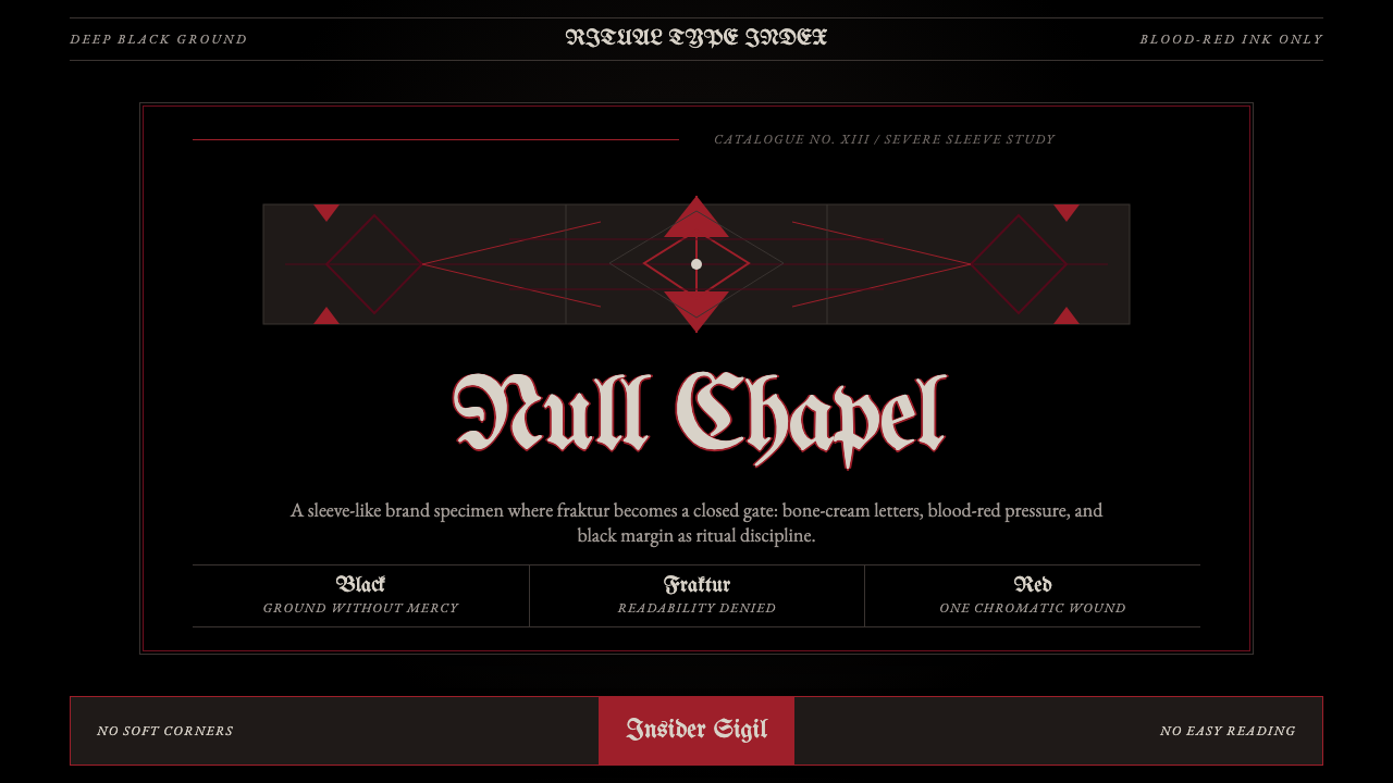
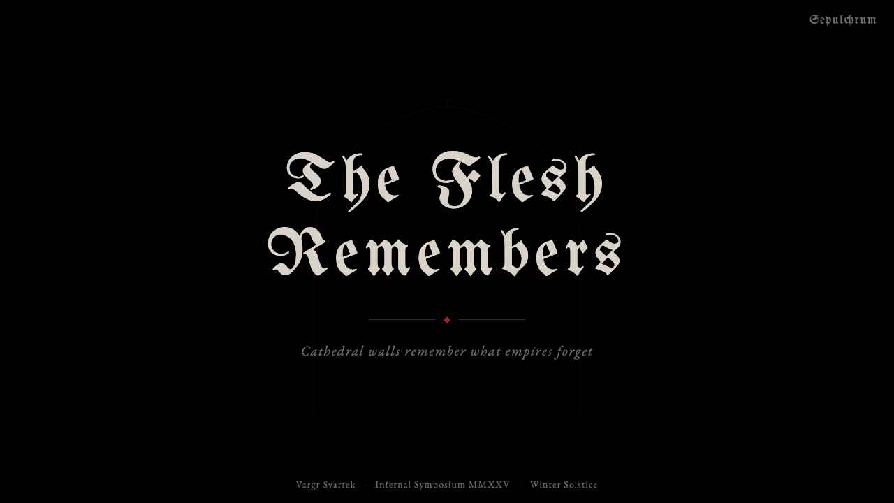
Death Metal Blackletter is the visual language forged in the extreme-metal underground: deep-black grounds, saturated blood-red accents, and Blackletter band logos descended from medieval Gothic fraktur, twisted and entangled until they hover at the edge of legibility. The palette is disciplined to the point of severity — black, blood-red, charcoal, and the occasional sliver of bone-cream are the only permitted tones. Nothing softens the contrast; nothing dilutes the darkness.Death Metal Blackletter 是极端金属地下场景锻造的视觉语言:纯粹的深黑底色、饱和至刺眼的血红点缀,以及由中世纪 Gothic fraktur 演化而来的乐队 logo——被扭曲、缠绕至徘徊于可辨读边缘。配色严苛到近乎苦行:黑色、血红、炭灰,偶尔加上一抹骨色奶白,再无其他。没有任何东西来软化对比度,没有任何东西稀释那份黑暗。
What separates this aesthetic from mere gothic pastiche is its conceptual core: illegibility is not a failure but an intention. Letters are sharpened, mirrored, interlocked, and stretched until the word dissolves into a visual sigil. Reading becomes an initiation rite. Those who can decode the logo belong; those who cannot are meant to be excluded. The typography functions as tribal mark, boundary line, and occult symbol simultaneously.这套美学与单纯的哥特仿制品的区别,在于其概念内核:难以辨读不是失败,而是意图。字母被削尖、镜像、互锁、拉伸,直到词语溶解为视觉符印。阅读变成了一种入门仪式。能解读 logo 的人才是圈内人;读不出来的人,本就该被排除在外。这套字体排印同时充当部落标记、边界线与神秘符号。
The style operates on a strict visual logic: every element exists to amplify the sense of weight and menace. Textures suggest corroded metal or dried bone. Compositional symmetry — rare in most design traditions — appears here as an almost heraldic formality, lending band logos the gravity of a coat of arms. The result is a visual system that is at once maximalist in surface complexity and minimalist in color, achieving its intensity through contrast rather than accumulation.这种风格运行于严格的视觉逻辑之下:每个元素都服务于放大重量感与威压感。纹理暗示锈蚀的金属或风干的骨骼。构图对称性——在大多数设计传统中罕见——在此以一种近乎纹章式的正式感出现,赋予乐队 logo 如盾徽般的庄重。最终呈现的是一套视觉体系:在表面复杂度上极度极繁,在色彩上极度克制,以对比而非堆砌来实现其强度。
See the Death Metal Blackletter design system查看 Death Metal Blackletter 完整设计系统
Where does Death Metal Blackletter come from?Death Metal Blackletter 从何而来?
The roots of Death Metal Blackletter reach back to the medieval scriptoriums of northern Europe, where monastic scribes developed Gothic fraktur — a compressed, angular letterform designed to pack maximum text onto costly parchment. Fraktur spread across German-speaking territories and remained the dominant typeface for German-language printing well into the twentieth century, carrying associations of antiquity, seriousness, and national identity. It was this historical freight — the weight of centuries, the suggestion of blood and iron — that extreme-metal musicians and designers would later consciously exploit.Death Metal Blackletter 的根源可追溯至北欧中世纪的修道院缮写室,那里的修士发展出 Gothic fraktur——一种紧凑、棱角分明的字形,旨在将最多文字压入昂贵的羊皮纸。Fraktur 在德语区广泛传播,在整个二十世纪相当长的时间内都是德语印刷的主导字体,承载着关于古朴、严肃与民族身份的联想。正是这份历史重量——数百年的积淀、血与铁的暗示——被极端金属的音乐人和设计师有意识地加以利用。
The immediate origin of the aesthetic lies in the late-1980s death-metal scene centered on Tampa, Florida. Bands including Death, Obituary, and Morbid Angel needed visual identities as sonically extreme as their music. Chuck Schuldiner of Death was among the first to commission heavily distorted Blackletter logos that treated the band name as something to be felt rather than read. The approach spread rapidly across the underground tape-trading network, where photocopied flyers and hand-assembled fanzines circulated a visual vocabulary of entangled letterforms, skeletal illustration, and near-total darkness.这套美学的直接起源,在于 1980 年代末以美国佛罗里达州坦帕为中心的死亡金属场景。Death、Obituary、Morbid Angel 等乐队需要与其音乐同样极端的视觉身份。Death 的主脑 Chuck Schuldiner 是最早委托制作高度变形 Blackletter logo 的人之一——他要求乐队名称是被感受到的东西,而非被阅读的东西。这种方式迅速在地下磁带交易网络中蔓延,那里通过影印传单与手工装订的同人志传播着一套视觉词汇:缠绕的字形、骷髅插图,以及近乎全黑的画面。
In the early 1990s, the Norwegian black-metal scene centered on Oslo introduced a colder, more abstract variation. Euronymous of Mayhem and Varg Vikernes of Burzum were central figures in a movement that stripped the aesthetic further, emphasizing rawness and a deliberately lo-fi, almost illegible quality. Norwegian black-metal cover art leaned into corrosion and obscurity as ideological positions. The logos became less ornate but more ritually opaque, often rendered in stark monochrome with a freezing, elemental quality absent from the Florida death-metal originals.1990 年代初,以奥斯陆为中心的挪威黑金属场景引入了一种更寒冷、更抽象的变体。Mayhem 的 Euronymous 与 Burzum 的 Varg Vikernes 是这场运动的核心人物,他们将美学进一步精简,强调粗粝感与刻意的低保真、近乎不可辨读的品质。挪威黑金属封面美学将腐蚀与晦暗作为意识形态立场。logo 变得不那么繁复,却愈加仪式性地不透明,常以纯粹的单色呈现,带着一种佛罗里达死亡金属原作所没有的冻彻骨髓的元素感。
The figure who most systematically refined the logo tradition into a recognized art form is Belgian designer Christophe Szpajdel, who has completed over ten thousand metal logo commissions since the early 1990s. Szpajdel — known within the scene as the Lord of Logos — treats each commission as a unique heraldic problem, balancing the phonetic identity of the band name against the visual demands of the letterform composition. His work established conventions that subsequent logo designers have worked within and against: the acceptable range of letterform distortion, the rules governing negative-space management in dense entangled scripts, and the degree to which symmetry or asymmetry serves a given composition. The deathcore fusion of the 2000s onward absorbed these conventions into a broader visual language that extended from record sleeves to merchandise, stage backdrops, and digital content.最系统地将 logo 传统提炼为公认艺术形式的人物,是比利时设计师 Christophe Szpajdel。自 1990 年代初以来,他已完成超过一万个金属 logo 委稿。Szpajdel——在圈内被称为「Logo 之主」——将每一次委稿视为一道独特的纹章学难题,在乐队名称的发音身份与字形构图的视觉需求之间寻求平衡。他的作品确立了后来 logo 设计师在其中工作与反抗的诸多惯例:字形变形的可接受幅度、在密集缠绕字体中管理负空间的规则、以及对称或非对称在特定构图中服务的程度。2000 年代以降的死亡核心融合吸纳了这些惯例,将其扩展为一套更广泛的视觉语言,从唱片封套延伸至周边商品、舞台背景与数字内容。
What defines the Death Metal Blackletter look?Death Metal Blackletter 的视觉特征是什么?
Color Palette色彩体系
The palette is governed by strict reduction. Pure black dominates as the ground, occupying the overwhelming majority of any composition. Blood-red — a saturated, slightly warm red that stops just short of orange — functions as the sole accent, used sparingly for geometric sigils, ruled lines, or typographic highlights. Charcoal appears as a midtone for textural elements. Bone-cream, if present at all, is reserved for the primary letterforms, separating them from the black ground just enough to create contrast without softening the overall darkness. No pastels, no neutrals, no colors that carry warmth or approachability.色彩体系受严格的减法支配。纯黑色作为底色主导一切,占据任何构图的绝大多数面积。血红色——一种饱和、略带暖意、止步于橙红之前的红——作为唯一的强调色,克制地用于几何符印、直线或字体点缀。炭灰色作为肌理元素的中间调出现。骨色奶白若出现,仅保留给主要字形,使其与黑色底面形成恰到好处的对比,同时不削弱整体的黑暗感。没有粉彩,没有中性色,没有任何带有温暖感或亲和力的颜色。
Blackletter TypographyBlackletter 字体排印
The typeface tradition draws directly from medieval Gothic fraktur — angular, compressed letterforms with dramatic contrast between thick strokes and hairline serifs. In Death Metal application, these historical letterforms are further distorted: ascenders and descenders are extended into sharp points or curling thorns, stroke terminals are sharpened to blades, and letters are interlocked so tightly that the word-shape dissolves into a single dense glyph. The goal is not readability but the visual impression of something inscribed rather than designed — a brand, a seal, a mark burned rather than drawn.字体传统直接源自中世纪 Gothic fraktur——棱角分明、紧凑的字形,粗笔画与发丝般细衬线之间形成戏剧性对比。在死亡金属的应用中,这些历史字形被进一步变形:上升部与下降部被延伸为尖锐的刺或卷曲的荆棘,笔画末端被削尖如刀锋,字母相互锁扣至如此紧密,以至于词语轮廓溶解为单一的密集字形。目标不是可读性,而是某种「铭刻」而非「设计」的视觉印象——一个烙印、一枚封印、一道用火烧出而非画出的标记。
Geometry as Sigil几何符印
Geometric forms in this aesthetic carry occult rather than constructivist meaning. Circles appear as ritual boundaries or celestial references — the inverted pentagram inscribed in a circle being the most recognizable — while triangles suggest direction toward dark or transcendent states. These geometric elements are treated as symbols, not structure: they float over or behind the typography rather than organizing the layout grid. The blood-red geometric sigil cutting across a composition is a characteristic compositional move — a single hard-edged shape that acts as a counterpoint to the organic chaos of the entangled letterforms.这套美学中的几何形态承载神秘学意义,而非构成主义意义。圆形作为仪式边界或天体参照出现——倒置五角星内切于圆是最具辨识度的形式——而三角形暗示朝向黑暗或超验状态的方向。这些几何元素被作为符号而非结构来处理:它们悬浮于字体排印的上方或后方,而非组织版面网格。一道血红几何符印横切画面,是典型的构图手法——一个硬边单形,作为缠绕字形有机混沌的对位声部出现。
Texture and Decay肌理与腐蚀感
Smooth, clean surfaces are alien to this aesthetic. Authentic Death Metal Blackletter compositions incorporate textures that evoke corrosion, age, and organic decay — surfaces that look as though they have been exposed to weather, acid, or time. These textures appear in the ground, in the letterforms, and in the surrounding space. They are not decorative in the conventional sense; they are atmospheric, implying a world governed by entropy rather than design. The texture creates the impression that the composition was found rather than made.光滑、干净的表面对这套美学而言是异物。正宗的 Death Metal Blackletter 构图融入了唤起腐蚀、年代感与有机衰败的肌理——表面看起来仿佛经历过风化、酸蚀或时间侵蚀。这些肌理出现在底色、字形以及周围空间中。它们并非传统意义上的装饰;它们是氛围性的,暗示着一个受熵而非设计支配的世界。肌理制造了一种印象:这个构图是被发现的,而非被制作的。
Heraldic Symmetry纹章式对称
Unlike most contemporary design traditions, which favor dynamic asymmetry, Death Metal Blackletter logo composition often employs strict bilateral symmetry — the same structure used in heraldry, religious iconography, and royal seals. This symmetry lends the composition a ceremonial gravity: the logo reads as emblem rather than wordmark, as declaration rather than label. The symmetry is never casual; it is always formal to the point of rigidity, reinforcing the sense that the design encodes something permanent and immutable.与大多数偏好动态非对称的当代设计传统不同,Death Metal Blackletter logo 构图常采用严格的双边对称——与纹章学、宗教图像志和王室封印所用的结构相同。这种对称赋予构图一种典仪式的庄重感:logo 读作徽章而非文字标识,读作宣告而非标签。对称性从不随意;它总是正式到近乎刻板,强化了这种设计编码着某种永恒不变之物的感觉。
Deliberate Illegibility刻意的不可辨读性
The defining characteristic of this aesthetic, and the one most foreign to conventional design thinking, is that legibility is actively subverted. The most respected logos in the genre are those that push furthest from readability while remaining internally coherent — compositions where the letterforms lock together into a single visual mass that communicates identity without communicating text. This is not incompetence but a radical reversal of typographic purpose: instead of using type to transmit information efficiently, the type is used to mark territory and construct a boundary between those who understand the culture and those who do not.这套美学最具决定性的特征——也是对传统设计思维最陌生的一点——是可读性被主动颠覆。该风格中最受推崇的 logo,是那些在保持内在连贯性的同时推进至最远离可读性的作品——字形互锁为单一视觉块面,传递身份认同而不传递文字内容。这不是无能,而是对字体排印目的的根本性逆转:不再用字体高效传递信息,而是用字体划定领地,在理解这种文化的人与不理解的人之间构建边界。
Skeletal and Organic Ornament骷髅与有机装饰
Where ornamental elements appear — and unlike Bauhaus, ornament here is not forbidden — they are drawn from a narrow set of sources: skeletal anatomy, thorned plant forms, serpentine curves, and runic or pseudo-runic mark-making. These elements appear as frame devices, as fills within letterform counters, or as extensions of stroke terminals. They never lighten the composition; they add to its density and darkness. The ornamental vocabulary reinforces the sense that the design operates at the edge of civilization, drawing from imagery associated with death, deep forest, and pre-Christian northern European tradition.当装饰性元素出现时——与包豪斯不同,装饰在这里并不被禁止——它们来自一套狭窄的来源:骨骼解剖学、带刺的植物形态、蛇形曲线,以及如尼文或伪如尼文的标记。这些元素作为框架装置、作为字形内白的填充、或作为笔画末端的延伸而出现。它们从不使构图变得轻盈;它们增加其密度与黑暗感。这套装饰词汇强化了一种感觉:这种设计运作于文明的边缘,汲取自与死亡、深林及前基督教北欧传统相关的图像。
See the Death Metal Blackletter design system查看 Death Metal Blackletter 完整设计系统
Who shaped Death Metal Blackletter?谁塑造了 Death Metal Blackletter?
Schuldiner founded Death in 1983 in Orlando, Florida, and is widely regarded as the father of death metal. Beyond his musical contributions, his approach to band visual identity — commissioning logos that treated the band name as a visual object rather than readable text — established a template for extreme-metal branding that persists today. His insistence on treating every aspect of the Death project with conceptual rigor, including the visual presentation, elevated the aesthetic from underground novelty to self-conscious artistic tradition.Schuldiner 于 1983 年在佛罗里达奥兰多创立了 Death 乐队,被广泛视为死亡金属之父。除音乐贡献外,他对乐队视觉身份的处理方式——委托制作将乐队名称视为视觉对象而非可读文字的 logo——为极端金属品牌树立了沿用至今的模板。他坚持以概念上的严肃性对待 Death 项目的每个方面,包括视觉呈现,将这套美学从地下圈的新奇事物提升为自觉的艺术传统。
Øystein Aarseth, known as Euronymous, was the guitarist and ideological architect of Mayhem, the Norwegian band whose visual and sonic approach defined black metal in the early 1990s. Euronymous ran the record shop Helvete in Oslo, which became the organizing center of the Norwegian black-metal scene and a space where aesthetic and ideological positions were debated and codified. The visual language he championed — rawer, more monochromatic, and more ideologically freighted than Florida death metal — established the black-metal aesthetic as distinct from and in some ways more extreme than its American predecessor.Øystein Aarseth,艺名 Euronymous,是 Mayhem 乐队的吉他手与意识形态设计者——这支挪威乐队的视觉与音乐方式在 1990 年代初定义了黑金属。Euronymous 在奥斯陆经营唱片店 Helvete,那里成为挪威黑金属场景的组织中心,也是美学与意识形态立场被辩论与成文化的空间。他所倡导的视觉语言——比佛罗里达死亡金属更粗粝、更单色调、更具意识形态重量——将黑金属美学确立为有别于、在某些方面比其美国前辈更为极端的独立系统。
The Belgian-born, Norway-based designer Szpajdel has produced more than ten thousand metal logo commissions since the early 1990s, working for bands across virtually every sub-genre of extreme metal. Known within the scene as the Lord of Logos, Szpajdel approaches each commission as an exercise in Blackletter heraldry — balancing the phonetic character of the band name against the visual demands of the composition. His systematic exploration of what is possible within the genre's strict constraints has effectively established the canon: the range of acceptable distortion, the conventions of negative-space management, and the vocabulary of ornamental extension that other logo designers reference and build upon.生于比利时、定居挪威的设计师 Szpajdel 自 1990 年代初以来已完成超过一万个金属 logo 委稿,服务对象涵盖极端金属几乎所有子类型的乐队。在圈内以「Logo 之主」著称的 Szpajdel,将每次委稿视为 Blackletter 纹章学的练习——在乐队名称的发音特性与构图视觉需求之间寻求平衡。他对这一风格严格约束内可能性的系统性探索,有效建立了这一领域的经典规范:可接受的变形幅度、负空间管理的惯例,以及其他 logo 设计师所参照与建立于其上的装饰延伸词汇。
Vikernes, the one-man project behind Burzum, pushed the black-metal aesthetic toward its most reductive extreme. Burzum's visual presentation — rough, hand-rendered, barely legible imagery applied to deliberately lo-fi recording and packaging — articulated an aesthetic position in which technical refinement was explicitly rejected. The rawness was ideological: sophistication and legibility were associated with the commercial mainstream, and the underground's opposition to that mainstream expressed itself partly through visual inaccessibility. This position influenced an entire generation of black-metal visual culture and the raw black-metal sub-genre that followed.Vikernes 是 Burzum 这一独角戏项目背后的人,将黑金属美学推向最极简的极端。Burzum 的视觉呈现——粗粝、手绘、几乎不可辨读的图像,配合刻意追求低保真的录音与包装——表达了一种明确拒绝技术精炼的美学立场。这种粗粝是意识形态性的:精致与可读性被与商业主流相关联,地下场景对主流的抵抗,部分通过视觉上的不可接近性来表达。这一立场影响了整整一代黑金属视觉文化,以及其后出现的「原始黑金属」子类型。
The British illustrator Seagrave is the defining visual artist of the death-metal album cover tradition, producing iconic artwork for Morbid Angel, Suffocation, Entombed, and Dismember in the late 1980s and early 1990s. Where logo designers worked with letterform, Seagrave worked with imagery — cavernous architectural nightmares, writhing organic masses, and impossible geometries rendered in exacting detail against dark grounds. His work established the pictorial vocabulary that surrounds and contextualizes the Blackletter logo, defining what kind of world the typography inhabits.英国插画师 Seagrave 是死亡金属唱片封面传统的决定性视觉艺术家,在 1980 年代末至 1990 年代初为 Morbid Angel、Suffocation、Entombed 和 Dismember 创作了标志性作品。logo 设计师以字形为工作材料,Seagrave 则以图像为材料——洞穴式的建筑噩梦、蠕动的有机块面,以及在深色底面上以精确细节呈现的不可能几何体。他的作品建立了围绕 Blackletter logo 并为其提供语境的图像词汇,定义了这套字体排印所栖居的世界是何种样貌。
How do you use Death Metal Blackletter today?今天怎么用 Death Metal Blackletter?
Death Metal Blackletter is a high-signal aesthetic: it communicates intensity, exclusivity, and countercultural positioning before a single word is read. This makes it exceptionally effective in contexts where those values are exactly what the work needs to project — and completely counterproductive in contexts where approachability, clarity, or mainstream appeal are goals. Knowing which context you are in is the prerequisite for applying this system correctly.Death Metal Blackletter 是一套高信号密度的美学:在任何文字被阅读之前,它就已传递出强度、排他性与反文化立场。这使它在那些恰好需要传递这些价值的场景中非常有效——而在以亲和力、清晰度或主流吸引力为目标的场景中,则完全适得其反。知道自己处于哪种语境,是正确应用这套体系的前提。
For presentation slides, this aesthetic works best on covers and divider slides rather than content pages. A cover built in this system should treat the slide as a record sleeve: deep black filling the entire frame, the title rendered in a distorted or heavily stylized letterform — not necessarily full Blackletter, but drawn from the same angular, high-contrast tradition — positioned centrally with near-heraldic symmetry. A blood-red geometric element — a circle, a ruled horizontal band, an angular sigil — provides the sole color accent. Divider slides can echo the cover; content slides should break decisively toward legibility, using the bone-cream or charcoal tones for body text against a near-black ground, with the Blackletter influence confined to section headers. Data slides in this system treat the chart as a ritual diagram: axes and grid lines in charcoal, bars or segments in blood-red, no decorative fills, no rounded corners.在演示文稿中,这套美学最适合封面与分隔页,而非内容页。用这套体系制作的封面,应将幻灯片视为唱片封套:深黑色充满整个画面,标题以变形或高度风格化的字形呈现——未必是完整的 Blackletter,但应出自同一套棱角分明、高对比度的传统——以近乎纹章式的对称居中定位。一个血红几何元素——圆形、水平色带或棱角符印——提供唯一的色彩点缀。分隔页可呼应封面;内容页则应果断转向可读性,在近黑底色上用骨色奶白或炭灰色排印正文,Blackletter 影响力仅保留在段落标题中。这套体系中的数据页将图表视为仪式图解:炭灰色的坐标轴与网格线,血红色的柱条或扇区,无装饰填充,无圆角。
For web interfaces, the aesthetic is suited to products where subcultural credibility, fierce brand differentiation, or a deliberately non-corporate tone are design goals. Music streaming platforms, gaming products, energy-drink brands, and apparel labels are natural fits. The approach: commit to a true black background, use a single high-contrast typeface with angular characteristics for all display text, and reserve blood-red for interactive states and primary calls to action only. Navigation should be sparse and text-driven. Pricing or tier pages can use the heraldic symmetry of the logo tradition for card layouts, with each tier presented as a self-contained emblem rather than a comparison table. Avoid soft-shadow card effects and rounded corners entirely — they are categorically incompatible with this system.对于网页界面,这套美学适合那些以亚文化公信力、强烈品牌差异化或刻意的非企业化语气为设计目标的产品。音乐流媒体平台、游戏产品、能量饮料品牌与服装标签是自然的适配场景。方法如下:坚持使用真正的黑色背景,所有展示文字使用具有棱角特征的高对比度字体,仅将血红色保留给交互状态与主要行动号召。导航应简洁而以文字为主。定价或等级页面可借用 logo 传统的纹章式对称来设计卡片布局,每个等级呈现为自成一体的徽章,而非对比表格。完全避免柔和投影卡片效果与圆角——它们与这套体系从根本上不相容。
For editorial and marketing work, Death Metal Blackletter operates best at large scale. Print posters, event announcements, merchandise graphics, and social-media hero images are ideal formats because they accommodate the scale at which the entangled letterforms and texture become legible as atmosphere rather than straining as small text. Marketing layouts should be treated as compositions rather than documents: the text hierarchy is secondary to the visual impact of the overall arrangement. One large typographic element, one geometric accent, and a textured or pure-black ground will consistently outperform more complex arrangements. In digital editorial, pull quotes and section headers can carry the aesthetic while body text remains in a high-legibility companion face.在编辑与营销工作中,Death Metal Blackletter 在大尺寸下效果最佳。印刷海报、活动公告、周边图形与社交媒体主视觉是理想格式,因为这些格式能容纳必要的尺度,让缠绕字形与肌理以氛围而非小号文字的方式呈现,而不至于费力挣扎。营销版面应被视为构图而非文档:文字层级从属于整体编排的视觉冲击。一个大型字体元素、一个几何重音与一个有质感或纯黑的底色,始终会比更复杂的编排表现更好。在数字编辑中,引用句与段落标题可承载这套美学,而正文保持为高可读性的配套字体。
The most common mistake in applying this aesthetic is attempting to soften or democratize it — adding lighter background tones to improve readability, introducing warm secondary colors to reduce harshness, or using clean modern letterforms as the primary display type while retaining only surface-level distress textures as decoration. These compromises do not produce an accessible version of the style; they produce a confused hybrid that achieves neither the intensity of the original nor the clarity of a different system. If the context requires softening, the honest answer is to choose a different aesthetic entirely. Death Metal Blackletter is not a spectrum of intensity; it is a commitment.应用这套美学时最常见的错误,是试图软化或民主化它——添加较浅的背景色调来改善可读性,引入暖调辅助色来降低刺激感,或以干净的现代字形作为主展示字体,仅保留表面级的做旧肌理作装饰。这些妥协不会产生这种风格的可接近版本;它们产生的是一个混乱的杂交体,既无法达到原版的强度,也无法实现另一套体系的清晰度。如果场景需要软化,诚实的答案是彻底选择一套不同的美学。Death Metal Blackletter 不是强度的光谱;它是一种承诺。
See the Death Metal Blackletter design system查看 Death Metal Blackletter 完整设计系统
Death Metal Blackletter — FAQDeath Metal Blackletter · 常见问题
Is Death Metal Blackletter the same as general Gothic or dark design?Death Metal Blackletter 和一般的哥特或暗黑设计是同一回事吗?
No. General Gothic design is a broad category that includes Victorian ornamental lettering, contemporary dark-lifestyle branding, and horror-genre visual culture — all of which share surface characteristics like dark backgrounds and serif letterforms but differ significantly in attitude and application. Death Metal Blackletter is a specific sub-tradition with a traceable history, a defined color restriction, and a clear ideological position: illegibility as tribal marker, severity as aesthetic principle. Where general Gothic design often retains decorative flourish and a degree of romantic softness, Death Metal Blackletter actively suppresses both. The distortion of letterforms in this system goes substantially further than in most Gothic traditions, and the commitment to near-total darkness is absolute in a way that romantic Gothic aesthetics typically are not.不是。一般的哥特设计是一个宽泛的类别,涵盖维多利亚时代的装饰性书法、当代暗黑生活方式品牌,以及恐怖类型的视觉文化——这些共享深色背景和衬线字形等表面特征,但在态度和应用上差异显著。Death Metal Blackletter 是一个可追溯历史、有明确色彩限制、清晰意识形态立场的特定子传统:不可辨读性作为部落标记,严苛性作为美学原则。一般哥特设计往往保留装饰性花饰与一定程度的浪漫柔和感,而 Death Metal Blackletter 则主动压制这两者。这套体系中字形的变形程度远超大多数哥特传统,对近乎全黑的承诺是绝对的——这是浪漫派哥特美学通常做不到的。
Can this aesthetic work for a brand that has nothing to do with music?这套美学能用于与音乐毫无关系的品牌吗?
Yes, but the cultural associations travel with it. When Death Metal Blackletter is applied outside its native context — to a coffee brand, a streetwear label, a gaming product — it imports those associations deliberately: intensity, underground credibility, countercultural positioning. Brands that understand and want those associations can use the system effectively. The risk is that the associations may overwhelm the product's own identity, or that audiences unfamiliar with the source culture will read the aesthetic as simply aggressive or unapproachable without the subcultural context that gives it meaning. The clearest path to successful cross-context application is to use the system selectively — Blackletter for the logo mark, the signature color restriction, and the typographic attitude — rather than importing every element wholesale.可以,但文化联想会随之而来。当 Death Metal Blackletter 被应用于其原生语境之外——咖啡品牌、街头服饰标签、游戏产品——它是在刻意引入那些联想:强度、地下圈公信力、反文化立场。理解并想要这些联想的品牌可以有效地运用这套体系。风险在于:这些联想可能压过产品自身的身份,或者对这种源头文化不熟悉的受众,在缺少赋予其意义的亚文化语境的情况下,可能只会将这套美学读作单纯的攻击性或不可接近。跨语境应用最清晰的成功路径是选择性地使用这套体系——Blackletter 用于 logo 标记、标志性的色彩限制与字体排印态度——而非整体照搬每一个元素。
How do you make the entangled Blackletter logo legible enough to function as a brand mark?如何让缠绕的 Blackletter logo 在足够难以辨读的同时,仍能作为品牌标记发挥功能?
The answer lies in shape recognition rather than letter recognition. The most successful Death Metal logos — even the most deliberately illegible — have a distinctive overall silhouette that functions as a consistent identifier across contexts even when the individual letterforms cannot be read. Szpajdel's approach, developed over thousands of commissions, is to ensure that the exterior contour of the word-shape is clear and distinctive enough to be recognized at a distance or at small sizes, while the interior detail remains deliberately complex. In practice: the overall bounding shape should be unique and consistent; the balance between filled mass and negative space within the logo should be maintained across different sizes; and the composition should be tested at both poster scale and at the small size it will appear on merchandise or a mobile screen.答案在于形状识别,而非字母识别。最成功的死亡金属 logo——即便是最刻意难以辨读的——都有一个独特的整体轮廓,即使单个字形无法被阅读,这个轮廓也能在不同语境下作为一致的识别符发挥功能。Szpajdel 经过数千次委稿发展出的方法是:确保词形外轮廓清晰而独特,足以在远处或小尺寸下被识别,而内部细节则保持刻意的复杂性。实践中:整体边界形状应是独特且一致的;logo 内部实心块面与负空间的平衡应在不同尺寸下保持;构图应同时在海报尺寸和周边或移动端屏幕上的小尺寸下进行测试。
Is it appropriate to use this aesthetic for projects that have no authentic connection to metal culture?对于与金属文化没有真实关联的项目,使用这套美学是否合适?
Appropriateness depends on intent and execution. Using an aesthetic as pure style, detached from its cultural origin, is a common design practice and not inherently disrespectful — design traditions have always been adopted across contexts. The relevant questions are whether the appropriation is knowingly done (understanding what you are borrowing and from where), whether it serves the project rather than simply being provocative, and whether the execution respects the internal logic of the system rather than cherry-picking surface elements. What undermines credibility is not adoption but dilution: using death-metal typography softened with pastels and rounded corners, or applying the vocabulary to contexts that directly contradict its values. The culture that produced this aesthetic is intensely aware of authenticity; designs that appropriate the surface while discarding the logic will read as inauthentic to audiences familiar with the source.是否合适取决于意图与执行。将一种美学作为纯粹风格使用,与其文化起源相剥离,是常见的设计实践,本质上并不构成不尊重——设计传统历来都在跨语境中被采用。相关问题在于:这种挪用是否是有意识的(理解你在借用什么、从哪里借用),它是否服务于项目而非仅仅为了挑衅,以及执行是否尊重了这套体系的内在逻辑,而非只是摘取表面元素。损害可信度的不是采用,而是稀释:将死亡金属字体排印与粉彩和圆角软化组合使用,或将这套词汇应用于直接抵触其价值观的语境。产生这套美学的文化对真实性极为敏感;挪用了表面却丢弃了逻辑的设计,在熟悉这一来源的受众面前,会被读作不真实。
What distinguishes death-metal visual style from black-metal visual style?死亡金属视觉风格与黑金属视觉风格有什么区别?
Both draw from the same Blackletter tradition and share the core color restriction, but they diverge in texture, temperature, and ornamental approach. Death-metal aesthetics — rooted in the Florida scene — tend toward higher ornamental complexity: intricately detailed logos with elaborate entanglement, and cover art featuring detailed biomechanical or anatomical imagery. The tone is visceral and physical. Black-metal aesthetics — rooted in the Norwegian scene — tend toward rawness and abstraction: logos that are cruder and less refined, cover art that favors desolate landscape photography, winter light, and deliberate lo-fi degradation. Where death metal is dense and elaborate, black metal is sparse and severe. Both are dark; death metal is warm-dark (blood, flesh, decay), while black metal is cold-dark (ice, void, night). In contemporary practice, deathcore and adjacent sub-genres often synthesize elements from both traditions.两者都源自相同的 Blackletter 传统并共享核心色彩限制,但在质感、温度与装饰方式上有所分化。死亡金属美学——根植于佛罗里达场景——倾向于更高的装饰复杂度:具有精细缠绕细节的繁复 logo,以及呈现精细生物机械或解剖学图像的封面。整体格调是内脏性的、肉体性的。黑金属美学——根植于挪威场景——倾向于粗粝与抽象:logo 更粗犷,不那么精炼;封面美学偏爱荒凉的风景摄影、冬日光线与刻意的低保真降质。死亡金属密集而繁复,黑金属稀疏而严苛。两者都是黑暗的;死亡金属是暖色调的黑暗(血液、肉体、腐败),黑金属是冷色调的黑暗(冰、虚空、黑夜)。在当代实践中,死亡核心及邻近子类型常综合两种传统的元素。
Related design styles相关设计风格
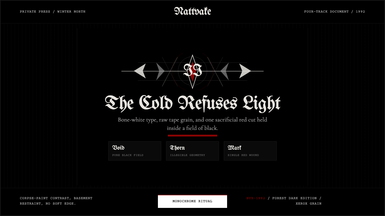 Norwegian Black Metal (1992)Ritual severity. Bone-white blackletter cuts through black grain with one blo…仪式般严酷。骨白哥特字切开黑色颗粒,只留一枚血红印记。
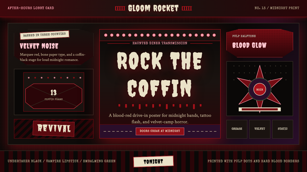 Gothabilly Horror RevivalHaunted swagger. Blood-red marquee type, coffin frames, and pulp halftone on…闹鬼的摇滚张扬:血红跑马灯字、棺材框与黑底半色调。
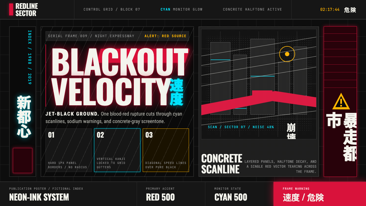 Akira (Otomo)Cyberpunk at impact. Kaneda red, cyan kanji, halftone concrete, and diagonal…冲击式赛博朋克:金田红、青色汉字、混凝土网点与斜向速度线。
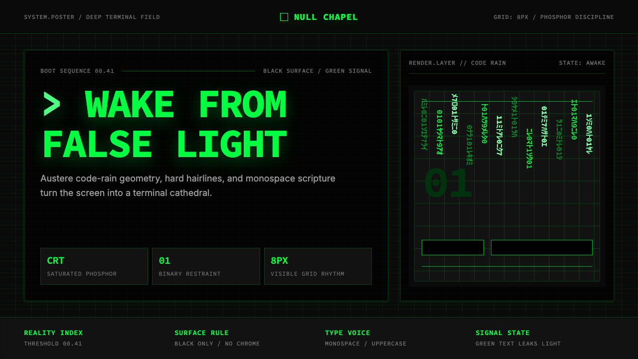 The Matrix (Green-Code)Terminal myth, disciplined. CRT green code rain, black grid, monospace script…终端神话,冷峻克制。CRT 绿代码雨、黑色网格与等宽字成形。
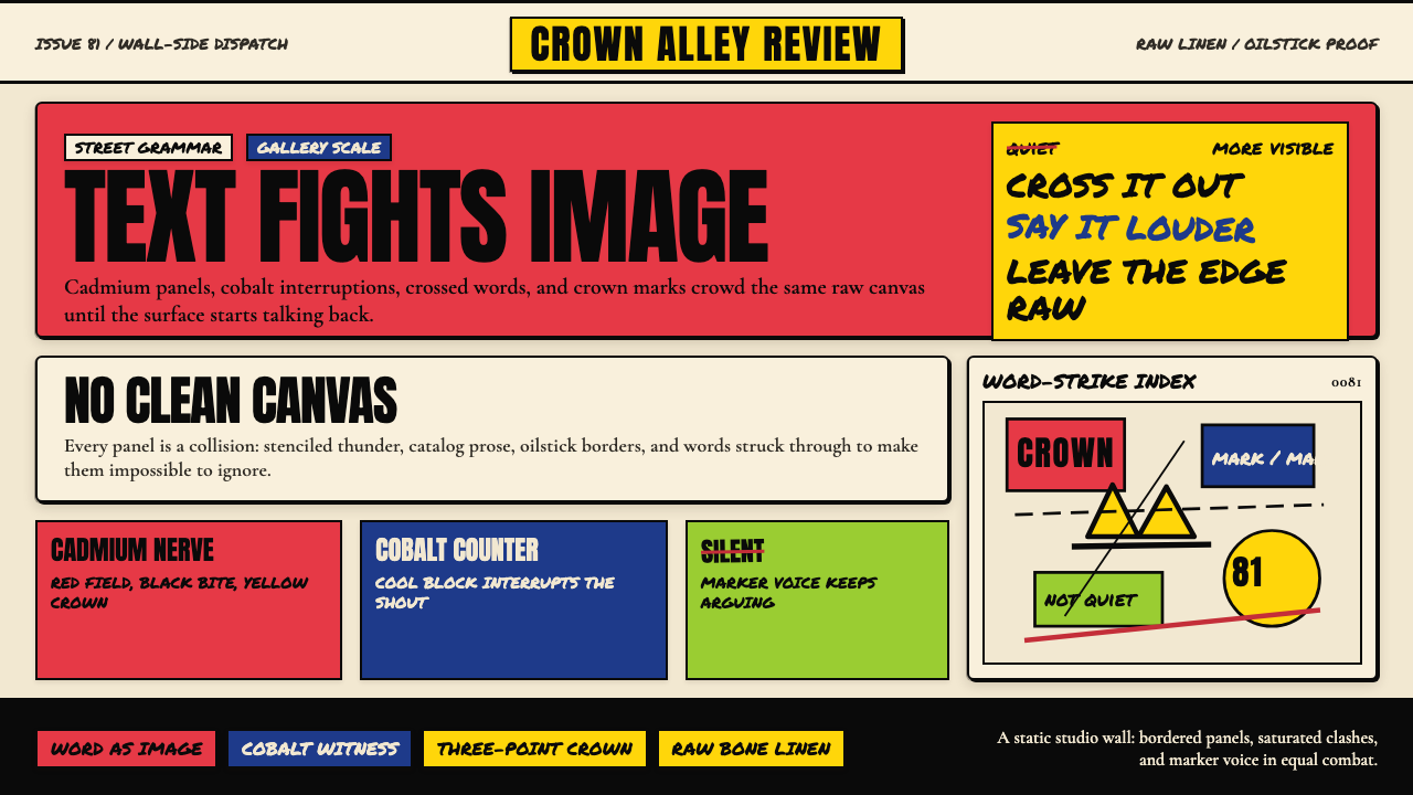 Basquiat Neo-ExpressionismExplodes off raw linen. Cadmium red, cobalt blue, Anton blocks, and struck ma…原生亚麻上爆裂:镉红、钴蓝、Anton 字块与划掉的手写字相撞。
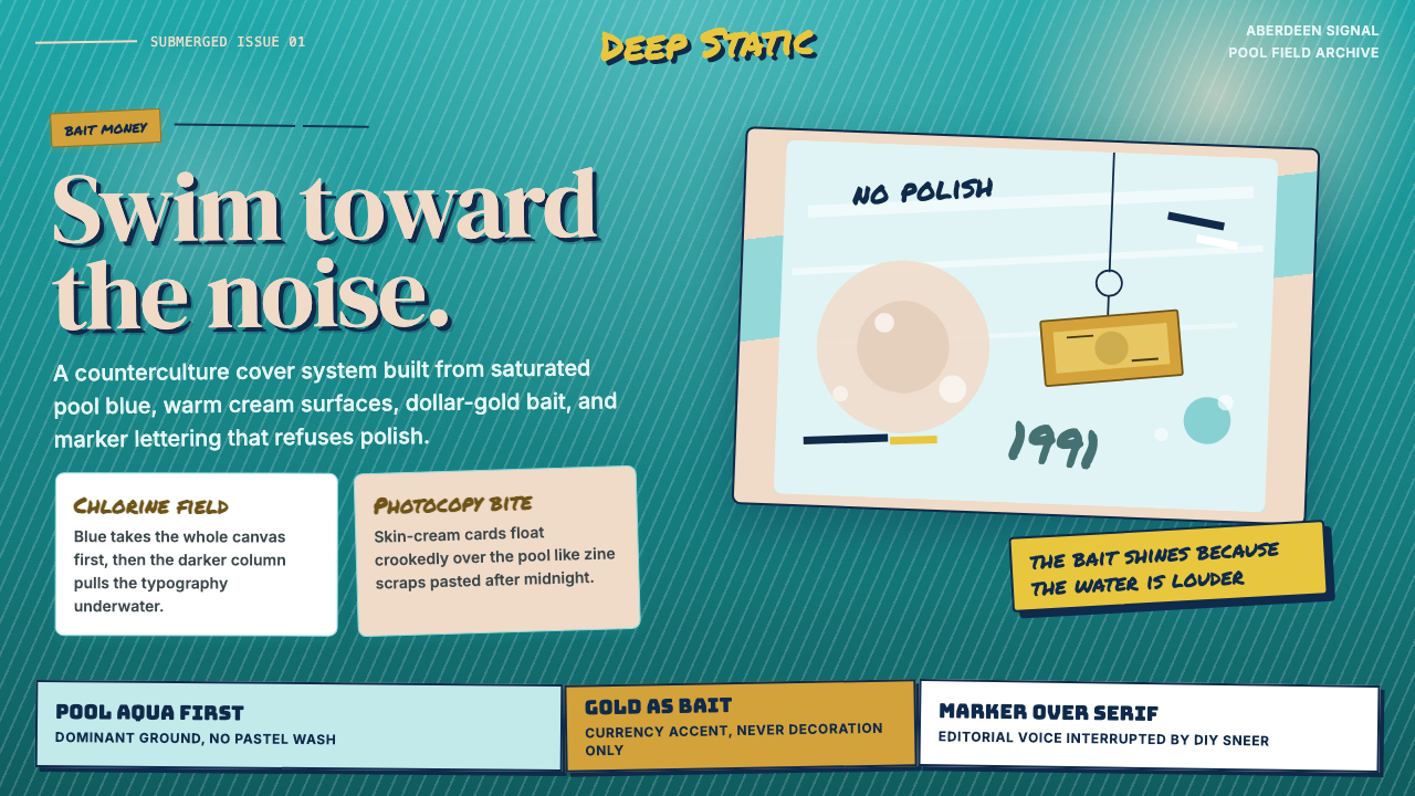 Nirvana — NevermindAnti-pop in pool blue. Cream cards, dollar-gold accents, and marker type roug…泳池蓝里的反主流:乳白卡片、美元金点缀与马克笔字打乱网格。