Design style guide设计风格指南
What is Norwegian Black Metal (1992)?什么是 Norwegian Black Metal (1992)?
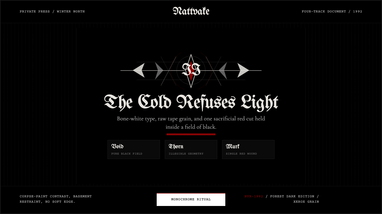
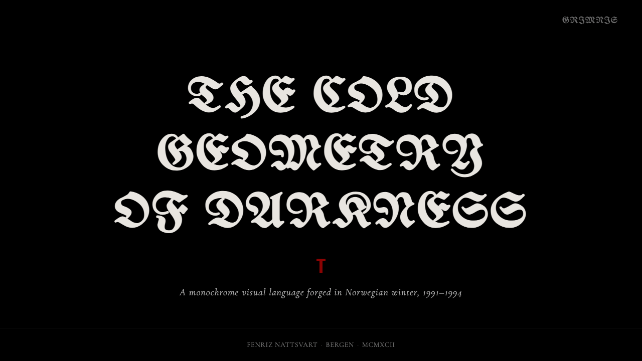
Norwegian Black Metal forged the most visually severe aesthetic in music history from corpse-paint, hand-drawn thorn logos, and an absolute commitment to black, bone-white, and a single drop of blood-red.挪威黑金属以尸妆、手绘荆棘 logo 和对黑色、骨白与一滴血红的绝对信仰,锻造出音乐史上视觉最极端的美学体系。
Norwegian Black Metal (1992) in briefNorwegian Black Metal (1992) 速览
Norwegian Black Metal (1992) is a design system distilled from the visual culture that erupted out of Oslo and Bergen in the early 1990s. A small circle of teenagers — armed with cassette recorders, photocopiers, and an almost ritualistic hatred of commercial gloss — produced album sleeves, fanzines, and merchandise that collectively defined a new grammar of severity: pure black backgrounds, bone-white typography, zero color except for a single sacrificial accent of deep red.挪威黑金属(1992)是一套从1990年代初奥斯陆与卑尔根爆发的视觉文化中提炼出来的设计系统。一小群少年——手持卡带录音机、复印机,以及对商业光鲜几近仪式性的憎恶——制作了唱片封套、地下杂志和周边商品,共同定义了一套新的严酷语法:纯黑底色、骨白字体、除了单一的祭祀血红之外零色彩。
The aesthetic is not minimalism in the contemporary sense. It does not pursue elegance or restraint for its own sake. It is instead an expression of negation — of everything soft, polished, or commercially palatable. Grain is embraced, not corrected. Edges are inked rather than smoothed. Typography pushes into deliberate illegibility, treating readability as a concession to the uninitiated. The result is a visual language that communicates exclusion and ritual intensity before a single word is deciphered.这种美学并非当代意义上的极简主义。它并不以优雅或克制为目的。它是一种否定的表达——否定一切柔软、精致或在商业上令人愉悦的东西。颗粒感被拥抱而非修正,边缘被墨水描摹而非抹平。字体被推向刻意的难以辨认,把易读性视为对外行人的妥协。结果是一套在破解任何文字之前就已传达排外感与仪式强度的视觉语言。
What makes this system usable beyond its original subcultural context is its underlying structural clarity. Beneath the grain and the blackletter extremity lies a remarkably disciplined palette: three values (near-black, bone-white, blood-red) and two typographic registers (ornate display and restrained body). When those constraints are applied with precision, the system generates compositions of extraordinary visual force — confrontational, memorable, and deeply resistant to the generic.让这套系统在其原始亚文化语境之外依然可用的,是它底层结构上的清晰度。在颗粒感与哥特字体的极端之下,隐藏着一套极为严格的色彩规范:三个色值(近黑、骨白、血红)和两个字体档位(华丽展示与克制正文)。当这些约束被精确运用时,这套系统会生成具有非凡视觉冲击力的构图——对抗性的、令人难忘的,以及对平庸有着深刻抵抗力的。
See the Norwegian Black Metal (1992) design system →查看 Norwegian Black Metal (1992) 完整设计系统 →
Where does Norwegian Black Metal (1992) come from?Norwegian Black Metal (1992) 从何而来?
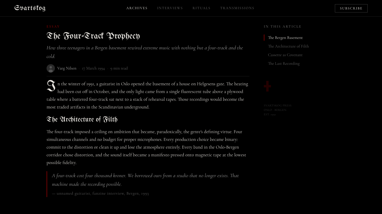
The visual culture of Norwegian Black Metal crystallized between 1991 and 1994, when a loose network of musicians centered on Oslo's Helvete record shop — owned by Euronymous (Øystein Aarseth) of Mayhem — began producing self-released cassettes and albums whose artwork was as ideologically charged as the music. The scene was self-consciously anti-commercial: professional design tools were rejected in favor of hand-drawn layouts, photocopied zines, and typesetting techniques borrowed from hardcore punk but pushed to new extremes. The black-and-white forest photography that became synonymous with the genre was shot in Norwegian winters, often by the musicians themselves, using consumer cameras and harsh available light.挪威黑金属的视觉文化在1991至1994年间结晶成形。以奥斯陆 Helvete 唱片店为中心——店主正是 Mayhem 的 Euronymous(Øystein Aarseth)——这个松散的音乐人网络开始发行自制卡带和专辑,其封面艺术与音乐本身一样具有意识形态烈度。这个场景是有意识地反商业的:职业设计工具被手绘排版、复印地下杂志和从硬核朋克借来却被推向新极端的印刷技法所取代。成为这个流派标志的黑白森林摄影,往往由乐手本人在挪威冬季用消费级相机和刺眼的自然光拍摄。
The blackletter typography that defines the style has roots stretching back centuries, but its specific form in Norwegian Black Metal was largely shaped by hand-drawn logo design. Christophe Szpajdel, known as the Lord of Logos, became the scene's most prolific lettering artist — producing hundreds of spike-and-thorn wordmarks for bands across Europe. His designs deliberately subverted readability, interweaving letterforms with thorns, branches, and inverted crosses until the text became close to pure visual texture. This anti-legibility was a statement: these records were not made for everyone, and the artwork made that rejection visible.定义这种风格的哥特字体拥有数百年的历史根源,但在挪威黑金属中的具体形态,很大程度上是由手绘 logo 设计所塑造的。被称为「Logo 领主」的 Christophe Szpajdel 成为该场景最高产的字母艺术家——他为欧洲各地乐队绘制了数以百计的尖刺荆棘文字标志。他的设计刻意颠覆易读性,将字母形态与荆棘、枝条和倒十字交织缠绕,直至文字接近纯粹的视觉肌理。这种反可读性是一种声明:这些唱片不是为所有人而做的,封面艺术让这种拒绝显而易见。
The genre's stark monochromatism was partly practical — self-released recordings with no label budget had to be produced cheaply, and two-color or single-color printing was the economic reality — and partly ideological. Color, particularly the warm and saturated palette of commercial heavy metal artwork, was associated with entertainment, with accessibility, with selling out. Black and white were the colors of negation, of winter, of the ancient and the raw. The single red accent, when it appeared, carried maximum symbolic weight precisely because it was the only chromatic note in an otherwise achromatic system.这个流派极端的单色主义一半出于实际考量——没有厂牌预算的自发行录音只能低成本生产,双色或单色印刷是经济现实——一半出于意识形态。色彩,尤其是商业重金属封面艺术的那种温暖饱和的色调,被视为娱乐性、亲民性和商业妥协的象征。黑与白是否定之色、冬之色、古老与粗粝之色。单一的红色点缀一旦出现,就承载着最大的象征重量——恰恰因为它是一套原本无彩系统中唯一的有彩音符。
Key albums from the period — Darkthrone's Transilvanian Hunger (1994), Burzum's Filosofem (1996), Emperor's In the Nightside Eclipse (1994) — established visual templates that the scene would return to for decades. Darkthrone's work in particular, photographed by the band themselves in stark Norwegian landscapes, exemplified the deliberate rejection of production value. The grain, the bleached-out contrast, the absence of any studio-polished element — these were not limitations but choices, and they gave the work an authenticity that more technically accomplished imagery could not replicate.这一时期的关键专辑——Darkthrone 的《Transilvanian Hunger》(1994年)、Burzum 的《Filosofem》(1996年)、Emperor 的《In the Nightside Eclipse》(1994年)——确立了该场景此后数十年不断回归的视觉模板。Darkthrone 的作品尤为典型:由乐队成员自行在挪威萧瑟的风景中拍摄,是对制作价值的蓄意拒绝的范本。颗粒感、高曝光对比度、任何录音室精修痕迹的缺席——这些都不是局限,而是选择。正是这些选择,赋予了作品一种技术上更精良的图像所无法复制的真实感。
What defines the Norwegian Black Metal (1992) look?Norwegian Black Metal (1992) 的视觉特征是什么?
Palette色板
The color system operates on absolute restriction: a field of near-black (not quite pure black, but black that carries the texture of darkness), bone-white for primary text and key graphic elements, and a single deep blood-red deployed as the sole chromatic accent. Secondary colors do not exist within the system. The red appears rarely and precisely — a band name, a border fragment, a single symbol — and its power derives entirely from that scarcity. Any expansion of the palette toward additional hues dilutes the system's ritual severity.色彩系统建立在绝对限制之上:一片近黑的底色(不是纯粹的黑,而是带有黑暗质感的黑),骨白用于主要文字与关键图形元素,以及单一的深血红作为唯一的有彩点缀。系统内不存在辅助色。红色出现得稀少而精准——一个乐队名、一段边框碎片、一个单一符号——其力量完全来自这种稀缺性。任何向更多色相的扩展都会稀释这套系统的仪式严酷感。
Typography字体排印
The typographic system operates in two opposing registers. Display type is drawn from ornate blackletter traditions — dense, spike-laden, sometimes approaching pure abstraction — and is used for titles, band names, and major headings where visual impact matters more than immediate legibility. Body text retreats to a restrained, classically proportioned serif, creating a sharp contrast between the decorative excess of the headline register and the deliberate plainness of the reading register. The tension between these two poles is essential to the system's character.字体排印系统在两个对立档位之间运作。展示字体取自华丽的哥特字母传统——密集、布满尖刺、有时接近纯粹的抽象——用于标题、乐队名称和视觉冲击力优先于即时易读性的大标题。正文字体则退回到克制的、比例古典的衬线体,在标题档位的装饰过剩与阅读档位的刻意朴素之间制造出鲜明对比。这两极之间的张力是这套系统性格的核心。
Grain and Texture颗粒与质感
Surface texture is not an accident but a structural element. High-contrast photographic grain, the artifacts of cassette-to-cassette dubbing, and the bleed of photocopied ink are not corrected but amplified. Black areas are not flat — they carry the depth of over-exposed film or inked paper. White areas glow with the particular quality of bleached-out photography pushed to its tonal limit. This deliberate roughness is what separates authentic applications of the style from sanitized recreations, which tend to use smooth digital approximations of grain that carry none of the material weight.表面质感不是意外,而是结构性元素。高对比度的摄影颗粒、磁带对拷的噪声痕迹、复印墨水的渗透——这些都不被修正,而是被放大。黑色区域不是平滑的——它们带有过曝胶片或墨水纸张的深度。白色区域以被推至色调极限的漂白摄影所特有的方式发光。这种刻意的粗粝感,正是这种风格的真实应用与经过消毒的再现之间的分界线——后者倾向于使用平滑的数字颗粒近似,完全没有原本的材料重量。
Composition and Negative Space构图与负空间
Layouts favor stark, confrontational arrangements over balanced harmony. Central placement of primary elements — a figure against an empty black field, a logo centered with wide margins of darkness on all sides — is common, and gives compositions a monumental, almost heraldic quality. The negative space is not empty but active: the black field is atmospheric, pressing against elements rather than simply surrounding them. Asymmetric compositions, when they appear, use extreme weight imbalance — a single dense typographic block against a largely empty ground — rather than conventional design tension.版面偏向于鲜明对抗性的安排,而非均衡和谐。主体元素的居中放置很常见——一个人物立于空旷黑色底场,一个 logo 居中并四周留有大量黑暗边距——这赋予构图一种纪念碑式的、近乎纹章的品质。负空间不是空旷的,而是活跃的:黑色底场具有大气感,向元素施压,而非仅仅围绕它们。非对称构图出现时,采用极端的重量失衡——一个密集的字体块对抗大面积空旷底场——而非惯常意义上的设计张力。
Iconography and Symbol图像学与符号
The visual vocabulary draws from a narrow and consistent set of references: inverted crosses, runes of Scandinavian origin, thorn and branch motifs, animal skulls, winter forest silhouettes, and the ornamental conventions of medieval manuscript marginalia. These symbols are not deployed decoratively — they carry specific subcultural meanings, and their inclusion signals allegiance to a tradition that predates contemporary design. When adapting the style, the iconographic choices should be treated as structural commitments, not arbitrary ornament.视觉词汇从一套狭窄而一致的参照中汲取:倒置十字、斯堪的纳维亚源的符文、荆棘与枝条母题、动物骷髅、冬季森林剪影,以及中世纪手稿边饰的装饰惯例。这些符号不是装饰性地使用的——它们承载着特定的亚文化含义,其出现信号着对一个早于当代设计的传统的归属。在改编这种风格时,图像学选择应被视为结构性承诺,而非随意装饰。
Photography and Image Treatment摄影与图像处理
When photography is used, it is treated to reinforce the system's tonal extremity. Images are converted to near-monochrome, with shadows crushed toward pure black and highlights blown toward pure white. Mid-tones are compressed or eliminated. The effect is less a photograph and more a field of black with white forms emerging from darkness — trees in winter, a figure against a pale sky, a landscape bleached by overcast light. Color photography has no place in the system; even desaturated images should carry the particular quality of developed black-and-white film rather than digital grayscale conversion.使用摄影时,处理方式是强化系统的色调极端性。图像被转换为近单色,阴影被压向纯黑,高光被推向纯白。中间调被压缩或消除。效果与其说是一张照片,不如说是一片黑色底场中浮现出的白色形态——冬季的树木、一个人物立于苍白天空之下、一片被阴霾漂白的风景。彩色摄影在这套系统中没有位置;即使是去饱和的图像,也应当带有冲洗黑白胶片的特有质感,而非数字灰阶转换的效果。
Anti-polish as Principle以反精致为原则
The most important characteristic of the system is what it deliberately refuses. Smooth gradients, soft shadows, rounded corners, any element that suggests digital refinement or corporate professionalism — these are treated not as neutral choices but as ideological betrayals of the aesthetic's core. The system communicates authenticity through material rawness. This does not mean technical incompetence; it means that every roughness is intentional, that every imperfection has been kept rather than corrected. The discipline required to achieve convincing rawness is as demanding as the discipline required to achieve conventional polish.这套系统最重要的特征,是它刻意拒绝的东西。平滑渐变、柔和阴影、圆角,以及任何暗示数字精修或企业专业主义的元素——这些不被视为中性选择,而是对美学核心的意识形态背叛。这套系统通过材料上的粗粝传达真实性。这不意味着技术上的不称职;它意味着每一处粗糙都是有意为之,每一个缺陷都是被保留而非被修正的。要实现令人信服的粗粝感,所需要的自律与实现惯常精致感所需要的自律同样严苛。
See the Norwegian Black Metal (1992) design system →查看 Norwegian Black Metal (1992) 完整设计系统 →
Who shaped Norwegian Black Metal (1992)?谁塑造了 Norwegian Black Metal (1992)?
Guitarist of Mayhem and founder of Helvete, Oslo's black metal record shop that served as the scene's ideological and social center from 1991 to 1993. Euronymous self-released key recordings, distributed underground tapes across Europe, and helped establish the visual codes — hand-drawn logos, stark black-and-white photography, the deliberate rejection of commercial presentation — that defined the genre's aesthetic. His murder by Varg Vikernes in 1993 ended his direct influence but crystallized the scene's mythology at the precise moment its visual language was fully formed.Mayhem 的吉他手与奥斯陆 Helvete 唱片店的创始人——后者是该场景在1991至1993年间的意识形态与社交中心。Euronymous 自发行了关键录音,在欧洲各地分发地下磁带,并帮助确立了定义这个流派美学的视觉规范——手绘 logo、鲜明的黑白摄影、对商业呈现的刻意拒绝。他于1993年被 Varg Vikernes 杀害,终结了他的直接影响,但在这套视觉语言完全成形的精确时刻,将这个场景的神话凝固了下来。
Drummer and visual creative director of Darkthrone, responsible for much of the band's artwork across their pivotal early albums including Transilvanian Hunger. Fenriz embraced deliberate technical primitivism — photographs shot in winter forests, layouts assembled with minimal equipment, a rejection of anything that suggested professional production. His approach formalized the aesthetic of intentional rawness that distinguishes Norwegian Black Metal from the more elaborate visual culture of earlier extreme metal scenes. He also operated as a tastemaker and archivist whose record collection and written commentary helped define the canon.Darkthrone 的鼓手与视觉创意总监,负责乐队包括《Transilvanian Hunger》在内的早期关键专辑的大量封面艺术。Fenriz 拥抱刻意的技术原始主义——在冬季森林中拍摄的照片、以最少设备拼接的排版、对任何暗示职业制作痕迹的东西的拒绝。他的方式将刻意粗粝感的美学正式化,使挪威黑金属区别于早期极端金属场景更为精致的视觉文化。他同时作为品味仲裁者和档案者存在,他的唱片收藏与书面评论帮助定义了这个流派的经典。
The sole member of Burzum, whose album artwork — particularly the hand-drawn cover of the self-titled debut and the bleak landscape photography of subsequent releases — contributed the most sustained exploration of the style's austere end. Vikernes's visual choices were deeply personal and anti-collaborative, treating the album cover as a private statement rather than a commercial artifact. The extreme spareness of Burzum's artwork, stripped of even the ornate logowork common elsewhere in the scene, represented the system's most reductive expression.Burzum 的唯一成员,其专辑封面——尤其是同名首张专辑的手绘封面,以及后续作品荒凉的风景摄影——贡献了对这种风格朴素极端的最持续探索。Vikernes 的视觉选择是高度个人化且反协作的,将专辑封面视为私人声明而非商业产物。Burzum 封面艺术的极端稀疏感——甚至剥去了该场景其他地方常见的华丽 logo 设计——代表了这套系统最具约简性的表达。
Belgian-born lettering artist known as the Lord of Logos, who became the primary craftsman of the scene's blackletter and spike-thorn logo tradition. Beginning in the early 1990s, Szpajdel produced hand-drawn wordmarks for hundreds of black metal and related extreme metal bands across Europe, developing a personal vocabulary of intertwined letterforms, natural motifs, and deliberate illegibility. His work is the single most studied and imitated aspect of the Norwegian Black Metal visual style, and his influence extends into contemporary logotype design, tattoo art, and brand identity work that engages with the style.比利时出生的字母艺术家,人称「Logo 领主」,是该场景哥特字体与尖刺荆棘 logo 传统的主要工匠。从1990年代初开始,Szpajdel 为欧洲数以百计的黑金属及相关极端金属乐队手绘文字标志,发展出一套包含交织字母形态、自然母题与刻意难读性的个人词汇。他的作品是挪威黑金属视觉风格中被研究和模仿最多的单一方面,他的影响延伸至当代标志字体设计、纹身艺术,以及涉及这种风格的品牌识别工作。
Primary creative force behind Emperor, whose albums — In the Nightside Eclipse in particular — developed the most compositionally elaborate visual language within the scene. Emperor's artwork incorporated classical landscape painting references, mythological illustration traditions, and a more overtly theatrical black-and-white aesthetic than the raw primitivism of Darkthrone or the isolationist sparseness of Burzum. Ihsahn's approach demonstrated that the Norwegian Black Metal visual system was capacious enough to accommodate range — from the near-abstract to the representational — while retaining its core identity.Emperor 背后的主要创作力量,其专辑——尤其是《In the Nightside Eclipse》——在该场景内发展出视觉构图最为精致复杂的语言。Emperor 的封面艺术融入了古典风景画参照、神话插图传统,以及比 Darkthrone 的原始主义或 Burzum 的孤立稀疏感更为明显戏剧性的黑白美学。Ihsahn 的方式证明,挪威黑金属视觉系统具有足够的包容性,能够容纳从近抽象到具象的范围——同时保留其核心身份认同。
How do you use Norwegian Black Metal (1992) today?今天怎么用 Norwegian Black Metal (1992)?
Applying Norwegian Black Metal (1992) to contemporary design work requires understanding that its power comes from constraint and commitment, not from surface decoration. The system produces its most effective results when every element — palette, typography, texture, imagery — is held to the same principles simultaneously. Partial application, where some elements follow the system and others do not, tends to produce incoherence rather than useful contrast.将挪威黑金属(1992)应用于当代设计工作,需要理解其力量来自约束与承诺,而非表面装饰。当每一个元素——色板、字体、质感、图像——都同时遵循相同原则时,这套系统产生最有效的结果。部分应用——某些元素遵循系统而其他不遵循——往往产生失调而非有用的对比。
For presentation slides, the style is most effective on cover pages and section dividers where impact takes precedence over information density. A cover built in this system uses the full black field as its primary surface, places a bone-white headline in a blackletter or heavy display typeface at center or slightly above center, and reserves the blood-red accent for a single subordinate element — a date, a tagline, a speaker name. Content slides should shift to a restrained mode: bone-white or near-white ground, black body text in a classical serif, and the blackletter display reserved only for section headers. Data visualizations within this system should treat chart elements as graphic forms — bars and lines rendered in bone-white against a dark ground, with the red accent marking the single most important data point rather than applied categorically.对于演示文稿,这种风格在冲击力优先于信息密度的封面页和章节分割页上最为有效。在这套系统中构建的封面将整个黑色底场作为主要表面,将骨白标题以哥特或粗重展示字体置于中央或略高于中央的位置,并将血红点缀保留给单一的次要元素——一个日期、一句标语、一个演讲者名字。内容页应切换到克制模式:骨白或接近白色的底色、古典衬线体的黑色正文,哥特展示字体仅保留用于节标题。在这套系统内的数据可视化应将图表元素视为图形形态——柱条与线条在深色底场中以骨白呈现,血红点缀标记单一最重要的数据点,而非按类别批量应用。
For web interfaces and product design, the style lends itself most naturally to contexts where authority, exclusivity, or cultural specificity are core brand values — independent music platforms, limited-edition product releases, event identities, or editorial platforms positioned as curated and selective rather than broadly accessible. Dashboard applications can use the dark-ground variant effectively when the product's content warrants a monumental visual register. Pricing pages benefit from the style's inherent hierarchy: the high-value tier receives the blood-red accent, while lower tiers remain in the bone-white and black system. Navigation should be typographic and minimal — the system has no room for decorative iconography beyond the genre's established symbolic vocabulary.对于网页界面与产品设计,这种风格最自然地适合权威性、排他性或文化特异性是核心品牌价值的场景——独立音乐平台、限量版产品发布、活动视觉标识,或定位为精选与排他而非广泛可及的编辑平台。当产品内容需要纪念碑式的视觉基调时,仪表板应用可以有效使用深色底色变体。定价页面受益于这种风格固有的层级感:高价值档位获得血红点缀,而较低档位保持在骨白与黑色系统内。导航应当是字体性且极简的——这套系统没有装饰性图标的容纳空间,除了这个流派已有的象征词汇之外。
For editorial and marketing applications, the style performs well in contexts that require high visual memorability with limited color budget. A single-color or two-color print context is where the system operates at its most authentic: one ink color on a black or near-black stock, or black and white photography printed with maximum contrast. Digital marketing applications should respect the same economy — social assets work best when they commit to a full black field with one significant typographic element and one red accent, rather than attempting to pack multiple hierarchies into a single frame.对于编辑与营销应用,这种风格在需要以有限色彩预算实现高视觉记忆度的场景中表现出色。单色或双色印刷场景是这套系统运作最接近本真的地方:一种墨水颜色印在黑色或近黑色纸张上,或以最大对比度印刷的黑白摄影。数字营销应用应遵守同样的经济原则——社交素材最有效的方式是在整个黑色底场中放置一个重要的字体元素和一个红色点缀,而非试图在单一画面中塞入多个层级。
The most common mistake when applying this style is treating the grain and the blackletter typography as costumes rather than structural commitments. Designers who apply the surface textures without the underlying palette discipline — who introduce mid-tones, who use the red accent on multiple elements, who mix the blackletter display with rounded sans-serif body text, or who add a fourth color on the grounds that it is also dark — produce work that reads as pastiche rather than as a coherent system. The discipline is not in the aesthetics alone but in the refusals: no softness, no warmth, no additional chromatic notes, no smoothing of rough edges. Every concession made to palatability costs the system a measure of its force.应用这种风格时最常见的错误,是将颗粒感与哥特字体当作服装而非结构性承诺来对待。那些应用表面质感却不遵守底层色板纪律的设计师——引入中间调、在多个元素上使用红色点缀、将哥特展示字体与圆角无衬线正文混用、或以「也是深色」为由加入第四种颜色——所产生的作品读起来像是仿制品,而非连贯的系统。这种纪律不仅在于美学,更在于拒绝:不柔软、不温暖、不增加有彩音符、不抹平粗糙边缘。每一次向可口性的妥协,都使这套系统损失一分力量。
See the Norwegian Black Metal (1992) design system →查看 Norwegian Black Metal (1992) 完整设计系统 →
Norwegian Black Metal (1992) — FAQNorwegian Black Metal (1992) · 常见问题
How is this style different from general gothic or dark design?这种风格与一般哥特或暗黑设计有何不同?
General gothic design and broadly dark aesthetics typically allow themselves a wider color range — deep purples, forest greens, warm ambers — and often incorporate soft shadows, atmospheric gradients, and decorative flourishes drawn from Victorian or Romantic sources. Norwegian Black Metal is more radical in its restraint: near-black, bone-white, one red, no gradients, no softness, no decorative warmth. It is not darkness for atmosphere; it is darkness as ideological position. The grain is material rather than stylistic. The illegibility of the typography is a statement rather than an aesthetic preference. These distinctions matter practically: a design that introduces soft shadows or a deep purple accent is no longer operating within this system, even if it retains the black background.一般哥特设计与宽泛的暗黑美学通常允许更宽的色彩范围——深紫、森林绿、暖琥珀色——并经常融入柔和阴影、氛围渐变,以及取自维多利亚或浪漫主义来源的装饰花纹。挪威黑金属在克制上更为激进:近黑、骨白、一点红,无渐变、无柔软、无装饰温度。它不是用于氛围的黑暗;它是作为意识形态立场的黑暗。颗粒感是材料性的,而非风格性的。字体的难读性是声明,而非美学偏好。这些区别在实践中至关重要:一个引入柔和阴影或深紫点缀的设计,即使保留了黑色背景,也不再在这套系统内运作。
Can this style work for mainstream commercial clients?这种风格能用于主流商业客户吗?
It can, but the use cases are specific. The style works where the client's brand values include exclusivity, subcultural credibility, or deliberate difficulty — limited-edition product releases, collector-market communications, festival and event identities, independent publishing, and any brand that positions itself as not for everyone. It fails in contexts that require warmth, accessibility, or broad appeal. A financial services firm, a healthcare brand, a food company, or any brand built on trust and approachability will find that the system's severity reads as alienating. The style's power is inseparable from its unwillingness to accommodate — applied to a context that needs accommodation, it produces antagonism rather than authority.可以,但使用场景很具体。这种风格适用于客户品牌价值包含排他性、亚文化公信力或刻意难度的地方——限量版产品发布、收藏市场传播、节日与活动视觉标识、独立出版,以及任何将自身定位为「不是为所有人而设」的品牌。它在需要温暖感、亲民性或广泛吸引力的场景中失败。金融服务公司、医疗品牌、食品公司,或任何以信任与亲近感为基础的品牌,都会发现这套系统的严酷感被读解为疏离。这种风格的力量与它不愿意妥协密不可分——当被应用于需要妥协的场景时,它产生的是对抗而非权威。
Is the deliberate illegibility of the typography a problem for digital applications?字体排印刻意的难读性在数字应用中会是问题吗?
For display use — large headers, cover text, titles — the illegibility is a feature rather than a bug, and digital applications handle it no differently than print. The tension between ornate display and legible body is the same whether the medium is a screen or a page. The practical challenge arises at smaller scales and on low-resolution outputs, where intricate blackletter forms can become genuinely unreadable. The solution is not to simplify the blackletter — that defeats the purpose — but to apply it only at scales where its details are visible, and to ensure that any essential information it carries is reinforced by secondary legible text. The ornate headline communicates atmosphere; the legible subhead communicates content.对于展示用途——大标题、封面文字、标题——难读性是特性而非缺陷,数字应用对它的处理方式与印刷品没有不同。华丽展示与清晰正文之间的张力,无论媒介是屏幕还是纸张都是相同的。实际挑战出现在较小尺寸和低分辨率输出时,复杂的哥特字体形态在那里可能变得真正无法辨认。解决方案不是简化哥特字体——那会违背目的——而是仅在其细节可见的尺寸上应用它,并确保它承载的任何关键信息都由次要的清晰文字加以强化。华丽标题传达氛围;清晰副标题传达内容。
How should imagery be sourced or created for this style?应该如何为这种风格选取或创作图像?
The most authentic imagery for this system is high-contrast black-and-white photography of natural subjects — bare trees, winter landscapes, overcast skies, rock formations — processed to eliminate mid-tones and push shadows toward absolute black. Stock photography can be used if it is treated aggressively: desaturated, contrast-boosted, and grain-added until the digital origin is no longer evident. Illustration, if used, should draw from the genre's existing visual vocabulary — the spike-and-thorn ornamental tradition, the skeletal and runic iconography — rather than from unrelated decorative styles. Photorealistic color illustration, soft digital painting, and vector-clean imagery have no place in the system. The rougher and more material the image source, the more convincingly it integrates.这套系统最真实的图像是自然主题的高对比度黑白摄影——光秃的树木、冬季风景、阴霾的天空、岩石地形——经过处理以消除中间调,将阴影推向绝对的黑。图库摄影可以使用,前提是进行激进的处理:去饱和、增强对比度、加入颗粒,直至数字来源不再明显。插图如果使用,应从这个流派现有的视觉词汇中汲取——尖刺荆棘的装饰传统、骷髅与符文的图像学——而非来自无关的装饰风格。照片写实彩色插图、柔和数字绘画和矢量线条清晰的图像在这套系统中没有位置。图像来源越粗糙、越具材料感,整合起来就越令人信服。
What is the difference between using one red accent versus two or three?使用一个红色点缀与使用两个或三个,有什么区别?
The difference is fundamental, not gradual. The entire logic of the blood-red accent rests on its singularity: it is the only chromatic element in an achromatic system, and its visual force comes from that uniqueness. When a second red element is introduced — a second headline, a second border, a second icon — the accent becomes a color rather than an event. The composition loses its focal point; the eye has nowhere to land with finality. A third red element completes the transition from ritual severity to simply a dark color scheme with red in it. The practical rule is one red element per composition, and ideally one red element per entire visual identity — the same mark, the same use, repeated consistently — rather than red applied to any element that needs emphasis.区别是根本性的,而非渐进的。血红点缀的全部逻辑建立在其单一性之上:它是一套无彩系统中唯一的有彩元素,其视觉力量来自这种唯一性。当第二个红色元素被引入——第二个标题、第二条边框、第二个图标——这个点缀就变成了一种颜色,而非一个事件。构图失去了焦点;眼睛没有最终落脚的地方。第三个红色元素完成了从仪式严酷感到仅仅是带有红色的深色配色方案的转变。实际规则是每个构图一个红色元素,理想情况下是整个视觉识别中只有一个红色元素——同一个标记、同一种用法、一致重复——而非将红色应用于任何需要强调的元素。
Related design styles相关设计风格
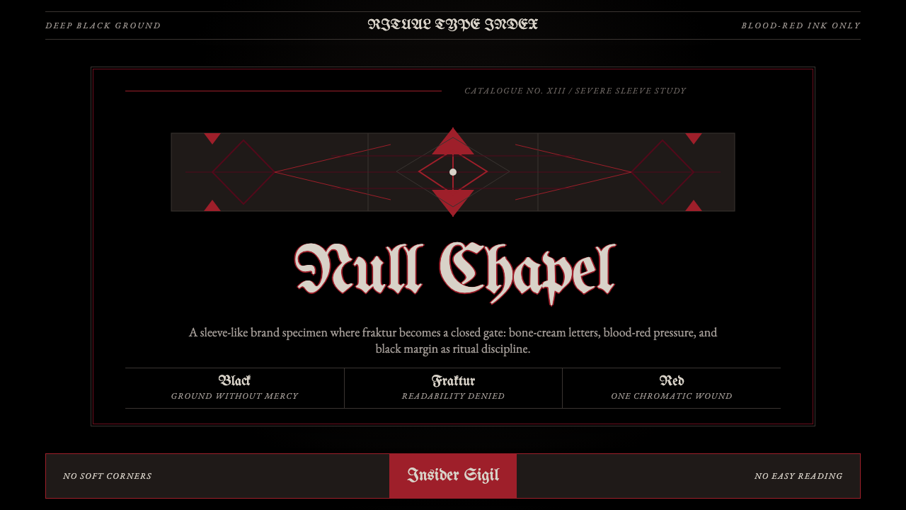 Death Metal BlackletterUnreadable by design. Bone fraktur on black, cut by one blood-red geometric s…以难读划界:黑底骨色哥特字,被一道血红几何符印切开。
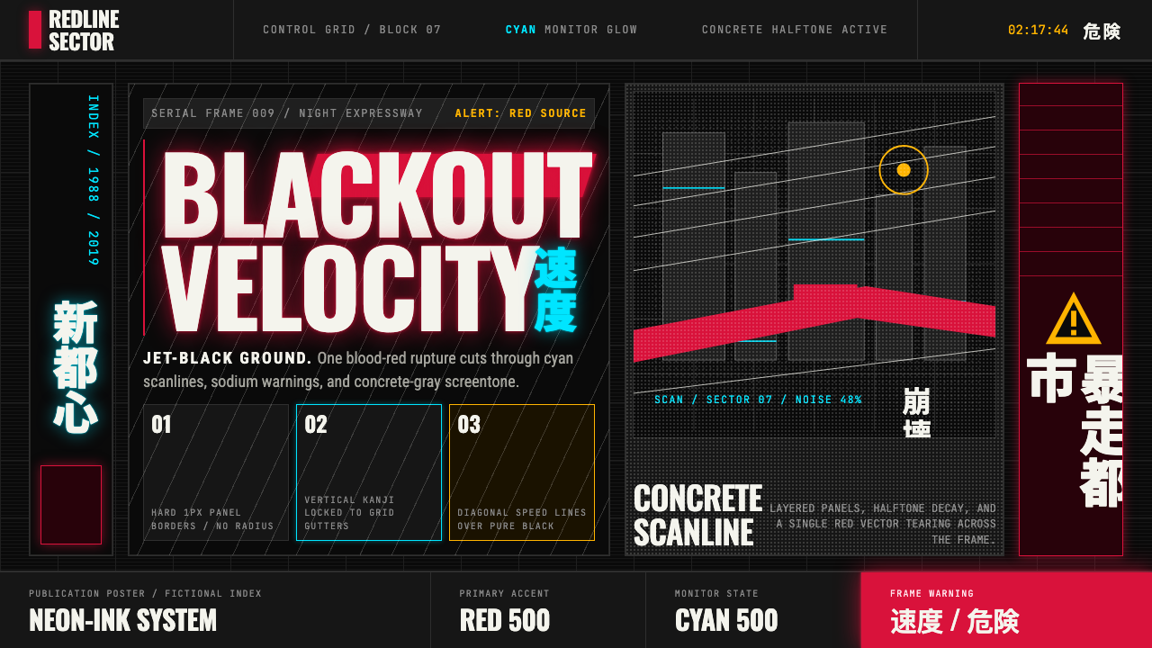 Akira (Otomo)Cyberpunk at impact. Kaneda red, cyan kanji, halftone concrete, and diagonal…冲击式赛博朋克:金田红、青色汉字、混凝土网点与斜向速度线。
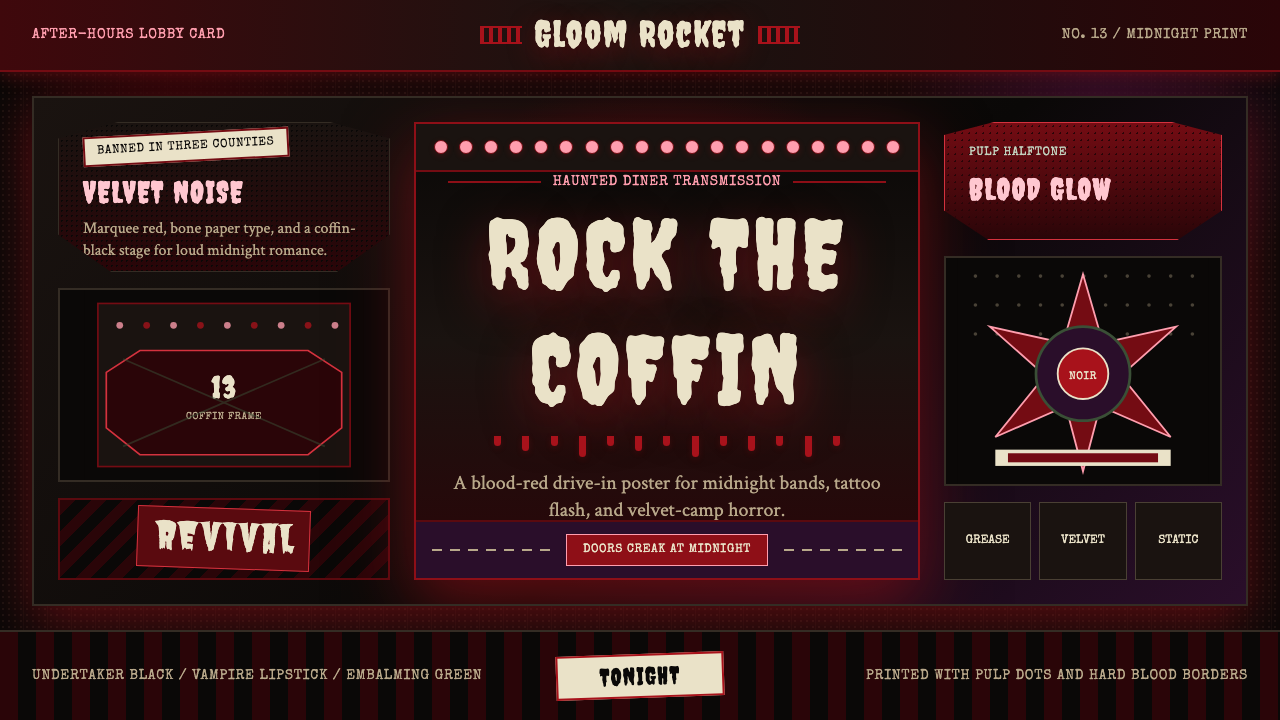 Gothabilly Horror RevivalHaunted swagger. Blood-red marquee type, coffin frames, and pulp halftone on…闹鬼的摇滚张扬:血红跑马灯字、棺材框与黑底半色调。
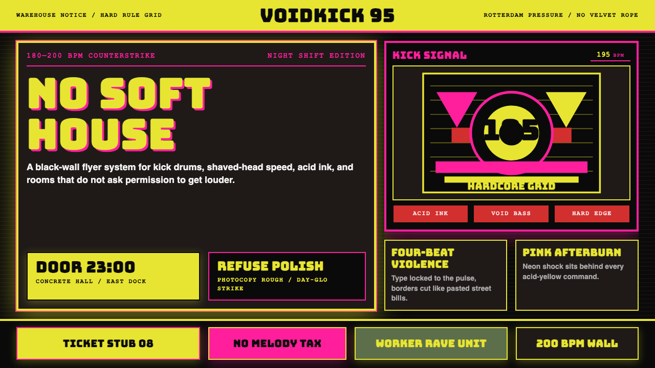 Rotterdam Gabber HardcoreHardcore refuses polish. Acid yellow, neon pink, black grid, and brutal Bunge…硬核拒绝精致:酸黄、霓虹粉与黑色网格,让粗暴 Bungee 字体像传单砸来。
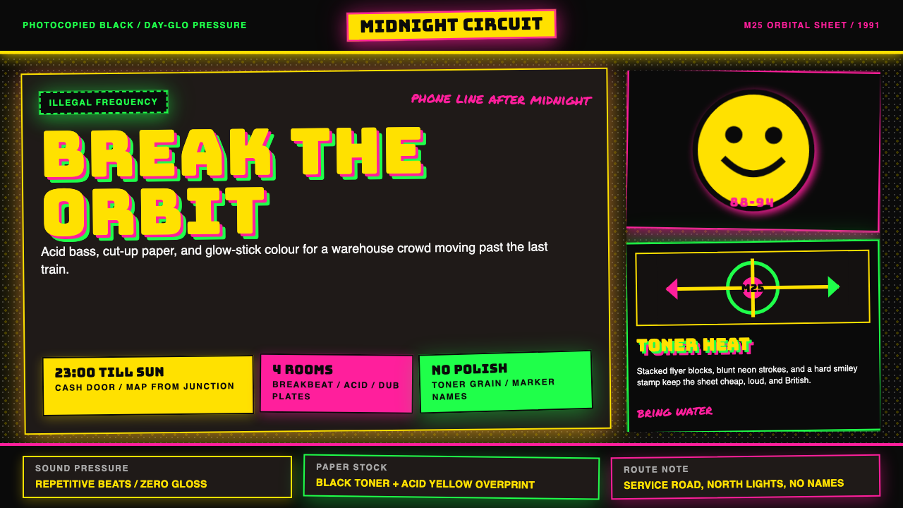 UK Rave Glow-Stick FlyerIllicit euphoria. Acid yellow, rave pink, and laser green slam into photocopi…非法狂喜。荧光黄、粉、绿撞上复印黑。
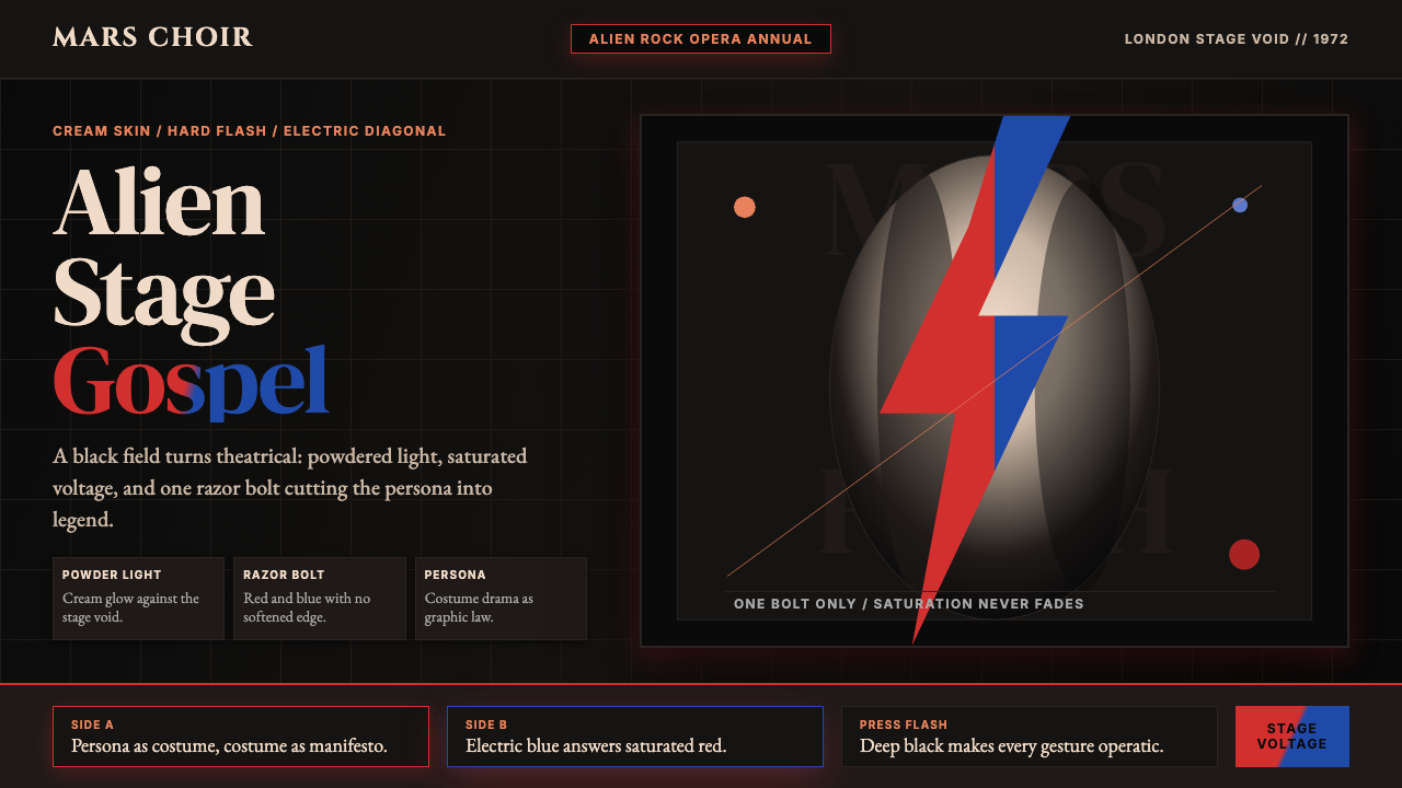 Bowie — Ziggy StardustTheater at full voltage. Cream-on-black portrait cut by one red and electric-…满电压的剧场感:黑底奶油肖像,被红与电蓝闪电劈开。