What is Akira (Otomo)?什么是 Akira (Otomo)?
Katsuhiro Otomo's Akira set the visual grammar of cyberpunk Japan: jet-black night skies, a single blood-red accent, obsessive hand-inked detail, and diagonal motion lines that make still images feel like they are already moving.大友克洋的《AKIRA》奠定了赛博朋克日本的视觉语法:纯黑夜空、唯一的血红强调色、着魔般的手工勾线,以及让静止画面仿佛已在移动的斜向速度线。
Akira (Otomo) in briefAkira (Otomo) 速览
Akira (Otomo) is the design language derived from Katsuhiro Otomo's landmark manga serial (1982–1990) and its 1988 animated film — a visual system built on extreme tonal contrast, dense architectural cross-hatching, and a deliberately constrained palette anchored by one blazing accent color against a near-total black field. It is the foundational visual grammar of cyberpunk Japan and the single most imitated aesthetic template the genre has produced.Akira(Otomo)是从大友克洋里程碑式的漫画连载(1982—1990年)及其1988年动画电影中提炼出的设计语言——一套建立在极端明暗对比、密集建筑交叉线条与刻意克制的色板之上的视觉系统,以接近绝对黑的底面上一抹灼烈强调色为核心锚点。它是赛博朋克日本的基础视觉语法,也是这一流派迄今被模仿最多的美学模板。
The style operates on a principle of controlled overload: every surface is maximally detailed — concrete stippled with halftone dots, steel structures rendered with architectural precision, crowds drawn figure by figure — yet the composition never collapses into chaos because the black field acts as an absolute negative-space anchor. The eye always knows where to rest and where to move. Speed lines and motion blur are not decorations; they are structural devices that tell the reader's eye exactly how fast something is traveling and in which direction.这种风格运行在一种「受控过载」的原则上:每一个表面都被最大程度地细化——混凝土用半调网点点描,钢铁结构以建筑绘图般的精度勾勒,人群逐个人物描绘——然而构图从不坍塌成混乱,因为黑色底面充当着绝对的负空间锚定。眼睛始终知道在哪里停留、向哪里移动。速度线与动态模糊不是装饰,而是结构性装置,精确地告诉读者某物的移动速度与方向。
Unlike cyberpunk aesthetics that rely on neon saturation across the entire palette, Akira's color logic is almost monastic in its restraint. The base is black, the ground is gray concrete, and only a single color — the red of Kaneda's motorcycle — is allowed to operate at full intensity. Secondary accents, cyan and amber, are used sparingly as light-source signals rather than compositional color. The result is a style that reads as simultaneously overwhelming in detail and precise in hierarchy.不同于依靠整体调色板霓虹饱和度的赛博朋克美学,《AKIRA》的色彩逻辑几乎带有修道院式的克制。基底是黑色,背景是灰色混凝土,只有一种颜色——金田的摩托车的红——被允许以完全强度运作。次要强调色青色与琥珀色,被节制地用作光源信号,而非构图色彩。结果是一种在细节上令人窒息、在层级上却极度精准的风格。
Where does Akira (Otomo) come from?Akira (Otomo) 从何而来?
Otomo began serializing Akira in Young Magazine (Kodansha) in December 1982, at a moment when Japan's postwar economic miracle had produced both extraordinary technological optimism and deep social anxiety about what that prosperity concealed. Neo-Tokyo — Otomo's fictional metropolis built on the ruins of a city destroyed by a psychic weapon in 1988 — is an architectural diagram of that contradiction: gleaming supertower corridors above, crumbling underpass slums below, all of it rendered with the obsessive documentary precision of an artist who had studied the actual infrastructure of Tokyo with an engineer's eye.大友克洋于1982年12月开始在讲谈社的《Young Magazine》上连载《AKIRA》,彼时日本战后经济奇迹既带来了非凡的技术乐观主义,也带来了对这种繁荣背后隐藏着什么的深重社会焦虑。新东京——大友笔下建立于1988年被精神武器摧毁的城市废墟之上的虚构大都市——是这种矛盾的建筑学图解:上方是闪亮的超级塔楼走廊,下方是破败的高架桥底贫民窟,所有这一切都以一个用工程师眼光深入研究过东京真实基础设施的艺术家所特有的、着魔般的纪实精确度加以描绘。
Otomo's visual approach was shaped by a specific lineage within postwar Japanese manga. He absorbed Osamu Tezuka's cinematic panel sequencing but rejected its rounded, expressive character design in favor of a harder, more Western-influenced realism. He studied European bande dessinée — especially the Franco-Belgian tradition of Moebius (Jean Giraud), whose clean-line architectural detail and vast, alienating cityscapes left a clear imprint on Neo-Tokyo's urban geometry. From American underground comix and the then-emerging cyberpunk fiction of writers like William Gibson, Otomo drew a sensibility of systemic failure: technology not as liberation but as infrastructure for oppression and eventual catastrophe.大友的视觉方法由战后日本漫画内部一条特定的传承脉络所塑造。他吸收了手塚治虫的电影式分格序列,但拒绝了其圆润、富有表情的人物设计,转而偏向更硬朗、更受西方影响的写实主义。他研习了欧洲漫画(bande dessinée)——尤其是法比传统中的墨比斯(让·吉罗),其清晰线条的建筑细节与广袤疏离的城市景观在新东京的城市几何中留下了清晰印记。从美国地下漫画,以及威廉·吉布森等作家的新兴赛博朋克小说中,大友汲取了一种系统性失败的感性:技术不是解放,而是压迫与最终灾难的基础设施。
The 1988 animated film — co-written and directed by Otomo himself, produced by TMS Entertainment with a then-unprecedented budget — translated the manga's black-and-white density into a hand-painted color system that has become equally canonical. The animation studio employed over a thousand individual paint colors and pioneered a technique of recording dialogue after animation was complete, allowing the mouth movements to be precisely synchronized with sound in a way rare for Japanese animation of the period. The film's score, composed by Geinoh Yamashirogumi using a blend of Balinese kecak chanting, orchestral percussion, and synthesizer drones, fused the visual system with a sonic one that is inseparable from the style's cultural identity.1988年的动画电影——由大友本人联合编剧并执导,TMS娱乐以当时史无前例的制作预算出品——将漫画的黑白密度转化为手绘上色的色彩系统,成就了同样具有经典地位的视觉语言。动画制作团队使用了超过一千种独立颜色,并开创性地在动画完成后才录制对白,使口型与声音的精确同步达到了日本动画当时罕有的水准。由芸能山城组创作的配乐,融合巴厘岛克差吟唱、管弦打击乐与合成器持续音,将视觉系统与一套声音系统熔为一体,使两者在风格的文化身份中密不可分。
The global impact of Akira on design, film, and visual culture was both immediate and enduring. Released in North America in 1989 and in Europe shortly after, the film introduced Western audiences to a conception of Japan that was neither the traditional aesthetic of ukiyo-e and Zen minimalism nor the cute commercial face of early Nintendo — but something dystopian, hyper-urban, and viscerally modern. The Akira visual system became the reference grammar for an entire generation of game designers, album cover artists, streetwear brands, and motion graphics studios. Films from The Matrix to Ghost in the Shell to Tron: Legacy absorbed its language of vertical city-stacking, monochromatic ground with single-color accent, and diagonal speed as a compositional verb.《AKIRA》对设计、电影与视觉文化的全球性影响既是即时的,也是持久的。影片于1989年在北美上映,随后登陆欧洲,向西方观众呈现了一种对日本的想象——既非浮世绘与禅宗极简主义的传统美学,也非早期任天堂的可爱商业面孔,而是某种反乌托邦的、超级都市的、从脏腑层面感受到的现代性。《AKIRA》视觉系统成为整整一代游戏设计师、专辑封面艺术家、街头服饰品牌和动态图形工作室的参照语法。从《黑客帝国》到《攻壳机动队》再到《创:战纪》,无数影片都吸收了它的语言:垂直叠加的城市,以单色调为底的单色强调,以及斜向速度作为构图动词的运用方式。
What defines the Akira (Otomo) look?Akira (Otomo) 的视觉特征是什么?
Absolute Black Field绝对黑色底面
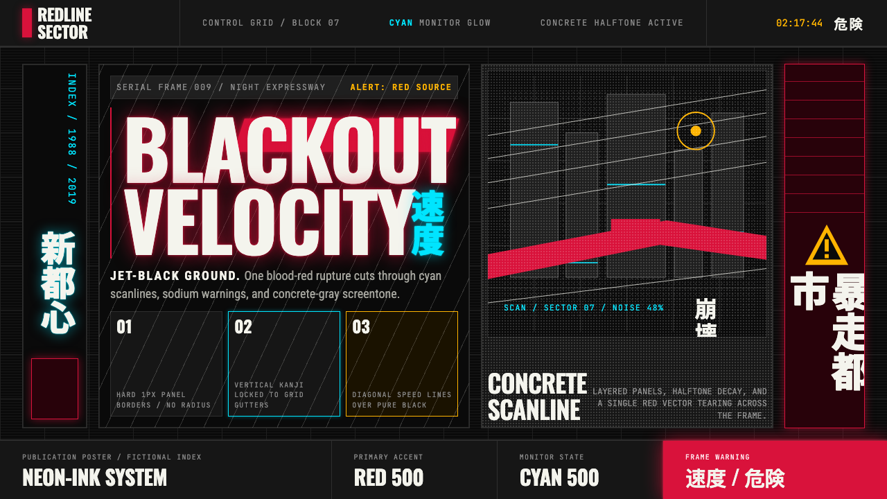
The background in Akira-derived work is not dark gray or navy — it is pure, consuming black, the visual equivalent of the void of outer space or the bottom of a tunnel at full speed. This absolute black functions as the compositional anchor for everything else: it makes moderate-intensity colors appear to glow, it makes white linework vibrate, and it collapses spatial depth into a flat, high-contrast plane. Intermediate values — twilight grays, atmospheric haze — are avoided precisely because they would soften the contrast that gives the style its impact.Akira衍生作品中的背景不是深灰或深蓝——而是纯粹的、吞噬一切的黑色,在视觉上等同于外太空的虚空或全速穿越隧道时所见的深渊。这种绝对黑色充当其他一切元素的构图锚点:它使中等强度的色彩看似在发光,使白色线条产生振动感,并将空间深度压缩为平面而高对比度的平面。中间调——黄昏灰、大气朦胧——被刻意回避,因为它们会软化赋予这种风格冲击力的对比。
Single Blazing Accent唯一灼烈强调色
Where most design systems distribute color across multiple elements, Akira concentrates all chromatic intensity into a single object or category — typically a warm, saturated red or a deep, chemical cyan — and lets everything else remain in the achromatic range. This is not a scarcity of color; it is a weaponization of it. The accent color commands absolute attention against the black ground, and because it appears only in one place, the eye treats it as structurally significant rather than decorative. Cyan appears as monitor glow and neon, amber as sodium-vapor streetlight — both used as light-source identifiers, not palette members.大多数设计系统将色彩分配给多个元素,而《AKIRA》则将全部色度强度集中于单一物体或类别——通常是温暖的高饱和红,或深沉的化学青——其他一切保持在消色差范围内。这不是色彩的匮乏,而是色彩的武器化。强调色在黑色底面上命令般地吸引全部注意力;因为它只出现在一处,眼睛将其视为结构性的而非装饰性的。青色以显示器光晕和霓虹的形式出现,琥珀色以钠灯路灯的形式出现——两者都用作光源识别符,而非调色板成员。
Dense Cross-Hatching and Halftone密集交叉线与半调网点
The tonal range between the absolute black ground and pure white highlights is built not through gradients but through mark-making: dense cross-hatched pen strokes that create a mid-tone concrete texture, and halftone dot patterns that simulate the mechanical reproduction process of print journalism. These marks are not hidden or smoothed — they are proudly visible as the evidence of hand labor. The cross-hatching on concrete walls, the stipple on asphalt, and the parallel hatching on metal surfaces all communicate material identity through accumulated marks rather than through color or rendered shading.绝对黑色底面与纯白高光之间的色调范围,不是通过渐变而是通过笔触构建的:密集的交叉钢笔线条创造出中间调的混凝土质感,半调网点图案模拟印刷新闻摄影的机械复制过程。这些笔触并不被隐藏或平滑处理——它们作为手工劳动的证据骄傲地可见。混凝土墙上的交叉线、沥青上的点描、金属表面上的平行排线,都通过积累的笔触而非色彩或渲染阴影来传达材料身份。
Diagonal Speed Architecture斜向速度建筑
Motion in the Akira visual system is rendered through diagonal lines that originate from or converge toward a single vanishing point, creating a powerful directional pull across the frame. These speed lines are not merely decorative convention borrowed from earlier manga traditions — they are compositional infrastructure that establishes both the direction and approximate velocity of every moving element. In still images derived from the style, the same diagonal logic appears as slanted text, raked composition, or asymmetrically angled layout divisions that make static surfaces feel kinetically charged.Akira视觉系统中的运动通过从单一消失点发散或向其汇聚的斜线来表现,在画面上制造出强烈的方向牵引力。这些速度线不仅仅是借自早期漫画传统的装饰惯例——它们是确定每个运动元素方向与大致速度的构图基础设施。在衍生自这一风格的静态图像中,同样的斜向逻辑以倾斜文字、倾斜构图或不对称角度的版面分割呈现,使静止的表面产生动能感。
Vertical Urban Stacking垂直城市叠加
Neo-Tokyo's architecture is defined by vertical accumulation: highways layered above each other, advertising towers stacked on rooftops, utility cables crossing at multiple heights, structures built on top of structures. In design applications, this stacking principle translates to compositional depth through overlapping planes at different scales — large background elements, mid-ground structural elements, and small foreground detail all occupying the same frame without a clear separation plane. The result is a sense of density and layered complexity that reads as a city-like system rather than a simple layout.新东京的建筑由垂直叠加所定义:公路一层层架设在彼此之上,广告塔楼堆叠于屋顶,公用线缆在多个高度交叉,结构建立在结构之上。在设计应用中,这种叠加原则转化为通过不同尺度的重叠平面所产生的构图深度——大型背景元素、中景结构元素与小型前景细节全部占据同一画面,没有清晰的分离平面。结果是一种密度感与分层复杂性,读起来像一个城市系统,而非一个简单的版面。
Condensed All-Caps Type and Kanji Fusion窄体大写字母与汉字融合
Text in the Akira visual system operates as a visual mass rather than a purely legibility vehicle. Latin lettering is condensed and set in all capitals, giving it a mechanical, stenciled quality reminiscent of military signage and industrial labeling. Japanese text — when present — appears as vertically set kanji and kana in a bold, brush-influenced weight that creates a strong geometric counter-rhythm against the Latin letterforms. The fusion of these two typographic traditions, each with distinct visual geometry, is part of what gives the style its specifically Japanese-cyberpunk cultural identity.Akira视觉系统中的文字作为视觉质量而非纯粹的可读性载体运作。拉丁字母被压缩并以全大写呈现,赋予其机械的、模板印刷般的质感,令人联想到军事标识与工业标牌。日文文字——若出现——以粗壮的、受毛笔影响的字重纵向排列的汉字和假名呈现,与拉丁字形产生强烈的几何对位节奏。这两种各具独特视觉几何形态的排印传统的融合,正是赋予这一风格其特定的日本赛博朋克文化身份的因素之一。
Controlled Catastrophe受控的灾难感
The Akira aesthetic does not depict a clean, aspirational future — it depicts a future that is spectacular and collapsing simultaneously. Structures show stress fractures, surfaces show weathering and decay, crowds are panicked, vehicles are at the edge of control. In design terms, this translates to a deliberate introduction of imperfection: textures that suggest age and use, compositional elements that appear off-balance or under extreme tension, and a general sensibility that the energy on display is barely contained. This quality distinguishes Akira-derived work from cleaner, more stable cyberpunk aesthetics and gives it its emotional charge.《AKIRA》美学所描绘的不是一个干净、充满憧憬的未来——而是一个壮观与崩塌同时发生的未来。结构显示出应力裂缝,表面显示出风化与腐朽,人群处于恐慌中,车辆处于控制的边缘。在设计语言上,这转化为对不完美的刻意引入:暗示年代与使用痕迹的质感,显得失衡或处于极度张力之下的构图元素,以及一种整体的感性——画面上展示的能量勉强被压制着。这种品质将Akira衍生作品与更干净、更稳定的赛博朋克美学区别开来,赋予了它的情感张力。
Who shaped Akira (Otomo)?谁塑造了 Akira (Otomo)?
Otomo began his career as a manga artist in the mid-1970s, developing his signature hyper-detailed architectural drawing style through early works including Domu (1980–1981), a psychic thriller set in a housing project whose dense, isometric apartment complex drawings are direct precursors to Neo-Tokyo. His decision to write and direct the Akira film himself — an unusual move for a manga artist — and to demand the unprecedented production resources required to animate the manga's level of detail, was the act that transformed the style from a print medium into a global visual language. After Akira, Otomo continued directing, most notably the anthology film Memories (1995) and Steamboy (2004), but no subsequent work matched Akira's cultural impact.大友克洋于1970年代中期开始漫画创作生涯,通过早期作品《童梦》(1980—1981年)发展出其标志性的超精细建筑绘画风格——这部设定于住宅小区的精神惊悚漫画,其密集的等距公寓楼绘图正是新东京的直接前身。他亲自编剧并执导《AKIRA》动画电影的决定——对漫画家而言是罕见之举——以及要求制作团队提供当时史无前例的资源以动画化漫画的细节水准,这一举动将这一风格从印刷媒介转化为全球视觉语言。《AKIRA》之后,大友克洋继续执导,最值得注意的是短片集《记忆》(1995年)和《蒸汽男孩》(2004年),但没有后续作品能匹敌《AKIRA》的文化影响力。
Kodansha's Young Magazine provided the institutional context and editorial latitude that allowed Akira to develop without the tonal restrictions that applied to manga aimed at younger audiences. Seinen manga — the category defined by Young Magazine's demographic — permitted graphic violence, moral ambiguity, and political themes that were essential to the Akira narrative and its visual register. Kodansha's subsequent international licensing strategy, which made the manga available in full-color translated editions in the West beginning in the late 1980s, was instrumental in exporting the visual system globally before the internet made such distribution self-organizing.讲谈社的《Young Magazine》提供了机构背景与编辑自由度,使《AKIRA》得以在没有面向低龄读者的漫画所受语调限制的情况下发展。青年漫画——《Young Magazine》人口统计学所定义的类别——允许呈现对《AKIRA》叙事及其视觉语境至关重要的暴力图像、道德模糊性与政治主题。讲谈社随后的国际授权策略——从1980年代末开始在西方推出全彩翻译版本——在互联网使此类传播自组织化之前,对于将这套视觉系统输出至全球起到了决定性作用。
This Japanese musical collective, led by composer Tsutomu Ohashi, created the Akira soundtrack using a compositional approach that mirrored the film's visual system: layered, dense, rooted in non-Western musical traditions (particularly Balinese kecak and gamelan, Tibetan Buddhist chanting, and Japanese gagaku court music), yet assembled through contemporary electronic processing. The score became inseparable from the visual identity of the film, and the sonic aesthetic it established — aggressive rhythmic complexity combined with otherworldly vocal texture — has influenced electronic music producers, game sound designers, and film composers continuously since 1988.这个由作曲家大桥力领导的日本音乐团体,使用一种与电影视觉系统相呼应的作曲方法创作了《AKIRA》原声带:层次丰富、密度极高、根植于非西方音乐传统(尤其是巴厘岛克差和甘美兰音乐、西藏佛教唱诵与日本雅乐宫廷音乐),却经由当代电子处理加以组装。原声带与电影的视觉身份变得密不可分,它所建立的声音美学——具有攻击性的节奏复杂性与异世界般的人声质感相结合——自1988年以来持续影响着电子音乐制作人、游戏音效设计师与电影作曲家。
Though not directly involved with Akira, the French bande dessinée artist Moebius is the most visible Western precursor to Otomo's visual approach. His work on the science fiction anthology Métal Hurlant (Heavy Metal) through the 1970s and early 1980s — vast cityscapes rendered with architectural drafting precision, clean linework against empty grounds, and a conception of the future as monumental and alienating rather than gleaming and aspirational — provided a structural template that Otomo acknowledged and that readers familiar with both bodies of work can trace directly in Neo-Tokyo's urban geometry and environmental design.尽管与《AKIRA》没有直接关联,法国漫画艺术家墨比斯(让·吉罗)是大友克洋视觉方法最显而易见的西方前驱。他在1970年代至1980年代初为科幻短篇集《金属狂啸》(Heavy Metal)所创作的作品——以建筑制图精度描绘的广袤城市景观,空白底面上的清晰线条,以及将未来理解为宏大而疏离而非闪亮而充满憧憬的概念——提供了一种大友克洋曾明确承认的结构模板,熟悉两位艺术家作品的读者可以在新东京的城市几何与环境设计中直接追溯这种影响。
The Tokyo Movie Shinsha studio (TMS Entertainment) produced the 1988 Akira film under conditions that were extraordinary for Japanese animation at the time: a production budget that dwarfed any previous animated feature, a team that at its peak employed hundreds of key animators, and a technical approach that prioritized fidelity to Otomo's source drawings over the production shortcuts that were standard in television animation. TMS's production decisions — including the unprecedented use of over a thousand distinct paint colors and the post-recording dialogue method — were engineering solutions to the problem of animating a visual system whose density and precision had been assumed to be unreproducible in motion.东京Movie新社(TMS娱乐)在当时日本动画领域极为罕见的条件下制作了1988年的《AKIRA》电影:制作预算远超此前任何动画长片,团队在高峰期雇用了数百名原画师,技术方法优先追求对大友克洋原稿的忠实度,而非电视动画中惯用的制作捷径。TMS的制作决策——包括史无前例地使用超过一千种不同颜料色彩,以及后期配音的对白录制方式——都是将一套原本被认为无法以动态形式复现的、密度与精确度兼具的视觉系统动画化的工程解决方案。
How do you use Akira (Otomo) today?今天怎么用 Akira (Otomo)?
Applying the Akira visual system well requires understanding its core structural logic before borrowing its surface markers. The style works because it establishes an extreme hierarchy — pure black as the absolute base, a single accent color as the sole point of chromatic intensity, white linework as the primary mark-making medium — and then loads maximum detail into the negative space that hierarchy creates. Importing the speed lines and the dark background without the disciplined color restraint produces clutter, not cyberpunk.要准确应用Akira视觉系统,需要在借用其表面标记之前理解其核心结构逻辑。这一风格之所以有效,是因为它建立了一种极端的层级关系——纯黑作为绝对基底,单一强调色作为唯一色度强度点,白色线条作为主要笔触媒介——然后将最大程度的细节装载进这种层级关系所创造的负空间中。在没有纪律性色彩克制的前提下引入速度线与深色背景,产生的是杂乱而非赛博朋克。
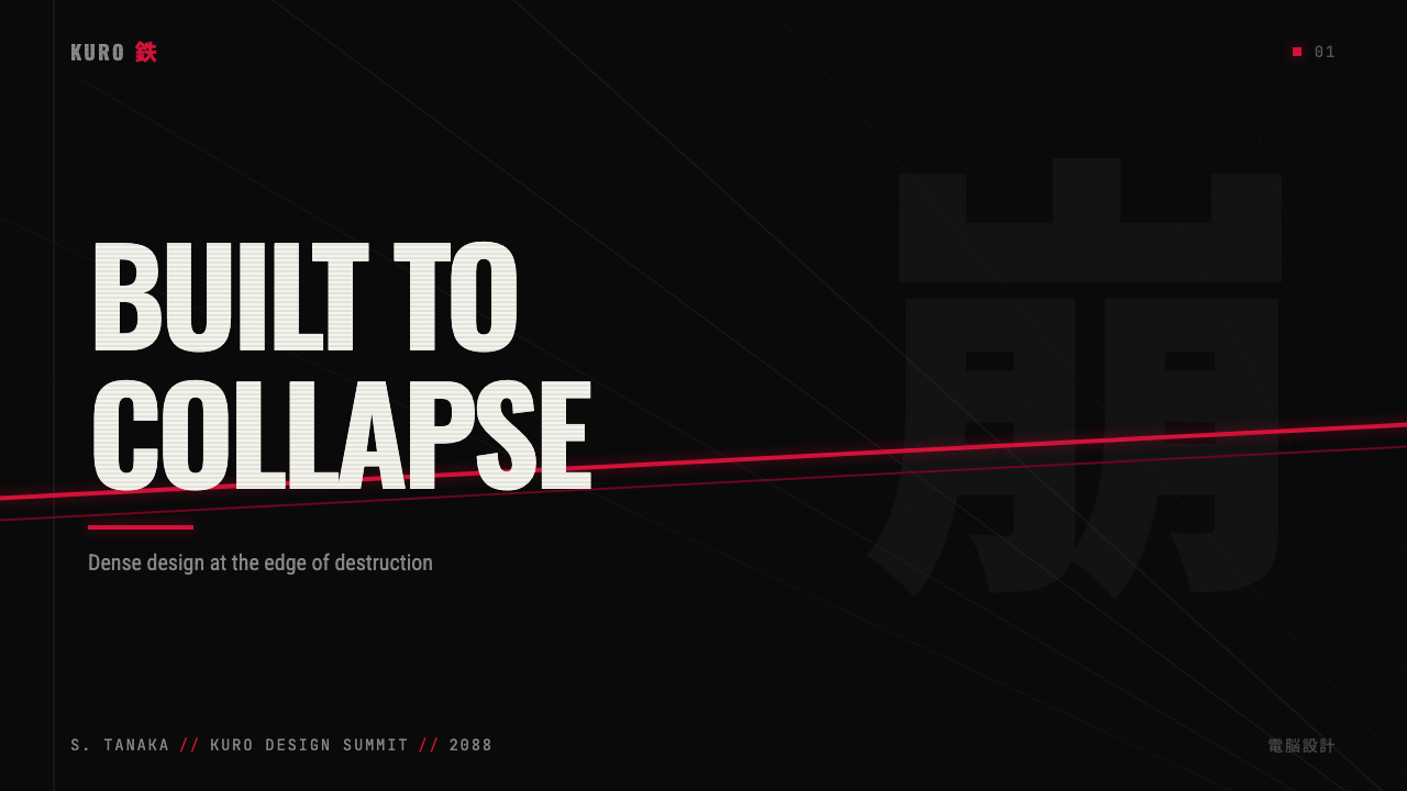
For presentation slides, Akira's visual system is best deployed on cover and section-break slides rather than on dense content pages. A cover using this aesthetic sets a full-bleed black field, places the title in compressed all-caps type, and positions a single graphic element — a diagonal speed-line composition, a partial mechanical form, or a fragmented architectural detail — in the accent color. Content slides should pull back significantly: a dark-but-not-black background, white body type on a dark field, and the accent color reserved exclusively for the one data point or call-out that demands attention. Data visualizations in this style work best when treated as technical diagrams — hard-edged bars and lines, no rounded corners, no gradient fills — with the primary accent color used only for the key metric.对于演示文稿,Akira视觉系统最好部署在封面和章节分隔页上,而非密集内容页上。使用这种美学的封面设置满版出血的黑色底面,以压缩全大写字体放置标题,并以强调色定位单一图形元素——斜向速度线构图、局部机械形态或碎片化建筑细节。内容页应大幅收敛:深色但非纯黑的背景,深色底面上的白色正文,强调色专门保留给唯一一个需要引起注意的数据点或引用。这种风格下的数据可视化最好被当作技术图表处理——硬边条形与线条,无圆角,无渐变填充——主强调色仅用于关键指标。
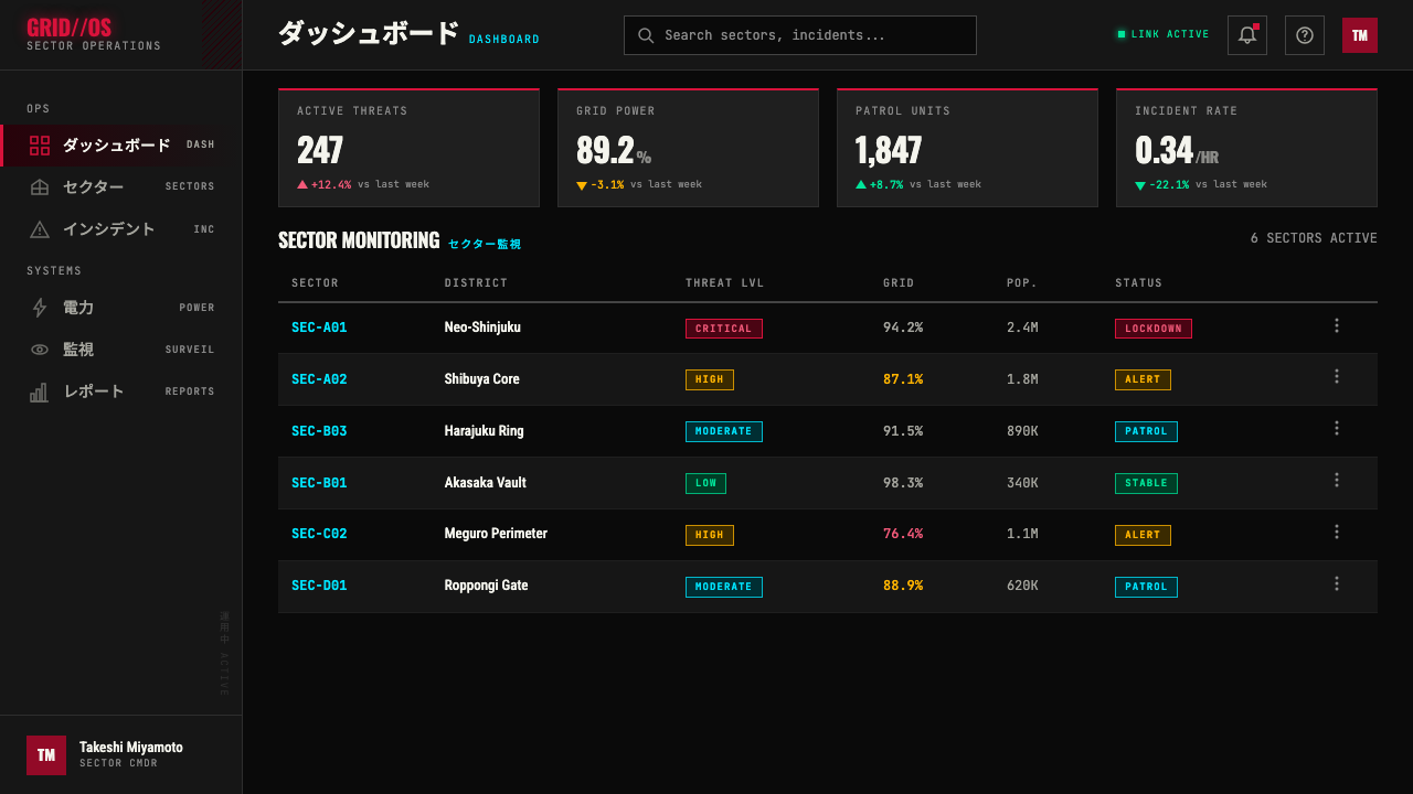
For web interfaces and digital dashboards, the Akira aesthetic is well-suited to contexts where urgency, technical authority, and information density are primary values: security monitoring dashboards, trading interfaces, developer tools, and any application that benefits from the association between dense data and controlled competence. The approach requires committing to a genuinely dark background rather than a softened dark gray, using a single accent color for interactive elements and alert states, and building component borders and separators from hard lines rather than shadows or gradients. Typographically, the system calls for a condensed or narrow typeface for headings and interface labels, with a legible but compact typeface for body and data values.对于网页界面和数字仪表板,Akira美学非常适合紧迫感、技术权威性与信息密度是首要价值的场景:安全监控仪表板、交易界面、开发者工具,以及任何受益于密集数据与受控能力感之间关联的应用程序。这种方法要求采用真正的深色背景而非柔化的深灰,使用单一强调色用于交互元素和警示状态,并以硬线而非阴影或渐变构建组件边框和分隔符。在排印上,这一系统要求为标题和界面标签使用压缩或窄体字形,为正文和数据值使用可读但紧凑的字体。
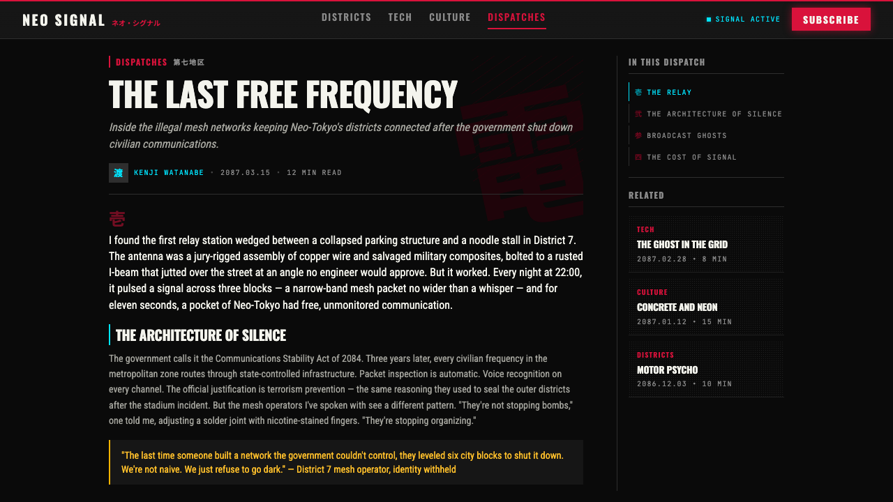
For editorial and marketing applications, the Akira visual system translates into a poster-logic aesthetic: high-contrast, directional, designed to be read from a distance before it is read up close. A marketing page or editorial spread using this language leads with a full-bleed image or color field in the near-black base, uses the accent color for the one headline or call-to-action that must be seen first, and employs diagonal compositional lines — slanted text, angled image crops, or raked section dividers — to inject motion into a static layout. For physical print applications including merchandise and packaging, the style's limited palette and hard-edged graphic quality reproduce cleanly across screen printing, vinyl, and single-color embossing.对于编辑与营销应用,Akira视觉系统转化为一种海报逻辑美学:高对比度、有方向感、设计为在近距离阅读之前能从远处被看懂。使用这种语言的营销页面或编辑跨版以接近纯黑底面的满版出血图像或色彩开场,使用强调色标注必须首先被看到的那个标题或号召性用语,并采用斜向构图线——倾斜文字、有角度的图像裁切或倾斜的版面分割——向静态版面注入运动感。对于包括周边商品和包装在内的实体印刷应用,这种风格有限的色板与硬边图形质量能在丝网印刷、乙烯基材料与单色压印中清晰再现。
The most common mistake when applying Akira-derived aesthetics is palette overload: adding multiple accent colors — purple, green, orange — on the grounds that cyberpunk is inherently multicolored. The power of the original style comes directly from its color austerity. A second common error is using soft shadows and atmospheric glow effects to simulate the neon-lit environment, which produces a completely different visual logic — ambient, blurry, cinematic — rather than the hard-edged, mark-driven quality of the source material. A third error is applying the speed-line motif as decoration rather than as a structural motion indicator, producing compositions that feel busy and directionless rather than kinetically charged.应用Akira衍生美学时最常见的错误是调色板过载:以赛博朋克本质上是多色彩的为由,添加多种强调色——紫色、绿色、橙色。原始风格的力量直接来自其色彩简朴性。第二个常见错误是使用柔和阴影和大气光晕效果来模拟霓虹灯环境,这产生的是完全不同的视觉逻辑——氛围型的、模糊的、电影感的——而非原始素材的硬边、笔触驱动的品质。第三个错误是将速度线母题作为装饰而非结构性运动指示符来应用,产生的构图感觉繁忙而无方向感,而非充满动能张力。
Akira (Otomo) — FAQAkira (Otomo) · 常见问题
How is Akira different from general cyberpunk aesthetics like vaporwave or synthwave?Akira与蒸汽波或合成波等泛赛博朋克美学有何不同?
Vaporwave and synthwave rely on color abundance — multiple saturated hues, chromatic gradients, neon spread across the full palette — to evoke the late-1980s and early-1990s consumer technology aesthetic. Akira's visual system is its structural opposite: it uses near-total color austerity, with one accent against black, and builds its impact through mark density and contrast rather than chromatic richness. Vaporwave is pastel and nostalgic; Akira is severe and kinetic. Synthwave is often warm and aspirational; Akira is cold and catastrophic. They share a historical moment and a broad cyberpunk cultural frame, but they represent fundamentally different visual philosophies.蒸汽波和合成波依赖色彩丰盛——多种高饱和色调、色彩渐变、在整个调色板上蔓延的霓虹——来唤起1980年代末至1990年代初的消费技术美学。Akira的视觉系统是其结构上的对立面:它使用接近彻底的色彩简朴性,以黑色底面上的单一强调色,通过笔触密度与对比度而非色度丰富性构建冲击力。蒸汽波是粉彩色调的、带有怀旧感的;Akira是严峻的、充满动势的。合成波通常是温暖而充满憧憬的;Akira是冷峻而充满灾难感的。它们共享一个历史时刻与广泛的赛博朋克文化框架,但代表着根本不同的视觉哲学。
Can this style work on light backgrounds, or does it require dark fields?这种风格能在浅色背景上使用吗,还是必须依赖深色底面?
The Akira visual system is structurally dark-field dependent in its canonical form — the absolute black ground is not an ambient choice but the foundation from which the entire contrast logic operates. Light-background inversions are possible but require significant adaptation: the accent color loses its luminous impact when not surrounded by darkness, the speed-line motif reads as busy rather than directional without strong value contrast, and the halftone/cross-hatch textures become muddy rather than crisp against a light ground. A light-field application works best if treated as a deliberate daylight or technical-document variant rather than an attempt to reproduce the full aesthetic — using the graphic marks, condensed type, and diagonal composition while accepting that the style's emotional register will shift from urgent and nocturnal to diagrammatic and controlled.Akira视觉系统在其经典形态中是结构性地依赖深色底面的——绝对黑色底面不是一个氛围性选择,而是整个对比度逻辑从中运作的基础。浅色背景的反转版本是可能的,但需要大幅适应:强调色在不被黑暗包围的情况下失去其发光效果,速度线母题在没有强烈明度对比的情况下读起来像繁忙而非有方向感,半调/交叉线纹理在浅色底面上变得模糊而非清晰。浅色底面的应用最有效的做法是:将其视为刻意的日光感或技术文档变体,而非试图复现完整美学——使用图形笔触、压缩字体与斜向构图,同时接受风格的情感语调将从紧迫而夜间感转向图表化而受控。
Is it appropriate to use Akira aesthetics in commercial contexts, and what are the cultural considerations?在商业场景中使用Akira美学是否合适?有哪些文化方面需要考量?
The Akira aesthetic has been widely commercialized since the early 1990s, appearing across streetwear, gaming, film production design, and digital products to the point where it has become a recognizable genre template rather than a proprietary visual identity. Commercial use of the design language — as opposed to direct reproduction of specific Otomo-authored images — is broadly practiced. The cultural considerations worth noting are contextual rather than categorical: the style's original narrative context is deeply concerned with state violence, nuclear trauma, youth radicalization, and systemic collapse. Deploying it as a purely decorative layer on products or services that have no relationship to those themes can read as aesthetic extraction — using the visual weight of a serious cultural document to lend borrowed authority to unrelated commercial content. This matters more in some contexts than others, but it is worth naming.Akira美学自1990年代初以来已被广泛商业化,出现于街头服饰、游戏、电影美术设计与数字产品之中,以至于它已成为可识别的类型模板,而非专有视觉身份。使用这套设计语言——而非直接复制大友克洋的具体图像——是被广泛实践的。值得注意的文化考量是情境性的而非类别性的:这种风格的原始叙事语境深切关注国家暴力、核创伤、青年激进化与系统性崩溃。将其作为纯粹装饰性层面部署于与这些主题毫无关联的产品或服务上,可能被解读为美学抽取——利用一份严肃文化文献的视觉分量,为不相关的商业内容借取权威感。这在某些语境中比其他语境更为重要,但值得明确指出。
How should motion and animation be handled in Akira-inspired digital work?在Akira风格的数字作品中,如何处理运动与动画?
Motion in Akira-inspired digital work should follow the same structural logic as the speed lines in the source material: directional, decisive, and originating from or converging toward a clear point. Transitions should be hard cuts or rapid wipes rather than soft fades — the style is not ambient or atmospheric, and dissolves undermine its visual logic. When animating typographic elements, compression and rapid directional entry are appropriate; floating or drifting motion is not. Camera movement (in 3D or video contexts) should favor fast lateral tracking or forward-plunge moves along a clear axis rather than orbital or hovering shots. The most common motion mistake is adding ambient particle effects or slow light-ray animations — these introduce the soft, atmospheric quality that the style structurally excludes.Akira风格数字作品中的运动应遵循与原始素材中速度线相同的结构逻辑:有方向感、决断性,从清晰的点发散或向其汇聚。转场应是硬切或快速划变,而非柔和淡出——这种风格不是氛围型或大气型的,溶解转场会破坏其视觉逻辑。为排印元素设置动画时,压缩与快速定向入场是恰当的;漂浮或飘移的运动则不然。镜头运动(在三维或视频语境中)应优先选择沿清晰轴线的快速横向跟踪或向前冲刺运动,而非环绕或悬停镜头。最常见的运动错误是添加氛围性粒子效果或缓慢光线动画——这些引入了这一风格在结构上所排除的柔和、大气品质。
What types of products and brands is this aesthetic poorly suited for?哪些类型的产品和品牌不适合使用这种美学?
The Akira aesthetic is poorly suited to any context where the core value proposition involves warmth, approachability, care, or organic natural quality. Health and wellness products, children's applications, food and beverage brands, financial services aimed at cautious or risk-averse users, and any product whose primary emotional contract with the user is one of safety and reassurance will find that the style's severity, darkness, and density work against the product's intended affect. The aesthetic is also a poor fit for brands that depend on aspirational lightness — luxury fashion, travel, and hospitality — because its visual logic is compressive and urgent rather than expansive and pleasurable. The style's power is real, but it is the power of a compressed spring: it will not relax into warmth.Akira美学不适合任何核心价值主张涉及温暖感、亲切感、关怀或有机自然品质的场景。健康与养生产品、儿童应用程序、食品与饮料品牌、面向谨慎或风险规避型用户的金融服务,以及任何与用户的核心情感契约是安全感与安慰感的产品,都会发现这种风格的严峻性、黑暗感与密度与产品预期的情感效果背道而驰。这种美学也不适合依赖憧憬性轻盈感的品牌——奢侈时装、旅游与酒店业——因为其视觉逻辑是压缩性的、急迫性的,而非开阔性的、令人愉悦的。这种风格的力量是真实的,但那是一根压缩弹簧的力量:它不会松弛成温暖。
Related design styles相关设计风格
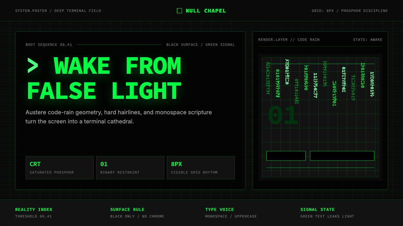 The Matrix (Green-Code)Terminal myth, disciplined. CRT green code rain, black grid, monospace script…终端神话,冷峻克制。CRT 绿代码雨、黑色网格与等宽字成形。
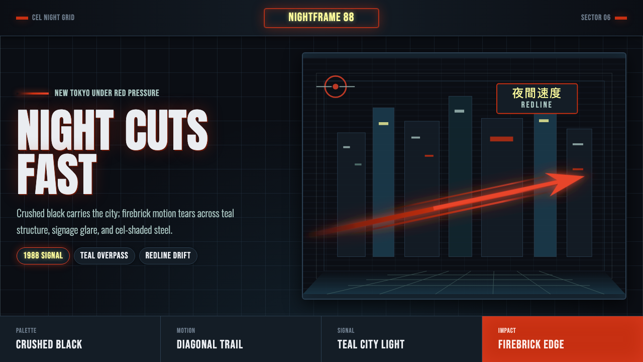 Akira Neo-TokyoNight moves fast. Firebrick trails cut crushed black, teal grids, and condens…黑夜疾驰。砖红光轨切开墨黑、青蓝网格与压缩招牌。
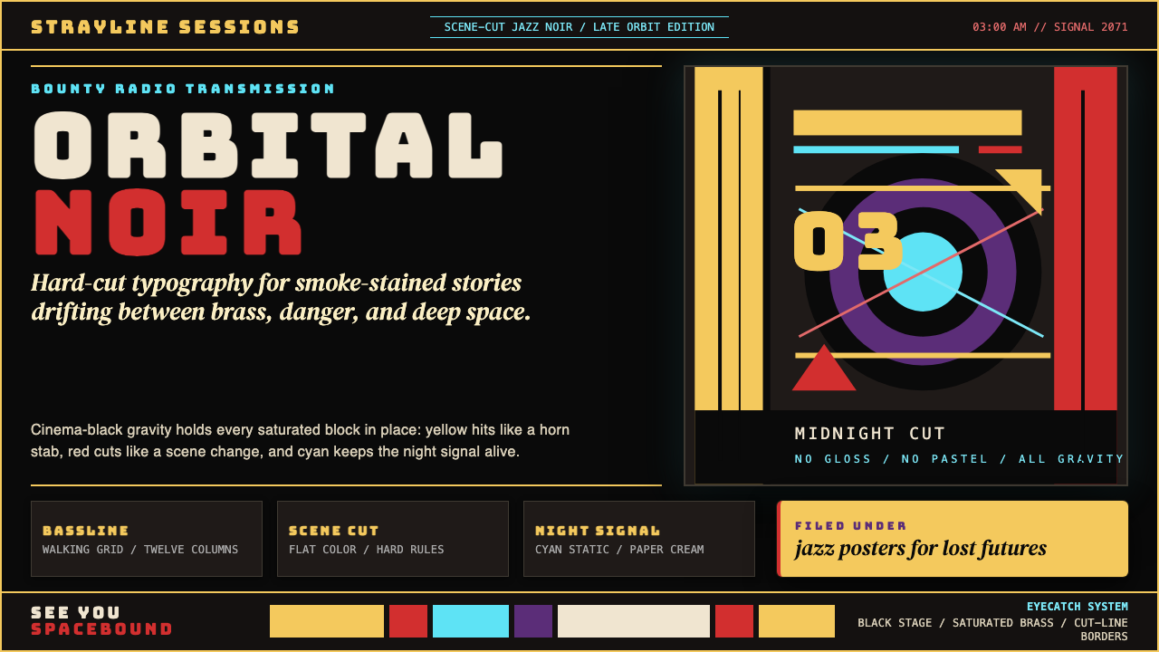 Cowboy Bebop Jazz-NoirCool at 3 AM. Bungee type, jazz yellow, red cuts, and cyan rules hit deep bla…凌晨三点的酷:黑底上 Bungee 字、爵士黄、红切线与青色规则。
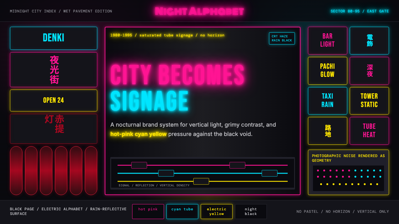 Tokyo Shinjuku Neon (1980)Night turns into alphabet. Hot pink, cyan, and yellow stack as glowing vertic…夜晚化作文字。热粉、青蓝、电黄垂直堆成霓虹峡谷。
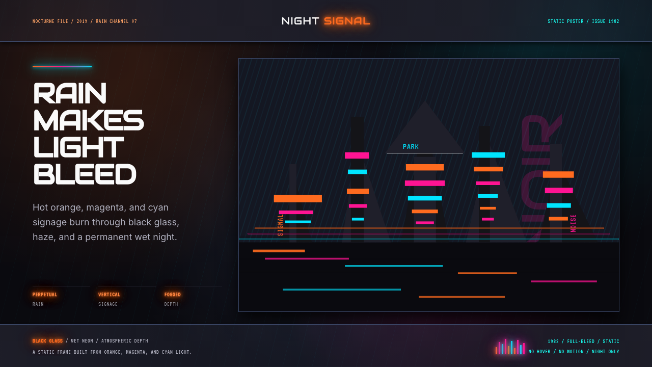 Blade Runner 1982 Neon NoirRain-soaked noir. Orange, magenta, and cyan neon cut black glass.雨夜黑色电影。橙洋红青霓虹切开黑玻璃。
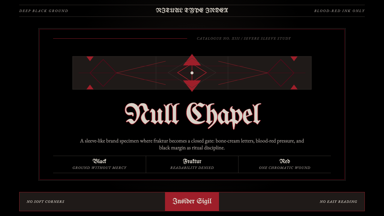 Death Metal BlackletterUnreadable by design. Bone fraktur on black, cut by one blood-red geometric s…以难读划界:黑底骨色哥特字,被一道血红几何符印切开。