What is The Matrix (Green-Code)?什么是 The Matrix (Green-Code)?
The Matrix distilled cyberpunk into two colors — saturated terminal green and absolute black — and made the command line feel like a religion.《黑客帝国》将赛博朋克提炼为两种颜色——饱和的终端绿与绝对的黑——让命令行拥有了宗教般的气场。
The Matrix (Green-Code) in briefThe Matrix (Green-Code) 速览
The Matrix aesthetic is a design language born from a single, decisive visual choice: the entire world of information is rendered as glowing green characters cascading down a black field. Released in 1999, the film directed by the Wachowskis synthesized decades of cyberpunk literature, hacker culture, and Japanese digital mythology into a visual system so coherent that it became instantly and permanently iconic. The look is simultaneously austere and electric — a terminal pretending to be a cathedral.《黑客帝国》的美学语言,诞生于一个单一而决定性的视觉选择:整个信息世界以发光的绿色字符从黑色底场倾泻而下的方式呈现。1999年上映,由沃卓斯基姐妹执导的这部电影将数十年的赛博朋克文学、黑客文化与日本数字神话融合成一套如此连贯的视觉系统,以至于它在诞生之初便成为永久性图标。整个面貌同时具备苦涩的克制与电流般的张力——一台被供奉为圣殿的终端机。
At its core, the system operates on radical restraint. Only two tones do any meaningful work: a phosphorescent Matrix-green that pulses with the suggestion of cathode-ray tube light, and a near-absolute black that acts as the void the green is falling through. Monospace typography is not merely a stylistic choice but a philosophical statement — every character is a unit of code, equally spaced, equally weighted, as if the fabric of reality has been laid bare as data. There is no decoration that does not also function as information.在核心层面,这套系统依赖极端的节制运作。只有两种色调在承担真正的意义:一种磷光般的矩阵绿,以阴极射线管式的光晕跳动;以及一种接近绝对的黑,充当那道绿色文字穿越的虚空。等宽字体在这里不仅是风格选择,更是哲学声明——每个字符是一个代码单元,等距排列,等重呈现,仿佛现实的织物被剥开,露出其数据本质。没有任何装饰不同时承担信息的功能。
This design vocabulary has outlived its source film through four sequels and twenty-five years of cultural transmission. It now operates as a widely recognized shorthand for a specific cluster of values: technical authority, hidden knowledge, the tension between control and liberation, and the suspicion that the visible world is a layer built on top of something more fundamental. When applied to product design, it carries all of that cultural weight — which is both its power and its risk.这套设计语汇在四部续集与二十五年的文化传播中延续至今。它现在作为一组特定价值观的广泛认知简写而存在:技术权威、隐秘知识、控制与解放之间的张力,以及对可见世界不过是某种更根本之物上层建筑的怀疑。当它被应用于产品设计时,携带着全部这些文化重量——这既是它的力量,也是它的风险。
See the The Matrix (Green-Code) design system查看 The Matrix (Green-Code) 完整设计系统
Where does The Matrix (Green-Code) come from?The Matrix (Green-Code) 从何而来?
The Matrix was released by Warner Bros. in March 1999, principal photography having taken place in Sydney, Australia. The Wachowskis drew consciously from multiple visual traditions: the green phosphorescent glow of early CRT monitors, the cascading katakana sequences invented for the film's title sequence by visual effects supervisor John Gaeta, and the anime Ghost in the Shell (1995), which the directors showed to the studio as a visual reference before a single frame was shot. Ghost in the Shell had already established the idea that digital consciousness could be expressed as visible cascading data — the Matrix team took that premise and made it the literal appearance of reality itself.《黑客帝国》于1999年3月由华纳兄弟发行,主体拍摄地点在澳大利亚悉尼。沃卓斯基姐妹有意识地汲取了多重视觉传统:早期CRT显示器的绿色磷光晕,由视觉效果总监约翰·盖塔为片头序列专门设计的倾泻片假名,以及1995年的动画电影《攻壳机动队》——她们在开机前将这部动画展示给片方作为视觉参考。《攻壳机动队》已经确立了数字意识可以被表达为可见的瀑布式数据流这一概念;《黑客帝国》的团队则将这个前提推进一步,让它成为现实本身的字面外观。
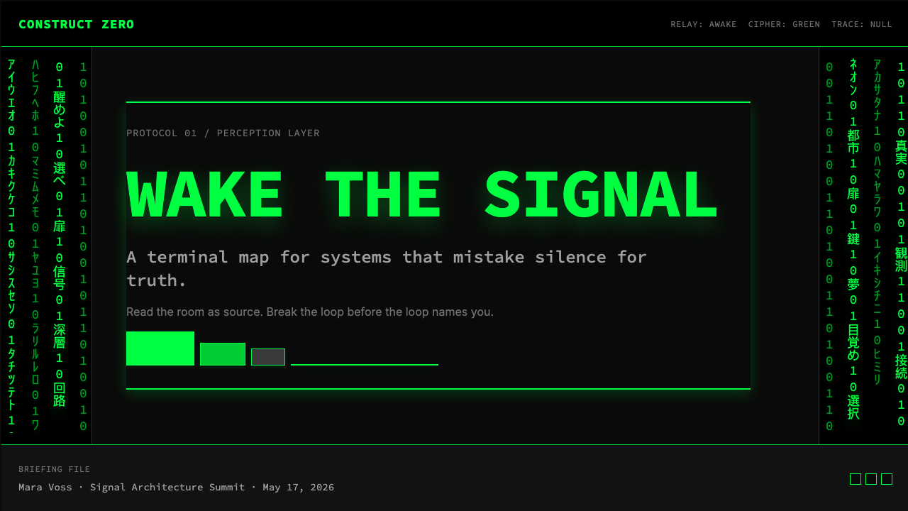
The specific choice of katakana characters for the falling code was made by production designer Owen Paterson and the VFX team as a nod to the influence of Japanese science fiction and the Pacific Rim cyberpunk literary tradition established by William Gibson's Neuromancer (1984). The characters were stylized and mirrored — deliberately unreadable as actual Japanese text — transforming language into pure visual texture. Cinematographer Bill Pope shot the film in a deliberately desaturated palette outside the Matrix simulation, reserving warmth and color saturation almost exclusively for sequences inside the simulated world, making the green-code aesthetic feel like an X-ray of the false reality rather than the false reality itself.倾泻代码中选用片假名字符,是制作设计师欧文·帕特森与视效团队对日本科幻及威廉·吉布森《神经漫游者》(1984年)所确立的环太平洋赛博朋克文学传统的致敬。这些字符经过风格化处理并被镜像翻转——作为真实日文文本刻意不可读——将语言转化为纯粹的视觉纹理。摄影师比尔·波普在模拟世界外的场景中刻意使用去饱和度的色调,将色彩饱和度几乎专门保留给模拟世界内部的段落,使绿色代码美学感觉像是对虚假现实的X光透视,而非虚假现实本身。
The cultural timing was precise. 1999 was the eve of Y2K, a moment when mainstream culture was simultaneously fascinated and terrified by the idea that civilization depended on invisible code running in machines nobody fully understood. The Matrix gave that anxiety a visual form: the world as green text on black, running whether or not any human was watching. Don Davis's score layered industrial sound design with orchestral weight, reinforcing the idea that the code-world was not cold and mechanical but mythic and alive. The film grossed over four hundred and sixty million dollars worldwide and won four Academy Awards for technical achievement.文化时机精确。1999年是Y2K前夕,主流文化同时对一个想法着迷又恐惧——文明依赖于在没有人完全理解的机器中运行的隐形代码。《黑客帝国》赋予了这种焦虑一个视觉形态:世界是黑色底面上的绿色文本,无论是否有人类在观看,它都在运行。唐·戴维斯的配乐将工业音效设计与管弦乐的分量叠加,强化了代码世界并非冷漠机械而是神话般鲜活的概念。影片在全球斩获逾四亿六千万美元票房,并赢得四项奥斯卡技术成就奖。
The aesthetic endured through two sequels in 2003 — The Matrix Reloaded and The Matrix Revolutions — and returned with The Matrix Resurrections in 2021, each iteration refining and sometimes recontextualizing the visual language. Beyond the films, the green-code look saturated hacker culture, cybersecurity conference branding, technology marketing, and eventually mainstream UI design to such a degree that it now operates independently of its source. A generation of developers and designers learned to associate the aesthetic with authenticity, expertise, and the idea that beneath the user-friendly surface of things, something more powerful and more honest is running.这套美学通过2003年的两部续集——《黑客帝国:重装上阵》与《黑客帝国:矩阵革命》——得以延续,并随着2021年的《黑客帝国:矩阵复活》回归,每次迭代都在精炼、有时也在重新语境化这套视觉语言。在电影之外,绿色代码外观渗透进黑客文化、网络安全会议品牌、科技营销,乃至最终渗入主流UI设计,其程度之深,使它现在已能脱离源作独立运作。一代开发者与设计师习得了将这套美学与真实性、专业度,以及「友好用户界面之下,有更强大、更诚实的东西在运行」这一概念相关联的文化反射。
What defines the The Matrix (Green-Code) look?The Matrix (Green-Code) 的视觉特征是什么?
Color — Two-Tone Discipline色彩——双色纪律
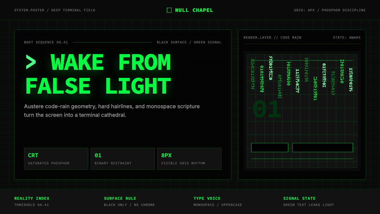
The palette is a strict duopoly: a single saturated green with the quality of phosphor light emitted by a cathode-ray tube, set against a background that approaches but never quite reaches pure black — there is always a trace of the screen's self-illumination in the void. No secondary or tertiary colors are introduced. Accent states and hover effects are handled by modulating the brightness or opacity of that single green, not by adding hues. The discipline is absolute: any color outside this range reads as a deliberate breach of the system.色板是一套严格的双色垄断:单一的饱和绿,带有阴极射线管发出的磷光质感,置于一个接近但从未抵达纯黑的背景之上——那片虚空中始终存有屏幕自发光的一丝痕迹。不引入任何间色或复色。强调状态与悬停效果通过调节那唯一绿色的亮度或不透明度来处理,而非增加色相。这种纪律是绝对的:任何超出此范围的颜色都会被读作对系统的刻意破坏。
Typography — Monospace as Scripture字体排印——等宽字体作为经文
Monospace letterforms are the only acceptable voice for this system. The equal spacing of every character — whether a narrow letter or a wide one — carries the implicit message that information is data, not expression. Headlines are set in monospace at a weight that feels heavy by the standards of terminal text but is still unmistakably machine-made. Body text is compact, tightly leaded, and set at a size that recalls the density of a terminal screen. Mixed-width typefaces break the system's foundational logic irreparably.等宽字体是这套系统唯一可接受的声音。每个字符的等距排列——无论窄字母还是宽字母——携带着隐性讯息:信息是数据,不是表达。标题以等宽字体排设,字重在终端文本标准下显得厚重,却仍无误地呈现机器制造的气质。正文紧凑,行间距收紧,排设于一个令人联想到终端屏幕密度的字号。混合字宽字体会不可修复地破坏这套系统的基础逻辑。
Luminosity — Phosphor Glow发光性——磷光晕
The system is not simply dark-background-with-light-text; it is a simulation of a screen that is itself emitting light. Key elements — primary headlines, active states, critical data values — carry a soft outer radiance that suggests they are generating photons rather than reflecting them. This glow is subtle and directional: it bleeds outward from the character edges into the surrounding black rather than emanating uniformly. The effect distinguishes the aesthetic from generic dark-mode design and roots it in the specific physics of cathode-ray technology.这套系统不仅仅是深底浅字;它是对一块自身正在发光的屏幕的模拟。关键元素——主标题、激活状态、关键数据值——携带一种柔和的外向光晕,暗示它们在生成光子而非反射光子。这种光晕是微妙而有方向性的:它从字符边缘向外渗入周围的黑色,而非均匀散发。这种效果将此美学与通用的深色模式设计区分开来,并将其根植于阴极射线管技术的特定物理现实。
Grid — Terminal Rigidity网格——终端刚性
Layouts are governed by an invisible but absolute grid — the character grid of a terminal, where every element aligns to the same invisible cell structure. There are no rounded compositions, no organic arrangements. Dividers are hairlines: single-pixel-weight lines that carry more visual authority than decorative rules precisely because they claim almost no space. Spacing is generous and consistent, treating the black ground as active breathing room rather than empty waste. Zero-radius corners on interactive components enforce the system's refusal of organic form.版面受一套隐形但绝对的网格支配——终端机的字符网格,其中每个元素与相同的隐形单元格结构对齐。没有圆润的构图,没有有机的排列。分割线是发丝线:单像素重量的线条,正是因为几乎不占任何空间,反而比装饰性粗线拥有更强的视觉权威。间距充裕而一致,将黑色底场视为积极的呼吸空间而非空洞的浪费。交互组件的零圆角强化了这套系统对有机形态的拒绝。
Motion — The Cascade动效——倾泻
When animation is present, it moves in one direction: downward, at a pace that suggests data streaming rather than decorative choreography. Characters enter from the top and dissolve at the bottom, with the brightest and most legible characters mid-fall and the faintest approaching the end of their journey. Loading states, background textures, and atmospheric effects all borrow from this vertical cascade logic. Horizontal motion, scaling animations, and bounce curves all read as foreign to the system — only linear, directional movement is native.当动效存在时,它朝单一方向运动:向下,以一种暗示数据流而非装饰性编排的速度。字符从顶部进入,在底部消散,最明亮、最清晰的字符处于下落中途,最暗淡的则接近旅程终点。加载状态、背景纹理与氛围效果都借鉴这种垂直倾泻逻辑。水平运动、缩放动画与弹性曲线在这套系统中都显得格格不入——只有线性的、有方向的运动才是本土的。
Texture — Scanline and Noise质感——扫描线与噪点
Pure flat color is almost never used in isolation. The aesthetic calls for subtle texture derived from the physical properties of the CRT screen: faint horizontal banding that evokes the scanline structure of analog displays, and a very fine grain that recalls the phosphor coating's uneven surface. These textures are applied at low opacity so they never compete with the primary green-on-black composition, but their presence transforms what might otherwise read as generic dark UI into something that suggests age, physicality, and analog warmth beneath digital coldness.纯平色几乎从不单独使用。这套美学要求来自CRT屏幕物理特性的微妙质感:唤起模拟显示器扫描线结构的隐约水平带状纹,以及令人联想到磷光涂层不均匀表面的极细颗粒。这些质感以低不透明度应用,从不与主要的绿底黑字构图竞争,但它们的存在将原本可能被解读为通用深色UI的东西转化为某种暗示着年代感、物质性,以及数字冷峻之下模拟温度的东西。
Zero Decoration零装饰
Every visual element must justify its presence as either structure or information. There are no ornamental borders beyond functional hairlines, no gradient backgrounds added for visual richness, no icons that are merely decorative. If a terminal would not display it, it should not appear. This principle is more demanding than general minimalism because it demands a specific justification — not 'is this simple enough?' but 'would this appear on a command-line interface?' The question filters out a surprising range of contemporary UI conventions.每个视觉元素都必须以结构或信息的身份为自己的存在提供正当理由。没有超出功能性发丝线的装饰性边框,没有为丰富视觉而添加的渐变背景,没有纯装饰性的图标。如果终端不会显示它,它就不应出现。这一原则比一般的极简主义更为严苛,因为它要求一个特定的正当性——不是「这够简单吗?」而是「这会出现在命令行界面上吗?」这个问题会过滤掉相当多当代UI惯例中的元素。
See the The Matrix (Green-Code) design system查看 The Matrix (Green-Code) 完整设计系统
Who shaped The Matrix (Green-Code)?谁塑造了 The Matrix (Green-Code)?
The Wachowskis wrote and directed all four Matrix films, establishing and then reinterpreting the visual language across a span of more than two decades. Their synthesis of Hong Kong action cinema, Japanese anime, western philosophical tradition, and American cyberpunk literature produced a coherent aesthetic world rather than an assembled pastiche. Their decision to root the film's visual identity in the specific material quality of CRT phosphor light — rather than in abstract digital imagery — gave the green-code aesthetic its tactile, almost nostalgic quality, which proved far more durable than contemporaneous digital effects work that aimed for photorealism.沃卓斯基姐妹编导了全部四部《黑客帝国》影片,在超过二十年的跨度中确立并重新诠释了这套视觉语言。她们对香港动作电影、日本动画、西方哲学传统与美国赛博朋克文学的综合,产生了一个连贯的美学世界,而非拼凑的大杂烩。她们将影片视觉身份根植于CRT磷光物理质感——而非抽象的数字图像——的决定,赋予了绿色代码美学一种触感性、几乎带有怀旧色彩的品质,这证明比同期追求照片真实感的数字特效作品持久得多。
Gaeta led the visual effects team that developed both the iconic code-rain sequence and the bullet-time photography technique that became the film's other defining visual signature. His work on the code-rain established the specific visual grammar of the falling characters: the variation in brightness from top to bottom of each column, the slight variation in fall speed between columns, and the way individual characters resolve briefly into legibility before dissolving. These details gave the cascade the quality of a living system rather than a screensaver. Gaeta and his team won the Academy Award for Best Visual Effects in 2000.盖塔领导了开发标志性代码雨序列与子弹时间摄影技术的视觉效果团队——后者成为影片另一个决定性的视觉标签。他在代码雨上的工作确立了下落字符的具体视觉语法:每列字符从上至下的亮度变化、列与列之间下落速度的细微差异,以及单个字符短暂清晰可辨后消散的方式。这些细节赋予了倾泻效果一个活体系统而非屏保程序的品质。盖塔及其团队于2000年赢得奥斯卡最佳视觉效果奖。
Paterson designed the physical environments of the Matrix trilogy, solving the central challenge of making two visually distinct worlds — the simulated Matrix and the real world of Zion — feel coherent within a single film. His decision to render the Matrix's code in katakana characters honored the Japanese science-fiction influences that shaped the project while making the code visually distinct from any real programming language, thus preserving its mythic quality. The sets he designed for the real-world sequences — all exposed machinery, organic curves, and warm tungsten light — form the visual counterargument to the green-code world that makes the latter feel like a cage.帕特森为《黑客帝国》三部曲设计了物理环境,解决了如何让两个视觉上截然不同的世界——模拟的矩阵与锡安的真实世界——在单一影片框架内显得连贯这一核心挑战。他将矩阵代码以片假名字符呈现的决定,向塑造了这个项目的日本科幻影响致敬,同时使代码在视觉上区别于任何真实编程语言,从而保全了其神话气质。他为真实世界场景设计的布景——全是裸露机械、有机曲线与钨灯暖光——构成了对绿色代码世界的视觉反驳,正是这一对比使后者感觉像一座牢笼。
Pope made the crucial decision to shoot the film's exterior-to-Matrix world with a strong blue-green color cast — desaturating and cooling all scenes set in the simulated world — while warming the real-world sequences. This meant the green-code aesthetic was not just a special-effects element but was embedded in the photochemical quality of the image itself. The practical consequence for design appropriation is significant: the Matrix green does not simply sit on black; it has the quality of light that has passed through a specific atmospheric filter, which is why it reads as eerie and artificial rather than merely vivid.波普做出了关键决定:以强烈的蓝绿色调拍摄模拟世界中的场景——对所有设定在矩阵内的画面去饱和并降温——同时温暖真实世界的场景。这意味着绿色代码美学不仅是一个特效元素,而且被嵌入了图像本身的光化学品质中。这对设计挪用具有重要的实践意义:矩阵绿不只是简单地坐落于黑色之上;它具有穿越特定大气滤镜的光的品质,这正是它读来诡异而人工,而非仅仅鲜艳的原因。
Though not a direct creator of the Matrix films, Gibson's 1984 novel Neuromancer established the conceptual and aesthetic vocabulary on which the Wachowskis drew — most critically, the idea of cyberspace as a visual and navigable space, and the word 'matrix' itself as a term for the networked digital world. Gibson's prose style also modeled the aesthetic of monospace information density: his descriptions of the digital world are technical, austere, and deliberately stripped of warmth, establishing the literary template for how code-as-reality should feel on the page and, ultimately, on the screen.尽管并非《黑客帝国》影片的直接创作者,吉布森1984年的小说《神经漫游者》确立了沃卓斯基姐妹所借鉴的概念与美学词汇——最关键的是,将网络空间定义为可视化和可导航空间的理念,以及「matrix」这个词本身作为网络化数字世界术语的使用。吉布森的散文风格也为等宽字体的信息密度美学树立了模板:他对数字世界的描述是技术性的、苦涩的,刻意剥离温度,为「代码即现实」应该在页面上——以及最终在屏幕上——感觉如何建立了文学原型。
How do you use The Matrix (Green-Code) today?今天怎么用 The Matrix (Green-Code)?
The Matrix aesthetic is among the most specific and demanding historical styles to apply well in product design, because it carries a powerful cultural pre-load that works for you when the context is right and against you when it is not. Before committing to it, the question to answer honestly is: does this product actually want to evoke technical authority, hidden knowledge, and a slight sense of danger? If the answer is yes — cybersecurity tools, developer platforms, data infrastructure products, technical documentation, and certain fintech or analytics contexts — the style delivers enormous signal efficiency. If the answer is no, the style will create cognitive friction between the aesthetic and the product's actual intent.《黑客帝国》美学是产品设计中最难精准应用的历史风格之一,因为它携带着强大的文化预载——在语境合适时为你工作,在语境不对时反过来对你。在决定采用它之前,需要诚实回答的问题是:这个产品真的想要唤起技术权威、隐秘知识与一丝危险感吗?如果答案是肯定的——网络安全工具、开发者平台、数据基础设施产品、技术文档,以及某些金融科技或分析类场景——这种风格能以极高的效率传递信号。如果答案是否定的,这种风格将在美学与产品实际意图之间制造认知摩擦。
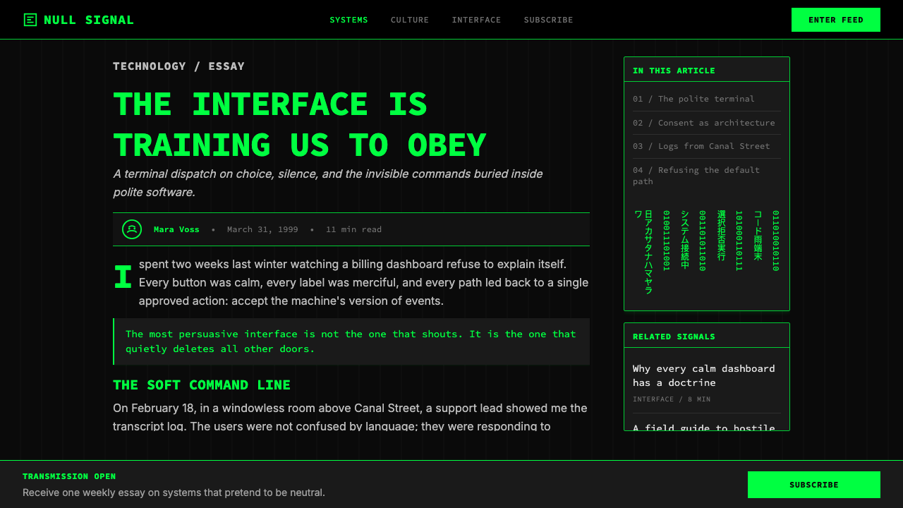
For presentation slides, the system works powerfully on cover and section-break pages. A cover benefits from maximum restraint: the product name or talk title set in monospace against deep black, a thin phosphor-green hairline as the only accent, and nothing else. Resist the temptation to add the falling-code animation unless the presentation context genuinely warrants it — used casually, it reads as costume rather than conviction. Content slides should treat text as terminal output: tight leading, generous left margin, text hierarchies differentiated by size and brightness of the green alone, no decorative elements. Data slides become dashboards: numerical values carry the most visual weight, labeled with the smallest legible monospace text, with color intensity used to signal criticality rather than decoration.在演示文稿中,这套系统在封面页与章节分隔页上效果最强。封面以最大限度的克制为宜:产品名或演讲标题以等宽字体置于深黑之上,一条细磷光绿发丝线作为唯一强调,此外别无他物。抵制添加倾泻代码动画的冲动,除非演示语境真正需要它——随意使用时,它读来像戏服而非信念。内容页应将文字视为终端输出:紧凑行距、充裕左边距、文字层级仅以绿色的尺寸与亮度区分,无装饰元素。数据页成为仪表板:数值携带最大视觉重量,以最小可辨的等宽文字标注,以色彩强度信号传达重要性而非装饰。
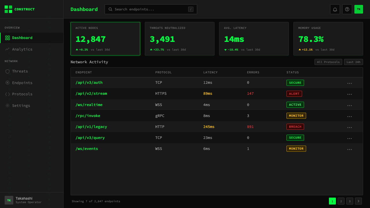
For web interfaces, the style is exceptionally well-suited to dashboards, API documentation, status pages, and developer-tool landing pages. The grid should be strict and columnar, with elements snapping to an underlying character-grid logic. Navigation should be purely typographic — no icon-only elements, no rounded pill labels. Interactive states should be distinguished through brightness changes in the green — active elements glow more intensely than inactive ones — rather than through color additions. Cards and containers use hairline borders rather than background fills, and their corners are unequivocally square. For pricing pages, the style's two-tone discipline works well for tier differentiation: the recommended or featured tier can step up to full phosphor-green brightness while others remain at reduced luminosity.对于网页界面,这种风格极为适合仪表板、API文档、状态页面与开发者工具落地页。网格应严格且列式,元素应吸附于底层字符网格逻辑。导航应纯粹字体性——无纯图标元素,无圆角徽章标签。交互状态应通过绿色亮度变化区分——活跃元素比非活跃元素发光更强——而非通过添加色彩。卡片与容器使用发丝线边框而非背景填充,其圆角毫无疑问是直角。对于定价页面,这套风格的双色纪律适合用于套餐层级区分:推荐或主推套餐可以步升至全磷光绿亮度,其他套餐则保持在较低的发光强度。
For editorial and marketing work, the style is best deployed as a contrast device rather than a full-system application. A technical white paper with a Matrix-styled cover and section headers — all other pages clean and legible — uses the aesthetic as a signal of technical seriousness without making the document exhausting to read. Marketing pages for developer tools can use a full-bleed Matrix-styled hero section, transitioning to a more neutral background for feature and pricing content. The green-on-black treatment is especially effective for code examples and terminal demonstrations, where it is literally accurate as well as stylistically appropriate.对于编辑与营销内容,这种风格最好作为对比设备而非全系统应用来部署。一份技术白皮书以矩阵风格的封面与章节标题呈现——其他所有页面干净清晰——将这种美学用作技术严肃性的信号,而不使文档阅读起来令人疲惫。开发者工具的营销页面可以使用全出血矩阵风格的英雄区块,过渡到更中性的背景展示功能与定价内容。绿底黑字处理对代码示例和终端演示尤为有效,在那里它在字面上准确,在风格上也恰当。
A common mistake when applying this aesthetic is treating it as a dark mode with green accents. The error shows up as: rounded corners surviving from the base design system; multiple accent colors appearing alongside the green; soft drop shadows borrowed from the light-mode version; and body text set in a proportionally-spaced typeface rather than monospace. Each of these choices is individually small but collectively they dissolve the system's identity into generic dark UI. The other common failure is over-application of the falling-code motif as background texture — the cascade works as an ambient element at very low opacity, but used prominently it competes with content and signals that the designer found the reference more interesting than the product it is supposed to serve.应用此美学时最常见的错误是将它视为带绿色强调的深色模式。这种错误表现为:基础设计系统中的圆角得以保留;多种强调色与绿色并存出现;从浅色模式版本借用的柔和投影阴影;以及正文以比例间距字体而非等宽字体排设。这些选择中的每一个单独来看都很小,但合在一起,它们将这套系统的身份消解为通用深色UI。另一个常见失败是过度应用倾泻代码母题作为背景纹理——倾泻效果以极低不透明度作为环境元素时有效,但突出使用时会与内容竞争,并发出一个信号:设计师对这个参考的兴趣,比对它本应服务的产品更大。
See the The Matrix (Green-Code) design system查看 The Matrix (Green-Code) 完整设计系统
The Matrix (Green-Code) — FAQThe Matrix (Green-Code) · 常见问题
Is this aesthetic only appropriate for technical or developer-facing products?这套美学只适合技术性或面向开发者的产品吗?
Not exclusively, but the cultural associations are strong enough that a non-technical product using it needs a deliberate conceptual justification. The aesthetic works outside strictly technical contexts when the product's identity genuinely intersects with its core values: hidden-layer revelation, system-awareness, resistance to surface appearances. A financial intelligence platform, a journalism tool focused on data investigation, or an educational product about how technology works can all use the aesthetic authentically. A consumer lifestyle app or a food delivery service using it would simply read as cosplay — the style would signal values the product does not hold.并非如此,但文化关联足够强烈,以至于使用它的非技术性产品需要一个刻意的概念正当性。当产品身份与其核心价值真正交汇时,这套美学可以在严格技术语境之外运作:隐藏层的揭示、系统意识、对表面现象的抵制。一个金融情报平台、一个专注于数据调查的新闻工具,或一个关于技术运作方式的教育产品,都可以真实地使用这套美学。一个消费类生活方式应用或外卖服务使用它,则只会被读作角色扮演——这种风格会发出产品并不具备的价值观信号。
How do you maintain legibility in an all-dark, monospace system?如何在全深色、等宽字体系统中保持易读性?
Legibility in this system depends on contrast and hierarchy more than it does in a standard light-mode design, because the compressed tonal range — working with brightness variations of a single green rather than multiple hues — demands much more deliberate sizing and weight decisions. The primary rule is to establish a clear luminosity ladder: the most important element on any given view should be at the highest brightness of the green, secondary elements at a noticeably lower value, and tertiary information approaching the minimum contrast threshold. Body text should be set at a size that accounts for the monospace letterform being somewhat narrower than a proportional typeface at the same point size. Generous line spacing compensates for the visual density of monospace setting.在这套系统中,易读性比标准浅色模式设计更依赖对比度与层级,因为压缩的色调范围——在单一绿色的亮度变化中工作,而非多个色相——要求更加刻意的尺寸与字重决定。首要规则是建立清晰的发光度阶梯:任何给定视图中最重要的元素应处于绿色的最高亮度,次要元素处于明显更低的亮度值,第三级信息趋近最低对比度阈值。正文字号应考虑到等宽字体比相同字号的比例字体视觉上稍窄这一事实。充裕的行间距可以补偿等宽排设的视觉密度。
What distinguishes an authentic application of this aesthetic from a cheap imitation?真正的美学应用与廉价模仿之间的区别是什么?
The fastest diagnostic is to look at what happens when there is no content. Cheap imitations fill empty space with falling-code background animations, decorative scanline overlays, and gratuitous glow effects on every element. An authentic application is almost ascetically empty — the black is allowed to be just black, the hairlines are given room to breathe, and special effects like glow or texture are deployed so sparingly that they register as meaningful when they appear. The second diagnostic is typography: imitations typically use a single monospace font for one headline and then revert to a proportional typeface for everything else. Authentic application commits to monospace throughout, accepting the visual density and solving it through hierarchy rather than by switching systems.最快速的诊断方法是看在没有内容时会发生什么。廉价模仿用倾泻代码背景动画、装饰性扫描线叠加,以及每个元素上无节制的光晕效果填满空白空间。真正的应用几乎是修道院式的空旷——黑色被允许就是黑色,发丝线被给予呼吸的空间,光晕或质感等特效被如此稀疏地部署,以至于它们出现时会被感知为有意义的。第二个诊断是排版:模仿通常为一个标题使用等宽字体,然后为其他一切恢复比例字体。真正的应用全程坚持等宽字体,接受其视觉密度,并通过层级而非切换系统来解决它。
Can the Matrix aesthetic work in a light-background context?《黑客帝国》美学可以在浅色背景语境中使用吗?
Technically possible but fundamentally misaligned with the system's logic. The phosphor-glow quality of the green — its defining visual property — only reads as luminous against a dark background; on a light ground, the same green becomes an ordinary saturated color with no suggestion of screen-emission. The monospace typography retains its connotations on either background, but without the dark-field context it reads as developer-tool reference rather than mythic terminal aesthetic. A light-ground version of the system is better described as a technical or utilitarian monospace design inspired by terminal conventions — a valid approach but a different system, not an extension of this one.技术上可行,但从根本上与这套系统的逻辑不符。绿色的磷光晕品质——其决定性的视觉属性——只有在深色背景下才能被读作发光;在浅色底面上,同样的绿色会变成一种普通的饱和色,失去任何屏幕发光的暗示。等宽字体在任何背景上都保留其内涵,但脱离了深色底场语境,它会被读作开发者工具参考,而非神话式终端美学。这套系统的浅色底面版本,更准确地描述为受终端惯例启发的技术性或实用性等宽设计——一种有效的方法,但属于不同的系统,而非这套系统的延伸。
How does this aesthetic age, and is it at risk of feeling dated?这套美学如何随时间演变?它是否有过时的风险?
The green-code aesthetic has already survived one full generational cycle since 1999 and shows no signs of becoming inert — partly because it is periodically refreshed by new Matrix installments, and partly because each new generation of developers encounters it through terminal emulators, code editors, and hacker culture before encountering the film. The risk of datedness is real but specific: it arrives when the aesthetic is used by products that are not genuinely technical, chasing an association they have not earned. When a product that authentically operates in the domain of code, systems, and data uses this visual language, it reads as native rather than nostalgic. The CRT-phosphor quality may eventually read as retro in the same way vinyl album art does — a deliberate evocation of an older technology — but that retro quality is itself culturally loaded and far from neutral.绿色代码美学自1999年以来已经存活了一个完整的世代周期,且没有显示出变得无效的迹象——部分原因是它因新的《黑客帝国》作品而定期得到更新,部分原因是每一代新的开发者在接触这部电影之前,已经通过终端模拟器、代码编辑器与黑客文化与之相遇。过时的风险是真实的但具体的:当这套美学被并非真正技术性的产品使用,追逐一种它们尚未赢得的关联时,它便会到来。当一个真实运作于代码、系统与数据领域的产品使用这套视觉语言时,它读来是本土的而非怀旧的。CRT磷光质感最终可能像黑胶唱片封面艺术那样被读作复古——一种对更旧技术的刻意唤起——但那种复古品质本身具有文化负载,远非中性。
Related design styles相关设计风格
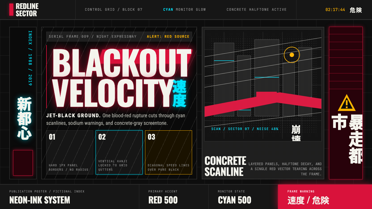 Akira (Otomo)Cyberpunk at impact. Kaneda red, cyan kanji, halftone concrete, and diagonal…冲击式赛博朋克:金田红、青色汉字、混凝土网点与斜向速度线。
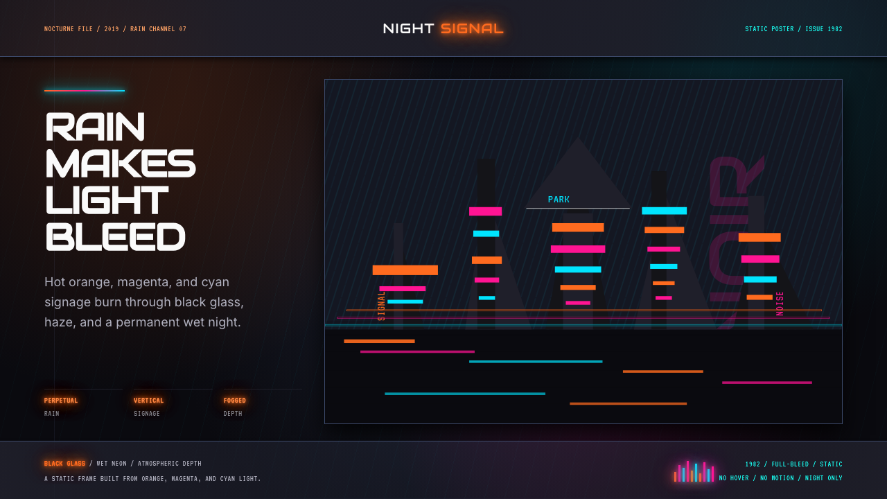 Blade Runner 1982 Neon NoirRain-soaked noir. Orange, magenta, and cyan neon cut black glass.雨夜黑色电影。橙洋红青霓虹切开黑玻璃。
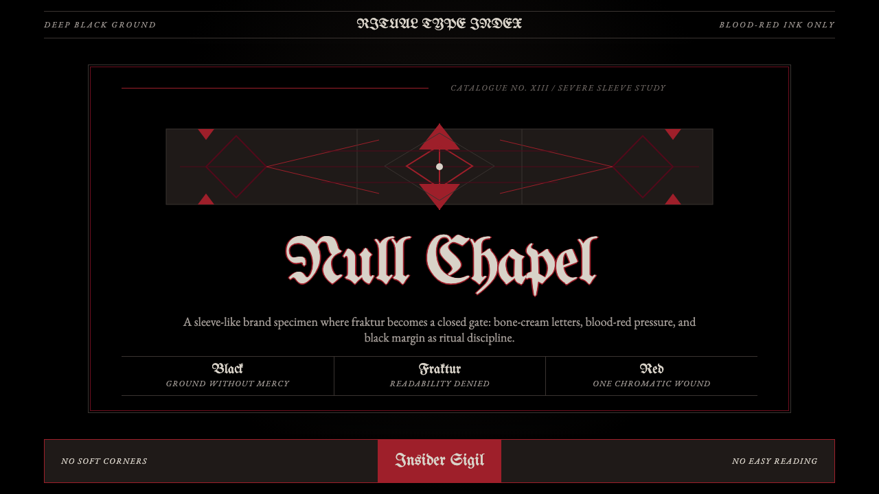 Death Metal BlackletterUnreadable by design. Bone fraktur on black, cut by one blood-red geometric s…以难读划界:黑底骨色哥特字,被一道血红几何符印切开。
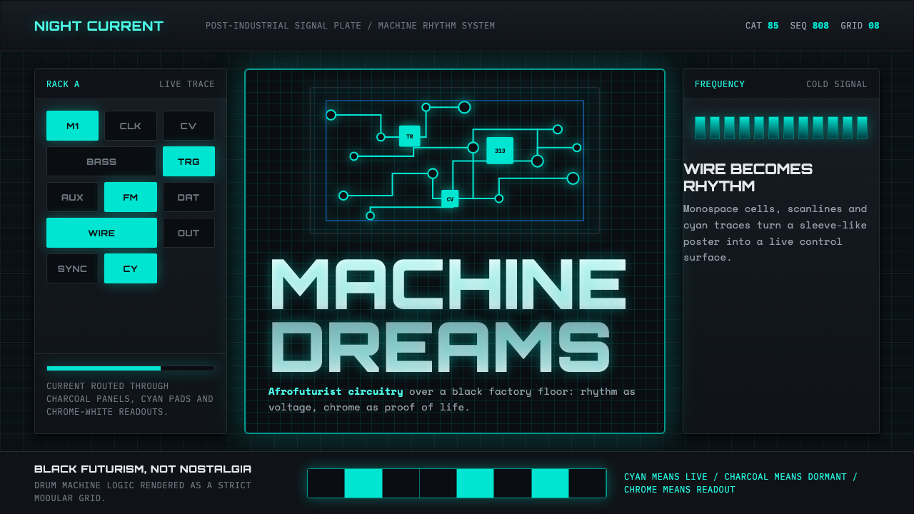 Detroit TechnoCold machines dream. Electric cyan circuits and chrome display type lock to a…冷机器在做梦。电青线路与铬感字形锁进黑色网格。
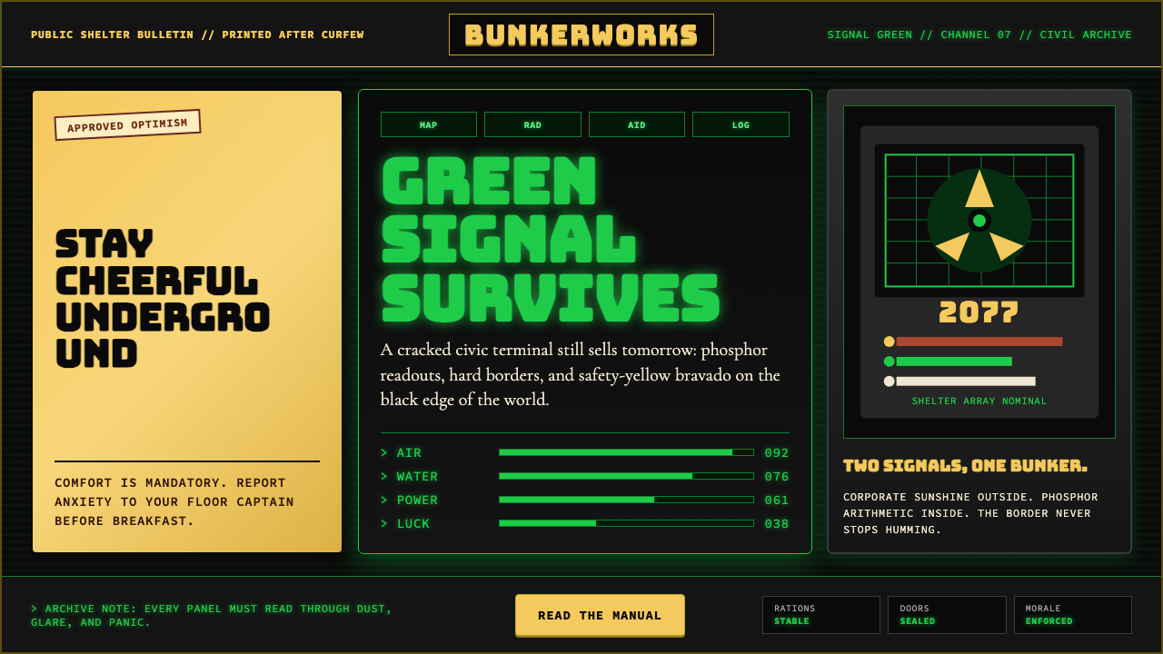 Fallout Vault-Tec Pip-BoyIrradiated optimism. Vault yellow and CRT green lock into a bordered bunker g…辐照乐观主义:避难所黄与CRT绿嵌入硬边地堡网格。
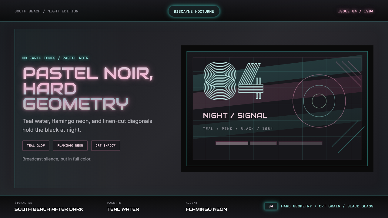 Miami Vice Pastel Teal (1984)Pastel noir, not nostalgia. Teal glow and flamingo pink slice black with geom…不是怀旧,是粉青霓虹。青光与火烈鸟粉切开黑底几何。