What is Blade Runner 1982 Neon Noir?什么是 Blade Runner 1982 Neon Noir?
Ridley Scott's 1982 masterpiece burned a single visual grammar into culture: perpetual rain, saturated neon bleeding through black fog, and the beautiful dread of a future that never cleaned itself up.雷德利·斯科特1982年的杰作将一套视觉语法烙入文化记忆:永不停歇的雨,饱和霓虹穿透黑色雾气燃烧,以及那个从未收拾干净自身的未来所散发的美丽恐惧。
Blade Runner 1982 Neon Noir in briefBlade Runner 1982 Neon Noir 速览
Blade Runner Neon Noir is the visual language distilled from Ridley Scott's 1982 film — a system built on near-total darkness punctuated by hot-orange and magenta neon, washed in cyan atmospheric haze, and layered with the humid texture of perpetual rain. It is the canonical aesthetic of cyberpunk cinema: retrofitted technology colliding with decayed grandeur, vertical signage towering in languages that no longer belong to any single nation, and a chromatic palette where warmth and cold exist in violent simultaneous tension.《银翼杀手》霓虹黑色电影是从雷德利·斯科特1982年影片中提炼出的视觉语言——一套建立在近乎绝对黑暗之上的系统,以炽热橙色与洋红霓虹点亮暗场,以青色大气雾霭渲染全局,并以永恒雨水的潮湿质感层层叠加。这是赛博朋克电影美学的经典范式:改装技术与破败宏伟的碰撞,不再属于任何单一民族的多语种垂直招牌高耸入云,以及温暖与寒冷在同一画面中剧烈共存的色彩关系。
The style is simultaneously dark and luminous. Backgrounds are almost uniformly deep — ink blacks and ash grays — but every surface catches reflected light. Neon spills across wet pavement, bleeds through frosted glass, and halos the silhouettes of figures moving through fog. This light is never clean or directional in the way daylight is; it is ambient, diffused, competing. The result is a visual world that feels dense rather than empty despite its heavy use of darkness.这种风格同时兼具黑暗与光亮。背景几乎一律深沉——墨黑与灰烬灰——但每一个表面都承接着反射的光。霓虹漫溢于湿润路面,穿透磨砂玻璃渗透,在穿行于雾中的人物剪影周围形成光晕。这种光从不像日光那样洁净或有方向性;它是环境性的、漫散的、相互竞争的。结果是一个视觉世界,尽管大量使用黑暗,却感觉密实而非空洞。
What separates Blade Runner Neon Noir from generic 'dark mode' design is its specificity of atmosphere. Generic darkness is uniform and flat. This aesthetic has weather: gradients of fog that shift depth, pools of color that define zones rather than fill them, and the sense that every lit element is fighting the surrounding darkness rather than simply existing against it. It is a style about tension — between warmth and cold, between human scale and monumental architecture, between beauty and menace.将《银翼杀手》霓虹黑色电影与普通「深色模式」设计区分开来的,是其氛围的特殊性。普通的黑暗是均匀而平面的;这套美学有天气:雾气的渐变层次定义了深度,色彩的池塘划定了区域而非填满它们,每一个发光元素都仿佛在与周遭黑暗搏斗,而不仅仅是存在于其前。这是一种关于张力的风格——温暖与寒冷之间,人的尺度与纪念碑式建筑之间,美丽与威胁之间。
See the Blade Runner 1982 Neon Noir design system查看 Blade Runner 1982 Neon Noir 完整设计系统
Where does Blade Runner 1982 Neon Noir come from?Blade Runner 1982 Neon Noir 从何而来?
Blade Runner opened in American theaters on June 25, 1982, directed by Ridley Scott from a screenplay by Hampton Fancher and David Peoples, adapted from Philip K. Dick's 1968 novel Do Androids Dream of Electric Sheep? The film was troubled in production and received a mixed critical reception on release, yet its visual design was immediately recognized as unprecedented. Set in Los Angeles in November 2019, the film imagined a city that had grown without coherence — a dense vertical accretion of architectural eras, cultures, and technologies that had never been reconciled or cleaned up.《银翼杀手》于1982年6月25日在美国公映,由雷德利·斯科特执导,汉普顿·范彻与大卫·皮普尔斯编剧,改编自菲利普·K·迪克1968年的小说《仿生人会梦见电子羊吗?》。影片制作过程多有波折,公映后评价褒贬不一,但其视觉设计被立即认定为前所未有的创举。故事设定于2019年11月的洛杉矶,影片构想了一座无序生长的城市——建筑年代、文化与技术的稠密垂直堆积,从未被调和或清理。
The visual world of Blade Runner was the creation of a small team working with unusual creative latitude. Production designer Lawrence G. Paull and his team built the 'Enhancements' — the retrofitted street-level environment — on the backlot Warner Bros. set known as the New York Street, layering it with neon signage drawing from Japanese, Chinese, and Arabic scripts, steam vents, and practical rain rigs that operated continuously during filming. Conceptual artist and futurist Syd Mead, who had worked for Ford and U.S. Steel before entering film, developed the visual concept of 'retro-fitting': the idea that future technology would not replace old infrastructure but would be bolted onto it, creating a world of accumulated temporal layers. His vehicle and environmental designs gave the film its distinctive look of high technology weathered into urban grime.《银翼杀手》的视觉世界由一个获得罕见创作自由的小团队打造。生产设计师劳伦斯·G·保尔及其团队在华纳兄弟的外景地「纽约街」上搭建了「改造区」——街道层级的环境——将其覆盖以汲取日文、中文与阿拉伯文字的霓虹招牌、蒸汽排口,以及拍摄期间持续运转的实体降雨装置。概念艺术家与未来学家西德·米德在进入电影行业之前曾为福特和美国钢铁公司工作,他发展出「改装」的视觉概念:未来的技术不会取代旧有基础设施,而是将其螺栓固定其上,创造出一个时间层叠积累的世界。他的交通工具与环境设计赋予影片高科技被城市污垢侵蚀的独特外观。
Director of photography Jordan Cronenweth made choices that broke with the conventions of science fiction cinematography. Rather than the clean, high-key lighting typical of optimistic futurism, Cronenweth used deep shadows, motivated practical lights — neon signs, street lamps, desk lamps — and smoke and rain as diffusion media. The palette emerged from the practical light sources on set: sodium vapor street lamps casting orange warmth, blue-tinted industrial illumination, and the competing colored neon of signage. The film was shot almost entirely at night or in controlled interior environments, giving it a consistency of atmosphere that would have been impossible in daylight.摄影指导乔丹·克罗嫩威斯的选择打破了科幻电影摄影的惯例。他没有采用乐观未来主义常见的高调、明亮打光,而是使用深沉阴影、有动机的实际光源——霓虹招牌、路灯、台灯——以及烟雾与雨水作为漫散介质。色彩调板直接来自片场的实际光源:钠蒸气路灯投射橙色暖光,蓝色调工业照明,以及招牌霓虹相互竞争的色光。影片几乎全部在夜间或受控室内环境中拍摄,赋予其在日光下不可能实现的大气一致性。
The film's cultural afterlife was enormous and slow-building. Blade Runner performed modestly at the box office in 1982 — it was competing against E.T. the Extra-Terrestrial — but entered heavy cable television rotation and became a formative visual reference for a generation of artists, designers, and filmmakers in the mid-1980s. The release of the Director's Cut in 1992 and the definitive Final Cut in 2007 introduced the film to successive new audiences. By the time cyberpunk had crystallized as a literary and visual genre — through William Gibson's Neuromancer in 1984, and through the work of Japanese artists and animators who found Blade Runner's dense urban layering directly applicable to their own aesthetic traditions — the film's visual vocabulary had become a shared cultural inheritance. Its influence on video game art, graphic design, fashion, architecture, and eventually the aesthetics of dark-mode digital interfaces has been continuous and direct.影片的文化余波巨大而缓慢地积累。《银翼杀手》1982年在票房上表现平平——彼时正与《E.T. 外星人》同场竞争——但随后进入大量有线电视轮播,成为1980年代中期一整代艺术家、设计师与电影人的视觉参照系。1992年导演剪辑版与2007年权威终极剪辑版的相继发行,将影片介绍给一批又一批新观众。当赛博朋克通过威廉·吉布森1984年的《神经漫游者》以及对《银翼杀手》稠密城市层叠感深有共鸣的日本艺术家与动画师的作品,作为文学与视觉类型完全结晶之时,影片的视觉语汇已成为共享的文化遗产。它对电子游戏美术、平面设计、时尚、建筑,乃至最终数字界面深色模式美学的影响,持续而直接。
What defines the Blade Runner 1982 Neon Noir look?Blade Runner 1982 Neon Noir 的视觉特征是什么?
Color and Light色彩与光线
The palette is built on the opposition of deep cold backgrounds and intensely warm neon foregrounds. Blacks and dark charcoals form the base; over this, hot orange, vivid magenta, and electric cyan cut through as luminous accents. The cyan typically reads as atmospheric — the color of fog, rain, and distance — while orange and magenta operate as close-range neon heat sources. No single color dominates cleanly; they bleed into each other through fog, reflection, and wet surfaces. This chromatic conflict is the emotional engine of the aesthetic.调色板建立在深冷背景与强烈暖霓虹前景的对立之上。黑色与深炭灰构成基底;在此之上,炽热橙色、鲜明洋红与电气青色作为发光强调色切入。青色通常以大气方式呈现——雾、雨与远景的色彩——而橙色与洋红则作为近距离霓虹热源运作。没有哪种颜色能干净地主导全局;它们透过雾气、倒影与潮湿表面相互渗透。这种色彩冲突是这套美学的情感引擎。
Darkness and Atmosphere黑暗与大气
The background is never neutral. Darkness in this aesthetic is textured and layered: it contains gradients of fog, suggestions of depth, and zones of deeper and shallower shadow. Atmospheric haze is a structural device — it creates soft separation between foreground and background, softens hard edges at a distance, and gives the impression that the world extends beyond what is visible. Rain is implied even when not shown directly, through the sheen of wet surfaces and the scattered reflection of light across any horizontal plane.背景从不是中性的。这套美学中的黑暗是有质感、有层次的:它包含雾气的渐变、深度的暗示,以及深浅不一的阴影区域。大气雾霭是一种结构性装置——它在前景与背景之间创造柔和分离,软化远处的硬边,营造出世界延伸至可见范围之外的印象。即便雨未直接展示,也通过潮湿表面的光泽与光线在任何水平面上的散射倒影而被暗示。
Vertical Layering and Signage垂直层叠与标牌
The compositional logic favors strong vertical elements. In the film, towering signage in multiple scripts — Japanese katakana, Chinese characters, Arabic numerals — stacked and overlapping, communicates a future of cultural accumulation rather than cultural replacement. In design terms, this translates to compositions that read from top to bottom, where scale contrast between large vertical elements and small fine text creates the sense of a world in excess of any single viewer's comprehension. Text is not decorative; it is environmental information competing for attention across multiple planes simultaneously.构图逻辑偏爱强烈的垂直元素。在影片中,多种文字——日文片假名、汉字、阿拉伯数字——叠加交织的高大招牌,传递出文化积累而非文化替代的未来。转化为设计语言,即构图从上至下展开阅读,大型垂直元素与细小文字之间的尺度对比,营造出一个超越任何单一观察者理解范围的世界感。文字不是装饰;它是在多个平面上同时竞争注意力的环境信息。
Retrofitted Texture改装质感
A defining quality of the aesthetic is the coexistence of advanced technology and visible age. Surfaces are not pristine. They carry the evidence of accumulated use: grime on glass, condensation on metal, imperfections in neon tubes that flicker rather than glow steadily. This is Syd Mead's 'retro-fitting' principle made visual: the future does not replace the present but grows over it. In design applications, this translates to intentional roughness — grain over gradients, irregular glow edges rather than clean halos, a preference for analog imperfection over digital precision.这套美学的核心品质之一,是先进技术与可见老化的共存。表面并非洁净无瑕——它们承载着积累使用的痕迹:玻璃上的污垢、金属上的冷凝水、霓虹管的不均匀而闪烁的光。这是西德·米德「改装」原则的视觉化:未来不取代现在,而是在其上生长。在设计应用中,这转化为刻意的粗糙感——渐变上叠加颗粒,光晕边缘不规则而非洁净轮廓,偏好模拟的不完美而非数字的精确。
Silhouette and Contrast剪影与对比
Human figures and objects in this aesthetic frequently appear as dark silhouettes against luminous backgrounds, or as lit surfaces against near-total shadow. High contrast between illuminated and unlit areas is the default condition rather than the exception. This extreme contrast is not mere moodiness; it is a compositional tool that creates immediate reading hierarchy — the eye moves to the lightest area first, regardless of its size — and it allows multiple layers of depth to coexist in a single composition without competing.在这套美学中,人物与物体频繁以深色剪影的形式出现在发光背景前,或以被照亮的表面形式出现在近乎全黑的阴影中。明亮与黑暗区域之间的高对比是默认状态而非例外。这种极端对比不仅是情绪渲染;它是一种构图工具——无论尺寸大小,视线首先移向最亮的区域——并允许多层次深度在单一构图中共存而不相互竞争。
Glow and Bleed光晕与渗溢
Light in this aesthetic does not have clean edges. Neon signs cast halos; reflections spread and distort on uneven wet surfaces; color bleeds from one element into the surrounding space. This diffusion is characteristic of practical neon lighting photographed in humid, smoky conditions — Cronenweth's actual shooting environment — and it gives the aesthetic its quality of barely-contained luminosity. Color never stays precisely where it is placed; it radiates. In design terms, glow is structural, not decorative, and elements that glow should feel like they are genuinely emitting light rather than having a filter applied.这套美学中的光没有洁净的边界。霓虹招牌投射出光晕;倒影在凹凸不平的潮湿表面上扩散变形;色彩从一个元素向周围空间渗透溢出。这种漫散是潮湿烟雾环境下实拍霓虹灯的典型效果——克罗嫩威斯的真实拍摄环境——赋予这套美学「几乎无法遏制的发光性」之质感。色彩从不精确停留在被放置之处;它向外辐射。在设计语言中,光晕是结构性的而非装饰性的,发光元素应感觉像真正在发射光线,而非仅是被施加了滤镜。
Scale and Alienation尺度与疏离感
Blade Runner's architecture operates at a scale that dwarfs the human figure deliberately. The Tyrell Corporation's pyramid, the Bradbury Building adapted as J. F. Sebastian's residence, the canyon-like streets formed by close-packed towers — all communicate a world built for the accumulation of capital and power rather than human habitation. In this aesthetic, small human-scale elements are in constant dialogue with monumental structures. This tension between the intimate and the overwhelming is what gives the style its specific emotional register: beauty tipped toward dread.《银翼杀手》的建筑以刻意矮化人物的尺度运作。泰瑞公司的金字塔、改造为J·F·塞巴斯蒂安住所的布拉德伯里大厦、紧密堆砌高楼形成的峡谷般街道——一切都传达出一个为资本与权力积累而非为人类居住而建造的世界。在这套美学中,人类尺度的微小元素始终与纪念碑式结构处于对话之中。亲密与压倒之间的张力,正是这种风格独特情感频率的来源:美丽向恐惧倾斜。
See the Blade Runner 1982 Neon Noir design system查看 Blade Runner 1982 Neon Noir 完整设计系统
Who shaped Blade Runner 1982 Neon Noir?谁塑造了 Blade Runner 1982 Neon Noir?
Scott brought to Blade Runner an obsessive attention to environmental detail cultivated in his earlier career directing television commercials, where every frame had to carry maximum visual information in minimal time. His insistence on continuous rain on set — a practical and financial extravagance — was the decision that most unified the film's atmosphere. Scott's subsequent revision of the film into the 1992 Director's Cut and 2007 Final Cut, removing the studio-imposed voiceover narration and the artificially optimistic ending, clarified the aesthetic and philosophical coherence that had always been present in the images.斯科特将其在电视广告导演生涯中磨砺出的对环境细节的痴迷带入了《银翼杀手》——在那个职业中,每一帧画面都必须在最短时间内承载最大信息量。他坚持在片场持续降雨的决定——一种实际上奢侈且昂贵的选择——是最终统一影片氛围的关键。他随后将影片修订为1992年导演剪辑版与2007年终极剪辑版,去除了片方强加的旁白和人为乐观的结局,厘清了那些影像中始终存在的美学与哲学连贯性。
Mead was a visual futurist whose clients before Blade Runner included major American manufacturers. His concept of 'retro-fitting' — technology layered onto existing infrastructure rather than replacing it — gave Blade Runner its foundational spatial logic and distinguished it from the pristine, sterile futures of most science fiction cinema at the time. Mead designed the film's vehicles, the Spinner police cars and their world, and contributed to the environmental design of the street level. His philosophy that future cities would be defined by accumulated layers of technology rather than total replacement became the governing idea of the entire cyberpunk visual tradition.米德是一位视觉未来学家,《银翼杀手》之前的客户包括多家美国主要制造商。他的「改装」概念——技术叠加于现有基础设施之上而非取而代之——赋予《银翼杀手》基础性的空间逻辑,使其有别于当时大多数科幻电影的洁净无菌未来。米德设计了影片的交通工具、旋翼警车及其所处的世界,并参与了街道层级的环境设计。他关于未来城市将由技术的层叠积累而非全面替换来定义的哲学,成为整个赛博朋克视觉传统的核心理念。
Cronenweth's cinematography for Blade Runner solved the specific problem of making a world of near-total darkness legible and beautiful. His technique of 'motivated lighting' — ensuring that every light source in a scene was justified by a visible practical source within the frame — gave the film's extreme contrast a logical foundation rather than arbitrary moodiness. Cronenweth's use of smoke and rain as atmospheric diffusion materials was partly practical necessity and partly aesthetic choice, and it produced the characteristic quality of light that seems to exist in the air rather than falling on surfaces. His work on Blade Runner remains a benchmark reference for low-key, high-contrast digital cinematography.克罗嫩威斯在《银翼杀手》中的摄影解决了一个特殊问题:如何使一个近乎全黑的世界既清晰可读又具有美感。他的「有动机打光」技术——确保场景中每个光源都由画面内可见的实体光源来证明其合理性——为影片的极端对比提供了逻辑基础,而非任意的情绪渲染。克罗嫩威斯使用烟雾与雨水作为大气漫散介质,一半出于实际需要,一半出于美学选择,创造出那种特有的「存在于空气中而非落在表面上」的光线质感。他在《银翼杀手》上的工作至今仍是低调、高对比度数字摄影的基准参照。
As production designer, Paull translated Scott's and Mead's visions into physical sets that could be photographed. His key decision — to use the Warner Bros. backlot New York Street as the primary exterior environment and transform it through layered dressing into the film's Los Angeles 2019 — was both pragmatic and visionary. The 'Enhancements' he and his team added: the dense neon signage drawing from multiple real-world scripts, the steam and smoke practical effects, the vertical complexity added to existing buildings through structural additions, created the environmental grammar that every cyberpunk visual work since has referenced, consciously or not.作为生产设计师,保尔将斯科特与米德的构想转化为可供拍摄的实体场景。他的关键决策——以华纳兄弟外景地「纽约街」为主要外景环境,通过层叠布景将其改造为影片的2019年洛杉矶——既务实又具前瞻性。他与团队添加的「改造物」:汲取多种真实文字脚本的密集霓虹标牌、蒸汽与烟雾的实际效果、通过结构性添加为现有建筑增加的垂直复杂性,创造了此后每一部赛博朋克视觉作品——有意或无意地——所参照的环境语法。
How do you use Blade Runner 1982 Neon Noir today?今天怎么用 Blade Runner 1982 Neon Noir?
Blade Runner Neon Noir is one of the most immediately recognizable aesthetics available for contemporary design, and precisely because of that recognizability, it demands a light and disciplined hand. The visual system is built on specific relationships — between dark and luminous, between warm and cold, between human scale and architectural excess — and those relationships must be honored for the result to feel authentic rather than like a filter applied carelessly over unrelated content.《银翼杀手》霓虹黑色电影是当代设计中最具即视感的美学之一,也正因为这种即视感,它要求设计师保持克制与纪律。这套视觉系统建立在特定关系之上——黑暗与发光之间、温暖与寒冷之间、人类尺度与建筑过度之间——这些关系必须被尊重,结果才能感觉真实,而非像一个滤镜被漫不经心地叠加在不相关内容上。
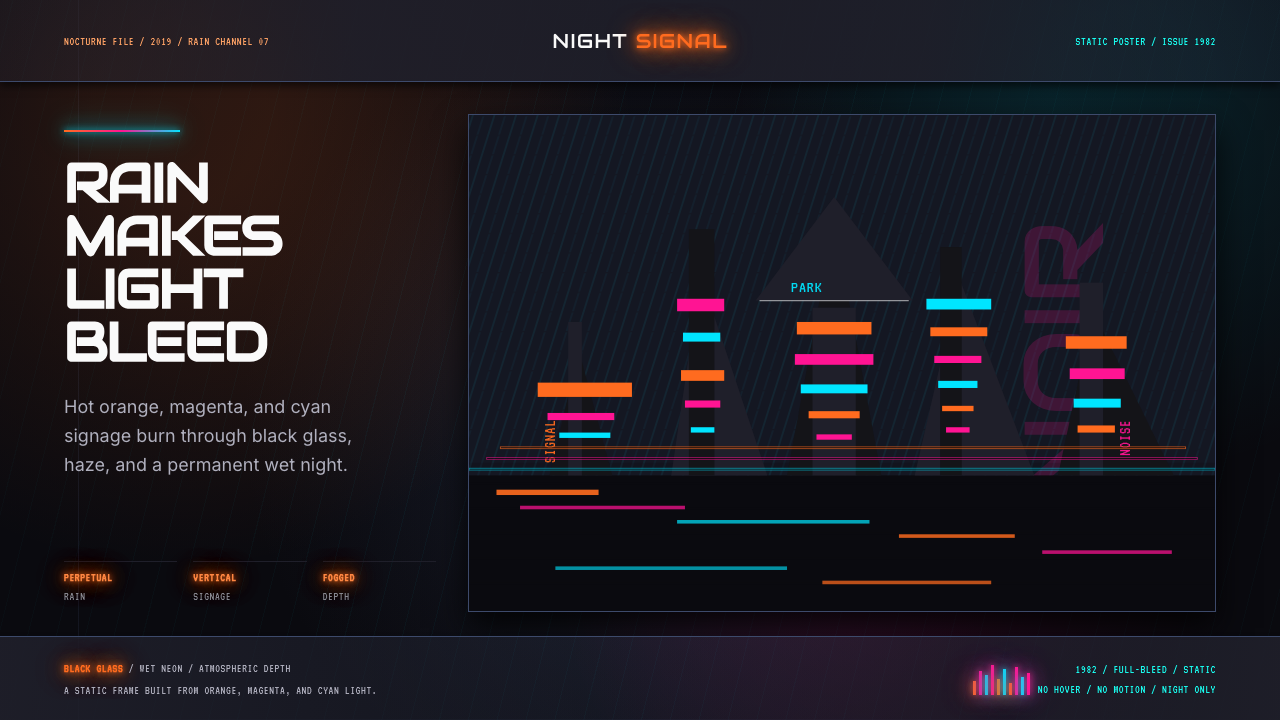
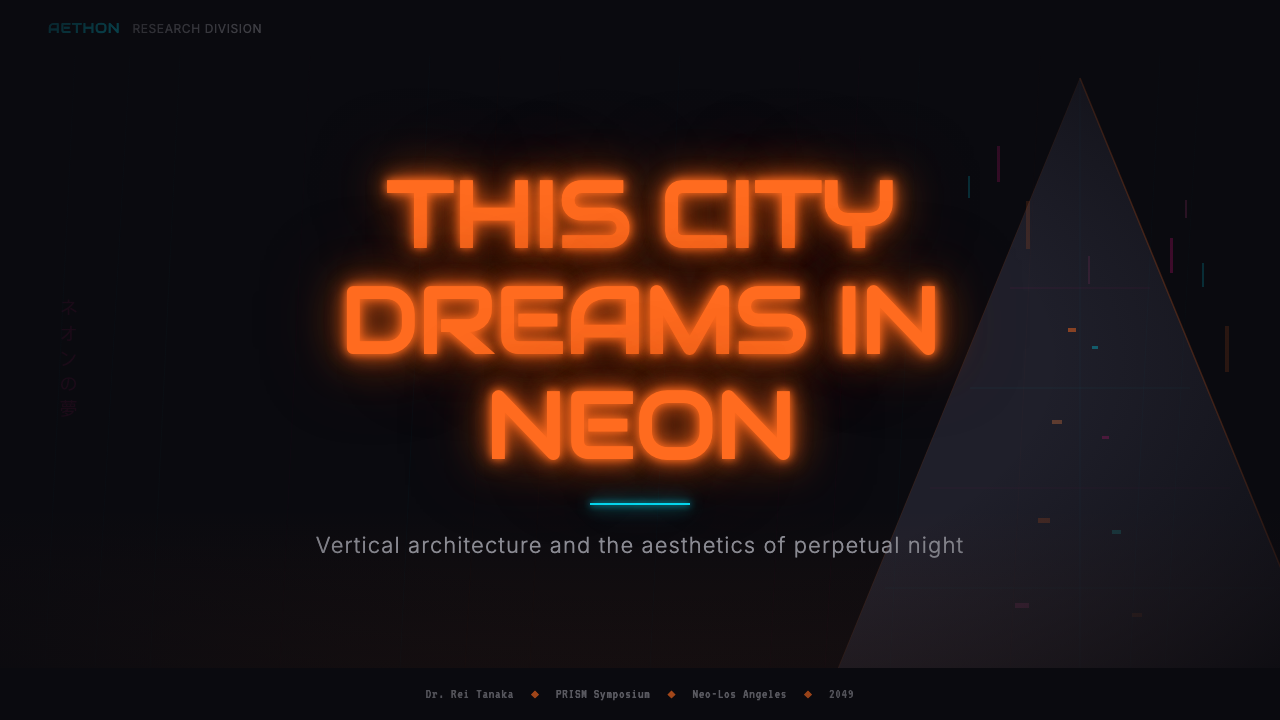
For presentation slides, the style works exceptionally well as a cover or section-break aesthetic, less reliably as a format for sustained reading. A cover built in this language leads with a deep, fog-layered background, a large typographic element treated with a warm neon-adjacent color, and a narrow subheading in cool-toned light. The key is restraint: one or two colored elements against near-total darkness, not a field crowded with competing lights. Content slides that need this atmosphere should use the dark ground for emphasis only — isolating key statistics or callouts in pools of warm light while keeping surrounding context in dark gray rather than black, maintaining the same neon logic at a lower intensity. Data visualizations benefit greatly from selective color: a single accent color applied to one bar, one line, one wedge to direct attention, rather than a full palette applied categorically.在演示文稿中,这种风格作为封面或章节间隔页的美学表现极佳,但作为持续阅读的格式则不够可靠。以这套语言构建的封面,以深沉、雾气层叠的背景为主导,以暖色霓虹质感处理大号文字元素,以冷色调细副标题点缀。关键在于克制:近乎全黑的黑暗中一两个彩色元素,而非拥挤着相互竞争的光源。需要这种氛围的内容页应将黑暗底面仅用于强调——用暖光的池塘孤立关键数据或摘引,同时将周围背景保持为深灰而非纯黑,以较低强度维持相同的霓虹逻辑。数据可视化从选择性用色中受益极大:将单一强调色施于一根柱条、一条线、一个扇区以引导注意力,而非将完整色板分类应用。
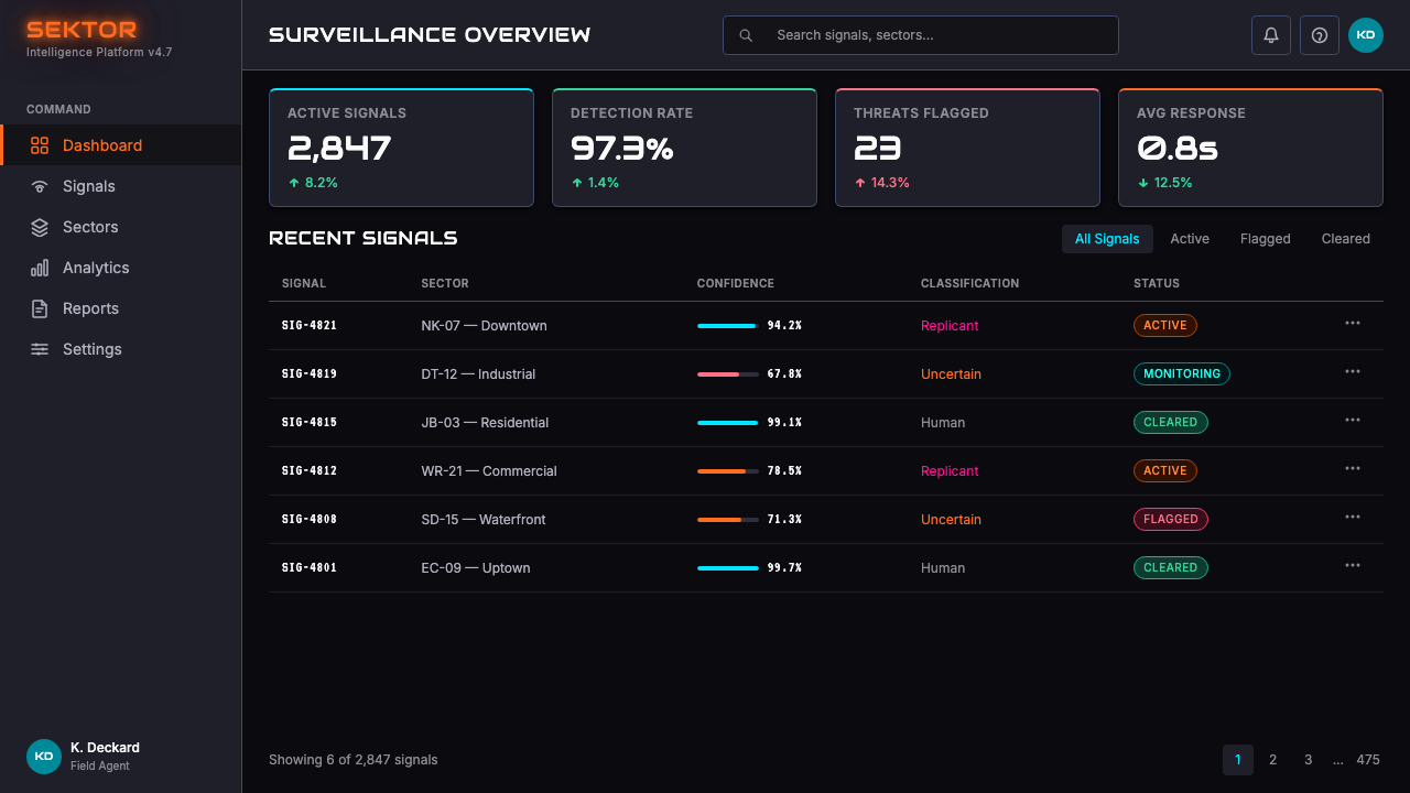
For web interfaces, this aesthetic is particularly well-suited to dashboards, developer tools, analytics platforms, and products that want to communicate technical seriousness and nocturnal intensity. The approach: commit to a very dark background as the base, define the primary text color as a cool near-white, and reserve the warm accent colors for interactive states, highlights, notifications, and primary calls to action. Navigation and structural chrome should live in the mid-dark range — darker than text backgrounds, lighter than the deepest shadows — creating the layered depth that is essential to the aesthetic. Borders should be subtle, defined by a slight luminosity difference rather than a bright contrasting line. Cards and panels are defined by depth rather than by hard boundaries; they are zones of slightly different darkness, not boxes.对于网页界面,这套美学特别适合仪表板、开发者工具、数据分析平台,以及希望传递技术严肃感与深夜强度的产品。方法:以极深背景为基底,将主要文字色定义为冷色调近白,将暖调强调色保留给交互状态、高亮显示、通知与主要行动号召。导航与结构性框架应处于中深色范围——比文字背景更深,比最深阴影更亮——创造这套美学不可或缺的层次深度。边框应微妙,以细微的明度差异而非鲜明对比线来定义。卡片与面板通过深度而非硬边界来界定;它们是略有不同深度的区域,而非方框。
For editorial and marketing applications, the style's cinematic quality makes it powerful for product launches, brand campaigns, and editorial features aimed at audiences comfortable with cultural references to science fiction and tech culture. A full-page feature built in this language uses a high-contrast lead image — silhouette against fog-lit background, or extreme close-up of a neon-lit surface — with typography that is large, confident, and given a warm or cold tonal cast consistent with the surrounding palette. Section markers and pull-quotes are distinguished by a shift in background depth or a narrow rule in a neon accent color rather than decorative ornament. The neon-lit color should appear rarely enough to feel like signal rather than noise.对于编辑与营销应用,这种风格的电影质感使其在面向熟悉科幻与科技文化的受众的产品发布、品牌推广与专题报道中极为有力。以这套语言构建的整版特写使用高对比度主图——雾光背景前的剪影,或霓虹照亮表面的极近特写——配以宽大、自信且色调与周围调色板一致(或暖或冷)的文字排印。章节标记与摘引通过背景深度的转换或霓虹强调色的细线来区分,而非装饰性元素。霓虹照亮的色彩应出现得足够稀少,以感觉像信号而非噪音。
The most common failure mode when applying this aesthetic is the addition of too many light sources in too many colors simultaneously. Authentic Blade Runner atmosphere achieves its sense of density through the relationships between a small number of specific colors — the fog is one color, the neon is one or two, the darkness is not pure black but a range of very deep values. When designers add four or five equally saturated accent colors to a dark background in an attempt to amplify the effect, the result loses all atmospheric coherence and begins to look like generic 'gaming aesthetic' rather than studied cinematic noir. The discipline is to choose one dominant warm color — orange or magenta — and one cool atmospheric color — cyan or a desaturated blue-green — and then trust the darkness to do the rest.应用这套美学时最常见的失败模式,是同时添加过多颜色的光源。真实的《银翼杀手》氛围通过少数几种特定颜色之间的关系实现其密实感——雾是一种颜色,霓虹是一或两种,黑暗不是纯黑而是一系列极深色值。当设计师为了放大效果而在深色背景上添加四五种等饱和度强调色时,结果失去一切大气连贯性,开始看起来像通用的「游戏美学」而非经过研究的电影黑色电影。纪律在于:选择一种主导暖色——橙色或洋红——以及一种冷调大气色——青色或去饱和的蓝绿——然后信任黑暗去完成其余的工作。
See the Blade Runner 1982 Neon Noir design system查看 Blade Runner 1982 Neon Noir 完整设计系统
Blade Runner 1982 Neon Noir — FAQBlade Runner 1982 Neon Noir · 常见问题
Is this aesthetic the same as generic 'cyberpunk' or 'dark mode'?这套美学与泛泛的「赛博朋克」或「深色模式」是同一回事吗?
Not precisely. Generic cyberpunk and dark mode are categories; Blade Runner Neon Noir is a specific visual grammar derived from a specific film with a specific cinematographic logic. Generic dark mode uses dark backgrounds for readability and battery reasons, without atmospheric intention. Generic cyberpunk borrows neon colors but typically deploys them without the fog, the retrofitted texture, or the particular tension between warm orange-magenta and cool cyan that is central to Blade Runner's palette. The difference is in atmospheric specificity: this aesthetic has weather, depth, and a particular emotional register — the beauty of the menacing and beautiful simultaneously — that generic dark-mode or cyberpunk templates rarely achieve.并不完全相同。通用赛博朋克与深色模式是类别;《银翼杀手》霓虹黑色电影是从一部具有特定电影摄影逻辑的具体影片中提炼出的特定视觉语法。通用深色模式出于可读性与省电原因使用深色背景,没有大气意图。通用赛博朋克借用霓虹色彩,但通常在没有雾气、没有改装质感、没有那种对《银翼杀手》调色板至关重要的暖橙-洋红与冷青张力的情况下部署。差异在于大气的特殊性:这套美学有天气、有深度、有特定的情感频率——同时威胁与美丽的美——这是通用深色模式或赛博朋克模板很少能实现的。
Can this aesthetic work for light-background applications?这套美学能在浅色背景的应用场景中使用吗?
The aesthetic is fundamentally dark-ground — the darkness is not a stylistic choice that can be reversed while keeping the same system. Light-background 'day mode' versions can borrow individual elements: the warm-to-cool chromatic tension, the typographic scale contrasts, the preference for glowing accent colors over flat ones. But the specific quality of luminous neon emerging from near-total darkness — which is the defining condition of the aesthetic — cannot be replicated on a light ground. What you get on a light background is a loosely related palette rather than the aesthetic itself. If light-background is required by the design context, consider using the Neon Noir language only for specific high-emphasis components — hero banners, data highlights, notifications — rather than as a system-wide treatment.这套美学从根本上是深色底面的——黑暗不是可以在保持相同系统的情况下反转的风格选择。浅色背景的「日间模式」版本可以借用个别元素:暖到冷的色彩张力、文字排印的尺度对比、对发光强调色而非平面色的偏好。但「发光霓虹从近乎全黑的黑暗中涌现」——这套美学的定义性条件——无法在浅色底面上复制。在浅色背景上得到的是一个松散相关的调色板,而非美学本身。若设计语境要求浅色背景,可考虑仅将霓虹黑色电影语言用于特定高强调组件——英雄横幅、数据高亮、通知——而非作为全系统处理。
How do I avoid this aesthetic looking dated or clichéd?如何避免这套美学看起来过时或陈腐?
The key is to apply the atmospheric logic rather than the surface signals. The surface signals — neon on dark backgrounds, Japanese-adjacent typography, rain textures — became clichéd in the 1990s and again in the 2010s precisely because designers applied them without understanding the underlying relational logic. The atmospheric logic — the specific relationship between a narrow range of warm and cold luminous colors against a complex dark ground, the sense that light is diffused through air rather than placed on surfaces, the scale tension between monumental and intimate — remains powerful and contemporary when applied with restraint. One practical test: if removing the neon color from your design leaves something visually coherent and well-structured, the neon is functioning as signal. If removing it leaves a visual void, the neon was structural — which means the underlying design needed more work before the atmospheric treatment was applied.关键在于应用大气逻辑而非表面信号。表面信号——深色背景上的霓虹、近日文风格的文字排印、雨水质感——在1990年代以及2010年代变得陈腐,恰恰是因为设计师在不理解底层关系逻辑的情况下应用它们。大气逻辑——复杂深色底面上一系列暖冷发光色之间的特定关系、光线漫散于空气而非置放于表面的感觉、纪念碑与亲密之间的尺度张力——当以克制方式应用时,仍然强大而当代。一个实用测试:如果从你的设计中去除霓虹色彩后留下视觉上连贯且结构良好的东西,则霓虹正在作为信号发挥作用。如果去除后留下视觉空洞,则霓虹是结构性的——这意味着在应用大气处理之前,底层设计还需要更多工作。
What typography works best with this aesthetic?哪种字体排印与这套美学最为契合?
The film itself used a combination of large-scale sans-serif text for signage and a more condensed typeface for the film's own credits. For design applications, the aesthetic supports two typographic directions: bold, wide, high-contrast display type that references monumental signage — where the letters themselves carry weight and presence — and narrow, technical, monospaced type that references the interfaces and data readouts visible in the film. Either direction works; mixing both in a single composition creates the layering effect characteristic of the film's signage-dense environment. What does not work is light, delicate, or historically referential type — serifs, scripts, humanist letterforms — which carries associations incompatible with the aesthetic's industrial and alienated atmosphere.影片本身将用于标牌的大号无衬线文字与影片片头字幕中更为窄体的字体组合使用。在设计应用中,这套美学支持两种字体排印方向:大胆、宽展、高对比度的展示文字,参照纪念碑式标牌——字母本身承载分量与存在感;以及窄体、技术性、等宽的文字,参照影片中可见的界面与数据读出。两个方向均可行;在单一构图中混合两者会创造出影片标牌密集环境的层叠效果。不起作用的是轻盈、纤细或带有历史参照的字体——衬线体、手写体、人文主义字形——它们携带与这套美学的工业感与疏离感不相容的联想。
Is this style appropriate for consumer-facing products, or primarily for technical and professional tools?这种风格适合面向消费者的产品,还是主要适合技术与专业工具?
The aesthetic carries specific emotional associations — menace, complexity, technological overwhelm, the beauty of a world in decay — that are not universally desirable in consumer products. It works well for products where users want to feel that they are engaging with something serious, powerful, and slightly dangerous: gaming platforms, cybersecurity tools, financial trading interfaces, developer environments, entertainment products targeting audiences who appreciate the cultural references. It is poorly suited to products where warmth, accessibility, simplicity, or cheerfulness are the primary emotional goals: children's products, health and wellness applications, e-commerce contexts where trust is paramount, or any product where the user relationship depends on feeling safe and welcomed rather than impressed and slightly challenged. The style signals intensity; intensity is not always what a product should signal.这套美学携带特定的情感联想——威胁、复杂性、技术压迫感、衰败世界中的美——这些并非所有消费产品都期望传递的。它适合用户希望感觉自己正在接触某种严肃、强大且略带危险之物的产品:游戏平台、网络安全工具、金融交易界面、开发者环境、面向欣赏文化参照的受众的娱乐产品。它不适合温暖感、可及性、简洁性或愉悦感是首要情感目标的产品:儿童产品、健康与养生应用、信任至关重要的电商场景,或任何用户关系依赖于感到安全与受欢迎而非被印象深刻与被轻微挑战的产品。这种风格传递强度;强度并非总是产品应当传递的信号。
Related design styles相关设计风格
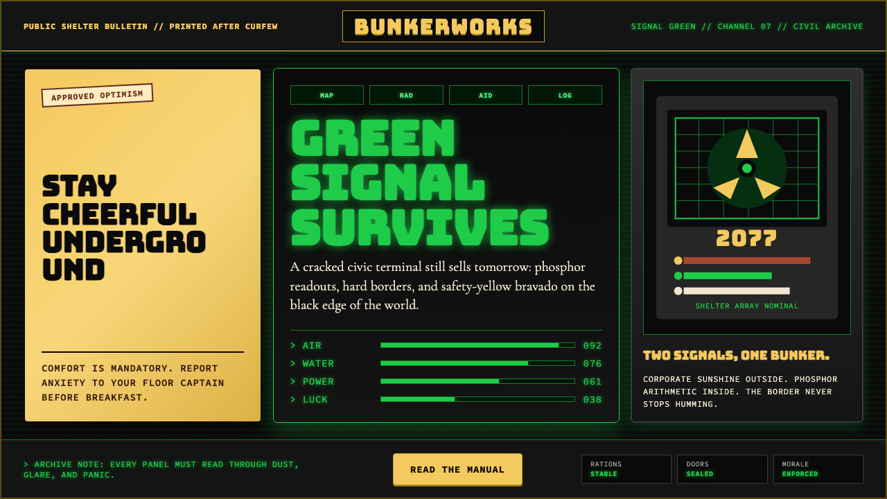 Fallout Vault-Tec Pip-BoyIrradiated optimism. Vault yellow and CRT green lock into a bordered bunker g…辐照乐观主义:避难所黄与CRT绿嵌入硬边地堡网格。
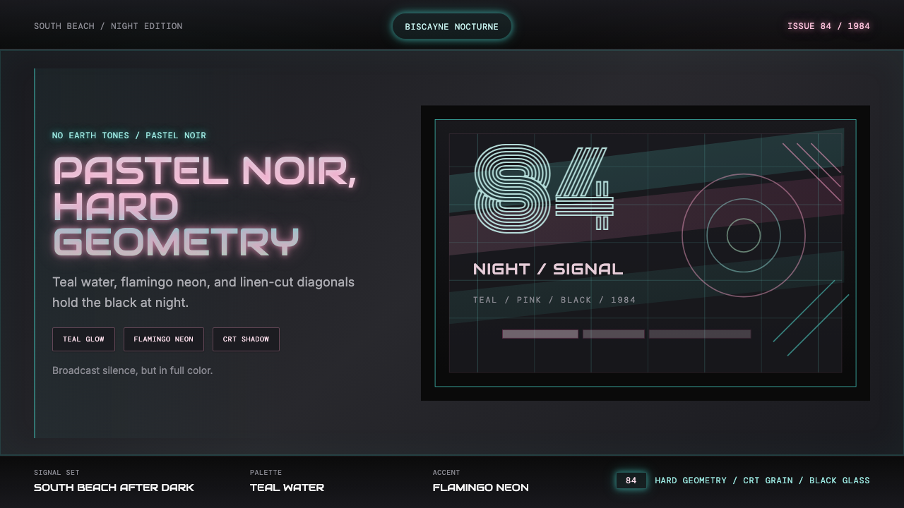 Miami Vice Pastel Teal (1984)Pastel noir, not nostalgia. Teal glow and flamingo pink slice black with geom…不是怀旧,是粉青霓虹。青光与火烈鸟粉切开黑底几何。
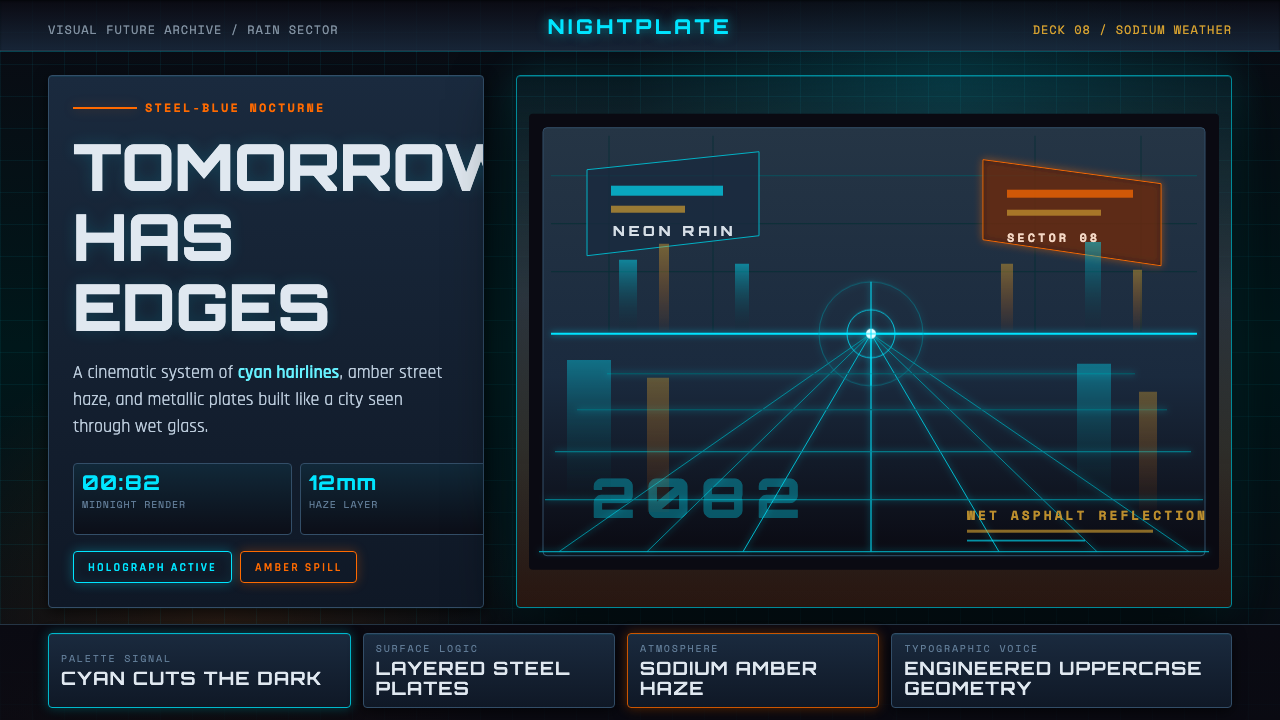 Retro-Futurism (Syd Mead)Tomorrow looks dangerous. Steel-blue night, neon cyan edges, and amber rain r…危险的明日感:钢蓝夜色、霓虹青边线与琥珀雨面反光。
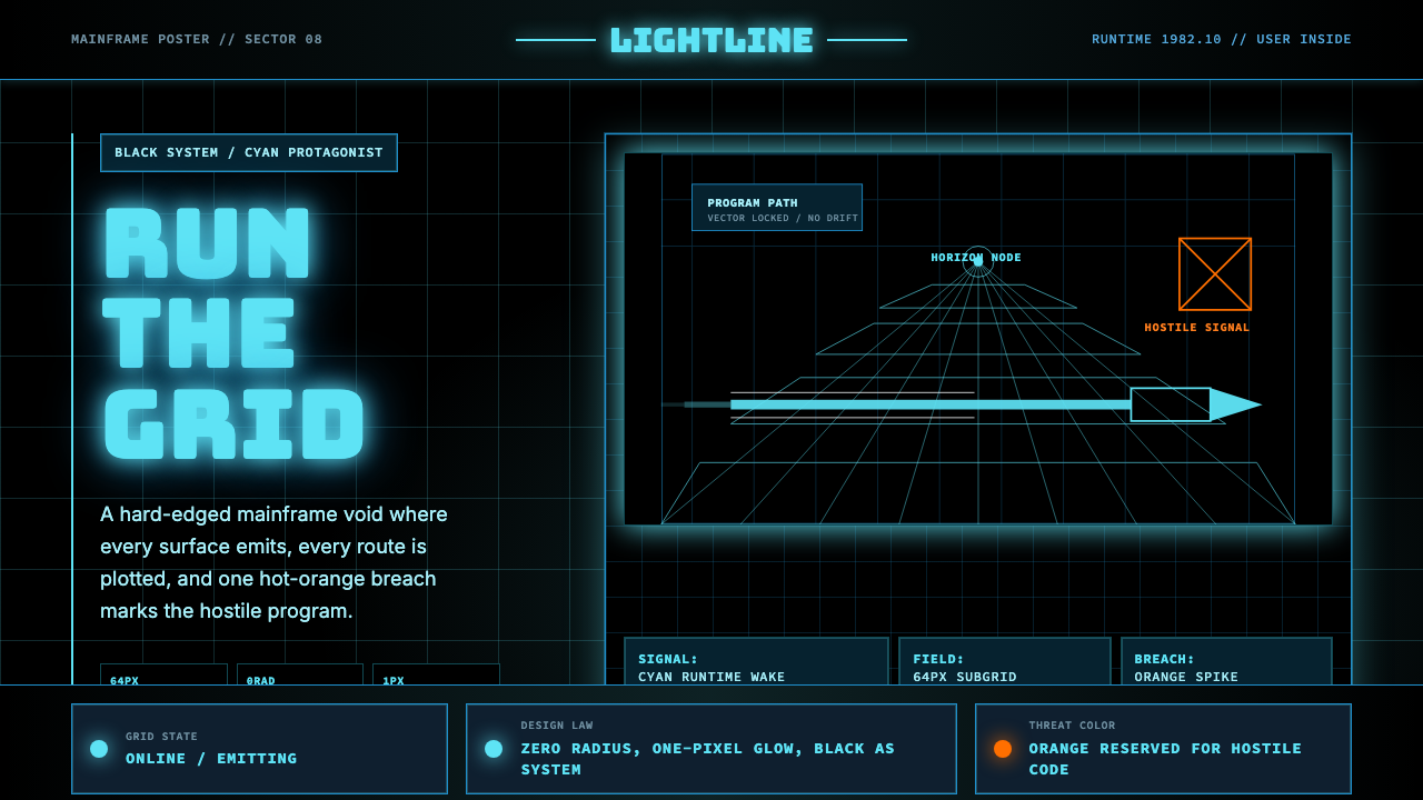 Tron Grid (1982)Cyber-precision in black. Neon cyan grids, Bungee type, and one orange breach…黑色赛博精度:霓虹青网格、Bungee 字体与一处橙色入侵切开虚空。
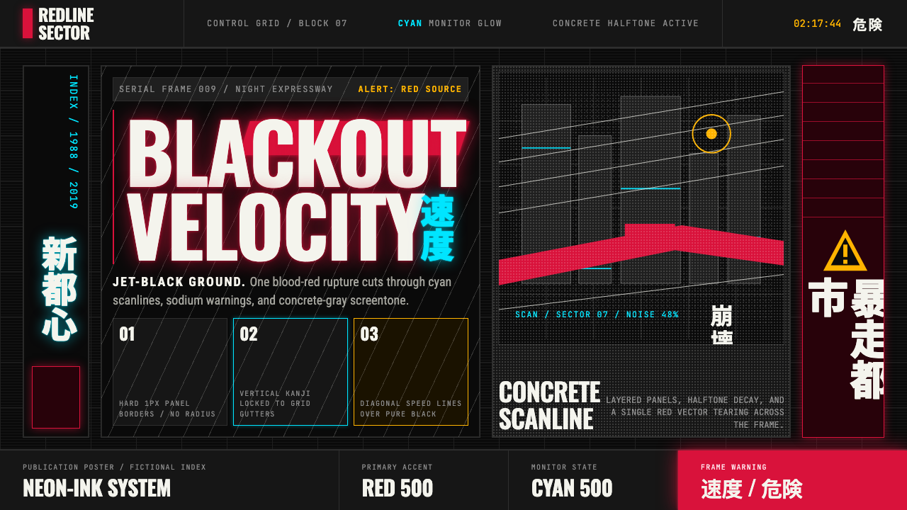 Akira (Otomo)Cyberpunk at impact. Kaneda red, cyan kanji, halftone concrete, and diagonal…冲击式赛博朋克:金田红、青色汉字、混凝土网点与斜向速度线。
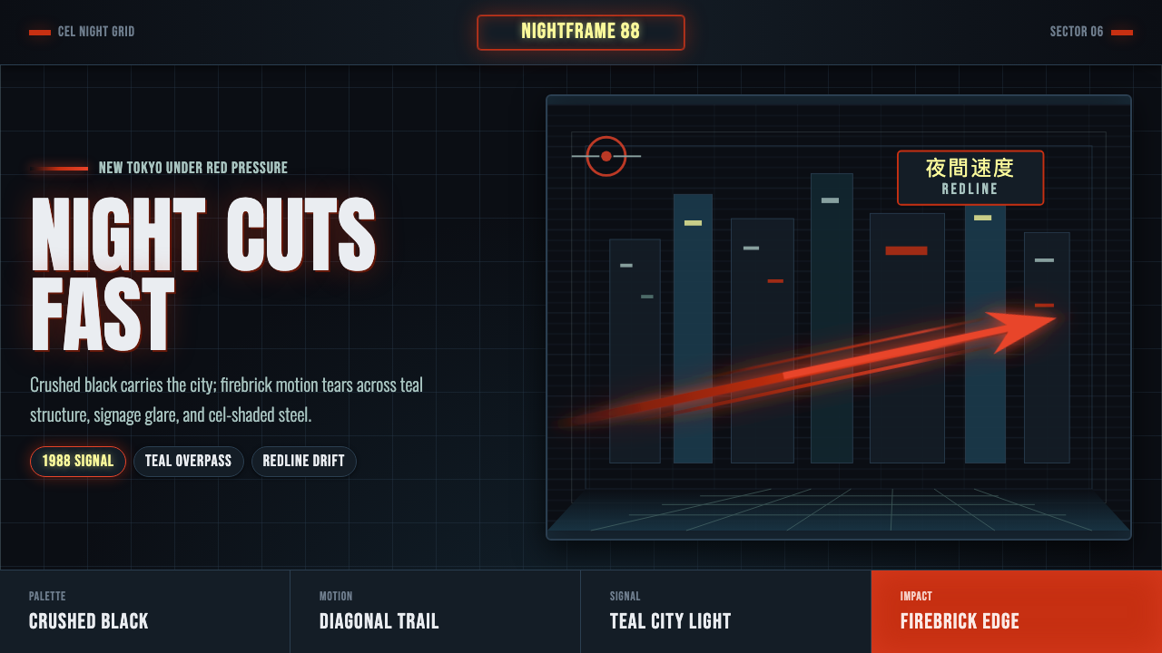 Akira Neo-TokyoNight moves fast. Firebrick trails cut crushed black, teal grids, and condens…黑夜疾驰。砖红光轨切开墨黑、青蓝网格与压缩招牌。