What is Retro-Futurism (Syd Mead)?什么是 Retro-Futurism (Syd Mead)?
Syd Mead's Retro-Futurism is the future the 1980s dreamed and feared — neon-cut megacities, chrome vehicles, and rain-soaked streets that smell of ozone and sodium light.赛德·米德的复古未来主义,是八十年代既向往又恐惧的明天——霓虹切割的巨型都市、镀铬飞行器,以及弥漫着臭氧与钠灯气息的雨浸街道。
Retro-Futurism (Syd Mead) in briefRetro-Futurism (Syd Mead) 速览
Retro-Futurism, as codified by visual futurist Syd Mead, is the aesthetic language of a specific imaginative moment: the late twentieth century's vision of what tomorrow would look like. It is not nostalgia for the past, but nostalgia for a future that never arrived — a future of hovering vehicles, towering arcologies, glowing holographic displays, and perpetually rain-dark streets. The style emerged from concept art, industrial design, and science-fiction cinema, and its visual logic is inseparable from the films it helped define.赛德·米德所定义的复古未来主义,是一个特定想象时刻的美学语言:二十世纪末对明天面貌的构想。它并非对过去的怀旧,而是对一个从未到来的未来的怀念——那个未来里有悬浮飞行器、拔地而起的垂直城市、发光的全息显示屏,以及永远笼罩在雨色中的街道。这种风格源自概念艺术、工业设计与科幻电影,其视觉逻辑与它所参与塑造的那些影片密不可分。
Where many historical design movements aspire to timelessness, Retro-Futurism is deliberately temporal. It belongs to a specific decade's imagination, carrying the marks of that era's anxieties — urban overcrowding, industrial decay, techno-utopianism, and corporate power — rendered in a palette that is simultaneously seductive and threatening. Deep steel blue dominates the shadows; neon cyan traces every edge and reflection; amber sodium light bleeds across wet surfaces. Together these hues construct a world that feels both hyper-real and dreamlike.许多历史设计运动追求超越时代的永恒感,复古未来主义却刻意具有时代性。它属于某个特定十年的集体想象,携带着那个时代的焦虑印记——城市过密、工业衰败、技术乌托邦幻想、企业权力膨胀——以一种既诱人又令人不安的色彩语言呈现出来。深钢蓝主宰阴影区域;霓虹青描摹每一条边缘与反射;琥珀色的钠灯光晕在潮湿表面晕染开来。这些色调共同构建出一个既超现实又如梦似幻的世界。
The visual system is defined by its treatment of surface and light. Nothing is matte; everything reflects. Surfaces are metallic, wet, or glass — each one a mirror that multiplies the light sources around it. Typography is engineered and precise, drawn from the tradition of technical lettering and industrial signage rather than humanist calligraphy. The overall impression is of a world built for efficiency and spectacle in equal measure, where beauty is a byproduct of function pushed to its extreme.这套视觉系统以其对表面与光线的处理方式为核心特征。没有哑光,一切都在反射。表面是金属的、湿润的或玻璃质的——每一种都是放大周围光源的镜子。字体出于工程化与精确性的需要,其传统来自技术制图与工业标牌,而非人文主义书法。整体印象是:这是一个为效率与奇观并重而建造的世界,美是功能被推至极限后自然产生的副产品。
See the Retro-Futurism (Syd Mead) design system查看 Retro-Futurism (Syd Mead) 完整设计系统
Where does Retro-Futurism (Syd Mead) come from?Retro-Futurism (Syd Mead) 从何而来?
The movement's definitive moment arrived in 1982, when Ridley Scott's Blade Runner gave Syd Mead's concept paintings their first mass audience. Mead — who had spent the previous decade designing vehicles and environments for corporate clients including U.S. Steel, Ford, and Philips — was brought on as the film's visual futurist, a title that defined both his role and his emerging reputation. His production designs for Blade Runner established the template: layered vertical cities, retrofit technology applied to decaying infrastructure, and a chromatic palette that felt simultaneously alien and familiar. The film's aesthetic became the foundational reference for everything that followed.这一运动的决定性时刻出现在1982年:雷德利·斯科特执导的《银翼杀手》让赛德·米德的概念画第一次拥有了大众观众。米德此前十年一直为U.S.钢铁、福特、飞利浦等企业客户设计车辆与环境——此次作为影片的「视觉未来学家」加盟,这个头衔既定义了他的职能,也奠定了他正在形成的声誉。他为《银翼杀手》打造的生产设计建立了一套模板:垂直叠加的城市层级、应用于腐朽基础设施的改装技术,以及那套同时让人感到陌生又熟悉的色彩语言。影片的美学成为此后一切同类作品最根本的参照。
Mead had been active since the early 1970s, but his work found its largest audience through a series of landmark film projects across the decade. In 1982 alone, he contributed to both Blade Runner and Tron — two films that approached science-fiction visual design from very different directions but both relied on Mead's capacity to make imagined technology feel material and functional. His work on Aliens (1986) extended the vocabulary in a more militarized direction, adding industrial brutalism to the already-established neon-and-chrome lexicon. Each project refined and expanded the visual system.米德从1970年代初便已活跃,但真正触达最广大受众是通过这十年间一系列里程碑式的电影项目。仅1982年一年,他便参与了《银翼杀手》与《电子世界争霸战》两部影片——两者从截然不同的方向切入科幻视觉设计,却都依赖米德将想象中的技术赋予物质感与功能可信度的能力。1986年的《异形2》将这套视觉词汇向更军事化的方向延伸,在既有的霓虹与镀铬语汇之上叠加了工业粗野主义。每个项目都在精炼并扩展这套视觉系统。
The deeper origins of the style reach back into the postwar American imagination of technological progress. The 1950s and 1960s produced concept cars, world's fair pavilions, and magazine illustrations that depicted the future as clean, aerodynamic, and optimistic. Mead had absorbed this tradition during his studies at the Art Center College of Design in Los Angeles in the early 1960s, and he brought its formal confidence — the willingness to render impossible things with complete conviction — into a later, darker decade. What he added was consequence: his futures felt inhabited, weathered, and morally complicated.这种风格更深远的起源可追溯至战后美国对技术进步的集体想象。1950至60年代的概念车、世界博览会展馆与杂志插图,将未来描绘为洁净、流线型、充满乐观情绪的景象。米德在1960年代初于洛杉矶艺术中心设计学院求学期间,吸收了这一传统中的形式自信——那种以完全的笃定感呈现不可能之物的能力——并将其带入了一个更晚、更黑暗的十年。他所增添的是重量感:他的未来世界看起来有人居住,经历过风化,在道德上是复杂的。
The visual futurism movement that Mead effectively launched was shaped by a specific creative ecosystem. The French artist Jean Giraud — known as Moebius — brought a European ligne claire sensibility to science-fiction illustration that complemented and competed with Mead's American industrial approach. Ron Cobb contributed production design work emphasizing functional plausibility and grimy realism. Together, working across overlapping film and publishing projects, these artists created the visual grammar that defined a generation's conception of the future — and that has proven resilient enough to remain a live reference for designers working forty years later.米德实际上所开创的视觉未来主义运动,由一个特定的创作生态圈所塑造。法国艺术家让·吉罗——笔名莫比乌斯——将欧洲清线风格的感性带入科幻插图领域,与米德的美国工业化路径形成互补与竞争。罗恩·科布则贡献了强调功能可信度与脏乱现实主义的生产设计。这些艺术家在相互交叠的电影与出版项目中协作,共同创造出定义了整整一代人对未来想象的视觉语法——而这套语法经历了四十年,至今仍是当代设计师的活跃参照。
What defines the Retro-Futurism (Syd Mead) look?Retro-Futurism (Syd Mead) 的视觉特征是什么?
Palette: Steel, Neon, and Sodium色彩:钢蓝、霓虹与钠光
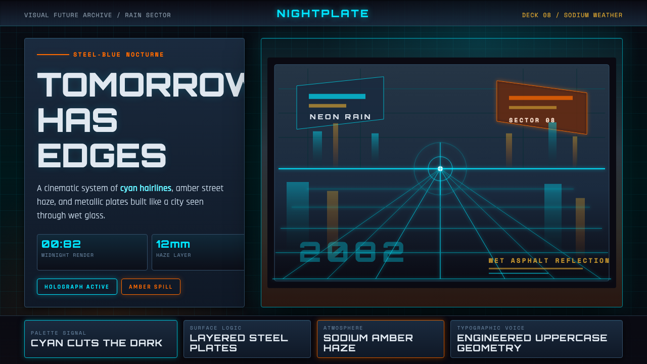
The palette is organized around three dominant tones that each carry a specific atmospheric role. Deep steel blue functions as the ambient ground — the color of night sky filtered through smog, of shadow pooling between buildings. Neon cyan appears as the accent that cuts through darkness: it traces the edges of signage, reflects off puddles, and marks the technology that is still functional in a decaying world. Amber — the color of sodium vapor streetlamps — provides warmth without comfort, a light that illuminates but also isolates. These three tones work together to create depth without sunshine, a world lit entirely by artificial sources.色彩体系围绕三种主导色调组织,每种都承载特定的大气氛围职能。深钢蓝作为环境底色——穿过雾霾过滤的夜空颜色,聚集在建筑之间阴影中的颜色。霓虹青作为穿透黑暗的强调色出现:它描摹标牌边缘,在积水中反射,标记出那些在腐朽世界中仍然运作的技术。琥珀色——钠蒸汽路灯的颜色——提供没有温暖感的暖意,一种照亮但也隔离的光。这三种色调共同营造出一种无需阳光的深度感:一个完全由人工光源照明的世界。
Reflective and Layered Surfaces反射性与层叠表面
No surface in this visual system is passive. Wet asphalt mirrors overhead neon; polished metal panels catch and distort surrounding light; glass reflects multiple overlapping images simultaneously. This relentless reflectivity serves both atmospheric and compositional functions — atmospherically, it creates the sense of a world saturated with energy; compositionally, it allows a single light source to appear in multiple locations within a frame, multiplying visual complexity without adding new elements. Rain is almost always implied if not depicted, because rain maximizes the reflective surface of every horizontal plane.这套视觉系统中没有被动的表面。湿沥青映照头顶的霓虹灯;抛光金属板捕捉并扭曲周围的光线;玻璃同时反射多个叠加的图像。这种无处不在的反射性兼具大气与构图两重功能——在大气层面,它营造出一种世界被能量浸透的感知;在构图层面,它使单一光源能在画面的多处位置出现,在不添加新元素的情况下增殖视觉复杂度。雨水几乎总是被暗示而非直接描绘的,因为雨水能将每一个水平面的反射性最大化。
Engineered Typography工程化字体排印
Type in this system derives from industrial and technical traditions rather than humanist ones. Letterforms tend toward the geometric and the constructed — condensed forms that read well at distance on signage, characters with consistent stroke weights that communicate precision and system-level thinking. The approach is not minimalist in any contemporary sense; it is mechanical. Text often appears as if part of a larger information system — labeled, categorized, formatted for utility rather than expressiveness. Hierarchy is established through dramatic scale differences and through the quality of light applied to text: glowing text belongs to technology still active, dim or stenciled text to infrastructure that has aged.这个系统中的字体排印源自工业与技术传统,而非人文主义传统。字形倾向于几何化与构建感——在标牌上远距离也清晰可读的窄体字形,笔画粗细一致、传达精确性与系统化思维的字符。这种处理方式并非当代意义上的极简主义,而是机械主义的。文字常常如同更大信息系统的一部分出现——被标注、分类、以实用性而非表现性格式呈现。层级通过戏剧性的尺度差异与施于文字的光质量来建立:发光的文字属于仍在运作的技术,昏暗或镂空印刷的文字属于已经老化的基础设施。
Vertical Scale and Density垂直尺度与密度
Mead's environments are almost always vertically exaggerated. Buildings stack upward past the frame's edge; infrastructure layers over infrastructure; the sky, when visible at all, is a narrow strip between towers. This vertical compression does two things simultaneously: it communicates urban density and societal overcrowding, and it creates a compositional rhythm of stacked horizontal bands — ground level, mid-rise, upper structure, sky — that gives layouts a natural layering logic. Designs in this style tend to organize information in depth as much as in width, with foreground elements distinct in tone and scale from background elements.米德的环境几乎总是在垂直方向上被夸张处理。建筑向上堆叠直至超出画框边缘;基础设施在基础设施之上层叠;天空如果可见,也只是塔楼之间的一条窄带。这种垂直压缩同时完成两件事:它传达城市密度与社会过密化的状态,同时创造出一种由水平条带叠加的构图节奏——地面层、中层、上部结构、天空——赋予版面一种自然的层叠逻辑。这种风格的设计倾向于在深度上与在宽度上同等地组织信息,前景元素在色调和尺度上与背景元素截然有别。
Glow and Light Emission发光与光发射
Unlike design systems that simulate shadow to create depth, this visual language uses glow to assert presence. Objects that matter emit light rather than cast shadow. A neon sign, a status indicator, a vehicle's thruster array — each is rendered not merely as a colored shape but as a source that bleeds luminescence into adjacent surfaces. This treatment of light as emission rather than reflection distinguishes the aesthetic from any approach rooted in natural lighting. The glow effect also serves a narrative function: it marks technology as live, operational, and potentially dangerous.与通过模拟阴影创造深度的设计系统不同,这套视觉语言以发光来宣示存在感。重要的物体发射光线,而非投下阴影。一块霓虹招牌、一个状态指示灯、一辆飞行器的推进阵列——每一个都不仅仅被呈现为一个有颜色的形状,而是作为将光晕渗入相邻表面的光源来处理。这种将光理解为发射而非反射的方式,将这种美学与任何植根于自然采光的方法区别开来。发光效果还承担叙事功能:它标记技术为活跃的、运作中的,以及潜在危险的。
Functional Complexity and Mechanical Detail功能复杂性与机械细节
Mead's signature contribution was the insistence that every designed object be fully resolved — not suggested or sketched, but specified as if it had actually been engineered. Vehicles have visible panel seams, exhaust ports, sensor arrays, and structural rivets. Buildings have maintenance access, signage in multiple languages, and the evidence of repeated repair. This commitment to functional plausibility creates objects that feel as if they belong to a coherent technological system rather than having been invented for visual effect. Applied to graphic design, this principle suggests layering information at multiple densities, including details that reward close reading even if they are not immediately legible.米德最具标志性的贡献,是坚持让每一个被设计的物体都被完整解析——不是被暗示或草绘,而是被规格化,如同真正经过工程设计一般。飞行器有可见的板件接缝、排气口、传感阵列与结构铆钉。建筑有维修通道、多语言标牌,以及反复修缮留下的痕迹。这种对功能可信度的承诺创造出仿佛属于某个连贯技术系统的物体,而非为视觉效果而凭空发明的形式。应用于平面设计,这一原则意味着以多个密度层叠信息,包括那些需要近距离阅读才能解读的细节,即便这些细节并不立即可读。
Mood: Magnificent and Threatening情绪基调:壮丽与威胁并存
The defining emotional register of the style is ambivalence. The world depicted is visually spectacular — the scale is enormous, the technology is extraordinary, the lighting is cinematic — and simultaneously oppressive. The beauty is inseparable from the danger; the spectacle cannot be separated from the dystopia. Designs in this mode should resist the temptation to resolve this tension into either pure glamour or pure grimness. The most successful applications hold both qualities simultaneously: a dashboard that feels powerful and slightly ominous, a marketing image that attracts and unsettles in equal measure.这种风格决定性的情感基调是矛盾性。所描绘的世界在视觉上令人叹为观止——尺度宏大、技术非凡、光线如电影般戏剧——同时又令人窒息压抑。美丽与危险不可分割;奇观无法与反乌托邦剥离。这种模式下的设计应当抵制将这种张力化解为纯粹魅力或纯粹阴郁的诱惑。最成功的应用同时保持两种品质:一个让人感到强大而略带不安的仪表板,一张吸引力与不安感等量并存的营销图像。
See the Retro-Futurism (Syd Mead) design system查看 Retro-Futurism (Syd Mead) 完整设计系统
Who shaped Retro-Futurism (Syd Mead)?谁塑造了 Retro-Futurism (Syd Mead)?
Syd Mead (1933–2019) trained as an industrial designer at the Art Center College of Design in Los Angeles before beginning a corporate career designing vehicles and interiors for Ford, U.S. Steel, and Philips. His transition into entertainment began with his work on Star Trek: The Motion Picture (1979), but it was Blade Runner (1982) that made his name synonymous with science-fiction visual design. Over the following decades he contributed to Tron, Aliens, Johnny Mnemonic, and numerous other productions while continuing commercial work, and he gave dozens of lectures and interviews that articulated the philosophy behind his practice — that the future should be depicted not as fantasy but as a fully engineered, inhabitable reality.赛德·米德(1933—2019年)在洛杉矶艺术中心设计学院接受工业设计训练,此后为福特、U.S.钢铁与飞利浦设计车辆与室内。他进入娱乐业始于《星际迷航:无限太空》(1979年),但真正使他的名字与科幻视觉设计画上等号的,是《银翼杀手》(1982年)。此后数十年,他参与了《电子世界争霸战》、《异形2》、《捍卫机密》等众多项目,同时持续商业工作,并通过大量讲座与访谈阐述其实践哲学——未来应被呈现为一个完整工程化的、可居住的现实,而非幻想。
Director Ridley Scott shaped the visual realization of Blade Runner as much as any of the film's designers. His insistence on atmospheric depth — the layers of steam, smoke, rain, and overhead light that fill every frame — transformed Mead's concept paintings from static illustrations into a believable inhabited environment. Scott's production approach, which involved constructing practical sets that extended seemingly to infinity and filling them with texture, detail, and authentic street life, established the standard against which subsequent science-fiction films have been measured. His collaboration with Mead defined what it meant to commit to a future world rather than merely suggest it.导演雷德利·斯科特对《银翼杀手》视觉实现的塑造不亚于任何一位影片设计师。他对大气深度的坚持——充满每一个画格的蒸汽、烟雾、雨水与顶光层次——将米德的概念画从静态插图转化为一个可信的、有人居住的环境。斯科特的制作方式——搭建实景布景并将其延伸至几乎无限远的纵深,以质感、细节与真实街头生活填充其中——确立了此后科幻电影被衡量的标准。他与米德的合作定义了究竟什么叫做对一个未来世界的真正承诺,而非仅仅暗示它的存在。
French artist Jean Giraud, working under the pseudonym Moebius, brought a parallel visual intelligence to science-fiction design that complemented and occasionally competed with Mead's American industrial approach. His work on the Heavy Metal magazine, his concept designs for Alien and Tron, and his comics series The Incal (written by Alejandro Jodorowsky) developed a vocabulary of organic-mechanical hybridization, vast open desert landscapes, and metaphysical narrative that expanded the genre's visual possibilities beyond the purely urban and technological. Moebius and Mead together established the poles between which most subsequent science-fiction visual design has operated.法国艺术家让·吉罗以笔名「莫比乌斯」工作,为科幻设计带来了与米德的美国工业化路径互补且偶有竞争的平行视觉智识。他在《重金属》杂志的创作、为《异形》与《电子世界争霸战》所作的概念设计,以及与霍多罗夫斯基合作的漫画系列《印加石》,发展出一套有机-机械混合、广袤荒漠景观与形而上叙事的视觉词汇,将这一流派的可能性扩展至纯城市化与技术性范畴之外。莫比乌斯与米德共同确立了此后大多数科幻视觉设计在其间运作的两极。
Production designer and concept artist Ron Cobb contributed to Alien, The Last Starfighter, Total Recall, and other landmark science-fiction films, developing a visual language of grease, wear, and functional grime that emphasized the lived-in quality of speculative technology. Where Mead's futures were sleek at their highest levels and layered below, Cobb specialized in the lower registers — the maintenance corridors, the cargo holds, the industrial decks that working people actually occupied. His attention to functional plausibility and to the way technology ages and degrades added a dimension of social realism to the science-fiction visual vernacular that Mead's more glamorous work sometimes elided.生产设计师与概念艺术家罗恩·科布参与了《异形》、《最后的星际战士》、《全面回忆》等科幻电影,发展出一套以油脂、磨损与功能性污垢为特征的视觉语言,强调推测性技术的使用痕迹感。米德的未来世界在最顶层是流线优雅的,向下则层叠复杂;科布则专精于更低的层级——维修走廊、货舱、工人实际居住的工业甲板。他对功能可信度以及技术如何老化降解的关注,为科幻视觉惯例添加了一个社会现实主义维度,而米德更具魅力的作品有时会将这一维度省略。
Visual effects supervisor Douglas Trumbull was the technical architect of the atmospheric depth that makes Blade Runner's imagery so durably powerful. His development of practical effects — layers of miniature sets photographed through artificial smog and vapor, combined with careful lighting choices that emphasized the distinction between light sources — translated Mead's flat concept paintings into three-dimensional environments with genuine atmospheric presence. Trumbull's commitment to in-camera practical effects rather than composited illusions gave Blade Runner a material weight that later digital productions have struggled to replicate, and his approach continues to influence how designers and cinematographers think about creating depth through atmosphere rather than geometry.视觉效果总监道格拉斯·特伦布尔是《银翼杀手》影像大气深度的技术设计师——正是这种深度使影片画面至今仍具有持久的震撼力。他对实体特效的开发——在人工烟雾与蒸汽中拍摄的微缩布景层,配合强调不同光源区分度的精心打光选择——将米德的平面概念画转化为具有真实大气存在感的三维环境。特伦布尔坚持摄影机内实体特效而非合成幻觉的做法,赋予了《银翼杀手》一种后来数字制作难以复制的物质重量感;他的方法至今仍影响着设计师与摄影师思考如何通过大气感而非几何关系创造深度。
How do you use Retro-Futurism (Syd Mead) today?今天怎么用 Retro-Futurism (Syd Mead)?
Applying Retro-Futurism to contemporary design work requires understanding what the visual system is actually doing before applying its surface qualities. The style is not simply dark backgrounds with neon accents — it is an atmospheric argument about the relationship between technology, humanity, and urban density. Successful applications commit to that argument; unsuccessful ones borrow the palette without the logic, producing interfaces that look like nightclub branding rather than inhabited futures.将复古未来主义应用于当代设计,需要在施加其表面品质之前先理解这套视觉系统实际上在做什么。这种风格并非简单地将深色背景配以霓虹强调色——它是一种关于技术、人类与城市密度之间关系的大气层面的论点。成功的应用承诺于这个论点;失败的应用借用了色板却没有内在逻辑,最终产出的界面更像夜店品牌,而非有人居住的未来。
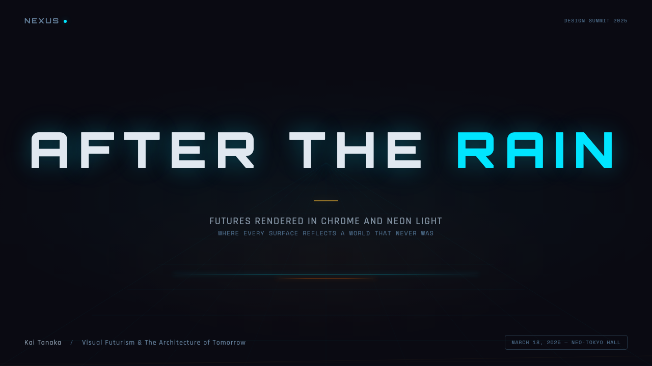
For presentation slides, the style is most effective when structure mirrors the aesthetic's vertical density. Cover slides benefit from a composition that places the central visual element — a glowing logo, a product image, a bold statement — against a deep steel-blue ground, with neon-toned accent marks at the edges rather than centered. Section dividers work well as horizontal bands that shift between dark and slightly lighter dark, with label text glowing softly at low intensity. Data slides should treat charts as functional objects: bar graphs rendered in cyan against dark grounds, with amber highlights marking key data points, and grid lines drawn in the very faint tone that suggests structural scaffolding rather than visual noise.对于演示文稿,当结构映射出这种美学的垂直密度时,效果最为突出。封面页受益于将核心视觉元素——一个发光的标志、一张产品图像、一句大胆的陈述——置于深钢蓝底面之上的构图,以霓虹色调的强调线条装点边缘而非居中。章节分隔页以从深色到略浅深色之间过渡的水平条带效果最佳,标签文字以低强度柔和发光呈现。数据页应将图表视为功能性物体:柱状图以青色在深色底面上呈现,以琥珀色高亮标记关键数据点,网格线以极淡的色调绘制——暗示结构支撑而非视觉噪声。
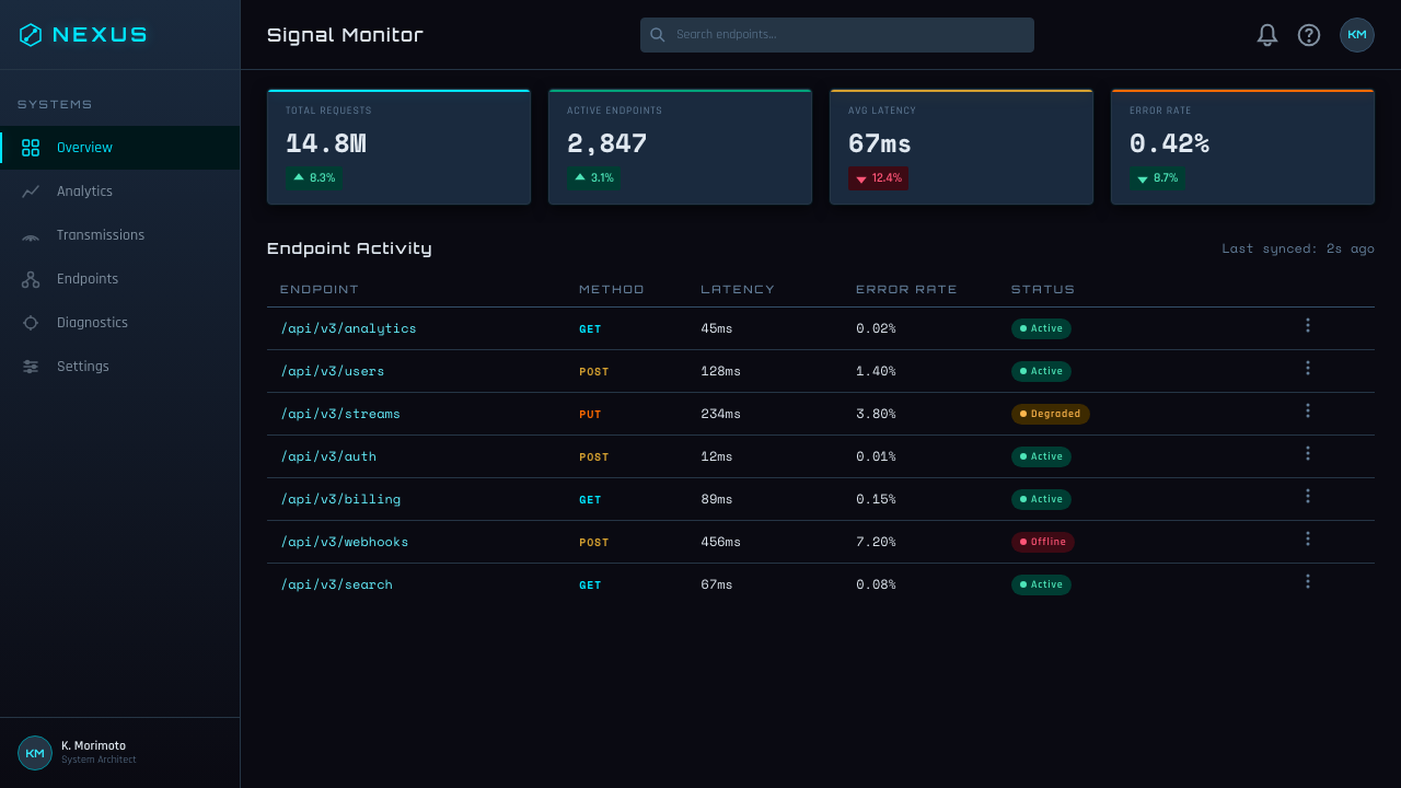
For web interfaces, the style is particularly well-suited to dashboards, monitoring tools, developer consoles, and any interface that needs to communicate information density and operational seriousness. The structural approach is to anchor the layout with a very dark near-black background, reserve the neon cyan for interactive elements and alerts, and use amber selectively to signal warnings or elevated status. Navigation elements should feel like instrumentation panels — compact, labeled with high precision, visually quiet until activated. Pricing pages gain power from the style's implicit hierarchy: the top tier should feel like it belongs to a different technological order than the lower tiers, achieved through glow intensity and the depth of shadow rather than through color difference alone.对于网页界面,这种风格特别适合仪表板、监控工具、开发者控制台,以及任何需要传达信息密度与操作严肃性的界面。结构化方法是以极深的近黑色背景锚定布局,将霓虹青保留给交互元素与警报,有选择性地使用琥珀色标示警告或升级状态。导航元素应当像仪器面板一样——紧凑、高精度标注、激活之前视觉上保持安静。定价页从这种风格的隐含层级中获得力量:顶层应当感觉仿佛属于与低层不同的技术秩序,这种效果通过发光强度与阴影深度来实现,而非单纯依赖色彩差异。
For editorial and marketing work, the style supports dramatic feature imagery and minimal supporting text. A Retro-Futurism-derived landing page works best when full-width image sections are treated as environments rather than illustrations — the viewer should feel as if they are looking into a space rather than at a picture. Marketing copy in this style is terse and confident, formatted with wide tracking and set in compressed or condensed letterforms that evoke technical documentation. Pull quotes and call-to-action text benefit from being rendered in the glowing cyan, which reads as active and forward-directed against a dark ground.对于编辑与营销作品,这种风格支持戏剧性的特性图像与简约的辅助文字。复古未来主义风格的落地页在全宽图像区块被当作环境而非插图处理时效果最佳——观者应当感觉自己在向一个空间内部凝视,而不是在看一张图片。这种风格下的营销文案简洁而自信,采用宽字间距格式,以令人联想到技术文档的紧缩或窄体字形排版。引语与行动号召文字以发光的青色呈现效果最好——在深色底面上,它读起来是主动的、向前指向的。
The most common mistake when applying this style is overusing glow effects until every element competes for attention. In Mead's original work, glow is selective: a few carefully chosen elements emit light while the majority of the image remains in controlled darkness. This discipline — of withholding glow from most elements to make it meaningful where it appears — is the hardest aspect of the style to maintain in production, because the impulse is always to add one more glowing edge or one more light source. A related mistake is applying neon cyan to text at body-copy scale, where it becomes difficult to read and loses the specificity that makes it powerful at headline or accent scale.应用这种风格时最常见的错误是过度使用发光效果,直到每一个元素都在争夺注意力。在米德的原作中,发光是有选择性的:少数精心选择的元素发光,而图像的大部分区域保持在可控的黑暗中。这种自律——对大多数元素克制发光,使其在出现时富有意义——是这种风格在实际制作中最难维持的方面,因为本能的冲动总是想再添一条发光边缘或再加一个光源。一个相关的错误是将霓虹青应用于正文级别的字体,这会导致阅读困难,并让它失去在标题或强调尺度上才具备的那种特定力量。
See the Retro-Futurism (Syd Mead) design system查看 Retro-Futurism (Syd Mead) 完整设计系统
Retro-Futurism (Syd Mead) — FAQRetro-Futurism (Syd Mead) · 常见问题
Is Retro-Futurism the same as Cyberpunk?复古未来主义与赛博朋克是同一回事吗?
They overlap substantially but are not identical. Cyberpunk is a literary and cultural genre, first articulated in fiction by writers including William Gibson, that deals with themes of corporate power, body modification, and technological inequality in near-future settings. Retro-Futurism as a visual style is older and broader — it describes any design work that presents a vision of the future imagined from a past moment, including both the optimistic chrome-and-fins aesthetic of the 1950s and the darker neon-and-grime palette of the 1980s. Syd Mead's work became the dominant visual reference for cyberpunk aesthetics, but the style predates and exceeds the genre. Not all Retro-Futurism is cyberpunk, and not all cyberpunk visual work follows Mead's specific design language.两者有大量重叠,但并不相同。赛博朋克是一种文学与文化类型,最初由威廉·吉布森等作家以小说的形式阐述,处理近未来背景下的企业权力、身体改造与技术不平等主题。复古未来主义作为视觉风格,历史更久、范围更广——它描述的是任何呈现从某一过去时刻想象的未来愿景的设计作品,包括1950年代乐观的镀铬与鱼尾美学,以及1980年代更阴暗的霓虹与污垢色板。赛德·米德的作品成为赛博朋克美学的主导视觉参照,但这种风格早于这一类型且超越其范围。并非所有复古未来主义都是赛博朋克,也并非所有赛博朋克视觉作品都遵循米德特定的设计语言。
Can this style work in a light or bright color scheme?这种风格能在浅色或明亮的配色方案中运用吗?
A light inversion is theoretically possible but works against the style's atmospheric logic at a fundamental level. The deep darkness of the Mead-derived palette is not merely an aesthetic preference — it is what makes the glow elements meaningful. Neon cyan on a dark ground is legible, atmospheric, and emotionally charged; the same tone on a near-white ground becomes a flat accent color with none of the luminous quality that defines the style. A designer who needs to work in a light environment but wants to reference this aesthetic would be better served by borrowing the style's typography and compositional density while using a different palette, rather than attempting a direct translation that dilutes the core visual argument.理论上浅色反转是可能的,但在根本层面上违背了这种风格的大气逻辑。米德色板的深邃黑暗并非仅仅是一种美学偏好——它是使发光元素具有意义的前提条件。深色底面上的霓虹青具有可读性、大气感与情感冲击力;同样的色调在近白色底面上,变成一种失去了定义这种风格的发光品质的普通强调色。需要在浅色环境中工作却想参照这种美学的设计师,更好的策略是借用这种风格的字体排印与构图密度,同时使用不同的色板,而不是尝试一种直接稀释了核心视觉论点的转译。
How do I avoid the look feeling like a generic dark UI or gaming interface?如何避免效果看起来像普通的深色UI或游戏界面?
The difference between an authentic Retro-Futurism application and a generic dark interface lies in three disciplines. First, atmospheric depth: dark UIs are typically flat, with elements sitting on the same implied plane; Mead-derived design creates a sense of recession and layering, as if the interface has foreground, middle ground, and background zones. Second, mechanical specificity: generic dark interfaces use rounded corners, generous spacing, and smooth gradients; this style uses tighter geometry, harder edges, and details that suggest engineering rather than consumer comfort. Third, restrained use of the signature colors: an interface that applies neon cyan to every interactive element looks like a gaming peripheral advertisement; a design that reserves it for a small number of specifically chosen moments — a key status indicator, a single call-to-action — reads as deliberate and authoritative.真正的复古未来主义应用与普通深色界面之间的差异,在于三种自律。第一,大气深度:深色UI通常是平面的,元素处于同一隐含平面上;米德派生的设计创造一种退缩感与层叠感,仿佛界面具有前景、中景与背景区域。第二,机械特异性:普通深色界面使用圆角、宽松间距与平滑渐变;这种风格使用更紧凑的几何形、更硬的边缘,以及暗示工程设计而非消费者舒适感的细节。第三,对标志性色彩的克制使用:将霓虹青应用于每一个交互元素的界面,看起来像游戏外设广告;将其保留给少数特定精选时刻——一个关键状态指示器、单一行动号召——的设计,读起来是审慎而权威的。
Does this style suit consumer-facing products, or is it better suited to technical and professional audiences?这种风格适合面向消费者的产品,还是更适合技术与专业受众?
The style has genuine power with both audiences, but it works differently in each context. For technical and professional audiences — security platforms, developer tools, data infrastructure, financial terminals — the style's associations with operational seriousness and systematic precision are direct assets. The aesthetic communicates that the product is powerful, that it takes its users seriously, and that it was designed by people who understand how systems work. For consumer audiences, the style functions more as an emotional register than a functional one — it creates a sense of premium status, technological authority, and cultural reference. Entertainment products, performance consumer goods, and lifestyle brands that want to evoke a specific kind of aspirational future can use the style effectively. Where it struggles is with products that depend on warmth, approachability, or organic sensory richness — food, children's products, wellness, and social platforms designed around personal connection.这种风格对两类受众都有真正的感染力,但在各自语境中的运作方式不同。对于技术与专业受众——安全平台、开发者工具、数据基础设施、金融终端——这种风格与操作严肃性和系统精确性的关联是直接的资产。美学传达出:这个产品是强大的,它认真对待用户,并且是由真正理解系统运作方式的人设计的。对于消费者受众,这种风格更多地作为一种情感基调而非功能性基调发挥作用——它创造出高端地位感、技术权威感与文化参照感。想要唤起特定未来憧憬感的娱乐产品、性能消费品与生活方式品牌,可以有效地使用这种风格。它力不从心的地方在于依赖温暖感、亲近感或有机感官丰富性的产品——食品、儿童产品、健康与以个人连接为核心的社交平台。
How faithful does the application need to be to count as this style?应用需要多忠实才算是这种风格?
The style supports a wide spectrum of application depth. A minimal invocation — dark background, one neon accent color, compressed typography — can establish the reference without full commitment to the aesthetic's denser qualities. A deeper application layers in the atmospheric complexity: multiple light sources, reflective surface treatment, mechanical typographic detailing, and the vertical compositional density of the source material. What distinguishes genuine engagement with the style from superficial borrowing is whether the light logic is consistent. If glow elements emit their color into adjacent surfaces; if dark zones are treated as environments rather than backgrounds; if the typography feels engineered rather than chosen for taste — these qualities mark an application as belonging to the tradition. The palette alone is insufficient; it is how the palette behaves with light that defines the style.这种风格支持广泛的应用深度。一种最小化的援引——深色背景、一种霓虹强调色、紧缩字体排印——可以建立参照感,而不必完全承诺于美学的更密集品质。更深层的应用叠加进大气复杂性:多个光源、反射性表面处理、机械感排印细节,以及源材料的垂直构图密度。真正参与这种风格与表面借用的区别,在于光线逻辑是否一致。如果发光元素将其颜色渗入相邻表面;如果暗区被当作环境而非背景处理;如果字体感觉是被工程化的而非出于品味选择的——这些品质标志着一种应用属于这一传统。仅有色板是不够的;定义这种风格的,是色板与光线相互作用的方式。
Related design styles相关设计风格
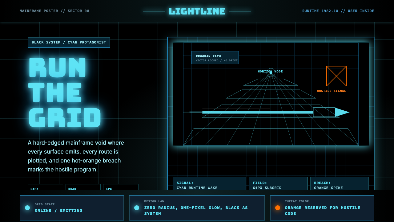 Tron Grid (1982)Cyber-precision in black. Neon cyan grids, Bungee type, and one orange breach…黑色赛博精度:霓虹青网格、Bungee 字体与一处橙色入侵切开虚空。
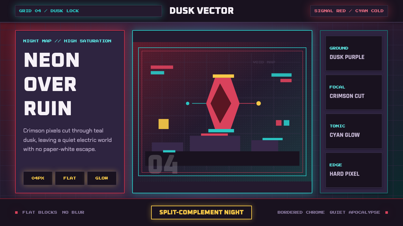 Hyper Light DrifterBeautiful ruin glows. Dusk purple holds crimson pixels and cyan grid light.废土很美:暮紫承托猩红像素与青色网格光。
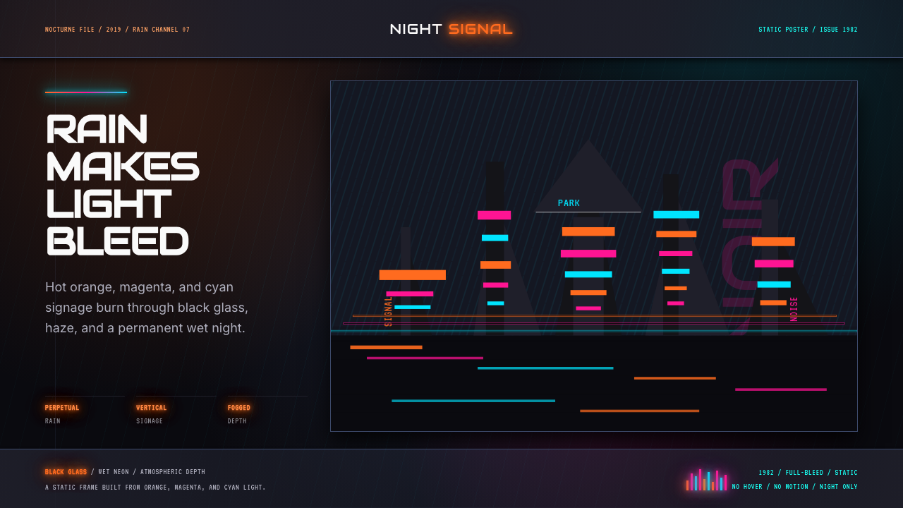 Blade Runner 1982 Neon NoirRain-soaked noir. Orange, magenta, and cyan neon cut black glass.雨夜黑色电影。橙洋红青霓虹切开黑玻璃。
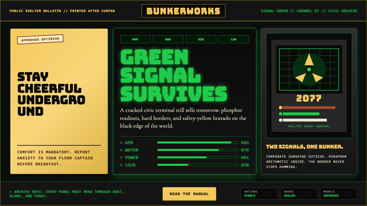 Fallout Vault-Tec Pip-BoyIrradiated optimism. Vault yellow and CRT green lock into a bordered bunker g…辐照乐观主义:避难所黄与CRT绿嵌入硬边地堡网格。
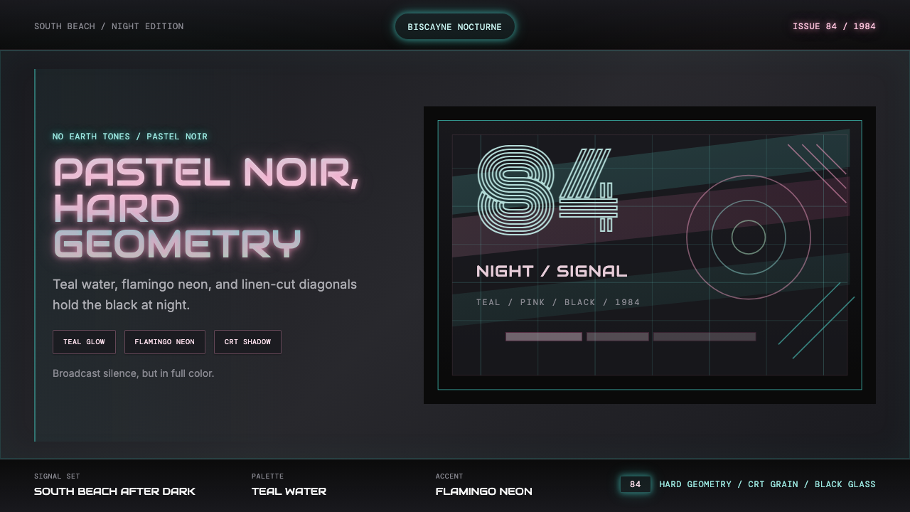 Miami Vice Pastel Teal (1984)Pastel noir, not nostalgia. Teal glow and flamingo pink slice black with geom…不是怀旧,是粉青霓虹。青光与火烈鸟粉切开黑底几何。
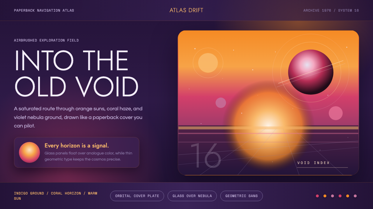 No Man's SkyA paperback cosmos you can enter. Orange suns, magenta haze, and Jost type fl…可进入的平装宇宙。橙日、品红雾与Jost字漂浮在靛蓝上。