What is Tron Grid (1982)?什么是 Tron Grid (1982)?
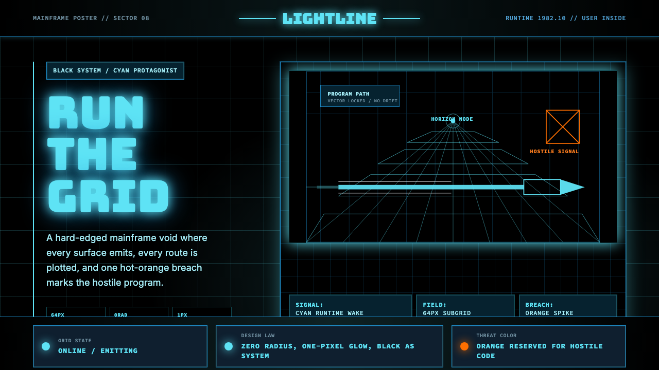
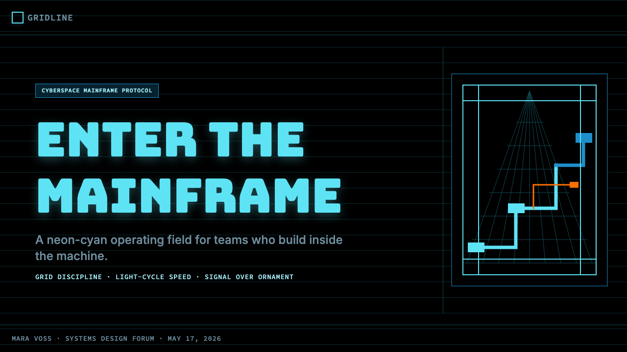
Tron Grid is the visual language of cyberspace itself — a pure-black void carved open by glowing neon-cyan lines, zero-radius geometry, and the occasional hot-orange breach of a villain's presence.Tron Grid 是赛博空间的视觉语言本身——纯黑虚空被霓虹青色的发光线条、零圆角几何与偶尔燃起的橙红反派余晖共同切开。
Tron Grid (1982) in briefTron Grid (1982) 速览
Tron Grid is the design language drawn directly from Disney's Tron (1982) and its sequel Tron: Legacy (2010): a deep-black void that stands in for the interior of a computer mainframe, criss-crossed by saturated neon-cyan gridlines and electric-blue runtime bands, with a single hot-orange accent reserved for the antagonist's presence. The aesthetic is immediately legible as a coded world — hard, planar, and self-luminous — rather than a naturalistic one.Tron Grid 是直接取自迪士尼《电子世界争霸战》(1982)及其续集《创:战纪》(2010)的设计语言:纯黑虚空代表电脑主机的内部空间,饱和的霓虹青色网格线与电光蓝色程序光带纵横其间,仅以一种炽热的橙色作为反派存在的专属标记。这套美学语言作为一个「被编码的世界」——坚硬、平面、自我发光——而非自然主义世界,能被立即辨认。
The system is built on a handful of ruthless principles: every surface is flat and glowing, every corner is sharp, every line is a deliberate decision. Roundness, gradient fills, and soft shadows are categorically absent. The grid itself is not a layout tool in the conventional sense — it is the subject matter. It represents the underlying coordinate system of a digital universe, made visible as actual lines of light rather than implied as an invisible scaffold beneath content.这个体系建立在几条毫不妥协的原则之上:每一个表面都是平坦而发光的,每一个转角都是锐利的,每一条线都是刻意的决定。圆角、渐变填充与柔和阴影被完全排除在外。网格本身并不是传统意义上的布局工具——它是主题本身。它代表数字宇宙潜在的坐标系,以可见的光线形式显现,而非作为内容之下的隐形脚手架被暗示。
Visually, Tron Grid reads as cyber-precision: monospace typographic cues echo terminal readouts, gridlines vibrate at the threshold of visibility against pure black, and the hierarchy of color — cyan for structure, blue for runtime activity, orange for threat — encodes information the way a circuit diagram does. The whole system evokes that specific moment in early-CGI history when audiences first believed a computer's interior could be a place.在视觉上,Tron Grid 呈现出赛博精度感:等宽字体的排印暗示终端机读数,网格线在纯黑底色上以可见性的临界亮度振动,色彩层级——青色用于结构,蓝色用于程序运行,橙色用于威胁——以电路图的方式编码信息。整个体系唤起早期 CGI 历史上那个特定时刻:观众第一次相信计算机内部可以是一个真实可居的场所。
See the Tron Grid (1982) design system查看 Tron Grid (1982) 完整设计系统
Where does Tron Grid (1982) come from?Tron Grid (1982) 从何而来?
The story begins in 1976 when Steven Lisberger, a Boston-based animator, saw early vector-graphics arcade games and became fascinated by the idea of a world that existed entirely inside a computer. He spent years developing what would become Tron, pitching it to every major studio before Disney agreed to produce it in 1980. The production brought together a genuinely unusual coalition: traditional Disney animators, a team of computer graphics pioneers from firms including Information International Inc. and MAGI Synthavision, and the conceptual artist Syd Mead, whose industrial design sensibility would later shape the film's sequel.故事开始于1976年。波士顿动画师 Steven Lisberger 在看到早期矢量图形街机游戏后,被「一个完全存在于计算机内部的世界」这一概念深深迷住。他花了数年时间开发这个名为《Tron》的项目,辗转向各大制片公司推介,直至1980年迪士尼同意投资制作。这次制作汇聚了一个极不寻常的联合体:传统迪士尼动画师、来自 Information International Inc. 和 MAGI Synthavision 等公司的计算机图形学先驱团队,以及概念艺术家 Syd Mead——这位工业设计师的审美感知后来也深刻影响了续集的视觉风格。
The film's visual language was partly a technical necessity and partly an inspired aesthetic decision. Because the computer-generated sequences could only render geometric primitives in the early 1980s — polygons, lines, flat planes — the production team made a virtue of the constraint. The world inside the computer would not pretend to be organic; it would be unapologetically mathematical. Black was chosen as the dominant background not because it was stylistically preferred but because it was technically free: black required no rendering at all, saving precious compute cycles for the glowing geometry placed against it. The neon-cyan color of the gridlines emerged from the glow of cathode-ray tube monitors of the era — the default color of phosphor-on-glass.影片的视觉语言一半是技术必要性的产物,一半是富有灵感的美学决策。因为1980年代初期,计算机生成的画面只能渲染几何基元——多边形、线条、平面——制作团队将这一限制转化为美德。计算机内部的世界不会假装是有机的,它将毫不掩饰地数学化。黑色被选为主导背景,不是出于风格偏好,而是技术上「免费」的:黑色根本不需要渲染,可以为置于其上的发光几何体节省宝贵的计算资源。网格线的霓虹青色来源于那个时代阴极射线管显示器的辉光——磷光体涂覆于玻璃屏幕上的默认发光色。
By 1982, when Tron opened in cinemas, it had consumed an unprecedented share of its production budget on computer-generated imagery — roughly fifteen to twenty minutes of fully synthetic footage, more than any film before it. Critics were divided, but the film's visual system was immediately influential in graphic design, video game art direction, and the nascent field of computer visualization. The iconography of the Light Cycle — a motorcycle that leaves a solid wall of light behind it, turning only at right angles — distilled the entire aesthetic into a single image: a line drawing itself through a void, leaving behind a permanent mark.1982年《Tron》公映时,计算机生成图像已消耗了影片制作预算中前所未有的比例——约十五到二十分钟的全合成画面,超过此前任何一部电影。影评人看法不一,但影片的视觉体系立即对平面设计、电子游戏美术指导以及新兴的计算机可视化领域产生了深远影响。「光轮摩托」的视觉图腾——一辆在身后留下实心光墙、只能以直角转向的摩托车——将整套美学浓缩进一个单一意象:一条线在虚空中自我描绘,在身后留下永久的痕迹。
The sequel, Tron: Legacy, arrived in 2010 directed by Joseph Kosinski. Where the 1982 film's CGI was raw and constrained by hardware limits, the 2010 production could render anything it chose — and it chose to honor the original vocabulary while refining its resolution. Syd Mead joined the concept design team. The electronic duo Daft Punk composed the score and made a cameo appearance in the film, bringing a quality of Europeanist techno-cool that deepened the aesthetic's associations with a particular strain of machine-era discipline. The color palette tightened: the cyan became more precisely saturated, the black more absolute, and the orange accent more sparingly applied, so that its appearance carried genuine narrative weight.续集《创:战纪》于2010年上映,由 Joseph Kosinski 执导。1982年影片的 CGI 受硬件限制而粗粝原始,2010年的制作则可以渲染任何选择的画面——它选择了尊重原有视觉词汇,同时提升其精度。Syd Mead 加入概念设计团队。电子二人组 Daft Punk 为影片创作配乐并在片中客串出演,带来了一种欧洲式科技冷酷感,深化了这套美学与特定机器时代纪律气质之间的关联。色板也随之收紧:青色的饱和度变得更加精准,黑色更趋绝对,橙色点缀更加克制——每次出现都承载着真实的叙事分量。
What defines the Tron Grid (1982) look?Tron Grid (1982) 的视觉特征是什么?
Color Hierarchy色彩层级
The palette is tripartite and strictly coded. Neon cyan — the color of phosphor glowing on cathode-ray glass — serves as the primary structural tone: it defines the grid, outlines active surfaces, and marks the identity of the protagonist's faction. Electric blue appears at a lower luminosity level for secondary runtime elements and ambient world-building. Hot orange is the opposition color, used sparingly and only where narrative or compositional tension demands it. Against an absolute-black ground, these three colors do not decorate — they communicate system state. The hierarchy is non-negotiable: mixing faction colors or diluting any hue toward pastels destroys the coding logic entirely.色板是三元制且严格编码的。霓虹青色——阴极射线管玻璃上磷光体发光的颜色——充当主要结构色调:定义网格、勾勒活跃表面,并标示主角阵营的身份。电光蓝色以较低的亮度层级呈现,用于次级程序元素与环境世界构建。炽热的橙色是对立阵营的颜色,使用极为克制,仅在叙事或构图张力需要时出现。在绝对黑色的底面上,这三种颜色不是在装饰——它们在传达系统状态。层级关系不容妥协:混淆阵营色彩,或将任何颜色稀释至粉彩调,都会彻底摧毁编码逻辑。
Grid as Subject网格作为主题
The defining formal gesture of Tron Grid is that the underlying coordinate system is made visible — it is not hidden beneath content but displayed as content. Lines of light extend to a vanishing point, creating a sense of infinite receding space. The grid's proportions suggest machine regularity: intervals are equal, intersections are precise, and the whole structure implies a world governed by arithmetic rather than nature. In applied design work, this means the grid is never merely structural scaffolding — it appears on the surface, functions as an active visual element, and conveys the impression of a space that has been precisely calibrated.Tron Grid 最决定性的形式姿态在于:底层坐标系被显现出来——它不是隐藏在内容之下,而是作为内容本身展示。光线延伸至消失点,创造出无限退却的空间感。网格的比例暗示机器的规则性:间距相等,交叉点精确,整个结构暗示一个受算术而非自然支配的世界。在实际设计工作中,这意味着网格从不仅仅是结构性脚手架——它出现在表面,作为活跃的视觉元素发挥作用,传达一种经过精密校准的空间印象。
Zero Radius零圆角
Every corner in the Tron visual system is a hard right angle. This is not merely a stylistic preference — it is a categorical statement about the nature of the world being depicted. A digital space governed by binary logic and integer coordinates has no use for curves; curvature implies organic growth, material flexibility, or biological form. The absence of rounded corners signals that every edge is a decision rather than a convenience, and that the system prioritizes computational precision over ergonomic comfort. Even typographic elements follow this discipline: letterforms with circular counters feel anomalous in full Tron Grid compositions, and geometric display types with angular construction are strongly preferred.Tron 视觉体系中的每一个转角都是硬直角。这不仅仅是风格偏好——它是一个关于所描绘世界本质的范畴性声明。一个由二进制逻辑和整数坐标支配的数字空间对曲线毫无需求;曲度暗示有机生长、材料柔韧性或生物形态。圆角的缺席标志着每一条边都是一个决定而非一种便利,这个系统将计算精度置于人体工学舒适之上。即使是排版元素也遵循这一纪律:在完整的 Tron Grid 构图中,带有圆形内部轮廓的字形显得异常,具有棱角构造的几何展示字体被强烈优先考虑。
Self-Luminous Depth自发光深度
Objects in the Tron world do not receive light — they emit it. This inversion of conventional lighting logic produces a distinctive visual quality: forms appear to glow from within rather than being illuminated from without. In practice, this means glowing edges on otherwise dark surfaces, halos around bright lines against pure black, and a sense that brightness is a property of the object's identity rather than its position relative to a light source. The depth effect is achieved not by shadow and highlight in the classical sense but by luminosity gradients at the edges of forms — lines that are brightest at their axis and fall to black within a very narrow band.Tron 世界中的物体不接受光照——它们发射光。这种对传统照明逻辑的逆转产生了一种独特的视觉品质:形态看起来从内部发光,而非从外部被照亮。在实践中,这意味着在其他方面黑暗的表面上有发光边缘,在纯黑底色上的亮线周围有光晕,以及一种亮度是物体身份属性而非其相对于光源位置属性的感知。深度效果的实现不是通过古典意义上的阴影和高光,而是通过形态边缘的亮度渐变——在其轴线处最亮、在极窄范围内衰减至黑色的线条。
Monospace Typography等宽排印
The typographic register of Tron Grid is the terminal — not the printed page, the editorial spread, or the advertising poster. Monospaced letterforms, where every character occupies an identical horizontal increment, carry the associations of command-line interfaces, system logs, and machine-generated text. In the Tron aesthetic, this means display text that feels output rather than composed: characters aligned to an invisible grid, letter-spacing that emphasizes the modular unit rather than optical rhythm, and a general preference for uppercase settings that read as system labels or status identifiers. The effect is cool, authoritative, and impersonal in a way that humanist type cannot replicate.Tron Grid 的排版语境是终端机——而非印刷页面、编辑版面或广告海报。等宽字形中每个字符占据相同的水平增量,带有命令行界面、系统日志和机器生成文本的联想。在 Tron 美学中,这意味着文字感觉是被「输出」而非被「排版」:字符对齐至不可见的网格,字符间距强调模块单元而非光学节奏,并普遍偏好大写设置,读起来像系统标签或状态标识符。这种效果是冷静的、权威的、非个人化的——人文主义字体无法复制这种气质。
Absolute Black Ground绝对黑色底面
The background in Tron Grid is not dark grey, not near-black, not a deeply saturated navy — it is the most absolute black achievable in any given medium. This is the foundational decision from which all others follow. Absolute black removes any ambient sense of atmosphere or air; the space feels like a void rather than a room. Against this ground, even a moderately luminous color reads as intensely bright, which means the palette's neon qualities are entirely dependent on the black holding its depth. Any brightening of the background — any softening toward grey — collapses the system's sense of infinite digital space and reduces the color accents to mere decoration.Tron Grid 中的背景不是深灰,不是近黑,不是高度饱和的深蓝——而是在任何给定媒介中可实现的最绝对的黑色。这是所有其他决定由此而来的基础性决定。绝对黑色消除了任何环境感或空气感;空间感觉像虚空而非房间。在这一底色上,即使是适度发光的颜色也会显得极度明亮,这意味着色板的霓虹品质完全依赖于黑色保持其深度。任何背景的提亮——任何向灰色的软化——都会瓦解这个系统无限数字空间的感知,将色彩点缀降格为纯粹的装饰。
Orange as Rupture橙色作为破裂
In the Tron color system, orange is not simply a third accent — it is the color of opposition, malfunction, and intrusion. Its warmth is alien to the cool cyan-and-blue dominant palette, which means its appearance always registers as a breach: something that does not belong, a force that has entered from outside the system's logic. This coded quality makes orange extraordinarily powerful when used sparingly and immediately disruptive when overused. In applied design, orange in a Tron Grid context should be reserved for the single most important call to action, the most critical alert, or the element that represents the maximum contrast point within a composition. Using it for more than one purpose in the same layout dissipates its meaning entirely.在 Tron 色彩体系中,橙色不只是第三种点缀——它是对立、故障与入侵的颜色。它的暖意对于冷峻的青色与蓝色主导色板而言是异质的,这意味着它的出现总是被解读为一次破裂:某种不属于此处的东西,一股从系统逻辑之外闯入的力量。这种编码品质在克制使用时极具力量,在过度使用时则立即产生破坏性。在实际设计中,Tron Grid 语境下的橙色应被保留给单一最重要的行动号召、最关键的警报,或代表构图中最大对比点的元素。在同一版面中将其用于多个目的,会彻底稀释其含义。
See the Tron Grid (1982) design system查看 Tron Grid (1982) 完整设计系统
Who shaped Tron Grid (1982)?谁塑造了 Tron Grid (1982)?
Lisberger wrote and directed the original Tron (1982), having nursed the concept for six years before production began. A traditional animator by training, he saw the potential of computer-generated imagery not as a replacement for hand-drawn film but as a means to depict a world that hand-drawing could not plausibly represent — the mathematical interior of a computer. His decision to embrace the geometric limitations of early CGI as an aesthetic system rather than fight them produced the visual language that persists in design culture today. Without Lisberger's conviction that constraints were assets, Tron Grid would likely have been an awkward transitional style rather than a coherent aesthetic statement.Lisberger 编写并执导了1982年的原版《Tron》,在制作开始之前已将这一概念酝酿了六年。他受过传统动画师训练,他看到了计算机生成图像的潜力——不是作为手绘电影的替代品,而是作为描绘手绘无法可信呈现的世界的手段:计算机的数学内部。他选择将早期 CGI 的几何限制作为美学体系接纳而非对抗,由此产生了今天仍在设计文化中延续的视觉语言。若非 Lisberger 坚信限制即资产,Tron Grid 很可能成为一种尴尬的过渡风格,而非一套连贯的美学声明。
Mead was one of the twentieth century's most influential visual futurists — his concept design work shaped the look of films including Blade Runner and Aliens before he joined the Tron: Legacy production team in the late 2000s. For Tron: Legacy, Mead refined the original film's aesthetic vocabulary, pushing the grid proportions toward greater precision and the vehicle designs toward harder geometry. His involvement gave the sequel's visual system an industrial design credibility that mere CGI craft could not supply: the world felt engineered rather than imagined. Mead's discipline of beginning every design problem with function rather than form aligned precisely with the Tron Grid's underlying logic.Mead 是二十世纪最具影响力的视觉未来主义者之一——在加入《创:战纪》制作团队之前,他的概念设计工作塑造了《银翼杀手》和《异形》等影片的视觉面貌。在《创:战纪》中,Mead 精炼了原版影片的美学词汇,将网格比例推向更大精度,将载具设计推向更硬朗的几何形态。他的参与赋予了续集视觉体系一种纯粹 CGI 技艺无法提供的工业设计可信度:那个世界感觉是被工程设计出来的,而非被想象出来的。Mead 从功能而非形式开始每一个设计问题的思维纪律,与 Tron Grid 的底层逻辑精确契合。
The French electronic duo Thomas Bangalter and Guy-Manuel de Homem-Christo composed the score for Tron: Legacy and made a cameo appearance within the film itself — appearing as DJs in the film's world, costumed in the same luminous geometric suits worn by the film's digital characters. Their involvement was not incidental: Daft Punk had spent the previous decade developing an aesthetic of technological self-presentation — robot helmets, LED-studded stage suits, music that fused mechanical precision with emotional restraint — that was in deep alignment with the Tron Grid sensibility. Their score amplified the visual system's qualities through sound: precise, cold, structured, and lit from within.法国电子二人组 Thomas Bangalter 与 Guy-Manuel de Homem-Christo 为《创:战纪》创作配乐,并在影片中以客串角色现身——以 DJ 身份出现在影片世界中,身着与影片数字角色相同的发光几何服装。他们的参与并非偶然:Daft Punk 在过去十年间已建立起一套科技自我呈现的美学——机器人头盔、镶嵌 LED 的舞台服装、将机械精度与情感克制融合的音乐——与 Tron Grid 的精神气质深度契合。他们的配乐通过声音放大了视觉体系的品质:精确、冷峻、有结构,且从内部发光。
Kosinski directed Tron: Legacy as his feature debut, having come from a background in architecture and commercial direction. His architectural training shaped how he approached the film's world-building: he treated the Grid as a designed environment with consistent spatial logic rather than as a backdrop for action sequences. Kosinski imposed systematic rules on what could and could not exist in the digital world — rules about proportion, material finish, and the behavior of light — that gave the sequel's visual system a rigor the original film's production pressures had not fully allowed. His subsequent career continued to explore technology and aesthetics in films including Oblivion (2013) and Top Gun: Maverick (2022).Kosinski 以《创:战纪》作为其剧情长片处女作,此前他有建筑学和广告导演的背景。他的建筑训练塑造了他进行世界构建的方式:他将「网格」视为具有一致空间逻辑的被设计环境,而非动作场面的背景。Kosinski 对数字世界中可以和不可以存在的事物施加了系统性规则——关于比例、材料质感和光的行为的规则——赋予了续集视觉体系原版影片的制作压力所未能完全实现的严谨性。他随后的职业生涯继续在《遗忘星球》(2013年)和《壮志凌云:独行侠》(2022年)等影片中探索技术与美学的关系。
How do you use Tron Grid (1982) today?今天怎么用 Tron Grid (1982)?
Tron Grid translates into contemporary design work with remarkable directness because its rules are few and absolute. The key is understanding that the aesthetic is not a collection of decorative elements — glowing lines, dark backgrounds, cyan accents — but a complete spatial logic: a world seen from inside a machine. Applied correctly, it produces work that feels precisely calibrated and unapologetically digital. Applied incorrectly, it becomes a set of surface decorations that evoke the aesthetic without embodying its principles.Tron Grid 在当代设计工作中的转化极为直接,因为它的规则寥寥而绝对。关键在于理解这套美学不是一系列装饰元素的集合——发光线条、深色背景、青色点缀——而是一套完整的空间逻辑:从机器内部观看的世界。正确应用时,它产生感觉被精密校准、毫不掩饰数字感的作品。错误应用时,它沦为一套唤起美学表象却未能体现其原则的表面装饰。
For presentation slides, Tron Grid is particularly well-suited to cover pages and section breaks. A cover works best as a near-total void: the slide background held at the deepest black the display medium allows, a fine cyan grid extending to the edges, and the title rendered in monospaced or angular display type with enough luminosity contrast to read as a self-emitting surface rather than text on a background. Data slides benefit from the style's diagrammatic clarity: line charts rendered in cyan on black read as system telemetry rather than business reporting, which can significantly elevate the perceived precision of quantitative content. Chart axes should be treated as gridlines — fine, luminous, extending fully — rather than as conventional axis strokes. Content slides with body text require care: the absolute-black background demands high luminosity on text, and mixing multiple text colors risks fragmenting the coding logic.在演示文稿中,Tron Grid 尤其适合封面页与章节分割页。封面最佳效果是接近于完全虚空:幻灯片背景保持显示媒介所允许的最深黑色,细密的青色网格延伸至边缘,标题以等宽或棱角分明的展示字体呈现,亮度对比足以使其作为自发光表面而非底色上的文字被阅读。数据页受益于这种风格的示意图式清晰度:以青色渲染在黑色上的折线图读起来像系统遥测数据而非商业报表,这能显著提升定量内容的感知精度。图表坐标轴应被视为网格线——细密、发光、完整延伸——而非传统的坐标轴笔触。含有正文的内容页需要谨慎:绝对黑色背景要求文字具有高亮度,混用多种文字颜色有使编码逻辑碎裂的风险。
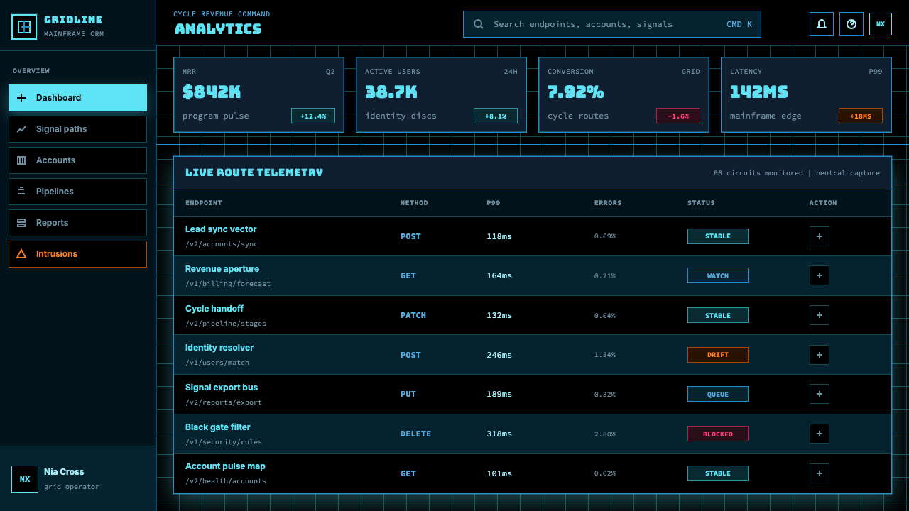
For web interfaces, the style is most naturally suited to dashboards, analytics platforms, developer tools, and any product where the user's relationship to the interface is operational rather than emotional. The dark ground eliminates eye strain in extended-use contexts and provides natural focus on luminous data elements. Navigation and structural elements should be defined by fine glowing lines rather than filled containers; interactive states should shift between cyan, blue, and — for warnings or primary actions — orange. Pricing pages in this aesthetic work well when tier differentiation is handled through the color hierarchy: a standard tier in neutral blue, a recommended tier in full cyan, and an enterprise or premium tier marked with the orange accent to signal its category difference. The key discipline is maintaining the absolute-black ground throughout — any background that brightens, even to near-black, collapses the system.对于网页界面,这种风格最自然地适合仪表板、分析平台、开发者工具,以及任何用户与界面关系是操作性而非情感性的产品。深色底面在长时间使用场景中减少眼睛疲劳,并为发光的数据元素提供自然的焦点。导航与结构元素应以细密发光线条而非填充容器来定义;交互状态应在青色、蓝色之间切换,警告或主要操作使用橙色。这套美学下的定价页面,当等级区分通过色彩层级处理时效果最佳:标准等级用中性蓝色,推荐等级用完整青色,企业或高级等级用橙色点缀标记其类别差异。关键纪律是在整个设计中保持绝对黑色底面——任何背景的提亮,即使是接近黑色,都会瓦解整个体系。
For editorial and marketing work, Tron Grid carries strong genre associations — technology launches, gaming, cybersecurity, developer conferences, science fiction entertainment — that make it highly effective in those contexts and potentially incongruous in others. A product launch deck for a developer infrastructure company, a conference identity for a machine-learning symposium, or the title design for a science fiction series are natural homes for the aesthetic. In editorial layouts, full-bleed black spreads with cyan headline type and fine-rule structural dividers create a reading experience that feels like interacting with a system rather than reading a publication. Marketing materials work best when the grid is treated as a design element in itself — present on the surface of the piece, not merely implied — and when the layout leaves enough pure black space to allow the colored elements to read as luminous rather than merely tinted.对于编辑与营销工作,Tron Grid 带有强烈的类型联想——技术发布、游戏、网络安全、开发者大会、科幻娱乐——这使它在这些场景中极为有效,在其他场景中则可能显得格格不入。开发者基础设施公司的产品发布幻灯片、机器学习研讨会的会议视觉识别,或科幻系列的片头设计,都是这套美学的自然归宿。在编辑版面中,满版黑色跨页搭配青色标题字与细线结构分割,营造一种感觉像在与系统交互而非在阅读出版物的阅读体验。营销材料在网格作为设计元素本身被对待时效果最佳——出现在作品表面,而非仅仅被暗示——并且当版面留有足够的纯黑空间,使有色元素读起来像是发光而非仅仅着色时。
The most common mistake in applying Tron Grid is treating it as a dark theme with added glow effects rather than as a complete spatial language. Specific failure modes include: using near-black or dark grey backgrounds instead of absolute black, which destroys the self-luminous quality; applying cyan, blue, and orange simultaneously across many elements, which overwrites the coding logic and produces visual noise; softening gridlines with opacity or blur, which suggests atmosphere rather than the void; rounding corners on any element, which introduces organic warmth the system is built to exclude; and using warmly lit or naturalistic photography without applying high-contrast duotone treatment, which imports a competing visual logic. The style requires commitment: every element either belongs to the system or belongs outside it.应用 Tron Grid 时最常见的错误是将其视为加了发光效果的深色主题,而非一套完整的空间语言。具体失败模式包括:使用近黑或深灰背景而非绝对黑色,这会摧毁自发光品质;同时在众多元素上应用青色、蓝色和橙色,这会覆盖编码逻辑并产生视觉噪音;用不透明度或模糊柔化网格线,这会暗示大气感而非虚空感;在任何元素上使用圆角,这引入了这个体系被构建来排除的有机温度;以及使用暖光或自然主义摄影而不应用高对比度双色调处理,这引入了一套相互竞争的视觉逻辑。这种风格需要承诺:每一个元素要么属于这个体系,要么属于体系之外。
See the Tron Grid (1982) design system查看 Tron Grid (1982) 完整设计系统
Tron Grid (1982) — FAQTron Grid (1982) · 常见问题
Is Tron Grid the same as general dark-mode or neon-cyber design?Tron Grid 和一般的深色模式或霓虹赛博设计是一回事吗?
No — Tron Grid is a specific aesthetic system with strict rules, not simply a dark background with colorful accents. General dark-mode design uses near-black surfaces, multiple accent colors, soft shadows, and conventional rounded components. General neon-cyber design (often called cyberpunk) typically features magenta, purple, or multi-color neons, photographic textures, rain or vapor visual effects, and a deliberately noisy, maximalist sensibility. Tron Grid, by contrast, is severe and minimal: absolute black only, a three-color palette with a precise coding hierarchy, zero radius on every element, visible gridlines, self-luminous rendering, and nothing that suggests organic life. The discipline is much closer to early-CGI mathematical purity than to the cultural pastiche of cyberpunk.不是——Tron Grid 是一套具有严格规则的特定美学体系,而非简单的深色背景配彩色点缀。一般的深色模式设计使用近黑表面、多种点缀色、柔和阴影和传统圆角组件。一般的霓虹赛博设计(常被称为赛博朋克)通常以品红、紫色或多色霓虹为特色,配以摄影纹理、雨或蒸汽视觉效果,以及刻意嘈杂的极繁主义感性。相比之下,Tron Grid 是严格而极简的:只有绝对黑色,具有精确编码层级的三色板,每个元素零圆角,可见网格线,自发光渲染,以及任何暗示有机生命的元素的缺席。这种纪律更接近早期 CGI 的数学纯粹性,而非赛博朋克的文化拼贴。
Can Tron Grid work for a light-background layout?Tron Grid 能用于浅色背景版面吗?
Only with significant loss of fidelity to the core logic. The self-luminous quality — the sense that elements glow from within — is entirely dependent on the absolute-black ground. On a light background, the same cyan and blue colors become flat decorative accents rather than light-emitting forms; the coding hierarchy collapses; and the spatial impression of infinite digital void disappears entirely. If a product requires a light background for functional or accessibility reasons, it is better to describe the result as 'Tron-inspired' or 'cyber-grid-influenced' rather than authentic Tron Grid. A more effective approach is to limit Tron Grid treatment to dark sections or modal overlays within an otherwise light interface.只能以对核心逻辑的显著损失为代价。自发光品质——元素从内部发光的感知——完全依赖于绝对黑色底面。在浅色背景上,同样的青色和蓝色变成平面装饰点缀而非发光形态;编码层级崩溃;无限数字虚空的空间印象完全消失。如果产品因功能或可访问性原因需要浅色背景,最好将结果描述为「Tron 风格启发」或「赛博网格影响」,而非真实的 Tron Grid。更有效的方法是将 Tron Grid 处理限制于深色段落或在其他浅色界面中的模态覆盖层。
How should photography or illustration be used in a Tron Grid layout?在 Tron Grid 版面中应如何使用摄影或插图?
Photography requires transformation before it belongs in a Tron Grid composition. Naturalistic, warmly lit photography imports a competing visual logic — organic textures, ambient light, environmental color — that conflicts with the system's machine-interior premise. The standard treatment is high-contrast duotone rendering in the palette colors: shadows to absolute black, highlights to cyan or near-white, with no intermediate warmth. Alternatively, photography can be reduced to a hard silhouette against pure black, or processed to appear as if displayed on a low-resolution vector screen. Illustrated elements work better than photography if they are constructed from geometric forms using the palette's color hierarchy; figurative or painterly illustration in a Tron Grid layout almost always reads as genre inconsistency.摄影在属于 Tron Grid 构图之前需要经过转化。自然主义的、暖光摄影引入了一套相互竞争的视觉逻辑——有机纹理、环境光、环境色——与这个体系的机器内部前提相冲突。标准处理是以色板颜色进行高对比度双色调渲染:阴影到绝对黑色,高光到青色或接近白色,中间没有任何温暖色调。或者,摄影可以被简化为在纯黑背景上的硬边剪影,或处理成看起来像显示在低分辨率矢量屏幕上的效果。插图元素如果由几何形态使用色板的色彩层级构建,效果好于摄影;在 Tron Grid 版面中使用具象或绘画风格的插图,几乎总是会呈现出类型不一致感。
What products or industries is Tron Grid poorly suited for?Tron Grid 不适合哪些产品或行业?
The style's core associations — machine precision, digital void, oppositional color coding, absolute zero warmth — make it actively unsuitable for contexts requiring emotional warmth, human connection, or sensory richness. Consumer wellness products, children's education platforms, food and beverage brands, healthcare patient interfaces, and hospitality experiences all depend on design registers that Tron Grid categorically excludes. Even within technology contexts, the style can misfire: a consumer-facing mobile application whose value proposition is ease and approachability would find Tron Grid's severity alienating rather than reassuring. The grid's codedness also makes it genre-specific in ways that limit its application to B2C consumer products outside the gaming, entertainment, or enthusiast-technology sectors.这种风格的核心联想——机器精度、数字虚空、对立色彩编码、绝对零温度——使其在需要情感温度、人际连接或感官丰富性的场景中明显不适用。消费者健康产品、儿童教育平台、食品饮料品牌、医疗患者界面和酒店体验都依赖于 Tron Grid 范畴性地排除的设计语境。即使在科技场景内,这种风格也可能失效:一个价值主张是便捷与亲切感的面向消费者的移动应用,会发现 Tron Grid 的严格感是疏离的而非令人安心的。网格的编码性也使其在类型上具有特定性,将其在游戏、娱乐或发烧友科技领域以外的 B2C 消费产品中的应用受到限制。
How does Tron Grid relate to other dark, tech-forward design aesthetics like brutalism or dark glassmorphism?Tron Grid 与其他深色技术前沿设计美学(如野兽主义或深色玻璃拟态)有何关系?
They share the dark background but diverge fundamentally at the material and spatial level. Web brutalism on a dark ground typically uses raw, unstyled typography, harsh layout decisions, and a deliberately unfinished quality that signals rejection of polish — the opposite of Tron Grid's extreme precision. Dark glassmorphism uses blur, translucency, layered depth, and soft halos to simulate the appearance of frosted glass over a dark environment — an atmospheric, material quality that Tron Grid's void explicitly rejects; there is no atmosphere in a computer mainframe, no material to be translucent. Tron Grid is distinguished from both by its mathematical flatness, its zero-tolerance for softness or ambiguity, and its insistence that every element declare its system membership through the color-coding hierarchy. It is the most rule-bound and least atmospheric of the major dark-design aesthetics.它们共享深色背景,但在材料和空间层面存在根本分歧。深色背景上的网页野兽主义通常使用原始的、未经样式处理的字体排印,强硬的版面决策,以及刻意未完成的品质——这与 Tron Grid 极度精密的品质相反,信号是对精致感的拒绝。深色玻璃拟态使用模糊、半透明、层叠深度和柔和光晕,在深色环境上模拟磨砂玻璃的外观——一种 Tron Grid 的虚空明确拒绝的大气感、材料品质;计算机主机中没有大气,没有可以半透明的材料。Tron Grid 与两者的区别在于其数学平面性、对柔软或模糊的零容忍,以及坚持每个元素都通过色彩编码层级声明其系统成员身份。它是主要深色设计美学中规则最为严格、最无大气感的一种。
Related design styles相关设计风格
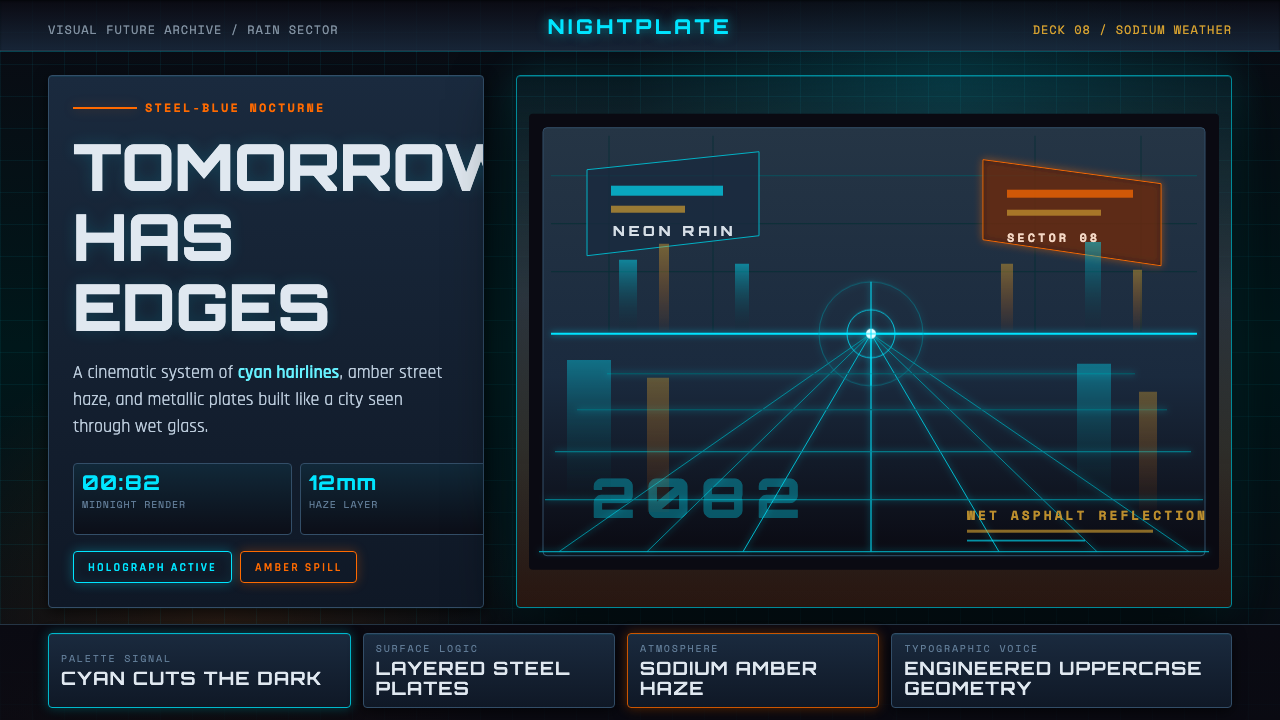 Retro-Futurism (Syd Mead)Tomorrow looks dangerous. Steel-blue night, neon cyan edges, and amber rain r…危险的明日感:钢蓝夜色、霓虹青边线与琥珀雨面反光。
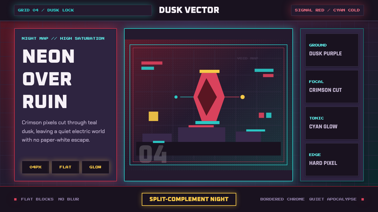 Hyper Light DrifterBeautiful ruin glows. Dusk purple holds crimson pixels and cyan grid light.废土很美:暮紫承托猩红像素与青色网格光。
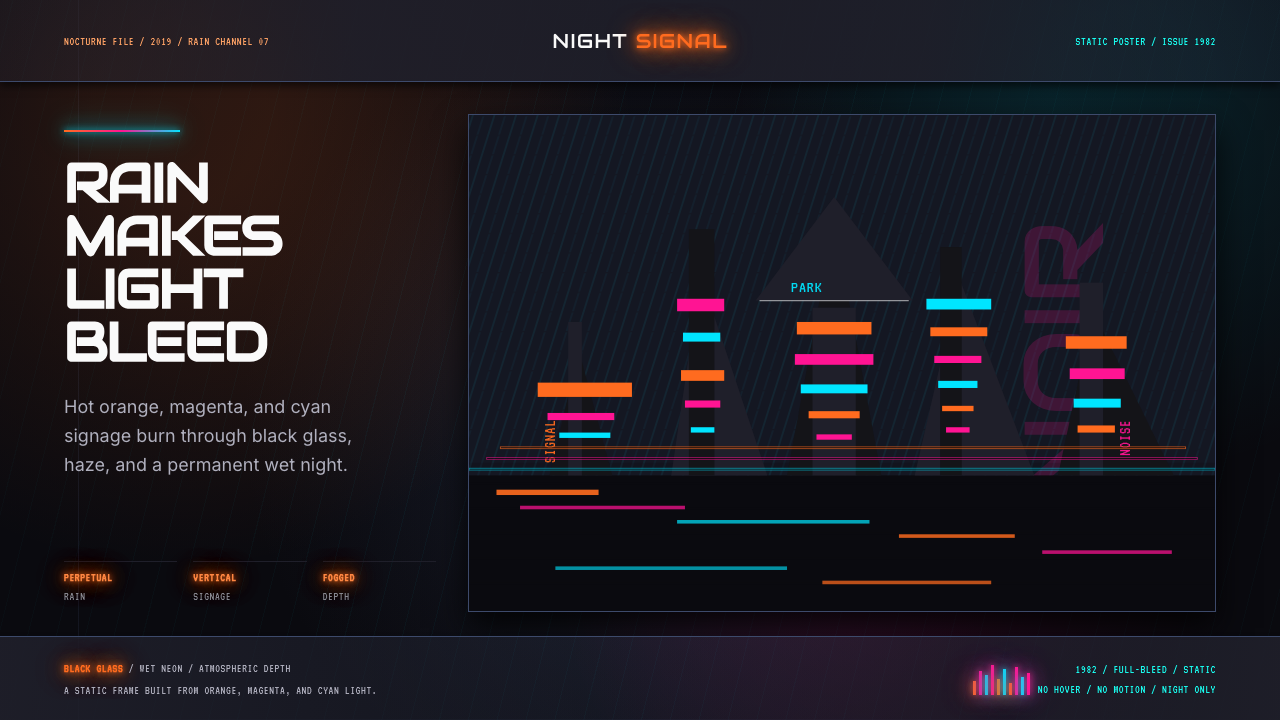 Blade Runner 1982 Neon NoirRain-soaked noir. Orange, magenta, and cyan neon cut black glass.雨夜黑色电影。橙洋红青霓虹切开黑玻璃。
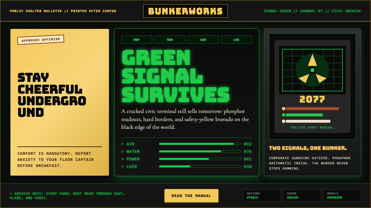 Fallout Vault-Tec Pip-BoyIrradiated optimism. Vault yellow and CRT green lock into a bordered bunker g…辐照乐观主义:避难所黄与CRT绿嵌入硬边地堡网格。
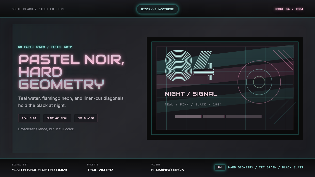 Miami Vice Pastel Teal (1984)Pastel noir, not nostalgia. Teal glow and flamingo pink slice black with geom…不是怀旧,是粉青霓虹。青光与火烈鸟粉切开黑底几何。
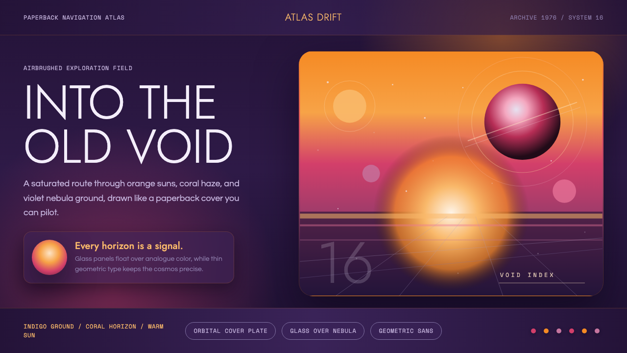 No Man's SkyA paperback cosmos you can enter. Orange suns, magenta haze, and Jost type fl…可进入的平装宇宙。橙日、品红雾与Jost字漂浮在靛蓝上。