What is Hyper Light Drifter?
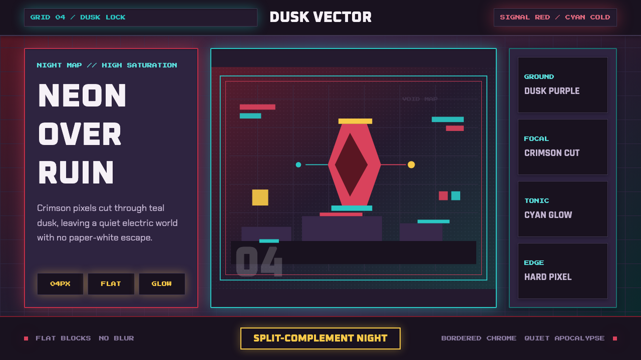
Hyper Light Drifter turned a dying world into a color chord — dusk purple and deep teal ground, neon-red foliage bleeding light, and a crimson cloak burning through it all like the last ember of a civilization.
Hyper Light Drifter in brief
Hyper Light Drifter is the visual language of Heart Machine's 2016 action-adventure game of the same name: a pixel-art aesthetic built on flat color blocks, a perpetual night sky, and a palette that treats brightness as scarce and precious. Dusk-purple and deep-teal grounds carry the weight of the composition; against them, small accents of saturated color — crimson red, acid magenta, electric cyan — do all the work of drawing the eye.
The style's defining move is contrast without whitespace. Nothing in this world is paper-white or daylight-bright. Instead, brightness is relative — a red cloak reads as blazing not because it is light in absolute terms, but because everything around it sinks into shadow. This is a palette built around a single rule: color must fight its way out of darkness to be seen, and only the most important elements are allowed to win that fight.
Visually, the aesthetic reads as a split-complementary scheme anchored by crimson as the focal warm note and cool blues and teals as the tonic that surrounds it. Edges are sharp pixel-grid edges rather than soft brush strokes; forms are built from flat color blocks rather than gradients or rendered shading. The result sits at the intersection of high-saturation pixel art, flat-color-plus-gradient illustration, and a mood that owes as much to melancholic post-apocalyptic science fiction as it does to any videogame lineage.
Where does Hyper Light Drifter come from?
Hyper Light Drifter was released in 2016 by Heart Machine, a studio founded by designer and artist Alex Preston and based in Los Angeles. It belongs to a wave of independent games made in the 2010s that used pixel art not as a budget constraint inherited from retro hardware, but as a deliberate expressive choice — a way to render a fully imagined world with total control over every visible pixel of color.
The project's visual identity grew out of Preston's own history: he began developing the game's look while processing a serious cardiac health crisis, and that experience of a body and a world in fragile, uncertain repair fed directly into the fiction of a dying civilization built from the wreckage of a more advanced past. The palette's melancholy is not incidental atmosphere — it is the subject. Ruins glow because something beautiful is ending, not because something new is being born.
Where earlier pixel-art traditions on limited hardware were often built around a bright, high-key palette out of technical necessity — few available colors, so make each one count in full daylight — Hyper Light Drifter inverted the assumption. It used a large, modern color range specifically to build depth in darkness: relatively few discrete hues, but each pushed to a specific place on the value scale, so that dusk purple and deep teal could sit as neighbors on the same dark register while red and cyan leapt forward as figure against that ground.
The game's success in 2016 helped popularize this particular strand of pixel art — flat, high-saturation color blocks on a permanently dim base — as its own recognizable sub-style within independent game design and, from there, into illustration, motion graphics, and branding work that borrows videogame nostalgia without borrowing its technical limitations.
What defines the Hyper Light Drifter look?
Color
The base of the palette sits entirely in dusk and night registers — dusk purple and deep teal dominate large surfaces, functioning the way cream or white would in a lighter system. Bright color is rationed: crimson red, magenta, and cyan appear only where the composition wants the eye to land. Nothing in the palette approaches paper-white; the darkest darks and the brightest accents are always separated by that dim mid-register, never by a jump to a light background.
Contrast Logic
Brightness here is relational rather than absolute. A red cloak or a glowing rune reads as intensely luminous purely because everything surrounding it is pushed into shadow — the same red would look ordinary on a white ground. This is the opposite of a high-key system: instead of adding light to make things visible, the palette subtracts light from everything except what must be seen.
Split-Complementary Anchor
The scheme is organized around crimson as the single focal warm color, balanced by cool blues and teals as the surrounding tonic — a split-complementary structure rather than a simple two-color complementary pair. This keeps the palette from feeling like a flat opposition of two hues; the cool side has room to modulate between deep teal and softer blue while the warm side stays concentrated in one commanding red.
Pixel Form
Every shape resolves into the sharp, stepped edges of a visible pixel grid rather than smooth vector curves or painterly strokes. This is not incidental texture — it is the same discipline the exemplar Bauhaus style applies to hard shadows: an edge is a decision, rendered at a fixed granularity, never softened or anti-aliased into ambiguity. The grid gives the world a sense of construction, as though it were assembled rather than painted.
Flat Color, No Illustration Gradients
Forms are built from flat blocks of a single hue rather than shaded volumes. Where gradation exists, it functions more like an atmospheric transition between two flat zones — dusk purple easing into deep teal along a horizon — than as a rendered highlight on an object's surface. Foliage, architecture, and figures alike are constructed as silhouettes filled with color rather than objects lit from a directional source.
Emissive Accents
Neon-red foliage and glowing grid-light details behave as if lit from within rather than reflecting an external source. This emissive quality — color that appears to generate its own light rather than catch it — is what allows small accents to compete visually with an entire dark landscape. It reinforces the fiction of a world running on the last charge of some older, more advanced power source.
Mood as Structure
The palette's melancholy is not a decorative mood layered on top of a neutral system — it is structural. Every choice, from the refusal of white grounds to the rationing of bright color, is in service of a single emotional register: beauty that is aware of its own ending. This makes the style unusually cohesive; there is no neutral or purely functional passage in the palette that doesn't also carry the tone.
Who shaped Hyper Light Drifter?
Preston is the designer and artist behind Hyper Light Drifter and the founder of Heart Machine. He built the game's visual identity while recovering from a serious heart condition, and that experience of physical fragility and uncertain repair became the emotional core of a world depicted as beautiful but dying. His approach treated pixel art not as a retro constraint but as a precise medium for controlling color and light at the smallest possible unit, letting a restrained palette carry an entire mood.
Heart Machine is the Los Angeles studio Preston founded to make the game, and the name under which the aesthetic is credited as a design movement — high-saturation pixel art paired with a melancholic post-apocalyptic sensibility. The studio's subsequent work continued to develop this same visual grammar of flat color blocks against dark grounds, cementing it as a recognizable house style rather than a one-off game skin.
Though not connected to this game directly, Kandinsky's early-twentieth-century theory linking specific hues to emotional and structural weight — warm colors as active and forward, cool colors as recessive and spatial — underlies the split-complementary logic this style relies on. The crimson-versus-teal relationship in Hyper Light Drifter follows the same warm-advances, cool-recedes principle that shaped decades of color theory in design education.
How do you use Hyper Light Drifter today?
Hyper Light Drifter's palette is a strong fit for any presentation that wants to feel atmospheric and premium rather than clean and corporate, because its entire logic is built around making a small amount of bright color feel precious against a dark field.
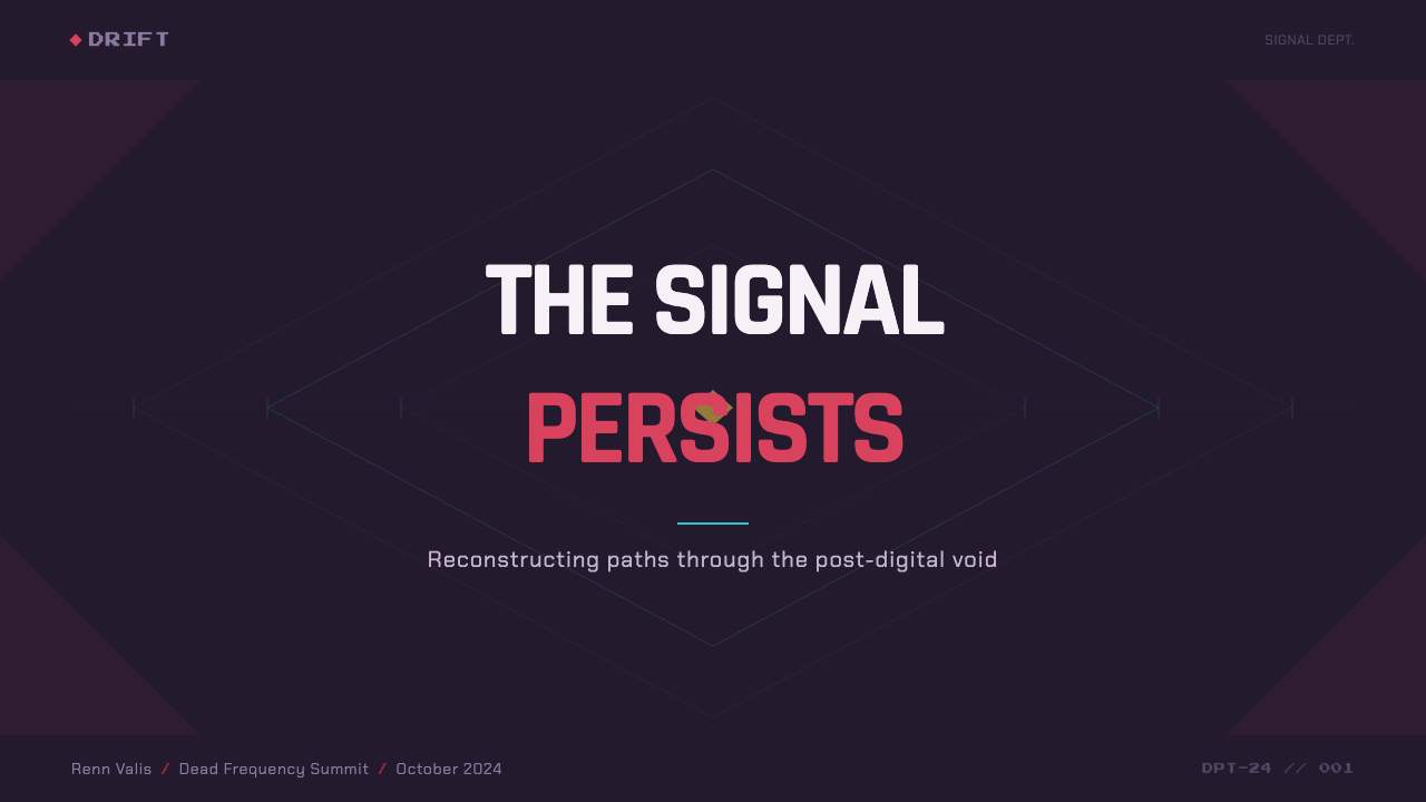
On cover slides, the style rewards restraint: a dusk-purple or deep-teal field filling the frame, with a single crimson or cyan element — a title treatment, a small emblem, a thin rule — doing all the accent work. Content and data slides should keep body text and structural elements in muted, desaturated tones close to the dark ground, reserving the saturated red or cyan strictly for the one number, label, or call-out that the slide actually wants the audience to remember. Charts translate well as glowing line or bar elements against a near-black field, echoing the emissive-accent quality of the source aesthetic rather than using flat corporate chart colors.
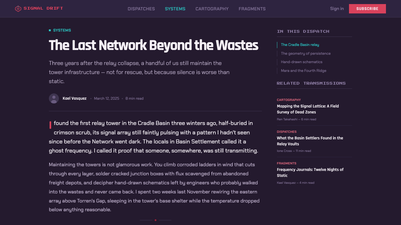
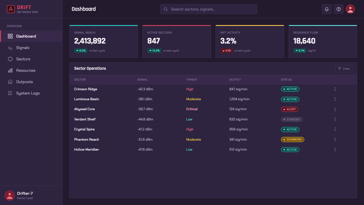
For web interfaces, the style suits dashboards and pricing pages that want to feel premium, immersive, or slightly cinematic rather than utilitarian. A dark dusk-toned background carries the interface chrome, structural lines stay in cool desaturated tones, and the single brightest accent color is reserved for the primary action — an upgrade button, an active plan, a key metric — so it reads with the same urgency a red cloak has against a dark landscape. Overusing bright accents across multiple simultaneous elements collapses this hierarchy immediately.
In editorial and marketing contexts, the aesthetic works well for narrative-driven pieces — brand stories, product reveals, anything positioning itself around atmosphere and emotional weight rather than plain information delivery. A dark, moody field with one saturated accent color used consistently across a campaign (never rotating between red, magenta, and cyan within the same piece) reproduces the same rationed-brightness discipline that makes the source material feel considered rather than decorative.
The most common mistake in applying this style is treating it as simply 'dark mode with neon accents' and then using several bright colors at once — red, cyan, and magenta all fighting for attention on the same screen. The source aesthetic works precisely because brightness is scarce: pick one dominant accent color per composition, let the cool dusk-and-teal base do the majority of the visual work, and reserve any second accent for a genuinely secondary hierarchy level, used far more sparingly than the primary one.
Hyper Light Drifter — FAQ
Is this the same as generic 'cyberpunk neon' styling?
No, though they are often confused. Generic cyberpunk neon typically saturates a scene with multiple competing bright colors — pink, cyan, purple, all glowing at once — to convey density and sensory overload. Hyper Light Drifter's palette is built on scarcity rather than abundance: the dark dusk-and-teal ground dominates, and only one or two accent colors are allowed to be bright at any given moment. The mood is melancholic and restrained rather than dense and overloaded.
Can this style work with a light or white background?
Not without losing its defining logic. The entire contrast system depends on brightness being relative to a dark surrounding field — a crimson accent reads as glowing precisely because everything around it is pushed into shadow. On a white ground, that same red would simply read as a normal saturated color with no special emphasis. If a lighter variant is needed, it works better to shift toward a dim, muted mid-tone ground rather than true white, preserving at least some of the dark-field contrast logic.
Why does the palette avoid gradients as shading, and where do gradients appear at all?
Forms in this style are built from flat color rather than rendered volume, so gradients are not used to simulate light falling across an object's surface — that would contradict the flat, constructed feel of the pixel grid. Where soft transitions do appear, they function atmospherically, easing one flat color zone into another, such as a horizon line where dusk purple meets deep teal. The distinction matters: gradient-as-atmosphere is in bounds, gradient-as-object-shading is not.
Does this style suit every kind of product, or are there contexts where it struggles?
It suits products that want to feel atmospheric, premium, narrative, or slightly cinematic — games, entertainment brands, immersive dashboards, or any story-driven marketing piece. It struggles in contexts that demand maximum legibility across many simultaneous data points, such as dense enterprise dashboards with dozens of live values, because the whole system depends on rationing bright color to just one or two elements at a time. It also sits awkwardly in contexts requiring a light, airy, or clinical feel — healthcare intake forms, accessibility-first government services — where a dark, moody field works against the desired tone.
How should color hierarchy be decided when adapting this style to a new product?
Start by deciding which single element in the composition most deserves the viewer's attention, and assign it the one bright accent color — typically the crimson equivalent. Everything else, including secondary information, should stay within the dim dusk-and-teal register, no matter how important it might seem in a conventional design system. Only after that primary hierarchy is settled should a second, cooler accent be considered, and it should always read as clearly subordinate to the first. Skipping this ordering — treating two or three colors as equally important — is what most often breaks the style.
Related design styles
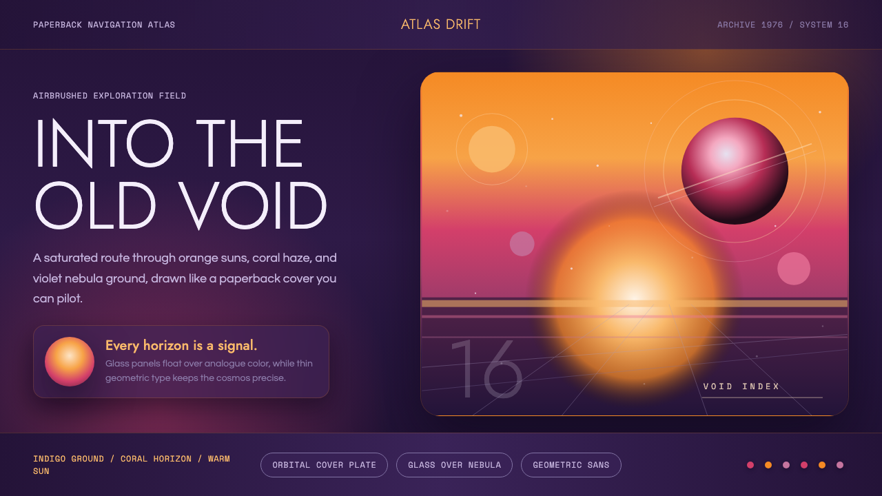 No Man's SkyA paperback cosmos you can enter. Orange suns, magenta haze, and Jost type fl…
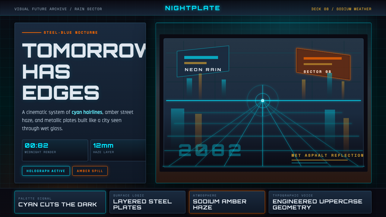 Retro-Futurism (Syd Mead)Tomorrow looks dangerous. Steel-blue night, neon cyan edges, and amber rain r…
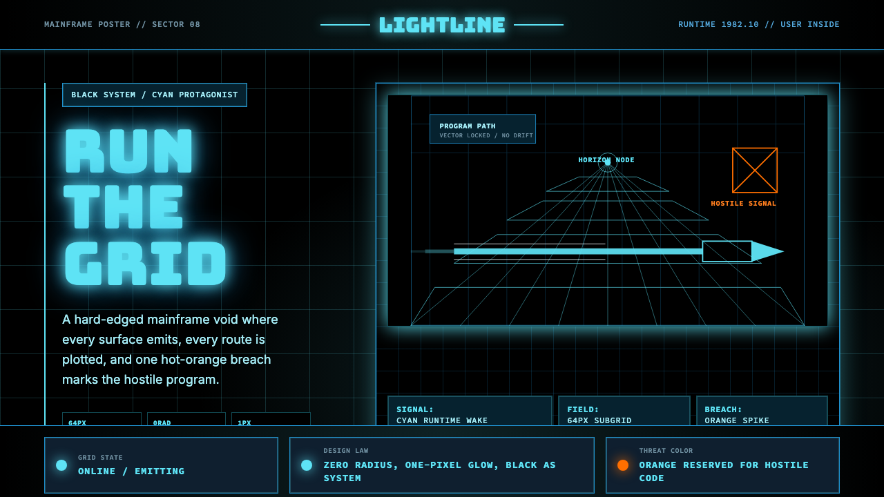 Tron Grid (1982)Cyber-precision in black. Neon cyan grids, Bungee type, and one orange breach…
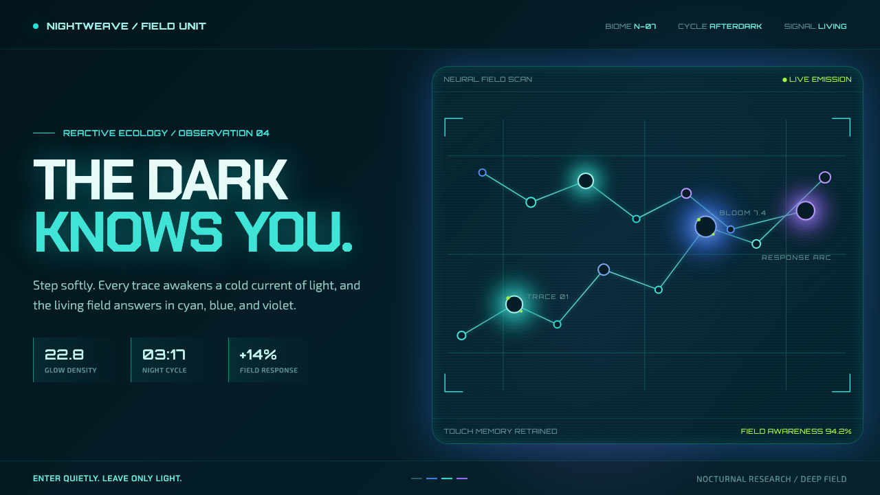 Avatar — Pandora Bioluminescence (2009)The forest knows you are there. Cyan light blooms across a deep-teal living f…
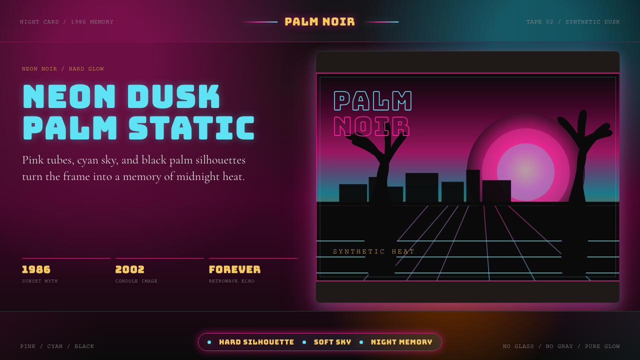 GTA Vice City (2002)Neon-noir nostalgia. Pink-cyan dusk, chunky type, and palm silhouettes.
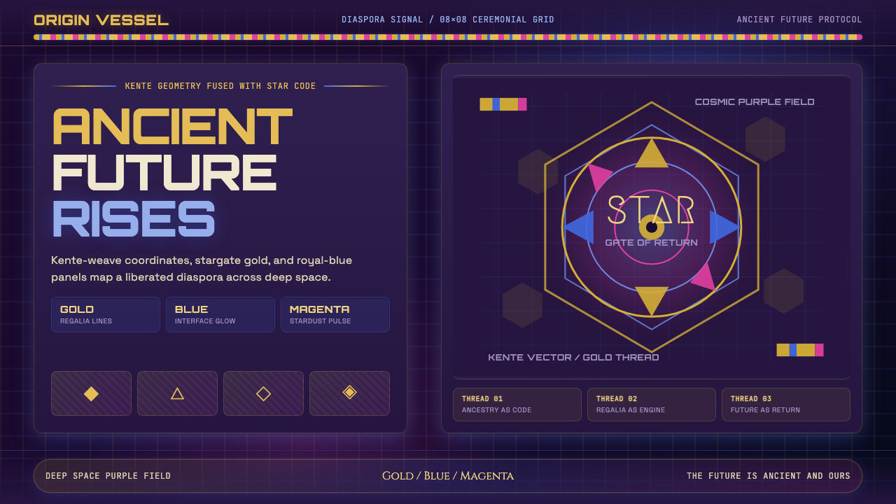 AfrofuturismAncient future, fully luminous. Gold kente grids cut through cosmic purple an…