What is Daft Punk Discovery (Gold-Helmet)?什么是 Daft Punk Discovery (Gold-Helmet)?
Discovery dressed electronic music in gold-gradient armor and magenta void — and made robot luxury feel inevitable.《Discovery》为电子乐披上金色渐变铠甲与品红虚空,让机器人的奢华感变得不可抗拒。
Daft Punk Discovery (Gold-Helmet) in briefDaft Punk Discovery (Gold-Helmet) 速览
The Daft Punk Discovery aesthetic is a visual language born from the 2001 album cover that introduced Thomas Bangalter and Guy-Manuel de Homem-Christo to the world as gold-and-silver-helmeted robots. Designed in collaboration with art director Cédric Hervet, the system layers warm saturated gold gradients over a deep void-black field, punctuated by magenta-pink accents and chrome-disc geometry. The result is something that feels simultaneously like a disco poster from the late 1970s and a PlayStation-era computer-generated render — theatrical, warm, and unmistakably mechanical.Daft Punk《Discovery》视觉语言诞生于2001年的同名专辑封面——那张封面第一次将 Thomas Bangalter 与 Guy-Manuel de Homem-Christo 以金色和银色头盔机器人的形象推向世界。在艺术总监 Cédric Hervet 的协作下,这套系统将温暖、高饱和的金色渐变叠加在深邃的虚空黑色底面之上,以品红粉强调色和铬色圆盘几何形加以点缀。最终效果既像七十年代末的迪斯科海报,又像 PlayStation 时代的计算机生成渲染——戏剧化、温暖,且毫无保留地机械。
Where most electronic music visuals of the era retreated into cool blue minimalism or industrial grey, Discovery pushed in the opposite direction: toward heat, saturation, and an almost operatic sense of occasion. Gold is not used as a neutral accent — it is the dominant atmospheric register, evoking both the warmth of analogue vinyl-era music and the prestige of science-fiction civilizations. Magenta functions as the complement that prevents the gold from becoming monotonous: it appears in glows, halos, and background fields, creating a sense of luminous depth rather than flat color.同时期大多数电子乐视觉作品退守冷蓝色极简主义或工业灰,而《Discovery》却向反方向推进:走向热度、饱和与近乎歌剧式的仪式感。金色在此并非中性的点缀——它是主导性的氛围基调,同时唤起模拟黑胶时代音乐的温暖感和科幻文明的尊贵感。品红则作为互补色,防止金色走向单调:它出现在光晕、环光与背景场域之中,制造出一种发光的深度感,而非单调的平面色彩。
The aesthetic draws on the visual grammar of the French Touch movement — the late-1990s Parisian electronic music scene that produced Daft Punk, Cassius, and Air — but pushes it into a more explicitly cinematic register. Geometric chrome forms (disc shapes, rings, reflective curved surfaces) read as both futuristic technology and vintage audiophile hardware, collapsing a timeline between 1978 and 2001 into a single image. The robots themselves — helmeted, faceless, anonymous — anchor the aesthetic in a philosophy of persona-as-design: identity constructed through surface rather than revealed through expression.这套美学从法式 French Touch 运动的视觉语法中汲取养分——那个诞生了 Daft Punk、Cassius 和 Air 的九十年代末巴黎电子乐场景——并将其推入更具电影感的维度。几何铬合金形态(圆盘、圆环、反光曲面)既像未来技术,又像复古的发烧友音响硬件,将1978年至2001年之间的时间线折叠进单一画面。而机器人本身——戴着头盔、无面孔、匿名——将这套美学锚定在「人格即设计」的哲学上:身份通过表面建构,而非通过表情揭示。
See the Daft Punk Discovery (Gold-Helmet) design system查看 Daft Punk Discovery (Gold-Helmet) 完整设计系统
Where does Daft Punk Discovery (Gold-Helmet) come from?Daft Punk Discovery (Gold-Helmet) 从何而来?
The Daft Punk project was founded in Paris in 1993 by Bangalter and Homem-Christo, initially as a house music act operating within the nascent French Touch scene. Their 1997 debut album *Homework* established the duo's musical identity but relied on relatively conventional electronic-music visuals. The robot persona — and the fully realized visual aesthetic that came with it — was not introduced until the *Discovery* campaign in 2001, making the album cover a genuine origin point for the aesthetic rather than an iteration on earlier work.Daft Punk 项目于1993年在巴黎由 Bangalter 与 Homem-Christo 创立,最初以浩室音乐组合的身份活跃于新兴的法式 French Touch 场景。他们1997年的首张专辑《Homework》确立了这支组合的音乐身份,但视觉上沿用了相对常规的电子乐语言。机器人人格——以及随之而来的完整视觉美学——直到2001年《Discovery》宣传期才正式确立,这使专辑封面成为这套美学真正意义上的起源点,而非对早期作品的延续迭代。
The gold-helmet-and-magenta visual language was developed in direct response to the album's thematic content. *Discovery* was a conscious departure from the grittier, harder-edged house music of *Homework*: it was warmer, more melodic, more indebted to 1970s funk and disco and to the orchestral pop of the same era. The cover needed to encode this shift in a single image. Hervet, working with the duo, resolved the visual problem by reaching back to the palette of late-1970s disco culture — gold, warm brown, magenta — and projecting it forward through the lens of early-2000s computer graphics, complete with reflective surfaces and depth-of-field blur effects that signaled both technological sophistication and cinematic aspiration.这套金色头盔与品红粉的视觉语言,是对专辑主题内容的直接回应。《Discovery》是对《Homework》中更为粗粝、硬朗的浩室音乐风格的有意脱离:它更温暖、更具旋律性,更多地师承七十年代的放克与迪斯科,以及同时期的管弦流行乐。封面需要在单一画面中编码这一转变。Hervet 与组合二人合作,通过回溯七十年代末迪斯科文化的色板——金色、暖棕、品红——并借助2000年代初的计算机图形技术向前投射,来解决这个视觉难题:反光表面、景深模糊效果,既传递出技术上的精深,也流露出电影级别的抱负。
Tony Gardner, the Hollywood special-effects artist who actually fabricated the physical helmets worn by the duo in promotional and live contexts, brought an industrial rigor to the robot aesthetic that reinforced its visual seriousness. The helmets were not costumes in the theatrical sense — they were engineered objects, with LEDs and articulated visors, designed to be read as genuinely technological rather than merely decorative. This distinction between genuine engineering and theatrical prop matters to the aesthetic: the Discovery look is not pastiche. It is a claim about the future made with full conviction.好莱坞特效艺术家 Tony Gardner 实际制作了这对组合在宣传和现场演出中佩戴的实体头盔,为机器人美学带来了工业级的严谨性,强化了其视觉上的分量感。头盔不是戏剧意义上的服装道具——它们是工程制品,配备 LED 灯和可活动面罩,被设计成真正具有技术感,而非单纯装饰性的存在。真实工程与戏剧道具之间的这种区分,对这套美学至关重要:《Discovery》的视觉语言不是拼贴模仿,而是对未来的一种充满信念的主张。
The historical context shaped what the aesthetic could mean. In 2001, computer graphics and digital production had become mainstream tools in music and film, but they retained a sense of novelty and prestige. The photorealistic rendering of metallic surfaces, the depth gradients of a simulated void, the warm-to-cool color transitions of a calculated glow — these were not default options but deliberate technical choices that communicated mastery and ambition. Daft Punk's visual team understood that the medium carried its own message: a machine-rendered image of machines making music closed a conceptual loop that made the aesthetic feel earned rather than adopted.历史语境决定了这套美学所能承载的意义。2001年,计算机图形与数字制作虽已成为音乐和电影领域的主流工具,但仍保有一种新鲜感和声望感。金属表面的照片级渲染、模拟虚空的深度渐变、精心计算的光晕所产生的冷暖色彩过渡——这些不是默认选项,而是传达出技术掌控力与野心的刻意抉择。Daft Punk 的视觉团队深知媒介本身即是讯息:由机器渲染的、关于机器在创作音乐的图像,形成了一个概念上的闭环,使这套美学显得实至名归,而非借来一用。
What defines the Daft Punk Discovery (Gold-Helmet) look?Daft Punk Discovery (Gold-Helmet) 的视觉特征是什么?
Gold-Gradient Atmosphere金色渐变氛围
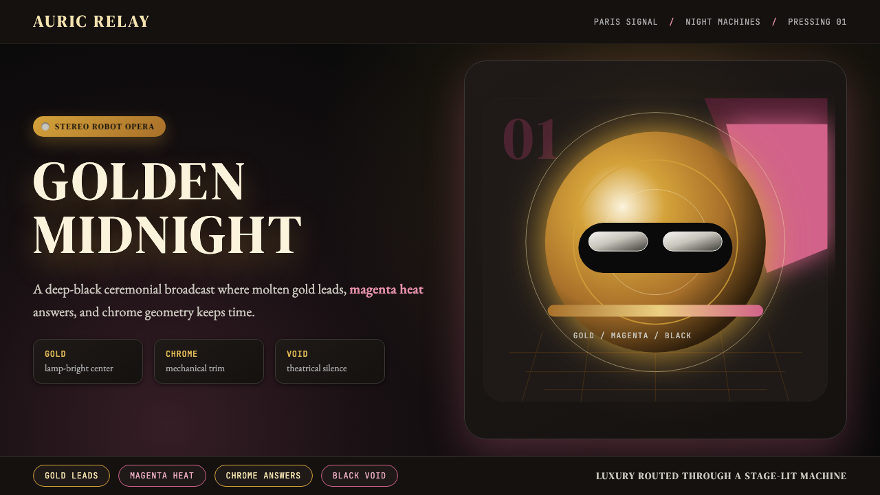
Gold is not a highlight or an accent in this system — it is the primary atmospheric condition. The characteristic gradient moves from a deep, saturated amber at the center of light sources outward toward cooler, darker tones, creating the impression of warmth radiating from within the image rather than falling onto it from outside. This interior luminosity is the defining temperature of the aesthetic: it reads as both the warmth of vintage analogue sound and the prestige glow of high-technology surfaces.在这套系统中,金色不是强调或点缀——它是主导性的氛围基调。典型的渐变从光源核心处深沉、饱和的琥珀色向外扩展至更冷、更暗的色调,制造出一种温暖从图像内部向外辐射、而非从外部打入的印象。这种内发光的品质是这套美学的核心温度:它同时唤起复古模拟声效的温暖感与高科技表面的尊贵光泽。
Void-Black Depth Field虚空黑色景深场域
Behind every gold form and magenta glow lies an absolute void: a black so deep and empty that it reads less as a background color and more as the absence of space itself. This void functions as the negative space through which all warm-toned elements gain their luminosity. Without the void, the gold would simply be saturated color; set against it, the gold becomes a light source. The contrast between illuminated foreground and unlit depth is what gives the aesthetic its sense of infinite theatrical scale.每一个金色形态与品红光晕的背后,都是绝对的虚空:一种深邃、空洞到让人感觉不像背景颜色、而更像空间本身缺席的黑色。这片虚空是负空间,所有暖色调元素正是通过它才获得发光感。没有虚空,金色不过是饱和的色彩;与之对照,金色便成了光源。被照亮的前景与未被点亮的深渊之间的反差,赋予了这套美学无限戏剧性纵深感。
Magenta-Pink Complement品红粉互补色
Magenta occupies the chromatic role that gold cannot fill alone: it provides the cool-warm tension that keeps the palette from reading as monochromatic. In practice, magenta appears as atmospheric haze around light sources, as the dominant hue in large background zones, and as the glow that bleeds between foreground and void. It is used at full saturation but rarely at full opacity — it most often appears as a tinted luminosity rather than a solid hue, maintaining the sense of depth and atmosphere over graphic flatness.品红色承担着金色单独无法填补的色彩角色:它提供冷暖对比张力,防止整体色板读起来像单色调。在实践中,品红以光源周围的大气雾霭形式出现,以大面积背景区域的主导色调出现,也以渗透于前景与虚空之间的光晕形式出现。它以完全饱和度出现,但很少以完全不透明度呈现——通常作为带色彩的发光感而非实心色块,从而维持深度与氛围感,而非沦为平面的图形化。
Chrome-Disc Geometry铬色圆盘几何
The signature geometric motifs — discs, rings, hemispheres, and toroidal forms — are rendered as reflective chrome or brushed metal surfaces that pick up both the gold and magenta from their environment. These forms carry a dual meaning: they read simultaneously as futuristic technology (spacecraft, machinery, industrial components) and as vintage audio hardware (record grooves, speaker cones, amplifier knobs). The reflective quality is essential — flat shapes would lose the environmental warmth that makes the geometry feel inhabited rather than diagrammatic.标志性的几何母题——圆盘、圆环、半球、环形体——被渲染为反光铬合金或拉丝金属表面,从周围环境中同时拾取金色与品红。这些形态承载双重意义:它们既像未来技术(飞船、机械、工业零件),又像复古音响硬件(黑胶唱片纹路、扬声器锥体、功放旋钮)。反光品质至关重要——平面形态将失去那种让几何感觉被居住而非单纯示意图化的环境温度。
Retro-Futurist Typography复古未来主义字体排印
Type in this aesthetic leans toward serif or display letterforms with enough weight to hold their own against the atmospheric intensity of the palette. Characters are often set in gold or cream against the dark void, sometimes with a subtle glow treatment that integrates them into the lighting logic of the composition. The typographic register is unhurried and ceremonial — more like a film title card than a product label — which reinforces the sense that the aesthetic is presenting something of consequence rather than simply labeling it.这套美学中的字体倾向于衬线或展示性字形,字重足以在色板的大气强度面前自立。字符通常以金色或奶油色置于深色虚空之上,有时带有微妙的光晕处理,使之融入构图的光照逻辑。字体排印的基调不急不徐、仪式感十足——更像电影字幕卡而非产品标签——这强化了一种感觉:这套美学在呈现某件有分量的事物,而非单纯为其贴标签。
Warm Luminous Depth温暖发光的景深感
Unlike the hard-edged flatness of graphic-design movements such as Bauhaus or Swiss Style, the Discovery aesthetic relies on soft gradients, atmospheric bloom, and depth-of-field simulation to create the impression of three-dimensional space rendered under theatrical lighting. This is intentional softness — not a failure to commit to edge — and it is what separates the aesthetic from its contemporaries in electronic music visuals. The warmth is not sentimental; it is architectural, constructing a space the viewer can imaginatively inhabit.与包豪斯或瑞士风格等图形设计运动的硬边平面感截然不同,《Discovery》美学依赖柔和渐变、大气泛光与景深模拟,营造出在戏剧性照明下被渲染的三维空间印象。这是刻意的柔软——而非对边缘的回避——这正是将这套美学与同时期其他电子乐视觉语言区分开来的关键。这种温暖感不是感伤性的;它是建筑性的,构筑了一个观看者可以在想象中居住其中的空间。
Persona-as-Surface人格即表面
The robot helmets that anchor the aesthetic are not characters in a narrative sense — they are designed surfaces. Their appeal lies precisely in their blankness: without eyes or mouths to read, the viewer projects onto the reflective visor. This principle extends throughout the aesthetic system. Every element — gold disc, magenta void, chrome ring — functions as a surface that reflects its environment rather than generating its own meaning from within. The style rewards designers who understand how to use visual weight, finish quality, and chromatic atmosphere to create presence without representation.锚定这套美学的机器人头盔并非叙事意义上的角色——它们是被设计过的表面。它们的魅力恰恰在于这种空白感:没有眼睛和嘴巴可供解读,观看者将自身投射到反光面罩上。这一原则贯穿整套美学系统。每一个元素——金色圆盘、品红虚空、铬色圆环——都是反映其所处环境的表面,而非从内部生成自身意义。这套风格奖励那些理解如何运用视觉重量、表面质感与色彩氛围来制造存在感(而无需具象表现)的设计师。
See the Daft Punk Discovery (Gold-Helmet) design system查看 Daft Punk Discovery (Gold-Helmet) 完整设计系统
Who shaped Daft Punk Discovery (Gold-Helmet)?谁塑造了 Daft Punk Discovery (Gold-Helmet)?
One of the two members of Daft Punk, Bangalter served as the primary architectural force behind the duo's sonic direction, and his sensibility — rooted equally in French house music, 1970s Italian disco, and analogue synthesizer aesthetics — shaped the warm-gold-and-chrome visual direction of Discovery as much as any visual decision. His insistence on the robot persona as a permanent and total identity (interviews conducted in character, photographic appearances only in helmet) gave the aesthetic its philosophical backbone: the idea that identity could be a designed surface rather than a revealed self.Daft Punk 两名成员之一,Bangalter 是这支组合音乐方向的主要建构力量。他植根于法式浩室、七十年代意大利迪斯科与模拟合成器美学的感性,与任何视觉决策一样深刻地塑造了《Discovery》温暖金铬色的视觉方向。他坚持将机器人人格作为永久且彻底的身份认同(以角色身份接受采访,公开露面只戴头盔),为这套美学提供了哲学支柱:身份可以是被设计的表面,而非被揭示的自我。
The second member of Daft Punk, Homem-Christo contributed a visual sensibility more directly drawn from cinematic and art-historical references than Bangalter's more music-theoretical approach. His interest in science-fiction film aesthetics — particularly the warm amber and chrome palettes of late-1970s genre cinema — is directly legible in the Discovery visual system. Together with Bangalter, he developed the philosophical framework in which the robots were not costumes but permanent identities, a commitment that forced the visual aesthetic to carry the full weight of public persona.Daft Punk 的另一名成员,Homem-Christo 的视觉感性比 Bangalter 更偏重电影与艺术史参照。他对科幻电影美学的兴趣——尤其是七十年代末类型电影中温暖琥珀色与铬合金色的色板——在《Discovery》视觉系统中清晰可读。他与 Bangalter 共同建立了一个哲学框架:机器人不是服装,而是永久的身份认同。这一承诺迫使视觉美学独力承担起整个公众形象的全部重量。
The art director principally responsible for translating the Discovery concept into a resolved visual system. Working within the constraints and direction provided by Bangalter and Homem-Christo, Hervet made the specific decisions — the precise balance between gold saturation and void depth, the choice of magenta as complement, the treatment of chrome surfaces as environmental mirrors rather than graphic shapes — that transformed an aesthetic idea into a reproducible visual language. His contribution represents the professional craft layer beneath the conceptual architecture: the system-building rather than the vision.主要负责将《Discovery》概念转化为完整视觉系统的艺术总监。在 Bangalter 与 Homem-Christo 提供的约束与方向框架内,Hervet 做出了具体的决策——金色饱和度与虚空深度之间的精确平衡、品红色作为互补色的选择、将铬合金表面处理为环境反射镜而非平面图形——将一个美学理念转化为可复制的视觉语言。他的贡献代表了概念架构之下的专业工艺层:是系统构建,而非愿景本身。
The Hollywood special-effects artist and costume fabricator who built the physical Discovery-era helmets. Gardner's background in practical effects for science-fiction film brought genuine engineering credibility to objects that could easily have read as theatrical props. His helmets featured functional LED matrices, precisely engineered visor mechanisms, and material finishes chosen for both photographic performance and live-stage readability. The physical solidity of these objects — their obvious weight, their engineered articulation — translated directly into the visual seriousness of the aesthetic, grounding the gold-and-chrome system in something that existed as real technology rather than only as image.打造了《Discovery》时期实体头盔的好莱坞特效艺术家与服装制作师。Gardner 在科幻电影实拍特效领域的背景,为这些本来可能只像戏剧道具的物件赋予了真正的工程可信度。他的头盔配备了功能性 LED 矩阵、精密工程化的面罩机构,以及为摄影表现与现场舞台可读性共同优化的材质表面处理。这些物件的实体厚重感——明显的重量、经过工程设计的机械运动——直接转化为这套美学的视觉分量,将金色与铬色系统锚定在真实存在的技术之上,而非仅仅作为图像。
The broader Parisian electronic music scene of the late 1990s — including Cassius, Air, Bob Sinclar, and associated producers and designers — established the cultural context within which the Discovery aesthetic became legible as a statement rather than merely a style. French Touch was characterized by a warmer, more melodic, more groove-oriented approach to house music than the prevailing Northern European and American scenes, and its visual culture — typically warm-toned, reference-heavy, cinematic — provided the immediate precedent that Discovery both honored and departed from. Understanding French Touch as context is essential for understanding what Discovery was claiming when it reached for gold and void: it was positioning itself as the peak, not merely a participant.九十年代末更广泛的巴黎电子音乐场景——包括 Cassius、Air、Bob Sinclar 及相关制作人与设计师——建立了文化语境,使《Discovery》美学能够被解读为一种宣言,而非仅仅是一种风格。法式 French Touch 的特征是比当时主流的北欧和美国场景更温暖、更具旋律性、更以律动为导向的浩室音乐,其视觉文化——通常色调温暖、参照丰富、具有电影感——为《Discovery》提供了它既致敬又背离的直接先例。将法式 French Touch 作为语境加以理解,对于理解《Discovery》在选择金色与虚空时在宣示什么至关重要:它在将自己定位为这个场景的顶峰,而非仅仅是其中一个参与者。
How do you use Daft Punk Discovery (Gold-Helmet) today?今天怎么用 Daft Punk Discovery (Gold-Helmet)?
The Discovery aesthetic is one of the most immediately recognizable visual registers in popular music history, which makes it both highly evocative and unusually demanding to apply outside its original context. Used well, it signals warmth, prestige, technological sophistication, and a particular kind of theatrical confidence — the feeling that what is being presented is worth the ceremony. Used carelessly, it collapses into a generic dark-background gold-text treatment that carries none of the system's specific atmospheric logic. The key is understanding that Discovery is not a palette — it is a lighting environment, and every design decision should be made in service of that environment.《Discovery》美学是流行音乐史上辨识度最高的视觉风格之一,这既使其极具感召力,也使其在原始语境之外的应用异常苛刻。运用得当时,它传递出温暖、尊贵、技术精深以及一种特定的戏剧性自信——一种所呈现之物值得如此仪式感的感觉。运用不当时,它将坍塌为一种普通的深色背景金色文字处理,完全丧失这套系统特有的大气逻辑。关键在于理解:《Discovery》不是色板——它是一个光照环境,所有设计决策都应服务于这个环境。
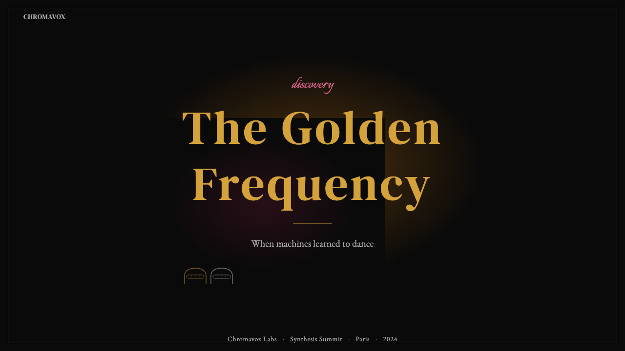
For presentation slides, the Discovery approach works powerfully on cover and section-divider pages where full atmospheric commitment is possible. A cover slide should be treated as a film title card: void black occupying most of the field, with the title in warm gold or cream letterforms that appear to be lit from within rather than printed on a surface. The gradient logic should move from the densest luminosity at a specific focal point — typically center or slightly above center — outward toward cooler, darker tones at the edges. Content slides require a different discipline: use the void-black background consistently but pull back the atmospheric effects, letting the content read against a clean dark field with warm-gold section labels and magenta used sparingly for data highlights or callout emphasis. Data visualization inherits the palette directly: charts and graphs rendered in gold against void, with magenta as the accent for peak values or selected states.在演示文稿中,《Discovery》的方法在封面和章节分隔页上效果最为强大,因为这些页面允许完整的大气投入。封面幻灯片应当被当作电影字幕卡处理:虚空黑色占据大部分画面,标题以温暖金色或奶油色字形呈现,使其看起来像是从内部发光而非印在表面上。渐变逻辑应从特定焦点处——通常是画面中央或略高于中央——的最浓郁光度向边缘的更冷、更暗色调扩散。内容页需要不同的约束:保持虚空黑色背景的一致性,但收敛大气效果,让内容在干净的深色场域上清晰呈现,以暖金色作为章节标签,品红色则节制地用于数据亮点或引用强调。数据可视化直接继承色板:金色对虚空渲染图表,品红用于峰值或选中状态的强调色。
For web interfaces and dashboards, the aesthetic translates most effectively to dark-mode environments where the void-black background can function as intended. A dashboard built in this register should use the deep black as the base surface, reserve gold-gradient treatments for primary KPI values, section headers, and active navigation states, and use a muted version of the palette — desaturated warm tones rather than full gold saturation — for secondary data. The atmospheric bloom effect (a soft warm glow radiating from key values) can be achieved through careful layering without simulation of literal light. Pricing pages benefit from the theatrical confidence of the system: high-tier plans presented in full gold-gradient glory against void, lower tiers in the same field at reduced luminosity, magenta reserved for the recommended-plan highlight or primary call-to-action.对于网页界面和仪表板,这套美学在深色模式环境中转化效果最佳——在那里,虚空黑色背景能够如预期般发挥功能。以这种风格构建的仪表板应以深黑色作为基础表面,将金色渐变处理保留给主要 KPI 数值、章节标题和激活导航状态,对次要数据使用色板的降调版本——去饱和暖调而非完全饱和的金色。大气泛光效果(从关键数值向外辐射的柔和暖光)可以通过精心的图层叠加实现,无需模拟真实光源。定价页面受益于这套系统的戏剧性自信:高级套餐以完整金色渐变的荣光在虚空中呈现,较低套餐在同一场域中以降低的光度呈现,品红色保留给推荐方案高亮或主要行动号召按钮。
For editorial and marketing work, the Discovery aesthetic supports rich, full-page spreads where the atmospheric environment can breathe across a large canvas. A marketing hero section should commit entirely to the void: no competing backgrounds, no texture overlays, no competing color systems. Photography, if used, should be treated as a surface within the environment — lit as if by the same warm-gold light source that governs everything else, desaturated where it conflicts with the palette, and composited rather than placed. Headlines should carry the full typographic weight that the atmospheric surroundings invite: large, well-spaced, set in warm tones against the dark field. The key editorial use case is the feature announcement or product reveal — contexts where ceremonial presentation is a legitimate communication goal.对于编辑和营销内容,《Discovery》美学支持丰富的全页展开,让大气环境在宽阔画布上自由呼吸。营销主视觉区块应当对虚空完全投入:没有竞争性背景,没有纹理叠加,没有相互竞争的色彩系统。如果使用摄影,应将其处理为环境中的一个表面——以同样统御一切的暖金色光源来打光,在与色板冲突之处降低饱和度,采用合成而非简单置入的方式。标题应承载大气环境所邀请的完整字体重量:在深色场域上设置大号、间距舒适的暖调字形。关键的编辑应用场景是功能发布或产品揭幕——在这些语境中,仪式感呈现是合理的传播目标。
The most common mistake when working with the Discovery aesthetic is treating it as a dark-mode color theme rather than as a lighting environment. Adding gold text and magenta accents to a dark background does not produce Discovery — it produces generic dark-luxury. The distinguishing element is the sense that light is emanating from within the composition: golds that appear to glow rather than simply be colored, voids that read as space rather than as background fill, gradients that model a coherent light source rather than adding visual interest. A secondary common mistake is deploying all three tonal registers — full gold, magenta, and void — simultaneously and at equal weight, destroying the hierarchy that gives the system its depth. In authentic Discovery-derived work, void dominates, gold is the primary light source, and magenta is the atmospheric complement — never the lead.运用《Discovery》美学时最常见的错误,是将其视为深色模式配色方案,而非光照环境。在深色背景上添加金色文字和品红点缀,并不能产生《Discovery》的效果——它产生的是普通的深色奢华感。区别在于那种光从构图内部向外发射的感觉:金色看起来像在发光而非单纯着色,虚空读起来像空间而非背景填充,渐变模拟了一个连贯的光源而非单纯增添视觉趣味。另一个常见错误是同时以相同分量部署所有三种色调层次——完整金色、品红和虚空,摧毁了赋予这套系统深度感的层级关系。在真正源自《Discovery》的作品中,虚空占主导,金色是主要光源,品红是大气补色——永远不是主角。
See the Daft Punk Discovery (Gold-Helmet) design system查看 Daft Punk Discovery (Gold-Helmet) 完整设计系统
Daft Punk Discovery (Gold-Helmet) — FAQDaft Punk Discovery (Gold-Helmet) · 常见问题
Is the Discovery aesthetic the same as general dark-gold luxury design?《Discovery》美学与一般的深色金色奢华设计是同一回事吗?
They share surface elements but operate on different logic. Generic dark-gold luxury design uses gold as a prestige signal against a dark field, typically with hard edges and opaque fills. The Discovery aesthetic is a lighting environment: gold values appear to emit light rather than simply occupy space, the void is a depth field rather than a background color, and magenta functions as atmospheric complement rather than decorative accent. The test is whether the composition reads as a scene with an interior light source or as a dark background with colored elements placed on it. Discovery-derived work passes the first test; generic dark-luxury passes only the second.两者共享表面元素,但运作逻辑不同。普通的深色金色奢华设计将金色作为尊贵信号置于深色场域之上,通常使用硬边和不透明填充。《Discovery》美学是一个光照环境:金色数值看起来像在发光而非单纯占据空间,虚空是景深场域而非背景颜色,品红作为大气补色而非装饰点缀发挥功能。测试方法是:这个构图读起来像是拥有内部光源的场景,还是像是在深色背景上摆放了彩色元素。真正源自《Discovery》的作品通过第一项测试;普通深色奢华感只通过第二项。
Can the Discovery aesthetic work for brands that are not in music or entertainment?《Discovery》美学能用于音乐和娱乐行业以外的品牌吗?
Yes, with the right positioning. The aesthetic carries values of technological sophistication, warmth-within-modernity, and theatrical confidence that translate well to premium technology products, luxury automotive, high-end financial services, and any brand seeking to distinguish itself from the cold minimalism dominant in tech. The key is tonal alignment: Discovery works for brands that are comfortable presenting themselves with ceremony. It is a poor fit for brands whose positioning depends on approachability, organic warmth, or understated simplicity — contexts where the theatrical scale of the aesthetic reads as disproportionate or pretentious.可以,但需要正确的品牌定位。这套美学承载着技术精深、现代感中的温暖,以及戏剧性自信等价值观,这些价值观在高端技术产品、豪华汽车、高端金融服务,以及任何寻求与科技领域主流冷酷极简主义区分开来的品牌中都能良好转化。关键在于调性对齐:《Discovery》适合那些乐于以仪式感方式呈现自身的品牌。它不适合那些品牌定位依赖亲近感、有机温暖感或低调简约的场景——在这些语境中,这套美学的戏剧性规模会被读成不成比例或自命不凡。
How do you prevent the aesthetic from feeling dated or nostalgic rather than timeless?如何防止这套美学看起来过时或充满怀旧感,而非历久常新?
The risk is real: early-2000s computer graphics carry specific period associations that can tip the aesthetic into retro territory if the rendering quality or compositional decisions feel like period reproduction rather than genuine application. The antidote is to understand what the aesthetic is actually about — a lighting philosophy and a chromatic logic — rather than reproducing specific period techniques. A Discovery-derived composition should feel like it was made now, by someone who deeply understands the original system, not like an artifact from 2001 deliberately recreated. This means avoiding the specific tells of early CG (low polygon counts, visible render artifacts, dated lens flare shapes) while preserving the atmospheric intelligence that makes the original work timeless.这种风险是真实存在的:2000年代初的计算机图形携带着特定的时代印记,如果渲染质量或构图决策让人感觉像是年代复制而非真正的应用,这套美学很容易滑向复古领域。解药在于理解这套美学真正关于什么——一种光照哲学和色彩逻辑——而非复制特定时代的技术手法。一个真正源自《Discovery》的构图,应当让人感觉像是现在由深刻理解原始系统的人创作的,而非对2001年风格的刻意重现。这意味着要避免早期 CG 的特定标志(低多边形数量、可见的渲染瑕疵、过时的镜头光晕形状),同时保留使原作历久常新的大气智慧。
What is the correct relationship between gold and magenta in a Discovery-derived layout?在源自《Discovery》的版面中,金色与品红的正确关系是什么?
Gold is the primary light source and the dominant chromatic register; magenta is the atmospheric complement that gives the void its depth and prevents the composition from reading as simply a bright-on-dark contrast study. In practice, this means gold should occupy the most visually prominent positions — headlines, focal geometry, key values — while magenta operates more diffusely, as ambient haze, background zone color, or the color of the space between elements rather than the elements themselves. When magenta appears at full saturation in a foreground element, it should be the exception, not the rule, and it should be positioned to create dialogue with the gold rather than compete with it.金色是主要光源和主导色调;品红是大气补色,赋予虚空以深度,防止构图被读成单纯的亮色对深色反差研究。在实践中,这意味着金色应占据视觉上最突出的位置——标题、焦点几何体、关键数值——而品红则更扩散地运作,作为环境雾霭、背景区域颜色,或元素之间空间的颜色,而非元素本身的颜色。当品红以完全饱和度出现在前景元素中时,它应该是例外而非常规,并且应当被定位为与金色产生对话,而非与之竞争。
Does the Discovery aesthetic require a dark background, or can it work on light grounds?《Discovery》美学必须使用深色背景吗?还是在浅色底面上也能运作?
The void-black background is not optional — it is structural. The entire luminosity logic of the aesthetic depends on the contrast between emitted warm light and the unlit depth field. On a light background, gold becomes a flat yellow-beige and magenta becomes a saturated pink; neither carries the sense of interior light that defines the aesthetic. A light-background version that retains gold and magenta will inevitably read as a different aesthetic system — warm and festive, perhaps, or retro-disco — but not as Discovery. If a light-background application is genuinely required by context, it is better to draw selectively from the aesthetic's typographic and geometric logic while acknowledging that the full atmospheric system cannot be preserved.虚空黑色背景不是可选的——它是结构性的。这套美学的整体光度逻辑依赖于发射的暖光与未被点亮的景深场域之间的对比。在浅色背景上,金色变成平面的黄米色,品红变成饱和的粉色;两者都无法承载定义这套美学的内发光感。保留金色和品红的浅色背景版本将不可避免地被读成另一套美学系统——也许是温暖节庆感,或是复古迪斯科感——但不会是《Discovery》。如果语境确实需要浅色背景的应用,更好的做法是有选择地借鉴这套美学的字体排印与几何逻辑,同时承认完整的大气系统无法得到保留。
Related design styles相关设计风格
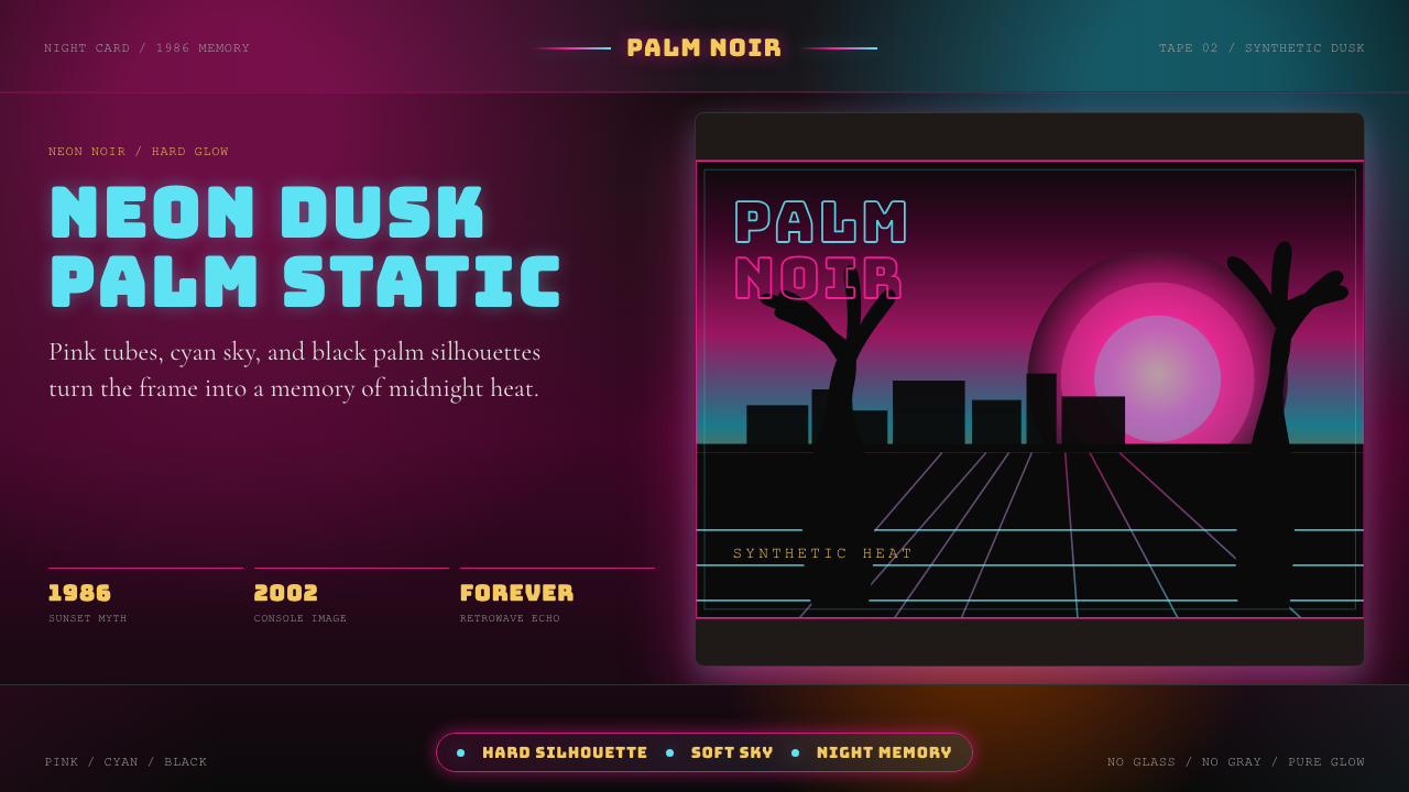 GTA Vice City (2002)Neon-noir nostalgia. Pink-cyan dusk, chunky type, and palm silhouettes.霓虹黑色怀旧。粉青黄昏、粗体字和棕榈剪影。
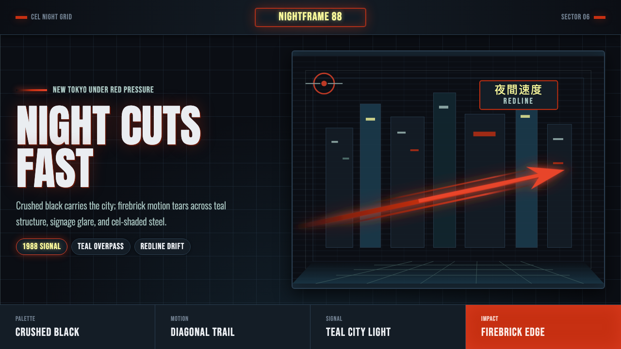 Akira Neo-TokyoNight moves fast. Firebrick trails cut crushed black, teal grids, and condens…黑夜疾驰。砖红光轨切开墨黑、青蓝网格与压缩招牌。
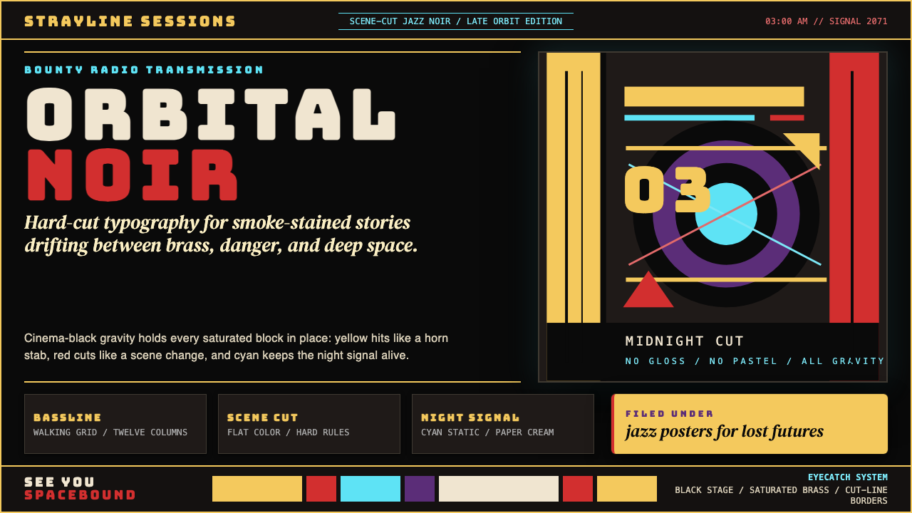 Cowboy Bebop Jazz-NoirCool at 3 AM. Bungee type, jazz yellow, red cuts, and cyan rules hit deep bla…凌晨三点的酷:黑底上 Bungee 字、爵士黄、红切线与青色规则。
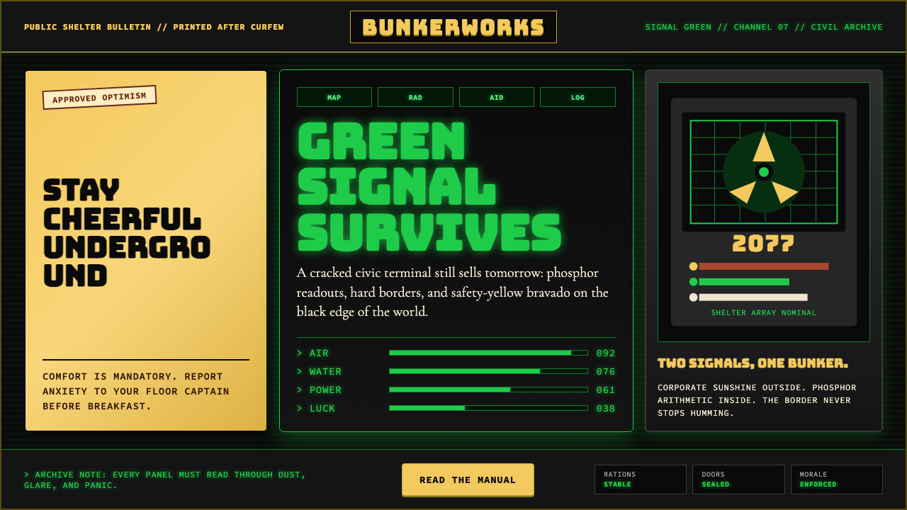 Fallout Vault-Tec Pip-BoyIrradiated optimism. Vault yellow and CRT green lock into a bordered bunker g…辐照乐观主义:避难所黄与CRT绿嵌入硬边地堡网格。
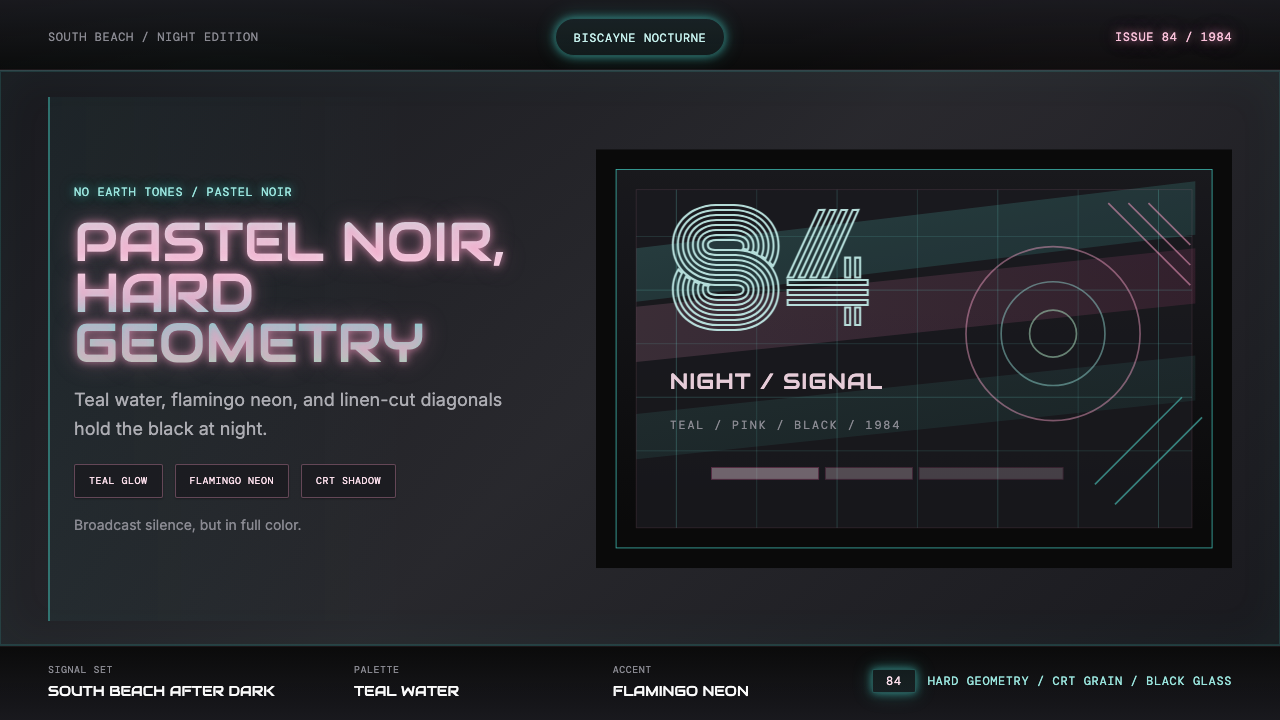 Miami Vice Pastel Teal (1984)Pastel noir, not nostalgia. Teal glow and flamingo pink slice black with geom…不是怀旧,是粉青霓虹。青光与火烈鸟粉切开黑底几何。
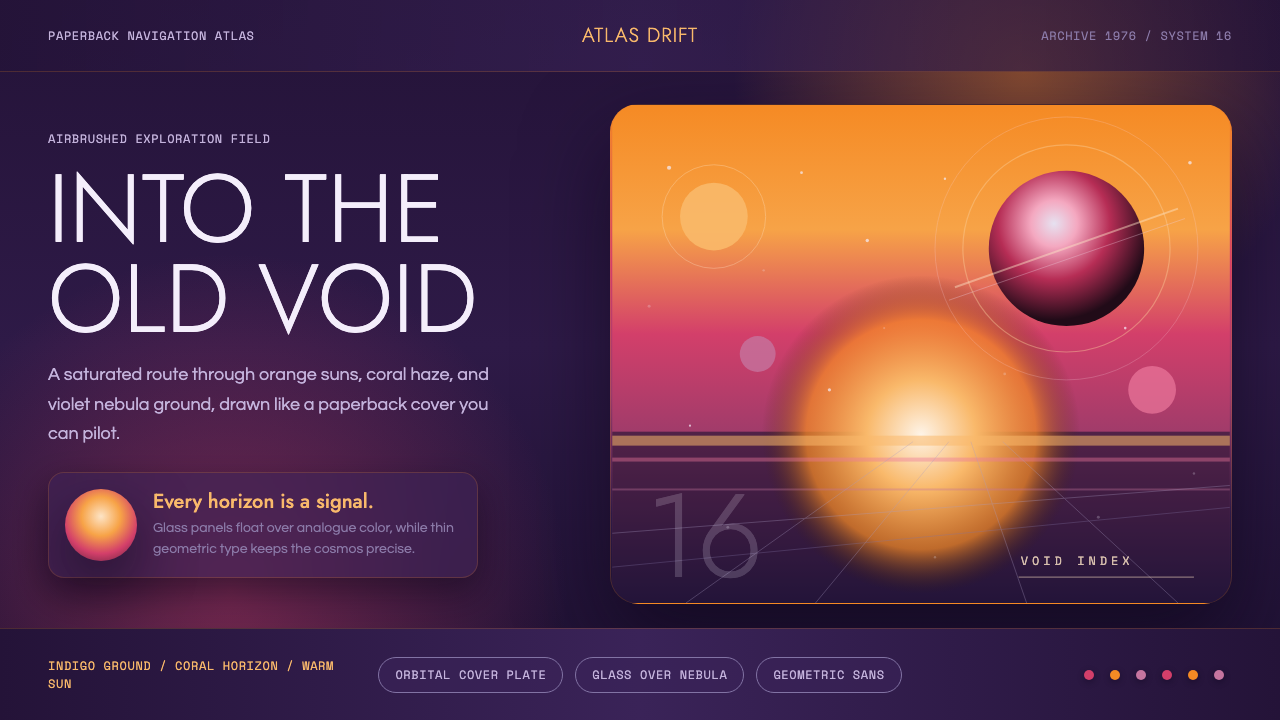 No Man's SkyA paperback cosmos you can enter. Orange suns, magenta haze, and Jost type fl…可进入的平装宇宙。橙日、品红雾与Jost字漂浮在靛蓝上。