What is Akira Neo-Tokyo?
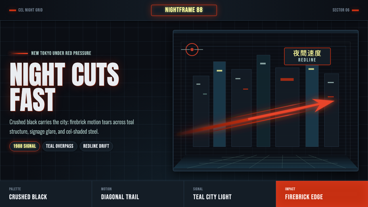
Akira Neo-Tokyo is anime cyberpunk's defining image — a crushed-black metropolis pierced by firebrick headlight trails and teal-lit streets, painted with an unusually rich hand-mixed night palette.
Akira Neo-Tokyo in brief
Akira Neo-Tokyo is drawn directly from Katsuhiro Otomo's 1988 animated film Akira, whose vision of a dystopian future Tokyo became the single most influential image in anime cyberpunk. The style renders night as an almost total absence of light broken only by deliberate, high-contrast interruptions: neon signage glowing in isolated pockets, and the streaking crimson headlight trail of a motorcycle cutting through otherwise near-total darkness.
What sets this palette apart from other cyberpunk visual traditions is its specificity and restraint. Otomo's production team mixed an unusually large number of custom paint colors for the film's night scenes — reportedly around 327 distinct hues, with roughly fifty newly invented specifically for this production — to render dark-slate holographic skyscrapers, wet asphalt reflections, and high-contrast cel-shaded character edges with a painterly precision rarely achieved in traditional animation.
This design system distills that hand-painted cel-animation grit into a digital visual language: firebrick red set against crushed near-black, kinetic diagonal light trails suggesting high-speed motion, glowing neon-sign panels rendered as isolated points of color rather than an even wash, and heavy condensed display typography set against a documented, deliberately gritty night noir rather than a clean digital gradient.
Where does Akira Neo-Tokyo come from?
Akira, released in 1988, was adapted by director Katsuhiro Otomo from his own manga series and set in a reconstructed Tokyo — Neo-Tokyo — following a catastrophic explosion that triggered World War III, imagining the rebuilt city as it might appear in 2019. The film's production budget was, at the time, among the largest ever devoted to an animated feature, allowing for a level of visual and coloring detail that departed sharply from typical anime production of the era.
Color direction on Akira, led under Otomo's supervision, deliberately expanded the standard cel-animation color palette used throughout the Japanese animation industry, mixing new paint hues specifically to achieve the film's distinctive night scenes — deep, near-black urban shadow interrupted by isolated neon glow and the specific crimson-red trail of Kaneda's motorcycle headlight, a visual motif that became the film's most recognizable single image.
The film's vision of Neo-Tokyo synthesized several real influences into its fictional cityscape: postwar Tokyo's rapid, chaotic reconstruction, Hong Kong's dense vertical urbanism, and a biker and bosozoku motorcycle-gang subculture aesthetic drawn from 1980s Japanese youth culture, all filtered through a science-fiction lens depicting societal collapse and reconstruction.
Akira's international release and subsequent home-video circulation through the late 1980s and 1990s introduced Western audiences to Japanese cyberpunk animation at a formative moment, directly influencing subsequent anime, film, and video-game visual design and cementing Neo-Tokyo's specific color and lighting vocabulary as shorthand for the entire cyberpunk-anime genre, distinct from the more overtly retro-futurist, magenta-heavy palette of Western synthwave and outrun aesthetics.
What defines the Akira Neo-Tokyo look?
Color
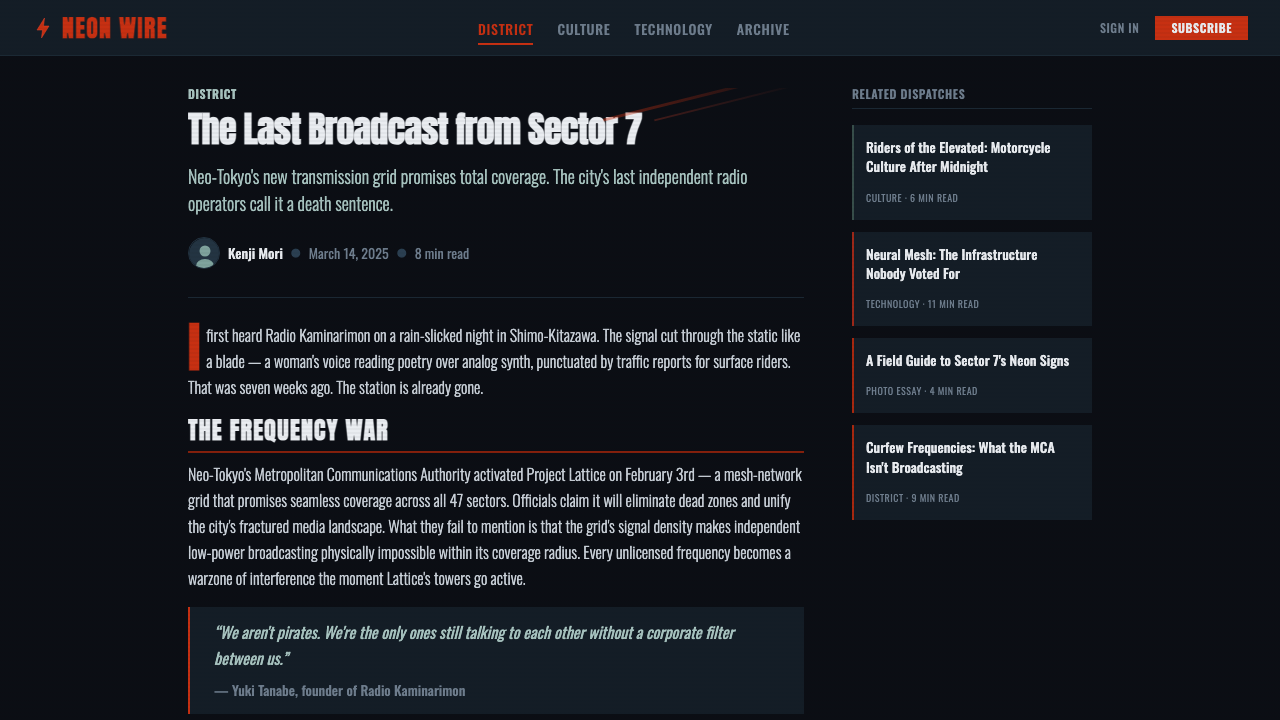
The palette is dominated by crushed, near-total black, punctuated by firebrick red and cool teal-blue neon rather than magenta or purple — this specific red-and-teal combination, never pink-and-cyan, is what distinguishes Akira's night palette from generic synthwave color schemes.
Typography
Heavy, condensed display type — often set in bold sans-serif — mimics the film's period signage and title-card lettering, favoring dense, high-impact letterforms over refined or delicate typefaces.
Kinetic Light Trails
Diagonal streaking lines in firebrick red evoke the motorcycle headlight trail central to the film's most iconic imagery, used throughout the system to suggest high-speed motion and urgency.
Isolated Neon Glow
Neon-sign elements appear as discrete, isolated glowing panels rather than an even wash of color across the composition, mimicking the way individual signs punctuate darkness in the film's cityscape rather than uniformly lighting it.
Cel-Shaded Edges
Where illustrative elements appear, edges carry a high-contrast, hand-painted cel-animation quality — crisp outlines and flat interior shading rather than soft photographic gradients, honoring the film's hand-painted production technique.
Documented Night Noir
The overall mood favors a gritty, documented realism over a clean, stylized digital dark mode — wet-asphalt reflections, dense urban texture, and a slightly grimy quality distinguish this from a generic minimalist dark theme.
Restraint in Color Count
Despite the film's famously large custom palette, any single scene or composition uses only a small, deliberate subset — restraint and repetition of the firebrick-and-teal pairing across a composition, rather than a rainbow of neon hues, is what keeps the style cohesive.
Who shaped Akira Neo-Tokyo?
As writer and director of Akira, adapting his own manga, Otomo conceived Neo-Tokyo's specific vision of dystopian reconstruction and personally supervised the film's unusually ambitious color direction, establishing the visual template this design style is drawn from.
As the film's color designer, Mizutani led the expansion of the standard cel-animation palette, mixing the custom hues that produced Akira's distinctive night scenes and giving the film its unusually rich, painterly color vocabulary.
How do you use Akira Neo-Tokyo today?
Akira Neo-Tokyo suits contexts wanting to feel urgent, gritty, and unmistakably cyberpunk rather than the softer, retro-futurist mood of synthwave. Applying it well means committing to firebrick red and teal as the signature pairing and avoiding the magenta-and-cyan palette associated with other retro-digital styles.
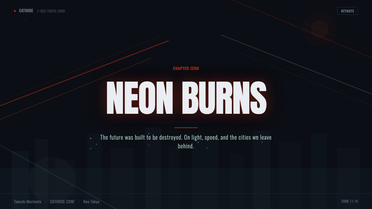
For presentation slides, this style works powerfully for technology, gaming, or urban-futurist storytelling: a cover slide built around a near-black field with a single firebrick light-trail streak and the title set in heavy condensed type. Content slides should keep the neon accents isolated and sparing — reserved for key figures or headings — rather than washing every element in glow, preserving the film's disciplined use of darkness.
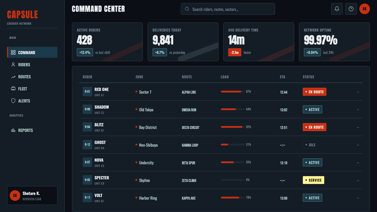
For web interfaces, the aesthetic suits gaming platforms, entertainment brands, urban or transit-themed products, or any identity wanting a gritty, high-energy cyberpunk mood. Primary actions and key alerts can carry the firebrick treatment, while secondary UI recedes into near-black panels with teal accents used sparingly for structural elements like dividers or icons.
For editorial and marketing work — film and anime coverage, urban-futurist storytelling, gaming culture features — the style provides an immediately recognizable mood: full-bleed near-black sections, firebrick light-trail graphics as key visuals, and photography or illustration treated with high-contrast, cel-shaded color grading.
A common mistake is substituting magenta or purple for the firebrick red, which shifts the palette toward generic synthwave rather than the specific Akira reference. A second common error is overusing neon glow evenly across a composition rather than keeping it isolated and sparing, which undermines the disciplined darkness the film's night scenes depend on.
Akira Neo-Tokyo — FAQ
Why is the red specifically 'firebrick' rather than magenta or crimson?
Firebrick — a slightly muted, brick-toned red — matches the specific hue of Kaneda's motorcycle headlight trail in the original film, which reads as warmer and more grounded than the cooler, more saturated magenta typical of synthwave palettes. This specific hue choice is what ties the style to Akira rather than to generic retro-neon design.
How is this different from generic cyberpunk or synthwave styles?
Synthwave and outrun aesthetics typically use magenta-to-cyan gradients evoking 1980s Miami and arcade culture, with a nostalgic, retro-futurist warmth. This style instead centers on firebrick red and teal specifically, a documented near-black urban grit rather than a clean gradient, and a gritty, dystopian mood drawn from a specific 1988 Japanese film rather than a generalized 1980s American aesthetic.
Can this style work with a lighter or daytime setting?
Not convincingly. The entire visual logic depends on near-total darkness against which isolated neon and light-trail elements can read as luminous — removing that darkness collapses the contrast the style relies on and shifts the mood away from its specific nighttime cyberpunk reference.
What typography should be avoided in this style?
Thin, delicate, or highly decorative typefaces undercut the gritty, high-impact urgency the style relies on. Heavy condensed sans-serif forms, ideally with slight roughness or texture, keep the poster-like intensity consistent with the film's signage and title-card lettering.
Does this style suit a calm, corporate product?
It struggles there. The style's gritty urgency and dystopian undertone work against qualities like calm, trust, or approachability. It is best reserved for gaming, entertainment, urban-culture, or technology brands wanting to project edge and high-energy intensity rather than reassurance.
Related design styles
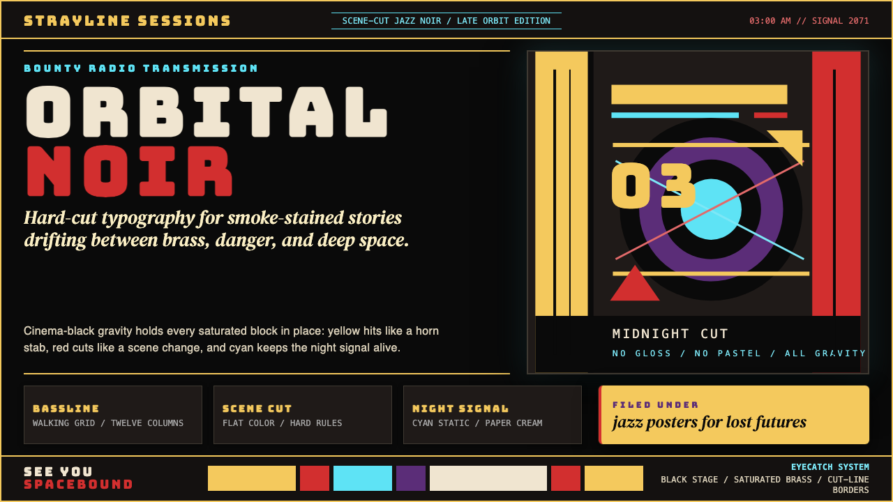 Cowboy Bebop Jazz-NoirCool at 3 AM. Bungee type, jazz yellow, red cuts, and cyan rules hit deep bla…
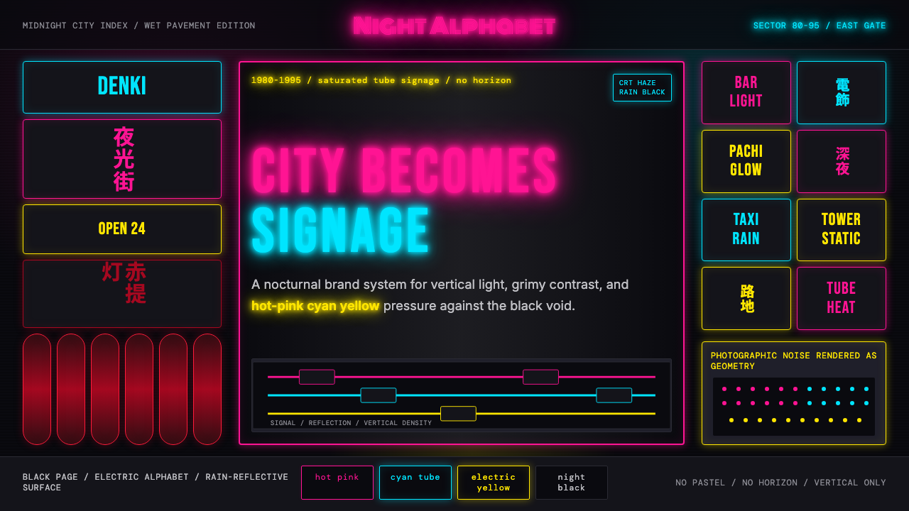 Tokyo Shinjuku Neon (1980)Night turns into alphabet. Hot pink, cyan, and yellow stack as glowing vertic…
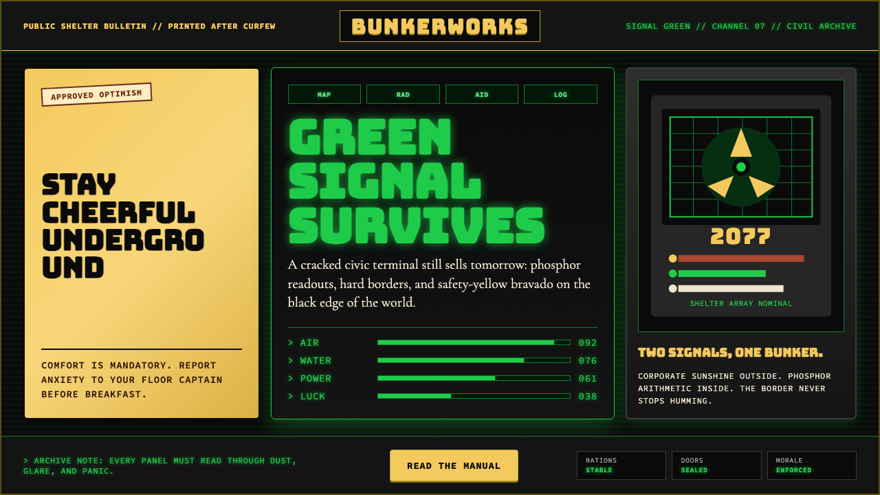 Fallout Vault-Tec Pip-BoyIrradiated optimism. Vault yellow and CRT green lock into a bordered bunker g…
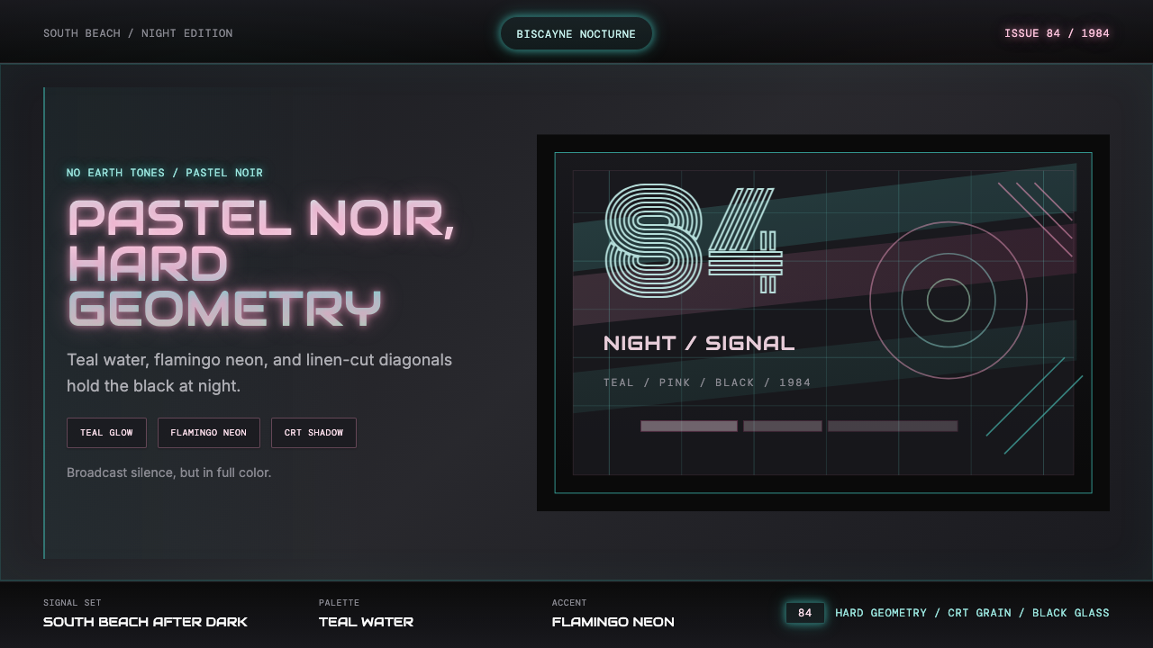 Miami Vice Pastel Teal (1984)Pastel noir, not nostalgia. Teal glow and flamingo pink slice black with geom…
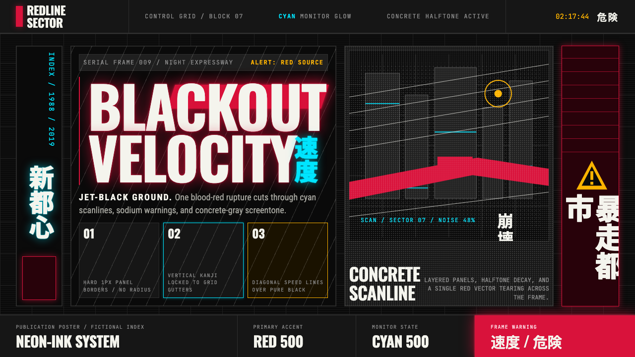 Akira (Otomo)Cyberpunk at impact. Kaneda red, cyan kanji, halftone concrete, and diagonal…
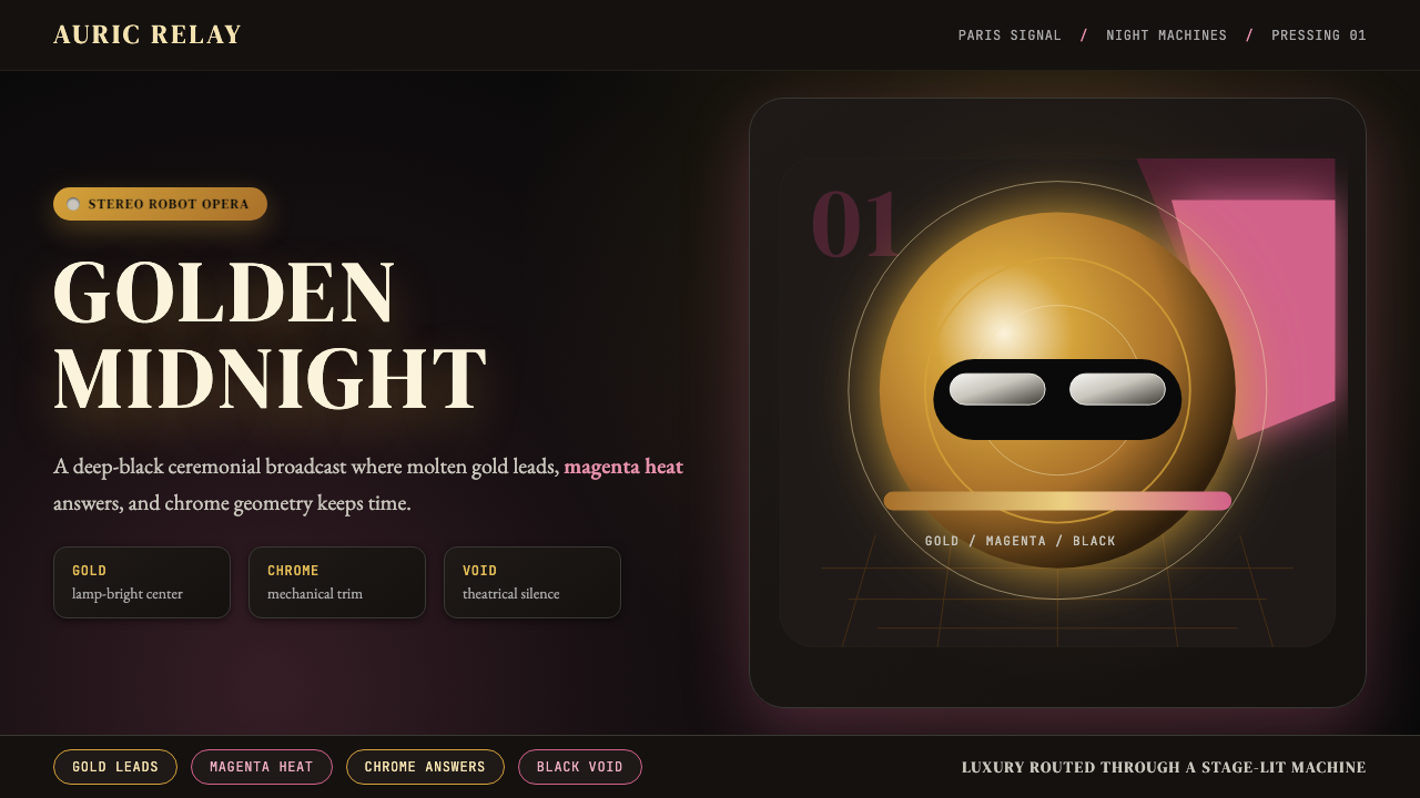 Daft Punk Discovery (Gold-Helmet)Warm sci-fi disco. Gold serif caps orbit a magenta void with chrome-disc geom…