What is Miami Vice Pastel Teal (1984)?什么是 Miami Vice Pastel Teal (1984)?
Miami Vice didn't borrow the eighties — it manufactured them, projecting a night-Miami dream of teal water, flamingo-pink neon, and knife-sharp linen geometry that the decade immediately mistook for reality.《迈阿密风云》不是借用了八十年代——它制造了八十年代,将青色海湾、火烈鸟粉霓虹与刀锋般的亚麻几何投影成一场迈阿密夜晚的幻梦,而那个年代随即将幻梦误认为现实。
Miami Vice Pastel Teal (1984) in briefMiami Vice Pastel Teal (1984) 速览
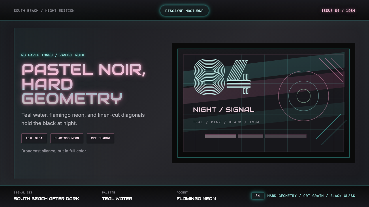
Miami Vice Pastel Teal is a dark-ground visual language built on the collision of opposite impulses: the softness of pastel pigment against the severity of noir black, the warmth of sun-bleached South Beach architecture against the cool glow of cathode-ray tube monitors and neon signage. The palette centers on a luminous teal — the color of Biscayne Bay under tropical late-afternoon light — paired with flamingo pink, warm white linen, and surfaces of near-absolute black. Together these hues describe a world that is simultaneously glamorous and dangerous, aspirational and melancholy.迈阿密风云粉青是一套建立在对立冲动碰撞之上的深色视觉语言:柔和粉彩颜料的温润,对抗黑色霓幕的严峻;南海滩阳光漂白建筑的暖意,对抗阴极射线管显示器与霓虹招牌的冷光。色板以一种发光的青色为核心——那是比斯坎湾在热带午后阳光下的颜色——搭配火烈鸟粉、温暖的亚麻白,以及近乎纯粹的黑色表面。这些色调共同描述了一个既迷人又危险、既充满渴望又隐含忧郁的世界。
The style emerged directly from the 1984 NBC television series Miami Vice, where producer Michael Mann issued a now-legendary production directive: no earth tones. This single prohibition dismantled the muted, naturalistic palette that had defined American television drama through the 1970s and replaced it with something closer to a painted surface — colors selected for emotional and symbolic weight rather than mimetic fidelity to the world. The result was a visual grammar instantly legible as a statement: modern, sleek, self-aware.这种风格直接诞生于1984年NBC电视剧《迈阿密风云》,制片人迈克尔·曼恩发布了一条如今已成传奇的制作指令:禁止大地色。这一单一禁令彻底拆解了贯穿七十年代美国电视剧的柔和自然主义色板,代之以更接近绘制表面的东西——颜色的选取依据情感与象征分量,而非对世界的模仿性忠实。结果是一套视觉语法,作为一种陈述立即变得清晰可读:现代、利落、自我意识强烈。
Visually, the system is defined by its relationship between dark fields and pastel luminosity. Teal and pink do not simply sit on a black background — they appear to glow from within it, an effect heightened by references to CRT scanlines, neon tube diffusion, and the warm haze of Miami humidity. Typography in this world is geometric display lettering derived from the synth-arcade titling conventions of the early 1980s, where display type needed to read on video monitors at broadcast resolution. Every element is grounded in its broadcast origins.在视觉上,这套系统由深色底面与粉彩发光之间的关系所定义。青色与粉色并非简单地落在黑色背景上——它们看起来从黑色深处向外发光,这种效果因对CRT扫描线、霓虹管散射以及迈阿密湿度造成的温暖薄雾的引用而进一步强化。这个世界的字体是源自八十年代初合成器街机标题惯例的几何显示字体——那个年代的标题字需要在广播分辨率的视频显示器上清晰可读。每一个元素都锚定于其广播起源的土壤中。
See the Miami Vice Pastel Teal (1984) design system查看 Miami Vice Pastel Teal (1984) 完整设计系统
Where does Miami Vice Pastel Teal (1984) come from?Miami Vice Pastel Teal (1984) 从何而来?
The year 1984 marks a precise cultural hinge. Ronald Reagan's America was projecting an image of confidence and consumption; MTV had been broadcasting music videos for three years and was retraining the visual vocabulary of an entire generation toward rapid cutting, high contrast, and image-as-sensation. Into this context, NBC executive Brandon Tartikoff handed producer Michael Mann a brief that has since become apocryphal: 'MTV Cops.' The directive was a compression of everything the network sensed the moment required — speed, style, and a visual register that had more in common with music video than with police procedural.1984年是一个精确的文化转折点。里根时代的美国正在投射一种自信与消费的形象;MTV已将音乐录影带播送了三年,正在用快速剪辑、高对比度与图像即感受的方式重塑整整一代人的视觉词汇。就在这个背景下,NBC高管布兰顿·塔提科夫向制片人迈克尔·曼恩递交了一份后来成为传奇的简报,据说只有三个字:「MTV警察。」这道指令浓缩了电视网感知到那个时刻所需的一切——速度、风格,以及一套与音乐录影带的关系远比与警察程序剧更密切的视觉体系。
Mann, working with creator Anthony Yerkovich, chose Miami's South Beach as the series' location partly for practical reasons and partly for what the city meant aesthetically. South Beach in the early 1980s was a neighborhood in physical decay but extraordinary visual richness — its Art Deco hotels from the 1930s and 1940s still stood, faded and sun-bleached, their pastel facades a legacy of the Miami Modern movement that had absorbed and tropicalized European Deco geometry. The buildings gave the show its architectural backdrop: curved corners, porthole windows, horizontal banding, all rendered in aquamarine, coral, and cream under ferociously bright subtropical light. Mann and cinematographer Víctor Hammer then photographed this material with a luminance and color sensitivity that maximized the contrast between the pastel architecture and the deep Florida night sky.曼恩与创作者安东尼·耶尔科维奇选择迈阿密南海滩作为剧集拍摄地,部分出于实际考量,部分出于这座城市在美学上的意义。八十年代初的南海滩是一个物质上衰败却视觉上极为丰富的街区——三四十年代的装饰艺术酒店依然矗立,褪色而被阳光漂白,其粉彩外立面是迈阿密现代运动的遗产,那场运动吸收了欧洲装饰艺术几何并将其热带化。这些建筑为剧集提供了建筑背景:弯曲的转角、舷窗式圆形窗户、水平横带线脚,全部在猛烈的亚热带强光下以水绿色、珊瑚色和奶油色呈现。曼恩与摄影指导维克托·哈默随后以一种最大化粉彩建筑与佛罗里达深沉夜空之间对比的亮度与色彩敏感度拍摄了这些素材。
The 'no earth tones' mandate had an immediate and specific effect on the costume and set design. Don Johnson's character Sonny Crockett established the signature look: unstructured pastel linen blazers worn over bare torsos, pleated trousers in cream or pale aqua, loafers without socks. These choices were deliberate inversions of the power-suited Wall Street aesthetic that dominated American masculine fashion elsewhere in the decade. Where suits spoke of corporate containment, Crockett's wardrobe spoke of ease, heat, and a slightly dissolute glamour — an aesthetic that fashion designers from Armani to Versace either influenced or were directly influenced by during the mid-1980s.「禁止大地色」的命令对服装和布景设计产生了直接而具体的影响。唐·约翰逊饰演的角色桑尼·克罗科特确立了标志性造型:非结构化的粉彩亚麻西装外套穿在裸露的躯干上,奶油色或浅水绿色的褶裥裤,不穿袜子的莫卡辛鞋。这些选择是对那个十年里主导美国男性时尚的华尔街权力西装美学的刻意颠覆。西装传达企业约束,而克罗科特的衣橱传达的是悠闲、炎热与略带放纵的魅力——一种美学,阿玛尼到范思哲等时装设计师在八十年代中期前后要么影响了它,要么被它直接影响。
Jan Hammer's synthesizer-driven score provided the sonic equivalent of the visual grammar — melodic lines played on instruments that did not exist in the acoustic world, hovering between warmth and coldness in a way that exactly mirrored the palette. The show's most famous musical moment, the use of Phil Collins' 'In the Air Tonight' in the pilot episode, demonstrated this correspondence: the song's thunderous drum machine entry as a car crosses a night bridge is one of the earliest examples of image and electronic music achieving emotional synchrony in television. The visual-sonic language Miami Vice established was absorbed within months by advertising, fashion photography, and graphic design, and it had propagated globally by 1986. By the time the series ended in 1989, the aesthetic had already been named, quoted, parodied, and eventually archived as a cultural artifact — only to be revived a quarter-century later by the vaporwave movement, which found in its synthesizer tones and pastel-on-black color language an apt metaphor for digital nostalgia.扬·哈默以合成器驱动的配乐提供了视觉语法的声音等价物——用声学世界中并不存在的乐器演奏旋律线条,在温暖与冰冷之间悬浮,恰好镜像了色板所呈现的张力。剧集最著名的音乐时刻——试播集中使用菲尔·柯林斯的《In the Air Tonight》——展示了这种对应关系:汽车驶过夜晚桥梁时那段震撼人心的鼓机切入,是电视史上图像与电子音乐最早实现情感同步的案例之一。《迈阿密风云》建立的视觉-声音语言在数月之内被广告、时装摄影和平面设计吸收,并于1986年前后在全球传播。剧集于1989年终播时,这套美学已经被命名、引用、戏仿,并最终作为文化遗产被存档——直到四分之一个世纪后被蒸汽波运动复活,该运动在其合成器音调与粉彩叠黑的色彩语言中找到了数字怀旧的恰当隐喻。
What defines the Miami Vice Pastel Teal (1984) look?Miami Vice Pastel Teal (1984) 的视觉特征是什么?
Color Field色彩底色
The defining gesture of this palette is a deep, near-absolute black or dark charcoal ground against which pastel tones register as luminous rather than muted. Teal — a blue-green that sits closer to the blue end of the spectrum, evoking tropical water under overcast tropical light — is the signature accent. Flamingo pink, a warm, slightly desaturated rose, provides complementary tension. Linen white or pale cream appears as a structural neutral, suggesting the natural fabrics central to the show's costume language. These four values — deep black, luminous teal, warm pink, and structural cream — constitute the system's complete vocabulary of color.这套色板的核心姿态,是以深沉的近纯黑或深炭灰为底色,使粉彩色调在其衬托下呈现出发光而非柔淡的质感。青色——一种偏向光谱蓝端的蓝绿色,令人联想起阴天热带光线下的热带水域——是标志性强调色。火烈鸟粉,一种温暖而略微去饱和的玫瑰色,提供互补性张力。亚麻白或浅奶油色作为结构性中性色出现,暗示着该剧服装语言中居核心地位的天然织物。这四个色值——深黑、发光青色、暖粉与结构奶油——构成了这套系统完整的色彩词汇。
Glow and Diffusion光晕与散射
Color in this system does not sit flatly on surfaces — it glows. This is achieved through soft, wide halation effects that surround pastel elements with a gentle bloom of their own hue, mimicking the behavior of neon gas tubes and CRT phosphors viewed in a dark environment. The glow is always restrained: it suggests light source rather than simulating one literally. Text and geometric shapes appear to radiate outward slightly, as if backlit or electronically generated. This luminosity is the single quality that most clearly separates the aesthetic from simple pastel-on-dark design.这套系统中的色彩不是平铺在表面上的——它在发光。这通过柔和、宽幅的晕光效果实现,将粉彩元素包围在其自身色调的轻柔光晕中,模拟霓虹气体管和在黑暗环境中观看的CRT荧光粉的行为。光晕始终克制:它暗示一个光源,而非字面上模拟光源。文字和几何形状看起来向外微微辐射,仿佛经过背光处理或是以电子方式生成的。这种发光性是最清晰地将这套美学与简单的粉彩叠黑设计区别开来的单一品质。
CRT Texture and Scan LinesCRT质感与扫描线
The aesthetic is inseparable from its broadcast origins. CRT scanlines — the horizontal bands created by the electron gun sweep of cathode-ray tube televisions — function as a signature texture that simultaneously authenticates the period reference and adds visual density to large flat areas of color. Used subtly, scanline overlays give black backgrounds a sense of depth and give illuminated surfaces a slight vibrancy. Used more prominently, they evoke the direct aesthetics of early video games and computer terminal graphics, connecting Miami Vice's visual language to the broader synth-arcade cultural moment of the early 1980s.这套美学与其广播起源不可分割。CRT扫描线——由阴极射线管电视的电子枪扫描产生的水平条带——作为一种标志性纹理,同时验证了年代参照并为大面积纯色区域增添了视觉密度。细微运用时,扫描线叠加赋予黑色背景一种深度感,并为受光表面带来轻微的活跃感。运用更突出时,它们唤起早期电子游戏和计算机终端图形的直接美学,将《迈阿密风云》的视觉语言与八十年代初更广泛的合成器街机文化时刻联结起来。
Geometric Display Typography几何显示字体
Type in this system draws from the tradition of early-video geometric display letterforms — characters built on visible circular and rectangular modules, with a mechanical precision that reads as deliberately technological. Thin strokes and hairline details are avoided; the letters are built to survive low resolution and rapid legibility at broadcast scale. Headline text is typically set with wide tracking in a single weight, allowing the letterforms to breathe against the dark ground. The overall effect is of type as architecture: constructed, lit, and slightly monumental.这套系统的字体汲取自早期视频几何显示字形的传统——字符建立在可见的圆形与矩形模块上,具有一种被刻意处理为技术性的机械精准感。细描边和发丝级细节被回避;字母的构造旨在在低分辨率下存活,并在广播尺度上快速可读。标题文字通常以单一字重、宽字间距排印,让字形在深色底面上得以呼吸。整体效果是将文字视作建筑:被构造、被照亮,略带纪念碑感。
Art Deco Tropical Geometry热带装饰艺术几何
Miami's South Beach provided the series with a ready-made geometric vocabulary: the rounded corners, horizontal banding, stepped facades, and porthole motifs of 1930s and 1940s Miami Modern architecture. These forms recur throughout the aesthetic as structural and decorative elements — not as historical pastiche but as a living visual context that the show literalized by filming on location among the actual buildings. Horizontal stripes, diagonal rule lines, and rounded rectangular frames derive from this Deco-tropical inheritance and give the system a geometry that is warmer and more curved than pure Modernist grids.迈阿密南海滩为剧集提供了一套现成的几何词汇:三四十年代迈阿密现代建筑的圆角、水平横带、台阶状外立面与舷窗圆形母题。这些形式作为结构性和装饰性元素反复出现在这套美学中——不是作为历史拟古,而是作为一个活生生的视觉语境,剧集通过在真实建筑之间的实地拍摄将其字面化。水平条纹、对角线尺线与圆角矩形框架源自这一装饰艺术热带传承,赋予这套系统一种比纯粹现代主义网格更温暖、更弯曲的几何感。
Contrast Ratio and Negative Space对比度与负空间
The system depends on extreme contrast between the dark ground and its luminous inhabitants. This is not a delicate or low-contrast aesthetic — teal and pink at full saturation against near-black demand attention and project confidence. Negative space, however, plays an equally important role: the black or deep-charcoal areas function not as voids but as atmosphere, giving the glowing elements room to breathe and preventing the composition from reading as cluttered despite its chromatic boldness. Well-composed Miami Vice layouts are simultaneously dense and spacious — a balance achieved by treating dark space as active presence rather than absence.这套系统依赖深色底面与其发光住客之间的极端对比。这不是一种精致或低对比度的美学——充分饱和的青色与粉色在近纯黑底上要求注意力,并投射出自信。然而,负空间扮演着同等重要的角色:黑色或深炭灰区域不作为虚空而作为氛围运作,给发光元素留出呼吸空间,防止构图在色彩上的大胆与拥挤之间失衡。构图良好的迈阿密风云版面同时具有密度与空间感——这种平衡通过将深色空间视为主动存在而非缺席来实现。
Linen and Natural Fabric Texture亚麻与天然织物质感
Alongside the electronic and architectural references, the palette carries a tactile counterpoint in the form of warm cream and linen-white tones that recall unstructured natural fabrics. These surfaces have a slight warmth and visual softness that prevents the system from reading as purely cold or machine-made. In print and digital contexts, this quality can be suggested through off-white backgrounds with a barely perceptible grain, or through type set in warm white rather than pure cold white. This texture grounds the system in the human and organic, balancing the neon and electronic qualities that dominate the palette.在电子与建筑的参照之外,色板以温暖的奶油色和亚麻白色调携带一种触觉性的对位,令人联想起非结构化的天然织物。这些表面具有轻微的温暖感和视觉柔软度,防止整套系统被解读为纯粹冰冷或机械制造的。在印刷和数字场景中,这种品质可以通过隐约带有细微颗粒的白底,或者以暖白而非纯冷白排印的文字来暗示。这种质感将系统锚定于人性与有机之中,平衡了色板中占主导地位的霓虹与电子特质。
See the Miami Vice Pastel Teal (1984) design system查看 Miami Vice Pastel Teal (1984) 完整设计系统
Who shaped Miami Vice Pastel Teal (1984)?谁塑造了 Miami Vice Pastel Teal (1984)?
Mann created the visual and tonal identity of Miami Vice as executive producer and frequent director, issuing the foundational 'no earth tones' mandate that dismantled three decades of naturalistic television color convention. His background in feature film production — he had directed Thief in 1981 — meant he brought a cinematic approach to television framing, lighting, and location photography that was genuinely unprecedented for a network drama series. Mann continued to develop and refine the dark-surface, neon-accent visual grammar in his later films, most directly in the 2006 Miami Vice feature adaptation, where digital cinematography allowed the palette to be pushed to an even higher degree of luminance contrast.曼恩作为执行制片人和频繁导演,创造了《迈阿密风云》的视觉与调性身份,发布了颠覆三十年自然主义电视色彩惯例的基础性「禁止大地色」命令。他的故事片制作背景——1981年执导了《贼》——意味着他将真正前所未有于电视网剧集的电影化方式带入了取景、打光与实地摄影中。曼恩在后来的电影中继续发展和精炼深色表面、霓虹强调的视觉语法,最直接体现于2006年的《迈阿密风云》电影版改编,数字摄影使色板能够被推向更高程度的亮度对比。
Yerkovich created Miami Vice and wrote the series bible, establishing its thematic and geographic premise. His decision to set the show specifically in Miami — and within Miami, specifically in South Beach — was as consequential aesthetically as it was narratively: it gave the production access to a unique built environment whose Art Deco architecture, tropical light, and cultural ambiguity (neither fully American nor Latin) were inseparable from the visual language the show would develop. Yerkovich's series concept was lean enough to allow Mann's visual ambitions maximum room to operate, and their collaboration defined the boundary between content and form that made the show's aesthetic so coherent.耶尔科维奇创作了《迈阿密风云》并撰写了剧集圣经,确立了其主题与地理前提。他将剧集具体设定在迈阿密——在迈阿密中,具体设定在南海滩——这一决定在美学上与叙事上同样重要:它使剧组得以进入一个独特的建筑环境,其装饰艺术建筑、热带光线以及文化模糊性(既非完全美国式也非拉丁式)与剧集将要发展的视觉语言不可分割。耶尔科维奇的剧集概念足够简练,给曼恩的视觉抱负留下了最大的施展空间,两人的合作确定了使剧集美学如此连贯的内容与形式之间的边界。
Hammer composed the series' synthesizer score, which established the sonic equivalent of the visual palette: melodic and textural, warm and cold simultaneously, built entirely from electronic instruments that in 1984 existed at the cutting edge of consumer technology. His theme for the series reached the top of the pop charts in 1985, the first television score to do so in decades — a measure of how completely the show's aesthetic had penetrated popular culture. The synthesizer's timbral palette, all sustained tones, pitch bends, and arpeggiated sequences, mirrors the neon-and-diffusion visual logic precisely: luminous, slightly unreal, and emotionally direct.哈默为剧集创作了合成器配乐,建立了与视觉色板在声音上的等价物:旋律性与质感性并存,同时温暖与冰冷,完全由1984年处于消费技术尖端的电子乐器构建。他为剧集创作的主题曲于1985年登上流行音乐排行榜榜首,成为数十年来首支做到这一点的电视配乐——这是衡量这部剧集的美学渗透流行文化之深度的一个指标。合成器的音色词汇——所有延续音调、音高弯曲与琶音序列——精确镜像了霓虹与散射的视觉逻辑:发光的、略显超现实的、情感直接的。
As Sonny Crockett, Johnson embodied the aesthetic in physical form, wearing the unstructured pastel linen blazers, sockless loafers, and stubble that became the decade's most widely copied masculine style. The costume design — largely driven by Johnson's own fashion sensibilities and his collaboration with costume designer Jodie Tillen — was not merely character-appropriate clothing but a visual argument about what modernity looked like in the mid-1980s. Johnson's physical presence on screen, with a color palette chosen to work specifically against South Florida backgrounds and light conditions, made him essentially a human element within the show's visual system rather than an actor within a set.以桑尼·克罗科特这一角色,约翰逊以肉身呈现了这套美学:穿着非结构化粉彩亚麻西装外套、不穿袜子的莫卡辛鞋,以及成为那个十年被复制最广泛的男性风格的胡茬。服装设计——很大程度上由约翰逊自身的时尚感知以及他与服装设计师乔迪·蒂伦的合作驱动——不仅仅是角色适配的着装,而是一个关于八十年代中期现代性外观的视觉论点。约翰逊的银幕存在,其色板被专门选定以配合南佛罗里达背景与光线条件,使他本质上成为剧集视觉系统中的一个人类元素,而非布景中的一名演员。
As the series' director of photography, Hammer — no relation to Jan Hammer — was responsible for translating Mann's visual directives into actual photographic decisions about exposure, lens choice, and color timing. His approach to Miami's tropical light involved significant overexposure of exterior daytime shots to maximize the bleached-out, high-key quality of the environment, then maximum underexposure in interiors and night sequences to push black areas toward true black rather than the lifted, muddy blacks typical of 1980s television. This contrast in exposure treatment between day and night is the photographic foundation of the entire aesthetic.作为剧集的摄影指导,哈默——与作曲家扬·哈默无关——负责将曼恩的视觉指令转化为关于曝光、镜头选择与色彩校时的实际摄影决策。他处理迈阿密热带光线的方式,涉及对日间外景镜头的大幅过曝,以最大化环境的漂白高调质量,然后在内景和夜间镜头中进行最大限度的欠曝,将黑色区域推向真正的黑色,而非八十年代电视惯常的提亮而浑浊的黑色。这种日夜曝光处理上的对比,是整套美学的摄影基础。
How do you use Miami Vice Pastel Teal (1984) today?今天怎么用 Miami Vice Pastel Teal (1984)?
Miami Vice Pastel Teal is among the most atmospherically distinctive historical styles available for contemporary design work, but its effectiveness depends entirely on restraint and structural discipline. The palette is assertive by nature — teal and flamingo pink against deep black demand visual attention — and the temptation to push all elements to full saturation simultaneously must be resisted. At its best, the system creates a sense of nocturnal luxury and controlled drama; misapplied, it reads as retro costume rather than intentional design language.迈阿密风云粉青是当代设计实践中氛围辨识度最高的历史风格之一,但其有效性完全取决于克制与结构纪律。这套色板本质上是主动的——青色与火烈鸟粉在深黑底面上要求视觉注意——同时将所有元素推至最高饱和度的诱惑必须被抵制。在最佳状态下,这套系统创造出一种夜间奢华与受控戏剧感;被错误应用时,它会读作复古服装而非有意图的设计语言。
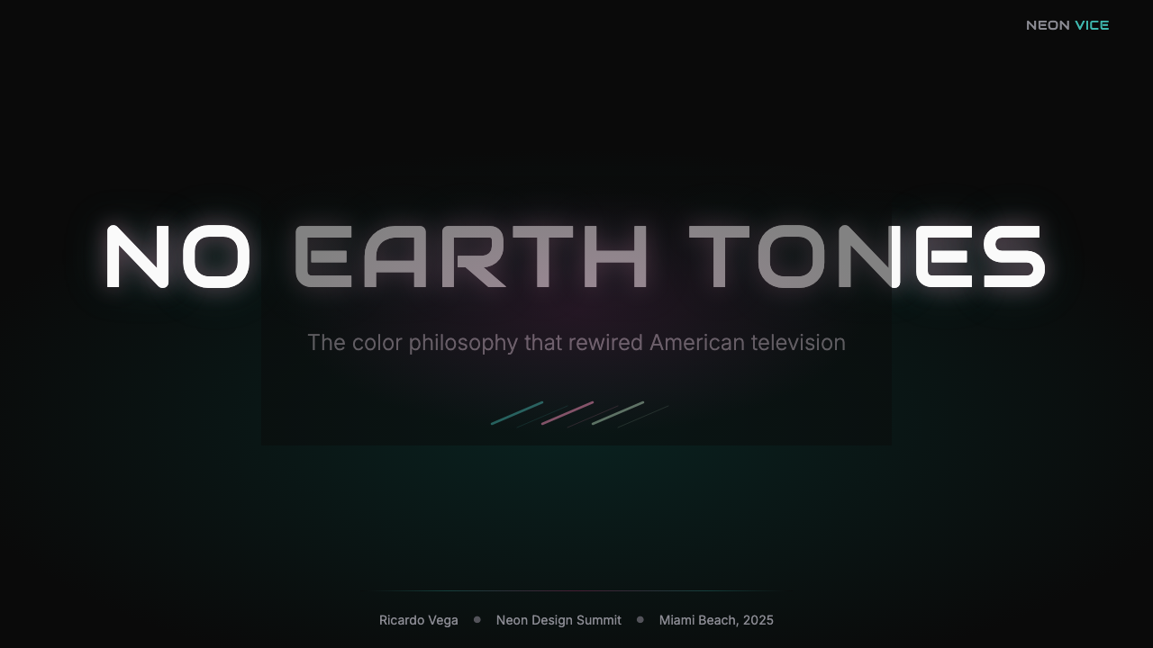
For presentation slides, the style is particularly effective on both cover and full-bleed section divider pages. A cover built in this system should treat the black field as primary, introducing teal as a single dominant accent — a geometric shape, a rule line, a luminous headline — with flamingo pink held in reserve for a secondary element or a single supporting detail. Linen white works well for readable body copy. Content slides need careful restraint: against a dark background, even a small amount of teal or pink carries significant visual weight, so these colors should be reserved for the single most important element per slide. Data slides benefit from the system's built-in contrast: teal bars on a dark chart ground read more crisply than the same data on a light background, and the neon-glow quality of the palette naturally draws attention to highlighted values.在演示文稿幻灯片中,这种风格在封面页和全出血节段分隔页上尤为有效。以这套系统构建的封面应将黑色底面视为主体,将青色作为单一主导强调引入——一个几何形状、一条尺线、一个发光标题——而将火烈鸟粉保留为次要元素或单一支撑细节。亚麻白适合可读的正文文字。内容页需要仔细克制:在深色背景上,即使少量青色或粉色也携带显著的视觉分量,因此这些颜色应保留给每张幻灯片上最重要的单一元素。数据幻灯片受益于系统内建的对比度:深色图表底面上的青色柱状图比相同数据在浅色背景上读来更清晰,色板的霓虹光晕特质自然地将注意力引向高亮值。
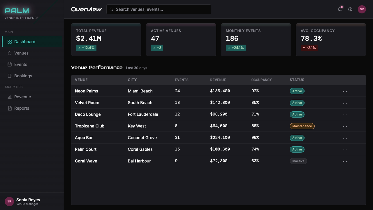
For web interfaces, the aesthetic is well-suited to dashboards, SaaS product landing pages, and pricing pages for products positioning themselves as premium, tech-forward, or distinctly nocturnal in their use context — tools for traders, creative professionals working after hours, or entertainment and nightlife platforms. The approach requires strict hierarchy: the dark background should cover the vast majority of the viewport, with teal and pink reserved for interactive elements, active states, and key calls to action. Navigation should be simple and typographic. Card components work well with a subtle inner glow on the card border or a hairline teal border that suggests luminosity without overpowering content. Ghost buttons in teal outline on dark ground are particularly effective.对于网页界面,这套美学非常适合仪表板、SaaS产品落地页,以及将自身定位为高端、技术前沿或使用场景distinctly夜间性质的产品定价页——面向交易者的工具、非工作时间作业的创意专业人士,或娱乐与夜生活平台。这种方法需要严格的层级:深色背景应覆盖视口的绝大部分,青色和粉色保留给交互元素、活跃状态和关键行动号召。导航应当简单而字体性。卡片组件与卡片边框上的细微内发光或发光青色细线边框配合良好,后者暗示发光性而不压制内容。深色底面上青色轮廓的幽灵按钮尤为有效。
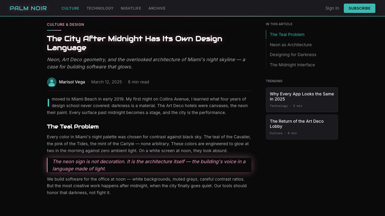
For editorial and marketing contexts, the palette supports covers, feature opening spreads, and promotional materials where emotional impact is the primary objective. A Bauhaus-derived editorial layout uses structure and restraint; a Miami Vice-derived layout is permitted to be more atmospheric and sensation-driven. Full-bleed dark backgrounds with a single luminous teal graphic element and headline type in linen white create a strong poster effect. Marketing materials for events, music, entertainment, and nightlife are natural fits; the style also works for high-end fashion campaigns seeking an eighties referential quality. In long-form editorial contexts, the dark-ground palette should be used selectively — perhaps for opening spreads and chapter dividers — with lighter pages for sustained reading.对于编辑和营销场景,这套色板支持封面、特稿开篇跨页,以及以情感冲击为主要目标的推广材料。包豪斯衍生的编辑版面运用结构与克制;迈阿密风云衍生的版面被允许更具氛围感和感官驱动性。全出血深色背景配以单一发光青色图形元素和亚麻白标题文字,创造出强烈的海报效果。活动、音乐、娱乐与夜生活的营销材料是天然的适配场景;这种风格也适用于寻求八十年代参照感的高端时装广告大片。在长篇编辑场景中,深色底面色板应选择性使用——或许用于开篇跨页和章节分隔——而以较浅的页面用于持续阅读。
A common mistake when applying this system is treating it as equivalent to generic dark mode design, resulting in work that has neither the specificity of the Miami Vice aesthetic nor the practical legibility advantages of a well-designed dark theme. The system is not simply dark-background-with-colored-accents; it is a specific combination of luminous pastel, tropical geometry, broadcast-era typography, and glow effects that requires all its components to be present for the visual language to read as coherent. Another frequent error is using the palette across every element simultaneously — teal backgrounds, pink type, cream borders, all at once — which erases the contrast ratio that makes the system function. The dark ground is not decoration; it is structure, and it should dominate the composition.应用这套系统时最常见的错误,是将其等同于通用深色模式设计,导致作品既没有《迈阿密风云》美学的特殊性,也没有设计良好的深色主题的实际可读性优势。这套系统不只是深色背景加彩色强调;它是发光粉彩、热带几何、广播年代字体与光晕效果的特定组合,需要所有组件同时在场,视觉语言才能被读作连贯。另一个频繁出现的错误是同时将色板运用于每一个元素——青色背景、粉色文字、奶油色边框全部同时出现——这会抹去使系统运作的对比度。深色底面不是装饰;它是结构,应当主导构图。
See the Miami Vice Pastel Teal (1984) design system查看 Miami Vice Pastel Teal (1984) 完整设计系统
Miami Vice Pastel Teal (1984) — FAQMiami Vice Pastel Teal (1984) · 常见问题
How does Miami Vice Pastel Teal differ from generic vaporwave or synthwave aesthetics?迈阿密风云粉青与通用蒸汽波或合成波美学有何不同?
All three aesthetics share a common ancestry — the early-1980s synthesizer culture and CRT visual environment — but they diverge significantly in emotional register and compositional logic. Vaporwave, which emerged as a music genre and visual meme around 2010–2012, is deliberately ironic and uncanny: it combines pastel tones with glitchy, corrupted imagery, classical statuary, and corporate clip art to suggest digital nostalgia tinged with anxiety. Synthwave, popularized by games and films such as Hotline Miami and Drive, leans toward a masculine, high-energy register — faster geometry, darker grounds, more aggressive neon. Miami Vice Pastel Teal is the oldest and most restrained of the three: its origins are in prestige television drama, not internet culture or gaming, and it carries a sense of warm nocturnal glamour that both vaporwave's irony and synthwave's aggression lack. The glow is softer, the geometry includes organic Art Deco curves, and the palette includes warm linen tones that the others typically omit.三种美学共享一个共同起源——八十年代初的合成器文化与CRT视觉环境——但它们在情感基调和构图逻辑上显著分歧。蒸汽波约于2010至2012年作为音乐类型与视觉梗兴起,带有刻意的反讽与诡异感:它将粉彩色调与故障损坏的图像、古典雕塑和企业剪贴画组合,暗示带有焦虑色彩的数字怀旧。合成波因《热线迈阿密》和《亡命驾驶》等游戏与电影而普及,倾向于一种阳刚、高能的基调——更快速的几何、更深的底色、更具攻击性的霓虹。迈阿密风云粉青是三者中最古老也最克制的:其起源在精品电视剧,而非网络文化或游戏,它携带着一种蒸汽波的反讽与合成波的攻击性都欠缺的温暖夜间魅力感。光晕更柔和,几何包含有机的装饰艺术曲线,色板包含另外两者通常省略的暖亚麻色调。
Can this aesthetic work effectively in a light-background context?这套美学能在浅色背景场景中有效运作吗?
The dark ground is load-bearing in this system — it is what gives teal and flamingo pink their luminous quality. On a white or cream background, the same teal becomes a simply pleasant blue-green without glow or drama; the flamingo pink becomes a conventional accent. Light-background versions are possible but require acknowledging that you are working with the palette of Miami Vice rather than its visual logic. If a light-background context is required, the most effective approach is to concentrate dark-ground areas in specific zones — hero images, section headers, call-to-action blocks — and use linen white or very pale teal-tinted fields for text-heavy areas. This hybrid approach allows the aesthetic to function in contexts where sustained dark reading environments are inappropriate.深色底面在这套系统中是承重结构——正是它赋予青色和火烈鸟粉发光的品质。在白色或奶油色背景上,同样的青色只是变成一种简单愉悦的蓝绿色,没有光晕也没有戏剧感;火烈鸟粉则变成一种常规的强调色。浅色背景版本是可能的,但需要承认你在使用《迈阿密风云》的色板而非其视觉逻辑。如果需要浅色背景场景,最有效的方法是将深色底面区域集中于特定区域——主视觉图、节段标题、行动号召模块——并为文字密集区域使用亚麻白或极浅的青色调底面。这种混合方法使美学能够在不适合持续深色阅读环境的场景中运作。
How should photography be used within this visual system?在这套视觉系统中应如何使用摄影?
Photography integrates best when treated as a luminous element rather than a naturalistic window. Images should be color-graded to enhance the teal and warm tones already present in the shot, with shadows pushed toward deep black rather than lifted. Faces and architecture photograph particularly well in this system when lit with a teal-gel key light and a warmer fill — the setup that Mann's cinematographers used extensively on location in Miami. Alternatively, photography can be treated with a strong color overlay — a translucent teal or magenta wash — that integrates it into the palette rather than leaving it as a naturalistic intrusion. High-contrast black-and-white photography with a slight teal duotone tint also works well, maintaining detail in highlights while merging shadow areas with the dark background.摄影作为发光元素而非自然主义窗口处理时,整合效果最佳。图像应进行色彩分级,以增强镜头中已有的青色和暖色调,并将阴影推向深黑而非提亮。面孔和建筑在以青色凝胶主光和较暖补光打光时,在这套系统中的拍摄效果尤为出色——这正是曼恩的摄影指导在迈阿密实地拍摄时广泛采用的设置。另一种方法是对摄影施加强烈的色彩叠加——半透明的青色或洋红色滤镜——将其整合进色板,而非留作自然主义的闯入者。带有轻微青色双色调的高对比度黑白摄影也效果良好,在保持高光细节的同时将阴影区域与深色背景融合。
What kinds of brands or products is this aesthetic unsuited for?哪些品牌或产品不适合这套美学?
The system carries strong cultural associations that make it unsuitable for contexts requiring neutrality, warmth, or institutional authority. Healthcare and financial services brands typically need palettes that communicate trust, calm, and accessibility — the high drama of Miami Vice neon works against those values. Children's products and family-oriented services will find the system too nocturnal and too culturally specific to the adult entertainment economy of the 1980s. Organic and natural food brands, wellness products, and sustainability-focused companies tend to work in palettes of earthy greens, warm browns, and natural whites that are the aesthetic opposite of this system. Corporate B2B products that need to communicate stability and conservatism are also poor fits. The aesthetic is most at home with products and brands that explicitly embrace modernity, tech-forward identity, nighttime or entertainment contexts, or a deliberate eighties cultural reference.这套系统携带着强烈的文化联想,使其不适合需要中立感、温暖感或机构权威的场景。医疗健康和金融服务品牌通常需要传达信任、平静与易接触性的色板——《迈阿密风云》霓虹的高度戏剧感与这些价值观相悖。儿童产品和面向家庭的服务会发现这套系统过于夜间性质,对八十年代成人娱乐经济过于文化特定。有机天然食品品牌、健康产品与专注可持续发展的公司,往往在大地绿色、暖棕色和自然白的色板中运作,这些正是这套系统的美学对立面。需要传达稳定性和保守主义的企业B2B产品也是不良适配。这套美学在明确拥抱现代性、技术前沿身份、夜间或娱乐场景,或刻意引用八十年代文化的产品和品牌中最为自在。
How does the Miami Vice aesthetic relate to the Art Deco movement it sampled so heavily?迈阿密风云美学与它大量采样的装饰艺术运动之间是什么关系?
The relationship is one of transformation through context rather than quotation or revival. Art Deco in its original 1920s and 1930s European form was a style of optimism, luxury, and technological excitement expressed through geometric abstraction, exotic material richness, and streamlined forms. Miami Modern, the local South Beach variant that developed through the 1930s and 1940s, took these forms and tropicalized them: the geometry became softer and more curvilinear, the materials shifted from marble and gilt to stucco and pastel paint, and the overall effect was more casual and sun-bleached than the grand European originals. Miami Vice then photographed this already-transformed architecture under artificial and nocturnal light, stripping away its daylight warmth and replacing it with the cold-warm contrast of neon against deep shadow. The result was a second transformation: Art Deco geometry, already softened by Miami's climate, was further recontextualized as a backdrop for electronic-age tension rather than interwar optimism. Contemporary designers who use this aesthetic are working with the third iteration of those forms — not Deco itself, nor even Miami Modern, but the specifically cinematic and nocturnal reading that the television series established.两者的关系是通过语境进行的转化,而非引用或复兴。装饰艺术运动在其原初的二三十年代欧洲形态中,是一种以几何抽象、异域材料丰富性与流线型形式表达乐观主义、奢华感与技术兴奋感的风格。迈阿密现代,在南海滩于三四十年代发展起来的本地变体,取用了这些形式并将其热带化:几何变得更柔和、更曲线化,材料从大理石与镀金转向抹灰与粉彩涂料,整体效果比宏大的欧洲原作更随意、更被阳光漂白。《迈阿密风云》随后在人工与夜间光线下拍摄这些已经转化的建筑,剥去其日光暖意,以霓虹对抗深沉阴影的冷暖对比取而代之。结果是第二次转化:装饰艺术几何,已被迈阿密气候软化,被进一步重新语境化为电子时代紧张感而非两次大战间乐观主义的背景。当代使用这套美学的设计师,正在使用那些形式的第三次迭代——不是装饰艺术本身,也不是迈阿密现代,而是这部电视剧确立的那种特定的电影化与夜间化解读。
Related design styles相关设计风格
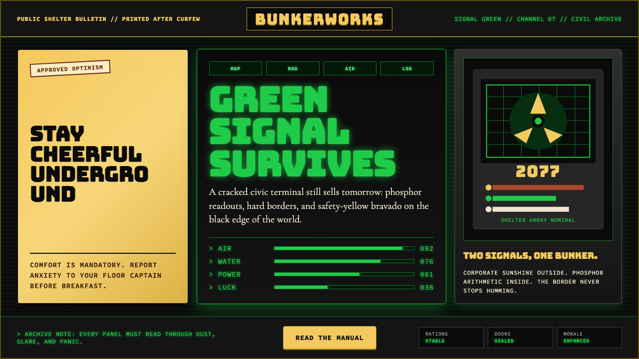 Fallout Vault-Tec Pip-BoyIrradiated optimism. Vault yellow and CRT green lock into a bordered bunker g…辐照乐观主义:避难所黄与CRT绿嵌入硬边地堡网格。
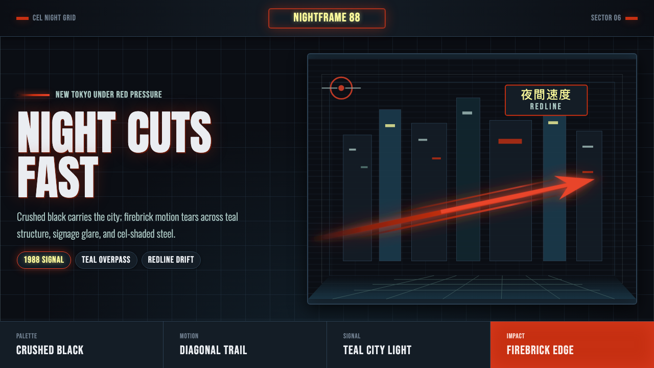 Akira Neo-TokyoNight moves fast. Firebrick trails cut crushed black, teal grids, and condens…黑夜疾驰。砖红光轨切开墨黑、青蓝网格与压缩招牌。
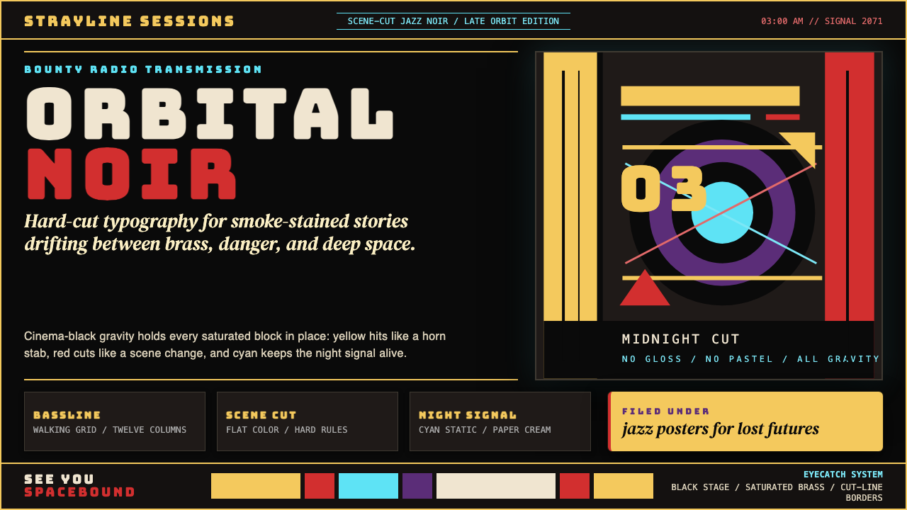 Cowboy Bebop Jazz-NoirCool at 3 AM. Bungee type, jazz yellow, red cuts, and cyan rules hit deep bla…凌晨三点的酷:黑底上 Bungee 字、爵士黄、红切线与青色规则。
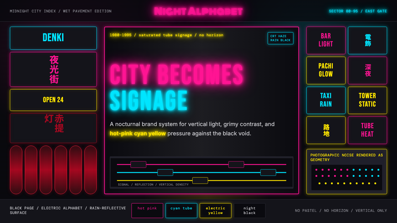 Tokyo Shinjuku Neon (1980)Night turns into alphabet. Hot pink, cyan, and yellow stack as glowing vertic…夜晚化作文字。热粉、青蓝、电黄垂直堆成霓虹峡谷。
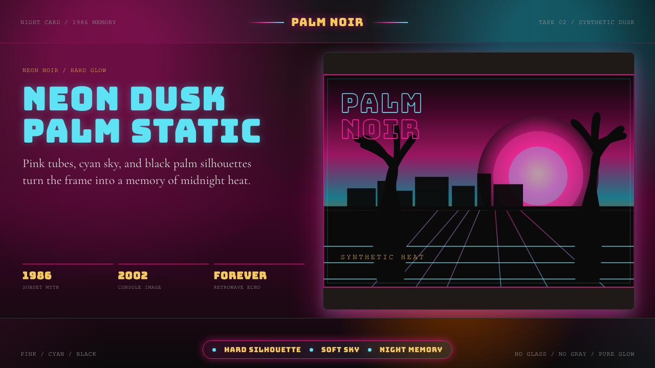 GTA Vice City (2002)Neon-noir nostalgia. Pink-cyan dusk, chunky type, and palm silhouettes.霓虹黑色怀旧。粉青黄昏、粗体字和棕榈剪影。
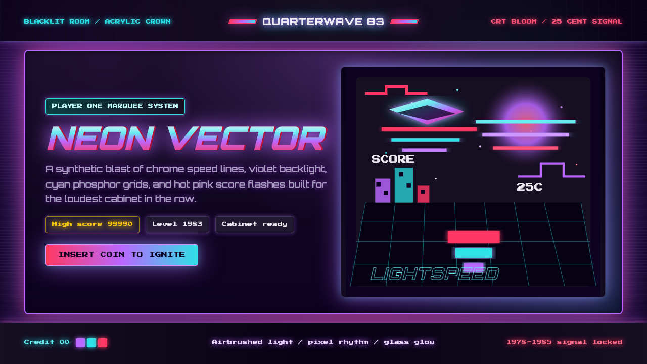 Arcade Cabinet MarqueeToo loud to ignore. Black-indigo glass, violet glow, cyan grids, hot-pink arc…刺眼才对。黑靛玻璃、霓虹紫光、电青网格与品红像素字。