What is Detroit Techno?
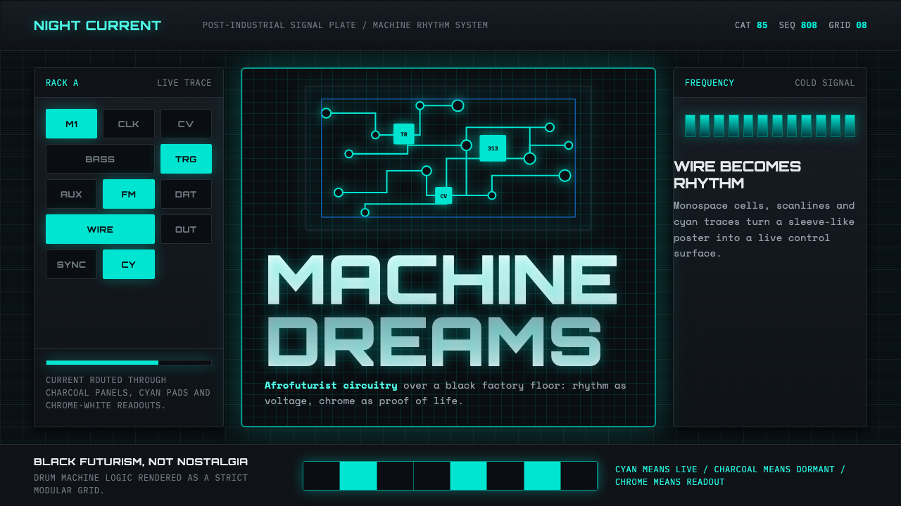
Detroit Techno is Black futurism with circuit boards for bones — a visual language born in 1985 from the collision of Kraftwerk's machine precision, African American funk, and the post-industrial wreckage of a city reinventing itself in the dark.
Detroit Techno in brief
Detroit Techno is a design aesthetic rooted in the first wave of techno music, which emerged from suburban Belleville and inner-city Detroit around 1985. Its founders — Juan Atkins, Derrick May, and Kevin Saunderson, collectively known as the Belleville Three, along with Atkins' earlier electronic project Cybotron — fused the cold mechanical precision of German electronic music with the rhythmic momentum of funk and the speculative futurism of Alvin Toffler's 'The Third Wave.' The resulting visual system is built from electric cyan circuitry, chrome speculars, scanline glows, and monospace type locked to a black grid — the graphic imagination of a future that never arrived but insisted on being visualized.
The aesthetic draws heavily from the sleeve artwork of Detroit's pioneering record labels, Metroplex and Transmat, which framed dance records as transmissions from a parallel technological civilization. These twelve-inch covers deployed catalog-plate typography, circuit-trace line work, and industrial readout aesthetics that had more in common with an oscilloscope display or a factory safety manual than with conventional music marketing. The darkness of the palette was not nihilism — it was the night shift, the factory floor at three in the morning, the moment when the machine dreamed.
At its core, Detroit Techno visual language is a form of Afrofuturism: an assertion that Black creators occupied the technological future on their own terms, before that future had been assigned to them. The strict technical vocabulary — monospace terminals, circuit diagrams, robotic glyph systems — was chosen not for nostalgia but as a claim on modernity, a refusal to be excluded from the machine age. This is what separates Detroit Techno from generic 'synthwave' aesthetics: the urgency is political and the darkness is structural, not decorative.
Where does Detroit Techno come from?
The story begins with Juan Atkins, who grew up in Belleville, Michigan, a small city southwest of Detroit, and discovered the music of Kraftwerk as a teenager. The German band's robotic precision — electronic pulses timed like assembly-line machinery — struck Atkins not as alien but as deeply familiar: the sound of the automobile plants that had defined his family's city and then begun to hollow it out. In the early 1980s, Atkins formed Cybotron with Richard Davis (known as 3070), and they released 'Alleys of Your Mind' in 1981 and 'Clear' in 1983 — tracks that introduced a vocabulary of machine beats and synthesized bass lines that would define the genre. Atkins also absorbed Alvin Toffler's futurism and began describing himself as a 'techno rebel,' a term that gave the genre its eventual name.
The Belleville Three coalesced around Atkins in the mid-1980s. Derrick May, who had been close to Atkins since high school, and Kevin Saunderson studied together at Belleville High School and later at Eastern Michigan University, where they shared records, equipment, and a vision of what electronic music could become. May would go on to produce 'Strings of Life' in 1987 under the name Rhythim Is Rhythim — a record widely regarded as one of the definitive early techno tracks, with a piano motif that suggested human emotion fragmenting into electronic pattern. Saunderson, performing as Inner City, gave the genre its biggest commercial crossover with 'Big Fun' and 'Good Life' in 1988.
Detroit's economic collapse was not incidental to the aesthetic. By 1985 the city had lost well over a hundred thousand manufacturing jobs as the American automobile industry contracted and shifted production abroad. Abandoned factories, empty lots, and a gutted city center created a post-industrial landscape that the music and its visual language reflected directly. The imagery of circuit boards and readout displays was not a fantasy escape from this environment — it was a reimagining of the industrial infrastructure as something that could belong to the people who had been left behind by it.
The record labels that canonized the visual language were Metroplex, founded by Atkins in 1985, and Transmat, founded by May in 1986. Their sleeve designs — often created with limited budgets and basic graphic tools — developed a consistent vocabulary: black backgrounds, cyan or white technical type, circuit-trace line work, and a deliberate rejection of the warm organic aesthetics of soul and R&B record sleeves. These covers looked like printouts from an industrial terminal. They were meant to. Transmat's name, an abbreviation of 'matter transmitter,' said everything about the label's aspirations: to transmit something across the gap between the present and the technological future.
What defines the Detroit Techno look?
Color
The palette is anchored in absolute black, with electric cyan as the primary accent — a color chosen for its association with cathode-ray terminal screens, oscilloscope traces, and fluorescent light refracting through industrial glass. Chrome white and cool metallic grays occupy the middle register, while occasional bursts of magenta or amber appear as warning indicators or data anomalies. Warm colors are structurally absent; the system has no room for the nostalgic tones of organic materials. The darkness is not an absence but a ground: the factory floor, the night sky over a city without functioning streetlights, the blank screen before a signal arrives.
Typography
Monospace typefaces dominate — the visual language of terminals, teletypes, and industrial label printers where every character occupies identical horizontal space. This equality is philosophical as well as functional: in a monospace system, no letter is more important than another by virtue of its natural form. Display typography often mimics catalog-plate lettering, stencil-cut industrial signage, or digital segment displays. The hierarchy is established through size contrast and color temperature rather than through typeface variation — a single monospace family set at multiple scales will carry the entire visual system.
Grid and Circuit Logic
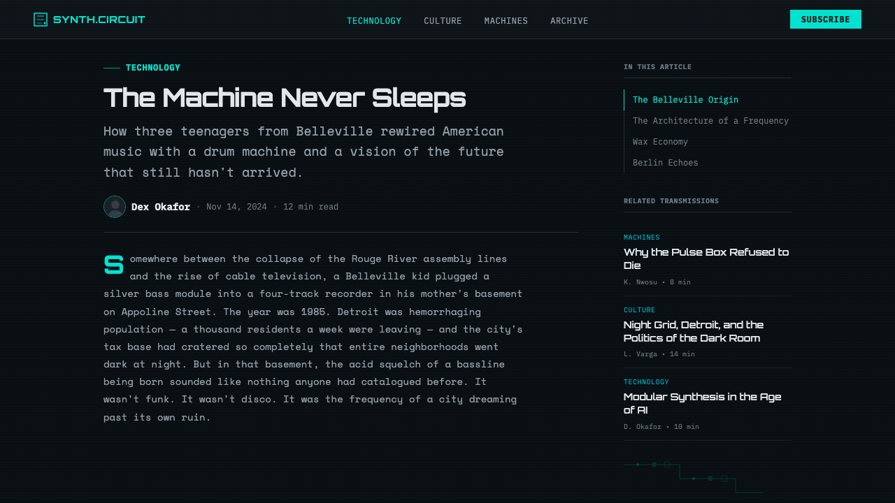
Composition is structured as a circuit diagram: horizontal and vertical trace lines connect elements across a black field, creating the impression that every design component is wired to every other. Intersections are marked, connections are explicit, and negative space functions as the gap between conductors rather than as breathing room in the conventional typographic sense. The grid is strict and technical — not the organic asymmetric grid of Swiss modernism, but the orthogonal precision of a printed circuit board, where deviations from right angles introduce signal interference.
Glow and Scanline Texture
Where other systems use shadow to create depth, Detroit Techno uses glow: elements emit light rather than cast shade. Cyan strokes bloom softly at their edges against the dark field, suggesting phosphor persistence on a cathode-ray screen. Scanline overlays — faint horizontal banding at consistent intervals — reference the raster structure of early video technology and add a layer of mediated reality to any surface they touch. These are not decorative filters applied after the fact; they are the visual evidence that the image was transmitted, received, and scanned.
Industrial Readout Aesthetics
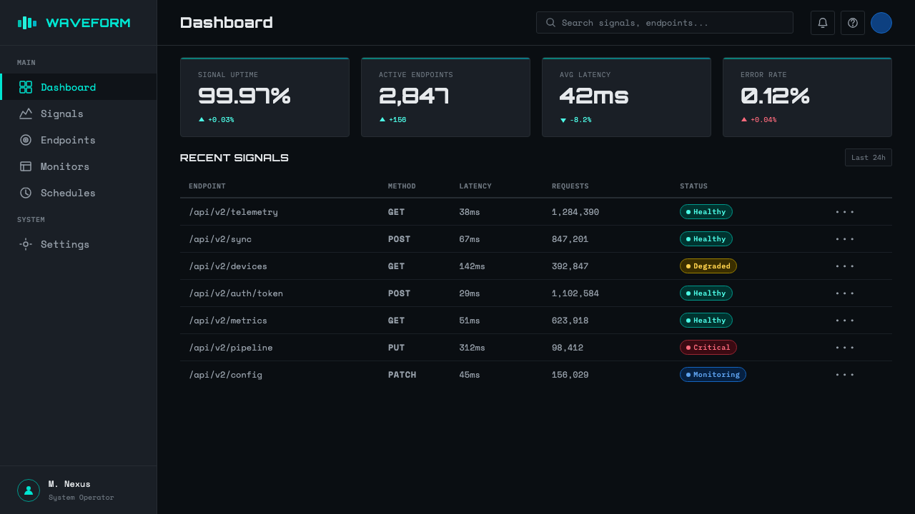
Data is displayed as if on an industrial instrument panel: numbers are large, monospaced, and isolated; units appear as small-cap abbreviations; status indicators use binary language (active/standby, signal/noise, open/closed). This readout logic can be applied to any content — a pricing table becomes a system diagnostic, a navigation menu becomes a terminal menu, a biographical note becomes a technical specification sheet. The transformation is not merely visual but cognitive: it reframes information as signal rather than as narrative.
Controlled Chromatic Aberration
Edges of bright elements — particularly white or cyan type against black — can exhibit slight color separation, mimicking the optical distortion of early video projection or poorly calibrated monitors. Red and blue channel offsets applied at the sub-pixel level create a fringe that registers as technological imperfection rather than design failure. This is the system's deliberate acknowledgment that all transmission involves noise, and that visual integrity is something maintained against entropy rather than guaranteed by it.
Zero Warmth
No element in the system signals biological warmth: no skin tones, no plant textures, no wood grain, no handmade marks. The human body, where it appears at all, is translated into a robotic or diagrammatic form. This is not misanthropy — it is a rigorous position about where the visual system locates its horizon. Detroit Techno places that horizon at the boundary where human aspiration becomes machine capability, and keeps everything in frame pointed toward that border.
Who shaped Detroit Techno?
Atkins is the originating figure of Detroit Techno, both musically and conceptually. As a teenager he synthesized Kraftwerk's machine aesthetics with funk rhythms and Alvin Toffler's futurist writings, producing the first recordings under the Cybotron name in 1981. His founding of Metroplex Records in 1985 established the visual template that would define the genre: catalog-numbered releases with spare, technical sleeve designs that treated dance music as an output of an imagined industrial system. His concept of the 'techno rebel' — a human actor who uses technology to claim autonomy rather than be subsumed by it — remains the philosophical core of the aesthetic.
May's 1987 recording 'Strings of Life,' released under the name Rhythim Is Rhythim, is the defining statement of what the genre's visual language was gesturing toward: a point where the organic and the mechanical become indistinguishable, where piano arpeggios and drum machine patterns exist in the same emotional register. His Transmat label, named for the science-fiction concept of matter transmission, explicitly framed techno as a signal sent from one reality to another. May described his own music as 'somewhere between George Clinton and Kraftwerk' — a formulation that locates the aesthetic precisely at the intersection of Black cultural production and European machine art.
Saunderson, who performed as Inner City with vocalist Paris Grey, gave Detroit Techno its most commercially successful moment with 'Big Fun' and 'Good Life' in 1988. These records demonstrated that the genre's visual and sonic vocabulary could carry genuine emotional content without compromising its technical integrity. The Inner City aesthetic — still hard-edged, still machine-driven, but with a vocal warmth that acknowledged human longing — maps onto the design system as a variant mode: the same grid, the same type logic, but with a single warm element admitted as counterpoint.
The Cybotron project — Atkins and Richard Davis recording together between 1981 and 1984 — established the foundational vocabulary before the genre even had a name. Their recordings 'Alleys of Your Mind,' 'Cosmic Cars,' and especially 'Clear' translated the science-fiction imagery of Isaac Asimov and Philip K. Dick into electronic music form, and their sleeve designs established the convention of treating the record as a technological artifact rather than a cultural product. The name itself — a fusion of cybernetics and electron — was a statement of methodology: this was music made by thinking about systems, not feelings.
As an institution rather than an individual, Metroplex Records — Atkins' label, founded in 1985 — created the visual grammar that subsequent producers and designers would spend decades decoding and extending. Its catalog-numbered releases, with their austere black sleeves and technical type treatments, established the convention that techno records were documents of a technological process rather than personal artistic expressions. The label's design choices were made under severe financial constraints, which turned out to be generative: the limitation to black-and-white or single-color printing, forced by cost, produced an aesthetic severity that has never fully been superseded.
How do you use Detroit Techno today?
Detroit Techno is one of the most contextually specific design aesthetics available: it carries a precise set of cultural associations — Afrofuturism, post-industrial melancholy, machine precision, underground club culture — that either align with a project's values or they do not. It is most powerful for products and contexts where the tension between human aspiration and technical constraint is thematically relevant: developer tools, hardware interfaces, AI product branding, music technology, urban infrastructure platforms, and any product that positions itself as operating at a technological frontier.
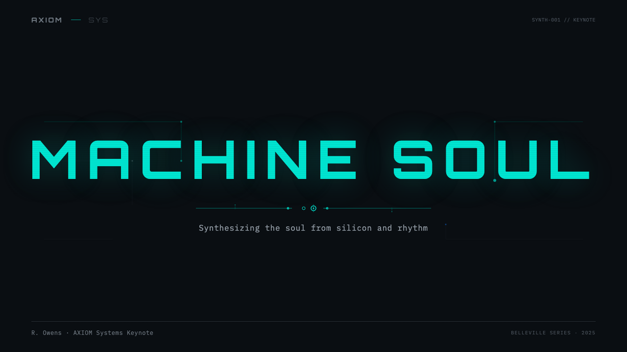
For presentation slides, Detroit Techno works best when treated as a transmission rather than a presentation. A cover slide should establish the dark field and primary glowing element immediately — white or cyan on absolute black, with a catalog-style identifier or technical designation functioning as the title system rather than a conventional headline. Content slides should resist the temptation to introduce warmth through photography or illustration; instead, data and text should be displayed as readouts, using monospace type and hard horizontal rules to separate information streams. Charts and graphs become oscilloscope traces or diagnostic panels when their background is darkened and their axes are treated as circuit reference lines.
For web interfaces, the system is ideally suited to terminal-style products, developer dashboards, audio production platforms, and any interface where precision and technical authority are the primary emotional registers. The approach demands strict discipline with color: reserve the electric cyan or magenta accent exclusively for interactive states and primary calls to action, and use white type at varying opacity levels to create hierarchy against the dark background. Card components should use thin luminous borders rather than fills; hover states can introduce a glow rather than a shadow. Navigation should be entirely typographic.
For editorial and marketing work, the style's poster heritage makes it powerful for event promotion, product launches in the technology sector, and any context where the message benefits from a sense of transmitting from a different temporal moment. Full-width sections alternating between pure black and near-black with cyan accents create strong rhythm. The key editorial decision is restraint with the accent color: a single glowing element per screen carries far more charge than a scattered palette.
The most common mistake when applying Detroit Techno is mistaking darkness for depression and cyan for decoration. The darkness is structural — it is the ground that makes signals visible, not a mood. The cyan is functional — it marks active elements, live circuits, and points of contact. Applying the aesthetic as a skin over conventional warm-palette layouts, or using the scanline texture as an ornamental filter on unrelated imagery, produces pastiche rather than resonance. The system only works when the coldness is earned by the content's relationship to technology, futurity, or the productive tension between machine and human.
Detroit Techno — FAQ
How is Detroit Techno different from generic 'synthwave' or 'cyberpunk' aesthetics?
The surface similarities — dark palettes, cyan accents, grid structures, technical type — obscure fundamental differences in origin and meaning. Synthwave is primarily nostalgic, drawing on 1980s pop aesthetics as they appeared in mass-market film and television; it is warm in affect despite its palette, and it aestheticizes the past. Cyberpunk is literary in origin, concerned with the dystopian consequences of technological capitalism, and is typically baroque in its layering of detail. Detroit Techno is neither nostalgic nor dystopian — it is a present-tense claim on a future that was being denied. The coldness is not mood; it is the actual temperature of the machinery. The Afrofuturist dimension — the specific claim of Black creators to technological modernity — is entirely absent from both synthwave and cyberpunk, and its presence or absence is the single most reliable marker of authenticity.
Can the Detroit Techno aesthetic work for products that are not music or technology related?
It can, but the transfer requires conceptual justification rather than surface application. The system's core logic — signal over noise, precision over warmth, the future as a place to be transmitted into rather than arrived at — can apply to any product that operates under constraint and aspires to transcend it. Urban infrastructure, industrial design, public health dashboards, and architectural visualization can all absorb the aesthetic when the underlying content warrants its severity. Where it fails is in contexts where the darkness reads as hostile rather than rigorous — consumer wellness, children's education, food and hospitality, and any context where the user is in a vulnerable or uncertain emotional state. The style is not universally welcoming, and knowing when that is a feature rather than a bug is the designer's primary responsibility.
How should photography and imagery be handled within this system?
Photography is the system's most challenging element. The purist approach — used on original Metroplex and Transmat releases — avoids representational photography entirely in favor of technical imagery: circuit close-ups, industrial machinery, oscilloscope captures, architectural details of brutalist or industrial structures. When human figures must appear, they are typically silhouetted, reduced to outline, overlaid with circuit trace patterns, or rendered in extreme high-contrast duotone with the warm tones removed. Color photography used unmodified — especially any image with skin tone warmth, natural light, or organic texture — will immediately break the system's temperature logic. The test is simple: does the image look like it was captured by a sensor rather than seen by an eye?
Is this aesthetic appropriate for light-mode interfaces, or does it only work on dark backgrounds?
A true light-mode inversion of Detroit Techno is structurally difficult, because the system's core logic depends on elements emitting light against a dark field — glow, bloom, and scanline effects are only legible on dark grounds. An inverted version — dark circuit elements on a light field — loses the transmission quality and becomes closer to technical illustration or scientific diagram, which is a legitimate aesthetic but a different one. If a light-mode variant is required, the most coherent approach is to retain the monospace type logic, the circuit-trace structural lines, and the catalog-plate information hierarchy while accepting that the glow and scanline elements must be dropped or heavily modified. The result resembles a factory schematic more than a transmission screen, which can itself be a compelling direction for certain product contexts.
How does the Afrofuturist dimension affect how the aesthetic should be credited or applied?
Detroit Techno is not a neutral technical style — it is a specific cultural artifact created by Black artists in a specific historical and economic context. Applying it carries an obligation of acknowledgment: knowing where the aesthetic came from, and ensuring that application does not flatten it into generic 'dark tech' style while erasing its origins. This does not mean the aesthetic is unavailable to non-Black designers or non-Black contexts — cultural aesthetics have always crossed boundaries through influence and adoption. It does mean that the further an application moves from the cultural and technological tensions that produced the original work, the more it risks producing pastiche. The most authentic applications are those in which the tension the aesthetic encodes — between exclusion and aspiration, between the machine world and the human who navigates it — is genuinely present in the product's own story.
Related design styles
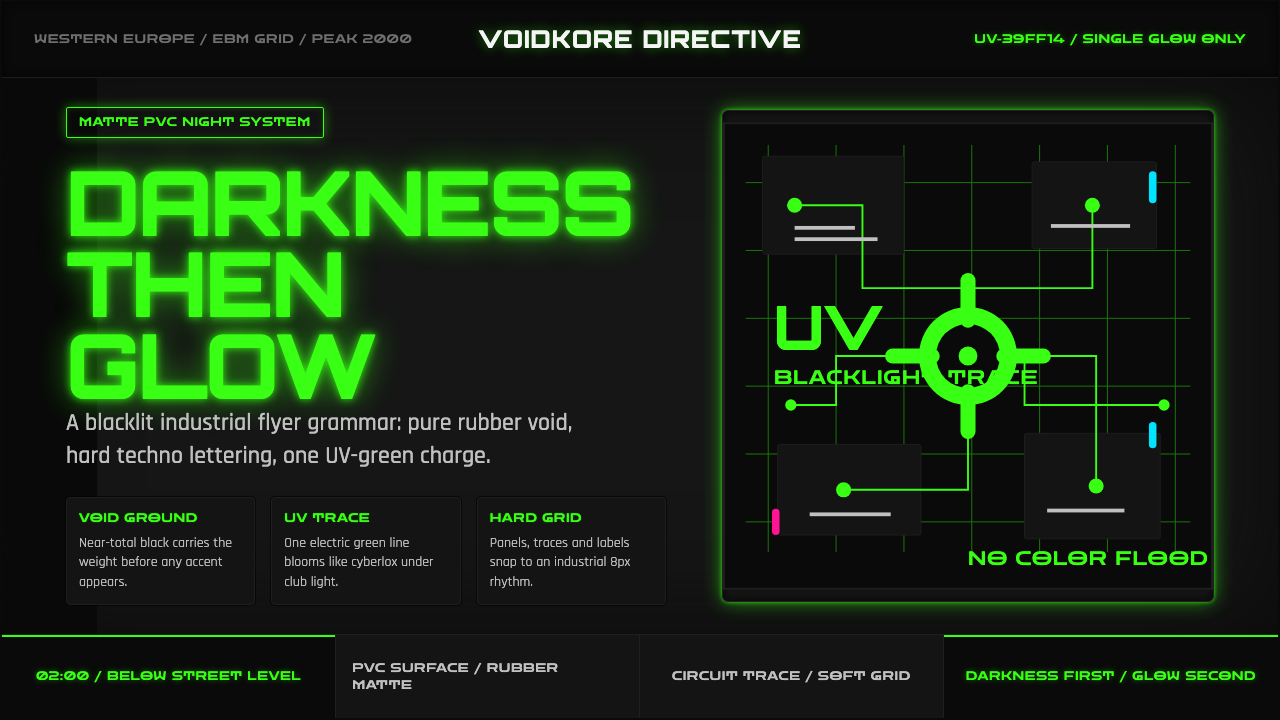 Cybergoth RaveDarkness rules. Pure black PVC is split by one UV-green circuit glow.
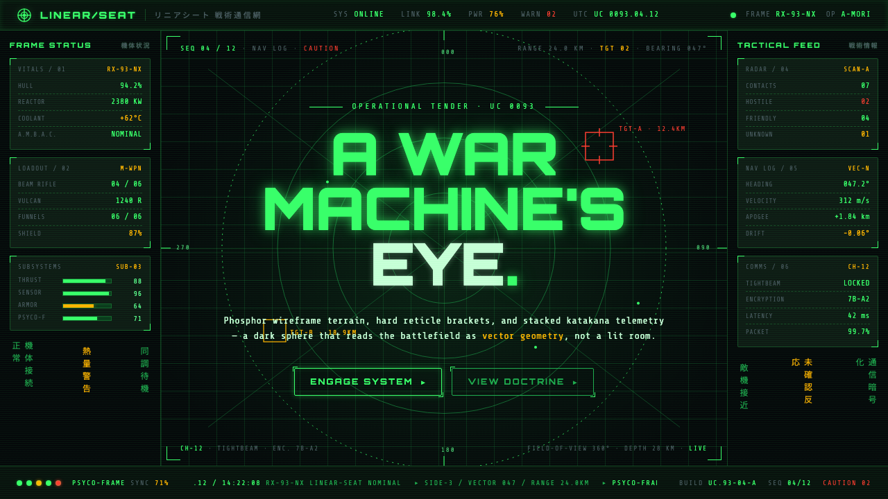 Gundam Universal Century UIA war machine's eye. Phosphor wireframe and katakana telemetry glow inside a…
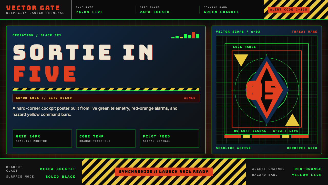 Neon Genesis EvangelionCockpit dread at launch. Tech-green grids, red-orange alarms, and hazard yell…
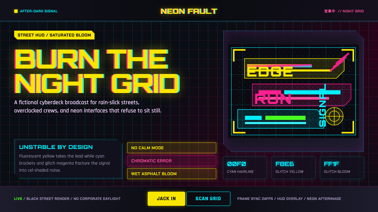 Edgerunners NeonNeon overload. Fluorescent yellow, cyan HUD grids, and magenta glitches burn…
 Ghostrunner Dharma TowerHostile precision at speed. Blue-black steel grids cut by red neon and cyan g…
 Mad Max Fury Road (2015)Built to roar. Molten saffron cuts through petrol teal, riveted grids, and ha…