What is DTM Touring Car?
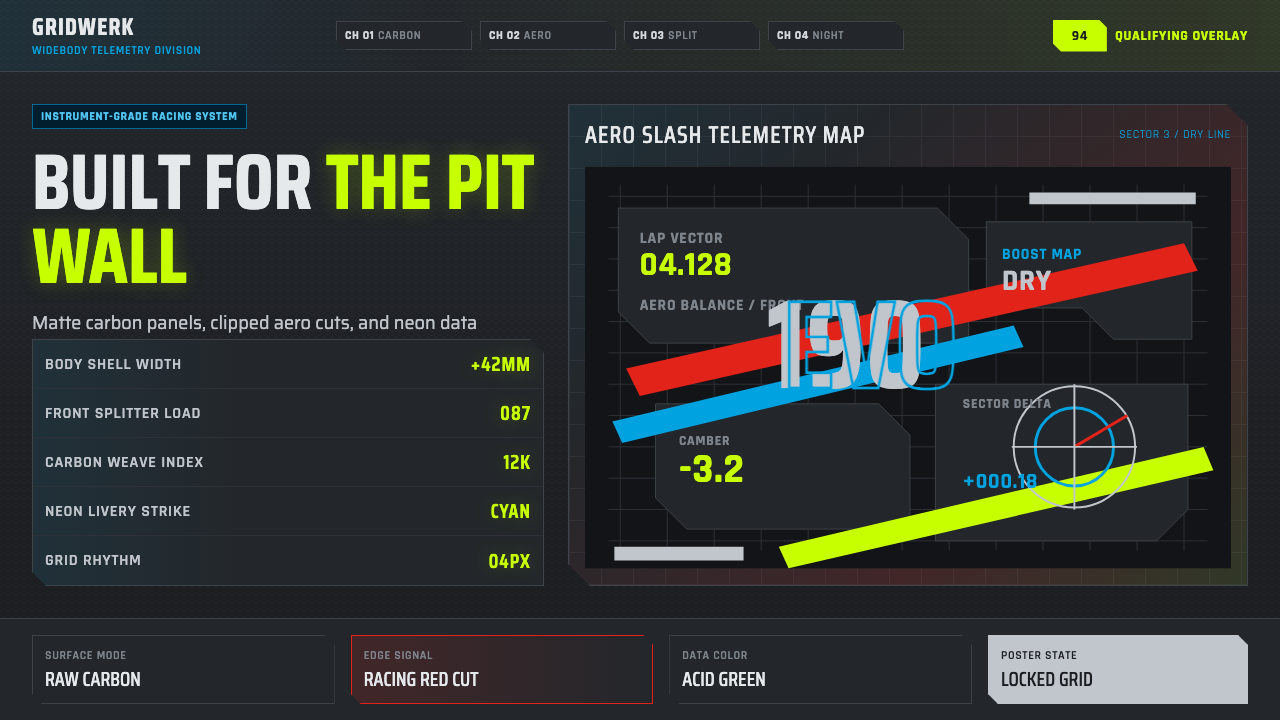
DTM Touring Car took the raw aggression of 1990s German motorsport engineering and turned it into a graphic language — carbon-dark grounds, gunmetal surfaces, and neon telemetry cutting across every panel like a livery built for the paddock, not the showroom.
DTM Touring Car in brief
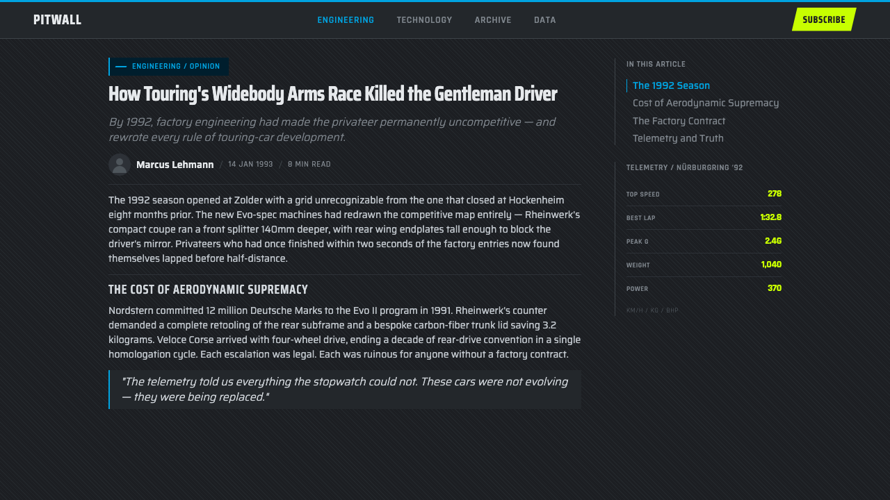
DTM Touring Car is a design style drawn from the golden era of the Deutsche Tourenwagen-Meisterschaft, the German touring car championship that turned homologated street sedans into some of the most aggressively engineered race cars of the twentieth century. Its visual language is not decorative motorsport nostalgia — it is a direct translation of what a race team's instrument panel, livery sheet, and pit-wall data feed actually look like: dense measurement grids, clipped and angled panel edges, and information rendered in technical, no-nonsense type.
Where a style like Bauhaus organizes a page around primary color and geometric calm, DTM Touring Car organizes it around velocity and instrumentation. The ground is near-black, brushed rather than flat, evoking raw carbon fibre and machined gunmetal rather than paper or screen. Onto that dark, matte base, the style cuts fluorescent sponsor-neon accents and diagonal aerodynamic slashes — the visual equivalent of a wide-body touring car cutting across a straight at speed.
The overall effect reads as instrumentation rather than illustration. Labels look like they belong on a data logger, panels look cut and bolted rather than drawn, and nothing asks to be admired at rest — it is built to communicate at a glance, under pressure, the way a lap-time readout is.
Where does DTM Touring Car come from?
The DTM was founded in 1984 as a successor to the earlier German Racing Championship, but it was the years spanning the late 1980s through the mid-1990s that produced the aesthetic this style distills. Under Group A and later the DTM's own homologation rules, manufacturers were permitted to modify production sedans far beyond what road-going versions ever saw: flared wheel arches, aggressive front splitters, towering rear wings, and engines pushed to the edge of what a touring car chassis could survive. The cars that resulted — the wide-body Mercedes-Benz 190E Evolution II, the BMW M3 E30 prepared by Schnitzer, the Alfa Romeo 155 V6 TI — looked like street cars sent through a wind tunnel and returned as weapons.
This was also the era in which sponsorship livery became its own design discipline. Tobacco, electronics, and petrochemical sponsors demanded maximum visibility at 200 kilometers per hour, which meant liveries built around high-contrast fluorescent color blocked in hard diagonal bands rather than subtle branding. Combined with the manufacturers' own obsession with engineering precision — visible in everything from cutaway technical diagrams to pit-wall telemetry readouts — the result was a graphic vocabulary fusing motorsport sponsorship with the era's emerging computer-aided technical illustration.
The championship's key circuits — Hockenheimring, the Nürburgring, and the tight, walled Norisring street circuit in Nuremberg — became the backdrop for a rivalry between AMG-prepared Mercedes squads, BMW Motorsport's factory and Schnitzer-run cars, and Alfa Corse's Italian entries. Drivers like Klaus Ludwig and Bernd Schneider became as identified with the sport's technical intensity as with their driving; the cars, bristling with aero addenda and stitched together from composite panels, were as much engineering showcases as racing machines.
By the early 2000s, spiraling costs and a manufacturer exodus reshaped the series, and the extreme Group A-era silhouette cars gave way to standardized regulations. But the 1990s look — matte gunmetal bodies, carbon-dark undertones, acid and cyan sponsor graphics slashing across clipped panel geometry — survived as a recognizable aesthetic on its own, referenced today whenever a designer wants to evoke engineered speed rather than a specific car or team.
What defines the DTM Touring Car look?
Color
The ground is near-black, treated as raw carbon fibre or matte gunmetal rather than flat print black — deep, slightly textured, absorbing rather than reflecting. Against it, fluorescent accent colors read as sponsor neon: acid greens and cyans behave like telemetry highlights or warning states, appearing in short, decisive strokes rather than broad fills. Warm colors are used sparingly, reserved for alerts or the rare accent that needs to compete with the cyans for attention. Nothing is pastel or muted mid-tone; the palette lives at the extremes of dark structure and bright signal.
Typography
Type reads as technical labeling rather than editorial voice: condensed, geometric, engineered for legibility in cramped instrument space rather than warmth on a printed page. Letterforms favor tight, uniform strokes with little width variation, closer to the stenciled lettering on a race car's bodywork than to a magazine headline. Hierarchy is built through scale and letter-spacing rather than serif-versus-sans contrast — a wide-tracked all-caps label sits above a tighter numeric readout, both from the same technical family. Numerals carry the style's identity: tabular, monospaced in feel, built to be scanned as data rather than read as prose.
Panel Geometry
Surfaces are broken into clipped-corner panels rather than plain rectangles — a diagonal cut at one corner, a beveled edge at another, echoing the way race car bodywork is built from bolted composite sections rather than a single continuous shell. This clipped geometry gives every card or block a sense of having been fabricated and fastened rather than drawn. Diagonal slashes cut across panel boundaries at consistent, aggressive angles, borrowed directly from aero livery graphics — they are never decorative curves, always straight cuts that imply forward motion.
Grid and Data Density
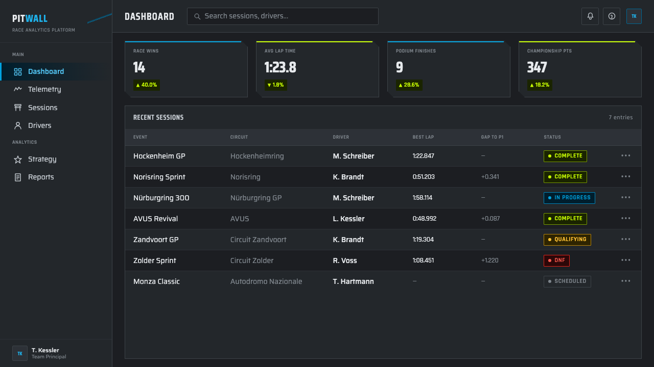
The underlying structure is a tight measurement grid, denser and more visible than in most graphic styles — closer to graph paper or a telemetry overlay than to an editorial layout grid. Labels, values, and small technical annotations cluster near their reference points the way sensor readouts cluster around a car diagram in a pit-wall display. Empty space is treated with suspicion: a data-driven surface should look instrumented, not sparse, and negative space is filled with grid lines, tick marks, or small secondary labels rather than left genuinely empty.
Surface and Material
Surfaces read as brushed metal and raw composite rather than painted or printed. A brushed-gunmetal panel carries a directional texture rather than a flat fill; a carbon-dark ground carries a fine woven pattern rather than pure black. This material honesty extends the racing-livery logic: every surface should look like something a fabricator built, not something a screen simply displays. Gloss is reserved for small accent details — a highlight along a panel edge — while the dominant surfaces stay matte, absorbing light the way a stealth-liveried race car does under paddock lighting.
Motion and Directionality
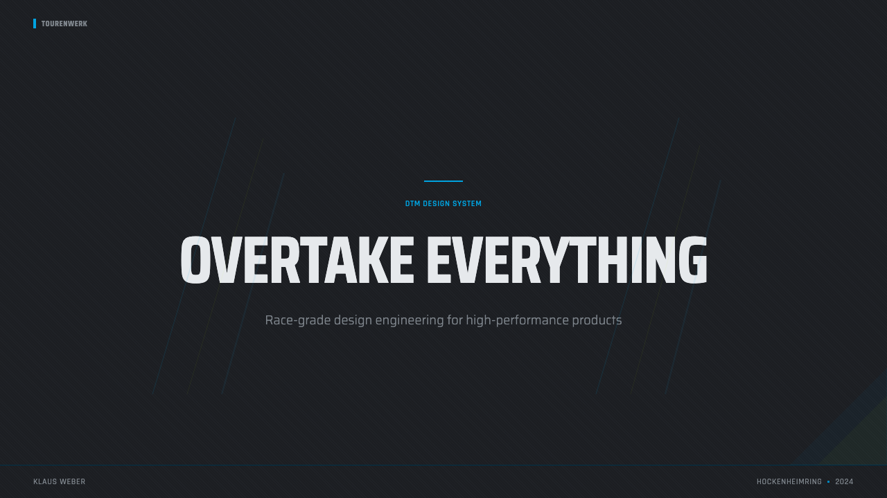
Every diagonal in the system points in a consistent direction, implying forward travel the way an aero slash on a car's flank implies the direction of airflow at speed. This is not random dynamism — it is disciplined, repeated angling, the same slash angle recurring across panel edges, dividers, and accent marks so the whole composition reads as one object moving in one direction, not a collage of unrelated diagonal flourishes.
Restraint Under Pressure
Despite the aggression of its diagonals and the intensity of its accent neon, the style is disciplined rather than chaotic. Fluorescent color is used the way a pit wall uses warning lights — sparingly, at specific decision points, not as ambient decoration. The dark ground dominates by area; the neon exists to flag what matters most, the way a single red telemetry spike stands out precisely because the rest of the readout stays calm. This is the difference between a style that looks fast and a style that is simply loud.
Who shaped DTM Touring Car?
Ludwig was among the most successful drivers of the DTM's golden era, taking championships with Mercedes-AMG teams during the years when the wide-body 190E Evolution cars defined the series' silhouette. His association with AMG's factory effort places him at the center of the era's defining rivalry between the German manufacturers, and his career spans precisely the years — late 1980s through mid-1990s — that this style draws from.
Schneider became one of the defining Mercedes-Benz DTM drivers, competing through the series' transitions from the Group A homologation era into the DTM's own regulatory framework. His long tenure with Mercedes-linked teams ties him closely to the AMG engineering program that produced some of the most recognizable liveries and chassis of the period.
AMG served as Mercedes-Benz's motorsport engineering partner during the DTM era, responsible for developing the race-tuned 190E Evolution models into championship-winning machines. AMG's engineering-first ethos — pushing a production sedan platform to its absolute mechanical limits — is central to why this style reads as engineered aggression rather than styled decoration.
BMW's factory motorsport division, working closely with the Schnitzer racing team, developed the BMW M3 E30 into one of the most successful touring cars of the era. The Schnitzer-prepared cars, with their flared arches and aggressive aero packages, exemplify the homologation-era philosophy of pushing a road car's silhouette as far as the rules allowed.
Alfa Romeo's racing division fielded the 155 V6 TI in the DTM, bringing an Italian engineering sensibility into a championship otherwise dominated by German manufacturers. The car's distinctive aerodynamic package and livery added a third visual identity to the AMG-versus-Schnitzer rivalry, broadening the era's graphic vocabulary beyond a two-team contest.
How do you use DTM Touring Car today?
DTM Touring Car works best where a product wants to feel instrumented, fast, and technically credible rather than warm or approachable — its aesthetic argument is precision under pressure, and it should be reached for when that argument fits the content.
For presentation covers, the style produces an immediate sense of velocity: a near-black ground, one bold diagonal slash in a fluorescent accent color, and a clipped-corner title block positioned off-center. Content and data slides are where it truly earns its keep — a chart or KPI grid dressed in DTM Touring Car looks like a genuine telemetry readout, with tight grid lines, tabular numerals, and short fluorescent flags marking the one or two data points that matter most, while everything else stays in disciplined gunmetal and dark tones.
For web interfaces, the style suits dashboards more naturally than almost any other application — status panels, performance monitors, and technical control surfaces all benefit from a dark, brushed-metal ground with neon accents reserved for alerts and active states. Pricing pages can borrow the same logic in a lighter dose: a dark hero panel with clipped-corner pricing cards and a single neon accent marking the recommended tier, surrounded by calmer gunmetal cards for the alternatives.
For editorial and marketing work, the style is most effective in short, high-impact formats — a poster, a product-launch page, a motorsport-adjacent feature — where its diagonal energy and dense labeling can dominate a full viewport without competing against long-form reading. It struggles in long paragraphs of body copy, since the density that makes it feel fast also makes sustained reading fatiguing.
A common mistake is treating the fluorescent accents as a general-purpose color scheme rather than a signaling device. Authentic work keeps the dark ground dominant by area and uses cyan or acid green sparingly, at genuine decision points — the way a pit wall reserves bright telemetry color for the one reading that needs attention. Flooding a layout with neon on every element collapses the hierarchy and reads as noisy rather than fast.
DTM Touring Car — FAQ
Is DTM Touring Car the same as generic "racing" or "esports gaming" design?
They overlap but are not identical. Generic racing or gaming aesthetics often lean on glossy reflections, saturated full-color gradients, and stylized speed lines meant to look exciting at a glance. DTM Touring Car is more restrained and more literal: it is modeled on an actual paddock's instrumentation and livery logic — matte gunmetal and carbon-dark surfaces, sparing fluorescent accents, and panel geometry that mimics bolted composite bodywork rather than a stylized illustration of motion. It reads as engineering documentation that happens to be exciting, rather than excitement rendered as graphics.
Can this style work with a light background instead of a dark one?
The style is conceived as dark-ground — the carbon-fibre and gunmetal reference point only makes sense against a near-black field, and the fluorescent accents lose most of their signaling power on a light surface, where they simply read as bright color rather than as telemetry highlights against instrument-panel dark. A light variant is possible for isolated components — a single card or chart pulled out of context — but a full light-background application abandons the paddock-instrumentation logic that gives the style its identity, and risks reading as generic sport branding instead.
Why does the style rely so heavily on diagonal cuts instead of straight rectangles?
The diagonals are borrowed directly from aerodynamic livery graphics, where sponsor color bands are painted at an angle across a car's bodywork specifically to imply the direction of airflow and forward motion at speed. A pure rectangle communicates stability and rest; a consistent diagonal cut communicates motion and urgency. The style uses this deliberately and sparingly — the diagonals appear at panel edges and accent dividers, always at a consistent angle, rather than scattered at random angles that would read as chaotic instead of directional.
How much fluorescent accent color is too much?
As a rule of thumb, the dark gunmetal-and-carbon ground should dominate any composition by area, with fluorescent cyan or acid green appearing only at specific points that genuinely need emphasis — a single data callout, one active state, one recommended option. If more than a small fraction of the visible surface is bright neon, the hierarchy has collapsed and the layout will read as loud rather than fast. The discipline is the same one a pit wall uses: warning lights are bright precisely because everything around them stays calm.
What kinds of products or brands should avoid this style?
DTM Touring Car is a poor fit for anything that needs to feel soft, organic, or emotionally warm — wellness products, children's brands, hospitality, or any context where the user experience depends on approachability rather than technical authority. Its density and dark intensity can also overwhelm content-heavy editorial products that require long, comfortable reading sessions. It is at its best in performance-oriented, technical, or motorsport-adjacent contexts where instrumented precision is itself the selling point.
Related design styles
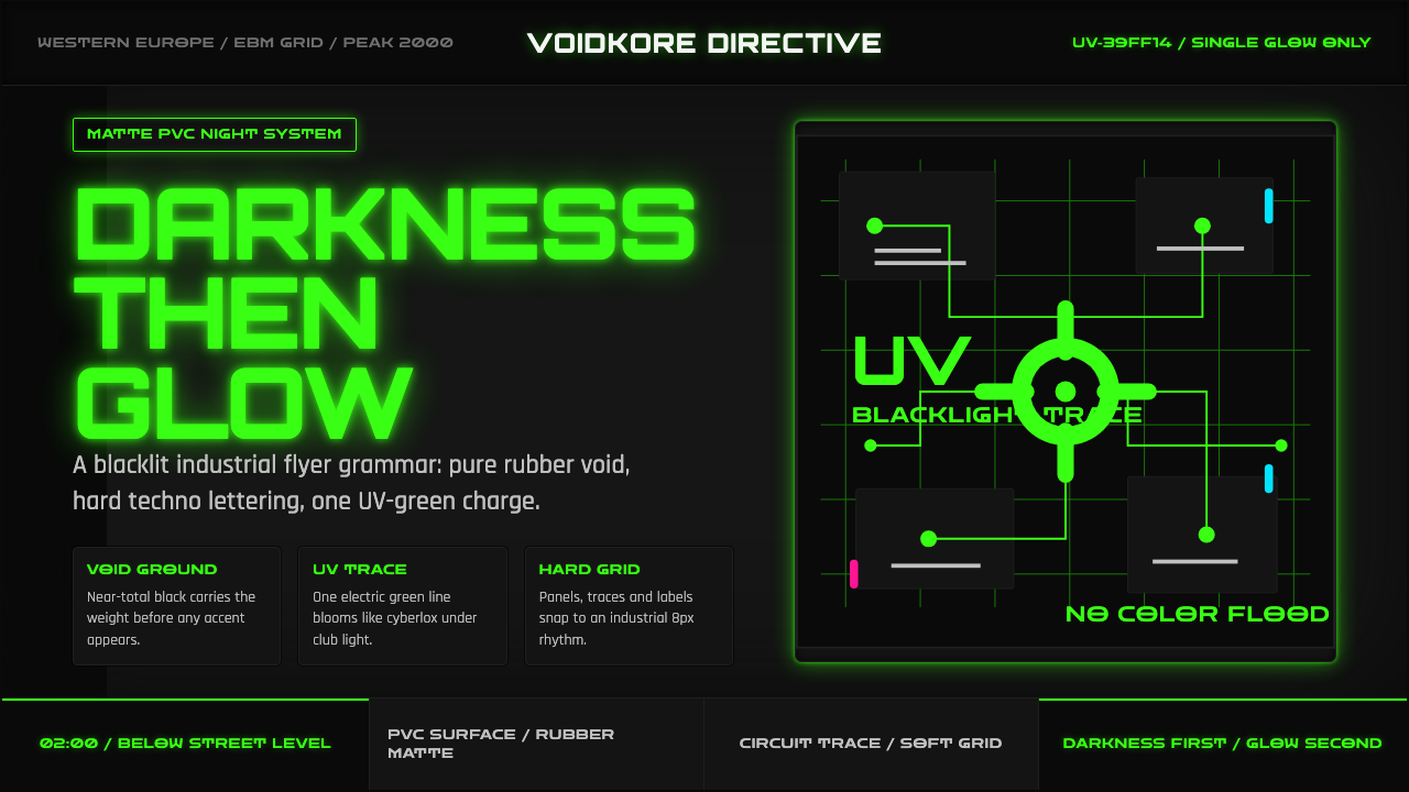 Cybergoth RaveDarkness rules. Pure black PVC is split by one UV-green circuit glow.
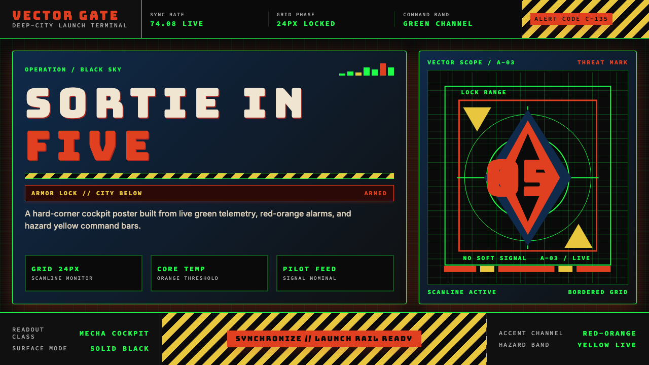 Neon Genesis EvangelionCockpit dread at launch. Tech-green grids, red-orange alarms, and hazard yell…
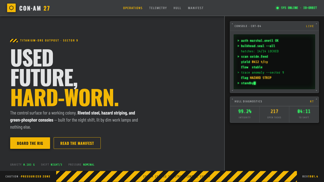 Outland (1981)Used-future industrial grit. Dim steel, caution-yellow hazard stripes, green-…
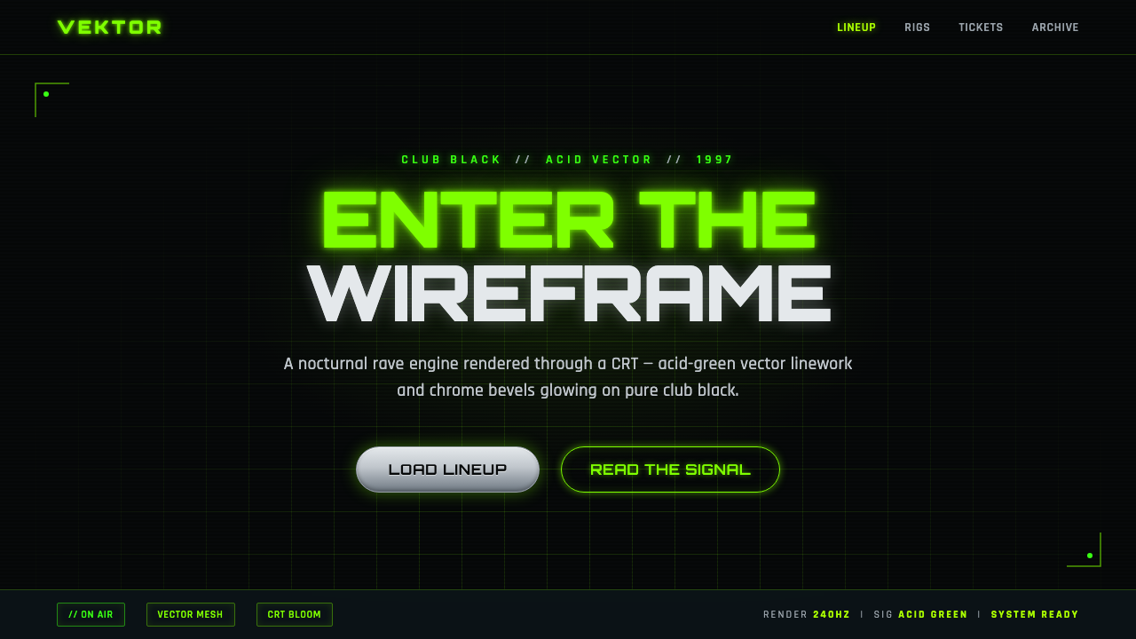 Playstation Rave Green 1997Enter the wireframe. Acid-green vector lines and chrome glow on club black, a…
 Terminator HUD (1984)The machine never blinks. Blood-red reticles and mono data burn across absolu…
 Alien: IsolationLo-fi dread glows. Amber phosphor and terminal green pulse through bordered C…