What is Gunpla Model Box?
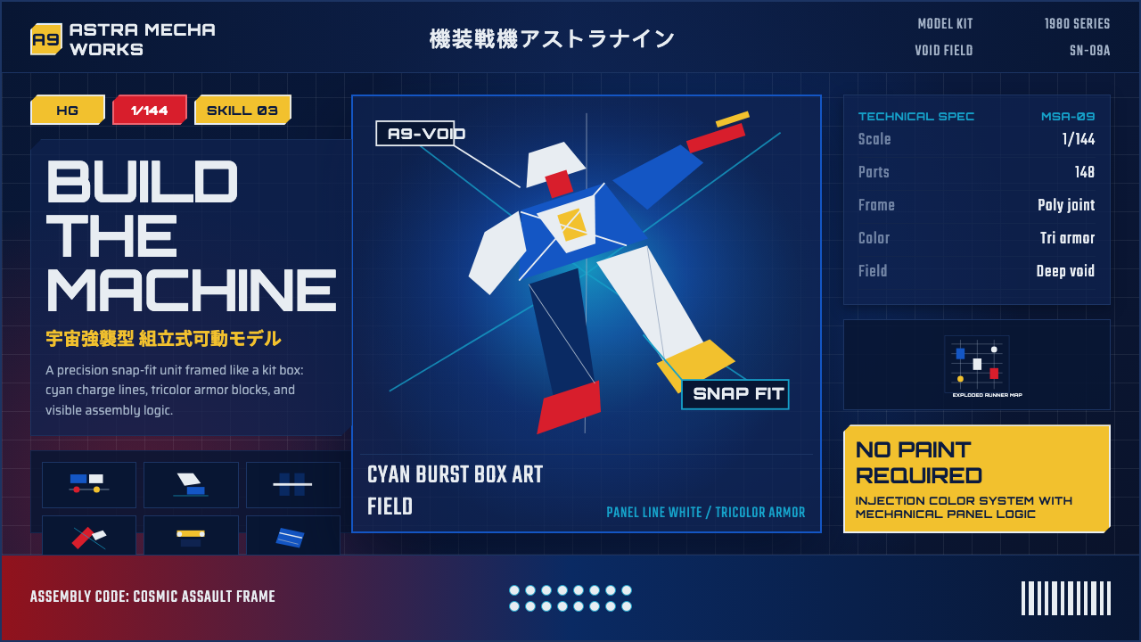
Gunpla box art turned the plastic model kit into a poster: a mobile suit lunging out of a cosmic void, ringed by energy bursts and hard technical labeling.
Gunpla Model Box in brief
Gunpla Model Box is the packaging language Bandai built around its Gundam plastic model kits: a dramatic, airbrush-painted mobile suit set against a deep cosmic blue-black void, ringed by cyan energy bursts and crisp white panel lines, with a tricolor palette of royal blue, mecha red, and signal yellow lifted straight from the original RX-78-2 Gundam.
The style is inseparable from its function as a sales object. A model kit box has to do a job a poster does not: it must communicate grade, scale, and part count at a glance, while still making an unbuilt block of gray plastic look like a machine in mid-battle. That tension between marketing drama and technical honesty is what gives Gunpla packaging its particular energy — half movie poster, half instruction manual cover.
Visually, the system reads as dynamic and unapologetically technical. Diagonal composition suggests motion even in a static illustration; exploded-parts diagrams and spec panels sit alongside the hero art rather than being hidden in fine print; and bold katakana titling announces the product with the same confidence as the artwork itself. Nothing here apologizes for being a toy box — it is proud packaging for a machine you build with your own hands.
Where does Gunpla Model Box come from?
The visual system traces back to Mobile Suit Gundam, the 1979 television anime created and directed by Yoshiyuki Tomino, whose mechanical designs were the work of Kunio Okawara. Okawara had already designed robots for earlier Japanese giant-robot shows, but Gundam asked for something different: a machine that looked like military hardware rather than a folklore hero. The RX-78-2 Gundam that resulted — blocky, jointed, painted in that now-iconic blue, red, and yellow — became the template for a genre that came to be called 'real robot,' as opposed to the more fantastical 'super robot' shows that preceded it.
Bandai, the toy company that had licensed the merchandising rights, launched the first Gunpla — a contraction of 'Gundam plastic model' — in July 1980. The timing mattered: the anime itself had underperformed on its initial broadcast and was pulled early, but reruns and a trio of compilation films built a devoted following just as the model kits reached stores. What followed was less a product launch than a cultural detonation: by the early-to-mid 1980s Japan was gripped by a full-blown Gunpla boom, with kits selling out within hours and scalpers reselling them at multiples of retail price.
Bandai's model line matured quickly from a single fixed design into a structured system of grades — tiers that dictated articulation, part complexity, and price, each with its own box-art conventions and badge iconography. This grading system is central to why the packaging language feels so technical: a shopper needs to distinguish a beginner-friendly kit from a museum-grade replica before they even open the box, and Bandai solved that problem visually, with color-coded badges, scale callouts, and exploded-view diagrams that function almost like a spec sheet stapled to the front of a poster.
Over four decades the box art itself evolved through generations of illustrators working in an increasingly refined airbrush and, later, digital-painting tradition, but the underlying grammar barely moved: cosmic dark ground, tricolor mecha, cyan light effects, and hard technical labeling. That consistency is precisely what let Gunpla packaging become a recognizable visual dialect on its own — hobbyists who have never seen a frame of the anime can identify a Gunpla box from across a store.
What defines the Gunpla Model Box look?
Color
The palette is a fixed tricolor drawn from the original RX-78-2 Gundam — a deep royal blue, a hot mecha red, and signal yellow — set against a background that reads as deep space: near-black navy shading into cosmic blue, occasionally lit by a burst of cyan energy. Color here signals faction and heroism rather than mood; a kit's box tells you at a glance which machine and which allegiance you are building.
Typography
Titling favors bold, angular display faces alongside prominent katakana — the phonetic script used to render foreign and technical words in Japanese — set with the confidence of a movie title card. Spec labels, by contrast, run in tight, uniform monospaced characters, the kind associated with technical readouts and instrument panels. The pairing of expressive display type and clinical monospace mirrors the box's dual job: sell the drama, disclose the specs.
Composition
The hero mobile suit is almost always shot on a diagonal, lunging or turning out of the frame, so that even a still illustration reads as mid-motion. Exploded-parts diagrams and small technical call-outs are arranged around this central figure rather than hidden away, giving the whole box a layered, poster-plus-blueprint quality — drama in the center, documentation around the edges.
Grade and Badge System
Every box carries a grade badge — a compact, color-coded marker that tells a shopper the kit's articulation tier, scale, and rough skill level before the box is even opened. These badges function like a product spec condensed into a logo: a small geometric emblem, a scale ratio, and a short designation, all legible from arm's length on a crowded shelf.
Technical Panels
Alongside the hero illustration, the box carries dedicated panels for spec data, weapon load-outs, and part previews, framed with ruled lines and small technical icons. These panels borrow their visual logic from instruction manuals and instrument displays rather than advertising — a deliberate signal that this is a machine, and the box respects the buyer enough to show its workings.
Energy and Light Effects
Cyan energy bursts, thruster glow, and beam-weapon streaks are used sparingly but decisively — a single dramatic burst rather than a field of scattered sparkle. These effects mark the machine as active and powered rather than a static toy, and they are almost always cool-toned, contrasting against the mecha's warmer red and yellow accents.
Material Honesty
Even at its most dramatic, the illustration keeps faith with the actual model kit: panel lines, joint seams, and surface paneling on the painted mobile suit correspond to the plastic parts inside the box. This is packaging that never pretends the product is something it is not — the promise on the front is a promise the sprues inside can keep.
Who shaped Gunpla Model Box?
Tomino created and directed Mobile Suit Gundam in 1979, establishing the 'real robot' approach that treated mobile suits as plausible military hardware rather than folklore heroes. The franchise's tone and mythology, which every subsequent Gunpla box art trades on, originate directly from his direction.
Okawara designed the RX-78-2 Gundam and much of the original mechanical cast, translating Tomino's demand for military plausibility into the blocky, jointed silhouette and tricolor scheme that became the franchise's visual signature — and the direct source of Gunpla box art's color palette.
Bandai's hobby division launched the first Gunpla kit in July 1980 and, over the following decades, built the tiered grade system — from beginner-friendly kits to museum-grade replicas — whose badges and technical panels define the packaging language today.
A mechanical designer and illustrator who joined the franchise in the 1980s, Katoki became known for meticulously detailed redesigns and box-art illustrations that pushed the tricolor mecha aesthetic toward a harder, more technical rendering style, influencing a generation of later Gunpla packaging.
How do you use Gunpla Model Box today?
Gunpla Model Box is a high-energy, technical-yet-heroic style, and it transfers well whenever a product needs to feel both aspirational and precisely engineered. Applying it means treating the deep cosmic ground as non-negotiable — this is a dark system through and through — and reserving the tricolor palette for the single hero element on the page, exactly as the original box art reserves it for the mobile suit.
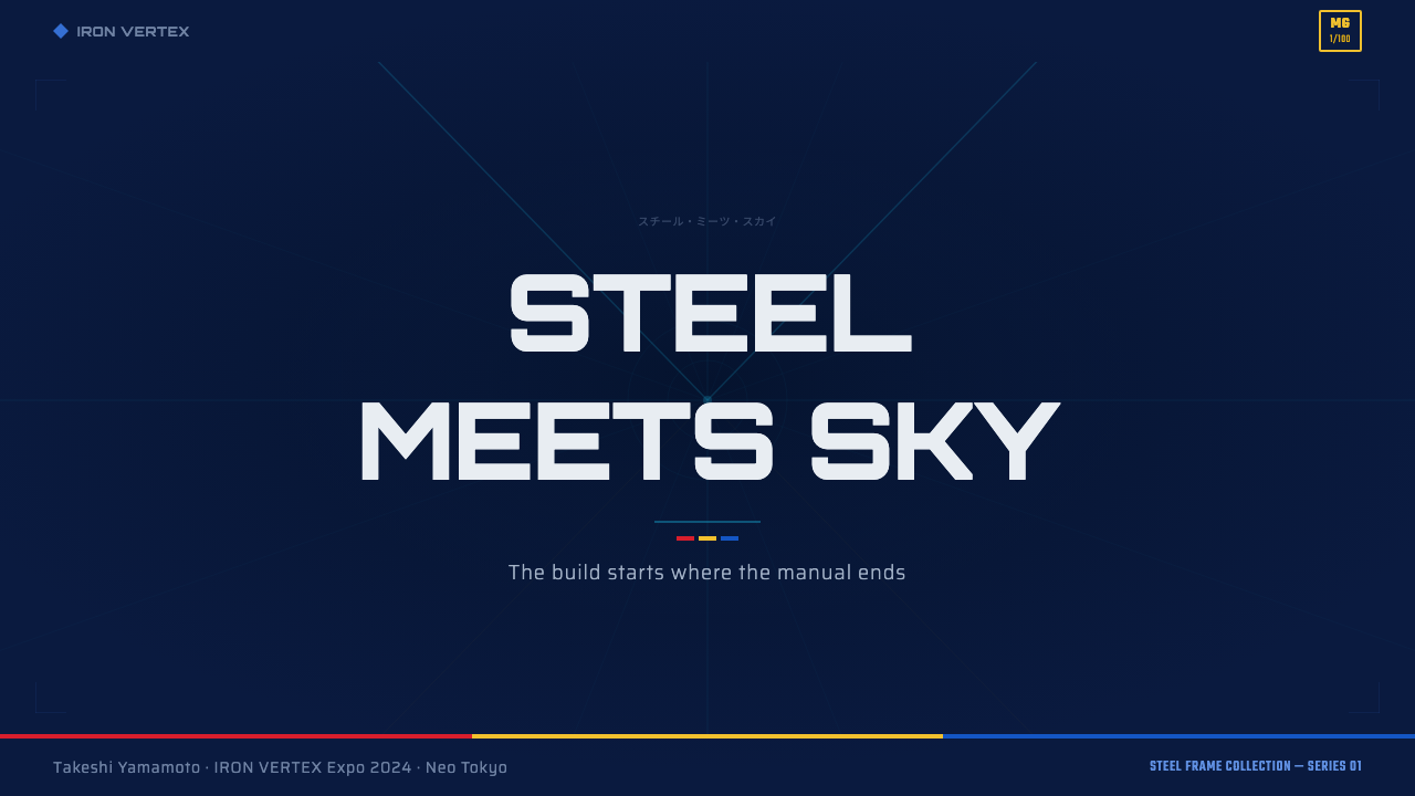
On presentation slides, a cover slide works well built around one dramatic diagonal hero image or icon lit against the cosmic-dark ground, with a bold display title and a small technical badge in a corner, echoing a grade marker. Content slides should keep the drama contained: a dark ground, white or cyan rule lines to organize sections, and monospaced labels for any data callouts. Full data slides can lean into the exploded-diagram habit — breaking a concept into labeled parts rather than a single flowing paragraph mirrors the kit's own visual logic.
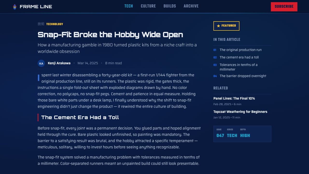
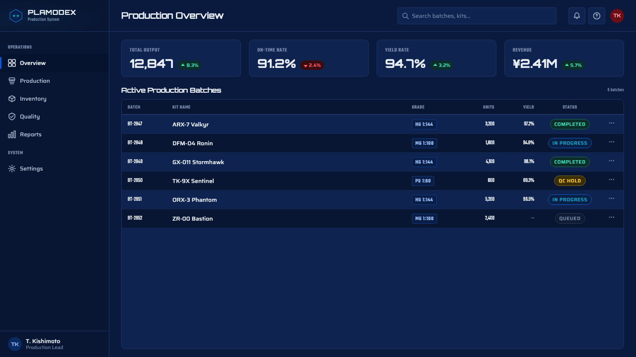
For web interfaces, the style suits dashboards and product pages for anything technical, gaming-adjacent, or collector-oriented: a dark UI ground, a restrained tricolor accent system reserved for status and primary actions, and monospaced type for any numeric or spec-like data. Navigation and section badges can borrow the grade-badge convention directly — small, color-coded emblems that communicate tier or category at a glance.
In editorial and marketing contexts, the style is well suited to launch pages, hobbyist communities, and anything selling a build-it-yourself promise. A hero visual on a cosmic-dark ground, a short burst of energy-colored accent, and a spec panel laid out like a product sheet all read as confident and technical without needing photography.
A common mistake is treating the tricolor palette as decoration to be scattered everywhere; in the source material it is disciplined — one hero machine, one clear color identity, and everything else rendered in the dark ground, white lines, or cyan light. Piling on multiple bright accents at once collapses the hierarchy the whole system depends on, and dropping the technical panels in favor of pure illustration removes the honesty that makes the style distinct from generic sci-fi art.
Gunpla Model Box — FAQ
Is Gunpla Model Box the same as generic sci-fi or mecha art?
No. Generic mecha art is free to invent its own palette, mood lighting, and composition. Gunpla box art is bound by a specific tricolor inherited from one machine, a fixed cosmic-dark ground, and a technical-panel discipline that treats the box as a spec sheet as much as a poster. The style is recognizable precisely because those constraints never loosen, regardless of how the illustration technique itself has evolved over the decades.
Why is the background always dark rather than light?
The deep cosmic ground does two things at once: it stages the mobile suit in the void of space where these stories are set, and it makes the tricolor mecha and cyan energy effects pop with maximum contrast. A light ground would flatten that contrast and undercut the sense of scale and drama the packaging is built to sell on a crowded store shelf.
What role do the grade badges actually play in the design?
They compress a purchasing decision into a single glyph. A shopper scanning a shelf needs to know, before opening the box, roughly how complex the kit is, what scale it builds to, and which product tier it belongs to. The badge does that job with a small color-coded emblem and a short designation, functioning like a condensed spec sheet stapled onto otherwise purely dramatic packaging.
Does this style require an actual mobile-suit-like subject to work?
No — the underlying grammar is transferable to any hero element: a product, a feature icon, a data visualization. What matters is keeping the same structure — one dominant subject on a diagonal, a cosmic-dark ground, a disciplined tricolor accent, and honest technical labeling around the edges — rather than the specific subject matter of a robot.
Is this style too aggressive or 'gamer' for a serious business product?
It depends entirely on the product's own values. The style communicates precision engineering, capability, and confidence, which suits gaming, hardware, hobbyist, and technical-audience products very naturally. For products that need to signal warmth, approachability, or informality, the style's dark ground and technical rigor will read as cold or overbuilt — the same way it would be a poor fit on a children's product.
Related design styles
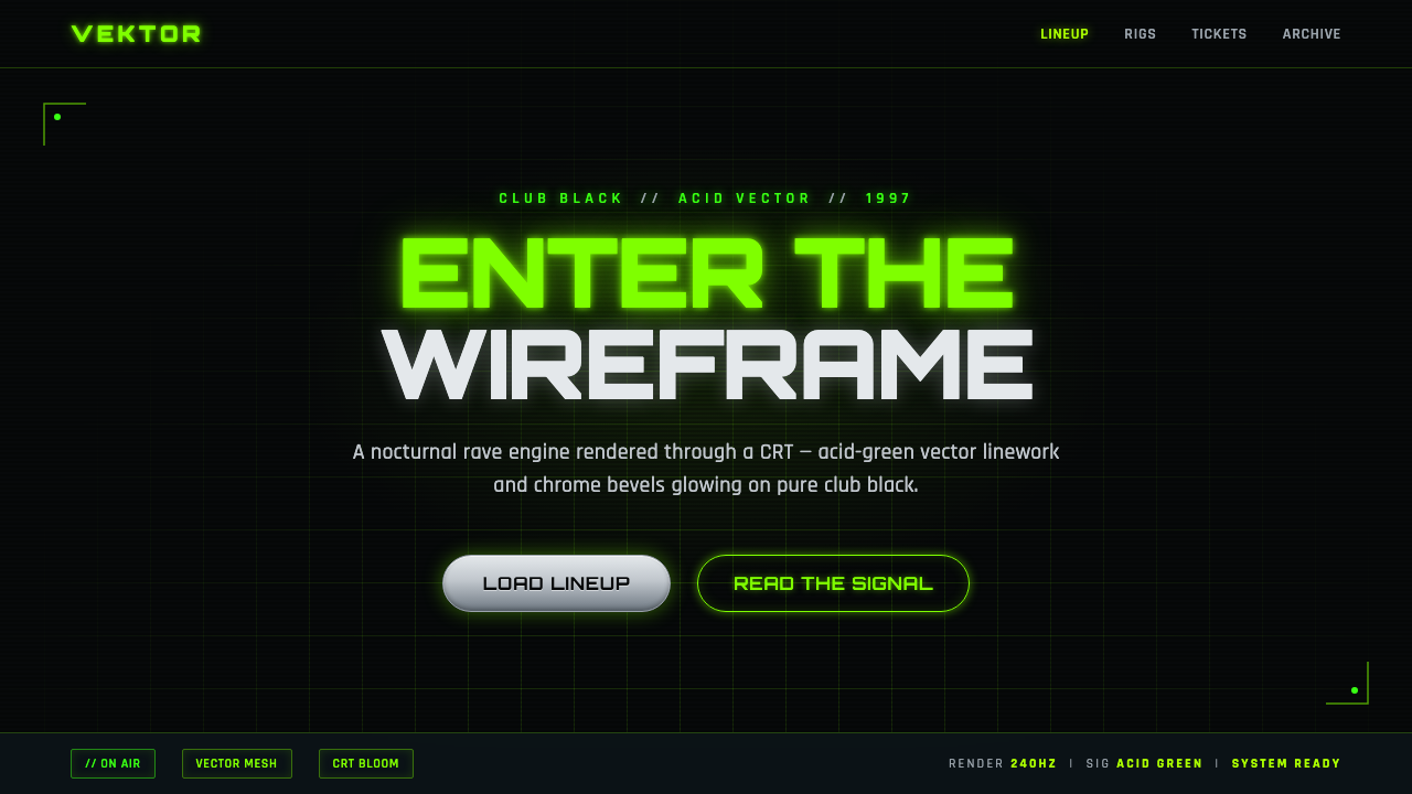 Playstation Rave Green 1997Enter the wireframe. Acid-green vector lines and chrome glow on club black, a…
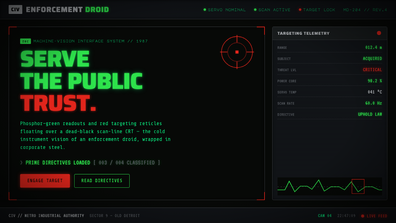 RoboCop (1987)Machine vision as interface. Phosphor-green readouts on dead-black CRT, red r…
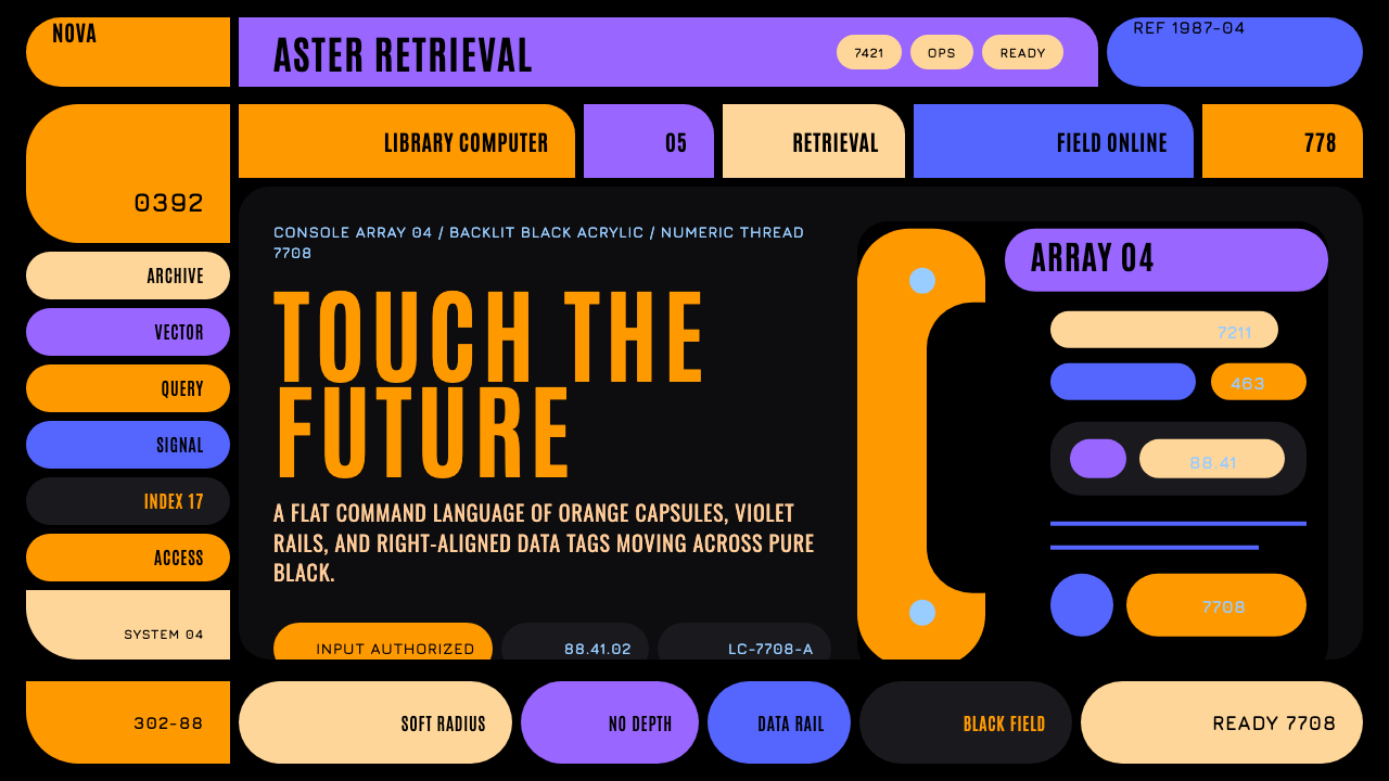 Star Trek LCARSFuture as flat command. Orange-violet elbows and Jura numbers glow on black.
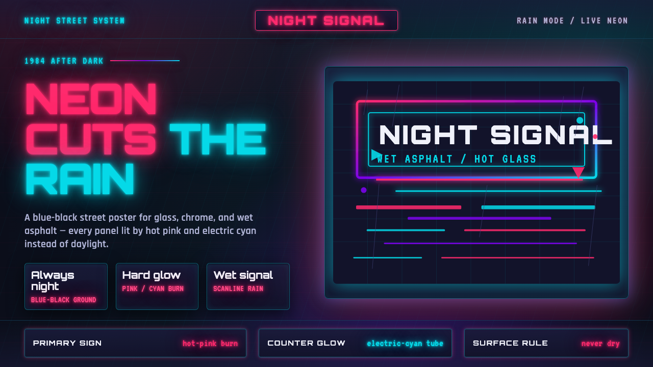 Tech-NoirAlways night. Blue-black asphalt reflects hot pink and electric cyan neon.
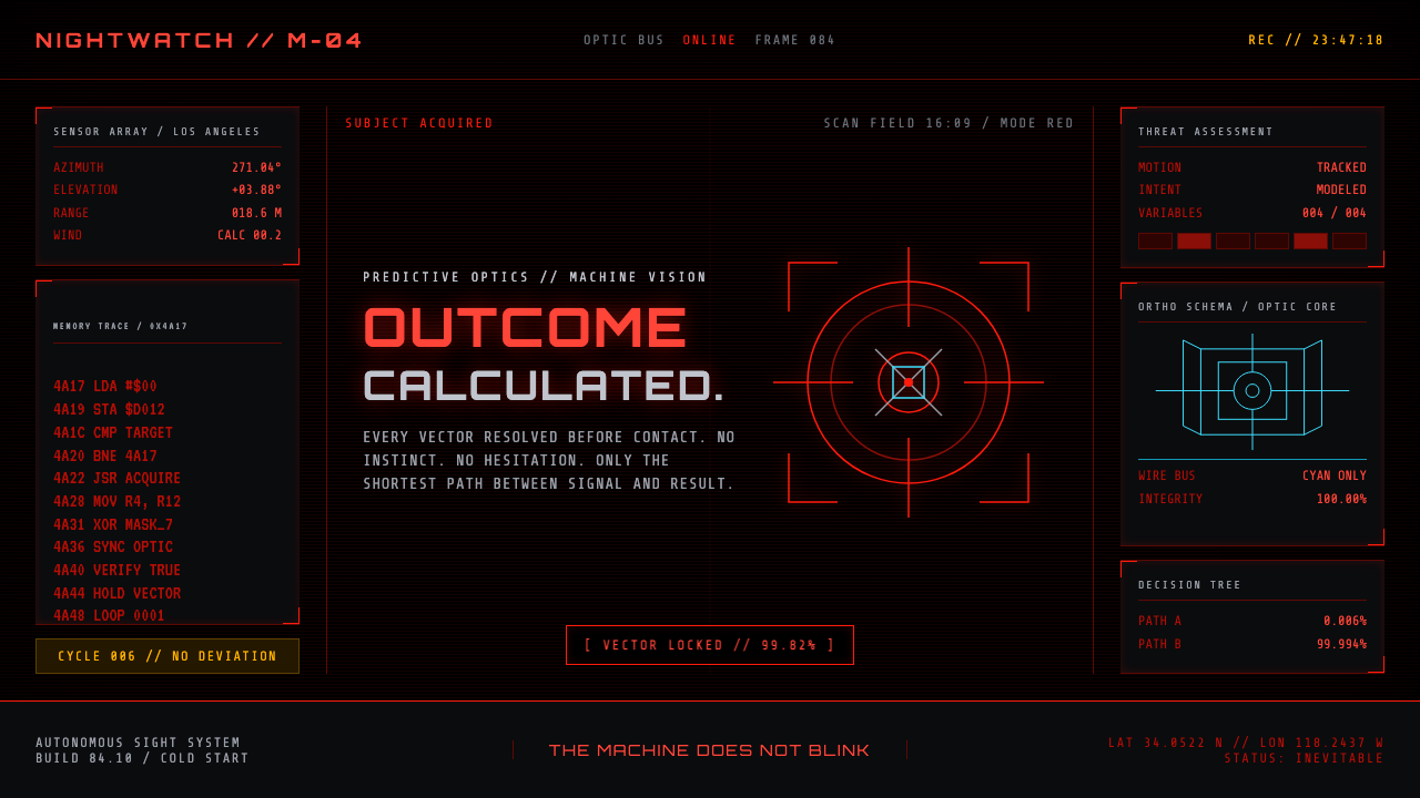 Terminator HUD (1984)The machine never blinks. Blood-red reticles and mono data burn across absolu…
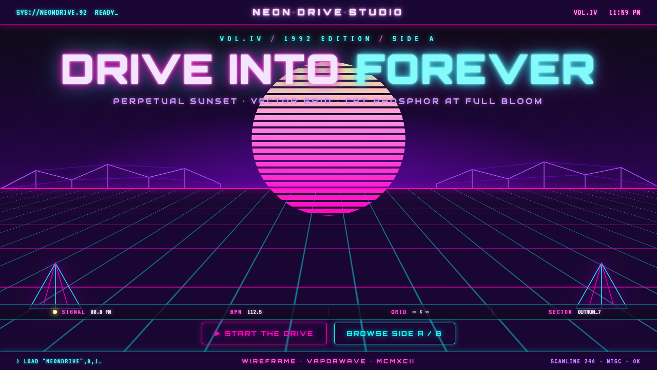 Wireframe VaporwaveDrive into forever. Magenta-cyan grid races to a vanishing point under a stri…